PROTECTED SOURCE SCRIPT
Statistical Projection over N Days (drift + σ) – v1.2 [EN]
🧭 Overview
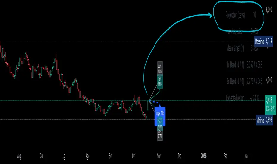
“Statistical Projection over N Days (drift + σ)” is a quantitative forecasting model that estimates the expected future price range of any asset over a chosen horizon (default = 10 days).
It combines average drift (trend direction) and historical volatility (σ) to produce a probabilistic cone of future price movement.
The indicator displays:
a blue dashed line (expected price path),
1σ / 2σ deviation bands (volatility envelopes),
and a summary table with the key forecast values and expected return.
⚙️ Core Logic (Explained Simply)
The indicator analyses recent price behavior to estimate two key elements:
the average daily tendency of the market (called drift), and
the average daily variability (called volatility).
Here’s how it works, step by step:
Measures daily percentage changes (using logarithmic returns) to understand how much the price typically moves from one bar to the next.
It then calculates the average of those returns over a chosen historical window (for example, 70 bars).
If the average is positive → the market has a rising tendency (upward drift).
If the average is negative → the market tends to decline (downward drift).
At the same time, it computes the standard deviation of those returns — this shows how “wide” the movements are, i.e. how volatile the asset is.
Using these two measures — drift and volatility — it estimates where the price is statistically expected to move over the next N bars:
The mean projection (blue dashed line) represents the most likely price path.
The 1σ and 2σ lines (teal and gray) define confidence zones, where price is expected to remain about 68% and 95% of the time, respectively.
The model updates continuously with every new bar, recalculating both drift and volatility, so the projection cone expands, contracts, or changes direction depending on the latest market behavior.
📉 Interpretation of the Blue Line
The blue dashed line (pMean) is the statistical forecast path of price over the next N bars.
🔹 When the blue line is below the current price
The recent drift (average log return) is negative → the model expects a gradual decline.
Interpretation:
The prevailing statistical bias is bearish — the market is expected to move lower toward equilibrium.
🔹 When the blue line is above the current price
The recent drift is positive → the model expects a continued rise.
Interpretation:
The price is statistically likely to trend upward, maintaining momentum in the direction of the current drift.
🔹 When the blue line is sloping upward
The mean projection pMean is rising with each new bar.
Indicates positive drift → the average daily return is positive.
Interpretation:
The asset is in a growth phase; volatility bands act as potential expansion corridors.
🔹 When the blue line is sloping downward
The mean projection pMean decreases bar after bar.
Indicates negative drift → average daily return is negative.
Interpretation:
The asset is in a corrective or declining phase, with volatility determining potential drawdown limits.
🔹 When the blue line is flat
The drift (μ) is approximately zero.
Interpretation:
The model sees no directional bias; price equilibrium dominates.
Expect a sideways range unless new volatility (σ) expansion occurs.
📈 How to Read the Entire Projection
Blue dashed line → expected mean path (most probable price trajectory).
Teal lines (±1σ) → statistically normal range (≈68% of future outcomes).
Gray lines (±2σ) → extreme bounds (≈95% of outcomes).
Labels on the right show exact forecast prices for each band.
If the actual price moves outside the gray 2σ range →
→ it signals volatility breakout or regime shift, meaning the past volatility no longer explains the present movement.
🧮 Summary Table
Located at the top-right corner, it provides:
Field Description
Projection (days) Number of bars used for projection (h).
Anchor price Starting close used for forecast.
Mean target (h) Expected price after h bars (blue line endpoint).
1σ Band (↓ / ↑) 68% confidence interval.
2σ Band (↓ / ↑) 95% confidence interval.
Expected return Projected % change from current close to mean target.
Colors can be customized — for example:
white headers,
aqua for anchor price,
lime for target,
orange/red for σ bands,
yellow for expected return.
🧠 Practical Meaning
Blue Line State Interpretation Bias
Above price, rising Ongoing positive drift Bullish
Below price, falling Negative drift Bearish
Flat, near price Neutral drift Sideways
Steep slope Strong directional momentum Trend confirmation
Price > +2σ band Excess volatility / overextension Possible correction
Price < −2σ band Undervaluation or panic Reversion likely
⚡ Summary
Aspect Description
Purpose Statistical forecast of expected price range
Method Drift (μ) + Volatility (σ) from log returns
Outputs Mean projection (blue), 1σ & 2σ bands, expected return
Interpretation Directional bias from blue line and its slope
Recommended timeframe Daily
Best use Trend confirmation, probabilistic target estimation, volatility analysis.
Скрипт с защищённым кодом
Этот скрипт опубликован с закрытым исходным кодом. Однако вы можете использовать его свободно и без каких-либо ограничений — читайте подробнее здесь.
Отказ от ответственности
Информация и публикации не предназначены для предоставления и не являются финансовыми, инвестиционными, торговыми или другими видами советов или рекомендаций, предоставленных или одобренных TradingView. Подробнее читайте в Условиях использования.