ADX Breakout Enhanced Signal🥋 Trading Dojo – ADX Breakout Enhanced Signal
This indicator combines the trend-strength power of the ADX with dynamic breakout-based signals, designed for traders who want more frequent and higher-probability entries on timeframes like 1 hour.
The core logic focuses on:
📌 1. Trend Strength Detection with ADX
The indicator evaluates whether the market is showing a strong directional trend using an optimized ADX.
When ADX rises above the configured threshold, the system interprets that price has enough momentum to validate an entry.
📌 2. Breakout Entry Logic
It identifies points where price breaks recent highs or lows, confirming the start or continuation of movement.
This breakout-based approach produces more entries than traditional ADX strategies alone.
📌 3. Clear and Simple Signals
🟩 Long when price breaks a recent high with strong trend confirmation.
🟥 Short when price breaks a recent low with strong trend confirmation.
📌 4. Built-In Automated Alerts
The indicator automatically generates JSON alerts ready for use with automation tools such as trading bots, webhooks, BingX, 3Commas, Discord bots, and more.
🎯 Purpose of the Indicator
To provide more frequent, well-distributed, and momentum-validated entries, while maintaining simplicity and speed — perfect for real-time decision-making.
Perfect For:
Intraday trading
1h, 30m, and 15m timeframes
Breakout-based strategies
Automated trading systems
Полосы и каналы

BullTrading Axis Ribbon (MTF)BullTrading Axis Ribbon (MTF)
BullTrading Axis Ribbon 是一条「高周期主轴 + 自适应包络带」的趋势彩带,用来刻画价格围绕关键均衡轴的磁吸区、扩散区与趋势方向。
• 主轴(Axis Ribbon):使用更高时间级别的价格数据,在当前周期上映射一条「日内趋势中轴」。默认适合在 3m / 5m 图上调用 15m 主轴。
• 中枢区(Core Zone):主轴上下的窄区间,用彩带填充显示。当价格在中枢区震荡时,代表围绕均衡轴的磁吸与盘整。
• 外圈带(Outer Band):位于中枢之外的扩展区,用于观察顺势扩张与「过热」区域,可选线框或填充显示。
• 颜色逻辑:
• 轴线彩带根据趋势方向与中枢状态变色:上升(绿色)、下降(红色)、中枢磁吸(黄色)、整理(灰色)。
• 左下角状态灯同步给出当前轴向状态(上涨 / 下跌 / 中枢 / 整理)。
使用建议
• 在 3m / 5m 作为短周期信号时,用 Axis Ribbon 作为「大级别方向过滤」与「高概率回踩区域」参考。
• 价格长时间贴着外圈带运行,可视为顺势加速或过热区;频繁回到中枢,则倾向震荡与均值回归。
• 指标本身不直接给出买卖点,更适合与你已有的进场离场系统配合,用于方向过滤和环境判断。
本指标仅用于技术研究与图表分析,不构成任何投资建议或交易信号,请根据自身风险承担能力独立决策。
BullTrading Axis Ribbon (MTF)
BullTrading Axis Ribbon is a trend ribbon built from a higher-timeframe core axis + adaptive envelope bands.
It depicts the magnet zone, expansion zone and trend direction of price around a key equilibrium axis.
• Axis (Axis Ribbon): Uses higher-timeframe price data to project an “intraday trend spine” onto the current chart. By default it works well using a 15m axis on 3m / 5m charts.
• Core Zone: A narrow band above and below the axis, displayed as a filled ribbon. When price oscillates inside the Core Zone, it reflects magnet behavior and consolidation around the equilibrium axis.
• Outer Band: An extended area outside the Core Zone, used to observe trend extension and potential “overheated” zones. It can be shown as simple lines or as a filled band.
• Color Logic:
• The axis ribbon color changes with trend direction and core state: uptrend (green), downtrend (red), core/magnet (yellow), ranging/flat (gray).
• A status lamp in the bottom-left corner simultaneously shows the current axis state (Up / Down / Core / Flat).
Usage Suggestions
• When using 3m / 5m as your signal timeframe, treat Axis Ribbon as a higher-timeframe bias filter and as a reference for high-probability pullback areas.
• If price rides along the Outer Band for an extended period, it can be interpreted as trend acceleration or a potential overheated zone; if price frequently returns to the Core Zone, the market tends to be ranging with mean-reversion behavior.
• The indicator itself does not directly generate entry/exit signals. It is best used together with your existing entry/exit systems, as a tool for directional filtering and market-regime assessment.
This indicator is intended solely for technical research and chart analysis.
It does not constitute investment advice or a trading signal. Please make independent decisions according to your own risk tolerance.

XAUUSD 9/1 and 6/4 zone lane chart (BUY zone and SELL zone)XAUUSD 9/1 and 6/4 zone lane chart (BUY zone and SELL zone)

Daily Open Range - TatoshiDisplays a daily open range for both current and previous days. Gives users the flexibility to adjust the number of minutes that the daily open range is determined by. I personally use the first 30 minutes, but adjust at your discretion.
Another GOAT of a indicator. I don't use as much as my monthly open inidcator but for trading lower time frames, this allows the user to easily set their bias for the day and extremely simple to build a strategy around.

PersonsPivots-UpdatedThe script was written by another script writer and it worked fine with Futures, Forex and ETFs but had a Runtime error for stocks so I had a coder friend do a debug

Weekly Open Range - TatoshiDisplays a weekly open range for both current and previous weeks. Gives users the flexibility to adjust the number of hours that the weekly open range is determined by. I personally use the first 3 hours, but play around with it.
A GOAT of a indicator, allows the user to easily set their bias for the week and extremely simple to build a strategy around.

Monthly Open Range - TatoshiDisplays a monthly open range for both current and previous months. Gives users the flexibility to adjust the number of hours that the monthly open range is determined by. I personally use the first 10 hours, but play around with it.
A GOAT of a indicator, allows the user to easily set their bias for the month and extremely simple to build a strategy around.

ES-VIX Daily Price Bands - Inner bands (80% and 50%)ES-VIX Daily Price Bands
This indicator plots dynamic intraday price bands for ES futures based on real-time volatility levels measured by the VIX (CBOE Volatility Index). The bands evolve throughout the trading day, providing volatility-adjusted price targets.
Formulas:
Upper Band = Daily Low + (ES Price × VIX ÷ √252 ÷ 100)
Lower Band = Daily High - (ES Price × VIX ÷ √252 ÷ 100)
The calculation uses the square root of 252 (trading days per year) to convert annualized VIX volatility into an expected daily move, then scales it as a percentage adjustment from the current day's extremes.
Features:
Real-time band calculation that updates throughout the trading session
Upper band (green) extends from the current day's low
Lower band (red) contracts from the current day's high
Inner upper band (green) at 50% of expected move
Inner lower band (red) at 50% of expected move
Middle Inner upper band (green) at 80% of expected move
Middle Inner lower band (red) at 80% of expected move
Shaded zone between bands for visual clarity
Information table displaying:
Current ES price and VIX level
Running daily high and low
Current upper and lower band values

ES-VIX Daily Price Bands - Inner bandsES-VIX Daily Price Bands
This indicator plots dynamic intraday price bands for ES futures based on real-time volatility levels measured by the VIX (CBOE Volatility Index). The bands evolve throughout the trading day, providing volatility-adjusted price targets.
Formulas:
Upper Band = Daily Low + (ES Price × VIX ÷ √252 ÷ 100)
Lower Band = Daily High - (ES Price × VIX ÷ √252 ÷ 100)
The calculation uses the square root of 252 (trading days per year) to convert annualized VIX volatility into an expected daily move, then scales it as a percentage adjustment from the current day's extremes.
Features:
Real-time band calculation that updates throughout the trading session
Upper band (green) extends from the current day's low
Lower band (red) contracts from the current day's high
Inner upper band (green) at 50% of expected move
Inner lower band (red) at 50% of expected move
Shaded zone between bands for visual clarity
Information table displaying:
Current ES price and VIX level
Running daily high and low
Current upper and lower band values

ES-VIX Daily Price BandsES-VIX Daily Price Bands
This indicator plots dynamic intraday price bands for ES futures based on real-time volatility levels measured by the VIX (CBOE Volatility Index). The bands evolve throughout the trading day, providing volatility-adjusted price targets.
Formulas:
Upper Band = Daily Low + (ES Price × VIX ÷ √252 ÷ 100)
Lower Band = Daily High - (ES Price × VIX ÷ √252 ÷ 100)
The calculation uses the square root of 252 (trading days per year) to convert annualized VIX volatility into an expected daily move, then scales it as a percentage adjustment from the current day's extremes.
Features:
Real-time band calculation that updates throughout the trading session
Upper band (green) extends from the current day's low
Lower band (red) contracts from the current day's high
Shaded zone between bands for visual clarity
Information table displaying:
Current ES price and VIX level
Running daily high and low
Current upper and lower band values

@Complete Squeeze Cycle Detector v2.0 FINALDescription:
The Complete Squeeze Cycle Detector identifies and tracks the full lifecycle of squeeze formations, from pre-squeeze consolidation through active squeeze periods to squeeze completion. The indicator systematically detects the characteristic conditions that precede and accompany squeeze events.
The indicator monitors multiple factors associated with squeeze development including:
• Volatility compression relative to recent volume activity
• Elevated market stress conditions as measured by VIX levels
• Momentum compression through rate of change measurements across multiple time periods
• Alignment of multiple exponential moving averages indicating consolidation
The squeeze cycle is classified into three distinct phases: Pre-Squeeze Setup, Active Squeeze, and Squeeze Complete. Each phase is identified based on threshold levels of multiple compression metrics, with adjustable sensitivity settings to control the strictness of detection.
The indicator provides visual identification of each phase through labels, background coloring, and an optional dashboard, allowing users to distinguish between the preparation phase where volatility contracts, the active squeeze phase where compression reaches critical levels, and the completion phase where the squeeze releases and directional movement resumes.
This systematic approach enables users to identify squeeze formations throughout their complete development cycle rather than focusing only on the breakout phase.

Futures-Spot Round NumbersFutures-Spot Round Numbers
This indicator displays round number levels for Gold Futures on your spot chart, automatically adjusting for the price spread between futures and spot markets.

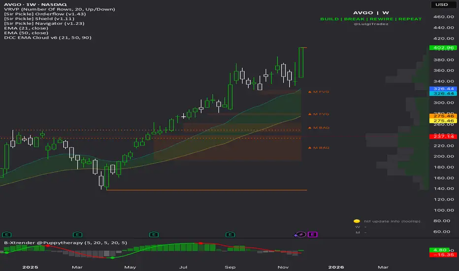
2 EMA Cloud by LuigiTradez☁️ Dynamic Color EMA Cloud (v6) Indicator Description
This Pine Script v6 indicator creates a visually powerful EMA Cloud that dynamically changes color based on the prevailing short-term trend, making it an excellent tool for trend confirmation, support, and resistance identification.
Key Features
Dynamic Cloud Coloring: The cloud automatically changes its fill color when the Fast EMA crosses the Slow EMA.
Bullish Cloud: Activated when the **Fast EMA is above the Slow EMA** (uptrend).
Bearish Cloud: Activated when the **Fast EMA is below the Slow EMA** (downtrend).
Full Customization: All key parameters are exposed in the indicator settings for easy adjustment.
Trend Background: An optional, very light background color is plotted to reinforce the current trend direction across the entire chart.
🛠️ How to Use the Indicator
The EMA Cloud primarily serves as a visual filter and a dynamic zone of support/resistance.
1. Trend Confirmation: Use the cloud color to confirm the trend direction. A green (bullish) cloud suggests an uptrend is in effect, while a red (bearish) cloud suggests a downtrend.
2. Support and Resistance: The cloud itself acts as a dynamic zone.
* In an uptrend, prices pulling back into the Bullish Cloud often find support there.
* In a downtrend, prices rallying into the Bearish Cloud often find resistance there.
3. Crossover Signal: The moment the cloud color flips (e.g., from red to green), it signals a potential major trend shift as the fast-moving EMA has crossed the slower-moving EMA.
AUBANK Future-Spot % BasisThis indiacator tells Future asset diffrence of aubank future and aubank spot price

Bassi's Pattern Breakout IndicatorBASSI'S PATTERN BREAKOUT INDICATOR
Author: Bassi | Published 2025
One of the cleanest and most accurate classic pattern detectors on TradingView – proudly coded and shared by Bassi.
Detects & confirms breakouts from:
• Double Top / Double Bottom
• Triple Top / Triple Bottom
• Head & Shoulders
• Inverse Head & Shoulders
Key Features:
• 100% non-repainting – signals only appear after candle close
• Smart breakout confirmation using the correct neckline level
• Visual pattern drawing (tops/bottoms + necklines)
• Clear breakout labels with vertical confirmation lines
• Real-time TradingView alerts (one alert per bar close)
• All alerts include "Bassi" prefix so you know it's the original
• Dynamic coloring for Double Bottom (red in lower areas, green in higher areas)
• No messy BUY/SELL labels – clean professional look (as requested by the community)
Why traders love it:
- Extremely reliable on all timeframes (1m to monthly)
- Works perfectly on Forex, Stocks, Crypto, Indices
- No false signals during consolidation
- Perfect for swing trading, scalping and position trading
Settings:
• Pivot Left/Right Bars – adjust sensitivity
• Price Tolerance % – how flat the tops/bottoms must be
• Max Pivot Storage – memory management
• Enable/disable alerts and visual markers
How to use:
1. Add to chart
2. Create alert → select "Bassi's Pattern Breakout Indicator"
3. Choose "Once per bar close"
4. Get notified instantly on every confirmed breakout!
This is the original and only authorized version by Bassi.
If you enjoy this indicator, please leave a like and follow for future updates!
© Bassi 2025 – All rights reserved
#pattern #breakout #doubletop #doublebottom #headandshoulders #tradingview #bassi

Session Markers - JDK AnalysisSession Markers is a tool designed to study how markets behave during specific, recurring time windows. Many traders know that price behaves differently depending on the day of the week, the time of the day, or particular market sessions such as the weekly open, the London session, or the New York open. This indicator makes those recurring windows visible on the chart and then analyzes what price typically does inside them. The result is a clear statistical understanding of how a chosen session behaves, both in direction and in strength.
The script works by allowing the trader to define any time window using a start day and time and an end day and time. Every time this window occurs on the chart, the indicator highlights it with a full-height vertical band. These visual markers reveal patterns that are otherwise difficult to detect manually, such as whether certain sessions tend to trend, reverse, consolidate, or create large imbalances. They also help the trader quickly scan through historical price action to see how the market has behaved under similar conditions.
For every completed session window, the indicator measures how much price changed from the moment the window began to the moment it ended. Instead of using raw price differences, it converts these changes into percentage moves. This makes the measurement consistent across different price ranges and market regimes. A one-percent move always has the same meaning, whether the asset is trading at 100 or 50,000. These percentage moves are collected for a user-selected number of past sessions, creating a dataset of how the market has behaved in the chosen time window.
Based on this dataset, the indicator generates several statistics. It counts how many past sessions closed higher and how many closed lower, producing a directional tendency. It also computes the probability of an upward session by dividing the number of positive sessions by the total. More importantly, it calculates the average percentage movement for all sessions in the lookback period. This average move reflects not just the direction but also the magnitude of price changes. A session with frequent small upward moves but occasional large downward moves will show a negative average movement, even if more sessions ended positive. This creates a more realistic representation of true market behavior.
Using this average movement, the script determines a “Bias” for the session. If the average percentage move is positive, the bias is considered bullish. If it is negative, the bias is bearish. If the values are very close to zero, the bias is neutral. This way, the indicator takes both frequency and impact into account, producing a magnitude-aware assessment instead of one that only counts wins and losses. A sequence such as +5%, –1% results in a bullish bias because the overall impact is strongly positive. On the other hand, a series of small gains followed by a large drop produces a bearish bias even if more sessions ended positive, because the large move dominates the average. This provides a far more truthful picture of what the market tends to do during the chosen window.
All relevant statistics are displayed neatly in a small panel in the top-right corner of the chart. The panel updates in real time as new sessions complete and older ones fall out of the lookback range. It shows how many sessions were analyzed, how many ended up or down, the probability of an upward move, the average percentage change, and the final bias. The background color of the panel instantly reflects that bias, making it easy to interpret at a glance.
To use the tool effectively, the trader simply needs to define a time window of interest. This could be something like the weekly opening window from Sunday to Monday, the London open each day, or even a unique custom window. After selecting how many past sessions to analyze, the indicator takes care of the rest. The vertical session markers reveal the structure visually. The statistics summarize the historical behavior objectively. The magnitude-weighted bias provides a realistic indication of whether the window tends to produce upward or downward movement on average.
Session Markers is helpful because it translates repeated market timing behavior into measurable data. It exposes hidden tendencies that are easy to feel intuitively but hard to quantify manually. By analyzing both direction and magnitude, it prevents misleading interpretations that can arise from looking only at win rates. It helps traders understand whether a session typically produces meaningful moves or just small noise, whether it tends to trend or reverse, and whether its behavior has recently changed. Whether used for bias building, session filtering, or deeper market research, it offers a structured framework for understanding the market through time-based patterns.


Levels S/R Boxes + Gaps + SL/TPWhat It Does:
Automatically identifies and displays:
🟦 Support/Resistance zones (horizontal boxes)
🟨 Price gaps (unfilled gaps from market open/close)
🎯 Stop Loss levels (where to protect trades)
💰 Take Profit levels (where to exit trades)
Purpose: Shows you exactly where price is likely to bounce, reverse, or break through.
Best Practices:
✅ Trade at the boxes - Don't chase price
✅ Use SL/TP lines - Automatic risk management
✅ Wait for confirmation - Candle pattern + S/R level
✅ Gaps get filled - Trade towards yellow boxes
✅ Solid lines = stronger - Prefer 3+ touch levels
❌ Don't ignore SL - Always protect yourself
❌ Don't trade middle - Wait for S/R zones
❌ Don't fight strong levels - Respect solid boxes
Settings (Quick Reference):
S/R Strength: 10 (default) - Lower = more levels, Higher = fewer stronger levels
Max Levels: 5 (default) - Number of S/R boxes to show
Show Gaps: ON - Display yellow gap boxes
Show SL/TP: ON - Display entry/exit suggestions

EMA Divergence Channel (Only Above EMA 200)shows ema divergence above 200 ema. When the 7 ema diverges from 21 and 50 really fast, the channel shows up

rahulp33It is a 15-min high-low for the day; this will help the fellow chartist understand a trend emerging for the day. This indicator, along with others, gives a general sense of the daily trend, but it's not the sole factor to consider.


FusionFlow Pro – Trend & Regime🌀 FusionFlow Pro — Trend & Regime
Introduction
FusionFlow Pro is a visual trend-and-regime map designed for traders who prefer clarity over noise.
It blends multiple concepts—trend direction, volatility, volume behavior, higher-timeframe bias, and a smooth neon-gradient ribbon—into a single, readable structure.
This tool was built over many revisions and experiments, and it’s offered freely for the community. The goal is simple: provide a clean way to understand market context without overwhelming the chart.
About the Indicator
FusionFlow Pro combines several market components into one display:
• Trend Engine
Two adaptive moving averages form the core directional structure. Their separation, strength, and interaction define whether the market is leaning bullish, bearish, or neutral.
• Regime Classifier
The script can interpret either ADX or Choppiness Index to determine whether conditions favor trending behavior or range-bound phases.
• Volume & Momentum Influence
Volume expansion and short-term momentum add additional context, helping highlight when market participation is rising or cooling.
• Higher-Timeframe Bias (HTF)
The option to reference a larger timeframe gives users a broader directional backdrop while still trading on their preferred interval.
• Neon Ribbon Visualization
The slow MA forms the backbone of a multi-gradient, distance-based ribbon.
When price hugs the ribbon, the fill becomes subtle and transparent; as price moves away, the ribbon becomes more visible.
This creates an intuitive sense of distance, pressure, and trend engagement.
• HUD Panel
A compact top-right panel summarizes the current trend state, regime, volume condition, HTF bias, and most recent event.
It acts as a quick reference so the chart stays readable even at fast timeframes.
Color Interpretation
FusionFlow Pro uses color to convey structure at a glance:
Ribbon Line:
• Uptrend: green-cyan tone
• Downtrend: soft red-magenta tone
• Neutral: cool gray-blue
Ribbon Fill:
A neon gradient cycles from lime → aqua → blue → violet → soft red.
The specific color is determined by the slow MA’s position inside a 50-bar normalization window.
Opacity Behavior:
• Near the ribbon: color is more pronounced
• Approaching the candles: the fill fades smoothly
• At the extremes: almost fully transparent
This tapered fade is intentional—it helps the shape remain visible without overwhelming the candles underneath.
HUD Colors:
Each HUD value shifts based on conditions—bullish, bearish, neutral, trending, choppy, strong volume, etc.—making it easy to read with peripheral vision.
Settings & Customization
FusionFlow Pro allows users to customize its behavior without assuming any specific market or style.
Different symbols—indices, crypto, commodities, forex, individual stocks—can have very different volatility and rhythm. Because of that, many traders tweak the MA lengths, ATR multiplier, volume factor, and regime settings depending on the symbol or timeframe they prefer.
Shorter lengths generally create a more reactive environment; longer lengths smooth out noise. ATR buffer and volume requirements can be increased or reduced depending on how tightly or loosely the user wants FusionFlow Pro to respond.
Instead of prescribing “best settings,” FusionFlow Pro stays neutral and flexible.
Experimenting with adjustments is part of the workflow, and finding a comfortable configuration is encouraged.
Disclaimer
This script is published purely for chart visualization and educational use.
It does not provide financial advice, does not guarantee outcomes, and should not be used as a sole basis for trading decisions.
Users remain responsible for their own analysis and risk management.

Multi-TF Flexible Triple MA + Envelope🔷 Main Features
1. Three Moving Averages (MA1, MA2, MA3)
Fully customizable types: SMA, EMA, WMA, VWMA, TEMA
Individual period and price source for each MA
Optional multi-timeframe (MTF) calculation
This allows you to build a flexible trend structure with local, medium-term, and higher-timeframe layers.
2. Envelope Based on MA3
The indicator includes an Envelope channel (upper and lower bands) derived from MA3.
Features:
Adjustable deviation in percentage
Enable/disable the channel
Optional fill between bands
Dotted line style mode
The Envelope helps visualize:
Overbought/oversold zones relative to trend
Volatility expansion and contraction
Dynamic support/resistance bounces
3. MA1–MA2 Crossover Signals
The indicator plots visual markers for crossover events:
🔺 MA1 crossing above MA2 — potential bullish impulse
🔻 MA1 crossing below MA2 — early warning of trend weakness or reversal
These signals can be used for entries, trend filtering, or confirmation of directional movement.
🎯 Why Use This Indicator
This tool combines several analytical approaches:
Dynamic trend levels (MAs)
Volatility structure through the Envelope
Multi-timeframe analysis
Clear visual crossover signals
It works well for:
Trend-following entry zones
Trading from Envelope boundaries
Identifying market expansion/compression
Filtering trend direction across multiple timeframes
Both intraday and swing trading
