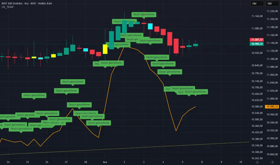
MC [PRO+]MC Pro+ Indicator Strategy
Blue Line (MC 1):
Long or Short Trend Indicator When price crosses this blue line level, the trend changes Acts as the primary trend direction signal.
Orange Line (MC 2) :
Works like a magnet, keeping price attracted to it When price is too far from this line, it pulls price back like a magnet (long scenario) Price tends to gravitate towards this level. When this orangheline starts moving downward (loses its strength), the trend may reverse We can start going short even if we're still above the blue line (which indicates long or short) Shows weakening bullish momentum.
RedLine (MC 3):
Ultra Bullish Scenario Used specifically for ultra bullish scenarios Confirms extremely strong upward momentum.
Support/Resistance Function: When any line breaks, it acts as support or resistance
Broken levels become important price zones
Choppy Market Signal: When price is very choppy and not moving much (consolidation) All 3 lines are very close together This signals a major explosive move coming either downward or upward Breakout direction confirmed when blue line is crossed.
This is a multi-timeframe momentum and trend-following system using moving averages as dynamic support/resistance and trend indicators.
Индикаторы ширины рынка

Pure xATR ProUncover the hidden rhythm of the market with Pure xATR Pro. This indicator is designed for serious traders who need to understand "Price Extension". It calculates the precise distance between the price and the baseline Moving Average (MA) relative to market volatility (ATR). Instead of guessing top and bottom, visualize exactly where the price stands in the cycle—from extreme panic selling to euphoric profit-taking.
Key Features:
4-Stage Market Zoning System:
Panic Zone (Oversold): Identifies extreme price drops (statistically rare deviations). Often presents high-reward mean reversion opportunities.
Buy Zone (Entry): The sweet spot for trend initiation.
Hold / Winner Zone: Detects strong momentum. Keeps you in the trade while the trend is healthy (Ride the trend).
Profit Taking Zone (Overbought): signals when the price is statistically overextended and liable to pullback.
Adaptive Volatility Logic:
Includes a dynamic algorithm that analyzes historical volatility (Lookback Period) to automatically adjust Overbought/Oversold percentiles, adapting to changing market conditions.
Professional Dashboard:
Real-time Status: Displays current Zone, Volatility State (Breakout/Normal), and Actionable Advice.
Risk Management: Auto-calculates Dynamic Stop Loss (based on Supertrend, ATR, or MA) and Fixed % Risk.
Multi-Level Targets: Automatically projects 3 profit targets (TP) based on ATR multiples.
Clean & Customizable Visuals:
Smart Highlighting: Background colors automatically highlight key zones (Panic/Buy/Hold/Profit).
Style Control: Full color customization available directly in the "Style" tab for a clutter-free input menu.
------------------
ค้นพบจังหวะที่แท้จริงของตลาดด้วย Pure xATR Pro อินดิเคเตอร์ระดับมืออาชีพที่ออกแบบมาเพื่อวิเคราะห์ "ระยะการยืดตัวของราคา" (Price Extension) โดยคำนวณระยะห่างระหว่างราคากับเส้นค่าเฉลี่ย (MA) เทียบกับความผันผวน (ATR) ช่วยให้คุณเห็นภาพชัดเจนว่าราคา ณ ปัจจุบันอยู่ในสถานะใด ตั้งแต่จุดที่คนเทขายด้วยความตกใจ (Panic) ไปจนถึงจุดที่ราคาแพงเกินไปและควรขายทำกำไร
ฟีเจอร์หลัก (Key Features):
ระบบแบ่งโซนตลาด 4 ระดับ (4-Stage Zoning):
Panic Zone (โซนของถูก/Oversold): จับจังหวะที่ราคาดิ่งลงแรงผิดปกติ ซึ่งมักเป็นจุดกลับตัวที่ให้ผลตอบแทนสูง (High Reward)
Buy Zone (โซนสะสม): จุดเริ่มต้นของเทรนด์ เป็นระยะปลอดภัยในการเข้าออเดอร์
Hold / Winner Zone (โซนรันเทรนด์): แยกแยะช่วงที่เทรนด์แข็งแกร่ง ให้คุณ "ถือสถานะต่อ" (Let Profit Run) ไม่ขายหมู
Profit Taking Zone (โซนขายทำกำไร): แจ้งเตือนเมื่อราคาวิ่งไปไกลเกินค่าเฉลี่ยทางสถิติ (Overextended) เพื่อพิจารณาขาย
ระบบปรับตัวตามความผันผวน (Adaptive Logic):
อัลกอริทึมอัจฉริยะที่คำนวณค่า Percentile ย้อนหลัง เพื่อปรับระดับ Overbought/Oversold ให้เหมาะสมกับสภาวะตลาดที่เปลี่ยนไปโดยอัตโนมัติ
หน้าปัดสถานะครบวงจร (Professional Dashboard):
แสดงสถานะปัจจุบัน (Action), ระดับความผันผวน, และคำแนะนำแบบ Real-time
Risk Management: คำนวณจุด Stop Loss ให้อัตโนมัติ (เลือกสูตรได้: Supertrend, ATR, หรือ MA)
Target Projection: คำนวณเป้าหมายทำกำไร (TP) ให้ล่วงหน้า 3 ระดับตามระยะ ATR
กราฟสะอาดตา ปรับแต่งง่าย (Clean Visuals):
Smart Highlight: ไฮไลท์สีพื้นหลังตามโซนต่างๆ อัตโนมัติ (Panic/Buy/Hold/Profit) ทำให้ดูเทรนด์ง่ายเพียงกวาดตา
Customizable: ปรับแต่งสีและความโปร่งใสได้อิสระผ่านแถบ "Style" เพื่อกราฟที่ดูเป็นระเบียบและไม่รกสายตา

Evergito HH/LL 3 Señales + ATR SLHow to trade with the Evergito HH/LL 3 Signals + ATR SL indicator? Brief and direct explanation: General system logic: The indicator looks for actual breakouts of the high/low of the last 20 bars (HH/LL) and combines them with the position relative to the 200 SMA to filter the underlying trend. You have 3 types of signals that you can activate/deactivate separately: Signal
When it appears
What it means in practice
Entry type
V1
HH breakout + the close crosses above the 200 SMA (or the opposite in a short position)
Very safe entry confirmed. The price has just validated the long/flat trend → safer and with a better ratio
The most reliable (the original)
V2
HH breakout but the price was already above the 200 SMA (or already below in a short position)
Entry in an already established trend. Fewer “surprises”, more continuity
Ideal for strong trends
V3
Only the breakout of the HH or LL, without looking at the 200 SMA
Aggressive entry/scalping on explosive breakouts. More signals, more noise.
For times of high volatility.
How to enter the market (simple rule): Wait for any of the 3 labels (V1, V2, or V3) to appear, depending on which ones you have activated.
Enter at the close of that candle (or at the open of the next one if you are conservative).
Automatic Stop Loss → the blue (long) or yellow (short) line that represents the ATR x2.
Take Profit → you decide, but the indicator already gives you the visual reference for the risk (ATR x2), so 1:2 or 1:3 is usually very convenient.
Practical example: You see a large green label “HH LONG V1” → you go long at the close of that candle. Stop right at the blue line (ATR x2 below the price).
Typical target: 2x or 3x the risk (very common to reach it in a trend).
Recommended use: Most traders leave only V1 activated → fewer signals but very high quality.
Those who trade intraday or crypto usually combine V1 + V2.
V3 only for news events or very volatile openings.
In summary:
Label = immediate entry
Blue/yellow line = automatic stop
And enjoy the move.

ULTRA KAMA (Hayalet Sinyaller)Although you only see the KAMA (Kaufman Adaptive Moving Average) line on the chart, signal generation is managed by a powerful, 5-layer confirmation system running in the background.
MACD Zero-Line Dominance (no ta.sum)Description Option 1 (Simple & Clear)
“This indicator compares how many recent bars have the MACD line above the zero line versus below it.
It plots the resulting strength as a green/red histogram showing whether bullish or bearish momentum is dominating.”
“MACD Zero-Line Dominance measures the strength balance between bullish and bearish momentum by counting how many candles in a lookback period have MACD above or below the zero line.
The histogram turns green when bullish pressure dominates and red when bearish momentum takes control.
Useful for trend confirmation, regime detection, and higher-timeframe alignment.”

XΩ — T+ Sentiment Sniper
**XΩ — T+ Sentiment Sniper**
Crowd psychology helper for timing T+ reversals and managing risk
---
### 1. What is XΩ — T+ Sentiment Sniper?
XΩ — T+ Sentiment Sniper is a **crowd sentiment companion indicator**.
It estimates whether the market as a whole is currently:
- Deep in profit (euphoria, FOMO‑prone)
- Deep in loss (panic, capitulation‑prone)
- Slightly profitable / slightly losing
From that, it marks:
- Potential **supply/demand absorption** zones at panic lows and euphoric highs
- **Sentiment divergences** between price and crowd PnL
You use it as a **psychology layer on top of your main system**, especially for timing T+ style moves (the next 1–3 swings after an emotional extreme).
You do not need to understand the internal math to use it.
---
### 2. How to read the panel
The indicator runs in a **separate pane** (not on the price chart) and shows:
1. **Crowd Sentiment (Raw) – columns**
- Green/red columns represent how “good” or “bad” the crowd’s current PnL is.
- Taller columns = more emotional / more extreme conditions.
2. **Signal Line – white line**
- A smoothed line summarising the **overall direction of sentiment**.
- Helps you see whether psychology is improving or deteriorating.
3. **Horizontal levels**
- `0 (Neutral)` → sentiment is roughly balanced.
- `Euphoria` → crowd is strongly in profit (high risk of FOMO and distribution).
- `Panic` → crowd is deeply underwater (high risk of capitulation and absorption).
4. **Dashboard label on the latest bar**
- Status: `EUPHORIA (Risk)`, `PANIC (Opp.)`, `SLIGHT PROFIT`, or `SLIGHT LOSS`.
- Current **Crowd PnL (%)**.
- A short note about volume (stable vs unusually high, with a T+2 warning when needed).
At a glance, you know:
> “Is the market currently euphoric, panicking, or somewhere in between?”
---
### 3. What the signals mean
The indicator plots shapes at the top/bottom of the pane:
- **ABS (Absorption – Buy)**
- Small green circle near the bottom.
- Suggests **demand absorption**: sentiment is bad (panic), but strong buying appears against the selling.
- Use as a **potential bottom area** to watch, not an automatic “buy now”.
- **DST (Distribution – Sell)**
- Small red circle near the top.
- Suggests **distribution**: sentiment is very positive (euphoria), but strong selling appears into that optimism.
- Use as a **potential top area** to watch for taking profits or avoiding FOMO entries.
- **DIV triangle up (Bullish Div – Buy)**
- Yellow triangle pointing up near the bottom.
- Price makes new lows while sentiment stops getting worse and starts to improve.
- Suggests selling pressure is fading; potential for an upward reversal.
- **DIV triangle down (Bearish Div – Sell)**
- Orange triangle pointing down near the top.
- Price makes new highs while sentiment stops getting better and starts to weaken.
- Suggests buying pressure is fading; potential for a downward reversal.
Think of these as **context signals / alerts**, not as “must‑take” entries on their own.
---
### 4. Suggested ways to use it
#### 4.1. As a context filter before entering trades
Use Sentiment Sniper to avoid trading directly into emotional extremes:
- Avoid opening **new longs** when:
- The indicator is in the **Euphoria** zone and you see **DST or Bearish DIV** near resistance.
- Avoid opening **new shorts** when:
- The indicator is in the **Panic** zone and you see **ABS or Bullish DIV** near support.
In other words, use it as a **“do not chase” filter** for tops and bottoms.
---
#### 4.2. To spot potential T+ reversal zones
Example workflow:
1. Use your normal tools to mark **key zones** (support/resistance, liquidity areas, higher‑timeframe levels).
2. When price reaches those zones, look at T+ Sentiment Sniper:
- Near **Panic** with **ABS or Bullish DIV** → watch for potential long opportunities.
- Near **Euphoria** with **DST or Bearish DIV** → watch for potential short/exit opportunities.
3. Only take trades when:
- You also have confirmation from your own system (reversal candle, structure break, etc.).
4. Expect a **T+ style move** (1–3 swings) away from the extreme.
---
#### 4.3. To manage open positions
- When you are **heavily in profit**:
- If Sentiment Sniper moves into **Euphoria** and starts printing **DST or Bearish DIV**, consider:
- Taking partial profits
- Tightening stops
- Reducing risk to protect gains
- When you are **stuck in drawdown**:
- If sentiment is deep in **Panic** but there is **no** ABS or Bullish DIV yet, be careful:
- Avoid catching a falling knife too early.
- Look for sentiment to stabilise (ABS/DIV + your own confirmation) before committing.
---
### 5. User‑level settings (simple view)
You typically only need to think of them like this:
- **Half-Life (Memory Decay)**
- Higher value → sentiment reacts more slowly (more “long‑term” feel).
- Lower value → sentiment reacts faster to recent moves (better for short‑term trading).
- **Euphoria / Panic Threshold (%)**
- Define what counts as an “extreme”.
- For very volatile assets (crypto, small caps), you may want slightly wider thresholds.
- For calmer markets (majors, large caps), slightly tighter thresholds may be enough.
- **Avg Volume Length**
- Period to define “normal” volume.
- Spikes above this are used to flag meaningful absorption/distribution.
- **Show Sentiment Divergence / Show Supply/Demand Absorption**
- Turn off one or both if you feel the chart is too crowded.
- Keep only the parts that match your own style.
---
### 6. Alerts
In TradingView’s **Alerts** panel you will find:
- `XΩ SNIPER BUY`
- Triggers when a **psychological Buy** signal appears (Absorption or Bullish Divergence, if enabled).
- `XΩ SNIPER SELL`
- Triggers when a **psychological Sell** signal appears (Distribution or Bearish Divergence, if enabled).
Use alerts to be notified when the crowd hits important **Panic/Euphoria zones**, without watching the screen all day.
---
### 7. Important notes
- This is a **sentiment / context tool**, not a standalone “black box” system.
- Always combine it with:
- Price structure on higher timeframes
- Your own entry/exit rules
- Proper risk management
- Backtest and forward‑test before applying it with real capital.

VietNguyen Buy_Sell VIPThis is indicator of Vietnammes, it is very good for trade Gold and Crypto.
Cre by: VietNguyenDN

Candle Length by RaviThis is a private, invite-only script designed to measure and analyze candle length behavior in real-time.
It detects significant deviations in candle size, allowing traders to identify:
High volatility zones
Breakout and breakdown conditions
Momentum continuation or exhaustion
Potential reversal signals
Ideal for scalpers, intraday traders, and momentum-based systems.

NEXFEL – Quantum Adaptive MACD System v2.0# NEXFEL – Quantum Adaptive MACD System v2.0
## 📌 Overview
The **NEXFEL – Quantum Adaptive MACD System v2.0** is an advanced, fully integrated decision-support tool built upon an enhanced adaptive MACD engine.
Unlike traditional MACD implementations that rely on fixed parameters, this system uses **R² correlation** to dynamically adjust sensitivity based on current market behavior.
This indicator **does not simply merge tools**; it unifies:
- Adaptive MACD calculation
- Multi-timeframe sentiment (1H + 4H)
- Market regime detection
- Volume confirmation
- Confidence scoring (0–100%)
- ATR stop-loss visualization
- Session filtering
- Daily trade limit control
into a **single coherent trading framework**.
This publication replaces my previous “Adaptive MACD Flow PRO”, as this version is a complete rewrite with new logic, improved structure, and expanded analytical capabilities.
---
## ⚙️ How It Works
### **1. Adaptive MACD Core (R²-Based)**
The MACD sensitivity is adjusted using R² correlation:
- High R² → smoother & more stable response
- Low R² → more reactive & faster response
This adaptation allows the oscillator to naturally adjust to different volatility environments.
---
### **2. Multi-Timeframe Sentiment**
The system analyzes:
- **1H EMAs (10/30)**
- **4H EMAs (20/50)**
A directional sentiment score is generated, allowing signals only when the local timeframe aligns with the higher timeframe structure.
---
### **3. Market Regime Detection**
The indicator identifies whether the market is:
- **TRENDING**
- **RANGING**
- **NEUTRAL**
Signals are validated or filtered depending on the active regime.
---
### **4. Confidence Scoring System (0–100%)**
The signal quality is measured by weighting:
- Momentum
- Volume confirmation
- Market regime compatibility
- Multi-timeframe alignment
- Local trend direction
- Short-term momentum
Only **high-confidence** conditions produce the safest BUY/SELL signals.
---
### **5. ATR Stop-Loss Visualization**
Dynamic stop levels are displayed using:
- ATR × multiplier
A visual reference for risk management without executing trades.
---
### **6. Daily Trade Limit Control**
To prevent overtrading, the system tracks daily signals and restricts new ones once a limit is reached.
---
### **7. Multi-Language Interface**
The panel can display:
- **English**
- **Portuguese**
depending on user selection.
(TradingView requires English as the primary language, which is why it appears first in this description.)
---
## 👤 Who This Script Is For
- Traders seeking a more reliable and adaptive MACD
- Scalpers who prefer high-confirmation entries
- Swing traders analyzing market regimes
- Users needing a clean, objective analytical panel
---
## ⚠️ Important
This indicator does **not** execute trades and does not guarantee results.
It is a **decision-support system**, not a trading bot.
# 📝 Author’s Notes
This version is a complete redesign of my previous indicator.
All components were rebuilt, expanded, and optimized to offer a more structured and reliable trading system.

6EMA & SMA with alertOverview
This indicator is designed to combine multiple moving averages, higher-timeframe levels, and flexible alerts into a single tool. It helps you monitor trend direction, dynamic support/resistance, and key daily/weekly/monthly levels without loading several separate indicators.
Main Features
1 12 Moving Averages in One Indicator
・Plots a total of 12 lines: 6 EMAs and 6 SMAs.
・All lengths and sources are fully configurable from the settings, so you can adapt them to your own style and timeframe.
2 Slope-Based Color Change
・One EMA and one SMA are colored based on their slope (rising vs. falling).
・This makes it easy to visually confirm when the medium/long-term bias is turning up or down.
3 Price-vs-MA Alerts
・You can enable alerts when price touches or crosses any selected EMA or SMA.
・Direction can be set to “Up”, “Down”, or “Both”, and you can choose to trigger only on bar close.
・The script can also send detailed alert() messages containing the symbol, timeframe, price, and line value at the moment of the cross.
4 Daily / Weekly / Monthly High–Low Levels
・Optionally display the current Daily, Weekly, and Monthly high/low levels as rays extended to the right.
・Each set of levels can be shown or hidden individually, and has its own color, style, and width options.
・Labels (DH/DL, WH/WL, MH/ML) are attached at the right side of each line for quick identification.
Notes & Disclaimer
This indicator is for charting and alerting purposes only. It does not open, close, or manage any positions.
It does not guarantee any specific results or performance. All examples are for educational and informational purposes only.
Always test and adjust the settings on your own symbols and timeframes, and use proper risk management when applying it to live trading.

Мой скриптinputs:
window(1),
type(0), // 0: close, 1: high low, 2: fractals up down, 3: new fractals
persistent(False),
exittype(1),
nbars(160),
adxthres(40),
nstop(3000);
vars:
currentSwingLow(0),
currentSwingHigh(0),
trailStructureValid(false),
downFractal(0),
upFractal(0),
breakStructureHigh(0),
breakStructureLow(0),
BoS_H(0),
BoS_L(0),
Regime(0),
Last_BoS_L(0),
Last_BoS_H(0),
PeakfilterX(false);
BoS(window,persistent,type,Bos_H,BoS_L,upFractal,downFractal,breakStructureHigh,breakStructureLow);
//BOS Regime
If BoS_H <> 0 then begin
Regime = 1; // Bullish
Last_BoS_H = BoS_H ;
end;
If BoS_L <> 0 Then begin
Regime = -1; // Bearish
Last_BoS_L = BoS_L ;
end;
//Entry Logic: if we are in BoS regime then wait for break swing to entry
if ADX(5) of data2 < adxthres then begin
if time>900 and Regime = 1 and EntriesToday(date)= 0 and Last_BoS_H upFractal then buy next bar at market;
end;
if time>900 and EntriesToday(date)= 0 and Regime = -1 and Last_BoS_L>downFractal then
begin
if close < downFractal then sellshort next bar at market;
end;
end;
// Exits: nbars or stoploss or at the end of the day
if marketposition <> 0 and barssinceentry >nbars then begin
sell next bar at market;
buytocover next bar at market;
end;
setstoploss(nstop);
setexitonclose;

Stock Relative Strength Rotation Graph🔄 Visualizing Market Rotation & Momentum (Stock RSRG)
This tool visualizes the sector rotation of your watchlist on a single graph. Instead of checking 40 different charts, you can see the entire market cycle in one view. It plots Relative Strength (Trend) vs. Momentum (Velocity) to identify which assets are leading the market and which are lagging.
📜 Credits & Disclaimer
Original Code: Adapted from the open-source " Relative Strength Scatter Plot " by LuxAlgo.
Trademark: This tool is inspired by Relative Rotation Graphs®. Relative Rotation Graphs® is a registered trademark of JOOS Holdings B.V. This script is neither endorsed, nor sponsored, nor affiliated with them.
📊 How It Works (The Math)
The script calculates two metrics for every symbol against a benchmark (Default: SPX):
X-Axis (RS-Ratio): Is the trend stronger than the benchmark? (>100 = Yes)
Y-Axis (RS-Momentum): Is the trend accelerating? (>100 = Yes)
🧩 The 4 Market Quadrants
🟩 Leading (Top-Right): Strong Trend + Accelerating. (Best for holding).
🟦 Improving (Top-Left): Weak Trend + Accelerating. (Best for entries).
⬜ Weakening (Bottom-Right): Strong Trend + Decelerating. (Watch for exits).
🟥 Lagging (Bottom-Left): Weak Trend + Decelerating. (Avoid).
✨ Significant Improvements
This open-source version adds unique features not found in standard rotation scripts:
📝 Quick-Input Engine: Paste up to 40 symbols as a single comma-separated list (e.g., NVDA, AMD, TSLA). No more individual input boxes.
🎯 Quadrant Filtering: You can now hide specific quadrants (like "Lagging") to clear the noise and focus only on actionable setups.
🐛 Trajectory Trails: Visualizes the historical path of the rotation so you can see the direction of momentum.
🛠️ How to Use
Paste Watchlist: Go to settings and paste your symbols (e.g., US Sectors: XLK, XLF, XLE...).
Find Entries: Look for tails moving from Improving ➔ Leading.
Find Exits: Be cautious when tails move from Leading ➔ Weakening.
Zoom: Use the "Scatter Plot Resolution" setting to zoom in or out if dots are bunched up.

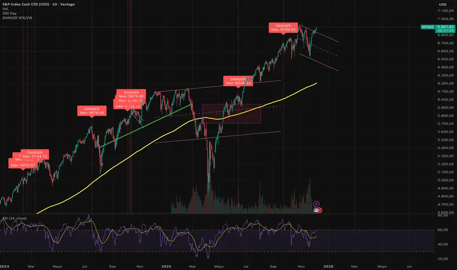
DANGER SP500This indicator is designed to identify severe correlation anomalies between the Volatility Index (VIX) and the S&P 500 (SPX). It operates on the premise that a simultaneous rise in both assets often precedes market corrections or significant local tops.
The underlying concept is "fear in the rally": investors are buying equities (driving price up), but at the same time, they are aggressively buying protection (Puts), causing the VIX to spike.
⚠️ Strict Usage Rules
To guarantee the mathematical reliability of the VIX data, this indicator includes strict security restrictions:
EXCLUSIVE ASSET: Designed solely for the S&P 500 (SPX, SPY, US500, ES1!). It should not be used on Crypto or Forex, as the VIX correlation does not apply in the same way.
LOCKED TIMEFRAME: It only functions on the Daily Chart (1D).
Note: The script includes a runtime.error block that will prevent execution if you attempt to load it on intraday charts (H1, H4, etc.) to avoid false signals caused by market noise.
Visualization
Red Background: Visually highlights the exact moment the alert is triggered.
"DANGER" Label: Prints clearly above the signaled bar.
Max Price Display: Unlike other indicators that mark the close, this tool specifically labels the HIGH of the candle, allowing you to identify the exact point of price extension.
🔔 Alerts
The script is ready for TradingView Alerts. The alert message is dynamic and will include the exact High price reached during the signal candle.
Disclaimer: This script is for technical analysis purposes only and does not constitute financial advice. Trading involves risk.
London First 15m Candle (Real-Time NY)London First 15-Minute Candle (Real-Time New York Time)
This custom TradingView indicator identifies and tracks the first 15-minute candle of the London session, but calculated in real-time according to New York time (EST/EDT).
🔹 What the Indicator Does
1. Detects the London Session Open (Real NY Time)
You define the London session start time in New York hours (default: 3:00 AM NY Time).
The indicator monitors the first 15 minutes from the defined start time (3:00–3:15 NY time).
Only today’s candle is tracked — historical London ranges are not shown.
2. Builds the London Opening Range Candle (15m)
While the 15-minute window is still open, it continuously tracks:
Highest price reached (London High)
Lowest price reached (London Low)
The values update in real time only within the 3:00–3:15 window.
At 3:15 NY time, the candle is locked in and no longer changes.
3. Draws Three Persistent Levels on the Chart
Once the London candle closes, the indicator plots:
🔴 Top Line (London High)
Extended to the right across the chart.
🟢 Bottom Line (London Low)
Extended to the right across the chart.
⚪ Mid Line (Middle of the Range)
Computed as:
(londonHigh + londonLow) / 2
Also extended to the right.
All lines:
Are only drawn for today.
Auto-delete and refresh when a new trading day begins.
4. Works on ANY Timeframe
Even if the indicator runs on:
1m
2m
5m
1h
etc.
…it still uses a real 15-minute aggregation, ensuring the London candle is accurate.
5. Clean Chart — No Historical London Levels
The script:
Removes old lines at the start of each new day.
Keeps only today’s active London range.
This prevents clutter and ensures clarity.
6. Optional Alerts (if enabled)
The indicator can generate alerts when the market crosses:
The top of the London range
The bottom of the London range
The midline
For example:
Price breaks above London High
Price breaks below London Low
Price crosses the Midline up or down
These can be used for:
Breakout strategies
Liquidity grabs
Range-trading confirmations
7. Fully Customizable
User inputs allow you to modify:
London session start hour (NY Time)
Candle duration (fixed at 15 minutes)
Line colors:
High line color
Low line color
Midline color
Line widths
Summary
This indicator gives you a clean and accurate view of the first 15-minute candle of the London session — critical for many ICT/SMS/prop firm strategies — with:
Real-time NY-based calculation
Automatic cleanup
Clear range lines
Custom colors
Alerts for breakouts

Week high / Week low (Mo–Fr)The indicator tracks the weekly high and low levels of the market starting from Monday 00:00 and updates them throughout the week until Friday. It draws horizontal lines across the chart representing:
Weekly High
Weekly Low
Each level also displays a label that can be positioned in different ways depending on user settings.
🧠 How it works step-by-step
1. Every Monday a new week starts
When a new week begins:
The script stores the current candle’s high as the initial weekHigh
And the current candle’s low as weekLow
Previous week's lines and labels are deleted
New horizontal lines are created and extended to the right
Labels (for high & low) are placed initially at the start of the week
2. During Monday–Friday
On every candle:
If a new higher price is reached → weekly high updates
If a new lower price is reached → weekly low updates
The horizontal line moves to the new value
A saved index remembers where that high/low was created
3. Label Position Control
The user can choose how labels should be anchored:
Mode Meaning
Update point Label stays where the high/low occurred
Right edge Label always moves to the current bar (right end of week)
Right offset Like Right edge but shifted further right by X bars
You can also customize:
label background color
label text color
label size
whether the label points up/down (above or below the line)
line color, style, and width
4. Weekend behavior
On Saturday, the script stops extending the lines, effectively freezing the weekly high and low for that completed week.
Summary
This indicator is useful for traders who want automatic weekly levels, visually clean chart structure, and customizable label placement. It tracks market structure weekly, keeps levels persistent across the chart, and lets you choose exactly how those levels appear.
If you want, I can also create:
✔ previous week high/low
✔ midline (50% of the range)
✔ alerts when price breaks the weekly high/low
✔ highlight liquidity sweeps

SIGMA 0.44📌 الشرح بالعربي:
اسم المؤشر: SIGMA 0.44
الوظيفة: يساعد المتداول على تحديد اتجاه السوق، مناطق الدخول والخروج، وأهداف السعر اليومية.
✅ المميزات:
تحديد جلسات السوق (افتتاح، أوروبا، أمريكا) مع مستويات دعم ومقاومة ديناميكية.
إشارات دخول مؤكدة.
رسم أهداف اليوم من نطاق الساعة الأولى.
رسم المتوسط 200 EMA لتحديد الاتجاه العام.
رسم خطوط افتتاح اليوم، وبعد ساعة، وبعد 4 ساعات لمراقبة حركة السعر.
🎯 الفائدة:
مؤشر متكامل يساعدك على تحليل السوق بدقة واتخاذ قرارات مدروسة باستخدام أدوات احترافية.
📌 English Summary:
Indicator Name: SIGMA 0.44
Purpose: Helps traders identify market direction, entry/exit zones, and daily price targets.
✅ Features:
Detects market sessions (Open, Europe, US) with dynamic support/resistance levels.
Provides confirmed entry signals.
Draws daily targets based on the first hour range.
Includes 200 EMA to define the overall trend.
Plots daily open line, +1 hour, and +4 hours to track price behavior.
🎯 Benefit:
A complete indicator that helps you analyze the market accurately and make informed trading decisions using professional tools.
⚠️ إخلاء المسؤولية:
هذا المؤشر لا يُعد توصية مباشرة للبيع أو الشراء، ولا يضمن الأرباح أو نتائج محددة.
الأداء السابق لا يعني بالضرورة أداءً مستقبليًا مماثلًا.
المستخدم هو المسؤول الوحيد عن قراراته الاستثمارية، وينبغي عليه دراسة السوق وتحليل المخاطر قبل الدخول في أي صفقة.
💰 إدارة رأس المال:
من الضروري الالتزام بإستراتيجية واضحة لإدارة رأس المال.
لا تخاطر بأكثر من 1-2٪ من رأس مالك في الصفقة الواحدة، واستخدم وقف الخسارة دائمًا.
التداول بدون خطة مالية مدروسة قد يؤدي إلى خسائر كبيرة، لذلك اجعل حماية رأس المال أولوية قبل البحث عن الأرباح.
⚠️ Disclaimer:
This indicator is not a direct buy or sell recommendation and does not guarantee profits or specific outcomes.
Past performance is not indicative of future results.
The user is solely responsible for their trading decisions and should perform their own market analysis and risk assessment before entering any trade.
💰 Capital Management:
It is essential to follow a clear risk management strategy.
Do not risk more than 1–2% of your total capital per trade, and always use a stop-loss.
Trading without a solid financial plan may lead to significant losses, so prioritize capital protection before seeking profits.

Market Trend & Breadth Checklist [Kulturdesken]Description
Concept & Inspiration This indicator serves as a disciplined "Pre-Flight Checklist" for swing traders, combining two powerful methodologies into one objective dashboard.
The Foundation (@kulturdesken): The core checklist structure is inspired by the workflow of @kulturdesken, utilizing the QQQE (Nasdaq 100 Equal Weighted Index). By focusing on the equal-weighted index rather than the market-cap weighted QQQ, we avoid distortions caused by mega-cap stocks and gauge the true price trend of the average stock.
The Enhancement (StockBee): To further filter out "hollow rallies," we integrated Pradeep Bonde’s (StockBee) "Market Monitor" logic. This adds a layer of analysis based on the Total US Universe (Wilshire 5000) to ensure market breadth is expanding, not just price.
Why StockBee Logic Was Added While QQQE tells us if the average price is trending, the StockBee logic tells us if the market structure is healthy. We added the "Universe" checks (Total US Market Breadth) because price trends can sometimes be deceptive during low-volume corrections.
By incorporating the Market Monitor concept (specifically checking if the % of stocks above their 50-day Moving Average is rising), this tool acts as a "Traffic Light." It prevents the trader from entering aggressive long positions even if QQQE is green, provided the underlying participation (Market Breadth) is weak.
How It Works (The 7 Checks)
1. Price Momentum (Kulturdesken): QQQE > Rising 5 SMA
Verifies short-term momentum is aggressive (Price > 5SMA) and the 5SMA itself is curling up.
2. Daily Trend Structure: Daily Buy Signal
Verifies a "stacked" bullish alignment where Price > 10 SMA > 20 SMA.
3. Macro Trend: Weekly Buy Signal
Verifies the Weekly Price > 10 WMA > 20 WMA (Weighted Moving Averages).
4. Universe Breadth (StockBee/McClellan): Summation Uptrend
We aggregate Nasdaq + NYSE data to create a "Total Universe" McClellan Summation Index.
Check: Is the Summation Index rising? (Indicates long-term money flow entering the system).
5. Short-Term Thrust: Oscillator Positive
Uses the "Total Universe" McClellan Oscillator.
Check: Is the Oscillator > 0? (Indicates immediate buying pressure is dominant).
6. Leadership: Net Highs/Lows
Check: Are Net New Highs (Highs minus Lows) trending positive?
7. Performance Filter (Manual): Traction Check
A psychological guardrail. If you toggle this off in settings (indicating you are losing money/getting stopped out), the checklist forces a "WAIT" signal, protecting you from overtrading during choppy conditions.
Settings & Customization
Data Feeds: The script is pre-configured with USI (United States Indices) and INDEX tickers to ensure accurate breadth data, but these can be customized in the settings.
Main Ticker: Defaults to QQQE.
Disclaimer: This tool is for educational purposes and market analysis only. It does not constitute financial advice. Past performance is not indicative of future results.

Universe Breadth Engine & Trend Scorecard [StockBee Style]Description
Concept & Methodology Traders are often misled by market-cap weighted indices (like SPY or QQQ). When a handful of mega-cap stocks rally, the index may look healthy even if the majority of stocks are selling off. This is called a "Hollow Rally."
This script is designed to look "under the hood" of the US Stock Market. It aggregates data from the entire investable universe (combining both NASDAQ and NYSE internals) to determine the true strength of market participation. It draws heavy inspiration from the StockBee Market Monitor methodology, using breadth and moving average geometry to define "Safe" vs. "Unsafe" trading environments.
How It Works (The Math)
This indicator combines three distinct layers of market analysis into a single pane:
1. The "Universe" McClellan Oscillator Most breadth indicators only look at one exchange. This script aggregates data to create a "Total US Market" view:
Data aggregation: We sum Advancing Issues (USI:ADVN.NQ + USI:ADVN.NY) and subtract Declining Issues (USI:DECL.NQ + USI:DECL.NY).
The Calculation: We apply the standard McClellan Oscillator formula to this aggregated net number: (19-period EMA of Net Issues) - (39-period EMA of Net Issues).
The Signal Line: A 5-period Simple Moving Average (SMA) of the Oscillator.
Green Line: Breadth momentum is rising (5SMA > Previous 5SMA).
Red Line: Breadth momentum is falling.
2. The Market Monitor Filter (Background Color) To determine the long-term "Health" of the market, the script queries the Wilshire 5000 index breadth (INDEX:MMTH), which represents the total US stock universe.
Logic: It measures the percentage of stocks currently above their 50-Day Moving Average.
Green Background: The percentage is rising (Current % > 10-Day SMA of %). This indicates an expanding environment.
Red Background: The percentage is falling. This indicates a contracting environment.
3. The "Traffic Light" Ribbon (Bottom Line) A thick ribbon at the bottom of the pane visualizes the trend of the QQQ (Nasdaq 100 Equal Weighted).
Green Ribbon: Price is above both the 10-day and 20-day SMAs.
Gray Ribbon: Price has lost the short-term moving average structure.
4. The Breadth Scorecard (Table) The table on the right provides a statistical summary of "Winning Days" (Positive Breadth) vs "Losing Days" (Negative Breadth) over multiple timeframes:
7 Days & 30 Days: For short-term momentum checks.
3 Month, 6 Month, 1 Year: For secular trend analysis.
YTD: Year-to-Date performance.
How to Use This Tool
The "All Clear" Signal: When the Background is Green (Market Monitor rising), the Ribbon is Green (Price Trend), and the Oscillator Bars cross above the Signal Line. This suggests high-probability conditions for long swing trades.
Divergence Warning: If the QQQ is making new highs, but the Oscillator is making lower highs (or staying red), it indicates that the rally is not supported by the broader market.
The Turnaround: A crossover of the Oscillator above the Signal Line while deep in negative territory often marks a short-term sold-out low.
Settings & Customization
Fully Configurable Table: You can change the position, size, and colors of the Scorecard table to fit your chart layout.
Data Sources: The script uses USI and INDEX tickers by default. These can be adjusted in the settings if you use different data providers.
Disclaimer: This tool is for educational market analysis only and does not constitute financial advice.

市场微观转变确认指标Logic: Signals only appear when Cloud Trend aligns with Structural Breakouts.
Visuals: Grey bars indicate noise/chop; colored bars indicate valid resonance.
Best for: 15m timeframe fast-paced trading.
"High-speed scalping indicator fusing Volatility Clouds and Market Structure for noise-filtered, double-confirmed entries."

SPX Cumulative AD Line IndicatorThe Other ADLines online are trash. Use this one.
This indicator, written in Pine Script version 6, is designed to track market breadth for the S&P 500 by constructing and analyzing a cumulative Advance-Decline (AD) Line. It begins by allowing the user to set two parameters: a smoothing length for the AD line itself and a moving-average length (defaulted to 50 weeks) that will later be applied to the smoothed line. These inputs let traders tailor the sensitivity of the indicator to their preferred timeframe and trading style.
To build the AD line, the script pulls real-time S&P 500 index prices as well as the number of advancing and declining stocks using dedicated market breadth tickers. It calculates the daily AD difference by subtracting declines from advances, a classic method for measuring participation across the index. This difference is fed into a cumulative calculation, which produces a running total that tracks whether market participation is strengthening or weakening over time.
The cumulative AD line is then smoothed with a simple moving average based on the user’s specified smoothing length. At the same time, the script dynamically converts the 50-week moving-average period into an equivalent value for whatever chart timeframe is being used—intraday, daily, weekly, or monthly. This ensures that the moving average of the AD line reflects a consistent long-term trend regardless of the chart’s resolution.
Next, the smoothed AD line is compared to its converted 50-week moving average to determine the market’s directional bias. When the AD line rises above its long-term average, the script labels the environment as bullish; when it falls below, it flags a bearish environment. It also detects crossovers between the two lines, generating discrete buy signals when the AD line crosses upward and sell signals when it crosses downward.
Finally, the indicator visualizes all elements on the chart: the smoothed AD line, its long-term moving average, a zero reference line, and the buy/sell markers. It also colors the line and background to reflect bullish or bearish conditions, making shifts in market breadth easy to spot at a glance. This provides traders with a comprehensive breadth-based tool for identifying trend strength and potential reversals in the S&P 500.

Sky Eye Oscillator 中文版 [Sky Eye]DC: discord.gg
輔助 判斷RSI KDJ 量能 幫助你加速學習
只需要知道這個位子是甚麼在去加強研究 技術分析 即可
想學習更多可以到DC一起學習
DC: discord.gg
Assists in judging RSI, KDJ, and volume to help you learn faster.
Just know what this position represents before you can further study technical analysis.
Want to learn more? Join DC for more learning opportunities.

Sky Eye TRADE AI DC: discord.gg
輔助 規劃進出場 位子畫線 幫助你加速學習
只需要知道這個位子是甚麼在去加強研究 技術分析 即可
想學習更多可以到DC一起學習
DC: discord.gg
Assisted with entry and exit point planning and position drawing to accelerate your learning.
You only need to know what this position represents before you can further study and analyze technical indicators.
To learn more, you can join us at DC.

ICT | SMC 工具箱 [Sky Eye]DC: discord.gg
輔助 SMC 位子畫線 幫助你加速學習
只需要知道這個位子是甚麼在去加強研究 ICT / SMC 即可
想學習更多可以到DC一起學習
DC: discord.gg
This tool helps you draw lines to indicate SMC positions, accelerating your learning.
You only need to know what each position represents before focusing your research on ICT/SMC.
To learn more, join us at DC.
