9/15 EMA Scalper 9/15 EMA Scalper — by uzairbaloch
This script is a price-action based scalping system built around the 9 EMA and 15 EMA trend structure.
It identifies short-term reversal points where the market pulls back into the EMAs and confirms direction with a strong candle signal.
The strategy looks for:
• A clear EMA trend (9 above 15 for buys, 9 below 15 for sells)
• Pullback into EMA9/EMA15 with candle bodies touching the fast EMA
• Strong confirmation candle (engulfing / strong momentum / controlled wick)
• Optional slope filter to avoid flat, choppy sessions
• Automatic trade labels showing Entry, SL and TP (based on R:R)
The script is designed for scalping on gold, indices, and high-volatility FX pairs.
It resets trade logic immediately after SL or TP is hit, so it can catch the next valid signal without delay.
This tool is meant as an indicator — not a full strategy — and can be used to visually mark high-probability EMA pullback setups with precise levels.
Author: uzairbaloch
BTCUSD

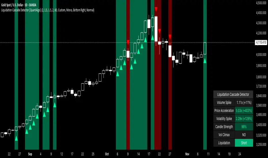
Liquidation Cascade Detector [QuantAlgo]🟢 Overview
The Liquidation Cascade Detector employs multi-dimensional microstructure analysis to identify forced liquidation events by synthesizing volume anomalies, price acceleration dynamics, and volatility regime shifts. Unlike conventional momentum indicators that merely track directional bias, this indicator isolates the specific market conditions where leveraged positions experience forced unwinding, creating asymmetric opportunities for mean reversion traders and market makers to take advantage of temporary liquidity imbalances.
These liquidation cascades manifest through various catalysts: overwhelming spot selling coupled with leveraged long liquidation forced unwinding creates downward spirals where organic sell pressure triggers margin calls, which generate additional selling that triggers more margin calls. Conversely, sudden large buy orders or coordinated buying can squeeze overleveraged shorts, forcing buy-to-cover orders that push price higher, triggering additional short stops in a self-reinforcing feedback loop. The indicator captures both scenarios, regardless of whether the initial catalyst is organic flow or forced liquidation.
For sophisticated traders/market makers deploying amplification strategies, this indicator serves as an early warning system for distressed order flow. By detecting the moments when cascading stop-losses and margin calls create self-reinforcing price movements, the system enables traders to: (1) identify forced participants experiencing capital pressure, (2) strategically add liquidity in the direction of panic flow to amplify displacement, (3) accumulate contra-positions during the overshoot phase, and (4) capture mean reversion profits as equilibrium pricing reasserts itself. This approach transforms destructive liquidation events into potential profit opportunities by systematically front-running and then fading coordinated forced selling/buying.
🟢 How It Works
The detection engine operates through a three-tier confirmation framework that validates liquidation events only when multiple independent market stress indicators align simultaneously:
► Tier 1: Volume Anomaly Detection
The system calculates bar-to-bar volume ratios to identify abnormal participation spikes characteristic of forced liquidations. The Volume Spike threshold filters for transactions where current volume significantly exceeds previous bar volume. When leveraged positions hit stop-losses or margin requirements, their simultaneous unwinding creates distinctive volume signatures absent during organic price discovery. This metric isolates moments when market makers face one-sided order flow from distressed participants unable to control execution timing, whether triggered by whale orders absorbing liquidity or cascading margin calls creating relentless directional pressure.
► Tier 2: Price Acceleration Measurement
By comparing current bar's absolute body size against the previous bar's movement, the algorithm quantifies momentum acceleration. The Price Acceleration threshold identifies scenarios where price velocity increases dramatically, a hallmark of cascading liquidations where each stop-loss triggers additional stops in a feedback loop. This calculation distinguishes between gradual trend development (irrelevant for amplification attacks) and explosive moves driven by forced order flow requiring immediate liquidity provision. The metric captures both panic selling scenarios where spot sellers overwhelm bid liquidity triggering long liquidations, and short squeeze dynamics where aggressive buying exhausts offer-side depth forcing short covering.
► Tier 3: Volatility Expansion Analysis
The indicator measures bar range expansion by computing the current high-low range relative to the previous bar. The Volatility Spike threshold captures regime shifts where intrabar price action becomes erratic, evidence that market depth has evaporated and order book imbalance is driving price. Combined with body-to-range analysis indicating strong directional conviction, this metric confirms that volatility expansion reflects genuine liquidation pressure rather than random noise or low-volume chop.
*Supplementary Confirmation Metrics
Beyond the three primary detection tiers, the system analyzes additional candle characteristics that distinguish genuine liquidation events from ordinary volatility:
► Candle Strength: Measures the ratio of candle body size to total bar range. High readings (above 60%) indicate strong directional conviction where price moved decisively in one direction with minimal retracement. During liquidations, distressed traders execute market orders that drive price aggressively without the normal back-and-forth of balanced trading. Strong-bodied candles with minimal wicks confirm forced participants are accepting any available price rather than attempting to minimize slippage, validating that observed volume and price acceleration stem from liquidation pressure rather than routine trading.
► Volume Climax: Identifies when current volume reaches the highest level within recent history. Climax volume events mark terminal liquidation phases where maximum panic or squeeze intensity occurs. These extreme participation spikes typically represent the final wave of forced exits as the last remaining stops are triggered or the final shorts capitulate. For mean reversion traders, volume climax signals provide optimal reversal entry timing, as they mark maximum displacement from equilibrium when all forced sellers/buyers have been exhausted.
*Directional Classification
The system categorizes cascades into two actionable classes:
1. Short Liquidation (Bullish Cascade): Upward price movement combined with cascade patterns equals forced short covering. This occurs when aggressive spot buying (often from whales placing large market orders) or coordinated buy programs exhaust available offer liquidity, spiking price upward and triggering clustered short stop-losses. Short sellers experiencing margin pressure must buy-to-close regardless of price, creating artificial demand spikes that compound the initial buying pressure. The combination of organic buying and forced covering creates explosive upward moves as each liquidated short adds buy-side pressure, triggering additional shorts in a self-reinforcing loop. Market makers can amplify this by lifting offers ahead of forced buy orders, then selling into the exhaustion at elevated levels.
2. Long Liquidation (Bearish Cascade): Downward price movement combined with cascade patterns equals forced long liquidation. This manifests when heavy spot selling (panic sellers, large institutional unwinds, or coordinated distribution) overwhelms bid-side liquidity, breaking through support levels where long stop-losses cluster. Over-leveraged longs facing margin calls must sell-to-close at any price, generating artificial supply waves that compound the initial selling pressure. The dual force of organic selling coupled with forced long liquidation creates downward spirals where each margin call triggers additional margin calls through further price deterioration. Amplification opportunities exist by hitting bids ahead of panic selling, accumulating long positions during the capitulation, and reversing as sellers exhaust.
🟢 How to Use
1. For Mean Reversion Traders
When the indicator highlights a short liquidation cascade (green background), this signals that shorts are experiencing forced buy-to-cover pressure, often initiated by whale bids or aggressive spot buying that triggered the squeeze. Mean reversion traders can interpret this as a temporary upward dislocation from fair value. As the dashboard shows declining momentum metrics and the cascade highlighting stops, this represents a potential fade opportunity. Enter short positions expecting price to revert back toward pre-cascade levels once the forced buying exhausts and the initial large buyer completes their accumulation.
When a long liquidation cascade triggers (red background), longs are undergoing forced sell-to-close liquidation, typically catalyzed by overwhelming spot selling that breached key support levels. This creates artificial downward pressure disconnected from fundamental value, as margin-driven forced selling compounds organic sell flow. Mean reversion traders wait for the cascade to complete (dashboard transitions from active liquidation status to neutral), then enter long positions anticipating snap-back toward equilibrium pricing as panic subsides and forced sellers are exhausted.
You can also monitor the dashboard's Volume Climax indicator. When it displays "YES" during an active cascade, this suggests the liquidation is reaching its terminal phase, whether driven by the final shorts being squeezed out or the last leveraged longs capitulating. Mean reversion entries become highest probability at this point, as maximum displacement from fair value has occurred. Wait for the next 1-3 bars after climax confirmation, then enter contra-trend positions with tight stops.
The Candle Strength metric also helps validate entry timing. When candle strength readings drop significantly after maintaining elevated levels during the cascade, this divergence indicates absorption is occurring. Market makers are stepping in to provide liquidity, supporting your mean reversion thesis. Strong candle bodies during the cascade followed by weaker bodies signal the forced flow is diminishing.
2. For Momentum & Trend Following Traders
When price breaks through a significant resistance level and immediately triggers a short liquidation cascade (green background), this confirms breakout validity through forced participation. Shorts positioned against the breakout are now experiencing margin pressure from the combination of breakout momentum and potential whale buying, creating self-reinforcing buying that propels price higher. Enter long positions during the cascade or immediately after, as the forced covering provides fuel for extended momentum continuation.
Conversely, when price breaks below key support and triggers a long liquidation cascade (red background), the breakdown is validated by forced selling from trapped longs. Heavy spot selling coupled with margin liquidations creates accelerated downside momentum as liquidations cascade through clustered stop-loss levels. Enter short positions as the cascade develops, riding the combined force of organic selling and forced liquidation for extended trend moves.
3. For Sophisticated Traders & Market Makers
► Amplification Attack Execution
Sophisticated operators can exploit cascades through systematic amplification positioning. When a short liquidation is detected (green highlight activating), often initiated by whale bids absorbing offer liquidity, place aggressive buy orders to front-run and amplify the forced short covering. This exacerbates upward pressure, pushing price further from equilibrium and triggering additional clustered stops. Simultaneously begin accumulating short positions at these artificially elevated levels. As dashboard metrics indicate cascade exhaustion (volume spike declining, climax signal appearing, candle strength weakening), flatten amplification longs and hold accumulated shorts into the mean reversion.
For long liquidations (red highlight), typically catalyzed by heavy spot selling overwhelming bid depth, execute the inverse strategy. Place aggressive sell orders to compound the panic selling, amplifying downward displacement and accelerating margin call triggers. Layer long entries at depressed prices during this amplification phase as forced liquidation selling creates artificial supply. When dashboard signals cascade completion (metrics normalizing, volume climax passing), exit amplification shorts and maintain long positions for the reversal trade.
► Market Making During Liquidity Crises
During detected cascades, temporarily adjust quote placement strategy. When dashboard shows all three confirmation metrics activating simultaneously with strong candle bodies, this indicates the highest probability liquidation event, whether from whale order flow or cascading margin calls. Widen spreads dramatically to capture enhanced edge during the liquidity vacuum. Alternatively, step away from quote provision entirely on your natural inventory side (stop offering during short cascades driven by aggressive buying, stop bidding during long cascades driven by overwhelming selling) to avoid adverse selection from forced flow.
Use cascade detection to inform inventory management. During short cascades initiated by large buy orders or short squeezes, reduce existing short inventory exposure while allowing the forced buying to push price higher. Rebuild short inventory only at the inflated levels created by liquidation pressure. During long cascades where spot selling compounds leveraged liquidation, reduce long inventory and use the forced selling to reaccumulate at artificially depressed prices rather than providing stabilizing liquidity too early.
► Sequential Positioning Strategy
Advanced traders can structure trades in phases: (1) Initial amplification orders placed immediately upon cascade detection to front-run forced flow, (2) Contra-position accumulation scaled in as displacement extends and dashboard readings intensify, (3) Amplification trade exit when metrics show deceleration or candle strength weakens, (4) Contra-position hold through mean reversion, targeting pre-cascade price levels. This sequential approach extracts profit from both the dislocation phase and the subsequent equilibrium restoration.
► Risk Monitoring
If cascade highlighting persists across many consecutive bars while dashboard volume readings remain extremely elevated with sustained strong candle bodies, this suggests sustained institutional deleveraging or persistent whale activity rather than simple retail liquidation. Reduce amplification position sizing significantly, as these extended events can exhibit delayed mean reversion. Professional counter-parties may be establishing dominant positions, limiting your edge.
When volatility spike metrics decline while cascade highlighting continues, professional absorption is occurring. Proceed cautiously with amplification strategies, as intelligent liquidity providers are already positioning for the reversal, potentially front-running your intended reversal trade. Similarly, if large liquidation wicks appear during cascades, this indicates partial absorption is happening, suggesting more sophisticated players are taking the opposite side of distressed flow.
Trading Sessions [QuantAlgo]🟢 Overview
The Trading Sessions indicator tracks and displays the four major global trading sessions: Sydney, Tokyo, London, and New York. It provides session-based background highlighting, real-time price change tracking from session open, and a data table with session status. The script works across all markets (forex, equities, commodities, crypto) and helps traders identify when specific geographic markets are active, which directly correlates with changes in liquidity and volatility patterns. Default session times are set to major financial center hours in UTC but are fully adjustable to match your trading methodology.
🟢 Key Features
→ Session Background Color Coding
Each trading session gets a distinct background color on your chart:
1. Sydney Session - Default orange, 22:00-07:00 UTC
2. Tokyo Session - Default red, 00:00-09:00 UTC
3. London Session - Default green, 08:00-16:00 UTC
4. New York Session - Default blue, 13:00-22:00 UTC
When sessions overlap, the color priority is New York > London > Tokyo > Sydney. This means if London and New York are both active, the background shows New York's color. The priority matches typical liquidity and volatility patterns where later sessions generally show higher volume.
→ Color Customization
All session colors are configurable in the Color Settings panel:
1. Click any session color input to open the color picker
2. Select your preferred color for that session
3. Use the "Background Transparency" slider (0-100) to adjust opacity. Lower values = more visible, higher values = more subtle
4. Enable "Color Price Bars" to color candlesticks themselves according to the active session instead of just the background
The Color column in the info table shows a block (█) in each session's assigned color, matching what you see on the chart background.
→ Information Table Breakdown
→ Timeframe Warning
If you're viewing a timeframe of 12 hours or higher, a red warning label appears center-screen. Session boundaries don't render accurately on high timeframes because the time() function in Pine Script can't detect intra-bar session changes when each bar spans multiple sessions. The warning tells you to switch to sub-12H timeframes (e.g., 4H, 1H, 30m, 15m, etc.) for proper session detection. You can disable this warning in Color Settings if needed, but session highlighting can be unreliable on 12H+ charts regardless.
→ Time Range Configuration
Every session's time range is editable in Session Settings:
1. Click the time input field next to each session
2. Enter time as HHMM-HHMM in 24-hour format
3. All times are interpreted as UTC
4. Modify these to account for daylight saving shifts or to define custom session periods based on your backtested optimal trading windows
For example, if your strategy performs best during London/NY overlap specifically, you could set London to 08:00-17:00 and New York to 13:00-22:00 to ensure you see the full overlap highlighted.
→ Weekdays Filter
The "Weekdays Only (Mon-Fri)" toggle controls whether sessions display on weekends:
Enabled: Sessions only show Monday-Friday and hide on Saturday-Sunday. Use this for markets that close on weekends (most equities, forex).
Disabled: Sessions display 24/7 including weekends. Use this for markets that trade continuously (crypto).
→ Table Display Options
The info table has several configuration options in Table Settings:
Visibility: Toggle "Show Info Table" on/off to display or hide the entire table.
Position: Nine position options (Top/Middle/Bottom + Left/Center/Right) let you place the table wherever it doesn't block your price action or other indicators.
Text Size: Four size options (Tiny, Small, Normal, Large) to match your screen resolution and visual preferences.
→ Color Schemes:
Mono: Black background, gray header, white text
Light: White background, light gray header, black text
Blue: Dark blue background, medium blue header, white text
Custom: Manual selection of all five color components (table background, header background, header text, data text, borders)
→ Alert Functionality
The indicator includes ten alert conditions you can access via TradingView's alert system:
Session Opens:
1. Sydney Session Started
2. Tokyo Session Started
3. London Session Started
4. New York Session Started
5. Any Session Started
Session Closes:
6. Sydney Session Ended
7. Tokyo Session Ended
8. London Session Ended
9. New York Session Ended
10. Any Session Ended
These alerts fire when sessions transition based on your configured time ranges, letting you automate monitoring of session changes without watching the chart continuously. Useful for strategies that trade specific session opens/closes or need to adjust position sizing when volatility regime shifts between sessions.

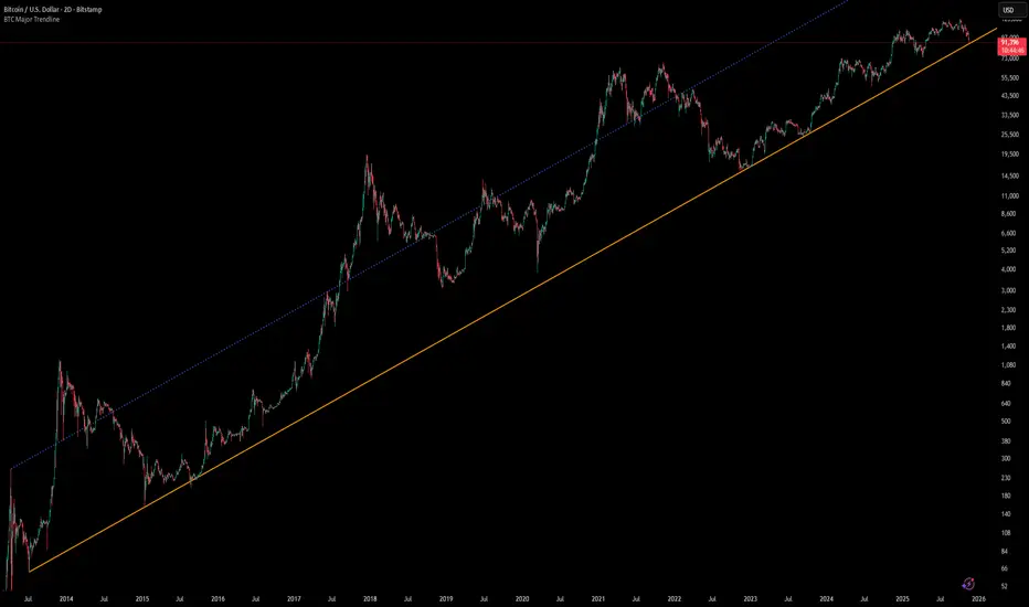
[Algoros] BTC Major Trendline# BTC Major Trendline - Long-Term Bitcoin Trend Analysis
## Overview
BTC Major Trendline is a comprehensive technical analysis tool designed to track Bitcoin's long-term bullish trajectory using historically significant price points. This indicator establishes a primary upward trendline anchored to two major Bitcoin cycle lows, along with optional parallel channels and Fibonacci-based price projections.
## ⚠️ Important Requirements
**This indicator requires a Bitcoin chart with sufficient historical data dating back to at least April 2013.**
**✅ Recommended Charts:**
- `INDEX:BTCUSD` - Bitcoin Index (comprehensive history)
- `BITSTAMP:BTCUSD` - Bitstamp Bitcoin (default setting)
**❌ Will NOT work properly on:**
- Charts with limited history (Like hourly charts)
- Exchanges that launched after 2013
- Altcoin pairs or other cryptocurrencies
If the indicator doesn't display correctly, switch to one of the recommended Bitcoin charts above.
## Key Features
### 📈 Primary Trendline
- Anchored to two historically significant lows:
- **Start Point**: July 6, 2013 - Early Bitcoin accumulation phase
- **End Point**: November 21, 2022 - FTX collapse bottom
- Automatically calculates and extends the trendline based on these anchor points
- Displayed as a solid orange line
### 🔷 Parallel Channel Line (Optional)
- Creates an upper boundary by connecting historical high points:
- April 10, 2013 and June 11, 2017
- Helps identify potential resistance zones and channel breakouts
- Displayed as a blue dotted line for easy distinction
### 🎯 Fibonacci Trendline Multipliers (Optional)
- Seven Fibonacci-based projection lines: **1.6x, 2x, 3x, 5x, 8x, 13x, and 21x**
- Each multiplier creates a parallel trendline above the main trend
- Color-coded from teal to maroon for clear visual separation
- Useful for identifying potential profit-taking zones and long-term price targets
### 📉 Negative Fibonacci Trendlines (Optional)
- Seven division-based support lines: **÷1.6, ÷2, ÷3, ÷5, ÷8, ÷13, and ÷21**
- Projects downward channels below the main trendline
- Displayed in yellow tones for easy identification
- Helps identify extreme oversold conditions and potential bounce zones
## Customization Options
- **Symbol Input**: Track any Bitcoin pair with sufficient history (default: BITSTAMP:BTCUSD)
- **Show/Hide Components**: Toggle parallel line, Fibonacci multipliers, and negative Fibonacci lines independently
- **Line Extension**: Extend lines right, left, both directions, or none
- **Multi-Timeframe Compatible**: View on any timeframe once loaded on a compatible chart
## How to Use
1. **Setup**: First, open a Bitcoin chart with sufficient history (INDEX:BTCUSD or BITSTAMP:BTCUSD recommended)
2. **Trend Confirmation**: The main orange trendline represents the long-term bullish trajectory. Price staying above this line suggests the bull market remains intact.
3. **Channel Trading**: Use the parallel line (blue dotted) as a potential upper boundary for the long-term channel.
4. **Price Targets**: Enable Fibonacci multiplier lines to identify ambitious long-term price targets during bull runs. Higher multipliers (13x, 21x) represent parabolic extension zones.
5. **Support Identification**: Enable negative Fibonacci lines to spot potential support zones during corrections or bear markets.
6. **Risk Management**: Breaking below the main trendline could signal a shift in long-term trend, warranting caution.
## Technical Implementation
- Uses `request.security()` to fetch precise daily prices at historical timestamps
- Requires access to Bitcoin price data from April 2013 onwards
- Calculates slope dynamically based on anchor points
- All lines update in real-time as new price data emerges
- Efficient rendering system minimizes performance impact
## Best Used For
✅ Long-term Bitcoin investors and HODLers
✅ Identifying major trend direction
✅ Setting realistic long-term price targets
✅ Spotting potential support/resistance zones
✅ Multi-timeframe analysis (on compatible charts)
✅ Educational purposes (understanding logarithmic growth)
## Troubleshooting
**Lines not appearing?**
- Ensure you're viewing INDEX:BTCUSD or BITSTAMP:BTCUSD
- Check that the chart has data back to April 2013
- Verify the symbol input matches your chart
- Try switching to a daily or weekly timeframe first
Smart RSI Money Flow - Core Bands V1.01SMART RSI – Money Flow Bands (Technical Overview)
1. Background: RSI and Its Behavior on Lower Timeframes
The Relative Strength Index (RSI) originally is a momentum oscillator calculated from average gains and losses over a selected period. In its standard form, RSI is derived solely from price changes; it does not incorporate volume data or order-flow information in its formula.
Because RSI is price-based, its interpretation depends strongly on the timeframe:
• On higher timeframes, each bar aggregates more trading activity, and RSI tends to behave more smoothly.
• On lower timeframes (1-hour down to intraday scalping intervals), price fluctuations are quicker, and RSI becomes more sensitive to short-term noise.
This does not imply that RSI becomes invalid, but that its signals on fast charts can be more reactive and may benefit from additional context such as volume behavior or structural information.
2. Purpose of This Indicator
This indicator extends the classical RSI by adding information that RSI does not include:
• Mapping RSI values into price-based bands instead of the 0–100 oscillator space.
• Retrieving lower timeframe volume data and separating it into buy and sell components.
• Comparing the slope (angle) of price movement with the slope of buy and sell volume.
The goal is to provide a structural interpretation of where price sits relative to RSI conditions and how volume is behaving on a lower timeframe.
3. Technical Differences Compared to Classical RSI
A) Classical RSI
• Input: price only (usually close).
• Output: normalized oscillator between 0 and 100.
• Does not incorporate intra-bar volume distribution.
• Does not separate buy/sell volume.
B) SMART RSI – Money Flow Bands
1) RSI-to-Price Mapping
Converts RSI values into upper/lower price bands using recent price extremes.
2) Lower Timeframe Volume Decomposition
Retrieves LTF data and splits each bar’s volume into buy (close>open) and sell (close

Frequency Momentum Oscillator [QuantAlgo]🟢 Overview
The Frequency Momentum Oscillator applies Fourier-based spectral analysis principles to price action to identify regime shifts and directional momentum. It calculates Fourier coefficients for selected harmonic frequencies on detrended price data, then measures the distribution of power across low, mid, and high frequency bands to distinguish between persistent directional trends and transient market noise. This approach provides traders with a quantitative framework for assessing whether current price action represents meaningful momentum or merely random fluctuations, enabling more informed entry and exit decisions across various asset classes and timeframes.
🟢 How It Works
The calculation process removes the dominant trend from price data by subtracting a simple moving average, isolating cyclical components for frequency analysis:
detrendedPrice = close - ta.sma(close , frequencyPeriod)
The detrended price series undergoes frequency decomposition through Fourier coefficient calculation across the first 8 harmonics. For each harmonic frequency, the algorithm computes sine and cosine components across the lookback window, then derives power as the sum of squared coefficients:
for k = 1 to 8
cosSum = 0.0
sinSum = 0.0
for n = 0 to frequencyPeriod - 1
angle = 2 * math.pi * k * n / frequencyPeriod
cosSum := cosSum + detrendedPrice * math.cos(angle)
sinSum := sinSum + detrendedPrice * math.sin(angle)
power = (cosSum * cosSum + sinSum * sinSum) / frequencyPeriod
Power measurements are aggregated into three frequency bands: low frequencies (harmonics 1-2) capturing persistent cycles, mid frequencies (harmonics 3-4), and high frequencies (harmonics 5-8) representing noise. Each band's power normalizes against total spectral power to create percentage distributions:
lowFreqNorm = totalPower > 0 ? (lowFreqPower / totalPower) * 100 : 33.33
highFreqNorm = totalPower > 0 ? (highFreqPower / totalPower) * 100 : 33.33
The normalized frequency components undergo exponential smoothing before calculating spectral balance as the difference between low and high frequency power:
smoothLow = ta.ema(lowFreqNorm, smoothingPeriod)
smoothHigh = ta.ema(highFreqNorm, smoothingPeriod)
spectralBalance = smoothLow - smoothHigh
Spectral balance combines with price momentum through directional multiplication, producing a composite signal that integrates frequency characteristics with price direction:
momentum = ta.change(close , frequencyPeriod/2)
compositeSignal = spectralBalance * math.sign(momentum)
finalSignal = ta.ema(compositeSignal, smoothingPeriod)
The final signal oscillates around zero, with positive values indicating low-frequency dominance coupled with upward momentum (trending up), and negative values indicating either high-frequency dominance (choppy market) or downward momentum (trending down).
🟢 How to Use This Indicator
→ Long/Short Signals: the indicator generates long signals when the smoothed composite signal crosses above zero (indicating low-frequency directional strength dominates) and short signals when it crosses below zero (indicating bearish momentum persistence).
→ Upper and Lower Reference Lines: the +25 and -25 reference lines serve as threshold markers for momentum strength. Readings beyond these levels indicate strong directional conviction, while oscillations between them suggest consolidation or weakening momentum. These references help traders distinguish between strong trending regimes and choppy transitional periods.
→ Preconfigured Presets: three optimized configurations are available with Default (32, 3) offering balanced responsiveness, Fast Response (24, 2) designed for scalping and intraday trading, and Smooth Trend (40, 5) calibrated for swing trading and position trading with enhanced noise filtration.
→ Built-in Alerts: the indicator includes three alert conditions for automated monitoring - Long Signal (momentum shifts bullish), Short Signal (momentum shifts bearish), and Signal Change (any directional transition). These alerts enable traders to receive real-time notifications without continuous chart monitoring.
→ Color Customization: four visual themes (Classic green/red, Aqua blue/orange, Cosmic aqua/purple, Custom) allow chart customization for different display environments and personal preferences.

Asset vs Total Market Cap & Relative Strength Purpose
This indicator allows traders to compare a selected asset to the major market benchmarks:
BTC – primary crypto market leader
ETH – secondary crypto market leader
USDT.D – shows market risk-on vs risk-off sentiment
TOTAL – total crypto market capitalization, useful for overall market trends
It also provides relative strength calculations:
Rel. Strength = Asset % change - USDT.D % change
Rel. Strength vs Total = Asset % change - Total % change
This allows you to see if your asset is outperforming or underperforming broader benchmarks.
The table covers multiple timeframes, making it easy to scan both short-term and longer-term trends:
Row Timeframe
0 Current
1 15m
2 1H
3 4H
4 1D
Selected Asset / BTC / ETH:
Green for positive % change
Red for negative % change
Gradient intensity proportional to magnitude (maxAbsChange input)
USDT.D:
Orange if rising (risk-off)
Teal if falling (risk-on)
Total Market Cap / Rel. Strength:
Gradient reflects asset performance relative to total market, independent of USDT.D.
Positives
Compact dashboard: Everything is in one table for quick scanning.
Multi-timeframe comparison: Traders can instantly see short-term vs long-term strength.
Relative performance visualization: Gradients immediately highlight outperformers and underperformers.
Benchmark comparisons: Asset vs BTC, ETH, USDT.D, and Total Market Cap.
Independent Rel. Strength: Highlights whether the asset is outperforming even if the total market moves.
Customizable gradient sensitivity: maxAbsChange and maxRelChange allow tuning how “strong” the colors appear.
Chart plotting: Rel. Strength vs total market is plotted for further visual reference.
How to Use
Green table cells → strong positive movement
Red table cells → negative movement
Rel. Strength > 0 → asset outperforming
Rel. Strength < 0 → asset underperforming
Use table to compare relative performance vs BTC, ETH, and total market for informed trading decisions.

BTC Bull/Bear marketThis indicator plots the 350-period Simple Moving Average (SMA) calculated on the Daily ("D") timeframe.
he color of the SMA line is determined by the closing price of the 2-Week ("2W") timeframe.
1. It fetches the 350-day SMA value (`sma350_daily`).
2. It checks where the *last closed* 2-Week candle finished relative to this SMA line.
3. If the 2W candle closed *above* the 350 SMA, the line is colored GREEN.
4. If the 2W candle closed *below* the 350 SMA, the line is colored RED.
This helps to visualize the long-term trend (350 SMA) confirmed by a higher (2W) timeframe bias, using non-repainting logic (`close `) for the color signal.

Cumulative Delta_Effort vs Result_immy**Cumulative Delta Oscillator\_effort**
This script creates a “Cumulative Delta Effort vs Result” oscillator, a custom indicator designed to measure the balance between buying and selling pressure (Effort) versus actual price movement (Result).
**How It Works**
Delta Volume: Measures aggressive buying vs selling per candle.
Cumulative Delta: Tracks net buying/selling pressure over time.
Effort vs Result: Compares volume delta (effort) to price movement (result).
Oscillator: Highlights divergence between effort and result, useful for spotting absorption (high effort, low result) and exhaustion (low effort, high result).
Histogram: Visual cue for accumulation/distribution zones.
----------------------------
This indicator combines volume delta (effort) and price movement (result), so it tells you how efficiently volume is moving price — a concept sometimes called effort vs. result analysis in Wyckoff or volume–spread analysis (VSA).
🔍 Concept Summary
Effort (delta volume) = how much buying/selling pressure is there (volume side).
Result (price change) = how much that effort moves price (price side).
Oscillator (Effort − Result) = how much “extra” effort is not producing movement — often showing absorption or exhaustion.
📈 How to Interpret the Signals
1\. Oscillator above Signal line → Bullish Momentum
When osc > signal, histogram turns green.
Means buying effort is stronger than price reaction — often early sign of accumulation or rising demand.
This can signal:
Possible bullish continuation if confirmed by rising prices.
Or early absorption if prices aren’t yet breaking out (smart money absorbing supply).
✅ Bullish Entry Signal:
When the oscillator crosses above the signal line (green cross) and price is near support or consolidating → potential long setup.
2\. Oscillator below Signal line → Bearish Momentum
When osc < signal, histogram turns red.
Selling effort dominates; can mean increasing supply or price exhaustion.
This often appears before:
Bearish continuation (trend strengthening)
Or upthrust/exhaustion (price rising on weak volume)
❌ Bearish Entry Signal:
When the oscillator crosses below the signal line (red cross), especially if near resistance → potential short setup.
3\. Crossovers
The alert is triggered when: ta.cross(osc, signal)
That means:
Bullish crossover: oscillator line crosses above signal → potential buy momentum shift.
Bearish crossover: oscillator line crosses below signal → potential sell momentum shift.
These work like MACD crossovers, but volume-adjusted.
4\. Zero Line
The zero line is the neutral point.
When osc crosses above zero, overall buying effort exceeds price change — market gaining strength.
When osc crosses below zero, selling pressure increases — market weakening.
→ Combining signal line crosses with zero-line crosses gives stronger confirmation.
5\. Histogram Analysis (Absorption \& Exhaustion)**
Tall green bars: rising momentum (buyers dominate)
Tall red bars: falling momentum (sellers dominate)
Shrinking bars: momentum fading — possible reversal zone.
If volume increases but price stalls, oscillator may spike while price stays flat — absorption (big players taking the opposite side).
If price surges but oscillator weakens, exhaustion — move running out of volume support.
------------------------------------------------------------------------
🧠 Practical Strategy Example
Situation What It Might Mean Possible Action
Oscillator crosses above signal near support Buyer effort increasing, price may rise Go long / close shorts
Oscillator crosses below signal near resistance Seller effort rising, price may drop Go short / take profits
Oscillator high but price flat Absorption (big players absorbing supply) Wait for breakout confirmation
Oscillator low but price flat Absorption (demand absorbing supply) Look for bullish reversal
Oscillator diverges from price Volume–price divergence Early warning of reversal
⚙️ Best Practice
Works best on volume-sensitive assets (futures, crypto, forex tick data).
**Combine with:**
Price structure (support/resistance)
Volume profile / delta footprint
Candle confirmation
We’ll go through both bullish and bearish examples so you can see how to trade with it in real market context.
---------------------------------------------------------------------------------
🟩 Example 1 — Bullish Setup (Long Trade)
Step 1. Context: Identify Potential Support Zone
Before relying on any indicator, find support using:
Previous swing low
Demand zone
VWAP / volume profile node
Trendline or moving average
👉 You’re looking for a place where buyers might step in.
Step 2. Wait for Oscillator Signal
Watch the oscillator panel:
The oscillator (green line) has been below the signal line (orange) → bearish phase.
Then it crosses above the signal line and the histogram turns green.
This means:
➡️ Buying “effort” is increasing faster than price reaction — momentum shift upward.
Step 3. Confirm with Price
On your chart:
Candle closes above short-term resistance or above previous candle high
Ideally volume confirms (green candle with increasing volume)
✅ Bullish Entry Condition
osc crosses above signal
price closes above local resistance
Step 4. Entry \& Stop
Entry: Next candle open after confirmation cross
Stop-loss: Below recent swing low or support zone
Take profit:
2R or 3R target
or near next resistance level
🧠 Optional filter: Only take the trade if oscillator is rising from below zero (coming out of weakness).
Step 5. Manage Trade
If oscillator flattens or starts curling down → tighten stop
If it crosses below the signal again → consider exit
Example Interpretation:
Oscillator crosses above signal from -200 to +100, histogram turns green, price breaks a resistance line → strong bullish reversal → enter long.
🟥 Example 2 — Bearish Setup (Short Trade)
Step 1. Context: Find Resistance
Look for: Prior swing high
Supply zone
Major moving average
Trendline top
Step 2. Wait for Oscillator Cross Down
The oscillator (green) crosses below the signal line (orange).
Histogram turns red.
This means:
➡️ Selling effort is rising relative to price movement — bearish pressure.
Step 3. Confirm with Price
Price fails to make higher highs, or
Forms a bearish engulfing candle near resistance.
✅ Bearish Entry Condition
osc crosses below signal
price confirms with bearish candle
Step 4. Entry \& Stop
Entry: On next candle open
Stop-loss: Above resistance or recent swing high
Take profit: 2R or more or at next major support
Step 5. Exit on Opposite Signal
If oscillator crosses back above signal → momentum shift → exit short.
⚙️ Pro Tips
Tip Why It Matters
Use on 15m–4H+ charts More reliable delta signal
Combine with volume or OBV Confirms “effort” strength
Watch divergences Early reversals
Align with higher timeframe trend Avoid countertrend traps
-------------------------------------------------------------------------------------------------
🧩 Quick Checklist
Step Condition Action
1 Identify zone (support/resistance) Mark area
2 Oscillator crossover Prepare order
3 Candle confirmation Enter
4 Stop-loss \& target Manage risk
5 Opposite cross Exit
Please follow and like if you appreciate my work. thank you.

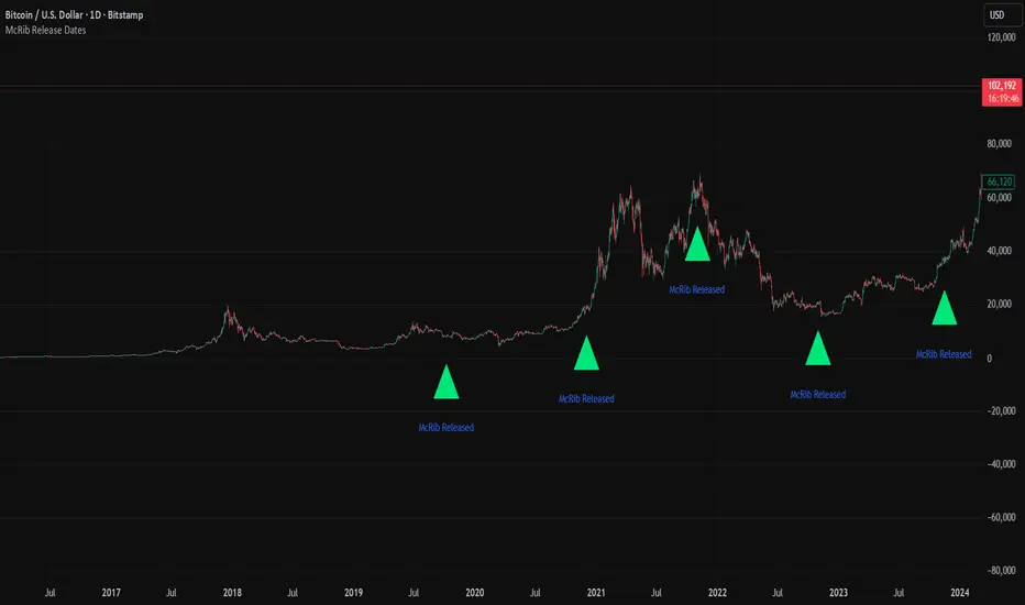
McRib Release Dates IndicatorMarks the McRib release dates from 2019-Current. Previous dates from Pre-2019 weren't clear enough to include accurate info. Goated Indicator. 67 😎
Volume Cluster Support and Resistance Levels [QuantAlgo]🟢 Overview
This indicator identifies statistically significant support and resistance levels through volume cluster analysis, isolating price zones characterized by elevated trading activity and institutional participation. By quantifying areas where volume concentration exceeded historical norms, it reveals price levels with demonstrated supply-demand imbalances that exhibit persistent influence on subsequent price action. The methodology is asset-agnostic and timeframe-independent, applicable across equities, cryptocurrencies, forex, and commodities from intraday to weekly intervals.
🟢 Key Features
1. Support and Resistance Levels
The indicator scans historical price data to identify bars where volume exceeds a user-defined threshold multiplier relative to the rolling average. For each qualifying bar, a representative price is calculated using the average of high, low, and close. Proximate price levels within a specified percentage range are then aggregated into discrete clusters using volume-weighted averaging, eliminating redundant signals. Clusters are ranked by cumulative volume to determine statistical significance. Finally, the indicator plots horizontal levels at each cluster price: support levels (green) below current price indicate zones where historical buying pressure exceeded selling pressure, while resistance levels (red) above current price mark zones where sellers historically dominated. These levels represent areas of established liquidity and price discovery, where institutional order flow previously concentrated.
The Touch Count (T) metric quantifies historical price interaction frequency, while Total Volume (TV) measures aggregate trading activity at each level, providing objective criteria for assessing level strength and trade execution decisions.
2. Volume Histogram
A histogram appears below the price chart, displaying relative volume for each bar within the lookback period, with bar height scaled to the maximum volume observed. Green bars represent up-periods (close > open) indicating buying pressure, while red bars show down-periods (close < open) indicating selling pressure. This visualization helps you confirm the validity of support/resistance levels by seeing where volume actually spiked, identify accumulation/distribution patterns, and validate breakouts by checking if they occur on above-average volume.
3. Built-in Alerts
Automated alerts trigger when price crosses below support levels or breaks above resistance levels, allowing you to monitor multiple assets without constant chart-watching.
4. Customizable Color Schemes
The indicator provides four preset color configurations (Classic, Aqua, Cosmic, Custom) optimized for visual clarity across different charting environments. Each scheme maintains consistent color mapping for support and resistance zones across both level lines and volume histogram components. The Custom configuration permits full color specification to accommodate individual charting setups, ensuring optimal visual contrast for extended analysis sessions.
Classic:
Aqua:
Cosmic:
Custom:
🟢 Pro Tips
→ Trade entry optimization: Execute long positions at support levels with high touch counts or upon confirmed resistance breakouts accompanied by above-average volume
→ Risk parameter definition: Position stop-loss orders near identified support/resistance zones with statistical significance to minimize premature exits
→ Breakout validation: Require volume confirmation exceeding historical average when price penetrates resistance to filter false breakouts
→ Level strength assessment: Prioritize levels with higher touch counts and total volume metrics for enhanced probability trade setups
→ Multi-timeframe confluence: Synthesize support/resistance levels across multiple timeframes to identify high-conviction zones where daily support aligns with 4-hour resistance structures

Better DEMAThe Better DEMA is a new tool designed to recreate the classical moving average DEMA, into a smoother, more reliable tool. Combining many methodologies, this script offers users a unique insight into market behavior.
How does it work?
First, to get a smoother signal, we need to calculate the Gaussian filter. A Gaussian filter is a smoothing filter that reduces noise and detail by averaging data with weights following a Gaussian (bell-shaped) curve.
Now that we have the source, we will calculate the following:
n2 = n/2 (half of the user defined length)
a = 2/(1+n)
ns
Now that we have that out of the way, it is time to get into the core.
Now we calculate 2 EMAs:
slow EMA => EMA over n
fast EMA => EMA over n2 period
Rather then now doing this:
DEMA = fast EMA * 2 - slow EMA
I found this to be better:
DEMA = slow EMA * (1-a) + fast EMA * a
As a last touch I took a little something from the HMA, and used a EMA with period of √n to smooth the entire the thing.
The Trend condition at base is the following (but feel free to FAFO with it):
Long = dema > dema yesterday and dema < src
Short = dema < dema yesterday and dema > src
Methodology
While the DEMA is an amazing tool used in many great indicators, it can be far too noisy.
This made me test out many filters, out of which the Gaussian performed best.
Then I tried out the non subtractive approach and that worked too, as it made it smoother.
Compacting on all I learned and smoothing it bit by bit, I think I can say this is worth looking into :).
Use cases:
Following Trends => classic, effective :)
Smoothing sources for other indicators => if done well enough, could be useful :)
Easy trend visualization => Added extra options for that.
Strategy development => Yes
Another good thing is it does not a high lookback period, so it should be better and less overfit.
That is all for today Gs,
Have fun and enjoy!

WAD : Whale Activity Detector🐋 WAD: Whale Activity Detector
WAD (Whale Activity Detector) automatically detects periods of abnormally high trading volume compared to the average, identifying potential whale (institutional) buy or sell activity and visualizing it directly on the chart.
🔍 How It Works
1. Buy/Sell Volume Separation
Each candle’s trading volume is categorized based on its direction:
Bullish candle → Buy volume
Bearish candle → Sell volume
This separation helps distinguish the actual strength of buying vs. selling pressure, rather than looking at total volume alone.
2. Average Volume Calculation
Over a user-defined lookback period (default: 34 bars), the indicator calculates the moving average of both buy and sell volumes, establishing a baseline for what constitutes “normal” activity.
3. Whale Activity Detection
When the current volume exceeds n times the average volume (default: 4×), the indicator flags it as a Whale Zone — a potential sign of large player involvement.
Volume surge on a bullish candle → Whale Buy
Volume surge on a bearish candle → Whale Sell
4. Visual Display
🟢 Green bars: Whale buy activity
🔴 Red bars: Whale sell activity
BUY/SELL labels: Appear above the chart when an anomaly is detected
Average line toggle: Users can turn the average volume lines on or off for clarity
5. Alerts
Whenever whale buy/sell signals are detected, real-time alerts are triggered.
Example: 🐋 Whale Buy – NVDA! 🟢
⚙️ Indicator Meaning
Rather than showing raw volume, WAD tracks “abnormal volume relative to the average.”
It filters out noise and highlights the moments where large entities begin to move.
Essentially, it visualizes intentional and impactful trades hidden within standard volume activity.
🚀 Example Use Cases
Whale accumulation tracking – Repeated strong buy signals may indicate sustained institutional accumulation.
Short-term breakout confirmation – Price often rallies shortly after whale buy signals appear.
Support/resistance analysis – Whale sell zones frequently align with short-term resistance areas.
In short:
WAD identifies when trading volume exceeds its historical norm to highlight where big money enters or exits the market.
===============================================================================
🐋 WAD : 세력 매매거래 추적기
WAD(Whale Activity Detector) 는 특정 종목의 거래량 패턴 속에서
‘평균 대비 비정상적으로 큰 거래량이 발생한 구간’을 자동으로 감지해
세력(Whale)의 매수·매도 활동을 시각화하는 지표입니다.
🔍 작동 원리
매수·매도 거래량 분리
각 캔들이 양봉인지, 음봉인지에 따라 거래량을 분리합니다.
양봉 시 발생한 거래량 → 매수 거래량(buy volume)
음봉 시 발생한 거래량 → 매도 거래량(sell volume)
이렇게 분리함으로써 단순 거래량이 아닌,
실제 매수세/매도세의 힘을 구분할 수 있습니다.
평균 거래량 계산
사용자가 지정한 기간(기본 34봉)을 기준으로
매수·매도 거래량의 이동평균선을 각각 계산합니다.
이는 ‘정상적인 거래량 수준’을 판단하는 기준선으로 활용됩니다.
이상치 탐지 (Whale Activity Detection)
현재 거래량이 평균 거래량의 n배(기본 4배)를 초과할 경우,
그 구간을 세력 개입 구간(Whale Zone) 으로 판단합니다.
양봉에서 급증 → 세력 매수 (Whale Buy)
음봉에서 급증 → 세력 매도 (Whale Sell)
시각적 표시
초록색 기둥 : 세력 매수 거래량
빨간색 기둥 : 세력 매도 거래량
라벨 표시 (BUY / SELL) : 이상치 발생 시 차트 상단에 표시
평균선 표시 옵션 : 사용자가 원할 때 평균선을 켜거나 끌 수 있음
알림(Alerts)
세력의 매수·매도 신호가 감지되면,
알림 메시지를 통해 실시간으로 통보받을 수 있습니다.
(예: 🐋 Whale Buy - NVDA! 🟢)
⚙️ 지표의 의미
단순 거래량이 아니라, ‘평균 대비 비정상적 거래량’ 을 추적합니다.
즉, “세력이 본격적으로 움직이기 시작한 구간” 만 걸러내는 지표입니다.
노이즈가 많은 거래량 차트 속에서 의도 있는 거래의 흔적을 포착할 수 있습니다.
🚀 활용 예시
세력 매집 구간 포착 : 큰 매수 시그널이 반복적으로 발생하는 구간은 세력의 누적 매집 가능성을 의미함
단기 급등 신호 확인 : 매수 이상치가 발생한 직후 가격이 급등하는 경우가 많음
지지/저항 분석과 병행 활용 : 세력 매도 구간은 단기 저항으로 작용하는 경향이 있음
copyright @invest_hedgeway

Relative Performance Tracker [QuantAlgo]🟢 Overview
The Relative Performance Tracker is a multi-asset comparison tool designed to monitor and rank up to 30 different tickers simultaneously based on their relative price performance. This indicator enables traders and investors to quickly identify market leaders and laggards across their watchlist, facilitating rotation strategies, strength-based trading decisions, and cross-asset momentum analysis.
🟢 Key Features
1. Multi-Asset Monitoring
Track up to 30 tickers across any market (stocks, crypto, forex, commodities, indices)
Individual enable/disable toggles for each ticker to customize your watchlist
Universal compatibility with any TradingView symbol format (EXCHANGE:TICKER)
2. Ranking Tables (Up to 3 Tables)
Each ticker's percentage change over your chosen lookback period, calculated as:
(Current Price - Past Price) / Past Price × 100
Automatic sorting from strongest to weakest performers
Rank: Position from 1-30 (1 = strongest performer)
Ticker: Symbol name with color-coded background (green for gains, red for losses)
% Change: Exact percentage with color intensity matching magnitude
For example, Rank #1 has the highest gain among all enabled tickers, Rank #30 has the lowest (or most negative) return.
3. Histogram Visualization
Adjustable bar count: Display anywhere from 1 to 30 top-ranked tickers (user customizable)
Bar height = magnitude of percentage change.
Bars extend upward for gains, downward for losses. Taller bars = larger moves.
Green bars for positive returns, red for negative returns.
4. Customizable Color Schemes
Classic: Traditional green/red for intuitive interpretation
Aqua: Blue/orange combination for reduced eye strain
Cosmic: Vibrant aqua/purple optimized for dark mode
Custom: Full personalization of positive and negative colors
5. Built-In Ranking Alerts
Six alert conditions detect when rankings change:
Top 1 Changed: New #1 leader emerges
Top 3/5/10/15/20 Changed: Shifts within those tiers
🟢 Practical Applications
→ Momentum Trading: Focus on top-ranked assets (Rank 1-10) that show strongest relative strength for trend-following strategies
→ Market Breadth Analysis: Monitor how many tickers are above vs. below zero on the histogram to gauge overall market health
→ Divergence Spotting: Identify when previously leading assets lose momentum (drop out of top ranks) as potential trend reversal signals
→ Multi-Timeframe Analysis: Use different lookback periods on different charts to align short-term and long-term relative strength
→ Customized Focus: Adjust histogram bars to show only top 5-10 strongest movers for concentrated analysis, or expand to 20-30 for comprehensive overview

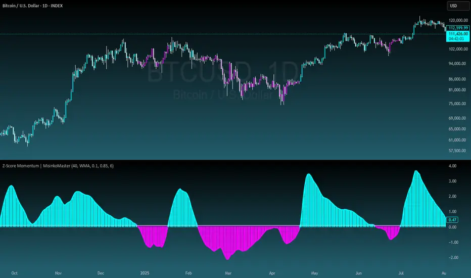
Z-Score Momentum | MisinkoMasterThe Z-Score Momentum is a new trend analysis indicator designed to catch reversals, and shifts in trends by comparing the "positive" and "negative" momentum by using the Z-Score.
This approach helps traders and investors get unique insight into the market of not just Crypto, but any market.
A deeper dive into the indicator
First, I want to cover the "Why?", as I believe it will ease of the part of the calculation to make it easier to understand, as by then you will understand how it fits the puzzle.
I had an attempt to create a momentum oscillator that would catch reversals and provide high tier accuracy while maintaining the main part => the speed.
I thought back to many concepts, divergences between averages?
- Did not work
Maybe a MACD rework?
- Did not work with what I tried :(
So I thought about statistics, Standard Deviation, Z-Score, Sharpe/Sortino/Omega ratio...
Wait, was that the Z-Score? I only tried the For Loop version of it :O
So on my way back from school I formulated a concept (originaly not like this but to that later) that would attempt to use the Z-Score as an accurate momentum oscillator.
Many ideas were falling out of the blue, but not many worked.
After almost giving up on this, and going to go back to developing my strategies, I tried one last thing:
What if we use divergences in the average, formulated like a Z-score?
Surprise-surprise, it worked!
Now to explain what I have been so passionately yapping about, and to connect the pieces of the puzzle once and for all:
The indicator compares the "strength" of the bullish/bearish factors (could be said differently, but this is my "speach bubble", and I think this describes it the best)
What could we use for the "bullish/bearish" factors?
How about high & low?
I mean, these are by definitions the highest and lowest points in price, which I decided to interpret as: The highest the bull & bear "factors" achieved that bar.
The problem here is comparison, I mean high will ALWAYS > low, unless the asset decided to unplug itself and stop moving, but otherwise that would be unfair.
Now if I use my Z-score, it will get higher while low is going up, which is the opposite of what I want, the bearish "factor" is weaker while we go up!
So I sat on my ret*rded a*s for 25 minutes, completly ignoring the fact the number "-1" exists.
Surprise surprise, multiplying the Z-Score of the low by -1 did what I wanted!
Now it reversed itself (magically). Now while the low keeps going down, the bear factor increases, and while it goes up the bear factor lowers.
This was btw still too noisy, so instead of the classic formula:
a = current value
b = average value
c = standard deviation of a
Z = (a-b)/c
I used:
a = average value over n/2 period
b = average value over n period
c = standard deviation of a
Z = (a-b)/c
And then compared the Z-Score of High to the Z-Score of Low by basic subtraction, which gives us final result and shows us the strength of trend, the direction of the trend, and possibly more, which I may have not found.
As always, this script is open source, so make sure to play around with it, you may uncover the treasure that I did not :)
Enjoy Gs!
Kalman Exponentialy Weighted Moving Average | MisinkoMasterThe Kalman Exponentialy Weighted Moving Average is a technical analysis tool providing users with more responsive and smoother signals, providing crystal-clear signals and giving investors valuable insights on market trends, however it could be used in many cases.
A deeper dive into the indicator:
When going through my creation of strategies, I had stumbled on an indicator called "EWMA", which worked decently, but it was far too simple in my opinion so I decided to combine the EMA & WMA, but with a little more complexity, and it has worked .
I began by learning how both MAs work, I already knew how WMA works, but EMA I did not.
After learning both I found out they were quite simple in principle and that there was a way to combine them in such way that you would get really good signals, however it was way too noisy.
While it could avoid major dumps that were not avoided by most indicators, it would lose that edge because of being too noisy.
After testing out many conditions, combinations & more, the best working one was this one:
WMA > KEWMA = long
WMA < KEWMA = short
I will explain this later, but this gave fast signals, and while it still was noisy it was better then before.
To smooth it out, I started testing price filters => Gaussian Filter and many more were tested out, but they either slowed it down to the point it was no longer of much use, or did not smooth it at all.
After testing the Kalman filter on this thing, I was shocked.
It was just right and made the indicator a lot better, smoothed it and kept most of the responsivness it had.
Now to the big question: "How is it calculated?"
Now first it needs to calculate the Kalman source, which smooths the source which will be used.
After that, we calculate the Weighted Moving Average for " n " period on the Kalman source.
Now that we have our WMA values, we need to calculate " a ".
a is calculated in the following formula:
a = 2/(1+ n )
where n is the user defined length
Now for the last part:
KEWMA = WMAyesterday * (1-a) + WMAtoday * a
This creates a very accurate and reactive indicator, that can prove useful in many uses, beyond those I will and did talk about.
For the trend logic as mentioned before:
Long = WMA > KEWMA
Short = WMA < KEWMA
This worked best, but you might find better ways of using it.
I think that is all I have to say about it, I left it open source so you can all code it in your strategies and play around with it.
Enjoy Gs!

Seasonality Heatmap [QuantAlgo]🟢 Overview
The Seasonality Heatmap analyzes years of historical data to reveal which months and weekdays have consistently produced gains or losses, displaying results through color-coded tables with statistical metrics like consistency scores (1-10 rating) and positive occurrence rates. By calculating average returns for each calendar month and day-of-week combination, it identifies recognizable seasonal patterns (such as which months or weekdays tend to rally versus decline) and synthesizes this into actionable buy low/sell high timing possibilities for strategic entries and exits. This helps traders and investors spot high-probability seasonal windows where assets have historically shown strength or weakness, enabling them to align positions with recurring bull and bear market patterns.
🟢 How It Works
1. Monthly Heatmap
How % Return is Calculated:
The indicator fetches monthly closing prices (or Open/High/Low based on user selection) and calculates the percentage change from the previous month:
(Current Month Price - Previous Month Price) / Previous Month Price × 100
Each cell in the heatmap represents one month's return in a specific year, creating a multi-year historical view
Colors indicate performance intensity: greener/brighter shades for higher positive returns, redder/brighter shades for larger negative returns
What Averages Mean:
The "Avg %" row displays the arithmetic mean of all historical returns for each calendar month (e.g., averaging all Januaries together, all Februaries together, etc.)
This metric identifies historically recurring patterns by showing which months have tended to rise or fall on average
Positive averages indicate months that have typically trended upward; negative averages indicate historically weaker months
Example: If April shows +18.56% average, it means April has averaged a 18.56% gain across all years analyzed
What Months Up % Mean:
Shows the percentage of historical occurrences where that month had a positive return (closed higher than the previous month)
Calculated as:
(Number of Months with Positive Returns / Total Months) × 100
Values above 50% indicate the month has been positive more often than negative; below 50% indicates more frequent negative months
Example: If October shows "64%", then 64% of all historical Octobers had positive returns
What Consistency Score Means:
A 1-10 rating that measures how predictable and stable a month's returns have been
Calculated using the coefficient of variation (standard deviation / mean) - lower variation = higher consistency
High scores (8-10, green): The month has shown relatively stable behavior with similar outcomes year-to-year
Medium scores (5-7, gray): Moderate consistency with some variability
Low scores (1-4, red): High variability with unpredictable behavior across different years
Example: A consistency score of 8/10 indicates the month has exhibited recognizable patterns with relatively low deviation
What Best Means:
Shows the highest percentage return achieved for that specific month, along with the year it occurred
Reveals the maximum observed upside and identifies outlier years with exceptional performance
Useful for understanding the range of possible outcomes beyond the average
Example: "Best: 2016: +131.90%" means the strongest January in the dataset was in 2016 with an 131.90% gain
What Worst Means:
Shows the most negative percentage return for that specific month, along with the year it occurred
Reveals maximum observed downside and helps understand the range of historical outcomes
Important for risk assessment even in months with positive averages
Example: "Worst: 2022: -26.86%" means the weakest January in the dataset was in 2022 with a 26.86% loss
2. Day-of-Week Heatmap
How % Return is Calculated:
Calculates the percentage change from the previous day's close to the current day's price (based on user's price source selection)
Returns are aggregated by day of the week within each calendar month (e.g., all Mondays in January, all Tuesdays in January, etc.)
Each cell shows the average performance for that specific day-month combination across all historical data
Formula:
(Current Day Price - Previous Day Close) / Previous Day Close × 100
What Averages Mean:
The "Avg %" row at the bottom aggregates all months together to show the overall average return for each weekday
Identifies broad weekly patterns across the entire dataset
Calculated by summing all daily returns for that weekday across all months and dividing by total observations
Example: If Monday shows +0.04%, Mondays have averaged a 0.04% change across all months in the dataset
What Days Up % Mean:
Shows the percentage of historical occurrences where that weekday had a positive return
Calculated as:
(Number of Positive Days / Total Days Observed) × 100
Values above 50% indicate the day has been positive more often than negative; below 50% indicates more frequent negative days
Example: If Fridays show "54%", then 54% of all Fridays in the dataset had positive returns
What Consistency Score Means:
A 1-10 rating measuring how stable that weekday's performance has been across different months
Based on the coefficient of variation of daily returns for that weekday across all 12 months
High scores (8-10, green): The weekday has shown relatively consistent behavior month-to-month
Medium scores (5-7, gray): Moderate consistency with some month-to-month variation
Low scores (1-4, red): High variability across months, with behavior differing significantly by calendar month
Example: A consistency score of 7/10 for Wednesdays means they have performed with moderate consistency throughout the year
What Best Means:
Shows which calendar month had the strongest average performance for that specific weekday
Identifies favorable day-month combinations based on historical data
Format shows the month abbreviation and the average return achieved
Example: "Best: Oct: +0.20%" means Mondays averaged +0.20% during October months in the dataset
What Worst Means:
Shows which calendar month had the weakest average performance for that specific weekday
Identifies historically challenging day-month combinations
Useful for understanding which month-weekday pairings have shown weaker performance
Example: "Worst: Sep: -0.35%" means Tuesdays averaged -0.35% during September months in the dataset
3. Optimal Timing Table/Summary Table
→ Best Month to BUY: Identifies the month with the lowest average return (most negative or least positive historically), representing periods where prices have historically been relatively lower
Based on the observation that buying during historically weaker months may position for subsequent recovery
Shows the month name, its average return, and color-coded performance
Example: If May shows -0.86% as "Best Month to BUY", it means May has historically averaged -0.86% in the analyzed period
→ Best Month to SELL: Identifies the month with the highest average return (most positive historically), representing periods where prices have historically been relatively higher
Based on historical strength patterns in that month
Example: If July shows +1.42% as "Best Month to SELL", it means July has historically averaged +1.42% gains
→ 2nd Best Month to BUY: The second-lowest performing month based on average returns
Provides an alternative timing option based on historical patterns
Offers flexibility for staged entries or when the primary month doesn't align with strategy
Example: Identifies the next-most favorable historical buying period
→ 2nd Best Month to SELL: The second-highest performing month based on average returns
Provides an alternative exit timing based on historical data
Useful for staged profit-taking or multiple exit opportunities
Identifies the secondary historical strength period
Note: The same logic applies to "Best Day to BUY/SELL" and "2nd Best Day to BUY/SELL" rows, which identify weekdays based on average daily performance across all months. Days with lowest averages are marked as buying opportunities (historically weaker days), while days with highest averages are marked for selling (historically stronger days).
🟢 Examples
Example 1: NVIDIA NASDAQ:NVDA - Strong May Pattern with High Consistency
Analyzing NVIDIA from 2015 onwards, the Monthly Heatmap reveals May averaging +15.84% with 82% of months being positive and a consistency score of 8/10 (green). December shows -1.69% average with only 40% of months positive and a low 1/10 consistency score (red). The Optimal Timing table identifies December as "Best Month to BUY" and May as "Best Month to SELL." A trader recognizes this high-probability May strength pattern and considers entering positions in late December when prices have historically been weaker, then taking profits in May when the seasonal tailwind typically peaks. The high consistency score in May (8/10) provides additional confidence that this pattern has been relatively stable year-over-year.
Example 2: Crypto Market Cap CRYPTOCAP:TOTALES - October Rally Pattern
An investor examining total crypto market capitalization notices September averaging -2.42% with 45% of months positive and 5/10 consistency, while October shows a dramatic shift with +16.69% average, 90% of months positive, and an exceptional 9/10 consistency score (blue). The Day-of-Week heatmap reveals Mondays averaging +0.40% with 54% positive days and 9/10 consistency (blue), while Thursdays show only +0.08% with 1/10 consistency (yellow). The investor uses this multi-layered analysis to develop a strategy: enter crypto positions on Thursdays during late September (combining the historically weak month with the less consistent weekday), then hold through October's historically strong period, considering exits on Mondays when intraweek strength has been most consistent.
Example 3: Solana BINANCE:SOLUSDT - Extreme January Seasonality
A cryptocurrency trader analyzing Solana observes an extraordinary January pattern: +59.57% average return with 60% of months positive and 8/10 consistency (teal), while May shows -9.75% average with only 33% of months positive and 6/10 consistency. August also displays strength at +59.50% average with 7/10 consistency. The Optimal Timing table confirms May as "Best Month to BUY" and January as "Best Month to SELL." The Day-of-Week data shows Sundays averaging +0.77% with 8/10 consistency (teal). The trader develops a seasonal rotation strategy: accumulate SOL positions during May weakness, hold through the historically strong January period (which has shown this extreme pattern with reasonable consistency), and specifically target Sunday exits when the weekday data shows the most recognizable strength pattern.

Golden Cross Screener [Pineify]Golden Cross Screener Pineify – Multi-Symbol Trend Detection Screener for TradingView
Discover the Golden Cross Screener Pineify for TradingView: a multi-symbol, multi-timeframe indicator for crypto and other assets. Customizable Golden Cross detection, robust algorithm, and intuitive screener design for smarter portfolio trend analysis.
Key Features
Multi-symbol screening across major cryptocurrencies or assets – BTCUSD, ETHUSD, XRPUSD, USDT, BNB, SOLUSD, DOGEUSD, TRXUSD (fully customizable).
Multi-timeframe analysis (e.g., 1m, 5m, 10m, 30m), enabling robust trend detection from scalp to swing.
Customizable Moving Average settings for both Fast and Slow MA (source and length).
Efficient screener table, highlighting Golden Cross events and current asset trends in one panel.
Visual cues for bullish, bearish, and cross states using intuitive color-coding and labels.
Flexible symbol and timeframe inputs to tailor the screener to any portfolio or watchlist.
How It Works
The Golden Cross Screener Pineify leverages the classic Golden Cross methodology—a bullish trend signal triggered when a shorter-term moving average crosses above a longer-term moving average. To improve robustness, you are empowered to configure both Fast MA and Slow MA periods and sources, making the detection logic applicable to any symbol, timeframe, or asset class.
Internally, the script runs dedicated calculations on each chosen symbol and timeframe, generating independent signals using exponential moving averages (EMA). Using the TradingView `request.security` function, it fetches and processes price data for up to eight portfolio assets on four timeframes, displaying the detected Golden Cross, Bullish, or Bearish states in a central screener table.
Trading Ideas and Insights
Spot emerging bullish or bearish trends across your favorite crypto pairs or trading assets in real time.
Capture prime opportunities when multiple assets align with Golden Cross signals—ideal for portfolio rebalancing or rotational strategies.
Analyze trend consistency by monitoring cross events at multiple timeframes for a given asset.
Swiftly identify when short-term and long-term momentum diverge—flagging potential reversals or trend initiations.
The Golden Cross Screener Pineify is not just a trend signal; it’s a holistic multi-asset scanner built for traders who know the power of combining technical breadth with agile timing.
How Multiple Indicators Work Together
This screener stands out with its modular approach: each asset/timeframe pair is monitored in isolation, yet displayed collectively for multidimensional market insight. Each symbol’s price action is processed through independently configured EMAs—Fast and Slow—whose crossovers are analyzed for directional bias. The implementation’s real innovation is in its screener table engine: it aggregates signals, synchronizes timeframes, and color-codes market states, allowing users to see confluences, divergences, and sector trends at a glance.
Combining Golden Cross detection with customizable moving averages and flexible multi-timeframe, multi-symbol scanning means users can fine-tune sensitivity, focus on specific signals, and adapt screener logic for scalping, swing trading, or investing.
Unique Aspects
True multi-symbol screener within the TradingView indicator framework.
Full customization of screener assets, timeframes, and moving averages.
Advanced, efficient use of TradingView table for clear, actionable visualization.
No dependency on standard, static MA settings—adjust everything to match your strategy.
Big-picture and granular trend detection in one tool, designed for both active traders and portfolio managers.
How to Use
Add the Golden Cross Screener Pineify to your TradingView chart.
Choose up to eight symbols—crypto, stock, forex, or custom assets.
Set four timeframes for screening, from lower to higher intervals.
Adjust moving average sources (price, close, etc.) and period lengths for both Fast and Slow MAs to suit your trading style.
Interpret table cells: clear labels and color indicate Golden Cross (trend shift), Bullish (uptrend), Bearish (downtrend) states for each symbol/timeframe.
React to signal alignments—deploy or rebalance positions, increase alert sensitivity, or backtest sequence confluences.
Customization
The indicator’s inputs panel gives full control:
Select which symbols to screen, making it perfect for any asset watchlist.
Pick the desired timeframes—mix daily, hourly, or minute-based intervals.
Adjust Fast and Slow MA settings: switch source type, change period length, and fine-tune detection logic as needed.
Style your screener table via TradingView settings (colors, font sizes, alignment).
Every element is customizable—adapt the Golden Cross Screener Pineify for your specific portfolio, trading timeframe, and strategy focus.
Conclusion
The Golden Cross Screener Pineify elevates multi-symbol trend detection to a new level on TradingView. By combining configurable Golden Cross logic with a powerful screener engine, it serves both precision and broad market insight—crucial for agile traders and strategic portfolio managers. Whether you’re tracking crypto pairs, stocks, forex, or a mix, this tool transforms static trend analysis into an active, multi-dimensional trading edge.

Michal D. Lagless Moving Average | MisinkoMasterThe 𝕸𝖎𝖈𝖍𝖆𝖑 𝕯. 𝕷𝖆𝖌𝖑𝖊𝖘𝖘 𝕸𝖔𝖛𝖎𝖓𝖌 𝕬𝖛𝖊𝖗𝖆𝖌𝖊 is my latest creation of a trend following tool, which is a bit different from the rest. By trying to de-lag the classical moving average, it gives you fast signals on changes in trend as fast as possible, keeping traders & investors always in check for potential risks they might want to avoid.
How does it work?
First we need to calculate lengths. The lengths are calcuted using a user defined input called the "Length Multiplier" and we of course need as well the length input too.
The indicator uses 10 lengths, 5 for an average price, 5 for median price.
The length for the average is the following:
length_2_avg = length_1_avg * length_multiplier
length_3_avg = length_2_avg * length_multiplier
...
and for the median lengths:
length_1_median = length_2_avg
length_2_median = length_3_avg
Here applies this rule
length_x_median < length_x_avg
This is intentional, and it is because the average is a little more reactive, while the median is a bit slower. To make up for the "slowness" of the median, we simple reduce the length of it a bit more than the average.
Now that we have our length we are ready to calculate averages and medians over their respective period. This is the a normal average from elementary school, nothing too fancy.
Now that we have all of them we match the pairs using another user defined input called "Median Weight" like so:
(Average_x * (2-median_weight) + Median_x * median_weight)/2
This gives more weight to the average (also due to the max value limit set to avoid breaking the fundational logic behind it).
After doing it to all the pairs we now average those pairs using another input called "Exponential Weight Multiplier".
The Exponential Weight Multiplier is used for weights which I will cover soon:
weight1 = weight
weight2 = weight * weight
weight3 = weight * weight * weight....
This is done until we have all the weights calculated
This gives exponentially more weight to the less lagging indicators, which is how we delag the indicator.
Then we sum all the pairs like so:
sum = pair1 * weight1 + pair2 * weight2 + pair3 * weight3 + pair4 * weight4 + pair5 * weight5
Then the sum is divided by the sum of weights, this results in us getting the final value.
Methodology & What is the actual point & how was it made?
I want to cover this one a bit deeper:
The methodology behind this was creating an indicator that would not be lagging, and would be able to avoid lag while not producing signals too often.
In many attempts in the first part, I tried using EMA, RMA, DEMA, TEMA, HMA, SMA and so on, but they were too noisy (except for SMA & RMA, but those had their flaws), so I tried the classical average taught in elementary school. This one worked better, but the noise was too high still after all this time. This made me include the median, which helped the noise, but made it far too lagging.
Here came the idea of making the median length lower and adding weights to counter the lag of the median, but it was still too lagging. This made me make the weights for lengths more exponential, while previously they were calculated using a little bit amplified sums that were alright, but nowhere near my desired result.
Using the new weights I got further, and after a bit of testing I was sattisfied with the results.
The logic for the trend was a big part in my development part, there were many I could think of, but not enough time to try them, so I stuck to the usual one, and I leave it up to YOU to beat my trend logic and get even better results.
Use Cases:
- Price/MA Crossovers
Simple, effective, useful
- Source for other indicators
This I tried myself, and it worked in a cool way, making the signals of for example RSI much smoother, so definitely try it out if you know how to code, or just simply put it in the source of the RSI.
- ROC
This trend logic stuck with me, I think you could find a way to make it good, but mainly for the people that can code in pine, trying out to combine the trend logic with ROC could work very well, do not sleep on it!
- Education
This concept is not really that complex, so for people looking for new ideas, inspiration, or just watching how trend following tools behave in general this is something that could benefit anyone, as the concept can be applied to ANYTHING, even the classical RSI, MACD, you could try even the Parabolic SAR, maybe STC or VZO, there is no limit to imagination.
- Strategy creation
Filtering this indicator with "and" conditions, or maybe even "or" or anything really could be very useful in a strategy that desires fast signals.
- Price Distance from bands
I noticed this while looking at past performance:
The stronger the trend the higher the distance from the Moving Average.
Final Notes
Watch out for mean reverting markets, as this is trend following you could get easily screwed in them.
Play around with this if it fits your desired outcome, you might find something I did not.
Hope you find it useful,
See you next time!
Copter 2.0💡 The indicator is designed for trading on any timeframe and includes a comprehensive system for determining entry and exit points based on technical analysis, price and volume.
📊 In the new version of Copter 2.0, the take profit and stop loss functions have been added
Let's analyze its key components:
✔️ Trend levels and extremes:
- The indicator determines local highs and lows for a certain period.
- the breakdown of these levels serves as a signal to open positions.
- the High-Low price dynamics analysis method is used to find key entry points.
✔️ Volumes:
-The indicator uses a configurable volume threshold to filter out candles with low volume and display only those with significant volume.
- the algorithm analyzes market data and sets an entry signal (opening a trade) and exit (profit taking/closing a position)
📍 Therefore, whether you are a beginner or an experienced trader, the indicator can help you stay ahead of the game and make more informed trading decisions.
📍 As a result, the trader can be sure that the signal is based on data analysis.
A long or short position can be stopped with either a profit or a small loss without prejudice to the potential profit.
✔️ Signal filtering:
- volume and volatile indicators are used to confirm the trend
- if a volume or volatility filter does not confirm the breakdown, the input signal is ignored
- analysis of moving averages of volumes and ATR is used
✔️ The use of the RSI in overbought and oversold analysis:
- the RSI indicator analyzes the strength of the current trend
- if the RSI exceeds 70, exit from a long position is possible
- if the RSI falls below 30, exit from a short position is possible
✔️ The use of EMA 20 and EMA 200
is additional moving average data that determines the current trend and the trend on higher timeframes.
- the main idea is that when they cross, we can see a change in trend movement and determine the general mood at the moment, based on which signals appear to open/close a deal.
- also, the indicator analyzes the past movement, thus determining the future direction
- based on the opening and closing of the past days, weeks, months.
✔️ Stop loss and risk management
- when entering a trade, a dynamic stop loss is set based on the percentage price change
- exit the position is carried out when a stop loss or a signal from the RSI is reached.
- it helps to minimize losses and protect profits
The market is unstable, and it is impossible to know what awaits it in the future.
The only way to manage risk is to limit the loss by setting a stop loss at 1% - 2% of the entry point.
It is recommended to set the profit in the ratio 1:1, 1:2,1:3, with partial fixation of 40%, 30%, 30% or wait for the indicator signal (TP)
We recommend fixing positions in parts. There will be a signal in the opposite direction when the volume is released.
To match the risk of the transaction, we recommend that you do not enter with high leverage.
Trade only with the amount that you are willing to lose.
With increased volatility in the market and flat, the indicator can give many signals.
After a strong fall or growth, we recommend not to open positions, because the probability of a flat is high.
✔️ Visualization of entry and exit points
- Entry points (long and short) are graphically displayed. green - long, orange - short
- stop loss levels are marked for clarity of risk management
✔️Recommendations for working with the indicator!
Entry/exit is performed on the next candle after the candle with the signal (buy/sell)
All timeframes and any trading pairs are used (when selecting settings for each one)
The indicator combines several methods of technical analysis:
- work with support and resistance levels
- filtering of signals based on volumes and volatility
- Overbought and oversold analysis using the RSI
- automatic risk management through stop loss
This approach makes the indicator a useful tool for short-term trading and active scalping.
❗️ NO REPAINT ! ❗️
BTC Cycle Halving Thirds NicoThe bold black vertical lines are the INDEX:BTCUSD halvings.
The background speak for itself.
Time to be bearish?

Supply & Demand Zones [QuantAlgo]🟢 Overview
The Supply & Demand (Support & Resistance) Zones indicator identifies price levels where significant buying and selling pressure historically emerged, using swing point analysis and pattern recognition to mark high-probability reversal and continuation areas. Unlike conventional support/resistance tools that draw arbitrary horizontal lines, this indicator can automatically detect structural zones, offering traders systematic entry and exit levels where institutional order flow likely congregates across any market or timeframe.
🟢 How to Use
# Zone Types:
Green/Demand Zones: Support areas where buying pressure historically emerged, representing potential long entry opportunities where price may bounce or consolidate before moving higher. These zones mark levels where buyers previously overcame sellers.
Red/Supply Zones: Resistance areas where selling pressure historically dominated, indicating potential short entry opportunities where price may reverse or stall before declining. These zones identify levels where sellers previously overwhelmed buyers.
# Zone Pattern Types:
Wick Rejection Zones: Zones created from candles with exceptionally long wicks showing violent price rejection. A demand rejection occurs when price drops sharply but closes well above the low, forming a long lower wick (relative to the total candle range) that demonstrates buyers aggressively defending that level. A supply rejection shows price spiking higher but closing well below the high, with the long upper wick proving sellers rejected that price aggressively. These zones often represent major institutional orders that absorbed significant market pressure. The rejection wick ratio setting controls how prominent the wick must be (higher ratios require more dramatic rejections and produce fewer but higher-quality zones).
Continuation Demand Zones: Areas where price rallied upward, paused in a brief consolidation base, then rallied again. This pattern confirms strong buying continuation (the consolidation represents profit-taking or minor pullbacks that failed to attract meaningful selling). When price returns to these zones, buyers who missed the initial rally often provide support, making them high-probability long entries within established uptrends. These zones follow the classic Rally-Base-Rally structure, demonstrating that buyers remain in control even during temporary pauses.
Reversal Demand Zones: Zones where price dropped, formed a consolidation base, then reversed into a rally. This structure marks potential trend reversals or major swing lows where buyers finally overwhelmed sellers after a decline. The base period represents accumulation by stronger hands, and these zones frequently appear at market bottoms or as significant pullback support within larger uptrends, signaling shifts in market control. These zones follow the Drop-Base-Rally pattern, showing the moment when selling pressure exhausted and buying interest emerged.
Continuation Supply Zones: Areas where price dropped, consolidated briefly, then dropped again. This pattern demonstrates strong selling continuation (the pause represents temporary buying attempts that failed to generate meaningful recovery). When price returns to these zones, sellers who missed the initial decline often provide resistance, creating short entry opportunities within established downtrends. These zones follow the Drop-Base-Drop structure, confirming that sellers maintain dominance even during temporary consolidations.
Reversal Supply Zones: Zones where price rallied upward, formed a consolidation base, then reversed into a decline. This formation identifies potential trend reversals or major swing highs where sellers overcame buyers after an advance. The base period often represents distribution by institutional participants, and these zones commonly appear at market tops or as key pullback resistance within larger downtrends, marking transfers of market control from buyers to sellers. These zones follow the Rally-Base-Drop pattern, capturing the transition point when buying exhaustion meets aggressive selling.
# Zone Mitigation Methods:
Wick Mitigation: Zones become invalidated immediately upon first contact by any wick. This assumes zones work only on their initial test, reflecting the belief that institutional orders concentrated at these levels get completely filled on first touch. Best for traders seeking only the highest-probability, untested zones and willing to accept that zones invalidate frequently in volatile markets. When price touches a zone boundary with even a single wick, that zone is considered "used up" and becomes mitigated.
Close Mitigation: Zones remain valid through wick penetration but become invalidated only when a candle closes through the zone boundary. This method allows price to briefly probe the zone with wicks while requiring actual commitment (a close) for invalidation. Suitable for traders who recognize that zones can withstand initial tests and prefer filtering out false breakouts caused by temporary volatility or liquidity hunts. A zone stays active as long as candles close within or outside it, regardless of wick penetration, until a close occurs beyond the boundary.
Full Body Mitigation: Zones stay valid until an entire candle body exists completely beyond the zone boundary, meaning both the open and close must be outside the zone. This approach maintains zone validity through partial penetrations, accommodating the reality that institutional zones can absorb considerable price action before exhausting. Ideal for volatile markets or traders who believe zones represent price ranges rather than precise levels, and who want zones to persist through aggressive but ultimately rejected breakout attempts. Only when both the open and close of a candle are beyond the zone does it become mitigated.
🟢 Pro Tips for Trading and Investing
→ Preset Selection: Choose presets matching your preferred timeframe - Scalping (M1-M30) for aggressive detection on minute charts, Intraday (H1-H12) for balanced filtering on hourly timeframes, or Swing Trading (1D+) for strict filtering on daily charts. Each preset automatically optimizes swing length, zone strength, and max zone counts for the selected timeframe.
→ Input Calibration: Adjust Swing Length based on market speed (lower values 3-7 for fast markets, higher values 12-20 for slower markets). Set Minimum Zone Strength according to asset volatility (0.05-0.15% for low-volatility assets, 0.25-0.5% for high-volatility assets). Tune Rejection Wick Ratio higher (0.6-0.8) for strict wick filtering or lower (0.3-0.5) to capture more subtle rejections.
→ Zone Pattern Toggle Strategy: Pattern types are mutually exclusive - enable Continuation OR Reversal patterns for each zone type, not both together. Recommended combinations: For trend trading, enable Rejection + Continuation (2-4 toggles total). For reversal trading, enable Rejection + Reversal (2-4 toggles). For scalping, enable only Rejection zones (1-2 toggles). Maximum 3-4 active toggles provides optimal chart clarity. A simple Wick Rejection toggle can also work on virtually any market and timeframe.
→ Mitigation Method Selection: Use Wick mitigation in clean trending markets for strict zone invalidation on first touch. Use Close mitigation in moderate volatility to filter out temporary spikes. Use Full Body mitigation in highly volatile markets to keep zones active through whipsaws and false breakouts.
→ Alert Configuration: Utilize built-in alerts for new zone creation, zone touches, and zone breaks. New zone alerts notify when fresh supply/demand areas form. Zone touch alerts signal potential entry opportunities as price reaches zones. Zone break alerts indicate when levels fail, signaling possible trend acceleration or structure changes.

Fisher Transform Trend Navigator [QuantAlgo]🟢 Overview
The Fisher Transform Trend Navigator applies a logarithmic transformation to normalize price data into a Gaussian distribution, then combines this with volatility-adaptive thresholds to create a trend detection system. This mathematical approach helps traders identify high-probability trend changes and reversal points while filtering market noise in the ever-changing volatility conditions.
🟢 How It Works
The indicator's foundation begins with price normalization, where recent price action is scaled to a bounded range between -1 and +1:
highestHigh = ta.highest(priceSource, fisherPeriod)
lowestLow = ta.lowest(priceSource, fisherPeriod)
value1 = highestHigh != lowestLow ? 2 * (priceSource - lowestLow) / (highestHigh - lowestLow) - 1 : 0
value1 := math.max(-0.999, math.min(0.999, value1))
This normalized value then passes through the Fisher Transform calculation, which applies a logarithmic function to convert the data into a Gaussian normal distribution that naturally amplifies price extremes and turning points:
fisherTransform = 0.5 * math.log((1 + value1) / (1 - value1))
smoothedFisher = ta.ema(fisherTransform, fisherSmoothing)
The smoothed Fisher signal is then integrated with an exponential moving average to create a hybrid trend line that balances statistical precision with price-following behavior:
baseTrend = ta.ema(close, basePeriod)
fisherAdjustment = smoothedFisher * fisherSensitivity * close
fisherTrend = baseTrend + fisherAdjustment
To filter out false signals and adapt to market conditions, the system calculates dynamic threshold bands using volatility measurements:
dynamicRange = ta.atr(volatilityPeriod)
threshold = dynamicRange * volatilityMultiplier
upperThreshold = fisherTrend + threshold
lowerThreshold = fisherTrend - threshold
When price momentum pushes through these thresholds, the trend line locks onto the new level and maintains direction until the opposite threshold is breached:
if upperThreshold < trendLine
trendLine := upperThreshold
if lowerThreshold > trendLine
trendLine := lowerThreshold
🟢 Signal Interpretation
Bullish Candles (Green): indicate normalized price distribution favoring bulls with sustained buying momentum = Long/Buy opportunities
Bearish Candles (Red): indicate normalized price distribution favoring bears with sustained selling pressure = Short/Sell opportunities
Upper Band Zone: Area above middle level indicating statistically elevated trend strength with potential overbought conditions approaching mean reversion zones
Lower Band Zone: Area below middle level indicating statistically depressed trend strength with potential oversold conditions approaching mean reversion zones
Built-in Alert System: Automated notifications trigger when bullish or bearish states change, allowing you to act on significant developments without constantly monitoring the charts
Candle Coloring: Optional feature applies trend colors to price bars for visual consistency and clarity
Configuration Presets: Three parameter sets available - Default (balanced settings), Scalping (faster response with higher sensitivity), and Swing Trading (slower response with enhanced smoothing)
Color Customization: Four color schemes including Classic, Aqua, Cosmic, and Custom options for personalized chart aesthetics
