Pivot Points High LowGaneshA Pivot Points High/Low indicator that:
Detects swing highs (ta.pivothigh) and swing lows (ta.pivotlow) using configurable left/right bar lengths.
Draws labels at the confirmed pivot points:
Down labels at pivot highs (potential resistance).
Up labels at pivot lows (potential support).
Lets you customize text color and label fill color separately for highs and lows.
It’s designed for overlay (on-price chart), with max_labels_count=500 to allow many labels.
Candlestick analysis
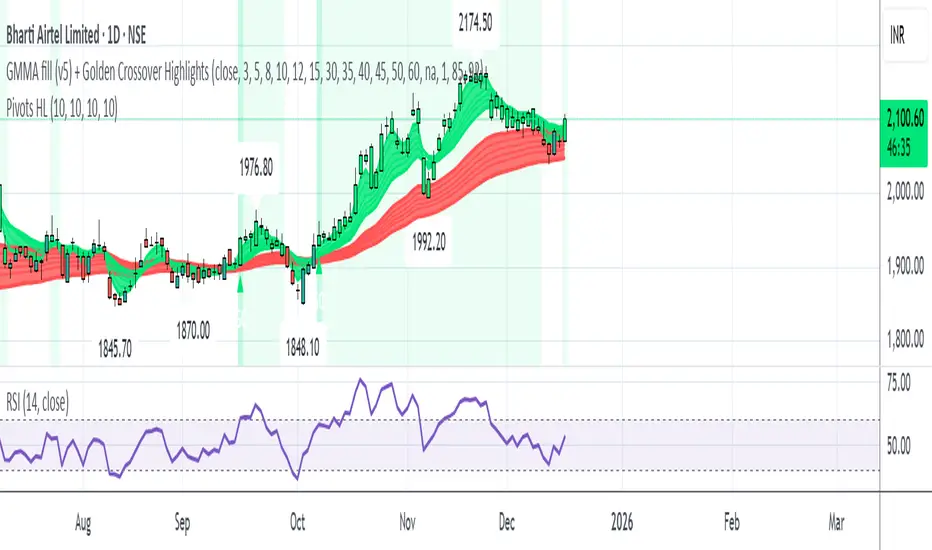
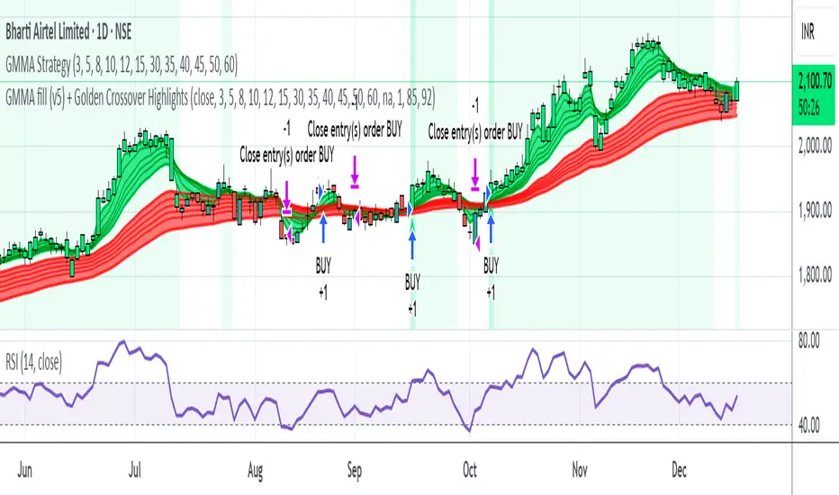
GMMA fill (v5) + Golden Crossover HighlightsGMMA Fill (v5) + Golden Crossover Highlights
This setup combines the Guppy Multiple Moving Average (GMMA) Fill version 5 with Golden Crossover signals to identify strong trend continuation and potential breakout points. GMMA provides layered moving averages for short- and long-term trend analysis, while the Golden Crossover highlights bullish momentum shifts, making it ideal for spotting entry opportunities in trending markets.
Opposite Candle Zone Identifier (v6) - Extended🔍 Opposite Candle Zone Identifier (Extended)
Opposite Candle Zone Identifier is a price-action based indicator designed to identify potential reversal or absorption zones by detecting candles that move against the surrounding trend.
The indicator highlights a central opposite candle (or group of candles) that is surrounded by candles moving in the opposite direction, both before and after the central candle.
This structure often represents areas where institutional activity, absorption, or supply/demand imbalance may occur.
📌 How the Indicator Works
The indicator analyzes price action using three configurable blocks:
1️⃣ Candles Before (Backward)
A user-defined number of candles before the central candle(s) must follow a consistent trend:
Bullish candles for a bearish zone
Bearish candles for a bullish zone
2️⃣ Central Candle(s)
The core of the pattern:
Default: 1 opposite candle
Can be increased (up to 5) to adapt the indicator to lower timeframes or noisier markets
This central block must move against the previous trend, signaling a potential shift or absorption area.
3️⃣ Candles After (Forward)
A user-defined number of candles after the central candle(s) must resume the original trend, confirming the pattern.
⚠️ The signal is confirmed only after the “after” candles are completed.
This avoids repainting and ensures structural confirmation.
📐 Zone Concept
The highlighted central candle (or candles) can be used to define a price zone:
The high and low of the central candle(s) represent a potential supply or demand zone
These zones can be used for:
Reversal areas
Reaction zones
Entry refinement
Stop placement
⚙️ Inputs & Customization
Number of candles before
Controls how many candles must follow the initial trend.
Number of candles after
Defines how many candles are required for confirmation.
Central candles count
Default is 1, but can be increased (e.g. 2) for:
Lower timeframes
More reliable structure
Reduced noise
ATR-based offset
Labels are positioned using a dynamic ATR offset to improve chart readability across different markets and timeframes.
📈 Bullish & Bearish Zones
🟢 Bullish Zone
Bearish candles before
Bullish central candle(s)
Bearish candles after
Indicates potential demand or accumulation zone
🔴 Bearish Zone
Bullish candles before
Bearish central candle(s)
Bullish candles after
Indicates potential supply or distribution zone
🧠 Best Use Cases
Works best on 15m and higher timeframes
Effective on:
Indices
Forex majors
Liquid cryptocurrencies
Can be combined with:
Trend filters (EMA, VWAP)
Support & resistance
Market structure analysis
⚠️ Notes
This indicator is confirmation-based, not predictive
Signals appear only after pattern completion
It does not repaint
Best used as a confluence tool, not as a standalone trading system
🎯 Summary
Opposite Candle Zone Identifier helps traders:
Detect opposite-direction candles within strong trends
Identify potential supply and demand zones
Adapt the pattern to different timeframes
Improve price-action based decision making

CRT - Candle Range TheoryCRT - Candle Range Theory is an indicator that identifies CRT patterns based on the concept of liquidity sweeps and price rejection.
WHAT IS CRT?
A CRT (Candle Range Theory) pattern occurs when:
- A "Parent" candle establishes a range (High/Low)
- The next candle sweeps beyond one side of that range (liquidity grab)
- But closes back INSIDE the parent range (rejection)
This creates a potential reversal signal as liquidity has been taken and price rejected continuation.
PATTERN TYPES
BEARISH CRT
- CRT candle sweeps above Parent High
- Does NOT sweep below Parent Low
- Closes inside Parent range
BULLISH CRT
- CRT candle sweeps below Parent Low
- Does NOT sweep above Parent High
- Closes inside Parent range
ALERT TYPES
The indicator offers three alert filters based on the strength of rejection:
1. Close NOT Reach 50%
Strongest rejection - Close doesn't even retrace to the 50% level of the parent range.
Bearish: Close > 50% | Bullish: Close < 50%
2. Price NOT Reach 50%
Price (wick) doesn't reach the 50% level at all.
Bearish: Low > 50% | Bullish: High < 50%
3. Basic CRT
Any valid CRT pattern without the 50% filter.
VISUAL ELEMENTS
- PH / PL lines: Parent candle High and Low
- 50% line: Middle of the parent range
- 25% / 75% lines: Quarter levels of the parent range
- Labels: Appear on CRT candle showing pattern type and conditions met
HOW TO USE
1. Set your preferred chart timeframe
2. Enable the alert types you want to monitor
3. Create alerts via the TradingView alert menu
4. Labels will automatically appear when conditions are met
SETTINGS
Visual Settings
- Colors for PH/PL, 50%, and 25%/75% lines
- Line widths for each level type
- Toggle visibility for 50% and quarter lines
CRT Alerts
- Show/hide labels on chart
- Customize bearish/bullish label colors
- Enable/disable each alert type independently
NOTES
- This indicator works on any timeframe
- Multiple conditions can be displayed in one label if enabled
- Outside bars (sweep both sides) are excluded from CRT detection
- Close must be inside parent range for valid pattern

CRT+ Advance Engulfing | @stefandimovCRT+ Lite implements institutional-style Candle Range Theory logic to identify displacement-driven engulfing structures with precision.
The script focuses on wick-based liquidity grabs, strict body closes, and optional higher-timeframe confirmation to highlight structurally valid bullish and bearish reversals.
Includes a Daily-only multi-market scanner and a compact dashboard for fast top-down analysis.
Designed for traders who prioritize structure, execution precision, and HTF alignment.

Manipulation Candle SystemThis indicator is based on One Candle Scalping Strategy by ProRealAlgos
## **Manipulation Candle System – Simple Explanation**
This indicator helps traders identify **potential market manipulation** during the **US stock market session (New York)** and highlights **key reversal signals**.
---
### **1. Daily ATR (Average True Range)**
* Measures the **average price movement** of the day.
* Helps determine if a move is **normal** or **abnormally large**.
* The indicator calculates **daily ATR** automatically.
* If 15 minute opening candle is more than 25% of Daily ATR, we can call it manipulation is happen .
---
### **2. 15-Minute Opening Candle Box**
* Highlights the **first 15-minute candle** of the US session.
* The box **extends for 2 hours** after the market opens.
* **Color indicates market condition**:
* **Red box** → the opening candle range is bigger than 25% of the daily ATR → potential **manipulation**.
* **Blue box** → the opening candle range is normal → **neutral session**.
* Helps traders visually spot when the market might be trying to **trap traders**.
---
### **3. 5-Minute Reversal Detection**
* Looks for **reversal candle patterns** on the 5-minute chart:
* Bullish engulfing or strong bullish pin → **buy reversal**.
* Bearish engulfing or strong bearish pin → **sell reversal**.
* Only checks during the **US session**, after 15 minute opening candle.
* Helps traders **time entries** in the direction of potential market reversals.
---
### **4. Buy / Sell Signals**
* Shows **triangle markers** on the chart:
* **Green triangle below candle** → buy signal.
* **Red triangle above candle** → sell signal.
* The signal text also indicates:
* `"BUY (Trap Reversal)"` → if the reversal occurs during manipulation.
* `"BUY (Normal Reversal)"` → if the reversal occurs during a neutral session.
* `"SELL (Trap Reversal)"` → if a sell reversal occurs during manipulation.
* `"SELL (Normal Reversal)"` → otherwise.
---
### **5. Info Table**
* Appears at the **top-right** of the chart.
* Shows:
1. Daily ATR value.
2. 15-minute opening candle range.
3. Session condition → `"MANIPULATION"` or `"NEUTRAL"`.
4. Current reversal signal text.
---
### **How a New Trader Can Use It**
1. Look at the **color of the opening box**:
* Red → be cautious, price may trap traders.
* Blue → normal market behavior.
2. Watch for **reversal signals** on the 5-minute chart.
3. Use the **info table** to confirm ATR, session bias, and signals.
4. Combine this with **risk management** before entering trades.

My RSI Fib Range Cloud//SOLO900q99This is basically the close price, optionally “stepped” if you set Bars Per Sample > 1.
2. Central Threshold Band (colored line)
• This is an EMA of the resampled price (default length 34).
• It turns:
• Green when RSI is in bullish fib zones,
• Pink when RSI is in bearish fib zones,
• Grey when RSI is in the middle/neutral area.
3. Sigma Range High (green line) and Sigma Range Low (pink line)
• These are an upper and lower band around price.
• The distance from price is based on how much price has been moving recently (average change).

Delta Grid Delta Grid H/L/C (Approx)
Delta Grid H/L/C (Approx) is an order-flow style table that breaks down intrabar delta behavior per candle and displays it in a clean, easy-to-read grid below your chart.
Instead of guessing what happened inside a candle, this indicator shows you:
Delta High – the maximum aggressive buying reached within the bar
Delta Low – the maximum aggressive selling reached within the bar
Delta Final – where delta closed when the candle finished
All values are displayed in a stand-alone table, making it easy to scan recent bars and quickly spot momentum shifts, absorption, and potential trap behavior.
How It Works
This indicator approximates intrabar delta by:
Aggregating lower-timeframe volume
Classifying volume direction based on price movement
Tracking the running delta inside each candle
Recording the highest, lowest, and final delta values per bar
A heat-mapped background is applied to the Final Delta column:
Green shades = net aggressive buying
Red shades = net aggressive selling
Brighter colors = stronger imbalance relative to recent bars
Key Features
Stand-alone Delta Grid panel below the chart
Per-bar Delta High / Delta Low / Delta Final
Heat-mapped Final Delta for fast visual interpretation
Optional time column for precise bar reference
Adjustable lookback and scaling settings
Clean layout designed for futures, crypto, and index trading
How Traders Use It
This tool is ideal for:
Spotting absorption at highs and lows
Identifying failed breakouts and traps
Confirming trend strength or exhaustion
Reading order-flow shifts without footprint charts
Pairing with VWAP, Initial Balance, Supply & Demand, and Market Structure
Important Notes
This is an approximate delta calculation due to TradingView data limitations.
It does not use true bid/ask volume.
For true order-flow delta, a platform with native tick data (e.g., Tradovate or NinjaTrader) is required.
Recommended Settings
Use a lower timeframe (1s–15s if available) for better intrabar accuracy
Combine with key levels (VWAP, IBH/IBL, prior highs/lows) for best results

EMA Trend & Stochastic Signal IndicatorThis indicator displays trend-aligned Stochastic crossover signals using EMA structure and swing-based directional filtering for market analysis.

Ingenuity Crazy Strategy Advance IntraThis indicator works — IF you use it correctly.
Wrong settings = bad results.
That’s why we keep:
🔥 The exact settings
🔥 Market-specific presets
🔥 Live trade examples
INSIDE OUR DISCORD ONLY.
🚫 Do not guess
🚫 Do not freestyle settings
👉 Join the Discord and trade it the way it’s meant to be traded.
discord.gg

HIGH BULLISH PROBABILITY SIGNAL Based on Ema, rsi, adr, volume we will determine if the stock is going to explode.

Multi-Trend + Credit Risk DashboardHello This is showing 20,50,200 as well as some other useful indicators. hope you like it, its my first! D and P is discount or premium to nav

Heikin Ashi + Real Price OverlayHeikin-Ashi + Real Price Overlay
This indicator combines the smooth trend visualization of Heikin-Ashi candles with the true market price for precise execution.
Features:
Heikin-Ashi Candles: Provides a clear, smoothed view of market trends and momentum.
Real Close Price Overlay: Plots the actual closing price as a line on top of HA candles, ensuring accurate entry, exit, and stop placement.
Trend-Based Coloring: The real price line is colored according to HA trend (green for bullish, red for bearish), making trend bias instantly visible.
Lightweight and ideal for scalping, day trading, or any strategy where trend bias + exact price matters.
Use Case:
Use HA candles to identify market bias and momentum.
Use the real price line for precise entries, exits, and stop levels.
Perfect for traders who want the clarity of HA without sacrificing real price accuracy.

Bravo Backtest - Multi Timeframe Fair Value GapsBravo Backtest – Multi Timeframe Fair Value Gaps
This indicator displays Fair Value Gaps (FVGs) across multiple timeframes, with a strong focus on clarity, structure, and non-repainting behavior.
To reduce noise and keep charts clean, only Fair Value Gaps from your current chart timeframe and higher are shown. Lower-timeframe imbalances are intentionally filtered out.
Key features:
- Multi-timeframe Fair Value Gap detection
- Wick-to-wick, three-candle FVG logic
- Non-repainting: all FVGs are confirmed on candle close
- Automatic removal of invalidated FVGs (close through the zone)
- Adjustable lookback period to limit historical zones
- Optional bullish / bearish filtering
- Optional borders that inherit the FVG color
- Clean, professional UI designed for real trading use
This tool is built to support higher-timeframe context, execution clarity, and disciplined charting, making it suitable for both discretionary traders and structured trading models.
Developed and verified by Bravo Backtest.

Auto Harmonic Patterns [Trader-Alex])This indicator is a sophisticated technical analysis tool designed to automate the identification of Harmonic Patterns across financial markets. By utilizing a multi-layered scanning engine, it detects valid geometric structures in price action, helping traders identify high-probability reversal zones (PRZ) with precision.
Whether you are a scalper or a swing trader, this tool streamlines the complex process of measuring Fibonacci ratios, allowing you to focus on execution rather than manual drawing.
Key Features
Multi-Scale Scanning Engine: The indicator runs 5 independent scanning groups simultaneously. This allows it to detect patterns across different market distinct market cycles (micro-structures to macro-trends) within a single timeframe.
Comprehensive Pattern Support: Automatically recognizes a wide range of classic and modern harmonic patterns, including:
Gartley
Bat & Alt Bat
Butterfly
Crab & Deep Crab
Shark
Cypher
Predictive PRZ Technology (Potential Patterns): Unlike standard indicators that only show completed patterns, this tool projects "Potential Patterns" in real-time. It calculates the Potential Reversal Zone (PRZ) based on converging Fibonacci projections, giving you a clear visual of where the D-point (Entry) is likely to form before price arrives.
Smart Filtering & Optimization: To maintain a clean chart, the indicator includes an intelligent filtering system. If multiple patterns are detected in the same area, it automatically evaluates the geometry and risk-to-reward ratio to display only the most optimal setup.
Integrated Trade Management: For every valid pattern, the indicator automatically plots:
Entry Level: The optimal completion point.
Stop Loss (SL): Calculated based on invalidation structures.
Take Profit (TP1 & TP2): Based on standard harmonic retracement targets.
Visual Clarity: Distinguishes between Bullish (Green/Blue tones) and Bearish (Red/Orange tones) setups. Successful historical patterns and currently developing patterns are visually distinct for easy back-testing and live trading.
Disclaimer This tool is for educational and informational purposes only. Trading financial markets involves risk. Past performance of harmonic patterns does not guarantee future results. Always use proper risk management.
-------------------------------------------------------------------------------------
此指標是一套高階的技術分析工具,專為自動化識別金融市場中的「諧波型態 (Harmonic Patterns)」而設計。透過多層次的掃描引擎,它能精準偵測價格行為中的幾何結構,協助交易者快速鎖定高勝率的潛在反轉區 (PRZ)。
無論您是短線交易者還是波段交易者,此工具都能簡化繁瑣的費波那契比例測量過程,讓您能專注於交易決策而非手動繪圖。
核心功能
多維度掃描引擎: 指標內建 5 組獨立的掃描運算邏輯,能夠同時運行。這意味著它能在單一圖表時間週期內,同時捕捉從小級別結構到大級別趨勢的各種型態。
支援多種經典型態: 自動識別市場上主流的諧波結構,包含:
加特利 (Gartley)
蝙蝠與變種蝙蝠 (Bat & Alt Bat)
蝴蝶 (Butterfly)
螃蟹與深海螃蟹 (Crab & Deep Crab)
鯊魚 (Shark)
賽福 (Cypher)
預測性 PRZ 技術 (潛在型態): 不同於一般指標僅顯示「已完成」的歷史型態,本工具具備即時預測功能。它能根據費波那契數列的匯聚點,計算出潛在反轉區 (PRZ),在價格到達前提前標示出預期的 D 點 (入場點)。
智能篩選與優化: 為了保持圖表整潔,指標內建智能過濾系統。當同一區域偵測到多個重疊型態時,系統會自動評估幾何結構與盈虧比,僅顯示條件最優異的一個交易機會。
整合式交易管理: 針對每一個有效型態,指標會自動計算並繪製:
入場價 (Entry): 型態完成的最佳價位。
止損位 (SL): 基於結構失效點的防守位置。
止盈位 (TP1 & TP2): 基於諧波回撤比例的標準獲利目標。
視覺化清晰呈現: 清楚區分看漲 (綠/藍色系) 與看跌 (紅/橙色系) 架構。歷史勝率回測線圖與正在發展中的潛在型態均有不同的視覺樣式,方便用戶進行複盤與實盤操作。
免責聲明 本工具僅供教學與輔助分析使用。金融市場交易具有風險,諧波型態的歷史表現不代表未來獲利保證。請務必做好個人風險管理。

HydraBot v1.2 publicenglish description english description english description english description english description english description english description english description english description

DisruptNEX Edge SystemDisruptNEX Edge System is an analytical overlay indicator designed to visualize market direction, trend maturity, exhaustion conditions, and impulse activity within a single, coherent framework.
The system is built as a structured analytical model rather than a collection of independent tools.
All visual elements are derived from a shared internal reference, ensuring consistency between trend context, exhaustion states, impulse activity, and higher-timeframe structure.
1. Market Regime & Trend Visualization
Illustration 1: Market regime visualization through candle coloring.
At the foundation of the system lies a price-centered baseline, computed as a windowed mid-range estimator with optional adaptive smoothing.
This baseline defines the current market regime:
Price above the baseline represents bullish directional pressure.
Price below the baseline represents bearish directional pressure.
The regime is expressed directly through candle coloring, allowing traders to visually identify the active trend without relying on additional overlays or separate panels.
This regime context acts as the primary reference for all subsequent components of the system.
2. Exhaustion Zones on the Price Chart
Illustration 2: Overbought / Oversold ribbons visualized directly on price.
DisruptNEX Edge System identifies potential exhaustion using a persistence-based evaluation of how consistently price holds above or below a volatility-adjusted reference.
Unlike oscillators displayed in a separate pane, exhaustion is visualized directly on the price chart using bounded ribbons.
Key characteristics of the exhaustion logic:
Overbought and Oversold states are detected as discrete state transitions.
Zones are marked at their initial appearance.
Visual persistence reflects state continuity rather than momentary fluctuations.
This approach helps traders assess when price reaches statistically stretched conditions relative to the active regime, often corresponding to areas where pullbacks or pauses may develop.
3. Candlestick Pattern Context
Illustration 3: Candlestick patterns displayed within the active trend context.
The system includes optional candlestick pattern detection displayed directly on the price chart as contextual information.
Patterns are evaluated relative to the active market regime and are commonly associated with short-term pauses, pullbacks, or localized price reactions within an existing trend.
Patterns are not interpreted as standalone reversal signals and do not provide trade instructions.
Their role is to complement trend context by highlighting moments where traders may choose to observe price behavior more closely.
4. Spark Impulses & Structural Reference Zones
Illustration 4: Spark impulses and dynamic structural reference zones.
Spark impulses highlight moments when directional pressure increases within the active market regime.
They are derived from a volatility-normalized measure of price displacement relative to the internal baseline and evaluated across multiple smoothing horizons.
This allows the system to identify shifts in directional activity rather than isolated price fluctuations.
Spark impulses commonly appear after consolidation, pullbacks, or localized hesitation and act as analytical confirmation that market activity is resuming in a given direction.
Alongside impulse visualization, the system derives dynamic structural reference levels based on recent price behavior and volatility.
These levels are updated only on the most recent bar and represent contextual support and resistance zones.
Structural reference levels are not predictive targets.
They serve as spatial guides, helping traders evaluate price positioning relative to recent structure and impulse activity.
5. Trend Power & Multi-Timeframe HUD
Illustration 5: Right-side HUD summarizing multiple timeframes.
The indicator includes a compact HUD panel that aggregates key structural information across multiple timeframes:
Overbought / Oversold state
Trend Power level
Trend direction
Trend Power quantifies how extended the current regime is by measuring price progression since the last confirmed regime change, normalized by volatility and mapped to a bounded scale.
This allows traders to distinguish between developing, established, and extended trends, while the multi-timeframe layout helps assess alignment between the current chart and higher-level market structure.
How to Read the Indicator
Start by observing candle coloring to identify the active market regime.
Use exhaustion ribbons to recognize areas where price may pause or pull back relative to the regime.
Treat candlestick patterns as contextual signals highlighting potential short-term reactions.
Look for Spark impulses as confirmation of renewed directional activity.
Use structural reference zones as orientation points when evaluating price location.
Consult the HUD to check trend direction, maturity, and exhaustion across higher timeframes.
Alerts & Usage Notes
Alerts are event-based and triggered only on confirmed state changes, including:
Regime transitions
Exhaustion state entries
Candlestick pattern detection
Spark impulse events
Important Notes
DisruptNEX Edge System is not an automated trading system.
It does not execute trades or provide trade instructions.
All outputs are analytical and visual in nature and are intended to support discretionary decision-making.

NY LONDON LUNCH AUTO**NY London Lunch Auto** is a precision session-anchor indicator designed for traders who focus on institutional timing and liquidity behavior.
This script automatically marks the **high and low of three key 15-minute New York session candles**:
• **3:00 AM NY** — London session expansion
• **8:00 AM NY** — New York open / kill zone
• **2:00 PM NY** — NY lunch / power hour transition
Each time one of these candles prints on the **15-minute chart**, the script captures its exact high and low and extends them forward as horizontal levels.
The levels remain **locked and unchanged** until the next key session candle appears, ensuring clean, non-repainting reference zones.
### Key Features
• Works **exclusively on the 15-minute timeframe**
• Automatically updates at **3AM, 8AM, and 2PM NY time**
• Levels stay fixed — no drifting or recalculation
• Clean, minimal design with customizable colors
• Ideal for liquidity sweeps, displacement, and ICT-style execution models
This indicator is built for traders who want **clarity, patience, and structure**, not clutter. It pairs seamlessly with liquidity sweep, displacement, and fair value gap strategies.

Sustained 200 SMA Cross (Locked to Daily)For individuals looking to track trend changes against the 200 day simple moving average. We are measuring 5 consecutive days changing from the above or below the 200 day SMA as a flag for a potential shift in trend.

HydraBot v1.2average bias of a bunch of indicators that blah blah blah i need to hit at least so many words to publish this

Wavelet Candle Constructor (Inc. Morlet) 2Here is the detailed description of the **Wavelet Candle** construction principles based on the code provided.
This indicator is not a simple smoothing mechanism (like a Moving Average). It utilizes the **Discrete Wavelet Transform (DWT)**, specifically the Stationary variant (SWT / à Trous Algorithm), to separate "noise" (high frequencies) from the "trend" (low frequencies).
Here is how it works step-by-step:
###1. The Wavelet Kernel (Coefficients)The heart of the algorithm lies in the coefficients (the `h` array in the `get_coeffs` function). Each wavelet type represents a different set of mathematical weights that define how price data is analyzed:
* **Haar:** The simplest wavelet. It acts like a simple average of neighboring candles. It reacts quickly but produces a "boxy" or "jagged" output.
* **Daubechies 4:** An asymmetric wavelet. It is better at detecting sudden trend changes and the fractal structure of the market, though it introduces a slight phase shift.
* **Symlet / Coiflet:** More symmetric than Daubechies. They attempt to minimize lag (phase shift) while maintaining smoothness.
* **Morlet (Gaussian):** Implemented in this code as a Gaussian approximation (bell curve). It provides the smoothest, most "organic" effect, ideal for filtering noise without jagged edges.
###2. The Convolution EngineInstead of a simple average, the code performs a mathematical operation called **convolution**:
For every candle on the chart, the algorithm takes past prices, multiplies them by the Wavelet Kernel weights, and sums them up. This acts as a **digital low-pass filter**—it allows the main price movements to pass through while cutting out the noise.
###3. The "à Trous" Algorithm (Stationary Wavelet Transform)This is the key difference between this indicator and standard data compression.
In a classic wavelet transform, every second data point is usually discarded (downsampling). Here, the **Stationary** approach is used:
* **Level 1:** Convolution every **1** candle.
* **Level 2:** Convolution every **2** candles (skipping one in between).
* **Level 3:** Convolution every **4** candles.
* **Level 4:** Convolution every **8** candles.
Because of this, **we do not lose time resolution**. The Wavelet Candle is drawn exactly where the original candle is, but it represents the trend structure from a broader perspective. The higher the `Decomposition Level`, the deeper the denoising (looking at a wider context).
###4. Independent OHLC ProcessingThe algorithm processes each component of the candle separately:
1. Filters the **Open** series.
2. Filters the **High** series.
3. Filters the **Low** series.
4. Filters the **Close** series.
This results in four smoothed curves: `w_open`, `w_high`, `w_low`, `w_close`.
###5. Geometric Reconstruction (Logic Repair)Since each price series is filtered independently, the mathematics can sometimes lead to physically impossible situations (e.g., the smoothed `Low` being higher than the smoothed `High`).
The code includes a repair section:
```pinescript
real_high = math.max(w_high, w_low)
real_high := math.max(real_high, math.max(w_open, w_close))
// Same logic for Low (math.min)
```
This guarantees that the final Wavelet Candle always has a valid construction: wicks encapsulate the body, and the `High` is strictly the highest point.
---
###Summary of ApplicationThis construction makes the Wavelet Candle an **excellent trend-following tool**.
* If the candle is **green**, it means that after filtering the noise (according to the selected wavelet), the market energy is bullish.
* If it is **red**, the energy is bearish.
* The wicks show volatility that exists within the bounds of the selected decomposition level.
Here is a descriptive comparison of **Wavelet Candles** against other popular chart types. As requested, this is a narrative explanation focusing on the differences in mechanics, interpretation philosophy, and the specific pros and cons of each approach.
---
###1. Wavelet Candles vs. Standard (Japanese) CandlesThis is a clash between "the raw truth" and "mathematical interpretation." Standard Japanese candles display raw market data—exactly what happened on the exchange. Wavelet Candles are a synthetic image created by a signal processor.
**Differences and Philosophy:**
A standard candle is full of emotion and noise. Every single price tick impacts its shape. The Wavelet Candle treats this noise as interference that must be removed to reveal the true energy of the trend. Wavelets decompose the price, reject high frequencies (noise), and reconstruct the candle using only low frequencies (the trend).
* **Wavelet Advantages:** The main advantage is clarity. Where a standard chart shows a series of confusing candles (e.g., a long green one, followed by a short red one, then a doji), the Wavelet Candle often draws a smooth, uniform wave in a single color. This makes it psychologically easier to hold a position and ignore temporary pullbacks.
* **Wavelet Disadvantages:** The biggest drawback is the loss of price precision. The Open, Close, High, and Low values on a Wavelet candle are calculated, not real. You **cannot** place Stop Loss orders or enter trades based on these levels, as the actual market price might be in a completely different place than the smoothed candle suggests. They also introduce lag, which depends on the chosen wavelet—whereas a standard candle reacts instantly.
###2. Wavelet Candles vs. Heikin AshiThese are close cousins, but they share very different "DNA." Both methods aim to smooth the trend, but they achieve it differently.
**Differences and Philosophy:**
Heikin Ashi (HA) is based on a simple recursive arithmetic average. The current HA candle depends on the previous one, making it react linearly.
The Wavelet Candle uses **convolution**. This means the shape of the current candle depends on a "window" (group) of past candles multiplied by weights (Gaussian curve, Daubechies, etc.). This results in a more "organic" and elastic reaction.
* **Wavelet Advantages:** Wavelets are highly customizable. With Heikin Ashi, you are stuck with one algorithm. With Wavelet Candles, you can change the kernel to "Haar" for a fast (boxy) reaction or "Morlet" for an ultra-smooth, wave-like effect. Wavelets handle the separation of market cycles better than simple HA averaging, which can generate many false color flips during consolidation.
* **Wavelet Disadvantages:** They are computationally much more complex and harder to understand intuitively ("Why is this candle red if the price is going up?"). In strong, vertical breakouts (pumps), Heikin Ashi often "chases" the price faster, whereas deep wavelet decomposition (High Level) may show more inertia and change color more slowly.
###3. Wavelet Candles vs. RenkoThis compares two different dimensions: Time vs. Price.
**Differences and Philosophy:**
Renko completely ignores time. A new brick is formed only when the price moves by a specific amount. If the market stands still for 5 hours, nothing happens on a Renko chart.
The Wavelet Candle is **time-synchronous**. If the market stands still for 5 hours, the Wavelet algorithm will draw a series of flat, small candles (the "wavelet decays").
* **Wavelet Advantages:** They preserve the context of time, which is crucial for traders who consider trading sessions (London/New York) or macroeconomic data releases. On a wavelet chart, you can see when volatility drops (candles become small), whereas Renko hides periods of stagnation, which can be misleading for options traders or intraday strategies.
* **Wavelet Disadvantages:** In sideways trends (chop), Wavelet Candles—despite the smoothing—will still draw a "snake" that flips colors (unless you set a very high decomposition level). Renko can remain perfectly clean and static during the same period, not drawing any new bricks, which for many traders is the ultimate filter against overtrading in a flat market.
###Summary**Wavelet Candles** are a tool for the analyst who wants to visualize the **structure of the wave and market cycle**, accepting some lag in exchange for noise reduction, but without giving up the time axis (like in Renko) or relying on simple averaging (like in Heikin Ashi). It serves best as a "roadmap" for the trend rather than a "sniper scope" for precise entries.

Displacement## Displacement Indicator (Institutional Momentum Filter)
This indicator highlights **true price displacement** — candles where price moves with **abnormal force relative to recent volatility**.
It is designed to help traders distinguish **real momentum** from normal market noise.
Displacement often precedes:
- Breaks of structure
- Fair Value Gaps (FVGs)
- Strong continuation or meaningful pullbacks
This tool focuses on **confirmation**, not prediction.
---
### 🔍 How Displacement Is Defined
A candle is marked as *displacement* only when **all conditions are met**:
• Candle body is larger than a multiple of ATR (volatility-adjusted)
• Candle body makes up a high percentage of the full candle (strong close)
• Directional conviction (bullish or bearish close)
This filters out:
- Small or average candles
- Wick-heavy indecision
- Low-quality breakouts
---
### 🎯 What This Indicator Is Best Used For
✔ Confirming impulsive moves
✔ Validating structure breaks
✔ Anchoring Fair Value Gaps
✔ Filtering low-probability setups
✔ Identifying institutional participation
Works best on **M5, M15, and H1**, especially during **London and NY sessions**.
---
### ⚠️ Important Notes
• This is **not** a buy/sell signal by itself
• Best used with trend, structure, or liquidity context
• Not designed for ranging or low-volatility markets
Think of this indicator as a **momentum truth filter** —
if displacement is missing, conviction is likely missing too.
---
### ⚙️ Inputs Explained
• ATR Length – defines normal volatility
• ATR Multiplier – how aggressive displacement must be
• Minimum Body % – ensures strong candle closes
All inputs are adjustable to fit different markets and styles.
---
### 🧠 Philosophy
Displacement reflects **commitment**, not anticipation.
This tool helps you wait for **proof**, not hope.
---
If you want, I can:
- Tighten this for **ICT-style language**
- Rewrite for **beginner clarity**
- Add a **“How I personally use it”** section
- Optimize it for **TradingView algorithm visibility**
**Tell me which you want changed.**

Renko with Multi-Timeframe RSI (Non-Repaint)This is a Renko-based Multi-Timeframe RSI indicator with Inverted Volatility Oscillator that combines three technical analysis concepts to provide trading signals without repainting issues.
Core Components
1. Renko Chart Foundation
Instead of using time-based candles, this indicator creates Renko bricks based on price movement:
Green brick = Price moved up by one brick size
Red brick = Price moved down by one brick size
Brick size = Either ATR-based (dynamic) or fixed value
Key advantage: Filters out market noise by ignoring time and small price fluctuations
Non-Repaint Feature: Only processes confirmed bars (barstate.isconfirmed), ensuring signals don't disappear or change after they appear.
2. Volume-Weighted RSI (Multiple Timeframes)
Three RSI calculations:
a) Renko RSI (Purple line)
Calculated directly from Renko brick close prices
Shows momentum based on actual brick formations
More stable than traditional RSI since it's based on significant price moves
b) 1-Hour RSI (Blue line)
Standard RSI from 1-hour timeframe
Provides medium-term momentum context
c) 4-Hour RSI (Orange line)
Standard RSI from 4-hour timeframe
Shows longer-term momentum trends
RSI Interpretation:
Above 70: Overbought (potential sell signal)
Below 30: Oversold (potential buy signal)
Above 50: Bullish momentum
Below 50: Bearish momentum
3. Inverted Volatility Oscillator (Yellow line)
Measures the opposite of price volatility in Renko brick closes:
What It Actually Is:
Simply calculates volatility (standard deviation of rate of change)
Normalizes it to 0-100 scale
Inverts it (100 minus volatility)
Result: When prices are volatile, the number is LOW. When prices are calm, the number is HIGH.
This is just repackaged volatility:
Above 80: Low volatility period (calm, stable prices)
50-80: Below-average volatility
20-50: Above-average volatility
Below 20: High volatility period (choppy, erratic prices)
The "Fear/Greed" Marketing: The assumption is that high volatility = panic/fear, and low volatility = complacency/greed. But this is just a narrative wrapper around basic volatility measurement. Markets can be:
Highly volatile during euphoric rallies (not fear)
Very calm during sustained downtrends (not greed)
The relationship between volatility and sentiment is assumed, not measured.
How It Works
Signal Generation
Buy Signals occur when:
Renko RSI < 30 (oversold) OR
1H RSI < 30 OR
4H RSI < 30 OR
Inverted Volatility < 20 (high volatility = "extreme fear")
Sell Signals occur when:
Renko RSI > 70 (overbought) OR
1H RSI > 70 OR
4H RSI > 70 OR
Inverted Volatility > 80 (low volatility = "extreme greed")
Exit Conditions:
Brick color changes (green→red or red→green)
Any RSI enters opposite extreme zone
Multiple confirmations increase signal reliability
What You're Actually Getting
Legitimately Useful:
Renko filtering: Real noise reduction
Multi-timeframe RSI: Valid momentum confirmation across timeframes
Non-repainting: Reliable signal timing
Marketing Fluff: The "Fear/Greed Index" is:
Just normalized, inverted volatility
Given emotional labels to sound sophisticated
Based on an assumption (volatility = fear) that's often wrong
No actual measurement of fear, greed, sentiment, or psychology
Adds no information you couldn't get from a standard volatility indicator
Reality Check
What the indicator claims: "Fear/Greed Index measures market psychology"
What it actually does: Calculates volatility of Renko closes, flips the scale, and slaps emotional labels on different levels
Better description: "Low Volatility Warning" (>80) and "High Volatility Warning" (<20)
The indicator works fine as a multi-timeframe RSI system with Renko smoothing. The volatility component can be useful for identifying regime changes. But calling it "Fear/Greed" is pure marketing - it's just repackaged volatility with psychology buzzwords.
Bottom Line
Use this for:
Renko trend following (genuinely useful)
Multi-timeframe momentum confirmation (valid approach)
Volatility regime detection (what the yellow line actually measures)
Don't use this thinking:
It reads market psychology (it doesn't)
It's measuring actual fear or greed (it isn't)
It's anything more than inverted volatility (it's not)
// ============ DISCLAIMER ============
// EDUCATIONAL PURPOSE ONLY - NOT FINANCIAL ADVICE
// This indicator is provided for educational and informational purposes only.
// It does NOT constitute financial, investment, trading, or any other type of advice.
//
// PAST PERFORMANCE IS NOT INDICATIVE OF FUTURE RESULTS
// No trading system or indicator can guarantee profits or prevent losses.
//
// RISKS:
// - Trading and investing involve substantial risk of loss
// - You can lose some or all of your invested capital
// - Only trade with money you can afford to lose
// - Indicators can produce false signals and lag price action
//
// "FEAR/GREED INDEX" DISCLAIMER:
// The so-called "Fear/Greed Index" is simply inverted normalized volatility.
// It does NOT actually measure fear, greed, sentiment, or market psychology.
// It is a mathematical calculation based on price volatility with emotional
// labels applied for marketing purposes. The relationship between volatility
// and sentiment is ASSUMED, not measured or proven.
//
// NO REPAINTING GUARANTEE:
// While designed to avoid repainting, no indicator is perfect. Always verify
// signals on confirmed bars and test thoroughly before live trading.
//
//(RESPONSIBILITY):
// By using this indicator, you acknowledge that:
// - All trading decisions are your own responsibility
// - You have tested this indicator on historical data
// - You understand the risks involved in trading
// - The creator(s) of this indicator are not liable for any losses
//
// ALWAYS:
// - Do your own research and due diligence
// - Consult with qualified financial professionals
// - Use proper risk management and position sizing
// - Never risk more than you can afford to lose
// - Practice on paper/demo accounts before live trading
// =======================================
