Peak Trading Activity Graphs [LuxAlgo]The Peak Trading Activity Graphs displays four graphs that allow traders to see at a glance the times of the highest and lowest volume and volatility for any month, day of the month, day of the week, or hour of the day. By default, it plots the median values of the selected data for each period. Traders can enable the Median Delta feature to further highlight differences in the data. The graphs are customizable in width and height and feature gradient colors by default.
🔶 USAGE
The tool is simple yet powerful. Using the three main parameters on the settings panel, traders can display up to four different graphs and up to 16 different configurations.
There are two main types of data: volume and volatility. There are also four different time periods: months, days of the month, days of the week, and hours of the day. There is also the possibility of displaying the raw medians or the delta between them.
Understanding which time periods have the most and least volume and volatility is essential for any trader. From avoiding trading during periods of low volume to properly sizing positions during periods of high volatility, there are multiple use cases directly related to improving execution and risk management.
🔹 Months
This chart shows the monthly volume and volatility of NQ as medians at the top and as the delta of medians at the bottom.
As we can see on the left-hand chart, the volume is fairly consistent throughout the year. January, March, and October have the highest volume, and December has the lowest volume for obvious reasons. Note the bottom chart with the delta feature enabled, which clearly shows the top and bottom periods.
On the right, we have volatility, which is also evenly distributed throughout most months. October is the most volatile month, and March is the least volatile month. The differences are also very clear on the bottom chart with delta enabled.
Traders may want to compare median volatility and volume by month to size positions and favor exposure during historically high-activity months.
🔹 Days of Month
The same NQ charts are shown, but in this case, the Days of Month period has been selected. As you can see, this displays a calendar-like graph. The volume is on the left, the volatility is on the right, and the delta feature is enabled on the bottom charts. This feature allows for stronger differences in gradient.
The top charts show that the raw medians of both volume and volatility are evenly distributed. We need to enable the delta feature on the bottom charts to see where the most and least volume and volatility are.
Traders can use median activity by calendar day to anticipate liquidity expansions or contractions and adjust trade frequency.
🔹 Days of Week
In this case, we have BTC charts with the same layout as before. Notably, the difference in volume on weekends is not as pronounced from a volatility perspective on those same days.
A practical use case can be differentiate high-risk, high-participation weekdays from low-activity sessions to select trend or range-based strategies.
🔹 Hours of Day
This shows the volume and volatility of each hour of the day for gold futures. As we can see, the most volume and volatility occur during the three hours around the RTH open at 8:00, 9:00, and 10:00 a.m.
Traders may want to isolate hours with the highest median volatility and volume to concentrate execution and avoid low-liquidity periods.
🔹 Assets Comparison
This tool allows us to compare different assets over the same period. In this case, we are comparing the hours of the day for 10-year notes, the S&P 500, silver, and the yen. Each asset has a different volatility profile throughout the day.
With the Delta feature enabled, we can clearly see the differences. The 10Y Notes move from 7:00 to 9:00 and from 2:00 to 9:00. The Yen moves from 7:00 to 9:00 and from 2:00 to 9:00. Silver moves from 8:00 to 10:00. The S&P 500 moves from 8:00 to 9:00 and from 14:00 to 15:00. All times are in exchange time.
🔹 Sizing & Coloring Graphs
Traders can adjust the width and height of the graphs, as well as the text size, at will.
Traders can choose from four different color configurations in the settings panel.
🔶 SETTINGS
Data: Select the type of data to display: Volume or Volatility.
Period: Select the time period to display: Month, Day of Month, Day of Week, or Hours.
Display delta between medians. Display the difference between the medians as a percentage. The smaller median is 0 and the larger median is 100. Enabling this feature highlights the differences between values.
🔹 Graph
Graph: Select the graph location.
Size: Select the graph size.
Width: Select the graph width.
Height: Select the height of the graph.
🔹 Style
Colors: Select a color map: Viridis, Plasma, Magma, or Custom.
Custom Cold: Select a custom color for cold (low values).
Custom Lukewarm: Select a custom color for lukewarm (medium values).
Custom Hot: Select a custom color for hot (high values).
Dashboard

Apex Wallet - MTF Trend Monitor: Unified Indicator DashboardOverview The Apex Wallet MTF Trend Meter is a powerful Multi-Timeframe (MTF) dashboard designed to provide a bird's-eye view of market conditions across several time intervals simultaneously. Instead of switching between charts, this tool presents a clean, real-time table directly on your workspace, allowing you to identify high-probability trade setups through timeframe alignment.
Multi-Layered Analysis The dashboard monitors and categorizes technical data into actionable color-coded cells:
Timeframe Master Trend: Tracks the core market direction using EMA filters (adjustable for Scalping, Day, or Swing trading).
Oscillator Confluence: Instant status of Stochastic (STO), RSI, MACD, and TDI.
Andean Oscillator: Specialized tracking for market states including Bullish, Bearish, Consolidating, or Reversing.
Market Volume Delta: Real-time institutional flow tracking with customizable modes (Buy/Sell, Neutral, or Auto).
Key Features:
Fully Customizable Grid: Toggle individual timeframes (from 1m up to 4h) and specific indicators to match your trading strategy.
Smart Adaptive Presets: One-click selection for Scalping, Day-Trading, or Swing-Trading automatically updates all internal indicator periods for optimized performance.
Trend-Filtered Signals: Momentum indicators are filtered by the master trend EMA to ensure signals are displayed only when aligned with the broader market direction.
Compact UI: Designed for efficiency, the dashboard sits discreetly on your chart while providing maximum data density.
How to Use: Identify "Vertical Confluence" where multiple timeframes align with the same color, indicating a high-conviction trend continuation or breakout.

Top 40 Best Performing Nasdaq Stocks with Advanced Stats ScreenWelcome to the CustomQuantLabs Advanced Stats Screener. This dashboard is designed for traders who need more than just price action—it provides a comprehensive, institutional-grade view of the "Top 40" performing assets in the Nasdaq (or any watchlist of your choice) at a single glance.
Instead of flipping through 40 different charts, this screener aggregates Performance Metrics and Advanced Statistical Risk Models into one clean, heatmap-style dashboard. It helps you instantly identify outliers, trend leaders, and potential mean-reversion setups.
Key Features
1. Multi-Timeframe Performance Heatmap Instantly spot momentum. The dashboard tracks returns across 5 key timeframes, color-coded with a dynamic heatmap (Bright Green for leaders, Bright Red for laggards):
Week% (Short-term momentum)
Month% & Quarter% (Medium-term trend)
6M% & 12M% (Long-term secular trend)
2. Institutional Risk Metrics (Advanced Stats) We go beyond simple percentage changes. This screener calculates complex statistical formulas for every single ticker in real-time:
Kelly Criterion (%): A money management formula used to determine optimal position size based on win probability and return ratio. A higher Kelly % suggests a statistically stronger "edge" based on recent history.
Sharpe Ratio: Measures risk-adjusted return. How much return are you getting for every unit of risk? (Values > 1.0 are generally considered good).
Sortino Ratio: Similar to Sharpe, but only penalizes downside volatility. This is crucial for distinguishing between "good volatility" (upside pumps) and "bad volatility" (crashes).
Z-Score: A mean-reversion metric. It measures how many standard deviations the current price is from its 20-day mean.
High Positive Z-Score (>2): Price may be overextended to the upside.
Low Negative Z-Score (<-2): Price may be oversold.
Volatility (%): A dynamic measure of the asset's daily range, helping you gauge the "personality" of the stock before entering.
Customization & Settings
Fully Customizable Watchlist: While pre-loaded with top Nasdaq performers (like NVDA, AMD, PLTR, MU), you can easily edit the "Symbols" input in the settings to track Crypto, Forex, or your own custom stock portfolio.
Smart Theme Detection: Includes a toggle for Dark Mode (ProjectSyndicate style) and Light Mode (Clean white style).
Compact Mode: You can toggle specific columns on or off to fit the table on smaller screens.
How to Use
Add the script to your chart.
Open Settings (Gear Icon).
Paste your list of 40 tickers into the "Ticker List" text area (separated by commas).
Use the Z-Score to find overbought/oversold setups and the Relative Strength (Week/Month) to find breakout candidates.
Disclaimer: This tool is for informational purposes only. The "Top 40" list requires manual updating if the market leaders change. All statistical metrics (Kelly, Sharpe, etc.) are based on historical data and do not guarantee future performance.
Built by CustomQuantLabs.

Maor Beniash | Pro DashboardMB-PRO | Smart Info & Risk Dashboard
Description The MB-PRO indicator is a minimalist dashboard designed to provide traders with rapid situational awareness and critical risk management data, without cluttering the chart. This tool consolidates fundamental and technical data into one organized corner, helping avoid common errors such as entering a trade right before an earnings report or incorrect stop-loss calculations.
Key Features:
Full Company Name: Displays the complete name of the entity.
Market Cap: Shows the current market capitalization.
Sector & Industry: Quickly identifies the sector and industry classification.
Risk Management (ATR): Displays the Average True Range (14) in both absolute value and percentage (crucial for stop-loss sizing).
Earnings Alert: A smart warning mechanism where the text automatically turns orange when the report date is approaching (default: 21 days, adjustable). This helps prevent holding positions during high-risk periods.

ICT Market Regime Detector [TradeHook]🔮 Overview
The **ICT Market Regime Detector** is an advanced market condition classifier designed to identify the current market environment and provide context-aware trading guidance. Rather than generating buy/sell signals, this indicator focuses on answering the crucial question: *"What type of market am I trading in right now?"*
Understanding market regime is fundamental to successful trading. The same strategy that works brilliantly in a trending market can fail spectacularly during consolidation. This indicator automatically classifies market conditions into one of eight distinct regimes, each requiring different trading approaches.
---
🎯 Regime Classifications
The indicator identifies these market states:
| Regime | Description | Recommended Approach |
|------------------------|--------------------------------------------------|--------------------------------------|
| *STRONG TREND* |Directional momen. w/ healthy struc| Cont.entries with OTE pullbacks |
| **WEAK TREND** | Gradual drift with retracements | Conservative Order Block entries |
| **ACCUMULATION** | Institutional buying within range | Longs near range lows |
| **DISTRIBUTION** | Institutional selling within range | Shorts near range highs |
| **CONSOLIDATION** | Tight range, low volatility squeeze | Wait for breakout |
| **EXPANSION** | Volatile breakout phase | Momentum following |
| **REVERSAL** | Structural transition period | Wait for confirmation |
| **CHOPPY** | No clear edge | **Avoid trading** |
---
⚙️ How It Works
**Trend Analysis Engine**
- Calculates ADX (Average Directional Index) using Wilder's smoothing method
- Monitors +DI/-DI for directional bias
- Detects trend health via EMA alignment
- Identifies exhaustion through RSI divergence
**Volatility Analysis Engine**
- Measures current vs historical volatility ratio
- Classifies as LOW, NORMAL, HIGH, or EXTREME
- Tracks volatility expansion/contraction phases
**Range Analysis Engine**
- Calculates dynamic support/resistance boundaries
- Tracks price position within range (0-100%)
- Detects range narrowing (squeeze) and expansion patterns
**Institutional Activity Detection**
- Volume spike identification
- Absorption candle patterns (large wicks, small body)
- Displacement candles (large body, small wicks)
- Accumulation/Distribution pattern recognition
---
🛡️ Risk Management Features
**Daily Loss Limit**
- Set maximum daily loss as percentage of account
- Visual warning when approaching limit
- Alert when limit is breached
**Maximum Daily Trades**
- Configurable trade counter per session
- Prevents overtrading
- Session reset options (NY Open, London Open, etc.)
**Trading Readiness Checklist**
- Clear regime ✓/✗
- Kill zone active ✓/✗
- HTF alignment ✓/✗
- Volatility normal ✓/✗
- Loss limit OK ✓/✗
- Trades remaining ✓/✗
---
📊 Multi-Timeframe Analysis
The indicator includes 4H timeframe regime alignment to ensure lower timeframe setups align with higher timeframe bias. Trades taken with HTF alignment historically have higher probability.
---
⏰ Kill Zone Integration
Built-in ICT Kill Zone detection:
- 🌙 Asian Session (Range Building)
- 🇬🇧 London Open (Prime Execution)
- 🇺🇸 NY AM (Prime Execution)
- 🔫 Silver Bullet (10-11 AM EST)
- 🇺🇸 NY PM (Afternoon Opportunities)
Configurable UTC offset for your timezone.
---
🎨 Visual Features
- **Regime-Colored Bars** - Instantly see current market state
- **Comprehensive Dashboard** - All metrics in one panel
- **Adjustable Table Size** - Tiny/Small/Normal/Large
- **Flexible Positioning** - Place dashboard in any corner
- **Optional Regime Labels** - Mark regime changes on chart
---
⚠️ Important Notes
1. This indicator is a **decision support tool**, not a signal generator
2. Always combine with proper price action analysis
3. Past regime identification doesn't guarantee future performance
4. Risk management settings are for tracking purposes only - actual position management should be done through your broker
5. The indicator works best on liquid markets with consistent volume data
---
📚 Educational Purpose
This indicator is designed for educational purposes to help traders understand market structure and regime classification. It implements concepts from ICT (Inner Circle Trader) methodology including:
- Market structure analysis
- Kill zone timing
- Institutional activity patterns
- Multi-timeframe confluence
---
🔧 Inputs Summary
**Master Toggles**
- Enable/Disable indicator, regime detection, recommendations, risk management, alerts
**Core Settings**
- Analysis lookback periods (short/medium/long)
- ADX thresholds for trend classification
- Volatility spike multiplier
**Risk Management**
- Max daily loss percentage
- Max daily trades
- Account size for P&L calculation
- Session reset timing
**Visualization**
- Dashboard on/off and position
- Regime zones and labels
- Bar coloring
- Table text size
---
💡 Tips for Use
1. **Don't trade CHOPPY regimes** - The indicator explicitly warns when no edge exists
2. **Respect the checklist** - Trade only when multiple conditions align
3. **Adjust ADX thresholds** - Different instruments may require fine-tuning
4. **Monitor regime duration** - Fresh regime changes often present the best opportunities
5. **Use with other TradeHook indicators** - Designed to complement the MTMGBS system
⚖️ DISCLAIMER
This indicator is for **educational and informational purposes only**. It does not constitute financial advice. Trading involves substantial risk of loss and is not suitable for all investors. Past performance is not indicative of future results. Always conduct your own analysis and consult with a qualified financial advisor before making trading decisions.

Entry ChecklistEntry Checklist
A comprehensive multi-factor analysis tool for stock and crypto entry decisions, combining fundamental, technical, and market sentiment indicators in a dynamic table display.
🎯 Overview
This advanced Pine Script indicator provides traders and investors with a systematic checklist for evaluating potential entry points. It consolidates critical market data into a clean, color-coded table that adapts based on asset type and data availability.
📊 Key Features
Market Context Analysis:
Seasonality: Historical S&P 500 monthly return patterns with strength/weakness labels
Market Breadth (S5TH): Percentage of S&P 500 stocks above their 50-day moving average
Fear/Greed Index (VIX): Market sentiment indicator with threshold-based color coding
Fundamental Analysis (Stocks Only):
Earnings Dates: Upcoming earnings announcement tracking with 14-day warning
Growth Metrics: Year-over-year sales and EPS growth rates
Acceleration: Quarter-over-quarter growth acceleration analysis
Sector & Industry Analysis:
Sector Relative Strength: 20-day performance vs SPY benchmark
Industry Relative Strength: Granular industry ETF performance comparison
120+ Industry ETF Mappings: Comprehensive sector and industry classifications
Technical Analysis:
IBD-Style RS Rating: Multi-timeframe relative strength scoring (1-99 scale)
RS vs SPX: Stock performance relative to S&P 500
RS vs Sector: Performance relative to sector ETF
RS vs Industry: Performance relative to industry ETF
🎨 Visual Design
Dynamic Table: Bottom-right overlay with professional dark theme
Color-Coded Signals: Green (bullish), red (bearish), neutral (white)

Multi Asset & Multi Timeframe Trend DashboardOverview
The Multi-Asset & Multi-Timeframe Trend Dashboard is a comprehensive visual data terminal designed to provide a bird's-eye view of market sentiment across five different assets and seven distinct timeframes simultaneously. By consolidating 10 core technical indicators into a single table, it eliminates the need for "chart hopping" and helps traders identify high-probability trend alignment.
How It Works
The dashboard evaluates each asset based on a Scoring System ($-10$ to $+10$). For every timeframe, the script analyzes the following 10 conditions:
Trend: EMA 20 > EMA 50Macro
Trend: EMA 50 > EMA 200
Position: Price > EMA 200
MACD: MACD Line > Signal Line
MACD Momentum: MACD Histogram > 0
RSI Momentum: RSI(14) > RSI SMA(14)
RSI Level: RSI(14) > 50
Stochastics: Stoch K > D
CCI: Commodity Channel Index > 0
Awesome Oscillator: AO > 0
Visual Logic & Features
Indicator Dots (■): Represent the 10 individual technical conditions. Green indicates a bullish state; Red indicates a bearish state.
Trend Arrows (▲/▼): Displays the aggregate directional bias of a timeframe based on the sum of the 10 dots.
Neutral State (✖): If indicators are split 50/50 (Score of 0), a grey cross is displayed to indicate total market indecision.
"ALL" Column: A macro-summary that aggregates scores across all four primary timeframes.
Volatility Marker (•): A dot appearing next to the symbol name indicates that current ATR is higher than the historical average (user-defined threshold).
Market Status Color: The symbol name background turns Green if the market is currently open and active, and Red if it is closed or stagnant.
Technical Implementation
This script utilizes request.security calls to fetch data across timeframes. To ensure performance and prevent repainting issues, all security calls are handled using the barstate.islast flag to only render the dashboard on the most recent bar.
How to Use
Alignment Trading: Look for "Full House" scenarios where all arrows (15m through Daily) are the same color.
Scalping Bias: Use the "Mini Timeframes" (1m, 3m, 5m) to find entries that align with the higher timeframe trend shown in the main table.
Volatility Filter: Only take trades when the volatility marker (•) is active to ensure there is enough "power" in the move.

Ultimate Major Contextual Dashboard (Multi-Asset)Overview : The Ultimate Major Dashboard is a performance-optimized market overview tool designed to provide a consolidated snapshot of the 7 major Forex pairs and Gold. It aggregates correlation, trend, momentum, and volatility data into a single, clean table, allowing users to view broader market context without switching charts.
Technical Logic & Components : This indicator utilizes a modular function to analyze EURUSD, GBPUSD, USDJPY, USDCHF, AUDUSD, USDCAD, NZDUSD, and XAUUSD across four key dimensions:
Intermarket Correlation (Pearson Coefficient): Uses ta.correlation() to compare each asset against the symbol currently on your main chart.
Logic: Values above 0.7 (Dark Green) suggest a strong positive relationship, while values below -0.7 (Dark Red) suggest inverse behavior. This is calculated over a rolling 50-period window to balance stability with current market sensitivity.
Trend Bias (EMA-200): Evaluates the long-term trend by checking price position relative to the 200-period Exponential Moving Average.
Visuals: An upward arrow (⬆) indicates price is above the EMA; a downward arrow (⬇) indicates it is below.
Momentum (RSI-14): Calculates the Relative Strength Index. The dashboard automatically highlights readings above 70 (OB) or below 30 (OS) to help identify potential momentum extremes.
Volatility (ATR-14): Displays the Average True Range as a reference for the current active range of each market, helping users compare volatility levels across the majors.
How to Interpret the Dashboard
Asset Alignment: Correlation values help identify when pairs are moving in "unison" versus when a specific currency is diverging from the group.
Directional Context: Combining the Trend (EMA) and Momentum (RSI) columns provides a quick view of whether a market is trending strongly or reaching an exhaustion point.
Volatility Benchmarking: The ATR values offer perspective on which pairs are currently the most active, assisting in market comparison based on volatility preference.
Data Handling & Customization
Multi-Symbol Sync: Data is fetched using request.security(). The calculations are synchronized with the chart's current bar state for real-time accuracy.
Dynamic TF: Users can select the analysis timeframe (60, 240, D, W) via the settings menu.
Flexibility: The dashboard position can be toggled between all four corners of the chart to avoid overlapping with price action.
Disclaimer
This tool is provided for analytical and educational purposes only. It does not generate trading signals and should not be considered financial advice.

MACD Matrix: Angle & SettlementThis indicator is a comprehensive Multi-Timeframe (MTF) Dashboard designed for technical traders who rely on MACD not just for crossovers, but for Momentum Angle and Settlement (Hooks).
Instead of cluttering your screen with 5 different MACD charts, this Matrix calculates the math in the background and presents a clean "Heads-Up Display" of the MACD state across your specific timeframes (Default: 3m, 15m, 1h, 4h, 16h).
The Concept: "Angle Settlement"
Standard MACD indicators only show you when a cross happens. By then, the move is often halfway over. This script focuses on the Angle (Slope) of the MACD line to predict turns before they happen:
Steep Angle: Momentum is accelerating. (Strong Trend)
Settling Angle: The slope is flattening out. The MACD line is "hooking." (Reversal/Cross Imminent)
Dashboard Columns Explained
TF (Timeframe): Auto-formats your settings into readable text (e.g., "240" becomes "4h").
Zone:
> 0 (Green): MACD is above the Zero Line (Bullish Trend context).
< 0 (Red): MACD is below the Zero Line (Bearish Trend context).
Cross:
PCO (Green): Positive Crossover (MACD > Signal).
NCO (Red): Negative Crossover (MACD < Signal).
Deg (°):
The calculated mathematical angle of the MACD line.
Positive (+): Momentum is rising.
Negative (-): Momentum is falling.
State (The Strategy):
STEEP (Bright Color): The angle is increasing. Do not trade against this momentum.
SETTLE (Dim Color): The angle is decreasing compared to the previous bar. The momentum is "cooling off," often signaling a "Hook" or an upcoming crossover.
Settings & Customization
Custom Timeframes: You can freely change TF-1, TF-2, etc., in the settings. The table labels will auto-update (e.g., if you change 4h to 1D, the table will display "1D").
MACD Lengths: Fully customizable (Default 12, 26, 9).
Angle Sensitivity: A multiplier to calibrate the "Degrees" to your specific asset class (Crypto, Forex, or Indices). If angles look too small, increase this value.

Quantum RCI FusionDescription:
Overview: The Quantum Momentum Engine Quantum RCI Fusion is a sophisticated momentum oscillator designed to solve the #1 problem of classic indicators: false signals in sideways markets. At the core of this script is the Rank Correlation Index (RCI), a powerful statistical tool based on Spearman’s correlation. Unlike RSI or Stochastic which only look at price levels, the RCI evaluates the "quality" of a trend by measuring the temporal correlation of price ranks.
This script is not just a line drawing: it is a complete trading ecosystem that fuses three RCI timeframes, volatility filters, and a real-time Risk Management simulation.
🛠 How It Works: The "Fusion" Logic
The strength of this indicator lies in the synergy between its components. It is not a simple mashup, but a filtered logical system:
Triple RCI Engine (Fast, Mid, Slow):
Fast (13) & Mid (18): These generate the Crossover signal for precise entry timing.
Slow (30) - The "Trend Shield": The true innovation. It acts as a directional shield; if the baseline is bullish, the script protects Long positions by ignoring premature exit signals, allowing you to ride the full trend.
HMA Smoothing: Raw price data passes through a Hull Moving Average before the RCI calculation. This drastically reduces market "noise" without sacrificing the responsiveness typical of the RCI.
Intelligent Filters (Anti-Whipsaw):
ADX Integration: Signals are blocked if the ADX is below the threshold (default 20), preventing trading in flat/ranging markets.
Momentum Impulse: Requires a minimum variation (Delta) in the RCI to confirm that the move has real drive and is not just random fluctuation.
🛡 Risk Management & Simulation
Since timing is useless without risk management, Quantum RCI Fusion includes a Dashboard and sophisticated exit logic:
Multiple Exits:
Take Profit / Stop Loss: Based on dynamic ATR multipliers.
Shield Break: Safety exit if the underlying trend (Slow RCI) changes direction.
Emergency: Immediate close if momentum sharply reverses across the zero line.
Live Dashboard: Monitors Win Rate, virtual PnL, and Trade Status (Long/Short/Scanning) in real-time directly on the chart, removing the need for external backtesters.
🚀 How to Use It
Setup: Add the script to a separate pane below your price chart.
Entry Signals:
LONG (Green Triangle): RCI Fast crosses Mid upwards + Oversold Zone (< -80) + ADX > 20 + Bullish Shield.
SHORT (Red Triangle): RCI Fast crosses Mid downwards + Overbought Zone (> 80) + ADX > 20 + Bearish Shield.
Customization:
Scalping: Reduce RCI lengths (e.g., 8/12/20) and disable the "Trend Shield" for quick entries and exits.
Swing Trading: Keep defaults and use the ATR Trailing logic to manage positions on H4 or Daily timeframes.
⚖️ Notes & Credits
Originality: This script enhances the standard RCI by implementing Array-based calculations (optimized for Pine v6), proprietary HMA smoothing, and unique "Trend Shield" logic.
Open Source: The code is released under the MPL 2.0 license. Credits to the Pine community for the foundational mathematical formulas of Spearman's correlation.
Disclaimer: The statistics shown in the dashboard are simulations based on live data and do not guarantee future profits. You are responsible for your own trading decisions.
🖼 Instructions for the Publication Chart (Preview)
To ensure your script gets approved and attracts users, follow these steps for the cover image:
Symbol: Use a volatile and liquid asset, e.g., BTCUSD or XAUUSD (Gold), on a 1H or 4H timeframe.
Clean Layout: Remove all other indicators from the chart (no Moving Averages on price, no Bollinger Bands). The focus must be solely on your script in the bottom pane.
Visualization:
Ensure the Dashboard (stats table) is clearly visible and does not obscure the most recent candle.
The chart should show at least one clear BUY and one clear SELL signal, ideally with the exit icons (the "X" or flags) visible to demonstrate the exit logic.

Tabla de EMA's y TimeframesGraphic and permanent representation of the trend of an action/CFD/stock/crypto, directly related to the technical analysis of its EMA's.

V-Max: Tactical Clock & Price (Master Fit)Overview
The V-Max Tactical Clock & Price is a high-visibility utility dashboard engineered for precision execution in global financial markets. It serves as a "Physical Timezone Navigator," providing real-time price tracking and synchronized local time display directly on the chart. This ensures traders can align their execution with specific market openings and closing volatility regardless of the exchange's default timezone.
Core Technical Logic & Features
This script focuses on the physics of time-alignment and visual stability:
Physical Time Calibration Engine: Unlike standard UI clocks, this script employs a millisecond-level compensation engine using the formula: $timenow + (tz\_offset \times 60 \times 60 \times 1000)$. This allows for precise synchronization with any global market (e.g., London, New York, or Asia sessions).
Momentum-Driven Price Rendering: The price display utilizes conditional coloring logic ($close \ge open ? up\_col : dn\_col$) to provide immediate visual feedback on the current bar's momentum.
High-Identifiability UI (Master Fit): Leverages the table.new titan rendering engine with size.huge font specifications for the price. This ensures critical data remains readable even on small mobile screens or high-density multi-chart layouts.
Anti-Flicker Monospaced Formatting: Employs font.family_monospace to ensure strict numerical alignment, preventing visual flickering or "jumping" during periods of extreme market volatility.
How to Use
Timezone Setup: Enter your local GMT offset (e.g., +8 for Taiwan/Singapore, -5 for New York) in the settings.
Visual Customization: Adjust the dashboard position (default: Bottom Left) and background aesthetics to fit your professional trading workspace.
產品概述
V-Max 戰術時鐘與價格顯示器是一款為全球市場設計的高辨識度工具。它作為一個實時的「全球時區導航儀」,在圖表上直接提供實時價格追蹤與同步化的本地時間顯示,確保交易者能精確對齊各國市場開盤瞬間的波動。
核心技術邏輯與功能物理時間校準引擎:採用毫秒級時間補償運算,公式為:$timenow + (tz\_offset \times 60 \times 60 \times 1000)$。這讓交易者能精確校準全球任一交易所的本地時間。
動能價格渲染:價格顯示具備即時漲跌變色邏輯,提供直觀的即時盤感反饋。
特大字體 UI (Master Fit):採用 size.huge 字體規格顯示價格,確保在移動端或複雜多圖表布局下依然清晰易讀。
防閃爍等寬格式:使用等寬字體確保數字在劇烈波動時不會產生視覺跳動,維持高度的讀數穩定性。
Access & Support
This script is published as a Free Public Utility in the TradingView Library. Disclaimer: For educational purposes only. Past performance does not guarantee future results.
Disclaimer: This script is for technical analysis and educational purposes only. It does not provide financial advice.

Pair Correlation Master [Macro]The Main Idea
Trading represents a constant battle between Systemic Flows (the whole market moving together) and Idiosyncratic Moves (one specific asset moving on its own).
This tool allows you to monitor a "basket" of 4 assets simultaneously (e.g., the major USD pairs). It answers the most important question in forex and multi-asset trading: "Is this move happening because the Dollar is weak, or because the Euro is strong?"
It separates the "Signal" (the unique move) from the "Noise" (the herd movement).
1. The Chart Lines: The "Race" (Macro Trend)
Think of the lines on your chart as a long-distance race. They visualize the performance of all 4 assets over the last 200 candles (adjustable).
- Bunched Together: If all lines are moving in the same direction, the market is highly correlated. (e.g., "The Dollar is selling off everywhere").
- Fanning Out: If the lines are spreading apart, specific currencies are outperforming others.
- The Zero Line: This is the starting line.
--- Above 0: The pair is in a macro uptrend.
--- Below 0: The pair is in a macro downtrend.
2. The Dashboard: The "Health Check" (Micro Data)
The table in the top right gives you the immediate statistics for right now.
- A. The Z-Score (The Rubber Band)
This measures how "stretched" price is compared to its normal behavior.
- White (< 2.0): Normal trading activity.
- Orange (> 2.0): The price is stretching. Warning sign.
- Red (> 3.0): Critical Stretch. The rubber band is pulled to its limit. Statistically, a pullback or pause is highly likely.
B. The Star (★)
The script automatically calculates the average behavior of your group. If one asset is behaving completely differently from the rest, it marks it with a Star (★).
- Example: EURUSD, GBPUSD, and NZDUSD are flat, but AUDUSD is rallying hard. AUDUSD gets the ★. This is where the unique opportunity lies.
🎯 Best Uses: 4H & Daily Timeframes
This indicator is tuned for "Macro" analysis. It works best on the "4-Hour" and "Daily" charts to filter out intraday noise and capture swing trading moves.
- Strategy 1: The "Rubber Band" Snap (Mean Reversion)
- Setup: Look for a Z-Score in the RED (> 3.0) on the Daily timeframe.
- Action: This indicates an unsustainable move. Look for reversals or exhaustion patterns to trade against the trend back toward the mean.
- Strategy 2: The "Lone Wolf" (Trend Following)
- Setup: Look for the asset with the Star (★).
- Action: If the whole basket is flat (Balanced), but the Star asset is breaking out, that creates a high-quality trend trade because that specific currency has its own catalyst (News/Earnings).
- Strategy 3: Systemic Flows (Basket Trading)
- Setup: The dashboard footer says "⚠️ SYSTEMIC MOVE."
- Action: This means everything is moving together (e.g., a massive USD crash). Don't look for unique setups; just join the trend on the strongest pair.
Dashboard Footer Key
The bottom of the table summarizes the current state of the market for you:
- Balanced / Rangebound: The market is quiet. Good for range trading.
- Focus: : Trade this specific pair. It is moving independently.
- Systemic Move: The whole basket is moving violently. Trade the momentum.
p.s. Suggestion - apply and use on the chart rather than an oscillator.

(QUANTLABS) Fractal God Mode: 25-Timeframe Scanner The indicator aggregates data into three distinct metric columns:
1. STRUCT (Market Structure) This analyzes price action relative to Fractal Pivots (Highs and Lows) to determine market direction.
HH (Breakout): Price has closed above the previous Pivot High. (Bullish Structure)
LL (Breakdown): Price has closed below the previous Pivot Low. (Bearish Structure)
TRAPPED: Price is trading between the last Pivot High and Low. This indicates a ranging market where trend trades should be avoided.
2. VELOCITY (Thrust) This measures the specific strength of the current candle on that timeframe.
The Math: It calculates the ratio of the body (Close - Open) relative to the total candle range (High - Low).
The Signal: High positive numbers (Green) indicate buyers are closing near highs. High negative numbers (Red) indicate sellers are dominating the range.
3. QUALITY (Efficiency Ratio) This acts as a "Noise Filter." It determines if the trend is moving in a straight line or whipping back and forth.
The Math: It divides the Net Price Movement (Distance from 5 bars ago) by the Total Path Traveled (Sum of the ranges of the last 5 bars).
PRISTINE (Values > 0.6): The market is moving efficiently in one direction.
CHOPPY (Values < 0.4): The market is volatile and non-directional (High Noise).
1. The Matrix (Dashboard) Located in the bottom right, this table gives you an instant read on Short-Term (3m-9m), Medium-Term (10m-45m), and Long-Term (1H-Daily) trends.
2. Coherence Flow At the bottom of the table, the script sums up the structural score of all 25 timeframes.
COHERENT BULL: When the Short, Medium, and Long terms align green.
COHERENT BEAR: When the Short, Medium, and Long terms align red.
3. God Mode (Global S/R) The indicator can plot Support and Resistance levels from higher timeframes onto your current chart. For example, while trading the 5m chart, you can see the 4H and Daily pivot levels plotted automatically as dotted lines, ensuring you never trade blindly into a higher-timeframe wall.
Trend Following: Wait for the "Coherent Bull/Bear" signal at the bottom of the dashboard. This confirms that momentum is aligned from the 3m chart up to the Daily.
Scalping: Focus on the Quality column. Only take trades when the Quality is "CLEAN" or "PRISTINE." Avoid entries when the dashboard warns of "High Noise" (Choppy).
Risk Management: If the dashboard shows "TRAPPED" on the Long Term (1H+), reduce position size or wait for a breakout.
Pivot Lookback: Adjusts the sensitivity of the Fractal Structure (Default: 5).
Show Fractal DNA Matrix: Toggles the dashboard table.
Show ALL Timeframe S/R: Enables "God Mode" to see supports/resistances from all 25 timeframes (Heavy visual processing, use carefully).

MA Strength Indicator EnhancedThe "MA Strength" is an indicator that measures market trend strength or (in the case of forex pairs) the relative strength of individual currencies based on up to five different moving averages (MA). It offers multiple calculation methods, such as simple summation, normalized value, or measuring ATR/percentage distance from the price. The results are summarized in a clear table, and it provides customizable alerts for trend changes or shifts in currency strength. The high level of configurability (e.g., MA weighting, "all MA alignment" requirement) allows for fine-tuning the strategy.
💬 Interpreting the Table (Top Rows)
The top row of the table shows the final output of the indicator. This changes according to the set "Table Mode".
Trend Mode: The top row shows the final, aggregated trend status (e.g., "BULLISH", "NEUTRAL") and the corresponding "Trend Value". This is the value the indicator compares to its thresholds.
Forex Mode: (Only on 6-character pairs): The top two rows show the strength of the Base currency and the Quote currency separately.
Calculation of the top rows:
The indicator calculates the individual score of all active MAs (according to the chosen method).
Trend Value: This is the final value calculated from the scores.
If "Enable Averaging" is ON, this will be the average of the scores (e.g., MA1 score is 5.0, MA2 score is 7.0 -> Trend Value is 6.0).
If averaging is OFF, this will be the sum of the scores (e.g., 5.0 + 7.0 = 12.0).
Forex Calculation: "Forex Mode" uses this "Trend Value". If the Trend Value is +6.0 (on an EURUSD pair):
The Base currency (EUR) value will be +6.0.
The Quote currency (USD) value will be -6.0.
The indicator compares these values to the thresholds to determine the "STRONG" status for EUR and "WEAK" status for USD.
📊 Calculation Methods
The indicator can calculate trend strength using 5 methods. The final "Trend Value" is derived from the results of these calculations.
Sum:
Description: Simply adds up the individual scores of all enabled moving averages (MA).
Formula: If the price is above an MA, it gets the "Score Above" value (e.g., +2.0); if below, it gets the "Score Below" value (e.g., -2.0).
Example: Result = (MA1 score) + (MA2 score) + ...
Normalized:
Description: Takes the sum obtained by the "Sum" method and converts it to a scale between -100% (maximally bearish) and +100% (maximally bullish). It takes into account the maximum possible positive and negative scores.
Formula: Result = (Total Score / Max Possible Score) * 100
Percentage Distance:
Description: This method also considers distance. The further the price is from the MA in percentage terms, the higher the score.
Formula: MA Score = (|Close Price - MA| / MA * 100) * Weight (The "Weight" is the "Score Above/Below" value set in settings).
ATR Distance:
Description: Similar to percentage distance, but normalizes the distance using volatility via ATR (Average True Range).
Formula: MA Score = (|Close Price - MA| / ATR) * Weight
Candle Count:
Description: Counts how many consecutive candles have been above or below the MA. It multiplies this number by the set weight.
Formula: MA Score = (Number of consecutive candles) * Weight
⚙️ Settings Options
Moving Averages (MA 1-5)
For each moving average, you can set:
Enable MA: Turn the specific MA on or off.
Type: The type of moving average (SMA, EMA, WMA, etc.).
Period: The period of the MA (e.g., 50, 200).
Score Above / Below: The most important setting. This defines the "weight" of the MA in the calculation. In "Sum" mode, this is a fixed score; in distance-based modes, this is a multiplier (weight). It is advisable to write a positive number for "Score Above" and a negative number for "Score Below".
Calculation Settings
Enable Averaging: If this is on, the indicator shows the average of the active MA scores, not the total score.
Exception: This function is not available in "Normalized" mode.
Require All MA Alignment: This is a strict filter. If enabled, the indicator only gives a "BULLISH" (or "STRONG") signal if the price is above all enabled moving averages. Similarly, a "BEARISH" signal only occurs if the price is below all moving averages. If the price is on the opposite side of even just one MA (e.g., above 4, below 1), the status becomes "NEUTRAL", regardless of the scores.
Strength / Trend Thresholds
Enable Extra Levels: If active, statuses are expanded: "EXT. BULLISH" / "EXT. BEARISH" (Trend mode) or "EXT. STRONG" / "EXT. WEAK" (Forex mode). This indicates stronger, overbought/oversold conditions.
Threshold setting: The thresholds (e.g., "Strong Above - ATR") determine when the calculated value counts as a "STRONG" or "WEAK" status.
🔢 Setting Thresholds via Calculation
If "Enable Averaging" is OFF, the "Trend Value" shown in the table will be the sum of the individual MA scores. Therefore, we must define the threshold by adding up the minimum expected performance from each moving average. This allows us to set different expectations for short, medium, and long-term averages.
Step 1: Determine MA weights
In our example, we use 3 active MAs with the following weights (Score Above values):
MA1 (Short): Weight = +2
MA2 (Medium): Weight = +3
MA3 (Long): Weight = +4
Step 2: Determine the minimum expected distance
Define a minimum distance expected from each MA to trigger a "Strong" signal.
Step 3: Calculate target scores and the final threshold
Note: If "Enable Averaging" is ON, the resulting value (sum of target scores) must be
averaged to get the final threshold.
Example 1: ATR Distance
-Goal: I want a "Strong" signal if the price is...
...at least 1.0 ATR above MA1 (Short),
...at least 1.5 ATR above MA2 (Medium),
...and at least 2.0 ATR above MA3 (Long).
-Calculation (Expected Distance * Weight):
MA1 Target Score: 1.0 * 2 = 2.0
MA2 Target Score: 1.5 * 3 = 4.5
MA3 Target Score: 2.0 * 4 = 8.0
-Final Threshold (Sum of Target Scores): 2.0 + 4.5 + 8.0 = 14.5
-Setting: Set "Strong Above - ATR" threshold to 14.5.
If "Enable Averaging" is ON, the obtained value must be averaged, and the result will be the
threshold: 4.8 (14.5 / 3 = 4.83).
Example 2: Percentage Distance
-Goal: I want a "Strong" signal if the price is...
...at least 0.5% above MA1,
...at least 1.0% above MA2,
...and at least 1.5% above MA3.
-Calculation (Expected Distance * Weight):
MA1 Target Score: 0.5 * 2.0 = 1.0
MA2 Target Score: 1.0 * 3.0 = 3.0
MA3 Target Score: 1.5 * 4.0 = 6.0
-Final Threshold (Sum): 1.0 + 3.0 + 6.0 = 10.0
-Setting: Set "Strong Above - Percentage" threshold to 10.0.
If "Enable Averaging" is ON, the obtained value must be averaged, and the result will be the
threshold.
Example 3: Candle Count
-Goal: I want a "Strong" signal if...
...at least 3 consecutive candles are above MA1,
...at least 5 consecutive candles are above MA2,
...and at least 10 consecutive candles are above MA3.
-Calculation (Expected Candle Count * Weight):
MA1 Target Score: 3 * 2.0 = 6.0
MA2 Target Score: 5 * 3.0 = 15.0
MA3 Target Score: 10 * 4.0 = 40.0
-Final Threshold (Sum): 6.0 + 15.0 + 40.0 = 61.0
-Setting: Set "Strong Above - Candle" threshold to 61.0.
If "Enable Averaging" is ON, the obtained value must be averaged, and the result will be the
threshold.
Example 4: Sum
In this mode, distance does not matter, only whether the price is above or below the MA.
-Goal: "Strong" signal if the price is above the long-term averages, but can be below the short-term (MA1).
MA1 (Short): Can be below (Weight: -2.0)
MA2 (Medium): Must be above (Weight: +3.0)
MA3 (Long): Must be above (Weight: +4.0)
-Calculation: -2.0 + 3.0 + 4.0 = 5.0
-Setting: Set "Strong Above - Sum" threshold to 5.0.
If it must be above all three moving averages, the threshold would be 2.0 + 3.0 + 4.0 = 9.0.
If "Enable Averaging" is ON, the obtained value must be averaged, and the result will be the
threshold.
Example 5: Normalized
The basic logic is similar to the "Sum" method.
-Goal: "Strong" signal if price is above MA2 and MA3, but potentially below MA1.
-Calculation: Target Sum: 5.0. Max Possible Score (above all): 9.0.
-Threshold: (5.0 / 9.0) * 100 = 55.5
In this calculation method, averaging cannot be set.
The Usage of the "ATR %" Row
The "ATR %" row shows the percentage movement of an average candle.
How to use this with "Percentage Distance" mode:
This number gives a baseline. It helps decide if the "Percentage Distance" threshold is realistic.
Example: You see the "ATR %" value is hovering around 1.2%. This means a "normal" candle moves about 1.2%.
If you set the Percentage threshold to 0.5%, it is too low. The indicator will constantly give a "Strong" signal because even average movement (noise) exceeds the threshold.
Correct Usage: If "normal" movement is 1.2%, then a "strong" movement (trend) needs to be significantly larger. For example, set the threshold to double the ATR %: 2.4 (2 * 1.2). Thus, you only get a "Strong" signal if the movement is twice the average volatility.
Supplementary Information
Rounding Differences:
The numbers displayed in the table and the precision of calculations in the background differ.
Table Display: The indicator rounds numbers to two decimal places in the table. So, if the value is 0.996, the table shows 1.00 (rounded up).
Internal Calculation: The background calculation uses much higher precision. When determining status (STRONG vs NEUTRAL), the program compares the precise, unrounded value to the threshold.
Result: Due to rounding, it may happen that if the threshold is 1.00 and the table shows 1.00, the status flickers between Strong and Neutral. If this is bothersome, it is advisable to set a slightly lower threshold (e.g., 0.98).
🔔 Alert Settings
The indicator can send alerts when the status changes.
Alert Method:
Trend: Alerts when the main trend status changes (e.g., from "NEUTRAL" to "BULLISH"). You can specify which direction to alert for (e.g., only "BULLISH").
Forex: Works only on 6-character forex pairs. You can set separate alerts for the Base or Quote currency.
Forex Strength Level: You can specify at which status level to alert (e.g., "WEAK" or "EXT. STRONG").
📈 Trading Tips
Trend Confirmation: Use the "BULLISH" / "BEARISH" status to confirm your existing strategy (e.g., breakouts, bounces off support).
Forex Pairing: In Forex mode, look for pairs where the Base currency is "STRONG" and the Quote currency is "WEAK" (or "EXT. STRONG" / "EXT. WEAK") for a long position.
Short Position: Reverse the above (Base: WEAK, Quote: STRONG).

Regime Filter [BigBeluga]🔵 OVERVIEW
Regime Filter is a dual-factor trend condition tool combining price trend momentum and volume expansion into a single, easy-to-read visual framework. It quantifies recent trend direction and volume shifts, then shows them as:
Two oscillator plots for Trend and Volume regimes
Dynamic candle coloring for trend clarity
A quadrant scatter map in your chart corner for immediate regime recognition.
This filter helps traders quickly detect when a trend is healthy & confirmed by strong volume, or weakening & vulnerable due to low volume.
🔵 CONCEPTS
Trend Oscillator: A loop-based trend value calculated by comparing the current smoothed price (HMA of HLC3) against its own trailing history. Positive values indicate trend-up regimes, negative values signal trend-down phases.
Volume Oscillator: Similar loop logic but on smoothed volume (HMA of Volume) — highlighting whether trading activity is expanding or contracting relative to past bars.
hma = ta.hma(hlc3, 15)
vol = ta.hma(volume, 15)
for i = 0 to len
if hma > hma
trend += 1
else
trend -= 1
for i = 0 to len
if vol > vol
voltrend += 1
else
voltrend -= 1
Regime Map Scatter Plot: A unique 2D quadrant displayed in the bottom-right corner. This shows where the market is sitting:
> Top Right (green): Trend ↑ and Volume ↑ → strong confirmed up trend.
> Top Left (red): Trend ↓ but Volume ↑ → strong sell momentum.
> Bottom Right (blue): Trend ↑ but Volume ↓ → uptrend losing steam.
> Bottom Left (yellow): Trend ↓ and Volume ↓ → weak bearish drift.
Dynamic Candle Coloring: Candles are colored by trend only: green for uptrends, red for downtrends, and orange near reversals.
Threshold Fills: The oscillator region is shaded green above +10 (healthy uptrend) and red below -10 (strong downtrend) for instant confidence.
🔵 FEATURES
Normalized trend and volume values adapt automatically to your lookback length.
Candlestick color overrides highlight current trend state in real-time.
Clear zero-line and fill bands help you gauge strength vs. noise.
Scatter regime dashboard updates live to track when trend and volume align or decouple.
Color gradients show intensification or cooling in both oscillators and the regime map.
🔵 HOW TO USE
Look for sustained positive trend and volume values to confirm strong directional moves.
Watch for the scatter dot in the green square (top right) for high-confidence breakouts.
If the dot drops to bottom right, uptrend may be tiring — possible exit zone.
If the dot jumps top left, bearish drive is reinforced by heavy volume — caution on longs.
Use the orange trend coloring as an early warning that trend pressure may be shifting.
Combine with breakout levels or moving averages for a robust regime filter system.
🔵 CONCLUSION
The Regime Filter distills price trend and volume dynamics into an actionable multi-mode display: oscillators, color-coded candles, and an intuitive scatter map. This all-in-one layout helps traders visually read market regime strength and spot fading trends before they turn — perfect for swing traders, intraday scalpers, and macro trend followers alike.

MTF Checklist DashboardMTF Checklist Dashboard
Overview
The MTF Checklist Dashboard is an advanced multi-timeframe analysis tool that provides traders with a comprehensive visual dashboard to analyze market conditions across six customizable timeframes simultaneously. This indicator combines multiple technical analysis methods, including Opening Range Breakouts (ORB), VWAP, EMAs, and daily price levels, to generate high-probability confluence-based trading signals.
Unlike traditional single-timeframe indicators, this dashboard displays all critical information in one organized table, allowing traders to instantly identify when multiple timeframes align for optimal entry and exit opportunities.
Key Features
Multi-Timeframe Analysis
Analyzes up to 6 timeframes simultaneously (default: 1m, 5m, 15m, 30m, 1h, 4h)
Fully customizable timeframe selection via comma-separated input
Color-coded cells for instant visual recognition (green=bullish, red=bearish, yellow=neutral)
Technical Indicators Tracked
Current and previous candle direction
Opening Range Breakout (ORB) positioning with custom period
VWAP relationship (above/below)
200 EMA positioning
Daily and previous day high/low proximity
EMA crossovers (9 vs 21, both vs 200)
Advanced Signal Filtering System
Confluence scoring: Requires multiple timeframes to align (3-6 timeframes)
Higher timeframe confirmation: Ensures 30m/1h/4h agreement
Volume filter: Confirms signals with above-average volume (1.5x default)
ATR volatility filter: Validates sufficient market movement
Session timing: Restricts signals to optimal trading hours (EST)
Momentum confirmation: Requires recent directional strength
Range positioning: Blocks signals near daily extremes
Candle strength: Validates strong directional candles (60%+ body ratio)
Visual Signals
Optional entry arrows (above/below bars)
Background color highlighting
Organized dashboard with real-time price levels
ORB range, current day, and previous day summary rows
Alert Conditions
JSON-formatted alerts for automated trading integration
Separate alerts for long entry, short entry, long exit, and short exit
Compatible with webhook automation systems
How To Use
Dashboard Interpretation
The dashboard displays a color-coded table with the following columns:
TF: Timeframe being analyzed
C: Current candle (Green=bullish, Red=bearish)
P: Previous candle (Green=bullish, Red=bearish)
ORB: Opening Range Breakout position (A=Above, B=Below, W=Within)
VWAP: Price vs VWAP (A=Above, B=Below)
E200: Price vs 200 EMA (A=Above, B=Below)
D Hi/Lo: Proximity to current day high/low (Hi/Lo/Mid)
PD Hi/Lo: Proximity to previous day high/low (Hi/Lo/Mid)
9 vs 21: EMA 9 vs EMA 21 relationship (A=9 above 21, B=9 below 21)
9&21 v200: Both EMAs vs 200 EMA (>>=both above, <<=both below, <>=mixed)
Signal Generation
Long Entry Signal triggers when:
Minimum number of timeframes show bullish alignment (default: 5 of 6)
Higher timeframes (30m/1h/4h) confirm direction (default: 2 of 3)
Price breaks above ORB high with sufficient distance
Volume exceeds average by specified multiplier
ATR shows adequate volatility
Trade occurs during optimal session hours
Recent momentum is upward
Price not too close to daily high
Strong bullish candle forms
Short Entry Signal uses opposite conditions
Exit Signals trigger when opposing timeframe confluence reaches threshold (default: 3 timeframes)
Recommended Workflow
Select your asset and primary trading timeframe
Observe the dashboard - Look for rows showing mostly green (bullish) or red (bearish)
Wait for alignment - The indicator will show arrows when confluence requirements are met
Check the bottom rows - Review ORB levels and daily ranges for context
Set alerts - Enable TradingView alerts using the built-in alert conditions
Manage risk - Use appropriate position sizing and stop losses based on ORB range or daily ATR
Settings Guide
Basic Settings
Timeframes: Enter comma-separated values (e.g., "1,5,15,30,60,240")
Show Header: Toggle column headers on/off
ORB Minutes: Set opening range period (default: 15 minutes)
Near % for daily highs/lows: Define proximity threshold (default: 0.20%)
Use close for comparisons: Compare using close vs current price
Dashboard Position: Choose from 9 screen positions
Confluence Filters
Minimum Timeframes Aligned: Set required confluence (3-6, default: 5)
Require Higher Timeframe Confirmation: Toggle HTF requirement on/off
Min Higher Timeframes: Specify HTF agreement needed (1-3, default: 2)
Volume Filter
Volume Confirmation: Enable/disable volume filtering
Volume vs Average: Set multiplier threshold (default: 1.5x)
Volume Average Length: Period for volume average (default: 20 bars)
Volatility Filter (ATR)
Volatility Filter: Enable/disable ATR confirmation
ATR Length: Calculation period (default: 14)
Min ATR vs Average: Required ATR level (default: 0.5x = 50%)
ORB Filters
ORB Breakout Distance Required: Toggle distance requirement
Min Breakout % Beyond ORB: Additional breakout threshold (default: 0.10%)
Session Filter
Trade Only During Best Hours: Enable time-based filtering
Session 1: First trading window (default: 0930-1130 EST)
Session 2: Second trading window (default: 1400-1530 EST)
Momentum Filter
Recent Momentum Required: Enable directional momentum check
Lookback Bars: Period for momentum comparison (default: 3 bars)
Daily Range Filter
Block Signals Near Daily Extremes: Prevent entries at extremes
Distance from High/Low %: Minimum distance required (default: 2.0%)
Candle Filter
Strong Directional Candle: Require candle strength
Min Candle Body %: Body-to-range ratio threshold (default: 60%)
Visual Signals
Show Entry Signals: Master toggle for visual signals
Show Arrows: Display entry arrows on chart
Background Color: Enable background highlighting
Best Practices
Start with default settings and adjust based on your trading style and asset volatility
Higher confluence requirements (5-6 timeframes) produce fewer but higher-quality signals
Enable all filters for conservative trading; disable some for more frequent signals
Use the dashboard as confirmation alongside your existing trading strategy
Backtest on your specific instruments before live trading
Consider market conditions—trending vs ranging markets may require different settings
Alerts
This indicator includes four alert conditions with JSON formatting for webhook integration:
Long Entry Signal: Triggers when all long conditions are met
Short Entry Signal: Triggers when all short conditions are met
Long Exit Signal: Triggers when opposing confluence reaches exit threshold
Short Exit Signal: Triggers when opposing confluence reaches exit threshold
Alert messages include ticker symbol, action (buy/sell), price, and quantity for automated trading systems.
Important Notes
This indicator works best on liquid instruments with clear price action
Highly volatile markets may require adjusted ATR and ORB distance settings
Session times are in EST timezone—adjust if trading non-US markets
The ORB calculation requires sufficient price history for the day
Signals are generated in real-time but should be confirmed at candle close
Limitations
Maximum of 6 timeframes can be analyzed due to TradingView's security call limits
ORB calculations may not work correctly on instruments with gaps or irregular sessions
The indicator is most effective during regular market hours when volume and volatility are adequate
Lower timeframes (1m, 5m) may produce more false signals in choppy conditions
License
Mozilla Public License 2.0 (MPL-2.0)
This indicator is licensed under the Mozilla Public License 2.0. You are free to use, modify, and distribute this code under the terms of the MPL-2.0. The full license text is available at mozilla.org
Key license provisions:
You may use this code commercially
You may modify and distribute modified versions
Modified versions must be released under the same license
You must include the original license notice in any distributions
No trademark rights are granted
Disclaimer
This indicator is provided for educational and informational purposes only. It is not financial advice, and past performance does not guarantee future results. Trading involves substantial risk of loss. Always:
Practice proper risk management
Test thoroughly on paper/demo accounts before live trading
Use appropriate position sizing
Never risk more than you can afford to lose
Consult with a financial advisor for personalized advice
The creator assumes no liability for trading losses incurred using this indicator.
Version: 2.0
Pine Script Version: v6
Author: © EliasVictor

Rons Custom WatermarkRon's Custom Watermark (RCW)
This is a lightweight, all-in-one watermark indicator that displays essential fundamental and technical data directly on your chart. It's designed to give you a quick, at-a-glance overview of any asset without cluttering your screen.
Features
The watermark displays the following information in a clean table:
* Company Info: Full Name & Market Cap (e.g., "AST SpaceMobile, Inc. (18.85B)")
* Symbol & Timeframe: Ticker and current chart period (e.g., "ASTS, 1D")
* Sector & Industry: The asset's classification.
* Technical Status (MA): Shows if the price is Above or Below the SMA (with a 🟢/🔴 emoji).
* Technical Status (EMA): Shows if the price is Above or Below the EMA (with a 🟢/🔴 emoji).
* Earnings: A countdown showing "X days remaining" until the next earnings report.
* (Optional) Volatility: The 14-day ATR value and its percentage of the current price.

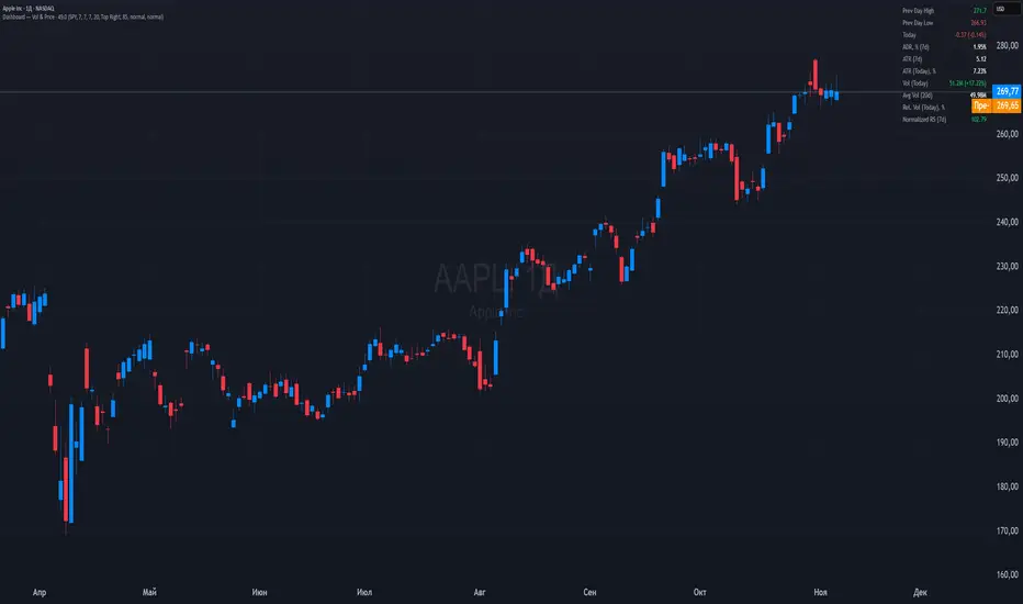
Dashboard — Vol & PriceDashboard for traders
Indicator Description
1. Prev Day High
What it shows: the previous trading day's high.
Why it shows: a resistance level. Many traders watch to see if the price will hold above or below this level. A breakout can signal buying strength.
2. Prev Day Low
What it shows: the previous day's low.
Why it shows: a support level. If the price breaks downwards, it signals weakness and a possible continuation of the decline.
3. Today
What it shows:
The difference between the current price and yesterday's close (in absolute values and as a percentage).
Color: green for an increase, red for a decrease.
Why it shows: immediately shows how strong a gap or movement is today relative to yesterday. This is an indicator of current momentum.
4. ADR, % (Average Daily Range)
What it shows: Average daily range (High – Low), expressed as a percentage of the closing price, for the selected period (default 7 days).
Why it's useful: To understand the "normal" volatility of an instrument. For example, if the ADR is 3%, then a 1% move is small, while a 6% move is very large.
5. ATR (Average True Range)
What it shows: Average fluctuation range (including gaps), in absolute points, for the specified period (default 7 days).
Why it's useful: A classic volatility indicator. Useful for setting stops, calculating position sizes, and identifying "noise" movements.
6. ATR (Today), %
What it shows: How much the current movement today (from yesterday's close to the current price) represents in % of the average ATR.
Why it shows: Shows whether the instrument has "played out" its average range. If the value is already >100%, there is a high probability that the movement will begin to slow.
7. Vol (Today)
What it shows:
Current trading volume for the day (in millions/billions).
Comparison with yesterday as a percentage (for example: 77.32M (-52.78%)).
Color: green if the volume is higher than yesterday; red if lower.
Why it shows:Quickly shows whether the market is active today. Volume = fuel for price movement.
8. Avg Vol (20d)
What it shows: Average daily volume over the last 20 trading days.
Why it's useful:"normal" activity level. It's a convenient backdrop for assessing today's turnover.
9. Rel. Vol (Today), % (Relative Volume)
What it shows: Deviation of the current volume from the average (20 days).
Formula: `(today / average - 1)` * 100`.
+30% = volume 30% above average, -40% = 40% below average.
Color: green for +, red for –.
Why it's useful:A key indicator for a trader. If RelVol > 100% (green), the market is "charged," and the movement is more significant. If low, activity is weak and movements are less reliable.
10. Normalized RS (Relative Strength)
What it shows: the relative strength of a stock to a selected benchmark (e.g., SPY), normalized by the period (default 7 days).
100 = same result as the market.
> 100 = the stock is stronger than the index.
<100 = weaker than the index.
Why it's needed: filtering ideas. Strong stocks rise faster when the market rises, weak stocks fall more sharply. This helps trade in the direction of the trend and select the best candidates.
In summary:
Prev High / Low — key support and resistance levels.
Today — an instant understanding of the current momentum.
ADR and ATR — volatility and potential movement.
ATR (Today) — how much the instrument has already "run."
Vol + Rel.Vol — activity and confirmation of the movement's strength.
RS — selecting strong/weak leaders against the market.
Period Range AnalyzerThis indicator analyzes a specific periodic range, which can start from a fixed date or a defined lookback period. It draws percentage levels and colored zones between the highest and lowest price. It also displays a detailed information table, which shows the price's position within the range in "Trend" mode, and the relative strength of currency pairs in "Forex" mode. The current price position is also indicated by a label with a percentage value and the name of the corresponding zone.
User Guide
Calculation Method
This setting determines how the indicator defines the range used for the calculation.
Lookback Period: In this mode, the indicator uses the last N candles (the number can be specified in the "Lookback Period (bars)" field). The range (the highest and lowest price) is "floating," meaning it is recalculated with each new candle based on the last N candles.
Date Based: In this mode, the calculation starts from a fixed date and time you select. The indicator finds the opening price of the start date and continuously tracks the highest and lowest price from that point on. This mode is ideal for measuring performance from a specific event (e.g., start of a week/month/year, news).
Data Handling Note: If you select a date in "Date Based" mode for which no data is available on the current timeframe (e.g., switching to a very low timeframe), the indicator will automatically use the earliest available candle as the starting point. All calculations (Open, Max, Min, Range, Percentage, Change, Trend) are based on this actual start date.
Start Date & Time
This setting is only active in "Date Based" mode.
Here you can specify the fixed starting point for the calculation.
The specified time is in the Exchange timezone.
Important limitation: Due to TradingView platform limits, visual elements (levels, zones) are only drawn for a maximum of 250 candles back. If the set date is older than this, the calculation still applies to the entire period (from the set date), but the drawing only covers the last 250 candles. The table always displays accurate data for the entire period.
When switching to a higher timeframe, the range may restart from a slightly later bar due to TradingView's bar alignment. For best accuracy, set your timeframe first, then select the start date.
Table Mode
This setting controls what data the information table displays.
Trend: This is the default mode, which works on any symbol (stock, index, crypto, etc.). It displays information related to the trend and the range.
Forex: This is a special mode used to measure the strength of currency and crypto pairs. It only works on symbols with exactly 6 characters (e.g., "EURUSD", "BTCUSD"). It treats the first 3 characters as the base currency (e.g., EUR) and the last 3 as the quote currency (e.g., USD). If the symbol does not have 6 characters, the table will automatically display in "Trend" mode.
Trend
This trend determination operates based on the formation order of the high and low within the analyzed range:
Its switch is located in the “Table Additional Rows” menu.
Bullish: Indicated if the low was formed before the high (on different candles). Or if they formed on the same candle, it was a bullish candle.
Bearish: Indicated if the high was formed before the low (on different candles). Or if they formed on the same candle, it was a bearish candle.
Neutral: Indicated if the high and low formed on the same candle, and it was a "doji" candle (close = open).
Upper & Lower Threshold
These settings (Upper Threshold (%) and Lower Threshold (%) in the "Label Coloring" section) primarily determine the state (Bullish/Bearish/Neutral) of the top row of the table.
The logic is not based on the percentage change of the price movement, but on the current price's position within the range, where the bottom of the range is 0% and the top is 100%.
Upper Threshold (%): The percentage level (e.g., 60.0) above which the indicator considers the price position "Bullish" (or "Strong").
Lower Threshold (%): The percentage level (e.g., 40.0) below which the indicator considers the price position "Bearish" (or "Weak").
If the price is between the two (e.g., between 40% and 60%), the signal is Neutral.
Secondary function: These thresholds also control the color of the label next to the price, provided the "Dynamic Label Coloring" option is enabled.

Range Percentage Analyzer This indicator is a tool for analyzing the market range and trend. It calculates the extent of price movement between a specified starting point and the current price, displaying it as a percentage.
The calculation can be based on a fixed lookback period (e.g., the last 30 candles) or from a fixed start date. It also provides a clear table that shows the general trend in "Trend" mode, and the relative strength of the base and quote currencies of forex pairs (e.g., EURUSD) in "Forex" mode.
User Guide
Calculation Method
This setting determines how the indicator defines the starting point for the calculation.
Lookback Period: In this mode, the indicator uses the last N candles (the number can be specified in the "Lookback Period (bars)" field, maximum 250).
The starting point is "floating," meaning it shifts with each new candle. For example, with a setting of 30, the 30th candle from the current one will always be the starting point.
Date Based: In this mode, the calculation starts from a fixed date and time you select.
This mode is ideal for measuring performance from a specific event (e.g., news, start of a week/month).
Note: If you select a date in "Date Based" mode for which no data is available on the current timeframe (e.g., switching to a very low timeframe), the indicator will automatically use the earliest available candle as the starting point.
Start Date & Time
This setting is only active in "Date Based" mode.
Here you can specify the fixed starting point for the calculation.
The specified time is in the Exchange timezone.
Important limitation: Due to TradingView platform limits, visual elements (box, line) are only drawn for a maximum of 250 candles back.
If the set date is older than this, the calculation still applies to the entire period (from the set date), but the drawing only covers the last 250 candles.
When switching to a higher timeframe, the range may restart from a slightly later bar due to TradingView's bar alignment. For best accuracy, set your timeframe first, then select the start date.
Table Mode
This setting controls what data the information table displays.
Trend: This is the default mode, which works on any symbol (stock, index, crypto, etc.). It displays information related to the trend.
Forex: This is a special mode used to measure the strength of currency pairs.
It only works on symbols with exactly 6 characters (e.g., "EURUSD", "BTCUSD"). It treats the first 3 characters as the base currency (e.g., EUR) and the last 3 as the quote currency (e.g., USD).
If the symbol does not have 6 characters, the table will automatically display in "Trend" mode.
Extremes Trend Row
If this is enabled, the table displays an additional row that determines the trend based on the formation order of the high and low within the analyzed range.
The logic is as follows:
Bullish: Indicated if the low was formed before the high.
(Or if they formed on the same candle, which was a bullish candle).
Bearish: Indicated if the high was formed before the low.
(Or if they formed on the same candle, which was a bearish candle).
Neutral: Indicated if the high and low formed on the same candle, and it was a "doji" candle (close = open).
Upper & Lower Threshold
These settings control the logic for the "Change Trend" and "Forex Display" rows at the top of the table.
They determine when the total percentage change for the entire period is considered "Bullish/Strong", "Bearish/Weak", or "Neutral".
Upper Threshold (%): The percentage value (default 0.1%) above which the indicator considers the change "Bullish/Strong".
Lower Threshold (%): The percentage value (default -0.1%) below which the indicator considers the change "Bearish/Weak".
If the change is between the two, the signal is Neutral.

Advanced Speedometer Gauge [PhenLabs]Advanced Speedometer Gauge
Version: PineScript™v6
📌 Description
The Advanced Speedometer Gauge is a revolutionary multi-metric visualization tool that consolidates 13 distinct trading indicators into a single, intuitive speedometer display. Instead of cluttering your workspace with multiple oscillators and panels, this gauge provides a unified interface where you can switch between different metrics while maintaining consistent visual interpretation.
Built on PineScript™ v6, the indicator transforms complex technical calculations into an easy-to-read semi-circular gauge with color-coded zones and a precision needle indicator. Each of the 13 available metrics has been carefully normalized to a 0-100 scale, ensuring that whether you’re analyzing RSI, volume trends, or volatility extremes, the visual interpretation remains consistent and intuitive.
The gauge is designed for traders who value efficiency and clarity. By consolidating multiple analytical perspectives into one compact display, you can quickly assess market conditions without the visual noise of traditional multi-indicator setups. All metrics are non-overlapping, meaning each provides unique insights into different aspects of market behavior.
🚀 Points of Innovation
13 selectable metrics covering momentum, volume, volatility, trend, and statistical analysis, all accessible through a single dropdown menu
Universal 0-100 normalization system that standardizes different indicator scales for consistent visual interpretation across all metrics
Semi-circular gauge design with 21 arc segments providing smooth precision and clear visual feedback through color-coded zones
Non-redundant metric selection ensuring each indicator provides unique market insights without analytical overlap
Advanced metrics including MFI (volume-weighted momentum), CCI (statistical deviation), Volatility Rank (extended lookback), Trend Strength (ADX-style), Choppiness Index, Volume Trend, and Price Distance from MA
Flexible positioning system with 5 chart locations, 3 size options, and fully customizable color schemes for optimal workspace integration
🔧 Core Components
Metric Selection Engine: Dropdown interface allowing instant switching between 13 different technical indicators, each with independent parameter controls
Normalization System: All metrics converted to 0-100 scale using indicator-specific algorithms that preserve the statistical significance of each measurement
Semi-Circular Gauge: Visual display using 21 arc segments arranged in curved formation with two-row thickness for enhanced visibility
Color Zone System: Three distinct zones (0-40 green, 40-70 yellow, 70-100 red) providing instant visual feedback on metric extremes
Needle Indicator: Dynamic pointer that positions across the gauge arc based on precise current metric value
Table Implementation: Professional table structure ensuring consistent positioning and rendering across different chart configurations
🔥 Key Features
RSI (Relative Strength Index): Classic momentum oscillator measuring overbought/oversold conditions with adjustable period length (default 14)
Stochastic Oscillator: Compares closing price to price range over specified period with smoothing, ideal for identifying momentum shifts
MFI (Money Flow Index): Volume-weighted RSI that combines price movement with volume to measure buying and selling pressure intensity
CCI (Commodity Channel Index): Measures statistical deviation from average price, normalized from typical -200 to +200 range to 0-100 scale
Williams %R: Alternative overbought/oversold indicator using high-low range analysis, inverted to match 0-100 scale conventions
Volume %: Current volume relative to moving average expressed as percentage, capped at 100 for extreme spikes
Volume Trend: Cumulative directional volume flow showing whether volume is flowing into up moves or down moves over specified period
ATR Percentile: Current Average True Range position within historical range using specified lookback period (default 100 bars)
Volatility Rank: Close-to-close volatility measured against extended historical range (default 252 days), differs from ATR in calculation method
Momentum: Rate of change calculation showing price movement speed, centered at 50 and normalized to 0-100 range
Trend Strength: ADX-style calculation using directional movement to quantify trend intensity regardless of direction
Choppiness Index: Measures market choppiness versus trending behavior, where high values indicate ranging markets and low values indicate strong trends
Price Distance from MA: Measures current price over-extension from moving average using standard deviation calculations
🎨 Visualization
Semi-Circular Arc Display: Curved gauge spanning from 0 (left) to 100 (right) with smooth progression and two-row thickness for visibility
Color-Coded Zones: Green zone (0-40) for low/oversold conditions, yellow zone (40-70) for neutral readings, red zone (70-100) for high/overbought conditions
Needle Indicator: Downward-pointing triangle (▼) positioned precisely at current metric value along the gauge arc
Scale Markers: Vertical line markers at 0, 25, 50, 75, and 100 positions with corresponding numerical labels below
Title Display: Merged cell showing “𓄀 PhenLabs” branding plus currently selected metric name in monospace font
Large Value Display: Current metric value shown with two decimal precision in large text directly below title
Table Structure: Professional table with customizable background color, text color, and transparency for minimal chart obstruction
📖 Usage Guidelines
Metric Selection
Select Metric: Default: RSI | Options: RSI, Stochastic, Volume %, ATR Percentile, Momentum, MFI (Money Flow), CCI (Commodity Channel), Williams %R, Volatility Rank, Trend Strength, Choppiness Index, Volume Trend, Price Distance | Choose the technical indicator you want to display on the gauge based on your current analytical needs
RSI Settings
RSI Length: Default: 14 | Range: 1+ | Controls the lookback period for RSI calculation, shorter periods increase sensitivity to recent price changes
Stochastic Settings
Stochastic Length: Default: 14 | Range: 1+ | Lookback period for stochastic calculation comparing close to high-low range
Stochastic Smooth: Default: 3 | Range: 1+ | Smoothing period applied to raw stochastic value to reduce noise and false signals
Volume Settings
Volume MA Length: Default: 20 | Range: 1+ | Moving average period used to calculate average volume for comparison with current volume
Volume Trend Length: Default: 20 | Range: 5+ | Period for calculating cumulative directional volume flow trend
ATR and Volatility Settings
ATR Length: Default: 14 | Range: 1+ | Period for Average True Range calculation used in ATR Percentile metric
ATR Percentile Lookback: Default: 100 | Range: 20+ | Historical range used to determine current ATR position as percentile
Volatility Rank Lookback (Days): Default: 252 | Range: 50+ | Extended lookback period for Volatility Rank metric using close-to-close volatility
Momentum and Trend Settings
Momentum Length: Default: 10 | Range: 1+ | Lookback period for rate of change calculation in Momentum metric
Trend Strength Length: Default: 20 | Range: 5+ | Period for directional movement calculations in ADX-style Trend Strength metric
Advanced Metric Settings
MFI Length: Default: 14 | Range: 1+ | Lookback period for Money Flow Index calculation combining price and volume
CCI Length: Default: 20 | Range: 1+ | Period for Commodity Channel Index statistical deviation calculation
Williams %R Length: Default: 14 | Range: 1+ | Lookback period for Williams %R high-low range analysis
Choppiness Index Length: Default: 14 | Range: 5+ | Period for calculating market choppiness versus trending behavior
Price Distance MA Length: Default: 50 | Range: 10+ | Moving average period used for Price Distance standard deviation calculation
Visual Customization
Position: Default: Top Right | Options: Top Left, Top Right, Bottom Left, Bottom Right, Middle Right | Controls gauge placement on chart for optimal workspace organization
Size: Default: Normal | Options: Small, Normal, Large | Adjusts overall gauge dimensions and text size for different monitor resolutions and preferences
Low Zone Color (0-40): Default: Green (#00FF00) | Customize color for low/oversold zone of gauge arc
Medium Zone Color (40-70): Default: Yellow (#FFFF00) | Customize color for neutral/medium zone of gauge arc
High Zone Color (70-100): Default: Red (#FF0000) | Customize color for high/overbought zone of gauge arc
Background Color: Default: Semi-transparent dark gray | Customize gauge background for contrast and chart integration
Text Color: Default: White (#FFFFFF) | Customize all text elements including title, value, and scale labels
✅ Best Use Cases
Quick visual assessment of market conditions when you need instant feedback on whether an asset is in extreme territory across multiple analytical dimensions
Workspace organization for traders who monitor multiple indicators but want to reduce chart clutter and visual complexity
Metric comparison by switching between different indicators while maintaining consistent visual interpretation through the 0-100 normalization
Overbought/oversold identification using RSI, Stochastic, Williams %R, or MFI depending on whether you prefer price-only or volume-weighted analysis
Volume analysis through Volume %, Volume Trend, or MFI to confirm price movements with corresponding volume characteristics
Volatility monitoring using ATR Percentile or Volatility Rank to identify expansion/contraction cycles and adjust position sizing
Trend vs range identification by comparing Trend Strength (high values = trending) against Choppiness Index (high values = ranging)
Statistical over-extension detection using CCI or Price Distance to identify when price has deviated significantly from normal behavior
Multi-timeframe analysis by duplicating the gauge on different timeframe charts to compare metric readings across time horizons
Educational purposes for new traders learning to interpret technical indicators through consistent visual representation
⚠️ Limitations
The gauge displays only one metric at a time, requiring manual switching to compare different indicators rather than simultaneous multi-metric viewing
The 0-100 normalization, while providing consistency, may obscure the raw values and specific nuances of each underlying indicator
Table-based visualization cannot be exported or saved as an image separately from the full chart screenshot
Optimal parameter settings vary by asset type, timeframe, and market conditions, requiring user experimentation for best results
💡 What Makes This Unique
Unified Multi-Metric Interface: The only gauge-style indicator offering 13 distinct metrics through a single interface, eliminating the need for multiple oscillator panels
Non-Overlapping Analytics: Each metric provides genuinely unique insights—MFI combines volume with price, CCI measures statistical deviation, Volatility Rank uses extended lookback, Trend Strength quantifies directional movement, and Choppiness Index measures ranging behavior
Universal Normalization System: All metrics standardized to 0-100 scale using indicator-appropriate algorithms that preserve statistical meaning while enabling consistent visual interpretation
Professional Visual Design: Semi-circular gauge with 21 arc segments, precision needle positioning, color-coded zones, and clean table implementation that maintains clarity across all chart configurations
Extensive Customization: Independent parameter controls for each metric, five position options, three size presets, and full color customization for seamless workspace integration
🔬 How It Works
1. Metric Calculation Phase:
All 13 metrics are calculated simultaneously on every bar using their respective algorithms with user-defined parameters
Each metric applies its own specific calculation method—RSI uses average gains vs losses, Stochastic compares close to high-low range, MFI incorporates typical price and volume, CCI measures deviation from statistical mean, ATR calculates true range, directional indicators measure up/down movement, and statistical metrics analyze price relationships
2. Normalization Process:
Each calculated metric is converted to a standardized 0-100 scale using indicator-appropriate transformations
Some metrics are naturally 0-100 (RSI, Stochastic, MFI, Williams %R), while others require scaling—CCI transforms from ±200 range, Momentum centers around 50, Volume ratio caps at 2x for 100, ATR and Volatility Rank calculate percentile positions, and Price Distance scales by standard deviations
3. Gauge Rendering:
The selected metric’s normalized value determines the needle position across 21 arc segments spanning 0-100
Each arc segment receives its color based on position—segments 0-8 are green zone, segments 9-14 are yellow zone, segments 15-20 are red zone
The needle indicator (▼) appears in row 5 at the column corresponding to the current metric value, providing precise visual feedback
4. Table Construction:
The gauge uses TradingView’s table system with merged cells for title and value display, ensuring consistent positioning regardless of chart configuration
Rows are allocated as follows: Row 0 merged for title, Row 1 merged for large value display, Row 2 for spacing, Rows 3-4 for the semi-circular arc with curved shaping, Row 5 for needle indicator, Row 6 for scale markers, Row 7 for numerical labels at 0/25/50/75/100
All visual elements update on every bar when barstate.islast is true, ensuring real-time accuracy without performance impact
💡 Note:
This indicator is designed for visual analysis and market condition assessment, not as a standalone trading system. For best results, combine gauge readings with price action analysis, support and resistance levels, and broader market context. Parameter optimization is recommended based on your specific trading timeframe and asset class. The gauge works on all timeframes but may require different parameter settings for intraday versus daily/weekly analysis. Consider using multiple instances of the gauge set to different metrics for comprehensive market analysis without switching between settings.

Total Info Indicator by MikePenzin
Install & Add to Chart
• Copy the script into Pine Editor → click Add to Chart .
• Open the ⚙️ Settings → Inputs to customize.
What It Does
• Displays key info in a floating table — trend, volume, ATR, RSI, stop loss, and more.
• Detects breakouts , smart SELL signals , and opening strength .
• Uses emojis and colours to make trends easy to read: 🟢 good, 🟡 neutral, 🔴 risky.
For Swing Traders
• Works best on Daily or 4H charts.
• Watch for 🟢 Uptrend + ⚡BUY / 🔥BUY breakout signals.
• Use ATR-based Stop Loss (shown in table).
• Avoid new entries a few days before earnings.
Suggested Setup
• 20/50/150 MA Lines: ON
• 200 MA Line: optional
• ATR Multiplier: 1.3
• Breakout Detection: ON (Volume + RSI + Trend filters)
• Smart SELLs: ON (RSI 70, EMA 20)
• Pivots: ON for quick swing levels
How to Read
• MA Row: 🟢 = price above MA (bullish).
• ATR/Stop Loss: Suggests where to place protective stop.
• Volume Info: Today’s vs 20-day average, plus pace.
• RSI & CCI: Shows momentum and overbought/oversold levels.
• Breakouts: ⚡BUY (early), 🔥BUY (confirmed).
• Smart SELLs: RSI🔴 / DIV🟣 / EMA🔵 mean potential exit zones.
Example Use
1️⃣ Find stocks with Uptrend 🟢 , rising volume, and ⚡BUY signal.
2️⃣ Enter near breakout; set Stop = shown level.
3️⃣ Take profits or trail when Smart SELLs appear or RSI peaks.
Tips
• Choose table corner under “Table Visualization.”
• Reduce clutter on small timeframes (turn off Pivots/200 MA).
• Use “Volume speed” to spot surging interest before breakouts.
• Compatible with most equities and ETFs.
Disclaimer
This script is for education & analysis only .
Not financial advice — always manage your own risk.
