RSI Regimes + Cardwell Sweet SpotsRSI based upon Cardwell principles, with a strength evaluation based upon the ADX, VWAP, velocity of both, and Cardwell RSI principles of a sweet spot of a RSI.
Educational

Candle Identification + Cardwell Strength (w/ Slope Velocity)Identifies candle patterns pin bar, inside bar, outside bar, and shaved bars. The script also indicates the strength of the candle formation based upon Cardwell RSI principles, ADX, and price in relation to the VWAP.
The settings are available to the user to adjust for there specific style of trading.

TheGrowth Checklist// -----------------------------------------------------------------------------
// TheGrowth Checklist Indicator
// Authors: Prochyy & Filip Moskal (The Growth Elite Mentor) | © 2025
//
// This indicator is provided strictly for personal use.
// You are welcome to use it in your own trading if you find it valuable.
//
// However, you are NOT allowed to:
// – copy or redistribute this script,
// – sell, publish, or otherwise commercialize it,
// – modify and distribute altered versions,
// – claim this work as your own.
//
// This tool was created specifically for the trading strategy used within
// The Growth Elite community:
// filip-moskal.mykajabi.com
//
// Please respect the creators' work. Thank you.
// -----------------------------------------------------------------------------

𝐃𝐀𝐑𝐊 - 𝐓𝐄𝐑𝐌𝐈𝐍𝐀𝐋 🥷✅ DARK TERMINAL™ — Adaptive Liquidity & Trend Intelligence System
A multi-layered market analysis framework for professional traders
DARK TERMINAL™ is an advanced, all-in-one market intelligence system designed to help traders interpret market structure, trend pressure, and liquidity zones with exceptional clarity. Built with a hybrid logic of dynamic trend mapping and liquidity-based zones, this indicator assists traders in quickly understanding real-time directional bias, potential reversal areas, and high-probability continuation zones.
This system is engineered to simplify complex price behavior into clean, actionable visual layers — making it suitable for scalpers, intraday traders, and swing traders.
🔥 Core Components
1. Trend Cloud Mapping
The multi-shade trend cloud automatically adapts to momentum direction and volatility shifts.
It highlights real-time:
Bullish / Bearish phases
Transitional zones
Momentum compression areas
Potential breakout conditions
2. Dynamic Support & Resistance Levels
Automatically plotted zones update in real time and act as:
Liquidity reaction points
Smart breakout & breakdown levels
Trend continuation confirmation zones
3. Auto Buy/Sell Pressure Markers
The system identifies key price behavior shifts such as:
Momentum weakening
Liquidity grabs
Exhaustion zones
Reversal signals
These markers are NOT signals, but help visualize directional pressure.
4. Price Flow Ribbon (Midline Engine)
The mid-structure ribbon shows micro-trend behavior:
Price stability
Short-term reversal intention
Trend smoothing
Entry refinement zones
5. Algorithmic Zone Identification
Smart zone labeling automatically identifies:
Support zones
Resistance zones
Reaction clusters
Consolidation pockets
Useful for planning entries, exits, and risk levels.
🎯 How Traders Typically Use DARK TERMINAL™
Scalpers: Use micro trend shifts + support/resistance zones
Intraday traders: Use trend cloud direction + pressure markers
Swing traders: Use liquidity zones + structural transitions
Risk managers: Use dynamic volatility zones for stop placement
DARK TERMINAL™ is created to complement any existing trading strategy or work as a standalone market-reading toolkit.
📘 Important Notes
The Buy/Sell markers represent algorithm-detected behavioral shifts, not guaranteed trading signals.
Support/Resistance zones represent liquidity reactions, not fixed market levels.
Trend clouds adjust based on volatility, so shades may vary with market conditions.
⚠️ Disclaimer :
This indicator is provided strictly for educational and informational purposes only. Nothing in this tool, including but not limited to Buy/Sell markers, support/resistance labels, clouds, or any visual elements, should be interpreted as financial advice, trading signals, invitations to invest, or recommendations to buy or sell any instrument.
Trading and investing involve substantial risk, including the possible loss of capital. Market behavior is unpredictable, and past visual patterns or indicator behavior do not guarantee future performance. The developer of this script does not guarantee accuracy, profitability, or performance of this indicator and is not liable for any losses, damages, or decisions made based on the information displayed.
Users are solely responsible for their own trading decisions and must perform independent research, apply proper risk management, and consult a licensed financial advisor if necessary. By using this indicator, you agree that all trades you take are fully at your own risk.

RSI adaptive zones [AdaptiveRSI]This script introduces a unified mathematical framework that auto-scales oversold/overbought and support/resistance zones for any period length. It also adds true RSI candles for spotting intrabar signals.
Built on the Logit RSI foundation, this indicator converts RSI into a statistically normalized space, allowing all RSI lengths to share the same mathematical footing.
What was once based on experience and observation is now grounded in math.
✦ ✦ ✦ ✦ ✦
💡 Example Use Cases
RSI(14): Classic overbought/oversold signals + divergence
Support in an uptrend using RSI(14)
Range breakouts using RSI(21)
Short-term pullbacks using RSI(5)
✦ ✦ ✦ ✦ ✦
THE PAST: RSI Interpretation Required Multiple Rulebooks
Over decades, RSI practitioners discovered that RSI behaves differently depending on trend and lookback length:
• In uptrends, RSI tends to hold higher support zones (40–50)
• In downtrends, RSI tends to resist below 50–60
• Short RSIs (e.g., RSI(2)) require far more extreme threshold values
• Longer RSIs cluster near the center and rarely reach 70/30
These observations were correct — but lacked a unifying mathematical explanation.
✦ ✦ ✦ ✦ ✦
THE PRESENT: One Framework Handles RSI(2) to RSI(200)
Instead of using fixed thresholds (70/30, 90/10, etc.), this indicator maps RSI into a normalized statistical space using:
• The Logit transformation to remove 0–100 scale distortion
• A universal scaling based on 2/√(n−1) scaling factor to equalize distribution shapes
As a result, RSI values become directly comparable across all lookback periods.
✦ ✦ ✦ ✦ ✦
💡 How the Adaptive Zones Are Calculated
The adaptive framework defines RSI zones as statistical regimes derived from the Logit-transformed RSI .
Each boundary corresponds to a standard deviation (σ) threshold, scaled by 2/√(n−1), making RSI distributions comparable across periods.
This structure was inspired by Nassim Nicholas Taleb’s body–shoulders–tails regime model:
Body (±0.66σ) — consolidation / equilibrium
Shoulders (±1σ to ±2.14σ) — trending region
Tails (outside of ±2.14σ) — rare, high-volatility behavior
Transitions between these regimes are defined by the derivatives of the position (CDF) function :
• ±1σ → shift from consolidation to trend
• ±√3σ → shift from trend to exhaustion
Adaptive Zone Summary
Consolidation: −0.66σ to +0.66σ
Support/Resistance: ±0.66σ to ±1σ
Uptrend/Downtrend: ±1σ to ±√3σ
Overbought/Oversold: ±√3σ to ±2.14σ
Tails: outside of ±2.14σ
✦ ✦ ✦ ✦ ✦
📌 Inverse Transformation: From σ-Space Back to RSI
A final step is required to return these statistically normalized boundaries back into the familiar 0–100 RSI scale. Because the Logit transform maps RSI into an unbounded real-number domain, the inverse operation uses the hyperbolic tangent function to compress σ-space back into the bounded RSI range.
RSI(n) = 50 + 50 · tanh(z / √(n − 1))
The result is a smooth, mathematically consistent conversion where the same statistical thresholds maintain identical meaning across all RSI lengths, while still expressing themselves as intuitive RSI values traders already understand.
✦ ✦ ✦ ✦ ✦
Key Features
Mathematically derived adaptive zones for any RSI period
Support/resistance zone identification for trend-aligned reversals
Optional OHLC RSI bars/candles for intrabar zone interactions
Fully customizable zone visibility and colors
Statistically consistent interpretation across all markets and timeframes
Inputs
RSI Length — core parameter controlling zone scaling
RSI Display : Line / Bar / Candle visualization modes
✦ ✦ ✦ ✦ ✦
💡 How to Use
This indicator is a framework , not a binary signal generator.
Start by defining the question you want answered, e.g.:
• Where is the breakout?
• Is price overextended or still trending?
• Is the correction ending, or is trend reversing?
Then:
Choose the RSI length that matches your timeframe
Observe which adaptive zone price is interacting with
Interpret market behavior accordingly
Example: Long-Term Trend Assesment using RSI(200)
A trader may ask: "Is this a long term top?"
Unlikely, because RSI(200) holds above Resistance zone , therefore the trend remains strong.
✦ ✦ ✦ ✦ ✦
👉 Practical tip:
If you used to overlay weekly RSI(14) on a daily chart (getting a line that waits 5 sessions to recalculate), you can now read the same long-horizon state continuously : set RSI(70) on the daily chart (~14 weeks × 5 days/week = 70 days) and let the adaptive zones update every bar .
Note: It won’t be numerically identical to the weekly RSI due to lookback period used, but it tracks the same regime on a standardized scale with bar-by-bar updates.
✦ ✦ ✦ ✦ ✦
Note: This framework describes statistical structure, not prediction. Use as part of a complete trading approach. Past behavior does not guarantee future outcomes.
framework ≠ guaranteed signal
---
Attribution & License
This indicator incorporates:
• Logit transformation of RSI
• Variance scaling using 2/√(n−1)
• Zone placement derived from Taleb’s body–shoulders–tails regime model and CDF derivatives
• Inverse TANH(z) transform for mapping z-scores back into bounded RSI space
Released under CC BY-NC-SA 4.0 — free for non-commercial use with credit.
© AdaptiveRSI

Sellers vs Buyers 2Pressure Gauges (Custom “Buyer/Seller Pressure” Indicators)
These combine volume, price momentum, and imbalances.
Green bars/lines indicate buying pressure
Red bars/lines indicate selling pressure

StockInfo: Sector/Industry /MarketCapThis indicator is designed to give traders a quick, accurate, and clean snapshot of the business fundamentals behind any Indian stock — directly on the chart. With a focus on the needs of retail investors, swing traders, and position traders, this tool displays the most important classification details used in market analysis:
✔ Sector
✔ Industry
✔ Market-Cap Category (Large / Mid / Small Cap – SEBI aligned)
✔ Stock Symbol (Exchange:Ticker)
All information is shown in a compact, customizable table, positioned neatly on the chart without disturbing your technical analysis.
Why this indicator is useful
1️⃣ Know what you are trading — instantly
Many traders unknowingly enter trades without checking whether a stock is:
part of the right sector cycle
in a strong or weak industry
a large, mid, or small cap
This tool puts that information right in front of you, saving time and preventing mistakes.
2️⃣ Helps identify sector rotation & industry strength
Sector and industry trends often drive strong multi-week moves.
This indicator allows you to:
Quickly compare a stock’s sector with others
Spot sector rotation early
Filter stocks based on industry strength
Perfect for momentum, trend, and positional traders.
3️⃣ Automatic Market-Cap Classification (SEBI-aligned)
The script automatically categorizes stocks into:
LARGE CAP (safe, stable, institutional favourites)
MID CAP (growth stage, volatile but rewarding)
SMALL CAP (high-risk, high-reward)
Great for risk profiling and deciding correct position size and portfolio allocation.
4️⃣ Fully Customisable User Interface
You can change:
Table position (all four corners)
Font size (Tiny → Huge)
Header & value colors
Background colors
Border color & width
Which rows to display
This keeps the indicator clean and flexible for every type of chart layout.
5️⃣ Perfect for Traders Who Combine Fundamentals + Technicals
This is not a heavy fundamental tool.
Instead, it gives you exactly the core business details you need while performing technical analysis.
Useful for:
Swing traders
Position traders
Portfolio allocation
Index-relative comparison
Sector/industry-based screening
How traders typically use this indicator
Identify the sector leader in a breakout
Avoid weak or declining industries
Confirm if a stock fits your risk profile
Quickly check classification during live market
Build thematic watchlists (Auto, IT, Pharma, PSU, Defense, etc.)
Avoid mixing small-caps into large-cap strategies
Compare sector rotation with Nifty, Bank Nifty & broader indices
Conclusion
This indicator enhances any chart by adding high-level business intelligence directly on screen.
It improves decision-making, reduces time spent switching between windows, and keeps your analysis complete — all in one place.
If you trade Indian equities, this is one of the simplest yet most powerful fundamental overlays you can add to your workflow.

Pivot & GapPIVOT and GAP – Indicator
PIVOT and GAP is an advanced structural price-action tool designed to detect hidden imbalances in the market by analyzing gap and pivot formations between candles.
It identifies areas where institutional activity may have left a price void, signaling potential Demand or Supply Zones. When these imbalances align with lower-timeframe zones, the probability of a powerful price reaction increases.
This indicator is built for traders who want to combine gap analysis, price-action structure, with multi-timeframe confluence to make smarter trading decisions.
How Does It Work?
The indicator automatically scans candles for two types of imbalances:
1. Demand-Side Imbalances
PIVOT (Demand Pivot Creation)
A Demand Pivot forms when:
a bearish candle is followed by a bullish candle, and
There is a gap/price difference between the bearish candle’s close and the
bullish candle’s open. A blue color box is created
This signals buyers stepping in aggressively after sellers weaken.
GAP (Demand Gap Creation)
A Demand Gap forms when:
two consecutive bullish candles appear, and there is a positive difference between
the first candle’s close and the next candle’s open.
A blue color box is created
This implies strong upward momentum with institutional buying pressure.
2. Supply-Side Imbalances
PIVOT (Supply Pivot Creation)
A Supply Pivot forms when:
A bullish candle is followed by a bearish candle, and
There is a gap/price difference between the bullish candle’s close and the
bearish candle’s open. A red color box is created
This signals sellers stepping in aggressively after buyers exhaust.
GAP (Supply Gap Creation)
A Supply Gap forms when:
Two consecutive bearish candles appear, and There is a negative difference between
the first candle’s close and the next candle’s open.
A red color box is created
This reflects strong downward momentum with institutional selling pressure.
Higher Timeframe Confirmation:
The indicator performs gap and pivot analysis on higher timeframes, and
If combine with Demand Zone or Supply Zone on the lower timeframe which forms on the same candle.
That zone becomes a High-Probability Zone.
Such zones are considered more powerful because they combine:
• Higher timeframe institutional imbalance
• Strong confluence for reversal or continuation
• Demand and Supply zone creation at Lower Time Frame
How Traders Benefit from It?
High-Probability Zones combining HTF imbalance + LTF zone gives traders clearer areas with higher success probability.
Early Detection of Institutional Moves
Gaps and pivots typically occur where big players enter or exit positions.
Reduces Chart Noise
Instead of guessing where a zone matters, the indicator highlights only those backed by real price imbalances.
What Makes This Indicator Unique?
1. Candle-by-Candle Imbalance Detection
Instead of simple gap detection, this indicator reads the difference in open-close levels with high precision.
2. HTF–LTF Confluence Logic
When the same candle shows imbalance on HTF and a Demand & Supply zone on LTF, the zone is tagged as powerful — a unique decision layer not commonly seen in other scripts.
3. Designed From Your Custom Rules
This structure is built from your personal interpretation of how pivots and gaps create pressure zones — not copied from other scripts.
How This Indicator Is Original ?
The entire logic is created from my own rules of identifying pivots and
gaps, not from any open-source or public code.
The unique combination of:
Gap detection
Pivot shift logic
Direction-specific candle sequence
Multi-timeframe zone alignment
No repurposed or copied logic from existing demand-supply indicators.
The design reflects our personal trading experience, analysis style, and
custom definitions of imbalance.
Disclaimer:
This indicator is created for educational purposes.
It does not provide buy or sell signals, and it should not be considered financial advice.
Trading involves risk, and users should perform their own analysis before taking any positions.

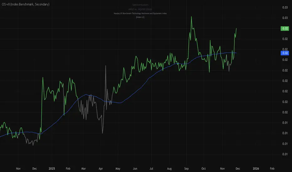
stock-vs-industry using NQUSB benchmark idexesOriginal idea from Stock versus Industry by Tr33man .
━━━━━━━━━━━━━━━━━━━━━━━━━━━━━━━━━━━━━━━━
═══ PRIMARY IMPROVEMENT: NQUSB Hierarchical Index Benchmarks ═══
The KEY improvement: Multi-Level Industry Granularity with Drill-Down/Drill-Up Navigation
From: Simple ETF Comparison (1 Level) Stock → Industry ETF (e.g., "SOXX" for all semiconductors)
To: NQUSB Hierarchical Comparison (4 Levels)
Level 4 (Primary): NQUSB10102010 → Semiconductors (most specific)
Level 3 (Secondary): NQUSB101020 → Technology Hardware and Equipment
Level 2 (Tertiary): NQUSB101010 → Software and Computer Services
Level 1 (Quaternary): NQUSB10 → Technology (broadest sector)
Users can now drill up and down the industry hierarchy to see how their stock performs against different levels of industry classification!
━━━━━━━━━━━━━━━━━━━━━━━━━━━━━━━━━━━━━━━━
═══ WHY THIS MATTERS ═══
Original Limitations:
Single comparison level - ETF only
No drill-down capability - Can't zoom in to more specific industries
No drill-up capability - Can't zoom out to broader sectors
ETF limitations - Not all industries have dedicated ETFs
Arbitrary mappings - Manual ETF selection may not represent true industry
Improved Capabilities:
4-level hierarchical navigation - Drill-down and drill-up through industry classifications
361 NQUSB official indices - NASDAQ US Benchmark Index structure
Official NASDAQ classification - Industry-standard taxonomy
Large Mid Cap (LM) option - Focus on larger companies when needed
Enhanced UI - Clear level indicators and full index descriptions
━━━━━━━━━━━━━━━━━━━━━━━━━━━━━━━━━━━━━━━━
═══ EXAMPLE: ANALYZING NVDA (Semiconductors) ═══
Level 4 - Primary (Most Specific):
NQUSB10102010 - Semiconductors
→ NVDA vs. AMD, AVGO, QCOM, TXN, etc. (direct competitors)
Level 3 - Secondary (Broader):
NQUSB101020 - Tech Hardware & Equipment
→ NVDA vs. AAPL, CSCO + semiconductors
Level 2 - Tertiary (Even Broader):
NQUSB101010 - Software and Computer Services
→ NVDA vs. all tech hardware
Level 1 - Quaternary (Broadest):
NQUSB10 - Technology Sector
→ NVDA vs. entire technology sector
You can now zoom in to see direct competitors or zoom out to understand macro sector trends - all in one indicator!
━━━━━━━━━━━━━━━━━━━━━━━━━━━━━━━━━━━━━━━━
═══ COMPARISON SUMMARY ═══
Original Version:
Comparison System: Industry ETFs
Industry Levels: 1 (flat ETF mapping)
Total Classifications: ~140 industries
Hierarchy Navigation: ❌ No
Data Source: Manual ETF curation
Improved Version:
Comparison System: NQUSB Official Indices
Industry Levels: 4 (hierarchical drill-down/up)
Total Classifications: 361 NQUSB indices
Hierarchy Navigation: ✅ 4-level drill navigation
Data Source: NASDAQ official taxonomy
Large/Mid Cap Option: ✅ LM variant toggle
Level Indicator: ✅ to labels
━━━━━━━━━━━━━━━━━━━━━━━━━━━━━━━━━━━━━━━━
═══ ADDITIONAL FEATURES ═══
Dual Comparison System - Toggle between ETF mode (original) and Index Benchmark mode (NQUSB hierarchy)
Better Fallback Logic - Manual Override > NQUSB Index > ETF > SPY default
Enhanced Display - 4-row information table with full NQUSB index description
Backward Compatible - All original ETF mappings still work, existing charts won't break
Large Mid Cap Toggle - Optional "LM" suffix for focusing on larger companies only
━━━━━━━━━━━━━━━━━━━━━━━━━━━━━━━━━━━━━━━━
For complete documentation, data files, technical details, and the full NQUSB hierarchy structure, visit the GitHub repository.
The result: More accurate, more flexible, and more comprehensive industry strength analysis - enabling traders to understand exactly where their stock's performance comes from by drilling through multiple levels of industry classification.
Pin Bar Detector 「ED22x」Auto Pin Bar Function
- with 15M 30M 1H 4H 1D PinBar
自动测量PinBar并标示
- 包括长针周期调整
- 影线倍数
- 15M 30M 1H 4H 1D 周期PinBar
- RSI 触顶 / 触底 开关
By ED22x
X : ED22_x

Morning Box [Fax Academy]Morning Box — Precision Daily Bias Box for Professional Traders
Overview
Draws a daily box from a single 1-hour candle (default: 11:00 PM UTC) and extends it forward into the trading day.
Fully timezone-aware (Exchange or specific region). Box levels are locked after the hour closes — no repainting .
Clean, stable, and designed for consistency in all global markets.
What It Does
Selects exactly one 1-hour bar per day using a configurable 12h + AM/PM time input.
Plots a high–low box around that candle.
Provides flexible extension options:
Candle Only — limits box to the 1-hour range.
End of Day (TZ) — extends the box to the end of the selected timezone’s trading day.
Extend N Hours — customizable width for strategy-specific use.
Maintains only the current day's box; previous day’s box is automatically replaced.
Inputs
Timezone : UTC, Exchange, or region (Asia/Dhaka, Europe/London, America/New_York, etc.).
Target Hour (12h) + AM/PM : defines which 1-hour candle is used.
Extend Right : Candle Only, End of Day (TZ), or Extend N Hours.
Extend N Hours : number of hours if using the custom extension mode.
Box Styling : Color, transparency, border width.
How To Use
Works on any chart timeframe — the selected candle is always a true 1-hour bar in the chosen timezone.
Choose a meaningful Target Hour (e.g., NY close, Asia open).
Select extension style:
End of Day (TZ) → ideal for full-session framing
Extend N Hours → flexible for any strategy (e.g., Asia range, pre-London box)
Candle Only → minimal, high-precision range focus
Use the resulting box as a daily bias tool, liquidity pocket, or session anchor.
Best Practices
Align your Target Hour with key market transitions (NY close → Asia open for Forex/Gold).
Pair with:
EMA — for directional bias and structural confidence.
Sessions — for timing and volatility context.
Keep the “only today’s box” design for uncluttered daily workflow.
Defaults
Timezone: UTC
Target Hour: 11 PM
Extend Right: End of Day (TZ)
Colors: Fax Academy standard theme (fully editable)
Notes
Non-repainting — box values lock after the selected candle closes.
Works on all chart timeframes; vertical bounds always represent that day’s chosen 1-hour high/low.
Brand
Crafted by Fax Academy for traders who value simplicity, precision, and consistency.
Educational use only — not financial advice. Always validate concepts through backtesting and risk-managed execution.

Distance Dashboard (50DMA / 52W High / 20DMA)Distance Dashboard – Summary
The Distance Dashboard indicator provides a quick snapshot of where price is positioned relative to three key reference points:
Distance of current HIGH from the 50-day moving average (50DMA)
Helps gauge how extended price is above or below medium-term trend support.
Distance of current LOW from the 52-week HIGH
Shows how far price has pulled back from long-term highs.
Distance of current HIGH from the 20-day moving average (20DMA)
Measures short-term extension and potential overbought/overextended behaviour.
The indicator displays these values in a clean, movable table directly on the price chart.
It does not affect chart scaling and is designed for quick visual assessment of trend extension and relative strength.

Consolidation Breakout PRO — Clean Boxes + 200 EMA Trend Filter High-probability range breakout detector that draws perfect, always-visible consolidation boxes and only alerts when price breaks out with strong volume and (optionally) in the direction of the prevailing trend.
Features
Automatically draws and extends clean consolidation boxes in real time
Boxes stop extending the moment the breakout occurs — no more “ghost” lines
Optional but powerful 200 EMA trend filter (dramatically reduces false breakouts)
Stronger volume confirmation (default 1.8× the 20-period average, fully adjustable)
Auto-deletes old boxes so your chart stays perfectly clean even after hundreds of signals
Clear “BREAKOUT ↑” and “BREAKDOWN ↓” labels + ready-to-use alerts
Works on any market and any timeframe (best on 1H, 4H, Daily)
How to trade it (edge > 65 % when used correctly)
Wait for the labeled breakout candle to close
Enter on pullback/retest of the box edge (or on strong close + retest)
Stop-loss just outside the opposite side of the box
Take-profit: minimum 1:2, ideally measured move (box height added/subtracted) or trailing with the 20 EMA
This is the cleanest and most professional public consolidation breakout tool available in 2025 — no repainting, no lag, no chart clutter.
Created and continuously improved with love for the TradingView community.

BHUVANA Fib 50–61.8 • Turn Alerts when FIB directions change
Detects step-up / step-down on both Fib 50 & 61.8 (your “stairs” logic).
Triggers BUY/SELL on that slope change (optionally also requires price to be above/below the line).Spot volatility compression around the 50%–61.8% Fibonacci mid-band of the current swing, then trade the first expansion with clean, rules-based entries and auto SL references.
Swing mapping: Finds the active high/low over a user-defined lookback and computes Fib 50% and Fib 61.8%.
Squeeze detection: Measures the distance between 50% and 61.8%. If the band width is ≤ (ATR × multiplier), the zone is flagged as a Squeeze.
Breakout entries (on close):
Long when price crosses up through 50% while squeezed.
Short when price crosses down through 61.8% while squeezed.
Risk framework: Auto-plots stop lines from the signal bar:
Long SL = swing low; Short SL = swing high.
Visuals: Fib lines (50/61.8) + optional yellow zone highlight during squeeze.
Signals evaluate on bar close (no forward-looking data).
Works well on XAUUSD / US30 intraday (5–15m) during London/NY sessions.
Add your own alertcondition() lines if you want push alerts on Long/Short entries.

Fair Value Gaps [Fax Academy]FVG — Precision Fair Value Gap Detection for Professional Traders
Overview
Identifies and draws Fair Value Gaps (FVGs) using a refined 3-bar displacement model on the selected timeframe.
Optimized for Forex and Gold, but fully compatible with all instruments and timeframes.
Non-repainting, fast, and engineered to filter only meaningful imbalances.
ATR% or Points-based thresholds ensure cleaner charts; optional “latest only” mode and automatic gap removal on fill.
Detection Logic
Bullish FVG :
Current low > high from two bars ago, and the prior bar closes above that high at a source-timeframe boundary.
Bearish FVG :
Current high < low from two bars ago, and the prior bar closes below that low at a source-timeframe boundary.
All boxes anchor using xloc.bar_time for precise alignment with the source timeframe.
Inputs
Source Timeframe : Chart timeframe or any higher TF (1H, 4H, D, etc.)
Show Bullish / Show Bearish : Direction toggles.
Threshold Mode : Points or ATR % filter (dynamic). ATR length is internal; set your preferred percentage.
Min Gap (points) : Used when Threshold Mode = Points.
Extend Bars : How many bars the box extends to the right.
Show Latest Only : Only show the most recent gap.
Delete On Fill : Automatically remove gaps once price fully mitigates them.
Colors & Border Width : Fully adjustable styling.
How To Use
Select a Source Timeframe to map higher-TF FVGs onto lower-TF charts (e.g., 4H → 1H/15m).
Use ATR % filtering (10–20% recommended) to eliminate small, irrelevant gaps.
Enable “Latest Only” for a clean chart, or keep full history for multi-mitigation analysis.
Combine with:
EMA for trend + pullback structure.
Sessions for timing and volatility alignment.
Reading FVGs
Unmitigated FVGs can behave like magnets or supply/demand pockets.
In trending markets, fresh FVGs aligned with higher-TF bias offer high-quality continuation entries.
Filled gaps are automatically deleted when “Delete On Fill” is enabled.
Defaults
Bullish = ON, Bearish = ON
Threshold Mode: ATR % (10%)
Extend Bars: 1
Latest Only: OFF
Delete On Fill: ON
Colors: Dark Green (bullish), Dark Red (bearish)
Notes
Non-repainting — all detection occurs only when the source timeframe bar closes.
Works on any chart timeframe with perfect timestamp alignment.
If your chart lacks enough higher-TF bars, extend history or select a lower Source TF.
Brand
Developed by Fax Academy to bring precision, clarity, and professional-grade imbalance analysis to modern trading.
For educational and analytical purposes only — always combine with sound risk management and verification.

Forex Sessions [Fax Academy]Forex Sessions — Precision Session Mapping for Professional Traders
Overview
Highlights the four major FX sessions — Sydney, Tokyo, London, New York — directly on your chart.
Kill Zones: high-impact windows around the session open (default 10 minutes).
Timezone-aware with full DST support — sessions that cross midnight shade correctly.
Engineered for clean intraday context, overlap visibility, and professional session-based execution.
What It Shows
Kill Zones — bold-tinted windows around each session's open.
Full Session Shading — lighter background for the entire active window.
London–New York Overlap highlight for maximum-liquidity hours.
Inputs
Timezone
Exchange • UTC • Europe/London • America/New_York • Asia/Tokyo • Australia/Sydney
Use Exchange to automatically align with instrument time.
Per-Session Controls for Sydney, Tokyo, London, New York:
Kill Zone toggle + custom minutes (default 10)
Full Session toggle
Start/End hour (24h format)
How To Use
Set the Timezone first — regional options auto-adjust for DST (London/New York).
Enable Kill Zones to expose opening-volatility spikes and liquidity sweeps.
Tune session hours to match your broker if schedules differ from the global standard.
Watch the London–NY overlap for directional moves, breakouts, and trend continuation.
Practical Tips
Intraday Bias : Favor setups inside or shortly after Kill Zones that align with higher-timeframe structure.
Overlap Hours : Often produce the day’s key breakout/continuation legs.
Combine with:
EMA — pullback precision inside session windows.
FVG — imbalance-based entries during high-liquidity periods.
Defaults
Kill Zones: 10 minutes at each session open.
Full sessions: standard global FX windows (fully adjustable).
Color scheme: bold tint for Kill Zones, subtle tint for session ranges.
Notes
Non-repainting — all shading is based on confirmed chart bars.
Works on any instrument and any timeframe.
If a session’s opening bar is missing (holiday/limited trading), shading is automatically skipped.
Brand
Built by Fax Academy to elevate timing, clarity, and execution in the FX markets.
For educational and analytical use only — always validate with backtesting and disciplined risk management.

ATR Trailing Stop (Long or Short Selectable)The ATR Trailing Stop (Long or Short Selectable) will start calculating on a set date that you specify. This is great because you want to trail the price from the breakout day or even after exceeding specific price level (can be your breakeven level or even to capture more of the upside after the price target is met).
Entry price: If you act at the close of the day, you can leave this value as 0 and it will take the close of the day for the initial protective stop-loss calculation. You can choose to add a value such as the pattern boundary and in that case it will subtract the initial protective stop-loss from the pattern boundary and not the close of the day. If you use a scaling in tactic during the day (buying in tranches intraday as the breakout takes place) and your average purchase price is different than the close of the day, you can also plug that number in to calculate the initial protective stop-loss.
This is a modified version as many followers asked for ATR trailing for short setups. Now you can select the Long/Short trade setup from the drop down menu.
ATR period: You can select the ATR period. It can be 10 day, 14 day or 30 day or any ATR period of your choice.
ATR Multiplier for Stop-loss: This is the multiplier that you want to trail the price with. From the highest level price reached it will trail the price with a 3 x ATR () distance. The higher the number, the wider the trailing stop-loss. A multiplier of 1 will trail the price so close that and adverse movement can result in triggering the stop-loss.
Custom Value for First day Trailing Stop: This is my favorite part. For aggressive risk management, your initial protective stop can be smaller than what the ATR Trailing Stop will use in its calculation after entry day. In this case you can take 1xATR () or even with FX and Futures you can apply 0.5xATR() as the first day to calculate initial protective stop. The protective stop turns into a trailing stop after the first day.
Asset Correlation Matrix [PEARSON|BETA|R2]The Market Dilemma: The Liquidity Trap and The Illusion of Diversification
One of the most expensive mistakes in modern trading is the assumption that holding different asset classes—such as Technology Stocks, Crypto, and Commodities—automatically provides safety. In stable economic times, this may be true. However, in environments defined by high liquidity stress or macroeconomic shocks, the correlations between these seemingly distinct assets tend to converge mathematically to 1.0. This phenomenon is known in quantitative finance as "Systemic Coupling." When this occurs, technical analysis on individual charts loses its predictive power because the asset is no longer trading on its own idiosyncratic fundamentals (e.g., earnings or user growth) but is merely acting as a high-beta proxy for global liquidity flows. This toolkit solves this problem by providing an institutional-grade framework to quantify exactly how much "independence" your assets truly possess at any given moment. It objectively separates a "Stock Picker's Market," where individual analysis works, from a "Macro Regime," where only the broader trend matters.
Scientific Foundation: Why Logarithmic Returns Matter
Standard retail indicators often calculate correlation based on simple percentage price changes. This approach is mathematically flawed over longer timeframes due to the compounding effect. This algorithm is grounded in Modern Portfolio Theory (MPT) and utilizes Logarithmic Returns (continuously compounded returns). As established in academic literature by Hudson & Gregoriou (2015), log returns provide time-additivity and numerical stability. This ensures that the statistical relationship measured over a rolling 60-day window is accurate and not distorted by volatility spikes, providing a professional basis for risk modeling.
The Three Pillars of Analysis: Understanding the Metrics
To fully understand market behavior, one must look at the relationship between an asset and a benchmark from three distinct mathematical angles. This indicator allows you to switch between these institutional metrics:
1. Pearson Correlation (Directional Alignment):
This is the classic measure of linear dependence, ranging from -1.0 to +1.0. Its primary value lies in identifying Regime Changes . When the correlation is high (above 0.8), the asset has lost its autonomy and is "locked" with the benchmark. When the correlation drops or turns negative, the asset is "decoupled." This mode is essential for hedging strategies. If you are long Bitcoin and short the Nasdaq to hedge, but their correlation drops to zero, your hedge has mathematically evaporated. This mode warns you of such structural breaks.
2. Beta Sensitivity (Volatility Adjusted Risk):
While Correlation asks "Are they moving together?", Beta asks "How violently are they moving together?". Beta adjusts the correlation by the relative volatility of the asset versus the benchmark. A Beta of 1.5 implies that for every 1% move in the S&P 500, the asset is statistically likely to move 1.5%. This is the single most important metric for Position Sizing . In high-beta regimes, you must reduce position size to maintain constant risk. This mode visualizes when an asset transitions from being a "Defensive Haven" (Beta < 1.0) to a "High Risk Vehicle" (Beta > 1.0).
3. Explained Variance / R-Squared (The Truth Serum):
This is the most advanced metric in the toolkit, rarely found in retail indicators. R-Squared ranges from 0% to 100% and answers the question of causality: "How much of the asset's price movement is purely explained by the movement of the benchmark?" If R2 is 85%, it mathematically proves that 85% of the price action is external noise driven by the market, and only 15% is driven by the asset's own news or chart pattern. Institutional traders use this to filter trades: They seek Low R-Squared environments for alpha generation (breakouts) and avoid High R-Squared environments where they would simply be trading the index with higher fees.
The Theory of "Invisible Gravity" and Macro Benchmarking
While comparing assets to the S&P 500 is standard, the theoretical value of this matrix expands significantly when utilizing Macro Benchmarks like US Treasury Yields (US10Y). According to Discounted Cash Flow (DCF) theory, the value of long-duration assets (like Tech Stocks or Crypto) is inversely related to the risk-free rate. By setting the benchmark to yields, this indicator makes this theoretical concept visible. A strong Negative Correlation confirms that asset appreciation is being driven by "cheap money" (falling yields). However, a sudden flip to Positive Correlation against yields signals a profound shift in market mechanics, often indicating that inflation fears are being replaced by growth fears or monetary debasement. This visualizes the "Denominator Effect" in real-time.
Visualizing Market Breadth and Internal Health
Beyond individual lines, the "Breadth Mode" aggregates the data into a histogram to diagnose the health of a trend. A healthy rally is supported by broad participation, meaning high correlation across risk assets. A dangerous, exhausted rally is characterized by Divergence : Price makes a new high, but the Correlation Breadth (the number of assets participating in the move) collapses. This is often the earliest warning signal of a liquidity withdrawal before a reversal occurs.
References
Markowitz, H. (1952). Portfolio Selection. The Journal of Finance.
Sharpe, W. F. (1964). Capital Asset Prices: A Theory of Market Equilibrium.
Hudson, R., & Gregoriou, A. (2015). Calculating and Comparing Security Returns: Logarithmic vs Simple Returns.
Disclaimer: This indicator is for educational purposes only. Past performance is not indicative of future results.

Auto Position CalculatorA position sizing tool that automatically detects the instrument you're trading and calculates the correct position size based on your risk parameters.
What It Does
This indicator calculates how many contracts, lots, or shares to trade based on your account size, risk percentage, and stop loss distance. It auto-detects the instrument type and adjusts the point/pip value accordingly.
Supported Instruments
Futures: NQ, MNQ, ES, MES, YM, MYM, RTY, M2K, CL, MCL, GC, MGC
Forex: All major pairs (USD, EUR, GBP, JPY, etc.)
Index CFDs: NAS100, US500, US30, GER40, UK100
Metals: XAU, XAG
Crypto and Stocks: Automatic detection
How to Use
Set your account size and risk % in settings
Click the settings icon and place Entry, Stop Loss, and Take Profit on the chart
The position size and risk calculations appear automatically
Levels auto-reset at your chosen session (Asia, London, or New York open)
Limitations
CFD and forex pip values assume standard lot sizing - your broker may differ
Auto-detection relies on ticker naming conventions, which vary by broker/data feed
Session reset times are based on ET (Eastern Time)

piPH"Signals Refined. Opportunities Defined."
piPH is built for traders who value precision over noise. By demanding multiple confirmations, it avoids the trap of chasing every move and instead focuses on high-probability setups that align with trend, momentum, and divergence.

Josh FXJoshFX Multi-Timeframe Levels & Fair Value Gap Indicator
This powerful TradingView indicator provides a comprehensive view of key market levels and trends across multiple timeframes. Designed for traders who want precise entries and market context, it includes:
Previous Daily Levels: Automatically marks the previous day’s High, Low, and 50% midpoint.
Multi-Timeframe Trend: Displays the trend direction for 5-minute, 15-minute, 1-hour, and 4-hour charts directly on your current chart.
Daily Candle Display: Shows the current daily candle for quick visual reference.
Pivot Points: Accurately marks technical highs and lows (pivot points) to the exact unit on the chart.
Fair Value Gaps (FVGs): Highlights areas of imbalance for potential high-probability trade setups.
JoshFX Telegram Watermark: Includes branding for the JoshFX community.
This all-in-one tool is perfect for traders combining price action, liquidity concepts, and multi-timeframe analysis to find high-quality setups efficiently.

TIK Options Trade Setup v2TIK Options Trade Setup v2 is a specialized options-based intraday framework designed for Expiryscalping Group Members, premium behavior analysis, and breakout confirmation using both Call (CE) and Put (PE) data.
Using this data, it calculates a set of high-accuracy option scalping levels.
Underlying index (e.g., NIFTY / BANKNIFTY / SENSEX)
💎 Why This Indicator Is Powerful
This system uses both CE and PE data together, making it superior to single-side indicators.
It helps expiry-day traders:
⭐ Identify premium equilibrium
⭐ Predict CE/PE combined reversal zones
⭐ Catch sharp scalps with predefined levels
⭐ Avoid fake breakouts
⭐ Trade with confidence using data-backed zones

EMA+维加斯通道+Boll「ED22x」Multi EMA & Boll Function
- 6 EMA Line.
- Boll Function.
多均线指标+布林带指标
- 6条EMA 均线可自调试
- 可设置维加斯通道
- 布林带指标
By ED22x
X : ED22_x
