Dynamic Market Structure DetectorTitle: Dynamic Market Structure Detector – Real-Time BoS & ChoCH Signals
Short Description:
Identify market structure dynamically with real-time Break of Structure (BoS) and Change of Character (ChoCH) signals. Highlight untested support and resistance zones to improve trading precision.
Full Description:
The Dynamic Market Structure Detector is a powerful TradingView indicator designed for traders who want to automate the identification of key market structure levels. This indicator simplifies market analysis by dynamically tracking swing highs and lows, marking critical Break of Structure (BoS) and Change of Character (ChoCH) points, and highlighting untested support and resistance zones.
Key Features:
1. Real-Time Signals:
• Marks Break of Structure (BoS) and Change of Character (ChoCH) points as they occur.
• Automatically updates as the market evolves.
2. Dynamic Swing Highs and Lows:
• Tracks swing highs and lows based on user-defined sensitivity (Swing Length).
• Adjust swing length to tailor signals for intraday or swing trading.
3. Untested Zones Highlight:
• Visualize untested support and resistance zones dynamically.
• Opacity settings allow customization for better chart readability.
4. Customizable Inputs:
• Swing Length:
Adjust the sensitivity of BoS and ChoCH signals.
• Smaller Swing Length values (e.g., 3–5): Capture short-term market movements, ideal for intraday trading.
• Larger Swing Length values (e.g., 10–20): Focus on significant market structure changes for swing or positional trading.
Experiment with these values to find the best fit for your trading style.
• Untested Zone Opacity:
Control the visibility of highlighted support and resistance zones.
• Lower opacity values (e.g., 10–50): Make the zones more prominent, helpful for darker chart backgrounds.
• Higher opacity values (e.g., 70–90): Provide subtle highlights, better suited for lighter chart setups.
• A value of 100% renders the zones completely transparent (invisible).
Use this setting to customize the visual appearance of your chart while still retaining key zone information.
5. User-Friendly Visualization:
• Color-coded labels for BoS (Green) and ChoCH (Red).
• Highlight zones for untested areas using customizable colors (Support: Blue, Resistance: Orange).
Why Use This Indicator?
• Simplifies market structure analysis by automating key calculations.
• Helps traders identify potential trend reversals and continuation points.
• Reduces the need for manual charting, saving time and effort.
• Provides visual clarity on untested zones for better decision-making.
Recommended Usage:
• Intraday Traders: Use smaller Swing Length values (e.g., 3–5) to capture short-term market movements.
• Swing Traders: Opt for higher Swing Length values (e.g., 10–20) to focus on larger market structure changes.
• Monitor untested zones for potential price reactions, enhancing your trade entries and exits.
Notes :
This indicator is best suited for traders who prefer price action trading and market structure analysis. While the indicator provides reliable insights, it is recommended to use it in conjunction with other analysis tools for a holistic trading approach.
Credits:
Developed by TradeTech Analysis to empower traders with automated tools for smarter trading decisions.
Multipletimeframeanalysis

Titan Wings 3 (by Oberlunar)Titan Wings 3: Volatility and Trend Dynamics Tool
Description:
Titan Wings 3 is a comprehensive indicator designed to help traders navigate complex market conditions by integrating volatility analysis, advanced moving averages, and dynamic signal generation. This script is not a simple combination of public domain tools; it is a carefully engineered system that merges statistical insights with market structure analysis to deliver actionable signals.
Core Functionality:
The indicator uses log returns to calculate volatility, which is then conditioned by price behavior relative to multiple moving averages. Volatility bands are dynamically adjusted based on percentile ranks, standard deviations, and ATR values to provide traders with precise zones of market activity. These bands are visualized on the chart, highlighting areas of potential breakout or reversal.
Titan Wings 3 features three types of moving averages—Exponential (EMA), Simple (SMA), and Hull (HMA)—giving users flexibility to align the tool with their trading strategies. The script evaluates price action relative to these averages, identifying critical zones where market sentiment shifts.
In addition to trend-following metrics, the script dynamically generates labels to signal key trading opportunities. These signals are derived from normalized distance calculations between the price and selected moving averages, combined with a proprietary methodology for filtering noise and amplifying significant trends.
Why Titan Wings 3 Stands Out:
Originality: Titan Wings 3 is not a generic mashup of indicators. Its unique normalization technique for distance metrics, percentile-based volatility thresholds, and the use of Hull Moving Averages make it a sophisticated tool for identifying high-probability trades.
Actionable Insights: The script provides real-time labels and visual cues for both long and short opportunities, allowing traders to act decisively during key moments of price action.
Adaptability: The customizable parameters for moving average types, percentile thresholds, and volatility multipliers ensure that the tool can adapt to various market conditions and trading styles.
How It Works:
Volatility Bands: Percentile-based calculations and ATR/standard deviation multipliers are used to create adaptive upper and lower bands, highlighting areas of market expansion and contraction.
Dynamic Labels: Signals are generated based on normalized metrics that measure the price's relationship to key moving averages, providing a reliable framework for trend identification.
Visual Overlays: The script fills specific price zones with color-coded areas to indicate bullish or bearish conditions, enhancing the clarity of market structure.
How to Use It:
Adjust the moving average type and parameters to align with your trading style.
Use the volatility bands to identify breakouts or reversals.
Follow the real-time labels to confirm potential trade entries.
Pay attention to the visual overlays to quickly assess market sentiment.

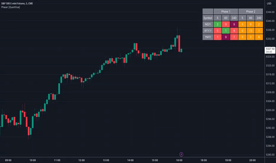
Phaser [QuantVue]The Phaser indicator is a tool to help identify inflection points by looking at price relative to past prices across multiple timeframes and assets.
Phase 1 looks for the price to be higher or lower than the closing price of the bar 4 bars earlier and is complete when 9 consecutive bars meet this criterion.
A completed Phase 1 is considered perfect when the highs (bearish) or lows (bullish) have been exceeded from bars 6 and 7 of the phase.
A bullish setup requires 9 consecutive closes less than the close 4 bars earlier.
A bearish setup requires 9 consecutive closes greater than the close 4 bars earlier.
Phase 2 begins once Phase 1 has been completed. Phase 2 compares the current price to the high or low of two bars earlier.
Unlike Phase 1, Phase 2 does not require the count to be consecutive.
Phase 2 is considered complete when 13 candles have met the criteria.
An important aspect to Phase 2 is the relationship between bar 13 and bar 8.
To ensure the end of Phase 2 is in line with the existing trend, the high or low of bar 13 is compared to the close of bar 8.
A bullish imperfect 13 occurs when the current price is less than the low of 2 bars earlier, but the current low is greater than the close of bar 8 in Phase 2.
A bearish imperfect 13 occurs when the current price is greater than the high of 2 bars earlier, but the current high is less than the close of bar 8 in Phase 2.
Phase 2 does not need to go until it is complete. A Phase 2 can be canceled if the price closes above or below the highest or lowest price from Phase 1.
Settings
3 Tickers
3 Timeframes
Show Phase 1
Show Phase 2
User-selected colors
Steel Step Assistant: Trend VisualizerSpecial thanks to Turicumo and Psychil for helping me write the code, both from my group.
Disclaimer: Nobody should use this indicator as a confirmation signal for entry/exit for your trades. Please message me on how to use this indicator correctly. This indicator was designed to be used in conjunction with my Steel Step strategy, hence the name.
This indicator simply gives a quick outlook of the market.
This indicator is an ordinary table that shows you the trends.
The default settings produce directions that are very similar to what I use for my strategy. You can change the settings as desired.
This indicator can be used on all charts and markets; crypto, commodities, forex, stock, indices, etc.
It is suitable for intra-day traders, as well as HTF traders.
One way of using this is to enhance your information gathering on trends in order to understand the market structure or direction better.
This indicator educates users on the market structure. Users can quickly break down the market into layers, analyze the layers and connect them all to understand the market as a whole. After users understand the market, users need to decide and choose a specific trend they want to trade. The basic idea is to flow with the market.
This indicator can be combined with EW theory to understand the market structure easily.
When I understand the whole market structure, it boosts my trading performance to the maximum.
Please comment below or message me if you have any questions. Enjoy!

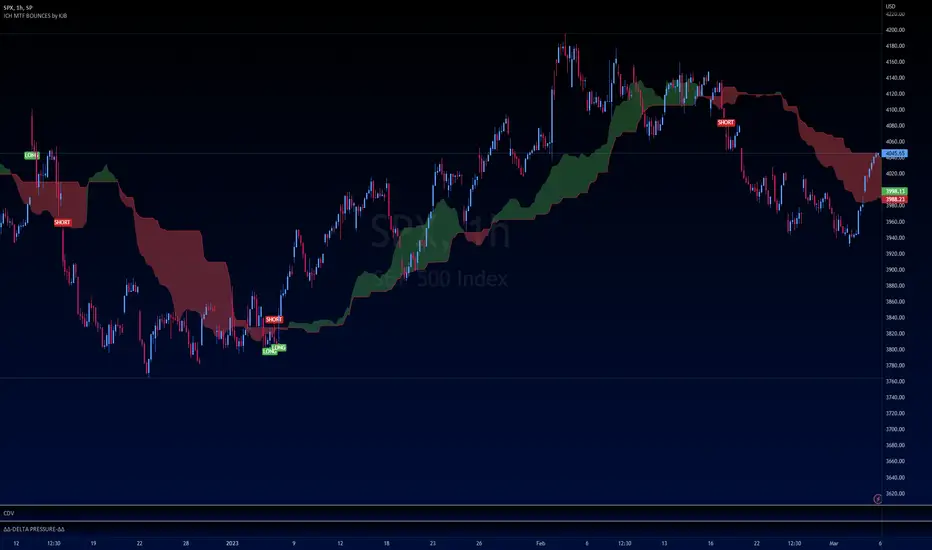
Ichimoku Buy/Sell Signals of manual MTF Tenkan crossing KijunIchimoku Buy/Sell Signals based on fast, small time frame Tenkans crossing longer timeframes Kijuns - Manual MTF Analysis
This code marks the potential change of direction based on the input of one timeframe's Ichimoku Tenkan (conversion) line crossing over a higher, longer timeframe's Ichimoku Kijun (base) line.
Feel free to change the inputs if need be and to hide the yellow box. Use Ichimoku rules of Tenkan, Kijun, Lagging Span, and Cloud for Take profit/Stop Losses. It is best to wait 3-5 minutes after the signal to enter to confirm the trend and to confirm if the Lagging Span has broken key levels. I refer to the book Trading with Ichimoku - A Practical Guide to Low-Risk Ichimoku Strategies by Karen Peloille as the Ichimoku rulebook. Good luck.
For day trading/scalping/intraday - 1min/3min/5min
Tenkan Line Timeframe = 1min
Kijun Line Timeframe = 5min
For swing trading - multiple days/weeks - 4HR/Daily/Weekly Charts
Tenkan Line Timeframe = day
Kijun Line Timeframe = week
Multi-Timeframe RSI GridThe relative strength index (RSI) is a momentum indicator that measures the magnitude of recent price changes to evaluate overbought or oversold conditions. The RSI is normally displayed as an oscillator separately from price and can have a reading from 0 to 100. This indicator displays the current RSI levels at up to 6 timeframes (of your choosing) in a grid. If the RSI levels reach overbought (above 70) or oversold (below 30) conditions, it changes the color to help you see that RSI has reached extreme levels. Note that in TradingView, when the chart is on a higher timeframe, the lower timeframe RSI levels don't calculate properly. If those conditions are met, this indicator will hide those values in the grid. If none of your selected values are available, it hides the table completely. There are configuration options, like:
Position the grid in any corner of the screen
Style customization (color, size)
Customize RSI length

TWP Chart Period Breaks█ OVERVIEW
This script plots historical and one future vertical line at the higher timeframe.period time mark of your choosing along with the ability to create alerts that ping on the opening of the new bar on the timeframe and during the market session that you have selected. This script adds body to the default "session breaks" that Tradingview provides within the chart settings. It can be a hassle visually keeping track of time when trading but particularly when day trading. Timing is so important and I needed some visual assistance aka some guard rails for my mind to operate in, in order to better execute my trades. I hope this helps you too.
█ CONCEPTS
The script takes some simple steps to plot vertical lines onto your chart with some extra goodies to go the extra yard.
█ FEATURES
1 — Resolution
• Auto / Manual selection
• There is tooltip explains how the automatic time selection operates (see below)
AUTO_TIMEFRAME_TOOLTIP = "When the Auto option is selected, the timeframe of the indicator is chosen automatically based on the chart timeframe. The Timeframe dropdown is ignored. The automated timeframes are:
'10 minutes' for any chart timeframes below '1 minute'
'1 hour' for any chart timeframes starting from '1 minute' up to '5 minutes'
'4 hours' for any chart timeframes starting from '5 minutes' up to '60 minutes'
'1 day' for any chart timeframes starting from '1 hour' up to '4 hours'
'1 week' for any chart timeframes starting from '4 hours' up to '1 day'
'1 month' for any chart timeframes starting from '1 day' up to '1 week'
'3 months' for any chart timeframes starting from '1 week' up to '1 month'
'12 months' for any chart timeframes above '1 month'"
2 — Show Future Period Line
3 — Number of Historical Lines Back
4 — Line Style
• Line color selection
• Line width selection
5 — Alerts
• Market session selection
█ HOW TO USE
• Add it to your chart, select your timeframe, change up your colors, add your alerts (if necessary) and enjoy yourself!

TWP Higher Timeframe Pivot Points█ OVERVIEW
This script displays the nearest support and resistance fibonacci pivot point levels from the higher reference timeframes -- weekly, monthly, and yearly levels. When trading it is always been helpful for me to be aware of significant price levels of the players participating on larger timeframes. HTF pivot points are a great tool for finding confluence and/or gaining extra conviction on your trades. This is a companion tool to be used in conjunction with the Standard Fibonacci Pivot Points .
█ CONCEPTS
Pivot points are a technical indicator / calculation that can be used to determine the overall trend of the market or determine the level that price may face support or resistance. At the same time it can lead to confirmation of the overall trend when price travels through support or resistance lines continuously.
The pivot point is the average of the high, low, and closing price of the previous time window - Day, Week, Month, Year.
The going belief is that if price is trading above the pivot point (P) then there is a bullish sentiment and trading below the pivot point (P) is a bearish sentiment.
Pivot points can be calculated a multitude of ways but the way I am using it here is using the fibonacci method. See the calculations below.
Note: Tooltips are added for each lines label that display the calculation used.
Default Ratios + Matching Labels:
pivot point = (high + low + close) / 3
support lines = pivot - (prevhigh - prevlow) * 0.236
resistance lines = pivot - (prevhigh - prevlow) * 0.236
38.2% - S1/R1
61.8% - S2/R2
100% - S3/R3
Additional (Mid) Ratios + Matching Labels:
23.6% - SA/RA
50% - SB /RB
76.4% - SC / RC
127.2% - S4/R4
141.4% - S5/R5
161.8% - S6/R6
200% - S7/R7
█ FEATURES
1 — Line Extension - Left, Right, Both, None
2 — Pivot Levels for Week, Month, and Year Pivot Points
• Show line
• Show label
• Line color
• Line style
█ HOW TO USE
• As mentioned earlier it best used along with the Standard Fibonacci Pivot Points to find levels of potential confluence where you believe may be key support, resistance, or a potential inflection point in price action.
█ LIMITATIONS
• Depending on the chart and the amount of data it naturally pulls back, the yearly fibonacci pivot point levels may not show
• Pivot points may be found useful for some and not for others
• There is no assurance that price will stop at, reverse, or reach a specific pivot level

TIL Multi RSITrading Indicator Lab’s Multi RSI for TradingView is a powerful indicator that extends your capability to monitor RSI signals up to 20 different symbols all at the same time in just a single chart.
Eagle Eyes
The Multi RSI indicator can calculate the RSI of close prices of multiple symbols at any timeframe. This allows you to scan for RSI signals that may escape your search for potential good trading opportunities. It lets you choose the symbols you want to monitor for up to 20 slots and it INSTANTLY tells you which ones are overbought, oversold and even those that are at the verge of the buying or selling extremes in real-time so you can always be there when that big trend reversal happens.
Auto Sort
The symbols you add to the Multi RSI indicator are automatically sorted by their RSI readings from the most oversold down to the most overbought, each with a color assigned to them. Symbols that have an RSI reading of 50 and above are displayed in red while those below 50 are displayed in green. Those that breach the oversold and overbought signals are displayed in a brighter shade of color of red and green respectively. These colors are fully customizable in the indicator’s inputs.
Adjustable Oversold and Overbought Levels
The Multi RSI indicator uses the default 70/30 oversold-overbought levels but this can be easily adjusted in the Inputs section to match your preferences. The indicator’s color and alert system adjusts automatically to these changes.
Arrows
Beside each RSI reading is an arrow which gives you information about its trajectory, whether it is going up, down, or sideways. This is based on the last bar’s RSI value.
Alerts
The indicator lets you know when one or more symbols in the table crosses the oversold or overbought levels. These are predefined alert conditions that can be chosen in TradingView’s alert creation tool.
Available Alert Conditions
- Oversold – triggers when one or more symbols in the table are oversold
- Overbought – triggers when one of more symbols in the table are overbought
Inputs
- Length – sets the period of the RSI function to be applied to all symbols
- Oversold – sets the reference level for oversold signals (default level at 70)
- Overbought – sets the reference level for overbought signals (default level at 30)
- Symbol 1 – Symbol 20 – slots for TradingView symbols (charts) that you want to monitor
- Top Half Color 1 – the color of rows that are in the oversold level
- Top Half Color 2 – the color of rows that are 50 or above but not beyond the oversold level
- Bottom Half Color 1 – the color of rows that are in the overbought level
- Bottom Half Color 2 – the color of rows that are below 50 but not beyond the overbought level
- Position – sets where the indicator is displayed in the chart
- Font Size – sets the text size of the indicator
- Height – sets the size of each cell in the table. Size 0 means the height automatically adjusts to the chart’s size.

5EMA with resolutionSimply 5 EMA's at once with chosable resolution on different TF instead of viewing at the moment. You can watch on 5m TF and use 1D EMA's for example
