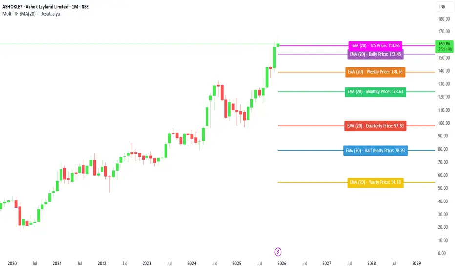
Multi-TF EMA(20) — JcsatasiyaOverview
This indicator plots 7 multi-timeframe EMA(20) lines on any chart and displays a clean dynamic label for each EMA showing:
Full timeframe name (Yearly, Half-Yearly, Quarterly, Monthly, Weekly, etc.)
EMA(20) value formatted with exactly 2 decimals
A label that is positioned automatically to the right of the latest candle
White text for maximum readability
Color-coded lines for each timeframe
All EMA lines extend horizontally and update in real-time when new candles form on the selected timeframes.
✅ Key Features
• 7 Custom Timeframes
Choose any timeframe for each EMA (Yearly, 6-Month, 3-Month, Monthly, Weekly, Daily, 4H, etc.)
• Horizontal EMA Levels
Each EMA is drawn as a fixed horizontal level, making structure and bias easier to analyze.
• Dynamic Label Placement
Labels automatically position:
Horizontally: Left, Middle, or Right of the right-side future area
Vertically: Above, Middle, or Below the EMA line
• Clean Readable Labels
Always white text
Shows: EMA (20) – Timeframe Price: 123.45
Price always displays with 2 decimals
Label style auto-adjusts based on position
• Color Customization
Each timeframe EMA has its own color picker.
• All EMA Thickness Unified
Set one line thickness for all EMA lines.
• Reliable Multi-TF Accuracy
Uses request.security() with proper lookahead handling.
⭐ Why This Indicator Is Useful
This tool makes it extremely easy to visualize where your chart sits relative to major multi-timeframe EMA levels.
You immediately see:
Higher-timeframe trend direction
Bias zones
Key support/resistance EMA levels
Long-term vs short-term trend alignment
Price interaction with institutional EMAs
Perfect for day traders, swing traders, and position traders.
📘 HOW TO USE
1️⃣ Add to Chart
After adding the indicator, open the Settings → Inputs panel.
2️⃣ Choose the 7 Timeframes
For each slot, select your desired timeframe (example setup):
Yearly
Half Yearly
Quarterly
Monthly
Weekly
Daily
4H
3️⃣ Customize Colors
Pick a different color for each EMA for clarity.
4️⃣ Choose Label Placement
Use the label position controls:
Vertical: Upper / Middle / Below
Horizontal: Left / Middle / Right (relative to right-side future space)
5️⃣ Adjust Line Thickness (Optional)
A single slider controls the thickness of all 7 EMAs.
📝 NOTES
The indicator places labels 2–50 bars into the future depending on chosen position.
Labels are always visible and readable due to white text.
EMA values always show exactly two decimals, even for crypto, indices, and forex.
Works on any market and any chart timeframe.
Multitimeframe
TrategyMulti-Indicator Trading System - Detailed Description
═══════════════════════════════════════════
OVERVIEW
This indicator combines four proven technical analysis tools (EMA, RSI, MACD, ATR) with a specific logic that filters out low-probability setups. Unlike simple indicator mashups, this system requires all conditions to align simultaneously before generating a signal, significantly reducing false entries.
═══════════════════════════════════════════
CORE COMPONENTS & LOGIC
1. Trend Detection - Triple EMA Filter
The system uses three Exponential Moving Averages (5, 10, 20 periods) to establish trend direction and strength:
For LONG signals:
• EMA(5) must be above EMA(10)
• EMA(10) must be above EMA(20)
• Price must be trading above all three EMAs
This creates a "stacked EMA" configuration that confirms a strong uptrend.
For SHORT signals:
• EMA(5) must be below EMA(10)
• EMA(10) must be below EMA(20)
• Price must be trading below all three EMAs
This inverse configuration confirms a strong downtrend.
2. Momentum Confirmation - RSI Filter
The RSI (14-period) acts as a momentum filter to avoid entering during exhausted moves:
For LONG signals:
• RSI must be above 40 (avoiding oversold extremes)
• RSI must be rising (current RSI > previous RSI)
For SHORT signals:
• RSI must be below 60 (avoiding overbought extremes)
• RSI must be falling (current RSI < previous RSI)
This prevents entries at extreme overbought/oversold levels while confirming momentum direction.
3. Entry Trigger - MACD Crossover
The MACD (12, 26, 9) provides the precise entry timing:
LONG trigger: MACD line crosses above Signal line
SHORT trigger: MACD line crosses below Signal line
The signal only fires when this crossover occurs while all other conditions are already met.
4. Risk Management - ATR-Based TP/SL
Take Profit and Stop Loss levels are calculated dynamically using the 14-period ATR (Average True Range), adjusted for timeframe:
5-Minute Charts:
• Take Profit: 1.0 × ATR
• Stop Loss: 0.5 × ATR
4-Hour Charts and above:
• Take Profit: 2.0 × ATR
• Stop Loss: 1.0 × ATR
This adaptive approach accounts for different volatility levels across timeframes.
═══════════════════════════════════════════
SIGNAL GENERATION LOGIC
A signal is only generated when ALL four conditions are simultaneously true:
LONG Signal Requirements:
1. ✓ Triple EMA alignment (bullish stack)
2. ✓ Price above all EMAs
3. ✓ RSI > 40 and rising
4. ✓ MACD bullish crossover
SHORT Signal Requirements:
1. ✓ Triple EMA alignment (bearish stack)
2. ✓ Price below all EMAs
3. ✓ RSI < 60 and falling
4. ✓ MACD bearish crossover
This multi-layered filtering approach is what differentiates this system from basic indicator combinations.
═══════════════════════════════════════════
WHY THIS COMBINATION WORKS
Trend + Momentum + Timing:
• EMAs establish the overall trend context
• RSI confirms momentum is present (not exhausted)
• MACD provides precise entry timing
• ATR adapts risk management to current volatility
Key Innovation: The system waits for all filters to align rather than acting on individual signals, which significantly reduces whipsaws and false breakouts common in single-indicator strategies.
═══════════════════════════════════════════
OPTIMIZED TIMEFRAMES
While the indicator works on all timeframes, it has been specifically optimized and backtested on:
• 5-minute charts (for scalping/day trading)
• 4-hour charts (for swing trading)
The ATR multipliers automatically adjust based on the selected timeframe.
═══════════════════════════════════════════
VISUAL FEATURES
• Green arrows below bars: Long signal
• Red arrows above bars: Short signal
• Green line: Take Profit level
• Red line: Stop Loss level
• Alert capability: Configurable alerts for paid TradingView subscriptions
═══════════════════════════════════════════
HOW TO USE
1. Add the indicator to your chart
2. Wait for a colored arrow to appear
3. Enter the trade in the direction of the arrow
4. Set your Take Profit at the green line
5. Set your Stop Loss at the red line
6. (Optional) Set up alerts to receive notifications
Note: Not every arrow will show TP/SL lines. Lines only appear when the ATR-based calculation determines there is sufficient volatility to justify the trade setup.
═══════════════════════════════════════════
WHAT MAKES THIS INVITE-ONLY WORTHY
Unlike free indicators that simply plot standard EMAs, RSI, or MACD separately, this system:
1. Integrates all four indicators with specific thresholds designed to work together
2. Uses adaptive risk management that adjusts to timeframe and volatility
The value lies not in the individual components (which are public domain) but in the specific combination logic, thresholds, and ATR-based risk system that took months of testing to optimize.
═══════════════════════════════════════════
ACCESS INFORMATION
This is an invite-only indicator. To request access:
• Visit our website
We offer both monthly subscriptions and lifetime access.
═══════════════════════════════════════════
RISK DISCLAIMER
This indicator is a technical analysis tool and does not constitute financial advice. All trading involves substantial risk of loss. Past performance does not guarantee future results. The indicator provides signals based on historical price patterns, but cannot predict future market movements. Always use proper risk management and never risk more than you can afford to lose.
═══════════════════════════════════════════
Questions? Feel free to message us on TradingView, or to email us.

London First 15m Candle (Real-Time NY)London First 15-Minute Candle (Real-Time New York Time)
This custom TradingView indicator identifies and tracks the first 15-minute candle of the London session, but calculated in real-time according to New York time (EST/EDT).
🔹 What the Indicator Does
1. Detects the London Session Open (Real NY Time)
You define the London session start time in New York hours (default: 3:00 AM NY Time).
The indicator monitors the first 15 minutes from the defined start time (3:00–3:15 NY time).
Only today’s candle is tracked — historical London ranges are not shown.
2. Builds the London Opening Range Candle (15m)
While the 15-minute window is still open, it continuously tracks:
Highest price reached (London High)
Lowest price reached (London Low)
The values update in real time only within the 3:00–3:15 window.
At 3:15 NY time, the candle is locked in and no longer changes.
3. Draws Three Persistent Levels on the Chart
Once the London candle closes, the indicator plots:
🔴 Top Line (London High)
Extended to the right across the chart.
🟢 Bottom Line (London Low)
Extended to the right across the chart.
⚪ Mid Line (Middle of the Range)
Computed as:
(londonHigh + londonLow) / 2
Also extended to the right.
All lines:
Are only drawn for today.
Auto-delete and refresh when a new trading day begins.
4. Works on ANY Timeframe
Even if the indicator runs on:
1m
2m
5m
1h
etc.
…it still uses a real 15-minute aggregation, ensuring the London candle is accurate.
5. Clean Chart — No Historical London Levels
The script:
Removes old lines at the start of each new day.
Keeps only today’s active London range.
This prevents clutter and ensures clarity.
6. Optional Alerts (if enabled)
The indicator can generate alerts when the market crosses:
The top of the London range
The bottom of the London range
The midline
For example:
Price breaks above London High
Price breaks below London Low
Price crosses the Midline up or down
These can be used for:
Breakout strategies
Liquidity grabs
Range-trading confirmations
7. Fully Customizable
User inputs allow you to modify:
London session start hour (NY Time)
Candle duration (fixed at 15 minutes)
Line colors:
High line color
Low line color
Midline color
Line widths
Summary
This indicator gives you a clean and accurate view of the first 15-minute candle of the London session — critical for many ICT/SMS/prop firm strategies — with:
Real-time NY-based calculation
Automatic cleanup
Clear range lines
Custom colors
Alerts for breakouts

Advanced Delta Trading System ProAdvanced Delta Trading System Pro
Overview
This indicator is an advanced order flow analysis tool that combines Delta Volume Analysis, Cumulative Volume Delta (CVD), Multi-Timeframe Trend Confirmation, and Volume Profile Zones to identify high-probability trading opportunities based on institutional buying and selling pressure.
🔍 Core Concepts & Methodology
1. Range-Weighted Delta Calculation (Original Implementation)
Unlike basic delta indicators that simply subtract selling volume from buying volume, this script uses a range-weighted approach:
Range Weight = |Price Movement| / Candle Range
Bar Delta = Volume × Direction × Range Weight
Why this matters:
Accounts for intra-bar price action strength
Provides more accurate representation of directional conviction
Filters out low-conviction volume during ranging periods
2. Cumulative Volume Delta (CVD) with Momentum
The script calculates CVD by accumulating bar deltas and applies:
EMA smoothing to reduce noise (adjustable period)
Delta Momentum indicator: Measures the rate of change of delta relative to its average
CVD Slope detection: Identifies accumulation/distribution phases
Formula:
Delta Momentum = Current Absolute Delta / Average Absolute Delta
This normalized momentum metric helps filter low-conviction signals.
3. Multi-Timeframe CVD Confluence (Unique Feature)
The indicator pulls CVD trend data from a higher timeframe (default: 15min) to:
Confirm signals only when aligned with HTF institutional flow
Display HTF bias in the dashboard (Bull ▲ / Bear ▼ / Neutral)
Prevent counter-trend trades against larger timeframe momentum
Edge: Many delta indicators operate on single timeframes; this multi-timeframe approach significantly reduces false signals.
4. Volume Profile Zone Detection
Instead of static support/resistance, the script dynamically identifies:
High Volume Nodes (HVN): Areas with 1.5x above-average volume - potential magnets/reversal zones
Low Volume Nodes (LVN): Areas with <0.5x average volume - breakout zones with minimal resistance
These zones are visualized as semi-transparent boxes on the chart, updated in real-time.
5. Delta-CVD Divergence Detection
The script identifies:
Bullish Divergence: Price makes lower low while CVD makes higher low (accumulation)
Bearish Divergence: Price makes higher high while CVD makes lower high (distribution)
Uses pivot detection with adjustable lookback periods and draws divergence lines automatically.
🎯 Signal Generation Logic
Buy Signal Requirements:
Bar delta exceeds threshold (Average Delta × Imbalance Multiplier)
Delta momentum ≥ minimum threshold (default: 1.2)
CVD slope is positive (accumulation phase)
Higher timeframe CVD is bullish (if MTF enabled)
Candle closes green (price confirmation)
Sell Signal Requirements:
Same criteria but inverted for selling pressure.
Enhanced Signals:
Signals are strengthened when accompanied by divergences, combining immediate imbalance with underlying accumulation/distribution patterns.
📊 Visual Features
1. Intelligent Candle Coloring
Color intensity based on delta momentum (0-3 scale)
Lime: Strong buying | Red: Strong selling | Gray: Neutral
Helps quickly identify conviction behind price moves
2. Delta Labels
Optional labels showing exact delta values (in thousands for readability)
Adjustable frequency (every Nth bar)
Color-coded by strength
3. Real-Time Dashboard
Displays:
Current bar delta
Cumulative Volume Delta (CVD)
Delta momentum reading
Higher timeframe bias
Active signals and divergences
⚙️ Customization Options
Delta Settings:
CVD Smoothing: Controls EMA period for CVD line
Avg Delta Length: Lookback for delta average calculation
Delta Momentum Period: Smoothing for momentum indicator
Signal Filters:
Imbalance Multiplier: Threshold for signal generation (higher = fewer, stronger signals)
CVD Confluence: Require/disable CVD trend alignment
Min Momentum: Filter weak signals below threshold
Volume Zones:
Lookback Period: Bars analyzed for HVN/LVN detection
Max Zone Boxes: Limit visual clutter
Toggle HVN/LVN independently
Multi-Timeframe:
Select any higher timeframe for CVD analysis
HTF Bias Panel: Show/hide dashboard element
🔔 Alert Conditions
Long/Short Signals: Fires when all confluence conditions met
Divergence Alerts: Bullish/Bearish divergence detected
Extreme Momentum: Delta momentum exceeds 2.5× average
HTF Trend Change: Higher timeframe CVD reverses
💡 How to Use
For Scalping:
Use 1-5min charts with 15min HTF confirmation
Focus on extreme momentum alerts (>2.5×)
Enter on signals near HVN zones for better R:R
For Swing Trading:
Use 15min-1H charts with 4H HTF confirmation
Wait for divergences + signal confluence
Avoid LVN zones (price likely to slice through)
Volume Profile Strategy:
Buy at HVN support with bullish delta
Sell at HVN resistance with bearish delta
Target LVN zones for breakout trades
🆚 What Makes This Script Unique
Unlike standard delta indicators, this combines:
Range-weighted delta (more accurate than simple volume delta)
Multi-timeframe confirmation (institutional flow alignment)
Dynamic volume profile zones (not static S/R)
Momentum-filtered signals (reduces noise significantly)
Divergence integration (catches reversals early)
Compared to free alternatives: Most delta scripts show raw cumulative delta without momentum filtering, MTF analysis, or volume profile integration. This script provides a complete order flow analysis system in one indicator.
⚠️ Important Notes
Not a standalone system: Use with price action and market structure
Optimize settings per asset: Crypto needs different settings than forex/stocks
Higher timeframes = more reliable: Reduce noise on lower timeframes with longer smoothing
Volume quality matters: Works best on high-liquidity assets with accurate volume data
📈 Best Timeframes
Scalping: 1m-5m (with 15m HTF)
Day Trading: 5m-15m (with 1H HTF)
Swing Trading: 1H-4H (with D HTF)
This indicator is designed for traders who understand order flow concepts and want a comprehensive, multi-layered approach to delta analysis beyond basic cumulative volume delta indicators.


Range Deviations PRO | Trade SymmetryRange Deviations PRO — Extended Session Levels
An enhanced version of the original Range Deviations by @joshuuu, retaining the full core logic while adding a key upgrade:
🔹 All session ranges, midlines, and deviation levels now extend into the next trading session, giving seamless multi-session context.
Supports Asia, CBDR, Flout, ONS, and Custom Sessions — with options for half/full standard deviations, equilibrium, and range boxes exactly as in the original.
Extending these levels helps identify:
• Liquidity sweeps
• Trap moves / false breaks
• Daily high/low projections
• Premium–discount behavior across sessions
Ideal for traders using ICT concepts who want clearer continuation of session structure into the next day.
Credit: Original logic by @joshuuu — enhancements by TradeSymmetry.
Disclaimer: Educational use only. Not financial advice.

Bassi MACD Pro + ADX Filter + Smart Histogram TP + RSIA professional-grade MACD indicator that dramatically reduces false signals by combining four powerful filters:
Key Features
Classic MACD (12,26,9) with clean, high-visibility histogram coloring
ADX + DI filter – only takes trades when ADX > user-defined threshold (default 25) ensuring you trade only in strong trending markets
Smart Histogram Take-Profit logic – automatically detects the exact moment bullish/bearish momentum starts to weaken after a strong move and marks a precise TP level (one TP per trade – no repainting, no multiple signals)
Zero-line crossover confirmation + histogram direction filter – eliminates many whipsaw signals common in regular MACD
Separate RSI pane with overbought/oversold levels and visual markers (for additional confluence – does not interfere with main logic)
Visual Signals
Green “MACD BUY” label + lime triangle = confirmed long entry in strong trend
Red “MACD SELL” label + red triangle = confirmed short entry in strong trend
Small lime/red “TP” triangles = Smart Histogram Take-Profit triggered (perfect exit timing based on momentum fade)
Alert Conditions Included
MACD BUY
MACD SELL
TP Long Hit
TP Short Hit
Combined “Any Signal” alert
Why this version outperforms standard MACD
Most MACD crossovers fail in ranging markets. This script solves that by:
Requiring strong trend (ADX filter)
Confirming histogram is actually growing in the new direction
Waiting for the true zero-line cross with momentum
Giving you an intelligent, non-fixed % take-profit based on real histogram exhaustion
Excellent for swing trading, day trading, crypto, forex, and stocks on any timeframe (works especially well on 1H–4H–Daily).
Clean, fast, no repainting, fully alert-ready.
Add to chart → set your alerts → trade only the highest-probability MACD signals.

Multi-TF Candle Gap DetectorHigh timeframe gap detector, these work well to identify key levels to trade from

The Trader's Edge (A professional Trader's tool)This is a script which is made by a professional stock trader and this script is capable of drawing Demand / Supply zones as well as capable of scoring the trade as well depending upon freshness, time spent in the zone, it also has the power to calculate the pre - defined risk to reward for every trade that you take as per this indicator. This script also displays the Trendo f the stock on 3 difrerent time frames on one single time frame easy to do multiple time frame analysis. and it also as the power of identifying which zones are falling outside "THE BOLLINGER BANDS" There by signaling an "ALL STAR ENTRY" This tool is A must have for any professional Stock trader.

Ichimoku MTF HeatmapGreat for flying down you watchlist, getting an idea what time frame to go to. Enjoy!

RSI/VIX Reversal Signal (StevenCharts) [BETA]The RSI/VIX Reversal Signal (StevenCharts) is a specialized mean-reversion indicator that combines technical momentum (RSI) with market sentiment data (VIX).
While standard RSI strategies often fail by catching "falling knives" during strong trends, this indicator filters setups by requiring a specific volatility environment. It identifies moments of extreme fear (High VIX + Oversold RSI) or extreme complacency (Low VIX + Overbought RSI) to pinpoint high-probability reversal zones.
How It Works
This script operates on a two-step confirmation logic to prevent premature entries:
The Trigger (Blue Dot): The indicator first identifies an extreme condition.
Potential Buy: Price is Oversold while Volatility is elevated. This indicates panic selling.
Potential Sell: Price is Overbought while Volatility is suppressed. This indicates market complacency.
The Signal (Triangle Label): Once a trigger is detected, the script waits for Price Action Confirmation.
It will not print a Green Buy Label until a green candle actually closes.
It will not print a Red Sell Label until a red candle actually closes.
Key Features
Dual-Factor Analysis: Filters out weak RSI signals by demanding VIX confirmation.
Stateful Logic: Remembers if a trigger condition was met and patiently waits for the reversal candle before signaling.
Timeframe Noise Filter: Includes a built-in setting to automatically hide signals on lower timeframes to focus on macro reversals.
Data Table: An optional dashboard that displays real-time VIX values, RSI values, and Overbought/Oversold status directly on your chart.
How to Use
Buying the Fear: Look for the Green Triangle. This signals that panic selling has likely exhausted itself and buyers are stepping back in.
Selling the Greed: Look for the Red Triangle. This signals that the market is overextended and volatility is too low to sustain the move.
Blue Dots: Treat these as "Warning Shots." They tell you a setup is building, but the reversal hasn't confirmed yet.

CapitalFlowsResearch: Sensitivity BandsCapitalFlowsResearch: Sensitivity Bands — Expected-Move Projection from Cross-Asset Beta
CapitalFlowsResearch: Sensitivity Bands builds on the idea of cross-asset sensitivity by turning beta into a set of projected price boundaries around the prior day’s close. Instead of showing beta as a standalone number, this tool translates it into real price levels that represent the expected magnitude of movement—up or down—given a typical shock in a chosen market driver.
The script measures how strongly the price asset has been responding to moves in the driver over a rolling window, then uses that relationship to calculate a dynamic “band width.” That width is applied symmetrically around the previous daily close to create two horizontal bands: an upper range and a lower range. These lines update intraday, offering a real-time sense of whether current price action is unfolding within normal sensitivity limits or pushing into statistically unusual territory.
Traders can choose how the driver’s changes are interpreted (basis points, absolute moves, or percent changes), and optionally replace the rolling band with a running mean to emphasise longer-term structural sensitivity. The resulting overlay acts much like an expected-move model—similar in spirit to options-derived ranges, but powered by beta dynamics rather than implied volatility.
In practice, Sensitivity Bands serves as a clean framework for contextualising market movement:
Inside the bands: price behaviour aligns with typical cross-asset sensitivity.
Touching a band: movement is strong but still consistent with historical response.
Breaking a band: indicates a regime shift, a driver disconnect, or unusually high momentum.
All of this is achieved without exposing the underlying beta calculations or normalisation logic.

CapitalFlowsRsearch: YC RegimeCapitalFlowsResearch: YC Regime — Yield Curve Regime Histogram
CapitalFlowsResearch: YC Regime takes the same six-regime yield curve framework (bull/bear steepeners, bull/bear flatteners, and their twist variants) and presents it as a dedicated histogram panel. Instead of colouring the background of a price chart, this indicator plots the 2s–10s (or chosen pair) spread as a column series and tints each bar according to the active curve regime, with an overlaid white line to show the raw spread path through time.
By comparing how the spread itself is evolving against the regime classification, traders can see not just what the curve is doing (steepening vs flattening), but also how those moves are building, stalling, or reversing over the chosen lookback. An optional legend explains each regime and the colour mapping, making it easy to standardise interpretation across instruments and timeframes. In practice, this panel functions as a compact “yield curve dashboard” you can stack under risk assets, helping align trades with the prevailing rates environment without exposing the underlying regime logic.

CapitalFlowsResearch: YC Regime (Shading)CapitalFlowsResearch: YC Regime (Shading) — Yield Curve Environment Overlay
CapitalFlowsResearch: YC Regime (Shading) turns the yield curve into a live, colour-coded market backdrop, classifying the curve into six intuitive regimes: bull steepener, bear steepener, steepener twist, bull flattener, bear flattener, and flattener twist. Instead of staring at raw spreads or multiple rate charts, you get a simple visual answer to: “What kind of curve move am I trading in right now?”
The script compares a short-dated and long-dated yield and tracks how both the spread and the individual legs have evolved over a chosen lookback window. From that, it tags each bar with the dominant curve regime and paints either the background or the candles accordingly, so regime changes are immediately obvious on any price chart you overlay it on. An optional on-chart legend summarises the regime definitions and colour scheme, making it easy to interpret at a glance and consistent across instruments and timeframes.
In practice, this overlay acts as a rates context layer for everything else you trade—equities, FX, credit, commodities—helping you link price action back to whether the curve is bull-steepening, bear-flattening, or twisting in ways that often line up with shifts in macro narrative, policy expectations, and risk appetite, all without exposing the underlying classification logic.

STRAT Private Beta v2.0 – OPTIMIZED (FROZEN)Name: STRAT Private Beta v2.0 – OPTIMIZED (FROZEN)
Timeframe: Weekly only (runs every Friday after US close)
What it does in one sentence:
Scans 200+ liquid stocks, ETFs, indices, and cryptos every Friday night and instantly shows only the highest-conviction STRAT weekly setups that pass Rob Smith’s exact rules (true 2-2 continuations + Rev Strats, FTC ≥ 80 %, no broadening, no earnings weeks, 3:1 minimum R:R).
What you see every Friday after 4 pm ET:
0–12 tickers (usually 4–8) with a big green “L” (long) or red “S” (short)
Exact entry, stop, and 3R target printed on the chart and in alerts
FTC percentage (80–100 %) so you know conviction level
Nothing else – if there’s no clean setup, it stays silent
How to use it (testers only):
Click the invite link → add script to TradingView
Open the regular Stock Screener → select watchlist “STRAT Universe”
Load saved layout “STRAT Weekly Live” (or add the 4 columns)
Every Friday after close: refresh → see the short list → place 1 % risk bracket orders → done until next Friday.
Zero daily monitoring. Zero discretion. Pure frozen STRAT rules.

CapitalFlowsResearch: Vol RangesCapitalFlowsResearch: Vol Ranges — Multi-Timeframe ATR Expansion Map
CapitalFlowsResearch: Vol Ranges creates a structured volatility “roadmap” by projecting expected price extensions across multiple timeframes using ATR-based ranges. Instead of relying on a single ATR reading, the tool pulls in higher-timeframe volatility measures—such as daily and monthly expansions—and uses them to build a set of reference levels that anchor the current market against where it should trade under normal volatility conditions.
The script does two things simultaneously:
Projects volatility-derived target bands
It computes a set of upper and lower expansion levels (e.g., +100%, +50%, –50%, –100%) around prior closing levels on different timeframes. These levels act as structural markers for expected movement, allowing traders to quickly recognise when price is behaving within typical bounds or pressing into statistically stretched territory.
Displays a live dashboard for interpretation
A fully configurable on-chart table displays:
Recent volatility readings
Today's reference ranges
Distance from current price to each expansion level
Whether today's movement is expanding or contracting relative to prior volatility
This gives traders a compact situational summary without cluttering the price chart.
Optional high-timeframe projection lines can also be plotted directly on the chart, updating once per new day or new month, making it easy to visually align intraday price action with broader volatility structure.
In practical terms, Vol Ranges functions as a multi-timeframe volatility compass—highlighting when markets are trading inside normal ranges, when they are beginning to stretch, and when they may be entering conditions supportive of momentum or reversal behaviour. All core mechanics remain abstracted, preserving the proprietary nature of the volatility framework.
