Dynamic Extreme Channels & Reversals [LuxAlgo]The Dynamic Extreme Channels & Reversals indicator provides an adaptive framework for identifying price extremes and trend shifts through self-adjusting boundaries. Unlike static channels, this tool dynamically resets its levels based on price activity, offering a responsive environment for trend following and mean-reversion analysis.
🔶 USAGE
The indicator functions by tracking the highest highs and lowest lows over a specific window. When the price fails to make a new extreme within the defined period, the boundaries contract toward the current price action. This behavior creates a "breathing" channel that adapts to market volatility and consolidation phases.
Users can toggle between two primary viewing modes:
Channel Mode: Displays the upper, lower, and midline boundaries. This is ideal for identifying overextended price levels and potential mean-reversion targets.
Trailing Stop Mode: Simplifies the visual output into a single step-line that tracks the lower boundary during uptrends and the upper boundary during downtrends, serving as a dynamic exit or trend-following level.
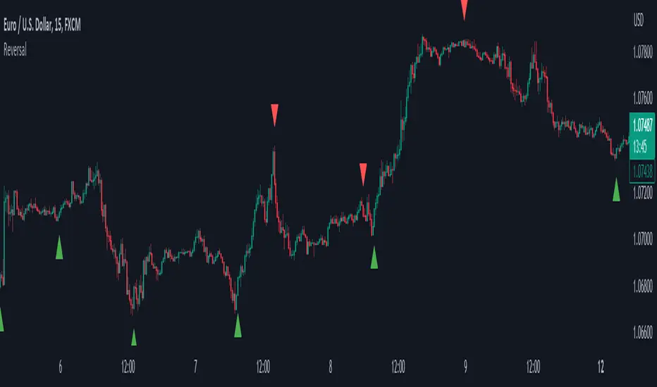
🔹 Reversal Signals
The script includes built-in reversal signals designed to catch "blow-off" tops or "panic" bottoms where price briefly exceeds a boundary but immediately loses momentum.
Bullish Signal (▲): Occurs when the price hits a new lower extreme (LL) but the current candle manages to peak back above the channel midline.
Bearish Signal (▼): Occurs when the price hits a new higher extreme (HH) but the current candle manages to drop below the channel midline.
The sensitivity and frequency of these signals are directly influenced by the Lookback Period and Reset Alpha % :
Lookback Period: A shorter lookback causes the channel boundaries to "reset" more frequently. This results in tighter channels and more frequent reversal signals, as the midline becomes easier to cross. A longer lookback creates wider, more stable channels, resulting in fewer, high-conviction signals.
Reset Alpha %: This determines how aggressively the levels move toward the price after the lookback period expires. A high Alpha (e.g., 100%) creates sharp adjustments, which can lead to rapid signal generation during choppy markets. A lower Alpha creates smoother transitions, filtering out noise in the reversal logic.
🔶 DETAILS
The core logic avoids standard rolling maximum/minimum functions to provide a more "sticky" boundary. Instead of the channel edge constantly moving with every bar, it remains fixed until a new extreme is reached or the "timer" (Lookback Period) runs out.
When the timer runs out, the level interpolates toward the price based on the Reset Alpha. This simulates a decaying memory of past price extremes, ensuring the indicator remains relevant even after long periods of sideways movement.
🔶 SETTINGS
🔹 Core Settings
Lookback Period: The number of bars the indicator waits before adjusting an extreme level if no new high/low is found.
Reset Alpha %: Controls the intensity of the level adjustment. 100% resets the level entirely to the current price, while 0% keeps it static.
Trailing Stop Mode: Switches the display from a three-line channel to a single trend-following stop line.
🔹 Visuals
Show Reversal Signals: Toggles the visibility of the triangle reversal labels.
Upper Color: Customizes the color and transparency of the upper boundary.
Midline Color: Customizes the color and transparency of the center line.
Lower Color: Customizes the color and transparency of the lower boundary.
🔹 Dashboard
Dashboard: Toggles the on-screen information panel.
Position: Controls the location of the dashboard on the chart.
Size: Controls the scale of the dashboard text and cells.
Индикатор Pine Script®