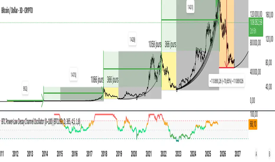
BTC Power-Law Decay Channel Oscillator (0–100)🟠 BTC Power-Law Decay Channel Oscillator (0–100)
This indicator calculates Bitcoin’s position inside its long-term power-law decay channel and normalizes it into an easy-to-read 0–100 oscillator.
🔎 Concept
Bitcoin’s long-term price trajectory can be modeled by a log-log power-law channel.
A baseline is fitted, then an upper band (excess/euphoria) and a lower band (capitulation/fear).
The oscillator shows where the current price sits between those bands:
0 = near the lower band (historical bottoms)
100 = near the upper band (historical tops)
📊 How to Read
Oscillator > 80 → euphoric excess, often cycle tops
Oscillator < 20 → capitulation, often cycle bottoms
Works best on weekly or bi-weekly timeframes.
⚙️ Adjustable Parameters
Anchor date: starting point for the power-law fit (default: 2011).
Smoothing days: moving average applied to log-price (default: 365 days).
Upper / Lower multipliers: scale the bands to align with historical highs and lows.
✅ Best Use
Combine with other cycle signals (dominance ratios, macro indicators, sentiment).
Designed for long-term cycle analysis, not intraday trading.
Поиск скриптов по запросу "BTC"
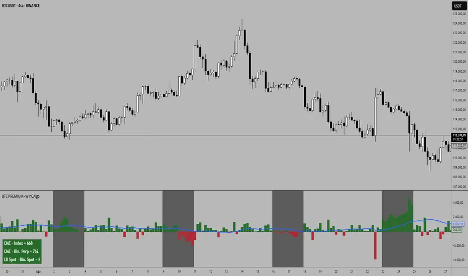
BTC Premium -WinCAlgoBitcoin Premium/Discount Tracker
This indicator tracks the premium or discount between different Bitcoin markets, helping traders identify arbitrage opportunities and market sentiment shifts.
What it shows:
CME vs Index: Price difference between CME Bitcoin futures and BTC index
CME vs Binance Perpetual: Spread between traditional futures and crypto perpetual contracts
Coinbase vs Binance Spot: Price difference between major spot exchanges
Moving Averages: 20-period smoothed trend lines for each spread
CME Market Hours: Automatically detects when CME is closed (weekends)
How to interpret:
Positive Values (Green): First market trading at premium to second market
Negative Values (Red): First market trading at discount to second market
Large Spreads: Indicate potential arbitrage opportunities or market stress
Converging Spreads: Suggest market equilibrium and efficient pricing
Diverging MA: May signal trend changes in market dynamics
📌 Trading Applications:
Arbitrage Detection: Identify price discrepancies between markets
Market Sentiment: Premium/discount patterns often reflect institutional vs retail sentiment
Weekend Analysis: CME closure periods can create temporary price dislocations
Risk Assessment: Large persistent premiums may indicate overheating in specific markets
Entry Timing: Use spread normalization as confluence for position entries
Key Features:
Smart Timeframe: Automatically switches to daily data on higher timeframes
CME Hours Detection: Shows "No Data" during CME closure with background highlighting
Customizable Display: Toggle different spread calculations and moving averages
Real-time Table: Current values displayed in customizable table
Visual Clarity: Color-coded columns and clear positive/negative distinction
BTC Dominance & Price RSI Analyzer by Sajad BagheriThis indicator analyzes the Relative Strength Index (RSI) for three key cryptocurrency metrics:
Bitcoin Price (BTC/USDT)
Bitcoin Dominance (BTC.D)
Tether Dominance (USDT.D)
It provides a comprehensive view of market momentum by displaying three RSI lines in a single pane, allowing traders to identify overbought and oversold conditions across these important metrics simultaneously.
BTC Regime Phase [HY|YC|GLI]The correlation between global liquidity and INDEX:BTCUSD has attracted a lot of attention. Building on this insight, I developed an indicator that not only tracks global liquidity but also integrates the high‑yield spread and yield‑curve slope to capture credit risk and growth expectations.
Essence and Logic
At its core, the Risk‑On Composite Z‑Score converts three macro factors global liquidity momentum, the US high‑yield spread and the slope of the US yield curve into standardized Z‑scores, weights them, and tracks moving‑average crossovers. Each factor has a rationale: high‑yield spreads are powerful business‑cycle indicators and often outperform other financial variables (Gertler & Lown, 2000). Yield‑curve steepness reflects investor optimism and prompts shifts toward riskier assets global liquidity drives cross‑border flows and risk sentiment (Goldberg, 2023; Lee, 2024). Combining these measures gives a composite signal that has historically aligned well with Bitcoin’s tops and bottoms. Usable also for other crypto coins: INDEX:ETHUSD CRYPTO:SOLUSD CRYPTO:LINKUSD
Limitations and My Current Model Outlook
I want to be transparent: the three model sections are highly correlated. Currently, the high‑yield spread and yield curve data come only from the US; I may add Euro or Japanese spreads later. I’m also aware that macro dynamics are evolving. Fiscal policy and political choices could shorten bear markets and make the current sell signals less relevant. In a stagflationary world, inflation‑adjusted liquidity may swing more violently and require an asset‑inflation adjustment. Yet, the model has captured Bitcoin’s tops and bottoms almost to the week—future patterns may rhyme, not repeat.
Questions and Ideas:
Do you think this model will still be useful as fiscal and monetary regimes shift?
Should I add a stagnation modulation perhaps real yields or inflation‑adjusted liquidity—to better capture a stagflation scenario?
Are there high‑yield spreads on TV beyond the US that I should include? (Euro and Japan indices do exist.)
Would it make sense to incorporate Bitcoin halving events or a stock‑to‑flow module?
The indicator is free to use. If it brings you value, you’re welcome to follow for updates. I appreciate your support and feedback. When you are interested in the source code, feel free to contact me for more details. When you feel like supporting me with some sats, contact me and I will give you a Lightning address. I am a student and that would help a lot – but please only if you can afford it!
♡ Thanks to everyone who contributes insight on TradingView ♡
© Robinhodl21
Features: Users can enable or disable each component, adjust weights and choose a short‑tenor (1‑year or 2‑year) for the yield curve. The script automatically scales lookback windows based on the chart timeframe (daily, weekly or monthly). It offers visual plots of each Z‑score, the composite score, and smoothed moving averages, with background colours highlighting regimes and markers for entries and exits. Trade logic includes optional dip‑buy triggers when the composite falls below a threshold, Friday‑only execution on daily charts to reduce whipsaws. A trend table summarises current Z‑scores and their trends. Settings are tuned for BTC weekly data but should be adjusted for other assets or timeframes. Because some inputs (e.g., GLI weights) have limited historical data, long backtests may be less reliable when using on other Risk On Assets like NASDAQ:NDX NCDEX:COPPER
‼ Disclaimer: This indicator is for educational purposes and does not constitute investment advice. Markets involve risk; past performance is not indicative of future results. Users should not rely solely on this script for trading decisions. Always test and adapt settings to your asset, timeframe and risk tolerance. The author assumes no liability for any trading losses.
Literature:
Gertler, M., & Lown, C. S. (2000). The information in the high yield bond spread for the business cycle: Evidence and some implications. NBER Working Paper 7549.
Lee, B. (2024). Staying ahead of the yield curve. CME Group.
McCauley, R. N. (2012). Risk‑on/risk‑off, capital flows, leverage and safe assets. BIS Working Paper 382.
Goldberg, L. (2023). Global liquidity: Drivers, volatility and toolkits. Federal Reserve Bank of New York Staff Report 1064.
FRED (2025). ICE BofA Euro High Yield Index Option‑Adjusted Spread (BAMLHE00EHYIOAS). St. Louis Fed Data.
Office of Financial Research (2025). Financial Stress Index sources: High yield indices..
Tashev, T. (2025). The Bitcoin Stock‑to‑Flow Model: A comprehensive guide. Webopedia.

BTC/USD Breakout Hours – IST (Hyderabad)This indicator highlights the most volatile BTC/USD trading hours based on Hyderabad (IST) time.
It marks three key breakout windows:
London–US Overlap (17:30–20:30 IST) – Highest liquidity & volatility
US Market Open Momentum (19:00–23:30 IST) – Strong trend moves
Early London Session (12:30–15:30 IST) – Pre-US setup moves
The script automatically converts chart time to IST, shades each breakout window, and includes optional alerts for:
Window start
15 minutes before start
Ideal for traders who want to align entries with high-probability market moves while avoiding low-volume hours.
BTC/ETH Al Brooks-Inspired Strategy (BP, Trap, SE2)This strategy backtests a price-action-based entry model for BTC/ETH Futures on lower timeframes (5m recommended). It combines:
✅ Breakout-Pullback entries after a trend move with pullback to 20 EMA
✅ Al Brooks-style Second Entries (SE2) after failed first reversals
✅ EMA-based trend filtering using 20 EMA and 200 EMA
✅ ATR-based dynamic stop-loss and 2R profit targets
Only trades are taken when:
Trend is clearly established (20 EMA slope confirmation)
Entry setup confirms with reversal candle (engulfing or pin bar)
Risk and reward are calculated dynamically with ATR(14)
Use this to evaluate strategy viability before live execution.

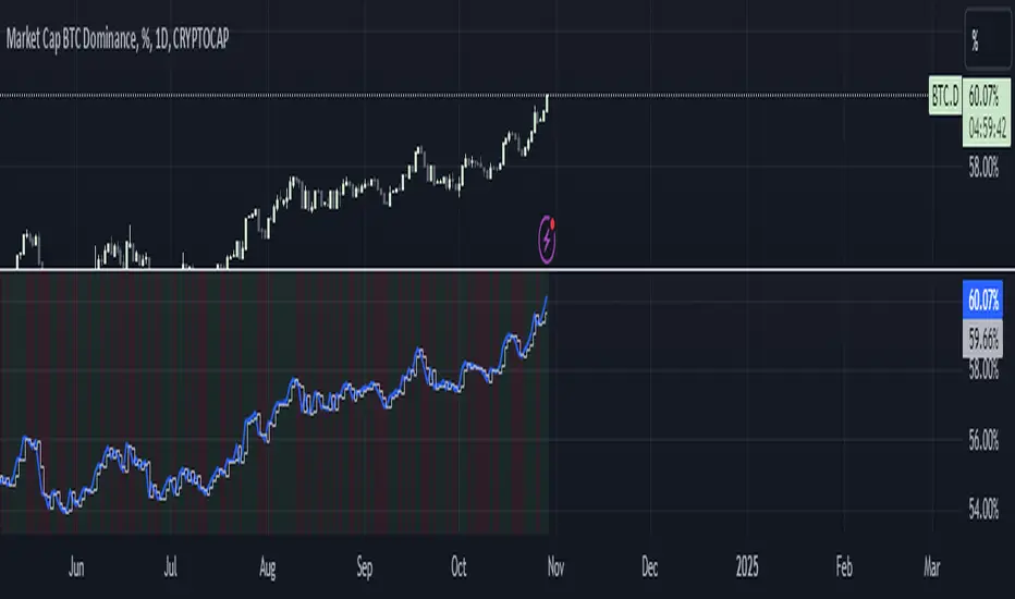
BTC Dominance Zones (For Altseason)Overview
The "BTC Dominance Zones (For Altseason)" indicator is a visual tool designed to help traders navigate the different phases of the altcoin market cycle by tracking Bitcoin Dominance (BTC.D).
It provides clear, color-coded zones directly on the BTC.D chart, offering an intuitive roadmap for the progression of alt season.
Purpose & Problem Solved
Many traders often miss altcoin rotations or get caught at market tops due to emotional decision-making or a lack of a clear framework. This indicator aims to solve that problem by providing an objective, historically informed guide based on Bitcoin Dominance, helping users to prepare before the market makes its decisive moves. It distils complex market dynamics into easily digestible sections.
Key Features & Components
Color-Coded Horizontal Zones: The indicator draws fixed horizontal bands on the BTC.D chart, each representing a distinct phase of the altcoin market cycle.
Descriptive Labels: Each zone is clearly labeled with its strategic meaning (e.g., "Alts are dead," "Danger Zone") and the corresponding BTC.D percentage range, positioned to the right of the price action for clarity.
Consistent Aesthetics: All text within the labels is rendered in white for optimal visibility across the colored zones.
Symbol Restriction: The indicator includes an automatic check to ensure it only draws its visuals when applied specifically to the CRYPTOCAP:BTC.D chart. If applied to another chart, it displays a helpful message and remains invisible to prevent confusion.
Methodology & Interpretation
The indicator's methodology is based on the historical behavior of Bitcoin Dominance during various market cycles, particularly the 2021 bull run. Each zone provides a specific interpretation for altcoin strategy:
Grey Zone (BTC.D 60-70%+): "Alts Are Dead"
Interpretation: When Bitcoin Dominance is in this grey zone (typically above 60%), Bitcoin is king, and capital remains concentrated in BTC. This indicates that alt season is largely inactive or "dead". This phase is generally not conducive for aggressive altcoin trading.
Blue Zone (BTC.D 55-60%): "Alt Season Loading"
Interpretation: As BTC.D drops into this blue zone (below 60%), it signals that the market is "heating up" for altcoins. This is the time to start planning and executing your initial positions in high-conviction large-cap and strong narrative plays, as capital begins to look for more risk.
Green Zone (BTC.D 50-55%): "Alt Season Underway"
Interpretation: Entering this green zone (below 55%) signifies that "real momentum" is building, and alt season is genuinely "underway". Money is actively flowing from Ethereum into large and mid-cap altcoins. If you've positioned correctly, your portfolio should be showing strong gains in this phase.
Orange Zone (BTC.D 45-50%): "Alt Season Ending"
Interpretation: As BTC.D dips into this orange zone (below 50%), it suggests that altcoin dominance is reaching its peak, indicating the "ending" phase of alt season. While euphoria might be high, this is a critical warning zone to prepare for profit-taking, as it's a phase of "peak risk".
Red Zone (BTC.D Below 45%): "Danger Zone - Alts Overheated"
Interpretation: This red zone (below 45%) is the most critical "DANGER ZONE". It historically marks the point of maximum froth and risk, where altcoins are overheated. This is the decisive signal to aggressively take profits, de-risk, and exit positions to preserve your capital before a potential sharp correction. Historically, dominance has gone as low as 39-40% in this phase.
How to Use
Open TradingView and search for the BTC.D symbol to load the Bitcoin Dominance chart and view the indicator.
Double click the indicator to access settings.
Inputs/Settings
The indicator's zone boundaries are set to historically relevant levels for consistency with the Alt Season Blueprint strategy. However, the colors of each zone are fully customizable through the indicator's settings, allowing users to personalize the visual appearance to their preference. You can access these color options in the indicator's "Settings" menu once it's added to your chart.
Disclaimer
This indicator is provided for informational and educational purposes only. It is not financial advice. Trading cryptocurrencies involves substantial risk of loss and is not suitable for every investor. Past performance is not indicative of future results. Always conduct your own research and consult with a qualified financial professional before making any investment decisions.
About the Author
This indicator was developed by Nick from Lab of Crypto.
Release Notes
v1.0 (June 2025): Initial release featuring color-coded horizontal BTC.D zones with descriptive labels, based on Alt Season Blueprint strategy. Includes symbol restriction for correct chart application and consistent white text.

BTC/ETH Lot Size for Dexin - V1.0
█ Overview - This tool is specifically tailored for Delta Exchange India’s users.
I use this interactive tool before taking a position in the BTC’s futures perpetual market . With only 3 mouse clicks, I see all the necessary information, whether a Long or Short position.
A visual of Liquidation Price Level, Stop Loss Price Level, Entry Price Level, Break-even Price Level, and Take Profit Price Level can be immediately seen.
On the top right corner of the chart, which Leverage is to be used, No. of Lots to be taken, expected Profit amount, Loss amount, Brokerage Fees, Risk to Reward Ratios, and Return on Investment are shown, excluding brokerage travel. To get the correct answer in the table that suits your account and risk-taking appetite, the user needs to enter the account balance and Risk per trade.
It also does live tracking of the position, and alerts can be configured too.
█ How to Use
Load the indicator on an active chart.
In the Trading View, ensure that the Magnets is enabled (on the left panel). This will precisely select the price levels you want to choose from OHLC for a candle.
When you first load the tool on the bottom of the chart, you will see a blue box with text in white color guiding you on what you need to do.
Before the first click, the box shall prompt “On the signal candle, set the entry level, where the position would be executed”.
Once the entry price level is selected, the next prompt in the blue box shall be “Set the stop loss level where the position would be exited”. Thus, you need to click the stop loss price level.
Now that the two clicks of Entry and Stop Loss are already done, the last remaining is for the take profit. The last prompt shall be “Set the profit level where the position would be exited”. Therefore, you need to select your take-profit level
Finally, when all three points are selected, the tool shall draw trade zones.
The tool automatically determines whether it is a Long Position or Short Position from the Stop loss and take-profit price levels concerning the entry price level
If the take profit level is above the entry price, the stop must be below, and vice versa; otherwise, an error occurs.
You can change levels by dragging the handles that appear when you select the indicator, or by entering new values in the settings.
Once the position tool is on a chart, it will appear at the same levels on all symbols you use.
If you select the position tool on your chart and delete it, this will also delete the indicator from the chart. You will need to re-add it if you want to draw another position tool. You can add multiple instances of the indicator if you need a position tool on more than one of your charts.
█ Features
Display
The tool displays the following information as graphical visuals
The Liquidation to Stop Loss, Stop Loss to Entry, Entry to Break-even, and Entry to Take Profit zones shall be initiated from the entry candle point.
If you want to be from the candle that crossed the level at a different time from the entry candle, you may go to the settings and adjust the time accordingly. Please note that the time interval is 15 minutes, so at times you may not be able to see the graphical display; however, once the 15-minute time interval is over, you will see the graphical display on the chart.
The tool displays the following information in a tabulated manner
The first row indicates the Leverage that is best suited. The leverage selection by default is greater than or equal to the risk distance.
The second row indicates the number of lots that is computed in relation to the account balance, Risk appetite, Entry price, and Stop Loss price.
The third row indicates estimated profit considering taker's fees and is computed in relation to the number of Lots, Entry price, and Take-Profit price.
The fourth row indicates estimated loss considering taker's fees and is computed in relation to the number of Lots, Entry price, and Stop Loss price.
The fifth row indicates the actual Risk to Reward Ratio, ignoring the travel that pertains to fees.
The sixth row indicates actual Return on Investment, ignoring the travel that pertains to fees.
The intent is to allow the user to make an informed decision prior to taking a position by seeing “$/Rs.” or “% of R O I” or “R : R”.
In case the user wants to know beforehand what the expected charges are that need to be borne before taking a position, that too is made available in the seventh and eighth rows. Both sides' charges are made available for ready reference, irrespective of the outcome of the trade, the user knows the consequences beforehand.
█ Settings
'Trade Sizing'
The tool's input menu is divided into various parts. The first part is 'Trade Sizing'. The user needs to key in the exact number that appears in the Delta Exchange India account against 'Account Balance ($)'. The second thing the user needs to do is key in the 'Risk per Trade'. By default,t it is set to 0.25 and has a default stop change of 0.25. Alternatively, the user can key in any number (Whole number or Rational number) within 100 if that suits their risk management criterion.
'Trade Levels'
Allows users to manually set the Entry, Time, Stop Loss, and Take Profit Price Levels.
'Aggressive Mode Selection'
As the Liquidation zone is shown on the chart, if the user feels that the liquidation price level is too far from the stop loss, this option of 'Use Aggressive Leverage?' allows to increase the leverage, thus reducing the investment amount and in return increasing the Return on Investment %.
The second option in this category is 'Compute Lots based on invested Margin?' itself is self-explanatory, and thus the tabulated data shall be populating the data based on the number entered by the user against 'Margin to be invested ($)'. It is for the user to ensure that the estimated outcomes are within their risk management criterion.
'Conversion & Charges'
If the user wants to see the Profit, Loss, and Fees amount in 'Rs.', all that needs to be done is simply enable the 'Show P&L in Rs.?' The conversion shall take place considering 1 USD = 85 Rs. Same as that carried out by Delta Exchange India.
If the user wants to see the Brokerage Fees, all that needs to be done is simply enable the 'Show Brokerage Fees?'. On enabling this, the table shall show Profitable Trade's (PT) Fees and Lost Trade's (LT) Fees irrespective of the outcome of the trade. The intent is to allow the user to make informed decisions to avoid regrets or surprises at the end of the trade.
'Table'
The division of the input section is related to table position, font size and colors for text and background.
█ Alerts
Alerts can be configured by clicking 'More' (the three dots that appear when you place the cursor on the indicator title that appears on the top left corner of the chart). Alternatively, one can configure alerts by right-clicking on either of the two price levels - Stop Loss price level or Take Profit Price level. Upon right clicking, a window shall appear and the topmost line on that window shall display 'Add alert on ……….' The user can thus put alerts on either of the key levels, such as Stop Loss, Take Profit, and Break Even, or on all of them one by one.

BTC Breakout Alert📈 BTC Breakout & Fakeout Detector with Volume, RSI & MACD Filters
This script helps identify high-confidence breakout setups by combining price action, volume spikes, and optional momentum filters (RSI & MACD). It’s designed to alert you when Bitcoin (or any asset) breaks above a defined resistance level with strong conviction — and warns you if that move turns out to be a fakeout.
🔍 Features:
✅ Confirmed Breakout Alerts: Triggers when price closes above your set resistance level with volume ≥ 1.5× the 20-period average.
⚠️ Fakeout Detection: Highlights when price closes back below resistance within a few candles after breakout.
📊 Momentum Filters:
RSI > 50 for bullish confirmation
MACD line > signal line to support breakout momentum
🔔 Custom Alerts: Built-in alert conditions for both breakout and fakeout events.
🔼🔽 Visual Markers: Arrows plotted directly on the chart for clear entry and caution zones.
🕒 Works on all timeframes and any asset that includes volume data.
Ideal for breakout traders who want more than just a price spike — this tool ensures volume and momentum alignment, helping you reduce false signals and react with more confidence.

BTC Markup/Markdown Zones by Koenigsegg📈 BTC Markup/Markdown Zones
A handcrafted indicator designed to mark Bitcoin's most critical High Time Frame (HTF) structure shifts. This tool overlays true institutional-level Markup and Markdown Zones, selected manually after deep market review. Whether you're testing strategies or actively trading, this tool gives you the bigger picture at all times.
🔍 Key Features:
✅ HTF Markup & Markdown Zones
Every zone is manually selected — no indicators, no repainting. Just raw market history and real structure.
✅ Two Display Modes
• Background Zones — soft overlays with low opacity for visual context — with the option to increase opacity manually if desired.
• Start Candle Highlight — sharply highlighted candle marking the final pivot before a macro reversal.
✅ Custom Color Controls (Style Tab)
All visual styling lives in the Style tab, with clearly labeled fields:
• Markup Zone
• Markdown Zone
• Start Candle Highlight Markup
• Start Candle Highlight Markdown
✅ Minimal Input Section
Just one toggle: display mode. Everything else is kept clean and intuitive.
🧠 Purpose:
This script is made for any timeframe:
• Zoom into lower timeframes to know whether you're trading inside a Markup or Markdown
• Use it during strategy testing for true structural awareness
📅 Handpicked Macro Turning Points:
Each zone originates from a manually confirmed candle — the last meaningful candle before a shift in control between bulls and bears:
• FRI 19 AUG 2011 12PM – MARK DOWN
• THU 20 OCT 2011 12AM – MARK UP
• WED 10 APR 2013 12PM – MARK DOWN
• FRI 12 APR 2013 12PM – MARK UP
• SAT 30 NOV 2013 12AM – MARK DOWN
• WED 14 JAN 2015 12PM – MARK UP
• SUN 17 DEC 2017 12PM – MARK DOWN
• SAT 15 DEC 2018 12PM – MARK UP
• WED 14 APR 2021 4AM – MARK DOWN
• TUE 22 JUN 2021 12PM – MARK UP
• WED 10 NOV 2021 12PM – MARK DOWN
• MON 21 NOV 2022 8PM – MARK UP
• THU 14 MAR 2024 4AM – MARK DOWN
• MON 5 AUG 2024 12PM – MARK UP
• MON 20 JAN 2025 4AM – MARK DOWN
💡 Zones are manually updated by me after each new confirmed Markup or Markdown.
🧬 Fractal Structure for MTF Systems
Price is fractal — meaning the same principles of structure repeat across all timeframes. In Version 2, this tool evolves by introducing manually selected sub-zones inside each High Time Frame (HTF) Markup or Markdown. These sub-zones reflect Medium Timeframe (MTF) structure shifts, offering precision for traders who operate on both intraday and swing levels.
This makes the indicator ideal for low timeframe (LTF) Markup/Markdown awareness — whether you're managing 15m entries or building multi-timeframe confluence systems.
No auto-zones. No guesswork. Just clean, intentional structure division within the broader trend, handpicked for maximum clarity and edge.
💡 Pro Tip:
When price is inside a Markup Zone, shorting becomes riskier — you're trading against a macro bullish structure.
When inside a Markdown Zone, longing becomes riskier — you're fighting against confirmed bearish momentum.
Use this tool to stay aligned with the broader move, especially when zoomed into smaller timeframes or managing entries/exits during intraday setups.
📈 Markup Phase – Bullish Sentiment
Definition: A period where price makes higher highs and higher lows — the uptrend is in full force.
Why sentiment is bullish:
- Institutions and smart money are already positioned long.
- Public/institutional demand drives prices up.
- Momentum is supported by positive news, breakouts, and FOMO.
- Higher highs confirm buyers are in control.
📉 Markdown Phase – Bearish Sentiment
Definition: A period where price makes lower lows and lower highs — clear downtrend.
Why sentiment is bearish:
- Distribution has already occurred, and supply outweighs demand.
- Smart money is short or sidelined, waiting for deeper prices.
- Panic selling or trend-following traders add downside momentum.
- Lower lows confirm sellers are in control.
❌ Trading Against the Trend — Consequences:
-Reduced Probability of Success
-You’re fighting the dominant flow. Most participants are pushing in the opposite direction.
-Drawdowns & Stop-Outs
-Countertrend trades often get wicked or flushed before any meaningful move, especially without structure-based entries.
-Low Risk-Reward Ratio
-Trends offer sustained moves. Countertrend trades may have small take-profit zones or chop.
-Mental Drain & Doubt
-Fighting momentum causes anxiety, second-guessing, and emotional reactions.
-Missed Opportunities
-Focusing on fighting the trend makes you blind to the high-probability setups with the trend.
-Increased Transaction Costs
-More stop-outs and re-entries mean more fees, more friction.
-FOMO from Watching the Trend Run
-Entering countertrend means you might watch the trend explode without you.
-Confirmation Bias & Stubbornness
-Countertrend traders often look for reasons to justify staying in the wrong direction — leading to bigger losses.
🧠 Summary
In markup = bulls dominate → you swim with the current.
In markdown = bears dominate → going long is like pushing a rock uphill.
Trading with the trend is not just safer, it's smarter. The edge lives in momentum — not ego.
⚠️ Disclaimer
This indicator is for educational and analytical use only. It is not financial advice and should not be relied on for decision-making without personal analysis.
This is not a predictive tool. No indicator can forecast upcoming price movements.
What you see here is based purely on past market behavior — specifically, historical tops and bottoms that marked the start of confirmed reversals.
This script does not know where the next reversal begins, nor can it determine where a new Markup or Markdown starts or ends. It is designed to provide context, not prediction.
Always trade with responsibility and perform your own due diligence.

BTC Growth | AlchimistOfCrypto🌈 BTC Regression Bands & Halvings – Unveiling Bitcoin's Logarithmic Growth Fields 🌈
"The Bitcoin Regression Bands, engineered through advanced logarithmic mathematics, visualizes the probabilistic distribution of Bitcoin's price evolution within a multi-cycle growth paradigm. This indicator employs principles from hyperbolic regression where decay coefficients create mathematical boundaries that define Bitcoin's long-term value progression. Our implementation features algorithmically enhanced rainbow visualization derived from extensive cycle analysis, creating a dynamic representation of Bitcoin's logarithmic growth with adaptive color gradients that highlight critical halving-based phase transitions in the asset's monetary evolution."
📊 Professional Trading Application
The Bitcoin Regression Bands transcends traditional price prediction models with a sophisticated multi-band illumination system that reveals the underlying structure of Bitcoin's monetary evolution. Scientifically calibrated across multiple halving cycles and featuring seamless rainbow visualization, it enables investors to perceive Bitcoin's position within its macro growth trajectory with unprecedented clarity.
- Visual Theming 🎨
Scientifically designed rainbow gradient optimized for cycle pattern recognition:
- Violet-Blue: Lower value accumulation zones with highest mathematical growth potential
- Green: Fair value equilibrium zone representing the regression mean
- Yellow-Orange: Moderate overvaluation regions indicating potential resistance
- Red: Statistical extreme zones indicating mathematical cycle peaks
- Halving Visualization 🔍
- Precise cycle boundaries demarcating Bitcoin's fundamental supply shock events
- Adaptive band spacing based on mathematical cycle progression
- Multiple sub-cycle markers revealing the probabilistic nature of Bitcoin's trajectory
🚀 How to Use
1. Identify Macro Position ⏰: Locate Bitcoin's current price relative to the regression bands
2. Understand Cycle Context 🎚️: Note position within the current halving cycle for time-based analysis
3. Assess Mathematical Value 🌈: Determine potential over/undervaluation based on band location
4. Adjust Investment Strategy 🔎: Modulate position sizing based on mathematical value assessment
5. Identify Cycle Phases ✅: Monitor band transitions to detect accumulation and distribution zones
6. Invest with Precision 🛡️: Utilize lower bands for strategic accumulation, upper bands for strategic reduction
7. Manage Risk Dynamically 🔐: Scale investment allocations based on mathematical cycle positioning

BTC Dominance Trend CheckerThis monitors the Bitcoin dominance (BTC.D) in the market. It retrieves the current and previous day's BTC dominance values, determines whether dominance is increasing or decreasing, and visually displays the trend.
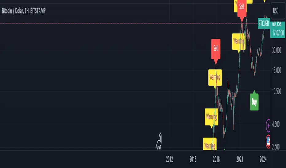
BTC Arcturus IndicatorBTC Arcturus Indicator: This indicator is designed to create buy and sell signals based on the market value of Bitcoin. It also predicts potential market tops with the Pi Cycle Top indicator.
How Does It Work?
1. MVRVZ (Market Value to Realized Value-Z Score) Calculation:
MC: Bitcoin's market cap (Market Cap) is pulled daily from Glassnode data.
MCR: Realized Market Cap of Bitcoin is taken daily from Coinmetrics data.
MVRVZ: It is calculated by dividing the difference between Bitcoin's market value and realized market value by one standard deviation. This value indicates whether the market is overvalued or undervalued.
2. Reception and Warning Signals:
Buy Signal: When MVRVZ falls below the -0.255 threshold value, the indicator gives a "Buy" signal. This indicates that Bitcoin is undervalued and may be a buying opportunity.
Warning Signal: A warning signal turns on when MVRVZ exceeds the threshold value of 2.765. This indicates that the market is approaching saturation and caution is warranted.
3. Tracking the Highest MVRVZ Value:
The indicator records the highest MVRVZ value in the last 10 candlesticks. This value is used to determine whether the market has reached its highest risk levels.
4. Warning Display:
If the MVRVZ value matches the highest value in the last 10 bars and this warning has not been displayed before, a "Warning" signal is displayed.
Once the warning signal is shown, no further warnings are shown for 10 candles.
5. Pi Cycle Top Indicator:
Pi Cycle Top: This indicator predicts Bitcoin tops by comparing two moving averages (350-day and 111-day). If the short-term moving average falls below the long-term moving average, this is considered a sell signal.
The indicator displays this signal with the label "Sell", indicating a potential market top.
User Guide:
Green Buy Signal: It means Bitcoin is cheap and offers a buying opportunity.
Yellow Warning Signal: Indicates that Bitcoin has reached possible profit taking points and caution should be exercised.
Red Sell Signal: Indicates that Bitcoin has reached market saturation and it may be appropriate to sell.
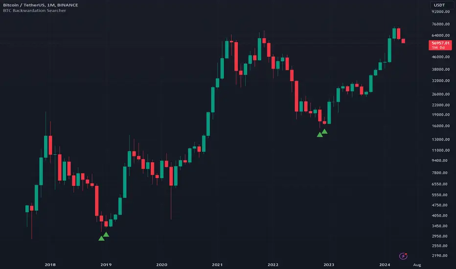
BTC Backwardation SearcherThis Pine Script code is a custom indicator named "BTC Backwardation Searcher" designed for the TradingView platform. The indicator aims to identify and visualize the price difference between two Bitcoin futures contracts: CME:BTC1! and CME:BTC2!.
Here's a breakdown of the code:
1. The script fetches the daily close prices of CME:BTC1! and CME:BTC2! using the security() function.
2. It calculates the percentage price difference between the two contracts using the formula: (btc1Price - btc2Price) / btc2Price * 100.
3. The script also calculates the price difference for the previous two days (2 days ago and 3 days ago) using the same formula.
4. Two conditions are defined:
(1) dailyGreenCondition: If the price difference is greater than or equal to 0.3% for three
consecutive days, including the current day and the previous two days.
(2) dailyRedCondition(commented): If the price difference is less than or equal to -1% for three consecutive days, including the current day and the previous two days.
(I commented it out because I don't think it's useful.)
5. The plotshape() function is used to display green triangles on the chart when the dailyGreenCondition is met, and red triangles when the dailyRedCondition is met. These triangles are displayed on the daily, weekly, and monthly timeframes.
The purpose of this indicator is to help traders identify potential trading opportunities based on the price difference between the two Bitcoin futures contracts. The green triangles suggest a bullish scenario where CME:BTC1! is significantly higher than CME:BTC2!, while the red triangles indicate a bearish scenario where CME:BTC2! is significantly lower than CME:BTC1!.
However, it's important to note that this indicator should be used in conjunction with other technical analysis tools and fundamental analysis. Traders should also consider their risk tolerance, investment goals, and market conditions before making any trading decisions based on this indicator.
BTC Supply in Profits and Losses (BTCSPL) [AlgoAlpha]Description:
🚨The BTC Supply in Profits and Losses (BTCSPL) indicator, developed by AlgoAlpha, offers traders insights into the distribution of INDEX:BTCUSD addresses between profits and losses based on INDEX:BTCUSD on-chain data.
Features:
🔶Alpha Decay Adjustment: The indicator provides the option to adjust the data against Alpha Decay, this compensates for the reduction in clarity of the signal over time.
🔶Rolling Change Display: The indicator enables the display of the rolling change in the distribution of Bitcoin addresses between profits and losses, aiding in identifying shifts in market sentiment.
🔶BTCSPL Value Score: The indicator optionally displays a value score ranging from -1 to 1, traders can use this to carry out strategic dollar cost averaging and reverse dollar cost averaging based on the implied value of bitcoin.
🔶Reversal Signals: The indicator gives long-term reversal signals denoted as "▲" and "▼" for the price of bitcoin based on oversold and overbought conditions of the BTCSPL.
🔶Moving Average Visualization: Traders can choose to display a moving average line, allowing for better trend identification.
How to Use ☝️ (summary):
Alpha Decay Adjustment: Toggle this option to enable or disable Alpha Decay adjustment for a normalized representation of the data.
Moving Average: Toggle this option to show or hide the moving average line, helping traders identify trends.
Short-Term Trend: Enable this option to display the short-term trend based on the Aroon indicator.
Rolling Change: Choose this option to visualize the rolling change in the distribution between profits and losses.
BTCSPL Value Score: Activate this option to show the BTCSPL value score, ranging from -1 to 1, 1 implies that bitcoin is extremely cheap(buy) and -1 implies bitcoin is extremely expensive(sell).
Reversal Signals: Gives binary buy and sell signals for the long term

BTC Indicator By Megalodon TradingThis indicator is designed help you see the potential reversal zones and it helps you accumulate for the long run.
This combines price data on any chart. The chart isolates between 0 and -100. Below -80 is a buy, above -20 is a sell location.
In these locations, try to Slowly Buy and Slowly Sell (accumulate...)
Story Of This Indicator
~I was always obsessed with Fibonacci and used Fibonacci all the time. Thus, i wanted to make a tool to see buying locations and selling locations.
Instead of drawing fibonacci's and manually interpreting buy/sell locations, i wanted algorithms to do the job for me. So, i created this algorithm and many more like it.
If you think i did a good job and want to do further work with me, feel free to contact.
I have a ton of other tools that can change everything for your trading/investing.
Best wishes
~Megalodon
BTC Dominance Exclude Stablecoins(USDT, USDC, DAI)This index's goal is to show the true bitcoin dominance relative to other risky crypto assets, excluding the diluting effects of those ever-increasing stablecoin(USDT, USDC, DAI)'s market cap. In this index, we can see the BTC dominance has been solid increasing & construct bottom during recent fear/bear.
Xiaolai Chen
Sept 14th 2022

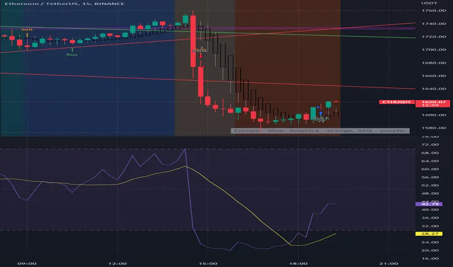
BTC Europe-America-Asia market backgrounds - 1h max frameMarket indicator - Europe - America - Asia.
Based on my trading experience. Therefore, time zones are of different sizes.
BTC spot volumeIndicator with aggregated volume for all the most actively traded bitcoin spot markets.
Can be denominated in either US dollars or the number of coins traded.
Can be displayed as stacked volume or an index that shows the percentage market share each market has.
In the settings you can exclude any market so that it only shows the individual and total volume of the markets you're interested in.
The currency it's traded against is always specified (e.g. USDT, BUSD, ...).
It's public and free for anyone to use.

BTC perpetual swaps volumeIndicator with aggregated volume for all the most actively traded bitcoin perpetual swaps.
Can be denominated in either US dollars or the number of coins traded.
Can be displayed as stacked volume or an index that shows the percentage market share each contract has.
In the settings you can exclude any contract so that it only shows the individual and total volume of the markets you're interested in.
"Linear" or "inverse" refers to the type of perpetual swap contract it is.
Inverse contracts use coin margin, so in this case BTC.
Linear contracts use some type of dollar equivalent margin like USDT for example.
The margin is always specified for the linear contracts.
It's public and free for anyone to use.

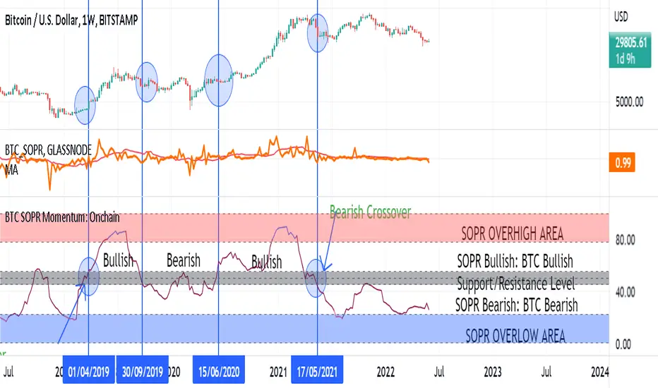
BTC SOPR Momentum: OnchainThis Onchin metric is based on SOPR data
Use this metric on daily and weekly timeframes:
SOPR:
The Spent Output Profit Ratio (SOPR) is computed by dividing the realized value (in USD) divided by the value at creation (USD) of a spent output. Or simply: price sold / price paid. Renato Shirakashi created this metric. When SOPR > 1, it means that the owners of the spent outputs are in profit at the time of the transaction; otherwise, they are at a loss. You can find "SOPR" in tradingview indicators
BTC SOPR Momentum: Onchain
This metric is based on SOPR Momentum. I made some changes to it so that its momentum can be checked.
Interpretation:
If the indicator is above the gray level of resistance/support, bitcoin has an uptrend and Bullish bias
If the indicator is below the resistance/ support level, bitcoin has a downtrend and Bearish Bias
Crossup the gray level is a long signal
Cross-down the gray level is a shorts signal
Entering and exit of the indicator to the overhigh area means creating a top
Entering and leaving the indicator to the overflow area means creating a bottom
BTC Price vs COP Spread Chart Wanted to create a spread chart using BTC and some cost of production estimates. In any commodity using COP is a great way to define "value" and typically there's about 100-150% markup for investors to keep in mind when using this metric in their analysis. Thanks to Grimm for the spread idea/request. #PMAFTW // Original cop code taken from;
BTC Gravity OscillatorThis indicator is a deviation of a Center of Gravity Oscillator corrected for the diminishing returns of Bitcoin.
I've set up this indicator for it to be used on the weekly timeframe. The indicator oscillates between 0 and 10, where 0 indicates oversold conditions and 10 indicates overbought conditions.
The indicator plots in any BTCUSD spot, futures , BLX index and BTCEUR .
It paints in all time frames, but Weekly time frame is the correct one to interpret the 'official' read of it.
