Pure Wyckoff V50R [Region Based]Pure Wyckoff V50R — Regional Wyckoff Volume-Price Structure Scanner
This script implements a semi-automatic Wyckoff volume–price analysis based purely on regional behaviour, not on single candles. Instead of trying to label every bar, it analyses the last N candles (default ≥ 50) and their volume distribution to estimate whether the market is in an accumulation, distribution or trend phase.
Main features:
🔍 Region-based structure detection
Scans the last regLen bars to find the trading range, then attempts to locate key Wyckoff points such as
SC (Selling Climax), AR, ST, Spring, UT, LPSY, and draws the SC–AR band when a structure is active.
⚖️ Supply–demand balance
Uses regional bullish vs bearish volume to show whether Demand > Supply, Supply > Demand, or Balanced for the current range.
🧠 Phase & decision panel
For the current bar the panel summarises:
overall structure (bullish / bearish / ranging),
approximate Wyckoff phase (e.g. “A phase: SC→AR rally”, “B phase: top distribution zone”, “Bottom testing zone”),
VSA-style bar reading (no supply, effort vs result, SOW, etc.),
current key signal (Spring / UT / LPSY / ST / Trend),
one-line short-term and long-term trading bias.
📊 Scoreboard
Simple scores for structure, volume and trend to give a quick “bullish / bearish / neutral” overview.
Recommended use:
Designed mainly for higher timeframes (Daily / 4H) where Wyckoff structures are clearer.
Parameters (window length, volume averages, multipliers) should be tuned to the instrument and timeframe.
This is a structure helper, not an automatic signal provider – always combine it with your own discretion and risk management.
Disclaimer: This script is for educational and analytical purposes only and does not constitute financial advice. Use at your own risk and feel free to share feedback or improvements.
Поиск скриптов по запросу "accumulation"

Institutional Valuation SuiteStandard volatility indicators often fail on long-term growth charts because they measure volatility in dollars rather than percentages. This causes bands to break or become irrelevant during exponential price moves (e.g., Bitcoin going from $1,000 to $100,000).
The Institutional Valuation Suite solves this by utilising Geometric (Log-Normal) Standard Deviation. This allows the model to adapt to the asset's price scale, providing accurate valuation zones regardless of price magnitude.
The model functions as a mean-reversion tool, visualizing price as an elastic band anchored to a "Fair Value" baseline. It identifies when the asset is statistically overextended (Bubble/FOMO) or undervalued (Deep Discount).
Key Features
1. Log-Normal Math Engine
Geometric Mode (Default): Calculates volatility in percentage terms. Essential for Crypto and Growth Stocks.
Arithmetic Mode: Available for Forex or range-bound assets where linear standard deviation is preferred.
2. Sentiment Heat map
Visualises valuation directly on the candles to remove interpretation bias.
GREEN: Deep Value / Accumulation Zone (< -0.5σ).
ORANGE: Overvalued / FOMO Zone (> 2.0σ).
RED: Speculative Bubble Zone (> 3.0σ).
3. Reversion Signals
"VALUE RECLAIM": Triggers when price re-enters the bottom band from below, filtering out "falling knife" scenarios.
"TOP EXIT": Triggers when price breaks down from the speculative top zone.
4. Statistical Dashboard
Displays the real-time Z-Score to quantify how "stretched" the price is relative to its baseline.
> 3.0: Statistical Anomaly (Top).
< -0.5: Statistical Discount (Bottom).
Optimisation Cheat Sheet
The "Cycle Length" input determines the lookback period for the baseline. Recommended settings:
Crypto Macro: 200 (Approx. 4 Years).
Altcoins: 100 (Approx. 2 Years).
Stocks (S&P 500): 50 (1 Year Trend).
Day Trading: Set "Timeframe Lock" to "Chart".
Technical Note
This indicator uses strict offset logic (`barmerge.lookahead_on`) to ensure historical consistency. The signals displayed on historical bars match exactly what would have appeared in real-time.
*Disclaimer: This script provides statistical analysis based on historical volatility and does not constitute financial advice.*

TradingBee Money FlowTradingBee Money Flow
Most traders make the mistake of relying on a single indicator. RSI only looks at price. OBV only looks at volume. If you only look at one, you are missing half the picture.
TradingBee Money Flow solves this by calculating a weighted consensus of 10 different technical metrics combined into a single "Flow Score." It answers the most important question in trading: "Is the money actually backing up the price move?"
If Price goes UP, but this indicator goes DOWN, it’s a trap.
How It Works: The 3-Tier Logic
This script does not just average numbers; it weights them based on importance to creating a true "Composite Score" (-100 to +100).
Tier 1: Primary Volume Flow (50% Weight) The engine of the indicator. It measures raw capital entering/exiting.
MFI (Money Flow Index)
OBV Momentum (On-Balance Volume)
Chaikin Money Flow (CMF)
Tier 2: Secondary Momentum (35% Weight) Validates if the volume is actually moving price efficiently.
VWAP Oscillation
Accumulation/Distribution (A/D) Momentum
Klinger Oscillator
Elders Force Index
Tier 3: Confirmation & Volatility (15% Weight) Filters out fake-outs using volatility metrics.
RSI
ADX (Trend Strength)
Bollinger Band Width
The "Clean Divergence" Engine (Unique Feature)
Standard divergence indicators are "noisy"—they print signals on every small pivot. The TradingBee Money Flow uses a custom Clean Wave Filter to only identify high-probability reversals.
It requires two conditions to trigger a Divergence Signal:
The "Gap" Rule (Zero Cross): The indicator must cross the Zero Line in between two peaks. This ensures we are comparing two distinct waves of buying/selling, rather than just jagged noise in a single trend.
The "Shrinkage" Rule: The second wave must be significantly smaller (by a user-defined ratio) than the first. This confirms a true collapse in momentum.
How to Use This Indicator
1. The Histogram (Trend Following)
Bright Green: Buying pressure is accelerating. Strong Trend.
Dark Green: Buying is continuing, but momentum is slowing. Warning sign.
Bright Red: Selling pressure is accelerating.
Zero Line Cross: The definitive signal of a trend change.
2. The Lines (Reversal Trading)
🔴 Red Line (Bearish Divergence): Price made a Higher High, but Money Flow made a Lower High (with a gap in between). Smart money is selling into the rally. Look for Shorts.
🟢 Green Line (Bullish Divergence): Price made a Lower Low, but Money Flow made a Higher Low. Sellers are exhausted. Look for Longs.
Settings
Lookback Period: Adjusts the sensitivity of the composite score.
Pivot Lookback: Increases or decreases the strictness of the pivot detection.
Require Zero Cross: Keep checked for "Clean" signals. Uncheck to see standard divergences.
Wave Size Ratio: Defines how much smaller the second wave must be to trigger a signal.
Disclaimer: This tool provides market analysis but does not guarantee future results. Always manage your risk.

X VFI (LB) w absorptiona variation of the On-Balance Volume (OBV) introduced by Markos Katsanos and further refined by LazyBear, is a robust volume-based momentum oscillator designed to measure the strength and direction of money flow. It utilizes advanced filtering mechanisms to enhance signal quality for active trading environments. This version has added an absorption feature.
Core Functionality and Enhancements
Filtered Volume Flow: The VFI is calculated using the Typical Price (HLC/3) and incorporates filters for Volatility (coef) and Excessive Volume (vcoef). This ensures the indicator responds only to price changes supported by sustained, relevant volume, filtering out market noise and anomalous spikes.
Zero-Line Bias: VFI values above zero indicate net accumulation (bullish flow), while values below zero indicate net distribution (bearish flow).
Signal Line Timing (vfima): The Exponential Moving Average (EMA) of the VFI acts as the Signal Line. Crossovers between the VFI (fast line) and the Signal Line are primary triggers for trade entries and exits.
Absorption/Distribution Signals
This customized version introduces unique features to visually isolate periods where underlying volume conviction contradicts immediate price action—the most powerful setups for reversals and strong continuations.
Absorption/Distribution Highlighting:
The histogram's color is dynamically changed to highlight hidden buying or selling pressure:
(Absorption Signal): Indicates strong positive VFI momentum occurring on a bearish (down) candle. This signals aggressive buying absorption of supply, where large traders are accumulating positions despite brief selling pressure, often preceding a sharp upward move.
(Distribution Signal): Indicates strong negative VFI momentum occurring on a bullish (up) candle. This signals aggressive selling distribution into demand, where large traders are offloading positions into brief rallies, often preceding a sharp downward move.
Volume-Filtered Conviction: The visual intensity (transparency) of the signal color is adjusted based on a Volume Filter (minVolFilter). Darker, solid colors denote high-conviction signals supported by above-average volume, while transparent colors indicate lower-conviction signals.
Histogram Magnification:
The magnification input allows users to visually increase the height of the histogram bars (e.g., 2x). This enhances the immediate visual recognition of momentum acceleration or deceleration.

LiquidityThe liquidity swings indicator highlights swing areas with existent trading activity. The number of times price revisited a swing area is highlighted by a zone delimiting the swing areas. Additionally, the accumulated volume within swing areas is highlighted by labels on the chart. An option to filter out swing areas with volume/counts not reaching a user-set threshold is also included.
This indicator by its very nature is not real-time and is meant for descriptive analysis alongside other components of the script. This is normal behavior for scripts detecting pivots as a part of a system and it is important you are aware the pivot labels are not designed to be traded in real-time themselves.
🔶 USAGE
The indicator can be used to highlight significant swing areas, these can be accumulation/distribution zones on lower timeframes and might play a role as future support or resistance.
Swing levels are also highlighted, when a swing level is broken it is displayed as a dashed line. A broken swing high is a bullish indication, while a broken swing low is a bearish indication.
Filtering swing areas by volume allows to only show significant swing areas with an higher degree of liquidity. These swing areas can be wider, highlighting higher volatility, or might have been visited by the price more frequently.
🔶 SETTINGS
Pivot Lookback : Lookback period used for the calculation of pivot points.
Swing Area : Determine how the swing area is calculated, "Wick Extremity" will use the range from price high to the maximum between price close/open in case of a swing high, and the range from price low to the minimum between price close/open in case of a swing low. "Full Range" will use the full candle range as swing area.
Intrabar Precision : Use intrabar data to calculate the accumulated volume within a swing area, this allows obtaining more precise results.
Filter Areas By : Determine how swing areas are filtered out, "Count" will filter out swing areas where price visited the area a number of time inferior to the user set threshold. "Volume" will filter out swing areas where the accumulated volume within the area is inferior to the user set threshold.
🔹 Style
Swing High : Show swing highs.
Swing Low : Show swing lows.
Label Size : Size of the labels on the chart.

Advanced Supply and DemandThe Supply and Demand Visible Range indicator displays areas & levels on the user's chart for the visible range using a novel volume-based method. The script also makes use of intra-bar data to create precise Supply & Demand zones.
🔶 SETTINGS
Threshold %: Percentage of the total visible range volume used as a threshold to set supply/demand areas. Higher values return wider areas.
Resolution: Determines the number of bins used to find each area. Higher values will return more precise results.
Intra-bar TF: Timeframe used to obtain intra-bar data.
The supply/demand areas and levels displayed by the script are aimed at providing potential supports/resistances for users. The script's behavior makes it recalculate each time the visible chart interval/range changes, as such this script is more suited as a descriptive tool.
Price reaching a supply (upper) area that might have been tested a few times might be indicative of a potential reversal down, while price reaching a demand (lower) area that might have been tested a few times could be indicative of a potential reversal up.
The width of each area can also indicate which areas are more liquid, with thinner areas indicating more significant liquidity.
The user can control the width of each area using the Threshold % setting, with a higher setting returning wider areas. The precision setting can also return wider supply/demand areas if very low values are used and has the benefit of improving the script execution time at the cost of precision.
The Supply and Demand Zones indicator returns various levels. The solid-colored levels display the average of each area, while dashed colored lines display the weighted averages of each area. These weighted averages can highlight more liquid price levels within the supply/demand areas.
Central solid/dashed lines display the average between the areas' averages and weighted averages.
🔶 DETAILS
Each supply/demand area is constructed from volume data. The calculation is done as follows:
The accumulated volume within the chart visible range is calculated.
The chart visible range is divided into N bins of equal width (where N is the resolution setting)
Calculation start from the highest visible range price value for the supply area, and lowest value for the demand area.
The volume within each bin after the starting calculation level is accumulated, once this accumulated volume is equal or exceed the threshold value (p % of the total visible range volume) the area is set.
Each bin volume accumulation within an area is displayed on the left, this can help indicate how fast volume accumulates within an area.
🔶 LIMITATIONS
The script execution time is dependent on all of the script's settings, using more demanding settings might return errors so make sure to be aware of the potential scenarios that might make the script exceed the allowed execution time:
Having a chart's visible range including a high number of bars.
Using a high number of bins (high resolution value) will increase computation time, this can be worsened by using a high threshold %.
Using very low intra-bar timeframe can drastically increase computation time but can also simply throw an error if the chart timeframe is high.

deKoder | Ultra High Timeframe Moving Average & Log StDev BandsdeKoder | Ultra High Timeframe Moving Average & Log StDev Bands
Identify long-term statistical extremes and map the core trend with the deKoder | uHTF MA indicator. Designed for macro analysis, this tool uses ultra high timeframe moving averages and logarithmic standard deviation bands to frame price action, providing clear signals for when an asset is statistically cheap, fairly priced, or expensive.
KEY FEATURES
• Ultra High Timeframe (uHTF) Moving Average:
• Acts as a dynamic long term fair value equilibrium line. Choose from periods like 1-Year, 2-Year, or 'Long Time'.
• Select your MA type: SMA, EMA, Hull MA, or a Rolling VWAP .
• Automatically fetches optimal data (4H/D) for smoother plotting on lower timeframes.
• Probabilistic Logarithmic Bands:
• The bands are calculated using log-standard deviation , creating a framework that adapts to exponential growth. As such, your chart price scale should be set to log.
• ~68% of price action typically occurs between the ±1σ bands (fair value zone).
• Trading in the ±1σ to ±2σ channel is typical in a strongly trending market. Moves towards the ±3σ bands can indicate that the market is becoming overextended. Expect strong price moves here and pay attention for signs of reversal.
• Bitcoin Halving Timeline:
• Integrated vertical lines and labels for all Bitcoin halvings.
• Correlates technical extremes with fundamental scarcity events.
• 4-Year Cycle Visual Aid:
• The background color cycle highlights yearly changes.
• Red years have historically aligned with bear markets, while the subsequent green zone has marked accumulation phases.
• Note: The bands provide the primary information - the background color is a contextual guide based on historical patterns around the BTC 4 year halving cycle that may not persist in future. It's quite possible that the market will act differently going forward considering the new types participants such as ETFs and government reserve funds.
HOW TO USE & INTERPRET
• Fair Value & Extremes:
• Price between ±1σ Bands: The asset is trading within a statistically fair value range.
• Price at +2σ / +3σ Bands: The asset is statistically expensive. Statistically, the price is overextended in this region, although you do NOT want to fade it based only upon this information.
• Price at -2σ / -3σ Bands: The asset is statistically cheap. These zones have frequently coincided with the end of bear markets and profound long-term buying opportunities.
• Dynamic Support & Resistance:
• The uHTF MA and its bands tend to act as support and resistance areas of interest on daily, weekly and monthly charts.
INPUTS & CUSTOMIZATION
• Toggles : Master switch for the MA, Bands, and Halving markers.
• uHTF Moving Average Filter : Select instrument (default: BITSTAMP:BTCUSD), price source, MA length, and type.
• Colours : Fine-tune the appearance of all elements.
PRO TIPS
• While created for Bitcoin, this principle will work well on other high-growth assets and major indices.
• The most reliable signals occur on the Daily, Weekly and Monthly timeframes.
• This is a lagging, macro-filter indicator. It is not for timing short-term entries but for confirming the long-term trend and cycle phase.
"Be Fearful When Others Are Greedy and Greedy When Others Are Fearful." - The deKoder | uHTF MA is here to help you quantify that greed and fear on a macro scale.

Order Flow AnalysisOrder Flow Pressure Suite — Wick, Volume & Absorption-Based Pressure Map
This indicator builds a composite buying/selling pressure score from candle structure, volume behavior, and absorption signals.
It is designed to infer the “intent” behind price moves by looking at how candles form, where they close, and how volume behaves — even without access to true bid/ask or footprint data.
Core Concepts
Wick-to-Body Analysis
The script evaluates the ratio of upper and lower wicks to the total candle range.
Strong wicks with relatively small bodies are treated as rejections :
Long upper wick → potential selling pressure / rejection of higher prices
Long lower wick → potential buying pressure / rejection of lower prices
Close Position Analysis
The close is normalized within the candle range:
Close near the high → bullish pressure
Close near the low → bearish pressure
Close near the middle → more neutral , context taken from wicks and volume
Volume Delta Estimation
Since true bid/ask data is not available on standard charts, the script estimates “volume delta” by distributing total volume between buyers and sellers based on candle characteristics:
Bull candles receive more “buying volume,” weighted toward closes near the high
Bear candles receive more “selling volume,” weighted toward closes near the low
This is an approximation of order flow, not a direct time & sales feed.
Absorption Detection
The script looks for candles where volume is high but price movement is relatively small .
This combination often suggests:
Bullish absorption → buyers absorbing aggressive selling (potential accumulation)
Bearish absorption → sellers absorbing aggressive buying (potential distribution)
Absorption zones are tracked over a configurable lookback and can be shaded in the background.
Composite Pressure Oscillator
All the above components (wicks, close position, heuristic volume delta, absorption bias) are blended into a single pressure score :
Values > 0 → net buying pressure
Values < 0 → net selling pressure
The raw score is smoothed with an EMA to reduce noise and create a cleaner oscillator line.
Divergence Detection
The indicator compares price pivots to pressure pivots:
Bullish divergence : price makes a lower low while pressure makes a higher low
Bearish divergence : price makes a higher high while pressure makes a lower high
These conditions can help highlight potential exhaustion or hidden participation from larger players.
Visual Elements
Histogram showing the intensity of buying/selling pressure
Color-coding for increasing vs. decreasing pressure
Background shading for detected absorption zones
Status table summarizing current pressure, trend bias, volume delta, wick signal, and absorption state in real time
How To Use
Use the pressure oscillator to gauge whether the current bar sequence is dominated by buyers or sellers. Strong positive readings may indicate sustained buying pressure; strong negatives may indicate sustained selling pressure.
Watch for divergences between price and the pressure oscillator around key levels, swings, or zones you already care about.
Use absorption zones and wick rejection signals as additional context around support/resistance, breakouts, or failed moves.
Treat all signals as context and confluence , not as stand-alone trade entries or exits. This tool is best used alongside your existing price action, volume, and risk management framework.
Important Notes & Limitations
This script does not access real bid/ask, footprint, or order book data . All volume delta and absorption interpretations are heuristic estimates derived from OHLCV candles.
Signals are probabilistic , not guarantees. They can be early, late, or outright wrong in fast or low-liquidity markets.
Always validate signals with your own analysis, timeframe alignment, and risk management. This indicator is intended as an analytical tool , not financial advice.

BifaneiroSinaleiro V3 ULTIMATEBifaneiroSinaleiro V3 ULTIMATE - Complete ICT Analysis System & Signal Generator
This isn't just an indicator - it's your 24/7 ICT analyst that does the manual work for you.
━━━━━━━━━━━━━━━━━━━━━━━━━━━━━━━━━━━━━━
🔥 WHAT IT DOES FOR YOU:
━━━━━━━━━━━━━━━━━━━━━━━━━━━━━━━━━━━━━━
✅ Marks ALL ICT Concepts Automatically:
- Fair Value Gaps (LTF + HTF with priority)
- Market Structure (BOS/CHoCH in real-time)
- Breaker Blocks (validated with volume + killzone)
- Liquidity Sweeps (Asian High/Low runs)
- Premium/Discount Arrays + OTE Zones
- Institutional Sessions (London, NY Silver Bullets)
✅ Advanced Pattern Recognition:
- Turtle Soup (sweep + reversal)
- Unicorn Model (sweep → BOS → FVG)
- SMT Divergences (monitors correlated pairs)
- PO3/AMD Phases (Accumulation → Manipulation → Distribution)
✅ Intelligent Scoring System:
- 12+ confluence factors analyzed
- Minimum score 12 for signals (configurable)
- Score 20+ = EXTREME (enables 2nd trade in session)
- Visual score display on every signal
✅ Professional Trade Management:
- 1 trade per session (London, NY AM, NY PM) = max 3/day
- EXTREME mode: 2 trades per session = max 6/day
- Automatic stop loss (session range-based)
- Dynamic take profit (score-adjusted multiplier)
- Auto breakeven after 2.5x move
- EOD close (23:59) with P&L label
- Weekend close (Fri 23:55) with P&L label
✅ 100% ICT Pure Methodology:
- NO EMAs, NO ATR, NO lagging indicators
- Pure price action: High/Low/Range only
- HTF confirmation via Premium/Discount (not EMAs!)
- Stop loss via Asian Range (not ATR!)
━━━━━━━━━━━━━━━━━━━━━━━━━━━━━━━━━━━━━━
⚡ WHY IT'S DIFFERENT:
━━━━━━━━━━━━━━━━━━━━━━━━━━━━━━━━━━━━━━
Traditional indicators show 1-2 concepts. This shows 10+ simultaneously.
Manual ICT takes 2-3 hours per session. This does it in milliseconds.
Other systems guess. This scores with objective confluence.
You save hours daily. You trade better. You profit more consistently.
━━━━━━━━━━━━━━━━━━━━━━━━━━━━━━━━━━━━━━
📊 WHAT YOU GET:
━━━━━━━━━━━━━━━━━━━━━━━━━━━━━━━━━━━━━━
- Real-time dashboard (scores, confluences, structure)
- Precision signals (only in killzones, only with confluences)
- Trade tracking (win rate, RR, P&L by session)
- Multi-timeframe analysis (automatic)
- News block filter (configurable)
- Full customization (colors, thresholds, sessions)
- Comprehensive alerts (8+ types)
Works on: Forex, Indices, Commodities, Crypto
Best on: 1m-5m for execution, 15m+ for swing
Timezone: Configured for CET (UTC+1), easily adjustable
⚠️ This is a professional tool requiring ICT/SMC understanding.
Not magic - it's methodology, automated.
🚀 Stop drawing. Start trading. Add to chart now.

jhehli LiquidityWhat are BSL and SSL?
In the context of Smart Money Concepts, liquidity simply refers to pending orders—specifically Stop Losses and Buy/Sell Stop orders—resting above old highs and below old lows.
BSL (Buy-Side Liquidity): This is found above Swing Highs. Retail traders who are short the market will place their "Buy Stop" protective orders here. Additionally, breakout traders place "Buy Limit" orders here. Smart Money views this area as a pool of willing buyers. To fill large sell orders, institutions must drive price up into this liquidity to pair their massive sell interest with these buy stops.
SSL (Sell-Side Liquidity): This is found below Swing Lows. Retail traders who are long the market place their "Sell Stop" protective orders here. Smart Money targets these levels to accumulate long positions. They need the market to sell off into these levels so they can buy from the willing sellers at a discount.
How this Indicator Works
This tool automates the process of market structure analysis by identifying key Swing Highs and Swing Lows.
Detection: It scans price action to find fractal highs and lows (classic swing points) where price has rejected a level.
Visualization: It projects a line from these points, clearly marking where the "stops" are likely residing.
Liquidity Raids: When price pierces these levels, it is considered a "Liquidity Raid" or "Stop Hunt."
How to Use This in Your Trading
Do not treat these lines simply as Support and Resistance. In the ICT methodology, old highs and lows are targets, not barriers.
For Reversals: Wait for a "Turtle Soup" or "Judas Swing." This occurs when price aggressively expands into a BSL or SSL level to trigger stops, only to quickly reverse back into the trading range. This indicates that Smart Money has finished their accumulation or distribution.
For Bias: If the higher timeframe trend is Bullish, expect SSL to be raided to fuel the move, while BSL becomes the target (Draw on Liquidity).
By using this indicator, you remove the guesswork of manually marking every swing point, allowing you to focus on price action and the reaction at these critical liquidity pools.

EP CPR Future CPR + 4 MA
1. CPR Trend Direction(Bias):
Bullish: If the current day's price is trading above the TC, it suggests a strong bullish trend where the CPR acts as a support zone.
Bearish: If the current day's price is trading below the BC, it suggests a strong bearish trend where the CPR acts as a resistance zone.
Range-Bound/Consolidation: If the price is trading within the CPR lines, it indicates a lack of clear directional bias and suggests a likely sideways or accumulation phase.
2. Moving average Trend Identification
Uptrend: If the price is above a moving average (and the MA line is sloping up), it confirms a bullish trend.
Downtrend: If the price is below a moving average (and the MA line is sloping down), it confirms a bearish trend.
Crossovers (Trading Signals)
A popular strategy involves using two moving averages—a short-term MA (e.g., 50-period) and a long-term MA (e.g., 200-period).
Golden Cross (Bullish Signal): Occurs when the shorter-term MA crosses above the longer-term MA.
Death Cross (Bearish Signal): Occurs when the shorter-term MA crosses below the longer-term MA.

BTC -50% Crash to Recovery ZoneGeneral Overview This is a macro-analysis tool designed to visualize the true duration of Bitcoin’s "Suffering & Recovery Cycles." Unlike standard oscillators that only signal oversold conditions, this script highlights the entire timeline required for the market to flush out leverage and return to All-Time Highs (ATH).
Operational Logic The algorithm tracks Bitcoin’s historical All-Time High (ATH).
The Trigger: It activates automatically when the price drops 50% below the last recorded ATH.
The "Recovery Zone": Once triggered, the chart background turns red (indicating a "Drawdown" state). This zone remains active persistently, even during intermediate relief rallies.
The Reset: The zone deactivates only when the price breaks above the previous ATH, marking the official start of a new Price Discovery phase.
How to Read It
Red Background: We are officially in a Bear Market or Recovery Phase. The asset is technically "underwater." For the long-term investor with a low time preference, this visually defines the accumulation window.
Red Horizontal Line: Indicates the "Target." This is the exact price level of the old ATH that Bitcoin must reclaim to close the bearish cycle.
No Background Color: We are in Price Discovery. The market is healthy and pushing for new highs.
The Financial Lesson This indicator visually demonstrates a fundamental market truth: "Price takes the elevator down, but takes the stairs up." It shows that after a halving of value (-50%), Bitcoin may take months or years to recover previous levels, helping investors filter out the noise of short-term pumps that fail to break the macro-bearish structure.

BTC GOD — DEFINITIVE BTC MULTI INDICATORBTC GOD — The Ultimate Bitcoin Cycle Indicator (2025 Edition)
The one indicator every serious BTC holder and trader has been waiting for.
A single script that perfectly combines the 5 most powerful and accurate Bitcoin indicators ever created — all 100 % official versions:
- Official Pi Cycle Top (LookIntoBitcoin) → in 2013, 2017 & 2021 (3/3 hits)
- Official MVRV Z-Score (Glassnode / LookIntoBitcoin) → every major bottom (2015, 2018–19, 2022)
- Dynamic Bull/Bear background (red bear-market when price drops X % from cycle ATH + monthly RSI filter)
- Monthly Golden/Death Cross (50-month EMA vs 200-week EMA) → huge, unmistakable signals
- SuperTrend + 200-week EMA + 50-month EMA
- Cycle ATH/ATL tracking with flashing alert in the table when new highs/lows are made
- Exact days to/from the next halving + optimal accumulation zone (200–750 days post-halving)
- Fully customizable inputs for experienced traders
Zero repainting. Zero errors. Works on every timeframe.
This is the indicator used by people who truly understand Bitcoin’s 4-year cycles.
If you could only keep ONE Bitcoin indicator for the rest of your life… this would be it.
Save it, test it, and you’ll instantly see why it’s called BTC GOD.
Built with love and obsession for Bitcoin cycles.
Last update: November 2025

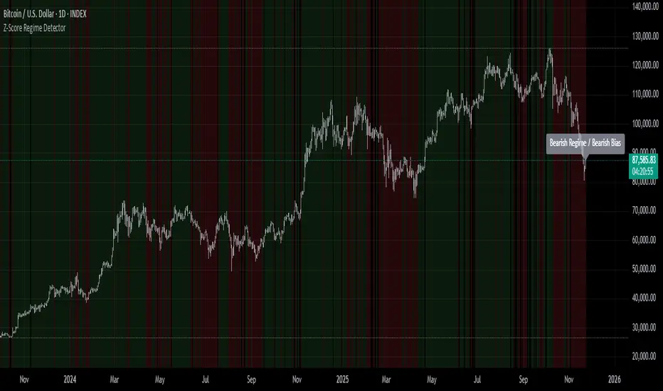
Z-Score Regime DetectorThe Z-Score Regime Detector is a statistical market regime indicator that helps identify bullish and bearish market conditions based on normalized momentum of three core metrics:
- Price (Close)
- Volume
- Market Capitalization (via CRYPTOCAP:TOTAL)
Each metric is standardized using the Z-score over a user-defined period, allowing comparison of relative extremes across time. This removes raw value biases and reveals underlying momentum structure.
📊 How it Works
- Z-Score: Measures how far a current value deviates from its average in terms of standard deviations.
- A Bullish Regime is identified when both price and market cap Z-scores are above the volume Z-score.
- A Bearish Regime occurs when price and market cap Z-scores fall below volume Z-score.
Bias Signal:
- Bullish Bias = Price Z-score > Market Cap Z-score
- Bearish Bias = Market Cap Z-score > Price Z-score
This provides a statistically consistent framework to assess whether the market is flowing with strength or stress.
✅ Why This Might Be Effective
- Normalizing the data via Z-scores allows comparison of diverse metrics on a common scale.
- Using market cap offers broader insight than price alone, especially for crypto.
- Volume as a reference threshold helps identify accumulation/distribution regimes.
- Simple regime logic makes it suitable for trend confirmation, filtering, or position biasing in systems.
⚠️ Disclaimer
This script is for educational purposes only and should not be considered financial advice. Always perform your own research and risk management. Past performance is not indicative of future results. Use at your own discretion.
BTC Halving Cycle SignalsBTC Halving Cycle Signals
What signals does this script give in real history (2011-2025):
2015 → BUY (bear market bottom)
2019 → BUY (post-2018 bottom)
October 2020 → BUY
November 2023 → BUY
And right now (Nov 2025) → green bottom + price above weekly EMA200 → about to give a buy signal if it breaks $72k strongly.
BUY signal: ~500 days pre-halving + price > weekly EMA200 + monthly RSI <60 (accumulation).
SELL signal: ~1064 days post-halving + RSI >75 or close < SuperTrend (distribution).
Hardcoded halving dates (can be edited). Works on BTCUSD weekly/monthly, gives 1-2 signals per cycle.

BTC Energy + HR + Longs + M2
BTC Energy Ratio + Hashrate + Longs + M2
The #1 Bitcoin Macro Weapon on TradingView 🚀🔥
If you’re tired of getting chopped by fakeouts, ETF noise, and Twitter hopium — this is the one chart that finally puts you on the right side of every major move.
What you’re looking at:
Orange line → Bitcoin priced in real-world mining energy (Oil × Gas + Uranium × Coal) × 1000
→ The true fundamental floor of BTC
Blue line → Scaled hashrate trend (miner strength & capex lag)
Green line → Bitfinex longs EMA (leveraged bull sentiment)
Purple line → Global M2 money supply (US+EU+CN+JP) with 10-week lead (the liquidity wave BTC rides)
Why this indicator prints money:
Most tools react to price.
This one predicts where price is going based on energy, miners, leverage, and liquidity — the only four things that actually drive Bitcoin long-term.
It has nailed:
2022 bottom at ~924 📉
2024 breakout above 12,336 🚀
2025 top at 17,280 🏔️
And right now it’s flashing generational accumulation at ~11,500 (Nov 2025)
13 permanent levels with right-side labels — no guessing what anything means:
20,000 → 2021 Bull ATH
17,280 → 2025 ATH
15,000 → 2024 High Resist
14,000 → Overvalued Zone
13,000 → 2024 Breakout
12,336 → Bull/Bear Line (the most important level)
12,000 → 2024 Volume POC
10,930 → Key Support 2024
9,800 → Strong Buy Fib
8,000 → Deep Support 2023
6,000 → 2021 Mid-Cycle
4,500 → 2023 Accum Low
924 → 2022 Bear Low
Live dashboard tells you exactly what to do — no thinking required:
Current ratio (updates live)
Hashrate + 24H %
Longs trend
Risk Mode → Orange vs Hashrate (RISK ON / RISK OFF)
180-day correlation
RSI
13-tier Zone + SIGNAL (STRONG BUY / ACCUMULATE / HOLD / DISTRIBUTE / EXTREME SELL)
Dead-simple rules that actually work:
Weekly timeframe = cleanest view
Blue peaking + orange holding support → miner pain = next leg up
Green spiking + orange failing → overcrowded longs = trim
Purple rising → liquidity coming in = ride the wave
Risk Mode = RISK OFF → price is cheap vs miners → buy
Set these 3 alerts and walk away:
Ratio > 12,336 → Bull confirmed → add
Ratio > 14,000 → Start scaling out
Ratio < 9,800 → Generational buy → back up the truck
No repainting • Fully open-source • Forced daily data • Works on any TF
Energy is the only real backing Bitcoin has.
Hashrate lag is the best leading indicator.
Longs show greed.
M2 is the tide.
This chart combines all four — and right now it’s screaming ACCUMULATE.
Load it. Trust it.
Stop trading hope. Start trading reality.
DYOR • NFA • For entertainment purposes only 😎
#bitcoin #macro #energy #hashrate #m2 #cycle #riskon #riskoff

🔥 SMC Reversal Engine v3.5 – Clean FVG + DashboardSMC Reversal Engine v3.5 – Clean FVG + Dashboard
The SMC Reversal Engine is a precision-built Smart Money Concepts tool designed to help traders understand market structure the single most important foundation in reading price action. It reveals how institutions move liquidity, where structure shifts occur, and how Fair Value Gaps (FVGs) align with these changes to signal potential reversals or continuations.
Understanding How It Works
At its core, the script detects CHoCH (Change of Character) and BOS (Break of Structure)—the two key turning points in institutional order flow. A CHoCH shows that the market has reversed intent (for example, from bearish to bullish), while a BOS confirms a continuation of the current trend. Together, they form the backbone of structure-based trading.
To refine this logic, the engine uses fractal pivots clusters of candles that confirm swing highs and lows. Fractals filter out noise, identifying points where price truly changes direction. The script lets you set this sensitivity manually or automatically adapts it depending on the timeframe. Lower fractal sensitivity captures smaller intraday swings for scalpers, while higher sensitivity locks onto major swing structures for swing and position traders.
The dashboard gives you a real-time reading of the trend, the last high and low, and what the market is likely to do next—for example, “Expect HL” or “Wait for LH.” It even tracks the accuracy of these structure predictions over time, giving an educational feedback loop to help you learn price behavior.
Fair Value Gaps and Tap Entries
Fair Value Gaps (FVGs) mark moments when price moves too quickly, leaving inefficiencies that institutions often revisit. When price taps into an FVG, it often acts as a high-probability entry zone for reversals or continuations. The script automatically detects, extends, and deletes old FVGs, keeping only relevant zones visible for a clean chart.
Traders can enable markTapEntry to visually confirm when an FVG gets filled. This is a simple but powerful trigger that often aligns with CHoCH or BOS moments.
Recommended Settings for Different Traders
For Scalpers, use a lower HTF structure such as 1 minute or 5 minutes. Keep Auto Fractals on for faster reaction, and limit FVG zones to 2–3. This gives you a clean, real-time reflection of order flow.
For Intraday Traders, 15-minute to 1-hour structure gives the perfect balance between reactivity and stability. Fractal sensitivity around 3–5 captures the most actionable levels without excessive noise.
For Swing Traders, use 4-hour, 1-day, or even 3-day structure. The chart becomes smoother, showing higher-order CHoCH and BOS that define true institutional transitions. Combine this with EMA confirmation for higher conviction.
For Position or Macro Traders, select Weekly or Monthly structure. The dynamic label system expands automatically to keep more historical BOS/CHoCH points visible, allowing you to see long-term shifts clearly.
Educational Value
This indicator is built to teach traders how to see structure the way professionals and smart money do. You’ll learn to recognize how markets transition from one phase to another from accumulation to manipulation to expansion. Each CHoCH or BOS helps you decode where liquidity is being taken and where new intent begins.
The included SMC Quick Guide explains each structural cue right on your chart. Within days of using it, you’ll start noticing patterns that reveal how price really moves, instead of guessing based on indicators.
Settings and How to Use Them
Everything in the SMC Reversal Engine is designed to adapt to your trading style and help you read structure like a professional.
When you open the Inputs Panel, you’ll see sections like Fractal Settings, FVG Settings, Buy/Sell Confirmation, and Educational Tools.
Under Fractal Settings, you can choose the higher timeframe (HTF) that defines structure—from minutes to weeks. The Auto Fractal Sensitivity option automatically adjusts how tight or wide swing points are detected. Lower sensitivity captures short-term fluctuations (great for scalpers), while higher values filter noise and isolate major swing highs and lows (perfect for swing traders).
The Fair Value Gap (FVG) options manage imbalance zones—the footprints of institutional orders. You can show or hide these zones, extend them into the future, and control how long they remain before auto-deletion. The Mark Entry When FVG is Tapped option places a small label when price revisits the gap—a potential entry signal that aligns with smart money logic.
EMA Confirmation adds a layer of confluence. The script can automatically scale EMA lengths based on timeframe, or you can input your preferred values (for example, 9/21 for intraday, 50/200 for swing). Require EMA Crossover Confirmation helps filter false moves, keeping you trading only with aligned momentum.
The Educational section gives traders visual reinforcement. When enabled, you’ll see tags like HH (Higher High), HL (Higher Low), LH (Lower High), and LL (Lower Low). These show structure shifts in real time, helping you learn visually what market structure really means. The Cheat Sheet panel summarizes each term, always visible in the corner for quick reference.
Early Top Warnings use wick size and RSI divergence to signal when price may be overextended—a useful heads-up before potential CHoCH formations.
Finally, the Narrative and Accuracy System translates structure into simple English—messages like Trend Bullish → Wait for HL or BOS Bearish → Expect LL. Over time, you can monitor how accurate these expectations have been, training your pattern recognition and confidence.
Pro Tips for Getting the Most Out of the SMC Reversal Engine
1. Start on Higher Timeframes First: Begin on the 4H or Daily chart where structure is cleaner and signals have more weight. Then scale down for entries once you grasp directional intent.
2. Use FVGs for Context, Not Just Entries: Observe how price behaves around unfilled FVGs—they often act as magnets or barriers, offering insight into where liquidity lies.
3. Combine With HTF Bias: Always trade in the direction of your higher timeframe trend. A bullish weekly BOS means lower timeframes should ideally align bullishly for optimal setups.
4. Clean Charts = Clear Mind: Use Minimal Mode when focusing on price action, then toggle the educational tools back on to review structure for learning.
5. Don’t Chase Every CHoCH or BOS: Focus on significant breaks that align with broader context and liquidity sweeps, not minor fluctuations.
6. Accuracy Rate Is a Feedback Tool: Use the accuracy stat as a reflection of consistency—not a trade trigger.
7. Build Narrative Awareness: Read the on-chart narrative messages to reinforce structured thinking and stay disciplined.
8. Practice Replay Mode: Step through past structures to visually connect CHoCH, BOS, and FVG behavior. It’s one of the best ways to train pattern recognition.
Summary
* Detects CHoCH and BOS automatically with fractal precision
* Identifies and manages Fair Value Gaps (FVGs) in real time
* Displays a smart dashboard with accuracy tracking
* Adapts label visibility dynamically by timeframe
* Perfect for both learning and trading with institutional clarity
This tool isn’t about predicting the market—it’s about understanding it. Once you can read structure, everything else in trading becomes secondary.

Dynamic S&R Projector [Polarity Flip]Support and Resistance should not be static. It should tell a story.
Most traders clutter their charts with manually drawn lines, often forgetting which ones were important or which timeframe they came from. This indicator automates the entire process of identifying market structure, adapting dynamically to your trading style while using Volume Price Analysis (VPA) to separate "Smart Money" levels from random noise.
It combines three professional concepts into one tool: Multi-Timeframe Projection, Volume Strength Filtering, and Live Polarity Flipping.
Who is this for?
Day Traders: Project Daily levels onto your 1-minute or 5-minute charts. Stop trading in a vacuum; see the walls before you hit them.
Swing Traders: Project Weekly levels onto your Daily chart to find major trend reversals.
Investors: Project Monthly levels to identify multi-year accumulation zones.
Core Features
1. Smart Timeframe (Auto-Detection) No more toggling settings. The indicator detects what chart you are viewing and automatically projects the next significant Higher Timeframe (HTF) structure:
Viewing Intraday (< Daily)? → Projects Daily Pivots.
Viewing Daily? → Projects Weekly Pivots.
Viewing Weekly? → Projects Monthly Pivots.
2. VPA Strength Filtering (The "Truth" Serum) Not all levels are equal. This script grades every pivot based on the volume activity at the moment it was formed:
Thick Solid Line: Formed on High Volume (>1.5x Average). This is an "Institutional Level." Expect hard bounces.
Thin Dashed Line: Formed on Low Volume. This is a weak structure.
3. Live Polarity Flip (Support ↔ Resistance) The script monitors price action in real-time to respect the "Principle of Polarity."
Wick Protection: The color change is based strictly on the Candle Close. If price wicks through a level but closes back inside, the line retains its original color (rejecting the fakeout).
The Flip: Once price successfully closes past a level, the color instantly flips (Red becomes Green, or Green becomes Red) to indicate the new market state.
How to Trade This Indicator (Example Strategies)
Strategy A: The "Concrete Wall" Bounce (Day & Swing) Identify a Thick Green Line below the current price. This represents a Strong HTF Support defended by institutional volume.
Action: Set Limit Buy orders at the line or wait for a bullish reversal candle (Hammer) to form at the touch.
Strategy B: The "Paper Wall" Breakout (Momentum) Identify price approaching a Thin Dashed Red Line (Weak Resistance).
Action: Since this level lacks volume backing, do not fade it. Look for a breakout setup as price is likely to slice through easily.
Strategy C: The "Flip & Retest" (Trend Following) Watch for a Thick Red Line to turn Green. This means resistance has been conquered.
Action: Wait for price to pull back to this new Green line. If it holds (the line stays Green), enter long. You are now using the "roof" as a "floor."
Settings Guide
Calculation Mode:
Auto (Higher TF): The recommended "Smart" mode described above.
Use Current Chart: Finds pivots on the exact timeframe you are viewing (good for scalping structure).
Fixed Manual: Locks the projection to a specific timeframe (e.g., always show Daily).
Pivot Lookback (Sensitivity):
Default (10/10): Balances major and minor structure.
Higher (20/20): Shows only the most critical major market turns.
Max Number of Lines: Limits how many historical levels are shown to keep your chart clean.
***********************************************************************************************
Disclaimer: This tool is for educational purposes and decision support. Past volume and price action do not guarantee future results. Always manage your risk.

BTC Macro Heatmap (Fed Cuts & Hikes)🔴 1. Red line – Fed Funds Rate (policy trend)
This line tells you what stage of the monetary cycle we’re in.
Rising red line = the Fed is hiking → liquidity is tightening → money leaves risk assets like BTC.
Flat = pause → markets start pricing in the next move (often sideways BTC).
Falling = easing / cutting → liquidity returns → bullish environment builds.
The rate of change matters more than the level. When the slope turns down, capital starts seeking yield again — BTC benefits first because it’s the most volatile asset.
💚 2. Dim green zones – detected cuts
These are data-based easing events pulled directly from FRED.
They show when the actual effective rate began moving down, not necessarily the exact meeting day.
Think of them as the Fed’s “foot off the brake” — that’s when risk markets begin responding.
🟩 3. Bright green lines – official FOMC cuts
These are the real policy shifts — the Fed formally changed direction.
After these appear, BTC historically transitions from accumulation → markup phase.
Look at 2020: the bright green lines came right before BTC’s full reversal.
You’re seeing the same thing now with the 2025 lines — early-stage liquidity return.
🟠 4. Orange line – DXY (US Dollar Index)
DXY is your “risk-off” gauge.
When DXY rises, global investors flock to dollars → BTC usually weakens.
When DXY peaks and starts dropping, it means risk appetite is coming back → BTC rallies.
BTC and DXY are inversely correlated about 70–80% of the time.
Watch for DXY lower highs after rate cuts — that’s your macro confirmation of a BTC-friendly environment.
🟦 5. Aqua line – BTC (normalized)
You’re not looking for the price itself here, but its shape relative to DXY and the Fed line.
When BTC curls up as the red line flattens and DXY rolls over → that’s historically the start of a major bull phase.
BTC tends to bottom before the first cut and explode once DXY decisively breaks down.
🧠 Putting it together
Here’s the rhythm this chart shows over and over:
Fed hikes (red line rising) → BTC weakens, DXY climbs.
Fed pauses (red line flat) → BTC stops falling, DXY tops.
Fed cuts (dim + bright green) → DXY turns down → BTC begins long recovery → bull cycle starts.

100+ BTC Tracker + 182-Day Dormant (6-Month HODL)Instantly see what the biggest Bitcoin whales are doing — and exactly how much of the supply has been completely untouched for 6 full months or longer (182+ days), the strictest and most respected definition of true HODLing.
What this indicator shows you in real time:
Number of wallets holding ≥100 BTC (~15,800 whales)
Total Bitcoin controlled by these whales (~3.25 million BTC)
6-Month Dormant Supply — Bitcoin that hasn’t moved in 182+ days (~14.1 million BTC)
6-Month Dormant % — What percentage of circulating supply is truly locked away
Why 182 days matters:
The 6-month threshold (≈182 days) is the industry-standard cutoff used by Glassnode, CryptoQuant, and analysts worldwide to define ultra-long-term holders. These are the coins least likely to ever hit exchanges — the ultimate measure of conviction and scarcity.
Key features:Live or fallback? — Instantly know if you’re seeing real-time on-chain data (green) or verified backup values (yellow)
Works on free accounts — No paid data subscription required (though it becomes even more accurate with Glassnode/CryptoQuant add-ons)
Clean, non-intrusive design — Three bold plots + sleek dark table in the top-right corner
Always up to date — Fallback values manually verified as of November 21, 2025
Perfect for:
Spotting whale accumulation/distribution phases
Tracking real Bitcoin scarcity during bull or bear markets
Confirming long-term holder conviction before big moves
Add it to any BTC chart and instantly understand who really controls Bitcoin — and how much of it is locked away forever by the strongest hands in crypto.

Whale Activity Detector (V20 - Candle-Relative Diamonds)This indicator is to visualize the "footprints" of large institutional traders, often referred to as "whales." By monitoring spikes in trading volume relative to a long-term average, the indicator flags moments when significant capital is entering or exiting the market.
How the Indicator Works (The Logic)
Volume Threshold : It calculates a Moving Average (MA) of the recent volume (default 20 bars). This average is then multiplied by a Spike Multiplier (default 3.0x) to create a dynamic threshold.
Spike Detection : Any price bar whose total volume exceeds this threshold is flagged as a potential "Whale Activity" bar.
Direction Confirmation : The color of the signal is determined by the price action of that bar (close > open for buying/accumulation, or close < open for selling/distribution).
SWUltimate Sniper: SMT + AO + Money Flow
Overview This indicator is a comprehensive trading system designed to identify high-probability reversal points by combining three powerful concepts: Smart Money Techniques (SMT), Awesome Oscillator (AO) Momentum Divergences, and Macro Money Flow Analysis. It aims to filter out false signals by requiring confirmation from multiple technical factors before generating a signal.
Key Features & Logic
1. SMT Divergence (Smart Money Tool) The core of this indicator compares the current asset's price structure (Highs and Lows) against a benchmark symbol (Default: BTCUSDT).
Bullish SMT: When Bitcoin makes a Lower Low (LL), but the Altcoin makes a Higher Low (HL). This suggests underlying strength and accumulation in the Altcoin despite BTC's weakness.
Bearish SMT: When Bitcoin makes a Higher High (HH), but the Altcoin makes a Lower High (LH). This suggests weakness and distribution in the Altcoin despite BTC's strength.
2. Awesome Oscillator (AO) Confirmation To prevent premature entries based solely on price action, the indicator checks for momentum divergence on the Awesome Oscillator.
If the "AO Filter" option is enabled in settings, a signal (triangle) will only appear if both SMT Divergence and AO Divergence occur simultaneously (or within the same pivot window). This significantly increases the reliability of the setup.
3. Money Flow Dashboard A dashboard in the top-right corner provides real-time macro context to ensure you are trading with the trend.
USDT.D (Tether Dominance): Monitors whether capital is entering (Bullish) or leaving (Bearish) the crypto market.
BTC.D (Bitcoin Dominance): Monitors whether capital is flowing into Bitcoin or rotating into Altcoins (Altcoin Season).
How to Use
Buy Signal (Green Triangle): Look for a Green Triangle below the bar. Ideally, confirm this with the Dashboard showing "Money Flow: Entering" (Green) and "Trend: Flowing to Alts" (Green).
Sell Signal (Red Triangle): Look for a Red Triangle above the bar.
Dashboard: Use the dashboard as a trend filter. Do not long an Altcoin if USDT.D is spiking (Market Bearish).
Settings
Comparison Symbol: Select the benchmark asset (Default: BTCUSDT).
Pivot Period: Adjust the sensitivity of the divergence detection.
Use AO Filter: Toggle ON/OFF to require Awesome Oscillator confirmation for signals.
Dashboard: Toggle the visibility of the Money Flow panel.

Volume Surge AlertVolume is often the fuel behind meaningful price moves. The Volume Surge Alert indicator highlights bars where volume explodes above its recent average, helping you spot accumulation, distribution, and breakout attempts before the price fully reacts.
Calculates a configurable simple moving average of volume to establish “normal” activity.
Flags bars where the current volume exceeds the SMA by a user-defined multiple (default 2×).
Colors the column and background on surge bars for quick visual confirmation.
Provides an alert condition so you can receive notifications the moment activity spikes.
Use it on any timeframe or market to monitor for unusual participation, confirm breakouts, or filter entries. Adjust the SMA length and surge multiple to match your market’s typical liquidity profile.
