Capitulation Candle for Bitcoin and Crypto V1.0 [ADRIDEM]Overview
The Capitulation Candle for Bitcoin and Crypto script identifies potential capitulation events in the cryptocurrency market. Capitulation candles indicate a significant sell-off, often marking a potential market bottom. This script highlights such candles by analyzing volume, price action, and other technical conditions. Below is a detailed presentation of the script and its unique features.
Unique Features of the New Script
Volume-Based Analysis : Uses a volume multiplier to detect unusually high trading volumes, which are characteristic of capitulation events. The default multiplier is 5.0, but it can be adjusted to suit different market conditions.
Support Level Detection : Looks back over a customizable period (default is 150 bars) to find support levels, helping to identify significant price breaks.
ATR-Based Range Condition : Ensures that the price range of a capitulation candle is a multiple of the Average True Range (ATR), confirming significant price movement. The default ATR multiplier is 10.0.
Dynamic Dot Sizes : Plots dots of different sizes below capitulation candles based on volume thresholds, providing a visual indication of the volume's significance.
Visual Indicators : Highlights capitulation candles and plots support levels, offering clear visual cues for potential market bottoms.
Originality and Usefulness
This script uniquely combines volume analysis, support level detection, and ATR-based range conditions to identify capitulation candles. The dynamic dot sizes and clear visual indicators make it an effective tool for traders looking to spot potential reversal points in the cryptocurrency market.
Signal Description
The script includes several features that highlight potential capitulation events:
High Volume Detection : Identifies candles with unusually high trading volumes using a customizable volume multiplier.
Support Level Breaks : Detects candles breaking significant support levels over a customizable lookback period.
ATR Range Condition : Ensures the candle's range is significant compared to the ATR, confirming substantial price movement.
Dynamic Dot Sizes : Plots small, normal, and large dots below candles based on different volume thresholds.
These features assist in identifying potential capitulation events and provide visual cues for traders.
Detailed Description
Input Variables
Volume Multiplier (`volMultiplier`) : Detects high-volume candles using this multiplier. Default is 5.0.
Support Lookback Period (`supportLookback`) : The period over which support levels are calculated. Default is 150.
ATR Multiplier (`atrMultiplier`) : Ensures the candle's range is a multiple of the ATR. Default is 10.0.
Small Volume Multiplier Threshold (`smallThreshold`) : Threshold for small dots. Default is 5.
Normal Volume Multiplier Threshold (`normalThreshold`) : Threshold for normal dots. Default is 10.
Large Volume Multiplier Threshold (`largeThreshold`) : Threshold for large dots. Default is 15.
Functionality
High Volume Detection : The script calculates the simple moving average (SMA) of the volume and checks if the current volume exceeds the SMA by a specified multiplier.
```pine
smaVolume = ta.sma(volume, supportLookback)
isHighVolume = volume > smaVolume * volMultiplier
```
Support Level Detection : Determines the lowest low over the lookback period to identify significant support levels.
```pine
supportLevel = ta.lowest(low , supportLookback)
isLowestLow = low == supportLevel
```
ATR Range Condition : Calculates the ATR and ensures the candle's range is significant compared to the ATR.
```pine
atr = ta.atr(supportLookback)
highestHigh = ta.highest(high, supportLookback)
rangeCondition = (highestHigh - low ) >= (atr * atrMultiplier)
```
Combining Conditions : Combines various conditions to identify capitulation candles.
```pine
isHigherVolumeThanNext = volume > volume
isHigherVolumeThanPrevious = volume > volume
bodySize = math.abs(close - open )
candleRange = high - low
rangeBiggerThanPreviousBody = candleRange > bodySize
isCapitulationCandle = isHighVolume and isHigherVolumeThanPrevious and isHigherVolumeThanNext and isLowestLow and rangeCondition and rangeBiggerThanPreviousBody
```
Dynamic Dot Sizes : Determines dot sizes based on volume thresholds and plots them below the identified capitulation candles.
```pine
isSmall = volume > smaVolume * smallThreshold and volume <= smaVolume * normalThreshold
isNormal = volume > smaVolume * normalThreshold and volume <= smaVolume * largeThreshold
isLarge = volume > smaVolume * largeThreshold
plotshape(series=isCapitulationCandle and isSmall, location=location.belowbar, offset=-1, color=color.rgb(255, 82, 82, 40), style=shape.triangleup, size=size.small)
plotshape(series=isCapitulationCandle and isNormal, location=location.belowbar, offset=-1, color=color.rgb(255, 82, 82, 30), style=shape.triangleup, size=size.normal)
plotshape(series=isCapitulationCandle and isLarge, location=location.belowbar, offset=-1, color=color.rgb(255, 82, 82, 20), style=shape.triangleup, size=size.large)
```
Plotting : The script plots support levels and highlights capitulation candles with different sizes based on volume significance.
```pine
plot(supportLevel, title="Support Level", color=color.rgb(255, 82, 82, 50), linewidth=1, style=plot.style_line)
```
How to Use
Configuring Inputs : Adjust the volume multiplier, support lookback period, ATR multiplier, and volume thresholds as needed.
Interpreting the Indicator : Use the plotted support levels and highlighted capitulation candles to identify potential market bottoms and reversal points.
Signal Confirmation : Look for capitulation candles with high volumes breaking significant support levels and meeting the ATR range condition. The dynamic arrow sizes help to assess the volume's significance.
This script provides a detailed and visual method to identify potential capitulation events in the cryptocurrency market, aiding traders in spotting possible reversal points and making informed trading decisions.
Поиск скриптов по запросу "bitcoin"

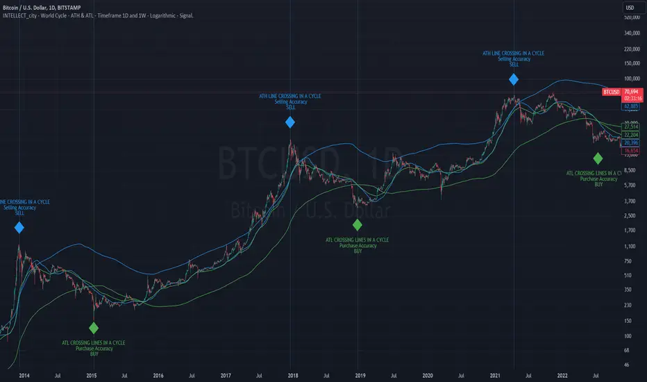
intellect_city - World Cycle - Ath & Atl - Logarithmic - Signal.Indicator Overview
INTELLECT_city - World Cycle - ATH & ATL - Timeframe 1D and 1W - Logarithmic - Signal - The Pi Cycle Top and Bottom Oscillator is an adaptation of the original Pi Cycle Top chart. It compares the 111-Day Moving Average circle and the 2 * 350-Day Moving Average circle of Bitcoin’s Price. These two moving averages were selected as 350 / 111 = 3.153; An approximation of the important mathematical number Pi.
When the 111-Day Moving Average circle reaches the 2 * 350-Day Moving Average circle, it indicates that the market is becoming overheated. That is because the mid time frame momentum reference of the 111-Day Moving Average has caught up with the long timeframe momentum reference of the 2 * 350-Day Moving Average.
Historically this has occurred within 3 days of the very top of each market cycle.
When the 111 Day Moving Average circle falls back beneath the 2 * 350 Day Moving Average circle, it indicates that the market momentum of that cycle is significantly cooling down. The oscillator drops down into the lower green band shown where the 111 Day Moving Average is moving at a 75% discount relative to the 2 * 350 Day Moving Average.
Historically, this has highlighted broad areas of bear market lows.
IMPORTANT: You need to set a LOGARITHMIC graph. (The function is located at the bottom right of the screen)
IMPORTANT: The INTELLECT_city indicator is made for signal purchases of sales, there is also a strategic one from INTELLECT_city
IMPORTANT: The Chart shows all cycles, both buying and selling.
IMPORTANT: Suitable timeframes are 1 daily (recommended) and 1 weekly
-----------------------------
Описание на русском:
-----------------------------
Обзор индикатора
INTELLECT_city - World Cycle - ATH & ATL - Timeframe 1D and 1W - Logarithmic - Signal - Логарифмический - Сигнал - Осциллятор вершины и основания цикла Пи представляет собой адаптацию оригинального графика вершины цикла Пи. Он сравнивает круг 111-дневной скользящей средней и круг 2 * 350-дневной скользящей средней цены Биткойна. Эти две скользящие средние были выбраны как 350/111 = 3,153; Приближение важного математического числа Пи.
Когда круг 111-дневной скользящей средней достигает круга 2 * 350-дневной скользящей средней, это указывает на то, что рынок перегревается. Это происходит потому, что опорный моментум среднего временного интервала 111-дневной скользящей средней догнал опорный момент импульса длинного таймфрейма 2 * 350-дневной скользящей средней.
Исторически это происходило в течение трех дней после вершины каждого рыночного цикла.
Когда круг 111-дневной скользящей средней опускается ниже круга 2 * 350-дневной скользящей средней, это указывает на то, что рыночный импульс этого цикла значительно снижается. Осциллятор опускается в нижнюю зеленую полосу, показанную там, где 111-дневная скользящая средняя движется со скидкой 75% относительно 2 * 350-дневной скользящей средней.
Исторически это высветило широкие области минимумов медвежьего рынка.
ВАЖНО: Выставлять нужно ЛОГАРИФМИЧЕСКИЙ график. (Находиться функция с правой нижней части экрана)
ВАЖНО: Индикатор INTELLECT_city сделан для сигнальных покупок продаж, есть также и стратегический от INTELLECT_сity
ВАЖНО: На Графике видны все циклы, как на покупку так и на продажу.
ВАЖНО: Подходящие таймфреймы 1 дневной (рекомендовано) и 1 недельный
-----------------------------
Beschreibung - Deutsch
-----------------------------
Indikatorübersicht
INTELLECT_city – Weltzyklus – ATH & ATL – Zeitrahmen 1T und 1W – Logarithmisch – Signal – Der Pi-Zyklus-Top- und Bottom-Oszillator ist eine Anpassung des ursprünglichen Pi-Zyklus-Top-Diagramms. Er vergleicht den 111-Tage-Gleitenden-Durchschnittskreis und den 2 * 350-Tage-Gleitenden-Durchschnittskreis des Bitcoin-Preises. Diese beiden gleitenden Durchschnitte wurden als 350 / 111 = 3,153 ausgewählt; eine Annäherung an die wichtige mathematische Zahl Pi.
Wenn der 111-Tage-Gleitenden-Durchschnittskreis den 2 * 350-Tage-Gleitenden-Durchschnittskreis erreicht, deutet dies darauf hin, dass der Markt überhitzt. Das liegt daran, dass der Momentum-Referenzwert des 111-Tage-Gleitenden-Durchschnitts im mittleren Zeitrahmen den Momentum-Referenzwert des 2 * 350-Tage-Gleitenden-Durchschnitts im langen Zeitrahmen eingeholt hat.
Historisch gesehen geschah dies innerhalb von 3 Tagen nach dem Höhepunkt jedes Marktzyklus.
Wenn der Kreis des 111-Tage-Durchschnitts wieder unter den Kreis des 2 x 350-Tage-Durchschnitts fällt, deutet dies darauf hin, dass die Marktdynamik dieses Zyklus deutlich nachlässt. Der Oszillator fällt in das untere grüne Band, in dem der 111-Tage-Durchschnitt mit einem Abschlag von 75 % gegenüber dem 2 x 350-Tage-Durchschnitt verläuft.
Historisch hat dies breite Bereiche mit Tiefstständen in der Baisse hervorgehoben.
WICHTIG: Sie müssen ein logarithmisches Diagramm festlegen. (Die Funktion befindet sich unten rechts auf dem Bildschirm)
WICHTIG: Der INTELLECT_city-Indikator dient zur Signalisierung von Käufen oder Verkäufen, es gibt auch einen strategischen Indikator von INTELLECT_city
WICHTIG: Das Diagramm zeigt alle Zyklen, sowohl Kauf- als auch Verkaufszyklen.
WICHTIG: Geeignete Zeitrahmen sind 1 täglich (empfohlen) und 1 wöchentlich
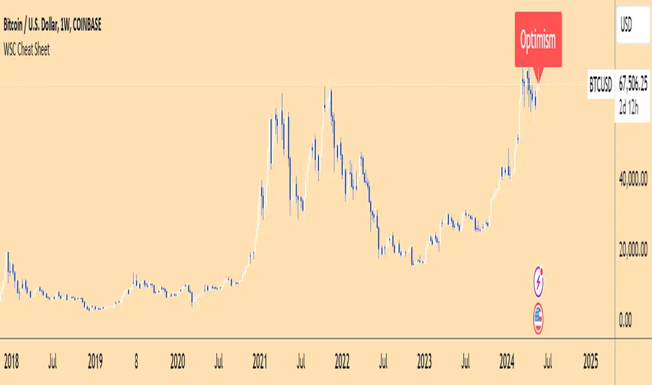
Wall Street Cheat Sheet IndicatorThe Wall Street Cheat Sheet Indicator is a unique tool designed to help traders identify the psychological stages of the market cycle based on the well-known Wall Street Cheat Sheet. This indicator integrates moving averages and RSI to dynamically label market stages, providing clear visual cues on the chart.
Key Features:
Dynamic Stage Identification: The indicator automatically detects and labels market stages such as Disbelief, Hope, Optimism, Belief, Thrill, Euphoria, Complacency, Anxiety, Denial, Panic, Capitulation, Anger, and Depression. These stages are derived from the emotional phases of market participants, helping traders anticipate market movements.
Technical Indicators: The script uses two key technical indicators:
200-day Simple Moving Average (SMA): Helps identify long-term market trends.
50-day Simple Moving Average (SMA): Aids in recognizing medium-term trends.
Relative Strength Index (RSI): Assesses the momentum and potential reversal points based on overbought and oversold conditions.
Clear Visual Labels: The current market stage is displayed directly on the chart, making it easy to spot trends and potential turning points.
Usefulness:
This indicator is not just a simple mashup of existing tools. It uniquely combines the concept of market psychology with practical technical analysis tools (moving averages and RSI). By labeling the psychological stages of the market cycle, it provides traders with a deeper understanding of market sentiment and potential future movements.
How It Works:
Disbelief: Detected when the price is below the 200-day SMA and RSI is in the oversold territory, indicating a potential bottom.
Hope: Triggered when the price crosses above the 50-day SMA, with RSI starting to rise but still below 50, suggesting an early uptrend.
Optimism: Occurs when the price is above the 50-day SMA and RSI is between 50 and 70, indicating a strengthening trend.
Belief: When the price is well above the 50-day SMA and RSI is between 70 and 80, showing strong bullish momentum.
Thrill and Euphoria: Identified when RSI exceeds 80, indicating overbought conditions and potential for a peak.
Complacency to Depression: These stages are identified based on price corrections and drops relative to moving averages and declining RSI values.
Best Practices:
High-Time Frame Focus: This indicator works best on high-time frame charts, specifically the 1-week Bitcoin (BTCUSDT) chart. The longer time frame provides a clearer picture of the overall market cycle and reduces noise.
Trend Confirmation: Use in conjunction with other technical analysis tools such as trendlines, Fibonacci retracement levels, and support/resistance zones for more robust trading strategies.
How to Use:
Add the Indicator: Apply the Wall Street Cheat Sheet Indicator to your TradingView chart.
Analyze Market Stages: Observe the dynamic labels indicating the current stage of the market cycle.
Make Informed Decisions: Use the insights from the indicator to time your entries and exits, aligning your trades with the market sentiment.
This indicator is a valuable tool for traders looking to understand market psychology and make informed trading decisions based on the stages of the market cycle.
[MAD] BTC ETF Volume In/OutflowThe " BTC ETF Volume In/Outflows" indicator is designed to analyze and visualize the volume data of various Bitcoin Exchange-Traded Funds (ETFs) across different exchanges. This indicator helps traders and analysts observe the inflows and outflows of trading volume in a structured and comparative manner.
Features
Multi-Ticker Support: The indicator is capable of handling volume data from multiple ETFs simultaneously, making it versatile for comparative analysis.
Volume Adjustments: Provides an option to view volume data either as the number of pieces (shares) traded or as monetary flow (value traded).
Compression Factor: Includes a volume compression factor setting that helps in emphasizing smaller volume changes or smoothing out volume spikes.
Data Calculation
Volume data is processed using a custom function that adjusts the data based on user settings for piece or monetary representation and applies a logarithmic compression factor.
This processed data is then fetched for each ticker.
Visualization
Volume data is visualized on the chart using column plots where each ETF's volume data is stacked and offset to provide a clear visual representation of in/outflows. Horizontal lines indicate the zero level for reference.
Usage Scenario
This indicator is particularly useful for traders who track multiple ETFs and need to compare their volume activities simultaneously. It provides insights into market trends, potentially indicating bullish or bearish shifts based on volume inflows and outflows across different instruments.
have fun :-)

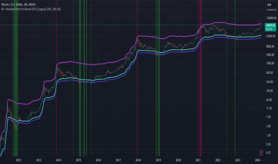
RP - Realized Price for Bitcoin (BTC) [Logue]Realized Price (RP) - The RP is summation of the value of each BTC when it last moved divided by the total number of BTC in circulation. This gives an estimation of the average "purchase" price of BTC on the bitcoin network based on when it was last transacted. This indicator tells us if the average network participant is in a state of profit or loss. This indicator is normally used to detect BTC bottoms, but an extension can be used to detect when the bitcoin network is "highly" overvalued. Because the "strength" of the BTC tops has decreased over the cycles, a logarithmic function for the extension was created by fitting past cycles as log extension = slope * time + intercept. This indicator triggers when the BTC price is above the realized price extension. For the bottoms, the RP is shifted downwards at a default value of 80%. The slope, intercept, and RP bottom shift can all be modified in the script.
HSI - Halving Seasonality Index for Bitcoin (BTC) [Logue]Halving Seasonality Index (HSI) for Bitcoin (BTC) - The HSI takes advantage of the consistency of BTC cycles. Past cycles have formed macro tops around 538 days after each halving. Past cycles have formed macro bottoms every 948 days after each halving. Therefore, a linear "risk" curve can be created between the bottom and top dates to measure how close BTC might be to a bottom or a top. The default triggers are set at 98% risk for tops and 5% risk for bottoms. Extensions are also added as defaults to allow easy identification of the dates of the next top or bottom according to the HSI.

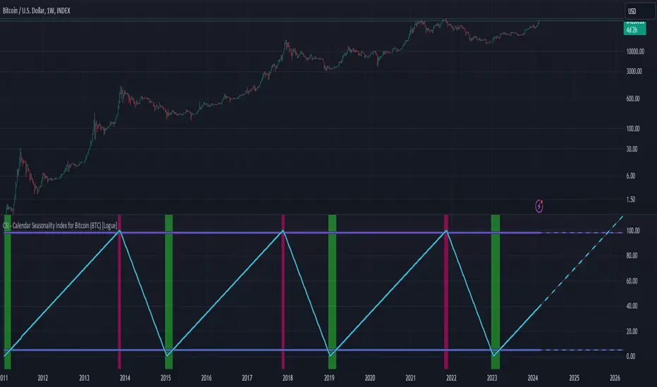
CSI - Calendar Seasonality Index for Bitcoin (BTC) [Logue]Calendar Seasonality Index (CSI) for Bitcoin (BTC) - The CSI takes advantage of the consistency of BTC cycles. Past cycles have formed macro tops every four years near November 21st, starting from in 2013. Past cycles have formed macro bottoms every four years near January 15th, starting from 2011. Therefore, a linear "risk" curve can be created between the bottom and top dates to measure how close BTC might be to a bottom or a top. The default triggers are at 98% risk for tops and 5% risk for bottoms. Extensions are also added as defaults to allow easy identification of the dates of the next top or bottom according to the CSI.
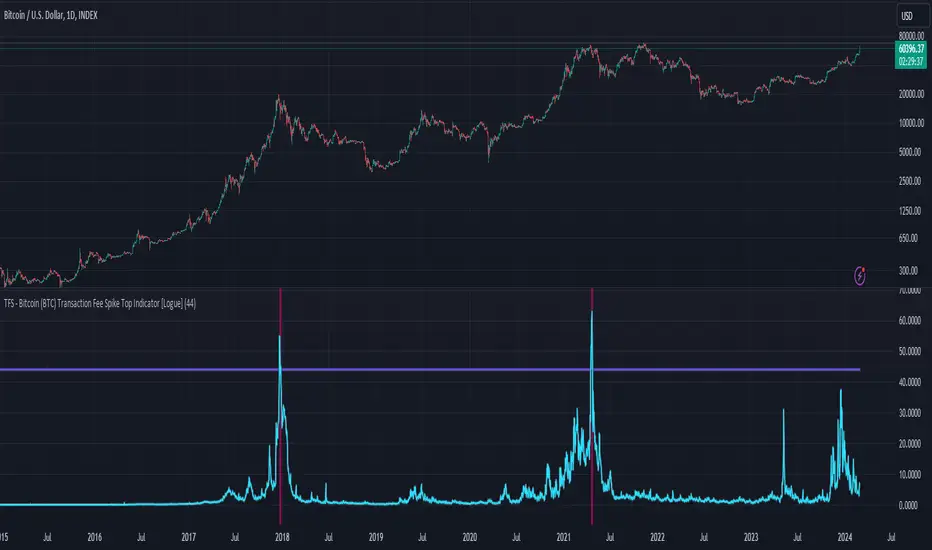
TFS - Bitcoin (BTC) Transaction Fee Spike Top Indicator [Logue]Transaction Fee Spike (TFS) - For bitcoin (BTC), transaction fees on the bitcoin network can signal a mania phase when they increase well above historical values. This mania phase may indicate we are near a top in the BTC price. The transaction fee in USD is directly retrieved from Glassnode. The default trigger for this indicator fires when the transaction fees increase above $44/transaction.
Market Activity Risk"Market Activity Risk" (MAR) - Is a dynamic tool designed to structurize the competitive landscape of blockchain transaction blocks, offering traders a strategic edge in anticipating market movements.
By capturing where market participants are actively buying and selling, the MAR indicator provides insights into areas of high competition, allowing traders to make informed decisions and potentially front-run transactions.
At the heart of this tool are blockchain transaction fees , they can represent daily shifts in transaction fee pressures.
By measuring momentum in fees, we can analyze the urgency and competition among traders to have their transactions processed first. This indicator is particularly good at revealing potential support or resistance zones, areas where traders are likely to defend their positions or increase their stakes, thus serving as critical junctures for strategic decision-making.
Key Features:
Adaptable Standard Deviation Settings: Users have the flexibility to adjust the length of the standard deviation and its multipliers, managing the risk bands to their individual risk tolerance.
Color-Coded Risk Levels: The MAR indicator employs an intuitive color scheme, making it easy to interpret the data at a glance.
Multi-Currency Compatibility: While designed with Bitcoin in mind, the MAR indicator is versatile, functioning effectively across various cryptocurrencies including Ethereum, XRP, and several other major altcoins. This broad compatibility ensures that traders across different market segments can leverage the insights provided by this tool.
Customizable Moving Average: The 730-day moving average setting is thoughtfully chosen to reflect the nuances of a typical cryptocurrency cycle, capturing long-term trends and fluctuations. However, recognizing the diverse needs and perspectives of traders, the indicator allows for the moving average period to be modified.
Volume Sum BTC ETFsThis volume indicator tracks the volume of these 10 bitcoin ETFS:
AMEX:GBTC, NASDAQ:IBIT, AMEX:BTCO, AMEX:ARKB, AMEX:HODL, AMEX:EZBC, NASDAQ:BRRR, AMEX:BTCW, AMEX:DEFI, AMEX:BITB
It multiplies the traded shares with the hl2 share price and then devides the volume by the bitcoin hl2 price.
You can change to usd volume in settings.
Enjoy!
Notice that historical volume comes from etfs which traded already before launch like GBTC.
Also notice that that btc trades also when tradfi markets are closed, so then the indicator will show the last available volume. Something to fix later.
PlayBit EMAPlayBit EMA Indicator
Introducing the PlayBit EMA, a highly esteemed technical analysis tool within the PlayBit Community and a personal favorite of Bitcoin Playboy. This indicator has cemented its place as a staple among traders for its simplicity and effectiveness.
Key Features:
PB EMA: Utilizes two Exponential Moving Averages (EMAs) to identify support and resistance zones and help identify potential reversal points.
Dynamic Fill Color:
The fill color will change based on if the closing price is above, below, or in between.
This indicator is not only a reflection of market dynamics but also an essential tool for traders looking to make informed decisions based on the relationship between price action and moving averages. Whether you're a seasoned trader or just starting out, the PlayBit EMA is an invaluable addition to your trading arsenal.

Delta price table, BTC Status (track bitcoin price change)If you are trading alt coins which are affected with Bitcoin price movements then this indicator may be useful. It allows you to trade altcoin and track bitcoin price changes simultaneously.
It shows the price change (delta price) for last 60 seconds, 5 minutes, 15 minutes, 30 minutes, 1 hour, 4 hours, 1 day.
If you want any updates, just feel free to write me :)

OI Volume Oscillator Cross DynamicsThe OI Volume Oscillator Cross Dynamics is a custom indicator designed to analyze the relationship between Open Interest (OI) and Volume Oscillator in the cryptocurrency markets. This tool aims to assist traders in identifying potential market sentiment shifts, enabling them to make informed trading decisions based on the dynamic interplay of these key market components.
Key Components:
Open Interest (OI): This component represents the total number of outstanding derivative contracts, such as futures and options, that have not been settled. Open Interest provides insights into market participation and trader commitment, offering a broader perspective on the flow of money into the market.
Volume Oscillator: The Volume Oscillator is a momentum indicator that showcases the difference between two volume moving averages. It is instrumental in identifying bullish or bearish market trends by providing insights into buying and selling pressure in the market.
Functional Dynamics:
Crossover Analysis: The indicator identifies points where the Volume Oscillator crosses above or below the Open Interest, marking potential shifts in market sentiment. These crossover points are visually represented, making them easily identifiable for analysis.
Visual Cues: The indicator uses visual shapes and colors to enhance interpretability. Bullish crossovers are marked with green upward triangles, while bearish crossovers are represented by red downward triangles.
Customization: The indicator allows for customization of the Volume Oscillator’s sensitivity through a multiplier, enabling traders to adjust the indicator according to their trading strategy and market outlook.
Usage Guidelines:
Bullish Scenario: A crossover of the Volume Oscillator above the Open Interest is interpreted as a bullish signal, indicating potential upward price movement due to increased buying pressure or trading activity.
Bearish Scenario: A crossover of the Volume Oscillator below the Open Interest is seen as a bearish signal, suggesting potential downward price movement due to increased selling pressure or reduced trading activity.
Conclusion:
The OI Volume Oscillator Cross Dynamics indicator is designed to provide traders with a nuanced perspective of market activity through the combined analysis of Open Interest and Volume Oscillator. Its design aims to offer valuable insights, allowing for a strategic approach to trading based on the observed market dynamics.
The code is open source and utilizes Binance info but you can alter the code to meet your needs to go beyond just Bitcoin if needed.

Crypto Daily WatchList And Screener [M]
Hi, this is a watchlist and screener indicator designed for traders in the field of cryptocurrencies who want to monitor developments in other currency pairs and indices.
The indicator consists of two tables. One of them is the table containing indices such as BTC dominance, total, total2, which allows you to track market developments and changes. In this table, you will find price information, daily change, stochastic, and trend information.
The other table includes cryptocurrencies like BTC/USDT, ETH/USDT, DOT/USDT, and more. In this table, you will see real-time prices, daily volume, daily change, stochastic, the correlation coefficient between the pair and Bitcoin, and the trend value calculated based on MACD.
The "Customize" section in the settings enables you to personalize the appearance of the tables according to your preferences.

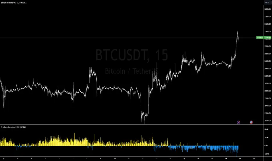
Coinbase/Binance Premium Histogram PCPR1NCIPALSummary of the "Coinbase/Binance Premium Histogram" Indicator:
The "Coinbase/Binance Premium Histogram" is a custom indicator developed for trading platforms that support the Pine Script language, primarily TradingView. Its primary function is to visualize the price differential or "premium" between Bitcoin's (BTC) price on two major exchanges: Coinbase and Binance.
Key Features:
Data Sources: The indicator pulls the closing prices of Bitcoin (BTC) from both the Coinbase (BTCUSD) and Binance (BTCUSDT) exchanges.
Premium Calculation: The indicator computes the premium by subtracting the Coinbase price from the Binance price.
If the result is positive, this means the BTC price on Binance is higher than on Coinbase.
Conversely, if the result is negative, this indicates that the BTC price on Coinbase is higher than on Binance.
Histogram Visualization: The price differential or "premium" is then plotted as a histogram.
Bars above the zero line (in blue) represent instances where the Binance price is higher than the Coinbase price.
Bars below the zero line (in red) represent instances where the Coinbase price is higher than the Binance price.
Color Coding: The histogram uses color coding to easily differentiate between positive and negative premiums:
Blue Bars: Indicate a positive premium, meaning BTC on Binance is priced higher than on Coinbase.
Red Bars: Indicate a negative premium, implying BTC on Coinbase is priced higher than on Binance.
Purpose: Traders and investors can use this indicator to spot potential arbitrage opportunities between the two exchanges or for signs of institutional buying. A significant difference in prices could mean a chance to buy BTC cheaper on one platform and sell at a higher price on the other, thereby capitalizing on the price disparity. However, it's essential to consider transaction fees, potential transfer delays, and other associated risks before pursuing any arbitrage strategy.
Blackrock Spot ETF Premium BTCUSD (COINBASE) V1I created an indicator that takes the spot BTC/USD pair from major exchanges and compares it to the Spot BTC/USD pair on Coinbase that institutions will use for their Spot ETFs.
Blackrock Spot ETF Premium BTCUSD (COINBASE)
I suspect we will see a new "Kimchi Premium" where the Spot ETF pressures from institutions will raise the Coinbase Bitcoin price by a factor of 10-50% premium to the other exchanges.
Naturally excess coins from other exchanges will flow into Coinbase to capture this.
This indicator should be good for some time until one of the other exchanges delist or stop using BTCUSD "spot" If it breaks it I will update it if I remember.
FederalXBT,

Stablecoin Market Cap RiskThe Stablecoins Market Cap Risk indicator serves as a valuable risk oscillator for Bitcoin on a macro scale . This metric is derived by aggregating the market capitalization of CRYPTOCAP:USDT (Tether) and CRYPTOCAP:USDC (USD Coin), subsequently dividing this combined value by CRYPTOCAP:TOTAL (total market capitalization). The resulting figure is further normalized through linear regression.
The regression in question:
drive.google.com
However, it is essential to acknowledge that this model's reliability may diminish over time, as it is based solely on data from the most recent 4.5 years of cryptocurrency market trends. Consequently, adaptations and enhancements to the model are anticipated in the future to ensure its continued relevance and accuracy.

TTP NVT StudioNVT Studio is an indicator that aims to find areas of reversal of the Bitcoin price based on the extreme areas of Network Value Transaction.
Instructions:
- We recommend using it on INDEX:BTCUSD
- Use the daily or weekly timeframe
The indicator works as an oscillator and offers to visualisation modes.
1) Showing the short term oscillations of NVT showing signals in potential areas of reversal.
2) The actual value of NVT displayed. When in green is an area of value and in red when its overextended.
This indicator can be used based on the signals or based on breakouts of trend lines drawn in the oscillator mode.
Red/green dots: signal type 1 - extremes with confirmation, these might trigger late
Yellow/Orange: signal type 2 - extremes without confirmation, might trigger too soon

Crypto Trend IndicatorThe Crypto Trend Indicator is a trend-following indicator specifically designed to identify bullish and bearish trends in the price of Bitcoin, and other cryptocurrencies. This indicator doesn't provide explicit instructions on when to buy or sell, but rather offers an understanding of whether the trend is bullish or bearish. It's important to note that this indicator is only useful for trend trading.
The band is a visual representation of the 30-day and 60-day Exponential Moving Average (EMA). When the 30-day EMA is above the 60-day EMA, the trend is bullish and the band is green. When the 30-day EMA is below the 60-day EMA, the trend is bearish and the band is red. When the 30-day EMA starts to converge with the 60-day EMA, the trend is neutral and the band is grey.
The line is a visual representation of the 20-week Simple Moving Average (SMA) in the daily timeframe. "Bull" and "Bear" signals are generated when the 20-day EMA is either above or below the 20-week SMA, in conjunction with a bullish or bearish trend. When the band is green and the 20-day EMA is above the 20-week SMA, a “Bull” signal emerges. When the band is red and the 20-day EMA is below the 20-week SMA, a “Bear” signal emerges. The 20-week SMA can potentially also function as a leading indicator, as substantial price deviations from the SMA typically indicate an overextended market.
While this indicator has traditionally identified bullish and bearish trends in various cryptocurrency assets, past performance does not guarantee future results. Therefore, it is advisable to supplement this indicator with other technical tools. For instance, range-bound indicators can greatly improve the decision-making process when planning for entries and exits points.

Hani angle support and resistanceBy examining the intersections of the average price in the past, this indicator identifies points as support and resistance, according to which it determines a diagonal line to the last average price in the future.
As you can see in the picture, these points are more important than floors and ceilings, and they can be cited more
According to the 360-period cycles of the market, it has the best performance
In this indicator, there are two lines that show the average price in different periods.
Ingulf candles and the pattern of three return candles are used for the signal
In the scalp model, the pattern of three consecutive candles and one engulfing candle is used
In the model of circles, Engulfing candle is also used according to algo
By default, this stop loss calculation is twice the size of the signal candle, which you can change according to the type of transaction.
Enter the amount of your balance and change the amount of contract size according to the currency
For example, the contract size is Bitcoin (1) and the contract size is EURUSD (100,000) and XAUUSD (100) and enter the amount of risk in each transaction.
At the time of the signal, you will see the exact size required to enter the transaction (not including the commission, because each exchange has a different commission and a different spread).
For a better view of the market, you can pay special attention to the distance and angle of the two lines.
Support and resistance lines are continuously displayed for 500 candles to be considered in the future of the market
This indicator requires basic knowledge of candlestick and it is better for the trader to make the final decision according to the market situation. However, an alarm has also been set that sends the stop loss amount for use in the web hook.
The price at the moment of the signal is also alarmed for comparison so that the signal can be compared at the time of the alarm.
The size of the ATR band is used to measure the wave if the waves are large enough to send cleaner signals.
The green label: distance between the last intersection and the average price.
The yellow label: distance between two periods of the average price
White label: lot size to enter the market
pink label: ATR size

Market Relative Candle Ratio ComparatorIntroducing the Market Relative Candle Ratio Comparator, a visually captivating script that eases the way you compare two financial assets, such as cryptocurrencies and market indices. Leveraging a distinctive calculation method based on percentage changes and their averages, this tool presents a crystal-clear view of how your chosen assets perform in relation to each other, both for individual candles and over a range of previous candles.
Tailoring the script to your preferences is a walk in the park, as it allows you to easily adjust input symbols, moving average lengths, and other parameters to match your analytical approach. The visually arresting column chart it creates employs vivid red and green colors to underscore the differences between the two assets on each candle. Simultaneously, the lower-opacity columns depict the accumulated differences over a specified lookback period. This vibrant blend of colors and opacities results in a dynamic visual experience, enabling you to better grasp market trends relative to each other.
The reverse bool input is a handy feature that lets you invert the effect of the input symbol (DXY by default) in the comparison. When you set the reverse input to true, the script multiplies the calculated DXY percentage change by -1, effectively reversing the comparison. This is particularly useful when examining assets with an inverse relationship or when you'd like to analyze the input symbol's impact in the opposite direction.
For instance, if the input symbol represents a market index that generally moves in the opposite direction of the selected cryptocurrency, enabling the reverse input will help you better visualize and understand the relationship between the two assets by inverting the input symbol's effect on the comparison.
In the accompanying chart, you can observe the comparison of Bitcoin's movement relative to the Dollar, Gold, Bonds, and the S&P 500. The indicator reveals that in the last day, Bitcoin outperformed Bonds, Gold, and the Dollar but not the S&P 500!

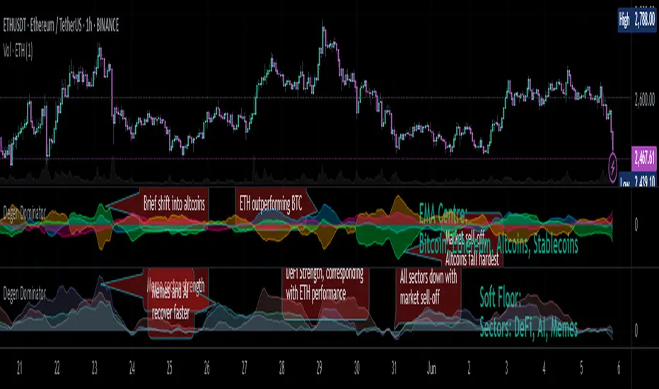
Degen Dominator - (Crypto Dominance Tool) - [mutantdog]A fairly simple one this time. Another crypto dominance tool, consider it a sequel to Dominion if you will. Ready to go out-of-the-box with a selection of presets at hand.
The premise is straightforward, rather than viewing the various marketcap dominance indexes as their standard percentage values, here we have them represented as basic oscillators. This allows for multiple indexes to be viewed in one pane and gives a decent overview of their relative changes and thus the flow of capital within the overall crypto market. As a general rule-of-thumb, when a plot is above zero then the dominance is climbing, thus capital is likely flowing in that direction. The inverse applies when below zero. When the market is quiet, all will be close to zero. Basic overbought/oversold conditions can also be inferred too.
Active as default are:
Bitcoin (0range): CRYPTOCAP:BTC.D
Ethereum (Blue): CRYPTOCAP:ETH.D
Stablecoins (Red): CRYPTOCAP:USDT.D + CRYPTOCAP:USDC.D
Altcoins (Green): 100 - (all of the above)
These are plotted according to the selected oscillator preset and it's length parameter. The default is set to 'EMA Centre'. An optional RMA(3) smoothing filter is also included and active as default. Each index plot has its own colour and opacity settings available on the main page.
Additionally, the following are also available (deactivated as default):
Total DeFi : CRYPTOCAP:TOTALDEFI.D
Current Symbol : Will try to match corresponding dominance index for the chart symbol if available.
Custom Input : Manual text input, will try to match if available.
-------------
The included presets determine the oscillator type used, all are fairly simple and easy to interpret:
EMA Centre
SMA Centre
Median Centre
Midrange Centre
The first 4 are all variations on the same theme, simply calculated as the difference between the actual value and its respective average. EMA is the default and is my personal preference, if you generally favour using an SMA then perhaps that would be your better choice. Like the two MAs, median and midrange are also dependant on the length parameter. Midrange is calculated from the difference between highest and lowest values within the length period, with a little extra smoothing from an RMA(3).
Simple Delta
Weighted Delta
Running Delta
Often referred to as momentum, delta is just change over time. 'Simple' is the most basic of these, the difference between the current value and the value (length) bars prior. A more long-winded way of calculating this would be to take the difference between each bar and its previous then average them with an SMA which results in the same value. 'Weighted' adopts that principle but instead uses a WMA, likewise 'Running' is the same but using an RMA. The latter is actually the basis of RSI calculations before any normalisation is applied, as you can see in the next preset.
RSI
CMO
RSI really should not need explaining, it is however applied a little differently here to the usual, in this case centred around 0. The x100 multiplication factor has been dropped too for the sake of consistency. The same principle applies with CMO, which is basically a 'Simple Delta' version of RSI.
Hard Floor
Soft Floor
These last two are a little different but both can provide useful interpretations. The floor here is simply the lowest value within the chosen length period. 'Hard' plots the difference between the current value and the floor, thus giving a value that is always above 0. In this case, focus should be given to the relative heights of each with a simple interpretation that capital is flowing into those that are climbing and out of those descending. 'Soft' is essentially the same except that the floor is smoothed with an RMA(3), the result being that when new lows are made, the plot will break below 0 before the floor corrects a few bars later. This soft break provides additional information to that given by 'Hard' so is probably the more useful of the two.
------------
To finish it off, a bunch of preset alerts are included for the various 0 crossings.
So that just about covers everything then, all quite straightforward really. Future updates may include some extra stuff, the composition of the stablecoin index may change if necessary too. While this is not really a tweaker's tool like some of my other projects, there's still some room for experimentation here. The 'current' and 'custom' indexes can provide some useful data for compatible altcoins and the possibility to compare inter-related tokens (eg: Doge vs Shib). While i introduced this as a sort of sequel to Dominion, it is not intended as a replacement but more of a companion. This initially started as a feature intended for that one but it quickly grew into its own thing. Both the oscillator view here and the more traditional view have merits, i personally use this one primarily now but frequently refer to Dominion for confirmations etc.
That's it for now anyway. As always, feedback is welcome below. Enjoy!
Short Term Bubble RiskThis risk indicator uses the extension of the closing price to the 20W SMA and displays a color-coded risk oscillator. The higher the oscillator is, the greater the short-term risk and vice-versa. This indicator has historically worked well for estimating the short-term risk of Bitcoin and Ethereum on a weekly timeframe.
