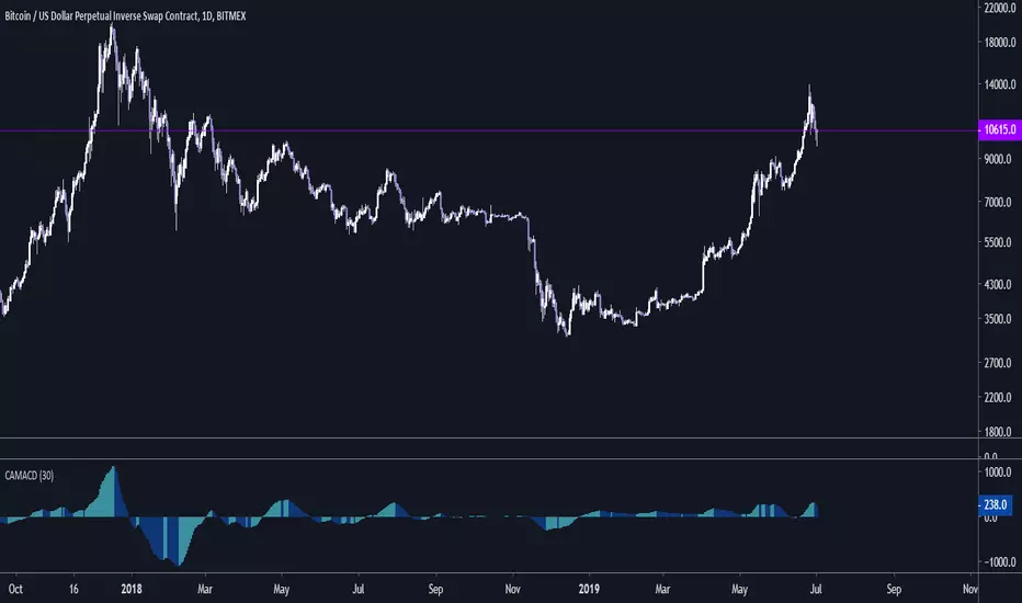
Cryptocurrency Adjusted MACD - CAMACDAdjust settings to your liking!
Support the development of new indicators:
BTC: 1LRHrA9wChPyZgCtWj3vBxv8FwHKWKmmmU
LTC: Lfw6FfeZhJofLJSackJ5uDam2BnDqh8Acp
ETH: 0xeE7abEc3303D5Ca4c05b876B2cE8E2406481365a
ZCASH: t1gSCHrcRN1GcCP2YWGh6xG9hSxSkxMoofF
Поиск скриптов по запросу "bitcoin"
Megalodon Pro Utility PanelHow to use?
Simply, add the indicator and follow the timing and kill zone signals on the screen.
This indicator is designed for Daily time frame for longer term analysis and 1 minute time frame for shorter term analysis.
Turn on the kill zone feature for overlaying different kill zones.
Turn on Day Trading checklist feature for becoming a better Day Trader using Megalodon indicators.


🔗 Blockchain Rhythms by Cryptorhythms🎼 Blockchain Rhythms v1.0 by Cryptorhythms
This indicator and data plot suite is for bitcoin BTCUSD analysis over longer periods and higher time frames. 🚨For this to plot anything you must use on Daily or higher timeframe🚨 .
You want to have an alternative to the typical technical indicators you see everywhere? This is it. Seen crypto twitter talking about/using all sorts of indicators you have never seen before on tradingview? Here you go. Are you a long term investor and not a short term speculator?... I think you get the picture...
With the wealth of data here, I cannot go into a fully detailed analysis for every indicator. Please make liberal use of google and as always DYOR before trading on a system you have never used.
These indicators are best observed versus a logarithmic price scale. If I have missed any indicators you think should be in here let me know! Let me preempt that by saying MVRV and UTXO Age Distribution are not possible to create on Tradingview at this time.
🚧Error Screen:
If you see this you need to choose a data-point or indicator to plot!
⌚If you are loading this indicator with alot of chart history shown (as in the example screenshots) it may take up to a minute to load.
Please note: some of the screenshots below show chart title plots which I subsequently had to remove due to limitations. If you would like a title for all the plot, simple use the Indicator Labels checkbox option located in the scales tab of chart settings.
[b📊 Fundamental Blockchain Indicators
NVT Signal & Ratio
Both are related. NVT / NVT Signal can be interpreted as the strength of market confidence in the means of payment / settlement layer narrative. A “measure of the chain’s strength as a payment network compared to its market value — a low NVT may suggest that a network is undervalued compared to the service it is providing as a settlement layer” (Matteo Leibowitz).
💰NVT Ratio:
NVT Ratio (Network Value to Transactions Ratio) is similar to the PE Ratio used in equity markets.
When Bitcoin`s NVT is high, it indicates that its network valuation is outstripping the value being transmitted on its payment network, this can happen when the network is in high growth and investors are valuing it as a high return investment, or alternatively when the price is in an unsustainable bubble.
🚦NVT Signal:
NVT Signal (NVTS) is a derivative of NVT Ratio created by Dimitry Kalichkin. This indicator provides more emphasis on predictive signaling ahead of price peaks.
🚀Bitcoin Velocity
Velocity is a measure of how quickly money is circulating in the economy. Is bitcoin trending towards savings or payments? This can help you decide. It is similar to Bitcoin Network Momentum, except this takes into account bitcoins increasing supply.
🏃Bitcoin Network Momentum
Network Momentum is a view created by PositiveCrypto which looks into the value transmitted through the Bitcoin blockchain denominated in BTC value plotted against Bitcoin's price. It serves as a leading indicator to bitcoin price, in that we need high levels of value throughput to drive the bull market. This indicator is experimental.
Both daily transaction values and price exhibit cyclical patterns, but not in sync with each other. A hypothesis to explain the mismatch is that short-term mindset traders (using exchanges) heavily influence price; but long-term mindset investments (more likely to be directly recorded on-chain) have a greater contribution to the daily transaction value recorded in the ledger.
An alternative to the NVT / NVT Signal - tracks the relationship between Bitcoin’s price and BTC volume flowing through the blockchain network.
Ⓜ Mayer Multiple
Introduced by Trace Mayer as a way to gauge the current price of Bitcoin against its long range historical price movements (200 day SMA by default), the Mayer Multiple highlights when Bitcoin is overbought or oversold in the context of longer time frames.
It`s worth noting as the market becomes larger and less volatile, the peaks are becoming less exaggerated. This is because a 200 day moving average baseline is a static yardstick against an ever growing, more stable, Bitcoin market. We should eventually re-calibrate what constitutes the overbought/oversold extremes on this chart accordingly.
A more fully featured Mayer Multiple version available here:
💲 BTC Marketcap and Thermocap
We are all familiar with marketcap, but it does come with its disadvantages.
A more appropriate measure of network value was recently put forth by Nic Carter. Remember capital flows in crypto generally do not come in via exchanges (miners notably like to sell OTC). Every buy in an exchange is matched by a sell. Money that comes in = money that goes out.
True inflows (in Bitcoin, at least) are the aggregate of resources spent by miners¹. And a good proxy for that is the amount these folks are earning back from networks they support in return for their investments. That’s aggregate security spend (or Thermocap): what was actually paid out to miners (transactions * their price in USD at the time they were mined).
There is an option to deduct lost coins, genesis (Satoshi's) coins, and dead HODL'ers coins from the marketcap. This information was taken from ChainAnalysis' 2017 report
This shows both plots for comparison on a logrithmic scale:
⛏Mining Indicators & Data
⛏ Petahash Dollar Ratio
Bitcoin’s Hashrate (Daily PetaHashes) to Daily Mining Earnings (PetaHashDollar) is a robust metric to asses the day to day mining profitability. In addition, when plotted over the past five years, its overall trend represents a good way to quantify and visualize the relative progress in efficiency of ASICs (more specifically the inverse of that metric: 1/relative mining efficiency).
⛏Unmined Coins Marketcap
A simple statistic I created to plot the value of the unmined BTC still waiting to be extracted. If you find any interesting value for analysis please message me and let me know.
⛏Percentage of Total BTC Mined
I hope this one doesnt need an explanation. 😅
#️⃣ Network Hash Rate
A network's hashrate is the most important data point in blockchain tech. It indicates to the world how secure its network is. The hashrate is the "bridge" between the analog world, and the digital world. Essentially, the hashrate describes how much computing power (called hashing power in blockchain speak) is being thrown at the network, by users all across the world. These "miners" are running servers with dedicated processing chips to solve random, cryptographic math problems. The reason miners do this constant computing is that it betters their chances to reap a "block reward." The block reward entitles them to:
1.)Newly "mined" coins, and
2.)Transaction fees
Both of these are typically paid out with each new block. This rewards miners for their “proof-of-work.” It signals to the world that real "work" and resources, like electricity, have been spent on the Bitcoin network.
As more and more miners compete for the block reward, the hashrate, mining calculations and block difficulty will increase. This increase in the network's hashrate over time means an increase in the network’s security. Much better detail on this is available elsewhere, but primarily, this process solves digital money's vulnerability to attacks and the "double spend" problem.
I like to plot it directly on the price chart (click on the indicator and drag it up)
⛏ Revenue Per Transaction
A chart showing miners revenue divided by the number of transactions.
Fee Per Block Kilobyte
A measure of how much it costs per kilobyte of blockchain block size.
⛏Return Per TeraHash (TH)
Revenue per TH of mining hash power.
Can also be plotted on price chart and looks nice:
Cost Per TX (CPT) and Cost % Per TX Volume
CPT - A chart showing miners revenue divided by the number of transactions
C%PRV - A chart showing miners revenue as percentage of the transaction volume
Blockchain Statistics & Data Plots
🏋Network Difficulty
A relative measure of how difficult it is to find a new block. The difficulty is adjusted periodically as a function of how much hashing power has been deployed by the network of miners.
I like plotting this one on price chart as well:
Daily Output Value
The total value of all transaction outputs per day (includes coins returned to the sender as change).
🔢Number of Unique Addresses Used
Addresses are kind of like bank accounts.
Unlike bank accounts, addresses on the blockchain can be generated by anyone, anywhere and one single person could have thousands.
The plot shows bitcoins growth of addresses which are both unique and active per day, smoothed out over 14 days for clarity (using a zero lag ema). As you can see bull runs typically lead to more unique addresses the assumption being that more new money is drawn into the market due to the news cycle.
This is another one I prefer to plot on the price chart.
🔢Number of Transactions (NoTX) and NoTX - Exchange Wallets
Number of TX's on the chain (green line) and NoTX minus (-) Exchange Wallets (blue line).
⏳ Median Confirmation Time
The median time for a transaction to be accepted into a mined block and added to the public ledger (note: only includes transactions with miner fees). Displayed in minutes.
🔊Volume Dominance (Liquidity to Transaction Volume Ratio)
Volume Dominance is another metric I invented simply to show the ratio between spot exchange TXs (liquidity/speculation) and blockchain TXs (utility/HODLing). Its shows percent of volume attributed to blockchain TXs.
🙃 We REALLY hope you enjoy and find this indicator useful. I certainly enjoyed creating it and learned quite a bit myself manipulating the data! I welcome any suggestions or ideas you may have to further extend, or create new indicators.
👍 Enjoying this indicator or find it useful? Please give me a like and follow! I post crypto analysis, price action strategies and free indicators regularly.
💬 Questions? Comments? Want to get access to an entire suite of proven trading indicators? Come visit us on telegram and chat, or just soak up some knowledge. We make timely posts about the market, news, and strategy everyday. Our community isn't open only to subscribers - everyone is welcome to join.

Heffae Clouds v1.00Heffae Clouds v1.0 - Ichimoku Modernized
Heffae Clouds Alpha release Version 1.0
Heffae Clouds functions as adaptive support and resistance. It has real-time paths and offset clouds, similar to ichimoku.
Paths are calculated by the complex discovery of prior behaviour for any crypto or forex asset.
Uses 5 single layer networks to calculate the optimal path fitting for any asset or timeframe.
The cloud color provides granular detail on path validity.
Please see the pastebin link for access information and links:
pastebin.com
Video introduction and trading strategy:
Some Beta-tester comments:
"It's like now having a microscope if you get what I mean. Which says great things about what you have done here. Love it man"
"I just find myself makes so many good decisions with your system it's hard to believe"
"this is without a doubt an improvement of Ichimoku (Which is my favorite tool by far). So much more info with your cloud system.."
Z Distance from VWAP Enhanced (ZVWAP)The "Z Distance from VWAP Enhanced" (ZVWAP) indicator is a comprehensive oscillator that provides deep insights into market dynamics. It calculates a Z-score, which tells you how many standard deviations the current price is away from the VWAP. This normalization makes it a consistent and reliable tool for identifying market extremes.
The indicator comes packed with features, including:
Customizable Overbought & Oversold Zones
Built-in Bullish & Bearish Divergence Detection
Automatic Trendline Plotting
A Moving Exponential Average (MEA) for crossover signals
Fully customizable alerts for every key event.
How to Use It - The BTC Dominance Strategy for Altcoins
As shown in the screenshot, this indicator is an exceptional tool for trading altcoins by analyzing the BTC Dominance (BTC.D) chart. The relationship is typically inverse:
When ZVWAP on BTC.D is RISING (or Overbought) ➔ It's BEARISH for Altcoins.
This means Bitcoin is gaining dominance, and capital is flowing out of altcoins and into Bitcoin. This is a time to be cautious with or short altcoins.
When ZVWAP on BTC.D is FALLING (or Oversold) ➔ It's BULLISH for Altcoins.
This means Bitcoin is losing dominance, and capital is flowing into altcoins, often starting an "altcoin season." This is a great time to look for long entries on your favorite altcoins.
Key Signals on the BTC.D Chart:
Zone Entries: When ZVWAP enters the red (Overbought) zone, prepare for altcoins to weaken. When it enters the blue (Oversold) zone, look for altcoin strength.
MEA Crossover: A crossover of the yellow ZVWAP line below the cyan MEA line is a strong confirmation that dominance is falling and the trend is becoming bullish for altcoins.
Divergences: A bearish divergence on the BTC.D chart can be an early warning that dominance is about to fall, signaling a potential bullish move for altcoins.
Key Features Explained
Overbought / Oversold Zones: The red and blue shaded areas clearly define when an asset is statistically over-extended. These are prime areas to look for mean reversion or trend exhaustion.
Divergence Detection: The script automatically detects and plots divergences between price and the ZVWAP.
• Bullish Divergence: Price makes a lower low, but ZVWAP makes a higher low. (Potential buy signal).
• Bearish Divergence: Price makes a higher high, but ZVWAP makes a lower high. (Potential sell signal).
The Reference Lines (+1 / -1): These gray lines represent one standard deviation from the VWAP. They act as an early warning system. When the ZVWAP crosses these lines, it shows that momentum is building, and the price is starting to deviate significantly from its average.
Automatic Trendlines: The indicator can automatically draw and manage trendlines based on recent pivots in the ZVWAP, helping you visualize the current momentum and potential breakout points. This feature can be turned off if you prefer a cleaner chart.
Customization and Alerts
The indicator is fully customizable. You can adjust the lengths, zone levels, and visual settings to fit your trading style. Most importantly, it includes a comprehensive set of alerts:
Enter Overbought Zone
Enter Oversold Zone
Bullish Divergence Detected
Bearish Divergence Detected
Enter Any Zone (OB/OS) - a single alert for either condition.
Any Divergence (Bull/Bear) - a single alert for any divergence.
This allows you to stay informed of every important signal without having to watch the charts all day.
i.imgur.com

[c3s] CWS - M2 Global Liquidity Index & BTC Correlation CWS - M2 Global Liquidity Index with Offset BTC Correlation
This custom indicator visualizes and analyzes the relationship between the global M2 money supply and Bitcoin (BTC) price movements. It calculates the correlation between these two variables to provide insights into how changes in global liquidity may impact Bitcoin’s price over time.
Key Features:
Global M2 Liquidity Index Calculation:
Fetches M2 money supply data from multiple economies (China, US, EU, Japan, UK) and normalizes using currency exchange rates (e.g., CNY/USD, EUR/USD).
Combines all M2 data points and normalizes by dividing by 1 trillion (1e12) for easier visualization.
Offset for M2 Data:
The offset parameter allows users to shift the M2 data by a specified number of days, helping track the influence of past global liquidity on Bitcoin.
BTC Price Correlation:
Computes the correlation between shifted global M2 liquidity and Bitcoin (BTC) price, using a 52-day lookback period by default.
Correlation Quality Display:
Categorizes correlation quality as:
Excellent : Correlation >= 0.8
Good : Correlation >= 0.6 and < 0.8
Weak : Correlation >= 0.4 and < 0.6
Very Weak : Correlation < 0.4
Displays correlation quality as a label on the chart for easy assessment.
Visual Enhancements:
Labels : Displays dynamic labels on the chart with metrics like M2 value and correlation.
Plot Shapes : Uses shapes to indicate data availability for global M2 and correlation.
Data Table : Optionally shows a data table in the top-right corner summarizing:
Global M2 value (in trillions)
The correlation between global M2 and BTC
The correlation quality
Optional Debugging:
Debug plots help identify when data is missing for M2 or correlation, ensuring transparency and accurate functionality.
Inputs:
Offset: Shift the M2 data (in days) to see past liquidity effects on Bitcoin.
Lookback Period: Number of periods (default 52) used to calculate the correlation.
Show Labels: Toggle to show or hide labels for M2 and correlation values.
Show Table: Toggle to show or hide the data table in the top-right corner.
Usage:
Ideal for traders and analysts seeking to understand the relationship between global liquidity and Bitcoin price. The offset and lookback period can be adjusted to explore different timeframes and correlation strengths, aiding more informed trading decisions.

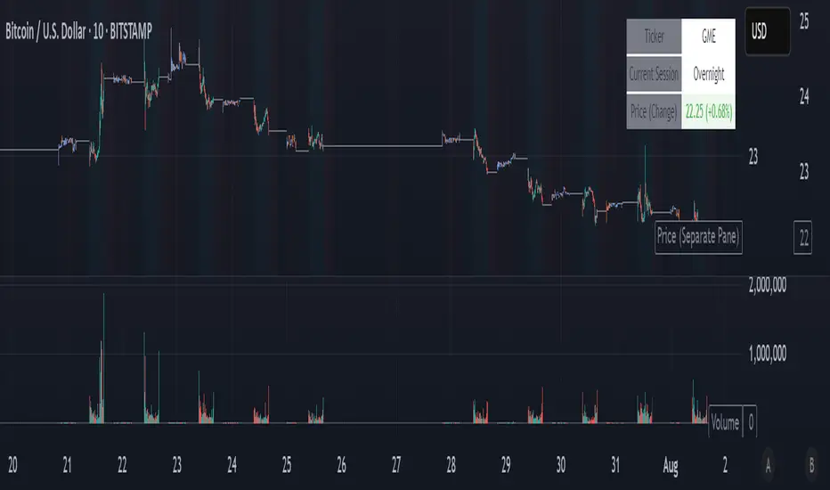
NightWatch 24/5 [theUltimator5]NightWatch 24/5 is a comprehensive indicator designed to seamlessly display both regular and overnight trading (BOATS exchange) into a single chart. Current TV limitations don't allow both overnight trading and regular exchanges to appear on the same chart due to timeframe visibility settings. We can either select between RTH (Regular Trading Hours) or ETH (Extended Trading Hours). There is no option to show 24 hour charts when looking at a stock. This indicator attempts to solve this issue.
Please read the entire description thoroughly because this indicator takes a little bit of setup to work properly!
---IMPORTANT-- -
This indicator MUST be used over a liquid cryptocurrency chart, like Bitcoin. It requires access to something that trades 24/7 and has volume data for all periods. Bitcoin on Coinbase is the best option. Please select Bitcoin as your main ticker before adding this indicator to the chart.
-------------------
This indicator combines the price of both the regular trading hours and the overnight trading to create a single price line and volume candles. You can select view settings to either overlay the price on the chart, or have it below the chart. Volume can be toggled on or off as well.
Default settings:
Ticker = GME
Overlay Candles on Main Chart = true
Display Data = Both Price and Volume
Show Status Table = true
Here is an explanation for each of these settings:
Ticker - Type in the ticker you want to track overnight and intraday data for
Overlay Candles on Main chart - This will push the price candles onto the main chart area instead of below it. Volume candles will remain in their own separate pane below. This is useful if you want to track both price and volume without adding the indicator twice.
Display Data - This determines what data to show. Volume, price, or both volume and price.
Show Status Table - This toggles on or off the table that shows the ticker name, current session, and the price (change) of the ticker since the most recent daily close.
If you overlay the price onto the chart, the price of the stock you are looking at will likely be a VERY different price than the crypto it is overlaying against. There are a couple workarounds. You can either zoom into the chart around the price of the stock you are looking at (time consuming), or you can go into your object tree and drag the indicator up into the main chart area. This will overlay the price onto the crypto while maintaining it's own unique y-axis.
After you move the indicator up, you can add the indicator back a second time, then change the settings to only show the volume candles. You can then toggle off the table on one of the two so you don't see duplicate tables. This is the setting I am showing in my chart above. The indicator is added twice with the price being pulled up into the same window as Bitcoin, then a second instance below showing just volume.
--LIMITATIONS--
Since the indicator requires the use of a 24 hour market ticker like Bitcoin, it DOES NOT display extended hours data. The price and volume data STOPS at 16:00 EST then resumes back up at 20:00 EST when BOATS opens. At 04:00, the price and volume then stops until 09:30, when the regular trading hours begin. This causes a flat line in the price during those periods. Unfortunately, there is no current workaround to this issue.
If Bitcoin becomes illiquid (or whatever crypto you choose), it will only populate data for the ticker you want if there is data available for that crypto at the same time period. A gap in Bitcoin volume will show a gap in trade activity for your ticker.
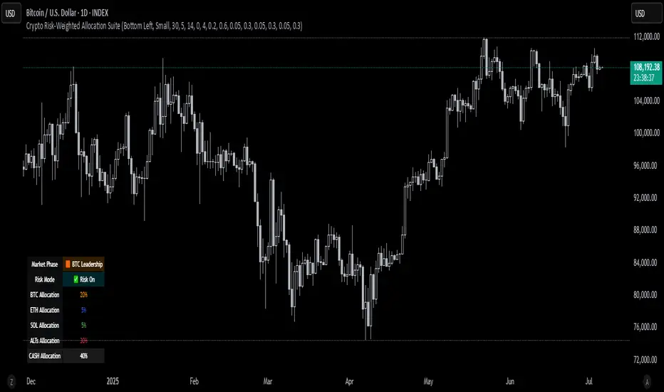
Crypto Risk-Weighted Allocation SuiteCrypto Risk-Weighted Allocation Suite
This indicator is designed to help users explore dynamic portfolio allocation frameworks for the crypto market. It calculates risk-adjusted allocation weights across major crypto sectors and cash based on multi-factor momentum and volatility signals. Best viewed on INDEX:BTCUSD 1D chart. Other charts and timeframes may give mixed signals and incoherent allocations.
🎯 How It Works
This model systematically evaluates the relative strength of:
BTC Dominance (CRYPTOCAP:BTC.D)
Represents Bitcoin’s share of the total crypto market. Rising dominance typically indicates defensive market phases or BTC-led trends.
ETH/BTC Ratio (BINANCE:ETHBTC)
Gauges Ethereum’s relative performance versus Bitcoin. This provides insight into whether ETH is leading risk appetite.
SOL/BTC Ratio (BINANCE:SOLBTC)
Measures Solana’s performance relative to Bitcoin, capturing mid-cap layer-1 strength.
Total Market Cap excluding BTC and ETH (CRYPTOCAP:TOTAL3ES)
Represents Altcoins as a broad category, reflecting appetite for higher-risk assets.
Each of these series is:
✅ Converted to a momentum slope over a configurable lookback period.
✅ Standardized into Z-scores to normalize changes relative to recent behavior.
✅ Smoothed optionally using a Hull Moving Average for cleaner signals.
✅ Divided by ATR-based volatility to create a risk-weighted score.
✅ Scaled to proportionally allocate exposure, applying user-configured minimum and maximum constraints.
🪙 Dynamic Allocation Logic
All signals are normalized to sum to 100% if fully confident.
An overall confidence factor (based on total signal strength) scales the allocation up or down.
Any residual is allocated to cash (unallocated capital) for conservative exposure.
The script automatically avoids “all-in” bias and prevents negative allocations.
📊 Outputs
The indicator displays:
Market Phase Detection (which asset class is currently leading)
Risk Mode (Risk On, Neutral, Risk Off)
Dynamic Allocations for BTC, ETH, SOL, Alts, and Cash
Optional momentum plots for transparency
🧠 Why This Is Unique
Unlike simple dominance indicators or crossovers, this model:
Integrates multiple cross-asset signals (BTC, ETH, SOL, Alts)
Adjusts exposure proportionally to signal strength
Normalizes by volatility, dynamically scaling risk
Includes configurable constraints to reflect your own risk tolerance
Provides a cash fallback allocation when conviction is low
Is entirely non-repainting and based on daily closing data
⚠️ Disclaimer
This script is provided for educational and informational purposes only.
It is not financial advice and should not be relied upon to make investment decisions.
Past performance does not guarantee future results.
Always consult a qualified financial advisor before acting on any information derived from this tool.
🛠 Recommended Use
As a framework to visualize relative momentum and risk-adjusted allocations
For research and backtesting ideas on portfolio allocation across crypto sectors
To help build your own risk management process
This script is not a turnkey strategy and should be customized to fit your goals.
✅ Enjoy exploring dynamic crypto allocations responsibly!
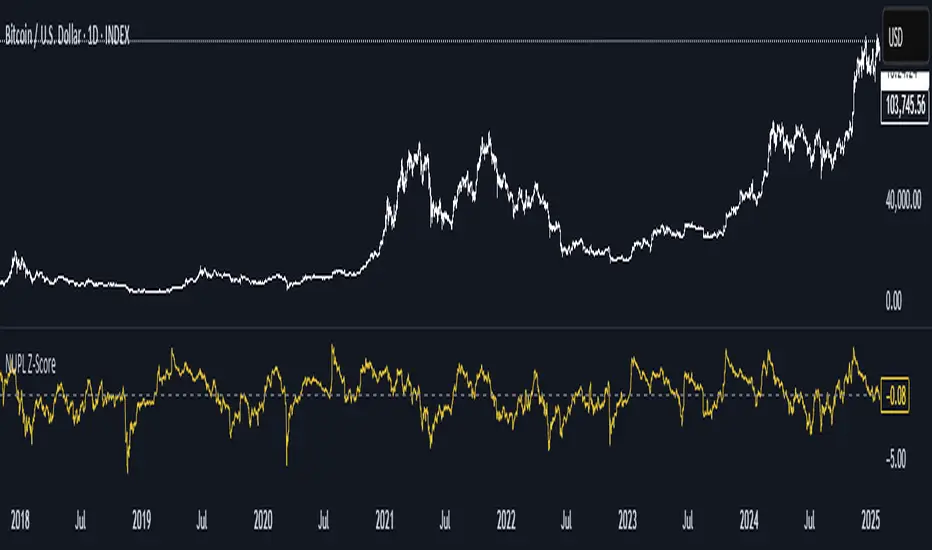
NUPL Z-ScoreThis indicator is derived from Market Value and Realized Value, which can be defined as:
Market Value: The current price of Bitcoin multiplied by the number of coins in circulation. This is like market cap in traditional markets i.e. share price multiplied by number of shares.
Realized Value: Rather than taking the current price of Bitcoin, Realized Value takes the price of each Bitcoin when it was last moved i.e. the last time it was sent from one wallet to another wallet. It then adds up all those individual prices and takes an average of them. It then multiplies that average price by the total number of coins in circulation.
By subtracting Realized Value from Market Value we calculate Unrealized Profit/Loss.
Unrealized Profit/Loss estimates the total paper profits/losses in Bitcoin held by investors. This is interesting to know but of greater value is identifying how this changes relatively over time.
To do this we can divide Unrealized Profit/Loss by Market Cap. This creates Net Unrealized Profit/Loss, sometimes referred to as NUPL, which is very useful to track investor sentiment over time for Bitcoin.
Relative Unrealised Profit/Loss is another name used for this analysis.
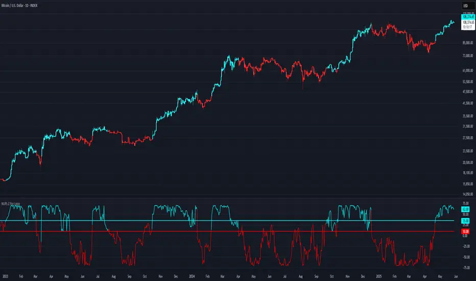
NUPL-Z For Loop🧠 Overview
NUPL-Z For Loop is a trend-following indicator built on Bitcoin’s on-chain Net Unrealized Profit/Loss (NUPL) metric. It uses a Z-scored transformation of NUPL and a custom loop-based scoring system to measure the consistency of directional movement. Rather than identifying tops and bottoms, this tool is designed to track sustained trends and filter out short-term noise, making it ideal for momentum-aligned strategies.
🧩 Key Features
Loop-Based Trend Logic: Assesses trend strength by summing the number of upward vs. downward moves in Z-scored NUPL across a custom lookback.
Z-Score Normalization: Applies long-term statistical normalization to NUPL to emphasize deviation from average behavior over time.
Threshold-Based Regime Shifts: Custom input thresholds define when trend strength is significant enough to trigger long or short signals.
Directional Market State Tracking: Internally tracks bullish, bearish, or neutral conditions to guide trend entries.
BTC-Focused On-Chain Analysis: Tailored specifically for Bitcoin using Market Cap and Realized Cap inputs.
🔍 How It Works
NUPL Calculation: Derived as the percentage of net unrealized profit relative to market cap: (MC - RMC) / MC * 100.
Z-Scoring: NUPL is normalized using a rolling mean and standard deviation over a long window (default 1300 days) to create a smoothed trend signal.
Directional Loop: A custom loop iterates from the start_loop to the end_loop, comparing the current Z-score to past values.
Each instance where NUPL_Z > NUPL_Z adds +1 to the score; otherwise, it subtracts -1.
This cumulative score reflects how consistently NUPL-Z has been trending.
Signal Logic:
Long signal when loop score exceeds long_threshold.
Short signal when score falls below short_threshold.
CD State Engine: Maintains the current trend regime (1 for long, -1 for short), which drives plot coloring and overlays.
🔁 Use Cases & Applications
Momentum Trend Filter: Detects and confirms sustained directional strength in BTC’s profit/loss positioning.
Noise Suppression: Avoids reactive signals from one-off spikes or dips in NUPL by requiring a consistent trend before confirming bias.
Best Suited for BTC: Designed specifically for Bitcoin’s price and on-chain structure, using its unique NUPL dynamics.
✅ Conclusion
NUPL-Z For Loop transforms a traditionally mean-reverting indicator into a trend-following signal engine. By scoring the consistency of movement in normalized NUPL, this tool identifies trend strength rather than reversal potential — providing more reliable context for momentum-aligned trades on Bitcoin.
⚠️ Disclaimer
The content provided by this indicator is for educational and informational purposes only. Nothing herein constitutes financial or investment advice. Trading and investing involve risk, including the potential loss of capital. Always backtest and apply risk management suited to your strategy.
SOPR with Z-Score Table📊 Glassnode SOPR with Dynamic Z-Score Table
ℹ️ Powered by Glassnode On-Chain Metrics
📈 Description:
This indicator visualizes the Spent Output Profit Ratio (SOPR) for major cryptocurrencies — Bitcoin, Ethereum, and Litecoin — along with a dynamically normalized Z-Score. SOPR is a key on-chain metric that reflects whether coins moved on-chain are being sold at a profit or a loss.
🔍 SOPR is calculated using Glassnode’s entity-adjusted SOPR feed, and a custom SMA is applied to smooth the signal. The normalized Z-Score helps identify market sentiment extremes by scaling SOPR relative to its historical context.
📊 Features:
Selectable cryptocurrency: Bitcoin, Ethereum, or Litecoin
SOPR smoothed by user-defined SMA (default: 10 periods)
Upper & lower bounds (±4%) for SOPR, shown as red/green lines
Background highlighting when SOPR moves outside normal range
Normalized Z-Score scaled between –2 and +2
Live Z-Score display in a compact top-right table
🧮 Calculations:
SOPR data is sourced daily from Glassnode:
Bitcoin: XTVCBTC_SOPR
Ethereum: XTVCETH_SOPR
Litecoin: XTVCLTC_SOPR
Z-Score is calculated as:
SMA of SOPR over zscore_length periods
Standard deviation of SOPR
Z-Score = (SOPR – mean) / standard deviation
Z-Score is clamped between –2 and +2 for visual consistency
🎯 Interpretation:
SOPR > 1 implies coins are sold in profit
SOPR < 1 suggests coins are sold at a loss
When SOPR is significantly above or below its recent range (e.g., +4% or –4%), it may signal overheating or capitulation
The Z-Score contextualizes how extreme the current SOPR is relative to history
📌 Notes:
Best viewed on daily charts
Works across selected assets (BTC, ETH, LTC)
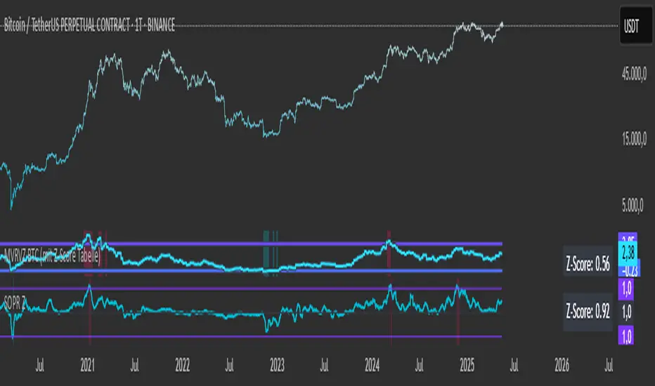
MVRVZ BTCMVRVZ BTC (Market Value to Realized Value Z-Score)
Description:
The MVRVZ BTC indicator provides insights into the relationship between the market value and realized value of Bitcoin, using the Market Value to Realized Value (MVRV) ratio, which is then adjusted using a Z-Score. This indicator highlights potential market extremes and helps in identifying overbought or oversold conditions, offering a unique perspective on Bitcoin's valuation.
How It Works:
MVRVZ is calculated by taking the difference between Bitcoin's Market Capitalization (MC) and Realized Capitalization (MCR), then dividing that by the Standard Deviation (Stdev) of the price over a specified period (usually 104 weeks).
The resulting value is plotted as the MVRVZ line, representing how far the market price deviates from its realized value.
Z-Score is then applied to the MVRVZ line, with the Z-Score bounded between +2 and -2, which allows it to be used within a consistent evaluation framework, regardless of how high or low the MVRVZ line goes. The Z-Score will reflect overbought or oversold conditions:
A Z-Score above +2 indicates the market is likely overbought (possible market top).
A Z-Score below -2 indicates the market is likely oversold (possible market bottom).
Values between -2 and +2 indicate more neutral market conditions.
How to Read the Indicator:
MVRVZ Line:
The MVRVZ line shows the relationship between market cap and realized cap. A higher value indicates the market is overvalued relative to the actual capital realized by holders.
The MVRVZ line can move above or below the top and bottom lines you define, which are adjustable according to your preferences. These lines act as trigger levels.
Top and Bottom Trigger Lines:
You can customize the Top Line and Bottom Line values to your preference.
When the MVRVZ line crosses the Top Line, the market might be considered overbought.
When the MVRVZ line crosses the Bottom Line, the market might be considered oversold.
SCDA Z-Score:
The Z-Score is displayed alongside the MVRVZ line and is bounded between -2 and +2. It scales proportionally based on the MVRVZ line's position relative to the top and bottom trigger lines.
The Z-Score ensures that even if the MVRVZ line moves beyond the trigger lines, the Z-Score will stay within the limits of -2 to +2, making it ideal for your custom evaluation system (SCDA).
Background Highlighting:
The background color changes when the MVRVZ line crosses key levels:
When the MVRVZ line exceeds the Top Trigger, the background turns red, indicating overbought conditions.
When the MVRVZ line falls below the Bottom Trigger, the background turns green, indicating oversold conditions.
Data Sources:
The data for the MVRVZ indicator is sourced from Glassnode and Coinmetrics, which provide the necessary values for:
BTC Market Cap (MC) – The total market capitalization of Bitcoin.
BTC Realized Market Cap (MCR) – The capitalization based on the price at which Bitcoin was last moved on the blockchain (realized value).
How to Use the Indicator:
Market Extremes:
Use the MVRVZ and Z-Score to spot potential market tops or bottoms.
A high Z-Score (above +2) suggests the market is overbought, while a low Z-Score (below -2) suggests the market is oversold.
Adjusting the Triggers:
Customize the Top and Bottom Trigger Lines to suit your trading strategy. These lines can act as dynamic reference points for when to take action based on the Z-Score or MVRVZ line crossing these levels.
Market Evaluation (SCDA Framework):
The bounded Z-Score (from -2 to +2) is tailored for your SCDA evaluation system, allowing you to assess market conditions based on consistent criteria, no matter how volatile the MVRVZ line becomes.
Conclusion:
The MVRVZ BTC indicator is a powerful tool for assessing the relative valuation of Bitcoin based on its market and realized capitalization. By combining it with the Z-Score, you get an easy-to-read, bounded evaluation system that highlights potential market extremes and helps you make informed decisions about Bitcoin's price behavior.

Quad Rotation StochasticQuad Rotation Stochastic
The Quad Rotation Stochastic is a powerful and unique momentum oscillator that combines four different stochastic setups into one tool, providing an incredibly detailed view of market conditions. This multi-timeframe stochastic approach helps traders better anticipate trend continuations, reversals, and momentum shifts with greater precision than traditional single stochastic indicators.
Why this indicator is useful:
Multi-layered Momentum Analysis: Instead of relying on one stochastic, this script tracks four independent stochastic readings, smoothing out noise and confirming stronger signals.
Advanced Divergence Detection: It automatically identifies bullish and bearish divergences for each stochastic, helping traders spot potential reversals early.
Background Color Alerts: When a configurable number (e.g., 3 or 4) of the stochastics agree in direction and position (overbought/oversold), the background colors green (bullish) or red (bearish) to give instant visual cues.
ABCD Pattern Recognition: The script recognizes "shield" patterns when Stochastic 4 remains stuck at extreme levels (above 90 or below 10) for a set time, warning of potential trend continuation setups.
Super Signal Alerts: If all four stochastics align in extreme conditions and slope in the same direction, the indicator plots a special "Super Signal," offering high-confidence entry opportunities.
Why this indicator is unique:
Quad Confirmation Logic: Combining four different stochastics makes this tool much less prone to false signals compared to using a single stochastic.
Customizable Divergence Coloring: Traders can choose to have divergence lines automatically match the stochastic color for clear visual association.
Adaptive ABCD Shields: Innovative use of bar counting while a stochastic remains extreme acts as a "shield," offering a unique way to filter out minor fake-outs.
Flexible Configuration: Each stochastic's sensitivity, divergence settings, and visual styling can be fully customized, allowing traders to adapt it to their own strategy and asset.
Example Usage: Trading Bitcoin with Quad Rotation Stochastic
When trading Bitcoin (BTCUSD), you might set the minimum count (minCount) to 3, meaning three out of four stochastics must be in agreement to trigger a background color.
If the background turns green, and you notice an ABCD Bullish Shield (Green X), you might look for bullish candlestick patterns or moving average crossovers to enter a long trade.
Conversely, if the background turns red and a Super Down Signal appears, it suggests high probability for further downside, giving you strong confirmation to either short BTC or avoid entering new longs.
By combining divergence signals with background colors and the ABCD shields, the Quad Rotation Stochastic provides a layered confirmation system that gives traders greater confidence in their entries and exits — particularly in fast-moving, volatile markets like Bitcoin.

Altseason Index (Top 10)### Altseason Index (Top 10)
#### Overview
The "Altseason Index (Top 10)" indicator identifies whether the market is in an altseason (altcoins outperforming Bitcoin) or a Bitcoin season. It analyzes the performance of 9 top altcoins (ETH, BNB, ADA, XRP, SOL, DOT, AVAX, SHIB, LINK) against Bitcoin over 90 days, inspired by the Blockchain Center Altcoin Season Index.
#### How It Works
- Calculates the 90-day price change for BTC and 9 altcoins.
- Counts how many altcoins outperform BTC.
- Index = (number of outperforming altcoins / 9) * 100.
- >75%: Altseason (green zone).
- <25%: Bitcoin season (red zone).
- 25–75%: Neutral.
#### Visualization
- Blue line: Index value (0–100).
- Green line at 75: Altseason threshold.
- Red line at 25: Bitcoin season threshold.
- Green/red background fill for altseason/BTC season zones.
#### Usage
Add to your chart and interpret:
- Above 75: Consider altcoin investments.
- Below 25: Focus on Bitcoin.
Ensure tickers match your exchange (e.g., "BTCUSD" or "BINANCE:BTCUSDT").
#### Notes
- Limited to 9 altcoins due to TradingView's request.security() limit.
- Best on daily charts but adaptable to other timeframes.

NUPL Z-Score | Vistula LabsWhat is NUPL?
NUPL (Net Unrealized Profit/Loss) is a fundamental on-chain metric used to evaluate the profit or loss state of a cryptocurrency's market participants, such as Bitcoin (BTC) and Ethereum (ETH). It compares the current market capitalization—the total value of all coins at their current price—to the realized capitalization, which represents the average price at which all coins were last transacted on-chain.
Market Capitalization: Current price × circulating supply.
Realized Capitalization: The sum of the value of all coins based on the price at their last on-chain movement.
For Bitcoin (BTC):
NUPL = (Market Cap - Realized Cap) / Market Cap * 100
For Ethereum (ETH):
NUPL = (Market Cap - Realized Cap) / Market Cap
A positive NUPL indicates that the market holds unrealized profits, meaning the current value exceeds the price at which coins were last moved. A negative NUPL signals unrealized losses. Extreme NUPL values—high positives or low negatives—can suggest overvaluation (potential market tops) or undervaluation (potential market bottoms), respectively.
How NUPL is Calculated for BTC & ETH
This indicator calculates NUPL using data sourced from Glassnode and CoinMetrics:
For Bitcoin:
Market Cap: GLASSNODE:BTC_MARKETCAP
Realized Cap: COINMETRICS:BTC_MARKETCAPREAL
Formula: ((btc_market_cap - btc_market_cap_real) / btc_market_cap) * 100
For Ethereum:
Market Cap: GLASSNODE:ETH_MARKETCAP
Realized Cap: COINMETRICS:ETH_MARKETCAPREAL
Formula: ((eth_market_cap - eth_market_cap_real) / eth_market_cap) * 100
The indicator then transforms these NUPL values into a Z-Score, which measures how many standard deviations the current NUPL deviates from its historical average. The Z-Score calculation incorporates:
A customizable moving average of NUPL (options: SMA, EMA, DEMA, RMA, WMA, VWMA) over a user-defined length (default: 220 periods).
The standard deviation of NUPL over a specified lookback period (default: 200 periods).
Z-Score Formula:
Z-Score = (Current NUPL - Moving Average of NUPL) / Standard Deviation of NUPL
This normalization allows the indicator to highlight extreme market conditions regardless of the raw NUPL scale.
How This Indicator Can Be Used
Trend Following
The NUPL Z-Score indicator employs a trend-following system with adjustable thresholds to generate trading signals:
Long Signals: Triggered when the Z-Score crosses above the Long Threshold (default: 0.26).
Short Signals: Triggered when the Z-Score crosses below the Short Threshold (default: -0.62).
Visual Representations:
Green up-triangles: Indicate long entry points (plotted below the bar).
Red down-triangles: Indicate short entry points (plotted above the bar).
Color-coded elements:
Candles and Z-Score plot turn teal (#00ffdd) for long positions.
Candles and Z-Score plot turn magenta (#ff00bf) for short positions.
These signals leverage historical NUPL trends to identify potential momentum shifts, aiding traders in timing entries and exits.
Overbought/Oversold Conditions
The indicator flags extreme market states using additional thresholds:
Overbought Threshold (default: 3.0): When the Z-Score exceeds this level, the market may be significantly overvalued, hinting at potential selling pressure. Highlighted with a light magenta background (#ff00bf with 75% transparency).
Oversold Threshold (default: -2.0): When the Z-Score drops below this level, the market may be significantly undervalued, suggesting buying opportunities. Highlighted with a light teal background (#00ffdd with 75% transparency).
These extreme Z-Score levels have historically aligned with major market peaks and troughs, making them useful for medium- to long-term position management.
Customization Options
Traders can tailor the indicator to their preferences:
Cryptocurrency Source: Choose between BTC or ETH.
Moving Average Type: Select from SMA, EMA, DEMA, RMA, WMA, or VWMA.
Moving Average Length: Adjust the period for the NUPL moving average (default: 220).
Z-Score Lookback Period: Set the historical window for Z-Score calculation (default: 200).
Thresholds: Fine-tune values for: Long Threshold (default: 0.26), Short Threshold (default: -0.62), Overbought Threshold (default: 3.0), Oversold Threshold (default: -2.0)
These options enable users to adapt the indicator to various trading strategies and risk profiles.
Alerts
The indicator supports four alert conditions to keep traders informed:
NUPL Long Opportunity: Alerts when a long signal is triggered.
NUPL Short Opportunity: Alerts when a short signal is triggered.
NUPL Overbought Condition: Alerts when the Z-Score exceeds the overbought threshold.
NUPL Oversold Condition: Alerts when the Z-Score falls below the oversold threshold.
These alerts allow traders to monitor key opportunities without constantly watching the chart.

IBD Style Relative Strength RatingWelcome to the IBD Style Relative Strength Rating Indicator!
A powerful tool inspired by Investor's Business Daily (IBD), this indicator helps traders evaluate stock performance relative to a benchmark. It’s perfect for identifying strong or weak stocks compared to the broader market, specifically the S&P 500 (SPY). Whether you're a beginner or an experienced investor, this guide will walk you through its features and key concepts, including the RS Line and RS Rating, and how legendary trader Mark Minervini uses similar tools.
Understanding the RS Line & RS Rating
RS Line (Relative Strength Line)
A visual representation of how a stock’s price performs relative to SPY.
Calculated by dividing the stock’s closing price by SPY’s closing price and multiplying by 100.
Rising RS Line → Stock is outperforming SPY.
Falling RS Line → Stock is underperforming SPY.
Helps identify strength or weakness compared to the market.
RS Rating
A numerical score (1-99) measuring stock performance over 252 trading days (1 year) relative to SPY.
Above 80 → Top 20% of performers.
Above 90 → Top 10% (ideal for growth investors).
Weighted average of stock’s price changes over 63, 126, 189, and 252 days.
Key Features Explained
RS Line Color Mode:
Static (default white) or Dynamic (green when rising, red when falling) for quick trend identification.
Comparative Symbol:
Default: SPY. Can be changed to NASDAQ:NDX, AAPL, or other indices/stocks.
Ensure selected symbols have sufficient historical data.
Plot RS New Highs: Marks new 250-day highs with subtle blue circles
Indicates a stock significantly outperforming SPY (potential buy signal).
Plot RS New Lows: Marks new 250-day lows with red circles
Signals underperformance (possible sell or avoid indicator).
Lookback for Display: Adjustable up to 2000 bars for historical trend analysis.
RS Rating Color Scheme
Green: Upward trend (improving RS Rating).
Orange: Neutral/mixed trend.
Red: Downward trend (declining RS Rating).
Dynamic Color Settings
Rising Line Color: Green (default), customizable.
Falling Line Color: Red (default), adjustable.
Advanced Options
Enable Replay Mode: Uses fixed percentile values for consistent RS Rating calculations in backtesting.
RS Rating Table
Displays current RS Rating and values from previous day, week, and month in the top-right corner (daily charts).
Background color reflects trend: Green (up), Orange (neutral), Red (down).
Past values appear in neutral gray for a quick performance snapshot.
How Mark Minervini Uses This Indicator
Mark Minervini, a legendary trader, emphasizes Relative Strength as a core strategy:
Looks for stocks with:
Rising RS Line.
RS Rating above 80-90 (top performers).
RS New Highs to spot breakout candidates.
Avoids stocks with:
Declining RS Line.
RS Rating below 70.
Important Information for Beginners
RS vs. SPY
The indicator compares stock performance against SPY (S&P 500).
Rising RS Line → Stock is beating SPY.
Falling RS Line → Stock is lagging.
Why Use This Indicator?
Helps find strong relative strength stocks, crucial for bullish trends.
New highs/lows on the RS Line signal significant shifts.
The RS Rating quantifies percentile-based performance.
Customization Options
Adjust colors, lookback periods, and marker sizes to match your trading style.
Default SPY comparison is ideal for U.S. traders but can be customized.
Timeframe Considerations
Optimized for daily charts.
Weekly/monthly charts may have limited data availability.
Tips for Crypto Traders (Measuring Altcoins vs. Bitcoin or Total Market Cap)
If trading cryptocurrencies, this indicator can measure altcoins vs. Bitcoin (BTC) or the total crypto market cap (TOTAL):
Comparative Symbol Setup:
Set Comparative Symbol to BTCUSD to compare an altcoin (e.g., ETHUSD) against Bitcoin.
Rising RS Line → The altcoin is outperforming Bitcoin (bullish signal).
Use TOTAL (crypto market cap index) to assess an altcoin’s strength against the total market.
High RS Rating suggests the altcoin is a market leader.
Adjust Look-back Periods:
Crypto markets are volatile, so reduce Look-back for New Highs/Lows to 50-100 bars (about 2-4 months) for shorter-term trends.
Fine-tune based on your trading strategy.
New Highs and Lows:
Watch for new RS Line highs (blue dots) to identify altcoins breaking out against BTC or TOTAL (momentum trading).
New lows (red dots) may signal weakening altcoins to avoid.
RS Rating Interpretation:
Above 80 against BTC or TOTAL → The altcoin is a strong performer.
This aligns with Minervini’s growth strategy for stocks.
Color Dynamics:
Use Dynamic RS Line Color (green for rising, red for falling) to quickly spot altcoin trends against BTC or TOTAL.
Crypto data may have gaps—test indicator settings on different timeframes (e.g., 1-hour or 4-hour charts).
Tips for Getting Started
Apply the Indicator to a stock chart and set Comparative Symbol to SPY.
Watch the RS Line:
If trending upward with new highs and RS Rating > 80, it's a strong candidate.
Use the RS Rating Table to check for trend consistency.
Adjust Opacity Settings for markers to balance visibility and clarity.
This indicator is now ready for public use as of March 18, 2025. Enjoy trading with enhanced insights, and feel free to share feedback or suggestions for future updates!

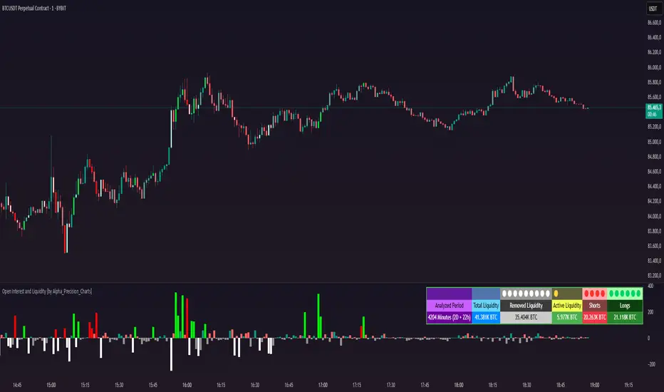
Open Interest and Liquidity [by Alpha_Precision_Charts]Indicator Description: Open Interest and Liquidity
Introduction:
The "Open Interest and Liquidity" indicator is an advanced tool designed for traders seeking to analyze aggregated Open Interest (OI) flow and liquidity in the cryptocurrency market, with a special focus on Bitcoin. It combines high-quality Open Interest data, a detailed liquidity table, and a visual longs vs shorts gauge, providing a comprehensive real-time view of market dynamics. Ideal for scalpers, swing traders, and volume analysts, this indicator is highly customizable and optimized for 1-minute charts, though it works across other timeframes as well.
Key Features:
Aggregated Open Interest and Delta: Leverages Binance data for accuracy, allowing traders to switch between displaying absolute OI or OI Delta, with value conversion to base currency or USD.
Liquidity Table: Displays the analyzed period, active liquidity, shorts, and longs with visual proportion bars, functioning for various cryptocurrencies as long as Open Interest data is available.
Longs vs Shorts Gauge: A semicircle visual that shows real-time market sentiment, adjustable for chart positioning, helping identify imbalances, optimized and exclusive for Bitcoin on 1-minute charts.
Utilities:
Sentiment Analysis: Quickly detect whether the market is accumulating positions (longs/shorts) or liquidating (OI exits).
Pivot Identification: Highlight key moments of high buying or selling pressure, ideal for trade entries or exits.
Liquidity Monitoring: The table and gauge provide a clear view of active liquidity, helping assess a move’s strength.
Scalping and Day Trading: Perfect for short-term traders operating on 1-minute charts, offering fast and precise visual insights.
How to Use:
Initial Setup: Choose between "Open Interest" (candles) or "Open Interest Delta" (columns) in the "Display" field. The indicator defaults to Binance data for enhanced accuracy.
Customization: Enable/disable the table and gauge as needed and position them on the chart.
Interpretation: Combine OI Delta and gauge data with price movement to anticipate breakouts or reversals.
Technical Notes
The indicator uses a 500-period VWMA to calculate significant OI Delta thresholds and is optimized for Bitcoin (BTCUSDT.P) on high-liquidity charts.
Disclaimer
This indicator relies on the availability of Open Interest data on TradingView. For best results, use on Bitcoin charts with high liquidity, such as BTCUSDT.P. Accuracy may vary with lower-volume assets or exchanges.
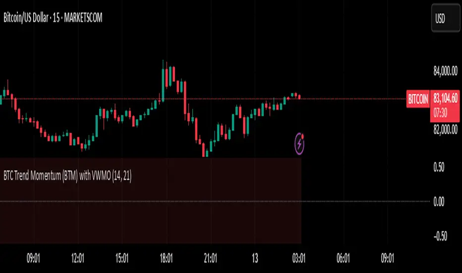
BTC Trend Momentum (BTM) with VWMOBTC Trend Momentum (BTM) with VWMO – A Smarter Way to Trade Bitcoin 🚀
Overview
Bitcoin price movements can be volatile, often leading to fake breakouts and whipsaws that mislead traders. BTC Trend Momentum (BTM), combined with Volume Weighted Moving Average (VWMO), helps smooth out market noise and provide clearer trend signals.
This script integrates momentum analysis, trend strength detection, and zero-line crossovers, allowing traders to make smarter entries and exits while avoiding false signals.
⸻
Why Use This Indicator?
✅ Momentum Histogram – Easily visualize trend strength with color-coded bars.
✅ Volume-Weighted Analysis – Uses VWMO to filter out weak price movements.
✅ Zero Line Crossover Alerts – Identifies major trend shifts in real-time.
✅ Dynamic Color Coding – Stronger trends highlighted in brighter colors.
✅ Background Shading – Differentiates bullish & bearish zones for easy trend reading.
✅ Built-in Alerts – Get notified of trade opportunities instantly.
⸻
How to Trade Using BTC Trend Momentum (BTM)
🔹 Buy Signal: When the momentum histogram (green bars) crosses above the EMA (orange line).
🔹 Sell Signal: When the momentum histogram (red bars) crosses below the EMA.
🔹 Strong Trend Confirmation: If histogram bars turn lime (bullish) or maroon (bearish), it indicates strong momentum.
🔹 Zero Line Crossovers: A bullish crossover above zero confirms an uptrend, while a bearish crossover below zero confirms a downtrend.
For better results, combine with RSI, MACD, or VWAP to confirm trend strength before entering trades.
⸻
Best Timeframes for Trading
📌 1H & 4H – Ideal for swing trading Bitcoin.
📌 5M & 15M – Perfect for scalping BTC with precision.
⸻
💡 Would you integrate BTC Trend Momentum (BTM) into your trading strategy? Let us know your thoughts below!
MVRV Z-Score | Vistula LabsWhat is MVRV?
MVRV (Market Value to Realized Value) is a fundamental on-chain metric used to assess the relative valuation of cryptocurrencies, particularly Bitcoin and Ethereum. This ratio compares the current market value (market capitalization) to the realized value (an approximation of the average price at which all coins were last moved).
Market Value : The total market capitalization of the cryptocurrency (current price × circulating supply)
Realized Value : The sum of the market value of all coins valued at the price they last moved on-chain
When MVRV is high, it suggests the market may be overvalued relative to the price investors paid for their coins, potentially indicating a market top. Conversely, a low MVRV ratio may signal undervaluation and a potential market bottom.
How MVRV is Calculated for BTC & ETH
The MVRV ratio for both Bitcoin and Ethereum is sourced directly from IntoTheBlock's data feed in this indicator:
For Bitcoin: INTOTHEBLOCK:BTC_MVRV
For Ethereum: INTOTHEBLOCK:ETH_MVRV
This indicator transforms the raw MVRV data into a Z-Score, which measures how many standard deviations the current MVRV value is from its historical mean over a specified period. The Z-Score calculation uses a moving average (customizable between SMA, EMA, DEMA, RMA, WMA, or VWMA) and standard deviation over the specified lookback period.
Z-Score formula: (Current MVRV - Moving Average of MVRV) / Standard Deviation of MVRV
How This Indicator Can Be Used
1. Trend Following
The MVRV Z-Score indicator implements a trend-following system with customizable thresholds:
Long signals are generated when the Z-Score crosses above the Long Threshold (default: 0.56)
Short signals are generated when the Z-Score crosses below the Short Threshold (default: -0.28)
These signals are visually represented by:
Green up-triangles for long entries
Red down-triangles for short entries
Color-coded candles and Z-Score plot (teal for long positions, magenta for short positions)
The trend signals help identify potential momentum shifts in the market based on historical MVRV behavior.
2. Overbought/Oversold Conditions
The indicator identifies extreme market conditions using two additional thresholds:
Overbought threshold (default: 3.0): When the Z-Score exceeds this value, the market may be significantly overvalued, suggesting potential selling pressure ahead. These zones are highlighted with a light magenta background.
Oversold threshold (default: -2.0): When the Z-Score falls below this value, the market may be significantly undervalued, suggesting potential buying opportunities. These zones are highlighted with a light teal background.
These extreme readings have historically coincided with major market tops and bottoms, making them valuable for medium to long-term position management.
Customization Options
The indicator offers several customization options:
Cryptocurrency source selection (BTC or ETH)
Moving average type and length for the MVRV calculation
Z-Score lookback period
Adjustable thresholds for long/short signals and overbought/oversold conditions
These parameters allow traders to fine-tune the indicator to their specific trading strategy and risk tolerance.
Alerts
The indicator includes four alert conditions:
MVRV Long Opportunity
MVRV Short Opportunity
MVRV Overbought Condition
MVRV Oversold Condition
These alerts can help traders stay informed of potential trading opportunities without constant chart monitoring.

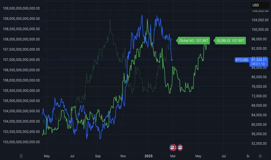
Global Liquidity ShiftedOverview
This indicator tracks global liquidity by aggregating M2 money supply data from major economies around the world, denominated in US dollars. It allows users to shift the data forward or backward in time to analyze correlations with other assets, particularly Bitcoin.
Features
Comprehensive global liquidity measurement combining M2 data from 21 major economies
Adjustable time shift parameter (0-24 months) to align liquidity data with price movements
Clean visualization with customizable labels
Background
Based on research by Lyn Alden and Sam Callahan (September 2024), which found that Bitcoin moves in the direction of global liquidity 83% of the time in any given 12-month period - a higher correlation than any other major asset class. This makes Bitcoin an excellent "global liquidity barometer."
How to Use
Add the indicator to your chart
Adjust the "Forward Shift (Months)" parameter to align global liquidity with asset price movements
Compare the shifted liquidity line with Bitcoin or other asset prices to identify correlations and potential divergences
Included Economies
This indicator aggregates M2 data from:
North America: US, Canada
Eurozone
Non-EU Europe: Switzerland, UK, Finland, Russia
Asia: China, Taiwan, Hong Kong, India, Japan, Philippines, Singapore
Latin America: Brazil, Colombia, Mexico
Middle East: UAE, Turkey
Africa: South Africa
Pacific: New Zealand
## Interpretation
Rising global liquidity typically supports risk assets, particularly Bitcoin. When liquidity contracts, risk assets often face headwinds. By shifting the liquidity data, you can identify lead/lag relationships between liquidity conditions and asset prices.
Notes
All M2 data is converted to USD to account for both money supply changes and relative currency strength
The indicator serves as a macro framework for understanding liquidity-driven market cycles
References
Based on research published at: www.lynalden.com
Black-Scholes Probability Model with Time-Based VolatilityI developed this tool to automate probability calculations and to verify if Polymarkets accurately reflects Bitcoin's value. The indicator uses a modified Black-Scholes model to estimate the likelihood of Bitcoin exceeding or falling below a $97,000 strike price by a specified end date, providing a "fair value" probability.
Key Features:
- Timeframe Control: Displays data only between a defined start and end date, ensuring relevance during the prediction period.
- Dynamic Volatility Calculation: Offers a choice between manual input and auto-calculated annualized volatility. The auto-calculation derives historical volatility from recent price data over a selected lookback period and adjusts it based on the time remaining until expiration. More time implies greater expected price movement; less time indicates a narrower expected range.
- Probability Estimation: Calculates an adjusted parameter (d1) and applies a normal cumulative distribution function (CDF) to determine:
- "Yes" (Green Line): Probability that Bitcoin will exceed $97,000.
- "No" (Red Line): Probability that Bitcoin will remain below $97,000.
When Bitcoin's price is exactly $97,000, the tool sets the probabilities to a balanced 50/50 split, indicating fair value.
- Fair Value Indicator: Includes a static white reference line at 50% probability. A 50/50 probability suggests Bitcoin is fairly valued at $97,000; deviations indicate potential overvaluation or undervaluation.
- Polymarkets Tracking & Trading Strategy: I use Polymarkets to access cost-effective, high-leverage long call options on Bitcoin. However, these options don't always mirror Bitcoin's price movements precisely. For instance, if I anticipate Bitcoin rising from $95,000 to $97,000 by day's end, the tool might show a fair value probability of 50%. If Polymarkets quotes a 50% chance, the alignment indicates a fair trade. In such cases, I can avoid an unfavorable trade or exploit the difference as an arbitrage opportunity.
- Personal Motivation: This indicator eliminates the need for manual calculations and ensures I can quickly assess when Polymarkets' pricing aligns with Bitcoin's actual value, leading to more informed trading decisions.
This tool automates probability and fair value assessments, serving as a practical resource for verifying and potentially capitalizing on discrepancies in Polymarkets' Bitcoin pricing. It helps identify when there's a mismatch between the market's implied probability and the calculated fair value, allowing me to avoid unnecessary premiums on high-leverage options.

TOTAL3/BTC This Pine Script™ code, named "TOTAL3/BTC with Arrow," is designed for cryptocurrency analysis on TradingView.
This script essentially provides a visual tool for traders to gauge when altcoins might be gaining or losing ground relative to Bitcoin through moving average analysis and color-coded trend indication.
Intention was to help the community with a script based on classic TA only.
Use it with SASDv2r indicator.
Feel free to make it better. If you did so, please let me know.
Main elements:
Data Fetching: It retrieves market cap data for all cryptocurrencies excluding Bitcoin and Ethereum (TOTAL3) and for Bitcoin (BTC).
Ratio Calculation: The script calculates the ratio of TOTAL3 to BTC market caps, which indicates how altcoins (excluding ETH) are performing relative to Bitcoin.
Plotting the Ratio: This ratio is plotted on the chart with a blue line, allowing traders to see the relative performance visually.
Moving Averages: Two Simple Moving Averages (SMA) are calculated for this ratio, one for 20 periods (ma20) and another for 50 periods (ma50), though these are not plotted in the current version of the code.
Reference Lines: Horizontal lines are added at ratios of 0.3 and 0.8 to serve as visual equilibrium points or thresholds for analysis.
Complex Moving Average: The script uses constants (len, len2, cc, smoothe) from another script, suggesting it's adapting or simplifying another's logic for multi-timeframe analysis.
Average Calculation: Two SMAs (avg and avg2) are computed using the constants defined, focusing on different lengths for trend analysis.
Direction Determination: It checks if the moving average is trending up or down by comparing the current value with its value smoothe bars earlier.
Color Coding: The color of the plotted moving average changes based on its direction (lime for up, red for down, aqua if no clear direction), aiding in quick visual interpretation of trends.
Plotting: Finally, the script plots this multi-timeframe moving average with a dynamic color to reflect the current market trend of the TOTAL3/BTC ratio, with a thicker line for visibility.
