Planetary Signs - CEPlanetary Signs - Community Edition
Welcome to the Planetary Signs - Community Edition , a specialized tool designed to enhance W.D. Gann-inspired trading by highlighting zodiac sign transitions for selected planets. This indicator marks when planets enter specific zodiac signs, which may correlate with market turning points, making it ideal for traders analyzing equities, forex, commodities, and cryptocurrencies.
Overview
The Planetary Signs - Community Edition calculates the ecliptic longitude of a chosen planet (Sun, Moon, Mercury, Venus, Mars, Jupiter, Saturn, Uranus, Neptune, or Pluto) and highlights periods when it enters user-selected zodiac signs (Aries, Taurus, Gemini, etc.). Supporting heliocentric and geocentric modes, the script plots sign transitions with minute-level accuracy, syncing perfectly with chart timeframes. Traders can customize colors for each sign and add multiple instances for multi-planet analysis, aligning with Gann’s belief that zodiac transitions influence market trends.
Key Features
Highlights zodiac sign transitions for ten celestial bodies (Sun, Moon, Mercury, Venus, Mars, Jupiter, Saturn, Uranus, Neptune, Pluto)
Supports heliocentric and geocentric modes (Pluto heliocentric-only; Sun and Moon geocentric)
Allows selection of one or multiple zodiac signs with customizable highlight colors
Plots vertical lines and labels (e.g., “☿ 0 ♈ Aries”) at sign transitions with minute-level accuracy
Projects future sign transitions up to 120 days with daily resolution
Enables multiple script instances for tracking different planets or signs on the same chart
How to Use
Access the script’s settings to configure preferences
Choose a planet from the Sun, Moon, Mercury, Venus, Mars, Jupiter, Saturn, Uranus, Neptune, or Pluto
Select one or more zodiac signs (e.g., Aries, Taurus) to highlight
Customize the highlight color for each selected zodiac sign
Select heliocentric or geocentric mode for calculations
Review highlighted periods and labeled lines to identify zodiac sign transitions
Use transitions to anticipate potential market turning points, integrating Gann’s astrological principles
Get Started
The Planetary Signs - Community Edition provides full functionality for astrological market analysis. Designed to highlight Gann’s zodiac cycles, this tool empowers traders to explore celestial transitions. Trade wisely and harness the power of planetary alignments!
Поиск скриптов по запросу "gann"

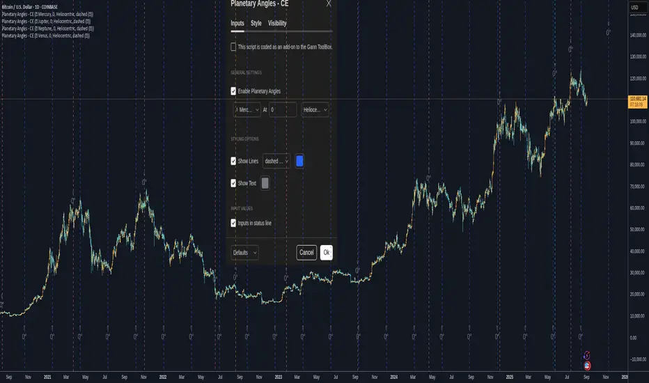
Planetary Angles - CEPlanetary Angles - Community Edition
Welcome to the Planetary Angles - Community Edition, a dynamic tool designed to enhance W.D. Gann-inspired trading by pinpointing dates when a selected planet reaches a user-defined ecliptic longitude angle. This feature-complete indicator provides traders with precise astrological timing for market analysis across equities, forex, commodities, and cryptocurrencies. It empowers traders to integrate celestial events into their strategies with ease.
Overview
The Planetary Angles - Community Edition calculates and plots vertical lines on your chart to mark dates when a chosen planet (Mercury, Venus, Mars, Jupiter, Saturn, Uranus, Neptune, or Pluto) crosses a specific longitude angle (0° to 359.99°) in either heliocentric or geocentric mode. With customizable line and label styling, this script highlights key astrological moments, helping traders identify potential market turning points based on Gann’s time-theory principles. It supports multiple instances on a single chart, offering flexibility for multi-planet analysis.
Key Features
Custom Angle Selection : Choose any ecliptic longitude angle (0° to 359.99°) to track when a planet crosses that precise degree.
Planetary Coverage : Supports eight planets (Mercury, Venus, Mars, Jupiter, Saturn, Uranus, Neptune, Pluto) for comprehensive astrological analysis.
Heliocentric and Geocentric Modes : Toggle between heliocentric and geocentric calculations to align with your preferred perspective.
Styling Options : Customize line styles (solid, dotted, dashed) and colors for lines and labels, with options to enable/disable lines and text for clarity.
Labeled Visuals : Displays labeled markers (e.g., “☿ 90°”) on the chart, with tooltips for easy identification of planetary angle crossings.
Multi-Instance Support : Add the script multiple times to track different planets or angles simultaneously on the same chart.
How It Works
Open Settings : Access the script’s settings to configure your preferences.
Enable the Script : Check the box to activate Planetary Angles.
Select a Planet : Choose from Mercury, Venus, Mars, Jupiter, Saturn, Uranus, Neptune, or Pluto.
Set the Angle : Input a specific ecliptic longitude angle (0° to 359.99°) to track.
Choose Planetary Mode : Select heliocentric or geocentric mode for the calculations.
Customize Styling : Adjust line and label styles and colors, and enable/disable lines or labels as needed.
Analyze and Trade : Observe the plotted vertical lines and labels to identify when the selected planet crosses the chosen angle, using these moments to inform your trading strategy.
Get Started
As a gift to the TradingView community and Gann traders, the Planetary Angles - Community Edition is provided free of charge. With no features locked, this tool offers full access to precise planetary angle tracking for enhanced market timing. Trade wisely and leverage the cosmic precision of Gann’s methodology!
Retrograde Planets - CERetrograde Planets - Community Edition
Welcome to the Retrograde Planets - Community Edition, a specialized tool designed to empower traders with W.D. Gann’s time-theory principles by highlighting planetary retrograde cycles. This feature-complete indicator allows traders to visualize critical retrograde periods for market analysis across equities, forex, commodities, and cryptocurrencies. As a seamless add-on to the Gann ToolBox, it enhances time-based trading strategies with precision and clarity.
Overview
The Retrograde Planets - Community Edition identifies and highlights retrograde cycles for Mercury, Venus, Mars, Jupiter, Saturn, Uranus, and Neptune, key periods often associated with market volatility and trend shifts in Gann’s methodology. By calculating ecliptic longitudes with high accuracy, the script plots historical and future retrograde periods (up to 365 days ahead) on your chart, complete with visual highlights and labels. This tool is ideal for traders leveraging astrological cycles to anticipate market turning points.
Key Features
Retrograde Cycle Highlighting : Displays retrograde periods for Mercury, Venus, Mars, Jupiter, Saturn, Uranus, and Neptune, marking start and end points with vertical lines and labels.
Historical and Future Projections : Visualizes past retrograde cycles and projects future ones up to a year in advance with minute-level precision.
Customizable Planet Selection : Choose from seven planets to focus on specific retrograde cycles relevant to your analysis.
24/7 Market Optimization : Enable extended future data for continuous markets like crypto, improving performance and projection accuracy.
Styling Flexibility : Customize the highlight color for retrograde periods to enhance chart clarity and align with your visual preferences.
Labeled Visuals : Includes labels (e.g., “℞ Starts,” “℞ Ends”) with tooltips for easy identification of retrograde cycle boundaries.
How It Works
Open Settings : Access the script’s settings to configure your preferences.
Select a Planet : Choose from Mercury, Venus, Mars, Jupiter, Saturn, Uranus, or Neptune to analyze its retrograde cycles.
Enable Retrograde Cycles : Check the box to activate retrograde highlighting for the selected planet.
Customize Highlight Color : Adjust the color of the highlighted retrograde periods for better chart visibility.
Enable 24/7 Mode (Optional) : For crypto or continuous markets, activate the 24/7 setting to include extended future data.
Analyze and Trade : Use the highlighted retrograde periods and labeled lines to identify potential market volatility or trend changes, integrating Gann’s time-theory into your strategy.
Get Started
As a gift to the TradingView community and Gann traders, the Retrograde Planets - Community Edition is provided free of charge. With no features locked, this tool offers full access to retrograde cycle analysis for precise market timing. Trade wisely and harness the power of planetary cycles!

Astro ToolBox - CEAstro ToolBox - Community Edition
Welcome to the Astro ToolBox - Community Edition, a meticulously designed tool that brings precise planetary ephemeris data to the TradingView community. Inspired by W.D. Gann’s astrological principles, this feature-complete indicator empowers traders to integrate celestial data into their market analysis across equities, forex, commodities, and cryptocurrencies.
Overview
The Astro ToolBox - Community Edition delivers accurate ephemeris data, calculating the ecliptic longitude and latitude of celestial bodies for any selected date. Supporting the Sun, Moon, Mercury, Venus, Mars, Jupiter, Saturn, Uranus, Neptune, and Pluto, this script offers both heliocentric and geocentric perspectives with high precision (within 1-2 arc seconds), it provides traders with a robust dataset for time-based analysis, enhancing Gann-inspired trading strategies.
Key Features
Comprehensive Planetary Data : Displays longitude and optional latitude for ten celestial bodies (Sun, Moon, Mercury, Venus, Mars, Jupiter, Saturn, Uranus, Neptune, Pluto) on user-specified dates.
Heliocentric and Geocentric Modes : Toggle between heliocentric and geocentric calculations (Pluto is heliocentric-only; Moon is geocentric-only).
Zodiac Sign Integration : Optionally display the astrological sign and degree for the selected planet’s longitude, enhancing astrological analysis.
Customizable Display Options : Enable/disable exact time display, longitude rounding, and latitude visibility for tailored data presentation.
Flexible Table Positioning : Choose from nine screen positions (e.g., Top Right, Bottom Center) to place the ephemeris table, with customizable colors for seamless chart integration.
High-Precision Calculations : Utilizes optimized algorithms to deliver near-real-time planetary positions without relying on external APIs.
How It Works
Select a Date : Choose the date for which you want to view planetary data using the input field.
Choose a Planet : Select from the Sun, Moon, Mercury, Venus, Mars, Jupiter, Saturn, Uranus, Neptune, or Pluto.
Set Planetary Mode : Toggle between heliocentric or geocentric modes to align with your analysis approach.
Customize Output : Enable options like zodiac signs, sign degrees, latitude, or exact time, and adjust the table’s position and color.
View Results : The ephemeris data appears in a clear, customizable table on your chart, providing longitude, latitude (optional), and astrological sign details.
Analyze and Trade : Leverage the data to identify time-based turning points or correlations with price action, integrating Gann’s astrological principles into your strategy.
Get Started
As a gift to the TradingView community and Gann traders, the Astro ToolBox - Community Edition is offered free of charge. With no features locked, this tool provides full access to precise ephemeris data for astrological market analysis. Trade wisely and harness the power of celestial insights!

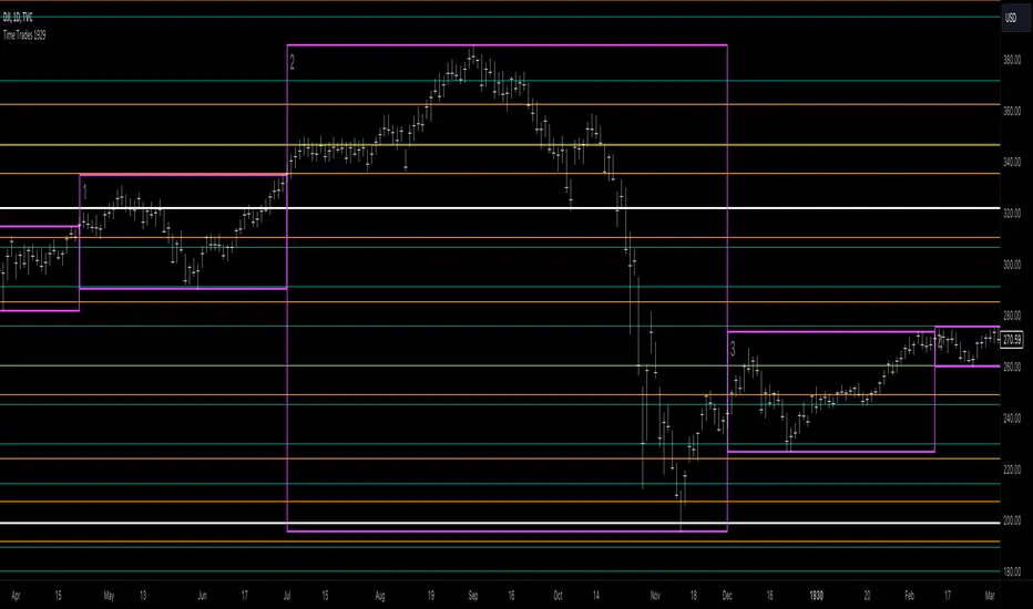
Mikula's Master 360° Square of 12Mikula’s Master 360° Square of 12
An educational W. D. Gann study indicator for price and time. Anchor a compact Square of 12 table to a start point you choose. Begin from a bar’s High or Low (or set a manual start price). From that anchor you can progress or regress the table to study how price steps through cycles in either direction.
What you’re looking at :
Zodiac rail (far left): the twelve signs.
Degree rail: 24 rows in 15° steps from 15° up to 360°/0°.
Transit rail and Natal rail: track one planet per rail. Each planet is placed at its current row (℞ shown when retrograde). As longitude advances, the planet climbs bottom → top, then wraps to the bottom at the next sign; during retrograde it steps downward.
Hover a planet’s cell to see a tooltip with its exact longitude and sign (e.g., 152.4° ♌︎). The linked price cell in the grid moves with the planet’s row so you can follow a planet’s path through the zodiac as a path through price.
Price grid (right): the 12×24 Square of 12. Each column is a cycle; cells are stepped price levels from your start price using your increment.
Bottom rail: shows the current square number and labels the twelve columns in that square.
How the square is read
The square always begins at the bottom left. Read each column bottom → top. At the top, return to the bottom of the next column and read up again. One square contains twelve cycles. Because the anchor can be a High or a Low, you can progress the table upward from the anchor or regress it downward while keeping the same bottom-to-top reading order.
Iterate Square (shifting)
Iterate Square shifts the entire 12×24 grid to the next set of twelve cycles.
Square 1 shows cycles 1–12; Square 2 shows 13–24; Square 3 shows 25–36, etc.
Visibility rules
Pivot cells are table-bound. If you shift the square beyond those prices, their highlights won’t appear in the table.
A/B levels and Transit/Natal planetary lines are chart overlays and can remain visible on the table as you shift the square.
Quick use
Choose an anchor (date/time + High/Low) or enable a manual start price .
Set the increment. If you anchored with a Low and want the table to step downward from there, use a negative value.
Optional: pick Transit and Natal planets (one per rail), toggle their plots, and hover their cells for longitude/sign.
Optional: turn on A/B levels to display repeating bands from the start price.
Optional: enable swing pivots to tint matching cells after the anchor.
Use Iterate Square to shift to later squares of twelve cycles.
Examples
These are exploratory examples to spark ideas:
Overview layout (zodiac & degree rails, Transit/Natal rails, price grid)
A-levels plotted, pivots tinted on the table, real-time price highlighted
Drawing angles from the anchor using price & time read from the table
Using a TradingView Gann box along the A-levels to study reactions
Attribution & originality
This script is an original implementation (no external code copied). Conceptual credit to Patrick Mikula, whose discussion of the Master 360° Square of 12 inspired this study’s presentation.
Further reading (neutral pointers)
Patrick Mikula, Gann’s Scientific Methods Unveiled, Vol. 2, “W. D. Gann’s Use of the Circle Chart.”
W. D. Gann’s Original Commodity Course (as provided by WDGAN.com).
No affiliation implied.
License CC BY-NC-SA 4.0 (non-commercial; please attribute @Javonnii and link the original).
Dependency AstroLib by @BarefootJoey
Disclaimer Educational use only; not financial advice.

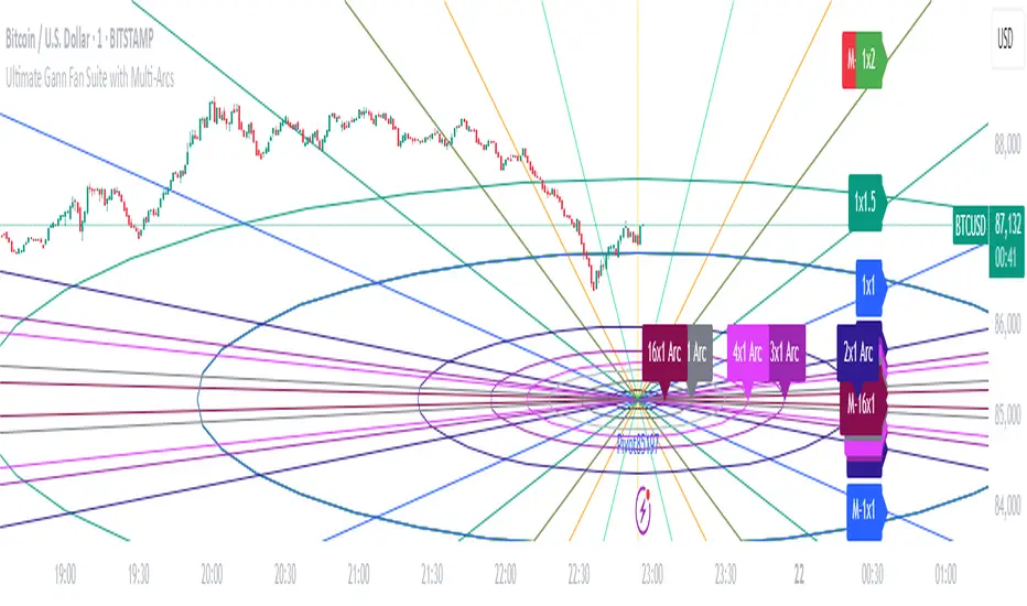
Ultimate Gann Fan Suite with Multi-ArcsUltimate Gann Fan Suite with Multi-Arcs
This open-source indicator plots Gann Fan angles, arcs, and levels to analyze price and time relationships based on a user-selected pivot point.
What It Does:
- Draws Gann Fan angles (1x16 to 16x1) from a pivot, with optional mirrored lines.
- Plots a base Gann arc and multi-arcs scaled by Gann ratios.
- Displays a Square of 9 grid and Gann Square levels for price projections.
- Supports custom timeframes and price types for pivot selection.
How to Use:
- Pivot: Enable manual pivot picking and select a price type (e.g., Close, High).
- Timeframe: Choose a timeframe (e.g., Daily) for pivot data.
- Angles and Arcs: Show/hide specific Gann angles, arcs, or levels; adjust colors and line styles.
- Scaling: Set price scale (e.g., 9.0) and arc radius (e.g., 36) for visual clarity.
- Labels: Enable labels to identify angles and levels.
- Best for stocks, forex, or crypto on daily or weekly charts.
Notes:
- Ensure enough chart history for the selected timeframe.
- Use on assets with clear trends or cycles for best results.
- Adjust settings to balance chart readability.
DT_GannDT_Gann - Combined Indicator Description
This TradingView indicator implements W.D. Gann's Square 9 concept with several visual enhancements to help traders identify key support and resistance levels. The indicator automatically adapts to different market types (forex or stocks) and includes the following features:
KEY FEATURES:
Support and resistance levels:
Automatically calculates and displays multiple support and resistance levels based on the Gann square theory of 9, with customizable colors (default green for support, red for resistance).
Day Opening Line:
Shows the day's opening price as a reference point, which serves as the base for all Gann calculations.
Previous 4H Range Box:
Displays a rectangular box showing the high-llow range of the previous day's last 4-hour candle, helping traders identify important price zones.
Vertical Time Lines:
Additional temporary vertical lines marking 4-hour intervals to help visualize potential reversal points.
Reject Mode:
Allows you to fine-tune support and resistance levels using percentage deviations.
CUSTOMIZATION OPTIONS:
Line Styles:
Select a solid, dashed, or dotted line.
Colors:
Adjust colors for support, resistance, daily open line, 4H rectangle and time lines.
Line Width:
Customize the thickness of all lines (1-5 pixels)
Opacity settings:
Control the transparency of various elements
Deviation settings:
Apply percentage adjustments to support and resistance levels
TECHNICAL IMPLEMENTATION:
Indicator:
- Automatically determines the appropriate point values depending on the instrument.
- Calculates Gann levels using the mathematical principle of Square 9.
- Finds the nearest support and resistance levels relative to the current price.
- Creates visualizations based on both charts and lines.
- Dynamically updates as price moves.
USAGE:
This indicator is especially useful for swing traders and day traders who follow Gann methods. The combination of price levels (support/resistance) and time markers (vertical lines) helps identify potential reversal zones where price and time align according to Gann principles.
The previous day's 4-hour rectangular frame often serves as an important reference zone that price can return to or respect.
The indicator works on all timeframes, but is most effective on charts from 15-minute to 4-hour charts, where time-based components provide the most value.
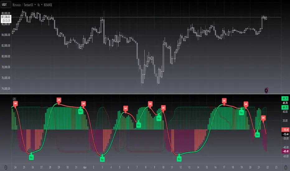
Swing Suite (SMT/Divergences + Gann Swings)Hello Traders!
TRN Swing Suite (SMT/Divergences + Gann Swings) is an indicator which identifies, and highlights pivot points (swings) and prints a lot of information about the swings in the chart (e.g. length, duration, cumulative Delta, ...). Furthermore, it detects divergences in connection with any given indicator, even custom ones. In addition to this, you can choose the algorithm to compute the swings. The famous Gann-Swing algorithm and the extremely precise TRN Swing algorithm (called Standard) are available for selection, as well as two other variants. Compared to other swing or zig-zag indicators it works in real-time, does not need a look-a-head to find swings and is not repainting. Moreover, equal (double) highs and lows are detected and displayed. The TRN Swing Suite helps traders to visualize the pure price action and identify key turning points or trends. The indicator comes with the following features:
Precise real-time swing detection without repainting
Divergence detecting for any given (custom) indicator - with 11 different preset indicators
SMT (Smart Money Technique)/Divergence detecting in relation to other instruments
Swing Performance Statistics
Swing support and resistance levels
Swing trend for multiple swing sizes
Equal/double high and low detection
4 different swing computation styles
Displaying of swing labels, values and information
Customizable settings as well as look and feel
It's important to note that the TRN Swing Suite is a visual tool and does not provide specific buy or sell signals. It serves as a guide for traders to analyze market structure in depth and make well-informed trading decisions based on their trading strategy and additional technical analysis.
Divergence Detection for any given (Custom) Indicator
The divergence detector finds with unrivaled precision bullish and bearish as well as regular and hidden divergences. The main difference compared to other divergences indicators is that this indicator finds rigorously the extreme peaks of each swing, both in price and in the corresponding indicator. This precision is unmatched and therefore this is one of the best divergences detectors.
The build in divergence detector works with any given indicator, even custom ones. In addition, there are 11 built-in indicators. Most noticeable is the cumulative delta indicator, which works astonishingly well as a divergence indicator. Full list:
External Indicator (see next section for the setup)
Awesome Oscillator (AO)
Commodity Channel Index (CCI)
Cumulative Delta Volume (CDV)
Chaikin Money Flow (CMF)
Moving Average Convergence Divergence (MACD)
Money Flow Index (MFI)
Momentum
On Balance Volume (OBV)
Relative Strength Index (RSI)
Stochastic
Williams Percentage Range (W%R)
The divergences are colored with vivid lines and labels. Bullish divergences are distinguished with luminous blue lines, while bearish divergences are denoted by striking red lines. Upon detecting a divergence, the colored lines act as a visual indicator for traders, signaling an imminent possibility of a trend reversal. In response, traders can leverage this valuable insight to make informed decisions in their trading activities.
Choose Your Custom Divergence Indicator
Handpick your custom indicator, and the TRN Swing Suite will hunt for divergences on your preferred market and timeframe. Importantly, you must add the indicator to your chart. Afterwards, simply go to the “Divergence Detection” section in the TRN Swing Suite indicator settings and choose "External Indicator". If the custom indicator has one reference value, then choose this value in the “External Indicator (High)” field. If there are high and low values (e.g. candles), then you also must set the “External Indicator Low” field.
In the provided graphic, we've chosen the stochastic RSI as our example, and as you can see, the TRN Swing Suite instantly identifies and plots bullish and bearish divergences on your chart.
Smart Money Technique (SMT)/Divergence detecting in Relation to other Instruments
Smart Money Technique/Tool (SMT) means the divergence detection between two related instruments. The TRN Swing Suite finds divergence in relation to other instruments, e.g. NQ vs ES or BTCUSDT vs ETHUSDT. Just add another instrument to the chart. As representation style you can choose lines or candles/bars. Afterwards, simply go to the “Divergence Detection” section in the TRN Swing Suite indicator settings and choose "External Indicator". If the second instrument is represented as line, then choose this value in the “External Indicator (High)” field. If there are high and low values (e.g. candles/bars), then you also must set the “External Indicator Low” field.
The detection of SMTs can help traders to decide whether the trend continues, or a reversal is imminent. E.g. if the NQ makes a new higher high but the ES fails to do so and makes a new lower high, then the TRN Swing Suite shows a divergence. As a result, the probability is high that the trend will not continue, and the trader can make an informed decision about what to do next.
How to Set Parameters for Divergence Indicators
To begin, access the indicator settings and find the “Divergence Detection”. Look for the "Parameters" sections where you can fine-tune Parameters 1-3. The default settings are already optimized for the oscillators AO, RSI, CDV, W%R, MFI and Stochastic. For other divergence indicators, you might want to adjust the settings to your liking. The parameter order is the same as in the corresponding divergence indicator.
TRN Swing Suite Statistics
Unveil the untapped potential of advanced Swing Statistics! Gain invaluable insights into historical swings and turning points. Elevate your expertise by harnessing this treasure trove of data to supercharge signal reliability, while masterfully planning stop loss and take profit strategies with unrivaled accuracy. Within the TRN Swing Suite lie two powerful statistics, each offering distinct insights to empower your trading prowess.
Swing Statistic
The Swing Statistic comprises of two series, one for up swings (Up) and one for down swings (Down), with values given in points. The columns have the following meaning:
Up or down
# - total number of analyzed swings
Overall ∅ Length - average length of all swings in points
Overall ∅ Duration - average duration of swings in bars
∅ Length - average lengths for custom-defined swing counts
∅ Duration - average durations for custom-defined swing counts
The custom-defined swing count is used to determine the swing length/duration for the last x swings. Note, in the case of well-established assets like Microsoft or Nvidia, which have undergone one or more stock splits, the overall average in column three may deviate significantly from those in column five. That is why column 5 is useful.
Relation Statistic
The Relation Statistic highlights percentages representing the historical occurrence of specific high and low sequences. In the first column (in %), various types of highs and lows are listed as reference points.
For example, the first row corresponds to "HH followed by", where the second column (#) displays the total count of higher highs (HH) considered. The subsequent columns showcase the percentages of how often certain patterns follow the initial HH.
Fields marked in blue represent sequences that occurred in over 50% of cases. The darker the shade of blue in each field, the higher the percentage.
Use Swing Statistics to Validate Stop-Loss and Take-Profit Levels
No matter which signals you choose to trade, consulting Swing Statistics can significantly enhance the reliability of these signals.
For example, when looking for a long entry after a lower low (LL), you can examine the likelihood of a subsequent lower high (LH) or even a higher high (HH). Combining this valuable information with your predetermined Take Profit level allows you to better assess whether your target can be achieved successfully. Additionally, you can add the average up swing length to the lower low for an alternative Take Profit level. Similarly, you can verify the probability of the next low being a higher low (HL) or another lower low (LL) to determine the likelihood of your Stop Loss being triggered. Align the length of the last down swing with the average down swing length for an alternative Stop Loss.
Swing Support and Resistance Levels
Swing support and resistance levels are horizontal lines starting from a swing high or swing low and representing natural support and resistance levels. Price tends to respect this levels one way or another. In most cases, old swing highs and swing lows provide a lot of liquidity to the market. For example, for a swing high there are at least three different market players at work:
Traders put there stop loss above the swing high
Breakout traders go long above the swing high
Turtle soup (reverse) trader go short above the swing high
Swing Trend (Multiple Sizes)
The TRN Swing Suite can display either at the top or at the bottom the prevailing swing trends for the main trend seen in the chart and for two additional swing sizes. This is useful to see the swing trend for medium and bigger swings to get a clear picture of the market.
Getting an Edge with the TRN Swing Suite
The indicator clearly displays up trends, defined as a sequence of higher highs (HH) and higher lows (HL), with green labels and down trends, defined as a sequence of lower lows (LL) and lower highs (LH), with red labels. Equal highs/double tops (DT) and equal lows/ double bottoms (DB) are highlighted in gold.
In addition, the labels show a full stack of valuable information about the swings to maximize your accuracy.
Length
Length percentage in relation to the last swing length
Duration
Time
Volume
Cumulative Delta
In an uptrend the up swings should have higher volume und higher cumulative delta than the down swings. The duration and time for down swings in an uptrend should be shorter than for the up swings.
Use Cases for Swing Detection
Trend Identification
By connecting the swing highs and lows, traders can identify and analyze the prevailing trend in the market. An uptrend is characterized by higher swing highs and lows, while a downtrend is characterized by lower highs and lower lows. The indicator helps traders visually assess the strength and continuity of the trend.
Support And Resistance Levels
The swing highs and lows can act as support and resistance levels. Swing highs may act as resistance levels where selling pressure increases, while swing lows may act as support levels where buying pressure increases. Traders often pay attention to these levels as potential areas for trade entries, exits, or placing stop-loss orders.
Pattern Recognition
The swings identified by the indicator can help traders recognize chart patterns, such as equal high/lows, consolidations, wedges, triangles or more complex patterns like Gartley or Head and Shoulders. These patterns can provide insights into potential trend continuation or reversal.
Trade Entry and Exit
Traders may use TRN Swing to determine potential trade entry and exit points. For example, in an uptrend, traders may look for opportunities to enter long positions near swing lows or on pullbacks to support levels. Conversely, in a downtrend, traders may consider short positions near swing highs or on retracements to resistance levels.
Swing Styles
In addition to the standard swings, you have the flexibility to choose between various swing styles, including ticks, percent, or even the famous Gann swings.
Standard
Gann
Ticks
Percent
Conclusion
While signals from TRN Swings can be informative, it is important to recognize that their reliability may vary. Various external factors can impact market prices, and it is essential to consider your risk tolerance and investment goals when executing trades.
Risk Disclaimer
The content, tools, scripts, articles, and educational resources offered by TRN Trading are intended solely for informational and educational purposes. Remember, past performance does not ensure future outcomes.

[blackcat] L3 Gann SlopeLevel 3
Background
William Gann (Wilian D. Gann) is one of the most famous investors in the twentieth century. His outstanding achievements in the stock and futures markets are unparalleled. The theory he created that perfectly combines time and price has been It is still talked about and highly praised by the investment community.
Function
The slope is the degree of the angle line relative to the time axis (X axis). Volatility is the ratio of unit amplitude to unit time. At the heart of Gann angles is the determination of volatility. Gann angle is the movement of price defined by time unit and price unit. Each angle is determined by the relationship between time and price. In the rising angle, the angle with the larger slope means that the stock price is rising stronger and falling. In a trend line, the larger the slope, the stronger the downtrend.
This technical indicator speaks of the Gann slope expressed as an oscillator. Its value varies from 0 to 100. The positive slope means rising, and the negative slope means falling. For rising and falling, the strength of rising and falling is distinguished by the thickness and color of the oscillating line:
1. The thin white line represents the basic oscillator curve and has no special meaning.
2. Light red indicates that an uptrend is established, and dark red indicates a very strong uptrend.
3. Light green indicates an established downtrend, dark green indicates a very strong downtrend.
Remarks
Feedbacks are appreciated.
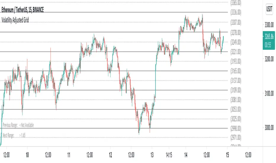
Volatility Adjusted Grid [Gann]█ OVERVIEW
Gann Square of 9 is one of the many brilliant concepts from W.D.Gann himself where it revolves around the idea that price is moving in a certain geometrical pattern. Numbers on the Square of 9 spiral tables, especially those lie in every 45degree in the chart act as key vibration levels where prices have tendency to react to (more on the table below).
There are few square of 9 related scripts here in Tradingview and while there's nothing wrong with them, it doesn't address 1 particular issue that i have: The numbers can be too rigid even when scaled based on current price because the levels are fixed, which makes them not tradable on certain timeframes depending on where the price currently sitting.
Heres 5min and 1hour Bitcoin chart to illustrate what i mean: Grey line on the left is based on Volatility Adjusted levels, while red/blue on the right are the standard Gann levels.
You can see that on 1hour chart, it provides a good levels (both Volatility Adjusted and the standard one happened to share the same multiplier in this case),
1Hour Chart:
On 5 min chart tells a different story as the range between blue/red levels can be deemed as to big for a short term trade, while the grey line is adjusted to suit that particular timeframe (You can still adjust to make it bigger/smaller from the settings, more on this below)
5Min Chart:
█ Little bit on Gann Square of 9 table
This is the square of nine table, the numbers highlighted in Red are known as Cardinal Cross and considered to be a major Support/Resistance while those in Blue color are known as Ordinal Cross considered as minor (but still important) Support/Resistance levels
Similarly, this script use these numbers (and certain multipliers) to print out the levels, with Cardinal numbers represented by solid lines and Ordinal numbers by dotted lines.
█ How it Works and Limitations
The Volatility Adjusted grid will go through several iterations of different multipliers to find the Gann number range that is at least bigger than times ATR. Because it's using ATR to determine the range, occasionally you'll notice that the line become smaller as ATR contracting (and vice versa). To overcome this, you can change the size range multiplier from the settings to retrieve the previous range size.
Use the size guide at the bottom left to find the multiplier that suits your need:
1st Row -> Previous Range -- Change Range Size to number lower than this to get a smaller range
2nd Row -> Next Range -- Change Range Size to number higher than this to get a larger range
Example:
Before:
After:
As you'll soon realise, the key here is to find the range that fits the historical structure and suits your own strategy. Enjoy :)
█ Disclaimer
Past performance is not an indicator of future results.
My opinions and research are my own and do not constitute financial advice in any way whatsoever.
Nothing published by me constitutes an investment recommendation, nor should any data or Content published by me be relied upon for any investment/trading activities.
I strongly recommends that you perform your own independent research and/or speak with a qualified investment professional before making any financial decisions.
Any ideas to further improve this indicator are welcome :)
Fibo-Gann Box 540 By MedHello All,
Related to the previously published script Gann Box 540 By Med .
This indicator has the same purpose but with a different methods of calculations adding Fibonacci numbers/series along with Gann methods.
To quote from the previous scriot description:
Using Gann angles and Fibonacci numbers/series to forecast support and resistance and draw different lines and levels forming a box/grid, it can be customized with your chosen angle and time periods, it is also multi-timeframe and can be fixed on one time-frame and used across all others."
* The indicator projects different lines into the future to help predict future price changes
* Total control of line coloring and line styles!
This is a paid indicator, Only available to the 540 R&D team, and 540 Group
(Use the links below to contact me for more informations about how you can obtain access to this indicator
Good luck!

Fibo-Gann Star 540 By MedHello All,
Related to the lately published script Angles 540 By Med we used the same Gann methods but with a different way of calculations using Fibonacci!
It will draw all the previous time and price levels with diagonal support/resistance line along with the new Fibo-Gann Star!
The indicator contains:
- Price/time grid
- Gann star
- Price Angles
- Time levels
* All of the above using Gann and Fibonacci calculations and methods
* The indicator projects different lines into the future to help predict future price changes
* Total control of line coloring and styles!
This is a paid indicator, Only available to the 540 R&D team, and 540 Group
(Use the links below to contact me for more information about how you can obtain access to this indicator
Good luck!

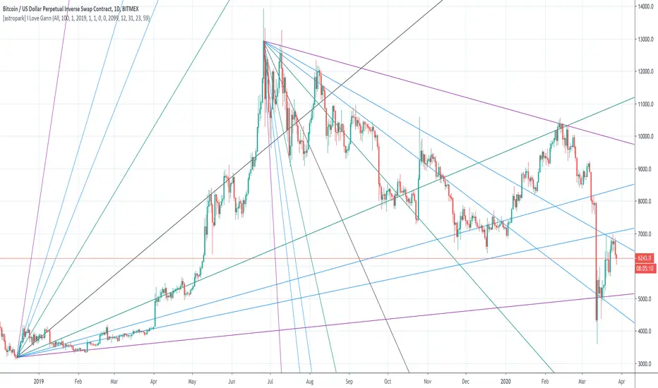
[astropark] I Love GannDear Followers,
yet another great tool! Gann was historically a great trader, who strictly followed his theory and died so rich!
Gann Fan is a great indicator: it draws a series of trendlines from important highs and lows in the chart and, as you will see from the chart itself, price action feels those trendlines, which acts as support and resistance !
Once a trendline is broken up, price tends to go upper to the next one, while the contrary happens when a trendline is broken down.
Here an example on BTCUSD:
Here an example on EURUSD:
This indicator
draws for you the Gann Fan, you don't need to do anything !
works on both cryptocurrencies, stocks and forex charts
works on every timeframe, but I suggest you to use it on high timeframes, where it's more reliable
lets you select the starting and the ending day-time from which and to which you want to see gann fans
lets you make trendlines be drawn dashed if you like, as well as you can edit their width
Combined: Gann HL + Supertrend + Supertrend v6Combined: Gann HL + Supertrend + Supertrend v6
Included Indicators
1. Gann High-Low Activator
A dynamic trend tool that flips direction when price crosses its smoothed high/low average. Gann signals often catch clean directional swings and act as an excellent early trend filter.
2. Standard Supertrend (ATR-based)
The classic trend-following indicator using average true range for volatility-adaptive stop levels. Its direction flips mark trend reversals, especially effective in trending markets.
3. Orekhov Supertrend (GPL Classic)
A robust version of Supertrend that includes wick sensitivity and doji-handling logic. It behaves smoothly on lower timeframes, avoiding false flips and maintaining direction more intelligently.

Planetary Speed - CEPlanetary Speed - Community Edition
Welcome to the Planetary Speed - Community Edition , a specialized tool designed to enhance W.D. Gann-inspired trading by plotting the speed of selected planets. This indicator measures changes in planetary ecliptic longitudes, which may correlate with market timing and volatility, making it ideal for traders analyzing equities, forex, commodities, and cryptocurrencies.
Overview
The Planetary Speed - Community Edition calculates the speed of a chosen planet (Mercury, Venus, Mars, Jupiter, Saturn, Uranus, Neptune, or Pluto) by comparing its ecliptic longitude across time. Supporting heliocentric and geocentric modes, the script plots speed data with high precision across various chart timeframes, particularly for markets open 24/7 like cryptocurrencies. Traders can customize line colors and add multiple instances for multi-planet analysis, aligning with Gann’s belief that planetary cycles influence market trends.
Key Features
Plots the speed of eight planets (Mercury, Venus, Mars, Jupiter, Saturn, Uranus, Neptune, Pluto) based on ecliptic longitude changes
Supports heliocentric and geocentric modes for flexible analysis
Customizes line colors for clear visualization of planetary speed data
Projects future speed data up to 250 days with daily resolution
Works across default TradingView timeframes (except monthly) for continuous markets
Enables multiple script instances for tracking different planets on the same chart
How to Use
Access the script’s settings to configure preferences
Choose a planet from Mercury, Venus, Mars, Jupiter, Saturn, Uranus, Neptune, or Pluto
Select heliocentric or geocentric mode for calculations
Customize the line color for speed data visualization
Review plotted speed data to identify potential market timing or volatility shifts
Add multiple instances to track different planets simultaneously
Get Started
The Planetary Speed - Community Edition provides full functionality for astrological market analysis. Designed to highlight Gann’s planetary cycles, this tool empowers traders to explore celestial influences. Trade wisely and harness the power of planetary speed!

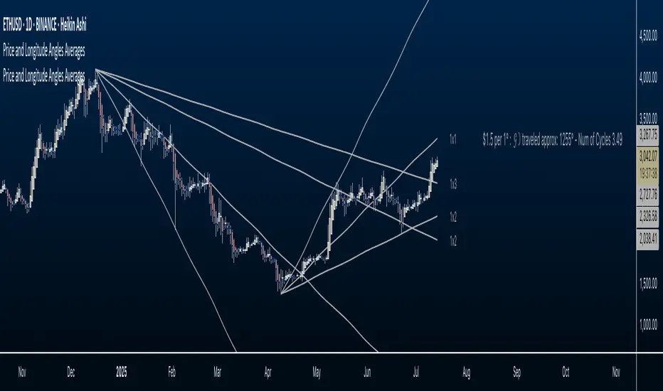
Price and Longitude Angles Planetary Price & Longitude Angles Indicator
This indicator plots planetary price and longitude angles starting from a user-selected date and time, offering a distinctive lens to explore the relationship between price and planetary timing. It supports both heliocentric and geocentric, enabling flexible and in-depth planetary analysis. The angles can be plotted across any time frame for maximum versatility.
How to Use
Once the indicator is loaded, you’ll be prompted to select a starting date and time for your analysis. From there, customize it as follows:
Select Planetary Options:
To plot the price and longitude for a single planet, choose the same planet in both dropdown menus.
To plot the average of two planets, select a different planet in each dropdown.
Set the Price Per Degree of Longitude: Adjust this value to define the scaling of the planetary angles relative to price.
Customize Fan Settings:
Toggle the mirroring of the fan on or off based on your needs.
Show or hide specific angle divisions to tailor the display to your preferences.
Display or conceal the information label that indicates the price per longitude and the number of degrees traveled.
This indicator is inspired by the methodologies of W.D. Gann and Patrick Mikula, expanding on concepts from Gann Scientific Method Unveiled, Volume 2. It was built using Astrolib by @BarefootJoey
I crafted this tool through dedication to support my own study of these ideas. I’m sharing it open-source not only to deepen my understanding and honor the work of Gann and Mikula, but also to invite collaboration. There’s always room for improvement—whether in functionality, accuracy, or design—and I hope others will join me in refining it. This is for those like me: eager to explore these concepts but lacking tools to experiment with. Let’s build on it together.
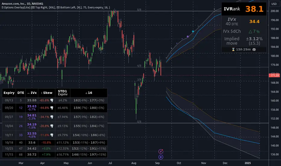
Options Overlay [Lite] IVR IV Skew Delta Expmv MurreyMath Expiry𝗡𝗼𝗻-𝗼𝗳𝗳𝗶𝗰𝗶𝗮𝗹 𝗧𝗢𝗦 𝗮𝗻𝗱 𝗧𝗮𝘀𝘁𝘆𝗧𝗿𝗮𝗱𝗲 𝗹𝗶𝗸𝗲 𝗜𝗩𝗥 𝗢𝗽𝘁𝗶𝗼𝗻𝘀 𝘃𝗶𝘀𝘂𝗮𝗹𝗶𝘇𝗮𝘁𝗶𝗼𝗻 𝘁𝗼𝗼𝗹 𝘄𝗶𝘁𝗵 𝗱𝗲𝗹𝗮𝘆𝗲𝗱 𝗼𝗽𝘁𝗶𝗼𝗻 𝗰𝗵𝗮𝗶𝗻 𝗱𝗮𝘁𝗮
Are you an options trader who uses TradingView for technical analysis for the US market?
➡️ Do you want to see the IV Rank of an instrument on TradingView?
➡️ Can’t you check the key options metrics while charting?
➡️ Have you never visualized the options chain before?
➡️ Would you like to see how the IVx has changed for a specific ticker?
If you answered "yes" to any of these questions, then we have the solution for you!
🔃 Auto-Updating Option Metrics without refresh!
🍒 Developed and maintained by option traders for option traders.
📈 Specifically designed for TradingView users who trade options.
Our indicator provides essential key metrics such as:
✅ IVRank
✅ IVx
✅ 5-Day IVx Change
✅ Delta curves and interpolated distances
✅ Expected move curve
✅ Standard deviation (STD1) curve
✅ Vertical Pricing Skew
✅ Horizontal IVx Skew
✅ Delta Skew
like TastyTrade, TOS, IBKR etc, but in a much more visually intuitive way. See detailed descriptions below.
If this isn't enough, we also include a unique grid system designed specifically for options traders. This package features our innovative dynamic grid system:
✅ Enhanced Murrey Math levels (horizontal scale)
✅ Options expirations (vertical scale)
Designed to help you assess market conditions and make well-informed trading decisions, this tool is an essential addition for every serious options trader!
Ticker Information:
This indicator is currently implemented for 5 liquid tickers: NASDAQ:AAPL NASDAQ:AMZN AMEX:DIA NYSE:ORCL and NASDAQ:TSLA
How does the indicator work and why is it unique?
This Pine Script indicator is a complex tool designed to provide various option metrics and visualization tools for options market traders. The indicator extracts raw options data from an external data provider (ORATS), processes and refines the delayed data package using pineseed, and sends it to TradingView, visualizing the data using specific formulas (see detailed below) or interpolated values (e.g., delta distances). This method of incorporating options data into a visualization framework is unique and entirely innovative on TradingView.
The indicator aims to offer a comprehensive view of the current state of options for the implemented instruments, including implied volatility (IV), IV rank (IVR), options skew, and expected market movements, which are objectively measured as detailed below.
The options metrics we display may be familiar to options traders from various major brokerage platforms such as TastyTrade, IBKR, TOS, Tradier, TD Ameritrade, Schwab, etc.
Key Features:
IV Rank (IVR) : The implied volatility rank compares the current IV to the lowest and highest values over the past 52 weeks. The IVR indicator helps determine whether options are relatively cheap or expensive.
IV Average (IVx) : The implied volatility displayed in the options chain, calculated similarly to the VIX. IVx values are aggregated within the 35-70 day expiration cycle.
IV Change (5 days) : The change in implied volatility over the past five trading days. This indicator provides a quick insight into the recent changes in IV.
Expected Move (Exp. Move) : The expected movement for the options expiration cycle, calculated using the price of the ATM (at-the-money) straddle, the first OTM (out-of-the-money) strangle, and the second OTM strangle.
Options Skew : The price difference between put and call options with the same expiration date. Vertical and horizontal skew indicators help understand market sentiment and potential price movements.
Visualization Tools:
Informational IVR Panel : A tabular display mode that presents the selected indicators on the chart. The panel’s placement, size, and content are customizable, including color and tooltip settings.
1 STD, Delta, and Expected Move : Visualization of fundamental classic options metrics corresponding to expirations with bell curves.
Colored Label Tooltips : Detailed tooltips above the bell curves showing options metrics for each expiration.
Adaptive Murrey Math Lines : A horizontal line system based on the principles of Murrey Math Lines, helping identify important price levels and market structures.
Expiration Lines : Displays both monthly and weekly options expirations. The indicator supports various color and style settings, as well as the regulation of the number of expirations displayed.
🟨 𝗗𝗘𝗧𝗔𝗜𝗟𝗘𝗗 𝗗𝗢𝗖𝗨𝗠𝗘𝗡𝗧𝗔𝗧𝗜𝗢𝗡 🟨
🔶 Auto-Updating Option Metrics and Curved Lines
🔹 Interpolated DELTA Curves (16,20,25,30,40)
In our indicator, the curve layer settings allow you to choose the delta value for displaying the delta curve: 16, 20, 25, 30, or even 40. The color of the curve can be customized, and you can also hide the delta curve by selecting the "-" option.
It's important to mention that we display interpolated deltas from the actual option chain of the underlying asset using the Black-Scholes model. This ensures that the 16 delta truly reflects the theoretical, but accurate, 16 delta distance. (For example, deltas shown by brokerages for individual strikes are rounded; a 0.16 delta might actually be 0.1625.)
🔹 Expected Move Curve (Exp.mv)
The expected move is the predicted dollar change in the underlying stock's price by a given option's expiration date, with 68% certainty. It is calculated using the expiration's pricing and implied volatility levels. We chose the TastyTrade method for calculating expected move, as we found it to be the most expressive.
Expected Move Calculation
Expected Move = (ATM straddle price x 0.6) + (1st OTM strangle price x 0.3) + (2nd OTM strangle price x 0.1)
For example , if stock XYZ is trading at 121 and the ATM straddle is 4.40, the 120/122 strangle is 3.46, and the 119/123 strangle is 2.66, the expected move is calculated as follows: 4.40 x 0.60 = 2.64; 3.46 x 0.30 = 1.04; 2.66 x 0.10 = 0.27; Expected move = 2.64 + 1.04 + 0.27 = ±3.9
In this example below, the TastyTrade platform indicates the expected move on the option chain with a brown color, and the exact value is displayed behind the ± symbol for each expiration. By default, we also use brown for this indication, but this can be changed or the curve display can be turned off.
🔹 Standard Deviation Curve (1 STD)
One standard deviation of a stock encompasses approximately 68.2% of outcomes in a distribution of occurrences based on current implied volatility.
We use the expected move formula to calculate the one standard deviation range of a stock. This calculation is based on the days-to-expiration (DTE) of our option contract, the stock price, and the implied volatility of a stock:
Calculation:
Standard Deviation = Closing Price * Implied Volatility * sqrt(Days to Expiration / 365)
According to options literature, there is a 68% probability that the underlying asset will fall within this one standard deviation range at expiration.
If the 1 STD and Exp.mv displays are both enabled, the indicator fills the area between them with a light gray color. This is because both represent probability distributions that appear as a "bell curve" when graphed, making it visually appealing.
Tip and Note:
The 1 STD line might appear jagged at times , which does not indicate a problem with the indicator. This is normal immediately after market open (e.g., during the first data refresh of the day) or if the expirations are illiquid (e.g., weekly expirations). The 1 STD value is calculated based on the aggregated IVx for the expirations, and the aggregated IVx value for weekly expirations updates less frequently due to lower trading volume. In such cases, we recommend enabling the "Only Monthly Expirations" option to smooth out the bell curve.
∑ Quant Observation:
The values of the expected move and the 1st standard deviation (1STD) will not match because they use different calculation methods, even though both are referred to as representing 68% of the underlying asset's movement in options literature. The expected move is based on direct market pricing of ATM options. The 1STD, on the other hand, uses the averaged implied volatility (IVX) for the given expiration to determine its value. Based on our experience, it is better to consider the area between the expected move and the 1STD as the true representation of the original 68% rule.
🔶 IVR Dashboard Panel Rows
🔹 IVR (IV Rank)
The Implied Volatility Rank (IVR) indicator helps options traders assess the current level of implied volatility (IV) in comparison to the past 52 weeks. IVR is a useful metric to determine whether options are relatively cheap or expensive. This can guide traders on whether to buy or sell options. We calculate IVrank, like TastyTrade does.
IVR Calculation:
IV Rank = (current IV - 52 week IV low) / (52 week IV high - 52 week IV low)
IVR Levels and Interpretations:
IVR 0-10 (Green): Very low implied volatility rank. Options might be "cheap," potentially a good time to buy options.
IVR 10-35 (White): Normal implied volatility rank. Options pricing is relatively standard.
IVR 35-50 (Orange): Almost high implied volatility rank.
IVR 50-75 (Red): Definitely high implied volatility rank. Options might be "expensive," potentially a good time to sell options for higher premiums.
IVR above 75 (Highlighted Red): Ultra high implied volatility rank. Indicates very high levels, suggesting a favorable time for selling options.
The panel refreshes automatically if the symbol is implemented. You can hide the panel or change the position and size.
🔹IVx (Implied Volatility Index)
The Implied Volatility Index (IVx) displayed in the option chain is calculated similarly to the VIX. The Cboe uses standard and weekly SPX options to measure the expected volatility of the S&P 500. A similar method is utilized to calculate IVx for each option expiration cycle.
For our purposes on the IVR Panel, we aggregate the IVx values specifically for the 35-70 day monthly expiration cycle . This aggregated value is then presented in the screener and info panel, providing a clear and concise measure of implied volatility over this period.
IVx Color coding:
IVx above 30 is displayed in orange.
IVx above 60 is displayed in red
IVx on curve:
The IVx values for each expiration can be viewed by hovering the mouse over the colored tooltip labels above the Curve.
IVx avg on IVR panel :
If the option is checked in the IVR panel settings, the IVR panel will display the average IVx values up to the optimal expiration.
Important Note:
The IVx value alone does not provide sufficient context. There are stocks that inherently exhibit high IVx values. Therefore, it is crucial to consider IVx in conjunction with the Implied Volatility Rank (IVR), which measures the IVx relative to its own historical values. This combined view helps in accurately assessing the significance of the IVx in relation to the specific stock's typical volatility behavior.
This indicator offers traders a comprehensive view of implied volatility, assisting them in making informed decisions by highlighting both the absolute and relative volatility measures.
🔹IVx 5 days change %
We are displaying the five-day change of the IV Index (IVx value). The IV Index 5-Day Change column provides quick insight into recent expansions or decreases in implied volatility over the last five trading days.
Traders who expect the value of options to decrease might view a decrease in IVX as a positive signal. Strategies such as Strangle and Ratio Spread can benefit from this decrease.
On the other hand, traders anticipating further increases in IVX will focus on the rising IVX values. Strategies like Calendar Spread or Diagonal Spread can take advantage of increasing implied volatility.
This indicator helps traders quickly assess changes in implied volatility, enabling them to make informed decisions based on their trading strategies and market expectations.
🔹 Vertical Pricing Skew
At TanukiTrade, Vertical Pricing Skew refers to the difference in pricing between put and call options with the same expiration date at the same distance (at expected move). We analyze this skew to understand market sentiment. This is the same formula used by TastyTrade for calculations.
We calculate the interpolated strike price based on the expected move , taking into account the neighboring option prices and their distances. This allows us to accurately determine whether the CALL or PUT options are more expensive.
PUT Skew (red): Put options are more expensive than call options, indicating the market expects a downward move (▽). If put options are more expensive by more than 20% at the same expected move distance, we color it lighter red.
CALL Skew (green): Call options are more expensive than put options, indicating the market expects an upward move (△). If call options are priced more than 30% higher at the examined expiration, we color it lighter green.
Vertical Skew on Curve:
The degree of vertical pricing skew for each expiration can be viewed by hovering over the points above the curve. Hover with mouse for more information.
Vertical Skew on IVR panel:
We focus on options with 35-70 days to expiration (DTE) for optimal analysis in case of vertical skew. Hover with mouse for more information.
This approach helps us gauge market expectations accurately, providing insights into potential price movements. Remember, we always evaluate the skew at the expected move using linear interpolation to determine the theoretical pricing of options.
🔹 Delta Skew 🌪️ (Twist)
We have a new metric that examines which monthly expiration indicates a "Delta Skew Twist" where the 16 delta deviates from the monthly STD. This is important because, under normal circumstances, the 16 delta is positioned between the expected move and the standard deviation (STD1) line (see Exp.mv & 1STD exact definitions above). However, if the interpolated 16 delta line exceeds the STD1 line either upwards or downwards, it represents a special case of vertical skew on the option chain.
Normal case : exp.move < delta16 < std1
Delta Skew Twist: exp.move < std1 < delta16
We indicate this with direction-specific colors (red/green) on the delta line. We also color the section of the delta curve affected by the delta skew in this case, even if you choose to display a lower delta, such as 30, instead of 16.
If "Colored Labels with Tooltips" is enabled, we also display a 🌪️ symbol in the tooltip for the expirations affected by Delta Skew.
If you have enabled the display of 'Vertical Pricing Skew' on the IVR Panel, a 🌪️ symbol will also appear next to the value of the vertical skew, and the tooltip will indicate from which expiration Delta Skew is observed.
🔹 Horizontal IVx Skew
In options pricing, it is typically expected that the implied volatility (IVx) increases for options with later expiration dates. This means that options further out in time are generally more expensive. At TanukiTrade, we refer to the phenomenon where this expectation is reversed—when the IVx decreases between two consecutive expirations—as Horizontal Skew or IVx Skew.
Horizontal IVx Skew occurs when: Front Expiry IVx < Back Expiry IVx
This scenario can create opportunities for traders who prefer diagonal or calendar strategies . Based on our experience, we categorize Horizontal Skew into two types:
Weekly Horizontal Skew:
When IVx skew is observed between two consecutive non-monthly expirations, the displayed value is the rounded-up percentage difference. On hover, the approximate location of this skew is also displayed. The precise location can be seen on this indicator.
Monthly Horizontal Skew:
When IVx skew is observed between two consecutive monthly expirations , the displayed value is the rounded-up percentage difference. On hover, the approximate location of this skew is also displayed. The precise location can be seen on our Overlay indicator.
The Monthly Vertical IVx skew is consistently more liquid than the weekly vertical IVx skew. Weekly Horizontal IVx Skew may not carry relevant information for symbols not included in the 'Weeklies & Volume Masters' preset in our Options Screener indicator.
If the options chain follows the normal IVx pattern, no skew value is displayed.
Color codes or tooltip labels above curve:
Gray - No horizontal skew;
Purple - Weekly horizontal skew;
BigBlue - Monthly horizontal skew
The display of monthly and weekly IVx skew can be toggled on or off on the IVR panel. However, if you want to disable the colored tooltips above the curve, this can only be done using the "Colored labels with tooltips" switch.
We indicate this range with colorful information bubbles above the upper STD line.
🔶 The Option Trader’s GRID System: Adaptive MurreyMath + Expiry Lines
At TanukiTrade, we utilize Enhanced MurreyMath and Expiry lines to create a dynamic grid system, unlike the basic built-in vertical grids in TradingView, which provide no insight into specific price levels or option expirations.
These grids are beneficial because they provide a structured layout, making important price levels visible on the chart. The grid automatically resizes as the underlying asset's volatility changes, helping traders identify expected movements for various option expirations.
The Option Trader’s GRID System part of this indicator can be used without limitations for all instruments . There are no type or other restrictions, and it automatically scales to fit every asset. Even if we haven't implemented the option metrics for a particular underlying asset, the GRID system will still function!
🔹 SETUP OF YOUR OPTIONS GRID SYSTEM
You can setup your new grid system in 3 easy steps!
STEP1: Hide default horizontal grid lines in TradingView
Right-click on an empty area of your chart, then select “Settings.” In the Chart settings -> Canvas -> Grid lines section, disable the display of horizontal lines to avoid distraction.
SETUP STEP2: Scaling fix
Right-click on the price scale on the right side, then select "Scale price chart only" to prevent the chart from scaling to the new horizontal lines!
STEP3: Enable Tanuki Options Grid
As a final step, make sure that both the vertical (MurreyMath) and horizontal (Expiry) lines are enabled in the Grid section of our indicator.
You are done, enjoy the new grid system!
🔹 HORIZONTAL: Enhanced MurreyMath Lines
Murrey Math lines are based on the principles observed by William Gann, renowned for his market symmetry forecasts. Gann's techniques, such as Gann Angles, have been adapted by Murrey to make them more accessible to ordinary investors. According to Murrey, markets often correct at specific price levels, and breakouts or returns to these levels can signal good entry points for trades.
At TanukiTrade, we enhance these price levels based on our experience , ensuring a clear display. We acknowledge that while MurreyMath lines aren't infallible predictions, they are useful for identifying likely price movements over a given period (e.g., one month) if the market trend aligns.
Our opinion: MurreyMath lines are not crystal balls (like no other tool). They should be used to identify that if we are trading in the right direction, the price is likely to reach the next unit step within a unit time (e.g. monthly expiration).
One unit step is the distance between Murrey Math lines, such as between the 0/8 and 1/8 lines. This interval helps identify different quadrants and is crucial for recognizing support and resistance levels.
Some option traders use Murrey Math lines to gauge the movement speed of an instrument over a unit time. A quadrant encompasses 4 unit steps.
Key levels, according to TanukiTrade, include:
Of course, the lines can be toggled on or off, and their default color can also be changed.
🔹 VERTICAL: Expiry Lines
The indicator can display monthly and weekly expirations as dashed lines, with customizable colors. Weekly expirations will always appear in a lighter shade compared to monthly expirations.
Monthly Expiry Lines:
You can turn off the lines indicating monthly expirations, or set the direction (past/future/both) and the number of lines to be drawn.
Weekly Expiry Lines:
You can display weekly expirations pointing to the future. You can also turn them off or specify how many weeks ahead the lines should be drawn.
Of course, the lines can be toggled on or off, and their default color can also be changed.
TIP: Hide default vertical grid lines in TradingView
Right-click on an empty area of your chart, then select “Settings.” In the Chart settings -> Canvas -> Grid lines section, disable the display of vertical lines to avoid distraction. Same, like steps above at MurreyMath lines.
🔶 ADDITIONAL IMPORTANT COMMENTS
- U.S. market only:
Since we only deal with liquid option chains: this option indicator only works for the USA options market and do not include future contracts; we have implemented each selected symbol individually.
- Why is there a slight difference between the displayed data and my live brokerage data? There are two reasons for this, and one is beyond our control.
- Brokerage Calculation Differences:
Every brokerage has slight differences in how they calculate metrics like IV and IVx. If you open three windows for TOS, TastyTrade, and IBKR side by side, you will notice that the values are minimally different. We had to choose a standard, so we use the formulas and mathematical models described by TastyTrade when analyzing the options chain and drawing conclusions.
- Option-data update frequency:
According to TradingView's regulations and guidelines, we can update external data a maximum of 5 times per day. We strive to use these updates in the most optimal way:
(1st update) 15 minutes after U.S. market open
(2nd, 3rd, 4th updates) 1.5–3 hours during U.S. market open hours
(5th update) 10 minutes before market close.
You don’t need to refresh your window, our last refreshed data-pack is always automatically applied to your indicator , and you can see the time elapsed since the last update at the bottom of your indicator.
- Skewed Curves:
The delta, expected move, and standard deviation curves also appear relevantly on a daily or intraday timeframe. Data loss is experienced above a daily timeframe: this is a TradingView limitation.
- Weekly illiquid expiries:
Especially for instruments where weekly options are illiquid: the weekly expiration STD1 data is not relevant. In these cases, we recommend checking in the "Display only Monthly labels" checkbox to avoid displaying not relevant weekly options expirations.
-Timeframe Issues:
Our option indicator visualizes relevant data on a daily resolution. If you see strange or incorrect data (e.g., when the options data was last updated), always switch to a daily (1D) timeframe. If you still see strange data, please contact us.
Disclaimer:
Our option indicator uses approximately 15min-3 hour delayed option market snapshot data to calculate the main option metrics. Exact realtime option contract prices are never displayed; only derived metrics and interpolated delta are shown to ensure accurate and consistent visualization. Due to the above, this indicator can only be used for decision support; exclusive decisions cannot be made based on this indicator . We reserve the right to make errors.This indicator is designed for options traders who understand what they are doing. It assumes that they are familiar with options and can make well-informed, independent decisions. We work with public data and are not a data provider; therefore, we do not bear any financial or other liability.
Wosabi 2 Time Cycle Gann and candles v3Important Note: This indicator relies on your expertise in time cycles and does not provide any buy or sell signals. It helps you by automating the drawing of minor and major time cycles and digital gates, relying on your personal expertise. It simply draws a vertical line every 12 candles from your selected starting candle and repeats this until the cycle is complete after 12 minor cycles. Additionally, it calculates digital gates, and you need to configure the settings to choose the type of calculation for the digital gate, whether it's based on the commonly known digital gates (12-15-18) or gate targets, for example (369-693-936-258-582-825-147...), and then multiply them based on the price difference you input to draw horizontal lines for the expected gates. If a gate is broken, the price will continue to the next gate.
This indicator is an auxiliary tool for drawing the five, seven, ten, and even fifty or more cycles that Gann discussed. With its default settings, it draws vertical lines every 12 candles for 12 minor cycles (modifiable), forming a major cycle of 144 candles, which is the ten-cycle. (You should have experience in time cycle patterns as explained by Gann to know if the trend will continue up or down over time). The indicator only draws the columns that define the minor cycles, and their total forms the major cycle.
- The indicator also draws digital gates as horizontal lines, which you need to set manually and adjust the price difference from one currency to another in the settings.
- When adding the indicator for the first time, you must specify the starting candle of the trend, whether at a bottom or a top, and determine the highest or lowest price expected to reach five digital gates. If you expect an upward cycle, set the price at the resistance area where you expect the price to bounce. If you want to draw a downward cycle, set the price at the support area where you expect the bounce. You can later adjust the gates from the settings if you want to calculate them according to the digital gate. For example, if you start drawing the downward cycle for Bitcoin, as in the above picture when the highest price was 73881, we add the first two digits 7+3=10, 1+0=1, and the number 1 corresponds to gate 12, so you select it from the settings and then adjust the price difference to 1000 or its multiples since Bitcoin's price is in thousands. If it is another currency with a price not exceeding $100, adjust the price difference to 10 or its multiples. Thus, adjust the price difference from one currency to another. For currencies with values in fractions, the price difference will be 0.0001 or the closest figure to the currency's price, as an example.
- You can display a horizontal line at the close of each minor cycle, i.e., every 12 candles.
- You can display a strategic line at candle 42 from the start of the cycle. The strategic line is used to guide you; if the trend is up and doesn't close below this line after 7 minor cycles, the trend will likely continue up, or above it if the trend is down. In a downtrend, there are slightly different rules that can't be fully explained here.
- You can also display lines on the vibration candles, which are multiples of the number 3 from the start of the cycle, i.e., 3, 9, 12, 15, etc.
- When the trend is upward, the ending price should be higher than the starting price to draw the trend towards the gates correctly. When the trend is downward, the ending price should be lower than the starting price.
- You can now calculate digital gates in more than one way, and you can adjust the digital gates (if you have a specific method for calculating them), double them, or divide them.
** One of the most important additions is the ability to convert minor time cycles into candles to visualize the upcoming direction of the minor cycle.
ملاحظة هامة : هذا المؤشر يعتمد على خبرتك في الدورات الزمنية ولن يعطيك اي اشارات شراء او بيع فهو مؤشر يوفر عليك الرسم للدورات الزمنية الصغرى والكبرى والبوابات الرقمية ويعتمد على خبرتك الشخصية وعمله ببساطه يقوم برسم خط عمودي كل 12 شمعة من بعد اختيارك لاي شمعة ويكرر رسم الاعمده حتى اكتمال الدورة بعد 12 دورة زمنية صغرى كما انه يقوم بحساب البوابات الرقمية ويجب عليك ضبط الاعدادات من المؤشر باختيار نوع الحساب للبوابة الرقمية هل هو حساب البوابات الرقمية المتعارف عليها ( 12-15-18) او حسب اهداف البوابات كمثال (369-693-936-258-582-825-147.....) ثن يتم مضاعفتها حسب ادخالك لفارق الاسعار ليتم رسم خطوط افقيه للبوابات المتوقع اذا كسرها يستمر السعر بالوصول للبوابة التي تليها .
هذا المؤشر اداة مساعدة لرسم دورة الخمس او السبع اوالعشر وحتى الخمسين واكثر التي تحدث عنها gan ، فهو باعداداته الافتراضية يرسم خطوط اعمده راسية كل 12 شمعة ولعدد 12 دورة صغرى (يمكن تعديلها) لتتكون دورة كبرى من 144 شمعة وهي دورة العشرة ، (يجب ان يكون ليك خبرة في انماط الدورات الزمنية كما شرحها gan لتعرف هل سيستمر الصعود او الهبوط زمنياً ) فالمؤشر فقط يرسم الاعمدة التي تحدد الدورات الصغرى ومجموعها يكون الدورة الكبرى .
- يقوم المؤشر ايضا برسم البوابات الرقمية في خطوط افقية وعليك تحديدها بشكل يدوي وتعديل فارق السعر من عملة لاخرى من الاعدادات .
- عند اضافة المؤشر لاول مرة يجب تحديد شمعة بداية الاتجاه سواء عند قاع او قمة وكذلك تحديد السعر الاعلى او الادنى المتوقع ان تصل له خمس بوابات رقمية فاذا كنت تتوقع ان الدورة صاعدة فحينها تحدد السعر عند منطقة المقاومة التي تتوقع ان يرتد منها السعر وان كنت تريد رسم دورة هابطة فحينها تحدد السعر عند منطقة الدعم المتوقع الارتداد منه ويمكنك تعديل البوابات لاحقا من الاعدادات اذا اردت حسابها حسب البوابة الرقمية على سبيل المثال اذا رسمت بداية الدورة الهابطة للبيتكوين كما في الصورة اعلاه حينما كان سعر اعلى قمة 73881 نقوم بجمع اول رقمين و هم 7+3=10 , 1+0=1 والرقم 1 يتبع البوابه 12 فتقوم باختيارها من الاعدادات ثم تقوم بتعديل فارق السعر الى 1000 او مضاعفاته كون سعر البيتكوين بالالاف وان كانت عمله اخرى نفترض ان سعرها ل يتجاوز 100 دولار نعدل فارق السعر الى 10 او مضاعفاته وهكذا نقوم بتعديل فارق السعر من عملة الى اخرى ففي العملات الصفرية سيكون فارق السعر 0.0001 او حسب الرقم القريب لسعر العملة هذا فقط كمثال .
- يمكنك اظهار خط افقي عند اغلاق كل دورة صغرى اي كل 12 سمعة .
- يمكنك اظهار خط الاستراتيجي عند شمعة 42 من بداية الدورة وخط الاستراتيجي يسترشد من خلاله اذا لم يتم الاغلاق اسفله اذا كان الاتجاه صاعد بعد 7 دورات صغرى ان الاتجاه سيستمر او اعلاه اذا كان الاتجاه هابط وفي الاتجاه الهابط هنالك قواعد مختلفة قليلاً لا يتسع المجال لشرحها.
- يمكنك كذلك اظهار خطوط على شمعات الاهتزاز التي تكون من بداية الدورة مضاعفات الرقم 3 اي 3,9,12,15 وهكذ .
- عندما يكون الاتجاه صاعد يجب ان يكون سعر النهاية اعلى من سعر البداية ليتم رسم الاتتجاه للبوابات بشكل صحيح وعندما يكون الاتجاه هابط يجب ان يكون سعر النهاية ادنى من سعر البداية .
- يمكنك الان حساب البوابات الرقمية باكثر من طريقة ويمكنك تعديل البوابات الرقمية (اذا كان لديك طريقة معينة لحسابها) او مضاعفتها او تقسيمها .
** من اهم الاضافات هو امكانية تحويل الدورات الزمنية الصغرة الى شموع حتى تتخيل الاتجاه القادم لحركة الدورة الصغرى .

[blackcat] L3 Gann B-XtrenderLevel 3
Background
The Gann Slope indicator has been welcomed by the community since its release, and many people are trying to integrate it into their trading systems. One of these is the need to integrate Gann Slope into QuantTherapy's B-Xtrender @Puppytherapy.
Function
You can find QuantTherapy's script above , he recreated a trend following indicator published in IFTA Journal by Bharat Jhunjhunwala. It is mainly to be traded on big timeframes.
As requested, i replaced the oscillator part with my Gann slope oscillator. However, I found the setting for input parameters for B-Xtrender is rather complex, you need to take great care to tuning them for specific time frame and trading pairs. Pls don't be lazy to apply this indicator to your chart and expect good results. You have to try and find proper values of them to obtain acceptable results.
Remarks
Feedbacks are appreciated.
Time Trades 1929The Time Trades script showing key timing elements for the period of 1927-1930, centered around the 1929 crash.
This script includes the following timing elements:
Medium Pivots is a rough 3 month cycle based on the inner planets. This script includes Medium Pivots from 1924-10-01 to 1930-09-30
Small Pivots is a monthly cycle based on the Moon. This script includes Small Pivots from 1926-10-01 to 1929-12-29
Gann Waves is a different monthly cycle based on the Moon. This script includes Gann Waves from 1926-10-01 to 1930-03-29
New lunar signs indicates when the moon enters Aquarius or Leo which tends to be important signs for trend changes. This script includes Aquarius and Leo lunar signs from 1929-04-03 to 1929-12-29
Unlike the Time Trades script for current dates, this script does NOT include:
Cheat Code purple or teal vertical lines
Moon void of course periods as we don't have access to intraday prices in the historical dataset
Lunar aspects as we don't have access to intraday prices in the historical dataset
This script is part of the Time Trades service.
Time Machine█ OVERVIEW
This script is designed to display future and current time resistance levels based on multiple techniques such as candle behaviors and count and some significant financial times according to Gann and more.
Each chart consists of an X-Axis ( time ) and a Y-Axis ( price ). Price can travel up and down giving you both support and resistance levels, on the other hand, time only travels forward which is why they are called time resistance levels.
Time resistance happens at multiple significant places. Have you noticed that when a triangle breaks north or south that the tip of the triangle acts as time resistance level where something happens ? Many patterns and techniques are designed
to detect and these levels through patters, candle behavior and more. This script aims to assist in detecting these levels ahead of time or at candle opens . This is a very important point. A signal of time resistance can be displayed at candle open
or ahead of time. both of these cases mean that the time resistance is confirmed. These resistance levels are rated on a scale from 0 to 3 and this scale could change and more filtering could be applied in the future to make this script
even more powerful. I would say this is a functional beta version ( v0.5 ) that could be improved upon and that's what I intend to do. scroll down to see if there are any other upgrades to this script. Each time frame has its own time resistance levels. Future levels could appear at any point;
for example, if there are no future time resistance levels within the next 6 days -lets say,- this does not mean that one doesn't appear tomorrow. A regular check would give you an edge in this script. Of course this is something that can be improved in the near future. This script does not reprint ( confirmed data does not change ) but more future data can be added no previous data.
Enjoy!
█ Future Plans and upgrades to this script may include :
1. Adding more astro influencers into the script.
2. Fine tuning the script a bit more to filter unwanted noise.
3. Adding toggle switches for users to select from. ( toggle between multiple techniques )
and more! feel free to let me know what you'd like to see!
█ How to use :
1. Put the script on your chart
give the script a few seconds and you should be set.
This script is coded as an addon to the Gann ToolBox package/scripts.

Tycoon Gann Currently this script will work for the stocks and futures price trading in between 1000 - 100000. In our future update we will add another feature that will give you access to all the price digit stocks futures and currencies too .
This is purely based on a secret method of Tycoon Infotek as a research of GANN levels we found in our experience these WD GANN Trend angle based calculations giving us some important hints to watch . Degree offset from previous close price add 90 degree to calculate resistance and substract 90 to get resistance levels . green color dots denotes buying pressure zone and red color denotes selling pressure zones . yellow line indicates neutral sign
These levels not only shows us the Support and resistance . It clearly intimate us the strength of selling and buying pressure naturally occurred once the price reaches the zones.
Time TradesThese indicators are part of the Time Trades service.
This script includes 2 timing indicators:
* Cheat Code displays green and purple timing periods
* Gann Waves displays yellow and blue vertical bars
Both indicators are based on natural cycles, and are visible into the future.
Visibility of both indicators is controlled via the Settings menu.
Cheat Code:
* Displays green periods and purple periods.
* Prices seem to trend more within a green period, both up and down.
* Often there’s major pivots around the middle of a green period, and about 3/4 through.
* Prices seem to chop more within a purple period with lots of volatility and reversals.
* Thin light grey lines appear at regular intervals that tend to align with local pivots.
* Thick grey lines appear around the middle of the green period that tens to align with major pivots
* You can use this information to vary your trading strategy to better match the expected price behavior.
Gann Waves
* Displays yellow and purple vertical bands that tend to align with local pivots.
* You can match this up with the symbol you’re analyzing to see what patterns tend to happen during similar periods.
* Sometimes stocks will make local highs for 3-4 yellow periods in a row, and then make a lower high. This would indicate a potential change in trend.
