Opening Range Gaps [TakingProphets]What is an Opening Range Gap (ORG)?
In ICT, the Opening Range Gap is defined as the price difference between the previous session’s close (e.g., 4:00 PM EST in U.S. indices) and the current day’s open (9:30 AM EST).
That gap is a liquidity void—an area where no trading occurred during regular hours.
Why ICT Traders Care About ORG
Liquidity Void (Gap Fill Logic)
-Because the gap is an untraded area, it naturally acts as a draw on liquidity.
-Price often seeks to rebalance by retracing into or fully filling this void.
Premium/Discount Sensitivity
-Once the ORG is defined, ICT treats it as a mini dealing range.
-Above EQ (Consequent Encroachment) = algorithmic premium (sell-sensitive).
-Below EQ = algorithmic discount (buy-sensitive).
-Price reaction at these levels gives a precise read on institutional intent intraday.
Support/Resistance from ORG
-If the session opens above prior close, the gap often acts as support until violated.
-If the session opens below prior close, the gap often acts as resistance until reclaimed.
Key ICT Concepts Anchored to ORG
Consequent Encroachment (CE): The midpoint of the gap. The algo is highly sensitive to CE as a decision point: reject → continuation; reclaim → reversal.
Draw on Liquidity (DoL): Price is algorithmically “pulled” toward gap fills, CE, or the opposite side of the ORG.
Order Flow Confirmation: If price ignores the gap and runs away from it, this signals strong institutional order flow in that direction.
Confluence with Other Tools: FVGs, OBs, and HTF PD arrays often overlap with ORG levels, strengthening setups.
Practical Application for Traders
Bias Formation:
Use ORG EQ as a line in the sand for intraday bias.
If price trades below ORG EQ after the open → look for short setups into the prior day’s low or external liquidity.
If price trades above ORG EQ → favor longs into highs/liquidity pools.
Execution Framework:
Wait for liquidity raids or market structure shifts at ORG edges (.00, .25, .50, .75).
Target: EQ, opposite quarter, or full gap fill.
Precision Reads:
ORG lines let traders anticipate where algorithms are likely to respond, providing mechanical invalidation and clear targets without clutter.
Поиск скриптов по запросу "ict"

AMD [TakingProphets]Overview
The AMD indicator is a real-time, high-resolution tool designed for traders following ICT methodology who want a clear visualization of higher timeframe (HTF) candles directly on their lower timeframe charts.
It overlays current HTF structure, including open, high, low, and close projections, allowing traders to align intraday decisions with institutional price delivery — all without switching timeframes.
Concept & Background
In ICT concepts, market behavior often follows a pattern of accumulation, manipulation, and distribution. Understanding these phases is essential for anticipating when price is likely to expand or reverse.
AMD automates this process by:
-Overlaying HTF candles directly on your lower timeframe chart.
-Projecting live levels like the current open, high, low, and close to map out evolving bias.
-Helping traders see whether price is accumulating orders, engineering liquidity sweeps, or distributing aggressively.
Key Features
Live HTF Candle Overlay
-Displays the full HTF candle — body, wicks, and directional bias — on your active chart in real time.
-Perfect for traders aligning intraday setups with broader HTF context.
Dynamic HTF Price Projections
-Plots the evolving open, high, low, and close for the current HTF candle.
-Each projection can be customized by color, style, labels, and visibility to fit your workflow.
Full Customization Control
-Adjust candle body widths, wick styles, and transparency.
-Configure projection lines and time labels in both 12h and 24h formats.
-Includes an optional Info Box showing instrument, timeframe, and session context.
Session Timing & Labeling
-Smart timestamping marks the start and close of each HTF candle.
-Helps traders anticipate potential expansions or reversals during killzones or liquidity events.
How to Use It
Select Your HTF Context
-Choose any timeframe overlay (e.g., 1H, 4H, 1D) to match your trading model.
-Monitor Live HTF Levels
-Watch how price interacts with current HTF highs, lows, and equilibrium levels in real time.
-Integrate With ICT Concepts
-Use alongside tools like SMT divergence, Order Blocks, or Liquidity Levels for confirmation and context.
-Refine Intraday Entries
-Check whether price is expanding in your favor before entering positions.
Best Practices
Combine AMD with ICT killzone sessions to monitor HTF behavior during high-liquidity periods.
Use it alongside correlated SMT divergence tools for stronger directional bias confirmation.
Who It’s For
Scalpers anchoring quick entries to HTF sentiment.
Intraday traders syncing 5m/15m setups with 1H/4H context.
Swing traders monitoring HTF ranges without switching charts.
Educators & analysts needing clean visual overlays for teaching and content creation.
Why It’s Useful
AMD doesn’t provide trading signals or predictive guarantees. Instead, it offers a clean, structured view of HTF price delivery — enabling traders to understand institutional intent as it unfolds and manage their execution with greater confidence.
Weekly Open (Current Week Only)📘 Indicator Name: Weekly Open (Current Week Only)
📝 Description:
This indicator plots a horizontal line representing the weekly open price, visible only during the current trading week. At the beginning of each new week (based on TradingView’s weekly time segmentation), the indicator captures the open price of the first candle and draws a constant line across the chart until the week ends. Once the new week begins, the line resets and updates with the new weekly open.
🎯 How to Use – ICT Concepts Integration (Weekly Profile):
This tool is designed to complement ICT (Inner Circle Trader) trading strategies, particularly within the weekly profile framework, by offering a clear and persistent visual of the weekly open, which is a critical reference point in ICT’s market structure theory.
✅ Use Cases:
Directional Bias:
According to ICT concepts, price trading above the weekly open suggests a bullish bias for the week, while trading below it implies bearish conditions.
Traders can use the weekly open line to align their intraweek trades with higher timeframe directional bias.
Dealing Ranges:
Weekly open helps frame the weekly dealing range, especially when combined with other levels like weekly high/low or previous week’s range.
It allows traders to identify potential liquidity pools or areas where price may seek to rebalance.
Mean Reversion Entries:
Price often reverts to or reacts from the weekly open. Traders may use this as a target or entry level, particularly during Monday/Tuesday setups.
Works well in conjunction with concepts like OTE (Optimal Trade Entry) and Judas Swings.
Risk Management:
Acts as a clean and visual anchor to structure stop losses or take-profits based on weekly bias shifts.
Dynamic Customizable 50% Line & Daily High/Low + True Day OpenA Unique Indicator for Precise Market-Level Analysis
This indicator is a fully integrated solution that automates complex market-level calculations and visualizations, offering traders a tool that goes beyond the functionality of existing open-source alternatives. By seamlessly combining several trading concepts into a single script, it delivers efficiency, accuracy, and customization that cater to both novice and professional traders.
Key Features: A Breakdown of What Makes It Unique
1. Adaptive Daily Highs and Lows
Automatically detects and plots daily high and low levels based on the selected time frame, dynamically updating in real time.
Features session-based adjustments, allowing traders to focus on levels that matter for specific trading sessions (e.g., London, New York).
Fully customizable styling, visibility, and alerts tailored to each trader’s preferences.
How It Works:
The indicator calculates daily high and low levels directly from price data, integrating session-specific time offsets to account for global trading hours. These levels provide traders with clear visual markers for key liquidity zones.
2. Automated ICT 50% Range Line
A pioneering implementation of ICT’s mid-range concept, this feature dynamically calculates and displays the midpoint of the daily range.
Offers traders a visual guide to identify premium and discount zones, aiding in determining market bias and potential trade setups.
How It Works:
The script calculates the range between the day’s high and low, dividing it by two to generate the midline. This line updates in real-time, ensuring that traders always see the most current premium and discount levels as price action evolves.
3. Dynamic Market Open Levels
Plots session opens (e.g., Asia, London, New York) and the True Day Open to provide actionable reference points for intra-day trading strategies.
Enhances precision in identifying liquidity shifts and aligning trades with institutional price movements.
How It Works:
The indicator uses predefined session times to calculate and display the opening levels for key trading sessions. It dynamically adjusts for time zones, ensuring accuracy regardless of the trader’s location.
4. Custom Watermark for Enhanced Visualization
Includes an optional watermark feature that allows users to display custom text on their charts.
Ideal for personalization, branding, or highlighting session notes without disrupting the clarity of the chart.
Why This Indicator Stands Out
First-to-Market Automation:
While the ICT 50% range line is a widely recognized concept, this is the first script to automate its calculation, combining it with other pivotal trading levels in a single tool.
All-in-One Functionality:
Unlike open-source alternatives that focus on individual features, this script integrates daily highs/lows, mid-range levels, session opens, and customizable watermarks into one cohesive system. The consolidation reduces the need for multiple indicators and ensures a clean, efficient chart setup.
Dynamic Customization:
Every feature can be adjusted to align with a trader’s strategy, time zone, or aesthetic preferences. This level of adaptability is unmatched in existing tools.
Proprietary Logic:
The indicator’s underlying calculations are built from scratch, leveraging advanced programming techniques to ensure accuracy and reliability. These proprietary methods differentiate it from similar open-source scripts.
How to Use This Indicator
Apply the Indicator:
Add it to your TradingView chart from the library.
Configure Settings:
Use the intuitive settings panel to adjust plotted levels, colors, styles, and visibility. Tailor the indicator to your trading strategy.
Incorporate into Analysis:
Combine the plotted levels with your preferred trading approach to identify liquidity zones, establish market bias, and pinpoint potential reversals or entries.
Stay Focused:
With all key levels automated and updated in real time, traders can focus on execution rather than manual plotting.
Originality and Justification for Closed Source
This script is closed-source due to its unique combination of features and proprietary logic that automates complex trading concepts like the ICT 50% range line and session-specific levels. Open-source alternatives lack this level of integration and customization, making this indicator a valuable and original contribution to the TradingView ecosystem.
What Sets It Apart from Open-Source Scripts?
Unlike open-source tools, this indicator doesn’t just replicate individual features—it enhances and integrates them into a seamless, all-in-one solution that offers traders a more efficient and effective way to analyze the market.
Pure Price Action Structures [LuxAlgo]The Pure Price Action Structures indicator is a pure price action analysis tool designed to automatically identify real-time market structures.
The indicator identifies short-term, intermediate-term, and long-term swing highs and lows, forming the foundation for real-time detection of shifts and breaks in market structure.
Its distinctive/unique feature lies in its reliance solely on price patterns, without being limited by any user-defined input, ensuring a robust and objective analysis of market dynamics.
🔶 USAGE
Market structure is a crucial aspect of understanding price action. The script automatically identifies real-time market structure, enabling traders to comprehend market trends more easily. It assists traders in recognizing both trend changes and continuations.
Market structures are constructed from three sets of swing points, short-term swings, intermediary swings, and long-term swings. Market structures associated with longer-term swing points are indicative of longer-term trends.
A market structure shift (MSS), also known as a change of character (CHoCH), is a significant event in price action analysis that may signal a potential shift in market sentiment or direction. Conversely, a break of structure (BOS) is another significant event in price action analysis that typically indicates a continuation of the prevailing trend.
However, it's important to note that while an MSS can be the first indication of a trend reversal and a BOS signifies a continuation of the prevailing trend, they do not guarantee a complete reversal or continuation of the trend.
In some cases, MSS and BOS levels may also act as liquidity zones or areas of price consolidation, rather than indicating a definitive change in market direction or continuation. Traders should approach them with caution and consider additional factors to confirm the validity of the signal before making trading decisions.
🔶 DETAILS
🔹 Market Structures
Market structures are based on the analysis of price action and aim to identify key levels and patterns in the market, where swing point detection is one of the core concepts within ICT trading methodologies and teachings.
Swing points are automatically detected solely based on market movements, without any reliance on user-defined input.
🔹 Utilizing Swing Points
Swing points are not identified in real time as they occur. While short-term swing points may be displayed with a delay of at most one bar, the identification of intermediate and long-term swing points depends entirely on market movements. Furthermore, detection is not limited by any user-defined input but relies solely on pure price action. Consequently, swing points are not typically utilized in real-time trading scenarios.
Traders often analyze historical swing points to discern market trends and pinpoint potential entry and exit points for their trades. By identifying swing highs and lows, traders can:
Recognize Trends: Swing highs and lows help traders identify the direction of the trend. Higher swing highs and higher swing lows indicate an uptrend, while lower swing highs and lower swing lows indicate a downtrend.
Identify Support and Resistance Levels: Swing highs often serve as resistance levels, known in ICT terminology as Buyside Liquidity Levels, while swing lows function as support levels, also referred to in ICT terminology as Sellside Liquidity Levels. Traders can utilize these levels to strategize entry and exit points for their trades.
Spot Reversal Patterns: Swing points can form various reversal patterns, such as double tops or bottoms, head and shoulders patterns, and triangles. Recognizing these patterns can signal potential trend reversals, allowing traders to adjust their strategies accordingly.
Set Stop Loss and Take Profit Levels: In the context of ICT teachings, swing levels represent specific price levels where a concentration of buy or sell orders is anticipated. Traders can target these liquidity levels/pools to accumulate or distribute their positions, essentially using swing points to establish stop loss and take profit levels for their trades.
Overall, swing points provide valuable information about market dynamics and can assist traders in making more informed trading decisions.
🔶 SETTINGS
🔹 Structures
Swings and Size: Toggles the visibility of the structure's highs and lows, assigns an icon corresponding to the structures, and controls the size of the icons.
Market Structures: Toggles the visibility of the market structures.
Market Structure Labels: Controls the visibility of labels that highlight the type of market structure.
Line Style and Width: Customizes the style and width of the lines representing the market structure.
Swing and Line Colors: Customizes colors for the icons representing highs and lows, and the lines and labels representing the market structure.
🔶 RELATED SCRIPTS
Market-Structures-(Intrabar).
Buyside-Sellside-Liquidity.

Daye's Quarterly TheoryDaye's Quarterly Theory Indicator
Description
The Daye's Quarterly Theory Indicator divides trading time into smaller units to help traders identify potential accumulation, manipulation, distribution, and reversal/continuation phases within a day. It applies these time divisions to your charts, offering visual guidance aligned with ICT's PO3 concept:
Accumulation (A): The phase where positions are accumulated.
Manipulation (M): The phase where the market moves against the prevailing trend to trap traders.
Distribution (D): The phase where accumulated positions are distributed.
Reversal/Continuation (X): The phase indicating either a reversal or continuation of the trend.
This indicator breaks down time into quarters at different levels:
Daily Quarters:
Q1: 18:00 - 00:00 (Asia)
Q2: 00:00 - 06:00 (London)
Q3: 06:00 - 12:00 (NY AM)
Q4: 12:00 - 18:00 (NY PM)
90-Minute Quarters:
Q1: 18:00 - 19:30
Q2: 19:30 - 21:00
Q3: 21:00 - 22:30
Q4: 22:30 - 00:00
Micro Quarters (22.5 minutes) (Displayed on 7-minute TF or lower):
Q1: 18:00 - 18:22:30
Q2: 18:22:30 - 18:45
Q3: 18:45 - 19:07:30
Q4: 19:07:30 - 19:30
Features
Time Box Visualization: Highlights different quarters of the trading day to help visualize market phases.
Customizable Colors: Allows users to set different colors for daily, 90-minute, and micro quarters.
Flexible Settings: Designed to work out-of-the-box on both light and dark background charts.
ICT PO3 Alignment: Helps traders align their strategies with ICT's Accumulation, Manipulation, Distribution, and Reversal/Continuation phases.
Usage
Apply this indicator to your NQ1! or ES1! charts and observe the confluence with ICT's macro times. Use it to predict potential market phases and optimize your trading strategy by buying after manipulation down or selling after manipulation up.
Note: The indicator's display may vary based on the timeframe viewed and broker feeds. Back-test and research for best results on your preferred assets.

Multi-Session H/L - Sweep & Grab v5# Multi-Session High/Low Levels with Liquidity Sweep & Grab Detection
## Overview
This indicator automatically identifies and plots the High and Low levels of key trading sessions (Asia, London, New York AM, New York PM) and Previous Day levels. It features advanced **Liquidity Sweep** and **Liquidity Grab** detection based on ICT/SMC methodology.
## Key Features
### 📊 Multi-Session Tracking
- **Asia Session** - Captures the Asian trading range
- **London Session** - Tracks the London open volatility
- **New York AM Session** - Monitors the NY morning session
- **New York PM Session** - Follows the afternoon price action
- **Previous Day High/Low** - Key daily reference levels
### 💧 Liquidity Detection (ICT/SMC Concepts)
**Liquidity Grab:**
- Detected when price **wicks through** a level but **closes back** inside
- Single candle event with rejection
- Often signals a potential reversal
- Label shows: `"Session H/L (Grab)"`
**Liquidity Sweep:**
- Detected when price **closes beyond** the level
- Indicates liquidity has been fully taken
- Label shows: `"Session H/L (Swept)"`
### 🎯 Visual Features
- Lines automatically **stop at the candle** where liquidity was grabbed or swept
- Different line styles for Active / Grabbed / Swept levels
- Customizable colors for each session
- Optional session background highlighting
- Information table showing all levels and their status
### ⚙️ Customization Options
- Adjustable session times for any timezone (GMT+0 to GMT+5)
- Calculation timeframe selection
- Line width and style settings
- Label size options
- Toggle each session on/off
- "Stop Line on Grab" option
### 🔔 Alerts
- Separate alerts for **Liquidity Grab** events
- Separate alerts for **Liquidity Sweep** events
- Available for all sessions and Previous Day levels
## How to Use
1. **Identify Key Levels:** The indicator automatically marks session highs and lows
2. **Watch for Liquidity Events:** Monitor when price approaches these levels
3. **Grab = Potential Reversal:** A liquidity grab (wick rejection) often signals smart money has collected orders and price may reverse
4. **Sweep = Liquidity Taken:** A sweep (close beyond level) confirms the liquidity pool has been cleared
5. **Plan Your Trades:** Use these levels in confluence with other SMC concepts like Fair Value Gaps (FVG) and Order Blocks (OB)
## Status Colors in Table
- 🟢 **Green (Active)** - Level has not been touched
- 🟠 **Orange (Grab)** - Wick touched the level, potential reversal zone
- 🔴 **Red (Swept)** - Close beyond level, liquidity fully taken
## Settings Explained
| Setting | Description |
|---------|-------------|
| Calculation Timeframe | Timeframe used for session calculations |
| Timezone | Your broker's timezone (GMT+0 to GMT+5) |
| Extend Lines | Extend active lines into the future |
| Stop Line on Grab | If enabled, lines stop when grabbed (not just swept) |
| Swept/Grab Line Style | Visual differentiation for liquidity events |
## Notes
- Works on all markets (Forex, Crypto, Stocks, Indices, Commodities)
- Best used on timeframes from 1min to 1H
- Session times are fully customizable to match your time zone
- The indicator respects the ICT/SMC definition where a **Grab** is a single-candle wick rejection and a **Sweep** involves price closing beyond the level

OTE Visualizer by AvenoirOTE Visualizer by Avenoir - Premium Fib-Based Structure Mapping
OTE Visualizer by Avenoir is a clean, modern market-structure indicator designed to automatically detect and visualize Optimal Trade Entry (OTE) zones using true ICT-style fib logic.
It identifies valid bullish and bearish impulse legs based on swing structure, then plots discount and premium retracement zones for high-probability entries.
This tool is built for precision, clarity, and algorithmic consistency.
🔶 Key Features
✔ Automatic OTE Zones (Bullish & Bearish)
Bullish OTE = deep discount zone from the prior swing low → swing high
Bearish OTE = deep premium zone from the prior swing high → swing low
Uses exact retracement levels: 62% – 79%, with optional 70.5% midline
✔ Active vs Old OTE Visualization
The most recent OTE is highlighted
Older OTE zones are automatically:
Faded, or
Completely hidden (optional toggle)
This keeps charts clean while maintaining structure awareness.
✔ Swing Structure Detection
Uses pivot-based swing identification
Tracks swing highs/lows and builds legs only when structure is valid
Optional labels for swing points
✔ Impulse Leg Lines
Draws the actual impulse leg used for OTE generation
Shows exactly which high/low produced the zone
Helps traders understand the logic behind each OTE
✔ BOS (Break of Structure) Detection
Marks BOS↑ when price closes above the previous swing high
Marks BOS↓ when price closes below the previous swing low
Useful confirmation for shift in market direction
✔ ATR-Based Impulse Filtering
Optional filter to ensure OTEs only form on significant moves:
Choose ATR length
Choose minimum impulse size (ATR multiples)
Removes noise and minor swings
Produces cleaner, more reliable OTE zones
✔ Fully Customizable Visuals
Choose any colors
Adjust opacity
Show/hide individual elements
Clean, minimalist aesthetic that blends beautifully into charts
🎯 Ideal For
ICT / Smart Money Concepts traders
Algo/systematic traders
Scalpers to swing traders
Anyone wanting clear structure-based OTE zones
Traders building automated or rule-based trading models
📌 How to Use
Identify trend direction
Wait for a bullish or bearish BOS
Watch for price to retrace into the active OTE zone
Combine with liquidity sweeps, displacement candles, FVGs, or other SMC/ICT techniques
Execute trades in premium/discount areas with strong context
✨ Final Notes
This indicator is built for precision and clarity.
It does not repaint and provides an objective, consistently structured view of OTE zones across any market or timeframe.
For traders who rely on execution models, structural mapping, and disciplined entries, this is your new foundation tool.

ZOE IFVG+his indicator combines the original ICT Inversion Fair Value Gap (iFVG) Detector by ote618 with a manual checklist panel for trade analysis.
Features:
ICT iFVG Detector
Automatically identifies bullish and bearish inversion fair value gaps (iFVGs) based on 3-candle formation logic.
Draws colored boxes on the chart to highlight confirmed iFVG zones.
Sends optional alerts when iFVGs are confirmed, respecting your selected timeframe.
Works exactly like the original ote618 iFVG script, with no modifications to the core detection logic.
Manual Checklist Panel
Displays a customizable checklist to track key market factors:
Liquidity Sweep
HTF FVG
V-Shape Recovery
Inversion FVG
Clear Opposite DOL
SMT Divergence
Assigns a score and grade (A+ to F) based on selected conditions.
Panel position and background can be customized.
Allows traders to visually track trade quality alongside iFVG zones.
Usage:
Use the iFVG boxes to identify high-probability zones for entries and liquidity hunts.
Use the manual checklist to evaluate trades based on additional criteria, creating a structured workflow for market analysis.
Fully compatible with your existing iFVG workflow — the core detection and alerts remain unchanged.
Ideal For:
Traders following ICT concepts, liquidity hunts, and structure-based strategies who want to combine automated FVG detection with a manual trade-quality checklist.

ORB + Fair Value Gaps (FVG/iFVG) Suite with Daily 50% MidlineA complete smart-money–focused price-action toolkit combining the New York Open Range Breakout (ORB), ICT-style Fair Value Gaps, Inverted FVGs, and a dynamic Daily 50% Midline.
Designed for traders who want a clean, fast, and highly visual way to track liquidity, imbalances, and intraday directional bias.
📌 Key Features
1. NY Session ORB (09:30–09:45 New York Time)
Automatically plots:
ORB High
ORB Low
Labels for ORB high/low
Optional 5-minute chart restriction
Lines extend forward for easy reference
Used to identify breakout conditions, liquidity sweeps, and directional bias into the morning session.
📌 2. ICT-Style Fair Value Gaps (FVGs)
Full automated detection of bullish & bearish FVGs based on the classic 3-candle displacement structure:
Bullish FVG: high < low
Bearish FVG: low > high
Each FVG is drawn as a box with:
Custom colour
Custom border style (solid, dashed, dotted)
Automatic extension to the right until filled
Optional size text showing the gap in points (font size/colour adjustable)
Adjustable max lookback for performance
📌 3. Inverted FVGs (iFVGs)
Once price fully fills an FVG, it automatically becomes an iFVG, shown with:
Custom iFVG colour
Custom border style
Extension to the right
Once price trades through the zone from the opposite side, the iFVG is considered “consumed” and:
It stops extending
And optionally auto-deletes based on user settings
This makes it easy to track meaningful imbalances that turn into liquidity pockets.
📌 4. “Show Only After ORB” Filter
Optionally hide all FVGs/iFVGs formed before the ORB completes.
This is especially useful for intraday strategies focused on NY session structure only.
📌 5. Daily 50% Midline (OHLC Midpoint)
A dynamic, always-updating midpoint of the current daily candle:
Mid = (Daily High + Daily Low) / 2
Features:
Custom colour
Dashed styling
Extends left and right as a horizontal ray
Updates live as the daily candle forms
Great for bias filters, mean reversion, and daily liquidity zones.
📌 6. Performance-Optimized (Fast!)
Built with:
Fully configurable max lookback
Memory-efficient arrays
Auto-cleaning of old FVG/iFVG objects
Lightweight daily midline recalculation
This allows extremely fast rendering even on 1-minute charts.
📌 7. Alerts
Includes a clean alert condition:
Price returned to a Fair Value Gap
Works for both bullish and bearish FVG revisits.
🎯 Who This Indicator Is For
This tool is ideal for traders who use:
ICT / SMC concepts
Liquidity-based trading
ORB strategies
Imbalance-driven price action
Intraday or NY session-focused setups
Futures, crypto, forex, and equities
🎁 Summary
This indicator gives you:
A clean ORB framework
Automatic, dynamic FVG and iFVG analysis
Real-time daily candle context
Customizable visuals
Powerful session filtering
Efficient performance
All in one clean, intuitive package built for real-time decision making.

[Statistics] killzone SFPSFP Statistics (ICT Sessions)
This indicator automatically finds and draws the high and low of the Asia, London, and New York trading sessions. It then hunts for Swing Failure Patterns (SFPs) that sweep these key session levels.
The main purpose of this script is to gather statistics on when these high-probability SFPs occur, allowing you to map out and identify the times of day when they are most frequent.
How to Use This Indicator
Set Your SFP Timeframe: In the settings, choose the timeframe you want to hunt for SFPs on (e.g., 1H, 15m). Important: You must also set your main chart to this exact same timeframe for the statistics to be collected correctly.
Define Your Sessions: Go to the "Session Definitions" tab.
Set the Global Timezone to your preferred trading timezone (e.g., "America/New_York"). This controls all session times and table times.
Adjust the start and end times for Asia, London, and NY AM sessions.
You can turn off sessions you don't want to track (like NY Lunch or NY PM).
You can also change the colors and text style for the session boxes here.
Set Confirmation Bars: In "SFP Engine Settings," the "Confirmation Bars" (default is 2) defines how many bars must close after the SFP bar without invalidating the level. An SFP is only "confirmed" and drawn after this period.
0 = Confirms immediately on the SFP candle's close.
2 = Confirms 2 bars after the SFP candle's close.
Read the Statistics: The "Custom SFP Statistics" table will appear on your chart. This table logs every confirmed SFP and tells you:
Which time of day they happen most.
How many were Bearish (swept a high) vs. Bullish (swept a low).
It's set by default to show the "Top 20" most frequent times, sorted chronologically.
Filter Your Chart (Optional): If your chart feels cluttered, go to "Visual Time Filter" and turn it ON.
Set a time window (e.g., "09:30-11:00").
The indicator will now only draw SFP signals that occurred within that specific time window. This is perfect for focusing on a single killzone.
How to Set Up Alerts
You can set up server-side alerts to be notified every time a new SFP is confirmed.
Check the "Enable SFP Alerts" box at the top of the indicator's settings.
Click the "Alert" button (alarm clock icon) on the TradingView toolbar.
In the "Condition" dropdown, select "SFP Statistics (ICT Sessions)".
In the second dropdown, choose "Any alert() function call".
Most Important Step: In the "Message" box, delete any default text and type in this exact placeholder:
{{alert_message}}
Set the trigger to "Once Per Bar Close".
Click "Create".
How Alerts Work (Triggers & Filtering)
Trigger: Alerts are tied to the confirmed signal. An alert will only fire after your "Confirmation Bars" have passed and the SFP is locked in. This prevents you from getting alerts on fake-outs.
Alert Filtering: The alerts are linked to the "Visual Time Filter". If you turn on the Visual Time Filter (e.g., to 09:30-11:00), you will only receive alerts for SFPs that are confirmed within that time window. If an SFP happens at 14:00, the script will ignore it, it will not be drawn, and it will not send you an alert. This allows you to get alerts only for the session you are actively trading.
Note: This is a first draft of this indicator. I will continue to work on it and improve it over time, as it may still contain small bugs.
Acknowledgements:
A big thank you to TFO (tradeforopp). The session detection logic and the visual style for the session boxes were adapted from his excellent "ICT Killzones & Pivots " indicator.

TrueOpens [AY]¹ See how price reacts to key multi-day and monthly open levels—perfect for S/R-focused traders.
Experimental indicator for tracking multi-day openings and ICT True Month Open levels, ideal for S/R traders.
TrueOpens ¹ – Multi-Day & True Month Open Levels
This indicator is experimental and designed to help traders visually track opening price levels across multiple days, along with the ICT True Month Open (TMO).
Key Features:
Supports up to 12 configurable multi-day opening sessions, each with independent color, style, width, and label options.
Automatically detects the True Month Open using the ICT method (2nd Monday of each month) and plots it on the chart.
Lines can extend dynamically and are limited to a user-defined number of historical bars for clarity.
Fully customizable timezones, label sizes, and display options.
This indicator is ideal for observing how price interacts with key levels, especially for traders who favor support and resistance-based strategies.
Disclaimer: This is an analytical tool for observation purposes. It does not provide buy or sell signals. Users should combine it with their own analysis and risk management.
Weekly Range ProjectionsWeekly Range Projections
Inspired by toodegrees' excellent "ICT Friday's Asian Range" indicator
This indicator is a modified and enhanced version of the original Friday's Asian Range indicator created by toodegrees. While studying their brilliant work, I realized the concept could be expanded beyond just Friday's Asian session to create a more versatile tool for weekly price projections.
What's New?
I've transformed the original concept into a fully customizable range projection tool that allows traders to:
Select Any Day of the Week - Not limited to just Fridays anymore
Define Custom Time Ranges - Set your own start and end times to capture any session (Asian, London, New York, or custom ranges)
Flexible Deviation Levels - Choose between 1-9 standard deviations instead of the fixed 5
Toggle Body/Wick Ranges - Show or hide body and wick projections independently
Updated to Pine Script v6 - Taking advantage of the latest Pine Script features
How It Works
The indicator captures the price range (body and/or wick) during your specified time window on your chosen day, then projects standard deviation levels from that range. These levels often act as significant support/resistance throughout the week.
Use Cases
Weekly Opening Range - Capture Monday's opening range for week-long projections
Session-Based Analysis - Define any session on any day for targeted analysis
Multi-Timeframe Projections - Create different instances for various time ranges
ICT Concepts - Perfect for traders following ICT methodologies with customizable ranges
Credits
Huge thanks to toodegrees for creating the original Friday's Asian Range indicator and sharing it with the community. Their clean code structure and innovative approach to range projections inspired this modification. The core logic and visual presentation style remain true to their original vision, with added flexibility for broader applications.
If you find this useful, please also check out toodegrees' original indicators - they create fantastic tools for the TradingView community!
Settings Guide
Range Settings - Choose your day and define start/end times
Range Type - Toggle body and/or wick ranges
Deviations - Select how many standard deviation levels to display
Styling - Customize colors and line styles for both range types
Alerts - Set up alerts for price crossing specific deviation levels
Remember to use this on 5-minute or 15-minute charts as intended by the original design.
Note: This indicator follows the Mozilla Public License 2.0

Checklist Dashboard Table# Checklist Dashboard Table – ICT/SMC Trading Helper
Overview
The “Checklist Dashboard Table” is a TradingView indicator designed to help traders structure, organize, and validate their market analyses following the ICT/SMC (Inner Circle Trader / Smart Money Concepts) methodology. It provides a visual and interactive checklist directly on your chart, ensuring you never miss a crucial step in your decision-making process.
Key Features
- Visual Checklist : All your trading criteria are displayed as color-coded checkboxes (green for validated, red for not validated), making your analysis process both clear and efficient.
- Clear Separation Between Analysis and Confirmations :
- Analysis : Reminders for your routine, such as timeframe selection (M3 to H4), trend analysis via RSI, and identification of key zones (Midnight Open, SSL/BSL, Asian High/Low).
- Confirmations : Six customizable criteria to check off as you validate your setup (clear trend, OB + FVG, OTE zone, Premium/Discount, R/R > 1:2, CBDR/Midnight).
- Personal Notes Section : Keep your trade entries, observations, or comments in a dedicated field in the indicator’s settings. Your notes are displayed right in the checklist for quick reference and journaling.
- Elegant and Compact Display : The table is styled for readability and can be positioned anywhere on your chart.
- Quick Customization : Instantly update any criterion or your personal notes via the script settings.
How to Use
1. Add the indicator to your chart.
2. Review the “Analysis” section as your pre-trade routine reminder.
3. Check off the “Confirmations” criteria as you validate your entry strategy.
4. Write your trade notes or comments in the provided notes section.
5. Use the checklist to reinforce discipline and repeatability in your trading.
Why Use This Checklist?
- Prevents you from skipping important steps in your analysis.
- Reinforces trading discipline and consistency.
- Allows you to document and review your trade decisions for ongoing improvement.
Who Is It For?
Perfect for ICT/SMC traders, but also valuable for anyone looking to organize and systematize their trading process.
Happy trading!

First FVG📘 Indicator Description (English)
First FVG – NY Open is a TradingView indicator designed to automatically identify the first Fair Value Gap (FVG) that appears during the New York session, following the ICT (Inner Circle Trader) methodology.
It highlights institutional inefficiencies in price caused by imbalanced price action and helps traders spot high-probability entry zones, especially after the 9:30 AM EST (New York Open).
⚙️ How It Works
Session time: The indicator scans for FVGs starting at 9:32 AM (allowing 3 candles after the NY Open to form).
FVG Conditions:
Bullish FVG: When the high of 2 candles ago is lower than the low of the current candle and the middle candle is bullish.
Bearish FVG: When the low of 2 candles ago is higher than the high of the current candle and the middle candle is bearish.
Only the first FVG per session is drawn, as taught by ICT for setups like Judas Swing or NY Reversal models.
A colored box is drawn to represent the FVG zone.
A dotted horizontal line (CE) is drawn at the midpoint of the FVG box (Consequent Encroachment), a key level watched by smart money traders.
A dashed vertical line is drawn at 9:30 NY time to mark the open.
🧠 How to Use It
Wait for the NY Open (9:30 AM EST) – the indicator becomes active at 9:32 AM.
Watch for the first FVG box of the day. This is often a high-probability reaction zone.
Use the CE line (center of the FVG) as a reference for entries, rejections, or liquidity grabs.
Combine with market structure, PD Arrays, and liquidity concepts as taught by ICT for confluence.
The FVG box and CE line will extend forward for several candles for visual clarity.
🎛️ Customizable Settings
Session time (default: 09:32–16:00 NY)
FVG box color (up/down)
Text color
Max number of days to keep boxes on chart
Option to show or hide the 9:30 NY Open vertical line
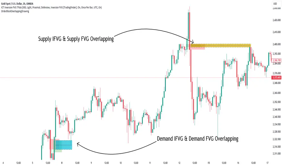
Order Block Overlapping Drawing [TradingFinder]🔵 Introduction
Technical analysis is a fundamental tool in financial markets, helping traders identify key areas on price charts to make informed trading decisions. The ICT (Inner Circle Trader) style, developed by Michael Huddleston, is one of the most advanced methods in this field.
It enables traders to precisely identify and exploit critical zones such as Order Blocks, Breaker Blocks, Fair Value Gaps (FVGs), and Inversion Fair Value Gaps (IFVGs).
To streamline and simplify the use of these key areas, a library has been developed in Pine Script, the scripting language for the TradingView platform. This library allows you to automatically detect overlapping zones between Order Blocks and other similar areas, and visually display them on your chart.
This tool is particularly useful for creating indicators like Balanced Price Range (BPR) and ICT Unicorn Model.
🔵 How to Use
This section explains how to use the Pine Script library. This library assists you in easily identifying and analyzing overlapping areas between Order Blocks and other zones, such as Breaker Blocks and Fair Value Gaps.
To add "Order Block Overlapping Drawing", you must first add the following code to your script.
import TFlab/OrderBlockOverlappingDrawing/1
🟣 Inputs
The library includes the "OBOverlappingDrawing" function, which you can use to detect and display overlapping zones. This function identifies and draws overlapping zones based on the Order Block type, trigger conditions, previous and current prices, and other relevant parameters.
🟣 Parameters
OBOverlappingDrawing(OBType , TriggerConditionOrigin, distalPrice_Pre, proximalPrice_Pre , distalPrice_Curr, proximalPrice_Curr, Index_Curr , OBValidGlobal, OBValidDis, MitigationLvL, ShowAll, Show, ColorZone) =>
OBType (string)
TriggerConditionOrigin (bool)
distalPrice_Pre (float)
proximalPrice_Pre (float)
distalPrice_Curr (float)
proximalPrice_Curr (float)
Index_Curr (int)
OBValidGlobal (bool)
OBValidDis (int)
MitigationLvL (string)
ShowAll (bool)
Show (bool)
ColorZone (color)
In this example, various parameters are defined to detect overlapping zones and draw them on the chart. Based on these settings, the overlapping areas will be automatically drawn on the chart.
OBType : All order blocks are summarized into two types: "Supply" and "Demand." You should input your Current order block type in this parameter. Enter "Demand" for drawing demand zones and "Supply" for drawing supply zones.
TriggerConditionOrigin : Input the condition under which you want the Current order block to be drawn in this parameter.
distalPrice_Pre : Generally, if each zone is formed by two lines, the farthest line from the price is termed Pervious "Distal." This input receives the price of the "Distal" line.
proximalPrice_Pre : Generally, if each zone is formed by two lines, the nearest line to the price is termed Previous "Proximal" line.
distalPrice_Curr : Generally, if each zone is formed by two lines, the farthest line from the price is termed Current "Distal." This input receives the price of the "Distal" line.
proximalPrice_Curr : Generally, if each zone is formed by two lines, the nearest line to the price is termed Current "Proximal" line.
Index_Curr : This input receives the value of the "bar_index" at the beginning of the order block. You should store the "bar_index" value at the occurrence of the condition for the Current order block to be drawn and input it here.
OBValidGlobal : This parameter is a boolean in which you can enter the condition that you want to execute to stop drawing the block order. If you do not have a special condition, you should set it to True.
OBValidDis : Order blocks continue to be drawn until a new order block is drawn or the order block is "Mitigate." You can specify how many candles after their initiation order blocks should continue. If you want no limitation, enter the number 4998.
MitigationLvL : This parameter is a string. Its inputs are one of "Proximal", "Distal" or "50 % OB" modes, which you can enter according to your needs. The "50 % OB" line is the middle line between distal and proximal.
ShowAll : This is a boolean parameter, if it is "true" the entire order of blocks will be displayed, and if it is "false" only the last block order will be displayed.
Show : You may need to manage whether to display or hide order blocks. When this input is "On", order blocks are displayed, and when it's "Off", order blocks are not displayed.
ColorZone : You can input your preferred color for drawing order blocks.
🟣 Output
Mitigation Alerts : This library allows you to leverage Mitigation Alerts to detect specific conditions that could lead to trend reversals. These alerts help you react promptly in your trades, ensuring better management of market shifts.
🔵 Conclusion
The Pine Script library provided is a powerful tool for technical analysis, especially in the ICT style. It enables you to detect overlapping zones between Order Blocks and other significant areas like Breaker Blocks and Fair Value Gaps, improving your trading strategies. By utilizing this tool, you can perform more precise analysis and manage risks effectively in your trades.
IPDA Standard Deviations [DexterLab x TFO x toodegrees]> Introduction and Acknowledgements
The IPDA Standard Deviations tool encompasses the Time and price relationship as studied by @TraderDext3r .
I am not the creator of this Theory, and I do not hold the answers to all the questions you may have; I suggest you to study it from Dexter's tweets, videos, and material.
This tool was born from a collaboration between @TraderDext3r, @tradeforopp and I, with the objective of bringing a comprehensive IPDA Standard Deviations tool to Tradingview.
> Tool Description
This is purely a graphical aid for traders to be able to quickly determine Fractal IPDA Time Windows, and trace the potential Standard Deviations of the moves at their respective high and low extremes.
The disruptive value of this tool is that it allows traders to save Time by automatically adapting the Time Windows based on the current chart's Timeframe, as well as providing customizations to filter and focus on the appropriate Standard Deviations.
> IPDA Standard Deviations by TraderDext3r
The underlying idea is based on the Interbank Price Delivery Algorithm's lookback windows on the daily chart as taught by the Inner Circle Trader:
IPDA looks at the past three months of price action to determine how to deliver price in the future.
Additionally, the ICT concept of projecting specific manipulation moves prior to large displacement upwards/downwards is used to navigate and interpret the priorly mentioned displacement move. We pay attention to specific Standard Deviations based on the current environment and overall narrative.
Dexter being one of the most prominent Inner Circle Trader students, harnessed the fractal nature of price to derive fractal IPDA Lookback Time Windows for lower Timeframes, and studied the behaviour of price at specific Deviations.
For Example:
The -1 to -2 area can initiate an algorithmic retracement before continuation.
The -2 to -2.5 area can initiate an algorithmic retracement before continuation, or a Smart Money Reversal.
The -4 area should be seen as the ultimate objective, or the level at which the displacement will slow down.
Given that these ideas stem from ICT's concepts themselves, they are to be used hand in hand with all other ICT Concepts (PD Array Matrix, PO3, Institutional Price Levels, ...).
> Fractal IPDA Time Windows
The IPDA Lookbacks Types identified by Dexter are as follows:
Monthly – 1D Chart: one widow per Month, highlighting the past three Months.
Weekly – 4H to 8H Chart: one window per Week, highlighting the past three Weeks.
Daily – 15m to 1H Chart: one window per Day, highlighting the past three Days.
Intraday – 1m to 5m Chart: one window per 4 Hours highlighting the past 12 Hours.
Inside these three respective Time Windows, the extreme High and Low will be identified, as well as the prior opposing short term market structure point. These represent the anchors for the Standard Deviation Projections.
> Tool Settings
The User is able to plot any type of Standard Deviation they want by inputting them in the settings, in their own line of the text box. They will always be plotted from the Time Windows extremes.
As previously mentioned, the User is also able to define their own Timeframe intervals for the respective IPDA Lookback Types. The specific Timeframes on which the different Lookback Types are plotted are edge-inclusive. In case of an overlap, the higher Timeframe Lookback will be prioritized.
Finally the User is able to filter and remove Standard Deviations in two ways:
"Remove Once Invalidated" will automatically delete a Deviation once its outer anchor extreme is traded through.
Manual Toggles will allow to remove the Upward or Downward Deviation of each Time Window at the discretion of the User.
Major shoutout to Dexter and TFO for their Time, it was a pleasure to collaborate and create this tool with them.
GLGT!

ALGO X LIMITLESS//@version=6
indicator("ICT NY Midnight Open", "ICT NY", overlay=true, max_lines_count=500, max_bars_back=5000)
// Heure New York
nyHour = hour(time, "America/New_York")
nyMinute = minute(time, "America/New_York")
// Détection minuit NY
isNYMidnight = (nyHour == 0 and nyMinute == 0)
// Tracer une seule ligne par jour
if isNYMidnight and not isNYMidnight
line.new(
bar_index,
open,
bar_index + 1,
open,
extend = extend.right,
color = color.blue,
width = 2
)

SWIFT ALGO X LIMITLESS//@version=5
//@Shanxia
// NOTE: Only works on 1HR and below and exchange timezones differ so change the session times accordingly.
indicator("ICT NY Midnight Open", "ICT NY OPEN", true, max_lines_count=500, max_bars_back = 5000)
// INPUTS
i_time = input.session ('0000-0001:1234567', "New York", tooltip="Different exchanges will have difference time zones so change accordingly.")
i_tz = input ("GMT-4", "Timezone")
i_vline = input.bool (true, "VLine", inline="in3")
i_vcol = input.color (#00b9d0, "", inline="in3")
i_txtcol = input.color (#0098ff, " Text color", inline="in3")
i_vstyle = input.string ("Solid", "Style", options= )
i_hline = input.bool (true, "HLine", inline="in1")
i_linecol = input.color (#0064ff, "", inline="in1")
i_linestyle = input.string ("Dotted", " ", options= , inline="in1")
i_ex = input.string ("1 Day", "Extend", options= , inline="in4" )
i_ex2 = input.bool (false, "", inline="in4")
i_ex3 = input.int (3, "Hours", 1, 23, inline="in4")
// MISC
nymid = time ("1", i_time, i_tz)
linestyle = i_linestyle == "Solid" ? line.style_solid : i_linestyle == "Dotted" ? line.style_dotted : line.style_dashed
vstyle = i_vstyle == "Solid" ? line.style_solid : i_vstyle == "Dotted" ? line.style_dotted : line.style_dashed
ex = i_ex == "1 Day" ? extend.none : i_ex == "2 Days" ? extend.none : i_ex == "Right" ? extend.right : extend.both
htime = i_ex == "2 Days" ? 172800000 : 86400000
hourtime = i_ex2 ? i_ex3 * 3600000 : htime
// CALC
var openprice = 0.0
if nymid
if not nymid
openprice := open
else
openprice := math.max(open, openprice)
// OBJECTS
var label lb = na
if openprice != openprice and i_hline
var line lne = na
line.set_x2(lne, nymid)
line.set_extend(lne, extend.none)
lne := line.new(nymid, openprice, nymid + hourtime , openprice, xloc.bar_time, extend.none, i_linecol, linestyle, 2)
lb := label.new(nymid + htime, openprice, "NY Midnight Open | " + str.tostring(math.round_to_mintick(openprice)), xloc.bar_time, yloc.price, na, label.style_none, i_txtcol)
label.delete(lb )
if i_vline and nymid == nymid
vl1 = line.new(nymid, high, nymid, low, xloc.bar_time, extend.both, i_vcol, vstyle, 1)
if line.get_y1(vl1) == line.get_y2(vl1)
line.delete(vl1)
// END

INSTITUTIONAL GHOST [Jorge's Algo]Here is the professional English translation for your TradingView publication. It uses the correct technical terminology (SMC, ICT, Order Flow) to attract serious traders.
Title: INSTITUTIONAL GHOST
Subtitle: The Institutional Footprint Algorithm: Liquidity, Structure, and Volume (CVD).
DESCRIPTION:
INSTITUTIONAL GHOST is not just an indicator; it is a complete vision system engineered to clear market noise and reveal only what matters: Where is the liquidity, and when are institutions entering?
Unlike conventional indicators that clutter your chart with colors and false signals, the Ghost Protocol operates on absolute minimalism. It only displays information when high-probability algorithmic conditions are met, based on Smart Money Concepts (SMC) and Cumulative Volume Delta (CVD).
🔥 KEY FEATURES:
1. LIQUIDITY DETECTOR (Lr): The algorithm automatically identifies Major Swing Points where retail Stop Losses reside.
"Lr" Lines: Minimalist projections that act as magnets for price.
2. POWER SWEEPS (The Institutional Trap): Forget signal spam on every candle. This system filters noise and only marks a "Power Sweep" (Cyan Diamond) when:
Price sweeps a major liquidity level.
IMMEDIATE REJECTION: The candle closes in the opposite direction of the breakout (e.g., breaks high but closes bearish).
This confirms a Stop Hunt and rapid distribution.
3. CVD DIVERGENCE (The Lie Detector): In the background, the script calculates the Cumulative Volume Delta.
If a small "D" label appears above a Sweep, it means price made a New High/Low, but the Order Flow (real money) did not support it.
Signal: Confirmed Divergence = High probability reversal.
4. FVG GHOST LINES: Identification of Fair Value Gaps (Imbalances) without intrusive boxes. Only fine vertical lines connecting the gap, maintaining a "Clean Chart" aesthetic.
5. ICT MIDNIGHT OPEN: A discrete marker at the New York Open (00:00 NY) to determine the Daily Bias (Premium vs. Discount).
📋 HOW TO TRADE THIS ALGORITHM (THE MECHANICAL PLAN):
WAIT: Let price approach a Liquidity Line (Lr). Do not chase the price.
OBSERVE: Look for the appearance of the Cyan Diamond (Power Sweep). This indicates liquidity has been taken and rejected.
CONFIRM: If the "D" (Divergence) appears, the signal is "institutionally validated" by volume.
EXECUTE: Enter at the close of the Sweep candle or on the retest of the nearest FVG.
AUTHOR'S NOTE: This script was designed under the philosophy of "Less is More." If the chart is empty, it is because there is nothing to do. Patience pays.
Recommended Settings: M15, H1, H4 (Forex, Gold, Indices). Style: Minimalist / Zen.

[ST] Killzones - Minimal Killzones — Minimal
User Manual
1. Purpose of the Indicator
Killzones — Minimal is a session-based market structure tool designed to highlight the highest-liquidity time windows of the trading day.
Instead of generating signals, this indicator provides context by visually marking the ICT Killzones, allowing the trader to:
Identify where liquidity is built
See which session created the range
Anticipate where liquidity is likely to be taken
Align SMC / Wyckoff / Order Flow analysis with time-based institutional behavior
This tool is especially effective for Crypto, Forex, and Indices, where markets run continuously and liquidity cycles matter more than exchange open times.
2. Killzones Covered (São Paulo Time – UTC-3)
The indicator draws one minimal, dotted box per session:
Session Time (SP) Role in Market Structure
ASIA 21:00 – 03:00 Range formation & liquidity buildup
LONDON 04:00 – 07:00 First liquidity raid & manipulation
NEW YORK (Killzone) 10:00 – 13:00 True displacement & delivery
These are ICT Killzones, not official stock exchange open times.
3. Visual Design Philosophy
The indicator is intentionally minimalist:
Dotted borders → no visual clutter
Optional fill → focus on structure, not noise
No signals or arrows → forces contextual reading
One box per session → clean session boundaries
The goal is to let price action and liquidity tell the story, not indicators.
4. How the Boxes Behave
Each session box:
Starts on the first candle of the session
Expands dynamically to include the session High and Low
Stops updating once the session ends
Remains fixed on the chart as historical context
This allows you to instantly see:
Which session created the current range
Where stop-loss clusters are likely resting
Which session was manipulated or delivered price
5. How to Use the Indicator (Practical Workflow)
Step 1 — Identify the Current Session
Ask:
Are we inside Asia, London, or New York?
Your expectations should change depending on the session.
Step 2 — Read Session Intent
ASIA
Expect compression and balance
Focus on identifying Asia High / Asia Low
Avoid aggressive trades inside the range
LONDON
Look for liquidity raids on Asia High/Low
Many London moves are manipulative
A failed raid is often a setup for NY
NEW YORK
Look for true displacement
High probability of:
Continuation
Reversal after a sweep
Best session to execute trades
Step 3 — Trade Liquidity, Not Candles
Use the boxes as liquidity maps, not entries.
High-probability ideas come from:
Asia range being swept during London
London manipulation being reversed during NY
NY taking remaining liquidity and delivering direction
6. Example Use Cases
Setup 1 — Asia Range Sweep
Asia forms a tight range
London sweeps Asia High or Low
Price fails to continue
Market shifts structure
Entry on OB / FVG toward the opposite side
Setup 2 — London Manipulation → NY Delivery
London sweeps liquidity but stalls
New York opens
NY takes the opposite side liquidity
Strong displacement occurs
Entry on NY pullback
Setup 3 — Session Breakout
No sweep
Immediate strong displacement
Clean continuation
Trade only after confirmation
7. What NOT to Do
Do not trade inside the middle of session boxes
Do not assume every sweep means reversal
Do not force trades without structure shift
Do not treat sessions as signals
The indicator shows where to pay attention, not when to click Buy or Sell.
8. Best Confluence Tools
This indicator works best when combined with:
Market Structure (BOS / CHoCH)
Order Blocks
Fair Value Gaps
Liquidity pools
Volume-based candle analysis (e.g. CandleFlow)
9. Final Notes
Killzones — Minimal is a contextual framework, not a strategy.
If you wait for:
Liquidity to be taken
Structure to shift
Price to confirm intent
You will trade with the market narrative, not against it.
Time reveals intent. Liquidity confirms it.

Market Regime | NY Session Killzones Indicator [ApexLegion]Market Regime | NY Session Killzones Indicator
Introduction and Theoretical Background
The Market Regime | NY Session Killzones indicator is designed exclusively for New York market hours (07:00-16:00 ET). Unlike universal indicators that attempt to function across disparate global sessions, this tool employs session-specific calibration to target the distinct liquidity characteristics of the NY trading day: Pre-Market structural formation (08:00-09:30), the Morning breakout window (09:30-12:00), and the Afternoon Killzone (13:30-16:00)—periods when institutional order flow exhibits the highest concentration and most definable technical structure. By restricting its operational scope to these statistically significant time windows, the indicator focuses on signal relevance while filtering the noise inherent in lower-liquidity overnight or extended-hours trading environments.
I. TECHNICAL RATIONALE: THE PRINCIPLE OF CONTEXTUAL FUSION
1. The Limitation of Acontextual Indicators
Traditional technical indicators often fail because they treat every bar and every market session equally, applying static thresholds (e.g., RSI > 70) without regard for the underlying market structure or liquidity environment. However, institutional volume and market volatility are highly dependent on the time of day (session) and the prevailing long-term risk environment.
This indicator was developed to address this "contextual deficit" by fusing three distinct yet interdependent analytical layers:
• Time and Structure (Macro): Identifying high-probability trading windows (Killzones) and critical structural levels (Pre-Market Range, PDH/PDL).
• Volatility and Scoring (Engine): Normalizing intraday momentum against annual volatility data to create an objective, statistically grounded AI Score.
• Risk Management (Execution): Implementing dynamic, volatility-adjusted Stop Loss (SL) and Take Profit (TP) parameters based on the Average True Range (ATR).
2. The Mandate for 252-Day Normalization (Z-Score)
What makes this tool unique is its 252-day Z-Score normalization engine that transforms raw momentum readings into statistically grounded probability scores, allowing the same indicator to deliver consistent, context-aware signals across any timeframe—from 1-minute scalping to 1-hour swing trades—without manual recalibration.
THE PROBLEM OF SCALE INVARIANCE
A high Relative Strength Index (RSI) reading on a 1-minute chart has a completely different market implication than a high RSI reading on a Daily chart. Simple percentage-based thresholds (like 70 or 30) do not provide true contextual significance. A sudden spike in momentum may look extreme on a 5-minute chart, but if it is statistically insignificant compared to the overall volatility of the last year, it may be a poor signal.
THE SOLUTION: CROSS-TIMEFRAME Z-SCORE NORMALIZATION
This indicator utilizes the Pine Script function request.security to reference the Daily timeframe for calculating the mean (μ) and standard deviation (σ) of a momentum oscillator (RSI) over the past 252 trading days (one year).
The indicator then calculates the Z-Score (Z) for the current bar's raw momentum (x): Z = (x - μ) / σ
Core Implementation: float raw_rsi = ta.rsi(close, 14) // x
= request.security(syminfo.tickerid, "D",
, // σ (252 days)
lookahead=barmerge.lookahead_on)
float cur_rsi_norm = d_rsi_std != 0 ? (raw_rsi - d_rsi_mean) / d_rsi_std : 0.0 // Z
This score provides an objective measurement of current intraday momentum significance by evaluating its statistical extremity against the yearly baseline of daily momentum. This standardized approach provides the scoring engine with consistent, global contextual information, independent of the chart's current viewing timeframe.
II. CORE COMPONENTS AND TECHNICAL ANALYSIS BREAKDOWN
1. TIME AND SESSION ANALYSIS (KILLZONES AND BIAS)
The indicator visually segments the trading day based on New York (NY) trading sessions, aligning the analysis with periods of high institutional liquidity events.
Pre-Market (PRE)
• Function: Defines the range before the core market opens. This range establishes structural support and resistance levels (PMH/PML).
• Technical Implementation: Uses a dedicated Session input (ny_pre_sess). The High and Low values (pm_h_val/pm_l_val) within this session are stored and plotted for structural reference.
• Smart Extension Logic: PMH/PML lines are automatically extended until the next Pre-Market session begins, providing continuous support/resistance references overnight.
NY Killzones (AM/PM)
• Function: Highlights high-probability volatility windows where institutional liquidity is expected to be highest (e.g., NY open, lunch, NY close).
• Technical Implementation: Separate session inputs (kz_ny_am, kz_ny_pm) are utilized to draw translucent background fills, providing a clear visual cue for timing.
Market Regime Bias
• Function: Determines the initial directional premise for the trading day. The bias is confirmed when the price breaks either the Pre-Market High (PMH) or the Pre-Market Low (PML).
• Technical Implementation: Involves the comparison of the close price against the predefined structural levels (check_h for PMH, check_l for PML). The variable active_bias is set to Bullish or Bearish upon confirmed breakout.
Trend Bar Coloring
• Function: Applies a visual cue to the bars based on the established regime (Bullish=Cyan, Bearish=Red). This visual filter helps mitigate noise from counter-trend candles.
• Technical Implementation: The Pine Script barcolor() function is tied directly to the value of the determined active_bias.
2. VOLATILITY NORMALIZED SCORING ENGINE
The internal scoring mechanism accumulates points from multiple market factors to determine the strength and validity of a signal. The purpose is to apply a robust filtering mechanism before generating an entry.
The score accumulation logic is based on the following factors:
• Market Bias Alignment (+3 Points): Points are awarded for conformance with the determined active_bias (Bullish/Bearish).
• VWAP Alignment (+2 Points): Assesses the position of the current price relative to the Volume-Weighted Average Price (VWAP). Alignment suggests conformity with the average institutional transaction price.
• Volume Anomaly (+2 Points): Detects a price move accompanied by an abnormally high relative volume (odd_vol_spike). This suggests potential institutional participation or significant order flow.
• VIX Integration (+2 Points): A score derived from the CBOE VIX index, assessing overall market stability and stress. Stable VIX levels add points, while high VIX levels (stress regimes) remove points or prevent signal generation entirely.
• ML Probability Score (+3 Points): This is the core predictive engine. It utilizes a Log-Manhattan Distance Kernel to compare the current market state against historical volatility patterns. The script implements a Log-linear distance formula (log(1 + |Δ|) ). This approach mathematically dampens the impact of extreme volatility spikes (outliers), ensuring that the similarity score reflects true structural alignment rather than transient market noise.
Core Technical Logic (Z-Score Normalization)
float cur_rsi_norm = d_rsi_std != 0 ? (raw_rsi - d_rsi_mean) / d_rsi_std : 0.0
• Technical Purpose: This line calculates the Z-Score (cur_rsi_norm) of the current momentum oscillator reading (raw_rsi) by normalizing it against the mean (d_rsi_mean) and standard deviation (d_rsi_std) derived from 252 days of Daily momentum data. If the standard deviation is zero (market is perfectly flat), it safely returns 0.0 to prevent division by zero runtime errors. This allows the AI's probability score to be based on the current signal's significance within the context of the entire trading year.
3. EXECUTION AND RISK MANAGEMENT (ATR MODEL)
The indicator utilizes the Average True Range (ATR) volatility model. This helps risk management scale dynamically with market volatility by allowing users to define TP/SL distances independently based on the current ATR.
Stop Loss Multiplier (sl_mult)
• Function: Sets the Stop Loss (SL) distance as a configurable multiple of the current ATR (e.g., 1.5 × ATR).
• Technical Logic: The price level is calculated as: last_sl_price := close - (atr_val * sl_mult). The mathematical sign is reversed for short trades.
Take Profit Multiplier (tp_mult)
• Function: Sets the Take Profit (TP) distance as a configurable multiple of the current ATR (e.g., 3.0 × ATR).
• Technical Logic: The price level is calculated as: last_tp_price := close + (atr_val * tp_mult). The mathematical sign is reversed for short trades.
Structural SL Option
• Function: Provides an override to the ATR-based SL calculation. When enabled, it forces the Stop Loss to the Pre-Market High/Low (PMH/PML) level, aligning the stop with a key institutional structural boundary.
• Technical Logic: The indicator checks the use_struct_sl input. If true, the calculated last_sl_price is overridden with either pm_h_val or pm_l_val, dependent on the specific trade direction.
Trend Continuation Logic
• Function: Enables signal generation in established, strong trends (typically in the Afternoon session) based on follow-through momentum (a new high/low of the previous bar) combined with a high Signal Score, rather than exclusively relying on the initial PMH/PML breakout.
• Technical Logic: For a long signal, the is_cont_long logic specifically requires checks like active_bias == s_bull AND close > high , confirming follow-through momentum within the established regime.
Smart Snapping & Cleanup (16:00 Market Close)
• Function: To maintain chart cleanliness, all trade boxes (TP/SL), AI Prediction zones, Killzone overlays (NY AM/PM), and Liquidity lines (PDH/PDL) are automatically "snapped" and cut off precisely at 16:00 NY Time (Market Close).
• Technical Logic: When is_market_close condition is met (hour == 16 and minute == 0), the script executes cleanup logic that:
◦ Closes active trades and evaluates final P&L
◦ Snaps all TP/SL box widths to current bar
◦ Truncates AI Prediction ghost boxes at market close
◦ Cuts off NY AM/PM Killzone background fills
◦ Terminates PDH/PDL line extensions
◦ Prevents visual clutter from extending into post-market sessions
4. LIQUIDITY AND STRUCTURAL ANALYSIS
The indicator plots key structural levels that serve as high-probability magnet zones or areas of potential liquidity absorption.
• Pre-Market High/Low (PMH/PML): These are the high and low established during the configured pre-market session (ny_pre_sess). They define the primary structural breakout level for the day, often serving as the initial market inflection point or the key entry level for the morning session.
• PDH (Previous Day High): The high of the calendar day immediately preceding the current bar. This represents a key Liquidity Pool; large orders are often placed above this level, making it a frequent target for stop hunts or liquidity absorption by market makers.
• PDL (Previous Day Low): The low of the calendar day immediately preceding the current bar. This also represents a key Liquidity Pool and a high-probability reversal or accumulation point, particularly during the Killzones.
FIFO Array Management
The indicator uses FIFO (First-In-First-Out) array structures to manage liquidity lines and labels, automatically deleting the oldest objects when the count exceeds 500 to comply with drawing object limits.
5. AI PREDICTION BOX (PREDICTIVE MODEL)
Function: Analyzes AI scores and volatility to project predicted killzone ranges and duration with asymmetric directional bias.
A. DIRECTIONAL BIAS (ASYMMETRIC EXPANSION)
The prediction model calculates directional probability using the ML kernel's 252-day Normalized RSI (Z-Score) and Relative Volume (RVOL). The prediction box dynamically adjusts its range based on this probability to provide immediate visual feedback on high-probability direction.
Bullish Scenario (ml_prob > 1.0):
• Upper Range: Expands significantly (1.5x multiplier) to show the aggressive upside target
• Lower Range: Tightens (0.5x multiplier) to show the invalidation level
• Visual Intent: The box is visibly skewed upward, immediately communicating bullish bias without requiring numerical analysis.
Bearish Scenario (ml_prob < -1.0):
• Upper Range: Tightens (0.5x multiplier) to show the invalidation level
• Lower Range: Expands significantly (1.5x multiplier) to show the aggressive downside target
• Visual Intent: The box is visibly skewed downward, immediately communicating bearish bias.
Neutral Scenario (-1.0 < ml_prob < 1.0):
Both ranges use balanced multipliers, creating a symmetrical box that indicates uncertainty.
B. DYNAMIC VOLATILITY BOOSTER (SESSION-BASED ADAPTATION)
The prediction box adjusts its volatility multiplier based on the current session and market conditions to account for intraday volatility patterns.
AM Session (Morning: 07:00-12:00):
• Base Multiplier: 1.0x (Neutral Base)
• Logic: Morning sessions often contain false breakouts and noise. The base multiplier starts neutral to avoid over-projecting during consolidation.
• Trend Booster: Multiplier jumps to 1.5x when:
Price > London Session Open AND AI is Bullish (ml_prob > 0), OR
Price < London Session Open AND AI is Bearish (ml_prob < 0)
• Logic: When the London trend (typically 03:00-08:00 NY time) aligns with the AI model's directional conviction, the indicator aggressively targets higher volatility expansion. This filters for "institutional follow-through" rather than random morning chop.
PM Session (Afternoon: 13:00-16:00):
• Fixed Multiplier: 1.8x
• Logic: The PM session, particularly the 13:30-16:00 ICT Silver Bullet window, often contains the "True Move" of the day. A higher baseline multiplier is applied to emphasize this session's significance over morning noise.
Safety Floor:
A minimum range of 0.2% of the current price is enforced regardless of volatility conditions.
• Purpose: Maintains the prediction box visibility during extreme low-volatility consolidation periods where ATR might collapse to near-zero values.
Volatility Clamp Protection:
Maximum volatility is capped at three times the current ATR value. During flash crashes, circuit breaker halts, or large overnight gaps, raw volatility calculations can spike to extreme levels. This clamp prevents prediction boxes from expanding to unrealistic widths.
Technical Implementation:
f_get_ai_multipliers(float _prob) =>
float _abs_prob = math.abs(_prob)
float _range_mult = 1.0
float _dur_mult = 1.0
if _abs_prob > 30
_range_mult := 1.8
else if _abs_prob > 10
_range_mult := 1.2
else
_range_mult := 0.7
C. PRACTICAL INTERPRETATION
• Wide Upper Range + Tight Lower Range: Strong bullish conviction. The model expects significant upside with limited downside risk.
• Tight Upper Range + Wide Lower Range: Strong bearish conviction. The model expects significant downside with limited upside.
• Symmetrical Range: Neutral/uncertain market. Wait for directional confirmation before entry.
• Large Box (Extended Duration): High-confidence prediction expecting sustained movement.
• Small Box (Short Duration): Low-confidence or choppy conditions. Expect quick resolution.
III. PRACTICAL USAGE GUIDE: METHODOLOGY AND EXECUTION
A. ESTABLISHING TRADING CONTEXT (THE THREE CHECKS)
The primary goal of the dashboard is to filter out low-probability trade setups before they occur.
• Timeframe Selection: Although the core AI is normalized to the Daily context, the indicator performs optimally on intraday timeframes (e.g., 5m, 15m) where session-based volatility is most pronounced.
• PHASE Check (Timing): Always confirm the current phase. The highest probability signals typically occur within the visually highlighted NY AM/PM Killzones because this is when institutional liquidity and volume are at their peak. Signals outside these zones should be treated with skepticism.
• MARKET REGIME Check (Bias): Ensure the signal (BUY/SELL arrow) aligns with the established MARKET REGIME bias (BULLISH/BEARISH). Counter-bias signals are technically allowed if the score is high, but they represent a higher risk trade.
• VIX REGIME Check (Risk): Review the VIX REGIME for overall market stress. Periods marked DANGER (high VIX) indicate elevated volatility and market uncertainty. During DANGER regimes, reducing position size or choosing a wider SL Multiplier is advisable.
B. DASHBOARD INTERPRETATION (THE REAL-TIME STATUS DISPLAY)
The indicator features a non-intrusive dashboard that provides real-time, context-aware information based on the core analytical engines.
PHASE: (PRE-MARKET, NY-AM, LUNCH, NY-PM)
• Meaning: Indicates the current institutional session time. This is derived from the customizable session inputs.
• Interpretation: Signals generated during NY-AM or NY-PM (Killzones) are generally considered higher-probability due to increased institutional participation and liquidity.
MARKET REGIME: (BULLISH, BEARISH, NEUTRAL)
• Meaning: The established directional bias for the trading day, confirmed by the price breaking above the Pre-Market High (PMH) or below the Pre-Market Low (PML).
• Interpretation: Trading with the established regime (e.g., taking a BUY signal when the regime is BULLISH) is the primary method. NEUTRAL indicates that the PMH/PML boundary has not yet been broken, suggesting market ambiguity.
VIX REGIME: (STABLE, DANGER)
• Meaning: A measure of overall market stress and stability, based on the CBOE VIX index integration. The thresholds (20.0 and 35.0 default) are customizable by the user.
• Interpretation: STABLE indicates stable volatility, favoring momentum trades. DANGER (VIX > 35.0) indicates extreme stress; signals generated in this environment require caution and often necessitate smaller position sizing.
SIGNAL SCORE: (0 to 10+ Points)
• Meaning: The accumulated score derived from the VOLATILITY NORMALIZED AI SCORING ENGINE, factoring in bias, VWAP alignment, volume, and the Z-Score probability.
• Interpretation: The indicator generates a signal when this score meets or exceeds the Minimum Entry Score (default 3). A higher score (e.g., 7+) indicates greater statistical confluence and a stronger potential entry.
AI PROBABILITY: (Bull/Bear %)
• Meaning: Directional probability derived from the ML kernel, expressed as a percentage with Bull/Bear label.
• Interpretation: Higher absolute values (>20%) indicate stronger directional conviction from the ML model.
LIVE METRICS SECTION:
• STATUS: Shows current trade state (LONG, SHORT, or INACTIVE)
• ENTRY: Displays the entry price for active trades
• TARGET: Shows the calculated Take Profit level
• ROI | KILL ZONE:
◦ For Active Trades: Displays real-time P&L percentage during NY session hours.
◦ At Market Close (16:00 NY): Since this is a NY session-specific indicator, any active position is automatically evaluated and closed at 16:00. The final result (VALIDATED or INVALIDATED) is determined based on whether the trade reached profit or loss at market close.
◦ Result Persistence: The killzone result (VALIDATED/INVALIDATED) remains displayed on the dashboard until the next NY AM KILLZONE session begins, providing a clear performance reference for the previous trading day.
Note: If a trade is still trending at 16:00, it will be force-closed and evaluated at that moment, as the indicator operates strictly within NY trading hours.
C. SIGNAL GENERATION AND ENTRY LOGIC
The indicator generates signals based on two distinct technical setups, both of which require the accumulated SIGNAL SCORE to be above the configured Minimum Entry Score.
Breakout Entry
• Trigger Condition: Price closes beyond the Pre-Market High (PMH) or Low (PML).
• Rationale: This setup targets the initial directional movement for the day. A breakout confirms the institutional bias by decisively breaking the first major structural boundary, making the signal high-probability.
Continuation Entry
• Trigger Condition: The market is already in an established regime (e.g., BULLISH), and the price closes above the high (or below the low) of the previous bar, while the SIGNAL SCORE remains high. Requires the Allow Trend Continuation parameter to be active.
• Rationale: This setup targets follow-through trades, typically in the afternoon session, capturing momentum after the morning's direction has been confirmed. This filters for sustainability in the established trend.
Execution: Execute the trade immediately upon the close of the bar that prints the BUY or SELL signal arrow.
D. MANAGING RISK AND EXITS
1. RISK PARAMETER SELECTION
The indicator immediately draws the dynamic TP/SL zones upon entry.
• Volatility-Based (Recommended Default): By setting the SL Multiplier (e.g., 1.5) and the TP Multiplier (e.g., 3.0), the indicator enforces a constant, dynamically sized risk-to-reward ratio (e.g., 1:2 in this example). This helps that risk management scales proportionally with the current market volatility (ATR).
• Structural Override: Selecting the Use Structural SL parameter fixes the stop-loss not to the ATR calculation, but to the more significant structural level of the PMH or PML. This is utilized by traders who favor institutional entry rules where the stop is placed behind the liquidity boundary.
2. EXIT METHODS
• Hard Exit: Price hits the visual TP or SL box boundary.
• Soft Exit (Momentum Decay Filter): If the trade is active and the SIGNAL SCORE drops below the Exit Score Threshold (default 3), it indicates that the momentum supporting the trade has significantly collapsed. This serves as a momentum decay filter, prompting the user to consider a manual early exit even if the SL/TP levels have not been hit, thereby preserving capital during low-momentum consolidation.
• Market Close Auto-Exit: At 16:00 NY time, any active trade is automatically closed and classified as VALIDATED (profit) or INVALIDATED (loss) based on current price vs. entry price.
IV. PARAMETER REFERENCE AND CONFIGURATION
A. GLOBAL SETTINGS
• Language (String, Default: English): Selects the language for the dashboard and notification text. Options: English, Korean, Chinese, Spanish, Portuguese, Russian, Ukrainian, Vietnamese.
B. SESSION TIMES (3 BOX SYSTEM)
• PRE-MARKET (Session, Default: 0800-0930): Defines the session range used for Pre-Market High/Low (PMH/PML) structural calculation.
• REGULAR (Morning) (Session, Default: 0930-1200): Defines the core Morning trading session.
• AFTERNOON (PM) (Session, Default: 1300-1600): Defines the main Afternoon trading session.
• Timezone (String, Default: America/New_York): Sets the timezone for all session and time-based calculations.
C. NY KILLZONES (OVERLAYS)
• Show NY Killzones (Bool, Default: True): Toggles the translucent background fills that highlight high-probability trading times (Killzones).
• NY AM Killzone (Session, Default: 0700-1000): Defines the specific time window for the first key liquidity surge (Open overlap).
• NY PM Killzone (Session, Default: 1330-1600): Defines the afternoon liquidity window, aligned with the ICT Silver Bullet and PM Trend entry timing.
• Allow Entry in Killzones (Bool, Default: True): Enables or disables signal generation specifically during the defined Killzone hours.
• Activate AI Prediction Box (Bool, Default: True): Toggles the drawing of the predicted target range boxes on the chart.
D. CORE SCORING ENGINE
• Minimum Entry Score (Int, Default: 3): The lowest accumulated score required for a Buy/Sell signal to be generated and plotted.
• Allow Trend Continuation (Bool, Default: True): Enables the secondary entry logic that fires signals based on momentum in an established trend.
• Force Ignore Volume (Bool, Default: False): Overrides the volume checks in the scoring engine. Useful for markets where volume data is unreliable or nonexistent.
• Force Show Signals (Ignore Score) (Bool, Default: False): Debug mode that displays all signals regardless of score threshold.
• Integrate CBOE:VIX (Bool, Default: True): Enables the connection to the VIX index for market stress assessment.
• Stable VIX (<) (Float, Default: 20.0): VIX level below which market stress is considered low (increases score).
• Stress VIX (>) (Float, Default: 35.0): VIX level above which market stress is considered high (decreases score/flags DANGER).
• Use ML Probability (Bool, Default: True): Activates the volatility-normalized AI Z-Score kernel. Disabling this removes the cross-timeframe normalization filter.
• Max Learning History (Int, Default: 2000): Maximum number of bars stored in the ML training arrays.
• Normalization Lookback (252 Days) (Int, Default: 252): The number of DAILY bars used to calculate the Z-Score mean and standard deviation (representing approximately 1 year of data).
E. RISK MANAGEMENT (ATR MODEL)
• Use Structural SL (Bool, Default: False): Overrides the ATR-based Stop Loss distance to use the Pre-Market High/Low as the fixed stop level.
• Stop Loss Multiplier (x ATR) (Float, Default: 1.5): Defines the Stop Loss distance in multiples of the current Average True Range (ATR).
• Take Profit Multiplier (x ATR) (Float, Default: 3.0): Defines the Take Profit distance in multiples of the current Average True Range (ATR).
• Exit Score Threshold (<) (Int, Default: 3): The minimum score below which an active trade is flagged for a Soft Exit due to momentum collapse.
F. VISUAL SETTINGS
• Show Dashboard (Bool, Default: True): Toggles the real-time data panel.
• Show NY Killzones (Bool, Default: True): Toggles killzone background fills.
• Show TP/SL Zones (Bool, Default: True): Toggles the drawing of Take Profit and Stop Loss boxes.
• Show Pre-Market Extensions (Bool, Default: True): Extends PM High/Low lines across the entire chart for support/resistance reference.
• Activate AI Prediction Box (Bool, Default: True): Enable or disable the predictive range projection.
• Light Mode Optimization (Bool, Default: True): Toggles dashboard and plot colors for optimal visibility on white (light) chart backgrounds.
• Enforce Trend Coloring (Bool, Default: True): Forces candle colors based on Market Regime (Bullish=Cyan, Bearish=Pink) to emphasize trend direction.
• Label Size (String, Default: Normal): Options: Tiny, Small, Normal.
G. LIQUIDITY POOLS (PDH/PDL)
• Show Liquidity Lines (Bool, Default: True): Toggles the display of the Previous Day High (PDH) and Low (PDL) lines.
• Liquidity High Color (Color, Default: Green): Color setting for the PDH line.
• Liquidity Low Color (Color, Default: Red): Color setting for the PDL line.
🔔 ALERT CONFIGURATION GUIDE
The indicator is equipped with specific alert conditions.
How to Set Up an Alert:
Click the "Alert" (Clock icon) in the top TradingView toolbar.
Select "Market Regime NY Session " from the Condition dropdown menu.
Choose one of the specific trigger conditions below depending on your strategy:
🚀 Available Alert Conditions
1. BUY (Long Entry)
Trigger: Fires immediately when a confirmed Bullish Setup is detected.
Conditions: Market Bias is Bullish (or valid Continuation) + Signal Score ≥ Minimum Entry Score.
Usage: Use this alert to open new Long positions or close existing Short positions.
2. SELL (Short Entry)
Trigger: Fires immediately when a confirmed Bearish Setup is detected.
Conditions: Market Bias is Bearish (or valid Continuation) + Signal Score ≥ Minimum Entry Score.
Usage: Use this alert to open new Short positions or close existing Long positions.
V. IMPORTANT TECHNICAL LIMITATIONS
⚠️ Intraday Only (Timeframe Compatibility)
This indicator is strictly designed for Intraday Timeframes (1m to 4h).
Daily/Weekly Charts: The session logic (e.g., "09:30-16:00") cannot function on Daily bars because a single bar encompasses the entire session. Session boxes, TP/SL zones, and AI prediction boxes will NOT draw on the Daily timeframe. Only the PDH/PDL liquidity lines remain visible on Daily charts. This is expected behavior, not a limitation.
Maximum Supported Timeframe: All visual components (session boxes, killzone overlays, TP/SL zones, AI prediction boxes) are displayed up to the 4-hour timeframe. Above this timeframe, only PDH/PDL lines and the dashboard remain functional.
⚠️ Drawing Object Limit (Max 500)
A single script can display a maximum of 500 drawing objects (boxes/lines) simultaneously.
On lower timeframes (e.g., 1-minute), where many signals and session boxes are generated, older history (typically beyond 10-14 days) will automatically disappear to make room for new real-time data.
For deeper historical backtesting visualization, switch to higher timeframes (e.g., 15m, 1h).
The indicator implements FIFO array management to comply with this limit while maintaining the most recent and relevant visual data.
VI. PRACTICAL TRADING TIPS AND BEST PRACTICES
• Killzone Confirmation: The highest statistical validity is observed when a high-score signal occurs directly within a visible NY AM/PM Killzone. Use the Killzones as a strict time filter.
• Liquidity Awareness (PDH/PDL): Treat the Previous Day High (PDH) and Low (PDL) lines as magnets. If your dynamic Take Profit (TP) is placed just above PDH, consider adjusting your target slightly below PDH or utilizing the Soft Exit, as liquidity absorption at these levels often results in sudden, sharp reversals that stop out a trade just before the target is reached.
• VIX as a Position Sizer: During DANGER VIX regimes, the resulting high volatility means the ATR value will be large. It is prudent to either reduce the SL Multiplier or, more commonly, reduce the overall position size to maintain a constant currency risk exposure per trade.
• Continuation Filter Timing: Trend Continuation signals are most effective during the Afternoon (PM) session when the morning's directional breakout has had time to establish a strong, clear, and sustainable trend. Avoid using them in the initial AM session when the direction is still being contested.
• 16:00 Market Close Rule: All trades, boxes, and lines are automatically cleaned up at 16:00 NY time. This prevents overnight chart clutter and maintains visual clarity.
VII. DISCLAIMER & RISK WARNINGS
• Educational Purpose Only
This indicator, including all associated code, documentation, and visual outputs, is provided strictly for educational and informational purposes. It does not constitute financial advice, investment recommendations, or a solicitation to buy or sell any financial instruments.
• No Guarantee of Performance
Past performance is not indicative of future results. All metrics displayed on the dashboard (including "ROI" and trade results) are theoretical calculations based on historical data. These figures do not account for real-world trading factors such as slippage, liquidity gaps, spread costs, or broker commissions.
• High-Risk Warning
Trading cryptocurrencies, futures, and leveraged financial products involves a substantial risk of loss. The use of leverage can amplify both gains and losses. Users acknowledge that they are solely responsible for their trading decisions and should conduct independent due diligence before executing any trades.
• Software Limitations
The software is provided "as is" without warranty. Users should be aware that market data feeds on analysis platforms may experience latency or outages, which can affect signal generation accuracy.

PSP (Precision Swing Point - CIC SMT)PSP SMT – Correlation Stages Indicator
The PSP SMT – Correlation Stages indicator is designed to identify Smart Money divergences (SMT) between correlated markets through a progressive, stage-based model.
It visually classifies price behavior into correlation stages, helping traders detect early imbalance, confirmation, and distribution phases used by institutional participants.
By comparing a primary asset with a correlated symbol, the indicator highlights loss of correlation, displacement, and confirmation signals, offering a structured framework to anticipate potential reversals or continuations within ICT-based market models.
Ideal for traders who apply ICT concepts, intermarket analysis, and liquidity-based strategies, the PSP SMT enhances timing, context, and confidence in decision-making.
