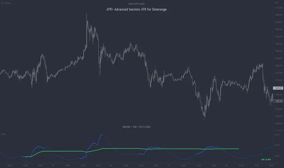
ATR+ Advanced Sessions ATR for DaterangeATR+ Advanced Sessions ATR for Daterange
The ATR+ adds the following additional filters to the stock ATR indicator by Tradingview:
- Calculates the overall average ATR for a user defined daterange, optionally filtered by trading session and selected weekdays, presented as a secondary line over the standard ATR line.
- Basic ATR line, with colour highlight to indicate the selected sessions, days and timeframe being calculated by the average ATR+ line.
- Average ATR+ line indicating the average of all ATRs within the defined timeframe, optionally filtered by instances of a selected trading session and selected weekdays.
- Customisable appearance.
- The ATR+ also includes the basic ATR configuration options typically found in the standard ATR by Tradingview, including period length and smoothing type. Defaults are set to the factory standards: 14 length, RMA smoothing type.
What Is the Average True Range (ATR)?
The ATR is a technical analysis tool that measures market volatility by decomposing the entire range asset price for that period. Investopedia describes the ATR as follows:
"The average true range (ATR) is a technical analysis indicator, introduced by market technician J. Welles Wilder Jr. in his book New Concepts in Technical Trading Systems, that measures market volatility by decomposing the entire range of an asset price for that period.
The true range indicator is taken as the greatest of the following: current high less the current low; the absolute value of the current high less the previous close; and the absolute value of the current low less the previous close. The ATR is then a moving average, generally using 14 days, of the true ranges."
For more information on the ATR and its calculations and use cases, see here:
Investopedia link here.
Tradingview link here.
Note
The indicator may time out if the number of bars being calculated is too long. If this happens, you will need to reduce the datetime range, or increase the chart timeframe in order to reduce the number of bars being calculated and the indicator will attempt to recalculate.
Поиск скриптов по запросу "range"
Asteroid Belt SpaceManBTCAsteroid Belt SpaceManBTC
Asteroid Belt is a trend analysis tool that provides 3 areas of importance, upper, lower, and main belt. The belts provide areas
of key interest that will likely cause a reaction on any asset that is being charted.
Within The Belt
There are 2 ways to play the belt, when trending in either direction, entering the belt can be seen as an area to buy a pullback, providing a strong entry in the trend. The Upper Belt will suffice in the strongest of trends, the middle of the belt indicates a trend that is still strong. A tap of the lowest belt is a weaker trend but often the bottom of any uptrend.
The other way to play the belt from within is play the range from one belt to the other usually the lower belt to the upper belt for a full range play is successful and the mid belt should be used to take partial profits/determine the strength of the move to the other side of the belt.
Responsiveness
3 Types of responsiveness, Fast, Slow and Normal. Slow being the default as its my preffered. The Slow belt will highlight entries with higher probability of causing reaction.
Normal is the best for reliable entries with less patience, it can be recommended for those who are faster to react to directional changes.
Fast belt should only really be used on the Higher timeframe trends as their pull backs can take significantly longer and therefore provides a reliable entry for a quicker than usual high time frame execution.
Dynamic Colors
This is a simple calculation which will be advanced in the future, it can be used to determine the strength of a trend in the belt, highlighting uptrend and downtrends when enabled. Can be disabled in settings.
Auto Aggregator is the primary difference by providing its own calculations very different to how previous auto calculations have worked in spacemanbtc indicators, this aggregator is a work in progress but should produce results that can be replicated accross all coins. Doing so allows for chart by chart switching and is useful for anyone who is in need of quick trend analysis. This can be disabled for manual fine tuning. On by default for new users to learn with.
To Do:
Add outer reversion belts for a full trading system.
Improve dynamic coloring logic.
Improve Auto Aggregator logic.

Rescaled RangeRescaled Range is an implementation of the fractal rescaled ranges developed by Harold Edwin Hurst and Benoit Mandlebrot.
Settings include:
“Window Size” - the number of time periods in a window over which price changes are analyzed. This will generally correspond to your trading horizon and defaults to 15.
“Number of Windows” - the number of “Window Size” intervals to average the rescaled range value over. By looking at a number of such periods, the study captures potential volatility that may have occurred in the recent past. This should be set long enough to capture the current trend (defaults to 63), but not so long to include volatility regimes no longer in play.
Each window in the average is offset by 1 time period from the the others - like a moving average.
This study plots two lines - “Rescaled Range High” which indicates overbought conditions when the price moves above it and “Rescaled Range Low” which indicates oversold conditions when the price moves below it.
This study builds upon the bridge range work of Joe Catanzaro (joecat808) and Caleb Sandfort (calebsandfort). Bridge ranges are used to position the rescaled range with respect to the closing price.
Note: Your time series must have (Window Size + Number of Windows) or more periods of data to complete this study. For example, using the defaults, your time series should have (15+63) = 78 periods or more of data.

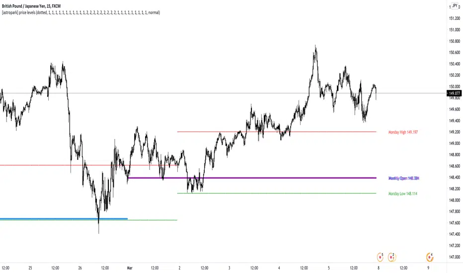
[astropark] price levelsDear Followers,
today another awesome Analysis Tool, that you can use in your trading journey: Price Levels !
Are you a range trading player? a scalper? or maybe a day-trader or a swing-trader? This is for you then. Indeed it's for everyone.
This indicator works on every timeframe, market and pair.
It keeps track of recent important levels generated by price action:
Monday high, low and middle range level
Tuesday high and low
Wednesday high and low
Thursday high and low
Friday high and low
Weekly open, high and low
Monthly open, high and low
Yearly open, high and low
Previous weekly open, high and low
Previous monthly open, high and low
Previous yearly open, high and low
You can:
choose price levels to hide and show
change each level color / thickness / display style (solid or dotted)
choose to show or hide price labels and change their size
Why such indicator should be helpful? How can I use it to do profit?
In multiple ways! Let's talk about Monday Range :
when Monday range is formed, price acceptance below Monday low is a bearish signal, so will more likely want to short / sell
equally price acceptance above Monday high is a bullish signal, so will more likely want to long / buy
it can happen that Monday high is simply retested, with price not being able to stay above it: this is called a retest (in case of a simple wick) or a deviation (in case of price staying above the level just for some candles) and what usually happens is price falling back to Monday middle range level and even back to Monday low.
the opposite can happen of course: you will become bullish if Monday low is tested or a deviation appears below Monday low: price tends to bounce on such occasions back to Monday middle range or even Monday high
Tuesday is usually a marker day within a trading week:
if Monday was pretty bullish, Tuesday high may mark the weekly top, following some red days
if Monday was pretty bearish, Tuesday low may mark the weekly bottom, following some green days
Thursday is the day when big players start to take profits, as the trading week is going to end the next day, so in an all-green week Thursday may be a red one, while in an all-red week it may be a bullish day
Thursday is the day when big players start to take profits, as the trading week is going to end the next day:
in an all-green week, Thursday may be a red one and it's low tends to mark the weekly low
while in an all-red week, it tends to be a bullish day, so here you will refill your shorts for the next blooding day
Let's talk now about the Weekly, Monthly and Yearly price levels : here it is the interesting part for Swing Traders
Weekly open is usually a defining level: on retest, if price keeps staying below then more downside is expected, if price keeps staying above then more upside is expected (similarly to what we said about Monday high and low)
Monthly and Yearly open price levels are usually a "no-brainer" buy level in a bullish trend or equally a sell level in a bearish trend: in this scenarios, a deviation structure is even more powerful in term of price reaction and efficiency
We trade Weekly, Monthly and Yearly high and low price levels as explained for the Monday high and low, but with a swing traders perspective (so a medium-long term trade)
Previous Weekly/Monthly/Yearly price levels are usually very useful as targets in your trades
Here below some screenshots that resumes what said above.
Weekly Open as support (bullish) and Monday High deviation (bearish)
Tuesday High, Weekly Open failing as support: bearish
Monday Low deviation (bullish)
Price Acceptance above Monday High and Weekly Open (bullish)
Yearly Open retests as buy opportunities
Deviation below Monthly Open (bullish), Price Acceptance below Monthly and Yearly Open (bearish)
This is a premium indicator , so send me a private message in order to get access to this script.
Consolidation Ranges [kingthies] Consolidation Range Analysis
Published by Eric Thies, January 2021
█ Indicator Summary
This tool calculates, analyzes and plots the visualization of a relative range over a given period of time
By adding to charts, users are enabled to see the impulsive nature of market cycles, along with their efforts to consolidate thereafter
The default period is 30, and should be adjusted to users preference
The default input is the current close price, on the chosen timeframe of the chart
█ Script Source
//
//@version=4
//© kingthies || This source code is subject to the terms of the Mozilla Public License 2.0 at mozilla.org
study("Consolidation Ranges ", shorttitle="CR ", overlay=true)
// !<------ User Inputs ----->
src = input(close, title='Range Input (Default set to Close'), lengthEMA=input(30,title='Length'),zoneToggle = input(true, title="Toggle Zone Highlights"), iCol = color.new(#FFFFFF, 100),
// !<---- Declarations & Calculations ---- >
trndUp = float(na),trndDwn = float(na), mid = float(na), e = ema(src, lengthEMA)
trndUp := src < nz(trndUp ) and src > trndDwn ? nz(trndUp ) : high, trndDwn := src < nz(trndUp ) and src > trndDwn ? nz(trndDwn ) : low, mid := avg(trndUp, trndDwn)
// !< ---- Plotting ----->
highRange = plot(trndUp == nz(trndUp ) ? trndUp : na, color=color.white, linewidth=2, style=plot.style_linebr, title="Top of Period Range")
lowRange = plot(trndDwn == nz(trndDwn ) ? trndDwn : na, color=color.white, linewidth=2, style=plot.style_linebr, title="Bottom of Period Range")
xzone = plot(zoneToggle ? src > e ? trndDwn : trndUp : na, color=iCol, style=plot.style_circles, linewidth=0, editable=false)
fill(highRange, xzone, color=color.lime,transp=70), fill(xzone, lowRange, color=color.red,transp=70)
//

@thecf RSI + 12-EMA + Magic 89-EMA + RangesThis RSI has a couple modifications. It works with bullish and bearish control zones and implements both a 12 EMA as well as the "magic" 89 Moving Average.
First, the ranges. Whenever the RSI moves above 65 the bulls are in control.
Whenever the RSI moves blow 45 the bears are in control. Everything in between in neutral. Traders can use these levels for information on strength of either bulls or bears and also for support and resistance .
Both EMAs are best used for crossovers, as well as support and resistance .
The idea for the "magic" 89 moving average, originally stems from Fibonacci values that some traders like to use for support and resistance on price.
From observation, it holds more information though, when used as a moving average of the RSI and in combination with a 12 EMA .
When the RSI crosses above the 89 moving average, it can be interpreted as a potential shift in trend up. The 12 EMA then shortly afterwards usually confirms it by also crossing above the 89 moving average.
The 89 moving average can also signalize a potential shift in trend coming up when reaching 70.
The magic MA works best on timeframes like the daily and upwards.
For more information about the indicator feel free to leave a comment.

Kalihari_Brothers_PRBBasic principle support ,resistance and flipping of support n resistance (support becomes resistance ,resistance becomes support)..
DRB- Previous Day Range High ( PDH ) and Low ( PDL )
WRB- Previous Week Range High (PWH) and Low (PWL)
MRB - Previous Monthly Range High (PMH) and Low (PML)
It gives Trending Market Signal for bullish (price breaks PDH range continuous in up direction and make support)
and similarly for bearish (price breaks PDL range continuous in down direction and make resistance)..
For sideways/Non-trending market stay with in a range not break high and low..(stay away from it)..
DRB act as minor support and resistance ..
WRB and MRB act as major support and resistance ...

Decision_Pointclassic decision point for intraday
CDH- current day high(not fixed range)
CDL- current day low (not fixed range)
CDO- current day open(fixed range)
PDH- previous day high(fixed range)
PDL- previous day low(fixed range)
PDC- previous day close(fixed range)
above all are decision points where market reaction takes place..
make your own strategy for intraday using DP...
Volume Range EventsChanges in the feelings (positive, negative, neutral) in the market concerning the valuation of an instrument are often preceded with sudden outbursts of buying and selling frenzies. The aim of this indicator is to report such outbursts. We can see them as expansions of volume, sometimes 10 times more than usual. and as extensions of the trading range, also sometimes 10 times more than usual (e.g. usual range is 10 cent suddenly a whole dollar.) The changes are calculated in such a way that these fit between plus and minus 100 percent, the bars are scaled in some sort of logarithmic way. The Emoline is the same as the one in the True Balance of Power indicator, which I already published
ONLY RISES ARE EVENTS
Sometimes analysts are tempted to give meaning to low volume or small ranges. These simply mean that the market has little interest in trading this instrument. I believe that in such cases the trader needs to wait for expansion and extension events to happen, then he can make a better guess of where the market is heading. As events often mark the beginning or ending of a trend, this indicator provides an early and clear signal, because it doesn’t bother us about non-events.
WHAT IS USUAL?
If the algorithm would use an average as a normal to scale volume or range events, then previous peaks will act as spoilers by making the average so high that a following peak is scaled too small. I developed a function, usual() , that kicks out all extremes of a ‘population of values’ and which returns the average of the non-extreme values. It can be called with any serial. This function is called by both algorithms that report volume and range peaks, which guarantees that the results are really comparable. As this function has a fixed look back of 8 periods, we might state that ‘usual’ is a short lived relative value. I think this doesn’t matter for the practical use of the indicator.
COLORING AND INTERPRETATION
I follow the categories in the ‘Better Volume Indicator’, published by LeazyBear, these are:
1. Climactic Volumes, event >40 % (this means peak is 1.5 X usual)
LIME: Climax Buying Volume, direction up, range event also > 30 %
RED: Climax Selling Volume, direction down, range event also > 30 %
AQUA: Climax Churning Volume, both directions, range event < 30%
2. Smaller Volumes, event <40 %
GREEN: Supportive Volume, both directions, if combined with range event
BLUE: Churning Volume, both directions, if not combined with range event (Professional Trading)
3. Just Range Events
BLACK histogram bars (Amateurish Trading)

Key Candle Range [NextPercent]Key Candle Range
This indicator draws persistent horizontal levels from a user-selected candle on any chosen timeframe. It is designed to mark a key reference range and project it forward, allowing traders to monitor reactions to that candle’s high and low.
Features:
• Select any specific candle by date and time
• Works on a custom timeframe independent of the chart
• Automatically projects the selected candle’s high and low into the future
• Fully customizable line color, width, and style
• Clean visual reference for breakout, rejection, or range trading
How it works:
The script finds the candle that matches the chosen timestamp on the selected timeframe. Once identified, it draws two horizontal lines at that candle’s high and low and extends them to the right. These levels remain visible as long-term structural references.
Use cases:
• Marking important session candles (open range, news candle, etc.)
• Tracking breakout levels
• Identifying support and resistance zones
• Anchoring trade bias to a key event candle
Tip:
Use higher timeframes to mark major structural levels, or intraday timeframes to track session-based ranges.

CRT Market Structure Toolkit v2What This Script Does
CRT Market Structure Toolkit v2 is a contextual market analysis tool designed to help traders visualize liquidity, market structure, and session-based behavior on the chart.
This script does not generate trade signals and does not automate entries or exits.
Its purpose is to provide objective reference levels and market context that traders can integrate into their own discretionary trading models.
Why This Is NOT a Simple Indicator Mashup
Although this script combines multiple analytical components, each module serves a specific role within a single, unified market structure framework.
All components are designed to work together to answer three core questions:
Where is liquidity located?
When has liquidity been taken (swept)?
During which sessions is price more likely to expand or react?
This makes the script a cohesive toolkit, not a random collection of indicators.
Core Concepts Used
This script is based on widely used market structure and liquidity concepts, including:
Previous Day High / Low (daily liquidity pools)
Higher Timeframe Highs & Lows
Liquidity sweeps (wick-based stop runs)
Fair Value Gaps (price imbalance)
Balanced Price Ranges (overlapping imbalances)
Session timing and volatility windows (Killzones)
Module Explanation
1. Previous Day High / Low (PDH / PDL – New York Session)
Tracks the full 24-hour New York trading day
Projects previous day highs and lows forward
Detects when price wicks above or below these levels
Swept levels remain visible and change style for clarity
These levels are commonly used to identify daily liquidity targets.
2. Higher Timeframe Highs & Lows
Allows the user to select any higher timeframe (e.g. 4H)
Projects completed HTF highs and lows onto lower timeframes
Detects liquidity sweeps on these HTF levels
Each level maintains its own sweep state
This helps traders align lower timeframe execution with higher timeframe structure.
3. NY Midnight Open
Marks the New York midnight opening price
Acts as a daily equilibrium reference
Resets automatically every New York trading day
This level is often used for bias and mean reversion analysis.
4. Fair Value Gap (FVG) Detection & Nearest FVG Selection
Identifies bullish and bearish Fair Value Gaps using a 3-bar displacement model
Filters FVGs based on:
Lookback period
Minimum price gap
User-defined mitigation rules
Displays only the nearest valid FVG to current price
Detects Balanced Price Ranges (BPR) when bullish and bearish FVGs overlap
This module helps visualize price imbalance and potential reaction zones, not entries.
5. Killzones (Session-Based Analysis)
Highlights user-defined time windows (sessions)
Draws dynamic boxes that expand with price
Helps traders focus on periods where volatility and liquidity are typically higher
Sessions are fully configurable.
Liquidity Sweep Configuration
Lower Timeframe (LTF) sweeps can be filtered by specific hours or minute ranges, allowing traders to focus only on liquidity events relevant to their strategy.
Daily PDH / PDL levels are fixed to the full New York trading day and are not adjustable, ensuring consistency.
How This Script Is Intended To Be Used
This script is meant to be used as a visual decision-support tool, alongside:
Price action analysis
Risk management rules
A personal trading plan
It does not replace trader judgment and should not be used in isolation.
Disclaimer
This script is provided for educational and analytical purposes only.
It is not a signal indicator, does not provide trading advice, and does not guarantee any trading outcome.
All trading decisions and associated risks remain entirely the responsibility of the user.
The developer assumes no liability for losses or damages resulting from the use of this script.
Final Notes for Moderation
This script is original in structure and implementation
All components are intentionally integrated into a single market structure framework

10 Youtube Opening Range Strategies + Backtest 1. Quick Flip Scalper
A strategy centered on fading or following the initial move relative to the Opening Range (OR).
LONG Rules:
Reversal Mode: If the Opening Range is Bearish (Red), enter Long when price drops below the Opening Range Low (ORL).
Continuity Mode: If the Opening Range is Bullish (Green), enter Long when price drops below the Opening Range Low (ORL) (Buying the deep pullback/trap).
SHORT Rules:
Reversal Mode: If the Opening Range is Bullish (Green), enter Short when price breaks above the Opening Range High (ORH).
Continuity Mode: If the Opening Range is Bearish (Red), enter Short when price breaks above the Opening Range High (ORH) (Selling the deep pullback/trap).
2. First Candle Scalper
Identical to the Quick Flip Scalper but restricts entries to the very first retest only.
LONG Rules:
Same as Quick Flip Long, but only triggers once per session.
SHORT Rules:
Same as Quick Flip Short, but only triggers once per session.
3. Smart Money Trap (SMT)
Identifies a "fakeout" breakout followed immediately by a reversal candlestick pattern.
LONG Rules:
Condition: The previous candle low was below the ORL, but the candle closed back inside (above ORL).
Trigger: Must have a Bullish Engulfing or Bullish Rejection pattern closing above the ORL.
SHORT Rules:
Condition: The previous candle high was above the ORH, but the candle closed back inside (below ORH).
Trigger: Must have a Bearish Engulfing or Bearish Rejection pattern closing below the ORH.
4. Trident Pattern (TG Capital)
A London-session exclusive strategy requiring a Fair Value Gap (FVG) and a Doji confirmation.
LONG Rules:
Filter: Price is Above the 200 EMA (if enabled).
Setup: A Bullish FVG forms.
Confirmation: A Doji candle wicks down into the 50% level of the FVG.
Trigger: Enter on the next candle close.
SHORT Rules:
Filter: Price is Below the 200 EMA (if enabled).
Setup: A Bearish FVG forms.
Confirmation: A Doji candle wicks up into the 50% level of the FVG.
Trigger: Enter on the next candle close.
5. OTE Framework (MBB Trader)
Simulates an Optimal Trade Entry by combining a Liquidity Sweep with a Market Structure Shift (SMR).
LONG Rules:
Sweep: Price drops below the lowest low of the last 20 candles.
Structure: A Bullish SMR forms (Low → High → Lower Low → Higher High).
SHORT Rules:
Sweep: Price breaks above the highest high of the last 20 candles.
Structure: A Bearish SMR forms (High → Low → Higher High → Lower Low).
6. Liquidity Trap (Marco Trades)
A contrarian strategy that buys/sells purely on sweeps of major structural levels.
LONG Rules:
Trigger: Price sweeps (drops below) the lowest low of the last 50 candles.
SHORT Rules:
Trigger: Price sweeps (breaks above) the highest high of the last 50 candles.
7. Trojan Horse (Trader Mayne)
Uses Trend EMAs (50 & 200) to identify direction, then enters on a Lower Timeframe Breaker.
LONG Rules:
Trend: 50 EMA > 200 EMA (Uptrend).
Trigger: Price sweeps a recent 10-candle low, then immediately breaks a recent 5-candle high.
SHORT Rules:
Trend: 50 EMA < 200 EMA (Downtrend).
Trigger: Price sweeps a recent 10-candle high, then immediately breaks a recent 5-candle low.
8. Simplified SMT (9:30 Range)
Focuses on the 9:30 AM range. Waits for a breakout and a confirmed failure to sustain it.
LONG Rules:
Context: Price previously broke above the ORH.
Trigger: Price returns to the ORH (Retest) with a Bullish Engulfing/Rejection pattern.
SHORT Rules:
Context: Price previously broke below the ORL.
Trigger: Price returns to the ORL (Retest) with a Bearish Engulfing/Rejection pattern.
9. 9:30 One-Candle (Scarface)
Uses the high/low of the single 9:30 candle as the range.
LONG Rules:
Setup: Price closes above the 9:30 High.
Trigger: Price pulls back and touches/dips into the 9:30 High (Retest).
SHORT Rules:
Setup: Price closes below the 9:30 Low.
Trigger: Price pulls back and touches/wicks into the 9:30 Low (Retest).
10. London Breakout (Joovier)
Based on the 3 AM - 9 AM EST box.
LONG Rules:
Trigger: A candle's Body (Open and Close) forms completely above the Box High after the session opens.
SHORT Rules:
Trigger: A candle's Body (Open and Close) forms completely below the Box Low after the session opens.
⚠️ DISCLAIMER & LIMITATION OF LIABILITY
1. NO AFFILIATION / INDEPENDENT PROJECT This script is an independent coding project created solely for testing, research, and entertainment purposes. The creator of this indicator is not associated, affiliated, endorsed by, or in any way connected to the strategy authors or influencers mentioned within the tool (including but not limited to TG Capital, MBB Trader, Marco Trades, Trader Mayne, Scarface, or Joovier).
The strategy names are used strictly for identification purposes to credit the original concept creators.
This code represents an independent interpretation of public trading concepts. It may not reflect the exact, proprietary, or private methods taught by these individuals.
This is not an official product from any of the aforementioned parties.
2. FOR EDUCATIONAL PURPOSES ONLY This indicator is strictly for educational and informational purposes. It is not a signal service and does not constitute investment, financial, or trading advice. The buy/sell labels generated by this script are merely visual representations of specific code logic and should not be interpreted as instructions to execute trades.
3. EXCLUSION OF LIABILITY By using this script, you explicitly agree that:
The creator assumes no responsibility or liability for any direct, indirect, consequential, or incidental losses or damages resulting from the use of this tool.
You engage in trading entirely at your own risk.
You release the creator from any legal responsibility regarding your trading activities or financial results.
4. HYPOTHETICAL PERFORMANCE The statistics displayed on the "Dashboard" (Win Rate, P&L, etc.) are hypothetical and based on historical backtesting data.
Past performance is not indicative of future results.
These results do not account for slippage, spreads, commission fees, or real-time liquidity issues.
Strategies that performed well in the past may fail in current or future market conditions.
5. HIGH-RISK WARNING Trading in financial markets (Stocks, Forex, Crypto, Futures) involves a high degree of risk and is not suitable for all investors. You could lose some or all of your initial investment. You should not trade with money that you cannot afford to lose.
IF YOU DO NOT AGREE WITH THESE TERMS, DO NOT USE THIS SCRIPT.

Opening Range (RTH, Globex, Tokyo, London) [Tradeisto]This indicator provides a comprehensive solution for monitoring Opening Ranges across major global trading sessions—RTH (New York), Globex, Tokyo, and London, within a single script. It is designed for stability and precision on all timeframes.
Key Features
Multi-Session Support: Track four distinct opening ranges simultaneously:
RTH (New York): Auto-detects based on asset class:
Indices (NQ, ES, YM): 09:30 NY
Metals (Gold/Silver): 08:20 / 08:25 NY
Energy (Oil/NatGas): 09:00 NY
Currencies & More: Automatically sets the correct pit open.
Globex: 18:00 America/New_York
Tokyo: 09:00 Asia/Tokyo
London: 08:00 Europe/London
Native Timezone Handling:
Automatically adjusts for Daylight Saving Time (DST) using native Pine Script timezones.
Smart Labeling: Evening sessions (Globex, Tokyo) display the correct "Trading Day" date (e.g., Sunday evening labeled as Monday).
Hybrid Data Engine:
Ensures stability by automatically switching data fetching methods based on your chart's timeframe.
Zoom In: Uses request.security_lower_tf for high-resolution data when the Chart Timeframe > Session Duration.
Zoom Out: Uses standard request.security when the Chart Timeframe <= Session Duration, preventing runtime errors.
Customizable Durations:
Independently configure durations for each session (30s, 1m, 5m, 15m, 30m).
How to Use
Add Opening Range to your chart.
Open Settings to enable or disable specific sessions.
Select the desired Duration for each session.
Customize colors and borders to fit your chart theme.

Volatility Ranges LABDescription This is the "LAB" edition of a comprehensive Volatility Analysis System designed for precision trading. It combines multi-timeframe statistical ranges (ADR, AWR, AMR) with a real-time Data Dashboard to visualize expected market moves.
Underlying Concepts & Methodology The indicator calculates volatility based on historical averages using either SMA or RMA (Wilder's Smoothing).
Anchoring: Projects ranges from the opening price. Includes a specialized NY Midnight Open (00:00 EST) anchor for accurate Forex alignments.
Projections: Plots standard volatility limits (100%) and exhaustion extensions (up to 200%) to identify overextended price action.
Dashboard: A built-in panel monitors the current status of all three timeframes (Daily, Weekly, Monthly), acting as a risk scanner.
Key Features
3 Timeframes: Simultaneous Daily (ADR), Weekly (AWR), and Monthly (AMR) levels.
Expansion Zones: Optional levels (125%, 150%, 200%) to spot extreme reversals.
Smart Dashboard: Color-coded table indicating risk levels (Traffic Light system).
Customization: Full control over colors, line styles, and label visibility.
How to Use
Targeting: Use the 100% lines as statistical take-profit zones.
Reversals: When price reaches expansion zones (e.g., 125% of ADR), the probability of a reversal increases significantly.
Dashboard: Use it to check if the asset has already consumed its average range for the day/week.
To comply with House Rules regarding non-English UI, here is the translation of the script's settings menu:
0. Rótulos (Labels)
Tamanho do Texto = Text Size
Mostrar Período/Nome/Preço = Show Period/Name/Price
Mostrar Variação Real % = Show Real % Variation
1. Geral (General)
Escala do Gráfico = Chart Scale (Linear/Log)
Método de Cálculo = Calculation Method (SMA/RMA)
2. ADR (Daily Settings)
Ativar ADR = Enable ADR
Período Média = Average Period (Days)
Usar NY Midnight Open = Use NY Midnight Open
Projeção Futura = Future Projection (Bars)
Mostrar Expansões = Show Expansions (125-200%)
Estilo/Espessura = Style/Width
Cor Máxima/Mínima = High/Low Color
Mostrar Terços/25%/50% = Show Thirds/25%/50%
3. AWR (Weekly Settings)
Ativar AWR = Enable AWR
Período Média = Average Period (Weeks)
Usar Abertura Semanal = Use Weekly Open Ref
4. AMR (Monthly Settings)
Ativar AMR = Enable AMR
Período Média = Average Period (Months)
5. Dashboard
Mostrar Dashboard = Show Dashboard
Tema de Fundo = Background Theme (Dark/Light)
Unidade de Medida = Unit (Points/Pips)
Psicologia das Cores = Color Psychology (Traffic Light/Heatmap)
Posição na Tela = Screen Position

Average Daily Range by EleventradesThe Average Daily Range (ADR) indicator helps traders measure how much of the current day’s range has already been completed and how much movement may still be available.
This tool calculates the average range of previous daily candles and compares it with the current day’s price action. It displays how many points of the ADR have been consumed, how much remains, and the percentage of the daily range already covered. This allows traders to better judge whether price is still expanding or approaching exhaustion.
Key Features:
ADR Consumption Tracking
Shows how much of the daily range has already been used in both points and percentage terms.
Reversal Threshold
A customizable threshold that highlights when price exceeds a defined ADR value, signaling potential exhaustion or reversal zones.
Mean Reversion Logic
When price reaches a user-defined percentage of the ADR, the indicator helps identify areas where price may revert back toward the daily range.
ADR Exceeded Alert
Displays a message when price exceeds 100% of the average daily range.
Information Table
A clean table that summarizes ADR values, consumed range, remaining range, and percentage data for quick reference.
ADR Projection Levels
Projected upper and lower ADR levels are plotted using visual guide lines, helping traders see where the daily range may extend before exceeding typical limits.

[turpsy] Midnight Opening Range-Fractal Midnight Open Range-Fractal Combined Trading System
Overview
This indicator combines Midnight Opening Range (MOR) analysis with HTF candle structure and fractal patterns to provide a comprehensive intraday trading framework. Unlike simple mashups, this system integrates three complementary methodologies that work together to identify high-probability trading zones.
Core Components & Synergy
1. MOR (Midnight Opening Range) Indicator
- Tracks the first 30 minutes of each trading day (00:00-00:30)
- Draws historical and current session boxes with quartile levels (25%, 50%, 75%)
- Custom opening price lines for key market times (NY Open 9:30, London Close, etc.)
- Concept:
Price tends to respect the opening range boundaries; quartiles act as support/resistance
2. HTF (Higher Timeframe) Candles
- Displays up to 6 higher timeframe candles alongside your chart
- Shows Fair Value Gaps (FVG) and Volume Imbalances (VI)
- Presents First Presented FVG (PFVG) - the initial gap after a fractal
- Concept:
HTF structure provides context for LTF entries; FVGs are magnetic price targets
3. Fractal Pattern Detection with CISD
- Identifies swing highs/lows using HTF candle structure
- CISD (Change in State of Delivery) lines mark confirmed fractal breaks
- Chart sweeps show liquidity grabs
- Concept: Fractals mark key market structure; CISD confirms directional bias
4. Killzones & Session Analysis
- Asia, London, NewYork AM/PM, and Lunch sessions
- Session highs/lows with pivot tracking
- Day/Week/Month opens and separators
- Concept: Specific sessions show characteristic volatility and directional behavior
5. ADR/CDR Analysis
- Average Daily Range and Current Daily Range tracking
- Shows percentage of ADR completed
- Concept: Helps gauge if there's room for continuation or if exhaustion is likely
How They Work Together
1. Context: It uses HTF candles and MOR boxes to identify the bigger picture structure
2. Timing: It uses Killzones to show when institutional activity is highest
3. Entry: It uses Fractals with CISD confirm structure breaks; FVGs provide entry zones
4. Risk Management: ADR/CDR helps set realistic profit targets and assess if move is extended
Original Contributions
This script significantly improves upon the base components by:
- Integrating 1-minute data feed for accurate Midnight Open Range calculations on all timeframes
- Adding PFVG detection synchronized with fractal patterns
- Creating logarithmic midpoint calculations between HTF candles
- Implementing chart sweep detection for liquidity analysis
- Adding CISD projection lines at 0.5, 1.0, 1.5, 2.0 extensions
How to Use
1. Enable desired HTF timeframes and MOR settings
2. Watch for PFVG formation after HTF candle closes
3. Look for CISD line breaks during killzone sessions
4. Enter at FVG mitigation zones aligned with MOR quartiles
5. Monitor ADR% to gauge move potential
Credits
- HTF Candles base structure: fadizeidan & tradeforopp
- Midnight opening range: trades-dont-lie
- I made the Significant modifications and integration

Session Range Control [PointAlgo]Session Range Control (SRC)
The Session Range Control (SRC) indicator provides a structured view of intraday price behavior by tracking where the current price sits within the session’s high–low range and how today’s volatility compares to the Average Daily Range (ADR). It combines range analytics, momentum context, volatility interpretation, and visual cues to help traders understand session strength and shifts in intraday conditions.
Core Concept
Every trading session forms a unique high and low. SRC continuously reads these values and calculates the Position in Range, expressed on a scale from 0% to 100%:
0% → Price at Day Low
100% → Price at Day High
50% → Mid-range equilibrium
By normalizing price into a percentage, traders can quickly interpret where market pressure is concentrated during the session.
Trend Zones and Market State
SRC divides the range into logical zones to show the likely sentiment of the session:
1. Strong Uptrend Zone (Above Threshold)
When price consistently holds above the user-defined upper threshold (e.g., 60%), the indicator marks a Strong Uptrend.
This typically reflects:
Persistent intraday buying pressure
Price acceptance near the upper part of the range
Reduced likelihood of deep pullbacks
2. Strong Downtrend Zone (Below Threshold)
When price remains below the lower threshold (e.g., 40%), SRC signals a Strong Downtrend, indicating:
Dominant intraday selling
Consistent pressure keeping price near session lows
3. Bullish / Bearish Zones
Between the midline and strong thresholds, SRC displays softer trend zones:
Above 50% = Bullish Zone
Below 50% = Bearish Zone
These zones help classify whether price is trending, balanced, or drifting.
4. Neutral Territory
When price hovers around the mid-level without conviction, the indicator treats it as a neutral or undecided phase.
Signal Logic :
SRC includes built-in momentum shift signals based on range transitions:
Long Signal
Triggered when price crosses upward through 50%, often showing:
A shift from intraday weakness to strength
Buyers gaining control of the session
Short Signal
Triggered when price crosses downward through 50%, suggesting:
Loss of intraday strength
Sellers taking control
These signals help highlight potential turning points inside the session.
Extreme Levels :
SRC highlights the top and bottom 10% of the range:
> 90% = Extreme High (Overbought intraday condition)
< 10% = Extreme Low (Oversold intraday condition)
These conditions can be useful for identifying overextended movements or potential reaction zones.
ADR Comparison and Volatility Context :
The indicator also measures how today’s price range compares to the Average Daily Range (ADR):
Range Expanding: Today’s range is significantly larger than the ADR
Indicates heightened volatility
Often associated with trending or breakout environments
Range Compressing: Today’s range is much smaller
Suggests low volatility
Common before breakout phases
Characteristic of consolidation or balanced markets
This volatility context helps traders assess whether the session is behaving within normal boundaries or deviating significantly.
Dashboard Overview :
When enabled, the dashboard summarizes key intraday metrics in a structured table:
Trend status (Strong Uptrend, Strong Downtrend, Bullish, Bearish, Neutral)
Range position (%)
Signal status (Long Cross, Short Cross, Extreme High/Low, or None)
Day range calculation
Range vs ADR (%)
Day High / Day Low
Current price level
Simplified action label based on current conditions
This provides a quick reference system to interpret both trend and volatility at a glance without analyzing the full chart visually.
Visual Elements
SRC includes:
Colored dynamic plot for easy trend recognition
Horizontal reference lines at key levels (0%, 50%, 100%, strong-trend thresholds)
Background shading during extreme zone conditions
A separate ADR comparison plot
These visuals ensure the indicator remains intuitive regardless of chart style or timeframe.
Alerts
The script includes alert conditions for:
Long cross
Short cross
Strong trend detection
Extreme high / extreme low
These allow users to automate notifications during key market events without manually monitoring the chart.
Customization Options
Users can configure:
ADR length
Strong trend thresholds
Dashboard visibility
Dashboard position on chart
This makes SRC adaptable to different trading instruments and intraday styles.
Usage Notes
Works best on intraday timeframes where session boundaries are clearly defined.
Designed for analytical interpretation—trend bias, volatility phase, and range structure.
Can complement other tools such as moving averages, volume, or market structure analysis.
Disclaimer :
This indicator is intended for chart analysis and educational purposes only.
It does not generate financial, investment, or trading advice.
Users should validate signals with additional research and apply proper risk management.

Forex Session TrackerForex Session Tracker - Professional Trading Session Indicator
The Forex Session Tracker is a comprehensive and visually intuitive indicator designed specifically for forex traders who need precise tracking of major global trading sessions. This powerful tool helps traders identify active market sessions, monitor session-specific price ranges, and capitalize on volatility patterns unique to each trading period.
Understanding when major financial centers are active is crucial for forex trading success. This indicator provides real-time visualization of the Tokyo, London, New York, and Sydney trading sessions, allowing traders to align their strategies with peak liquidity periods and avoid low-volatility trading windows.
---
Key Features
📊 Four Major Global Trading Sessions
The indicator tracks all four primary forex trading sessions with precision:
- Tokyo Session (Asian Market) - Captures the Asian trading hours, ideal for JPY, AUD, and NZD pairs
- London Session (European Market) - Monitors the most liquid trading period, perfect for EUR, GBP pairs
- New York Session (American Market) - Tracks US market hours, essential for USD-based currency pairs
- Sydney Session (Pacific Market) - Identifies the opening of the trading week and AUD/NZD activity
Each session is fully customizable with individual color schemes, making it easy to distinguish between different market periods at a glance.
🎯 Session Range Visualization
For each active trading session, the indicator automatically:
- Draws rectangular boxes that highlight the session's time period
- Tracks and displays session HIGH and LOW price levels in real-time
- Creates horizontal lines at session extremes for easy reference
- Positions session labels at the center of each trading period
- Updates dynamically as new highs or lows are formed within the session
This visual approach helps traders quickly identify:
- Session breakout opportunities
- Support and resistance zones formed during specific sessions
- Range-bound vs. trending session behavior
- Key price levels that institutional traders are watching
📱 Live Information Dashboard
A sleek, professional information panel displays:
- Real-time session status - Instantly see which sessions are currently active
- Color-coded indicators - Green dots for active sessions, gray for closed sessions
- Timezone information - Confirms your current timezone settings
- Customizable positioning - Place the dashboard anywhere on your chart (Top Left, Top Right, Bottom Left, Bottom Right)
- Adjustable size - Choose from Tiny, Small, Normal, or Large text sizes for optimal visibility
The dashboard provides at-a-glance awareness of market conditions without cluttering your chart analysis.
⚙️ Extensive Customization Options
Every aspect of the indicator can be tailored to your trading preferences:
Session-Specific Controls:
- Enable/disable individual sessions
- Customize colors for each trading period
- Adjust session times to match your broker's server time
- Toggle background highlighting on/off
- Show/hide session high/low lines independently
General Settings:
- UTC Offset Control - Adjust timezone from UTC-12 to UTC+14
- Exchange Timezone Option - Automatically use your chart's exchange timezone
- Background Transparency - Fine-tune the opacity of session highlighting (0-100%)
- Session Labels - Show or hide session name labels
- Information Panel - Toggle the live status dashboard on/off
Style Settings:
- Turn session backgrounds ON/OFF directly from the Style tab
- Maintain clean charts while keeping all analytical features active
🔔 Built-in Alert System
Stay informed about session openings with customizable alerts:
- Tokyo Session Started
- London Session Started
- New York Session Started
- Sydney Session Started
Set up notifications to never miss important market opening periods, even when you're away from your charts.
---
How to Use This Indicator
For Day Traders:
1. Identify High-Volatility Periods - Focus your trading during London and New York session overlaps for maximum liquidity
2. Monitor Session Breakouts - Watch for price breaks above/below session highs and lows
3. Avoid Low-Volume Periods - Recognize when major sessions are closed to avoid false signals
For Swing Traders:
1. Mark Key Levels - Use session highs and lows as support/resistance zones
2. Track Multi-Session Patterns - Observe how price behaves across different trading sessions
3. Plan Entry/Exit Points - Time your trades around session openings for better execution
For Currency-Specific Traders:
1. JPY Pairs - Focus on Tokyo session movements
2. EUR/GBP Pairs - Monitor London session activity
3. USD Pairs - Track New York session volatility
4. AUD/NZD Pairs - Watch Sydney and Tokyo sessions
---
Technical Specifications
- Pine Script Version: 5
- Overlay Indicator: Yes (displays directly on price chart)
- Maximum Bars Back: 500
- Drawing Objects: Up to 500 lines, boxes, and labels
- Performance: Optimized for real-time data processing
- Compatibility: Works on all timeframes (recommended: 5m to 1H for session tracking)
---
Installation & Setup
1. Add to Chart - Click "Add to Chart" after copying the script to Pine Editor
2. Configure Timezone - Set your UTC offset or enable "Use Exchange Timezone"
3. Customize Colors - Choose your preferred color scheme for each session
4. Adjust Display - Enable/disable features based on your trading style
5. Set Alerts - Create alert notifications for session starts
---
Best Practices
✅ Combine with Price Action - Use session ranges alongside candlestick patterns for confirmation
✅ Watch Session Overlaps - The London-New York overlap (1300-1600 UTC) typically shows highest volatility
✅ Respect Session Highs/Lows - These levels often act as intraday support and resistance
✅ Adjust for Your Broker - Verify session times match your broker's server clock
✅ Use Multiple Timeframes - View sessions on both lower (15m) and higher (1H) timeframes for context
---
Why Choose Forex Session Tracker Pro?
✨ Professional Grade Tool - Built with clean, efficient code following TradingView best practices
✨ Beginner Friendly - Intuitive design with clear visual cues
✨ Highly Customizable - Adapt every feature to match your trading style
✨ Performance Optimized - Lightweight code that won't slow down your charts
✨ Actively Maintained - Regular updates and improvements
✨ No Repainting - All visual elements are fixed once the session completes
---
Support & Updates
This indicator is designed to provide reliable, accurate session tracking for forex traders of all experience levels. Whether you're a scalper looking for high-volatility windows or a position trader marking key institutional levels, the Forex Session Tracker Pro delivers the insights you need to make informed trading decisions.
Happy Trading! 📈
---
Disclaimer
This indicator is a tool for technical analysis and should be used as part of a comprehensive trading strategy. Past performance does not guarantee future results. Always practice proper risk management and never risk more than you can afford to lose. Trading forex carries a high level of risk and may not be suitable for all investors.

CRT Full Checklist - Range Logic Trading📊 Professional Trading Dashboard for Range-Based Trading
A comprehensive, multi-column checklist designed for systematic traders who specialize in range trading across multiple currency pairs and instruments. This visual dashboard provides an organized workflow for the Range Logic Trading methodology.
🎯 KEY FEATURES
🔄 Multi-Instrument Range Monitoring
6 customizable columns for different instruments (EUR/USD, GBP/USD, USD/CAD, XAU/USD OA, XAU/USD FX, DXY)
Individual activation/deactivation for each column
Customizable instrument names and colors
📈 Range Trading Decision Framework
R Activa - Active range assessment (SI/NO/N/A)
Direction - Range breakout direction with color-coded options (Alcista/Bajista/Ambas)
Es para Obvio - Clear range setup qualification (SI/NO/N/A)
Rango Operativo - Operational timeframes for range analysis (2-1H to 11-2h)
FS 4H> - 4-hour frame structure within ranges (EUR/GBP/DXY)
⚡ Range Trading Entry System
Buscamos - Dual dropdown system for range levels (High/Low of 1H-4H, Direct Entry)
Objetivo - Range-based targets (Range/High 4H)
Entrada - Multiple range entry conditions (TS R Activa, TS 1H/4H RO)
🚨 Range Trading Risk Management
Red Flag System - Three range-specific warning flags:
Alto/Bajo Correlacionado
Alto/Bajo 4H Inhabilita
R/A Invalidado
🎨 CUSTOMIZATION
Fully customizable colors for all range levels and conditions
Adjustable text sizes (Tiny to Large)
Individual column colors for quick range identification
Professional color coding for range breakouts and rejections
💡 PRACTICAL BENEFITS
Streamlined range trading workflow across multiple instruments
Visual range assessment with color-coded levels
Systematic approach to range identification and breakout trading
Time-saving dashboard for range-bound market conditions
Customizable reminder section with range trading principles
🎯 PERFECT FOR
Range-bound market specialists
Multi-instrument range traders
Systematic breakout traders
Risk-conscious range traders
Traders using Range Logic Trading methodology
Master range trading across multiple instruments with this professional CRT dashboard designed specifically for Range Logic Trading systems!
Note: This indicator is for educational purposes and should be used as part of a comprehensive trading plan. Always practice proper risk management in range trading.

DRACO DateTime Range Box — DELTA📘 Title
DRACO DateTime Range Box — Stable Δ (Fixed Bottom, Extend-Right)
🔹 Short Description
A single stable range box from a custom start date and time.
The box locks its bottom to the first candle’s low, expands the top to the highest high, and accumulates Bars / Volume / Net Δ (buyers vs sellers).
Anchored to time (xloc.bar_time) so it stays stable and does not drift when zooming.
🔹 Full Description
What it does
DRACO DateTime Range Box — Stable Δ draws one clean, session-like box between any two dates and times you choose.
The bottom is fixed to the first in-range candle’s low (never moves).
The top expands dynamically to the highest high within the range.
The indicator accumulates:
• Bars – total candle count
• Volume – summed traded volume
• Net Δ (delta) – buyers vs sellers dominance
All geometry is anchored by real time (xloc.bar_time), ensuring perfect stability during zooming or resizing.
Optional extend-right mode continues the high and low levels into the future as guide lines.
Typical Use Cases
Accumulation / distribution analysis within a fixed time window.
Identifying who dominated the period — buyers (+) or sellers (−).
Spotting large-scale range phases or institutional accumulation.
Using the extended high/low as future support/resistance reference.
Delta Calculation (Proxy)
Δ
𝑏
𝑎
𝑟
≈
𝑉
𝑜
𝑙
𝑢
𝑚
𝑒
×
(
𝐶
𝑙
𝑜
𝑠
𝑒
−
𝑂
𝑝
𝑒
𝑛
)
max
(
𝐻
𝑖
𝑔
ℎ
−
𝐿
𝑜
𝑤
,
𝑡
𝑖
𝑐
𝑘
)
Δ
bar
≈Volume×
max(High−Low,tick)
(Close−Open)
Each bar’s Δ is clamped between −Volume and +Volume.
This provides a lightweight approximation of order-flow delta without needing raw tick data.
🔹 How to Use
Select your preferred Time Zone (Exchange / UTC / Europe/London).
Choose a precise From Date & Time.
Optionally enable Use End Date/Time to fix the end of the range.
Turn on Extend High/Low to the Right if you want future S/R lines.
Observe the bottom label:
Bars | Volume | Net Δ (+/−) (Buyers or Sellers)
🔹 Key Inputs
Date & Time Range
Time Zone — controls timestamp alignment
From — start date and time
Use End Date/Time — optional fixed range end
Box Settings
Border Color / Fill Color while active
Extend High/Low to Right — continues levels beyond the current bar
Bottom Label
Displays live metrics (Bars / Volume / Net Δ)
Customizable text color, background, and size
🔹 Notes & Limitations
Δ here is an approximate proxy, not real order-flow.
For educational and analytical use only — not financial advice.
If the selected range has no candles, the box will not appear.
Refresh the chart after changing the time zone or From/To dates.

ADR - Average Daily Range [KasTrades]This is an Average Daily Range (ADR) indicator.
There are two settings for ADR:
Two Look back period ADR range (e.g. 7 and 14 days)
One Look back period ADR (e.g. 5 days only)
Two day ADR ranges are typically used in equities and index futures whereas one day ADR is typically used in forex.
The opening time by default is 17:00 New York (Eastern) time. The ranges are always calculated from the opening price of the first bar on the respected timeframe.

Sessions [Trade Tribe HQ]Color-coded session ranges with ADR% labels to help you trade smarter, not harder.
This tool marks New York, London, Tokyo, and Sydney sessions, showing their ranges, highs/lows, VWAPs, and ADR%.
🔹 Key Features
Colored session boxes (NY, London, Tokyo, Sydney)
Session highs & lows, VWAP, and trendlines
Dashboard showing active sessions, volume, and %ADR
ADR% labels at session close
🔹 How It Helps
Spot session traps, moves, and reversals faster
Manage expectations using ADR% (no chasing over-extended moves)
Identify overlap zones (London → NY) for volatility spikes
Simplify cycle tracking across global markets
Market Sessions Marker—making it easy to see where the energy has been spent and where opportunity is building next.
Created with ❤️ by TraderChick – part of the Trade Tribe HQ community.
If you found this tool useful, check out my profile for more strategies, classes, and resources.

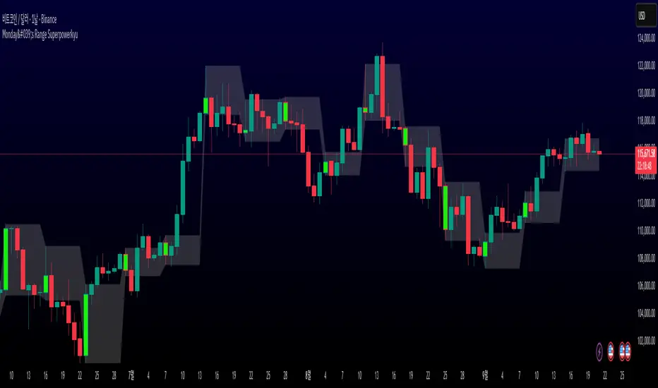
Monday's Range Superpowerkyu🔔 Settings
You can customize the colors and toggle ON/OFF in the indicator settings.
Works on daily, hourly, and minute charts.
Easily visualize Monday’s high, low, and mid-line range.
📌 1. Support & Resistance with Monday’s Range
Monday High: Acts as the first resistance of the week.
◽ Example: If price breaks above Monday’s high after Tuesday, it signals potential bullish continuation → long setup.
Monday Low: Acts as the first support of the week.
◽ Example: If price breaks below Monday’s low, it signals bearish continuation → short setup.
📌 2. Mid-Line Trend Confirmation
Monday Mid-Line = average price of Monday.
Price above mid-line → bullish bias.
Price below mid-line → bearish bias.
Use mid-line breaks as entry confirmation for long/short positions.
📌 3. Breakout Strategy
Break of Monday’s High = bullish breakout → long entry.
Break of Monday’s Low = bearish breakout → short entry.
Place stop-loss inside Monday’s range for a conservative approach.
📌 4. False Breakout Strategy
If price breaks Monday’s high/low but then falls back inside Monday’s range, it is a False Breakout.
Strategy: Trade in the opposite direction.
◽ False Breakout at High → short.
◽ False Breakout at Low → long.
Stop-loss at the wick (extreme point) of the failed breakout.
📌 5. Range-Based Scalping
Use Monday’s high and low as a trading range.
Sell near Monday’s High, buy near Monday’s Low, repeat until breakout occurs.
📌 6. Weekly Volatility Forecast
Narrow Monday range → higher chance of strong trend later in the week.
Wide Monday range → lower volatility expected during the week.
📌 7. Pattern & Trend Analysis within Monday Range
Look for candlestick patterns around Monday’s High/Low/Mid-Line.
◽ Example: Double Top near Monday’s High = short setup.
◽ Repeated bounce at Mid-Line = strong long opportunity.
✅ Summary
The Monday’s Range (Superpowerkyu) Indicator helps traders:
Identify weekly support & resistance
Confirm trend direction with Mid-Line
Trade breakouts & false breakouts
Apply range scalping strategies
Forecast weekly volatility
⚡ Especially, the False Breakout strategy is powerful as it captures failed moves and sudden sentiment reversals.