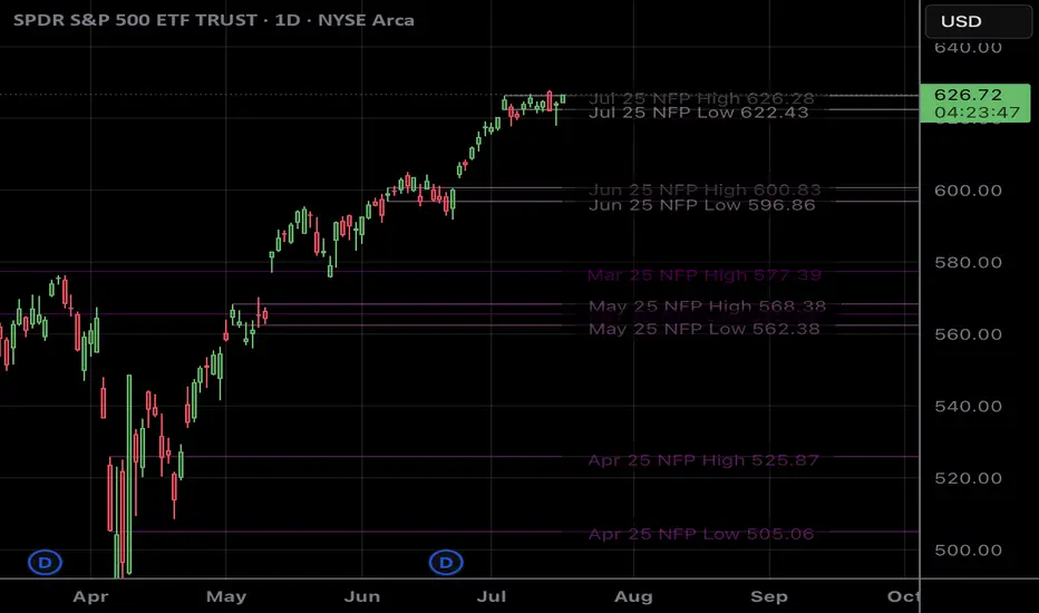
NFP RangesPlots the NFP daily ranges for NFP days. Includes extended hours ranges when the time frame is sub 1D, otherwise, only the daily range is taken.
NFP Dates are pre-populated through 2029 and historically through 2022. Will update script to include farther-out dates before they become necessary.
Поиск скриптов по запросу "range"
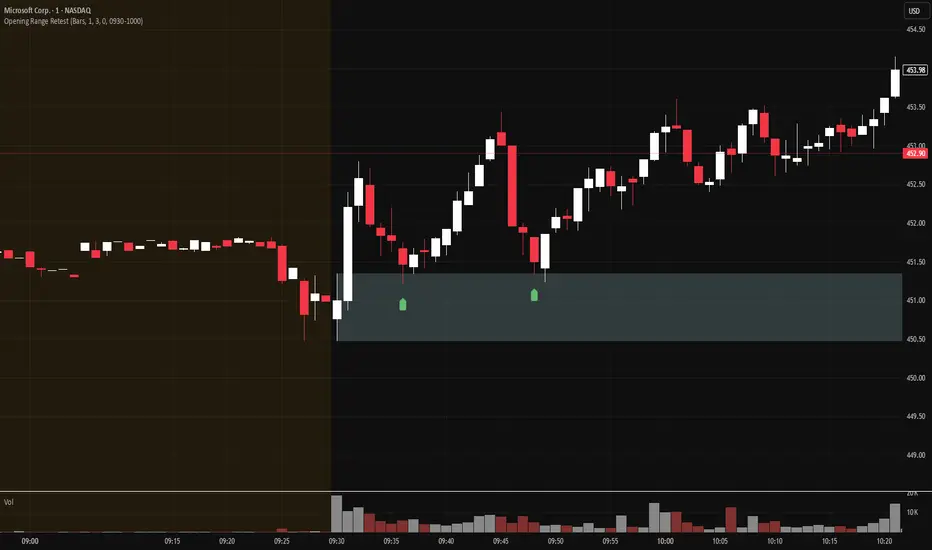
Opening Range Retest█ OVERVIEW
This indicator shows the opening range as a box. It also draws markers and triggers alerts when the opening range is retested. The opening range time is configurable, as is the period of time that must elapse before each return to the opening range is considered a retest.
█ FEATURES
Opening range time configurable in bars or minutes
Configurable "resting" period between the end of the opening range or since the last retest before a new retest is considered valid
Configurable tolerance so that a retest can trigger sooner
Active time range can be used to filter alerts and markers to a specific time window
Visual box showing the opening range, which can be optionally limited to the above-mentioned active time window
Well-documented, high-quality, open-source code for those interested
█ CONCEPTS
This indicator can be used for an opening range retest trading strategy, where long or short positions are taken on the retest of the opening range.
The opening range can be user-configured, so it is suitable for use with any opening range time period (e.g., 1-min, 5-min, 15-min, etc.).
The markers and alerts are equivalent, in the sense that whenever a marker appears, an alert will also trigger (assuming the user has set an alert up).
The alert active time range is simply used as a filter for markers and alerts, meaning that these will not draw or trigger outside of the specified time range.
█ LIMITATIONS
The indicator is intended for equities that have a highly active regular market open. For other security types, it will draw the opening range box from whenever TradingView specifies the market open time.
Open Range Candle [TradeWithRon]This Open Range Break indicator is a tool designed to help traders identify and visualize key price levels using the Opening Range Breakout (ORB) strategy. This indicator dynamically plots critical levels such as the high, low, and middle of a predefined range, along with Fibonacci retracement levels for further analysis. It also features several customization options to fit various trading styles.
Key Features:
Session Setup: Allows the user to set the time offset in GMT - or + to adjust the ORB session to their local time zone.
The default ORB session is set at 9:45 AM but can be adjusted based on user preferences.
Warning: Only supports 5-minute and 15-minute timeframes.
Visual Customization:
Line Styles: Users can choose from Solid, Dotted, or Dashed lines to represent key price levels.
Color Adjustments: Customizable colors for the high, middle, and low levels of the range, as well as Fibonacci levels and vertical lines.
Labeling Options: The labels can be customized in terms of size and color, helping to keep the chart clean and clear.
Fibonacci Retracement Levels: Fibonacci retracement levels are automatically drawn between the high and low of the range. Users can toggle these on or off and customize the offset to suit different trading instruments.
Time-Based Visuals: A vertical line is drawn at the start of the ORB session, providing a clear visual marker of where the breakout starts. This is useful for pinpointing key trade setups.
The indicator supports both 5-minute and 15-minute timeframes.
EMA Integration: The user can enable an Exponential Moving Average (EMA) on any chosen timeframe with adjustable parameters such as the length and color, providing additional trend context.
Dynamic Labeling: The indicator labels the high, middle, and low points of the ORB with custom text. These labels are updated in real-time as new data becomes available.
Limit on Lines and Labels: The indicator allows for a limit on the number of lines and labels drawn to maintain a clean chart, preventing unnecessary clutter as more ORB levels are plotted.
Daily Bias Information: The indicator assesses the daily trend bias (bullish or bearish) based on the relationship between the open and close prices for the last three daily candles, providing context for the current trading session.
Countdown Timer: The remaining time until the end of the current session is displayed in a countdown format, which helps traders to time their entries and exits more precisely.
How To Use:,
- Set the Timeframe to 15 minutes.
- Adjust the Time Zone Offset if needed, based on your local time zone.
- Enable the Show ORB feature for the first 15-minute candle to be drawn as the opening range. - The indicator will automatically mark the high, middle, and low points of the range.
Identify Breakout Points:
Bullish Breakout: If the price breaks above the high of the 15-minute opening range, this indicates a potential bullish breakout. The indicator will plot a vertical line marking the breakout point for further confirmation.
Bearish Breakout: If the price breaks below the low of the 15-minute opening range, this signals a potential bearish breakout. Again, the indicator will plot the breakout point with a vertical line for easy identification.
🔶 Disclaimer
Use with Caution: This indicator is provided for educational and informational purposes only and should not be considered as financial advice. Users should exercise caution and perform their own analysis before making trading decisions based on the indicator's signals.
Not Financial Advice: The information provided by this indicator does not constitute financial advice, and the creator (Tradewithron) shall not be held responsible for any trading losses incurred as a result of using this indicator.
Backtesting Recommended: Traders are encouraged to backtest the indicator thoroughly on historical data before using it in live trading to assess its performance and suitability for their trading strategies.
Risk Management: Trading involves inherent risks, and users should implement proper risk management strategies, including but not limited to stop-loss orders and position sizing, to mitigate potential losses.
No Guarantees: The accuracy and reliability of the indicator's signals cannot be guaranteed, as they are based on historical price data and past performance may not be indicative of future

Morning RangeOverview
The Morning Range Indicator highlights the high and low of the market session from 6 AM to 10AM, providing key levels for potential breakout trades. The box dynamically updates in real-time, extending until 4 PM, and adjusts color based on price action.
This tool is ideal for traders looking to identify breakout opportunities and visualize key intraday price ranges.
How It Works
Session High & Low (6 AM - 10 AM)
The indicator tracks the highest high and lowest low within this time window.
Once 10 AM passes, the high and low are locked in and will not change.
Box Extends Until 4 PM
The session box remains visible throughout the trading day.
It provides a visual reference for potential breakout zones.
Dynamic Box Coloring
Gray (Neutral): Neither high nor low is broken.
Green: Only the high is broken before 4 PM.
Red: Only the low is broken before 4 PM.
Yellow: Both high and low are broken before 4 PM.
Live Updating Box
The box appears as soon as the session begins at 6 AM.
It dynamically updates the high and low until 10 AM.
Alerts for Breakouts
This indicator includes built-in alert conditions, so you can set up TradingView alerts without modifying the script.
Morning Range High Broken → Triggers when price breaks above the morning high.
Morning Range Low Broken → Triggers when price breaks below the morning low.
To set alerts:
Click the Alerts (⏰) icon in TradingView.
Select Condition → "Morning Range High Broken" or "Morning Range Low Broken".
Choose your preferred notification method (popup, email, webhook, etc.).
Click Create to activate the alert.
Who This Is For
✔ Intraday & Scalp Traders – Identify key breakout levels for short-term trades.
✔ Futures & Forex Traders – Works great for markets like NQ, ES, Gold, and FX pairs.
✔ Breakout & Reversal Traders – Use the high/low boundaries as support & resistance levels.
Customization
This indicator automatically updates every day and requires no manual input.
You can change alert settings via TradingView’s built-in alert system.
How to Use This Indicator
Watch for breakouts above/below the morning range as potential trade opportunities.
Combine with volume, momentum indicators, or footprint charts for confirmation.
Use the box color to visually assess whether price action is bullish (green), bearish (red), or ranging (gray).

True Range & ATRDescription : This indicator plots both the True Range (TR) and the Average True Range (ATR) in a separate pane below the main chart.
- TR represents the absolute price movement range within each candle.
- ATR is a smoothed version of TR over a user-defined period (default: 14), providing insight into market volatility.
- TR is displayed as a histogram for a clearer view of individual candle ranges.
- ATR is plotted as a line to show the smoothed trend of volatility.
This indicator helps traders assess market volatility and potential price movements.

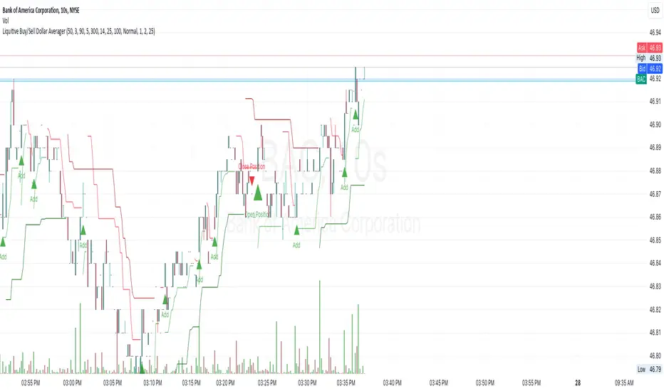
Liquitive Buy/Sell Dollar AveragerLiquitive Buy/Sell Dollar Averager Indicator
The "Liquitive Buy/Sell Dollar Averager" is a versatile trading tool designed for intraday and multi-timeframe analysis, combining advanced range-bound calculations, RSI normalization, volume spikes, and candle pattern recognition to identify optimal buy and sell conditions. This indicator is particularly suitable for traders employing strategies that focus on dollar-cost averaging, position scaling, and systematic buy/sell decision-making.
Key Features:
Adaptive RSI-Based Levels:
Dynamically calculates inner bounds (IB) and outer bounds (OB) using RSI and price ranges, helping to identify overbought and oversold conditions relative to the price action.
Normalizes RSI values to the price range for seamless visualization overlaid on the chart.
Volume and Candle Analysis:
Detects significant volume spikes relative to a moving average, signaling increased market activity.
Identifies spiking green/red candles to capture momentum-driven price movements.
Dynamic Support and Resistance:
Calculates and plots support and resistance levels based on recent swing highs and lows.
Median and boundary lines help visualize key price levels for decision-making.
Profitability Check:
Buy and Sell Signals:
Checks profitability thresholds based on percentage gains/losses.
Incorporates logic for "time to buy" and "time to sell" using target profit margins.
Implements average move percentage to define realistic thresholds for buy/sell actions.
Time-Based Trading Restrictions:
Configures trading logic to disallow trades after a specific time (e.g., 3:40 PM for intraday sessions).
Ensures logical entry and exit decisions are only made within active trading hours.
Color-Coded Visualization:
Background colors dynamically shift between green (bullish), red (bearish), and neutral, depending on RSI and price position relative to the inner bounds.
Opacity of the background adjusts based on normalized RSI differences to provide a visual cue of market strength.
Customizable Parameters:
Allows user input for key settings like lookback periods, RSI length, percent ranges, volume thresholds, and transparency levels, enabling flexible configuration tailored to individual strategies.
Actionable Alerts and Signals:
Plots "Open Position", "Add to Position", and "Close Position" markers directly on the chart, making it easy to follow systematic trading rules.
How It Works:
Buy Signals:
Triggered when price conditions, volume spikes, and RSI-based thresholds align with profitability metrics.
Designed for dollar-cost averaging, identifying opportunities to add to long positions or open new positions.
Sell Signals:
Evaluates profitability conditions to identify when to close or scale out of positions.
Incorporates real-time evaluation of market momentum and profitability.
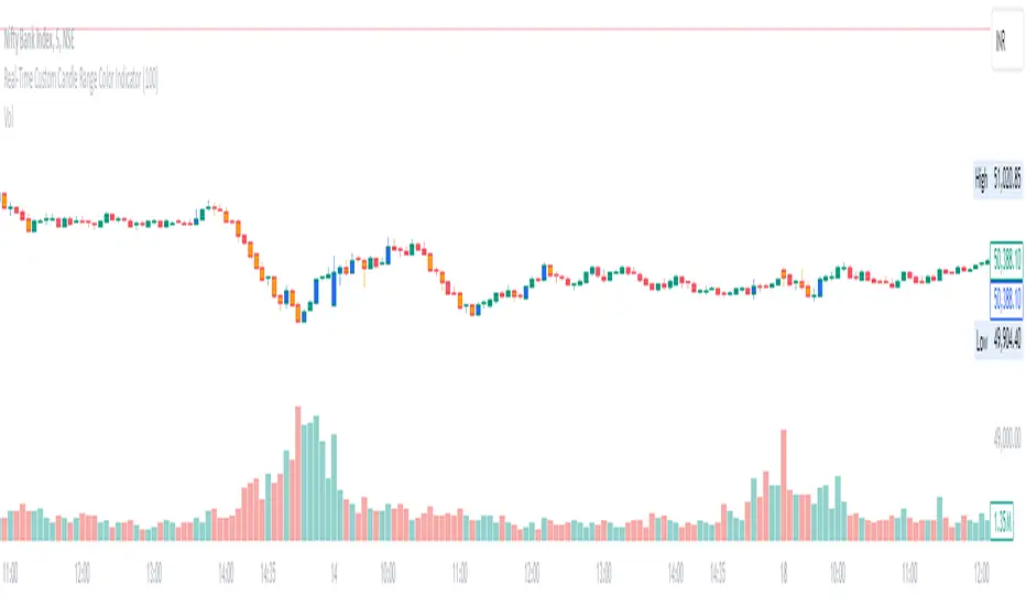
Real-Time Custom Candle Range Color Indicator
The script allows the user to input a custom range value (default set to 100 points) through the userDefinedRange variable. This value determines the minimum range required for a candle to change color.
Calculating Candle Range:
The script calculates the range of each candle by subtracting the low from the high price.
Determining Bullish or Bearish Candles:
It checks whether the close price is higher than the open price to determine if a candle is bullish (isBullish variable).
Coloring Candles:
Based on the custom range input, the script changes the color of the candles:
If the candle's range is greater than or equal to the custom range and it is bullish, the candle color is set to blue (bullishColor).
If the range condition is met and the candle is bearish, the color is set to orange (bearishColor).
If the range condition is not met, the color is set to na (not applicable).
Plotting Colored Candles:
The plotcandle function is used to plot candles with colors based on the custom range and bullish/bearish conditions. The candles will have a higher z-order to be displayed in front of default candles.
Displaying High and Low Price Points:
Triangular shapes are plotted at the high and low price levels using the plotshape function, with colors representing bullish (blue) and bearish (orange) conditions.
In trading, this indicator can help traders visually identify candles that meet a specific range criteria, potentially signaling strength or weakness in price movements. By customizing the range parameter, traders can adapt the indicator to different market conditions and trading strategies. It can be used in conjunction with other technical analysis tools to make informed trading decisions based on candlestick patterns and price movements.
Market Open Range Breakaway v1.2Script Name: Market Open Range Breakaway 1.2
This TradingView script, "Market Open Range Breakaway," highlights the market's opening range for a user-selected day of the week. It calculates the high and low prices during a specified period after the market opens, plots these levels, and tracks the opening price. The script dynamically adjusts for time zones and only displays data during market hours on the chosen day, with optional background shading for the defined range period.
Purpose: Identifies and highlights the market's opening range for a selected day of the week.
Features: Calculates and plots the high, low, and open price during the market's opening range.
Configurable range duration (e.g., 15, 30, or 60 minutes).
Automatically adjusts for different time zones.
Displays levels only during market hours on the target day.
Optional background shading for the opening range.
Inputs: Target day of the week.
Opening range duration.
Use Case: Ideal for traders looking to analyze breakout levels or price movements around the opening range.

Custom Time Range HighlighterCustom Time Range Highlighter
This versatile indicator allows traders to highlight specific time ranges on their charts, accommodating users worldwide by supporting customizable UTC offsets. Traders can define two distinct time ranges, setting start and end hours in their local time zone.
A toggle option enables the display of highlights for today only , ensuring focus on current trading conditions.
Ideal for day traders and those following specific market sessions, this tool enhances visibility of active trading periods and aids in effective trade management.

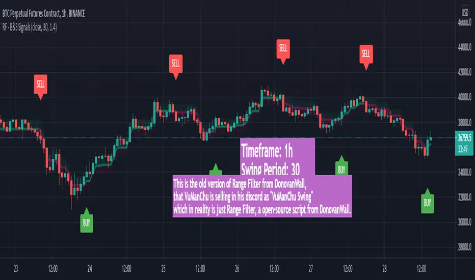
Austin's Range Filter with Trade SignalsAustin’s Range Filter with Trade Signals
Description:
Austin’s Range Filter with Trade Signals is a versatile indicator that combines a custom range filter with dynamic buy and sell signals based on EMA crossovers. This indicator is designed to help traders easily identify trend reversals and optimal trade entry/exit points.
Key Features:
• Range Filter Calculation: The indicator calculates the highest and lowest price over a user-defined period, then multiplies the difference by a customizable multiplier to establish a dynamic range. A combined middle band (average of the upper and lower bounds) is plotted for a clearer visual representation of the price trend.
• Exponential Moving Average (EMA): A user-configurable EMA is added, which acts as the primary signal line. You can adjust the length of the EMA to suit your trading style.
• Buy and Sell Signals:
• Buy Signal: Triggered when the price crosses above the EMA, indicating a potential upward trend.
• Sell Signal: Triggered when the price crosses below the EMA, indicating a potential downward trend.
• Alerts: Custom alert conditions for buy and sell signals allow you to set up real-time notifications when the signal changes, so you never miss an opportunity.
• Customizable Display: You can toggle the visibility of the combined band (purple) and the EMA (blue) for a cleaner chart.
How It Works:
• Buy when the price crosses above the EMA.
• Sell when the price crosses below the EMA.
• Background colors indicate whether the current price is above or below the calculated range, helping you visually identify bullish and bearish conditions.
Customization Options:
• Range Filter Length: The lookback period for the highest/lowest price calculation.
• Range Multiplier: Adjusts the size of the range.
• EMA Length: Set the length of the EMA to fine-tune the signal sensitivity.
• Toggle Lines: Show or hide the combined band and EMA for more flexibility.
This indicator is suitable for a variety of markets including stocks, forex, and crypto, and can be applied to any timeframe. Use it as part of your technical analysis to spot market trends and improve your decision-making process.
How to Use:
1. Apply the indicator to your chart and adjust the settings to suit your strategy.
2. Set up alerts for buy and sell signals to receive real-time notifications.
3. Monitor the price relative to the range and EMA to better time your trades.
This indicator is perfect for traders looking for an intuitive yet powerful tool to enhance their trading strategies with automatic signals and alerts.

Consolidation & Head and Shoulders ScannerHello Traders!
The Consolidation & Head and Shoulders Scanner utilizes a unique swing-based pattern recognition to pinpoint consolidation and (inverse) head and shoulders patterns in real-time with unparalleled precision.
The rectangle pattern, also known as a trading range or a consolidation pattern, is characterized by horizontal lines that act as support and resistance levels, creating a rectangular shape.
The head and shoulders chart pattern is a technical analysis pattern used to identify potential trend reversals in financial markets. It consists of three swing highs (peaks), with the middle peak being the highest and the two outside swing highs being slightly lower. The middle peak is referred to as the "head" and the two outside peaks are referred to as the "shoulders."
The pattern typically forms after an uptrend and is in most cases a bearish signal. The neckline is a support level that connects the lows of the two shoulders. Once the price breaks below the neckline, the pattern is confirmed, and a new down trend starts. Conversely, an "inverse head and shoulders" pattern forms after a downtrend and is a bullish signal.
The Consolidation & Head and Shoulders Scanner is designed to operate in a fully automated manner, detecting consolidation patterns, head and shoulders patterns and inverse head and shoulders patterns across the symbol and timeframe that you select. It grants you the ability to simultaneously scan for patterns across as many as 20 distinct symbols.
Feature List
Real-time consolidation and (inverse) head and shoulders pattern detection
Breakout alerts
Customizable pattern size and accuracy
Customizable look and feel
The value of this indicator is to support traders to easily identify consolidations and (inverse) head and shoulders patterns in an automated way and across many different markets at the same time. The special swing-based pattern recognition makes this indicator unique. The trader saves a lot of time scanning the markets for consolidation and head and shoulders patterns, since finding the pattern and alerting for a breakout is done automatically for the trader.
For a visualization of the detected patterns, you can add the TRN Consolidation and Range Pattern and the TRN Head and Shoulders Pattern indicators to your chart.
How does Consolidation & Head and Shoulders Scanner work?
On the right side of the chart, you can find a table displaying the symbols monitored by our scanner for pattern and breakout detection (first column). The table provides information on the status of each symbol.
ACTIVE – Pattern building up
UP – Upside Breakout
DN – Downside Breakout
UP CONF – Upside Breakout confirmed
DN CONF – Downside Breakout confirmed
FAILED – Pattern failed to get confirmed
This visual representation allows you to quickly identify the evolving pattern dynamics across different symbols, helping you stay informed and make timely trading decisions.
In the second and fifth column, the status of consolidation patterns with two different consolidation sizes gets displayed. In the third and fourth column, the status of detected long and short head and shoulders patterns is displayed. The same goes for column seven and eight but with a different head and shoulders size which is customizable in the settings.
The scanner operates specifically on the timeframe you have selected in TradingView, ensuring that the detected patterns and breakouts align precisely with your trading perspective. F If the scanner displays a pattern or a breakout, you just can switch to this instrument and start trading it if you like what you see.
Follow these instructions to discover how you can utilize the scanner for seamless and simplified chart pattern detection like never before:
Add Symbols
Go to indicator settings and scroll down to the "Symbols" section. The enabled symbols can be recognized by the check marks. Click on one of them and use the search function to add the symbol of your choice to the scanner. You can search for up to 20 different Symbols at the same time.
Use Alerts (optional but recommended)
You can also use the built-in alerts to easily get notified when a pattern occurs. In the indicator settings in the "Alerts" section you can choose whether you want to get notified when a pattern is
in the making (Pattern active),
confirms an up breakout (B/O Up Confirmed)
confirms a down breakout (B/O Down Confirmed)
(Unconfirmed) in case a pattern breakout occurs, even if the pattern is not yet confirmed
This allows you to stay informed about potential breakout opportunities that are still awaiting confirmation.
Customization and Settings
The indicator can scan for smaller and larger patterns at the same time. Adjust the consolidation and head and shoulders sizes in the indicator settings to align them with your preferences. A larger size results in larger patterns. Depending on the asset class, the market or the market phase, different sizes can be used for pattern detection.
To detect more patterns, increase the tolerance level, even though it may result in lower accuracy. However, be mindful that a higher tolerance level may result in more patterns hitting their stop-loss.
Risk Disclaimer
The content, tools, scripts, articles, and educational resources offered by TRN Trading are intended solely for informational and educational purposes. Remember, past performance does not ensure future outcomes.

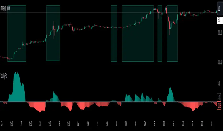
Volatility Filter v2VF v2 is a new iteration of my tool designed for traders who wish to gain a deeper understanding of market dynamics, specifically to distinguish periods of high volatility, which often correspond to strong market trends. By identifying these periods, traders can make more informed decisions, potentially leading to better trading outcomes.
Understanding Market Volatility:
At the heart of this script lies the concept of market volatility, a statistical measure reflecting the degree of variation in trading prices. Volatility is pivotal for traders; it provides insights into the market's emotional state, indicating periods of uncertainty or confidence. High volatility often correlates with strong trends, making it a critical indicator for trend-followers. By identifying when volatility crosses a certain threshold, traders can discern whether the market is likely to be in a trending phase or a more subdued, range-bound state.
How the Script Works:
The core functionality of the script revolves around a signal line that oscillates around a zero threshold. When the signal line is above zero, it indicates increased market volatility, suggesting the presence of a trend. The farther the oscillator deviates from zero, the stronger the implied trend. This mechanism enables traders to visually gauge market conditions and adjust their strategies accordingly.
Controlling the Indicator:
To cater to diverse trading styles and preferences, the script is equipped with several customizable settings:
Filter Threshold: This 'zero line' acts as the baseline for distinguishing between different volatility regimes. Crossing this threshold is a primary signal for changes in market volatility.
Moving Average Type: With over 30 types of moving averages to choose from, traders can select the one that best fits their analysis style. Each type offers a different perspective on price data, allowing for a tailored approach to trend identification.
Colorize Indicator: This feature enhances the visual representation of the indicator, making it easier to interpret. When enabled, the oscillator's color intensity varies with its proximity to the extremes, providing a quick visual cue about trend strength.
Advanced Settings – Length and Multiplier:
The script introduces an innovative approach to time frame analysis through its length and multiplier settings:
Length: This parameter sets the base period for all metrics within the script, similar to traditional indicators.
Multiplier: This unique feature differentiates the script by incorporating three distinct timeframes into the analysis: a lower timeframe, the main (current) timeframe, and a higher timeframe. The multiplier adjusts these timeframes relative to the main one. For instance, with a daily main timeframe and a multiplier of 2, the lower timeframe would be 12 hours, and the higher timeframe would be 2 days. This tri-timeframe approach aims to provide a more comprehensive volatility assessment.
Volatility Filter Indicators Section:
The script utilizes nine different, undisclosed metrics within its volatility filter. Traders have the flexibility to enable or disable these metrics based on their preferences, allowing for a customizable trading experience. Additionally, the script offers alert functionality for when the indicator crosses the threshold, either upwards or downwards, facilitating timely decision-making.
P.S
With better understanding of markets over time, I designed a new iteration of my volatility filter indicator. The second version provides faster, more precise way to analyze markets, but I also wanted to keep my first version untouched in case if some people find it better for their purposes. As I mentioned above, this version is calculated in a very different way from a previous one, so if you never tried it you can do it here
Market Structure (Range) & Internal Liquidity
This indicator will simplify the price-action reading of any trader/investor by decluttering his/her charts from un-important & confusing candles to highlight the true momentum candles which are usually formed by institutional buying/selling .
The indicator will be a good tool in the arsenal of the following styles of Trading/Investing
Smart Money / Liquidity Concepts
Price Action Concepts
Demand & Supply Concepts
Support & Resistance Concepts
UNIQUE FEATURES:
1. Market Structure - Range & Internal Liquidity:
Unlike other liquidity indicators, this indicator only highlights liquidity levels of significant importance. Not every intermediate high & low in a chart are worthy of noticing, hence by enabling the 'Swings' & 'Range (BoS)' feature in the indicator settings, the structure highs and lows (external liquidity) in a chart can be identified.
Any other liquidity levels within a market range (Range between structural High & Low) is known as internal liquidity which price targets to collect enough orders before heading towards the external liquidity levels.
2. Gaps (Fair Value Gaps / Imbalance):
Not every imbalance / gap between candles are important & trade-worthy. This feature of the indicator is different from the other widely available imbalance indicators & only highlights gaps formed by true momentum candles. Gaps between unimportant inside bars are not highlighted, as these bars occur in the absence of momentum.
3. True Price Action:
Looking at the two charts below, we can clearly observe the difference between price action of a confusing normal chart & the simplified price action highlighted by the indicator. This feature declutters the charts by only highlighting the candles a trader / investor should notice in a chart.
This feature when used in confluence with the liquidity levels feature & gap feature of the indicator, helps identify the true demand & supply zones (order blocks) in a chart.
Before
After
4. Zig Zag Lines:
This unique feature which is useful to Identify & Backtest different entry types taught by Smart Money Traders . This feature helps the trader understand the True Fractal Nature of price. This can also be seen as an alternate to the default line chart feature.
Examples of Entry Types taken by Smart Money Traders
ADDITIONAL FEATURES:
(These features are essential addons to trade liquidity. However, these are derived from publicly available indicators from the Tradingview library, but with a different interpretation for a better visualization of charts & or to time better trade entries without cluttering the charts)
a. Inside Bar & Outside Bars:
Identify not just a single Inside Bar as highlighted by other indicators, but to highlight a series of candles which are within a master candle range and are exhibiting unimportant sideways price action.
Outside Bars only relevant to momentum candles are highlighted, ignoring candles that occur within a master candle range. Highs & Lows of such Outside Bars are used by aggressive traders to identify liquidity levels in the charts.
b. Highs & Lows of previous Monthly / Weekly / Daily & Hourly Candles:
This feature draws Highs & Lows of previous Monthly / Weekly / Daily & Hourly Candles on the extreme right hand side of the chart to keep the charts clean.
Additionally for Hourly time frame, the indicator includes a setting to select the hourly candle time frame (60 min / 75 min / 240 min), which are personal and different for each trader.
UNDERLYING CONCEPT:
In the image below we see how a large majority of Traders / Investors incorrectly mark Structure markings, mistaking a raid of internal liquidity as a Break of Structure, thereby taking trades opposite to the broader trend of the markets
However, this indicator has a higher accuracy of identifying the correct price structure by only marking a structure high or low, when a subsequently opposite side liquidity is taken/raided. Further the broader trend of the markets can be easily identified by looking as to which side the Break of Structure has happened. (This is visible in the indicator in the form of 'Range' feature, so if a Range High is broken then it is understood to be in an uptrend & vice versa)
The underlying core functionality of the indicator is best displayed by the image below
USECASE OF THE INDICATOR:
Before taking any Buying/Selling position in the markets, a Trader / Investor must analyze the price action on the following parameters
HTF & LTF Trend Identification (To judge if trade is Pro-Trend or Counter-Trend)
Is Price at a High Probability Area of Interest?
Is Price satisfying the trade entry conditions?
Let us see how this indicator can be used as a complete trading system in itself and addresses each of the above parameters
Disclaimer: Illustrations shown below are just for understanding the features of the indicator & does not guarantee profitability. Every trader must back test their setups to arrive at a setup with an edge (positive expectancy) before they start actively trading the setup.
1. HTF & LTF Trend Identification (Pro-Trend / Counter-Trend) using 'Range (BoS)' feature of the indicator
Let's assume a Day Trader, uses hourly chart (75 min) to frame his Higher Time Frame (HTF) ideas & 15min charts (LTF) for trade entries
Looking at the chart below the Trader concludes that the HTF has most recently broken the structure to the downside and is considered Bearish till price action is below the range high of 48600 levels. It can also be concluded that the price is currently in a Bullish retracement.
The Trader can choose to take both Pro-Trend or Counter-Trend Trades, timing the trade entries using the LTF charts.
Looking at the LTF chart below, it is evident that price on LTF has also broken structure to the downside and is now aligned with the HTF Bearish Trend. The Trader will now look to get into short trades, to take trades both in line with HTF & LTF trend.
2. Let's identify if Price is at a High Probability Area of Interest, using either single or combination of the 'Swings' / 'Gaps' / 'Outside Bars' / 'HL of previous M,W,D, H candles' features of the indicator
Definition of High Probability Level / Area differs from each Traders perspective depending upon which of the Trading Styles (mentioned in the beginning) does one use.
Smart Money Traders
SMC Traders are known to get into trades early and their high R:R trades are taken mostly at a High Probability Area of Interest which are identified by them on HTF, by looking for candles with imbalance (gaps) & or candles which have taken out a previous liquidity and then having creating imbalance (gaps).
Also Turtle Soups is one of the favorite setups for SMC traders, where a trader enters a trade on LTF (typically 1 min/3min & 5min) after grabbing HTF liquidity lying at H/L of outside bar / previous monthly, weekly, daily or hourly candles.
Demand & Supply Traders
Some of the Best Demand & Supply Traders have the patience to wait for trades and take trades at the extreme Demand & Supply Zones within a market Range.
As illustrated below, the extreme hourly supply zone just below the structure high, which has the confluence of imbalance and Bearish HTF confirmation resulted in a good R:R trade.
Price Action Traders & Support & Resistance Traders
From the illustration below we can see how the 15 min Range breakdown confirms the breakdown of the Inverted Cup Pattern for Price Action Traders & Support & Resistance Traders using the same area of breakdown as the new Resistance to enter Short trades
3. Let's identify if Price is satisfying the Trade Entry Conditions using the 'Zig-Zag Lines' feature
Statistics say that majority (> 80%) of Traders blow up their accounts multiple times or completely give up and never achieve profitability.
One of the primary reasons for this is Traders punching trades randomly and without having proper Setup or rules for entering Trades.
Also in order to arrive at rules or execute the different entry models (couple of examples highlighted earlier) taught by different Trainers, a Trader needs to learn to visualize charts in a similar format to what the trainers are teaching.
The Zig-Zag lines feature is a form of line chart that joins the swing high points to the swing low points on the chart to represent the True Price action & a proper fractal nature of the markets, unlike the line chart which is formed by only by joining the closing value of each candle.
From the image below we can see that the Zig-Zag lines feature eliminates the randomness visible in the line chart and is a more smoother chart. Using this feature one can back test the various entry models widely available on the internet or arrive at a user specific model which he/she is comfortable with.
CONCLUSION:
Trading with a deeper understanding of Price Action allows a Trader/Investor to enter or exit trades with ease. Price Action trading allows individuals to keep their charts clean and stay away from the other lagging technical indicators and enter trades much earlier than other technical indicators.
This indicator attempts in simplifying the understanding of price action for every one and identify potential high probability areas / levels where one should enter / exit trades.
This indicator will be an important tool in the arsenal of any Trader / Investor to take better informed trades, however it does not guarantee profitability of a Trader, due to the randomness of the markets & external factors that influence each trader.
GET ACCESS:
Refer Author's instructions below to get access to the indicator

Fibonacci internal Break of Range PinescriptlabsThe uniqueness of this script lies in the synergy and dynamic interaction resulting from the advanced combination of key elements of technical analysis in the way it strategically merges Fibonacci Levels with the Linear Regression Channel and the internal price structure, creating a highly synergistic market analysis system.
The Linear Regression Channel, drawn from price regression and its standard deviation over a defined number of bars, offers a graphical representation of the prevailing market trend. The combination of this channel with Fibonacci Levels is deliberate and critical: the levels serve as additional filters to validate range breakouts within the channel, and vice versa, channel breakouts enhance the importance of Fibonacci levels by adjusting to the market context, represented by the specific length and displacement within the chart.
Fibonacci levels are updated with each new bar, and the detection of Break of Range (BoR) is integrated with the Fibonacci level plot to highlight significant breakout points. A unique aspect of this script is the way breakouts are identified not only by the price crossing certain Fibonacci levels but also by volume context and candlestick patterns, such as Engulfing patterns, which signal potential changes in market trends.
This interaction between the Linear Regression Channel and Fibonacci Levels, for example, a bullish price breakout above the upper channel boundary simultaneously crossing a significant Fibonacci level, suggests not only a possible continuation of the uptrend but also a strong support level established. Similarly, a bearish price breakout below the lower channel boundary, coinciding with a Fibonacci level, may signal a trend reversal confirmation and a new resistance level.
This script delves further into signal convergence, where the interaction between Break of Range and Fibonacci levels marks bullish and bearish breakouts, respectively, and when these signals coincide with breakouts of any Fibonacci level, they provide cross-confirmation that increases confidence in the generated signal. "BoR+Fib🔼" and "BoR+Fib🔽."
Additionally, the script introduces an innovative implementation of the Linear Regression Channel, which uses a customizable period and standard deviation to plot upper and lower trendlines. This approach allows traders to anticipate potential re-entry points after a breakout, as prices often retest the channel edges, providing low and high entry confirmation opportunities.
A differentiating technical aspect is the conditional logic implemented for bullish and bearish trend signal confirmation. For example, the script calibrates signals based on the intersection of price action with critical Fibonacci levels and confirmed candlestick patterns, enhancing signal reliability compared to using these indicators in isolation.
Key Features:
1. Dynamic calculation of Fibonacci levels.
2. Detection of internal price range breakouts (Break of Range).
3. Linear Regression Channel.
4. Detection of candlestick patterns (Engulfing Patterns).
Dynamic Fibonacci Level Calculation and Internal Range Breakout Detection (Break of Range):
The fusion of Fibonacci levels with the detection of internal range breakouts is crucial because it allows for precise identification of market turning points. Fibonacci levels act as initial filters, indicating potential support and resistance zones. When the price crosses a key Fibonacci level, especially in conjunction with an internal range breakout, the resulting signal is stronger and more reliable. This confluence significantly increases the probability of sustainable price movement.
Broken:
Function: The code identifies breakouts when the price crosses a key Fibonacci level (0%, 100%). A breakout is significant if the price crosses and holds beyond these levels.
Interaction: Breakouts validate Fibonacci levels. For example, a breakout above the 0% Fibonacci level can confirm an uptrend.
Structure Change:
Function: In the code, Structure Change can be interpreted through the detection of pivot patterns and price structure change signals, which we identify as Break of Range.
Interaction: This component acts as confirmation for range breakouts and Fibonacci levels. For example, if a range breakout is followed by a change in price structure (such as the formation of a new higher high), it strengthens the validity of the range breakout signal.
"BoR+Fib🔽": Indicates a bearish range breakout that has also crossed a Fibonacci level downward. This can be interpreted as a sell signal or a bearish trend indication.
"BoR+Fib🔼": Represents a bullish range breakout that has also crossed a Fibonacci level upward. It can be interpreted as a buy signal or a bullish trend indication.
Linear Regression Channel:
Function: The Linear Regression Channel is calculated and drawn using a defined number of bars to establish the overall market trend. Calculations involve summing and averaging closing prices and their products with the time index to calculate the regression line and its standard deviation. The script uses this channel to contextualize Fibonacci signals and range breakouts, with breakouts occurring in the direction of the channel's trend.
Interaction: Provides context to Fibonacci signals and range breakouts. For example, if a range breakout occurs in the same direction as indicated by the Linear Regression Channel, this adds credibility to the signal.
Integration Benefit: The Linear Regression Channel provides an overall trend context. When a range breakout signal and a Fibonacci level coincide within the direction indicated by the channel, the signal's validity is strengthened.
Signal Convergence: An ideal scenario occurs when all elements converge. For example, a good entry point could be when the price experiences a range breakout from a significant Fibonacci level, there is a change in price structure in the same direction, and all of this aligns with the trend indicated by the Linear Regression Channel.
Dynamic Volatility Visualization: Adjusts the width of the Linear Regression Channel based on market volatility.
Validation and Entry Confirmation after Linear Regression Channel Breakout:
Breakout Validation: The Linear Regression Channel breakout is validated not only by price crossing but also by an increase in volume, suggesting a significant breakout rather than a temporary fluctuation.
Entry Confirmation ('Low and High Entry Confirmation'):
Confirmation Bars: A specific number of bars (configurable entry) closing outside the channel are required to confirm an entry. This reduces the risk of false signals.
Channel Re-Test: After the breakout, the price often retests the channel's edge. An entry is confirmed if the price bounces from this area, validating the initial breakout.
Auxiliary Indicators: Oscillators or momentum indicators are used to confirm trend strength after the breakout.
Candlestick Pattern Detection (Engulfing Patterns):
Engulfing Pattern Identification: bullishEngulfing is activated in a bullish pattern with a previous bearish trend and a specific bullish candle. bearishEngulfing is activated in a bearish pattern with a previous bullish trend and a specific bearish candle.
Special Trend Signals:
Bullish signals are displayed as blue circles with "⬆️," while bearish signals are displayed as red circles with "⬇️."
Bullish Signals: Indicate that the price has crossed above certain Fibonacci levels, and the current trend is considered bullish, as the most recent closing price is higher than the closing price of a specific bar in the past.
Bearish Signals: Indicate that the price has crossed below certain Fibonacci levels, and the current trend is considered bearish, as the most recent closing price is lower than the closing price of a specific bar in the past.
Integration with 3Commas for Automation:
Signal Automation: The ability to integrate with platforms like 3Commas allows for the automatic execution of
strategies based on the script's signals, where a bot could execute trades based on the chart-generated signals, facilitating more efficient trading, reducing reaction time, and as an automated script, we only need to input our short Bot Id or our Long Bot ID into the previously loaded message alert.
Español:
La singularidad de este script radica en la sinergia y la interacción dinámica que resulta de la combinación avanzada de elementos clave del análisis técnico en la forma en que fusiona estratégicamente los Niveles de Fibonacci con el Canal de Regresión Lineal y la estructura interna del precio creando un sistema de análisis de mercado altamente sinérgico.
El Canal de Regresión Lineal, dibujado a partir de la regresión de precios y su desviación estándar sobre un número definido de barras, ofrece una representación gráfica de la tendencia predominante del mercado. La combinación de este canal con los Niveles de Fibonacci es deliberada y crítica: los niveles sirven como filtros adicionales para validar las rupturas de rango dentro del canal, y viceversa, las rupturas del canal potencian la importancia de los niveles de Fibonacci ajustándose al contexto del mercado, representado por la longitud y desplazamiento específicos dentro del gráfico.
Los niveles de Fibonacci se actualizan con cada nueva barra, La detección de rupturas de rango (Break of Range) se integra con la trama de niveles de Fibonacci para destacar los puntos de ruptura significativos. Un enfoque único de este script es la manera en que las rupturas no solo se identifican por el cruce de precios de ciertos niveles de Fibonacci sino también por el contexto de volumen y patrones de velas, como los patrones Engulfing, que señalan cambios potenciales en la tendencia del mercado.
Esta interacción entre el Canal de Regresión Lineal y los Niveles de Fibonacci Por ejemplo: una ruptura alcista del precio a través del límite superior del canal al mismo tiempo que cruza un nivel de Fibonacci significativo sugiere no solo una posible continuación de la tendencia alcista sino también un fuerte nivel de soporte establecido. Similarmente, una ruptura bajista del precio a través del límite inferior del canal, coincidiendo con un nivel de Fibonacci, puede señalar una confirmación de cambio de tendencia y un nuevo nivel de resistencia.
Este script profundiza aún más en la confluencia de señales, donde la interacción entre Break of Range y los niveles de Fibonacci marcan rupturas alcistas y bajistas respectivamente, y cuando estas señales coinciden con rupturas del de cualquier nivel de Fibonacci, proporcionan una confirmación cruzada que aumenta la confianza en la señal generada. "BoR+Fib🔼" y "BoR+Fib🔽"
Además, el script presenta una innovadora implementación de Canal de Regresión Lineal, que utiliza un periodo personalizable y una desviación estándar para trazar las líneas de tendencia superior e inferior. Este enfoque permite a los traders anticipar posibles puntos de reentrada después de una ruptura, con el precio a menudo retestando los bordes del canal, proporcionando así oportunidades de confirmación de entrada baja y alta.
Un aspecto técnico diferenciador es la lógica condicional implementada para la confirmación de señales de tendencia alcista y bajista. Por ejemplo, el script calibra señales basadas en la intersección de la acción del precio con los niveles críticos de Fibonacci y los patrones de velas confirmados, mejorando la confiabilidad de las señales en comparación con el uso de estos indicadores de forma aislada.
Características Principales:
1. Cálculo dinámico de niveles de Fibonacci.
2. Detección de rupturas internas del rango de precios (Break of Range).
3. Canal de regresión lineal.
4. Detección de patrones de velas (Patrones Engulfing).
Cálculo Dinámico de Niveles de Fibonacci y Detección de Rupturas Internas (Break of Range):
La fusión de los niveles de Fibonacci con la detección de rupturas internas del rango es crucial porque permite identificar con precisión los puntos de inflexión del mercado. Los niveles de Fibonacci funcionan como filtros iniciales, indicando potenciales zonas de soporte y resistencia. Cuando el precio cruza un nivel clave de Fibonacci, especialmente en conjunto con una ruptura interna del rango, la señal resultante es más robusta y fiable. Esta confluencia incrementa significativamente la probabilidad de que el movimiento del precio sea sostenible
Broken:
Función: El código identifica las rupturas cuando el precio cruza un nivel de Fibonacci clave (0%, 100%). Una ruptura es significativa si el precio cruza y se mantiene más allá de estos niveles.
Interacción: Las rupturas validan los niveles de Fibonacci. Por ejemplo, una ruptura por encima del nivel de Fibonacci del 0% puede confirmar una tendencia alcista.
Cambio de Estructura:
Función: En el código, el Cambio de Estructura se puede interpretar a través de la detección de patrones de pivote y señales de cambio en la estructura de precios, que identificamos como Break of Range.
Interacción: Este componente actúa como una confirmación de las rupturas de rango y los niveles de Fibonacci. Por ejemplo, si una ruptura de rango es seguida por un cambio en la estructura de precios (como la formación de un nuevo máximo más alto), esto refuerza la validez de la señal de ruptura de rango.
"BoR+Fib🔽": Indica una ruptura bajista del rango que también ha cruzado un nivel de Fibonacci hacia abajo. Esto puede interpretarse como una señal de venta o una indicación de tendencia bajista.
"BoR+Fib🔼": Representa una ruptura alcista del rango que también ha cruzado un nivel de Fibonacci hacia arriba. Puede interpretarse como una señal de compra o una indicación de tendencia alcista.
Canal de Regresión Lineal:
Función: El Canal de Regresión Lineal se calcula y dibuja utilizando un número definido de barras para establecer la tendencia general del mercado. Los cálculos involucran la suma y el promedio de los precios de cierre y sus productos con el índice de tiempo, para calcular la línea de regresión y su desviación estándar, el script utiliza este canal para contextualizar las señales de Fibonacci y las rupturas de rango, con rupturas que ocurren en la dirección de la tendencia del canal.
Interacción: Proporciona contexto a las señales de Fibonacci y rupturas de rango. Por ejemplo, si una ruptura de rango ocurre en la misma dirección que la tendencia indicada por el Canal de Regresión Lineal, esto añade credibilidad a la señal.
Beneficio de la Integración:El Canal de Regresión Lineal proporciona un contexto de tendencia general. Cuando una señal de ruptura de rango y un nivel de Fibonacci coinciden dentro de la dirección de la tendencia indicada por el canal, se fortalece la validez de la señal.
Convergencia de Señales: Un escenario ideal ocurre cuando todos los elementos convergen. Por ejemplo, un buen punto de entrada podría ser cuando el precio experimenta una ruptura de rango desde un nivel de Fibonacci importante, hay un cambio de estructura en la misma dirección, y todo esto ocurre en línea con la tendencia indicada por el Canal de Regresión Lineal.
Visualización de Volatilidad Dinámica: Ajusta el ancho del canal de regresión lineal en función de la volatilidad del mercado.
Validación y Confirmación de la Entrada después de la Ruptura del Canal de Regresión:
Confirmación de Ruptura: La ruptura del canal de regresión se valida no solo por el cruce del precio, sino también por un aumento en el volumen, lo que sugiere una ruptura significativa en lugar de una fluctuación temporal.
Confirmación de Entrada ('Confirmación de Entrada Baja y Alta'):
Barras de Confirmación: Se requiere un número específico de barras (entrada configurable) que cierren fuera del canal para confirmar una entrada. Esto reduce el riesgo de señales falsas.
Re-Test del Canal: Después de la ruptura, el precio a menudo vuelve a probar el borde del canal. Una entrada se confirma si el precio rebota desde esta área, validando la ruptura inicial.
Indicadores Auxiliares: Se utilizan osciladores o indicadores de impulso para confirmar la fuerza de la tendencia después de la ruptura.
Detección de Patrones de Velas (Patrones Engulfing):
Identificación de Patrones Engulfing: bullishEngulfing se activa en un patrón alcista con una tendencia bajista previa y una vela alcista específica. bearishEngulfing se activa en un patrón bajista con una tendencia alcista previa y una vela bajista específica.
Señales Especiales de Tendencia:
Las señales alcistas se muestran como círculos azules con "⬆️", mientras que las señales bajistas se muestran como círculos rojos "⬇️".
Señales Alcistas: Indican que el precio ha cruzado por encima de ciertos niveles de Fibonacci y la tendencia actual se considera alcista, ya que el precio de cierre más reciente es mayor que el precio de cierre de una barra específica en el pasado.
Señales Bajistas: Indican que el precio ha cruzado por debajo de ciertos niveles de Fibonacci y la tendencia actual se considera bajista, ya que el precio de cierre más reciente es menor que el precio de cierre de una barra específica en el pasado.
Integración con 3Commas para Automatización:
Automatización de Señales: La capacidad de integrar con plataformas como 3Commas permite la ejecución automática de estrategias basadas en las señales del script donde un bot podría ejecutar operaciones basadas en las señales generadas por el gráfico., facilitando un trading más eficiente y reduciendo el tiempo de reacción y como un script automatizado solo necesitamos poner en la alerta del mensaje previamente cargado nuestro short Bot Id o nuestro Long Bot ID.

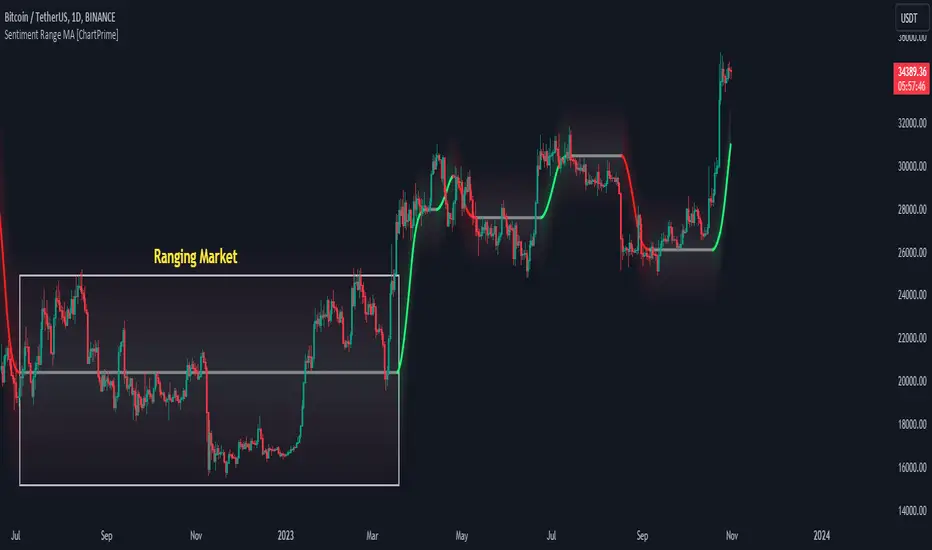
Sentiment Range MA [ChartPrime]The "Sentiment Range MA" provides traders with a dynamic perspective on market activity, emphasizing both stability in chop zones and quick adaptability outside of them.
Key Features:
Chop Zone Stability: In choppy markets, this indicator remains consistent, filtering out the noise to provide a clear view.
Quick Adaptability: Should the price break out of these zones, the indicator recalibrates promptly.
Dynamic Support and Resistance: Adapts based on the latest price action, serving as an evolving reference point.
Emphasis on Recent Levels: The tool factors in the latest notable market levels to stay relevant and timely.
Configurations:
Data Source: Choose your desired metric, though many default to the closing price.
Output Smoothing: Adjust the SR MA's response to market movements.
Trigger Smoothing: Refine boundary definitions based on your market insights.
ATR Period: Set the period for the ATR, influencing the surrounding boundary's width.
Range Multiplier: Control the ATR's effect on the range.
Range Switch: Flip between high-low and open-close values for range determination.
Visuals
Sentiment Range MA Line:
- This is the flowing line that transitions between green and red.
- When it's green, it indicates bullish momentum in the market. This suggests a prevailing upward trend and can be an entry cue for traders who trade with the trend.
- When it turns red, bearish sentiments dominate. It indicates the potential beginning of a downtrend or a continued downtrend. Traders might interpret this as a signal to be cautious, to short the market, or to exit long positions.
The Chop Zone:
- This is the space between the price candles and the Sentiment Range MA line. It represents a region where the price is considered to be moving sideways or without a clear direction. Price movements within the chop zone might not be substantial enough to warrant a trading decision. Only when the price breaks out of this zone do we see the Sentiment Range MA line change color, signaling a potential trading opportunity.
By interpreting these visuals, traders can make more informed decisions based on the prevailing market sentiment and trend. The chart becomes a tool, providing both an overview of the market condition and potential entry or exit points based on the Sentiment Range MA indicator's readings.
Detailed Settings Overview
Understanding the settings of the Sentiment Range MA Indicator can greatly enhance its utility in your trading strategy. Let's dive deeper into each:
Output Smoothing:
Purpose: It refines the SR MA to provide a clearer trend perspective.
Functionality:
- At `0`, it ensures the indicator responds immediately to price deviations from the chop zone.
- At higher values, it transforms the indicator into a volatility-adjusted moving average.
Filtering Modes:
- Single Filtering: Prioritizes speed.
- Double Filtering: Emphasizes stability.
Trigger Smoothing:
Purpose: Used for the range break detection.
Functionality: It dampens the indicator's sensitivity to sudden market volatility, preventing unnecessary triggers.
ATR Length:
Purpose: Governs the retrospective period for the chop zone.
Functionality:
- Higher values offer a more consistent and broad range size, capturing more historical data.
- Lower values allow for a more adaptive and responsive range.
Range Multiplier:
Purpose: Modifies the breadth of the range around the SR MA.
Functionality: Increasing the multiplier will extend the range, giving more leeway before triggering, while decreasing it will narrow the range, making the indicator more responsive to price changes.
Range Style:
Purpose: Decides which candlestick data is factored into the true range calculations.
Options:
- Body: Uses the open and close values.
- Wick: Accounts for the high and low values.
Functionality: Switching between styles lets you prioritize either the overall volatility (Wick) or just the concluded price action for a period (Body).
By fine-tuning these settings, traders can tailor the Sentiment Range MA Indicator to various market conditions and personal trading styles, ensuring optimal decision-making.
Quick Start
Based on the provided chart, here's a brief explanation of the default settings for the Sentiment Range MA Indicator:
Length: Set at ` 20 `.
- This determines the base moving average period. A standard setting, it calculates the average price over the last 20 periods, providing traders with a clear perspective of short-term trends.
ATR Length: Set at ` 200 `.
- This adjusts the lookback period for the Average True Range (ATR), which in turn influences the chop zone calculation. At a setting of 200, it offers a comprehensive view, considering a longer stretch of historical data.
Range Multiplier: Set at ` 6 `.
- This multiplies the ATR value, widening or narrowing the band around the SR MA. A setting of 6 means the range around the SR MA is determined by multiplying the ATR by 6, offering a broader fluctuation zone.
On the chart, the green line represents the bullish sentiment and the red represents the bearish sentiment. Price movements above and below these lines can be used as potential buy or sell signals respectively. Fine-tuning these settings can cater the Sentiment Range MA Indicator to your specific trading strategy and market condition preferences.
Alternative Settings
For traders looking to adapt to faster market conditions or prefer a more agile analysis, here's a brief description of the alternative settings for the Sentiment Range MA Indicator:
Length: Set at ` 3 `.
- This highly responsive setting calculates the average price over the last 3 periods. Ideal for quick market movements, it offers traders insights into very short-term price trends and potentially swift trade opportunities.
ATR Length: Set at ` 50 `.
- This shorter lookback period for the Average True Range (ATR) focuses on more recent market volatility, providing a tighter and more current chop zone calculation. It's suitable for those wanting to respond to recent market shifts.
Range Multiplier: Set at ` 4 `.
- Multiplying the ATR by 4 narrows down the buffer around the SR MA. This creates a tighter sentiment range, possibly resulting in more frequent crossovers and trading signals.
In the provided chart, the green line still denotes bullish momentum while the red symbolizes bearish sentiment. These alternative settings might generate more frequent signals, so traders should ensure their strategy is aligned with this heightened sensitivity.
Wrapping Up
The Sentiment Range MA melds stability and agility, making it a valuable tool in your trading toolkit. As always, before integrating new indicators, take the time to understand its nuances and potential impacts on your strategy.
Tick Weighted Average Price RangesTick Weighted Average Price Ranges
Tick weighted average prices ( TiWAP ) are prices averaged from movements of TICK that break above or below configured sensitivity (500 default). The TiWAP indicator plots bands calculating various standard deviations from that averaged price that expand as the anchorage session progresses.
A core feature of TiWAP is the "Show Target Levels" feature which projects prior anchored ending deviation values as horizontal plots where price often reacts.
This feature has become increasingly critical to trade plan development with referencing a myriad of TiWAP timeframes and numerous deviations within and beyond the standard 1st, 2nd and 3rd deviation multipliers.
Thus the feature of plotting these prior anchored ending deviation values has been ported into a standalone indicator.
It's now incredibly simple to pick a timeframe, setup standard multipliers and then additional multipliers that can simply be chosen as applicators to the main multipliers.
Example Configuration
Anchorage: Weekly
Standard Multipliers 1st, 2nd and 3rd: 1.0, 2.0 and 3.0 respectively
1st Additional: -0.5
This would result in:
Standard Deviation 1st (1.0, -1.0) Upper, Lower
Additional Deviation 1st (0.5, -0.5) Upper, Lower
Standard Deviation 2nd (2.0, -2.0) Upper, Lower
Additional Deviation 2nd (1.5, -1.5) Upper, Lower
Standard Deviation 3rd (3.0, -3.0) Upper, Lower
Additional Deviation 3rd (2.5, -2.5) Upper, Lower
The aim is to have the "in-between" deviations without the need to use manual drawing tools to find potential areas of pivot, a complete range from the above example would then provide:
3.0, 2.5, 2.0, 1.5, 1.0, 0.5, Prev TiWAP, -0.5, -1.0, -1.5, -2.0, -2.5, -3.0
Usage
Use this to conduct multi-timeframe analysis of where price is relative to TiWAP ranges, review potential reversals at broad market extensions or perhaps trend continuation opportunities given full timeframe continuity (FTFC).
If utilizing higher timeframe anchorages such as quarterly, yearly then chart timeframe will need to scale up in order to allow for proper calculations to run within the 5000 lookback limitations of TradingView.
The higher chart timeframes also may benefit from higher sensitivity settings, such as 1000 on 15m chart and yearly anchorage.
Markets
As TICK tracks up/down tick movement of NYSE/NASDAQ, this indicator should be focused on stocks that closely track those markets. TICK data is only available during RTH so it's recommended to leave ETH off and set anchorage to RTH only when using session timeframe.

Algo Targets [Premium]The Algo Targets indicator includes a suite of tools that attempt to identify market maker liquidity targets in advance.
These levels can be used by traders to determine:
1. future support/resistance
2. entries/exits
3. directional bias
4. potential reversal levels
5. pullback targets
The script uses a proprietary prediction model based on specific candle sequences, historical moves and volatility projections.
These tools have been live tested across a variety of instruments and timeframes, but should be backtested against your preferred ticker for best performance.
Primary Features:
1. Anchors
Anchors are derived from a simple, but powerful, three-candle breakout pattern. We have found that this pattern, when combined with the relative position to previous Anchor patterns on the chart, gives us clues to predicting future price structure.
Common use case: The simplest way to trade Anchors is to know that price *almost always* makes a return visit. This can be a useful tool for reversal traders. Additionally, Anchors often occur just before strong directional momentum. This can be useful for trend traders looking for entry signals.
Power User feature: Projected Ranges can be enabled in Settings. Each Anchor provides a Retracement leg (measured as the midpoint between the last two Anchors) and an Expansion leg (measured as twice the size of the Retracement leg, projected in the opposite direction). If Projected Ranges are enabled, the directional bias is also highlighted within the range, making it easy to spot at a glance.
Caveats: Expansion legs require patience and solid risk management. Additionally, the Expansion leg contains an additional Trigger level which price MUST cross before we consider the Expansion leg to be "in play" as a valid price target. This Trigger is marked on each Expansion legs as a dotted line.
Please note, Anchors require a 3 candle lookback before they are printed to the chart.
2. Target Zones
Target Zones are an advanced feature, and can be enabled in the Settings panel.
Each Target Zone consists of three levels:
Trigger — This the level closest to the current price. We expect it to act as a support/resistance level until price breaks through.
Target — This is the level farthest from the price. This is how far price is likely to move AFTER crossing the Trigger.
Midpoint — This is the level between the Trigger and Target. If price enters a Target Zone and wicks off of the Midpoint line, it’s usually a reversal signal. In this case we would cut our trade, consider the Target “filled” and potentially enter a reversal trade.
Common use case: When prices crosses a Trigger into a Target Zone, we consider that Target level to be “unlocked.” Our expectation is that price will gravitate toward the Target.
Power User feature: There are many strategies that a trader can build around Target Zones. One of our favorites is to use Targets strictly as reversal entries. On ranging days, price will often wick off of a Target level, before making a quick move in the opposite direction.
Caveats: After a Target is unlocked, it may be reached within the next few bars, or it may be saved by the market algorithms for later. Keep an eye on the Midpoint for potential reversals, and as always, proper risk management is key.
IMPORTANT: The presence of a Target Zone on the chart is neither bullish not bearish by itself. We consider the Target to be in play if, AND ONLY IF, price has crossed the Trigger level.
3. Pullback Levels
Pullback Levels are algorithmically detected return levels. They usually act as a strong draw on price, and often appear just before a pullback in price.
Common use case: The simplest way to use Pullbacks is to look for ones that have not been filled, either from a previous day or in after-hours/pre-market. We use them for confirmation bias along with Anchors and unlocked Targets.
Power User feature: For day trading, we set Alerts on our favorite tickers for any detected Pullbacks on the 5 min chart. This usually gives us plenty of time to review the chart for a possible day trade entry.
Settings:
All features are customizable, including color, line length and visibility. This lets you keep your chart as clean as you like, while only displaying additional data when it is needed.
Alerts:
Alerts can be set for all features, with the ability to set bearish and bullish alerts separately, depending on your trading preference. It is recommended to use "Once Per Bar Close" when you create an alert.

Opening Range Breakout (and price targets)This Opening Range Breakout indicator stands apart from others for several reasons. Apart from displaying the opening range high and low on a chart, the script also plots customized potential price targets ( different from any other on TradingView! ) for breakouts and breakdowns in price action. These customized targets can be toggled on and off in the input section of the indicator's settings.
With regard to the indicator itself, it has two other key inputs, the "ORB total time (minutes)" and "ORB Timeframe". The first input sets the maximum number of minutes to be used in the calculation of the opening range, and the second input sets the specific time frame when the opening range is calculated. The script plots the opening range high and low on the chart as two separate lines with the high in blue and the low in white, and these lines dynamically change color of the high to green and the low to red if the current price is above or below the opening range, respectively.
The script starts by calculating whether or not the current bar falls within the specified time frame. It then sets the initial values of the opening range high and low, and continuously updates these values if the current bar's high or low is higher or lower than the previous values, respectively. The updated values are then plotted on the chart with the specified style and color.
Traders may use the ORB Indicator to trade breakouts and breakdowns of the opening range. If the price breaks above the opening range high, traders may look to enter long positions, and if the price breaks below the opening range low, traders may look to enter short positions. The customized price targets may be consulted for potential areas to take profit. The color change of the high and low lines can provide additional confirmation of a potential breakout or breakdown, adding to the strength of the trade setup. It is important to note that the ORB Indicator does not guarantee success, and traders should always consider other technical and fundamental factors before entering a trade.
Users can also create alerts for when price breaks above or below the opening range. This will provide up-to-date live alerts for traders who cannot be staring at their screens all day long.

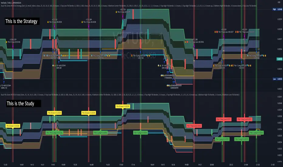
Dual Fibonacci Zones & Ranged Vol DCA Study - R3c0nTraderWhat does this do?
This signal script (aka Study) was created so it could be used with the corresponding strategy "Dual Fibonacci Zone & Ranged Vol DCA Strategy - R3c0nTrader" to create the buy and sell signals for 3Commas bots.
How to Use
Configure the study to match your settings you have set in the strategy. This script comes with an buy and sell alert conditions built-in. Just click to add alert and select Buy or Sell and paste in your bot messages.
Credits:
Thank you "EvoCrypto" for granting me permission to use "Ranged Volume" to create this study
Thank you "eykpunter" for granting me permission to use "Fibonacci Zones" to create this study
Wurucututu's Daily/Weekly/Monthly HLOCThis script draws the High/Low range for a daily, weekly, or monthly periods. By default is set to weekly.
Also it draws the open and close for each period, painting it in red if open greater than close, and green otherwise.
You can forward shift ranges to see how current price action interacts with ranges from past periods. By default this is set to zero.
For instance, here is the interaction of current week with previous week range (i.e. a 1 week shift forward).
And here is a 7 month shift forward.

SVDThis indicator aims to compare between two charts if trader isn't sure which one is more active and powerful, it does NOT show entries or help your chart analysis directly.
The main features of this indicator is to show vitality and range of any given chart.
Volatility: it calculates the average profit of every swing in the range and the final result will be the chart volatility, which indicate how profitable this chart is.
Range: it calculates the profit of the whole range compared to the total price. (E.g. range bottom is 0.1 and range top is 0.2 the range will be 100%)
Extra: indicator shows the total direction of the chart in term of (STRONG UPTREND, UPTREND, SIDEWAYS, DOWNTREND, STRONG DOWNTREND), if you got (Somthing_wrong) please contact me.
How to use: apply the indicator on different charts that you have chosen and the higher (volatility & range) the more profitable the chart is.
inputs:
Lookback length: how long the range is (how many candles are included).
How intense should the Swing be: how many candles should be counted as a confirmation complete swing.
Show counted Swings: if checked as true, will show the swings counted in the volatility calculation.
For any notes on the indicator to be edited, or for another indicator ideas please comment.

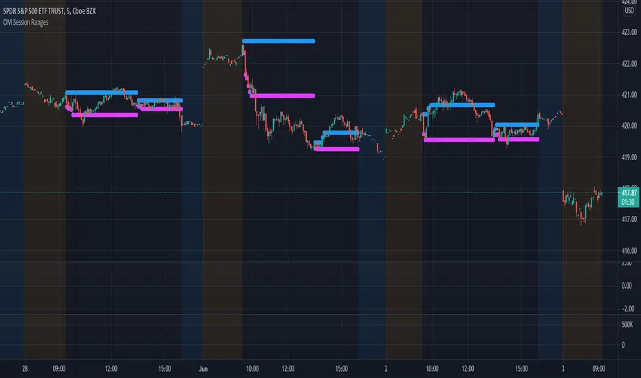
OM Session RangesThis indicator was created to assist in generating the morning and afternoon ranges as defined by Options Millionaire's strategy.
Morning range is determined by identifying the high and low from open to 10:05.
Afternoon range is determined by identifying the high and low from 13:30 to 14:05.
VuManChu Swing FreeThis is the old version of Range Filter from DonovanWall, that VuManChu is selling in his discord as "VuManChu Swing" which in reality is just Range Filter, a open-source script from DonovanWall.