Higher vs Lower Pivots overlayA simple script that I made that draws lines between the high and low pivots. The color of the line define if the pivot is higher or lower than the previous pivot. The main thing to tune is the pivot look back vs look ahead, which are the same params used by the tradingview pivot indicator. There are several other params you can tweaks to get the look you want.
Поиск скриптов по запросу "spx"
Equity Index Extended HoursHighlights the extended hours/Globex session for US Equity Index Futures.

Simple Bollinger Band and stochastic oscillator strategy for SPXThis is a very simple Bollinger Band strategy with stochastic oscillator added. Main trend is determined by Band breakout while (5,3,3) stochastic crosses is used for additional entries. Alert function is configured as "one alert for any events", so that free users can set up and get alert for every events in the script. The following code segment can be manipulated as your needs, by removing or keeping "//" comment slashes etc. Entries should be above/below the signal bars and 7-8 points should be regarded as first target, trail the left. Good luck !
signal = bbupcross or bbdowncross //or add_long or add_short
Volatility Rainbow [Nic]What is this
The volatility rainbow tracks divergences in a security and its volatility index. This can be used to identify periods of heightened implied (future) risk.
About Volatility
The volatility is calculated by looking at put / call ratios. When VIX goes up it means that puts are outpacing calls. This is a bearish signal.
About Correlation
When the security goes up while the VIX goes up, the divergence on the plot will increase and turn a color. This should be a warning.
Colors
RED - DIA
BLUE - SPX
GREEN - IWM
GOLD - GLD
YELLOW - QQQ
ORANGE - TLT
White- VVIX
Related

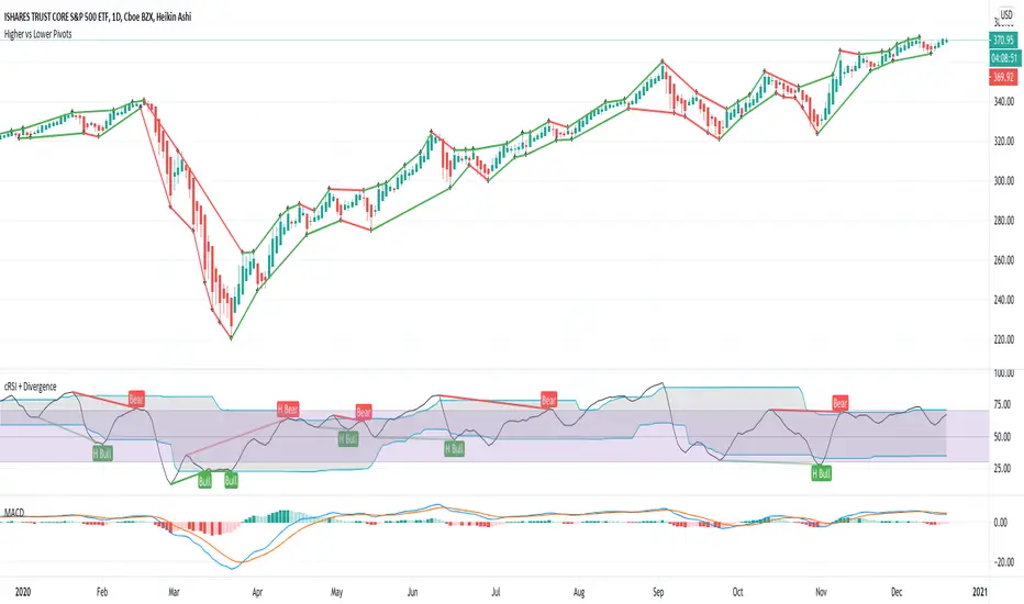
Cyclic Smoothed RSI with Divergence IndicatorI created a single indicator that combines 1) Cyclic Smoothed RSI and 2) the Divergence indicator (bull, bear). It is very handy when used with the MACD and crossover points.
Please refer to for info on how to use the cRSI indicator.
Info on the chart.
1) Red dotted lines = cRSI crossed back from overbought and crossover in MACD
2) Red solid lines = Bear divergence and crossover in MACD
3) Green dotted lines = cRSI crossed back from oversold and crossover in MACD
4) Green solid lines = Bull divergence and crossover in MACD
5) Black transition = cRSI crossover but NO crossover in MACD

Fama-French 3 Factor ModelFama-French 3 Factor Model
Extension of the Capital Asset Pricing Model (CAPM)
CAPM
Ra = Rfr +
where,
Ra = Return of the Asset
Rfr = Risk-Free Rate
βa = Beta Coefficient of the Asset
Rm - Rfr = Market Risk Premium
Fama-French 3 Factor
r = rf + β1*(rm - rf) + β2(smh) +β3(hml)
r = Expected rate of return
rf = Risk-free rate
ß = Factor’s coefficient (sensitivity)
(rm – rf) = Market risk premium
SMB (Small Minus Big) = Historic excess returns of small-cap companies over large-cap companies
HML (High Minus Low) = Historic excess returns of value stocks (high book-to-price ratio) over growth stocks (low book-to-price ratio)
Small is set to $EWSC
Invesco S&P SmallCap 600® Equal Weight ETF
Big is set to $EQLW
Invesco S&P 100 Equal Weight ETF
High is set to $IUSV
iShares Core S&P US Value ETF
Low is set to $IUSG
iShares Core S&P US Growth ETF
returns selections
'returns'
'logarithmic returns' (use for realized (historical) returns)
'geometric returns' (compounded returns)
risk-free rate selections:
$DTB3
$DGS2
$DGS5
$DGS10
$DGS30
tf = primary time-frame
rtf = reference time-frame
Realized Variables for Options ComparisonThese variables can be used in comparison with the implied volatility of options.
Variables:
Realized Volatility
mathematical notation lowercase 'sigma'
Realized Variance
mathematical notation lowercase 'sigma' squared
Realized Beta
mathematical notation lowercase 'beta'
Timeframes:
Yearly = 250 or 365
Quarterly = 50 or 90
Monthly = 20 or 30
Important Note:
Options Contract Expiry = barmerge.lookahead_on
"Merge strategy for the requested data position. Requested barset is merged with current barset in the order of sorting bars by their opening time. This merge strategy can lead to undesirable effect of getting data from "future" on calculation on history. This is unacceptable in backtesting strategies, but can be useful in indicators."
[ All other timeframes barmerge.lookahead is disabled.

Risk Metrics: Crypto VersionRisk Metrics for Crypto.
Market can be set to BTCUSD, BTCEUR, BTCCHF, BTCGBP, BTC1!, BTC2!, SPX, and DTB3
Beta
Correlation
Standard Deviation
Variance
R-squared

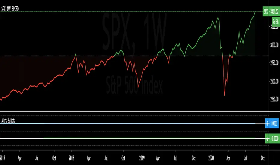
Alpha & BetaAlpha & Beta Indicators for Portfolio Performance
β = Σ Correlation (RP, RM) * (σP/σM)
α P = E(RP) –
Where,
RP = Portfolio Return (or Investment Return)
RM = Market Return (or Benchmark Index)
RF = Risk-Free Rate
How to use the Indicator
RM = SPX (Default)
The Market Return for the indicator has the options of $SPX, $NDX, or $DJI (S&P 500, Nasdaq 100, Dow 30)
RF = FRED: DTB3
The Risk-Free Rate in the Indicator is set to the 3-Month Treasury Bill: Secondary Market Rate
The Default Timeframe is 1260 or 5-Years (252 Trading Days in One Year)
RP = The symbol you enter
HOWEVER , you can determine your portfolio value by following the following directions below.
Note: I am currently working on an indicator that will allow you to insert the weights of your positions.
Complete Portfolio Analysis Directions
You will first need...
a) spreadsheet application - Google Sheets is Free, but Microsoft Excel will convert ticker symbols to Stocks and Retrieve Data.
b) your current stock tickers, quantity of shares, and last price information
In the spreadsheet,
In the first column list the stock tickers...
AMZN
AAPL
TSLA
In the second column list the quantity of shares you own...
5
10
0.20
In the third column insert the last price
Excel: Three tickers will automatically give you the option to "Convert to Stocks",
after conversion, click once on cell and click the small tab in the upper right-hand of the highlighted cell.
Click the tab and a menu pops up
Find "Price", "Price Extended-Hours", or "Previous Close"...
$3,284.72
$497.48
$2,049.98
Next, multiply the number of shares by the price (Stock Market Value)
Excel: in fourth column type "=(B1*C1)", "=(B2*C2)", "=(B3*C3)"...
= $16,423.60
= $4,974.80
= $410.00
add the three calculated numbers together or click "ΣAutoSum" (Portfolio Market Value)
= $21,808.40
Last, divide the market value of AMZN ($16,423.60) by the Portfolio Market Value ($21,808.40) for each of the stocks.
= 0.7531
= 0.2281
= 0.0188
These values are the weight of the stock in your portfolio.
Go back to TradingView
Enter into the "search box" the following...
AMZN*0.7531 + AAPL*0.2281 + TSLA*0.0188
and click Enter
Now you can use the "Alpha & Beta" Indicator to analyze your entire portfolio!
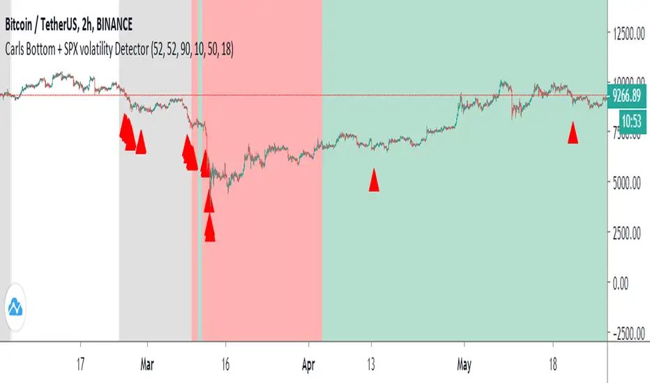
Carl's BOTTOM DETECTOR: Williams %R + normalized ATRThis script is based on Williams %r and normalized ATR.
When William%R indicates extreme oversold conditions
and the ATR indicates extreme volatility at the same time,
then it prints an arrow below the candle.
It is based on the concept that swing lows and market bottoms
are characterized by extreme oversold momentum and
extreme volatility.
The highest tf's like the daily, show you perfect market bottoms for btc.
If you zoom in it's still good to find swing highs and lows, if necessary
you can tweak the settings.
Next to that I added grey, red, and green vertical bands to the chart.
This is based on the VIX, the SPX volatility index.
Whenever the volatility of the S&P500 crosses above a specific level
it prints a colored background band behind the candle.
Grey means high volatility, red extreme volatility (like in the covid
crisis and 2008 crisis), and green means the same as grey, but indicates
it came after a red zone and could mean strong bullish bounce momentum.
You can tweak the thresholds for the grey/green and read areas.
Sto RSI and kijun-sen line to determine and follow the trend This script uses 25-75 treshold of stochastic RSI with the help of kijun-sen as confirmation, to find entry points to any trend either newly developed or an established one. I just realized it on the 1 hour SPX chart. Sure it can be used on other symbols. Crossing above/below 25/75 line of sto RSI is considered as buy/sell signal. Signals are evaluated whether price be above/below kijun-sen line. If a sell signal below kijun-sen is generated it is a continuation signal for downtrend, otherwise it is a countertrend signal (maybe a signal for a new downtrend). A countertrend signal must be evaluated carefully and only accepted in the right side of kijun-sen. e.g entering a sell signal generated above kijun-sen should be accepted only below the kijun-sen, vice-versa.

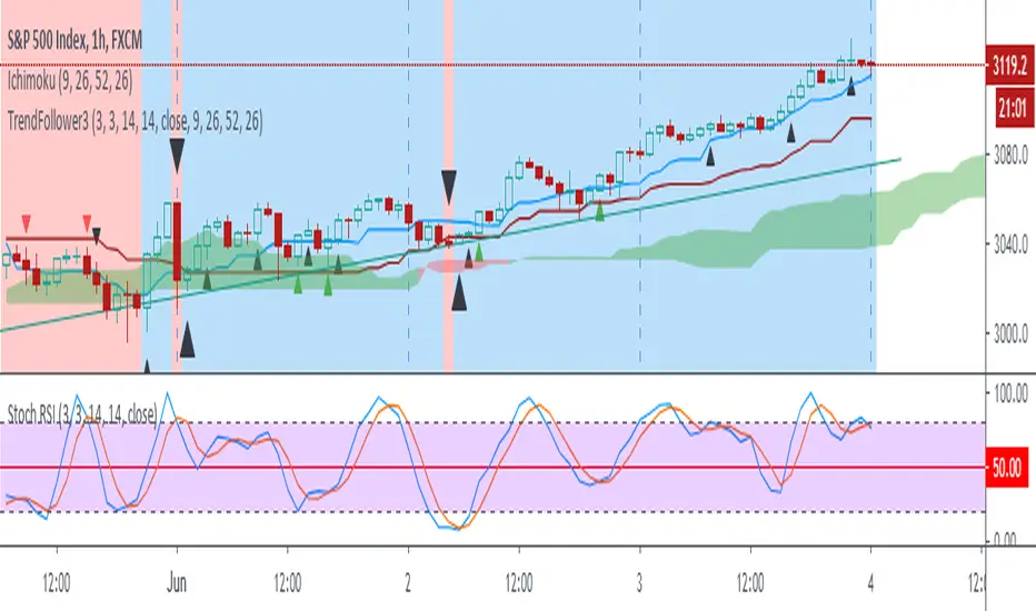
Trend Follow with kijun-sen/tenkan sen for 1 Hour SPX
This script determines, plots and alerts on probable trend initiation and continuation points, using tenkan-sen(conversion line of ichimoku), kijun-sen(baseline of ichimoku) and stochastic RSI, for 1 H SPX.
New long/short trend initiates when prices cross above/below kijun sen. The trend continues when prices cross above/below tenkan-sen or stochastic RSI crosses up/down its signal line, while prices are above/below kijun-sen.
It is good to take partial profit between 10-15 points gain and trail the left with stops below kijun-sen line.
While placing the order, using 2-3 points buffer above/below of signal bars is recommended. Additionally, please be careful about clouds and do not place long/short orders below/above clouds.
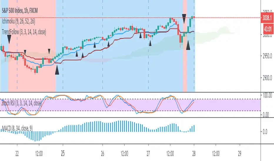
Trend Follow with 8/34 EMA and Stoch RSI for 1 Hour SPX
The script determines and plots entry points for 1 hour S&P index using 8/34 emas and stochastic RSI. When 8 ema above/below 34 ema up/down crosses of stochastic RSI are considered as long/short entries. Entry prices should be above/below high/low of the signal bars accordingly. Ichimoku cloud can be used as extra filtering.
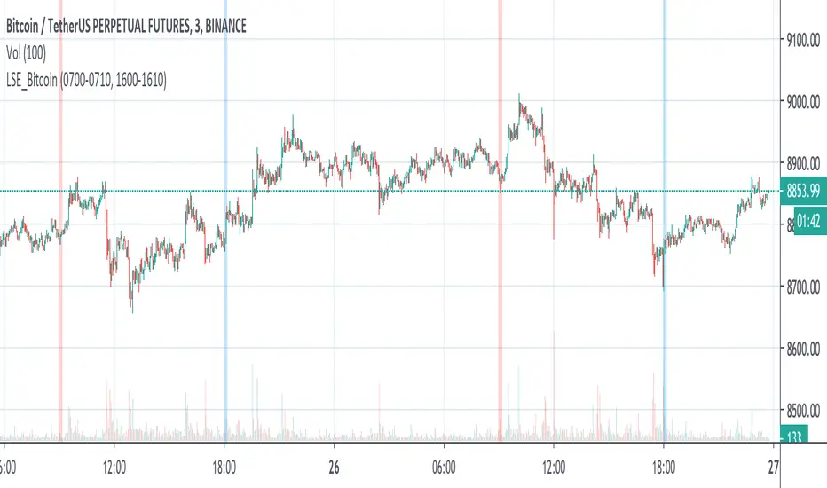
LSE_Bitcoin pump and flush at the London SE opening and closingBTC recently decoupled from SPX but now it is using London Exchange opening and closing hour to pump and flush.
Moving Average Speed Can Spot Turns Before They HappenMoving averages are perhaps the most common indicator in the world of technical analysis, highlighting trends over time by smoothing out values.
Because they show direction, moving averages inevitably rise or fall. These changes are often obvious in retrospect, but now they can be spotted as they happen with our MA Speed script.
This indicator calculates one of five kinds of moving averages (including exponential and volume-weighted). Users can set the length (50-day SMA by default). They can even pick whether it calculates based on open, high, low, close, etc. (Close is the default.)
MA Speed plots the simple 1-day percentage change similar to an oscillator at the bottom of the chart, color-coding for positive or negative values.
The chart above applies MA Speed to the S&P 500 . The result is pretty interesting because we can see how its 50-day SMA was falling at 0.67 percent in March, the fastest decline since December 2008. But this month it’s flattened quickly and is on pace to turn higher in the next session or two.

Selectable Ticker DIXWith this script you can select 10 tickers and see the aggregated DIX for them. I have the highest volume equity ETFs as defaults, but one could easily select FAANGM and a few other mega caps and make a FAANGM DIX index by changing the tickers in the settings. One improvement item that I have not gotten around to doing is to create a dollar weighted version of this, similar to the actual Squeezemetrics SPX DIX. This is "equal weighted" To make a dollar weighted version, multiply each by the daily closing price essentially and THEN find the average. It is possible to do I just have not taken the time to do it. It is on the list of things to do. If anyone has a solution PM me and I will add it. Thanks.

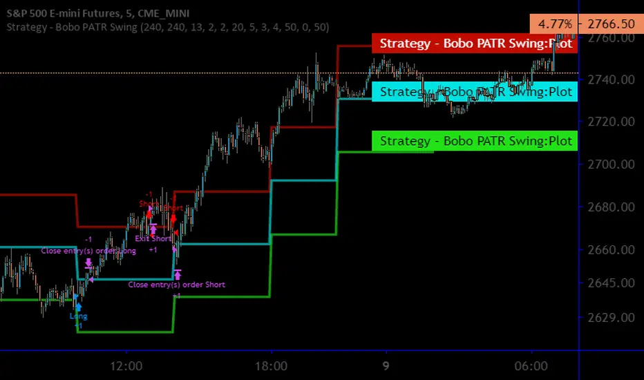
Strategy - Bobo Intraday Swing Bot with filtersThis is an adapted version of my swing bot with additional filters that mean it works quite well on lower timeframes like 1min, 5 mins as long as you adjust the setting accordingly (reduce pivot timescale, band width)
Entry conditions are filtered by an invisible trend calculation running in the background so the bot doesn't repeatedly try and fail to fade a strong trend. It has just about everything you should need for basic use, stop losses and targets, automatically close trade at pivot.
I get good results on rangey instruments like major indices such as SPX / ES that kind of thing. Make sure you understand the minmum tick value of an index so the stop setting on the bot work properly
Hope it's useful!
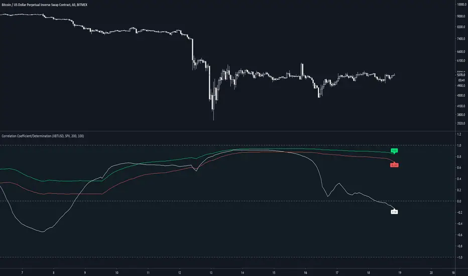
Correlation Coefficient & Coefficient of DeterminationMeasures the correlation between 2 assets, along with the coefficient of determination of the average of 200 candles. By default, 2 correlations are presented but only 1 with a coefficient of determination (default 200).
Default assets are XBTUSD and SPX
A value of 1 for R(200) gives a strong linear correlation between 2 assets
A value of 0 for R(200) suggests no linear correlation
A value of -1 for R(200) suggests a negative linear correlation between 2 assets
A coefficient of determination (R2) of 1 suggests confidence in the variability of the response data around mean.
A coefficient of determination (R2) of 0 suggests no confidence in the variability of the response data around mean.
BAT Multi Anchored VWAPMulti Anchored VWAP which includes:
BTC Key Pivots
SPX Key Pivots
Yearly Opens
5 Adjustable Dates
Works on all assets, unlike some VWAP calculations.

Volatitity Bands (STARC) on RSI for reversal warning [beta]Origin : The Indicator uses STARC volatilty bands created by Manning Stoller, based on ATR.
He perfered them to Bollinger because extreme price action never exceeds them.
Her former scholar and now TA Superstar Constance Brown applied them on RSI for getting
very relavant trend reversals. (She only used them in times when "overbought or not" becomes a severe question.
What it does: It delivers a reversal signal after rsi exceeded the bands and - as the bands resume the trend - the rsi fails to test the band once more. This is the moment of a reversal warning.
How to work wit h:
- Take the index of your interest and choose a time horizon one or two scales higher than your usual working horizon .(i.e if you work on Daily choose weekly).
-Scale the upper and the lower band via settings, so that the rsi only in rare cases exceeds or touches the bands. This is to tweak the reversal threshold. (For weekly SPX i am fine with 2.2 and 2.1)
- Find the arrows that mark possible reversals.
- Ready
Note: I called this a beta because i publish it with nearly no practical experience with it , just checked the formal correctness of the code. (Published so fast because it was written during the coronavirus days, for which to handle it might be helpful. )So feedback very welcome.
I took the formula in slight modification from the book "Technical Analysis for the Trading Professional", 2nd edition, by Constance Brown.
"Fun" Note: As you see the script would have warned before the corona selling - if you had used it.
I didn't because bull flags and all predicted nice weather...
Greets and again feedback welcome
yoxxx

SMU Quantum Thermo BallsThis script is the enhanced version of Market Thermometer with one difference. This one has Quantum Thermo balls shooting out of the thermometer tube when overheated. Quantum psychology, Quantum observation, call it what you like
My scripts are designed to beat ALGO, so the behavior of indicators is not like traditional indicators. Don't try to overthink it and compare it to other established functions.
If you knew ALGo as much as I do, then you would also ditch old indicators and design your own weird scripts to match the ALGO's personality. Oh yes, each AlGo for each stock has its own programming personality. Most my scripts are tuned to beat SPX ALGO meniac
Enjoy and think outside the box, the only way to beat the ALGO

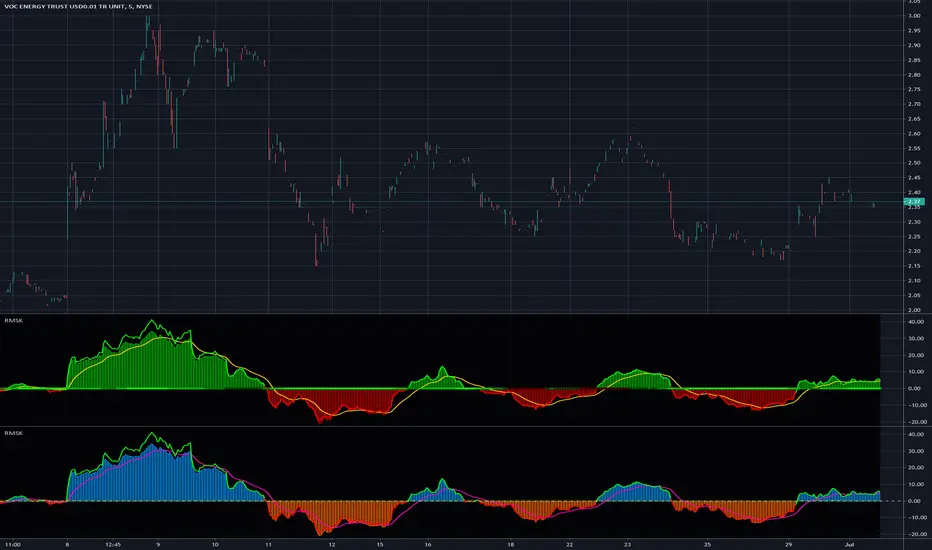
Relative Strength(RSMK) + Perks - Markos KatsanosIf you are desperately looking for a novel RSI, this isn't that. This is another lesser known novel species of indicator. Hot off the press, in multiple stunning color schemes, I present my version of "Relative Strength (RSMK)" employing PSv4.0, originally formulated by Markos Katsanos for TASC - March 2020 Traders Tips. This indicator is used to compare performance of an asset to a market index of your choosing. I included the S&P 500 index along side the Dow Jones and the NASDAQ indices selectively by an input() in "Settings". You may comparatively analyze other global market indices by adapting the code, if you are skilled enough in Pine to do so.
With this contribution to the Tradingview community, also included is MY twin algorithmic formulation of "Comparative Relative Strength" as a supplementary companion indicator. They are eerily similar, so I decided to include it. You may easily disable my algorithm within the indicator "Settings". I do hope you may find both of them useful. Configurations are displayed above in multiple scenarios that should be suitable for most traders.
As always, I have included advanced Pine programming techniques that conform to proper "Pine Etiquette". For those of you who are newcomers to Pine Script, this script may also help you understand advanced programming techniques in Pine and how they may be utilized in a most effective manner. Utilizing the "Power of Pine", I included the maximum amount of features I could surmise in an ultra small yet powerful package, being less than a 60 line implementation at initial release.
Unfortunately, there are so many Pine mastery techniques included, I don't have time to write about all of them. I will have to let you discover them for yourself, excluding the following Pine "Tricks and Tips" described next. Of notable mention with this release, I have "overwritten" the Pine built-in function ema(). You may overwrite other built-in functions too. If you weren't aware of this Pine capability, you now know! Just heed caution when doing so to ensure your replacement algorithms are 100% sound. My ema() will also accept a floating point number for the period having ultimate adjustability. Yep, you heard all of that properly. Pine is becoming more impressive than `impressive` was originally thought of...
Features List Includes:
Dark Background - Easily disabled in indicator Settings->Style for "Light" charts or with Pine commenting
AND much, much more... You have the source!
The comments section below is solely just for commenting and other remarks, ideas, compliments, etc... regarding only this indicator, not others. When available time provides itself, I will consider your inquiries, thoughts, and concepts presented below in the comments section, should you have any questions or comments regarding this indicator. When my indicators achieve more prevalent use by TV members, I may implement more ideas when they present themselves as worthy additions. As always, "Like" it if you simply just like it with a proper thumbs up, and also return to my scripts list occasionally for additional postings. Have a profitable future everyone!