Bitcoin vs M2 Global Liquidity (Lead 3M) - Table Ticker═══════════════════════════════════════════════════════════════
Bitcoin vs M2 Global Liquidity - Regression Indicator
═══════════════════════════════════════════════════════════════
TECHNICAL SPECS
• Pine Script v6
• Overlay: false (separate pane)
• Data sources: 5 M2 series + 4 FX pairs (request.security)
• Calculation: Rolling OLS linear regression with configurable lead
• Output: Regression line + ±1σ/±2σ confidence bands + R² ticker
CORE FUNCTIONALITY
Aggregates M2 money supply from 5 central banks (CN, US, EU, JP, GB),
converts to USD, applies time-lead, runs rolling linear regression
vs Bitcoin price, plots predicted value with confidence intervals.
CONFIGURABLE PARAMETERS
Input Controls:
• Lead Period: 0-365 days (default: 90)
• Lookback Window: 50-2000 bars (default: 750)
• Bands: Toggle ±1σ and ±2σ visibility
• Colors: BTC, M2, regression line, confidence zones
• Ticker: Position, size, colors, transparency
Advanced Settings:
• Table display: R², lead, M2 total, country breakdown (%)
• Ticker customization: 9 position options, 6 text sizes
• Border: Width 0-10px, color, outline-only mode
DATA AGGREGATION
Sources (via request.security):
• ECONOMICS:CNM2, USM2, EUM2, JPM2, GBM2
• FX_IDC:CNYUSD, JPYUSD (others: FX:EURUSD, GBPUSD)
• Conversion: All M2 → USD → Sum / 1e12 (trillions)
REGRESSION ENGINE
• Arrays: m2Array, btcArray (dynamic sizing, auto-trim)
• Window: Rolling (lookbackPeriod bars)
• Lead: Time-shift via array indexing (i + leadPeriodDays)
• Calc: Manual OLS (covariance/variance), no built-in ta functions
• Outputs: slope, intercept, r2, stdResiduals
CONFIDENCE BANDS
±1σ and ±2σ calculated from standard deviation of residuals.
Fill zones between upper/lower bounds with configurable transparency.
ALERTS
5 pre-configured alertcondition():
• Divergence > 15%
• Price crosses ±1σ bands (up/down)
• Price crosses ±2σ bands (up/down)
TICKER TABLE
Dynamic table.new() with 9 rows:
• R² value (4 decimals)
• Lead period (days + months)
• M2 Global total (trillions USD)
• Country breakdown: CN, US, EU, JP, GB (absolute + %)
• Optional: Hide/show M2 details
VISUAL CUSTOMIZATION
All plot() elements support:
• Color picker inputs (group="Couleurs")
• Line width: 1-3px
• Transparency: 0-100% for zones
• Offset: M2 plot has +leadPeriodDays offset option
PERFORMANCE
• Max arrays size: lookbackPeriod + leadPeriodDays + 200
• Calculations: Only when array.size >= lookbackPeriod + leadPeriodDays
• Table update: barstate.islast (once per bar)
• Request.security: gaps_off mode
CODE STRUCTURE
1. Inputs (lines 7-54)
2. Data fetch (lines 56-76)
3. M2 aggregation (line 78)
4. Array management (lines 84-95)
5. Regression calc (lines 97-172)
6. Prediction + bands (lines 174-183)
7. Plots (lines 185-199)
8. Ticker table (lines 201-236)
9. Alerts (lines 238-246)
DEPENDENCIES
None. Pure Pine Script v6. No external libraries.
LIMITATIONS
• Daily timeframe recommended (1D)
• Requires 750+ bars history for optimal calculation
• M2 data availability: TradingView ECONOMICS feed
• Max lines: 500 (declared in indicator())
CUSTOMIZATION EXAMPLES
• Shorter lookback (200d): More reactive, lower R²
• Longer lookback (1500d): More stable, regime mixing
• No bands: Set showBands=false for clean view
• Different lead: Test 60d, 120d for sensitivity analysis
TECHNICAL NOTES
• Manual OLS implementation (no ta.linreg)
• Array-based lead application (not plot offset)
• M2 values stored in trillions (/ 1e12) for readability
• Residuals array cleared/rebuilt each calculation
OPEN SOURCE
Code fully visible. Modify, fork, analyze freely.
No hidden calculations. No proprietary data.
VERSION
1.0 | November 2025 | Pine Script v6
═══════════════════════════════════════════════════════════════
Поиск скриптов по запросу "莱加内斯VS皇家社会"

ATR Daily (Classic vs Robust, NY-Fix, Spike Control)📘 What this indicator does
This tool provides an advanced view of daily market volatility by comparing two versions of the Average True Range (ATR):
• Classic ATR — standard Wilder smoothing
• Robust ATR — uses median-based filtering and spike-control logic to reduce distortion from abnormal candles
Both values are calculated using daily data aligned to the New York trading session, so volatility resets at the same moment each institutional trading day begins. This keeps readings consistent across crypto, forex and stocks, even on intraday charts.
⚙️ How it works (in simple terms)
The script evaluates each True Range (TR) value relative to a median-based threshold:
• Abnormally large ranges are either clamped to a limit or excluded from updating ATR
• A hard cap prevents single spikes from inflating the entire indicator
• The result is a smoother and more realistic representation of daily volatility
This allows ATR to reflect typical market behaviour instead of rare one-off events.
📊 What appears on the chart
• Two daily ATR lines (Classic and Robust)
• Histogram showing the percentage of daily range already completed
• Red bars when price exceeds 100% of daily ATR
• A data table with volatility metrics
• Background highlights on days with extreme values
💡 How traders can use it
• Identify when a market has already completed most of its typical daily move
• Compare Classic vs Robust ATR to spot news-driven distortion
• Use Robust ATR for more stable stop-loss and take-profit logic
• Track volatility expansion or contraction across sessions
⚙️ Key settings
Setting Purpose
ATR period Standard smoothing length (default 14)
Robust mode Clamp, Freeze or Off
MAD multiplier Sensitivity to outliers
Cap × median(TR) Maximum allowed spike size
Base for passed ATR Which ATR is used to measure daily %
Freeze weekends Keeps ATR unchanged on Sat/Sun
🧩 Unique concept
Unlike typical ATR indicators, this one combines robust statistics (median + MAD) with session-based fixation. ATR values update only once per New York session, creating stable volatility measurements that match institutional timing.
🔒 Source code
The script is published with protected source code to preserve its statistical structure and prevent unauthorized modification.
🧭 Summary
ATR Daily (Classic vs Robust, NY-Fix) provides a clearer and more reliable view of daily volatility.
It helps determine whether the market is still in the early phase of its daily range or already exhausted.

Price vs 10/50DMA (%) — single labelThis TradingView script shows how far the current price is from its 10-day and 50-day moving averages (DMAs), expressed as percentages, and displays both values as a single label near the latest candle — for example, “+3% vs 10DMA | +8% vs 50DMA.” You can switch between simple and exponential moving averages using the “Use EMA” checkbox, and adjust the period lengths in the input panel. To use it, simply copy the code into TradingView’s Pine Editor, click Add to chart, and you’ll see one live label updating each bar along with the plotted 10- and 50-day average lines.
DAMMU Buy vs Sell Liquidity + DifferenceIndicator Name:
Buy vs Sell Liquidity + Difference
Purpose:
This indicator helps traders analyze market liquidity by comparing the cumulative buy and sell volumes within a specified timeframe. It shows which side (buyers or sellers) is dominating and the magnitude of the imbalance.
Key Features:
Aggregation Timeframe:
Users can select the timeframe (1, 2, 3, 5, 15, 30 minutes) for which volume is analyzed.
Buy & Sell Volume Calculation:
Buy Volume: Total volume of candles where close > open.
Sell Volume: Total volume of candles where close < open.
Daily Reset:
Totals reset at the start of each new day, ensuring intra-day liquidity analysis.
Difference Calculation:
Shows the absolute difference between buy and sell volumes.
Also calculates the difference as a percentage of total volume.
Percentages:
Displays buy %, sell %, and diff % to 4 decimal places, giving precise insights.
Table Display:
A two-row table in the top-right corner of the chart:
Row 1: Absolute totals for BUY, SELL, and DIFF (full numbers with commas).
Row 2: Percentages for BUY, SELL, and DIFF (4 decimals).
Uses color coding: Green for BUY, Red for SELL, Dynamic for DIFF (based on dominance).
How to Use:
High Buy Volume: Indicates strong buying pressure; bullish sentiment.
High Sell Volume: Indicates strong selling pressure; bearish sentiment.
Large DIFF %: Signals dominant market side; useful for short-term scalping or spotting liquidity imbalance.
Comparing BUY vs SELL %: Helps identify when the market may reverse or continue the trend.
If you want, I can also make a 1-paragraph “trader-friendly” explanation that you could directly include in your Pine Script as a comment or in a strategy guide.

BTC Spread: Coinbase Spot vs CME Futures (skullcap)BTC Spread: Coinbase Spot vs CME Futures
This indicator plots the real-time spread between Coinbase Spot BTC (COINBASE:BTCUSD) and CME Bitcoin Futures (CME:BTC1!).
It allows traders to monitor the premium or discount between spot and futures markets directly in one chart.
⸻
📊 How it Works
• The script pulls Coinbase spot BTC closing prices and CME front-month BTC futures prices on your selected timeframe.
• The spread is calculated as:
Spread = CME Price – Coinbase Spot Price
🔧 How to Use
1. Add the indicator to your chart (set to any timeframe you prefer).
2. The orange line represents the spread (USD difference).
3. The grey dashed line marks the zero level (parity between CME and Coinbase).
4. Use it to:
• Compare futures vs. spot market structure
• Track premium/discount cycles around funding or expiry
• Identify arbitrage opportunities or market dislocations
⸻
⚠️ Notes
• This indicator is informational only and does not provide trading signals.
• Useful for traders analysing derivatives vs spot price action.
• Works best when paired with order flow, funding rate, and open interest data.

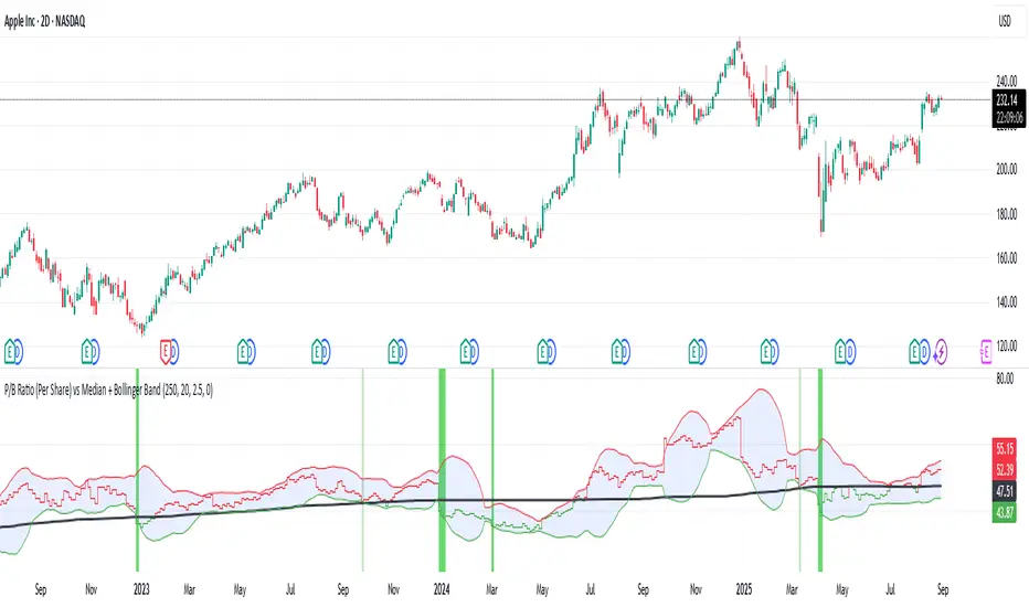
P/B Ratio (Per Share) vs Median + Bollinger Band- 📝 This indicator highlights potential buying opportunities by analyzing the Price-to-Book (P/B) ratio in relation to Bollinger Bands and its historical median.
- 🎯 The goal is to provide a visually intuitive signal for value-oriented entries, especially when valuation compression aligns with historical context.
- 💡 Vertical green shading is applied when the P/B ratio drops below the lower Bollinger Band, which is calculated directly from the P/B ratio itself — not price. This condition often signals the ticker may be oversold.
- 🟢 Lighter green appears when the ratio is below the lower band but above the median, suggesting a possible shorter-term entry with slightly more risk.
- 🟢 Darker green appears when the ratio is both below the lower band and below the median, pointing to a potentially stronger, longer-term value entry.
- ⚠️ This logic was tested using 1 and 2-day time frames. It may not be as helpful in longer time frames, as the financial data TradingView pulls in begins in Q4 2017.
- ⚠️ Note: This script relies on financial data availability through TradingView. It may not function properly with certain tickers — especially ETFs, IPOs, or thinly tracked assets — where P/S ratio data is missing or incomplete.
- ⚠️ This indicator will not guarantee successful results. Use in conjunction with other indicators and do your due diligence.
- 🤖 This script was iteratively refined with the help of AI to ensure clean logic, minimalist design, and actionable signal clarity.
- 📢 Idea is based on the script "Historical PE ratio vs median" by haribotagada
- 💬 Questions, feedback, or suggestions? Drop a comment — I’d love to hear how you’re using it or what you'd like to see changed.
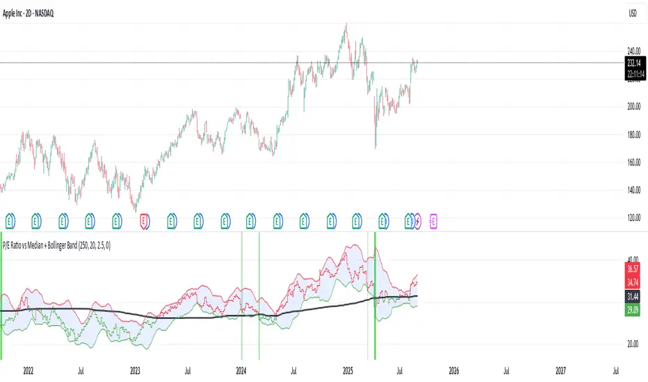
P/E Ratio vs Median + Bollinger Band- 📝 This indicator highlights potential buying opportunities by analyzing the Price-to-Earnings (P/E) ratio in relation to Bollinger Bands and its historical median.
- 🎯 The goal is to provide a visually intuitive signal for value-oriented entries, especially when valuation compression aligns with historical context.
- 💡 Vertical green shading is applied when the P/E ratio drops below the lower Bollinger Band, which is calculated directly from the P/E ratio itself — not price. This condition often signals the ticker may be oversold.
- 🟢 Lighter green appears when the ratio is below the lower band but above the median, suggesting a possible shorter-term entry with slightly more risk.
- 🟢 Darker green appears when the ratio is both below the lower band and below the median, pointing to a potentially stronger, longer-term value entry.
- ⚠️ This logic was tested using 1 and 2-day time frames. It may not be as helpful in longer time frames, as the financial data TradingView pulls in begins in Q4 2017.
- ⚠️ Note: This script relies on financial data availability through TradingView. It may not function properly with certain tickers — especially ETFs, IPOs, or thinly tracked assets — where P/S ratio data is missing or incomplete.
- ⚠️ This indicator will not guarantee successful results. Use in conjunction with other indicators and do your due diligence.
- 🤖 This script was iteratively refined with the help of AI to ensure clean logic, minimalist design, and actionable signal clarity.
- 📢 Idea is based on the script "Historical PE ratio vs median" by haribotagada
- 💬 Questions, feedback, or suggestions? Drop a comment — I’d love to hear how you’re using it or what you'd like to see changed.
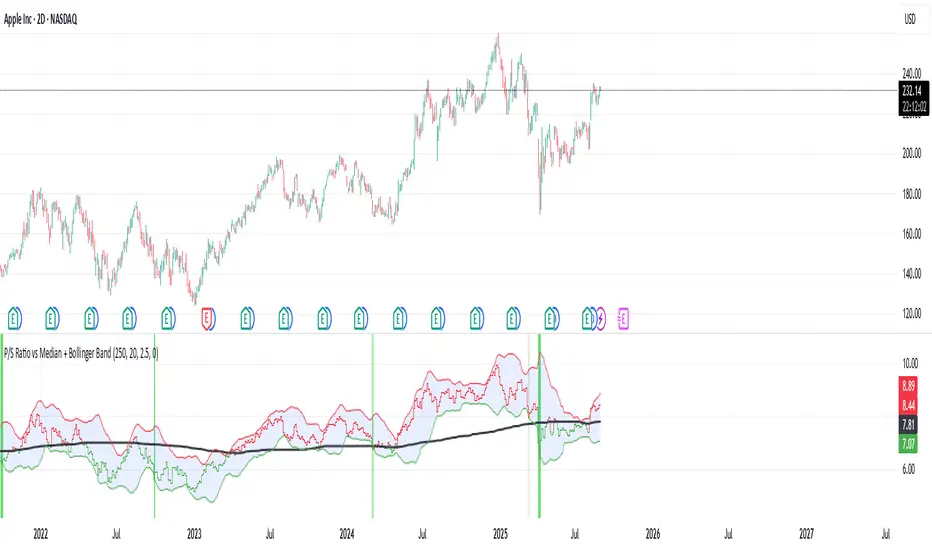
P/S Ratio vs Median + Bollinger Band- 📝 This indicator highlights potential buying opportunities by analyzing the Price-to-Sales (P/S) ratio in relation to Bollinger Bands and its historical median.
- 🎯 The goal is to provide a visually intuitive signal for value-oriented entries, especially when valuation compression aligns with historical context.
- 💡 Vertical green shading is applied when the P/S ratio drops below the lower Bollinger Band, which is calculated directly from the P/S ratio itself — not price. This condition often signals the ticker may be oversold.
- 🟢 Lighter green appears when the ratio is below the lower band but above the median, suggesting a possible shorter-term entry with slightly more risk.
- 🟢 Darker green appears when the ratio is both below the lower band and below the median, pointing to a potentially stronger, longer-term value entry.
- ⚠️ This logic was tested using 1 and 2-day time frames. It may not be as helpful in longer time frames, as the financial data TradingView pulls in begins in Q4 2017.
- ⚠️ Note: This script relies on financial data availability through TradingView. It may not function properly with certain tickers — especially ETFs, IPOs, or thinly tracked assets — where P/S ratio data is missing or incomplete.
- ⚠️ This indicator will not guarantee successful results. Use in conjunction with other indicators and do your due diligence.
- 🤖 This script was iteratively refined with the help of AI to ensure clean logic, minimalist design, and actionable signal clarity.
- 📢 Idea is based on the script "Historical PE ratio vs median" by @haribotagada
- 💬 Questions, feedback, or suggestions? Drop a comment — I’d love to hear how you’re using it or what you'd like to see changed.
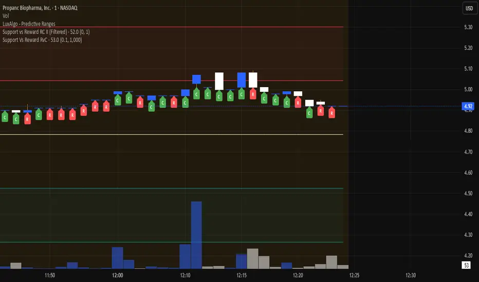
Support Vs Reward RvCSupport Vs Reward RvC
The Support Vs Reward RvC indicator is a simple yet effective tool that analyzes candle strength relative to both price movement and trading volume. Highlights candles where both body size and volume expand or contract, helping traders spot momentum shifts and weakening moves.
📌 How it works:
- “C” expect a Continuation of Trend in the next one or two candles;
- “R” expect a Reverse of Trend in the next one or two candles.
Works well on bigger time candles like 10-15 minutes but also gives important info in day-trading or scalping.
Marks candles where both body size and volume increase or decrease, making momentum shifts easy to spot. This smart candle analyzer reveals momentum surges and fading moves through body size and volume dynamics.
It compares each candle’s body size (open-to-close range) and its volume against the previous candle.
If both the body and volume are greater than the previous candle, a green “C” from Continuation of Trend is displayed under the bar.
If both the body and volume are smaller than the previous candle, a red “R” from Reverse of Trend is displayed under the bar.
Custom filters allow users to ignore insignificant moves by setting a minimum body size (as % of price) and a minimum volume threshold.
📌 Use cases:
Spot momentum shifts when price and volume expand together.
Identify weakening moves when both price action and volume contract.
Can be combined with other strategies for confirmation of entries or exits.
⚙️ Inputs:
Minimum Body Size % (of price): Filters out small candles.
Minimum Volume: Ensures only significant moves are marked.
This indicator is best used as a confirmation tool within a larger trading strategy, rather than as a standalone buy/sell signal.
RS Ratio vs Benchmark (Colored)📈 RS Ratio vs Benchmark (with Color Change)
A simple but powerful tool to track relative strength against a benchmark like QQQ, SPY, or any other ETF.
🔍 What it Shows
RS Ratio (orange line): Measures how strong a stock is relative to a benchmark.
Moving Average (teal line): Smooths out RS to show trend direction.
Color-coded RS Line:
🟢 Green = RS is above its moving average → strength is increasing.
🔴 Red = RS is below its moving average → strength is fading.
📊 How to Read It
Above 100 = Stock is outperforming the benchmark.
Below 100 = Underperforming.
Rising & Green = Strongest signal — accelerating outperformance.
Above 100 but Red = Consolidating or losing momentum — potential rest period.
Crosses below 100 = Warning sign — underperformance.
✅ Best Uses
Spot leading stocks with strong momentum vs QQQ/SPY.
Identify rotation — when strength shifts between sectors.
Time entries and exits based on RS trends and crossovers.
Index Futures vs Cash ArbitrageThis indicator measures the statistical spread between major stock index futures and their corresponding cash indices (e.g., ES vs SPX, NQ vs NDX) using Z-score normalization. It automatically detects commonly traded index pairs (S&P 500, Nasdaq, Dow Jones, Russell 2000) and calculates a smoothed spread between futures and spot prices. A Z-score is then derived from this spread to highlight potential overpricing or underpricing conditions.
Traders can use customizable thresholds to identify mean-reversion opportunities where the futures contract may be temporarily overvalued or undervalued relative to the index. The histogram highlights the direction of the Z-score (green = futures > index, red = futures < index), while built-in alerts notify users of key threshold breaches or zero-line crosses.
This tool is designed for discretionary traders, pairs traders, or anyone exploring statistical arbitrage strategies between futures and spot markets. It is not a buy/sell signal by itself and should be used with additional confluence or risk management techniques.

Aggregated Spot vs Perp Volume (% Change)Aggregated Spot vs Perp Volume (% Change)
Description
The "Aggregated Spot vs Perp Volume (% Change)" indicator helps crypto traders compare the momentum of spot and perpetual futures (perp) trading volumes across 12 major exchanges. It calculates the percentage change in volume from one bar to the next, highlighting divergences and showing which market—spot or perp—is leading a move. By focusing on relative changes, it eliminates the issue of absolute volume differences, making trends clear.
The indicator aggregates data from Binance, Bybit, OKX, Coinbase, Bitget, MEXC, Phemex, BingX, WhiteBIT, BitMEX, Kraken, and HTX. Users can toggle exchanges and choose to measure volume in coin units (e.g., BTC) or USD.
How It Works
Volume Aggregation:
Fetches spot and perp volume data for the selected crypto (e.g., BTC) from up to 12 exchanges.
Spot volume is included only if perp volume is available for the same pair, ensuring consistency.
Volume can be measured in coin units or USD (volume × spot price).
Percentage Change:
Calculates the percentage change in spot and perp volumes from the previous bar:
Percentage Change = ((Current Volume − Previous Volume) / Previous Volume) ×100
This focuses on relative momentum, making spot and perp volumes directly comparable.
Visualization:
Spot volume % change is plotted as a blue line, and perp volume % change as a red line, both with a linewidth of 1.
Who Should Use It
Crypto Traders: To understand spot vs. perp market dynamics across exchanges.
Momentum Traders: To spot which market is driving price moves via volume divergences.
Scalpers/Day Traders: For identifying short-term shifts in market activity.
Analysts: To study liquidity and sentiment in crypto markets.
How to Use It
Blue line: Spot volume % change.
Red line: Perp volume % change.
Look for divergences (e.g., a sharp rise in the red line but not the blue line suggests perp markets are leading).
Combine with Price:
Use alongside price charts to confirm trends or spot potential reversals.
Context
Spot markets reflect actual asset trading, while perp markets, with leverage, attract speculative activity and often show higher volumes. This indicator uses percentage change to compare their momentum, helping traders identify market leadership and divergences. For example, a 50% increase in both spot and perp volumes plots at the same level, making it easy to see relative shifts across exchanges.

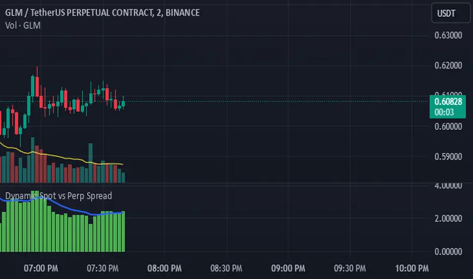
Dynamic Spot vs Perp Spread### **Description for TradingView Publication**
---
**Dynamic Spot vs Perp Spread**
(For USDT-Spot and USDT.P-Perp)
Summary of Usefulness:
This indicator is a valuable tool for traders who want to monitor and capitalize on the relationship between spot and perpetual futures (perp) prices. When the spot price exceeds the perp price, it's often a leading signal that the perp price will follow, creating potential trading opportunities. While this behavior doesn't happen every time, divergences between spot and perp prices can frequently signal significant market movements.
What it Does:
This indicator calculates and displays the price spread (percentage difference) between the spot price and perpetual futures (perp) price of a cryptocurrency asset. It dynamically adjusts to the instrument being viewed, ensuring that spot dominance (spot price higher) is plotted above the zero line and perp dominance (perp price higher) is plotted below the zero line. Additionally, the indicator accounts for symbols with multipliers (e.g., `1000SHIBUSDT.P`) to ensure accurate calculations.
Key features include:
- Automatic symbol detection and adjustment for Spot/Perp pairs.
- Dynamic handling of price multipliers for assets with prefixes like `1000`.
- Visualization of spread with a histogram and optional smoothing using an EMA (Exponential Moving Average).
- Configurable alerts for significant spread changes and spread flips.
- No repainting: the indicator uses the `barmerge.lookahead_off` setting to ensure stable, non-repainting values.
---
### **How to Use**
1. **Add the Indicator:**
- Search for "Dynamic Spot vs Perp Spread" in the TradingView Indicators library and add it to your chart.
2. **Understand the Visualization:**
- A positive spread (green histogram) indicates that the spot price is higher than the perp price (spot dominance).
- A negative spread (red histogram) indicates that the perp price is higher than the spot price (perp dominance).
3. **Customize Settings:**
- **EMA Length:** Use the input field to smooth the spread data over a chosen number of periods.
- **Alert Threshold:** Set a threshold to receive alerts when the spread exceeds a specific percentage.
4. **Receive Alerts:**
- Enable alerts for spread flips (when dominance shifts between spot and perp) or when the spread exceeds the defined threshold.
5. **Use Case Examples:**
- **Spot vs. Perp Arbitrage:** Traders can monitor significant deviations between spot and perp prices to identify potential arbitrage opportunities.
- **Market Sentiment Analysis:** Persistent spot dominance may indicate stronger buying interest in the spot market, while perp dominance may suggest futures market speculation.
---
### **Repainting Behavior**
This indicator **does not repaint** because it uses `barmerge.lookahead_off` for all calculations, ensuring that data from the comparison symbol (spot or perp) is locked to the currently completed candle. This means the values plotted and alerts triggered are reliable and do not change retrospectively.
Repainting occurs when an indicator uses future-looking or incomplete data for calculations. By design, this indicator avoids such practices, making it suitable for live trading and analysis.
---
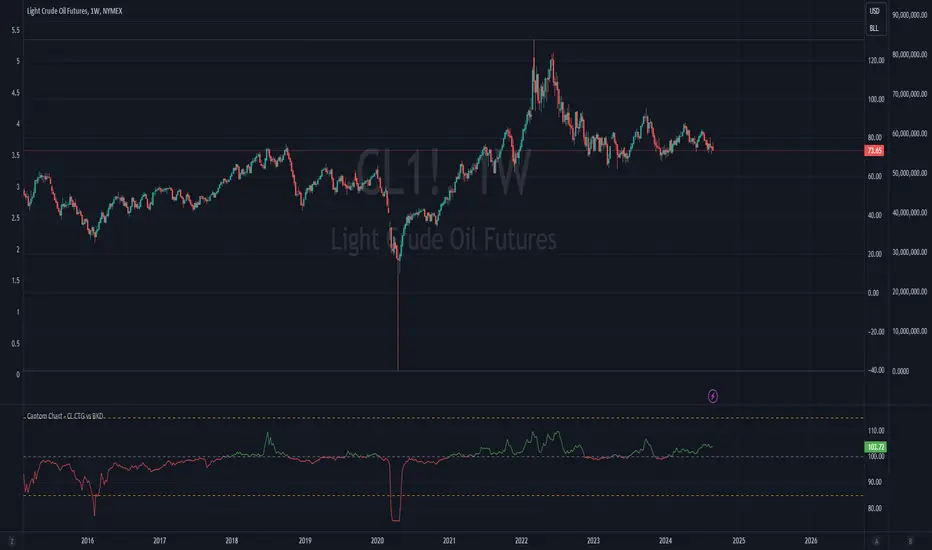
Cantom Chart - CL CTG vs BKDEnglish : This Pine Script indicator, named "Cantom Chart - CL CTG vs BKD," uniquely analyzes the immediate state of oil futures contracts to determine if they are in contango or backwardation. The script uses the price ratio between the nearest (CL1) and the next nearest (CL2) NYMEX crude oil futures contracts. It multiplies this ratio by 100 for clarity and scales fluctuations for enhanced visibility.
Key Features:
Dynamic Ratio Calculation: Computes the ratio (CL1/CL2 * 100) to determine the immediate market state.
Market State Interpretation: A ratio above 100 indicates backwardation, suggesting higher demand than supply, while a ratio below 100 indicates contango, suggesting higher supply than demand.
Volatility Adjustment: Amplifies market state changes by tripling the deviation from the baseline of 100, making it easier to observe subtle shifts.
Anomaly Detection: Caps the adjusted ratio at 125 for highs and 75 for lows, maintaining these limits until the ratio returns to normal levels.
Usage: This indicator is especially useful for traders analyzing supply-demand dynamics and inflationary pressures in the oil market. To apply it, simply add the script to your TradingView chart and adjust the 'Lower Threshold' and 'Upper Threshold' lines as needed based on your trading strategy.
-----
日本語 : この「Cantom Chart - CL CTG vs BKD」Pine Scriptインジケーターは、直近の原油先物契約がコンタンゴまたはバックワーデーションにあるかを特定するための独自の分析を提供します。最近の(CL1)と次の(CL2)NYMEX原油先物契約間の価格比を使用し、この比率に100を掛けて明確性を高め、変動の視認性を向上させます。
主要機能:
動的比率計算: 市場の即時状態を判断するために比率(CL1/CL2 * 100)を計算します。
市場状態の解釈: 比率が100を超える場合はバックワーデーション(需要が供給を上回る)、100未満の場合はコンタンゴ(供給が需要を上回る)を示します。
変動調整: 基準値100からの偏差を3倍にして、微妙な変化を容易に観察できるようにします。
異常値検出: 調整された比率を高値で125、低値で75に制限し、通常のレベルに戻るまでこれらの限界を維持します。
使用方法: このインジケーターは、原油市場における需給ダイナミクスとインフレ圧力を分析するトレーダーにとって特に有用です。使用するには、このスクリプトをTradingViewチャートに追加し、トレーディング戦略に基づいて「Lower Threshold」と「Upper Threshold」のラインを必要に応じて調整します。
Bearish vs Bullish ArgumentsThe Bearish vs Bullish Arguments Indicator is a tool designed to help traders visually assess and compare the number of bullish and bearish arguments based on their custom inputs. This script enables users to input up to five bullish and five bearish arguments, dynamically displaying the bias on a clean and customizable table on the chart. This provides traders with a clear, visual representation of the market sentiment they have identified.
Key Features:
Customizable Inputs: Users can input up to five bullish and five bearish arguments, which are displayed in a table on the chart.
Bias Calculation: The script calculates the bias (Bullish, Bearish, or Neutral) based on the number of bullish and bearish arguments provided.
Color Customization: Users can customize the colors for the table background, text, and headers, ensuring the table fits seamlessly into their charting environment.
Reset Functionality: A reset switch allows users to clear all input arguments with a single click, making it easy to start fresh.
How It Works:
Input Fields: The script provides input fields for up to five bullish and five bearish arguments. Each input is a simple text field where users can describe their arguments.
Bias Calculation: The script counts the number of non-empty bullish and bearish arguments and determines the overall bias. The bias is displayed in the table with a dynamically changing color to indicate whether the market sentiment is bullish, bearish, or neutral.
Customizable Table: The table is positioned on the chart according to the user's preference (top-left, top-right, bottom-left, bottom-right) and can be customized in terms of background color and text color.
How to Use:
Add the Indicator: Add the Bearish vs Bullish Arguments Indicator to your chart.
Input Arguments: Enter up to five bullish and five bearish arguments in the provided input fields in the script settings.
Customize Appearance: Adjust the table's background color, text color, and position on the chart to fit your preferences.
Example Use Case:
A trader might use this indicator to visually balance their arguments for and against a particular trade setup. By entering their reasons for a bullish outlook in the bullish argument fields and their reasons for a bearish outlook in the bearish argument fields, they can quickly see which side has more supporting points and make a more informed trading decision.
This script was inspired by Arjoio's concepts

VIX: Backwardation Vs ContangoVIX: Backwardation Vs Contango
Quickly visualize Contango vs Backwardation in the S&P 500 Volatility Index by plotting the prices of the futures contracts over the next 9 months
Note: indicator does not map to time axis in the same way as price; it simply plots the progression of contract months out into the future; left to right; so timeframe DOESN'T MATTER for this plot
TO UPDATE(every few months recommended): in REQUEST CONTRACTS section, delete old contracts (top) and add new ones (bottom). Then in PLOTTING section, Delete old contract labels (bottom); add new contract labels (top); adjust the X in 'bar_index-(X+_historical)' numbers accordingly
This is one of several similar indicators: Meats | Metals | Grains | VIX
Tips:
-Right click and reset chart if you can't see the plot; or if you have trouble with the scaling.
-Right click and pin to Scale A to plot on the same scale as price
--Added historical input: input days back in time; to see the historical shape of the Futures curve via selecting 'days back' snapshot
updated 15th June 2022
© twingall

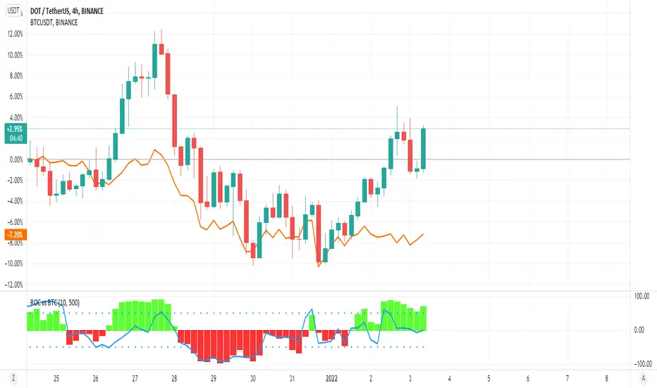
ROC vs BTCThis is a modification of my Rate of Change Percentile script, used to compare the current ticker (e.g. Altcoins) to BTC.
Essentially we are looking at (Current Ticker ROC percentile) vs (Bitcoin ROC percentile).
In other words, we are using the ROC value of both the current ticker and BTC, and ranking each based on their previous ROC.
We compare the rankings to gauge the relative overperformance or underperformance of the current ticker vs BTC.
The blue line is BTC, the columns are the current ticker.
Green columns above the blue line indicate positive ROC and current ticker has higher ROC ranking than BTC.
Red columns below the blue line indicate negative ROC and current ticker has a higher ROC ranking than BTC.
*** PLEASE LEAVE A LIKE AND FOLLOW IF YOU ENJOY THE SCRIPT ***
Any questions, comments or feedback I'd love to hear from you below!
Percentile - Price vs FundamentalsThis is done in the same lines of below scripts
Drawdown-Price-vs-Fundamentals
Drawdown-Range
Instead of using drawdown, here we are only plotting percentile of drawdown. Also added few more fundamental stats to the indicator. Also using part of the code from Random-Color-Generator/ to automatically generate colors. This in turn uses code from @RicardoSantos for convering color based on HSL to RGB
This is how the study can be used:
Study plots percentile of price and each of the listed fundamentals based on history. History can be chose All time or particular window. If any fundamental or price is near 100 - which means it is nearer to its peak. And if something is near its bottom, it is nearer to its 0th percentile.
Price of the stock is considered undervalued based on historical levels when it is below most of the fundamentals. Price is considered overvalued based on historical levels when it is above all the fundamentals. Please note, being undervalued does not guarantee immediate mean reversion. Stocks can stay undervalued for prolonged time and can go further down. Similarly overvalued stock can stay overvalued for prolonged time before correcting itself or justifying the position. Hence, further discretion needs to be used while using this study.
Few examples:
AMZN seems to be trading in range and so are the fundamentals:
MSFT at peak along with half of the fundamentals. But, debt levels are going up along with margins reducing.
LPX is trading at 15% discount whereas most of the fundamentals are at the peak.
FLGT price seems to have gone down further whereas fundamentals look pretty healthy.

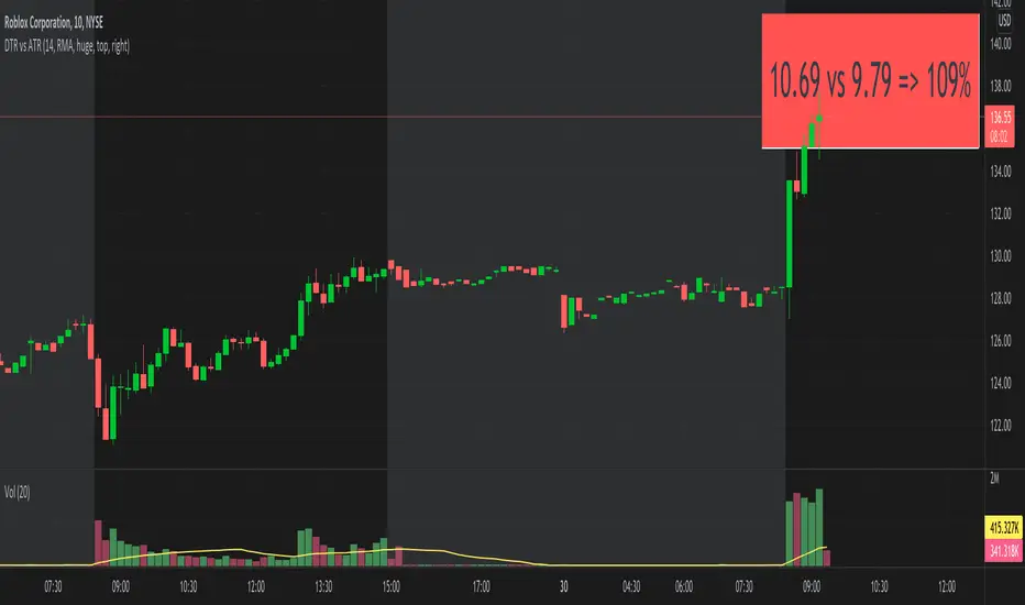
DTR vs ATRThis script shows DTR vs ATR (Today's True Range vs 14 days Avg True Range) along with percentage. The label automatically changes color based on percent value. <=70 is GREEN, >=90 is RED and between 70 & 90 is ORANGE.
The location of the script not stick to one place. There is no such a functionality to keep it static at one location (like top right corner). But I think that feature is coming soon. I may be wrong.
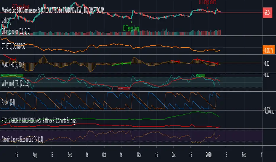
Altcoin Cap vs Bitcoin Cap RSIFollowing Willy Woo study of Altcoin Cap vs Bitcoin Cap RSI
charts.woobull.com
Price vs 200 EMA / 50 EMA / VWAP TablePrice vs 200 EMA / 50 EMA / VWAP Table
This indicator displays a compact real-time table showing where current price is trading relative to three major dynamic levels: 200 EMA, 50 EMA, and VWAP.
It provides an instant read on trend strength, bias, and distance from key moving levels — all in one glance.
Color-coded signals:
Lime → Price above
Red → Price below
Gray → Price at / near
Features
Adjustable table position (4 corners)
Adjustable text size
Toggle % distance and points distance
Clean, lightweight, and non-intrusive
Works on all timeframes and assets

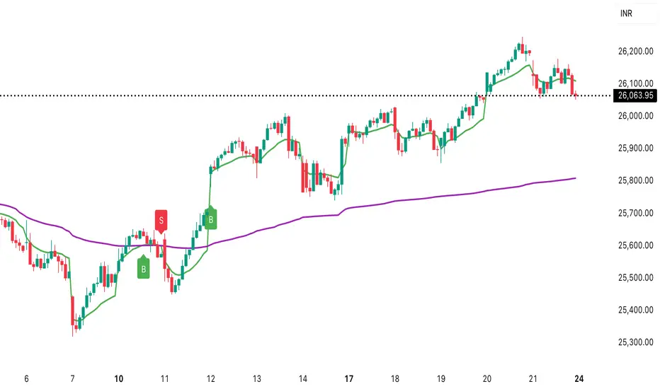
Daily vs Monthly VWAP CrossoverDaily vs Monthly VWAP Crossover Strategy
Description:
Overview This indicator is a trend-following tool designed to identify significant shifts in market sentiment by comparing short-term institutional value against the longer-term trend. It utilizes Anchored VWAP (Volume Weighted Average Price) logic to track the average price paid by traders for the current Day versus the current Month.
How It Works Unlike standard Moving Averages which lag significantly, VWAP factors in volume, making it a preferred benchmark for institutional traders.
Daily VWAP (Fast Line): Anchors at the start of the current trading day. It represents the intraday equilibrium price.
Monthly VWAP (Slow Line): Anchors at the start of the current month. It represents the broader value consensus for the month.
The indicator calculates these values cumulatively on every tick/bar, regardless of the chart timeframe selected (e.g., 30m, 1h).
Trading Logic & Signals The strategy is based on the concept of value migration:
BUY Signal (Bullish Reversal): Triggers when the Daily VWAP crosses ABOVE the Monthly VWAP. This suggests that short-term buying pressure and volume are pushing the price higher than the monthly average cost basis, indicating a potential breakout or trend continuation.
SELL Signal (Bearish Reversal): Triggers when the Daily VWAP crosses BELOW the Monthly VWAP. This indicates that intraday weakness has dragged the price below the month's average value, signaling potential downside momentum.
Features
Visual Crossovers: Clearly marked "B" (Buy) and "S" (Sell) labels on the chart.
Trend Background: The background color changes subtly (Green/Red) to indicate the current dominance of the Daily vs. Monthly trend.
Alerts: Fully compatible with TradingView alerts for real-time notifications on crossovers.
Best Practices
Timeframe: Designed optimally for intraday charts such as 30-minute or 1-hour timeframes.
Confirmation: As with any VWAP strategy, this works best when combined with price action analysis (e.g., breakout of key resistance) rather than used blindly in choppy, sideways markets.
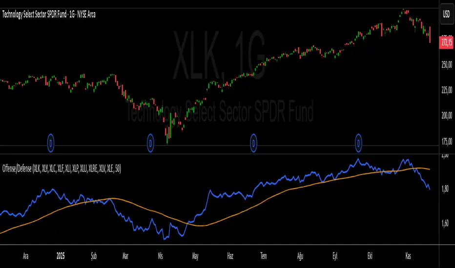
S&P 500 Offense vs. Defense RatioS&P 500 Offense vs. Defense Ratio
Formula: (XLK+XLY+XLC+XLF+XLI) / (XLP+XLU+XLRE+XLV+XLE)
change of offensive sectors vs defensive sectors