Luxy Adaptive MA Cloud - Trend Strength & Signal Tracker V2Luxy Adaptive MA Cloud - Professional Trend Strength & Signal Tracker
Next-generation moving average cloud indicator combining ultra-smooth gradient visualization with intelligent momentum detection. Built for traders who demand clarity, precision, and actionable insights.
═══════════════════════════════════════════════
WHAT MAKES THIS INDICATOR SPECIAL?
═══════════════════════════════════════════════
Unlike traditional MA indicators that show static lines, Luxy Adaptive MA Cloud creates a living, breathing visualization of market momentum. Here's what sets it apart:
Exponential Gradient Technology
This isn't just a simple fill between two lines. It's a professionally engineered gradient system with 26 precision layers using exponential density distribution. The result? An organic, cloud-like appearance where the center is dramatically darker (15% transparency - where crossovers and price action occur), while edges fade gracefully (75% transparency). Think of it as a visual "heat map" of trend strength.
Dynamic Momentum Intelligence
Most MA clouds only show structure (which MA is on top). This indicator shows momentum strength in real-time through four intelligent states:
- 🟢 Bright Green = Explosive bullish momentum (both MAs rising strongly)
- 🔵 Blue = Weakening bullish (structure intact, but momentum fading)
- 🟠 Orange = Caution zone (bearish structure forming, weak momentum)
- 🔴 Deep Red = Strong bearish momentum (both MAs falling)
The cloud literally tells you when trends are accelerating or losing steam.
Conditional Performance Architecture
Every calculation is optimized for speed. Disable a feature? It stops calculating entirely—not just hidden, but not computed . The 26-layer gradient only renders when enabled. Toggle signals off? Those crossover checks don't run. This makes it one of the most efficient cloud indicators available, even with its advanced visual system.
Zero Repaint Guarantee
All signals and momentum states are based on confirmed bar data only . What you see in historical data is exactly what you would have seen trading live. No lookahead bias. No repainting tricks. No signals that "magically" appear perfect in hindsight. If a signal shows in history, it would have triggered in real-time at that exact moment.
Educational by Design
Every single input includes comprehensive tooltips with:
- Clear explanations of what each parameter does
- Practical examples of when to use different settings
- Recommended configurations for scalping, day trading, and swing trading
- Real-world trading impact ("This affects entry timing" vs "This is visual only")
You're not just getting an indicator—you're learning how to use it effectively .
═══════════════════════════════════════════════
THE GRADIENT CLOUD - TECHNICAL DETAILS
═══════════════════════════════════════════════
Architecture:
26 precision layers for silk-smooth transitions
Exponential density curve - layers packed tightly near center (where crossovers happen), spread wider at edges
75%-15% transparency range - center is highly opaque (15%), edges fade gracefully (75%)
V-Gradient design - emphasizes the action zone between Fast and Medium MAs
The Four Momentum States:
🟢 GREEN - Strong Bullish
Fast MA above Medium MA
Both MAs rising with momentum > 0.02%
Action: Enter/hold LONG positions, strong uptrend confirmed
🔵 BLUE - Weak Bullish
Fast MA above Medium MA
Weak or flat momentum
Action: Caution - bullish structure but losing strength, consider trailing stops
🟠 ORANGE - Weak Bearish
Medium MA above Fast MA
Weak or flat momentum
Action: Warning - bearish structure developing, consider exits
🔴 RED - Strong Bearish
Medium MA above Fast MA
Both MAs falling with momentum < -0.02%
Action: Enter/hold SHORT positions, strong downtrend confirmed
Smooth Transitions: The momentum score is smoothed using an 8-bar EMA to eliminate noise and prevent whipsaws. You see the true trend , not every minor fluctuation.
═══════════════════════════════════════════════
FLEXIBLE MOVING AVERAGE SYSTEM
═══════════════════════════════════════════════
Three Customizable MAs:
Fast MA (default: EMA 10) - Reacts quickly to price changes, defines short-term momentum
Medium MA (default: EMA 20) - Balances responsiveness with stability, core trend reference
Slow MA (default: SMA 200, optional) - Long-term trend filter, major support/resistance
Six MA Types Available:
EMA - Exponential; faster response, ideal for momentum and day trading
SMA - Simple; smooth and stable, best for swing trading and trend following
WMA - Weighted; middle ground between EMA and SMA
VWMA - Volume-weighted; reflects market participation, useful for liquid markets
RMA - Wilder's smoothing; used in RSI/ADX, excellent for trend filters
HMA - Hull; extremely responsive with minimal lag, aggressive option
Recommended Settings by Trading Style:
Scalping (1m-5m):
Fast: EMA(5-8)
Medium: EMA(10-15)
Slow: Not needed or EMA(50)
Day Trading (5m-1h):
Fast: EMA(10-12)
Medium: EMA(20-21)
Slow: SMA(200) for bias
Swing Trading (4h-1D):
Fast: EMA(10-20)
Medium: EMA(34-50)
Slow: SMA(200)
Pro Tip: Start with Fast < Medium < Slow lengths. The gradient works best when there's clear separation between Fast and Medium MAs.
═══════════════════════════════════════════════
CROSSOVER SIGNALS - CLEAN & RELIABLE
═══════════════════════════════════════════════
Golden Cross ⬆ LONG Signal
Fast MA crosses above Medium MA
Classic bullish reversal or trend continuation signal
Most reliable when accompanied by GREEN cloud (strong momentum)
Death Cross ⬇ SHORT Signal
Fast MA crosses below Medium MA
Classic bearish reversal or trend continuation signal
Most reliable when accompanied by RED cloud (strong momentum)
Signal Intelligence:
Anti-spam filter - Minimum 5 bars between signals prevents noise
Clean labels - Placed precisely at crossover points
Alert-ready - Built-in ALERTS for automated trading systems
No repainting - Signals based on confirmed bars only
Signal Quality Assessment:
High-Quality Entry:
Golden Cross + GREEN cloud + Price above both MAs
= Strong bullish setup ✓
Low-Quality Entry (skip or wait):
Golden Cross + ORANGE cloud + Choppy price action
= Weak bullish setup, likely whipsaw ✗
═══════════════════════════════════════════════
REAL-TIME INFO PANEL
═══════════════════════════════════════════════
An at-a-glance dashboard showing:
Trend Strength Indicator:
Visual display of current momentum state
Color-coded header matching cloud color
Instant recognition of market bias
MA Distance Table:
Shows percentage distance of price from each enabled MA:
Green rows : Price ABOVE MA (bullish)
Red rows : Price BELOW MA (bearish)
Gray rows : Price AT MA (rare, decision point)
Distance Interpretation:
+2% to +5%: Healthy uptrend
+5% to +10%: Getting extended, caution
+10%+: Overextended, expect pullback
-2% to -5%: Testing support
-5% to -10%: Oversold zone
-10%+: Deep correction or downtrend
Customization:
4 corner positions
5 font sizes (Tiny to Huge)
Toggle visibility on/off
═══════════════════════════════════════════════
HOW TO USE - PRACTICAL TRADING GUIDE
═══════════════════════════════════════════════
STRATEGY 1: Trend Following
Identify trend : Wait for GREEN (bullish) or RED (bearish) cloud
Enter on signal : Golden Cross in GREEN cloud = LONG, Death Cross in RED cloud = SHORT
Hold position : While cloud maintains color
Exit signals :
• Cloud turns ORANGE/BLUE = momentum weakening, tighten stops
• Opposite crossover = close position
• Cloud turns opposite color = full reversal
STRATEGY 2: Pullback Entries
Confirm trend : GREEN cloud established (bullish bias)
Wait for pullback : Price touches or crosses below Fast MA
Enter when : Price rebounds back above Fast MA with cloud still GREEN
Stop loss : Below Medium MA or recent swing low
Target : Previous high or when cloud weakens
STRATEGY 3: Momentum Confirmation
Your setup triggers : (e.g., chart pattern, support/resistance)
Check cloud color :
• GREEN = proceed with LONG
• RED = proceed with SHORT
• BLUE/ORANGE = skip or reduce size
Use gradient as confluence : Not as primary signal, but as momentum filter
Risk Management Tips:
Never enter against the cloud color (don't LONG in RED cloud)
Reduce position size during BLUE/ORANGE (transition periods)
Place stops beyond Medium MA for swing trades
Use Slow MA (200) as final trend filter - don't SHORT above it in uptrends
═══════════════════════════════════════════════
PERFORMANCE & OPTIMIZATION
═══════════════════════════════════════════════
Tested On:
Crypto: BTC, ETH, major altcoins
Stocks: SPY, AAPL, TSLA, QQQ
Forex: EUR/USD, GBP/USD, USD/JPY
Indices: S&P 500, NASDAQ, DJI
═══════════════════════════════════════════════
TRANSPARENCY & RELIABILITY
═══════════════════════════════════════════════
Educational Focus:
Detailed tooltips on every input
Clear documentation of methodology
Practical examples in descriptions
Teaches you why , not just what
Open Logic:
Momentum calculation: (Fast slope + Medium slope) / 2
Smoothing: 8-bar EMA to reduce noise
Thresholds: ±0.02% for strong momentum classification
Everything is transparent and explainable
═══════════════════════════════════════════════
COMPLETE FEATURE LIST
═══════════════════════════════════════════════
Visual Components:
26-layer exponential gradient cloud
3 customizable moving average lines
Golden Cross / Death Cross labels
Real-time info panel with trend strength
MA distance table
Calculation Features:
6 MA types (EMA, SMA, WMA, VWMA, RMA, HMA)
Momentum-based cloud coloring
Smoothed trend strength scoring
Conditional performance optimization
Customization Options:
All MA lengths adjustable
All colors customizable (when gradient disabled)
Panel position (4 corners)
Font sizes (5 options)
Toggle any feature on/off
Signal Features:
Anti-spam filter (configurable gap)
Clean, non-overlapping labels
Built-in alert conditions
No repainting guarantee
═══════════════════════════════════════════════
IMPORTANT DISCLAIMERS
═══════════════════════════════════════════════
This indicator is for educational and informational purposes only
Not financial advice - always do your own research
Past performance does not guarantee future results
Use proper risk management - never risk more than you can afford to lose
Test on paper/demo accounts before using with real money
Combine with other analysis methods - no single indicator is perfect
Works best in trending markets; less effective in choppy/sideways conditions
Signals may perform differently in different timeframes and market conditions
The indicator uses historical data for MA calculations - allow sufficient lookback period
═══════════════════════════════════════════════
CREDITS & TECHNICAL INFO
═══════════════════════════════════════════════
Version: 2.0
Release: October 2025
Special Thanks:
TradingView community for feedback and testing
Pine Script documentation for technical reference
═══════════════════════════════════════════════
SUPPORT & UPDATES
═══════════════════════════════════════════════
Found a bug? Comment below with:
Ticker symbol
Timeframe
Screenshot if possible
Steps to reproduce
Feature requests? I'm always looking to improve! Share your ideas in the comments.
Questions? Check the tooltips first (hover over any input) - most answers are there. If still stuck, ask in comments.
═══════════════════════════════════════════════
Happy Trading!
Remember: The best indicator is the one you understand and use consistently. Take time to learn how the cloud behaves in different market conditions. Practice on paper before going live. Trade smart, manage risk, and may the trends be with you! 🚀
Visual

blackOrb CandleAddressing the Shortcomings of Conventional Candle Charts
I. Surmounting Volatility Challenges
In the realm of combined heightened or subdued volatility and erratic market conditions, traditional candlestick charts are susceptible to deficiencies in isolating extraneous data noise (e.g. high/low wicks, given their frequent incongruity with pivotal market dynamics or arbitrary green/red coloring of candle bodies).
II. Precision in Application
Novice traders may erroneously construe and misemploy traditional candlestick patterns, culminating in erroneous trading determinations. In addressing this challenge, this indicator can help to identify critical signal confluences, enhancing potential signals accuracy.
III. Strategy at the Core
Relying solely on candlestick charts lacks potency without an underpinning well-knit strategy. blackOrb's methodology integrates discernment of pivotal chart configurations with the meticulous construction of comprehensive strategies to mirror a comprehension of potential market dynamics.
blackOrb's Aspirations: Overcoming Enunciated Challenges of Traditional Candle Charts
- Customizable Data Analysis
Engendering the evolution of candle charts involves the judicious adjustment of multifarious open/high/low/close iterations coupled with evaluative mechanisms such as Heikin Ashi and MA smoothing, combined with stochastic calculations.
- Holistic Perspective
Seamless deployment of trading strategies is engendered through salient facets, encompassing up- and downside ratios as well as adaptable true range visualizations, attuned to unfolding price dynamics.
- Personalized Approach
Adaptations in trading styles are seamlessly accommodated, as this indicator offers stochastic candle coloring with customizable stochastic look-back evaluation phases. A selection of over 20 color schemes accommodates individual preferences to differentiate various chart setups at first glance.
Note: However, it's important to recognize that the efficacy of evaluation coloring might be compromised during periods of lateral price movement, characterized by less prominent market trends.
- Ghost Mode for Comparative Insights
Unveiling correlations and divergences, the Ghost Mode overlays two candle charts, which can reveal price trajectories and reactions (e.g. Apple stock's potential response to the NASDAQ 100 Technology Sector Index).
Note: This approach may not capture nuanced correlations during intricate market scenarios.
Technical Methodology
At its core, the stochastic calculation methodology of this indicator centers around the following formula:
100 * (close - lowest(low, length)) / (highest(high, length) - lowest(low, length))
This key formula employs a stochastic calculation methodology that assesses the percentage deviation of the closing price from the lowest low over a specified timeframe (length), relative to the span between the highest high and the lowest low. The outcome is normalized within a range of 0 to 100, providing insights into the relative position of the closing price within the high-low range. Traders can define the specific periods over which the stochastic calculation is performed.
Based on this stochastic analysis, the indicator integrates candle coloring, affording users the flexibility to adjust the sensitivity of candle coloring according to customized stochastic look-back evaluation phases. Consequently, the coloration of candles by length evaluation can mirror a comprehension of market dynamics.
By allowing traders to designate specific periods for the stochastic calculation, it fosters adaptability in combination with the following technical features:
- Conjoining optional transparent Heikin Ashi and/or a weighted MA alternative to harness the virtues of smoothing sans confounding authentic price data and candle dynamics
- Individual electable focus range encompassing retrospection and real-time alignments
- Intra-temporal evaluations, sub-domains & amalgamated value permutations
- Prioritizing individually chosen focus time intervals within the realm of real price highs and lows
- Elaborate price display (e.g. high/low/ohlc4/close) upon chart-hover, accentuating close price implications
- Features offering diverse scaling options, alongside adaptable and customizable price display
- Unveiling uncluttered and directed candle body visualization, implementing wicks to the transparent candle body, given their frequent incongruity of high/low data with pivotal market dynamics
Note on Usability
This indicator isn't intended for standalone trading application. Instead, it offers an alternative approach to traditional candle charts, serving as a supplementary tool for orientation within broader trading strategies.
Irrespective of market conditions, it can harmonize with a wider range of trading styles and instruments/trading pairs/indices like Stocks, Gold, EURUSDSPX500, GBPUSD, BTCUSD and Oil.
Inspiration and Publishing
Taking genesis from the inspirations amongst others provided by TradingView Pine Script Wizard Kodify, blackOrb Candles is an multi-encompassing script meticulously forged from scratch. It aspires to furnish a comprehensive candle chart approach, borne out of personal experiences and a strong dedication in supporting the trading community. We eagerly await valuable feedback to refine and further enhance

RSI-Instant-TA 3.69 by SimpsTAHow can this indicator benefit you?
Are you familiar with the RSI (Relative Strength Index), which is a commonly used indicator? Let me explain how it works in simpler terms. When the RSI is below 30 (considered oversold), it may be a signal to buy, and when it's above 70 (considered overbought), it may be a signal to sell. To confirm these signals, you can look for the RSI line crossing a moving average line while forming a higher high or lower low. I usually use a 1-hour timeframe (TF) for analysis but also glance at lower timeframes for better market understanding.
This indicator combines different averages of the RSI line, including the most important one, which is the RSI line averaged from 7 different timeframes. This averaging helps you gain a clearer understanding of what's happening across those timeframes.
To ensure you don't miss important market moments, you can set up predefined alerts using this indicator. However, it's always important to visually verify these alerts before taking any action.
What is what?
What do the different parts of the indicator represent and where does the data for plotting the lines come from?
1) THICK RED/GREEN OSCILLATING RSI LINE:
This line is a visual representation of the RSI (Relative Strength Index) calculated by averaging the RSI values from 7 different timeframes. It moves between the oversold and overbought regions while intersecting other simplified averaged RSI lines. The data used for plotting these line is derived from the RSI values calculated based on price movements across different timeframes.
2) THICK WHITE RSI LINE:
The thick white line is a slightly smoothed average of the regular RSI line (thin white line). It helps reduce the noise and volatility of the RSI line, making it easier to interpret.
3) TWO OSCILLATING RED/GREEN LINES WITH RED/GREEN BACKGROUND FILL:
These lines are further averages of the normal RSI line, providing a smoother oscillating baseline. When the thick white line or thick red/green line crosses this baseline, it typically indicates a change in direction.
4) BIG TRIANGLE WITH RED/GREEN VERTICAL BG LINE:
This element is used to create an alert. It serves as a visual signal when the market is likely to change direction. Many users find this feature particularly useful. (I pretty much use just this one)
5) SMALL TRIANGLE AND SMALL CIRCLE WITH RED/GREEN VERTICAL BG LINE:
These elements, although visually distinct, serve a similar purpose. They are used when a good entry opportunity has been missed, but there is still a desire to enter the position. They can also be helpful for re-entries into a position.
6) YELLOW HORIZONTAL LINE:
The yellow horizontal line represents the middle RSI line with a value of 50. It acts as a reference point for determining whether the RSI is in the overbought or oversold region.
7) TWO WHITE HORIZONTAL LINES:
These white horizontal lines represent the top and bottom RSI lines with values of 30 and 70, respectively. They serve as thresholds for identifying oversold (below 30) and overbought (above 70) conditions.
How to use this indicator effectively:
SETTING ALARMS:
To begin, familiarize yourself with setting alerts in TradingView. Here's how I usually set mine:
a) Choose the indicator name from the dropdown menu.
b) Select either a BUY or SELL TRIANGLE as the alert marker.
c) Set a value greater than 0 (this is necessary for the alert to trigger).
d) Opt for the alert to occur once per bar.
e) Write a description that you will recognize.
f) Choose the type of notification you prefer.
g) You're all set!
HOW TO READ THE LINES:
a) The baseline consists of two oscillating red/green lines (3) with a background fill.
b) When the thick red/green line (1) or the thick white line (2) is above the baseline, it indicates a BUY signal. If they are below the baseline, it signifies a SELL signal.
c) Confirm the signal by observing whether the thick red/green line (1) or the thick white line (2) form a Lower High (LH) as a SELL signal or a Higher Low (HL) as a BUY signal. It can occur before crossing baseline (3), so consider having ALERTS that support this.
d) Additionally, consider the vertical background colors from alerts as supplementary confirmation.
e) When the lines appear messy and there is no clear indication due to excessive zig-zagging through the baseline, it typically suggests that the market will continue its previous movement without any significant changes.
MY PREFERRED WORKFRAME:
I recommend using a 5-frame window, which includes the following timeframes:
3-minute TF (fine tuned entry)
13-minute TF (to understand 3minTF better)
30-minute TF (to understand 1h TF better)
1-hour TF (the most important one - looking for HL/LH on (1) or (2) and/or their crossings the baseline (3))
1-day TF (for a broader perspective on the market - you certainly wont do LONGS if market broke certain support)
Buy/Sell examples
To provide you with a better understanding, let's consider some examples of BUY and SELL signals using this indicator.
1st TRADING EXAMPLE:
This example is for those who want to take advantage of every market turn to maximize their gains. Please remember to rest and sleep; this approach may not be suitable for everyone.
Initially, the data might seem overwhelming, but as you become familiar with the meaning behind specific situations, it becomes less daunting. Let me guide you through what you see in the picture:
The UPPER WINDOW shows a BTC chart with marked positions and the gains you would have achieved by following the indicator's signals.
The LOWER WINDOW displays this indicator with my comments, explaining what is happening in the marked areas (circles).
You can view the example here:
To implement this approach, you need to set alerts on the 1-hour timeframe (TF) using the following options: BUY/SELL TRIANGLE, BUY/SELL triangle, and BUY/SELL circle. These alerts will send you notifications every few hours. When you receive a notification, visually assess the situation (consider going long, short, or exiting) based on the detailed criteria explained earlier.
2nd TRADING EXAMPLE:
This example is for those who prefer to have more free time and only react when there is an obvious market change, with more than a day or two between actions (going long, short, or exiting).
Here's what you see in the picture:
The UPPER WINDOW displays a BTC chart with marked positions and the gains you would have achieved by following the indicator's signals. As you can see, these positions are open for several days leaving you lots of time to rest.
The LOWER WINDOW shows this indicator with circles, highlighting the situations that prompted the actions. By now, you should be familiar with the rules.
You can view the example here:
To implement this approach, set alerts on the 1-hour timeframe (TF) for when the RSI AVG crosses the Slowest Line (select it from the dropdown menu). When you receive a notification, don't take immediate action; instead, turn on another alert (BUY/SELL triangle ALERT). If the RSI AVG is below the Slowest Line, choose the SELL triangle; if it's above, select the BUY triangle. Wait for the RSI AVG to return close to the Slowest Line for confirmation.
This approach will result in two to three notifications per day, allowing you to relax in the meantime.
******
PRO TIP!
Try not to constantly stare at the charts and this indicator. Instead, look and react only when the alerts are triggered. Remember, the market won't change direction without triggering those alerts (provided they are set correctly). This will save you a significant amount of time and stress.

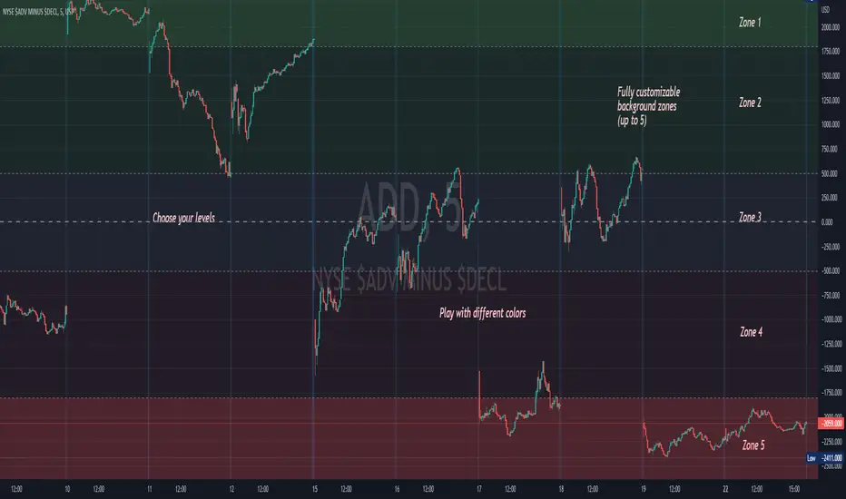
Background ZonesThis script provides up to 5 zones to apply background colors. This is especially useful for applying to indices such as USI:TICK , USI:ADD , and USI:VOLD , where certain levels provides significant meaning to market sentiment and directions. This script will give you the visual cue to help with your trading.
All levels and colors are fully customizable.
Enjoy~!!
Example:
the FlasherBriefly flashes chart background colors as a visual alert whenever a condition occurs, from the insatiable mind of @scarf .
Special thanks to @LucF for his advice on improving efficiency when working with dynamic tables.

Close Combination Lock Style - Visual AppealThis creates a combination style closing price change on each tick.
It has two theme options, one as silver dials for Dark Theme and the other as black dials for White Theme.
We get fixated to watching closing prices on charts and it gets visually daunting. This creates a combination style price change which updates on each tick, which is quite pleasing to the eye.
When new price is above current center line, it shift the above prices showing ▲ arrow, and if new price is lower, it will shift the bottom prices showing ▼ arrow. If there is no change in price between the ticks, it will show =.

MA VisualizerThe MA Visualizer is made up of 5 Moving Averages (MA)
All MA change color when the price closes above or below the MA line.
The background between the MA line and price will also change color, this creates the Visualizer.
When two or more MA are selected the two visualizer's will combine and create a gradient effect.
Each MA can be adjusted with 6 source selection's to choose from (SMA , EMA , WMA , HMA , RMA , WVMA).
The Visualizer can be turned off while leaving the MA lines turned on and vice versa.
Their is also a MA Cross indicator built-in.

Heikin Ashi Candle OverlayHello Friend,
This is a very simple script for fun to demonstrate the new ability to change the colors of attributes pertaining to the plotbar() and plotcandle() functions using series inputs.
For Heiken Ashi lovers, this script does several things. It gives you both bars and hollow candles with Heikin Ashi values - something TV does not currently support.
It also gives you the ability to see your favorite HA candles while on the main series plot. When viewing indicators in the "Heikin Ashi" candle setting on TradingView, the input values are "smoothed' with HA values. This skews the way your indicators behave as the OLHC are calculated averages. Only the regular candle settings will give your indicators "real close" etc.
By 'Muting' the main series bars by toggling the 👁 symbol next to your ticker id, it makes the normal candles invisible. You then overlay this script, which allows you to see the HA Candle of your choice, while not affecting the way your indicators behave.
You now have the best of 2 worlds. Smoothed behavior of price action to help visualize trends, and accurate indicator values derived from actual OLHC data.
Plus, something about hollow HA candles is just kind of clean and soothing isn't it?
Cheers,
Bjorgum
Hollow Setting:
Bars
Or just plain old regular, but on the main chart

Visual Candlestick Blender (Analysis Tool), by @BlueJayBird- This is a analysis tool.
Brief Description
- It generates candlestick containers for current timeframe, using OPEN/HIGH/CLOSE/LOW data from higher time frames.
- Current version supports up to 4 CVB at the same time. Usually using only 2 is enough.
- Vertical extended divisions for 1h, 4h, 1D and 1W using background lines are included too.
* Report any bugs or feedback you have.
NOTE. At current unclosed candlestick , some weird line painting it is expected. It is not a bug, it is a Trading View feature that I haven't been able to solve yet. To solve this, setting the VCB off and then on should be enough.

SRSI/CCI :: ALLinPower v10.0
Everything you see in this indicator has beed designed with purpose to ease your trading with visual technical analysis of the market. It pulls data from 7 different TimeFrames and it can not be more simpler visual representation of its calculations when applied on chart.
When applied on chart, you will see two sets of WAVES. First set is made out of SRSI calculation and the second is made out of CCI calculation. Both of them follows the same rules.
Background GREEN/RED wave is made out of Multiple Timeframes and it represents a TREND. GREEN for LONG, RED for SHORT trend.
Over the background wave there is a wave made of current TimeFrame data and its main purpose is to see when the POWER of certain direction will diminish. The less time little wave stays in current trend the more likely is that it will change the trend based on lack of power the market is getting in certain direction.
HOW TO USE IT?
Rule 1.
TIMEFRAMES
Choose the best TimeFrame for the job. I use: 1min, 2min, 3min, 5min, 8min, 13min, 21min, 34min or 56min (golden ratio). You can also pick a different TF but only to up to 1h TF chart as it does not work well with TF over 1h. Smaller TF is used for SCALPING of DAY TRADING higher TF is used for SWING TRADING. You get the picture?
Rule 2
TO ENTER BUY/LONG POSITION: When big trend wave is below the middle line and coloured in RED and little wave just entered the area and exits it very soon after. Basically when RED straight line gets smaller and smaller (the POWER of SHORT diminishes) it is a sign for LONG.
TO ENTER SELL/SHORT POSITION: When big trend wave is over the middle line and coloured in GREEN and little wave just entered the area and exits it very soon after. Basically when GREEN straight line gets smaller and smaller (the POWER of LONG diminishes) it is a sign for SHORT.
To ease yourself the spotting of this instances just follow the GREEN/RED dots and use ALERTS (choose BUY POWER for LONG signals or choose SELL POWER for SHORT signals) to make yourself free from staring at a computer/mobile all the time and just wait for a signal.
Rule 3
CAUTION
Do not rush to enter a position and try to predict what indicator will do next. It does not end well.
Be aware you are not exiting a position in panic that would be too soon or even worse, you get married to bad trade and you are not exiting even though you should exit by many signals you get.
Use risk management strategy to protect your capital.
Follow the rules and make your trading easier and better.

RSI :: ALLinDivergence v10.0
Everything you see in this indicator has been designed with a single purpose, to ease your trading with simplify visual technical analysis of the market. It pulls data from 7 different TimeFrames and it can not be more simpler visual representation of its calculations when applied on chart.
When applied on chart, you will see GREEN/RED alternating MTF RSI line and its 70 overbought area and its 30 oversold area. There is a gentle purple colour line in the background which represents RSI line of the current TF (it is not crucial but it helps to know why MTF line turns RED or turns GREEN (crossing of those two).
HOW TO USE IT?
Rule 1.
TIMEFRAMES
Choose the best TimeFrame for the job. I use: 1min, 2min, 3min, 5min, 8min, 13min, 21min, 34min or 56min (golden ratio). You can also pick a different TF but only to up to 1h TF chart as it does not work well with TF over 1h. Smaller TF is used for SCALPING of DAY TRADING higher TF is used for SWING TRADING. You get the picture?
Rule 2
TO ENTER BUY/LONG POSITION: search for HigherLows on RSI MTF GREEN/RED LINE when it is coloured RED. To enter a position it should be confirmed with AALERT :: ALLinDivergence v 10.0 that "GREEN" Divergence is emerging.
TO ENTER SELL/SHORT POSITION: search for LowerHighs on RSI MTF GREEN/RED LINE when it is coloured GREEN. To enter a position it should be confirmed with ALERT :: ALLinDivergence v 10.0 that "RED" Divergence is emerging.
Rule 3
EXIT FROM BUY/LONG POSITION: search for HigherLows on RSI MTF GREEN/RED LINE.
EXIT FROM SELL/SHORT POSITION: search for LowerHighs on RSI MTF GREEN/RED LINE.
Rule 4
CAUTION
Do not rush to enter a position and try to predict what indicator will do next. It does not end well.
Be aware you are not exiting a position in panic that would be too soon or even worse, you get married to bad trade and you are not exiting even though you should exit by many signals you get.
Use risk management strategy to protect your capital.
Follow the rules and make your trading easier and better.

Trading With Colors7 hours ago
Hello friends. This is simply a moving average ribbon, per se. The values for the colored ribbon can have their length calculated to fit their chosen resolution on the current one. This solved problems for me, but it was my own solution. Maybe I'll learn something new from sharing this.
To everybody else who is learning as well, this script essentially serves to introduce other time-frame moving averages. This intends to helps traders find the scope of relevance and not get lost in the current time-frame.
Besides the colored moving averages (2 sets, different resolutions, great zoomed in our out), I included optional check-boxes to allow comparison of sets of moving averages at will, so that the most important to the individual trader can be compared and selected specifically.
I kept the default options set to keep it clean. It likely won't be the only indicator on one's chart, so it's naturally best to reduce indicator noise from one, as to not subtract from the benefit of the other indicators.
I integrated tons of acquired knowledge into this, so I hope somebody finds a missing piece to their collection or a solution to a coding problem within. I also hope this provides a new insight and helps others on their path to financial freedom.
Best wishes.
PS: I left some old code in comments in case it helps to understand the evolution of my code. I'll update this again once it works on the Daily. You might figure it out before I do, in wish case, do share :)

MarketGod VisualsHere are the visuals we had included with previous versions of MG (and since removed)
Price-Tracking Fibs - S/R
Price-Tracking Pivots - S/R
Bollinger Bands
Keltner Channels
Hi-Lo
Parabolic SAR
This is a free add-on for users and non-users to use. Enjoy!

Visual RSI [LucF]Visual RSI offers a different way of looking at RSI by providing a composite representation of 9 different RSI-generated components. Instead of focusing on one line only, this approach blends multiple sources to provide the viewer with a larger context RSI-based picture.
For those who don’t want to read
• Green in bullish (>50) zone is the most bullish.
• Red in bullish zone doesn’t necessarily mean bearish—it just means bullish strength is weakening. It may be just a pause before a reprise or exhaustion signalling a reversal—impossible to tell.
• The same in inverse applies to the bearish zone (<50).
For those who want to understand
The nine components making up Visual RSI are:
• a current timeframe RSI
• a higher timeframe RSI
• the delta between these two RSI lines
• for each of these three basic components, two independent Bollinger band: one calculated for the bullish section of the scale (>50) and a separate one calculated for the lower bearish region.
Dual BBs
In my view, RSI’s position with regards to the centerline is much more important than its position in extreme areas. Why? Because the building block of RSI is the ratio of the averages of up/down moves during the RSI period. When the average of ups is greater, RSI is > 50. So while a rising signal starting from 20 let’s say, indicates that the rate of change is increasing, only when it crosses 50 can we say that sentiment balance has truly become bullish, and this information is more reliable than the signal being at a level corresponding to whatever estimate we make of what constitutes an extreme value. In my landscape, the general balance of a ratio provides more valuable information than the ratio’s exact value.
The idea behind the dual BBs is to provide independent tracking information for both halves of the indicator’s space, which I find more useful than the normal method of simply adding a multiple of the standard deviation on both sides of the mean. With dual BBs, the upper BB will never go lower than the indicator’s centerline, and the lower BB will never go higher. The upper BB focuses on upper-bound volatility when the signal is bearish, and the lower BB focuses on downside volatility when the signal is bearish.
The functions used to calculate the independent BBs are reusable on other signals if a centerline can be defined for them. A clamping percentage is implemented, so that when a BB line is hugging the centerline it clamps to it. This helps in providing earlier signals when they use the BB line states.
Providing context to RSI
What RSI measures indirectly is the balance in the rate of change—or the speed of price movement, but not its instant value, otherwise RSI would be even noisier. More precisely, RSI represents the relative strength of the up/down movement in the last n bars of RSI’s length, with 14 often used because that’s what Wilder proposed (Visual RSI’s defaults are 20 for the current timeframe and 40 for the higher timeframe). At every bar, a new value is added to the equation and an old value carrying equal weight is dropped, so a large dropped off value will have more impact on RSI’s value if the new bar’s move is small. This accounts for some of RSI’s speed in identifying exhaustion after important moves, but almost for some of its noise.
Visual RSI is the result of trying to drown RSI’s noise in the context of other informational streams, while simultaneously providing even faster information than RSI alone, by giving more visual weight to the delta between the current and higher timeframe RSI’s.
How to read Visual RSI
The default settings show all 9 basic components as green/red areas of intensities varying with their importance. The most intense colors are reserved for the delta RSI and the BBs have the lightest intensities. The individual lines of components are intentionally difficult to distinguish so that focus is first on the general picture, including the all-important six-state background, and then on the delta RSI.
One entry setup could be reversals in a larger trend context, so low pivots of the delta in a fully bullish context (a green background in the upper section of the indicator), and inversely, high pivots in a fully bearish context (a red background in the lower section of the indicator).
Please resist the common misconception, when interpreting RSI, that a reversal in the signal will necessarily lead to a reversal in price. Each trend has its rhythm. Only machine-generated price action can progress regularly. It’s normal for trends to take a breather for some time before they continue or reverse, as traders driving the trend experience emotional fatigue and gradual fear. RSI reversals merely signify that such a breather has occurred—nothing more. Only the larger context can provide information that can situate that pause and put more meaningful odds on it having more probability of continuing in one direction or the other. This is the reasoning behind the setup just described.
Features
• All components can be hidden, displayed as a simple line, a uniformly colored fill, or a green/red fill (the default).
• The background can be colored using 9 different methods, including 3 six-state methods using the rising/falling BB lines of the 3 basic components. These six states allow for bullish/bearish/neutral sentiment in both the upper and lower regions of the indicator. A bearish (dark red) background in the bullish (>50) section of the indicator represents decreasing bullishness. A bearish (slightly brighter red) in the bearish (<50) section of the indicator means incresingly bearish sentiment. The six-state backgrounds allow for neutral (no color) sentiment when no compelling signs can be found to conclude anything with meaningful odds. The default background uses the six-state method on the higher timeframe RSI’s BBs because I find it the most useful, as it represents the largest—and slowest—context sentiment among all the indicator’s components.
• A thin status bar in the top part of the indicator also allows selection of the same 9 methods to color it. The default is a triple-state system using the rising/falling characteristics of the current timeframe RSI’s BBs to provide a short-term counterbalance to the long-term background.
• Three different markers can be configured using approximately 70 permutations each, each filtered by 20 different filter permutations. When modification of the relevant parameters in the script’s Settings/Settings/Parameters section is added, possibilities are almost endless. If the generated signals are then fed into the PineCoders Engine and combined with the Engine’s own options, the permutations go up another order of magnitude, and changes to any setting can be instantly evaluated using the Engine’s backtesting results.
• Five simple filters can be combined. They are additive. They include volume-related conditions and a chandelier, which I find useful because both volume and volatility (the chandelier using highs/lows and ATR) are sensible complementary sources to RSI’s momentum information. The filter’s state can be shown as a thin line at the bottom of the indicator.
• Alerts can be configured using any of the marker/filter combinations mentioned. As usual, once your markers/filters are set up the way you want, create your alert from the chart/timeframe you want the alert to run on and be sure to use the “Once Per Bar Close” triggering condition. Use an alert message that will remind you of which combination of markers were used when creating the alert.
• A plot providing entry signals for the PineCoders Backtesting & Trading Engine is supplied. It will use whichever marker/filter configuration is active to generate signals.
• All higher timeframe information is non-repainting. Higher timeframe lines can be smoothed (the default). The selection of the higher timeframe can be made using 3 different methods:
1. By steps (if current timeframe <= 1 minute: 60 min, <= 60 min: 1D, <= 6H: 3D, <= 1D: 1W, <=1W: 1M, >1W: 12M)
2. By a user-defined multiple of the current timeframe
3. Using a fixed timeframe
Thanks to:
• Alex Orekhov aka @everget for the chandelier code.
• @RicardoSantos who through a small remark early on, unknowingly put me on the track of eliminating noise through visual crowding.
• The brilliant guys in the PineCoders Pro room for your knowledge, limitless creativity and constant companionship.
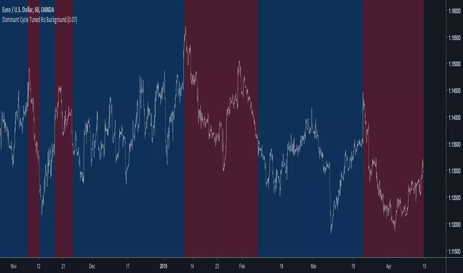
Dominant Cycle Tuned Rsi BackgroundBackground version of the Dominant Cycle Tuned Rsi Background published here
Trabalza EMA/MA + crosses,rejections,entries
EMA/MA crosses
Bullish cross = green "^"
Bearish cross = red "x"
Golden cross (50EMA > 200EMA) = Golden circle
Death cross (50EMA < 200EMA) = Red circle
Rejections
Bullish Wick through support = Gold candle
Bearish Wick through resistance = Purple candle
Bull entries
1st candle to open and close above EMA/MA
marked by "*" above candle, colour co-ordinated to match moving average
Bear entries
1st candle to open and close below an EMA/MA
Marked by "!" below candle, colour co-ordinated to match moving average

Support & Resistance FilterVisualize support and resistance levels with a high level of user control. Tired of meaningless, tightly clustered, support and resistance lines (shouldn't those just be considered bounces)? Just filter them out with the Bounce Filter. Want to visualize S&R in a crisp, clear new way? Use "Areas of S&R". Want to have a ridiculous amount of control over what counts for support and resistance in the first place? Use the Swing Filter (built-in). Perhaps most interesting... ...want to see support and resistance for (say) Bitfinex-BTC/USD on a Coinbase chart to see how they affect Coinbase candles? Then check out the advanced settings and have fun ;)
Support & Resistance levels are determined by historic pivots (swings). If a price breaks through the first resistance level, it may really take off. If it breaks through the second level, or through all five resistance levels, you might be on your way to the moon (Lambos not included). The inverse is true when the price breaks-down, through support levels.
5 Levels of Support and 5 levels of Resistance are available.
In a very bullish or bearish situation, searching back in time for the next highest Support or Resistance level can become quite demanding on TradingView's server. I've pushed it to the limit:
R2 & S2 look back 1,000 candles
R3 & S3 look back 2,250 candles
R4 & S4 look back 3,500 candles
R5 & S5 look back 4,999 candles
When TradingView's servers are getting a little bogged down, you may get an error about "a loop being longer than 100ms". That just comes with the territory of searching so many candles back. To resolve it, just click "Force Reload" in the settings.
I'd love to post the manual, the instructions for the settings, here in the description, but the publishing policy sets a limit as to how long these descriptions can be. So check the comments for a manual on how to use this indicator. And if you'd like to plug this kind of indicator into your scripts, just contact me for custom work.
~jdhadwin


Multi BB Heat Vis - SMA/EMA/Breakout - r2I don't expect to iterate any further on this script, unless any weird issue crops up.
Description and usage detailed in the comments at the top of the script. Cheers!
To repaint or not to repaint, all the relevant sources are exposed as inputs for customisation - so the choice is yours.
Cheers!
Price above/below EMAThis script will give you red/green columns to indicate if price is above or below a certain EMA. With Candlestick charting, we are looking for price in relation to the 8 ema Trigger Line (T-Line). You can adjust this indicator to fit your need. Simple, but nice to quickly see.
Oops. Last line's title should be "Sell". Doesn't affect display though.