Regime MapRegime Map — Volatility State Detector
This indicator is a PineScript friendly approximation of a more advanced Python regime-analysis engine.
The original backed identifies market regimes using structural break detection, Hidden-Markov Models, wavelet decomposition, and long-horizon volatility clustering. Since Pine Script cannot execute these statistical models directly, this version implements a lightweight, real-time proxy using realised volatility and statistical thresholds.
The purpose is to provide a clear visual map of evolving volatility conditions without requiring any heavy offline computation.
________________________________________
Mathematical Basis: Python vs Pine
1. Volatility Estimation
Python (Realised Volatility):
RVₜ = √N × stdev( log(Pₜ) − log(Pₜ₋₁) )
Pine Approximation:
RVₜ = stdev( log(Pₜ) − log(Pₜ₋₁), lookback )
Rationale:
Realised volatility captures volatility clustering — a key characteristic of regime transitions.
________________________________________
2. Regime Classification
Python (HMM Volatility States):
Volatility is modelled as belonging to hidden states with different means and variances:
State μ₁, σ₁
State μ₂, σ₂
State μ₃, σ₃
with state transitions determined by a probability matrix.
Pine Approximation (Z-Score Regimes):
Zₜ = ( RVₜ − mean(RV) ) / stdev(RV)
Regime assignment:
• Regime 0 (Low Vol): Zₜ < Zₗₒw
• Regime 1 (Normal): Zₗₒw ≤ Zₜ ≤ Zₕᵢgh
• Regime 2 (High Vol): Zₜ > Zₕᵢgh
Rationale:
Z-scores provide clean statistical boundaries that behave similarly to HMM state separation but are computable in real time.
________________________________________
3. Structural Break Detection vs Rolling Windows
Python (Bai–Perron Structural Breaks):
Segments the volatility series into periods with distinct statistical properties by minimising squared error over multiple regimes.
Pine Approximation:
Rolling mean and rolling standard deviation of volatility over a long window.
Rationale:
When structural breaks are not available, long-window smoothing approximates slow regime changes effectively.
________________________________________
4. Multi-Scale Cycles
Python (Wavelet Decomposition):
Volatility decomposed into long-cycle (A₄) and short-cycle components (D bands).
Pine Approximation:
Single-scale smoothing using long-horizon averages of RV.
Rationale:
Wavelets reveal multi-frequency behaviour; Pine captures the dominant low-frequency component.
________________________________________
Indicator Output
The background colour reflects the active volatility regime:
• Low Volatility (Green): trending behaviour, cleaner directional movement
• Normal Volatility (Yellow): balanced environment
• High Volatility (Red): sharp swings, traps, mean-reversion phases
Regime labels appear on the chart, with a status panel displaying the current regime.
________________________________________
Operational Logic
1. Compute log returns
2. Calculate short-horizon realised volatility
3. Compute long-horizon mean and standard deviation
4. Derive volatility Z-score
5. Assign regime classification
6. Update background colour and labels
This provides a stable, real-time map of market state transitions.
________________________________________
Practical Applications
Intraday Trading
• Low-volatility regimes favour trend and breakout continuation
• High-volatility regimes favour mean reversion and wide stop placement
Swing Trading
• Compression phases often precede multi-day trending moves
• Volatility expansions accompany distribution or panic events
Risk Management
• Enables volatility-adjusted position sizing
• Helps avoid leverage during expansion regimes
________________________________________
Notes
• Does not repaint
• Fully configurable thresholds and lookbacks
• Works across indices, stocks, FX, crypto
• Designed for real-time volatility regime identification
________________________________________
Disclaimer
This script is intended solely for educational and research purposes.
It does not constitute financial advice or a recommendation to buy or sell any instrument.
Trading involves risk, and past volatility patterns do not guarantee future outcomes.
Users are responsible for their own trading decisions, and the author assumes no liability for financial loss.
Волатильность

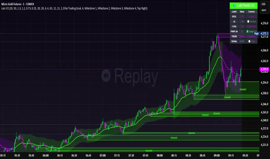
LarsTrades Order Flow ZonesLarsTrades Order Flow Zones
**Important:
-Futures charts only!
-Trust the default settings
-best on 2min or lower timeframe.
-if indicator error in replay mode: exit, ctrl+r - it will reset.
This indicator builds a full trade workflow from raw order flow imbalances. It finds aggressive buy and sell imbalances, promotes the strongest ones into key levels, and manages each level through its entire life cycle. Every level becomes a visual zone on the chart that updates in real time as the market moves.
It is built for short-term traders who want clarity, speed, and a structured decision process based on imbalances instead of guesswork.
If you rely on order flow, imbalance zones, or systematic retest setups, this tool helps you stay consistent and understand the story behind each move.
BT Volume & Volatility Spike
The BT Spike Indicator is aimed at identifying significant spikes in trading volume and price volatility on cryptocurrency or futures charts. It helps traders spot potential reversal or momentum shifts by combining volume analysis with volatility measures. The core logic revolves around detecting when volume surges above its historical average while volatility (measured via ATR) also spikes, signaling unusual market activity that could precede breakouts, pullbacks, or trend changes.
Key features include:
Inputs: Customizable parameters like lookback periods for averages (e.g., 14-bar EMA for volume), ATR length (default 14), and spike thresholds (e.g., volume multiplier of 2x the average).
Visuals: Plots bars or shapes on the chart for spike detections (e.g., green for bullish spikes, red for bearish), with optional alerts for real-time notifications.
Versions: We iterated on it, adding features like better alert conditions and visual signals, but rolled back to a simplified v0.1 for reliability, removing some experimental bug-prone elements like multi-timeframe checks.
BT Spike is a volume & volatility signal meant to alert traders that a move could begin soon, and is a supplementary tool to highlight confluence for existing high-probability setups.

Institutional Orderflow - CT Institutional Orderflow - CT
Overview
This indicator translates VIX futures dynamics into equity price implications, revealing institutional hedging flows and vol pricing's gravitational pull on price, where overpriced volatility signals compression and upside support, while underpriced levels flag expansion risks and downside pressure.
It maps VX deviations to equity levels via historical correlations, anchored by the Bull Bear Bias (BBB), a contango midpoint concept from Matt Cowart at Rocketscooter that sets VX1! fair value as the midpoint between front-month (VX1!) and second-month (VX2!) contracts at monthly rolls.
VX itself quantifies the distribution of options strikes around the underlying price over time, essentially the market's priced-in dispersion of potential outcomes, tied to expiration distance, with volatility inversely proportional to liquidity (fewer transactions in high-vol environments reduce flow and amplify moves).
Interpretation
- VX1! (Front-Month VIX Futures) : Gauges 30-day (±7 days, or 23-37 days to expiration) SPX implied volatility via forward options pricing, capturing medium-term hedging landscapes. Dealers, managing gamma exposure from longer-dated options, hedge by delta-adjusting underlying positions; rising VX1! reflects widening strike distributions (higher fear), prompting protective equity sales that pressure prices; falls toward BBB indicate narrowing distributions (calm), easing hedges and fostering liquidity-driven rallies as transaction frequency rises.
- VIX1D (1-Day Expected Volatility) : Focuses on ultra-short-dated (e.g., 0DTE) P.M.-settled options, measuring immediate strike clustering and gamma intensity near expiration. Closer-dated options heighten dealer sensitivity; spikes signal concentrated hedging bursts, eroding liquidity and fueling intraday volatility with sharp price reversals; declines promote hedging unwind, boosting transaction flow and short-term stability.
- VVIX (Volatility of VIX) : Assesses the implied volatility of VIX options (the "vol of vol"), revealing uncertainty in the vol forecast itself. Elevated VVIX denotes aggressive dealer repositioning across VIX strikes, forecasting erratic VX swings and reduced equity liquidity; subdued levels imply stable distributions, enhancing flow and trend persistence. BBB projections adjust dynamically: low VVIX (<80) constrains overshoots for reversion trades, while high (>110) expands them amid panic hedging.
- BBB Relationship : VX1! above BBB highlights over-distributed (expensive) vol, where dealers unwind hedges as time decays, inverting low liquidity into upside momentum; below BBB warns of under-distributed (cheap) vol, with sparse transactions amplifying expansion risks. Shorter tenors (VIX1D) drive tactical, gamma-fueled price action, contrasting VX1!'s strategic horizon, with VVIX scaling the intensity.
Key Features
- Target Line (Anchored) : Locks at swing violations as enduring support (green, below price) or resistance (red, above), fusing BBB's vol equilibrium with technical anchors to spotlight dealer hedge confluences in strike distributions.
- Magnet Line (Dynamic) : Mirrors live VX1!/BBB shifts, plotting "implied fair" price (blue above for unwind pull; orange below for hedge drag), linking term structure evolution to liquidity-driven gravity.
- Fear Scenario Line : Forecasts price erosion from a 10%+ VX1! surge above BBB, calibrated by VVIX for vol-of-vol amplification, defining dealer panic thresholds where low-liquidity spikes cascade.
- Overshoot Projection : Predicts interim extensions past targets, modulated by VIX1D (near-term gamma flares) and VVIX (distribution uncertainty), relating expiration proximity to heightened swings before time-decay reversion.
- Candle Coloring and SMA Trends : Tracks near-term VX1!/VVIX/VIX1D flows via gradient-colored candles (strong/medium/weak bullish/bearish based on SMA deviations), visualizing realtime options dynamics; green shades signal hedging unwind (rising liquidity, upside bias), red indicates expansion (dealer sales, downside drag). Recommended: VX1! Trend for long-term confluences (Tue-Thu swings); VIX1D Trend or VX1! + VIX1D for short-term (Mon/Fri scalps); add VVIX for regime shifts.
- Swing Boxes : Denote aggressive VX spikes (fear hedging bets) or de-escalations (position realizations), highlighting gamma-driven reversals where dealers rebalance, often preceding liquidity surges or drains in price action.
- Table Metrics : Condenses VX1!/BBB skew, VVIX regimes, VIX1D pulses, and contango cues, correlating options tenor gradients to price flow and hedging mechanics.

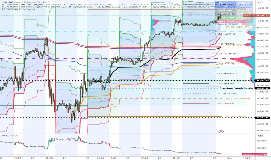
ES-VIX Daily Price Bands - Inner and OuterES-VIX Daily Price Bands
This indicator plots dynamic intraday price bands for ES futures based on real-time volatility levels measured by the VIX (CBOE Volatility Index). The bands evolve throughout the trading day, providing volatility-adjusted price targets.
Formulas:
Upper Band = Daily Low + (ES Price × VIX ÷ √252 ÷ 100)
Lower Band = Daily High - (ES Price × VIX ÷ √252 ÷ 100)
The calculation uses the square root of 252 (trading days per year) to convert annualized VIX volatility into an expected daily move, then scales it as a percentage adjustment from the current day's extremes.
Features:
Real-time band calculation that updates throughout the trading session
Upper band (green) extends from the current day's low
Lower band (red) contracts from the current day's high
Inner upper band (green) at 50% of expected move
Inner lower band (red) at 50% of expected move
Middle Inner upper band (green) at 80% of expected move
Middle Inner lower band (red) at 80% of expected move
Outer upper band (green) at 150% of expected move
Outer lower band (red) at 150% of expected move
Shaded zone between bands for visual clarity
Information table displaying:
Current ES price and VIX level
Running daily high and low
Current upper and lower band values
DTR OI IndicatorThe DTR OI Indicator is a multi-exchange open interest indicator designed for futures traders.
It aggregates OI from multiple exchanges to provide a unified and more reliable view of market positioning.
MAIN FUNCTIONS
• Open Interest Candles
• Open Interest Delta
• Delta × Relative Volume
• Open Interest RSI
• Threshold-based alerts for unusually large OI increases or decreases
• Optional OI EMA smoothing
PROFILE SYSTEM
Includes an OI-based distribution profile similar to a volume profile.
Shows Value Area, POC, and structural nodes based on OI activity within the visible chart range.
WHAT IT HELPS IDENTIFY
• Liquidations and rekt events
• Aggressive long/short buildup
• Position unwinds ahead of reversals
• OI-driven levels of interest
• Momentum confirmation (Delta × rVOL)
• Trend exhaustion (OI RSI)
NOTES
• Works across several exchanges for broader accuracy
• Coin or USD quoting supported
• Profile mode is resource-intensive
• No repainting
Ideal for traders who rely on OI, delta, and market positioning to understand futures flows and liquidity shifts.

FinPile Momentum📊 FinPile Momentum Indicator - User Guide
What Is This Indicator?**
A visual momentum histogram that sits below your price chart, giving you an instant read on whether momentum is bullish, bearish, or neutral. Designed for day traders who need to make fast decisions.
**The Basics: Grade System**
| Grade | Color | Score | What It Means | Action |
|-------|-------|-------|---------------|--------|
| **A+** | Bright Green | +60 to +100 | Everything aligned bullish | ✅ STRONG BUY |
| **A** | Green | +40 to +59 | Strong upward momentum | ✅ BUY |
| **B** | Light Green | +20 to +39 | Mild bullish momentum | ⚠️ MAYBE - be careful |
| **C** | Gray | -19 to +19 | No clear direction | ❌ NO TRADE - wait |
| **D** | Orange | -20 to -39 | Mild bearish momentum | ⚠️ Caution |
| **E** | Red | -40 to -59 | Bearish momentum | 🔴 AVOID longs |
| **F** | Dark Red | -60 to -100 | Strong downward momentum | 🔴 SHORT or stay out |
How to Read the Histogram**
A+ ──────── +60 ────────
A ──────── +40 ──────── ← GREEN ZONE = BUY
B ──────── +20 ────────
═════════ C ════════ 0 ═════════ ← GRAY = NO TRADE
D ──────── -20 ────────
E ──────── -40 ──────── ← RED ZONE = AVOID/SHORT
F ──────── -60 ────────
**Tall green bars above +40** = Strong momentum, look for long entries
**Bars near zero (gray)** = Choppy/no direction, stay out
**Tall red bars below -40** = Bearish momentum, avoid longs or short
### **Warning Symbols**
| Symbol | Meaning | What To Do |
|--------|---------|------------|
| ⚠️ | Exhaustion detected (climax top or bottom) | Expect potential reversal |
| ⚡ | Parabolic move | Too fast, pullback likely |
**The Info Table (Top Right)**
| Row | What It Shows |
|-----|---------------|
| **MOMENTUM** | Current grade (A+, A, B, C, D, E, F) |
| **Score** | Exact number (-100 to +100) |
| **Accel** | 🚀 ACCEL (speeding up) / 💨 DECEL (slowing down) / ➖ STEADY |
| **vs IWM/SPY** | 🟢 OUT (outperforming) / 🔴 UNDER (underperforming) |
| **Mode** | Current smoothing mode and EMA length |
**3 Smoothing Modes**
| Mode | Best For | How It Works |
|------|----------|--------------|
| **⚡ Quick & Clean** (Default) | Scalping, fast day trading | EMA(5) + threshold filter - responsive but no flickering |
| **🐢 Slow & Reliable** | Swing trading, patient traders | Longer lookback + EMA(8) - very smooth, fewer false signals |
| **🎯 Adaptive** | Volatile stocks, changing conditions | Adjusts EMA based on volatility - smart and automatic |
**How to change:** Settings → Smoothing → Smoothing Mode
---
### **Quick Decision Framework**
#### ✅ GO LONG when:
- Grade is **A+ or A** (green histogram above +40)
- Acceleration shows **🚀 ACCEL** (momentum increasing)
- vs IWM shows **🟢 OUT** (beating the market)
- No warning symbols (⚠️ or ⚡)
#### ❌ STAY OUT when:
- Grade is **C** (gray histogram near zero)
- Acceleration shows **💨 DECEL** while in a trade
- Score is bouncing between grades (indecision)
#### 🔴 GO SHORT or EXIT LONGS when:
- Grade is **E or F** (red histogram below -40)
- vs IWM shows **🔴 UNDER** (lagging market)
- Warning symbol ⚠️ appears at highs
---
### **Combining with Price Action**
| Momentum | Price Action | Decision |
|----------|--------------|----------|
| A/A+ rising | Breaking resistance | ✅ Strong buy |
| A/A+ but DECEL | At resistance | ⚠️ Wait for confirmation |
| B flat | Consolidating | ❌ No trade yet |
| C choppy | Ranging | ❌ Stay out |
| D/E falling | Breaking support | 🔴 Short or exit longs |
| F with ⚠️ | Capitulation low | 👀 Watch for bounce |
---
### **Settings Recommendations**
#### For Small Caps / Low Float:
```
Benchmark: IWM
Smoothing Mode: Adaptive
```
#### For Large Caps (AAPL, MSFT, etc.):
```
Benchmark: SPY
Smoothing Mode: Quick & Clean
```
#### For Volatile Meme Stocks:
```
Benchmark: IWM
Smoothing Mode: Adaptive
Adaptive High Vol EMA: 3
```
#### For Smoother Signals:
```
Smoothing Mode: Slow & Reliable
Slow Mode: Lookback Mult: 2.5
Slow Mode: EMA Length: 10
```
---
### **Pro Tips**
1. **Don't fight the color** - If histogram is red, don't go long hoping for reversal
2. **Watch for acceleration changes** - 🚀→💨 while price is rising = momentum fading, tighten stops
3. **Grade + Acceleration combo:**
- A + 🚀 ACCEL = Best setup
- A + 💨 DECEL = Momentum fading, be cautious
- C + 🚀 ACCEL = Potential breakout coming
4. **Use with the main indicator** - Momentum histogram for timing, main FinPile Institutional for levels and full analysis
5. **Background color** - When background turns green/red, momentum is strong (above +40 or below -40)
---
### **Example Trade**
```
You see:
┌─────────────────────────┐
│ MOMENTUM │ A │ ← Good grade
│ Score │ 52 │ ← Solid score
│ Accel │ 🚀 ACCEL │ ← Increasing!
│ vs IWM │ 🟢 OUT │ ← Beating market
│ Mode │ ⚡ QUICK │
└─────────────────────────┘
Histogram: Tall green bar above +40 line
Decision: ✅ LONG - All signals aligned
```
---
### **Quick Reference Card**
```
🟢 GREEN (A+/A) + 🚀 ACCEL + 🟢 OUT = BUY
⚪ GRAY (C) = NO TRADE
🔴 RED (E/F) + 💨 DECEL + 🔴 UNDER = SHORT/EXIT
⚠️ WARNING = Expect reversal

MFM - Light Context HUD (Free)Overview
MFM Light Context HUD is the free version of the Market Framework Model. It gives you a fast and clean view of the current market regime and phase without signals or chart noise. The HUD shows whether the asset is in a bullish or bearish environment and whether it is in a volatile, compression, drift, or neutral phase. This helps you read structure at a glance.
Asset availability
The free version works only on a selected list of five assets.
Supported symbols are
SP:SPX
TVC:GOLD
BINANCE:BTCUSD
BINANCE:ETHUSDT
OANDA:EURUSD
All other assets show a context banner only.
How it works
The free version uses fixed settings based on the original MFM model. It calculates the regime using a higher timeframe RSI ratio and identifies the current phase using simplified momentum conditions. The chart stays clean. Only a small HUD appears in the top corner. Full visual phases, ratio logic, signals, and auto tune are part of the paid version.
The free version shows the phase name only. It does not display colored phase zones on the chart.
Phase meaning
The Market Framework Model uses four structural phases to describe how the market behaves. These are not signals but context layers that show the underlying environment.
Volatile (Phase 1)
The market is in a fast, unstable or directional environment. Price can move aggressively with stronger momentum swings.
Compression (Phase 2)
The market is in a contracting state. Momentum slows and volatility decreases. This phase often appears before expansion, but it does not predict direction.
Drift (Phase 3)
The market moves in a more controlled, persistent manner. Trends are cleaner and volatility is lower compared to volatile phases.
No phase
No clear structural condition is active.
These phases describe market structure, not trade entries. They help you understand the conditions you are trading in.
Cross asset context
The Market Framework Model reads markets as a multi layer system. The full version includes cross asset analysis to show whether the asset is acting as a leader or lagger relative to its benchmark. The free version uses the same internal benchmark logic for regime detection but does not display the cross asset layer on the chart.
Cross asset structure is a core part of the MFM model and is fully available in the paid version.
Included in this free version
Higher timeframe regime
Current phase name
Clean chart output
Context only
Works on a selected set of assets
Not included
No forecast signals
No ratio leader or lagger logic
No MRM zones
No MPF timing
No auto tune
The full version contains all features of the complete MFM model.
Full version
You can find the full indicator here:
payhip.com
More information
Model details and documentation:
mfm.inratios.com
Disclaimer
The Market Framework Model (MFM) and all related materials are provided for educational and informational purposes only. Nothing in this publication, the indicator, or any associated charts should be interpreted as financial advice, investment recommendations, or trading signals. All examples, visualizations, and backtests are illustrative and based on historical data. They do not guarantee or imply any future performance. Financial markets involve risk, including the potential loss of capital, and users remain fully responsible for their own decisions. The author and Inratios© make no representations or warranties regarding the accuracy, completeness, or reliability of the information provided. MFM describes structural market context only and should not be used as the sole basis for trading or investment actions.
By using the MFM indicator or any related insights, you agree to these terms.
© 2025 Inratios. Market Framework Model (MFM) is protected via i-Depot (BOIP) – Ref. 155670. No financial advice.

2t's MA 50, MA 150, ATRThis indicator displays three key technical signals on the chart:
SMA 50 – Short-term trend direction
SMA 150 – Medium-term trend direction
ATR – Market volatility (Average True Range)
Line colors and lengths can be customized in the settings.
The ATR is plotted on the same chart for quick volatility reference without needing a separate panel.
This tool is designed for traders who want a clean, lightweight view of trend strength and volatility in a single indicator.

AIO+TX by Lucky-cbtThis system is not built on ordinary moving averages or textbook filters. It is a multi‑dimensional mathematical engine that interprets market rhythm through dynamic ratios, geometric alignments, and adaptive oscillations.
📐 Geometric Layering: The script measures the relative curvature of price trajectories against long‑term baselines, using proportional spacing rules derived from harmonic progressions.
🔄 Cross‑Dimensional Ratios: Instead of simple crossovers, it applies ratio‑based transitions where short‑term momentum vectors intersect with deep‑time anchors, producing signals only when multiple dimensions align.
📊 Volumetric Amplification: Market participation is filtered through a power‑law multiplier, ensuring that only statistically significant surges are considered valid.
🌫️ Cloud Dynamics: A dual‑span envelope evaluates whether price is floating above or below its equilibrium surface, acting as a probabilistic barrier rather than a fixed line.
🎯 Directional Memory: The algorithm embeds a trend memory function, smoothing directional impulses into a weighted regime that flips only after confirmation thresholds are satisfied.
🌀 Oscillatory Balance: Instead of naming RSI or CCI, the system checks whether the oscillatory balance remains within a bounded corridor, rejecting extremes that would otherwise distort the signal.
⚡ Adaptive Stretch: Volatility is normalized through a stretch‑compression model, where expansion and contraction are raised to fractional exponents, ensuring resilience across market conditions.
🔒 Confluence Gate: No single metric is decisive. Only when all mathematical gates unlock simultaneously does the system permit a directional flip, marking the chart with precision labels.
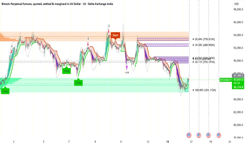
@Unwind Pressure Detector - AUDITED v3.0SQUEEZE → UNWIND PRESSURE DETECTOR v3.0
The first indicator that not only finds oversold squeezes… but tells you exactly when the move is exhausting and it’s time to take profits.
Fully audited, clean Pine Script v6, zero repainting, zero lag tricks.
WHAT IT DOES
• Detects high-probability squeeze setups (RSI + Volume + VIX + Trend confluence)
• Scores pressure from 0–115 with dynamic sensitivity (Low to Extreme)
• Identifies CRITICAL zones where explosive moves are most likely
• Most importantly → flags the UNWIND when trapped shorts are finally covering and the rally is running out of fuel (perfect profit-taking signal)
FEATURES
• Real-time pressure dashboard (top-right)
• Color-coded background zones (Critical = red, High = orange)
• Smart anti-spam labels with ATR offset
• Three alert conditions:
→ Squeeze Setup
→ Critical Squeeze
→ Unwind / Take Profit
• Works on all markets & timeframes (stocks, forex, crypto, futures)
WHY THIS VERSION IS DIFFERENT
- v3.0 completely rewrote the unwind logic (now requires rally + sharp pressure drop)
- No false unwinds during strong trends
- Built for real trading, not just pretty screenshots
100% Open Source • Fully commented • Free to modify & rep, I want this in the public library forever.
Created with love for the TradingView community
Drop a ♥ and follow if you find it useful!
#squeeze #ttmsqueeze #unwind #volatility #vix #takeprofits #smartmoney

ES-VIX Daily Price Bands - Inner bands (80% and 50%)ES-VIX Daily Price Bands
This indicator plots dynamic intraday price bands for ES futures based on real-time volatility levels measured by the VIX (CBOE Volatility Index). The bands evolve throughout the trading day, providing volatility-adjusted price targets.
Formulas:
Upper Band = Daily Low + (ES Price × VIX ÷ √252 ÷ 100)
Lower Band = Daily High - (ES Price × VIX ÷ √252 ÷ 100)
The calculation uses the square root of 252 (trading days per year) to convert annualized VIX volatility into an expected daily move, then scales it as a percentage adjustment from the current day's extremes.
Features:
Real-time band calculation that updates throughout the trading session
Upper band (green) extends from the current day's low
Lower band (red) contracts from the current day's high
Inner upper band (green) at 50% of expected move
Inner lower band (red) at 50% of expected move
Middle Inner upper band (green) at 80% of expected move
Middle Inner lower band (red) at 80% of expected move
Shaded zone between bands for visual clarity
Information table displaying:
Current ES price and VIX level
Running daily high and low
Current upper and lower band values

ES-VIX Daily Price Bands - Inner bandsES-VIX Daily Price Bands
This indicator plots dynamic intraday price bands for ES futures based on real-time volatility levels measured by the VIX (CBOE Volatility Index). The bands evolve throughout the trading day, providing volatility-adjusted price targets.
Formulas:
Upper Band = Daily Low + (ES Price × VIX ÷ √252 ÷ 100)
Lower Band = Daily High - (ES Price × VIX ÷ √252 ÷ 100)
The calculation uses the square root of 252 (trading days per year) to convert annualized VIX volatility into an expected daily move, then scales it as a percentage adjustment from the current day's extremes.
Features:
Real-time band calculation that updates throughout the trading session
Upper band (green) extends from the current day's low
Lower band (red) contracts from the current day's high
Inner upper band (green) at 50% of expected move
Inner lower band (red) at 50% of expected move
Shaded zone between bands for visual clarity
Information table displaying:
Current ES price and VIX level
Running daily high and low
Current upper and lower band values

ES-VIX Daily Price BandsES-VIX Daily Price Bands
This indicator plots dynamic intraday price bands for ES futures based on real-time volatility levels measured by the VIX (CBOE Volatility Index). The bands evolve throughout the trading day, providing volatility-adjusted price targets.
Formulas:
Upper Band = Daily Low + (ES Price × VIX ÷ √252 ÷ 100)
Lower Band = Daily High - (ES Price × VIX ÷ √252 ÷ 100)
The calculation uses the square root of 252 (trading days per year) to convert annualized VIX volatility into an expected daily move, then scales it as a percentage adjustment from the current day's extremes.
Features:
Real-time band calculation that updates throughout the trading session
Upper band (green) extends from the current day's low
Lower band (red) contracts from the current day's high
Shaded zone between bands for visual clarity
Information table displaying:
Current ES price and VIX level
Running daily high and low
Current upper and lower band values

@Complete Squeeze Cycle Detector v2.0 FINALDescription:
The Complete Squeeze Cycle Detector identifies and tracks the full lifecycle of squeeze formations, from pre-squeeze consolidation through active squeeze periods to squeeze completion. The indicator systematically detects the characteristic conditions that precede and accompany squeeze events.
The indicator monitors multiple factors associated with squeeze development including:
• Volatility compression relative to recent volume activity
• Elevated market stress conditions as measured by VIX levels
• Momentum compression through rate of change measurements across multiple time periods
• Alignment of multiple exponential moving averages indicating consolidation
The squeeze cycle is classified into three distinct phases: Pre-Squeeze Setup, Active Squeeze, and Squeeze Complete. Each phase is identified based on threshold levels of multiple compression metrics, with adjustable sensitivity settings to control the strictness of detection.
The indicator provides visual identification of each phase through labels, background coloring, and an optional dashboard, allowing users to distinguish between the preparation phase where volatility contracts, the active squeeze phase where compression reaches critical levels, and the completion phase where the squeeze releases and directional movement resumes.
This systematic approach enables users to identify squeeze formations throughout their complete development cycle rather than focusing only on the breakout phase.

Santhosh Zero lag Trend change AlertThis indicator alert whenever these is a change in trend direction. Change input to match with your Asset/Index. This works well in all time frame, I recommend this for Scalping and Position trading

ES-VIX Expected Daily MoveThis indicator calculates the expected daily price movement for ES futures based on current volatility levels as measured by the VIX (CBOE Volatility Index).
Formula:
Expected Daily Move = (ES Price × VIX Price) / √252 / 100
The calculation converts the annualized VIX volatility into an expected daily move by dividing by the square root of 252 (the approximate number of trading days per year).
Features:
Real-time calculation using current ES futures price and VIX level
Histogram visualization in a separate pane for easy trend analysis
Information table displaying:
Current ES futures price
Current VIX level
Expected daily move in points
Expected daily move as a percentage

Elite Energy Alpha MatrixThe Elite Energy Alpha Matrix indicator provides comprehensive analysis of the energy sector, focusing on the complex relationships between crude oil benchmarks, natural gas, energy-related ETFs, and the performance dynamics across various energy sub-sectors.
The indicator tracks multiple energy price data sources including WTI crude oil, Brent crude, natural gas, and oil ETFs, enabling detailed monitoring of price relationships and divergences within the energy complex.
Key analytical components include:
• Correlation analysis between major energy benchmarks
• Multi-timeframe examination of energy price relationships
• Sector rotation detection within energy sub-sectors including integrated oil majors, exploration and production companies, oilfield services, refiners, pipelines, and renewable energy
• Performance monitoring across different energy market segments
The indicator provides a structured framework for analyzing the internal dynamics of the energy sector, identifying periods of alignment or divergence between different energy price instruments, and monitoring relative performance across energy sub-sectors.
This approach enables users to assess the consistency of price movements across the energy complex and identify situations where different components of the energy market are exhibiting divergent behavior, which can provide insight into the underlying drivers affecting the sector.2.6s

Market Regime Storyline v6Title: Market Regime Storyline
Description:
The Market Regime Storyline indicator identifies and displays the current market condition or "regime" through a comprehensive framework that combines trend direction and volatility analysis.
The indicator classifies market conditions into four distinct regimes:
Uptrend: Price is above the trend moving average with short-term momentum confirming upward movement
Downtrend: Price is below the trend moving average with short-term momentum confirming downward movement
Squeeze: Low normalized volatility indicating a period of consolidation and potential impending breakout
Chop: Sideways, range-bound price action with no clear directional bias and normal volatility
Key features include:
• Clear identification of the dominant market regime with visual background coloring
• Continuous display of the current regime and normalized volatility level in the upper-left corner
• Labels marking transitions between different market regimes
• Subtle background coloring that provides visual context without visual clutter
The indicator combines trend determination (using an exponential moving average and momentum confirmation) with volatility normalization to provide a complete picture of the prevailing market environment. This regime identification helps traders adapt their strategies to the current market conditions, whether trending, consolidating, or ranging.
This approach recognizes that different trading strategies perform optimally in different market environments, allowing users to adjust their approach based on whether the market is exhibiting trending behavior, preparing for a volatility expansion, or trading in a range-bound manner.
Category: Trend Analysis
Tags: Market Regime, Trend Identification, Volatility Squeeze, Market Conditions, Consolidation, Trending, Range-Bound, Regime Change, Volatility Normalization, Market Environment
Recommended Publishing Information:
The Market Regime Storyline indicator is designed to provide traders with a clear, unambiguous identification of the prevailing market condition. By categorizing market behavior into distinct regimes, the indicator enables users to:
Determine whether the market is exhibiting directional trending behavior that favors trend-following strategies
Identify periods of low volatility consolidation (squeezes) that often precede significant directional moves
Recognize range-bound, non-directional market conditions where mean reversion or breakout strategies may be more appropriate
The indicator uses a combination of trend filtering through a primary moving average and momentum confirmation, along with normalized volatility measurement, to provide a robust regime classification system. The normalized volatility component helps distinguish between true consolidation periods (squeezes) and typical sideways movement (chop), providing additional context for anticipating potential changes in market behavior.
This regime-based approach acknowledges the reality that all trading strategies do not perform equally well in all market environments, and provides a framework for adapting trading approaches to the prevailing market conditions.
The combination of these classification elements and the clear visual presentation makes this indicator particularly useful for traders who need to adjust their strategy depending on whether the market is in a trending, consolidating, or range-bound state.

Z-EMA Fusion BandsDesigned with crypto markets in mind, particularly Bitcoin , it builds on the concept that the 1-Week 50 EMA often serves as a long-term bull/bear market threshold — an area where institutional bias, momentum shifts, and cyclical rotations tend to occur.
🔹 Core Components & Synergies:
1. 1W 50 EMA (Higher Timeframe)
- This EMA is calculated on a weekly timeframe, regardless of your current chart.
- In crypto, price above the 1W 50 EMA typically aligns with long-term bull market phases, while extended periods below can signify bearish macro structure.
- The slope of the EMA is also analyzed to add directional confidence to trend strength.
2. ±1 Standard Deviation Bands
- Surrounding the 50 EMA, these bands visualize normal price dispersion relative to trend.
- When price consistently hugs or breaks outside these bands, it often reflects market expansion, volatility events, or mean-reversion opportunity.
3. Z-Score Gradient Fill
- The area between the bands is filled using a Z-score-based gradient, which dynamically adjusts color based on how far price is from the EMA (in terms of standard deviations).
- Color shifts from aqua (near EMA) to fuchsia (far from EMA) help you spot price compression, equilibrium, or overextension at a glance.
- The fill also uses transparency scaling, making it fade as price stretches further, emphasizing the core structure.
4. Directional EMA Coloring
- The EMA line itself is colored based on:
- The slope of the EMA (rising/falling)
- Whether the HTF candle is bullish or bearish
- This provides intuitive color-coded confirmation of momentum alignment or potential exhaustion.
5. Price/EMA Divergence Detection
- The script detects bullish and bearish divergence between price and the EMA (rather than using a traditional oscillator).
- Bullish Divergence: Price makes a lower low, EMA makes a higher low.
- Bearish Divergence: Price makes a higher high, EMA makes a lower high.
- These signals often mark transitional zones where momentum fades before a trend reversal or correction.
📊 Suggested Uses:
🔸 Swing and Position Trading:
- Use the 1W 50 EMA as a macro-trend anchor.
- Stay long-biased when price is above with positive slope, and short-biased when below.
- Consider entries near band edges for mean-reversion plays, especially if confluence forms with divergence signals.
🔸 Volatility-Based Filtering:
- Use the Z-score fill to identify volatility compression (near EMA) or expansion (edge of bands).
- Combine this with breakout strategies or dynamic position sizing.
🔸 Divergence Confirmation:
- Combine divergence markers with HTF EMA slope for high-probability setups.
- Bullish div + EMA flattening/rising can signal the start of accumulation after a macro dip.
🔸 Multi-Timeframe Analysis:
- Works well as a structural overlay on intraday charts (1H, 4H, 1D).
- Use this indicator to track long-term bias while executing lower timeframe trades.
⚠️ Disclaimer:
This indicator is designed for educational and informational purposes only. It does not constitute financial advice or a recommendation to buy or sell any asset.
Always use proper risk management, and combine with your own analysis, tools, and strategy. Performance in past market conditions does not guarantee future results.

Simple Price ChannelSimple Price Channel
This indicator plots a basic volatility-based channel around a moving average.
Features:
Midline using Simple Moving Average (SMA)
Upper & lower bands using ATR or true range
Channel fill for easy trend visualisation
This script is designed for educational and analytical purposes only.
It does not provide signals, alerts, or financial advice.

Confluence Engine [BullByte]CONFLUENCE ENGINE
Multi-Factor Technical Analysis Framework
OVERVIEW
Confluence Engine is a multi-dimensional technical analysis framework that evaluates market conditions across five distinct analytical pillars simultaneously. Rather than relying on a single indicator or signal source, this tool synthesizes Structure, Momentum, Volume, Volatility, and Pattern analysis into a unified scoring system that identifies high-probability trading opportunities when multiple technical factors align.
The core philosophy behind this indicator stems from a fundamental observation: isolated signals frequently fail, but when multiple independent analytical methods agree, the probability of a successful trade increases substantially. This indicator was developed after extensive research into why traders often receive conflicting signals from different indicators on their charts, leading to analysis paralysis and poor decision-making.
THE PROBLEM AND SOLUTION
The Problem:
Most traders use multiple indicators independently, often receiving contradictory signals. One indicator says "buy" while another says "wait." This creates confusion and leads to missed opportunities, premature entries based on incomplete analysis, difficulty quantifying how strong a setup actually is, and inconsistent decision-making across different market conditions.
The Solution:
Confluence Engine addresses this by providing a single, unified score (0-100) that represents the aggregate strength of a trading setup. Instead of mentally weighing five different indicators, traders receive a clear numerical score indicating setup quality, visual tier classification (ULTRA, HIGH, STANDARD), specific identification of which factors are strong or weak, and actionable guidance on what to watch for next.
THE FIVE ANALYTICAL DIMENSIONS
Each dimension was selected because it measures a fundamentally different aspect of market behavior:
STRUCTURE ANALYSIS
Evaluates price position relative to key levels and recent swing points. Markets respect structure - previous highs, lows, and areas where price reversed. This dimension identifies when price interacts with these critical levels and measures the quality of that interaction.
What it detects: Price approaching or sweeping swing highs/lows, reclaim patterns after false breakouts, EMA alignment and trend structure, exhaustion after extended moves.
MOMENTUM ANALYSIS
Measures the underlying strength and direction of price movement. Strong moves are characterized by momentum preceding price. This dimension evaluates whether momentum supports the current price direction.
What it detects: Oversold/overbought conditions with reversal potential, momentum divergence states, directional movement strength (ADX-based), momentum shifts before price confirmation.
VOLUME ANALYSIS
Volume validates price movement. Significant moves require participation. This dimension measures current volume relative to recent averages to determine if market participants are genuinely committing to the move.
What it detects: Volume spikes confirming price action, below-average volume warning of weak moves, climactic volume at potential reversals, volume confirmation of rejection patterns.
VOLATILITY ANALYSIS
Markets alternate between compression (low volatility) and expansion (high volatility). This dimension identifies these phases and recognizes when compression is likely to resolve into directional movement.
What it detects: Volatility squeeze conditions (Bollinger inside Keltner), squeeze release direction, ATR expansion indicating breakout potential, compression duration for timing breakouts.
PATTERN ANALYSIS
Candlestick patterns reflect the battle between buyers and sellers within each bar. This dimension evaluates the quality and context of reversal and continuation patterns.
What it detects: Engulfing patterns with quality scoring, hammer and shooting star formations, rejection wicks indicating trapped traders, pattern confluence with other factors.
WHAT MAKES THIS INDICATOR ORIGINAL Not a mashup
This is NOT a mashup of indicators displayed together. The Confluence Engine represents an integrated analytical framework with the following unique characteristics:
Unified Scoring System: All five dimensions feed into a proprietary scoring algorithm that weights and combines their signals. The output is a single 0-100 score, not five separate readings.
Multi-Factor Gate: Beyond just scoring, the system requires a minimum number of factors to be "active" (meeting their individual thresholds) before allowing signals. This prevents signals based on one extremely strong factor masking four weak ones.
Regime-Aware Adjustments: The engine detects the current market regime (trending, ranging, volatile, weak) and automatically adjusts factor weights and score multipliers. A structure signal means something different in a trending market versus a ranging market.
Adaptive Risk Management: Take-profit and stop-loss levels are not static. They adapt based on current volatility, market regime, and signal quality - providing tighter targets in low-volatility environments and wider targets when volatility expands.
Liquidity Sweep Detection: A distinctive feature that identifies when price has swept beyond a swing high/low and then reclaimed back inside. This pattern often indicates stop hunts followed by reversals.
Signal Quality Tiers: Rather than just "signal" or "no signal," the engine classifies setups into tiers. ULTRA (80+) represents highest probability setups with all factors aligned. HIGH (70-79) represents strong setups with multiple factors confirming. STANDARD meets minimum threshold for acceptable setups.
HOW THE SCORING WORKS
Each of the five factors generates a raw score from 0-100 based on current market conditions. These raw scores are then weighted according to the selected trading style (Balanced, Scalper, Swing, Range, Trend), adjusted based on current market regime detection, modified by higher timeframe alignment (if enabled), bonused when multiple factors exceed their activation thresholds simultaneously, and multiplied by session factors (if session filter is enabled).
The result is a final Bull Score and Bear Score, each ranging from 0-100, representing the current strength of long and short setups respectively.
Signal Generation Requirements:
- Score meets minimum threshold (configurable: 60-95)
- Required number of factors are "active" (default: 3 of 5)
- Market regime is not blocked (if blocking enabled)
- Higher timeframe alignment passes (if required)
- Cooldown period from last signal has elapsed
UNDERSTANDING THE DASHBOARDS
Main Dashboard (Top Right)
The main dashboard displays real-time scores and market context:
LONG Score - Current bullish setup strength (0-100) with quality tier displayed
SHORT Score - Current bearish setup strength (0-100) with quality tier displayed
Regime - Current market state showing TREND UP, TREND DN, VOLATILE, RANGE, or WEAK
HTF - Higher timeframe alignment showing BULL, BEAR, NEUT, or OFF
Squeeze - Volatility state showing SQZ (in squeeze), REL+ (bullish release), REL- (bearish release), or NORM
Gate - Factor count versus requirement, for example 4/3 means 4 factors active with 3 required
Sweep L/S - Liquidity sweep status for long and short setups
ATR% - Current ATR as percentile of recent range indicating relative volatility
Vol - Current volume relative to 20-period average
R:R - Current risk-reward ratio based on adaptive TP/SL calculations
Trade - Active trade status and unrealized profit/loss percentage
Analysis Dashboard (Bottom Left)
The analysis dashboard provides actionable guidance:
Signal Readiness - Visual progress bars showing how close each direction is to generating a signal
Blocking Factors - Identifies which specific factor is weakest and preventing signals
Recommended Action - Context-aware guidance such as WATCH, WAIT, MANAGE, or SCAN
Watch For - Specific events to monitor for setup completion
Opportunity Level - Overall market opportunity rating from EXCELLENT to VERY POOR
Timing - Contextual timing guidance based on current conditions
Status Bar (Bottom Center)
Compact view displaying Long Score, Gate Status, Current State, Gate Status, and Short Score in a single row for quick reference.
Dashboard Size - Auto Mode Explained
When Dashboard Size is set to "Auto", the indicator intelligently adjusts text size based on your current chart timeframe to optimize readability:
Auto-Sizing Logic:
1-Minute to 5-Minute Charts → Tiny
- Lower timeframes show more bars on screen
- Tiny text prevents dashboard from obscuring price action
- Recommended for scalping and high-frequency monitoring
15-Minute Charts → Small
- Balanced size for intraday trading
- Readable without being intrusive
1-Hour to Daily Charts → Normal
- Standard size for most trading styles
- Optimal readability for swing trading
Weekly and Monthly Charts → Large
- Larger text for position trading
- Fewer bars visible so space is available
Manual Override:
You can override auto-sizing for any dashboard individually:
- Dashboard Size (All): Sets master size applied to all dashboards
- Main Dashboard Size: Override for top-right dashboard specifically
- Analysis Panel Size: Override for bottom-left panel specifically
- Status Bar Size: Override for bottom-center bar specifically
Example Use Case:
Trading on 5m chart (default = Tiny) but you have good eyesight and large monitor:
- Set "Dashboard Size (All)" to "Small" or "Normal" for better readability
- Individual dashboards will use your override instead of auto-sizing
Recommendation:
Start with Auto mode and only adjust if dashboards are too large or too small for your monitor/eyesight.
UNDERSTANDING SIGNAL LABELS
When a signal generates, a label appears with trade information:
Minimal Style Example:
LONG 85
Shows tier icon, direction, and score only.
Detailed Style Example:
ULTRA LONG
Score: 85
Entry: 50250.50
TP1: 50650.25
TP2: 51500.75
SL: 49850.25
R:R 1:2.5
Regime: TREND UP
HTF: BULL
Tier Icons Explained:
indicates ULTRA quality with score 80 or higher
indicates HIGH quality with score between 70 and 79
indicates STANDARD quality with score meeting minimum threshold
UNDERSTANDING TRADE ZONES
When a signal generates, visual elements appear on the chart:
Entry Line (Purple) marks the entry price level
TP1 Line (Blue Dashed) marks the first take-profit target
TP2 Line (Cyan Dashed) marks the final take-profit target
SL Line (Orange Dotted) marks the stop-loss level
Trade Zone Box shows shaded area from SL to TP2
These elements extend forward as price progresses. When TP1 is hit, its line becomes solid to indicate achievement. When the trade completes at either TP2 or SL, all elements are cleaned up and the entry label converts to a compact ghost label for historical reference.
Exit Labels Explained:
+X.XX% indicates first target reached with partial profit secured
+X.XX% indicates full target reached with maximum profit achieved
-X.XX% indicates stop-loss triggered
TP1 Hit, SL... indicates stopped out after TP1 was already hit (optional display)
OPPOSITE SIGNAL HANDLING
When market conditions shift dramatically, the engine may generate a signal in the opposite direction while an existing trade is active. This represents a significant change in confluence and is handled automatically:
Automatic Trade Reversal Process:
1. Detection: New signal triggers opposite to current trade direction (e.g., SHORT signal while LONG trade is active)
2. Current Trade Closure:
- All visual elements (entry line, TP/SL lines, trade zone) are deleted
- Current trade is marked as closed
3. Entry Label Conversion:
- The detailed entry label is converted to a compact ghost label
- Ghost label shows direction + score (e.g., "LONG 75")
- Marked with "OPP" outcome to indicate opposite signal closure
- Moved to a non-interfering position below/above price
4. New Trade Initialization:
- Fresh entry label created for new direction
- New TP1, TP2, SL levels calculated based on new signal quality
- Trade zone and price lines drawn for new trade
Example Scenario:
You enter a LONG trade at score 72. Price moves sideways for 8 bars, then market structure breaks down. Confluence shifts heavily bearish with a sweep reclaim bear + momentum + volume spike, generating a SHORT signal at score 81. The engine automatically:
- Closes the LONG trade
- Converts "LONG 72" entry label to a small ghost label
- Opens new SHORT trade at current price
- Displays new SHORT entry label with full trade details
Trading Implication:
This behavior ensures the engine is always aligned with the highest-probability direction based on current confluence. It prevents you from holding a position when all five factors have flipped against you.
Note: This does NOT happen for every small score change. The opposite signal must meet all signal generation requirements (minimum score, gate pass, regime check, HTF alignment) before triggering. Typically occurs during strong trend reversals or major support/resistance breaks.
EXAMPLE TRADE : LONG
Instrument and Exchange: Bitcoin / TetherUS (BTC/USDT) on Binance
Timeframe: 5-minute
Timestamp: Nov 27, 2025 12:39 UTC
Indicator Script: Confluence Engine v1.0
Trade Type: Long (Example Trade)
Setting Used: Default
Signal Details:
- Tier: HIGH
- Score: 70
- Entry Price: 90040.70
- TP1 Target: 90868.63
- TP2 Target: 92110.52
- Stop Loss: 89325.94
- Risk Reward: 1:2.9
Trade Outcome:
- TP1 hit after 12 bars (+0.95%)
- TP2 hit after 28 bars (+2.85%)
- Total gain: +2.85% on full position
EXAMPLE TRADE : SHORT with Dashboard Explanation and interpretation
Instrument and Exchange: Ethereum / U.S. Dollar (ETH/USD) — Coinbase
Timeframe: 1-hour
Timestamp (screenshot): Nov 28, 2025 16:41 UTC
Indicator Script: Confluence Engine v1.0
Trade Type: Short (Example Trade)
Setting Used: Default
Signal Details
-Tier: STANDARD (STD)
-Score: 64
-Entry Price: 3037.26
-TP1 Target: 2981.61 (-55.65 pts)
-TP2 Target: 2898.12 (-139.14 pts)
-Stop Loss: 3099.79 (+62.53 pts)
-Risk:Reward: ≈ 1 : 2.2 (TP2/SL)
-Market Context at Signal
-Regime: TREND UP (contextual regime at time of signal) — mixed environment for shorts
-HTF Alignment: OFF (no higher-timeframe confirmation)
-Gate Status: 3 / 3 (minimum factor groups active — gate passed)
-Squeeze Status: NORM (no active compression breakout)
-Volume: ~1.8× average (elevated participation)
-ATR%: 57% (elevated volatility)
Analysis Dashboard Reading (what the user sees)
-Long Readiness: Needs +36 points to qualify.
-Short Readiness: Needs +11 points to qualify (closer but not auto-entering).
-Blocking Factors: Structure = 0 — the single decisive blocker preventing fresh signals.
-Opportunity Level: VERY POOR (roughly 20 / 100) — low quality environment for adding positions.
-Timing: Wait for better setup (do not add new positions).
-Trade Outcome (screenshot moment)
-Trade state: Active SHORT (opened earlier).
-Live P&L (snapshot): +0.14% (managing trade).
-TP1/TP2: Targets shown on chart (TP1 2981.61, TP2 2898.12). Not closed yet at screenshot.
-Visuals: Entry label, TP/SL lines and trade zone are displayed and being extended while trade is active.
Interpretation
The engine produced a standard short (Score 64) while the market showed elevated volume and volatility but no HTF confirmation. Although the Gate passed (3/3), Structure = 0 blocks the indicator from issuing fresh entries — this is intentional and by design: one missing factor (structure) is enough to prevent new signals even when other factors look supportive. The currently open short is being managed (partial targets and SL visible), but the system's recommendation is to manage the existing trade only and not open new shorts until structure or HTF alignment improves.
Why this example matters (teaching point)
-Gate ≠ Go: Gate pass (factor count) alone does not force fresh trades — the system enforces additional checks (structure, regime, HTF) to avoid lower-quality setups.
-Volume & Volatility are necessary but not sufficient: High volume and wide ATR create movement but do not replace structural validation.
-Active trade vs new entries: The script will continue to manage an already open trade but will not create a new signal while a blocking factor remains. This prevents overtrading and reduces false positives.
-Practical trader actions shown by the example
-Manage existing SHORT only: Trail to breakeven if TP1 is taken; scale out at TP1; hold remaining if price respects trend and structure reclaims.
-Do not add fresh positions: Wait for Structure > 0 or a HTF alignment that lifts the block.
-Watch for signals that matter: Sweep reclaim, HTF alignment turning bullish for shorts (i.e., HTF changes to BEAR), or a squeeze release with volume spike — these can clear the blocker and validate new entries.
RECOMMENDED TIMEFRAMES
For Scalping on 1m, 5m, or 15m charts: Use higher factor thresholds and shorter cooldowns. The faster pace requires stricter filtering.
For Day Trading on 15m, 30m, or 1H charts: This provides a balance of signal frequency and reliability suitable for most active traders.
For Swing Trading on 1H, 4H, or Daily charts: Expect higher quality signals with longer hold periods and fewer false signals.
For Position Trading on Daily or Weekly charts: Focus on ULTRA signals only for maximum conviction on longer-term positions.
Higher Timeframe Alignment Recommendations:
When trading 5m, use 1H as your HTF
When trading 15m, use 1H or 4H as your HTF
When trading 1H, use 4H or Daily as your HTF
When trading 4H, use Daily as your HTF
The general rule is to select an HTF that is 4 to 12 times your trading timeframe.
TRADING STYLE PRESETS
Balanced (Default)
Equal weighting across all five factors at 20% each. Suitable for most market conditions and recommended as starting point.
Scalper
Emphasizes Volume at 30% and Volatility at 30%. Designed for quick in-and-out trades on lower timeframes where immediate momentum and volatility expansion matter most.
Swing Trader
Emphasizes Structure at 30% and Momentum at 30%. Focuses on catching larger moves where trend direction and key levels are paramount.
Range Trader
Emphasizes Structure at 35% and Pattern at 25%. Optimized for sideways markets where support/resistance levels and reversal patterns dominate.
Trend Follower
Emphasizes Momentum at 40%. Designed for trending markets where staying with the dominant direction is the priority.
QUALITY MODE SETTINGS
Custom Mode
Set your own minimum score threshold. Lower thresholds between 60 and 65 generate more signals but with lower average quality. Higher thresholds of 75 or above generate fewer but higher-quality signals.
High Quality Mode
Uses minimum score of 70. Recommended for most users as it filters out marginal setups while still providing reasonable signal frequency.
Ultra Only Mode
Uses minimum score of 80 for maximum selectivity. Only the highest-conviction setups generate signals. Recommended for swing and position traders or during uncertain market conditions.
REGIME DETECTION
The engine continuously evaluates market conditions and classifies them into five states:
TREND UP
Characteristics: Strong ADX reading with EMAs aligned in bullish order
Trading Implications: Long signals receive score boost while short signals are suppressed. Momentum factor gains additional weight.
TREND DN
Characteristics: Strong ADX reading with EMAs aligned in bearish order
Trading Implications: Short signals receive score boost while long signals are suppressed. Momentum factor gains additional weight.
VOLATILE
Characteristics: High ATR percentile, wide Bollinger Bands, elevated volume
Trading Implications: Both directions remain viable but wider stops are recommended. Volume factor gains additional weight.
RANGE
Characteristics: Low ADX reading, narrow Bollinger Bands, low ATR percentile
Trading Implications: Structure signals are emphasized while momentum signals are suppressed. Pattern recognition becomes more important.
WEAK
Characteristics: Unclear or mixed conditions that do not fit other categories
Trading Implications: Reduced confidence in all signals. Consider waiting for clearer market conditions.
Filter Mode Options:
Off - Regime is detected and displayed but no score adjustments are applied
Adjust Scores - Automatically modifies factor weights based on current regime
Block Weak Regimes - Prevents signals from generating when regime is RANGE or WEAK
VOLATILITY SQUEEZE DETECTION
A volatility squeeze occurs when Bollinger Bands contract inside the Keltner Channel, indicating reduced volatility and potential energy building for a breakout.
Squeeze States Explained:
SQZ with bar count (example: SQZ 15)
Indicates currently in squeeze for the displayed number of bars. A score penalty is applied during this phase because compression represents uncertainty about direction.
REL+ (Release Bullish)
Indicates squeeze has released with price above the basis line. Score bonus is applied for long setups as this often precedes strong upward moves.
REL- (Release Bearish)
Indicates squeeze has released with price below the basis line. Score bonus is applied for short setups as this often precedes strong downward moves.
NORM (Normal)
No active squeeze detected. Standard scoring applies.
Trading Implication:
Squeeze releases often produce strong directional moves. The engine detects both the squeeze duration and the release direction, awarding bonus points to signals that align with the release. Longer squeeze duration often corresponds to more powerful breakouts.
LIQUIDITY SWEEP DETECTION
Markets often sweep beyond obvious support and resistance levels to trigger stops before reversing. The engine detects these patterns:
Bullish Sweep Reclaim
Price sweeps below recent swing low, triggering stop losses, then reclaims back above the swing low. This often indicates smart money accumulation after retail stops are collected.
Bearish Sweep Reclaim
Price sweeps above recent swing high, triggering stop losses, then reclaims back below the swing high. This often indicates smart money distribution after retail stops are collected.
Sweep Status in Dashboard:
RCL (Reclaim) - Reclaim has been confirmed. This receives highest structure score as the pattern is complete.
PND (Pending) - Sweep has occurred and price is near the level but full reclaim not yet confirmed. Watching for completion.
ACT (Active) - Sweep is currently in progress with price beyond the swing level.
Dash (-) - No sweep activity detected.
MULTI-FACTOR GATE SYSTEM
Beyond overall score, the engine counts how many individual factors meet their activation threshold.
Example Calculation:
Structure score 45 with threshold 35 equals ACTIVE
Momentum score 25 with threshold 30 equals INACTIVE
Volume score 50 with threshold 35 equals ACTIVE
Volatility score 40 with threshold 30 equals ACTIVE
Pattern score 35 with threshold 30 equals ACTIVE
Result: 4 of 5 factors are active
If minimum required factors is set to 3, this example passes the gate and receives a 4-factor bonus.
Gate Bonuses:
4 factors active adds 8 points to final score (default setting)
5 factors active adds 15 points to final score (perfect confluence)
Purpose:
This mechanism prevents scenarios where one extremely high factor score masks four weak factors. A score of 75 with only 2 active factors is less reliable than a score of 70 with 4 active factors.
ADAPTIVE RISK MANAGEMENT
Take-profit and stop-loss distances adjust dynamically based on three inputs:
Volatility Influence (default 40% weight)
Low ATR percentile produces tighter targets
High ATR percentile produces wider targets
This ensures stops are not too tight in volatile conditions or too wide in calm conditions.
Regime Influence (default 30% weight)
Trending market with aligned signal produces extended targets
Ranging market produces contracted targets
Volatile regime produces wider stops for protection
Score Influence (default 30% weight)
ULTRA signals (high conviction) receive extended targets
STANDARD signals receive standard targets
Higher conviction justifies larger profit expectations.
You can configure the weight of each influence in settings to match your trading style.
SESSION FILTER (Optional Feature)
When enabled, the engine applies score multipliers based on the trading session:
Asian Session (default 0.9x multiplier)
Characterized by lower volatility and ranging tendency. Score reduction reflects reduced opportunity.
London Session (default 1.1x multiplier)
Characterized by high volatility and trend initiation. Score boost reflects increased opportunity.
London/NY Overlap (default 1.2x multiplier)
Characterized by highest liquidity and strongest moves. Maximum score boost reflects peak trading conditions.
New York Session (default 1.05x multiplier)
Characterized by volatility but typically after initial moves have occurred.
Configure your UTC offset in settings to align session detection with your chart timezone.
ALERT SYSTEM
The indicator provides comprehensive alerts with dynamic data:
Signal Alerts:
- ULTRA Long Signal with full trade details
- ULTRA Short Signal with full trade details
- HIGH Long Signal with key levels
- HIGH Short Signal with key levels
- Any Long Signal with basic info
- Any Short Signal with basic info
Trade Management Alerts:
- TP1 Reached with profit percentage
- TP2 Full Target with total profit
- Stop Loss Hit with loss percentage and status
Technical Event Alerts:
- Squeeze Release
- Liquidity Sweep
- Perfect Confluence
- Regime Change
All alerts include actual calculated values such as score, entry price, target levels, stop level, and risk-reward ratio at the time of trigger.
AUTOMATIC SETTINGS VALIDATION
The indicator performs comprehensive validation when first loaded on a chart. If configuration errors are detected, a warning label appears on the chart with specific guidance.
Critical Errors (Prevent Signal Generation):
ULTRA threshold must exceed HIGH threshold
- Example error: HIGH = 75, ULTRA = 70
- Fix: Ensure ULTRA threshold is higher than HIGH threshold
- Default safe values: HIGH = 70, ULTRA = 80
Minimum factors cannot exceed 5
- The gate requires 3 to 5 factors (you cannot require 6 of 5 factors)
- Fix: Set minimum active factors to 3, 4, or 5
TP2 multiplier must exceed TP1 multiplier
- Example error: TP1 = 3.0 ATR, TP2 = 2.0 ATR
- Fix: Ensure TP2 (final target) is farther than TP1 (partial target)
- Default safe values: TP1 = 2.0, TP2 = 5.0
Swing lookback minimum is 3 bars
- Liquidity sweep detection requires at least 3 bars to identify swing highs/lows
- Fix: Increase swing lookback period to 3 or higher
ATR period minimum is 5 bars
- ATR calculation requires sufficient data for accuracy
- Fix: Increase ATR period to 5 or higher (14 recommended)
Higher timeframe must be larger than chart timeframe
- Example error: Trading on 1H chart with MTF set to 15m
- Fix: Select HTF that is 4-12x your chart timeframe
- Example: If trading 15m, use 1H or 4H as HTF
Warnings (Signal Generation Continues):
Score threshold below 50 generates many signals
- Lower thresholds increase signal frequency but reduce quality
- Recommendation: Use minimum 60 for active trading, 70+ for swing trading
Cooldown below 3 bars may cause signal clustering
- Very short cooldowns can produce multiple signals in quick succession
- Recommendation: Use 5+ bars for lower timeframes, 3+ for higher timeframes
Validation Label Display:
When errors are detected, a label appears at the top of the chart showing:
SETTINGS QUICK REFERENCE
Signal Quality Section:
Quality Mode: High Quality recommended for most users
Custom Minimum Score: Used when Quality Mode is set to Custom (range 30-95)
HIGH Threshold: Score required for HIGH tier classification (default 70)
ULTRA Threshold: Score required for ULTRA tier classification (default 80)
Regime Engine Section:
Enable Regime Detection: Activates automatic market state classification
Filter Mode: Off, Adjust Scores, or Block Weak Regimes
ADX Strong Threshold: ADX level indicating strong trend (default 25)
ADX Weak Threshold: ADX level indicating ranging conditions (default 15)
Show Regime Background: Displays subtle background color for current regime
Liquidity and Squeeze Section:
Enable Liquidity Sweep Detection: Activates sweep and reclaim pattern detection
Swing Lookback Period: Bars used to identify swing highs and lows (default 8)
Reclaim Threshold: Percentage of range price must reclaim after sweep (default 15%)
Enable Volatility Squeeze Detection: Activates Bollinger/Keltner squeeze detection
Keltner Channel Multiplier: Width multiplier for Keltner Channel (default 1.5)
Squeeze Penalty: Points subtracted during active squeeze (default 25)
Squeeze Release Bonus: Points added on squeeze release (default 20)
Enable Multi-Factor Gate: Requires minimum factors active before signaling
Minimum Active Factors: How many factors must meet threshold (default 3)
Individual Factor Thresholds: Customize activation threshold for each factor
4-Factor Bonus: Points added when 4 of 5 factors active (default 8)
5-Factor Bonus: Points added when all 5 factors active (default 15)
MTF Confluence Section:
Enable MTF Confluence: Activates higher timeframe trend analysis
Higher Timeframe: Select timeframe for trend alignment (recommend 4-12x chart TF)
Require HTF Alignment: Block signals opposing higher timeframe trend
Show HTF EMAs: Display higher timeframe EMA 21 and EMA 50 on chart
Trading Style Section:
Enable Style Weighting: Activates factor weight adjustments based on style
Trading Style: Balanced, Scalper, Swing Trader, Range Trader, or Trend Follower
Custom Weights: Individual weight sliders when fine-tuning is needed
Session Filter Section:
Enable Session Filter: Activates session-based score multipliers
Your UTC Offset: Your timezone offset for accurate session detection
Session Multipliers: Individual multipliers for Asian, London, New York, and Overlap sessions
Risk Parameters Section:
ATR Period: Period for Average True Range calculation (default 14)
TP1 ATR Multiple: First target distance as ATR multiple (default 2.0)
TP2 ATR Multiple: Final target distance as ATR multiple (default 5.0)
SL ATR Multiple: Stop loss distance as ATR multiple (default 2.0)
Enable Adaptive TP/SL: Activates dynamic adjustment based on conditions
Volatility Weight: Influence of ATR percentile on adaptive calculation (default 40%)
Regime Weight: Influence of market regime on adaptive calculation (default 30%)
Score Weight: Influence of signal score on adaptive calculation (default 30%)
Appearance Section:
Color Theme: Matrix (green/red), Dark (modern dark), or Light (clean light)
Label Detail: Minimal (score only), Standard (key info), or Detailed (full breakdown)
Dashboard Size Controls: Master size and individual overrides for each dashboard
Show Trade Zones: Display shaded box from SL to TP2 for active trades
Show TP/SL Labels: Display price labels on target and stop lines
Show Trailing Exit Labels: Display exit label when stopped after TP1 hit
Show Main Dashboard: Toggle main dashboard visibility (top right)
Show Analysis Dashboard: Toggle analysis panel visibility (bottom left)
Show Status Bar: Toggle compact status bar visibility (bottom center)
Performance Section:
Performance Mode: Reduces visual elements on lower timeframes automatically
Max Ghost Labels: Maximum historical signal labels to retain (default 50)
Signal Cooldown: Minimum bars between signals in same direction (default 5)
Enable Script Alerts: Controls whether alert() calls fire automatically (default ON)
- ON: Dynamic alerts with calculated values fire automatically
- OFF: alert() suppressed, alertcondition() still available for manual creation
- Use OFF when testing settings or monitoring multiple instruments visually
- Toggle per-chart for selective alert coverage across watchlist
Show Factor Markers: Display shapes on chart when 3, 4, or 5 factors align
Show Score Breakdown: Display detailed factor scores table in debug panel
Show Regime Debug: Display regime state and ADX value in debug panel
Show MTF Debug: Display higher timeframe status in debug panel
DEBUG MODE AND FACTOR MARKERS
The indicator includes optional debug tools for traders who want deeper insight into the scoring mechanics and factor analysis. These features are disabled by default to keep the chart clean but can be enabled in the Debug Mode settings group.
FACTOR MARKERS
When "Show Factor Markers" is enabled, visual shapes appear on the chart indicating confluence states:
Perfect Confluence (5/5 Factors Active)
A circle appears below the bar for bullish or above the bar for bearish setups. This represents maximum confluence where all five analytical dimensions meet their activation thresholds simultaneously. A small label showing "5/5" also appears. This is a rare occurrence and typically precedes the highest quality signals. Background color shifts to highlight this exceptional alignment.
Strong Confluence (4/5 Factors Active)
A diamond shape appears below the bar for bullish or above the bar for bearish setups. This represents strong confluence with four of five factors active. A label showing "4/5" appears when this state is first achieved. This level of confluence is associated with high-quality setups.
Ready Confluence (3/5 Factors Active)
A triangle appears below the bar (pointing up) for bullish or above the bar (pointing down) for bearish setups. This represents the minimum confluence level required when gate is set to 3 factors. No label appears for this level to reduce visual clutter.
Confluence Background
When factor markers are enabled, a subtle background color appears indicating the current confluence state. Stronger colors indicate higher confluence levels. Bullish confluence shows green tints while bearish confluence shows red tints.
Purpose of Factor Markers:
These markers help traders visualize when confluence is building before a signal triggers. You might see a 4/5 diamond appear one or two bars before the actual signal, giving you advance notice that conditions are aligning. This can help with preparation and timing.
DEBUG PANEL (Bottom Right)
When any debug option is enabled, a debug panel appears in the bottom right corner of the chart providing detailed scoring information.
Score Breakdown Table
When "Show Score Breakdown" is enabled, the panel displays:
Factor column showing Structure, Momentum, Volume, Volatility, and Pattern
Bull column showing raw score (0-100) for each bullish factor
Bear column showing raw score (0-100) for each bearish factor
Weight column showing current percentage weight for each factor
Below the factor rows :
FINAL row shows the calculated final Bull and Bear scores after all adjustments
Adj row shows total adjustments applied including gate bonus, squeeze adjustment, and exhaustion adjustment with positive or negative sign
This breakdown allows you to see exactly which factors are contributing to the score and which are lagging. If you notice Structure consistently low, you know to wait for better price positioning relative to swing levels.
Regime Debug
When "Show Regime Debug" is enabled, the panel displays:
Current regime state (TREND UP, TREND DN, VOLATILE, RANGE, WEAK)
Current ADX value driving the regime classification
This helps you understand why certain score adjustments are being applied and verify the regime detection is working as expected for current market conditions.
MTF Debug
When "Show MTF Debug" is enabled, the panel displays:
Current MTF alignment status (BULL, BEAR, NEUT)
The higher timeframe being analyzed
This confirms the higher timeframe data is being read correctly and shows you the trend bias from the larger timeframe perspective.
Using Debug Mode Effectively
For Learning: Enable all debug options when first using the indicator to understand how scores are calculated and what drives signal generation.
For Optimization: Use score breakdown to identify which factors are consistently weak in your chosen market and timeframe. This can inform whether to adjust factor thresholds or switch trading styles.
For Troubleshooting: If signals seem inconsistent, enable debug to see exactly what values the engine is working with. This helps identify if a specific factor is behaving unexpectedly.
For Live Trading: Disable debug features to keep chart clean and reduce visual distraction. The main dashboards provide sufficient information for trade execution.
Debug Settings Summary:
Show Factor Markers - Displays shapes on chart when 3, 4, or 5 factors align. Useful for seeing confluence build before signals trigger.
Show Score Breakdown - Displays detailed table with all raw factor scores, weights, and adjustments. Useful for understanding exactly how final score is calculated.
Show Regime Debug - Adds regime state and ADX value to debug panel. Useful for verifying regime detection accuracy.
Show MTF Debug - Adds higher timeframe status and timeframe to debug panel. Useful for confirming MTF data is loading correctly.
PERFORMANCE CONSIDERATIONS
On lower timeframes such as 1-minute and 5-minute charts, the indicator creates visual elements including labels, lines, and boxes that may impact performance on slower devices.
Performance Mode automatically reduces visual elements, optimizes calculation frequency, and limits historical ghost labels when enabled.
Configure Max Ghost Labels (default 50) to control how many historical signal labels are retained on the chart.
NON-REPAINTING DESIGN
Signal Integrity:
All entry and exit signals generate only on confirmed (closed) bars using barstate.isconfirmed checks. This ensures signals do not appear and disappear during bar formation.
Higher Timeframe Data:
MTF analysis uses request.security with lookahead disabled (barmerge.lookahead_off) to prevent future data from influencing current calculations.
Visual Elements:
Lines, boxes, and labels for active trades update in real-time for monitoring purposes but this visual updating does not affect signal generation logic. Entry decisions are made solely on confirmed bar data.
DISCLAIMER
Trading financial instruments involves substantial risk of loss and is not suitable for all investors. Past performance does not guarantee future results. This indicator is a technical analysis tool provided for educational purposes only. It does not constitute financial advice, trading recommendations, or solicitation to buy or sell any financial instrument.
The developer makes no representations regarding the accuracy of signals or the profitability of trading based on this indicator. Users assume full responsibility for their trading decisions and should conduct their own analysis before entering any trade.
Always use proper risk management. Never risk more than you can afford to lose. Consider consulting a qualified financial advisor before making trading decisions.
VERSION HISTORY
v1.0 - Initial Release
- Five-factor confluence scoring system
- Regime detection and automatic adaptation
- Liquidity sweep and reclaim detection
- Volatility squeeze state machine
- Multi-factor gate with bonus system
- Adaptive risk management
- Comprehensive alert system
- Three dashboard display panels
- Session filter with multipliers
- Multiple trading style presets
- Theme customization options
Developed by BullByte
Pine Script v6
2025

Yash RSI Bars - timeframe alartOnly bar coloring - No extra plots or lines
✅ Custom timeframe - Colors bars based on RSI from your selected timeframe
✅ White bars - When RSI is above overbought level (default 70)
✅ Yellow bars - When RSI is below oversold level (default 30)
✅ No color - When RSI is in neutral zone
✅ Overbought → Normal - Alert fires when white bars stop and RSI falls back below 70
✅ Oversold → Normal - Alert fires when yellow bars stop and RSI rises back above 30
✅ No alert on entry - Only alerts when bars return to normal/no color
Add the indicator to your chart
Click the bell icon ⏰ on the indicator
Select which alerts you want:
"RSI: Overbought to Normal"
"RSI: Oversold to Normal"
Choose: Notify, Email, SMS, or Webhook
