Pradeep Bonde (Stockbee) Momentum Pro TradingView Description for "Pradeep Bonde (Stockbee) Momentum Pro"
-----------------------------------------------------------------------------------------------
Pradeep Bonde (Stockbee) Momentum Pro
The Complete Momentum & Episodic Pivot Trading System
Based on the proven methodology of Pradeep Bonde (Stockbee) — the legendary momentum trader and "Mentor to $100 Million Traders."
----------------------------------------------------------------------------------------------
📈 OVERVIEW
This indicator implements Stockbee's complete momentum trading system, designed to identify high-probability swing trade setups. It combines Episodic Pivots, Momentum Bursts, Anticipation Setups, and IBD-style Relative Strength analysis into a single professional tool.
----------------------------------------------------------------------------------------------
🔥 KEY FEATURES
1. EPISODIC PIVOT DETECTION (EP)
The crown jewel of Stockbee's methodology:
- Detects 10%+ gaps on massive volume (2x+ average) — true catalyst-driven breakouts
- Identifies Delayed EP Breakouts — consolidation after initial gap, then secondary breakout
- Tracks days since EP for optimal entry timing
- PEAD (Post Earnings Announcement Drift) opportunities
2. MOMENTUM BURST SIGNALS
- 4%+ moves on volume 40%+ above average
- Quality filters: Requires narrow range before breakout, close near high of day
- Tiered signals: Momentum Burst → Strong Momentum → Exceptional Momentum
- "Quality" prefix (★) indicates setups with all filters passed
3. ANTICIPATION SETUP DETECTION
Pre-breakout coiling patterns:
- Detects 1-3 week tight consolidations after prior 15-25%+ advances
- Volume dry-up analysis during consolidation (< 60% of prior average)
- Anticipation score helps identify coiled springs before they break out
4. IBD-STYLE RELATIVE STRENGTH
- Custom RS Rating (1-99 scale) weighted by recent performance
- RS New High detection — signals institutional accumulation
- Weighted calculation: 40% Q1, 20% Q2, 20% Q3, 20% Q4 performance
5. BAG HOLDER PROTECTION ⚠️
Stockbee's cardinal rule: "Never buy after 3+ consecutive up days"
- Automatic detection of late entries
- Visual warnings on chart
- Quality score penalty for bag holder territory
6. EXIT SIGNAL SYSTEM
- First down day after 3+ up days = EXIT
- Close below 5-day MA trigger
- Clear visual EXIT labels on chart
Signal Thresholds:
- 🎯 PERFECT: Score ≥ 8.5 (highest probability trades)
- 💪 STRONG BUY: Score ≥ 7.5
- BUY: Score ≥ 6.5
- WATCH: Score 5.0 - 6.5
- ⚠️ LATE ENTRY: High score but in bag holder territory
- BEARISH: Score ≤ 3.0 and below trend MA
----------------------------------------------------------------------------------------------
🎨 VISUAL ELEMENTS
Chart Labels
- 🔥 EP — True Episodic Pivot (10%+ gap)
- ★EM / ★MB — Quality Exceptional/Momentum Burst
- ★BO — Quality Breakout
- ⚡ — Coiling setup (pre-breakout)
- RS↑ — Relative Strength new high
- LATE — Bag holder warning
- EXIT — Exit signal
Chart Elements
- Moving Averages: 5, 10, 20, 50, 200 MA with professional styling
- Consolidation Boxes: Shows prior consolidation range on breakouts
- Stop/Target Lines: Automatic levels on active signals
- Background Colors: Gradient highlighting for signal strength
Dashboard (Top Right)
Professional 3-column display showing:
- Signal status & total score
- Visual score bars for each component
- Key metrics (RS Rating, Volume Ratio, Close Position)
- Filter status (Trend, Entry Day)
- Trade setup (Risk/Reward ratio)
----------------------------------------------------------------------------------------------
⚙️ CUSTOMIZABLE SETTINGS
General
- Show/hide labels, backgrounds, consolidation boxes
- Trend filter (50 MA, 200 MA, or Both)
- Bag holder avoidance toggle
Momentum Burst
- Threshold percentages (4%, 6%, 8%+)
- Require narrow range before breakout
- Close near high threshold
Episodic Pivot
- Consolidation period (20-60 days)
- Consolidation range (5-20%)
- Gap threshold (10%+)
- Volume multiple (2x+)
Narrow Range / Contraction
- Lookback period
- Range threshold
- Days required before breakout
Volume Analysis
- Average period (50 days)
- Spike threshold (1.4x = 40% above average)
- Volume vs previous day requirement
- Dry-up threshold for consolidation
Relative Strength
- Minimum RS rating (80)
- Strong RS rating (90)
- EPS growth minimum filter
Display Options
- Toggle for each signal type
- Debug panel for troubleshooting
- Color customization
----------------------------------------------------------------------------------------------
🔔 ALERTS
Comprehensive alert conditions:
- 🔥 True Episodic Pivot — The most important signal
- 🎯 Perfect Setup
- 💪 Strong Buy Signal
- Buy Signal
- Quality Momentum Burst
- Consolidation Breakout
- RS New High
- ⚠️ Bag Holder Warning
- Exit Signal
- Gap Up/Down
----------------------------------------------------------------------------------------------
📚 STOCKBEE METHODOLOGY SUMMARY
Core Principles:
- Buy Day 1 of breakout, not Day 3+ (bag holder territory)
- Focus on $10-$100 stocks with RS > 80
- Prefer breakouts after tight consolidation or negative day
- Close near high of day on breakout confirms strength
- Volume > previous day volume on breakout
- Exit on first down day after 3+ up days
- Hold 2-5 days typically for 8-40% gains
MAGNA Criteria:
- Massive earnings (100%+ EPS/Sales growth)
- Gap up (4%+ on 100k+ pre-market volume)
- Neglected (low prior volume, minimal institutional ownership)
- Analyst upgrades
----------------------------------------------------------------------------------------------
💡 USAGE TIPS
- For best results: Use on daily timeframe with stocks $10-$100
- Focus on: 🔥 EP and ★ (quality) signals
- Avoid: Entries showing "LATE" warning
- Combine with: Fundamental screening (EPS growth 25%+)
- Use trend filter: Prefer stocks above 50-day MA
----------------------------------------------------------------------------------------------
⚠️ DISCLAIMER
This indicator is for educational purposes. Past performance is not indicative of future results. Always use proper risk management and position sizing. Not financial advice.
----------------------------------------------------------------------------------------------
Based on the research and methodology of Pradeep Bonde at Stockbee.com
Объем

ADR / $Volume DashboardSee 5 / 20 days ADR / Volume and price %age from low of day on top of the chart

EMA Reversion + Fake Divergence Killer – PRO (Hardened)English Description (for TradingView Store):
"Mean Reversion Killer — Advanced Pine Script v6 Strategy with Fake Divergence Filter
Key Features:
Hurst Exponent Filter: Detects real mean-reversion vs persistent trends (H < 0.50 for entry).
Acceleration Filter: Only triggers on slowdowns (low |accel| < 0.0018) to avoid traps.
Higher Timeframe Confirmation: No repaint with lookahead_off for HTF (3m/5m/15m).
Volume Filter: Requires 1.5x average volume for valid signals.
Dynamic Bands: EMA-based with std dev multiplier (customizable 2.0).
Backtest Results (90 days, BTC/USDT 5m, ×20 Leverage):
Net Profit: +1,429% compounded (from $1k to $15k).
Win Rate: 79% (38 wins / 10 losses).
Profit Factor: 3.41.
Max Drawdown: 19.8%.
Perfect for 1m/5m scalping on BTC, ETH, SOL, ADA. No repaint, NA-safe, CPU-optimized.
Limited Copies: 100 Only — Price increases after.
Free 3-day trial available.
Contact for custom setups.
#PineScript #TradingView #CryptoStrategy #MeanReversion"

Wyckoff — True Composite Man (v6)⭐ Wyckoff — True Composite Man (v6)
Description (Copy/Paste for Publishing)
Wyckoff — True Composite Man (v6) is a full market-structure engine designed to detect authentic Wyckoff accumulation and distribution events directly on the chart.
It combines volume analysis, range expansion, structural pivots, and contextual pattern logic to identify the actions of the “Composite Man” with high accuracy.
This script tracks volatility spikes, range climaxes, structural breaks, and major Wyckoff events — without repainting — and visually marks each phase or event in real-time.
Detected Wyckoff Events
✔ SC — Selling Climax
✔ AR — Automatic Rally
✔ PS — Preliminary Support
✔ SPRING — Shakeout / Bear Trap
✔ UT — Upthrust (Distribution Trap)
✔ SOS — Sign of Strength
✔ LPS — Last Point of Support / Supply
Each event includes spacing logic to avoid duplicates and ensure only meaningful signals are shown.
How It Works
• Volume spikes identified using a moving average multiplier
• Range climaxes measured against dynamic range MA
• Structural context using 50-bar highs/lows
• Background phases (optional) based on Wyckoff logic
• Auto-labeling with smart bar spacing
• Optional triangle markers for climaxes
Use Cases
• Identifying accumulation/distribution zones
• Detecting Springs, UTADs, and climaxes
• Recognizing early trend reversals
• Confirming Wyckoff events during live price action
• Helping traders spot manipulative “Composite Man” footprints
Best For
• Intraday traders
• Swing traders
• Anyone using Wyckoff methodology
• Traders who want clean, objective event detection
This is a complete Wyckoff toolset built for real-time structural clarity.

The RayAlgo™ Pro Indicator 2.0RayAlgo™ Pro 2.0 is not just a signal generator; it is a comprehensive market structure engine designed to align retail traders with institutional footprints. By combining Smart Money Concepts (SMC) with advanced volatility calculations, this toolkit filters out noise to reveal the true narrative of the chart.
Core Features
Advanced Market Structure (BOS & CHoCH) : Automatically detects Break of Structure (BOS) for trend continuation and Change of Character (CHoCH) for potential reversals. Choose between Candle Close or Wick validation to suit your style.
Smart Order Blocks with Volume : Unlike standard order block indicators, RayAlgo™ validates zones using volume data. Blocks are clearly labeled with total volume, helping you distinguish between weak pivots and true institutional interest.
Institutional Dashboard: A non-intrusive, sleek panel located in the bottom right. It provides an instant "Health Check" of the market, monitoring multi-timeframe trends (MTF), trend age, volatility score, and ADX strength.
Neon Trend Wireframe : A proprietary volatility ribbon that visualizes the "breathing" of the market. It expands during high volatility and contracts during squeezes, keeping you on the right side of the momentum.
Automated TP/SL & S/R : Dynamic Support and Resistance zones that adapt to volatility, plus optional Take Profit and Stop Loss suggestions based on a fixed Risk/Reward ratio.
How to Trade with RayAlgo™ Pro 2.0
Identify the Bias: Use the Dashboard to confirm the higher timeframe trend.
Wait for Structure: Look for a confirmed CHoCH or BOS signal in the direction of the trend.
Confirm with Order Blocks: Look for price to retest a high-volume Order Block.
Execute: Use the built-in Signals for entry timing and the dynamic S/R zones for targets.
Every element is adjustable. You can toggle Order Blocks, adjust the Pivot Strength for S/R zones, or minimize the Dashboard to suit your screen real estate.

Shareline Normalized Momentum Indicator V1.5This simple tool shows if a stock is strong or weak. The thick blue line (MACD) tells the direction: up means growing. The purple line (RSI) warns if too expensive (over 70) or cheap (under 30). The gray line with green/red color (CVD) shows if buyers (green) or sellers (red) are winning. Yellow bars (VSI) show trading busyness. In the top-right box: "MOM" number (green over 60 = buy time, red under 40 = sell time) with arrow, and "Trend" (green UP = good rise).

Tesla 3-6-9 Vortex OscillatorTesla 3-6-9 Vortex Oscillator — Description
The Tesla 3-6-9 Vortex Oscillator is a unique market-structure indicator inspired by Nikola Tesla’s 3-6-9 theory, vortex mathematics, and digital-root numerical cycles.
This tool analyzes price and volume through digit-reduction patterns to track the frequency of “sacred” 3-6-9 values versus traditional 1-2-4-5-7-8 “material world” values.
Core Concept
In vortex math, all numbers reduce to a single digit (1–9).
However, 3, 6, and 9 form a special control triad, representing cyclical creation, harmony, and completion.
This indicator measures how often market data resolves into these higher-cycle digits — creating a real-time “vortex energy ratio” for trend bias and momentum shifts.
What the Indicator Measures
✔ Digital Root of Price / Volume / Range
✔ 3-6-9 Frequency vs. Counter Digit Frequency
✔ Vortex Ratio (%) – percentage dominance of 3/6/9 activity
✔ Smoothed Vortex Oscillator – trend-ready version
✔ Tesla Wave – a cyclical sine-wave based on vortex length & chosen (3, 6, or 9) multiplier
✔ Optional Visual Layers:
• Digital-root analysis
• Vortex spiral visualization
• Harmonic 3-6-9 levels
How to Use It
High Vortex Values (above 60%)
→ Market dominated by 3-6-9 cycles
→ Often aligns with expansion, breakouts, or trend strengthening
Low Vortex Values (below 40%)
→ Counter-digit dominance
→ Consolidation, weakening trend, or potential mean-reversion
Tesla Wave Crosses
→ Can signal timing windows and rhythm shifts within the cycle.
Who This Indicator Is For
• Traders who like numerical cycle analysis
• Users of vortex math, digital-root, or harmonic structures
• People who want a non-lagging sentiment oscillator
• Anyone blending TA + number theory for timing large moves

Vantage-X (2.0)Vantage-X (2.0) — The Clean-Chart Trading Dashboard
Vantage-X (2.0) is a next-generation, all-in-one chart optimization dashboard designed for traders who want clarity, precision, and zero clutter. Whether you scalp, day trade, or swing trade, this indicator removes the noise and gives you the exact market signals that matter, all from one clean, minimal interface.
Built for traders who are tired of overcrowded charts filled with lines, clouds, bands, and unnecessary indicators, Vantage-X (2.0) brings everything together into a powerful visual dashboard — so you can focus on price action, not distraction.
⸻
🔹 What’s New in Version 2.0
Vantage-X (2.0) adds several high-value trend-tracking systems to improve timing, confirmation, and momentum detection:
• EMA 50 / EMA 200 Cross
A classic long-term momentum and directional bias filter.
Perfect for identifying macro trend shifts or avoiding trades against the dominant trend.
• EMA 20 / EMA 50 Cross
A medium-term trend confirmation system used by professional intraday traders to time pullbacks, continuations, and structure-based setups.
• EMA 5 / EMA 13 Cross
A fast-reaction signal for sudden bursts of volatility.
Ideal for scalpers catching early momentum, breakouts, retests, and reversal flips.
All three systems come with full toggles, so you can enable or disable any layer depending on your style.
All three EMA Crosses work on the current timeframe you are looking at.
⸻
🔹 Core Purpose
The purpose of Vantage-X is simple:
Give traders a clean, powerful dashboard that replaces multiple indicators — without ever touching the price chart.
No more overlapping lines.
No more stacked indicators taking up screen space.
No more analysis paralysis.
Just fast, easy, intuitive signals displayed in a compact table so you can instantly read the market’s story.
⸻
🔹 Features
✔ Ultra-clean dashboard layout (does not clutter your chart)
✔ Trend direction & EMA cross signals
✔ Color-coded bias detection (bullish, bearish, neutral)
✔ Adjustable toggle system for full customization
✔ Works on all markets & timeframes
✔ Designed for scalpers, day traders, and swing traders
✔ Perfect for traders who rely on price action but still want smart confirmation
⸻
🔹 Why Traders Love It
Vantage-X is built for the modern trader — the type who values simplicity, clarity, and speed. Every feature in this dashboard is made to:
• Reduce hesitation
• Improve timing
• Simplify decision-making
• Keep charts visually clean
• Remove emotional noise
• Increase confidence in entries and exits
If you want a chart that stays clean but still gives high-precision market signals, Vantage-X is built for you.
⸻
🔹 Free to Use — For the Trading Community
Vantage-X (2.0) is completely free.
No paywalls. No locked features.
This release is my contribution to traders who want a cleaner, more efficient way to interpret the market without relying on a dozen indicators layered on top of each other.
⸻
🔹 Final Notes
Vantage-X (2.0) is continuously evolving, and future versions will bring even more flexibility, signal refinement, and dashboard intelligence. Feedback is always welcomed — I want this to be one of the most useful and clean charting tools available on TradingView.
🔥 {COMING SOON: You will be able to set different timeframes for each EMA cross Signal. So if you are looking at 5min timeframe but you want to know 15min 20/50 EMA cross. You will be able to adjust that in settings. SO NO SWITCHING BACK AND FORTH BETWEEN DIFFERENT TIMEFRAME CHARTS!!} 🔥

Shareline Normalized aggregated CVD + Funding Indicator V1.2English:
This indicator helps with crypto trading. It shows if buyers or sellers are stronger by comparing volume (trade amount) on spot markets (real buys) and perpetual markets (future contracts). Green line: Spot trend. Orange line: Perpetual trend. Bars: Funding rate (fee, positive green for bullish, negative red for bearish). Arrows: Divergences (mismatches hinting at turns). HUD on right: Summary with trends (↑ rising, ↓ falling) and overall rating (e.g., "STRONG BULL" for strong up). Look at colors and arrows for quick view.

Money Flow Matrix This comprehensive indicator is a multi-faceted momentum and volume oscillator designed to identify trend strength, potential reversals, and market confluence. It combines a volume-weighted RSI (Money Flow) with a double-smoothed momentum oscillator (Hyper Wave) to filter out noise and provide high-probability signals.
Core Components
1. Money Flow (The Columns) This is the backbone of the indicator. It calculates a normalized RSI and weights it by relative volume.
Green Columns: Positive money flow (Buying pressure).
Red Columns: Negative money flow (Selling pressure).
Neon Colors (Overflow): When the columns turn bright Neon Green or Neon Red, the Money Flow has breached the dynamic Bollinger Band thresholds. This indicates an extreme overbought or oversold condition, suggesting a potential climax in the current move.
2. Hyper Wave (The Line) This is a double-smoothed Exponential Moving Average (EMA) derived from price changes. It acts as the "signal line" for the system. It is smoother than standard RSI or MACD, reducing false signals during choppy markets.
Green Line: Momentum is increasing.
Red Line: Momentum is decreasing.
3. Confluence Zones (Background) The background color changes based on the agreement between Money Flow and Hyper Wave.
Green Background: Both Money Flow and Hyper Wave are bullish. This represents a high-probability long environment.
Red Background: Both Money Flow and Hyper Wave are bearish. This represents a high-probability short environment.
Signal Guide
The Matrix provides three tiers of signals, ranging from early warnings to confirmation entries.
1. Warning Dots (Circles) These appear when the Hyper Wave crosses specific internal levels (-30/30).
Green Dot: Early warning of a bullish rotation.
Red Dot: Early warning of a bearish rotation.
Usage: These are not immediate entry signals but warnings to tighten stop-losses or prepare for a reversal.
2. Major Crosses (Triangles) These occur when Money Flow crosses the zero line, confirmed by momentum direction.
Green Triangle Up: Major Buy Signal (Money Flow crosses above 0).
Red Triangle Down: Major Sell Signal (Money Flow crosses below 0).
Usage: These are the primary trend-following entry signals.
3. Divergences (Labels "R" and "H") The script automatically detects discrepancies between Price action and the Hyper Wave oscillator.
"R" (Regular Divergence): Indicates a potential Reversal.
Bullish R: Price makes a lower low, but Oscillator makes a higher low.
Bearish R: Price makes a higher high, but Oscillator makes a lower high.
"H" (Hidden Divergence): Indicates a potential Trend Continuation.
Bullish H: Price makes a higher low, but Oscillator makes a lower low.
Bearish H: Price makes a lower high, but Oscillator makes a higher high.
Dashboard (Confluence Meter)
Located in the bottom right of the chart, the dashboard provides a snapshot of the current candle's status. It calculates a score based on three factors:
Is Money Flow positive?
Is Hyper Wave positive?
Is Hyper Wave trending up?
Readings:
STRONG BUY: All metrics are bullish.
WEAK BUY: Mixed metrics, but leaning bullish.
NEUTRAL: Metrics are conflicting.
WEAK/STRONG SELL: Bearish equivalents of the buy signals.
Trading Strategies
Strategy A: The Trend Rider
Entry: Wait for a Green Triangle (Major Buy).
Confirmation: Ensure the Background is highlighted Green (Confluence).
Exit: Exit when the background turns off or a Red Warning Dot appears.
Strategy B: The Reversal Catch
Setup: Look for a Neon Red Column (Overflow/Oversold).
Trigger: Wait for a Green "R" Label (Regular Bullish Divergence) or a Green Warning Dot.
Confirmation: Wait for the Hyper Wave line to turn green.
Strategy C: The Pullback (Continuation)
Context: The market is in a strong trend (Green Background).
Trigger: Price pulls back, but a Green "H" Label (Hidden Bullish Divergence) appears.
Action: Enter in the direction of the original trend.
Settings Configuration
The code includes tooltips for all inputs to assist with configuration.
Money Flow Length: Adjusts the sensitivity of the volume calculation. Lower numbers are faster but noisier; higher numbers are smoother.
Threshold Multiplier: Controls the "Neon" overflow bars. Increasing this (e.g., to 2.5 or 3.0) will result in fewer, more extreme signals.
Divergence Lookback: Determines how many candles back the script looks to identify pivots. Increase this number to find larger, macro divergences.
Disclaimer
This source code and the accompanying documentation are for educational and informational purposes only. They do not constitute financial, investment, or trading advice.

3-in-1 Oscillator Pro3-IN-1 OSCILLATOR PRO: PMO + MACD + OBV
═══════════════════════════════════════════════════════════════════════════════
🎯 WHAT THIS INDICATOR DOES
The 3-in-1 Oscillator Pro combines three powerful momentum indicators into ONE clean, normalized oscillator panel. No more cluttered charts with multiple indicator windows - this combines Price Momentum Oscillator (PMO), MACD, and On-Balance Volume (OBV) into a single, actionable view.
**The Secret Sauce:** Advanced normalization technology puts all three indicators on the SAME SCALE, allowing you to compare momentum, trend, and volume flow side-by-side for the first time ever.
**Bonus Feature:** Automatic pattern detection for divergences, double tops/bottoms, and head & shoulders patterns across ALL THREE indicators simultaneously!
═══════════════════════════════════════════════════════════════════════════════
🔥 WHY THIS IS A GAME CHANGER
═══════════════════════════════════════════════════════════════════════════════
**Traditional Problem:**
- PMO ranges from -10 to +10
- MACD ranges from -2 to +2
- OBV ranges in millions
→ You CAN'T plot them together or compare them directly!
**Our Solution:**
Advanced normalization (Z-Score, Min-Max, or Percentage) puts ALL indicators on the same -3 to +3 scale, allowing you to:
✅ See when all 3 indicators AGREE (high conviction setups)
✅ Spot DIVERGENCES between momentum, trend, and volume
✅ Identify which indicator is leading vs lagging
✅ Make faster, more confident trading decisions
═══════════════════════════════════════════════════════════════════════════════
📊 THE THREE INDICATORS EXPLAINED
═══════════════════════════════════════════════════════════════════════════════
**1️⃣ PMO (Price Momentum Oscillator)** - BLUE LINE
- Advanced momentum indicator based on Rate of Change
- Smoother than RSI, more responsive than MACD
- Double EMA smoothing eliminates false signals
- Best for: Identifying momentum shifts EARLY
**How to Use:**
- PMO crossing above signal = Bullish momentum
- PMO crossing below signal = Bearish momentum
- PMO above 0 = Bullish zone
- PMO below 0 = Bearish zone
**2️⃣ MACD (Moving Average Convergence Divergence)** - ORANGE LINE
- The industry standard trend-following indicator
- Shows relationship between two moving averages
- Histogram shows momentum strength
- Best for: Confirming trend direction
**How to Use:**
- MACD above signal = Uptrend
- MACD below signal = Downtrend
- Histogram growing = Momentum increasing
- Histogram shrinking = Momentum decreasing
**3️⃣ OBV (On-Balance Volume)** - GREEN LINE
- Measures buying vs selling pressure
- Uses volume to confirm price moves
- Leading indicator (moves before price)
- Best for: Validating breakouts and reversals
**How to Use:**
- OBV rising = Accumulation (smart money buying)
- OBV falling = Distribution (smart money selling)
- OBV divergence = Possible reversal ahead
- OBV confirms price = Strong trend
═══════════════════════════════════════════════════════════════════════════════
🎨 NORMALIZATION METHODS
═══════════════════════════════════════════════════════════════════════════════
Choose the normalization method that fits your trading style:
**Z-SCORE (DEFAULT - RECOMMENDED)**
- Statistical method measuring standard deviations from mean
- Values typically range from -3 to +3
- Best for: Identifying extreme readings and mean reversion
- Reading: -2 or below = Oversold | +2 or above = Overbought
**MIN-MAX SCALING**
- Scales to -1 to +1 range based on recent high/low
- Best for: Range-bound markets
- Reading: Shows position within recent range
**PERCENTAGE**
- Shows deviation from average as percentage
- Best for: Relative strength comparison
- Reading: Direct percentage above/below mean
**Normalization Period:** Adjustable from 20-500 bars (default 100)
- Shorter period = More reactive, more signals
- Longer period = Smoother, fewer false signals
═══════════════════════════════════════════════════════════════════════════════
🎯 AUTOMATIC PATTERN DETECTION
═══════════════════════════════════════════════════════════════════════════════
The indicator automatically detects 6 powerful patterns across ALL THREE oscillators:
**BULLISH PATTERNS** 🟢
1. **Bullish Divergence** - Price makes lower low, indicator makes higher low
→ Signals: Downtrend losing momentum, reversal likely
2. **Double Bottom** - Two similar lows with bounce in between
→ Signals: Strong support level, upward reversal setup
3. **Inverse Head & Shoulders** - Three troughs with middle one lowest
→ Signals: Major reversal pattern, strong bullish signal
**BEARISH PATTERNS** 🔴
4. **Bearish Divergence** - Price makes higher high, indicator makes lower high
→ Signals: Uptrend losing momentum, reversal likely
5. **Double Top** - Two similar highs with dip in between
→ Signals: Strong resistance level, downward reversal setup
6. **Head & Shoulders** - Three peaks with middle one highest
→ Signals: Major reversal pattern, strong bearish signal
**Pattern Table Display:**
- Shows current pattern for each indicator
- 🟢 BULL / 🔴 BEAR / ⚪ None signal
- Updates in real-time as patterns develop
- Positioned at bottom right (non-intrusive)
═══════════════════════════════════════════════════════════════════════════════
💡 HOW TO TRADE WITH THIS INDICATOR
═══════════════════════════════════════════════════════════════════════════════
**STRATEGY 1: TRIPLE CONFIRMATION**
Wait for all 3 indicators to agree:
- All pointing up = Strong BUY signal
- All pointing down = Strong SELL signal
- Mixed signals = Stay out or reduce position size
**STRATEGY 2: DIVERGENCE HUNTER**
Watch for divergences between price and indicators:
1. Price makes new high but PMO/MACD/OBV doesn't = Bearish divergence (SHORT setup)
2. Price makes new low but PMO/MACD/OBV doesn't = Bullish divergence (LONG setup)
3. When 2 or 3 indicators show same divergence = HIGHEST probability
**STRATEGY 3: VOLUME CONFIRMATION**
Use OBV to confirm price moves:
- Price breaking out + OBV rising = Valid breakout (BUY)
- Price breaking out + OBV falling = False breakout (AVOID)
- Price dropping + OBV rising = Bullish accumulation (BUY DIP)
- Price rising + OBV falling = Distribution (PREPARE TO SHORT)
**STRATEGY 4: MOMENTUM SHIFTS**
Use PMO for early entries:
- PMO crosses signal line + MACD confirms = Early entry
- PMO extreme reading (>+2 or <-2) = Possible reversal zone
- PMO divergence + Pattern detection = High probability setup
**STRATEGY 5: PATTERN POWER PLAYS**
When pattern table shows same pattern on 2+ indicators:
- 2 indicators show Bull Divergence = Strong LONG setup
- 2 indicators show Double Bottom = Strong BUY signal
- 3 indicators show bearish pattern = MAXIMUM conviction SHORT
═══════════════════════════════════════════════════════════════════════════════
⚙️ CUSTOMIZATION OPTIONS
═══════════════════════════════════════════════════════════════════════════════
**DISPLAY CONTROLS**
- Toggle each indicator on/off independently
- Hide/show MACD histogram
- Hide/show pattern detection table
- Mix and match based on your strategy
**PMO SETTINGS**
- ROC Length (default 35)
- Smoothing periods (20 and 10)
- Custom colors and line width
- Signal line color and width
**MACD SETTINGS**
- Fast length (default 12)
- Slow length (default 26)
- Signal length (default 9)
- Custom colors for lines and histogram
- Bull/bear histogram colors
- Histogram transparency control
**OBV SETTINGS**
- Moving average length (default 20)
- Custom color and line width
- Percentage calculation based on MA
**NORMALIZATION**
- Method selection (Z-Score, Min-Max, Percentage)
- Lookback period (20-500 bars)
- Affects ALL indicators simultaneously
**PATTERN DETECTION**
- Lookback period (5-50 bars)
- Controls sensitivity of pattern recognition
- Shorter = More patterns (more signals)
- Longer = Stronger patterns (fewer signals)
═══════════════════════════════════════════════════════════════════════════════
📈 BEST PRACTICES
═══════════════════════════════════════════════════════════════════════════════
✅ **DO:**
- Wait for multiple indicators to confirm
- Use pattern detection as confluence
- Combine with price action and support/resistance
- Adjust normalization period based on timeframe
- Use divergences as early warning signals
❌ **DON'T:**
- Trade based on single indicator alone
- Ignore volume confirmation (OBV)
- Use in ranging markets without adjusting settings
- Chase signals without proper risk management
- Overtrade - quality over quantity
**TIMEFRAME RECOMMENDATIONS:**
- Scalping: 1m-5m charts, shorter normalization (50 bars)
- Day Trading: 5m-15m charts, default settings (100 bars)
- Swing Trading: 1H-4H charts, longer normalization (200 bars)
- Position Trading: Daily charts, longest normalization (500 bars)
═══════════════════════════════════════════════════════════════════════════════
🔍 WHAT MAKES THIS DIFFERENT
═══════════════════════════════════════════════════════════════════════════════
**vs. Traditional PMO:**
✅ Combined with MACD and OBV for multi-dimensional analysis
✅ Normalized scale allows direct comparison
✅ Automatic pattern detection
✅ Single panel instead of 3 separate windows
**vs. Standard MACD:**
✅ Enhanced with momentum (PMO) and volume (OBV)
✅ Earlier signals from PMO
✅ Volume confirmation from OBV
✅ Pattern recognition across all components
**vs. Regular OBV:**
✅ Normalized to match other indicators
✅ Combined with trend and momentum for context
✅ Pattern detection adds analytical power
✅ Cleaner visual presentation
═══════════════════════════════════════════════════════════════════════════════
⚡ QUICK START GUIDE
═══════════════════════════════════════════════════════════════════════════════
**FOR BEGINNERS:**
1. Start with default settings
2. Focus on triple confirmation (all 3 agree)
3. Watch the pattern table for signals
4. Wait for clear divergences
**FOR INTERMEDIATE TRADERS:**
1. Experiment with normalization methods
2. Adjust periods based on your timeframe
3. Combine pattern signals with price action
4. Use OBV to filter false breakouts
**FOR ADVANCED TRADERS:**
1. Fine-tune each indicator independently
2. Build strategies around specific patterns
3. Use shorter lookbacks for scalping
4. Combine with your existing edge for confluence
═══════════════════════════════════════════════════════════════════════════════
📊 TECHNICAL SPECIFICATIONS
═══════════════════════════════════════════════════════════════════════════════
**Pine Script Version:** v6 (Latest)
**Indicator Type:** Oscillator (Overlay = false)
**Calculation:** Real-time on every bar
**Repainting:** No - all calculations are finalized
**Data Required:** Minimum 100 bars recommended
**Max Lookback:** Configurable up to 500 bars
**Performance:** Optimized for all timeframes
**Pattern Detection Algorithm:**
- Pivot point identification
- Divergence calculation
- Double top/bottom recognition
- Head & shoulders complex pattern detection
- Minimum threshold filtering to reduce noise
═══════════════════════════════════════════════════════════════════════════════
🎁 WHAT YOU GET
═══════════════════════════════════════════════════════════════════════════════
✅ 3 indicators in 1 clean panel
✅ Advanced normalization technology
✅ 6 automatic pattern detection systems
✅ Real-time pattern table
✅ Fully customizable colors and settings
✅ Works on ALL timeframes
✅ Works on ALL markets (stocks, crypto, forex, futures)
✅ No repainting
✅ Clean, professional visual design
✅ Low CPU usage (optimized code)
═══════════════════════════════════════════════════════════════════════════════
💬 FINAL THOUGHTS
═══════════════════════════════════════════════════════════════════════════════
The 3-in-1 Oscillator Pro isn't just three indicators slapped together - it's a carefully engineered trading system that gives you a complete view of market momentum, trend, and volume flow in a single glance.
By normalizing these different indicators to the same scale, you can finally see the relationships between momentum, trend, and volume that were previously hidden. Combined with automatic pattern detection, you get high-probability setups served to you on a silver platter.
Whether you're scalping, day trading, swing trading, or position trading - this indicator adapts to your style and gives you the edge you need in today's markets.
**Stop cluttering your chart with multiple indicators. Get the 3-in-1 Oscillator Pro and trade with confidence.**
═══════════════════════════════════════════════════════════════════════════════
📌 **TAGS:** PMO, MACD, OBV, Momentum, Volume, Oscillator, Divergence, Pattern Detection, Multi-Indicator, Normalized, Trading System, Technical Analysis
🔗 **CATEGORY:** Oscillators, Volume
💡 **USE CASE:** Day Trading, Swing Trading, Scalping, All Markets
⚡ **TRADEHAWK PRO** - Professional Trading Tools for Serious Traders
═══════════════════════════════════════════════════════════════════════════════
---
**DISCLAIMER:** This indicator is for educational and informational purposes only. Past performance does not guarantee future results. Always practice proper risk management and never risk more than you can afford to lose. Trading involves substantial risk of loss.
---
**VERSION:** 1.0
**RELEASE DATE:** November 2025 **PINE SCRIPT:** v6
**DEVELOPER:** Timmy741
---
If you find this indicator helpful, please give it a 👍 and share your experience in the comments!
For questions, suggestions, or custom indicator requests, feel free to reach out.
Happy Trading! 🚀📈

Cumulative Volume Delta - LineA simple tweak to the CVD indicator from TradingView for better readability.
Use it to spot absorption and exhaustion at key levels.
For example,
Price is making higher highs while CVD is making lower highs - possible exhaustion of buyers
Price is making lower highs while CVD is making higher highs - possible absorption of buyers
Price is making lower lows while CVD is making higher lows - possible exhaustion of sellers
Price is making higher lows while CVD is making lower lows - possible absorption of sellers

volTA 𐤀It is exactly what the name suggests: volTA.
It is an addition of extreme importance to the indicator portfolio, complementing the other “𐤀”.
Very simple.
Action.

Gold Master: Swing + Daily Scalp (Fixed & Working)How to use it correctly
Daily chart → Focus only on big green/red triangles (Swing trades)
5m / 15m / 1H chart → Focus on small circles (Scalp trades)
You can turn each system on/off independently in the settings
Works perfectly on XAUUSD, GLD, GC futures, and even DXY (inverse signals).

SIDD Table Volume multiframe (Modified)🚀 SIDD Volume Table – The Most Powerful Multi-Timeframe Volume Dashboard
Designed by Siddhartha Mukherjee (SIDD)
Free for the community.
Get an unfair edge with the cleanest, fastest, and most accurate multi-timeframe volume analyzer available on TradingView. This tool reveals where buyers and sellers are truly active across multiple timeframes—helping you confirm trends, avoid traps, and enter with confidence.
🔥 Why Traders Love This Indicator
✅ 1. Multi-Timeframe Volume Domination
Instantly view Buy% / Sell% / Total Volume for:
1m • 5m • 15m • 1H • 4H • 1D • 1W
Choose any combination you want!
✅ 2. Advanced Buy/Sell Volume Logic
Not simple volume…
This tool breaks it into:
Buy Volume% (green dominance)
Sell Volume% (red dominance)
Using candle structure (H-L-C), giving far more accurate pressure detection.
✅ 3. Realtime Candle Countdown
Never guess when a candle will close again.
Get:
Seconds (1m)
MM:SS (5m/15m/1H)
DD:HH:MM:SS (4H, 1D, 1W)
Perfect for scalpers, swing traders, and index traders.
✅ 4. Beautiful & Customizable Dashboard
Choose position anywhere on screen
Auto size or choose Tiny → Huge
Color-coded Bias (Green Buyers, Red Sellers)
Clean layout built for modern charts
Your chart stays clean while your data stays powerful.
💡 What This Helps You Identify
Where buyers are gaining strength
Where sellers are dominating
Multi-timeframe alignment (the key to big moves)
Real reversal pressure
Volume divergence across timeframes
Trend confirmation before breakouts
Perfect for:
NIFTY / BANKNIFTY / Stocks / Crypto / FX / Commodities
🧠 Who Should Use This?
Intraday traders
Swing traders
Options traders
Futures traders
Crypto scalpers
Professional volume analysts
If volume matters to you → this indicator becomes a must-have.
🛠 Built with Precision
Non-repainting
Multi-TF aligned
Fast + lightweight arrays
Uses BTC/ETH feed to stabilize ticks
Zero chart clutter
❤️ Free for Everyone
This tool is released 100% free to help the community trade with clarity and confidence.
Leave a like ⭐, comment 💬, or follow if you want more such institutional-grade tools.
⚠️ Disclaimer
This is for educational/analytical use only.
Not financial advice. Trade at your own risk.

Low-Volume Trend Reversal ProLow-Volume Trend Reversal Pro 的核心设计目标,是让交易者能更容易识别“低量变盘”与“高量趋势衰竭”这两类极其关键的市场信号。在趋势的发展过程中,最早发生变化的往往不是价格,而是成交量,也就是市场参与者的真实意愿。当量能突然变得极低时,通常意味着市场在当前价位已经不愿意继续推动趋势,无论是买方还是卖方都表现出明显的“无兴趣”,这种状态往往会发生在趋势进入末期、震荡前夕、反转开始之前。很多顶部和底部在价格上看起来依旧正常,但量能已经率先“退潮”,而这种低量行为正是行情准备改变方向的标志之一。通过对这些异常区域的高亮和标记,指标让交易者更早察觉趋势内部正在失去动力。
与低量信号相反,另一类值得高度关注的结构是“高量趋势结束”。极端高量看起来像是强势,但在趋势后半段,它往往代表的是趋势的耗尽、最后的冲刺或终结点。高量常出现在突破失败之前、反转前最后一跳、以及主力出货或吸引散户接盘的阶段。当市场在单一区域短时间内出现过高密度的成交,意味着大部分力量已经在此释放,后续难以再延续相同速度的趋势。这类高量行为往往不是趋势开始,而是趋势即将终结的信号。指标通过视觉化处理,将这些“过度活跃”的时刻从普通放量中区分出来,让交易者能更准确判断趋势是否仍然健康。
无论是极低量还是极高量,它们都揭示了“价格背后真实的交易意愿”。价格只是表面结果,而量能代表的是参与者是否愿意继续投入资金。当参与度下降时,趋势会在内部先断层;当参与度过度集中时,也往往意味着趋势已经走得太远。Low-Volume Trend Reversal Pro 的作用,就是把这种隐藏在价格背后的“真实态度变化”以最直观的方式呈现出来,而不是预测市场未来方向。对于使用趋势、结构、量价分析的交易者来说,它提供了一套稳定、客观的观察框架,让你在趋势即将结束时更及时警觉,也能在趋势健康时更有底气地持仓。
Low-Volume Trend Reversal Pro is designed with one goal in mind: to help traders identify two critical but often overlooked signals—low-volume reversal conditions and high-volume trend exhaustion. During the life cycle of a trend, volume often shifts earlier than price, revealing the true intentions of market participants before any visible price reaction. When volume collapses to unusually low levels, it often indicates that neither buyers nor sellers are willing to push the market further. This lack of commitment tends to appear near the end of a trend, ahead of consolidation phases, or before a reversal begins. Many tops and bottoms look completely normal on price, yet internally the market has already “gone quiet.” By highlighting these moments, the indicator helps traders detect fading momentum and weakening structure long before it becomes obvious to the crowd.
On the opposite end of the spectrum, extreme high-volume behavior can signal the exhaustion of a mature trend rather than strength. When participation becomes too concentrated within a short window, it often reflects the final push of buyers or sellers, peak activity, aggressive profit-taking, or even distribution to late participants. These high-volume spikes frequently appear right before failed breakouts, last-minute surges, or transition points into reversal. They do not represent healthy continuation but rather the final stage of an overextended move. The indicator visually distinguishes this type of abnormal activity from ordinary volume expansion, helping traders judge whether a trend is accelerating or burning out.
Both low-volume and high-volume signals offer insight into something price alone cannot reveal: the willingness of market participants to continue driving the trend. Price is only the final outcome; volume expresses actual intent. When participation fades, trends weaken internally before price reacts. When participation peaks excessively, the trend becomes unsustainable. Low-Volume Trend Reversal Pro does not predict future movements. Instead, it surfaces these underlying shifts in a clean and objective way, giving traders a clearer understanding of trend quality. For those who rely on structure, trend analysis, or volume-based decision-making, it adds a valuable layer of confirmation and helps improve timing around potential turning points.

Divergence Scanner
Scanner and Indication (Divergence Scanner & Signal)An advanced experimental indicator designed to detect instances of Divergence between price action and key oscillator metrics (e.g., RSI or MACD).The primary function of this script is for Screener use. It plots a numerical value (a value greater than zero) on the chart when a confirmed bullish or bearish divergence signal appears."

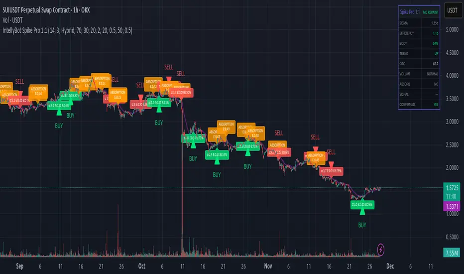
IntellyBot Spike ProIntellyBot Spike Pro
IntellyBot Spike Pro helps you quickly spot unusual market activity and highlights only the signals that truly matter. It cuts out the noise and marks candles where something “big” is happening – whether it's strong buying, strong selling, or a possible trend reversal.
What the script does for you
Detects real volume spikes:
It identifies moments when trading activity suddenly increases, often caused by large market orders or the start of a new move.
Generates clean Buy and Sell signals:
A signal is only shown when multiple conditions line up (trend direction, candle strength, momentum, etc.). This reduces false alerts and keeps things simple.
Spots absorption (hidden strength or weakness):
The script highlights candles where volume is high but price barely moves.
This can be a sign that big players are absorbing orders before a potential reversal.
No repainting:
All signals are based on confirmed candles and will not change later.
Includes a visual dashboard:
A small on-chart panel shows key information at a glance, such as trend, volume strength, efficiency, oscillator reading, and active signals.
Perfect for traders who want to…
use volume as an early indicator
catch real breakouts and avoid fake moves
identify trend shifts sooner
get clean, visual signals without combining many tools
Volume with VSAThis script is designed to identify meaningful volume activity using the principles of Volume Spread Analysis (VSA). By focusing on the relationship between price movement and volume, it highlights areas where professional traders may be active. The tool becomes especially powerful when applied to higher timeframes such as 15-minute or 30-minute charts. On these larger intervals, market noise is reduced, allowing true supply and demand imbalances to stand out more clearly. As a result, the zones and signals generated by the script tend to be more reliable and consistent. The combination of structural analysis and volume behaviour helps traders pinpoint potential trend reversals, continuation patterns, and breakout strength with greater accuracy. Overall, this script enhances decision-making by offering a clearer view of genuine market participation, making it well-suited for swing traders, intraday strategists, and anyone looking to understand volume dynamics more effectively.

Zonas de Liquidez Pro + Puntos de GiroAnalysis of Your BTC/USDT 4H Chart
Here’s the breakdown of the liquidity zones shown on your chart and what each element means:
🔴 Resistance Zones (Red Lines)
R 126199.43 – Upper dotted line
Level: ~$126,199
Strength: = Moderate zone
Touch count: 1 touch | 1 rejection
Meaning: Weak resistance, price has only reacted here once.
Dotted line = few historical rejections.
R 111263.81 – Thick solid red line
Level: ~$111,263
Strength: = Strong zone
Touch count: 3 touches | 2 rejections
Meaning: Major resistance level, strongly defended multiple times.
Solid, thicker line = very respected zone.
R 111250.01 – Solid red line (high strength)
Level: ~$111,250
Strength: = Extremely strong
Touch count: 5 touches | 4 rejections
Meaning: This is a critical zone, heavy liquidity stacked here.
Score 19 = institutional-grade liquidity zone.
R 107508.00 – Lower dotted line
Level: ~$107,508
Strength: = Strong zone
Touch count: 4 touches | 1 rejection
Meaning: Previously acting as resistance, now above current price.
💧 “LIQ” Markers – Liquidity Grabs
The yellow LIQ tags signal liquidity grabs.
Pattern detected:
Price taps the strong resistance around $111,263
Wicks above → triggers stop-losses
Closes back below → fake breakout
High volume → institutional stop-hunting
This led directly to the strong downside move.
🎯 Current Price Context
Current price: ~$91,533
Price is below all major resistance zones
Market structure is bearish
Price is far from major liquidity areas
📉 What Happened
The 111k resistance cluster acted as a massive ceiling
Multiple failed breakouts = institutional selling
Liquidity grabs at the top → trap for late buyers
Price then dumped from $111k to $91k (≈ -18%)
🎲 Probable Scenarios
Bullish Scenario 📈
If price returns to the $107,508 zone → first resistance test
Break with volume → target $111,250
Needs a confirmed close above to validate a breakout
Bearish Scenario 📉
If demand remains weak → continuation lower
Watch for new demand zones forming below price
Rejection from $107k–$111k would confirm bearish continuation
🔍 Key Signals to Watch
Bullish:
Price revisits resistance zone
Liquidity grab below support (fake breakdown)
Strong close back above with volume
Bearish:
New lows below $91k
Volume increasing on down moves
New resistance forming overhead
💡 Trading Approach
If you're a buyer (long bias):
Wait for price to pull into a strong demand zone
Look for bullish rejection + volume
Stop-loss below the zone
If you're a seller (short bias):
Ideal entry already happened at 111k (liquidity trap)
Look for a pullback into $107k–$111k
Watch for bearish rejection signs
Conservative Approach
Don’t trade in the middle of nowhere
Wait for price to reach a liquidity zone
Liquidity zones act as magnets → safest places to form trades
🎓 Key Takeaways
High-score zones like are extremely difficult to break → respect them
Liquidity grabs signaled the reversal perfectly
Strong rejections at 111k = smart money unloading
Thicker solid lines = more reliable levels

Myfxschool-HeatWave V25Introducing the MyFXSchool Leading Indicator™, a next-generation market prediction tool designed exclusively for traders who want accuracy, clarity, and early trend identification. Built using advanced price-action logic, institutional order-flow concepts, and dynamic volatility algorithms, this indicator gives you a true leading advantage—not just lagging signals.

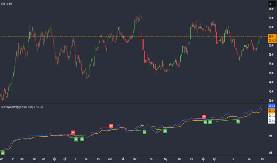
ORION Volume Engine by Ali_KamberogluORION Volume Engine by Ali_Kamberoglu | Look Beyond Volume, Track the "Smart Money"
Developer: Ali Kamberoğlu
Overview: What Price Doesn't Say, Volume Reveals
The ORION Volume Engine (VE) is a sophisticated market force analysis center that steps in where standard volume indicators fall short. This tool takes the classic On-Balance Volume (OBV) indicator and transforms it into an intelligent analysis engine that filters market noise, detects "explosions" in volume, and, most importantly, automatically uncovers the critical divergences between price and volume.
ORION VE tells you not just where the volume is flowing, but also when that flow might be signaling an impending trend reversal.
The ORION Advantage: Why It's Different
The power of ORION VE comes from three intelligent layers that turn the standard OBV into an information hub:
Layer 1 - The Adaptive Signal Line (Smart KAMA Integration):
The raw data of OBV can be choppy and misleading. ORION VE uses the Adaptive KAMA engine to clean this noise, adapting to market conditions. When the market is flowing in a strong trend, KAMA speeds up to keep you in the trend. When the market is indecisive and sideways, it slows down, protecting you from early or false signals. This provides a revolutionary level of clarity in OBV analysis.
Layer 2 - Volume Volatility (Bollinger Bands on OBV):
This unique feature offers the option to draw Bollinger Bands not on the price, but directly on the OBV itself. What does this mean? You can now see when not just the price, but the volume flow itself is "squeezing" and when it's ready to "explode." A breakout of the OBV line from its own Bollinger Band is a powerful signal of an extraordinary increase in volume flow in that direction, confirming the current trend.
Layer 3 - The Game-Changing Feature: Fully Automatic Volume Divergence Engine
One of the most powerful signals heralding the end of a trend is a volume divergence. ORION VE finds these priceless signals for you, automatically:
Bullish Divergence 🐂: Is the price falling to new lows while the OBV (volume) refuses to fall, making higher lows? This is the clearest sign that selling pressure is exhausted and "smart money" is quietly accumulating. You are instantly alerted with a "Bull" label on your chart.
Bearish Divergence 🐻: Is the price hitting record highs, but the OBV is not supporting this rise with sufficient volume and is making lower highs? This is a signal that the power behind the trend is fading and a sharp decline may be imminent. The "Bear" label prepares you to protect your position or take profits.
High-Probability Trading Strategies:
Strongest BUY Signal:
A Bullish Divergence appears on the chart with a "Bull" label.
The OBV line crosses above its orange Adaptive KAMA signal line.
This is an A+ grade buying opportunity, indicating that smart money is stepping in and momentum is starting.
Strongest SELL Signal:
A Bearish Divergence appears on the chart with a "Bear" label.
The OBV line crosses below its orange Adaptive KAMA signal line.
This is a high-probability shorting opportunity, indicating that the uptrend is not supported by volume and momentum is shifting to the sellers.
Disclaimer
This indicator is a professional analysis tool developed to assist in your trading decisions. No signal or analysis constitutes investment advice. Trading in financial markets involves high risk, and past performance is not a guarantee of future results. Please always apply your own risk management strategies.
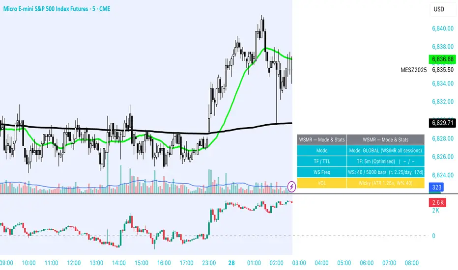
WSMR v3.8 — WhaleSplash → Mean Reversal# WSMR v3.8 — WhaleSplash → Mean Reversal
### Global, Anchored, Non-Repainting Signal Framework for Futures, Crypto & Index Markets
**WSMR v3.8** is a volatility-anchored market-structure framework designed to detect two high-probability turning points:
## 1️⃣ WhaleSplash (WS) — Short Impulse Exhaustion
A “WhaleSplash” is a large downside impulse characterised by:
- bar range ≥ *k × ATR*
- strong % move
- volume expansion vs SMA(20)
- deep Z-Score oversold
- compression away from VWAP
- RSI weakness
When these conditions align, the indicator marks a short exhaustion event and prints a 🐋 icon below the bar. This is a **non-repainting bar-close confirmation**.
---
## 2️⃣ Mean Reversal (MR) — Bullish Reversal Setup
The MR module combines:
- RSI bullish divergence (pivot-based, safe)
- Z-Score reset above threshold
- SMA20 reclaim with positive slope
- Higher-low structure
When confirmed at bar-close, the indicator identifies conditions favourable for a **mean-reversion long**.
MR signals can optionally trigger an “**1st green candle after MR**” confirmation within a user-defined TTL (default 12 bars).
---
# 🎯 Key Features
### ✔ Non-Repainting Confirmed Signals
WS & MR only fire **after** bar close, using cooldown logic to avoid clustering and noise.
### ✔ VWAP-Anchored Z-Score Framework
All signals reference price distance and statistical deviation from VWAP, producing adaptive, volatility-aware setups.
### ✔ Session Filter (Asia-Optimised)
Optional session gating allows signals only between **23:00–09:00 UTC**, ideal for systematic Asia-session breakout & mean-reversion traders.
### ✔ Volatility Monitor (Normal → Extreme)
Dynamic volatility classification using:
- ATR baseline ratio
- wickiness index
- range Z-Score
States: **Normal → Wicky → Spiky → Extreme**
Displayed with colour-coded background in the status panel.
### ✔ Rolling WhaleSplash Frequency (Analytics Panel)
WSMR tracks the frequency of WhaleSplash events over a rolling window (Bars/Days/Weeks/Months) and estimates average WS/day (on minute timeframes).
### ✔ Status Panel (Bottom-Right)
Live display of:
- Mode (Global/Asia)
- Timeframe + TTL status
- WhaleSplash frequency
- Volatility state
- ATR/Range information
---
# 📌 Best Timeframes
Optimised and validated on **5-minute charts**, but compatible with all intraday timeframes.
---
# 🚨 Alerts Included
- WhaleSplash SHORT
- WhaleSplash LONG
- Volatility Warning (Spiky/Extreme)
---
# ⚠️ Notes
WSMR v3.8 is not a buy/sell system. It is a **signal framework** highlighting exhaustion and reversal conditions. Always combine with market structure, session context, and risk management. Past performance does not guarantee future results.
---
# 💬 Credits
Script created by **John Nolan (JohnFrancisNolan)**
Pine Script® v6
© 2024–2025 — Published under the **Mozilla Public License 2.0**