Seasonality
In time series analysis, seasonality is the perceived tendency for similar variations in a dataset to occur within specific regular intervals of less than one year. TradingView's Seasonality built-in indicator tracks and visualizes an instrument's monthly performance starting from a specified year to help traders identify potential seasonal patterns.
The Seasonality indicator consists of two parts:
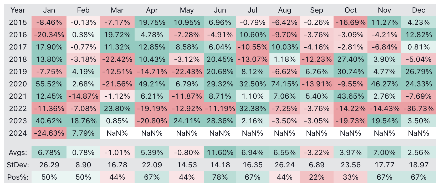
- A Heatmap table on a separate pane under the chart that displays monthly change percentages and metrics with gradient colors
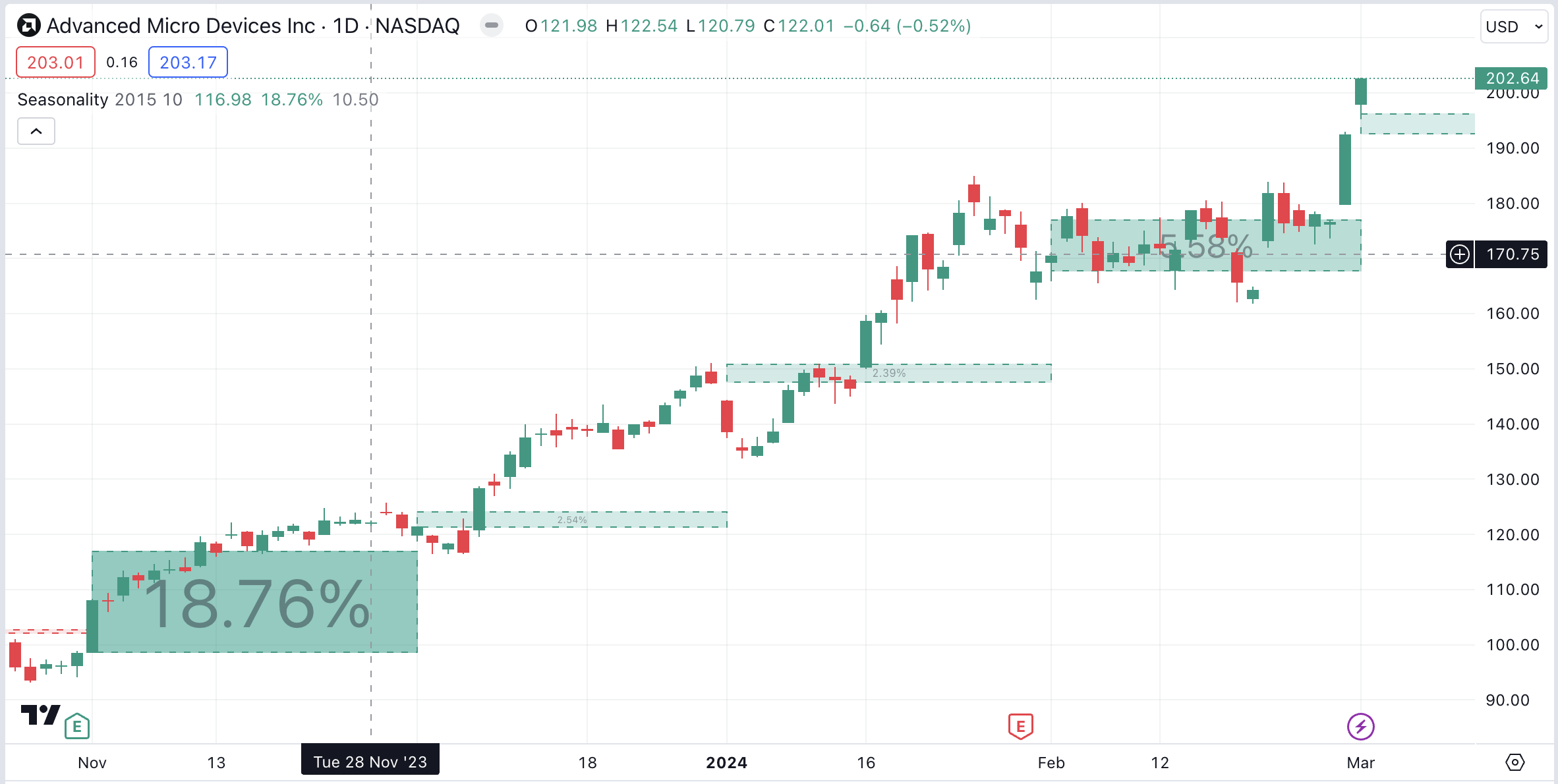
- Boxes on the chart that display monthly level projections based on historical average changes
Heatmap
The Heatmap table displays historical change percentages for each month since the chosen starting point. It organizes each year's month-to-month data on a separate row, with each column corresponding to a specific month. Additionally, the bottom rows of the table display the seasonal average, standard deviation, and percentage of positive changes for each month over the included years. See the "Inputs" section below for more information about these metrics.
This visual structure provides a simple, organized way for users to analyze monthly fluctuations over several years and identify potential seasonal tendencies in a symbol's data.

Boxes
The boxes on the chart represent each month's projections based on the average historical change for that month over previous years. Each box starts at the first bar of the month and spans throughout the month's duration, with a vertical range from the closing price of the previous month to the price where the month would close if the market moved according to its historical average change. Each box also displays the month's average change percentage within it.
For example, suppose the current month is February, the last January bar had a closing price of 200, and the average change percentage for February over previous years was 10%. In this case, the box would span the entire month of February with a starting price of 200 and an ending price of 220 (200 + 10% of 200), and the region within the box would display "10%" to signify the expected (average) change.

Users can toggle the display of the boxes in the "Style" tab of the indicator's "Settings".
NOTE: The Heatmap displays the values available at the latest tick, whereas the boxes use values available at the bar where the indicator draws them. Consequently, the average change percentages shown in the historical boxes and the "Avgs" section of the table will differ since the boxes show historical averages and the table shows current averages.
Plots
This indicator includes some helpful plots that provide additional information about the historical calculations. Users can view these plotted values in the indicator's status line and the Data Window.

"Expected price for current month" – The price where the month would close if the market moved according to its historical average change.
"Historical average for current month" - The average change percentage for the specific month at its opening time. The month's projection box also displays this value.
"Historical standard deviation for current month" – The standard deviation of change percentages for the specific month at its opening time.
"No. of months used in the current average" – The number of past years' months in the average and other metric calculations at the specific month's opening time.
Inputs

Starting year
The year when the indicator's calculations start. To gather and calculate results on all available data, set this value to any year before the symbol's first available date (e.g., 1900).
Note that the box drawings will start for the year after the starting year, as the indicator requires data from at least one previous year to begin projecting average change percentages. For example, if the starting year is 2015, box drawings won't start until 2016.
Positive Color
The color of boxes and Heatmap cells that contain positive values.
Negative Color
The color of boxes and Heatmap cells that contain negative values.
Color Intensity Cutoff (%)
Specifies the maximum absolute percentage for the color intensity calculation. Absolute values at or above this level will have the highest intensity (opacity) in the heatmap display. For example, a cutoff value of 10% means colors become more opaque as the corresponding values approach 10%, but all values above 10% will share the same opacity.
Table Position
Specifies the position of the Heatmap table relative to the pane where it is drawn. By default the setting is set to "Center" an the Heatmap is anchored to the center of its pane. Changing this setting to "Left" or "Right" anchors the table to the left or the right corner of the pane, respectively.
Table Width (%)
The table width as a percentage of the pane where the table is located. The default value is 100, which means that the table is as wide as the pane it is on. If this value is 0, the width fits the contents of the table, and the table can be wider than the pane.
Table Height (%)
The table height as a percentage of the pane where the table is located. The default value is 95, which means that the table is slightly shorter than the height of the pane it is on. If this value is 0, the height fits the contents of the table, and the table can be taller than the pane.
Show Averages
Toggles the visibility of the "Avgs" row, which displays the average change percentages for each month based on the accumulated historical data.
Show Standard Deviation
Toggles the visibility of the "StDev" row, which displays the standard deviation of each month's historical change percentages. Standard deviation measures the dispersion of change percentages around their mean. Analyzing this metric can help users determine whether a month's changes tend to vary or remain more stable over successive years.
Show Percent Positive
Toggles the visibility of the "Pos%" row, which shows how many instances of each month over previous years had a positive change. For example, if the same month had a positive change for six years out of nine recorded, the "Pos%" ratio will be 6 / 9 * 100 = 66.67%.

Ignored months
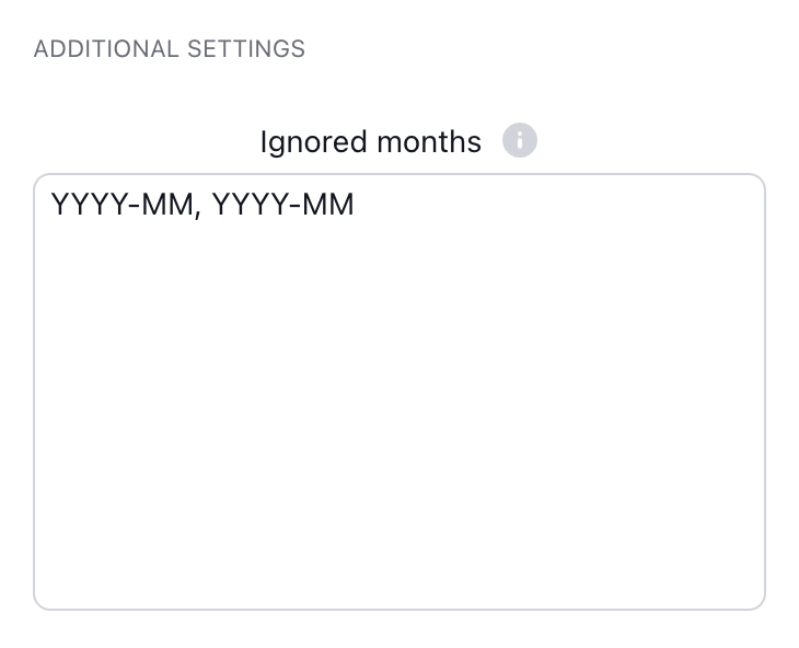
Excludes specific months from the Seasonality indicator's calculations. To exclude a month, write it in the "YYYY-MM" format. Users can exclude multiple months by separating them with commas and spaces. For example, "2020-03, 2022-11" will exclude March 2020 and November 2022.