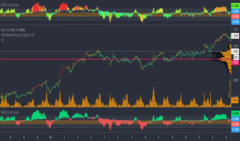
RSIEW V2 Thermal Falsecolor show Hot (Impulse) Cold (Correction)HI BIG PLAYER AROUND THE WORLD,
here is my new creation of modified RSI Indikator.
In order to the RSIEW Version 1 (look below this text) I build a thermal rainbow chart that shows the spectrum with all overbought and oversell phases. The colour spectrum can be compared with a thermal imaging camera.
In one hand, the hottest candles (going into red) show the extrem points of the chart. In trend direction this is often wave 3 of Elliott Waves theory and in correction phase it show the bounce period.
In other hand, the coldest candles (going into blue) show the weak points of the chart. In trend direction this is often a "cooling down" and in big correction phases it demonstrate frozen prices (really unattractive trading time).
Have fun with this and give me a feedback.
Of course, you are invited to follow me.
KIND REGARDS
NXT2017
Correction
CorrelationCorrelation of two stocks based on the percentile difference. Option to choose 4 different periods.

Correction Percent and Days SinceS
Use this script to see the depths of corrections and also to see how long it has been since a correction.
I published this script because the last time the SNP has gone this long without a 5% correction was 1996 excluding bear markets of course.
NOTE: This script is a 2 in 1. In order to see correction depth only use the first 3 plot settings as visible.
In order to see the days since a correction use the last two plot settings.
