Gold Inverse Correlation TrackerGold Inverse Correlation Tracker - Professional Multi-Asset Analysis
What This Indicator Does:
This indicator monitors the real-time correlation between Gold and five key financial assets that historically move inversely (opposite) to gold prices. It displays these relationships across three different timeframes simultaneously, giving you both short-term trading signals and long-term trend confirmation.
The indicator tracks:
US Dollar Index (DXY) - Historical correlation: -0.63
Real Interest Rates (TIPS) - Historical correlation: -0.82 (strongest inverse relationship)
10-Year Treasury Yield - Nominal interest rate proxy
S&P 500 (SPX) - Equity market sentiment (variable correlation)
VIX - Volatility index (optional, flight-to-safety indicator)
Why Inverse Correlations Matter for Gold Trading:
Understanding inverse correlations is critical for gold traders because:
Predictive Power - When assets move opposite to gold consistently, you can use their strength/weakness to predict gold's next move
Hedging Opportunities - Strong inverse correlations let you hedge gold positions by trading the inverse asset
Regime Detection - When correlations break down, it signals a market regime change or increased uncertainty
Confirmation Signals - Multiple strong inverse correlations validate your gold trade thesis
Risk Management - Knowing what moves against gold helps you understand your portfolio's true exposure
The Science Behind the Numbers:
Real interest rates have the strongest inverse correlation to gold (approximately -0.82) because:
Gold pays no yield or dividend
When real rates rise, the opportunity cost of holding gold increases
Investors shift to interest-bearing assets when they offer positive real returns
When real rates go negative, gold becomes relatively more attractive
The US Dollar shows strong inverse correlation (approximately -0.63) because:
Gold is priced in US dollars globally
A stronger dollar makes gold more expensive for foreign buyers, reducing demand
A weaker dollar makes gold cheaper internationally, increasing demand
Both compete as reserve assets and stores of value
Why the Indicator is Weighted This Way:
Three Timeframe Approach:
Short-term (20 periods) - Captures recent correlation shifts for day trading and swing trading
Medium-term (50 periods) - The primary signal - balances noise reduction with responsiveness
Long-term (100 periods) - Confirms structural correlation trends for position trading
Correlation Thresholds:
Strong Inverse (<-0.7) - Statistically significant inverse relationship; highest confidence for inverse trades
Moderate Inverse (<-0.3) - Meaningful inverse relationship; still useful but less reliable
Weak Inverse (<0.0) - Slight inverse tendency; correlation may be breaking down
Positive (>0.0) - Assets moving together; inverse relationship has failed
How to Use This Indicator:
For Inverse Trading Strategies:
When DXY shows RED correlation (<-0.7), consider shorting DXY when gold is strong
When Real Rates show RED correlation, rising rates = falling gold (and vice versa)
When multiple assets show strong inverse correlation, confidence is highest
For Regime Detection:
All RED = Classic gold market behavior; correlations intact
Mixed colors = Transitional market; be cautious
All GREEN/GRAY = Correlation breakdown; paradigm shift occurring
For Hedging:
Use assets with strong inverse correlation to hedge gold positions
When correlation weakens, reduce hedge size
When correlation strengthens, increase hedge effectiveness
Alert System:
The indicator includes built-in alerts for:
Individual assets crossing strong inverse threshold
Multiple assets simultaneously showing strong inverse correlation (highest probability setup)
Correlation breakdowns that may signal regime changes
Color Guide:
RED - Strong inverse correlation (<-0.7) - Best inverse trading opportunity
ORANGE - Moderate inverse (<-0.3) - Useful but less reliable
YELLOW - Weak inverse (<0.0) - Correlation weakening
GRAY - Weak positive (0.0 to 0.7) - Assets moving together
GREEN - Strong positive (>0.7) - Inverse relationship broken
Recommended Settings:
Day Trading (1H-4H charts):
Short: 14 periods
Medium: 30 periods
Long: 60 periods
Swing Trading (Daily charts):
Short: 20 periods (default)
Medium: 50 periods (default)
Long: 100 periods (default)
Position Trading (Weekly charts):
Short: 10 periods
Medium: 20 periods
Long: 50 periods
Pro Tips:
Watch for divergences - when gold moves but correlations don't confirm
Correlation breakdowns often precede major trend reversals
The Medium-term (50p) correlation is plotted on the chart as your primary reference
Use the Status column for quick assessment of each asset's relationship
Set alerts for "Multiple Strong Inverse" to catch highest-probability setups
Important Notes:
This indicator is designed for Gold charts only (XAUUSD, GLD, GC1!, etc.)
Correlations are not static - they change over time based on market conditions
A correlation of -0.82 means 82% of gold's price movements can be explained by real interest rates
Always combine with other technical analysis and fundamental factors
Past correlations do not guarantee future relationships
Based on Research:
The correlation coefficients used in this indicator are based on peer-reviewed research:
Erb & Harvey (1997-2012): Real rates to gold correlation of -0.82
World Gold Council (2024): US Dollar to gold correlation of -0.63
Multiple academic studies confirming gold's inverse relationship with opportunity cost assets
Use this indicator to trade smarter, hedge better, and understand the macro forces driving gold prices.
Correlation

Trader Otto - Christmas Tree V2.1 [Pearson Flux]Trader Otto - Pearson Flux is a high-performance statistical engine designed to visualize the true strength and direction of the market trend without the lag of traditional indicators.
Instead of cluttered lines, this system processes price action through a dual-core statistical algorithm (Pearson Correlation + Deviation Logic) to color-code candles directly based on their probability state.
**Core Intelligence:**
* **Statistical Trend Flow (Pearson R-Value):** The system continuously measures the correlation coefficient of price against time.
* **Cyan/Magenta Candles:** Indicate a statistically significant trend (High R-Value). This is the "Flux" state where momentum is strongest.
* **Grey Candles:** Indicate a low-correlation environment (Sideways/Chop). The system automatically filters out these noise periods.
* **Gold/Purple Candles:** Indicate a neutral but directional bias, useful for early trend anticipation.
* **Smart Reversion Signals:**
* **BUY/SELL Signals:** Generated only when price deviates statistically from its mean *AND* the correlation signature confirms a high-probability reversal point.
* **Zone Logic:** Automatically identifies "Overextended" price zones invisible to the naked eye.
* **Live Flux Dashboard:**
* A professional panel (position adjustable) displays the real-time R-Value, current Trend Status, and Signal State, giving you a complete statistical readout of the asset in seconds.
**Proprietary Calibration:**
The system uses a calibrated "Correlation Threshold" to filter signals.
* **Sensitivity Control:** Users can fine-tune the strictness of the trend filter via the settings menu (default 1.0). This protects the core statistical constants while allowing adaptation to different asset volatilities.
**Session Control:**
* Includes an optional "Time Filter" to restrict signals to specific trading hours (e.g., Active Market Session), perfect for filtering out low-volume noise in 24h markets.
*This script is protected to maintain the integrity of the underlying statistical engine.*

Benchmark & Multi-Correlation CombinedScann the correlation of your asset to different (variable benchmarks)

Correlation Screener + TF Heat map - V1.5[i]Correlation Screener + TF Heat Map V1.5
Correlation Screener + TF Heat Map V1.5 is a multi-symbol, multi-timeframe correlation analysis tool designed to measure how a main symbol behaves relative up to 7 different paired symbols, using progressive lookback layers.
Instead of relying on a single correlation value, this indicator constructs a 5-layer correlation framework per pair, enabling user to analyse correlation strength, stability, and structural changes across multiple time horizons.
Core Concept
One Main Symbol (e.g. BTC)
Up to 7 Paired Symbols
Example:
Pair 01: BTC / ETH
Pair 02: BTC / SOL
Pair 03: BTC / XRP
… up to Pair 07
Each pair is evaluated independently.
Multi-Layer Timeframe Correlation
For every Main–Pair combination, the indicator calculates 5 correlation layers using a base lookback period and a user-defined multiplier.
Example (BTC / ETH):
Timeframe: Daily
Base Lookback (L1): 30 Days
Multiplier: 2×
Layer Lookback Period
L1 30D correlation
L2 60D correlation
L3 120D correlation
L4 240D correlation
L5 480D correlation
This layered structure highlights whether correlation is:
Consistent across timeframes
Strengthening or weakening over time
Breaking down at specific horizons
Heat Map Visualisation
Correlation values are displayed using a heat map layout
Rows represent different symbol pairs
Columns represent correlation layers (L1 → L5)
Color intensity reflects correlation direction and strength
This allows fast visual screening of:
Strongly aligned pairs
Diverging or unstable correlations
Short-term vs long-term correlation conflict.
Screen for stable correlations before deploying:
Pair trading strategies
Hedging systems
Mean reversion models
Use as a filter and confirmation tool, not as a standalone signal generator
⚠️ Disclaimer
This indicator is provided for educational and informational purposes only.
It does not constitute financial advice, trading recommendations, or investment guidance.
Correlation is a historical statistical measure and does not guarantee future market behavior. Market conditions, volatility spikes, and macro or news events can cause correlations to change rapidly.
Users are solely responsible for their own trading decisions and risk management. Always conduct independent analysis and testing before using this indicator in live trading.
💬 Feedback & Updates
Feedback, bug reports, and improvement suggestions are welcome.
If you find unexpected behavior, visual issues, or have ideas for enhancement, please leave a comment or message so future versions can be improved.
This indicator will continue to evolve, and constructive feedback helps guide future updates.

Gold Projection DivergenceGOLD PROJECTION DIVERGENCE
Oscillator Companion for the Gold Macro Projection Model
OVERVIEW
The Gold Projection Divergence oscillator quantifies how far gold is trading from its projected fair value. While the main indicator shows where gold should be, this oscillator shows how extreme the mispricing is—providing precise timing signals for entries and exits.
HOW IT WORKS
The oscillator calculates the difference between actual gold price and the projected value, then normalizes it as a Z-score . This statistical measure shows how many standard deviations gold is trading away from its projected fair value.
Z > +2 — Gold is 2+ standard deviations above fair value (extremely overvalued)
Z > +1 — Gold is moderately overvalued
Z = 0 — Gold is trading at projected fair value
Z < -1 — Gold is moderately undervalued
Z < -2 — Gold is 2+ standard deviations below fair value (extremely undervalued)
VISUAL ELEMENTS
Histogram — Color-coded divergence magnitude
Yellow Line — Smoothed Z-score
Dashed Lines — +2 and -2 standard deviation levels
Dotted Lines — +1 and -1 standard deviation levels
Triangle Markers — Extreme crossover signals
Circle Markers — Zero-line crossings
HISTOGRAM COLORS
Dark Red — Z > +2 (extreme overvaluation)
Orange — Z between +1 and +2
Light Orange — Z between 0 and +1
Light Green — Z between -1 and 0
Green — Z between -2 and -1
Lime — Z < -2 (extreme undervaluation)
COMPONENT TABLE
The breakdown table shows divergence from each individual factor:
Silver — Is gold over/undervalued relative to silver?
M2 — Is gold over/undervalued relative to money supply?
DXY — Is gold over/undervalued relative to dollar strength?
Equity — Is gold over/undervalued relative to stocks?
TIPS — Is gold over/undervalued relative to real rates?
TRADING APPLICATIONS
Mean Reversion Strategy
Enter LONG when Z < -2 and begins rising
Enter SHORT when Z > +2 and begins falling
Use zero-line crossings for trend confirmation
Trend Following Filter
Only take long trades when Z < 0 (undervalued)
Only take short trades when Z > 0 (overvalued)
Divergence Confirmation
Bearish: Price makes new highs while Z-score makes lower highs
Bullish: Price makes new lows while Z-score makes higher lows
ALERTS
Extreme Undervaluation — Z crosses below -2
Extreme Overvaluation — Z crosses above +2
Moderate Undervaluation — Z crosses below -1
Moderate Overvaluation — Z crosses above +1
Divergence Turned Positive — Crossed above zero
Divergence Turned Negative — Crossed below zero
COMBINED USAGE
For best results, use both indicators together :
Main Indicator — Visual context of actual vs. projected on price chart
Divergence Oscillator — Precise measurement for timing decisions
The main indicator shows where gold should be; the oscillator shows how extreme the mispricing is and when to act.
Disclaimer: This indicator is for educational purposes only. Past correlations do not guarantee future relationships. Market conditions can alter historical relationships. Always use proper risk management.

Gold Macro Projection ModelGOLD MACRO PROJECTION MODEL
Multi-Factor Fair Value Estimation for Gold
OVERVIEW
The Gold Macro Projection Model estimates gold's fair value based on its historical relationships with key macroeconomic drivers. By synthesizing data from silver , M2 money supply , the US Dollar Index , TIPS (real rates proxy) , and major equity indices , this indicator projects where gold should theoretically be trading—helping traders identify potential overvaluation and undervaluation conditions.
HOW IT WORKS
This indicator employs three complementary projection methodologies :
Correlation-Weighted Z-Score Composite (50% weight)
Calculates rolling correlations between gold and each input factor. Factors with stronger correlations receive more influence. Each factor is normalized to a z-score, combined into a composite, then converted back to gold's price scale.
Silver/Gold Ratio Mean Reversion (35% weight)
The silver/gold ratio historically exhibits mean-reverting behavior. This component projects gold's implied price based on current silver prices and the historical average ratio.
M2 Money Supply Relationship (15% weight)
Gold tracks monetary expansion over long time horizons. This anchors the projection to the fundamental relationship between gold and the monetary base.
INPUT FACTORS
Silver — Strong positive correlation; precious metals move together
M2 Money Supply — Positive correlation; gold as inflation hedge
US Dollar Index (DXY) — Typically negative correlation; inverse relationship
TIPS ETF — Real interest rate proxy; gold responds to real yields
Equity Indices — Variable correlation; risk-on/risk-off dynamics
VISUAL ELEMENTS
Yellow Line — Actual gold price
Aqua Line — Projected fair value
Green Fill — Gold trading below projection (potentially undervalued)
Red Fill — Gold trading above projection (potentially overvalued)
Aqua Bands — Standard deviation envelope around projection
INFO TABLE
The indicator displays a real-time information panel showing:
Current actual vs. projected price
Divergence percentage and Z-score
Rolling correlations for each factor
Dynamic weight allocation
Buy/Sell signal based on divergence extremes
SIGNAL INTERPRETATION
STRONG BUY — Z-score below -2 (extremely undervalued)
BUY — Z-score between -2 and -1 (moderately undervalued)
NEUTRAL — Z-score between -1 and +1 (fairly valued)
SELL — Z-score between +1 and +2 (moderately overvalued)
STRONG SELL — Z-score above +2 (extremely overvalued)
SETTINGS
Correlation Period — Lookback for correlation calculations (default: 60)
Regression Period — Lookback for mean/standard deviation (default: 120)
Smoothing Period — EMA smoothing for projection line (default: 10)
Auto Weights — Toggle between correlation-based or manual weights
Band Multiplier — Standard deviation multiplier for bands (default: 1.5)
ALERTS
Gold Extremely Undervalued — Z crosses below -2
Gold Extremely Overvalued — Z crosses above +2
Gold Crossed Above Projection
Gold Crossed Below Projection
BEST PRACTICES
Use on daily timeframe for most reliable signals
Combine with the companion Gold Divergence Oscillator for timing
Disclaimer: This indicator is for educational purposes only. Past correlations do not guarantee future relationships. Always use proper risk management.

Price Action Strategy Screener 1&5 Min [TradingFinder]🔵 Introduction
Price action is the study of how price moves, reacts, and leaves information behind through structure, swings, and liquidity behavior. Instead of relying on indicator signals or mathematical outputs, price action focuses on reading market intent directly from price movement, especially around key swing highs and lows where liquidity is often targeted. Understanding repeated reactions, failed continuations, and stop hunts is essential for identifying high quality trading opportunities.
In this price action strategy, signals are not generated from a single breakout or liquidity grab. Price must sweep a swing level multiple times, form a new structural reference, and return again to hunt liquidity. This repeated sweep and reaction process filters out random volatility and highlights deliberate market behavior. When this sequence occurs near the upper band or lower band of a price band, the signal gains additional context by aligning with premium and discount zones.
Correlation plays a critical role in validating price action signals. Symbol pairs are first selected based on historically high correlation on the daily timeframe so that divergence becomes meaningful. When correlation weakens on the execution timeframe, situations emerge where one asset continues to make higher highs or lower lows while the correlated asset fails to confirm and remains near a key swing level. This correlation breakdown exposes inter market divergence and relative strength or weakness, reinforcing the price action narrative.
An RSI component is provided only as an optional confirmation tool. It does not participate in signal generation and does not influence the strategy logic. Traders may use RSI to evaluate momentum exhaustion divergence or overbought and oversold conditions, or ignore it entirely. The foundation of this approach remains price action driven, built on liquidity sweeps, structural interaction, correlation dynamics, and contextual price band positioning rather than indicator dependency.
⚠️ Note: This product works only on the 1m and 5m timeframes. Please switch your chart to one of these timeframes to use the indicator properly.
🔵 How to Use
A central pillar of this methodology is the emphasis on historically high correlation as a prerequisite for meaningful analysis. Correlation is not treated as a signal by itself, but as a contextual foundation that gives weight to divergence and disagreement. When two markets have demonstrated strong alignment over time, especially on higher timeframes such as the daily chart, any deviation from that relationship becomes informative. The strategy assumes that without prior correlation, divergence has little analytical value and may simply reflect unrelated market behavior.
By filtering symbol pairs based on strong long term correlation, the tool focuses only on situations where market alignment is expected. When that alignment weakens on the execution timeframe, price behavior gains additional significance. One symbol may continue to expand, break structure, or print new extremes, while the correlated symbol stalls, compresses, or fails to confirm. This breakdown highlights emerging relative strength or weakness and often precedes rotation, rebalancing, or corrective price action rather than clean continuation.
The practical application of this concept relies on selecting logically related markets. Examples include precious metals such as OANDA:XAUUSD and OANDA:XAGUSD , closely linked equity indices like CAPITALCOM:US100 and CAPITALCOM:US500 , highly correlated currency pairs within the same economic group such as OANDA:EURUSD and OANDA:GBPUSD , or crypto assets like COINBASE:BTCUSD and COINBASE:ETHUSD that often move in tandem. By anchoring analysis to these correlated pairs, the strategy avoids random comparisons and instead isolates moments where market disagreement reflects a genuine shift in participation, intent, or liquidity distribution.
🟣 Buy Setup
Buy scenarios are evaluated when price is positioned near the lower band and begins to show signs of downside fatigue. The market should demonstrate repeated probing below a reference low without sustained follow through, indicating sell side absorption. After several failed attempts to push lower, price often compresses, forms a reaction base, and starts to defend that area.
Confirmation comes from relative performance between correlated markets. While the primary symbol holds its ground, the secondary symbol may begin to stabilize or recover, showing that downside pressure is no longer synchronized. This decoupling suggests that bearish participation is weakening. Buy setups gain higher quality when price starts to rotate upward from the lower band while downside extensions continue to fail.
🟣 Sell Setup
Sell scenarios develop when price trades near the upper band and shows signs of upside exhaustion. Multiple extensions above a reference high followed by weak continuation often signal buy side consumption. Price may repeatedly spike higher but struggle to maintain acceptance, leaving behind rejection and compression near the same zone.
Cross market behavior plays a key role in validation. When one correlated asset continues to advance while the primary symbol fails to sustain new highs, the imbalance becomes visible. This lack of confirmation reflects diminishing demand and distribution rather than healthy expansion. Sell setups become higher probability when price stalls near the upper band, fails to hold premium levels, and correlated markets no longer move in alignment.
🔵 Setting
Signal Source Pair : This option defines which pair’s signals are displayed on the chart. The script calculates signals for six different symbol pairs simultaneously, but only one pair can be visualized on the chart at a time. By selecting Pair 1 through Pair 6, the user chooses which pair’s signal output is shown on the active symbol. For example, if Pair 4 is selected, only signals generated by Pair 4 will appear on the chart.
Table on Chart : This setting enables or disables the on chart screener table. When enabled, the table displays signal status, correlation information, and symbol data directly on the chart. When disabled, the chart remains clean with no table overlay.
Number of Symbols : This option controls how many symbol pairs are displayed in the screener table. Users can choose between four or six pairs depending on screen size and personal preference.
Table Size: This setting adjusts the visual scale of the screener table. Smaller sizes are suitable for minimal layouts, while larger sizes improve readability when monitoring multiple pairs simultaneously.
Table Mode : This setting offers two layout styles for the signal table.
Basic mode displays symbols in a single vertical column, using more vertical space and providing straightforward readability.
Extended mode arranges symbols in pairs side by side, optimizing screen space with a more compact and efficient layout.
Table Position : This option defines where the screener table is placed on the chart. The table can be positioned in any corner or central area to avoid overlapping with price action or other indicators.
Symbol 1 and Symbol 2 : These options define the two symbols that are evaluated together as a pair. Users should select symbols that have historically shown high correlation so that divergence and correlation breakdowns carry meaningful analytical value.
Signals are generated based on relative strength and weakness, behavioral divergence, and confirmation failure between the two symbols. For each pair, signals are displayed only for the symbol defined as the active output in the screener.
Confirmation Period : This setting controls the initial swing confirmation window. It defines how many bars are required for a swing structure to be considered valid before liquidity sweeps and reactions are evaluated. Higher values tend to produce stronger and more reliable swing structures while reducing signal frequency. Lower values respond faster but may include shorter term or less significant movements. This logic is applied identically across all six pairs, with each pair calculated independently.
RSI Setting : The RSI section is completely optional and is provided only for visual confirmation. It has no influence on signal generation or strategy logic.
Short RSI, Mid RSI, Long RSI : These options allow different RSI lengths to be displayed simultaneously. Short RSI reacts quickly to momentum changes, while Mid and Long RSI provide smoother and broader context. Each RSI length can be enabled or disabled independently.
Show RSI Levels : This option toggles the visibility of RSI reference levels.
Low Potential Zone : Highlights areas where momentum potential is relatively low.
Mid Potential Zone : Marks neutral or transitional momentum environments.
High Potential Zone : Highlights areas with higher momentum potential, often associated with expansion or exhaustion phases.
All RSI zones are purely visual and do not affect signal logic or calculations.
🔵 Conclusion
This price action strategy is built to highlight moments where market behavior shifts from participation to hesitation. By observing repeated tests of key areas, failed continuation, and loss of alignment between related markets, the approach helps traders focus on areas where risk becomes more defined and directional follow through becomes more selective. The combination of band location, multi stage interaction, and cross market confirmation allows users to filter noise and concentrate on scenarios where price is more likely reacting than accelerating.
Rather than offering fixed entries or automated decisions, this framework encourages discretion, contextual reading, and structured execution. It is most effective when used by traders who understand market phases, rotation, and imbalance, and who are willing to wait for price to reveal intent through behavior rather than speed. When applied with patience and proper risk management, the strategy provides a consistent way to evaluate quality over quantity in evolving market conditions.
Платный скрипт

Global Macro Scanner & Relative PerformanceDescription: This indicator is an all-in-one Macro Dashboard that allows traders to track money flow across major global asset classes in real-time. It combines a floating data table with a normalized percentage-performance chart.
Features:
Macro Dashboard (Table): Displays the current value, daily % change, and status (Inflow/Outflow) for 9 key economic sectors:
US M2 Supply: Tracks monetary inflation/tightening.
DXY (US Dollar): Currency strength.
Bonds (AGG): US Aggregate Bond market.
Stocks (VT): Total World Stock Index.
Real Estate (VNQ): Vanguard Real Estate ETF.
Commodities: Oil (WTI), Gold, and Silver.
Crypto: Total Crypto Market Cap.
Relative Performance Chart (Lines): Instead of plotting raw prices (which have vastly different scales), this script plots the Percentage Return relative to a baseline.
Lookback Period: You can set a lookback (default 100 bars). The script sets the price 100 bars ago as "0%" and plots how much each asset has gained or lost since then.
Comparison: This allows you to visually see which assets are outperforming or underperforming relative to each other over the same time period.
Visual Aids:
Dynamic Labels: Each line is tagged with a label at the current candle so you can identify assets without needing a legend.
Colors: Each asset has a distinct, fixed color for consistency between the table and the chart.
How to use:
Add the script to your chart.
Adjust the "Lookback" setting in the inputs to change the starting point of the comparison (e.g., set it to the start of the year to see Year-to-Date performance).
Use the dashboard to spot daily money flow rotation (e.g., Money moving out of Stocks and into Gold).

QuantLabs MASM Correlation TableThe Market is a graph. See the flows:
The QuantLabs MASM is not a standard correlation table. It is an Alpha-Grade Scanner architected to reveal the hidden "hydraulic" relationships between global macro assets in real-time.
Rebuilt from the ground up for Version 3, this engine pushes the absolute limits of the Pine Script™ runtime. It utilizes a proprietary Logarithmic Math Engine, Symmetric Compute Optimization, and a futuristic "Ghost Mode" interface to deliver a 15x15 real-time correlation matrix with zero lag.
Under the Hood: The Quant Architecture
We stripped away standard libraries to build a lean, high-performance engine designed for institutional-grade accuracy.
1. Alpha Math Engine (Logarithmic Returns) Most tools calculate correlation based on Price, which generates spurious signals (e.g., "Everything is correlated in a bull run").
The Solution: Our engine computes Logarithmic Returns (log(close/close )) by default. This measures the correlation of change (Velocity & Vector), not price levels.
The Result: A mathematically rigorous view of statistical relationships that filters out the noise of general market drift.
Dual-Core: Toggle seamlessly between "Alpha Mode" (Log Returns) for verified stats and "Visual Mode" (Price) for trend alignment.
Calculation Modes: Pearson (Standard), Euclidean (Distance), Cosine (Vector), Manhattan (Grid).
2. Symmetric Compute Optimization Calculating a 15x15 matrix requires evaluating 225 unique relationships per bar, which often crashes memory limits.
The Fix: The V3 Engine utilizes Symmetric Logic, recognizing that Correlation(A, B) == Correlation(B, A).
The Gain: By computing only the lower triangle of the matrix and mirroring pointers to the upper triangle, we reduced computational load by 50%, ensuring a lightning-fast data feed even on lower timeframes.
3. Context-Aware "Ghost Mode" The UI is designed for professional traders who need focus, not clutter.
Smart Detection: The matrix automatically detects your current chart's Ticker ID. If you are trading QQQ, the matrix will visually highlight the Nas100 row and column, making them opaque and bright while dimming the rest.
Dynamic Transparency: Irrelevant data ("Noise" < 0.3 correlation) fades into the background. Only significant "Alpha Signals" (> 0.7) glow with full Neon Saturation.
Key Features
Dominant Flow Scanner: The matrix scans all 105 unique pairs every tick and prints the #1 Strongest Correlation at the bottom of the pane (e.g., DOMINANT FLOW: Bitcoin ↔ Nas100 ).
Streak Counter: A "Stubbornness" metric that tracks how many consecutive days a strong correlation has persisted. Instantly identify if a move is a "flash event" or a "structural trend."
Neon Palette: Proprietary color mapping using Electric Blue (+1.0) for lockstep correlation and Deep Red (-1.0) for inverse hedging.
Usage Guide
Placement: Best viewed in a bottom pane (Footer).
Assets: Pre-loaded with the Essential 15 Macro Drivers (Indices, BTC, Gold, Oil, Rates, FX, Key Sectors). Fully editable via settings (Ticker|Name).
Reading the Grid:
🔵 Bright Blue: Assets moving in lockstep (Risk-On).
🔴 Bright Red: Assets moving perfectly opposite (Hedge/Risk-Off).
⚫ Faded/Black: No statistical relationship (Decoupled).
Key Improvements Made:
Formatting: Added clear bullet points and bolding to make it scannable.
Clarity: Clarified the "Logarithmic Returns" section to explain why it matters (Velocity vs. Price Levels).
Tone: Maintained the "high-tech/quant" vibe but removed slightly clunky phrases like "spurious signals" (unless you prefer that academic tone, in which case I left it in as it fits the persona).
Structure: Grouped the "Modes" under the Math Engine for better logic.
Created and designed by QuantLabs

SMT Divergence [Kodexius]SMT Divergence is a correlation-based divergence detector built around the Smart Money Technique concept: when two normally correlated instruments should be making similar swing progress, but one prints a new extreme while the other fails to confirm it. This “disagreement” can be a valuable contextual signal around liquidity runs, distribution phases, and potential reversal or continuation points.
The script compares the chart symbol (primary) with a user-selected comparison symbol (for example BTC vs ETH, ES vs NQ, EUR/USD vs GBP/USD) and automatically scans both instruments for confirmed swing highs and swing lows using pivot logic. Once swings are established, it checks for classic SMT conditions:
Primary makes a new swing extreme while the comparison symbol forms a non-confirming swing .
To support a wider range of markets, the indicator includes an Inverse Correlation option for pairs that typically move opposite to each other (for example DXY vs EUR/USD). With this enabled, the divergence rules are logically flipped so that the script still detects “non-confirmation” in a way that is consistent with the pair’s relationship.
The indicator is designed to be readable and actionable. It can draw divergence labels directly on the main chart, connect the relevant swing points with lines, show a compact information table with the last signal and settings, and optionally render the comparison symbol as a mini candle chart in the indicator pane for quick visual validation.
🔹 Features
🔸 Two-Symbol SMT Analysis (Primary vs Compare)
Select any comparison symbol to evaluate correlation structure and divergence. The script fetches the comparison OHLC data using the current chart timeframe to keep both series aligned for analysis.
🔸 Inverse Correlation Mode
For inversely correlated pairs, enable “Inverse Correlation” so the script interprets confirmation appropriately (for example, a higher low on the comparison instrument might be expected to correspond to a lower low on the primary, depending on the relationship). This helps avoid false conclusions when the pair naturally moves opposite.
🔸 Pivot-Based Swing with Adjustable Sensitivity
Swings are detected using confirmed pivots (left bars and right bars). This provides cleaner structural swing points compared with raw candle-to-candle comparisons, and it lets you control sensitivity for different market conditions and timeframes. The script also limits stored swing history to keep performance stable.
🔸 Flexible Detection Mode: Time Matched or Independent Swings
You can choose how swings are paired across instruments:
Time Matched searches for a comparison swing that occurred at the same pivot time as the primary swing.
Independent Swings compares each symbol’s own last two swings without requiring an exact time match.
🔸 Range Control and Noise Filtering
To reduce weak or irrelevant signals:
“Max Bars Between Swings” ensures the two swings being compared are close enough in structure to be meaningful.
“Min Price Diff (%)” can require a minimum percentage change between the primary’s last two swing prices to confirm the move is significant.
🔸 Clear Visual Output with Tooltips
When a divergence is detected, the script can print a label (“SMT”) with bullish or bearish styling and a tooltip that includes the symbol pair and the primary swing price for quick context.
🔸 Divergence Lines for Context
Optional lines connect the relevant swing points, making it easier to see the exact structure that triggered the signal. One line can be drawn on the main chart and another in the indicator pane for the comparison series.
🔸 Info Table (At a Glance)
A compact table can display the active symbols, correlation mode, total divergences stored, and the most recent signal type.
🔸 Alerts Included
Built-in alert conditions are provided for bullish SMT, bearish SMT, and any SMT event so you can automate notifications without editing the code.
🔸 Optional Comparison Candle Panel
If enabled, the indicator can plot the comparison symbol as candles in the indicator pane. This is useful for confirming whether the divergence is happening around major levels, consolidations, or impulsive legs on the secondary instrument.
🔹 Calculations
This section summarizes the core logic used by the script.
1. Data Synchronization (Comparison Symbol)
The comparison instrument is requested on the chart’s current timeframe so swing calculations are performed consistently:
=
request.security(compareSymbolInput, timeframe.period, )
This ensures pivots and swing times are derived from the same bar cadence as the primary chart.
2. Swing Detection via Confirmed Pivots
Swings are detected using pivot logic with user-defined left and right bars:
primaryPivotHigh = ta.pivothigh(high, pivotLeftBars, pivotRightBars)
primaryPivotLow = ta.pivotlow(low, pivotLeftBars, pivotRightBars)
Because pivots are confirmed only after the “right bars” have closed, the script stores each swing using an offset so the swing’s bar index and time reflect where the pivot actually occurred, not where it was confirmed.
3. Swing Storage and Retrieval
Both symbols maintain arrays of SwingPoint objects. Each new swing is pushed into the array, and older swings are dropped once the array exceeds the configured maximum. This makes the divergence engine predictable and prevents uncontrolled memory growth.
The script then retrieves the last and previous swing highs and lows (per symbol) to evaluate structure.
4. Matching Logic (Time Matched vs Independent)
When “Time Matched” is selected, the script searches the comparison swing array for a pivot that occurred at the exact same timestamp as the primary swing. When “Independent Swings” is selected, it simply uses the comparison symbol’s last two swings of the same type.
5. Bullish SMT Condition (LL vs HL)
A bullish SMT event is defined as:
Primary forms a lower low (last low < previous low)
Comparison forms a higher low (last low > previous low)
If inverse correlation is enabled, the comparison condition flips to maintain logical confirmation rules
The two primary swings must be within the configured bar distance window
Optional minimum percentage difference must be satisfied
A simple anti duplication rule prevents repeated triggers on the same structure
These checks are implemented directly in the bullish detection block.
6. Bearish SMT Condition (HH vs LH)
A bearish SMT event is defined as:
Primary forms a higher high (last high > previous high)
Comparison forms a lower high (last high < previous high)
Inverse correlation flips the comparison rule
Range checks, minimum difference filtering, and duplicate protection apply similarly
These checks are implemented in the bearish detection block.
7. Percentage Difference Filter
The optional “Min Price Diff (%)” filter measures the relative distance between the last two primary swing prices. This prevents very small structural changes from being treated as valid SMT signals.
priceDiffPerc = math.abs(lastSwing.price - prevSwing.price) / prevSwing.price * 100.0
The divergence condition is only allowed to trigger if this value exceeds the user defined threshold.
priceOk = priceDiffPerc >= minPriceDiff
This filter is especially useful on higher timeframes or during low volatility conditions, where micro structure noise can otherwise produce misleading signals.
8. Visualization and Output
When a divergence is confirmed, the script:
Stores the event in a divergence array (limited by “Max Divergences to Display”)
Draws a directional SMT label with a tooltip (optional)
Draws connecting lines using time based coordinates for clean alignment (optional)
It also updates an information table on the last bar only, and exposes alertconditions for automation workflows.

Pair Correlation Master [Macro]The Main Idea
Trading represents a constant battle between Systemic Flows (the whole market moving together) and Idiosyncratic Moves (one specific asset moving on its own).
This tool allows you to monitor a "basket" of 4 assets simultaneously (e.g., the major USD pairs). It answers the most important question in forex and multi-asset trading: "Is this move happening because the Dollar is weak, or because the Euro is strong?"
It separates the "Signal" (the unique move) from the "Noise" (the herd movement).
1. The Chart Lines: The "Race" (Macro Trend)
Think of the lines on your chart as a long-distance race. They visualize the performance of all 4 assets over the last 200 candles (adjustable).
- Bunched Together: If all lines are moving in the same direction, the market is highly correlated. (e.g., "The Dollar is selling off everywhere").
- Fanning Out: If the lines are spreading apart, specific currencies are outperforming others.
- The Zero Line: This is the starting line.
--- Above 0: The pair is in a macro uptrend.
--- Below 0: The pair is in a macro downtrend.
2. The Dashboard: The "Health Check" (Micro Data)
The table in the top right gives you the immediate statistics for right now.
- A. The Z-Score (The Rubber Band)
This measures how "stretched" price is compared to its normal behavior.
- White (< 2.0): Normal trading activity.
- Orange (> 2.0): The price is stretching. Warning sign.
- Red (> 3.0): Critical Stretch. The rubber band is pulled to its limit. Statistically, a pullback or pause is highly likely.
B. The Star (★)
The script automatically calculates the average behavior of your group. If one asset is behaving completely differently from the rest, it marks it with a Star (★).
- Example: EURUSD, GBPUSD, and NZDUSD are flat, but AUDUSD is rallying hard. AUDUSD gets the ★. This is where the unique opportunity lies.
🎯 Best Uses: 4H & Daily Timeframes
This indicator is tuned for "Macro" analysis. It works best on the "4-Hour" and "Daily" charts to filter out intraday noise and capture swing trading moves.
- Strategy 1: The "Rubber Band" Snap (Mean Reversion)
- Setup: Look for a Z-Score in the RED (> 3.0) on the Daily timeframe.
- Action: This indicates an unsustainable move. Look for reversals or exhaustion patterns to trade against the trend back toward the mean.
- Strategy 2: The "Lone Wolf" (Trend Following)
- Setup: Look for the asset with the Star (★).
- Action: If the whole basket is flat (Balanced), but the Star asset is breaking out, that creates a high-quality trend trade because that specific currency has its own catalyst (News/Earnings).
- Strategy 3: Systemic Flows (Basket Trading)
- Setup: The dashboard footer says "⚠️ SYSTEMIC MOVE."
- Action: This means everything is moving together (e.g., a massive USD crash). Don't look for unique setups; just join the trend on the strongest pair.
Dashboard Footer Key
The bottom of the table summarizes the current state of the market for you:
- Balanced / Rangebound: The market is quiet. Good for range trading.
- Focus: : Trade this specific pair. It is moving independently.
- Systemic Move: The whole basket is moving violently. Trade the momentum.
p.s. Suggestion - apply and use on the chart rather than an oscillator.

AssetCorrelationLibraryLibrary "AssetCorrelationLibrary™"
detectIndicesFutures(ticker)
Detects Index Futures (NQ/ES/YM/RTY + micro variants)
Parameters:
ticker (string) : The ticker string to check (typically syminfo.ticker)
Returns: AssetPairing with secondary and tertiary assets configured
detectMetalsFutures(ticker)
Detects Metal Futures (GC/SI/HG + micro variants)
Parameters:
ticker (string) : The ticker string to check
Returns: AssetPairing with secondary and tertiary assets configured
detectForexFutures(ticker)
Detects Forex Futures (6E/6B + micro variants)
Parameters:
ticker (string) : The ticker string to check
Returns: AssetPairing with secondary and tertiary assets configured
detectEnergyFutures(ticker)
Detects Energy Futures (CL/RB/HO + micro variants)
Parameters:
ticker (string) : The ticker string to check
Returns: AssetPairing with secondary and tertiary assets configured
detectTreasuryFutures(ticker)
Detects Treasury Futures (ZB/ZF/ZN)
Parameters:
ticker (string) : The ticker string to check
Returns: AssetPairing with secondary and tertiary assets configured
detectForexCFD(ticker, tickerId)
Detects Forex CFD pairs (EUR/GBP/DXY, USD/JPY/CHF triads)
Parameters:
ticker (string) : The ticker string to check
tickerId (string) : The full ticker ID (syminfo.tickerid) for primary asset
Returns: AssetPairing with secondary and tertiary assets configured
detectCrypto(ticker, tickerId)
Detects major Crypto assets (BTC, ETH, SOL, XRP, alts)
Parameters:
ticker (string) : The ticker string to check
tickerId (string) : The full ticker ID for primary asset
Returns: AssetPairing with secondary and tertiary assets configured
detectMetalsCFD(ticker, tickerId)
Detects Metals CFD (XAU/XAG/Copper)
Parameters:
ticker (string) : The ticker string to check
tickerId (string) : The full ticker ID for primary asset
Returns: AssetPairing with secondary and tertiary assets configured
detectIndicesCFD(ticker, tickerId)
Detects Indices CFD (NAS100/SP500/DJ30)
Parameters:
ticker (string) : The ticker string to check
tickerId (string) : The full ticker ID for primary asset
Returns: AssetPairing with secondary and tertiary assets configured
detectEUStocks(ticker, tickerId)
Detects EU Stock Indices (GER40/EU50) - Dyad only
Parameters:
ticker (string) : The ticker string to check
tickerId (string) : The full ticker ID for primary asset
Returns: AssetPairing with secondary asset configured (tertiary empty for dyad)
getDefaultFallback(tickerId)
Returns default fallback assets (chart ticker only, no correlation)
Parameters:
tickerId (string) : The full ticker ID for primary asset
Returns: AssetPairing with chart ticker as primary, empty secondary/tertiary (no correlation)
applySessionModifierWithBackadjust(tickerStr, sessionType)
Applies futures session modifier to ticker WITH back adjustment
Parameters:
tickerStr (string) : The ticker to modify
sessionType (string) : The session type (syminfo.session)
Returns: Modified ticker string with session and backadjustment.on applied
applySessionModifierNoBackadjust(tickerStr, sessionType)
Applies futures session modifier to ticker WITHOUT back adjustment
Parameters:
tickerStr (string) : The ticker to modify
sessionType (string) : The session type (syminfo.session)
Returns: Modified ticker string with session and backadjustment.off applied
isTriadMode(pairing)
Checks if a pairing represents a valid triad (3 assets)
Parameters:
pairing (AssetPairing) : The AssetPairing to check
Returns: True if tertiary is non-empty (triad mode), false for dyad
getAssetTicker(tickerId)
Extracts clean ticker string from full ticker ID
Parameters:
tickerId (string) : The full ticker ID (e.g., "BITGET:BTCUSDT.P")
Returns: Clean ticker string (e.g., "BTCUSDT.P")
resolveTriad(chartTickerId, pairing)
Resolves triad asset assignments with proper inversion flags
Parameters:
chartTickerId (string) : The current chart's ticker ID (syminfo.tickerid)
pairing (AssetPairing) : The detected AssetPairing
Returns: Tuple
resolveDyad(chartTickerId, pairing)
Resolves dyad asset assignment with proper inversion flag
Parameters:
chartTickerId (string) : The current chart's ticker ID
pairing (AssetPairing) : The detected AssetPairing (dyad: tertiary is empty)
Returns: Tuple
resolveAssets(ticker, tickerId, assetType, sessionType, useBackadjust)
Main auto-detection entry point. Detects asset category and returns fully resolved config.
Parameters:
ticker (string) : The ticker string to check (typically syminfo.ticker)
tickerId (string) : The full ticker ID (typically syminfo.tickerid)
assetType (string) : The asset type (typically syminfo.type)
sessionType (string) : The session type for futures (typically syminfo.session)
useBackadjust (bool) : Whether to apply back adjustment for futures session alignment
Returns: AssetConfig with fully resolved assets, inversion flags, and detection status
resolveCurrentChart()
Simplified auto-detection using current chart's syminfo values
Returns: AssetConfig with fully resolved assets, inversion flags, and detection status
AssetPairing
Core asset pairing structure for triad/dyad configurations
Fields:
primary (series string) : The primary (chart) asset ticker ID
secondary (series string) : The secondary correlated asset ticker ID
tertiary (series string) : The tertiary correlated asset ticker ID (empty for dyad)
invertSecondary (series bool) : Whether secondary asset should be inverted for divergence calc
invertTertiary (series bool) : Whether tertiary asset should be inverted for divergence calc
AssetConfig
Full asset resolution result with mode detection and computed values
Fields:
detected (series bool) : Whether auto-detection succeeded
isTriadMode (series bool) : True if triad (3 assets), false if dyad (2 assets)
primary (series string) : The resolved primary asset ticker ID
secondary (series string) : The resolved secondary asset ticker ID
tertiary (series string) : The resolved tertiary asset ticker ID (empty for dyad)
invertSecondary (series bool) : Computed inversion flag for secondary asset
invertTertiary (series bool) : Computed inversion flag for tertiary asset
assetCategory (series string) : String describing the detected asset category
Note to potential users.
I did not really intend to make this public but i have to in order to avoid any potential compliance issues with the TradingView Moderation Team and the House Rules.
However if you are to use this library, you cannot make your code closed source / invite only as it is intellectual property. The only exception to this is if I am credited in the header of your code and i explicitly give permission to do so.
As per the TradingView house rules, you are completely FREE to do with this as you like, provided the script stays private.
Use the @fstarcapital tag to give credits
❤️ from cephxs

RCV Essentials════════════════════════════════════════════
RCV ESSENTIALS - MULTI-TIMEFRAME & SESSION ANALYSIS TOOL
════════════════════════════════════════════
📊 WHAT THIS INDICATOR DOES
This professional-grade indicator combines two powerful analysis modules:
1. TRADING SESSION TRACKER - Visualizes high/low ranges for major global market sessions (NY Open, London Open, Asian Session, etc.)
2. MULTI-TIMEFRAME CANDLE DISPLAY - Shows up to 8 higher timeframes simultaneously on your chart (15m, 30m, 1H, 4H, 1D, 1W, 1M, 3M)
════════════════════════════════════════════
🎯 KEY FEATURES
════════════════════════════════════════════
TRADING SESSIONS MODULE:
✓ Track up to 6 custom trading sessions simultaneously
✓ Real-time high/low range detection during active sessions
✓ Pre-configured for NYO (7-9am), LNO (2-3am), Asian Session (4:30pm-12am)
✓ 60+ global timezone options
✓ Customizable colors, labels, and transparency
✓ Daily divider lines (optional Sunday skip for traditional markets)
✓ Only displays on ≤30m timeframes for optimal clarity
MULTI-TIMEFRAME CANDLES MODULE:
✓ Display 1-8 higher timeframes with up to 10 candles each
✓ Real-time candle updates (non-repainting)
✓ Fully customizable colors (separate bullish/bearish for body/border/wick)
✓ Adjustable candle width, spacing, and positioning
✓ Smart label system (top/bottom/both, aligned or follow candles)
✓ Automatic timeframe validation (only shows TFs higher than chart)
✓ Memory-optimized with automatic cleanup
════════════════════════════════════════════
🔧 HOW IT WORKS
════════════════════════════════════════════
TECHNICAL IMPLEMENTATION:
Session Tracking Algorithm:
• Detects session start/end using time() function with timezone support
• Continuously monitors and updates high/low during active session
• Finalizes range when session ends using var persistence
• Draws boxes using real-time bar_index positioning
• Maintains session ranges across multiple days for reference
Multi-Timeframe System:
• Uses ta.change(time()) detection to identify new MTF candle formation
• Constructs candles using custom Type definitions (Candle, CandleSet, Config)
• Stores OHLC data in arrays with automatic size management
• Renders using box objects (bodies) and line objects (wicks)
• Updates current candle every tick; historical candles remain static
• Calculates dynamic positioning based on user settings (offset, spacing, width)
Object-Oriented Architecture:
• Custom Type "Candle" - Stores OHLC values, timestamps, visual elements
• Custom Type "CandleSet" - Manages arrays of candles + settings per timeframe
• Custom Type "Config" - Centralizes all display configuration
• Efficient memory management via unshift() for new candles, pop() for old
Performance Optimizations:
• var declarations minimize recalculation overhead
• Conditional execution (sessions only on short timeframes)
• Maximum display limits prevent excessive object creation
• Timeframe validation at barstate.isfirst reduces redundant checks
════════════════════════════════════════════
📈 HOW TO USE
════════════════════════════════════════════
SETUP:
1. Add indicator to chart (works best on 1m-30m timeframes)
2. Open Settings → "Trading Sessions" group
- Enable desired sessions (NYO, LNO, AS, or custom)
- Select your timezone from 60+ options
- Adjust colors and transparency
3. Open Settings → "Multi-TF Candles" group
- Enable timeframes (TF1-TF8)
- Configure each timeframe and display count
- Customize colors and layout
READING THE CHART:
• Session boxes show high/low ranges during active sessions
• MTF candles display to the right of current price
• Labels identify each timeframe (15m, 1H, 4H, etc.)
• Real-time updates on the most recent MTF candle
TRADING APPLICATIONS:
Session Breakout Strategy:
→ Identify session high/low (e.g., Asian session 16:30-00:00)
→ Wait for break above/below range
→ Confirm with higher timeframe candle close
→ Enter in breakout direction, stop at opposite side of range
Multi-Timeframe Confirmation:
→ Spot setup on primary chart (e.g., 5m)
→ Verify 15m, 1H, 4H candles align with trade direction
→ Only take trades where higher TFs confirm
→ Exit when higher TF candles show reversal
Combined Session + MTF:
→ Asian session establishes range overnight
→ London Open breaks Asian high
→ Confirm with bullish 15m + 1H candles
→ Enter long with stop below Asian high
════════════════════════════════════════════
🎨 ORIGINALITY & INNOVATION
════════════════════════════════════════════
What makes this indicator original:
1. INTEGRATED DUAL-MODULE DESIGN
Unlike separate session or MTF indicators, this combines both in a single performance-optimized script, enabling powerful correlation analysis between session behavior and timeframe structure.
2. ADVANCED RENDERING SYSTEM
Uses custom Pine Script v5 Types with dynamic box/line object management instead of basic plot functions. This enables:
• Precise visual control over positioning and spacing
• Real-time updates without repainting
• Efficient memory handling via automatic cleanup
• Support for 8 simultaneous timeframes with independent settings
3. INTELLIGENT SESSION TRACKING
The algorithm continuously recalculates ranges bar-by-bar during active sessions, then preserves the final range. This differs from static zone indicators that simply draw fixed boxes at predefined levels.
4. MODULAR ARCHITECTURE
Custom Type definitions (Candle, CandleSet, Config) create extensible, maintainable code structure while supporting complex multi-timeframe operations with minimal performance impact.
5. PROFESSIONAL FLEXIBILITY
Extensive customization: 6 configurable sessions, 8 timeframe slots, 60+ timezones, granular color/sizing/spacing controls, multiple label positioning modes—adaptable to any market or trading style.
6. SMART VISUAL DESIGN
Automatic timeframe validation, dynamic label alignment options, and intelligent spacing calculations ensure clarity even with multiple timeframes displayed simultaneously.
════════════════════════════════════════════
⚙️ CONFIGURATION OPTIONS
════════════════════════════════════════════
TRADING SESSIONS:
• Session 1-6: On/Off toggles
• Time Ranges: Custom start-end times
• Labels: Custom text for each session
• Colors: Individual color per session
• Timezone: 60+ options (Americas, Europe, Asia, Pacific, Africa)
• Range Transparency: 0-100%
• Outline: Optional border
• Label Display: Show/hide session names
• Daily Divider: Dotted lines at day changes
• Skip Sunday: For traditional markets vs 24/7 crypto
MULTI-TF CANDLES:
• Timeframes 1-8: Enable/disable individually
• Timeframe Selection: Any TF (seconds to months)
• Display Count: 1-10 candles per timeframe
• Bullish Colors: Body/Border/Wick (independent)
• Bearish Colors: Body/Border/Wick (independent)
• Candle Width: 1-10+ bars
• Right Margin: 0-200+ bars from edge
• TF Spacing: Gap between timeframe groups
• Label Color: Any color
• Label Size: Tiny/Small/Normal/Large/Huge
• Label Position: Top/Bottom/Both
• Label Alignment: Follow Candles or Align
════════════════════════════════════════════
📋 TECHNICAL SPECIFICATIONS
════════════════════════════════════════════
• Pine Script Version: v5
• Chart Overlay: True
• Max Boxes: 500
• Max Lines: 500
• Max Labels: 500
• Max Bars Back: 5000
• Update Frequency: Real-time (every tick)
• Timeframe Compatibility: Chart TF must be lower than selected MTFs
• Session Display: Activates only on ≤30 minute timeframes
• Memory Management: Automatic cleanup via array operations

Omega Correlation [OmegaTools]Omega Correlation (Ω CRR) is a cross-asset analytics tool designed to quantify both the strength of the relationship between two instruments and the tendency of one to move ahead of the other. It is intended for traders who work with indices, futures, FX, commodities, equities and ETFs, and who require something more robust than a simple linear correlation line.
The indicator operates in two distinct modes, selected via the “Show” parameter: Correlation and Anticipation. In Correlation mode, the script focuses on how tightly the current chart and the chosen second asset move together. In Anticipation mode, it shifts to a lead–lag perspective and estimates whether the second asset tends to behave as a leader or a follower relative to the symbol on the chart.
In both modes, the core inputs are the chart symbol and a user-selected second symbol. Internally, both assets are transformed into normalized log-returns: the script computes logarithmic returns, removes short-term mean and scales by realized volatility, then clips extreme values. This normalisation allows the tool to compare behaviour across assets with different price levels and volatility profiles.
In Correlation mode, the indicator computes a composite correlation score that typically ranges between –1 and +1. Values near +1 indicate strong and persistent positive co-movement, values near zero indicate an unstable or weak link, and values near –1 indicate a stable anti-correlation regime. The composite score is constructed from three components.
The first component is a normalized return co-movement measure. After transforming both instruments into normalized returns, the script evaluates how similar those returns are bar by bar. When the two assets consistently deliver returns of similar sign and magnitude, this component is high and positive. When they frequently diverge or move in opposite directions, it becomes negative. This captures short-term co-movement in a volatility-adjusted way.
The second component focuses on high–low swing alignment. Rather than looking only at closes, it examines the direction of changes in highs and lows for each bar. If both instruments are printing higher highs and higher lows together, or lower highs and lower lows together, the swing structure is considered aligned. Persistent alignment contributes positively to the correlation score, while repeated mismatches between the swing directions reduce it. This helps differentiate between superficial price noise and structural similarity in trend behaviour.
The third component is a classical Pearson correlation on closing prices, computed over a longer lookback. This serves as a stabilising backbone that summarises general co-movement over a broader window. By combining normalized return co-movement, swing alignment and standard price correlation with calibrated weights, the Correlation mode provides a richer view than a single linear measure, capturing both short-term dynamic interaction and longer-term structural linkage.
In Anticipation mode, Omega Correlation estimates whether the second asset tends to lead or lag the current chart. The output is again a continuous score around the range. Positive values suggest that the second asset is acting more as a leader, with its past moves bearing informative value for subsequent moves of the chart symbol. Negative values indicate that the second asset behaves more like a laggard or follower. Values near zero suggest that no stable lead–lag structure can be identified.
The anticipation score is built from four elements inspired by quantitative lead–lag and price discovery analysis. The first element is a residual lead correlation, conceptually similar to Granger-style logic. The script first measures how much of the chart symbol’s normalized returns can be explained by its own lagged values. It then removes that component and studies the correlation between the residuals and lagged returns of the second asset. If the second asset’s past returns consistently explain what the chart symbol does beyond its own autoregressive behaviour, this residual correlation becomes significantly positive.
The second element is an asymmetric lead–lag structure measure. It compares the strength of relationships in both directions across multiple lags: the correlation of the current symbol with lagged versions of the second asset (candidate leader) versus the correlation of lagged values of the current symbol with the present values of the second asset. If the forward direction (second asset leading the first) is systematically stronger than the backward direction, the structure is skewed toward genuine leadership of the second asset.
The third element is a relative price discovery score, constructed by building a dynamic hedge ratio between the two prices and defining a spread. The indicator looks at how changes in each asset contribute to correcting deviations in this spread over time. When the chart symbol tends to do most of the adjustment while the second asset remains relatively stable, it suggests that the second asset is taking a greater role in determining the equilibrium price and the chart symbol is adjusting to it. The difference in adjustment intensity between the two instruments is summarised into a single score.
The fourth element is a breakout follow-through causality component. The script scans for breakout events on the second asset, where its price breaks out of a recent high or low range while the chart symbol has not yet done so. It then evaluates whether the chart symbol subsequently confirms the breakout direction, remains neutral, or moves against it. Events where the second asset breaks and the first asset later follows in the same direction add positive contribution, while failed or contrarian follow-through reduce this component. The contribution is also lightly modulated by the strength of the breakout, via the underlying normalized return.
The four elements of the Anticipation mode are combined into a single leading correlation score, providing a compact and interpretable measure of whether the second asset currently behaves as an effective early signal for the symbol you trade.
To aid interpretation, Omega Correlation builds dynamic bands around the active series (correlation or anticipation). It estimates a long-term central tendency and a typical deviation around it, plotting upper and lower bands that highlight unusually high or low values relative to recent history. These bands can be used to distinguish routine fluctuations from genuinely extreme regimes.
The script also computes percentile-based levels for the correlation series and uses them to track two special price levels on the main chart: lost correlation levels and gained correlation levels. When the correlation drops below an upper percentile threshold, the current price is stored as a lost correlation level and plotted as a horizontal line. When the correlation rises above a lower percentile threshold, the current price is stored as a gained correlation level. These levels mark zones where a historically strong relationship between the two markets broke down or re-emerged, and can be used to frame divergence, convergence and spread opportunities.
An information panel summarises, in real time, whether the second asset is behaving more as a leading, lagging or independent instrument according to the anticipation score, and suggests whether the current environment is more conducive to de-alignment, re-alignment or classic spread behaviour based on the correlation regime. This makes the tool directly interpretable even for users who are not familiar with all the underlying statistical details.
Typical applications for Omega Correlation include intermarket analysis (for example, index vs index, commodity vs related equity sector, FX vs bonds), dynamic hedge sizing, regime detection for algorithmic strategies, and the identification of lead–lag structures where a macro driver or benchmark can be monitored as an early signal for the instrument actually traded. The indicator can be applied across intraday and higher timeframes, with the understanding that the strength and nature of relationships will differ across horizons.
Omega Correlation is designed as an advanced analytical framework, not as a standalone trading system. Correlation and lead–lag relationships are statistical in nature and can change abruptly, especially around macro events, regime shifts or liquidity shocks. A positive anticipation reading does not guarantee that the second asset will always move first, and a high correlation regime can break without warning. All outputs of this tool should be combined with independent analysis, sound risk management and, when appropriate, backtesting or forward testing on the user’s specific instruments and timeframes.
The intention behind Omega Correlation is to bring techniques inspired by quantitative research, such as normalized return analysis, residual correlation, asymmetric lead–lag structure, price discovery logic and breakout event studies, into an accessible TradingView indicator. It is intended for traders who want a structured, professional way to understand how markets interact and to incorporate that information into their discretionary or systematic decision-making processes.

Asset Correlation Matrix [PEARSON|BETA|R2]The Market Dilemma: The Liquidity Trap and The Illusion of Diversification
One of the most expensive mistakes in modern trading is the assumption that holding different asset classes—such as Technology Stocks, Crypto, and Commodities—automatically provides safety. In stable economic times, this may be true. However, in environments defined by high liquidity stress or macroeconomic shocks, the correlations between these seemingly distinct assets tend to converge mathematically to 1.0. This phenomenon is known in quantitative finance as "Systemic Coupling." When this occurs, technical analysis on individual charts loses its predictive power because the asset is no longer trading on its own idiosyncratic fundamentals (e.g., earnings or user growth) but is merely acting as a high-beta proxy for global liquidity flows. This toolkit solves this problem by providing an institutional-grade framework to quantify exactly how much "independence" your assets truly possess at any given moment. It objectively separates a "Stock Picker's Market," where individual analysis works, from a "Macro Regime," where only the broader trend matters.
Scientific Foundation: Why Logarithmic Returns Matter
Standard retail indicators often calculate correlation based on simple percentage price changes. This approach is mathematically flawed over longer timeframes due to the compounding effect. This algorithm is grounded in Modern Portfolio Theory (MPT) and utilizes Logarithmic Returns (continuously compounded returns). As established in academic literature by Hudson & Gregoriou (2015), log returns provide time-additivity and numerical stability. This ensures that the statistical relationship measured over a rolling 60-day window is accurate and not distorted by volatility spikes, providing a professional basis for risk modeling.
The Three Pillars of Analysis: Understanding the Metrics
To fully understand market behavior, one must look at the relationship between an asset and a benchmark from three distinct mathematical angles. This indicator allows you to switch between these institutional metrics:
1. Pearson Correlation (Directional Alignment):
This is the classic measure of linear dependence, ranging from -1.0 to +1.0. Its primary value lies in identifying Regime Changes . When the correlation is high (above 0.8), the asset has lost its autonomy and is "locked" with the benchmark. When the correlation drops or turns negative, the asset is "decoupled." This mode is essential for hedging strategies. If you are long Bitcoin and short the Nasdaq to hedge, but their correlation drops to zero, your hedge has mathematically evaporated. This mode warns you of such structural breaks.
2. Beta Sensitivity (Volatility Adjusted Risk):
While Correlation asks "Are they moving together?", Beta asks "How violently are they moving together?". Beta adjusts the correlation by the relative volatility of the asset versus the benchmark. A Beta of 1.5 implies that for every 1% move in the S&P 500, the asset is statistically likely to move 1.5%. This is the single most important metric for Position Sizing . In high-beta regimes, you must reduce position size to maintain constant risk. This mode visualizes when an asset transitions from being a "Defensive Haven" (Beta < 1.0) to a "High Risk Vehicle" (Beta > 1.0).
3. Explained Variance / R-Squared (The Truth Serum):
This is the most advanced metric in the toolkit, rarely found in retail indicators. R-Squared ranges from 0% to 100% and answers the question of causality: "How much of the asset's price movement is purely explained by the movement of the benchmark?" If R2 is 85%, it mathematically proves that 85% of the price action is external noise driven by the market, and only 15% is driven by the asset's own news or chart pattern. Institutional traders use this to filter trades: They seek Low R-Squared environments for alpha generation (breakouts) and avoid High R-Squared environments where they would simply be trading the index with higher fees.
The Theory of "Invisible Gravity" and Macro Benchmarking
While comparing assets to the S&P 500 is standard, the theoretical value of this matrix expands significantly when utilizing Macro Benchmarks like US Treasury Yields (US10Y). According to Discounted Cash Flow (DCF) theory, the value of long-duration assets (like Tech Stocks or Crypto) is inversely related to the risk-free rate. By setting the benchmark to yields, this indicator makes this theoretical concept visible. A strong Negative Correlation confirms that asset appreciation is being driven by "cheap money" (falling yields). However, a sudden flip to Positive Correlation against yields signals a profound shift in market mechanics, often indicating that inflation fears are being replaced by growth fears or monetary debasement. This visualizes the "Denominator Effect" in real-time.
Visualizing Market Breadth and Internal Health
Beyond individual lines, the "Breadth Mode" aggregates the data into a histogram to diagnose the health of a trend. A healthy rally is supported by broad participation, meaning high correlation across risk assets. A dangerous, exhausted rally is characterized by Divergence : Price makes a new high, but the Correlation Breadth (the number of assets participating in the move) collapses. This is often the earliest warning signal of a liquidity withdrawal before a reversal occurs.
References
Markowitz, H. (1952). Portfolio Selection. The Journal of Finance.
Sharpe, W. F. (1964). Capital Asset Prices: A Theory of Market Equilibrium.
Hudson, R., & Gregoriou, A. (2015). Calculating and Comparing Security Returns: Logarithmic vs Simple Returns.
Disclaimer: This indicator is for educational purposes only. Past performance is not indicative of future results.

Pair Cointegration & Static Beta Analyzer (v6)Pair Cointegration & Static Beta Analyzer (v6)
This indicator evaluates whether two instruments exhibit statistical properties consistent with cointegration and tradable mean reversion.
It uses long-term beta estimation, spread standardization, AR(1) dynamics, drift stability, tail distribution analysis, and a multi-factor scoring model.
1. Static Beta and Spread Construction
A long-horizon static beta is estimated using covariance and variance of log-returns.
This beta does not update on every bar and is used throughout the entire model.
Beta = Cov(r1, r2) / Var(r2)
Spread = PriceA - Beta * PriceB
This “frozen” beta provides structural stability and avoids rolling noise in spread construction.
2. Correlation Check
Log-price correlation ensures the instruments move together over time.
Correlation ≥ 0.85 is required before deeper cointegration diagnostics are considered meaningful.
3. Z-Score Normalization and Distribution Behavior
The spread is standardized:
Z = (Spread - MA(Spread)) / Std(Spread)
The following statistical properties are examined:
Z-Mean: Should be close to zero in a stationary process
Z-Variance: Measures amplitude of deviations
Tail Probability: Frequency of |Z| being larger than a threshold (e.g. 2)
These metrics reveal whether the spread behaves like a mean-reverting equilibrium.
4. Mean Drift Stability
A rolling mean of the spread is examined.
If the rolling mean drifts excessively, the spread may not represent a stable long-term equilibrium.
A normalized drift ratio is used:
Mean Drift Ratio = Range( RollingMean(Spread) ) / Std(Spread)
Low drift indicates stable long-run equilibrium behavior.
5. AR(1) Dynamics and Half-Life
An AR(1) model approximates mean reversion:
Spread(t) = Phi * Spread(t-1) + error
Mean reversion requires:
0 < Phi < 1
Half-life of reversion:
Half-life = -ln(2) / ln(Phi)
Valid half-life for 10-minute bars typically falls between 3 and 80 bars.
6. Composite Scoring Model (0–100)
A multi-factor weighted scoring system is applied:
Component Score
Correlation 0–20
Z-Mean 0–15
Z-Variance 0–10
Tail Probability 0–10
Mean Drift 0–15
AR(1) Phi 0–15
Half-Life 0–15
Score interpretation:
70–100: Strong Cointegration Quality
40–70: Moderate
0–40: Weak
A pair is classified as cointegrated when:
Total Score ≥ Threshold (default = 70)
7. Main Cointegration Panel
Displays:
Static beta
Log-price correlation
Z-Mean, Z-Variance, Tail Probability
Drift Ratio
AR(1) Phi and Half-life
Composite score
Overall cointegration assessment
8. Beta Hedge Position Sizing (Average-Price Based)
To provide a more stable hedge ratio, hedge sizing is computed using average prices, not instantaneous prices:
AvgPriceA = SMA(PriceA, N)
AvgPriceB = SMA(PriceB, N)
Required B per 1 A = Beta * (AvgPriceA / AvgPriceB)
Using averaged prices results in a smoother, more reliable hedge ratio, reducing noise from bar-to-bar volatility.
The panel displays:
Required B security for 1 A security (average)
This represents the beta-neutral quantity of B required to hedge one unit of A.
Overview of Classical Stationarity & Cointegration Methods
The principal econometric tools commonly used in assessing stationarity and cointegration include:
Augmented Dickey–Fuller (ADF) Test
Phillips–Perron (PP) Test
KPSS Test
Engle–Granger Cointegration Test
Phillips–Ouliaris Cointegration Test
Johansen Cointegration Test
Since these procedures rely on regression residuals, matrix operations, and distribution-based critical values that are not supported in TradingView Pine Script, a practical multi-criteria scoring approach is employed instead. This framework leverages metrics that are fully computable in Pine and offers an operational proxy for evaluating cointegration-like behavior under platform constraints.
References
Engle & Granger (1987), Co-integration and Error Correction
Poterba & Summers (1988), Mean Reversion in Stock Prices
Vidyamurthy (2004), Pairs Trading
Explanation structured with assistance from OpenAI’s ChatGPT
Regards.

Triple Correlation Signal by COCOSTATriple Correlation Signal by COCOSTA
Concept
Bitcoin experiences violent swings driven by large liquidations and panic selling. During these chaotic market events, Bitcoin often decouples from its usual correlation patterns with traditional assets like gold, copper, and equity indices.
This indicator identifies these critical moments when an asset simultaneously loses correlation with three major reference assets—a phenomenon that typically signals oversold conditions and extreme market dislocations .
How It Works
The Triple Correlation Signal monitors the correlation coefficient between your primary asset and three customizable assets. Simply apply it to any chart—the signals will trigger based on that asset's correlation behavior.
Default Setup: Bitcoin (BTC1!)
Gold (GC1!) - Safe-haven asset correlation
Copper (HG1!) - Industrial/economic growth correlation
NASDAQ-100 (US100) - Technology/equity market correlation
When all three correlations fall below zero simultaneously , the indicator triggers a signal. This rare multi-asset decorrelation event suggests that the asset has decoupled far beyond normal trading ranges—often indicating extreme selling pressure that has pushed prices to unreasonable levels .
Signal Visualization
The indicator displays signals as vertical lines that span the full chart height when all three correlations drop below zero. A semi-transparent red background also highlights periods when the signal condition is active. This neutral visual representation avoids implying a specific directional bias.
Universal Application
This indicator works on any ticker or asset class . Simply change the chart to your desired asset and adjust the three correlation symbols to match different market combinations:
Stocks: Compare against sector indices, VIX, and bond futures
Commodities: Compare against currencies, equity indices, and related commodities
Forex: Compare against central bank proxies, commodity indices, and equity markets
Why Use BTC1! (CME Bitcoin Futures)
For Bitcoin specifically, use BTC1! (CME Bitcoin Futures) rather than spot BTCUSD. Since traditional assets like gold (GC1!) and copper (HG1!) trade on CME with market hours, using BTC1! ensures synchronized trading sessions and accurate correlation measurements . The 24/7 spot market can create timing mismatches that distort correlation readings.
Trading Application
Signal triggers = Potential capitulation events and oversold extremes
Best used with other confirmation indicators (support levels, RSI, volume analysis)
Customizable correlation length (default: 62 bars) and asset symbols to match any strategy
Finding Your Edge
Experiment with different asset combinations for your trading interest. If you discover particularly effective correlation combinations—especially for underexplored assets—feel free to reach out. Your insights help COCOSTA continuously improve market analysis tools.
Key Insight
When massive liquidations force panic selling, assets temporarily break their normal relationships with other markets. The Triple Correlation Signal catches these precise moments—your edge in identifying when any asset has been sold below reasonable value.
Created by COCOSTA | Advanced Market Analysis Tools
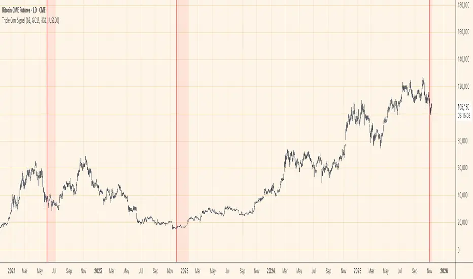
Rolling Correlation vs Another Symbol (SPY Default)This indicator visualizes the rolling correlation between the current chart symbol and another selected asset, helping traders understand how closely the two move together over time.
It calculates the Pearson correlation coefficient over a user-defined period (default 22 bars) and plots it as a color-coded line:
• Green line → positive correlation (move in the same direction)
• Red line → negative correlation (move in opposite directions)
• A gray dashed line marks the zero level (no correlation).
The background highlights periods of strong relationship:
• Light green when correlation > +0.7 (strong positive)
• Light red when correlation < –0.7 (strong negative)
Use this tool to quickly spot diversification opportunities, confirm hedges, or understand how assets interact during different market regimes.

cd_correlation_analys_Cxcd_correlation_analys_Cx
General:
This indicator is designed for correlation analysis by classifying stocks (487 in total) and indices (14 in total) traded on Borsa İstanbul (BIST) on a sectoral basis.
Tradingview's sector classifications (20) have been strictly adhered to for sector grouping.
Depending on user preference, the analysis can be performed within sectors, between sectors, or manually (single asset).
Let me express my gratitude to the code author, @fikira, beforehand; you will find the reason for my thanks in the context.
Details:
First, let's briefly mention how this indicator could have been prepared using the classic method before going into details.
Classically, assets could be divided into groups of forty (40), and the analysis could be performed using the built-in function:
ta.correlation(source1, source2, length) → series float.
I chose sectoral classification because I believe there would be a higher probability of assets moving together, rather than using fixed-number classes.
In this case, 21 arrays were formed with the following number of elements:
(3, 11, 21, 60, 29, 20, 12, 3, 31, 5, 10, 11, 6, 48, 73, 62, 16, 19, 13, 34 and indices (14)).
However, you might have noticed that some arrays have more than 40 elements. This is exactly where @Fikira's indicator came to the rescue. When I examined their excellent indicator, I saw that it could process 120 assets in a single operation. (I believe this was the first limit overrun; thanks again.)
It was amazing to see that data for 3 pairs could be called in a single request using a special method.
You can find the details here:
When I adapted it for BIST, I found it sufficient to call data for 2 pairs instead of 3 in a single go. Since asset prices are regular and have 2 decimal places, I used a fixed multiplier of $10^8$ and a fixed decimal count of 2 in Fikira's formulas.
With this method, the (high, low, open, close) values became accessible for each asset.
The summary up to this point is that instead of the ready-made formula + groups of 40, I used variable-sized groups and the method I will detail now.
Correlation/harmony/co-movement between assets provides advantages to market participants. Coherent assets are expected to rise or fall simultaneously.
Therefore, to convert co-movement into a mathematical value, I defined the possible movements of the current candle relative to the previous candle bar over a certain period (user-defined). These are:
Up := high > high and low > low
Down := high < high and low < low
Inside := high <= high and low >= low
Outside := high >= high and low <= low and NOT Inside.
Ignore := high = low = open = close
If both assets performed the same movement, 1 was added to the tracking counter.
If (Up-Up), (Down-Down), (Inside-Inside), or (Outside-Outside), then counter := counter + 1.
If the period length is 100 and the counter is 75, it means there is 75% co-movement.
Corr = counter / period ($75/100$)
Average = ta.sma(Corr, 100) is obtained.
The highest coefficients recorded in the array are presented to the user in a table.
From the user menu options, the user can choose to compare:
• With assets in its own sector
• With assets in the selected sector
• By activating the confirmation box and manually entering a single asset for comparison.
Table display options can be adjusted from the Settings tab.
In the attached examples:
Results for AKBNK stock from the Finance sector compared with GARAN stock from the same sector:
Timeframe: Daily, Period: 50 => Harmony 76% (They performed the same movement in 38 out of 50 bars)
Comment: Opposite movements at swing high and low levels may indicate a change in the direction of the price flow (SMT).
Looking at ASELS from the Electronic Technology sector over the last 30 daily candles, they performed the same movements by 40% with XU100, 73.3% (22/30) with XUTEK (Technology Index), and 86.9% according to the averages.
Comment: It is more appropriate to follow ASELS stock with XUTEK (Technology index) instead of the general index (XU100). Opposite movements at swing high and low levels may indicate a change in the direction of the price flow (SMT).
Again, when ASELS stock is taken on H1 instead of daily, and the length is 100 instead of 30, the harmony rate is seen to be 87%.
Please share your thoughts and criticisms regarding the indicator, which I prepared with a bit of an educational purpose specifically for BIST.
Happy trading.

Fair Value Lead-Lag Model [BackQuant]Fair Value Lead-Lag Model
A cross-asset model that estimates where price "should" be relative to a chosen reference series, then tracks the deviation as a normalized oscillator. It helps you answer two questions: 1) is the asset rich or cheap vs its driver, and 2) is the driver leading or lagging price over the next N bars.
Concept in one paragraph
Many assets co-move with a macro or sector driver. Think BTC vs DXY, gold vs real yields, a stock vs its sector ETF. This tool builds a rolling fair value of the charted asset from a reference series and shows how far price is above or below that fair value in standard deviation units. You can shift the reference forward or backward to test who leads whom, then use the deviation and its bands to structure mean-reversion or trend-following ideas.
What the model does
Reference mapping : Pulls a reference symbol at a chosen timeframe, with an optional lead or lag in bars to test causality.
Fair value engine : Converts the reference into a synthetic fair value of the chart using one of four methods:
Ratio : price/ref with a rolling average ratio. Good when the relationship is proportional.
Spread : price minus ref with a rolling average spread. Good when the relationship is additive.
Z-Score : normalizes both series, aligns on standardized units, then re-projects to price space. Good when scale drifts.
Beta-Adjusted : rolling regression style. Uses covariance and variance to compute beta, then builds a fair value = mean(price) + beta * (ref − mean(ref)).
Deviation and bands : Computes a z-scored deviation of price vs fair value and plots sigma bands (±1, ±2, ±3) around the fair value line on the chart.
Correlation context : Shows rolling correlation so you can judge if deviations are meaningful or just noise when co-movement is weak.
Visuals :
Fair value line on price chart with sigma envelopes.
Deviation as a column oscillator and optional line.
Threshold shading beyond user-set upper and lower levels.
Summary table with reference, deviation, status, correlation, and method.
Why this is useful
Mean reversion framework : When correlation is healthy and deviation stretches beyond your sigma threshold, probability favors reversion toward fair value. This is classic pairs logic adapted to a driver and a target.
Trend confirmation : If price rides the fair value line and deviation stays modest while correlation is positive, it supports trend persistence. Pullbacks to negative deviation in an uptrend can be buyable.
Lead-lag discovery : Shift the reference forward by +N bars. If correlation improves, the reference tends to lead. Shift backward for the reverse. Use the best setting for planning early entries or hedges.
Regime detection : Large persistent deviations with falling correlation hint at regime change. The relationship you relied on may be breaking down, so reduce confidence or switch methods.
How to use it step by step
Pick a sensible reference : Choose a macro, index, currency, or sector driver that logically explains the asset’s moves. Example: gold with DXY, a semiconductor stock with SOXX.
Test lead-lag : Nudge Lead/Lag Periods to small positive values like +1 to +5 to see if the reference leads. If correlation improves, keep that offset. If correlation worsens, try a small negative value or zero.
Select a method :
Start with Beta-Adjusted when the relationship is approximately linear with drift.
Use Ratio if the assets usually move in proportional terms.
Use Spread when they trade around a level difference.
Use Z-Score when scales wander or volatility regimes shift.
Tune windows :
Rolling Window controls how quickly fair value adapts. Shorter equals faster but noisier.
Normalization Period controls how deviations are standardized. Longer equals stabler sigma sizing.
Correlation Length controls how co-movement is measured. Keep it near the fair value window.
Trade the edges :
Mean reversion idea : Wait for deviation beyond your Upper or Lower Threshold with positive correlation. Fade back toward fair value. Exit at the fair value line or the next inner sigma band.
Trend idea : In an uptrend, buy pullbacks when deviation dips negative but correlation remains healthy. In a downtrend, sell bounces when deviation spikes positive.
Read the table : Deviation shows how many sigmas you are from fair value. Status tells you overvalued or undervalued. Correlation color hints confidence. Method tells you the projection style used.
Reading the display
Fair value line on price chart: the model’s estimate of where price should trade given the reference, updated each bar.
Sigma bands around fair value: a quick sense of residual volatility. Reversions often target inner bands first.
Deviation oscillator : above zero means rich vs fair value, below zero means cheap. Color bins intensify with distance.
Correlation line (optional): scale is folded to match thresholds. Higher values increase trust in deviations.
Parameter tips
Start with Rolling Window 20 to 30, Normalization Period 100, Correlation Length 50.
Upper and Lower Threshold at ±2.0 are classic. Tighten to ±1.5 for more signals or widen to ±2.5 to focus on outliers.
When correlation drifts below about 0.3, treat deviations with caution. Consider switching method or reference.
If the fair value line whipsaws, increase Rolling Window or move to Beta-Adjusted which tends to be smoother.
Playbook examples
Pairs-style reversion : Asset is +2.3 sigma rich vs reference, correlation 0.65, trend flat. Short the deviation back toward fair value. Cover near the fair value line or +1 sigma.
Pro-trend pullback : Uptrend with correlation 0.7. Deviation dips to −1.2 sigma while price sits near the −1 sigma band. Buy the dip, target the fair value line, trail if the line is rising.
Lead-lag timing : Reference leads by +3 bars with improved correlation. Use reference swings as early cues to anticipate deviation turns on the target.
Caveats
The model assumes a stable relationship over the chosen windows. Structural breaks, policy shocks, and index rebalances can invalidate recent history.
Correlation is descriptive, not causal. A strong correlation does not guarantee future convergence.
Do not force trades when the reference has low liquidity or mismatched hours. Use a reference timeframe that captures real overlap.
Bottom line
This tool turns a loose cross-asset intuition into a quantified, visual fair value map. It gives you a consistent way to find rich or cheap conditions, time mean-reversion toward a statistically grounded target, and confirm or fade trends when the driver agrees.
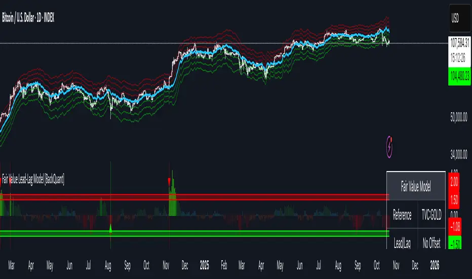
Pairs Trading Scanner [BackQuant]Pairs Trading Scanner
What it is
This scanner analyzes the relationship between your chart symbol and a chosen pair symbol in real time. It builds a normalized “spread” between them, tracks how tightly they move together (correlation), converts the spread into a Z-Score (how far from typical it is), and then prints clear LONG / SHORT / EXIT prompts plus an at-a-glance dashboard with the numbers that matter.
Why pairs at all?
Markets co-move. When two assets are statistically related, their relationship (the spread) tends to oscillate around a mean.
Pairs trading doesn’t require calling overall market direction you trade the relative mispricing between two instruments.
This scanner gives you a robust, visual way to find those dislocations, size their significance, and structure the trade.
How it works (plain English)
Step 1 Pick a partner: Select the Pair Symbol to compare against your chart symbol. The tool fetches synchronized prices for both.
Step 2 Build a spread: Choose a Spread Method that defines “relative value” (e.g., Log Spread, Price Ratio, Return Difference, Price Difference). Each lens highlights a different flavor of divergence.
Step 3 Validate relationship: A rolling Correlation checks if the pair is moving together enough to be tradable. If correlation is weak, the scanner stands down.
Step 4 Standardize & score: The spread is normalized (mean & variability over a lookback) to form a Z-Score . Large absolute Z means “stretched,” small means “near fair.”
Step 5 Signals: When the Z-Score crosses user-defined thresholds with sufficient correlation , entries print:
LONG = long chart symbol / short pair symbol,
SHORT = short chart symbol / long pair symbol,
EXIT = mean reversion into the exit zone or correlation failure.
Core concepts (the three pillars)
Spread Method Your definition of “distance” between the two series.
Guidance:
Log Spread: Focuses on proportional differences; robust when prices live on different scales.
Price Ratio: Classic relative value; good when you care about “X per Y.”
Return Difference: Emphasizes recent performance gaps; nimble for momentum-to-mean plays.
Price Difference: Straight subtraction; intuitive for similar-scale assets (e.g., two ETFs).
Correlation A rolling score of co-movement. The scanner requires it to be above your Min Correlation before acting, so you’re not trading random divergence.
Z-Score “How abnormal is today’s spread?” Positive = chart richer than pair; negative = cheaper. Thresholds define entries/exits with transparent, statistical context.
What you’ll see on the chart
Correlation plot (blue line) with a dashed Min Correlation guide. Above the line = green zone for signals; below = hands off.
Z-Score plot (white line) with colored, dashed Entry bands and dotted Exit bands. Zero line for mean.
Normalized spread (yellow) for a quick “shape read” of recent divergence swings.
Signal markers :
LONG (green label) when Z < –Entry and corr OK,
SHORT (red label) when Z > +Entry and corr OK,
EXIT (gray label) when Z returns inside the Exit band or correlation drops below the floor.
Background tint for active state (faint green for long-spread stance, faint red for short-spread stance).
The two built-in dashboards
Statistics Table (top-right)
Pair Symbol Your chosen partner.
Correlation Live value vs. your minimum.
Z-Score How stretched the spread is now.
Current / Pair Prices Real-time anchors.
Signal State NEUTRAL / LONG / SHORT.
Price Ratio Context for ratio-style setups.
Analysis Table (bottom-right)
Avg Correlation Typical co-movement level over your window.
Max |Z| The recent extremes of dislocation.
Spread Volatility How “lively” the spread has been.
Trade Signal A human-readable prompt (e.g., “LONG A / SHORT B” or “NO TRADE” / “LOW CORRELATION”).
Risk Level LOW / MEDIUM / HIGH based on current stretch (absolute Z).
Signals logic (plain English)
Entry (LONG): The spread is unusually negative (chart cheaper vs pair) and correlation is healthy. Expect mean reversion upward in the spread: long chart, short pair.
Entry (SHORT): The spread is unusually positive (chart richer vs pair) and correlation is healthy. Expect mean reversion downward in the spread: short chart, long pair.
Exit: The spread relaxes back toward normal (inside your exit band), or correlation deteriorates (relationship no longer trusted).
A quick, repeatable workflow
1) Choose your pair in context (same sector/theme or known macro link). Think: “Do these two plausibly co-move?”
2) Pick a spread lens that matches your narrative (ratio for relative value, returns for short-term performance gaps, etc.).
3) Confirm correlation is above your floor no corr, no trade.
4) Wait for a stretch (Z beyond Entry band) and a printed LONG / SHORT .
5) Manage to the mean (EXIT band) or correlation failure; let the scanners’ state/labels keep you honest.
Settings that matter (and why)
Spread Method Defines the “mispricing” you care about.
Correlation Period Longer = steadier regime read, shorter = snappier to regime change.
Z-Score Period The window that defines “normal” for the spread; it sets the yardstick.
Use Percentage Returns Normalizes series when using return-based logic; keep on for mixed-scale assets.
Entry / Exit Thresholds Set your stretch and your target reversion zone. Wider entries = rarer but stronger signals.
Minimum Correlation The gatekeeper. Raising it favors quality over quantity.
Choosing pairs (practical cheat sheet)
Same family: two index ETFs, two oil-linked names, two gold miners, two L1 tokens.
Hedge & proxy: stock vs. sector ETF, BTC vs. BTC index, WTI vs. energy ETF.
Cross-venue or cross-listing: instruments that are functionally the same exposure but price differently intraday.
Reading the cues like a pro
Divergence shape: The yellow normalized spread helps you see rhythm fast spike and snap-back versus slow grind.
Corr-first discipline: Don’t fight the “Min Correlation” line. Good pairs trading starts with a relationship you can trust.
Exit humility: When Z re-centers, let the EXIT do its job. The edge is the journey to the mean, not overstaying it.
Frequently asked (quick answers)
“Long/Short means what exactly?”
LONG = long the chart symbol and short the pair symbol.
SHORT = short the chart symbol and long the pair symbol.
“Do I need same price scales?” No. The spread methods normalize in different ways; choose the one that fits your use case (log/ratio are great for mixed scales).
“What if correlation falls mid-trade?” The scanner will neutralize the state and print EXIT . Relationship first; trade second.
Field notes & patterns
Snap-back days: After a one-sided session, return-difference spreads often flag cleaner intraday mean reversions.
Macro rotations: Ratio spreads shine during sector re-weights (e.g., value vs. growth ETFs); look for steady corr + elevated |Z|.
Event bleed-through: If one symbol reacts to news and its partner lags, Z often flags a high-quality, short-horizon re-centering.
Display controls at a glance
Show Statistics Table Live state & key numbers, top-right.
Show Analysis Table Context/risk read, bottom-right.
Show Correlation / Spread / Z-Score Toggle the sub-charts you want visible.
Show Entry/Exit Signals Turn markers on/off as needed.
Coloring Adjust Long/Short/Neutral and correlation line colors to match your theme.
Alerts (ready to route to your workflow)
Pairs Long Entry Z falls through the long threshold with correlation above minimum.
Pairs Short Entry Z rises through the short threshold with correlation above minimum.
Pairs Trade Exit Z returns to neutral or the relationship fails your correlation floor.
Correlation Breakdown Rolling correlation crosses your minimum; relationship caution.
Final notes
The scanner is designed to keep you systematic: require relationship (correlation), quantify dislocation (Z-Score), act when stretched, stand down when it normalizes or the relationship degrades. It’s a full, visual loop for relative-value trading that stays out of your way when it should and gets loud only when the numbers line up.
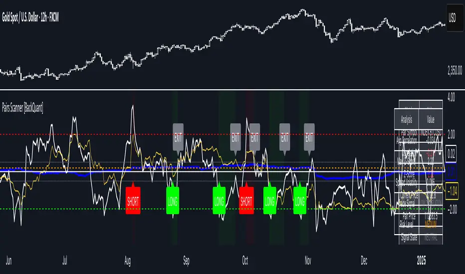
Bitcoin vs. Gold correlation with lagBTC vs Gold (Lag) + Correlation — multi-timeframe, publication notes
What it does
Plots Gold on the same chart as Bitcoin, with a configurable lead/lag.
Lets you choose how the series is displayed:
Gold shifted forward (+lag on chart) — shows gold ahead of BTC on the time axis (visual offset).
Gold aligned to BTC (gold lag) — standard alignment; gold is lagged for calculation and plotted in place.
BTC 200D Lag (BTC shifted forward) — visualizes BTC shifted forward (like popular “BTC 200D Lag” charts).
Computes Pearson correlations between BTC (no lag) and Gold (with lag) over multiple lookback windows equivalent to:
30d, 60d, 90d, 180d, 365d, 2y (730d), 3y (1095d), 5y (1825d).
Shows a table with the correlation values, automatically scaled to the current timeframe.
Why this is useful
A common macro claim is that BTC tends to follow Gold with a delay (e.g., ~200 trading days). This tool lets you:
Visually advance Gold (or BTC) to see that lead-lag relationship on the chart.
Quantify the relationship with rolling correlations.
Switch timeframes (D/W/M/…): everything automatically stays in sync.
Quick start
Open a BTC chart (any exchange).
Add the indicator.
Set Gold symbol (default TVC:GOLD; alternatives: OANDA:XAUUSD, COMEX:GC1!, etc.).
Choose Lag value and Lag unit (Days/Weeks/Months/Years/Bars).
Pick Visual Mode:
To mirror those “BTC 200D Lag” posts: choose “BTC 200D Lag (BTC shifted forward)” with 200 Days.
To view Gold 200D ahead of BTC: select “Gold shifted forward (+lag on chart)” with 200 Days.
Keep Rebase to 100 ON for an apples-to-apples visual scale. (You can move the study to the left price scale if needed.)
Inputs
Gold symbol: external series to pair with BTC.
Lag value: numeric value.
Lag unit: Days, Weeks, Months (≈30d), Years (≈365d), or direct Bars.
Visual mode:
Gold shifted forward (+lag on chart) → gold is offset to the right by the lag (visual only).
Gold aligned to BTC (gold lag) → standard plot (no visual offset); correlations still use lagged gold.
BTC 200D Lag (BTC shifted forward) → BTC is offset to the right by the lag (visual only).
Rebase to 100 (visual): rescales each series to 100 on its first valid bar for clearer comparison.
Show gold without lag (debug): optional reference line.
Show price tag for gold (lag): toggles the track price label.
Timeframe handling
The study uses the current chart timeframe for both BTC and Gold (timeframe.period).
Lag in time units (Days/Weeks/Months/Years) is internally converted to an integer number of bars of the active timeframe (using timeframe.in_seconds).
Example: on W (weekly), 200 days ≈ 29 bars.
On intraday timeframes, days are converted proportionally.
Correlation math
Correlation = ta.correlation(BTC, Gold_lagged, length_in_bars)
Lookback lengths are the bar-equivalents of 30/60/90/180/365/730/1095/1825 days in the active timeframe.
Important: correlations are computed on prices (not returns). If you prefer returns-based correlation (often more statistically robust), duplicate the script and replace price inputs with change(close) or ta.roc(close, 1).
Reading the table
Window: nominal day label (e.g., 30d, 1y, 5y).
Bars (TF): how many bars that window equals on the current timeframe.
Correlation: Pearson coefficient . Background tint shows intensity and sign.
Tips & caveats
Visual offsets (offset=) move series on screen only; they don’t affect the math. The math always uses BTC (no lag) × Gold (lagged).
With large lags on high timeframes, early bars will be na (normal). Scroll forward / reduce lag.
If your Gold feed doesn’t load, try an alternative symbol that your plan supports.
Rebase to 100 helps visibility when BTC ($100k) and Gold ($2k) share a scale.
Months/Years use 30/365-day approximations. For exact control, use Days or Bars.
Correlations on very short lengths or sparse data can be unstable; consider the longer windows for sturdier signals.
This is a visual/analytical tool, not a trading signal. Always apply independent risk management.
Suggested setups
Replicate “BTC 200D Lag” charts:
Visual Mode: BTC 200D Lag (BTC shifted forward)
Lag: 200 Days
Rebase: ON
Gold leads BTC (Gold ahead):
Visual Mode: Gold shifted forward (+lag on chart)
Lag: 200 Days
Rebase: ON
Compatibility: Pine v6, overlay study.
Best with: BTCUSD (any exchange) + a reliable Gold feed.
Author’s note: Lead-lag relationships are not stable over time; treat correlations as descriptive, not predictive.
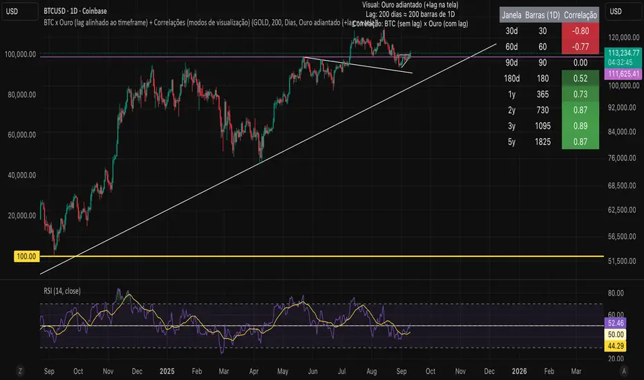
AI-Weighted RSI (Zeiierman)█ Overview
AI-Weighted RSI (Zeiierman) is an adaptive oscillator that enhances classic RSI by applying a correlation-weighted prediction layer. Instead of looking only at RSI values directly, this indicator continuously evaluates how other price- and volume-based features (returns, volatility, volume shifts) correlate with RSI, and then weights them accordingly to project the next RSI state.
The result is a smoother, forward-looking RSI framework that adapts to market conditions in real time.
By leveraging feature correlation instead of static formulas, AI-Weighted RSI behaves like a lightweight learning model, adjusting its emphasis depending on which features are most aligned with RSI behavior during the current regime.
█ How It Works
⚪ Feature Extraction
Each bar, the script computes features: log returns, RSI itself, ATR% (volatility), volume, and volume log-change.
⚪ Correlation Screening
Over a rolling learning window, it measures the correlation of each feature against RSI. The strongest relationships are ranked and selected.
⚪ Adaptive Weighting
Features are standardized (z-scored), then combined using their signed correlations as weights, building a rolling, adaptive prediction of RSI.
⚪ Prediction to RSI Weight
The predicted RSI is mapped back into a “weight” scale (±2 by default). Above 0 = bullish bias, below 0 = bearish bias, with color-graded fills to visualize overbought/oversold pressure.
⚪ Signal Line
A smoothing option (signal length) overlays a moving average of the AI-Weighted RSI for clearer trend confirmation.
█ Why AI-Weighted RSI
⚪ Adaptive to Market Regime
Because the model re-evaluates correlations continuously, it naturally shifts which features dominate, sometimes volatility explains RSI best, sometimes volume, sometimes returns.
⚪ Forward-Looking Bias
Instead of simply reflecting RSI, the model provides a projection, helping anticipate shifts in momentum before RSI itself flips.
█ How to Use
⚪ Directional Bias
Read the RSI relative to 0. Above = bullish momentum bias, below = bearish.
⚪ Overbought / Oversold Zones
Shaded fills beyond +0.5 or -0.5 highlight extremes where RSI pressure often exhausts.
⚪ Divergences
When price makes new highs/lows but AI-Weighted RSI fails to confirm, it often signals weakening momentum.
█ Settings
RSI Length: Lookback for the core RSI calculation.
Signal Length: Smoothing applied to the AI-Weighted RSI output.
Learning Window: Bars used for correlation learning and z-scoring.
-----------------
Disclaimer
The content provided in my scripts, indicators, ideas, algorithms, and systems is for educational and informational purposes only. It does not constitute financial advice, investment recommendations, or a solicitation to buy or sell any financial instruments. I will not accept liability for any loss or damage, including without limitation any loss of profit, which may arise directly or indirectly from the use of or reliance on such information.
All investments involve risk, and the past performance of a security, industry, sector, market, financial product, trading strategy, backtest, or individual's trading does not guarantee future results or returns. Investors are fully responsible for any investment decisions they make. Such decisions should be based solely on an evaluation of their financial circumstances, investment objectives, risk tolerance, and liquidity needs.
