VWAP v1VWAP Flow v1 is a price-action and market structure indicator built to help traders understand where real participation happens, not to generate random buy/sell signals.
The indicator focuses on VWAP interaction, liquidity behavior, and structure shifts, allowing the trader to align entries with higher-probability zones.
⸻
What the indicator does:
• Plots Daily and Weekly VWAP to define fair value and directional bias
• Highlights areas where price reacts strongly around VWAP
• Helps identify liquidity grabs, false breakouts, and re-entries
• Supports trend continuation and mean reversion setups
VWAP Flow v1 does not repaint and does not force entries. It shows context, not predictions.
⸻
How to use it:
• Higher timeframe (H4 / M30): determine market bias and key zones
• Lower timeframe (M5 / M1): wait for price reaction, rejection, or structure confirmation near VWAP
• Long setups are preferred above VWAP after downside liquidity
• Short setups are preferred below VWAP after upside liquidity
The indicator is designed to support decision-making, not replace it.
⸻
Who this indicator is for:
• Traders using Smart Money Concepts or price action
• Intraday and scalping traders who need clear structure
• Traders who value patience and confirmation
It is not intended for beginners looking for automatic signals or guaranteed profits.
⸻
Important note:
VWAP Flow v1 is a tool, not a strategy by itself.
Results depend on execution, risk management, and discipline.
Forecasting

Quantum EdgeQuantum Edge
DESCRIPTION:
Time-based cycle alignment scanner using fractal cycle theory to detect when multiple timing cycles converge at mathematically significant zones.
█ OVERVIEW
Quantum Edge is a time-based cycle alignment scanner built on fractal cycle theory. Markets move in nested cycles across multiple timeframes. This indicator detects moments when several of these cycles simultaneously reach mathematically significant positions, creating potential turning points.
The core concept: when multiple independent timing cycles converge at key zones, the probability of a reaction increases. The more cycles aligned, the higher the probability score.
█ HOW IT WORKS
The indicator tracks multiple time-based cycles of varying lengths. Each cycle is analyzed for its current position within its phase. When a cycle reaches a statistically significant zone (based on cycle theory), it contributes points to a composite probability score.
Shorter cycles contribute fewer points (they align frequently).
Longer cycles contribute more points (they align rarely).
Additional weighting is applied for:
- Specific days of the week known for higher volatility
- Specific times of day associated with market structure shifts
The final score represents how many timing factors are currently aligned.
█ SIGNALS EXPLAINED
👑 Rare multi-cycle convergence — Several long-duration cycles aligned simultaneously. Occurs a few times per month.
💎 Strong convergence — Multiple mid-to-long duration cycles aligned. Occurs a few times per week.
🌅 Daily cycle alignment — Daily-length cycle at a key zone with supporting factors. Occurs 1-2 times per day.
🔥 Short cycle alignment — Shorter-duration cycles aligned. Occurs several times per day.
🔮 Prediction — The indicator scans ahead and displays where future alignments are likely to occur based on the deterministic nature of time cycles.
█ TRADING MODES
The indicator includes preset modes that adjust sensitivity:
SNIPER — Only displays the highest-scoring alignments. For patient traders waiting for the best setups.
DAILY — Displays daily-quality alignments and above. Recommended starting point for most traders.
ACTIVE — Displays more frequent setups. For traders who want more opportunities and can filter with price analysis.
SCALP — Displays all qualifying alignments. Highest frequency, requires additional confirmation.
█ WHAT MAKES THIS UNIQUE
This indicator uses a proprietary weighted scoring system based on fractal cycle mathematics. The specific cycle lengths, zone calculations, and weighting factors are the result of extensive research into cyclical market behavior.
The predictive feature is deterministic — because time cycles are mathematical, future alignments can be calculated in advance. This allows traders to plan entries before setups occur rather than reacting after the fact.
The source is protected because the specific parameters and scoring logic represent significant research and development.
█ INTENDED USE
This is a TIMING tool, not a directional signal generator.
It answers: "When are multiple cycles aligned?"
It does NOT answer: "Which direction should I trade?"
Combine with your own price analysis (support/resistance, order flow, market structure) to determine direction. Use this tool to identify WHEN those setups have higher probability.
█ LIMITATIONS
- No indicator predicts the future with certainty
- Cycle alignments indicate probability, not guaranteed outcomes
- Past alignment results do not guarantee future performance
- This tool requires combination with price-based analysis for best results
- Not all alignments result in tradeable moves
█ SETTINGS
- Mode Selection: Choose your preferred sensitivity level
- Show Score: Toggle probability scores on/off
- Show Predictions: Toggle future alignment predictions on/off
- Prediction Range: How far ahead to scan for alignments
- Colors: Customize signal colors to your preference
█ MARKETS AND TIMEFRAMES
Works on any liquid market: Futures, Forex, Crypto, Stocks, Indices.
Optimized for intraday timeframes (1-15 minute charts) but can be applied to higher timeframes for swing trading applications.
█ ACCESS
This is an invite-only script. If you have questions about the methodology or would like to discuss access, you may send me a direct message.

ICT FINATIC🇮🇹 Descrizione (Italiano)
ICT FINATIC è un indicatore di supporto operativo basato su concetti ICT, progettato per aiutare il trader nella preparazione delle sessioni e nella lettura del contesto intraday.
Funzioni principali:
Bias multi-timeframe manuale (Daily, H4, H1, M15, M5) con calcolo automatico del bias prevalente e visualizzazione in tabella.
Linee verticali temporanee pre-sessione: vengono disegnate 5 minuti prima di orari chiave (09:45, 10:15, 10:45, 11:15, 11:45, 12:15 NY) e rimosse automaticamente all’orario target.
Notifiche automatiche 5 minuti prima delle sessioni principali (09:45, 10:45, 11:45 NY).
Gestione avanzata del timing intraday in fuso orario New York.
L’indicatore non genera segnali di ingresso o uscita: è pensato come strumento di contesto, disciplina e preparazione, ideale per chi segue un approccio ICT discrezionale.
🇬🇧 Description (English)
ICT FINATIC is a session-based intraday support indicator inspired by ICT concepts, designed to help traders prepare and manage key moments of the trading day.
Main features:
Manual multi-timeframe bias selection (Daily, H4, H1, M15, M5) with automatic dominant bias calculation displayed in a table.
Temporary pre-session vertical lines: drawn 5 minutes before key New York times (09:45, 10:15, 10:45, 11:15, 11:45, 12:15) and automatically removed at the target time.
Automatic alerts 5 minutes before major sessions (09:45, 10:45, 11:45 NY).
Precise intraday timing management using New York timezone.
This indicator does not generate entry or exit signals.
It is designed as a context, discipline, and preparation tool for discretionary traders following an ICT-style approach.

Rapid Signal GeometryMechanism Explained (Simple & Practical)
1. Fair Value Baseline
A smoothed moving average (RMA) is used to represent price equilibrium. This baseline filters noise and avoids reacting to minor fluctuations.
2. Volatility Envelope
ATR or Standard Deviation (user selectable) defines how far price must move away from equilibrium to be considered meaningful. This adaptive range expands and contracts with market conditions.
3. Regime Shift Detection
A bullish regime is confirmed when price decisively breaks above the upper volatility boundary.
A bearish regime is confirmed when price decisively breaks below the lower volatility boundary.
The logic resets on every candle — there is no trailing or repainting behaviour.
4. Signal Candle Geometry
On the first candle of a new regime, RSG draws two short horizontal guides:
• 50% Body Level
The midpoint of the signal candle’s body, representing balance within the impulse.
• Projected Wick Level
A mirrored wick projection calculated from the candle’s close:
– Bullish signal: upper wick distance projected downward
– Bearish signal: lower wick distance projected upward
These levels provide a geometric framework for execution planning.
Signals & Alerts
• Buy signal prints only on the first confirmed bullish regime
• Sell signal prints only on the first confirmed bearish regime
• No repeated signals during the same trend
Alert options include:
• Buy only
• Sell only
• Combined Buy/Sell
All alerts are bar-close confirmed.
How to Use Rapid Signal Geometry
RSG is best used as an execution aid, not a standalone strategy.
Common use cases:
• Refining entries after a confirmed directional bias
• Identifying pullback or reaction zones on signal candles
• Aligning discretionary entries with volatility-aware structure
• Complementing higher-timeframe analysis or session-based strategies
The geometric levels are reference points — traders should always apply their own risk management.
Recommended Timeframes
RSG performs best on:
• 15-minute
• 1-hour
These timeframes provide a strong balance between signal clarity and noise reduction.
Lower timeframes may produce more frequent regime changes, while higher timeframes offer fewer but broader signals.
Important Notes
• This indicator does not predict future price movement
• Signals are not trade recommendations
• Designed for educational and analytical purposes
• Always combine with your own market context and risk rules
Summary
Rapid Signal Geometry focuses on one thing only:
revealing the internal geometry of decisive market moments .
By combining volatility-aware regime detection with precise candle-level reference marks, RSG offers a clean and disciplined approach to execution-focused chart analysis.

TCI Time Oracle - Intraday
🟢 Green Zone — Opening & Closing Liquidity Window
Time:
Opening Green: ~9:15 – 9:30 AM
Closing Green: ~3:15 – 3:30 PM
Market Character:
Highest liquidity of the day
Overnight positions unwind / fresh positions initiate
Strong directional intent often revealed
Smart money sets the day’s bias
Trading Insight:
Best zone for trend bias identification
Option premiums react fastest here
Not ideal for late entries, but excellent for confirmation
🔵 Blue Zone — Midday Compression / Algo Control
Time: ~11:15 AM – 12:00 PM
Market Character:
Volatility contraction
Algo-driven price control
Time decay dominates options
Fake breakouts and mean reversion
Trading Insight
Worst zone for aggressive option buying
Best for range scalping or staying flat
Institutions wait, retailers get chopped
🔴 Red Zone — Institutional Expansion / Trap Zone
Time: ~1:15 PM – 2:00 PM
Market Character:
Sudden volatility expansion
Institutional orders hit the market
Trend acceleration or sharp reversal
Options see rapid delta & gamma shift
Trading Insight:
High probability trend continuation or trap creation
Strong zone for directional option trades
Requires strict risk management
Big Picture Takeaway
Green sets the intent
Blue compresses and traps
Red expands and delivers the real move
This time-zone behavior is exactly why one strategy cannot work all day. Edge comes from trading the right setup in the right time window.

Gold ORB Strategy (3/5/15/30 Min)It's a multi-mode Opening Range Breakout system for Gold futures that automates the detection of the 7:20-7:23 AM CT opening range and provides clear visual signals for four different trading styles.
In Plain English:
"It draws a box around gold's first 3 minutes of trading, then alerts you when price breaks out with confirmation from volume, VWAP, and moving averages. It automatically calculates your entry, stop, and target prices based on your chosen strategy style."
What Makes It Unique:
4 Trading Personalities in One Tool:
Aggressive = "I want every breakout, I'll manage the fakeouts"
Confirmed = "Show me only moves that close beyond the range"
Retest = "I want the pullback entry for better R:R"
Fibonacci = "Let me buy the dip after the initial move"
Smart Confluence Filtering:
Doesn't just show every breakout
Checks if VWAP agrees (trend filter)
Verifies EMA alignment (momentum filter)
Flags volume spikes (conviction filter)
Complete Trade Management:
Automatically calculates stops (3 different methods)
Shows profit targets based on your R:R preference
Labels stick to price levels as you scroll
Visual dashboard shows all key info at a glance
What It's NOT:
Not a "buy here, sell there" robot - you still need to read the market
Not foolproof - no strategy works every day
Not optimized yet - you'll need to backtest and adjust settings for your style
The Real Value:
It takes a proven strategy from your research and makes it systematic and repeatable. Instead of manually drawing boxes and calculating stops every morning, it does the math and shows you exactly where the setup is.

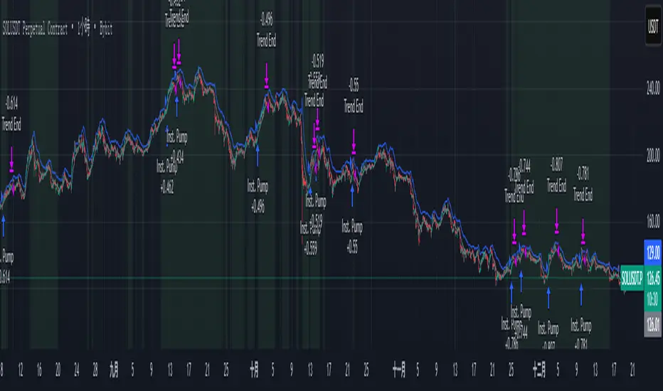
ITAS - Institutional Triggered Alpha SystemConcept & Originality: Standard breakout strategies often fail in the crypto market due to "fakeouts" driven by retail FOMO. ITAS (Institutional Triggered Alpha System) is a specialized quantitative system designed for SOL (Solana). Its core innovation is not the breakout itself, but the "Institutional Confirmation Layer." The script calculates the real-time arbitrage spread (Premium) between Coinbase (USD pair) and Binance (USDT pair). A trade is ONLY executed when this proprietary "Whale Monitor" confirms that US institutions are aggressively accumulating Bitcoin, which historically precedes an "Alpha Run" in high-beta assets like SOL.
Key Features & Logic:
Cross-Exchange Arbitrage Filter: The script runs a background algorithm that smooths the Coinbase-Binance price gap using a proprietary window.
Green Background: Indicates the "Institutional Bullish Zone" (Current Premium > Historical Baseline).
Logic: It filters out retail-driven pumps. We only trade when Smart Money is leading the charge.
Alpha Trigger (Volatility Breakout): Utilizes optimized Keltner Channels (tuned specifically for SOL's volatility profile) to time the entry. The system waits for a volatility expansion inside an Institutional Bullish Zone.
Dynamic Trailing Management: Features a hard-coded, ATR-based trailing stop mechanism designed to capture extended trends while protecting capital against sudden reversals.
Usage:
Target Asset: SOL/USDT (Parameters are strictly locked and optimized for Solana).
Visuals:
Green Background: Institutional Accumulation Zone (Safe to trade).
Blue/Gray Lines: Volatility Bands.
策略核心與原創性: 標準的突破策略常因散戶 FOMO 導致的假突破而虧損。ITAS (機構啟動 Alpha 系統) 是一套專為 SOL (Solana) 設計的量化交易系統。 本策略的核心創新不在於突破本身,而在於內建的**「機構確認層 (Institutional Confirmation Layer)」**。程式會即時計算 Coinbase (USD 交易對) 與 Binance (USDT 交易對) 之間的套利價差(溢價)。只有當獨家的「巨鯨監測算法」確認美國機構正在積極吸籌比特幣時,系統才會允許執行 SOL 的突破交易。
主要功能與邏輯:
跨交易所套利濾網: 程式在背景運作一套獨家演算法,對 Coinbase-Binance 的價差進行平滑處理。
綠色背景: 代表「機構看漲區域」(當前溢價 > 歷史基準線)。
邏輯: 過濾掉散戶推動的虛假拉升,我們只在聰明錢 (Smart Money) 領頭時進場。
Alpha 啟動 (波動率突破): 使用針對 SOL 波動特性優化過的肯特納通道 (Keltner Channels) 作為進場板機。系統僅在「機構看漲區域」內等待波動率爆發。
動態追蹤管理: 內建硬編碼的 ATR 動態追蹤止損機制,旨在抓取 SOL 的長波段趨勢,同時防止利潤回吐。
用法:
適用標的: SOL/USDT (參數已針對 Solana 進行嚴格鎖定與優化)。
視覺呈現:
綠色背景: 機構吸籌區 (適合交易)。
藍/灰線: 波動率通道。
LJ Parsons Adjustable expanding MRT Fib Version 2Based on premium/discount/fair-value levels the indicator will expand with the market by settable dates.
The levels are not fib based as such but are resonant levels within an multiplicative /12 log scale using the LJ Parsons Market resonance hypothesis.

Monthly Seasonality (for last N Years)Monthly Seasonality analyzes historical price behavior to reveal how a symbol typically performs in each calendar month. It helps traders identify recurring seasonal patterns, stronger months, weaker months, and overall consistency across years.
What this indicator does?
1. Calculates monthly percentage returns using historical price data
2. Aggregates results over a user-defined lookback period (max up to 20 years)
3. Displays a seasonality table showing:
> Average return (%) for each month
> Win rate (%) — how often the month closed positive
> Number of years included in the calculation
4. Automatically highlights:
> 📈 Best performing month
> 📉 Worst performing month
Seasonality Table:
Green shading indicates positive average returns
Red shading indicates negative average returns
⭐ A star marks the strongest and weakest months
Table colors automatically adapt to light and dark themes
Table position is fully customizable (top, middle, bottom)
How Traders Use It?
Identify seasonally strong months for swing trades or position entries
Avoid historically weak periods or tighten risk controls
Combine with technical indicators for higher-probability trade timing
Useful for equities, ETFs, and indices with long trading histories
Examples:
1. AAPL
2. BTCUSD

LJ Parsons Adjustable expanding MRT FibBased on premium/discount/fair-value levels the indicator will expand with the market by settable dates.
The levels are not fib based as such but are resonant levels within an multiplicative /12 log scale using the LJ Parsons Market resonance hypothesis.

Sector Flow AnalysisSector Flow Analysis - Track market leadership and rotation across 11 major sector ETFs with real-time performance rankings.
Key Features:
Monitors all 11 S&P sector ETFs (XLK, XLF, XLI, XLU, XLV, XLP, XLY, XLB, XLRE, XLC, XLE)
Configurable lookback period (5-60 days) for performance calculation
Color-coded risk indicators: 🟢 Risk-On sectors leading (bullish), 🟠 Risk-Off sectors leading (defensive), 🟡 Neutral sectors
Display top N sectors (1-11) to declutter your chart
Fully customizable positioning, text size, and color
Clean, minimal table overlay that won't obstruct your chart
Use Cases:
Identify sector rotation patterns and market leadership changes
Gauge market sentiment (risk-on vs risk-off behavior)
Find opportunities by tracking which sectors are gaining/losing momentum
Confirm trend strength when your stock's sector is leading
Perfect companion to comprehensive market analysis tools for a complete picture of sector dynamics.

NQ Geometric Trading System NQ Geometric Trading System
Advanced confluence indicator for NQ futures implementing Michael S. Jenkins' geometric methodology.
Core Features:
Automatic spike detection (9:30-9:35) captures institutional footprint
Geometric levels from opening range using Jenkins ratios (R_50, R_25, R_67, extensions)
Rising zero angles provide dynamic time+price support/resistance
Fibonacci time windows highlight natural reversal periods
Weighted confluence algorithm (spike levels = 2x, others = 1x)
Real-time dashboard displays score 0-10 and signal strength
Customizable alerts for high-probability setups
How It Works:
System automatically detects opening spike extremes, calculates geometric ratios from 9:30-10:00 range, projects zero angles rising at 0.75 points/minute, and highlights Fibonacci time windows. When multiple factors align, dashboard shows confluence score with color-coded signals (Strong 5+, Trade 4, Watch 3).
Optimized For:
NQ/MNQ scalping and day trading on 1-5 minute timeframes. Works best during regular trading hours with timezone set to Exchange.
Customizable:
15+ parameters including angle rate, confluence threshold, price tolerance, time windows, and visual settings. Default optimized for NQ but adaptable.
Requirements:
Chart timezone must be "Exchange" or "America/New_York" for proper spike/range detection.
Perfect for traders seeking mechanical, objective signals based on proven geometric principles.

Swing Elite - Futures to CFD calculatorThis utility indicator solves a common challenge faced by traders who analyze futures markets but execute trades through CFD brokers. Since futures contracts and their corresponding CFD instruments trade at different price levels due to factors like contract specifications, rollover timing, and broker pricing models, manually converting trade levels between the two can be time-consuming and error-prone.
The indicator uses a dynamic offset calculation method to convert futures price levels to their CFD equivalents in real-time. When the user selects three reference points on the chart, the tool calculates the price differential and applies this offset consistently across all trade levels. This ensures that entry, stop loss, and take profit levels maintain their relative distances when translated to the CFD instrument.
The conversion methodology works by establishing a fixed offset between the futures price and the CFD price at the moment of setup. This offset is then applied uniformly to all specified trade levels, preserving the original risk-to-reward structure of the trade. The indicator automatically detects whether the trade is long or short based on the relationship between entry and stop loss levels, and calculates the target price according to the user-defined risk-to-reward ratio.
The tool includes automatic instrument detection for major futures contracts including E-mini S&P 500, E-mini Nasdaq 100, E-mini Dow, Russell 2000, Crude Oil, and Gold futures, displaying the corresponding CFD instrument name for quick reference. A visual overlay shows the trade levels directly on the chart with color-coded zones indicating risk and reward areas.
This indicator is designed for traders who prefer the liquidity and price discovery of futures markets for their analysis while utilizing CFD platforms for trade execution due to accessibility, leverage options, or account size considerations.

Ichimoku MTF Heatmap W/ adj alert placement W and D cloud ALERTShows green FLAG 50 bars back when Daily and Weekly Cloud metrics are ACTIVE.

Ichimoku + Time Theory Cluster PRO++ (ZZZ)## Ichimoku + Time Theory Cluster PRO++ (ZZZ)
### 1) What does this script do?
**Ichi+Time PRO++** combines **Ichimoku + Ichimoku Time Theory (Hosoda’s time cycles)** to:
- Automatically plot **Ichimoku (Tenkan/Kijun/Chikou/Kumo)** as a **trend filter & support/resistance framework**.
- Calculate **projected time targets** derived from **pivots (swing highs/lows)**, then **cluster** nearby targets into **“time windows”** where the probability of **reversal / acceleration / strong volatility** is higher than usual.
- Show **early warnings (countdown “~in N bars”)** and classify clusters as **Normal / Strong** using a **score**.
> Core idea: **Price can travel far/short based on “price”, but it often turns hard around certain “time” marks.** Ichimoku helps define *direction and key areas*, while Time Clusters tell you *when to be on alert*.
---
### 2) How it works (simple overview)
1. **Detect pivots** (swing highs/lows) using Pivot Left/Right
- A pivot is confirmed only after *pivRight* bars → less noise.
2. From each pivot, the script generates **projected time targets** based on Time Theory cycle offsets (bar intervals).
3. Nearby projections are **grouped into clusters** using **“Tolerance ± bars”**.
4. A cluster is kept only if it meets:
- **Min hits**: minimum number of projections inside the same window
- **Min score**: minimum score threshold
Score = **baseScore (weighted hits)** + **contextBonus (Ichimoku context)**
→ Clusters aligned with favorable Ichimoku conditions are **prioritized**.
---
### 3) What you will see on the chart
- **Ichimoku**: Tenkan / Kijun / Chikou / Kumo (to read trend & key zones).
- **Time Cluster Window**:
- **Normal**: meets baseline conditions.
- **Strong (TC++)**: higher score (≥ strongScore) → more important.
- **Tooltips / info labels** (e.g., hits, base, ctx, score, ~in N bars) show:
- How strong a cluster is
- How many bars remain until the “time window”
---
### 4) Practical usage (recommended workflow)
**Step 1 — Filter the trend with Ichimoku**
- Prefer Long when: price is **above Kumo**, Tenkan > Kijun, Chikou is not obstructed.
- Prefer Short when: price is **below Kumo**, Tenkan < Kijun, Chikou is not obstructed.
**Step 2 — Use Time Clusters to pick the “WHEN”**
- When a **Time Cluster (Normal/Strong)** appears, interpret it as:
- A **“sensitive time window”** → higher chance of reversal, breakout, acceleration, or sharp shakeout.
- Not an automatic entry; you still need **price action confirmation**.
**Step 3 — Entry trigger**
- Wait for confirmation such as: structure break, pin/engulf candle, range breakout, Kijun/Kumo retest, etc.
- **Strong clusters** are often useful to:
- Hunt reversals around Ichimoku zones (Kijun/Kumo)
- Hunt breakouts when consolidating and Ichimoku agrees with the trend
**Step 4 — Risk management**
- Place SL using the nearest structure (swing/pivot/Kijun) + buffer.
- If already in a trade, Time Clusters can help you:
- tighten SL, take partial profits, or anticipate volatility.
---
### 5) Presets (A/B) & signal tuning
- **Mode A: “Fewer but stronger”**
Stricter filtering → fewer clusters, higher quality (swing/position-friendly).
- **Mode B: “More early warnings”**
Moderate filtering → more clusters (good for earlier monitoring and flexibility).
- **Custom**
Manually adjust key parameters:
- Pivot Left/Right
- Tolerance ± bars
- Min hits / Min score / Strong score
- Filter small pivots (reduce noise)
> Tip: Higher timeframes (4H–1D) usually work best with Mode A (cleaner). Lower timeframes (15m–1H) can use Mode B, but require disciplined triggers.
---
### 6) Important notes (avoid misinterpretation)
- Pivots require confirmation → pivot-based signals **do not print exactly at the top/bottom**, but after *pivRight* bars.
- Future **projected clusters may shift** when new pivots appear (they update with new data).
Treat Time Clusters as **time windows to be alert**, not “exact entry points”.
- This script does not replace a trading plan; always use proper position sizing and risk control.
---
### 7) Performance
This script uses many drawing objects (box/label/line). If your device is slow:
- Reduce **Max pivots stored**
- Reduce the number of clusters displayed or switch to **Mode A**
- Use a higher timeframe
---
**Disclaimer:** This tool is for technical analysis support only and is not financial advice. You are responsible for your own trading decisions.
---
## User Guide
### 1) What is this indicator for?
This indicator combines **Auto Ichimoku** + **Time Theory Clusters** to:
- Identify **trend & equilibrium zones** via Ichimoku (Kumo, Tenkan/Kijun, Chikou).
- Find **time windows** with higher probability of volatility/reversal/acceleration (Time Clusters).
- Score each time cluster based on **cluster strength (hits)** and **Ichimoku context (context bonus)**.
> Key reminder: Time Clusters answer **WHEN**, not **WHERE**. Always combine them with **price confirmation / Ichimoku / PA** before entering.
---
### 2) Add the indicator & quick setup
1. Open a chart → **Indicators** → choose **Ichimoku + Time Theory Cluster PRO++**.
2. Recommended timeframes:
- Swing/position: **H4 – D1 – W1**
- Intraday: **M15 – H1** (noisier; needs stricter filtering).
3. Choose **Mode (Preset)**:
- **A: Fewer but stronger** → stricter, fewer signals, higher quality (recommended for swing).
- **B: More early warnings** → more signals (recommended for intraday monitoring).
- **Custom** → fine-tune all parameters.
---
### 3) Signal meaning (how to read the chart)
The indicator marks **Time Clusters** in two levels:
- **Time Cluster Enter (Normal)**: meets minimum thresholds (minHits/minScore).
- **Time Cluster Enter (Strong / TC++)**: strong cluster (score ≥ strongScore) → higher priority.
**Correct interpretation:**
- As price approaches a Time Cluster window, the market is more likely to:
- reverse,
- break out of consolidation,
- accelerate a trend,
- or produce strong volatility (sweep/false break).
- Trading direction should be aligned with **Ichimoku context** (see section 4).
---
### 4) Suggested trading rules (practical & simple)
#### A. Trend trading (recommended)
**Prefer LONG when:**
- Price is **above Kumo**, future Kumo is bullish (Span A > Span B).
- Tenkan is **above** Kijun (or just crossed up), Chikou is not trapped by price/cloud.
- At a Time Cluster:
- Look for a **pullback** to Kijun/Tenkan or structural support,
- Wait for confirmation (engulfing/pinbar/micro-structure break),
- Enter.
**Prefer SHORT when:**
- Price is **below Kumo**, future Kumo is bearish (Span A < Span B).
- Tenkan is **below** Kijun, Chikou is pressured/blocked.
- At a Time Cluster:
- Look for a rally into Kijun/cloud edge,
- Wait for rejection, then enter.
✅ Tip: **Strong clusters (TC++)** matter most when they align with:
- Kumo edge,
- Kijun,
- horizontal S/R,
- supply/demand (order block) or swing high/low.
#### B. Reversal trading (only with strong confirmation)
Consider reversals only when:
- Time Cluster is **Strong (TC++)**
- + you see a **structure shift** (BOS/CHoCH) or a clear reversal candle setup,
- + Ichimoku shows weakness (price inside cloud, flat Tenkan/Kijun, Chikou trapped).
---
### 5) Risk management (mandatory)
- Do not enter just because you “reached a Time Cluster”.
- Always set SL by structure:
- LONG: below swing low / below Kijun / below nearest cloud edge.
- SHORT: above swing high / above Kijun / above nearest cloud edge.
- Take profit using:
- minimum R:R **1:1.5 – 1:2**
- or key targets (prior highs/lows, cloud boundaries, fib levels, etc.)
---
### 6) Inputs explained (Custom mode)
- **Pivot Left / Pivot Right**: pivot confirmation (higher = fewer but more reliable pivots).
- **Max pivots stored**: how many pivots are stored for clustering (more = more sensitive but heavier).
- **Tolerance ± bars**: cluster window width (larger = more clusters; smaller = sharper).
- **Min hits**: minimum overlaps to qualify as a cluster.
- **Min score**: minimum score to accept a cluster.
- **Strong score**: threshold to mark strong clusters (TC++).
- **Filter small pivots / Filter mode**: remove small pivots to reduce noise (recommended ON).
---
### 7) Alerts (recommended)
You can create alerts for:
- **Time Cluster Enter (Normal)**
- **Time Cluster Enter (Strong / TC++)**
Recommendation: set alerts on your main trading timeframe (H1/H4/D1) to avoid spam on very small TFs.
---
### 8) Disclaimer
This indicator is for technical analysis support only and is **not financial advice**. All trading decisions are your responsibility. Please test (forward/backtest) and apply risk management before using real money.
---
### 9) Access (Invite-only, if applicable)
To request access, send me a private message on TradingView with:
- TradingView username
- Market you trade (Crypto/FX/Indices…)
- Primary timeframe (e.g., H1/H4/D1)
I will grant access in order of requests.
---

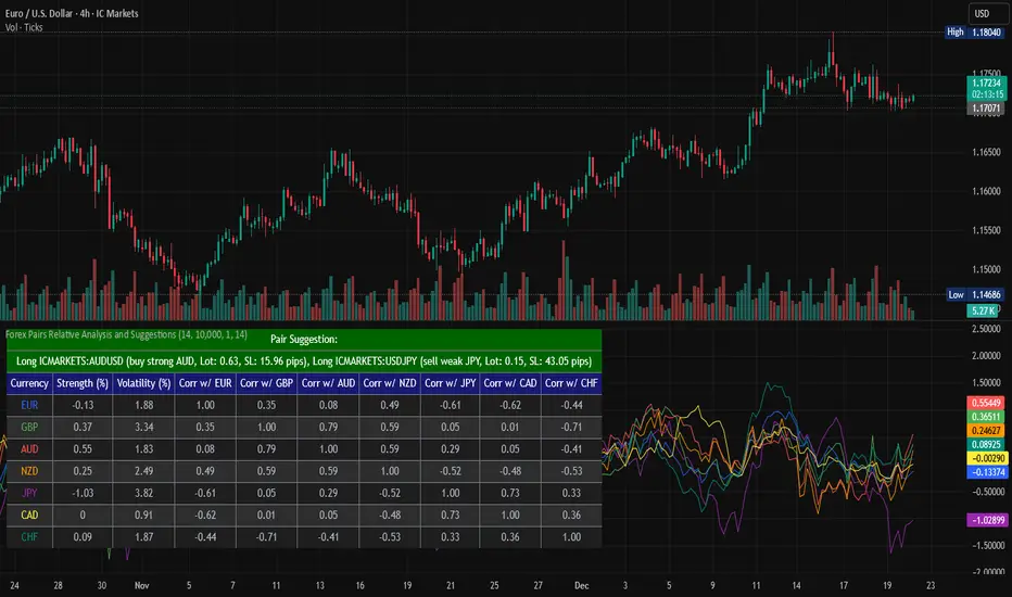
Forex Pairs Relative Analysis and SuggestionsThis Pine Script (version 5) indicator, titled "Forex Pairs Relative Analysis and Suggestions," is designed for use on TradingView charts. It provides real-time analysis of major forex pairs sourced from the IC Markets exchange, facilitating relative value or pair trading strategies by evaluating currency strengths against the US Dollar (USD). The script focuses on seven major currencies—EUR, GBP, AUD, NZD, JPY, CAD, and CHF—through their respective pairs: EURUSD, GBPUSD, AUDUSD, NZDUSD, USDJPY, USDCAD, and USDCHF.
Key features include:
Relative Currency Strengths: Calculated using the Rate of Change (ROC) over a user-defined lookback period (default: 14 bars), normalized to reflect performance versus USD. Positive values indicate strengthening, while negative values denote weakening.
Annualized Volatilities: Derived from the standard deviation of logarithmic returns, annualized assuming 252 trading days, and expressed as percentages to compare risk levels across pairs.
Full Pairwise Correlations: A comprehensive matrix displaying Pearson correlation coefficients between all pairs over the lookback period, aiding in identifying hedging opportunities (e.g., low or negative correlations for diversification).
Automated Pair Suggestions: Identifies the strongest and weakest currencies, proposing a long position in the pair to buy the strong currency and a short position (or opposite direction) to sell the weak currency against USD. Suggestions include estimated lot sizes based on user-input account balance, risk percentage (default: 1%), and a stop-loss proxy using 1x Average True Range (ATR).
Visual Elements: A table displays all metrics with color-coded rows for readability (optimized for dark mode), alternating backgrounds, and merged cells for suggestions. Strengths are also plotted in a separate pane with matching colors for trend visualization.
Customization: Users can adjust the lookback length, ATR period, account balance, and risk percentage via indicator settings to tailor the analysis.
Ensure access to IC Markets data in your TradingView account. The table appears in the top-left position by default and updates on the last bar. This tool is intended for educational and analytical purposes, supporting informed decision-making in forex trading by highlighting relative strengths, risks, and potential hedges.
Guidance on Choosing a Timeframe:
The indicator adapts to the chart's timeframe, with the lookback period influencing the historical window for metrics. Select based on your strategy:
Short-Term (Intraday/Scalping): Use 15-minute to 1-hour charts for timely signals; adjust lookback to 5–10 for responsiveness.
Medium-Term (Swing Trading): Opt for 4-hour to daily charts (recommended default) for balanced trends; 14-bar lookback covers days to weeks.
Long-Term (Position Trading): Choose weekly or monthly charts for macro views; increase lookback to 20–50 for smoother data.
Test across timeframes via backtesting to align with your risk and objectives.
Disclaimer:
This script is provided for informational and educational purposes only and does not constitute financial, investment, or trading advice. Trading forex involves significant risk of loss and is not suitable for all individuals. Past performance is not indicative of future results. The calculations, suggestions, and metrics (including lot sizes) are based on historical data and simplified assumptions, such as using ATR for stop-loss estimation, and may not account for real-time market conditions, slippage, commissions, or other factors. Users should conduct their own research, consult with qualified financial professionals, and verify the script's outputs before making any trading decisions. The author assumes no responsibility or liability for any losses incurred from the use of this script.


BulletProof Long Wick Reversal Markers with LinesThis custom Pine Script indicator for TradingView identifies and marks potential reversal points on your chart based on long wick candles at swing highs (tops) and lows (bottoms). It focuses on candles where the wick is significantly longer than the body (e.g., shooting stars or hammers) and where the subsequent price reversal exceeds a minimum percentage move. Markers appear as colored circles (green for tops, red for bottoms), with horizontal lines extending from each marker to the current bar for easy reference as support/resistance levels.Key Features and InterpretationMarkers (Dots): Green circles at tops: Indicate a potential bearish reversal where price was pushed down after a long upper wick candle.
Red circles at bottoms: Indicate a potential bullish reversal where price was pushed up after a long lower wick candle.
These only appear if the wick-to-body ratio meets the threshold (default 2.0) and the reversal move is at least the minimum percentage (default 1%).
Lines: Horizontal lines extend from each marker to the current bar (updating in real-time). Use these as dynamic levels—e.g., a green top line might act as resistance, while a red bottom line could be support. Lines do not extend into the future blank space on the chart.
Time Filtering: By default, only markers from the last 7 days are shown to reduce clutter. Set to 0 to display all historical ones.
Best Used On: 1-hour charts as per your request, but it works on any timeframe. It's ideal for spotting reversals in trending markets or confirming entries/exits with other indicators.

3 Session ORB (Opening Range Breakout) [TickDaddy]The ORB, or Opening Range Breakout indicator. will show all 3 sessions and you can adjust the times.

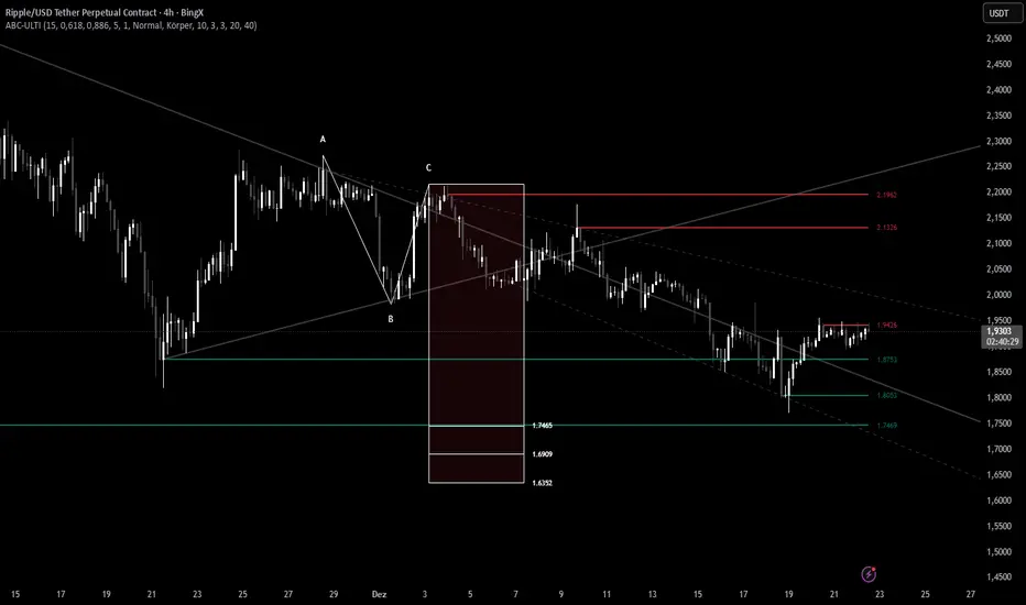
ABC Pro Ultimate S/RABC Pro Ultimate is a high-precision trading tool designed to identify harmonic ABC (Zigzag) patterns and combine them with institutional Support & Resistance levels. Unlike standard indicators that clutter your chart with noise, this script filters for high-relevance pivot points from the distant past to provide truly meaningful trade setups.
King Trade 4-hour buy/sell strategyThis is a buy/sell system for 4-hour candlestick charts. For best results, use it on Heiken Ashi candlestick charts.

cd_VW_Cx IMPROVED - Quant VWAP System: Regime, Magnets & Z-ScoQuant VWAP System: Regime, Magnets & Z-Score Matrix
This indicator is a comprehensive Quantitative Trading System designed to move beyond simple support and resistance. Instead of static lines, it uses Statistical Probability (Z-Score) and Standard Deviation to define the current market regime, identify institutional value zones, and project high-probability liquidity targets.
It is engineered for Day Traders and Scalpers (Crypto & Futures) who need to know if the market is Trending, Ranging, or preparing for a Breakout.
1. The "Regime" System (Standard Deviation Bands)
The core engine anchors a VWAP (Volume Weighted Average Price) to your chosen timeframe (Daily, Weekly, or Monthly) and projects volatility bands based on market variance.
The Trend Zone (Inner Band / 1.0 SD): This is the "Fair Value" zone. In a healthy trend, price will pull back into this zone and hold. A hold here signals a high-probability continuation (Trend Following).
The Reversion Zone (Outer Band / 2.0 SD): This represents a statistical extreme. Price rarely sustains movement beyond 2 Standard Deviations without a reversion. A touch of this band signals "Overbought" or "Oversold" conditions.
2. Liquidity Magnets (Virgin VWAPs)
The script automatically tracks "Unvisited VWAPs" from previous sessions. These are price levels where significant volume occurred but have not yet been re-tested.
The Logic: Algorithms often target these "open loops." The script visualizes them as Blue Dashed Lines with price tags.
Smart Scaling (Anti-Scrunch): Includes a custom "Ghost Engine" that automatically hides or "ghosts" magnets that are too far away. This prevents your chart from being squashed (scrunched) on lower timeframes, keeping your candles perfectly readable while still tracking targets in the background.
3. The Quant Matrix (Dashboard)
A real-time Heads-Up Display (HUD) that interprets the data for you:
Regime: Detects Volatility Squeezes. If the bands compress, it signals "⚠ SQUEEZE", warning you to stop mean-reversion trading and prepare for an explosive breakout.
Bias: Color-coded Trend Direction (Bullish/Bearish) based on VWAP slope.
Signal: actionable text prompts such as "BUY DIP" (Trend Following), "FADE EXT" (Mean Reversion), or "PREP BREAK" (Squeeze).
4. Visual Intelligence
Bold Day Separators: Clear, vertical dotted dividers with Date Stamps to instantly separate trading sessions.
Dynamic Labels: Floating labels on the right axis identify exactly which deviation level is which, preventing chart confusion.
How to Use
Strategy A: The Trend Pullback (continuation)
Check Matrix: Ensure Bias is BULLISH (Green).
Wait: Allow price to pull back into the Inner Band (Dark Green Zone).
Trigger: If price holds the Center VWAP or the -1.0 SD line, enter Long.
Target: The next Liquidity Magnet above or the +2.0 SD band.
Strategy B: The Reversion Fade (Counter-Trend)
Check Matrix: Ensure price is labeled "EXTREME" or Signal says "FADE EXT".
Trigger: Price touches or pierces the Outer Band (2.0 SD).
Action: Enter counter-trend (Short) with a target back to the Center VWAP (Mean Reversion).
Strategy C: The Magnet Target
Identify a "MAGNET" line (Blue Dashed) near current price.
These act as high-probability Take Profit levels. Price will often rush to these levels to "close the loop" before reversing.
Settings
Anchor: Daily (default), Weekly, or Monthly.
Magnet Focus Range: Adjusts how aggressively the script hides distant magnets to fix chart scaling (Default: 2%).
Visuals: Fully customizable colors, label sizes, and dashboard position.
