Sentiment

USDT Market Cap Change [Alpha Extract]A sophisticated stablecoin market analysis tool that tracks USDT market capitalization changes across daily and 60-day periods with statistical normalization and gradient intensity visualization. Utilizing z-score methodology for overbought/oversold detection and dynamic color gradients reflecting change magnitude, this indicator delivers institutional-grade market liquidity assessment through stablecoin flow analysis. The system's dual-timeframe approach combined with statistical normalization provides comprehensive market sentiment measurement based on capital inflows and outflows from the dominant stablecoin.
🔶 Advanced Market Cap Tracking Framework
Implements daily USDT market capitalization monitoring with dual-period change calculations measuring both 1-day and 60-day net capital flows. The system retrieves real-time CRYPTOCAP:USDT data on daily timeframe resolution, calculating absolute dollar changes to quantify stablecoin supply expansion or contraction as primary market liquidity indicator.
// Core Market Cap Analysis
USDT = request.security("CRYPTOCAP:USDT", "D", close)
USDT_60D_Change = USDT - USDT
USDT_1D_Change = USDT - USDT
🔶 Dynamic Gradient Intensity System
Features sophisticated color gradient engine that intensifies visual representation based on change magnitude relative to recent extremes. The system normalizes current 60-day change against configurable lookback period maximum, applying gradient strength calculation to transition colors from neutral tones through progressively intense blues (negative) or reds (positive) based on flow direction and magnitude.
🔶 Statistical Z-Score Normalization Engine
Implements comprehensive z-score calculation framework that normalizes 60-day market cap changes using rolling mean and standard deviation for objective overbought/oversold determination. The system applies statistical normalization over configurable periods, enabling cross-temporal comparison and threshold-based regime identification independent of absolute market cap levels.
// Z-Score Normalization
Change_Mean = ta.sma(USDT_60D_Change, Normalization_Length)
Change_StdDev = ta.stdev(USDT_60D_Change, Normalization_Length)
Z_Score = Change_StdDev > 0 ? (USDT_60D_Change - Change_Mean) / Change_StdDev : 0.0
🔶 Multi-Tier Threshold Detection System
Provides four-level regime classification including standard overbought (+1.5σ), standard oversold (-1.5σ), extreme overbought (+2.5σ), and extreme oversold (-2.5σ) thresholds with configurable adjustment. The system identifies market liquidity extremes when stablecoin inflows or outflows reach statistically significant levels, indicating potential market turning points or trend exhaustion.
🔶 Dual-Timeframe Flow Visualization
Features layered area plots displaying both 60-day strategic flows and 1-day tactical movements with distinct color coding for instant flow direction assessment. The system overlays short-term daily changes on longer-term 60-day trends, enabling traders to identify divergences between tactical and strategic capital flows into or out of stablecoin reserves.
🔶 Gradient Color Psychology Framework
Implements intuitive color scheme where red gradients indicate capital inflow (bullish for crypto as USDT supply expands for buying) and blue gradients show capital outflow (bearish as USDT is redeemed). The intensity progression from pale to vivid colors communicates flow magnitude, with extreme colors signaling statistically significant liquidity events requiring attention.
🔶 Background Zone Highlighting System
Provides subtle background coloring when z-score breaches overbought or oversold thresholds, creating visual alerts without obscuring primary data. The system applies translucent red backgrounds during overbought conditions and blue during oversold states, enabling instant regime recognition across chart timeframes.
🔶 Configurable Normalization Architecture
Features adjustable gradient lookback and statistical normalization periods enabling optimization across different market cycles and trading timeframes. The system allows traders to calibrate sensitivity by modifying the window used for maximum change detection (gradient) and mean/standard deviation calculation (z-score), adapting to volatile or stable market regimes.
🔶 Market Liquidity Interpretation Framework
Tracks USDT supply changes as proxy for overall cryptocurrency market liquidity conditions, where expanding market cap indicates fresh capital entering crypto markets and contracting cap suggests capital flight. The system provides leading indicator properties as large stablecoin inflows often precede major market rallies while outflows may signal distribution phases.
🔶 Why Choose USDT Market Cap Change ?
This indicator delivers sophisticated stablecoin flow analysis through statistical normalization and gradient visualization of USDT market capitalization changes. Unlike traditional market sentiment indicators that rely on price action alone, this tool measures actual capital flows through the dominant stablecoin, providing objective assessment of market liquidity conditions. The combination of dual-timeframe tracking, z-score normalization for overbought/oversold detection, and intensity-based gradient coloring makes it essential for traders seeking macro-level market assessment and regime change detection across cryptocurrency markets. The indicator excels at identifying liquidity extremes that often precede major market reversals or trend accelerations.

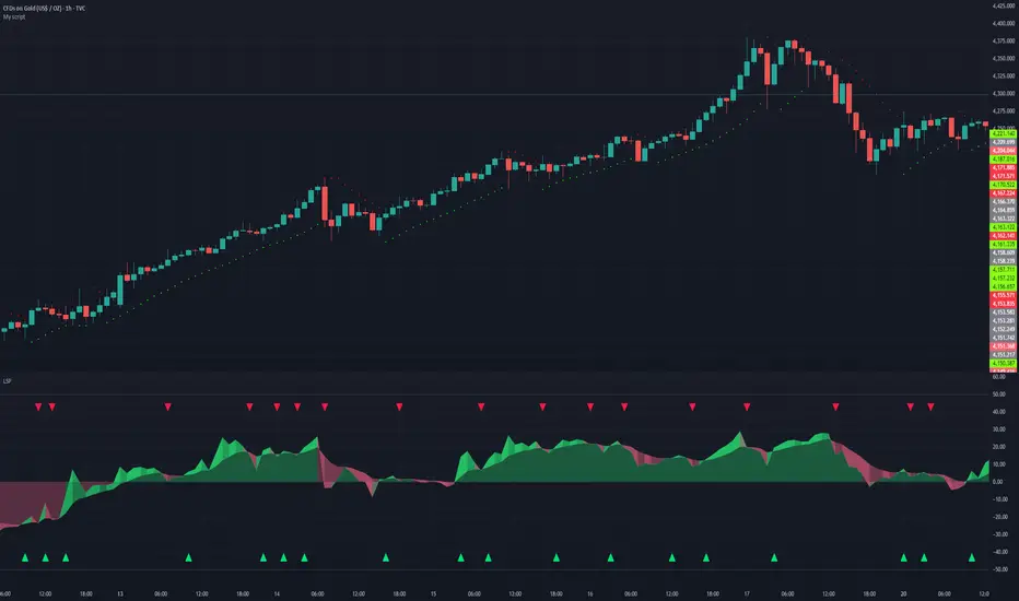
Liquidity Sentiment Profile | LUPENIndicator Guide: Liquidity Sentiment Profile (LSP).
What is the LSP?
The Liquidity Sentiment Profile (LSP) is a "Next-Generation" oscillator designed to look beyond simple price action. While standard indicators (like RSI or MACD) primarily focus on where a candle closes, the LSP analyzes the micro-structure of the entire candle—specifically the relationship between the candle's Body, its Wicks (Shadows), and the Volume.
The Core Philosophy:
Wicks tell the truth: A long lower wick indicates that sellers pushed the price down, but buyers aggressively absorbed that liquidity and pushed it back up.
That is hidden bullish strength.
Volume validates intent: A price move with low volume is noise. A price move (or wick rejection) with high volume is a commitment by institutional players.
The LSP calculates a "Sentiment Score" between -100 and +100 based on these factors.
How to Read the Visuals
The Colors (Intensity)
color: Light Green - Bullish Acceleration. Buyers are in control, and momentum is increasing. This is the ideal time to be in a Long trade.
color: Dark Green - Bullish Deceleration. Buyers are still in control (price is likely rising), but the momentum is fading. This is a warning sign to tighten stop-losses or take profits.
color: Light Red - Bearish Acceleration. Sellers are dominating, and panic is increasing. This is the ideal time to be Short.
color: Dark Red - Bearish Deceleration. Sellers are still in control, but the downward pressure is exhausted. Be careful with new short positions.
The Lines & Fills
The Main Line: The actual LSP sentiment value.
The Yellow Signal Line: A smoothed average of the sentiment.
The Core Fill: The colored area between the Main Line and the Signal Line. When this area "glows", the trend is strong. When it dims (Dark), the trend is weak. Bearish Deceleration. Sellers are still in control, but the downward pressure is exhausted. Be careful with new short positions.
The Lines & Fills
The Main Line: The actual LSP sentiment value.
The Yellow Signal Line: A smoothed average of the sentiment.
The Core Fill: The colored area between the Main Line and the Signal Line. When this area "glows" (Neon), the trend is strong. When it dims (Dark), the trend is weak.
How to Use It (Trading Strategies)
Strategy A: The "Power Cross" (Trend Entry)
Use this for entering trends when the market wakes up.
Long Entry: Wait for the LSP line to cross ABOVE the Yellow Signal Line.
Confirmation: The fill color must turn Neon Green.
Short Entry: Wait for the LSP line to cross BELOW the Yellow Signal Line.
Confirmation: The fill color must turn Neon Red.
Strategy B: The "Absorption" Play (Reversals)
This is where the LSP shines. It detects when liquidity is being absorbed before price turns.
Bullish Absorption: The Price makes a Lower Low, but the LSP makes a Higher Low. This happens because the LSP detects the Volume on the Lower Wicks (buyers absorbing selling pressure). This is a high-probability reversal signal.
Bearish Absorption: The Price makes a Higher High, but the LSP makes a Lower High. The volume on the Upper Wicks suggests sellers are absorbing the buy orders.
Strategy C: The "Dimming" Exit (Risk Management)
Don't wait for the price to crash to exit a trade.
If you are in a Long trade (Neon Green) and the color instantly shifts to Dark Green, it means the "fuel" is running out. Consider taking partial profits or moving your Stop Loss to break even.
Standard oscillators (like RSI) often give false signals during strong trends (showing "Overbought" while price keeps going up). The LSP avoids this because it weights Volume and Wicks. If price goes up and volume increases, the LSP stays Neon Green, telling you the move is genuine, not just overextended.
VIX Term Structure Pro [v7.0 Enhanced]# VIX Term Structure Pro v7.0
[! (img.shields.io)](www.tradingview.com)
[! (img.shields.io)](www.tradingview.com)
[! (img.shields.io)](LICENSE)
**Professional VIX-based Market Sentiment & Timing Indicator**
专业的 VIX 市场情绪与择时指标
---
## 🌟 Overview / 概述
VIX Term Structure Pro is an advanced multi-factor market timing indicator that analyzes the VIX futures term structure, volatility regime, and market breadth to generate actionable buy/sell signals.
VIX Term Structure Pro 是一款高级多因子市场择时指标,通过分析 VIX 期货期限结构、波动率区间及市场广度,生成可操作的买卖信号。
---
## 🚀 Key Features / 核心功能
### 📊 Multi-Factor Scoring System / 多因子评分系统
- **Term Structure Z-Score**: Measures deviation from historical mean / 期限结构 Z 分数:衡量与历史均值的偏离
- **VIX/VX1 Basis**: Spot premium detection for panic signals / VIX 现货溢价:恐慌信号检测
- **Contango Analysis**: Futures curve shape insights / 期货升水分析
- **SKEW Integration**: Options skew for tail risk / SKEW 整合:尾部风险监测
- **Put/Call Ratio**: Sentiment extremes / 看跌/看涨比率:情绪极端
- **VVIX Support**: Volatility of volatility (optional) / VVIX 支持:波动率的波动率
### 🎯 Three-Tier Signal System / 三级信号系统
| Signal | Score | Description |
|--------|-------|-------------|
| 🚨 **CRASH BUY** | ≥ 6 | Extreme panic, rare opportunity / 极端恐慌,罕见机会 |
| 🟢 **STRONG BUY** | ≥ 5 | Multi-factor confluence / 多因子共振 |
| 🟡 **BUY DIP** | ≥ 4 | Accumulate on weakness / 逢低吸纳 |
| 🟠 **SELL/HEDGE** | ≤ -2 | Consider reducing risk / 考虑减仓对冲 |
| 🔴 **STRONG SELL** | ≤ -5 | Strong bearish signals / 强烈看跌信号 |
| 🔥 **EUPHORIA SELL** | ≤ -6 | Extreme greed, sell signal / 极度贪婪,卖出信号 |
### 📈 Dashboard Indicators / 仪表盘指标解读
| Indicator | Bullish 🟢 | Bearish 🔴 |
|-----------|------------|------------|
| Overall Bias | STRONG BUY / BUY DIP | STRONG SELL / SELL/HEDGE |
| AI Score | ≥ 5 (Extreme Fear) | ≤ -5 (Extreme Greed) |
| Market Trend | 🟢SPX 🟢NDX (Above MA200) | 🔴SPX 🔴NDX (Below MA200) |
| VIX Regime | LOW VOL (<15) | HIGH VOL (>25) |
| Term Struct Z | < -2.0 (Panic) | > 2.0 (Complacency) |
---
## ⚙️ Configuration / 配置选项
### 📡 Data Sources / 数据源
- **VIX Symbol**: Default `CBOE:VIX` (Alternative: `TVC:VIX`)
- **Put/Call Ratio**: Default `INDEX:CPCI` (Index P/C)
- **Timeframe**: Daily (stable) or Chart (real-time)
### ⚠️ Strategy Mode / 策略模式
- **High (Scalping)**: Sensitive, for short-term trades / 高敏感,短线
- **Normal (Swing)**: Balanced approach / 平衡模式
- **Low (Trend/Safe)**: Conservative, trend-following / 保守,趋势跟踪
### 🔬 Backtest Mode / 回测模式
- **OFF (Real-time)**: Shows current day data, suitable for live monitoring / 显示当日数据,适合实盘监控
- **ON (Historical)**: Uses only confirmed data, avoids look-ahead bias / 仅使用已确认数据,避免未来函数
---
## 📖 Usage Guide / 使用指南
### Best Practices / 最佳实践
1. **Apply to SPX/SPY/QQQ daily charts** for optimal signal accuracy
在 SPX/SPY/QQQ 日线图上使用,信号准确度最佳
2. **Wait for next trading day** to execute signals (signals trigger on daily close)
信号触发后在下一交易日执行(信号基于日线收盘)
3. **Use in conjunction with price action** for confirmation
结合价格走势确认信号
4. **Enable Market Trend Filter** (MA200) for safer entries in uncertain markets
开启趋势过滤(MA200)以在不确定市场中更安全入场
### Signal Interpretation / 信号解读
```
🚨 CRASH BUY (Score ≥ 6)
→ Rare extreme panic event
→ Historical average return: significant positive over 2 months
→ Consider aggressive positioning
🟢 STRONG BUY (Score ≥ 5)
→ Multiple indicators align
→ Historical average return: positive over 1 month
→ Consider building positions
🟡 BUY DIP (Score ≥ 4)
→ Moderate fear detected
→ Suitable for adding to existing positions
→ Filtered out in bear markets if Trend Filter is ON
```
---
## 📊 Historical Statistics / 历史统计
The indicator tracks signal frequency and average subsequent returns:
- **CRASH BUY**: 40-day return period (~2 months)
- **STRONG BUY**: 20-day return period (~1 month)
- **BUY DIP**: 10-day return period (~2 weeks)
指标追踪信号频率和后续平均收益,可在仪表盘中查看历史统计。
---
## 🔔 Alerts / 警报
Built-in alert conditions with cooldown mechanism to prevent spam:
| Alert | Condition |
|-------|-----------|
| Crash Buy Alert | Score ≥ 6, extreme panic |
| Strong Buy Alert | Score ≥ 5, multi-factor confluence |
| Buy Dip Alert | Score ≥ threshold |
| Euphoria Sell Alert | Score ≤ -6, extreme greed |
| Strong Sell Alert | Score ≤ -5 |
| VIX Basis Panic | VIX spot premium spike |
---
## 📋 Changelog / 更新日志
### v7.0 (Current)
- ✨ Three-tier buy/sell signal system
- 📊 Signal statistics with average return tracking
- 🔬 Backtest Mode toggle for historical testing
- 🎨 Configurable ±1 Z-Score reference lines
- ⚡ Modular scoring functions
- 🛡️ Dual index trend display (SPX + NDX)
- 📱 Compact & Full dashboard modes
---
## ⚠️ Disclaimer / 免责声明
**English:**
This indicator is for educational and informational purposes only. It does not constitute financial advice. Past performance does not guarantee future results. Always do your own research and consider your risk tolerance before trading.
**中文:**
本指标仅供教育和信息参考,不构成投资建议。过往表现不代表未来收益。交易前请自行研究并评估风险承受能力。
---
## 📄 License / 许可证
MIT License - Feel free to use, modify, and share.
---
## 🤝 Contributing / 贡献
Issues and pull requests are welcome!
欢迎提交问题和贡献代码!
---
**Made with ❤️ for the trading community**
**为交易社区用心打造**

VWAP Histogram with EMAsBased on VWAP and Moving Averages.
Bias turns +ve if dynamic colour of the moving averages turns green. All moving avaerages are customisable.

Order Flow Analysis [Master Alert]This script is a custom modification of the original "Order Flow Analysis" indicator by kingthies.
I have taken the original code and engineered a "Master Alert" system into it. Here is the breakdown of what this specific script does:
1. The Core Purpose: "One Ring to Rule Them All"
In the original script, if you wanted to catch every move, you would have to set up separate alerts for Divergences, Absorptions, Crosses, etc. This modified script combines all 8 possible signals into a single "Master Trigger."
2. What triggers the Alert?
The alert will fire if ANY of the following 4 events happen on a candle:
Divergence (The Arrows):
Green Arrow: Price makes lower low, Pressure makes higher low (Bullish).
Red Arrow: Price makes higher high, Pressure makes lower high (Bearish).
Absorption (The Transparent Bars):
Bull Absorption: Huge volume + Price won't drop (Hidden Buying).
Bear Absorption: Huge volume + Price won't rise (Hidden Selling).
Zero Line Crosses (The Sentiment Flip):
Bull Cross: Pressure score flips from Negative to Positive.
Bear Cross: Pressure score flips from Positive to Negative.
Strong Zones (Turbo Mode):
Strong Bull: Pressure score breaks above +50.
Strong Bear: Pressure score breaks below -50.
3. How to Use It
Add the script to your chart.
Create an Alert.
Select "Order Flow Master" as the Condition.
Select "MASTER ALERT (All Signals)".
Now, you will get a notification for every single significant event this indicator detects, without needing multiple alert slots.
Relative Volume Bollinger Band %
The Relative Volume Bollinger Band % indicator is a powerful tool designed for traders seeking insights into volume, Bollinger band and relative strength dynamics. This indicator assesses the deviation of a security's trading volume relative to the Bollinger band % indicator and the RSI moving average. Together, these shed light on potential zones of interests where market shifts have a high probability of occurring.
Key Features:
Period: Tailor the indicator's sensitivity by adjusting the period of the smooth moving average and/or the period of the Bollinger band.
How it Works:
Moving Average Calculation: The script computes the simple moving average (SMA) of the relative strength over a defined period. When the higher SMA (orange line) is in the top grey zone, the security is in a zone where it has a high probability of becoming bullish. When the higher SMA is in the lower grey zone, the security is in a zone where it has a high probability of becoming bearish.
-Bollinger Band %: The script also computes the BB% which is primarily used to confirm overbought and oversold areas. When overbought, it turns white and remains white until the overbuying pressure is released indicating that the security is about to become bearish. The script indicates a bearish reversal when the BB% and RVOL bars are both red or when there are no more yellow RVOL bars, if present. When the BB% is<0 and rising, it will also appear white with yellow RVOL bars above. This is a good indication that bulls are beginning to enter buying positions. Confirmation here is indicated when the yellow RVOL bars change to green.
Relative Volume: The indicator then also normalizes the difference volume to indicate areas of high and low volatility. This shows where higher than normal volumes are being traded and can be used as a good indication of when to enter or exit a trade when the above criterions are met.
Visual Representation: The result is visually represented on the chart using columns. Bright green columns signify bullish relative volume values that are much greater than normal. Green columns signify bullish relative volume values that are significant. Red columns represent bearish values that are significant. Blue columns on the BB% indicator represent significant bullish buying in overbought areas. Red columns on the BB% indicator that are < 0 represent a bearish trend that is in an oversold area. This is there to prevent early entry into the market.
Enhancements:
Areas of Interest: Optionally, Areas of interest are represented by red, yellow and green circles on the higher SMA line, aiding in the identification of significant deviations.

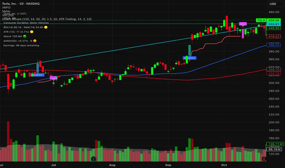
Smart WhaleOverview The Smart Whale Breakout System is a pure momentum strategy designed for Swing Traders who want to capture high-probability breakouts while managing risk with a mechanical trailing stop.
Unlike indicators that try to guess "bottoms," this system follows the "Smart Money" approach: buying strength when institutional volume enters, and riding the trend until the momentum breaks.
How it Works
1. The Entry (The Hunter) The system identifies a valid BREAKOUT signal only when four specific conditions align:
Trend Filter: Price must be above the 150 SMA. We only trade with the long-term trend.
Momentum: RSI > 50. Ensuring bulls are in control.
Volume Spike (Whale Activity): Current volume must be significantly higher than the average (Default: 1.5x). This filters out weak retail moves.
Price Action: A bullish candle closing higher than it opened.
2. The Exit (The Manager) Once in a trade, the system activates a dynamic Trailing Stop line. You never have to guess when to sell. You can choose between two exit logic modes in the settings:
ATR Trailing (Default): Adapts to volatility. The stop moves up based on a multiple of the Average True Range (ATR). Great for volatile stocks (e.g., TSLA, NVDA).
Percent Trailing: A fixed percentage drop from the highest high. (e.g., "Sell if price drops 10% from peak").
3. The Context (Optional Filter)
Squeeze Filter: Includes a built-in Bollinger/Keltner squeeze detection. If enabled in settings, the system will only signal a buy if the price recently broke out of a consolidation (squeeze). Default is OFF to catch all momentum moves.
Key Features
NO Repainting: Signals are confirmed at candle close.
Visual Risk Management: A Red Trailing Stop line clearly shows where your invalidation point is.
Fully Customizable: Adjust the Volume multiplier, ATR sensitivity, or Percentage drop to fit your asset class (Crypto/Stocks/Forex).
Clean Visuals: Only colors the Breakout and Sell candles to keep your chart clean.
Settings Guide
Trend SMA Length: Define the long-term trend baseline (Default: 150).
Volume Spike (xAvg): How much volume is needed to trigger a buy? (1.5 = 150% of average).
Exit Method: Choose between "ATR Trailing" or "Percent Trailing".
ATR Multiplier: Tighter stop (2.0) vs Looser stop (3.0).
Require Squeeze?: Check this to filter for breakouts that only happen after a consolidation period.
Disclaimer This tool is for educational purposes only. Always use proper risk management.
Trinity Real Move Detector DashboardRelease Notes (critical)
1. This code "will" require tweaks for different timeframes to the multiplier, do not assume the data in the table is accurate, cross check it with the Trinity Real Move Detector or another ATR tool, to validate the values in the table and ensure you have set the correct values.
2. I mention this below. But please understand that pine code has a limitation in the number of security calls (40 request.security() calls per script). This code is on the limit of that threshold and I would encourage developers to see if they can find a way around this to improve the script and release further updates.
What do we have...
The Trinity Real Move Detector Dashboard is a powerful TradingView indicator designed to scan multiple assets at once and show when each one has genuine short-term volatility "energy" — the kind that makes directional options trades (especially 0DTE or short-dated) have a high probability of follow-through, and can be used for swing trading as well. It combines a simple ATR-based volatility filter with a SuperTrend-style bias to tell you not only if the market is "awake" but also in which direction the momentum is leaning.
At its core, the indicator calculates the current ATR on your chosen timeframe and compares it to a user-defined percentage of the asset's daily ATR. When the short-term ATR spikes above that threshold, it signals "enough energy" — meaning the underlying is moving with real force rather than choppy noise. The SuperTrend logic then determines bullish or bearish bias, so the status shows "BULLISH ENERGY" (green) or "BEARISH ENERGY" (red) when energy is on, or "WAIT" when it's not. It also counts how many bars the energy has been active and shows the current ATR vs threshold for quick visual confirmation.
The dashboard displays all this in a clean table with columns for Symbol, Multiplier, Current ATR, Threshold, Status, Bars Active, and Bias (UP/DOWN). It's perfect for 3-minute charts but works on any timeframe — just adjust the multiplier based on the hints in the settings.
Editing symbols and multipliers is straightforward and user-friendly. In the indicator settings, you'll see numbered inputs like "1. Symbol - NVDA" and "1. Multiplier". To change an asset, simply type the new ticker in the symbol field (e.g., replace "NVDA" with "TSLA", "AVGO", or "ADAUSD"). You can also adjust the multiplier for each asset individually in the corresponding "Multiplier" field to make it more or less sensitive — lower numbers give more signals, higher numbers give stricter, higher-quality ones. This lets you customize the dashboard to your watchlist without any coding. For example, if you switch to a 4-hour chart or a slower-moving stock like AVGO, you may need to raise the multiplier (e.g., to 0.3–0.4) to avoid false "bullish" signals during minor bounces in a larger downtrend.
One important note about the multiplier and timeframes: the default values are optimized for fast intraday charts (like 3-minute or 5-minute). On higher timeframes (15-minute, 1-hour, 4-hour, or daily), the SuperTrend bias can be too sensitive with low multipliers (1.0 default in the code), leading to situations like the AVGO 4-hour example — where price is clearly downtrending, but the dashboard shows "BULLISH ENERGY" because the tight bands flip on small bounces. To fix this, you need to manually increase the multiplier for that asset (or all assets) in the settings. For 4-hour or daily charts, 0.25–0.35 is often better to match smoother SuperTrend indicators like Trinity. Always test on your timeframe and asset — crypto usually needs slightly lower multipliers than stocks due to higher volatility.
TradingView has a hard limit of 40 request.security() calls per script. Each asset in the dashboard requires several calls (current ATR, daily ATR, SuperTrend components, etc.), so with the full ATR-based bias, you can safely monitor about 6–8 assets before hitting the limit. Adding more symbols increases the number of calls and will trigger the "too many securities" error. This is a platform restriction to prevent excessive server load, and there's no official way around it in a single script. Some advanced coders use tricks like caching or lower-timeframe requests to squeeze in a few more, but for reliability, sticking to 6–8 assets is recommended. If you need more, the common workaround is to create two separate indicators (e.g., one for stocks, one for crypto) and add both to the same chart.
Overall, this dashboard gives you a professional-grade multi-asset scanner that filters out low-energy noise and highlights real momentum opportunities across stocks and crypto — all in one glance. It's especially valuable for options traders who want to avoid theta decay on weak moves and only strike when the market has true fuel. By tweaking the per-symbol multipliers in the settings, you can perfectly adapt it to any timeframe or asset behavior, avoiding issues like the AVGO false bullish signal on higher timeframes.

Nooner's Heikin-Ashi/Bull-Bear CandlesCandles are colored red and green when Heikin-Ashi and Bull/Bear indicator agree. They are colored yellow when they disagree.

Supply and Demand Zones [BigBeluga]🔵 OVERVIEW
The Supply and Demand Zones indicator automatically identifies institutional order zones formed by high-volume price movements. It detects aggressive buying or selling events and marks the origin of these moves as demand or supply zones. Untested zones are plotted with thick solid borders, while tested zones become dashed, signaling reduced strength.
🔵 CONCEPTS
Supply Zones: Identified when 3 or more bearish candles form consecutively with above-average volume. The script then searches up to 5 bars back to find the last bullish candle and plots a supply zone from that candle’s low to its low plus ATR.
Demand Zones: Detected when 3 or more bullish candles appear with above-average volume. The script looks up to 5 bars back for a bearish candle and plots a demand zone from its high to its high minus ATR.
Volume Weighting: Each zone displays the cumulative bullish or bearish volume within the move leading to the zone.
Tested Zones: If price re-enters a zone and touches its boundary after being extended for 15 bars, the zone becomes dashed , indicating a potential weakening of that level.
Overlap Logic: Older overlapping zones are removed automatically to keep the chart clean and only show the most relevant supply/demand levels.
Zone Expiry: Zones are also deleted after they’re fully broken by price (i.e., price closes above supply or below demand).
🔵 FEATURES
Auto-detects supply and demand using volume and candle structure.
Extends valid zones to the right side of the chart.
Solid borders for fresh untested zones.
Dashed borders for tested zones (after 15 bars and contact).
Prevents overlapping zones of the same type.
Labels each zone with volume delta collected during zone formation.
Limits to 5 zones of each type for clarity.
Fully customizable supply and demand zone colors.
🔵 HOW TO USE
Use supply zones as potential resistance levels where sell-side pressure could emerge.
Use demand zones as potential support areas where buyers might step in again.
Pay attention to whether a zone is solid (untested) or dashed (tested).
Combine with other confluences like volume spikes, trend direction, or candlestick patterns.
Ideal for swing traders and scalpers identifying key reaction levels.
🔵 CONCLUSION
Supply and Demand Zones is a clean and logic-driven tool that visualizes critical liquidity zones formed by institutional moves. It tracks untested and tested levels, giving traders a visual edge to recognize where price might bounce or reverse due to historical order flow.

Universe PACut through the noise: The "Universe PA" Strategy
You don't need to get lost in thousands of complex terms like Order Flow, PO3, or Judas Swing. This indicator is based on the purest and most effective form of Price Action: Simplicity.
The Core Philosophy: While many traders focus on old history, the real opportunity lies in the last valid break (BOS). We call this the "Magic Line". The key is the Supply/Demand zone that caused that specific break.
Key Features:
Magic Line (BOS): Automatically marks the level where structure is broken.
Auto Supply & Demand Zones: Identifies the origin of the move (Order Block) that caused the break and draws a zone.
Smart Clean: Keeps your chart clean by automatically removing old/invalid zones, focusing only on the latest opportunity.
Entry Signals: Detects Pinbar (P) and Engulfing (E) patterns to help you time your entry perfectly within the zones.
How to Use:
Identify the "Magic Line" break and the Zone on higher timeframes (e.g., H4).
Wait for price to return (retest) to the Zone.
Look for "P" or "E" signals inside the zone for confirmation.
Simplicity pays.

NIFTY RENKO OPTION CE/PENIFTY RENKO OPTION CE/PE ek non-repainting intraday Renko-based option direction indicator hai jo price action + money flow ko combine karke CE / PE buy signals generate karta hai.

Confluence Signal Intelligence Indicators (CSI Indicators)CSI - Confluence Signal Intelligence is a dual-oscillator analysis tool that combines two specialized indicators in a single pane. It provides visibility into cycle exhaustion and statistical deviation conditions to help identify potential turning points.
The Two Oscillators
CEI - Cycle Exhaustion Index (Upper Section)
CEI measures where price sits within its recent cycle range and detects momentum depletion states. It identifies moments when a move has stretched beyond typical levels, which historically have preceded mean-reversion.
Normalized range from -1.0 to +1.0
Configurable exhaustion thresholds
Reversal signals (REV) when extreme zones begin turning
Cycle wave overlay showing peak/trough phases
Stepped confluence indicator between sections
PRG - PDF Reversal Gauge (Lower Section)
PRG applies statistical transforms across multiple timeframes to measure deviation from price norms. It combines readings from primary and secondary periods to create a confluence assessment.
Multi-period analysis for timing and confirmation
Strong Confluence (SC) signals at statistical extremes
Confluence scoring when multiple periods align
Deviation bars showing distance from mean
Signal Types
CEI Signals:
REV - Reversal signal when exhaustion zone begins turning
Triangle markers - Entry into exhaustion zones
X markers - Extreme exhaustion levels
PRG Signals:
SC - Strong Confluence signal when threshold met
Triangle markers - Standard reversal signals
Diamond markers - Multi-period confluence alignment
Visual Design
The pane is divided into two distinct sections with a separator line:
Upper Section (CEI) - Cycle analysis with area fill and confluence stepping
Lower Section (PRG) - Statistical gauge with deviation bars
Color Coding - Gold for strong confluence, Green/Red for direction, Gray for neutral
Zone Backgrounds - Shaded areas marking overbought/oversold regions
Information Table - Real-time values, zones, confluence scores, and signals for both oscillators
Configuration
CEI Settings:
Cycle period and exhaustion lookback
Signal smoothing and sensitivity
Upper/lower exhaustion thresholds
Extreme level definition
PRG Settings:
Primary and secondary periods
Smoothing and extreme threshold
Confluence sensitivity
Strong confluence threshold
Multi-period confluence toggle
Layout Settings:
Adjustable vertical positioning
Independent scale factors for each oscillator
Separator position control
Alert Conditions
CEI Alerts - Bull/Bear reversals, extreme exhaustion levels
PRG Alerts - Strong confluence buy/sell, standard reversals
Combined Alerts - Both oscillators signaling together, strong combined confluence
Companion Indicator
CSI - Confluence Signal Intelligence is the main chart overlay that generates BUY/SELL signals with confidence classifications (HIGH/MEDIUM/LOW). This oscillator pane is designed to work alongside it, showing the cycle and statistical dynamics that contribute to signal generation.
When using both together:
Main CSI provides analytical signals directly on the price chart
This pane reveals the underlying CEI and PRG oscillator states
Aligned readings across both indicate stronger confluence
Reading the Pane
For potential long setups:
CEI in lower exhaustion zone (OS) and rising
PRG in oversold territory and turning up
REV or SC labels appearing
Both oscillators showing elevated confluence scores
For potential short setups:
CEI in upper exhaustion zone (OB) and falling
PRG in overbought territory and turning down
REV or SC labels appearing
Both oscillators showing elevated confluence scores
The oscillators may not signal on the exact same bar. When readings cluster within a few bars, this suggests developing conditions that warrant attention.
Risk Disclosure
This indicator measures technical conditions—not future price direction. Confluence scores represent analytical assessments based on statistical deviation and cycle position, not guarantees of market movement. All trading involves substantial risk of loss. Use this tool alongside your own analysis and proper risk management. No indicator can predict future price movements with certainty.
---
## AUTHOR'S INSTRUCTIONS:
```
To request access to CSI - Confluence Signal Intelligence , please send a private message or visit frontieralgo.com/tradingview.
For best results, use alongside the main CSI overlay on the price chart.

Confluence Signal Intelligence (CSI)CSI - Confluence Signal Intelligence is a professional-grade analytical overlay that evaluates market conditions across multiple dimensions simultaneously. Rather than relying on a single indicator, CSI synthesizes multiple evidence factors and classification models into unified BUY/SELL signals with confidence classifications.
What It Does
CSI identifies potential reversal zones by detecting when multiple independent analytical components align in the same direction. Each signal displays a confidence classification:
HIGH - Strong multi-factor alignment (Gold labels)
MEDIUM - Moderate factor alignment
LOW - Limited factor alignment
Important : The confidence level measures analytical consensus—not a prediction of trade outcome. A HIGH reading means multiple components agree on directional bias at that moment, not that the trade will be profitable.
Multi-Factor Analysis
The classification system evaluates conditions across several categories:
Statistical Extremes - Normalized price transforms that identify stretched conditions
Momentum Indicators - Multiple oscillators confirming oversold/overbought states
Cycle Analysis - Gauges measuring exhaustion and potential turning points
Trend Alignment - Multi-timeframe directional agreement
Market Structure - Break of Structure events and swing point analysis
Pattern Classification - Models comparing current conditions to historical setups
Volume Analysis - Confirming directional moves with participation
Divergence Detection - Price/momentum disagreements across multiple oscillators
Classification Components
CSI incorporates multiple classification models (KNN, gradient boosting approximation, perceptron) that analyze current market conditions against historical patterns. These models contribute to the overall confidence assessment by identifying setups with characteristics similar to past formations.
Smart Money Concepts
The indicator includes institutional trading concepts:
Break of Structure (BOS) - Markers when price violates significant swing points
Order Blocks - Potential support/resistance zones based on price structure
Fair Value Gaps (FVG) - Price imbalances that may act as future reference points
Regime Detection - Background coloring distinguishing trending vs. ranging conditions
Key Features
Non-Repainting Mode - Optional bar-close confirmation prevents signal changes on the current bar
Adaptive Thresholds - Automatically adjusts sensitivity based on market volatility
Signal Filtering - Option to hide LOW confidence signals to reduce noise
Configurable Cooldown - Minimum bars between signals to prevent overtrading
Comprehensive Dashboard - Real-time display of key metrics and states
Trend EMAs - 20/50/200 period moving averages for context
Extensive Alerts - Conditions for signals, structure breaks, divergences, and more
Intended Use
CSI is designed as a decision-support tool for traders conducting their own analysis. It identifies moments of technical alignment that may warrant further investigation—it does not guarantee profitable outcomes. Market results depend on numerous variables beyond any single analytical tool.
The indicator works across all markets and timeframes.
Companion Indicator
CSI - Confluence Signal Intelligence is published separately and displays the underlying oscillators in their own pane:
CEI (Cycle Exhaustion Index) - Cycle position and momentum depletion measurement
PRG (PDF Reversal Gauge) - Statistical deviation scoring
When used together, the main CSI overlay provides signals on the chart while the oscillator pane offers visibility into the cycle and reversal dynamics contributing to those signals.
Risk Disclosure
This indicator is an analytical tool—not financial advice. Past performance does not guarantee future results. All trading involves substantial risk of loss. Confidence levels reflect internal model agreement only and should be considered alongside broader market context, your own analysis, and sound risk management practices. No indicator can predict future price movements with certainty.
---
## AUTHOR'S INSTRUCTIONS:
```
To request access to CSI - Confluence Signal Intelligence, please visit frontieralgo.com/tradingview or send a private message.

COT Index by thedatalayers.comThe COT Index transforms the weekly COT net positions of Commercial traders into a normalized mathematical model.
Instead of displaying raw net positioning, the COT Index processes the data through a cyclical normalization algorithm (commonly using a 26-week or alternatively a 52-week cycle).
This makes it easier to identify bullish or bearish extremes in Commercial activity.
The index is plotted as a color-coded line:
• Green Zone - Commercials are mathematically classified as bullish.
Historically, bullish Commercial positioning often aligns with upward market pressure.
• Red Zone - Commercials are mathematically classified as bearish.
This typically corresponds with increased downward pressure in the underlying market.
• Neutral Zone - Neither bull nor bear dominance; positioning is mid-range.
Since COT data is published only once per week and the COT Index is built on cyclical multi-week analysis, the indicator is intended to be used exclusively on the weekly timeframe.
Using lower timeframes will not reflect the structure of the data accurately.
The selected cycle length (typically 26 weeks, optionally 52 weeks) determines how net positions are compared and normalized, and can influence how quickly extreme zones appear.
The COT Index provides an objective way to interpret Commercial trader sentiment and to identify potential directional bias in the market.

COT Net Positions by thedatalayers.comCOT Net Positions by thedatalayers.com visualizes the net positioning of different trader groups based on the weekly Commitments of Traders (COT) reports published by the CFTC every Friday.
The indicator processes the raw COT data by calculating Long positions minus Short positions for each trader category. This results in the net position of every group per report.
The script then plots these net positions continuously over time, based on every available COT release. This creates a clear and easy-to-read visualization of how different market participants are positioned.
The indicator displays the three primary COT categories:
• Commercials
• Non-Commercials
• Non-Reportables
By observing how these trader groups shift their positioning, traders can better understand market sentiment and identify potential directional biases or changes in underlying market pressure.
This tool is designed to help traders incorporate positioning data into their analysis and to better interpret how institutional and speculative flows evolve over time.
This indicator is intended to be used exclusively on the weekly timeframe.
COT data is published once per week by the CFTC and therefore only updates weekly.
Using this script on lower timeframes may result in misleading visualization or irregular spacing between data points.
For correct interpretation, please apply it on 1W charts only.

Dragon Smart Detector [Sentiment & Flow HUD]Dragon Smart Detector is a professional-grade contextual analysis tool designed to answer the most critical questions in trading: "Is the market driven by Fear or Greed?", "Is Smart Money stepping in?", and "Is the current breakout genuine?".
Instead of lagging indicators or simple buy/sell arrows, this tool provides a Head-Up Display (HUD) that analyzes the internal dynamics of price and volume in real-time.
1. 🧠 How It Works (The Core Logic)
This indicator combines technicals and fundamentals into four distinct metrics:
A. Market Sentiment (The Mood)
Quantifies crowd psychology using a hybrid algorithm of RSI (14) and Bollinger Bands.
EXTREME FOMO 🔥 (Red): Price is overextended beyond the upper band with high RSI. Indicates the crowd is euphoric. Risk Level: High.
EXTREME FEAR 😱 (Cyan): Price is panicking below the lower band with low RSI. Often marks a potential reversal bottom (Capitulation).
GREED / ANXIETY: Intermediate states of the market.
B. Volume Winner & Flow (The Battle)
Since accurate "Order Flow" data is not universal across all feeds, this script uses Price Spread Analysis to estimate aggressive pressure.
BULLS: Close price is near the High of the candle $\rightarrow$ Accumulation/Buying Pressure.
BEARS: Close price is near the Low of the candle $\rightarrow$ Distribution/Selling Pressure.
Flow Display: Shows the estimated percentage of Buying vs. Selling volume for the current session.
C. Volume Strength (RVOL)
Relative Volume compares the current volume against the 20-period simple moving average.
1.0x: Average volume.
> 2.0x (Orange): Volume is double the average. Significant activity.
> 3.0x (Pink/Magenta): Institutional Activity. Massive volume spike indicating Smart Money participation.
D. Float Rotation (The "Dragon" Metric)
Calculates what percentage of the company's available shares have been traded today.
Smart Data Fetch: The script automatically attempts to load FLOAT_SHARES. If unavailable (common with ETFs or some Indices), it intelligently switches to TOTAL_SHARES as a backup.
Why it matters: High rotation (e.g., > 2%) accompanied by a price increase suggests a massive changing of hands, often validating a strong breakout.
2. 🎯 How to Trade (Strategy Guide)
Scenario 1: The "Dragon Breakout" (Momentum)
Condition: Price is breaking a key resistance level.
Check HUD:
WINNER: Must be BULLS.
VOL STRENGTH: Should be > 1.5x (Orange) or > 3.0x (Pink).
ROTATION: High rotation confirms the breakout is supported by fresh demand.
Action: Enter the trade with confidence.
Scenario 2: The "Capitulation Buy" (Reversal)
Condition: Price is dropping sharply.
Check HUD:
SENTIMENT: Must show EXTREME FEAR 😱 (Cyan).
WINNER: Wait for the "Winner" status to flip from BEARS to BULLS (indicating a wick/rejection of lows).
Action: Look for long entries or reversal patterns.
Scenario 3: The "FOMO Trap" (Risk Management)
Condition: Price is rallying, but you are late to the party.
Check HUD:
SENTIMENT: Shows EXTREME FOMO 🔥.
FLOW: Shows BEARS winning (selling into strength/wicks).
Action: Do NOT buy. Tighten stop-losses or take partial profits.
3. ⚙️ Settings & Features
Smart Backup Data: Automatically handles N/A data for NASDAQ/NYSE tickers (like TSLA, NVDA) by switching data sources.
Manual Float: Allows you to manually input share count (in Millions) for penny stocks or local markets where data is missing.
Minimalist Mode: Hides Fundamental rows (Float/Rotation) if you only want to see Sentiment and Flow.
Visuals: Modern Neon/Borderless interface designed for dark mode charts.
Disclaimer
This indicator is for educational and informational purposes only. "Volume Flow" and "Winner" are estimates based on Price Action logic, not Level 2 data. Fundamental data relies on TradingView's financial database. Past performance does not guarantee future results.
Tip: Add this to your favorites ⭐️ and boost 🚀 if you find it useful in your daily trading!

Pre-Market Gap %Helps identify Pre Market Gap %. If Blue line is above the green dotted line, this indicates the stock is gapping up as its >1%. If the Blue line is below the dotted Red then this indicates the stock will gap down on open.

Swing Elite Valuation ToolSwing Elite Macro Valuation
This indicator provides intermarket valuation analysis by measuring how an asset is priced relative to key macroeconomic instruments. Rather than analyzing price in isolation, it contextualizes current levels against bonds, the dollar, and gold — the three pillars of macro market structure.
The Concept Behind Macro Valuation
Assets don't move in a vacuum. Equities, commodities, and currencies maintain dynamic relationships with macro instruments. When the S&P 500 rises while bonds (ZB1) also rally, that's a different signal than when stocks rise while bonds sell off. Similarly, an asset's relationship to the dollar index (DXY) and gold (GC1) reveals whether price moves reflect genuine strength or simply dollar weakness.
This indicator quantifies these relationships by normalizing relative performance into a 0-100 scale, making it easy to identify when an asset is historically overvalued or undervalued relative to macro conditions.
How Valuation Is Calculated
The indicator computes a ratio between the charted asset and each comparison instrument, then normalizes this ratio as a percentage move from a historical baseline. Two modes are available: Short-term mode captures recent sentiment shifts and is useful for tactical positioning, while Long-term mode evaluates deeper macro positioning for swing trades and portfolio decisions.
The normalized reading places current valuation within historical context. A reading near 88+ suggests the asset is overvalued relative to that macro instrument — price has extended beyond typical ranges. Readings below 10 indicate undervaluation, where the asset may be oversold relative to macro conditions.
Dynamic vs Manual Thresholds
Users can select between manual threshold levels or automatic dynamic bands. Auto-levels calculate overvalued and undervalued zones using standard deviation from the mean, adapting to each asset's historical volatility. Manual mode allows fixed thresholds for traders who prefer consistent reference points across different instruments.
Multi-Instrument Flexibility
While defaults include ZB1 (30-year Treasury futures), DXY (dollar index), and GC1 (gold futures), any symbol can be substituted. This allows analysis against silver, currency futures, sector ETFs, or any instrument relevant to your trading thesis. Each comparison instrument displays independently with color-coded status: readings in overvalued territory appear red, undervalued zones show green, and neutral conditions display blue.
Practical Application
This tool serves traders who incorporate intermarket analysis into their decision-making. When an asset shows overvalued readings against multiple macro instruments simultaneously, it suggests price has extended relative to the broader macro environment — a potential mean reversion setup. Conversely, undervaluation across multiple macro comparisons can highlight value opportunities where price hasn't kept pace with supportive macro conditions.
The dashboard table provides at-a-glance status for each comparison, while alert conditions enable notifications when valuation crosses key thresholds.

KRIPTANO SHORT SNIPERИндикатор для поиска точек входа в SHORT после резких ценовых движений на криптовалютном рынке.
Возможности
Детектор пампа: автоматическое выявление скачков цены на интервалах 15m, 30m, 1h с настраиваемыми порогами
Уровни сопротивления: динамические линии с 7 таймфреймов (5m-1W) с автоудалением после пробития
Volume Profile: распределение объема по ценовым уровням с профилем настроений (бычьи/медвежьи зоны)
KRIPTANO SHORT SNIPER
Indicator for finding SHORT entry points after sharp price movements in the cryptocurrency market.
Features
Pump Detector: automatic detection of price spikes on 15m, 30m, 1h intervals with customizable thresholds
Resistance Levels: dynamic lines from 7 timeframes (5m-1W) with auto-removal after breakout
Volume Profile: volume distribution across price levels with sentiment profile (bullish/bearish zones)
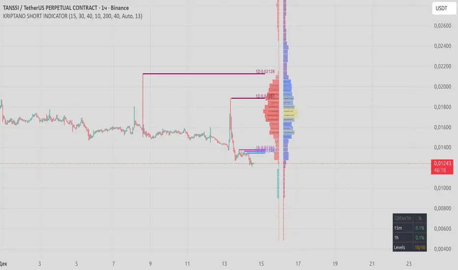
KRIPTANO ISHORT HUNTERИндикатор для поиска точек входа в SHORT после резких ценовых движений на криптовалютном рынке.
Возможности
Детектор пампа: автоматическое выявление скачков цены на интервалах 15m, 30m, 1h с настраиваемыми порогами
Уровни сопротивления: динамические линии с 7 таймфреймов (5m-1W) с автоудалением после пробития
Volume Profile: распределение объема по ценовым уровням с профилем настроений (бычьи/медвежьи зоны)
KRIPTANO SHORT HUNTER
Indicator for finding SHORT entry points after sharp price movements in the cryptocurrency market.
Features
Pump Detector: automatic detection of price spikes on 15m, 30m, 1h intervals with customizable thresholds
Resistance Levels: dynamic lines from 7 timeframes (5m-1W) with auto-removal after breakout
Volume Profile: volume distribution across price levels with sentiment profile (bullish/bearish zones)

MinsenTTS 2.0Minsen Trend Tracking System 2.0 (MinsenTTS 2.0)
明心鉴己 · 顺势而为
-------------------------------
“Minsen (明心道动)” 取自 “明心见性,道动为术”,是我作为一个独立交易者,对自己交易体系的一次完整梳理与输出。
交易做久了,我发现最难的不是技术,而是心性。所谓的 “明心”,不仅仅是看清行情,更是认清自己。是在面对市场的诱惑与恐慌时,能否诚实地执行自己制定好的原则,不侥幸、不自欺欺人。
MinsenTTS 2.0 就是基于这个初衷设计的辅助工具。我希望它能像一面镜子,客观地反映市场的真实状态,帮你在混沌中保持清醒,让你的每一次决策,都符合你内心的原则。
-------------------------------
我的设计理念
这套系统的核心,融合了我对“反者道动,弱者道用”的理解,旨在解决我们在交易中常遇到的三个难题:
1. 关于“明心”(去噪与自律):
市场里充满了噪音,很容易让人迷失。系统通过算法过滤掉了那些无效的波动,只呈现最核心的趋势。这不仅是为了看清盘面,更是为了让你在面对杂乱K线时,能守住自己的交易纪律,不被情绪左右。
2. 关于“顺势”(多维共振):
我们常说顺势,但什么是势?真正的趋势是动能、量能与结构的共鸣。这套系统不依赖单一信号,只有当市场的多个维度达成“共识”时,它才会确认趋势。顺势而为,才能让交易变得简单。
3. 关于“弱者道用”(柔弱与保全):
老子讲“柔弱胜刚强”。在交易中,承认自己的渺小,不与市场硬碰硬,才是长存之道。当行情极度亢奋、看似最强劲时,往往内部结构最为脆弱。系统内置的**“极值防御”**机制,就是帮你避开这种“盛极而衰”的锋芒。我们不争一时的暴利,而是求得资金在长周期里的安稳与复利。
-------------------------------
**特别说明:关于“诚实”与“不重绘”
既然讲“明心”,最基本的就是不自欺,也不欺人。
我特别反感市面上那种为了“好看”而作弊的指标。它们最恶心的地方在于:行情走完之后,回头在历史最高点补一个“卖出”,在最低点补一个“买入”。乍一看简直是神级预测,但在实盘的那个当下,信号根本不存在,你永远无法在那个位置成交。
MinsenTTS 2.0 严守底线,绝不使用未来函数,绝不重绘。 我们拒绝为了美化历史业绩而欺骗用户,更不会为了让指标看起来“神准”而扭曲数据的真实性。
所有的信号一旦在当前K线收盘确认,就永久固定,绝不会消失或漂移。哪怕是错误的信号,也会诚实地留在图表上。因为只有面对真实的(哪怕是不完美的)历史,我们才能进行有效的复盘,做出对自己负责的决策。
-------------------------------
Minsen 指标生态:左侧与右侧的配合
MinsenTTS 2.0 专注于右侧趋势追踪(趋势确立后的跟随)。为了获得更完整的视角,建议结合我的另一款指标 MinsenAMRS 使用:
* MinsenAMRS:负责左侧预警,在趋势反转前夕提供信号。
* MinsenTTS:负责右侧确认,在趋势确立后提供跟随依据。
心得分享:当 AMRS 提示反转风险,随后 TTS 确认趋势进入“萌芽期”或“发展期”,这种“左侧预警 + 右侧确认”的结合,往往能提供更高质量的观察窗口。
-------------------------------
图表元素解读:如何使用这套工具
为了还你一个清爽的盘面,系统将繁杂的数据处理转化为直观的视觉元素。以下是你默认可见的内容,建议按这个顺序来观察市场:
1. 🌊 智能趋势色带 (Smart Trend Band)
这是最直观的视觉参考,代表了市场阻力最小的方向。
颜色:绿色代表多头(上涨),红色代表空头(下跌)。
形态:色带越宽,说明趋势劲头越足;色带变窄,说明动能减弱。
衰竭提示:当色带边缘出现橙色轮廓,意味着趋势进入“衰竭期”。虽然价格可能还在惯性运行,但这提示你内部动能已经背离,这时候应该警惕风险,而不是盲目乐观。
(注:本系统采用国际主流配色:绿涨红跌)
2. 🏷️ 市场状态标记 (State Markers)
系统在关键节点会给出图标,作为你观察行情的窗口。
“多” / “空” 标签:代表市场状态发生了高胜率的切换(比如从震荡转为趋势)。这通常是趋势启动或重启的节点,值得你重点关注。
小三角图标 (△/▽):趋势延续标记。当趋势在发展中出现良性回调,并再次顺势突破时,系统会标记这个图标,提示趋势结构依然完整。
3. 🟨 横盘识别背景 (Consolidation Filter)
视觉表现:图表背景出现淡黄色区域。
含义:系统识别到市场进入了低波动或无序的横盘整理。
建议:在这片区域,趋势策略很容易失效。黄色的背景不仅是警示灯,更是资金的保护罩。它提醒你当前处于“垃圾时间”,避免在无序波动中反复磨损本金。
4. 📊 市场情报面板 (Info Table)
右下角的面板是对当前K线的全方位“体检”,帮你把感性的盘感量化为数据:
趋势 (Trend):强势/中等/弱势。注:此项仅代表动能的级别,不代表涨跌方向。
评分 (Score):0-100分。分数越高,代表动能、量能与结构的共振度越高。
阶段 (Stage):告诉你当前处于“萌芽、发展、加速”还是“衰竭”期。
置信度 (Confidence):算法对当前判断的把握有多大。
方向 (Direction):明确指出是“↗上涨”、“↘下跌”还是“震荡”。
市况 (State):定性判断是“趋势”还是“横盘”。
效率 (Efficiency):“高效”代表K线走得干脆利落;“低效”代表锯齿多、磨人。
5. 🚧 动态支撑与阻力 (Dynamic S/R Lines)
视觉表现:图表中延伸出的红色虚线与绿色虚线。
含义:这是系统自动筛选出的筹码密集区。红色虚线是潜在阻力,绿色虚线是潜在支撑。这些位置往往是价格可能停顿或测试的地方,做交易计划时可以作为客观参考。
-------------------------------
写在最后
工具是死的,人是活的。
MinsenTTS 2.0 只是一个辅助你观察市场的工具,它无法消除市场的不确定性,更不能替你做决定。
真正的交易决策,应该来自于你对自己交易系统的坚持,和对风险的敬畏。希望这个工具能帮你省去繁琐的计算,让你在看盘时,心里更明亮,决策更坚定。
明心鉴己,顺势而为。
-------------------------------
免责声明:本指标仅用于技术分析与市场观察,不构成任何具体的投资建议。金融市场风险巨大,请用户结合自身情况独立决策。
=========English Version=========
Minsen Trend Tracking System 2.0 (MinsenTTS)
Reflect on the Self · Flow with the Trend
-------------------------------
"Minsen" (明心道动) is derived from the philosophy of "Clarifying the Mind to see one's Nature, and acting through the movement of the Tao." It represents a complete consolidation and output of my personal trading system as an independent trader.
After trading for a long time, I realized that the hardest part is not the technique, but the mindset (psychology). "Clarifying the Mind" isn't just about seeing the market clearly; it's about seeing yourself clearly. It is about whether you can honestly execute your principles without luck-seeking or self-deception when facing the market's temptations and panic.
MinsenTTS 2.0 was designed as an auxiliary tool with this original intention. I hope it serves as a mirror, objectively reflecting the true state of the market, helping you stay clear-headed amidst the chaos, ensuring every decision aligns with your inner principles.
-------------------------------
My Design Philosophy
The core of this system integrates my understanding of "Reversal is the movement of the Tao; Weakness is the usage of the Tao." It aims to solve three common challenges we face in trading:
On "Clarifying the Mind" (De-noising & Discipline):
The market is full of noise that leads people astray. The system uses algorithms to filter out invalid fluctuations, presenting only the core trend. This is not just to see the chart clearly, but to help you maintain your trading discipline and remain unaffected by emotions when facing messy price action.
On "Flowing with the Trend" (Multi-dimensional Confluence):
We often talk about following the trend, but what is the "trend"? A true trend is the resonance of Momentum, Volume, and Structure. This system does not rely on a single signal; it only confirms a trend when multiple dimensions of the market reach a "consensus." Following the trend makes trading simple.
On "The Way of Weakness" (Yielding & Preservation):
Laozi said, "The soft and weak overcome the hard and strong." In trading, acknowledging one's insignificance and not fighting the market head-on is the way to survive. When the market is extremely euphoric and appears strongest, its internal structure is often the most fragile. The system's built-in "Extremes Defense" mechanism helps you avoid this "sharp edge" of exhaustion. We do not strive for momentary explosive profits, but seek the safety and compounding of capital over the long cycle.
-------------------------------
Special Note: On "Honesty" & "Non-Repainting"
Since we speak of "Clarifying the Mind," the most basic requirement is not to deceive oneself or others.
I have a strong aversion to indicators on the market that cheat just to "look good." The most disgusting part is how they operate: after the market moves, they go back and paint a "Sell" at the historical high and a "Buy" at the low. At first glance, it looks like a god-tier prediction, but in the reality of live trading, that signal did not exist, and you could never have executed that trade.
MinsenTTS 2.0 strictly holds the line: No Future Functions, No Repainting.
We refuse to deceive users to beautify historical performance, and we certainly will not distort the authenticity of the data just to make the indicator look "magical."
All signals are permanently fixed once the current candle closes. They will never vanish or drift. Even incorrect signals will honestly remain on the chart. Because only by facing real (even if imperfect) history can we conduct effective reviews and make responsible decisions.
-------------------------------
The Minsen Ecosystem: Left & Right Side Synergy
MinsenTTS 2.0 focuses on Right-side Trend Tracking (following after the trend is established). For a more complete perspective, it is recommended to combine it with my other indicator, MinsenAMRS:
MinsenAMRS: Responsible for Left-side Warning, providing signals on the eve of a trend reversal.
MinsenTTS: Responsible for Right-side Confirmation, providing the basis for following the trend after it is established.
Trader's Insight: When AMRS alerts to reversal risks, and subsequently TTS confirms the trend entering the "Germination" or "Development" stage, this combination of "Left-side Warning + Right-side Confirmation" often provides a higher-quality observation window.
-------------------------------
Chart Elements: How to Use This Tool
To return a clean chart to you, the system transforms complex data processing into intuitive visual elements. Here is the default content, and I suggest observing the market in this order:
1. 🌊 Smart Trend Band
This is the most intuitive visual reference, representing the path of least resistance.
Color: Green represents Bulls (Up), Red represents Bears (Down).
Shape: A wider band indicates strong momentum; a narrowing band indicates weakening momentum.
Exhaustion Alert: When an Orange Outline appears on the edge of the band, it means the trend has entered the "Exhaustion Phase." Although the price may still run on inertia, this warns you that internal momentum has diverged. You should be alert to risks rather than blindly optimistic.
(Note: This system uses the international color standard: Green for Up, Red for Down).
2. 🏷️ Market State Markers
The system provides icons at key nodes as windows for observing price action.
"Long" / "Short" Labels: Represent a high-probability switch in market state (e.g., from ranging to trending). These are usually the starting or restarting points of a trend and are worth your focus.
Small Triangle Icons (△/▽): Trend Continuation Markers. When a trend experiences a healthy pullback during development and breaks through again with the trend, the system marks this icon, suggesting the trend structure remains intact.
3. 🟨 Consolidation Filter (Range Background)
Visual: A pale yellow area appears in the chart background.
Meaning: The system has identified that the market has entered low-volatility or disordered sideways consolidation.
Advice: In this area, trend strategies are prone to failure. The yellow background is not just a warning light; it is a Capital Protection Shield. It reminds you that you are in "Junk Time"—avoid grinding down your principal in disordered fluctuations.
4. 📊 Market Info Table
The panel in the bottom right corner performs a comprehensive "Health Check" on the current candle, quantifying intuitive market feel into data:
Trend: Strong / Mid / Weak. Note: This represents the level of momentum, not the direction.
Score: 0-100. The higher the score, the higher the Confluence of momentum, volume, and structure.
Stage: Tells you if the trend is in "Germination," "Development," "Acceleration," or "Exhaustion."
Confidence: How confident the algorithm is in the current judgment.
Direction: Clearly indicates "↗ Up", "↘ Down", or "Range".
State: Qualitative judgment of "Trend" vs. "Consolidation".
Efficiency: "High" means the price action is clean and decisive; "Low" means it is choppy and grinding.
5. 🚧 Dynamic S/R Lines (Support & Resistance)
Visual: Red and Green dashed lines extending from the chart.
Meaning: These are dense volume zones automatically filtered by the system. Red dashed lines are potential Resistance; Green dashed lines are potential Support. These are locations where price is likely to pause or test, serving as objective references for your trading plan.
-------------------------------
Final Words
Tools are static; humans are dynamic.
MinsenTTS 2.0 is merely a tool to assist your market observation. It cannot eliminate market uncertainty, nor can it make decisions for you.
True trading decisions should come from your adherence to your own trading system and your reverence for risk. I hope this tool saves you from tedious calculations, making your mind clearer and your decisions firmer when watching the market.
Reflect on the Self, Flow with the Trend.
-------------------------------
Disclaimer: This indicator is for technical analysis and market observation only and does not constitute specific investment advice. Financial markets carry significant risks; please make independent decisions based on your own circumstances.
