Arbitrage Detector [LuxAlgo]The Arbitrage Detector unveils hidden spreads in the crypto and forex markets. It compares the same asset on the main crypto exchanges and forex brokers and displays both prices and volumes on a dashboard, as well as the maximum spread detected on a histogram divided by four user-selected percentiles. This allows traders to detect unusual, high, typical, or low spreads.
This highly customizable tool features automatic source selection (crypto or forex) based on the asset in the chart, as well as current and historical spread detection. It also features a dashboard with sortable columns and a historical histogram with percentiles and different smoothing options.
🔶 USAGE
Arbitrage is the practice of taking advantage of price differences for the same asset across different markets. Arbitrage traders look for these discrepancies to profit from buying where it’s cheaper and selling where it’s more expensive to capture the spread.
For begginers this tool is an easy way to understand how prices can vary between markets, helping you avoid trading at a disadvantage.
For advanced traders it is a fast tool to spot arbitrage opportunities or inefficiencies that can be exploited for profit.
Arbitrage opportunities are often short‑lived, but they can be highly profitable. By showing you where spreads exist, this tool helps traders:
Understand market inefficiencies
Avoid trading at unfavorable prices
Identify potential profit opportunities across exchanges
As we can see in the image, the tool consists of two main graphics: a dashboard on the main chart and a histogram in the pane below.
Both are useful for understanding the behavior of the same asset on different crypto exchanges or forex brokers.
The tool's main goal is to detect and categorize spread activity across the major crypto and forex sources. The comparison uses data from up to 19 crypto exchanges and 13 forex brokers.
🔹 Forex or Crypto
The tool selects the appropriate sources (crypto exchanges or forex brokers) based on the asset in the chart. Traders can choose which one to use.
The image shows the prices and volumes for Bitcoin and the euro across the main sources, sorted by descending average price over the last 20 days.
🔹 Dashboard
The dashboard displays a list of all sources with four main columns: last price, average price, volume, and total volume.
All four columns can be sorted in ascending or descending order, or left unsorted. A background gradient color is displayed for the sorted column.
Price and volume delta information between the chart asset and each exchange can be enabled or disabled from the settings panel.
🔹 Histogram
The histogram is excellent for visualizing historical values and comparing them with the asset price.
In this case, we have the Euro/U.S. Dollar daily chart. As we can see, the unusual spread activity detected since 2016, with values at or above 98%, is usually a good indication of increased trader activity, which may result in a key price area where the market could turn around.
By default, the histogram has the gradient and smoothing auto features enabled.
The differences are visible in the chart above. On top is an adaptive moving average with higher values for unusual activity. At the bottom is an exponential moving average with a length of 9.
The differences between the gradient and solid colors are evident. In the first case, the colors are in sync with the data values, becoming more yellow with higher values and more green with lower values. In the second case, the colors are solid and only distinguish data above or below the defined percentiles.
🔶 SETTINGS
Sources: Choose between crypto exchanges, forex brokers, or automatic selection based on the asset in the chart.
Average Length: Select the length for the price and volume averages.
🔹 Percentiles
Percentile Length: Select the length for the percentile calculation, or enable the use of the full dataset. Enabling this option may result in runtime errors due to exceeding the allotted resources.
Unusual % >: Select the unusual percentile.
High % >: Select the high percentile.
Typical % >: Select the typical percentile.
🔹 Dashboard
Dashboard: Enable or disable the dashboard.
Sorting: Select the sorting column and direction.
Position: Select the dashboard location.
Size: Select the dashboard size.
Price Delta: Show the price difference between each exchange and the asset on the chart.
Volume Delta: Show the volume difference between each exchange and the asset on the chart.
🔹 Style
Unusual: Enable the plot of the unusual percentile and select its color.
High: Enable the plot of the high percentile and select its color.
Typical: Enable the plot of the typical percentile and select its color.
Low: Select the color for the low percentile.
Percentiles Auto Color: Enable auto color for all plotted percentiles.
Histogram Gradient: Enable the gradient color for the histogram.
Histogram Smoothing: Select the length of the EMA smoothing for the histogram or enable the Auto feature. The Auto feature uses an adaptive moving average with the data percent rank as the efficiency ratio.
Statistical

RunRox - Pairs Screener📊 Pairs Screener is part of our premium suite for pair trading.
This indicator is designed to scan and rank the most profitable and optimal pairs for the Pairs Strategy. The screener can backtest multiple metrics on deep historical data and display results for many pairs against one base asset at the same time.
This allows you to quickly detect market inefficiencies and select the most promising pairs for live trading.
HOW DOES THIS STRATEGY WORK⁉️
The core idea of the strategy is described in detail in our main indicator Pairs Strategy from the same product line.
There you can find a full explanation of the concept, the math behind pair trading, and the internal logic of the engine.
The Pairs Screener is built on top of the same core technology as the main indicator and uses the same internal logic and calculations.
It is designed as a key companion tool to the main strategy: it helps you find tradeable pairs, evaluate current deviations, sort and filter lists of candidates, and much more. All of these features will be described in this post.
✅ KEY FEATURES
More than 400+ assets available for scanning
Forex assets
Crypto assets
Lower Timeframe Backtester Strategy support
Invert signals mode
Hedge Coefficient (position size balancing between both legs)
6 hedge modes
Stop Loss support
Take Profit support
Whitelist with your own custom asset list
Blacklist to exclude unwanted assets
Custom filters
12 tracking metrics for pair evaluation
Customizable alerts
And many other tools for fine-tuning your search
The screener runs backtests simultaneously across a large number of assets and calculates metrics automatically.
This helps you very quickly find pairs with strong structural relationships or current inefficiencies that can be used as the basis for your pair trading strategies.
⚙️ MAIN SETTINGS
The first section controls the core parameters of the screener: Score, correlation, asset groups for scanning, and other base settings. All major crypto and forex symbols are embedded directly into the screener.
Since there are more than 400 assets, it is technically impossible to analyze everything at once, so we grouped them into batches of 40 assets per group.
The workflow is simple:
Open the chart of the asset you want to use as the base ticker.
In the screener settings choose the market (Crypto or Forex).
Select a Group (for example, Group 1) and the indicator will scan all assets inside that group against your base ticker.
Then you switch to Group 2, Group 3, etc., and repeat the scan.
Embedded universe:
400+ assets total
350+ Crypto – split into 10 groups
70+ Forex – split into 3 groups
Below is a description of each setting.
🔸 Exclude Dates
Allows you to specify a period that should be excluded from analysis.
Useful for removing abnormal spikes, news events, or any non-typical segments that distort the statistics for your pairs.
🔸 Market
Defines which universe will be used to build pairs with the current main asset:
Crypto – 350+ crypto symbols
Forex – 70+ FX symbols
Whitelist – your own custom list of assets
🔸 Group
Selects the asset group to scan.
As mentioned above, assets are split into groups of about 40 instruments:
350+ Crypto → 10 groups
70+ Forex → 3 groups
The screener will calculate all metrics only for the group you select.
🔸 Lower Timeframe
This option enables deep history analysis.
Each TradingView plan has a limit on the number of visible bars (for example, 5,000 bars on the basic plan). In standard mode you would only get statistics for the last 5,000 bars of your current timeframe.
If you want a deeper backtest on a lower timeframe, you can do the following:
Suppose your target timeframe for analysis is 5 minutes.
Switch your chart to a 30-minute timeframe.
Enable Lower Timeframe in the indicator.
Select 5 minutes as the lower timeframe inside the screener.
In this mode the screener can reconstruct and analyze up to 99,000 bars of data for your assets. This allows you to evaluate pairs on a much deeper history and see whether the results are stable over a larger sample.
🔸 Method
Here you choose the deviation model:
preferred Z-Score or S-Score for your analysis,
plus you can enable Invert to search for negatively correlated pairs and calculate their profit correctly.
🔸 Period
This is the lookback period for Z/S Score.
It defines how many bars are used to calculate the deviation metric for each pair.
🔸 Correlation Period
This is the number of bars used to calculate correlation between the base asset and each candidate in the group.
The resulting correlation value is also displayed in the results table.
🔀 HEDGE COEFFICIENT
The next block of settings is related to the hedge coefficient.
This defines how much margin is allocated to each leg of the pair.
The classic approach in pair trading is to split the position equally between both assets.
For example, if you allocate 100 USD to a trade , the standard model would open 50 USD long on one asset and 50 USD short on the other.
This works well for pairs with similar volatility , such as BTCUSDT / ETHUSDT
However, if you use a pair like BTCUSDT / DOGEUSDT , the volatility of these assets is very different.
They can still be correlated, but their amplitude is not the same. While Bitcoin might move 2% , Dogecoin can move 10% over the same period.
Because of that, for pairs with strongly different volatility, we can use a hedge coefficient and, for example, enter with 30 USD on one leg and 70 USD on the other, taking the volatility difference into account.
This is the main idea behind the Hedge Coefficient section and its primary use.
The indicator includes 6 methods of calculating the coefficient:
Cumulative RMA
Beta OLS
Beta TLS
Beta EMA
RMA Range
RMA Delta
Each method uses a different formula to compute the hedge coefficient and to size the position based on different metrics of the assets.
We leave it to the trader to decide which algorithm works best for their specific pair and style.
Below are the settings inside this section:
🔹 Method
When Auto Hedge is enabled, you can select which method to use from the list above.
The chosen method will automatically calculate the hedge coefficient between the two legs.
🔹 Hedge Coefficient
This is the manual hedge ratio per trade when Auto Hedge is disabled.
By default it is set to 1, which means the position is opened 50/50 between the two assets.
🔹 Min Allowed Hedge Coef.
This is the minimum allowed hedge coefficient.
By default it is 0.2, which means the model will not go below a 20% / 80% split between the legs.
🔹 MA Length
For methods that use moving averages (for example Beta EMA), this parameter sets the period used to calculate the hedge coefficient.
💰 STRATEGY SETTINGS
This section defines the base backtesting settings for all assets in the screener.
Here you configure entries, exits, Stop Loss, and other parameters used to find the most optimal pairs for your strategy. 🔸 Commission %
In this field you set your broker’s fee percentage per trade.
The indicator automatically calculates the correct commission for each leg of every trade. You only need to input the real commission rate that your broker charges for volume. No additional manual calculations are required.
🔸 Qty $
The margin amount used for backtesting across all assets in the screener.
This margin is split between both legs of the pair either equally or according to the selected hedge coefficient.
🔸 Entry
The Z/S Score deviation level at which the backtest opens a trade for each pair.
🔸 Exit
The Z/S Score level at which the backtest closes trades for the tested assets.
🔸 Stop Loss
PnL threshold at which a trade is force-closed during the historical test.
🔸 Cooldown
Number of bars the strategy will wait after a Stop Loss before opening the next trade.
This block gives you flexible control over how your strategy is tested on 400+ assets, helping you standardize the rules and compare pairs under the exact same conditions.
🗒️ WHITELIST
In this section you can define your own custom list of assets for monitoring and backtesting.
This is useful if you want to work with symbols that are not included in the built-in lists, such as exotic crypto from smaller exchanges, specific stocks, or any custom universe 🔹 Exchange Prefix
Enter the exchange prefix used for your tickers.
Example: BINANCE, OANDA, etc.
🔹 Ticker Postfix
Enable this option if the tickers require a postfix.
Example 1: .P for Binance Futures perpetual contracts.
Example 2: USDT if you only provide the base asset in the ticker list.
🔹 Ticker List
Enter a comma-separated list of tickers to analyze.
Example 1: BTCUSDT, ETHUSDT, BNBUSDT (when the exchange prefix is set).
Example 2: BTC, ETH, BNB (when using postfix USDT).
Example 3: BINANCE:BTCUSDT.P, OANDA:EURUSD (when different exchanges are used and the prefix option is disabled).
This gives you full flexibility to build a screener universe that matches exactly the assets you trade.
⛔ BLACKLIST
In this section you can enable a blacklist of unwanted assets that should be skipped during analysis. Enter a comma-separated list of tickers to exclude from the screener:
Example 1: BTCUSDT, ETHUSDT
Example 2: BTC, ETH (all tickers that contain these symbols will be excluded)
This helps you quickly remove illiquid, noisy, or unwanted instruments from the results without changing your main groups or whitelist.
📈 DASHBOARD
This section controls the results dashboard: table position, style, and sorting logic.
Here is what you can configure:
Result Table – position of the results table on the chart.
Background / Text – colors and opacity for the table background and text.
Table Size – overall size of the results table (from 0 to 30).
Show Results – how many rows (pairs) to display in the table.
Sort by (stat) – which metric to use for sorting the results.
Available options: Profit Factor, Profit, Winrate, Correlation, Score.
This lets you quickly focus on the most interesting pairs according to the exact metric that matters most for your strategy.
📎 FILTER SETTINGS
This section lets you filter the results table by metric values.
For example, you can show only pairs with a minimum correlation of 0.8 to focus on more stable relationships. 🔸 Min Correlation
Minimum allowed correlation between the two assets over the selected lookback period.
🔸 Min Score
Minimum absolute Score (Z-Score or S-Score) required to include a pair in the results.
For example, 2.0 means only pairs with Score >= 2.0 or <= -2.0 will be displayed.
🔸 Min Winrate
Minimum win rate percentage for a pair to be included in the table.
🔸 Min Profit Factor
Minimum profit factor required for a pair to stay in the results. These filters help you quickly narrow the list down to pairs that meet your quality criteria and match your risk profile.
📌 COLUMN SELECTION
This section lets you fully customize which metrics are displayed in the results table.
You can enable or hide any column to focus only on the data you need to identify the best pairs for trading. The screener allows you to show up to 12 metrics at the same time, which gives a detailed view of pair quality. Available columns:
🔹 Exchange Prefix
Show the exchange prefix in the ticker.
🔹 Correlation
Correlation between the two assets’ prices over the lookback period.
🔹 Score
Current Score value (Z-Score or S-Score).
On lower timeframe research, Score is not displayed.
🔹 Spread
Shows spread as % change since entry.
Positive value = profit on the main position.
🔹 Unrealized PnL
Shows unrealized PnL as a $ value based on current prices.
🔹 Profit
Total profit from all trades: Gross Profit − Gross Loss.
🔹 Winrate
Percentage of profitable trades out of all executed trades.
🔹 Profit Factor
Gross Profit / Gross Loss.
🔹 Trades
Total number of trades.
🔹 Max Drawdown
Maximum observed loss from peak to trough before a new peak is made.
🔹 Max Loss
Largest loss recorded on a single trade.
🔹 Long/Short Profit
Separate profit/loss for long trades and short trades.
🔹 Avg. Trade Time
Average duration of trades.
All these metrics are designed to help you quickly identify the strongest pairs for your strategy.
You can change colors, opacity, and hide any columns that are not relevant to your workflow.
🔔 ALERT
The alert system in this screener works in a specific way.
Alerts are tied directly to the filters you set in the Filter Settings section:
Minimum Correlation
Minimum Score
Minimum Winrate
Minimum Profit Factor
You can configure alerts to trigger when a new pair appears that matches all your filter conditions. 💡 Example
You set:
Minimum Score = 3
Then you create an alert based on the screener.
When any pair reaches a Score greater than +3 or less than −3, you will receive a notification.
This is how alerts work in this screener.
The idea is to deliver the most relevant information about the current market situation without forcing you to watch the screener all the time.
Supported placeholders for alert messages: {{ticker_1}} – main ticker (the one on the chart).
{{ticker_2}} – the paired ticker listed in the table.
{{corr}} – correlation value.
{{score}} – Score value (Z-Score or S-Score).
{{time}} – bar open time (UTC).
{{timenow}} – alert trigger time (UTC). You can use these placeholders to build alert text or JSON payloads in any format required by your tools.
The screener is designed to significantly enhance your pair trading workflow: it helps you quickly identify working pairs and current market inefficiencies, and with the alert system you can react to opportunities without constantly sitting in front of the screen.
Always remember that past performance does not guarantee future results.
Use the screener data within a risk-controlled trading system and adjust position sizing according to your own risk management rules.

RunRox - Pairs Strategy🧬 Pairs Strategy is a new indicator by RunRox included in our premium subscription.
It is a specialized tool for trading pairs, built around working with two correlated instruments at the same time.
The indicator is designed specifically for pair trading logic: it helps track the relationship between two assets, identify statistical deviations, and generate signals for opening and managing long/short combinations on both legs of the pair.
Below in this description I will go through the core functions of the indicator and the main concepts behind the strategy so you can clearly understand how to apply it in your trading.
📌 CONCEPT
The core idea of pair trading is to find and trade correlated instruments that usually move in a similar way.
When these two assets temporarily diverge from each other, a trading opportunity appears.
In such moments, the relatively overvalued asset is sold (short leg), and the relatively undervalued asset is bought (long leg).
When the spread between them narrows and both instruments revert back toward their typical relationship (mean), the position is closed and the trader captures the profit from this convergence.
In practice, one leg of the pair can end up in a loss while the other generates a larger profit.
Due to the difference in performance between the two assets, the combined result of the pair trade can still be positive.
✅ KEY FEATURES:
2 deviation types (Z-Score and S-Score)
Invert signals mode
Hedge Coefficient (position size balancing between both legs)
6 hedge modes
Entries based on Score or RSI
Extra entries based on Score or Spread
Stop Loss
Take Profit
RSI Filter
RSI Pivot Mode
Built-in Backtester Strategy
Lower Timeframe Backtester Strategy
Live trade panel for current position
Equity curve chart
21 performance metrics in the backtester
2 alert types
*And many more fine-tuning options for pair trading
🔗 SCORE
Score is the core deviation metric between the two assets in the pair.
For example, if you are trading ETHUSDT/BTCUSDT, the indicator analyzes the relationship ETH/BTC, and when one leg temporarily diverges from the other, this difference is reflected in the Score value.
In other words, Score shows how much the current spread between the two instruments deviates from its typical state and is used as the main signal source for pair entries and exits.
In the screenshot above you can see how Score looks in our indicator.
Depending on how large the difference is between the two assets, the Score value can move in a range from −N to +N
When Score is in the −N zone, this is a 🟢 long zone for the first asset and a short zone for the second.
Using the ETH/BTC example: when Score is deeply negative, you open a long on ETH and a short on BTC at the same time, then close both legs when Score returns back to the 0 zone (balance between the two assets).
When Score is in the +N zone, this is a 🔴 short zone for the first asset and a long zone for the second.
In the same ETH/BTC example: when Score is strongly positive, you short ETH and long BTC, and again close both positions when Score comes back to the neutral 0 zone.
☯️ Z/S SCORE
Inside the indicator we added two different formulas for calculating the spread between the two legs of the pair: Z-Score and S-Score.
These approaches measure deviation in different ways and can produce slightly different signals depending on the chosen pair and its behavior.
This allows you to switch between Z-Score and S-Score and choose the method that gives more stable and cleaner signals for your specific instruments.
As you can see in the screenshot above, we used the same pair but applied different Score types to measure the spread and deviation from the norm.
🟣 Z-Score – generated 9 entry signals .
It reacts to price fluctuations more smoothly and usually stays within a range of approximately −8 to +8 .
🟠 S-Score – generated 5 entry signals .
It reacts to price changes more aggressively and produces wider deviations, often reaching −15 to +15 .
This gives traders the choice between a more sensitive but smoother model (Z-Score) and a more selective, stronger-deviation model (S-Score)
⁉️ HOW DOES THE STRATEGY WORK
Here is a basic example of how you can trade this pair trading strategy using our indicator and its signals.
In the classic approach the trade consists of one initial entry and several scale-ins (averaging) if the spread continues to move against the position.
The first entry is opened when Score reaches a standard deviation of −2 or +2.
If price does not revert to the mean and moves further against the position so that Score expands to −3 or +3, the strategy performs the first scale-in.
If Score extends to −4 or +4, a second scale-in is added.
If the spread grows even more and Score reaches −5 or +5, a third scale-in is executed.
In our indicator the number of averaging steps can be up to 4 scale-ins .
After that the position waits until Score returns back to the 0 level , where the whole pair position is closed.
This is the standard model of classical pair trading.
However there are many variations:
using Stop Loss and Take Profit,
exiting earlier or later than the 0 zone,
scaling in not by Score but by Spread, since Score is not linear while Spread is linear,
entering when RSI on both tickers shows opposite extremes, for example RSI 20 on one asset and RSI 80 on the other, and so on.
The number of possible trading styles for this strategy is very large.
We designed the indicator to cover as many of these variations as possible and added flexible tools so you can build your own pair trading logic on top of it.
Below is an example of a classic pair trade with two entries: one main entry and one extra entry (scale-in) .
The pair SUIUSDT / PENGUUSDT shows a high correlation, and on one of the trades the sequence looked like this:
A −2 Score deviation occurred into the long zone and triggered the Main Entry .
🔹 Main Entry
Long SUIUSDT – Margin: 5,000 USD, Entry price: 1.5708
Short PENGUUSDT – Margin: 5,000 USD, Entry price: 0.011793
Price then moved further against the position, Score went deeper into deviation, and the strategy added one extra entry.
🔸 Extra Entry
Long SUIUSDT – Margin: 5,000 USD, Entry price: 1.5938
Short PENGUUSDT – Margin: 5,000 USD, Entry price: 0.012173
The trade was closed when Score reverted back toward the 0 zone (mean reversion of the spread):
❎ Exit
SUIUSDT P&L: −403.34 USD, Exit price: 1.5184
PENGUUSDT P&L: +743.73 USD, Exit price: 0.011089
✅ Total P&L: +340.39 USD
With a total margin of 10,000 USD used per side (20,000 USD combined), this trade yielded around +1.7% on the deployed margin.
On different assets the size and speed of the spread movement will vary, but the principle remains the same.
This is just one example to illustrate how the strategy works in practice using simplified theoretical balances.
⚙️ MAIN SETTINGS
After explaining how the strategy works, we can move to the indicator settings and their logic.
The first block is Main Settings, which controls how the pair is built, how the spread is calculated, and how the backtest is performed.
The core idea of the indicator is to backtest historical data, generate entry signals, show open-position parameters, and provide all necessary metrics for both discretionary and algorithmic trading.
This is a complete framework for analyzing a pair of assets and building a trading system around them. Below I will go through the main parameters one by one.
🔹 Exclude Dates
Allows you to exclude abnormal periods in the pair’s history to remove outlier trades from the backtest.
This is useful when the market experienced extreme news events, listing spikes, or other non-typical situations that distort statistics.
🔹 Pair
Here you select the second asset for your pair.
For example, if your main chart is BTCUSDT, in this field you choose a correlated asset such as ETHUSDT, and the working pair becomes BTCUSDT / ETHUSDT.
The indicator then calculates spread, Score, and all related metrics based on this asset combination.
🔹 Lower Timeframe
This is a special mode for backtesting on a lower timeframe while using a higher timeframe chart to extend the history limit.
For example, if your TradingView plan provides only 5,000 bars of history on the current timeframe, you can switch your chart to a higher timeframe and select a lower timeframe in this setting.
The indicator will then reconstruct the pair logic using up to 99,000 bars of lower timeframe data for backtesting.
This allows you to test the pair on a much longer historical period and find more stable combinations of assets.
🔹 Method
Here you choose which deviation model you want to use: Z-Score or S-Score.
Both methods calculate spread deviation but use different formulas, which can give different signal behavior depending on the pair.
Examples of these two methods are shown earlier in this description.
🔹 Period
This parameter defines how many bars are used to calculate the average deviation for the pair.
If you set Period = 300, the indicator looks back 300 bars and calculates the typical spread deviation over that window.
For example, if the average deviation over 300 bars is around 1%, then a move to 2% or more will push Z/S Score closer to its boundary levels, since such a deviation is considered abnormal for that lookback period.
A larger Period means that only bigger deviations will be treated as anomalies.
A smaller Period makes the model more sensitive and treats smaller deviations as anomalies.
This allows you to tune how aggressive or conservative your pair trading signals should be.
🔹 Invert
This setting is used for negatively correlated pairs.
Some instruments have a positive correlation in the range from +0.8 to +1.0 (strong positive correlation), while others show a negative correlation from −0.8 to −1.0, meaning they usually move in opposite directions.
A classic example is the pair EURUSD and DXY.
As shown in the screenshot above, these instruments often have strong negative correlation due to macro factors and typically move in opposite directions: when EURUSD is rising, DXY is falling, and vice versa.
Such pairs can also be traded with our indicator.
To do this, we use the Invert option, which effectively flips one of the assets (as shown in the screenshot below). After inversion, both instruments are brought to a “same-direction” behavior from the model’s point of view.
From there, you trade the pair in the same way as a positively correlated one:
you open both legs in the same direction (both long or both short) depending on the spread and Score, and then wait for the spread between the inverted pair to converge back toward its mean.
🔀 HEDGE COEFFICIENT
The next block of settings is related to the hedge coefficient.
This defines how much margin is allocated to each leg of the pair.
The classic approach in pair trading is to split the position equally between both assets.
For example, if you allocate 100 USD to a trade , the standard model would open 50 USD long on one asset and 50 USD short on the other.
This works well for pairs with similar volatility , such as BTCUSDT / ETHUSDT
However, if you use a pair like BTCUSDT / DOGEUSDT , the volatility of these assets is very different.
They can still be correlated, but their amplitude is not the same. While Bitcoin might move 2% , Dogecoin can move 10% over the same period.
Because of that, for pairs with strongly different volatility, we can use a hedge coefficient and, for example, enter with 30 USD on one leg and 70 USD on the other, taking the volatility difference into account.
This is the main idea behind the Hedge Coefficient section and its primary use.
The indicator includes 6 methods of calculating the coefficient:
Cumulative RMA
Beta OLS
Beta TLS
Beta EMA
RMA Range
RMA Delta
Each method uses a different formula to compute the hedge coefficient and to size the position based on different metrics of the assets.
We leave it to the trader to decide which algorithm works best for their specific pair and style.
Below are the settings inside this section:
🔹 Method
When Auto Hedge is enabled, you can select which method to use from the list above.
The chosen method will automatically calculate the hedge coefficient between the two legs.
🔹 Hedge Coefficient
This is the manual hedge ratio per trade when Auto Hedge is disabled.
By default it is set to 1, which means the position is opened 50/50 between the two assets.
🔹 Min Allowed Hedge Coef.
This is the minimum allowed hedge coefficient.
By default it is 0.2, which means the model will not go below a 20% / 80% split between the legs.
🔹 MA Length
For methods that use moving averages (for example Beta EMA), this parameter sets the period used to calculate the hedge coefficient.
🛠️ STRATEGY SETTINGS
The next important block is Strategy Settings .
Here you define the core parameters used for backtesting: trading commission, position size, entry / exit logic, Stop Loss, Take Profit, and other rules that describe how you want the strategy to operate.
Below are all parameters with a detailed explanation.
🔸 Commission %
In this field you set your broker’s fee percentage per trade .
The indicator automatically calculates the correct commission for each leg of every trade. You only need to input the real commission rate that your broker charges for volume. No additional manual calculations are required.
🔸 Main Entry Mode
There are two options for the main entry:
Score - This is the primary entry method based on Z/S Score.
When Score reaches the deviation level defined in the settings below, the strategy opens the first position.
For example, if you set “Entry at 2 deviations”, the trade will be opened when Score hits ±2.
RSI Only - Alternative entry method based on RSI divergence between the two assets.
The exact RSI levels are defined in the RSI settings section below.
For example, if you set the entry threshold at 30, then when one asset has RSI below 30 and the second one has RSI above 70, the first entry will be triggered.
🔸 Extra Entries Mode
This defines how scale-ins (averaging) are executed. There are two modes:
Score - Works the same way as the main entry, but for additional entries.
For example, the main entry can be at 2 deviations, the first scale-in at 3, the second at 4, etc.
Spread - This mode uses the Spread (difference between the two assets) starting from the main entry moment.
As the spread continues to widen, the strategy can add extra entries based on spread growth rather than Score.
Since Score is a non-linear metric and Spread is linear, in some configurations averaging by Spread can produce better results than averaging by Score. This is pair- and strategy-dependent. 🔸 Entry parameters
Deviation / Spread threshold
Entry size
Main Entry – first field (deviation / spread), second field (position size)
Entry 2 – first field (deviation / spread), second field (position size)
Entry 3 – first field (deviation / spread), second field (position size)
Entry 4 – first field (deviation / spread), second field (position size)
This allows you to define up to four scaling steps with different triggers and different sizing.
🔸 Exit Level
This parameter defines at what Score level you want to exit the trade.
By default it is 0, which means the backtester closes the position when Score returns to the neutral (0) zone.
You can also use positive or negative values. Example:
Assume your main entry is configured at a 3 deviation.
You can exit at the 0 level, or you can set Exit Level = 2.
If your initial entry was at −3, the position will be closed when Score reaches +2.
If your initial entry was at +3, the position will be closed when Score reaches −2.
This approach can increase the profit per trade due to a larger captured spread, but it may also increase the holding time of the position.
🔸 Stop Loss
Here you define the maximum loss per trade in PnL units.
If a trade reaches the negative PnL value specified in this field and the Stop Loss option is enabled, the indicator will close the trade at a loss.
The Cooldown parameter sets a pause after a losing trade:
the strategy will wait a specified number of bars before opening the next trade.
🔸 Take Profit
Works similar to Stop Loss but for profit targets.
You set the desired PnL value you want to reach.
The trade will be closed when either the Take Profit target is hit or when Score reaches the exit level defined in the settings, whichever occurs first (depending on your configuration).
🔸 Show Qty in currency
When enabled, trade size is displayed in currency (USD) instead of token quantity.
This is useful for quickly understanding position size in monetary terms.
You will see this in the Current Trade panel, which is described later.
🔸 Size Rounding
Controls how many decimal places are used when rounding position size (from 0 to 10 digits after the decimal).
This is also used for the Current Trade panel so you can adjust how detailed or compact the size display should be.
📊 RSI FILTERS
This section is used for additional trade filtering.
RSI can be used in two ways:
as a primary entry signal,
or as an extra filter for entries based on Z/S Score.
If in the Strategy Settings the Main Entry Mode is set to RSI, then RSI becomes the main trigger for opening a position.
In this case a trade is opened when the RSI of the two assets reaches opposite zones.
Example:
If the threshold is set to 30, then:
when one asset has RSI below 30, and
the second asset has RSI above 70 (100 − 30),
the strategy opens the first entry.
All extra entries after that will be executed either by Spread or by Z/S Score, depending on your Extra Entries Mode.
Below are the parameters in this block:
RSI Length – standard RSI period setting.
RSI Pivot Mode – when enabled, RSI is used as an additional filter together with Z/S Score. The indicator looks for a reversal pattern on RSI (pivot behavior). If RSI forms a reversal structure, the trade is allowed to open. If not, the signal is skipped until a proper RSI pivot is formed.
Entry RSI Filter – here you define the RSI thresholds used for RSI-based entries. These are the same boundary levels described in the example above.
Overall, this section helps filter out lower-quality trades using additional RSI conditions or lets you build RSI-only entry logic based on extreme levels.
🎨 MAIN CHART STYLING
This section controls the visual appearance of trades on the main chart.
You can customize how the second asset line is drawn, as well as the icons for entries, scale-ins, and exits, including their size and style.
▫️ Price Line
This is the line that shows the price of the second asset and the relative difference between the two instruments.
You can adjust the line thickness and color to make it more readable on your chart.
▫️ Adjust Price Line by Hedge Coefficient
When this option is enabled, the second asset’s line is normalized by the hedge coefficient.
If you turn it off, the hedge coefficient will not be applied to the second asset’s line, and it will be displayed in raw form.
▫️ Entry Label
Here you can customize how the entry markers look:
choose the color, icon style, and size of the label that marks each trade entry and scale-in on the chart.
▫️ Exit Label
Similarly, you can define the color, icon style, and size of the label used for exits.
This helps visually separate entries and exits and makes it easier to read the trade history directly from the chart.
🎯 INDICATOR PANEL
This section controls the settings of the indicator panel, which works like an oscillator and allows you to visualize multiple metrics in one place.
You can flexibly enable, style, and scale each parameter.
🔹 Score
Displays the main deviation metric between the two assets.
You can customize the color and line thickness of the Score plot.
🔹 Spread
Shows the spread between the two assets.
It starts calculating from the moment the trade is opened.
You can adjust its color and thickness for better visibility.
🔹 Total Profit
Displays the cumulative profit for this pair and strategy as a line that grows (or falls) over time.
Color, opacity, and line thickness can be customized.
🔹 Unrealized PNL
Once a trade is opened, this line shows the current PnL of the active position.
It also lets you see historical drawdowns on the pair.
Color and thickness can be adjusted.
🔹 Released PNL
Shows the realized PnL of each closed trade as bars.
Useful for quickly evaluating the result of every individual trade in the backtest.
🔹 Correlation
Plots the correlation coefficient between the two assets as a graph, so you can visually track how stable or unstable the relationship between them is over time.
🔹 Hedge Coefficient
Shows the hedge coefficient as a line, which helps understand how the model is rebalancing exposure between the two legs depending on their behavior.
For each metric there is also a 📎 Stretch option.
Stretch allows you to compress or expand the scale of a specific line to visually align metrics with different ranges on the same panel and make the chart easier to read.
📈 PROFIT CHART
Since TradingView does not natively support proper backtesting for pair trading, this indicator includes its own profit curve for the pair.
You can visually see how the strategy performed over historical data: whether there were deep drawdowns, abnormal profit spikes, or stable equity growth over time. This makes it much easier to evaluate the quality of the pair and the strategy on history.
In the settings of this section you can flexibly customize how the profit chart is displayed:
labels, position of the panel, padding, and other visual details.
Everything depends on your personal preferences, so we give full control over styling:
you can adjust the look of the profit chart to match your layout or completely hide it from the chart if you do not need it.
📌 CURRENT TRADE
This section controls the current trade table.
When there is an active trade on the chart, the panel displays all key information for the open position:
direction for each ticker (long or short),
required position size for each leg,
entry price for both assets,
and real-time PnL for each leg separately,
so you always have a clear view of the current situation.
The main thing you can do with this table is customize its appearance:
you can change the size, position on the chart, background and text colors, as well as separate coloring for positive / negative PnL and different colors for long and short positions.
📅 BACKTEST RESULTS
The next key block is Backtest Results.
This results table with detailed metrics gives you an extended view of how the pair and strategy perform: win rate, profit factor, long/short breakdown, and more than 20 additional stats that help you evaluate the potential of your setup.
⚠️ First of all, it is important to note ⚠️
past performance does not guarantee future results.
Every trader must keep this in mind and factor these risks into their strategy.
The table shows metrics in three cuts:
All Entries
Main Entries
Extra Entries (scale-ins)
Core metrics:
Profit – total profit for each entry type.
Winrate – win rate for this pair.
Profit Factor – ratio of gross profit to gross loss for the strategy.
Trades – number of trades in the backtest.
Wins – number of winning trades.
Losses – number of losing trades.
Long Profit – profit generated by long positions.
Short Profit – profit generated by short positions.
Longs – total number of long trades.
Shorts – total number of short trades.
Avg. Time – average time spent in a trade.
Additional metrics for a deeper evaluation of the pair:
Correlation – current correlation between the two assets in the pair.
Bars Processed – number of bars used in the analysis.
Max Drawdown – maximum historical drawdown of the strategy.
Biggest Loss – the largest single losing trade in the backtest.
Recommended Hedge – recommended hedge coefficient based on historical behavior.
Max Spread – maximum positive spread observed in history.
Min Spread – maximum negative spread observed in history.
Avg. Max Spread – average of positive extreme spread values (above 0).
Avg. Min Spread – average of negative extreme spread values (below 0).
Avg Positive Spread – average positive spread across all trades (only values above 0).
Avg Negative Spread – average negative spread across all trades (only values below 0).
Current Spread – current spread between the assets when a trade is open.
These metrics together allow you to quickly assess how stable the pair is, how the risk/return profile looks, and whether the strategy parameters are suitable for live trading. You can fully customize this results table to fit your workflow:
hide metrics you don’t need, change colors, opacity, and other visual styles, and reorder the focus of the stats according to your trading style.
This way the backtest block can show only the metrics that matter to you most and remain clean and readable during analysis.
📣 ALERTS
The next section is dedicated to alerts.
Here you can configure all signals you need, both for manual trading and for full automation of this pair trading strategy. This block is designed to cover most practical use cases. The indicator supports two alert modes:
Single Alert – one universal custom alert for all events.
Two Alerts – separate alerts for each ticker so you can receive different messages per asset.
Available alert events:
Main Entry – when the main entry is triggered.
Entry 2 – when the first scale-in is executed.
Entry 3 – when the second scale-in is executed.
Entry 4 – when the third scale-in is executed.
Exit Alert – when the position is closed.
StopLoss Alert – when Stop Loss is hit.
TakeProfit Alert – when Take Profit is hit.
All alerts are fully customizable and support a set of placeholders for building structured messages or JSON payloads.
🔹1 Alert Type
List of supported placeholders: {{event}} – trigger name ('Entry 1', 'Exit').
{{dir_1}} – 'Long' or 'Short' for the main ticker.
{{dir_2}} – 'Long' or 'Short' for the other ticker.
{{action_1}} – 'Buy', 'Sell' or 'Close' for the main ticker.
{{action_2}} – 'Buy', 'Sell' or 'Close' for the other ticker.
{{price_1}} – price for the main ticker.
{{price_2}} – price for the other ticker.
{{qty_1}} – order size for the main ticker.
{{qty_2}} – order size for the other ticker.
{{ticker_1}} – main ticker (e.g. 'BTCUSD').
{{ticker_2}} – other ticker (e.g. 'ETHUSD').
{{time}} – candle open time in UTC.
{{timenow}} – signal time in UTC.
🔹2 Alert Type
List of supported placeholders: {{event}} – trigger name ('Entry 1', 'Exit', 'SL', 'TP').
{{action}} – 'Buy', 'Sell' or 'Close'.
{{price}} – order price.
{{qty}} – order size.
{{ticker}} – ticker (e.g. 'BTCUSD').
{{time}} – candle open time in UTC.
{{timenow}} – signal time in UTC. You can use these placeholders to build any JSON structure or custom alert text required by your trading bot, exchange API, or automation service.
In this post I’ve explained how the indicator works, the core concept behind this pair trading strategy, and shown practical examples of trades together with a detailed breakdown of each unique feature inside the tool.
We have invested a lot of work into building this indicator and we truly hope it will help you trade pair strategies more efficiently and more profitably by giving you structured, strategy-specific information that is difficult to obtain in any other way.
⚠️ Please also remember that past performance does not guarantee future results.
Always evaluate the risks, the robustness of your setup, and your own risk tolerance before entering any position, and make independent, well-considered decisions when using this or any other strategy.

NY 8-11 Statistical Bias NQ 【Donkey】This indicator analyzes historical session patterns to predict directional bias during the NY 8:00-11:00 AM trading window for Micro NQ futures.
Simple Logic:
Monitors 3 sessions: Asian (20:00-02:00), London (02:00-08:00), NY (08:00-11:00)
Identifies current pattern based on: ranges, opening positions, and sweep behaviors
Searches database of 2.080 historical sessions for matching patterns
Displays statistical probability: "X% reached HIGH" vs "Y% reached LOW"
Shows expected drawdown levels for risk management
Example: If pattern shows "77% HIGH bias" → historically, 77 out of 100 similar sessions reached London high during NY 8-11 window.
Key Features
✅ Statistical Database:2.080 real sessions analyzed, 236 unique patterns
✅ 4-Level Pattern Matching: Finds best match with minimum 25 occurrences
✅ Live Bias Display: Shows HIGH% vs LOW% probability in real-time table
✅ Risk Management Zones: Visual drawdown levels (50%, 75%, 90%) + stop-loss suggestion
✅ No Repainting: Calculations made in real-time, no look-ahead bias
✅ Session Visualization: Color-coded boxes for Asian/London/NY ranges
How Pattern Matching Works
5 Components Analyzed:
Asian Range: Above/Below average
London Open: Above/Below Asian 50%
London Sweep: H, L, DH (double high→low), DL (double low→high), N (none)
London Range: Above/Below average
NY Open: Above/Below London 50%
Cascade Search (finds best available match):
Level 1: All 5 components (most specific)
Level 2: 4 components (drops London Range)
Level 3: 3 components (core pattern)
Level 4: 2 components (minimal pattern)
Validity: Only displays patterns with ≥25 historical occurrences.
Interpretation
Bias Table Shows:
Pattern match level (1-4) and historical count
Session characteristics (ranges, sweeps, positions)
TOTAL HIGH % = probability of reaching London high
TOTAL LOW % = probability of reaching London low
Bias strength: ⭐⭐⭐ STRONG (≥70%), ⭐⭐ MEDIUM (60-69%), ⭐ WEAK (<60%)
Drawdown Zones (for winning trades):
🟢 Green: 50% of winners stayed within this level
🟡 Yellow: 75% of winners stayed within this level
🟠 Orange: 90% of winners stayed within this level
🔴 Red Line: Suggested stop-loss (95th percentile + buffer)
Settings
Fully Customizable:
Timezone selection (auto-detects sessions correctly)
Minimum session threshold (default: 25)
Toggle boxes, lines, labels, drawdown zones
Complete color customization
Table size and position
Best Use Cases
✅ Optimal Setup:
Instrument: Micro NQ (MNQ) futures
Timeframe: Only 1-minute
Timezone: America/New_York
Historical data: 8+ years loaded
✅ Trading Approach:
Wait for pattern confirmation (≥25 sessions)
Prefer STRONG bias (≥70%) for higher confidence
Use drawdown zones for stop placement
Combine with price action confirmation
Avoid major news events (FOMC, NFP)
⚠️ Required Disclaimers
IMPORTANT RISK WARNINGS:
Past Performance ≠ Future Results: Historical statistics do NOT guarantee future outcomes
Not Financial Advice: Educational tool for statistical analysis only
Risk of Loss: Futures trading involves substantial risk of loss
No Guarantees: Individual trades WILL result in losses regardless of percentages shown
Requires Knowledge: Best for traders familiar with session analysis and risk management
Instrument-Specific: Optimized for Micro NQ - test before using elsewhere
Never risk more than you can afford to lose. Always use proper risk management.

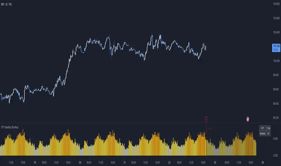
OTT Volatility [RunRox]📊 OTT Volatility is an indicator developed by the RunRox team to pinpoint the most optimal time to trade across different markets.
OTT stands for Optimal Trade Time Volatility and is designed primarily for markets without a fixed trading session, such as cryptocurrencies that trade 24/7. At the same time, it works equally well on any other market.
🔶 The concept is straightforward. The indicator takes a specified number of historical periods (Samples) and statistically evaluates which hours of the day or which days show the highest volatility for the selected asset.
As a result, it highlights time windows with elevated volatility where traders can focus on searching for trade setups and building positions.
🔶 As the core volatility metric, the indicator uses ATR (Average True Range) to measure intraday volatility. Then it calculates the average ATR value over the last N Samples, creating a statistically stable estimate of typical volatility for the selected asset.
🔶 Statistically, during these highlighted periods the market shows higher-than-average volatility.
This means that in these time windows price is more likely to be subject to stronger moves and potential manipulation, making them attractive for active trade execution and position management.
⚠️ However, historical behavior does not guarantee future results.
These periods should be treated only as zones where volatility has a higher probability of being above normal, not as a promise of movement.
As shown in the screenshot above, the indicator also projects potential future volatility based on historical data. This helps you better plan your trading hours and align your activity with periods where volatility is statistically expected to be higher or lower.
🔶 Current Volatility – as shown in the screenshot above, you can also monitor the real-time volatility of the market without any statistical averaging.
On top of that, you can overlay the current volatility on top of the statistical volatility levels, which makes it easy to see whether the market is now trading in a high- or low-volatility regime relative to its usual behavior.
4 display modes – you can choose any visualization style that fits your trading workflow:
Absolute – displays the raw volatility values.
Relative – shows volatility relative to its typical levels.
Average Centered – centers volatility around its average value.
Trim Low Value – filters out low-volatility noise and highlights only more significant moves.
This indicator helps you define the most effective trading hours on any market by relying on historical volatility statistics.
Use it to quickly see when your market tends to be more active and to structure your trading sessions around those periods.
✅ We hope this tool becomes a useful part of your trading toolkit and helps you improve the quality of your decisions and timing.
Liquidity ThermometerThis is a universal indicator that assesses market liquidity based on five key market parameters: volume, volatility, candlestick range, body size, and price momentum.
The indicator does not use open interest data and is suitable for all markets, including spot, futures, and Forex.
This indicator normalizes each metric historically and creates a composite index between 0 and 1, where higher values correspond to a stable and calm market environment, and lower values indicate periods of increased risk and potential liquidity stress.
LT generates an integral liquidity index in the range based on five normalized components:
-nVol — normalized volume, reflecting trading density and activity.
-nATR — the volatility component (ATR), inverted, as high volatility is typically associated with declining liquidity.
-nRange — the normalized candlestick range, also inverted to assess the structural narrowness of the price movement.
-nBody — the normalized candlestick body size (|close − open|), inverted to assess the balance of supply and demand.
-nMove — the normalized value of the price impulse movement (|Δclose|), reflecting short-term price spikes.
Each metric is linearly normalized over a sliding window (200 bars) using the formula:
norm(x) = (x − min) / (max − min),
where at max = min, the value is fixed at 0.5 to ensure stability.
The ALT index is calculated as a weighted combination:
ALT = 0.35 nVol + 0.20 (1 − nATR) + 0.20 (1 − nRange) + 0.15 (1 − nBody) + 0.10 (1 − nMove)
The result is further smoothed using EMA(3) to reduce micronoise.
Red Zone (MLI < 0.25) — Risk, Thin Liquidity
When the indicator falls into the red zone, it means the market is extremely volatile:
Characteristics:
Low volume — small trades have a strong impact on the price.
High volatility — candlesticks rise or fall sharply.
Wide candlestick range — the market is "breathing heavily," easily breaking price extremes.
Impulsive movements — small market shocks lead to sharp spikes.
Thin liquidity — few orders in the order book, large orders "eat up" the market.
What this means for a trader:
🔥 High risk of spikes and false breakouts.
⚠ Possible series of liquidations on leverage.
❌ It is not recommended to enter long or short positions without a filter or protection.
✅ Can be used for short scalping strategies if you know the entry point, but very carefully.
Green Zone (MLI > 0.75) — High Liquidity, Safe Zone
When the indicator rises into the green zone, it means the market is stable and balanced:
Characteristics:
High volume — the market is deep, orders are executed without a strong impact on the price.
Low volatility — candlesticks are stable, no sharp spikes.
Narrow candlestick range — price moves calmly.
Weak impulse movements — no sharp surges.
Sufficient liquidity — the market can handle large orders.
What this means for a trader:
✅ Safe zone for opening positions.
🔄 Easier to set stop-loss and take-profit orders.
💡 You can trade both up and down, the risk of sharp movements is minimal.
⚡ Under these conditions, there is a lower risk of spikes and accidental liquidations.
It does not predict price movements or guarantee results. It is an analytical tool intended for additional research into market structure.

Price Drop CounterThe Price Drop Counter is a very basic statistical indicator.
See it as an analytical tool that tracks how many times an asset's price has dropped by a specified percentage from its recent peak within a defined date range.
The indicator monitors the highest price reached and counts each occurrence when the price falls by your chosen threshold, then resets its peak tracking point after each drop is registered.
Uses
Volatility Assessment: Measure how frequently significant price corrections occur during specific periods
Market Behavior Analysis: Compare drop frequency across different timeframes or market conditions
Risk Evaluation: Identify assets or periods with higher downside volatility
Historical Pattern Recognition: Study how often major pullbacks happened during bull or bear markets
Backtesting Support: Analyze how your strategy would perform based on the frequency of drawdowns
How to use it
Add the indicator to your TradingView chart
Configure the Percent Drop (%) to define your threshold (default: 10%). The indicator will count each time price falls by this percentage from the most recent high
IMPORTANT Set your Start Date and End Date to analyze a specific period of interest
The blue step-line plot shows the cumulative count of drops within your date range
Adjust the percentage threshold based on your analysis needs - use smaller values (2-5%) for more frequent signals or larger values (15-20%) for major corrections only
The counter resets its high-water mark after each qualifying drop, allowing it to track multiple sequential drops within the same period.

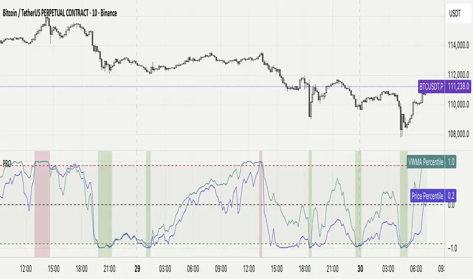
Percentile Rank Oscillator (Price + VWMA)A statistical oscillator designed to identify potential market turning points using percentile-based price analytics and volume-weighted confirmation.
What is PRO?
Percentile Rank Oscillator measures how extreme current price behavior is relative to its own recent history. It calculates a rolling percentile rank of price midpoints and VWMA deviation (volume-weighted price drift). When price reaches historically rare levels – high or low percentiles – it may signal exhaustion and potential reversal conditions.
How it works
Takes midpoint of each candle ((H+L)/2)
Ranks the current value vs previous N bars using rolling percentile rank
Maps percentile to a normalized oscillator scale (-1..+1 or 0–100)
Optionally evaluates VWMA deviation percentile for volume-confirmed signals
Highlights extreme conditions and confluence zones
Why percentile rank?
Median-based percentiles ignore outliers and read the market statistically – not by fixed thresholds. Instead of guessing “overbought/oversold” values, the indicator adapts to current volatility and structure.
Key features
Rolling percentile rank of price action
Optional VWMA-based percentile confirmation
Adaptive, noise-robust structure
User-selectable thresholds (default 95/5)
Confluence highlighting for price + VWMA extremes
Optional smoothing (RMA)
Visual extreme zone fills for rapid signal recognition
How to use
High percentile values –> statistically extreme upward deviation (potential top)
Low percentile values –> statistically extreme downward deviation (potential bottom)
Price + VWMA confluence strengthens reversal context
Best used as part of a broader trading framework (market structure, order flow, etc.)
Tip: Look for percentile spikes at key HTF levels, after extended moves, or where liquidity sweeps occur. Strong moves into rare percentile territory may precede mean reversion.
Suggested settings
Default length: 100 bars
Thresholds: 95 / 5
Smoothing: 1–3 (optional)
Important note
This tool does not predict direction or guarantee outcomes. It provides statistical context for price extremes to help traders frame probability and timing. Always combine with sound risk management and other tools.
Statistical Price Deviation Index (MAD/VWMA)SPDI is a statistical oscillator designed to detect potential price reversal zones by measuring how far price deviates from its typical behavior within a defined rolling window.
Instead of using momentum or moving averages like traditional indicators, SPDI applies robust statistics - a rolling median and Mean Absolute Deviation (MAD) - to calculate a normalized measure of price displacement. This normalization keeps the output bounded (from −1 to +1 by default), producing a stable and consistent oscillator that adapts to changing volatility conditions.
The second line in SPDI uses a Volume-Weighted Moving Average (VWMA) instead of a simple price median. This creates a complementary oscillator showing statistically weighted deviations based on traded volume. When both oscillators align in their extremes, strong confluence reversal signals are generated.
How It Works
For each bar, SPDI calculates the median price of the last N bars (default 100).
It then measures how far the current bar’s midpoint deviates from that rolling median.
The Mean Absolute Deviation (MAD) of those distances defines a “normal” range of fluctuation.
The deviation is normalized and compressed via a tanh mapping, keeping the oscillator in fixed boundaries (−1 to +1).
The same logic is applied to the VWMA line to gauge volume-weighted deviations.
How to Use
The blue line (Price MAD) represents pure price deviation.
The green line (VWMA Disp) shows the volume-weighted deviation.
Overbought (red) zones indicate statistically extreme upward deviation -> potential short-term overextension.
Oversold (green) zones indicate statistically extreme downward deviation -> potential rebound area.
Confluence signals (both lines hitting the same extreme) often mark strong reversal points.
Settings Tips
Lookback length controls how much historical data defines “normal” behavior. Larger = smoother, smaller = more sensitive.
Smoothing (RMA length) can reduce noise without changing the overall statistical logic.
Output scale can be set to either −1..+1 or 0..100, depending on your visual preference.
Alerts and color fills are fully customizable in the Style tab.
Summary:
SPDI transforms raw price and volume data into a statistically bounded deviation index. When both Price MAD and VWMA Disp reach joint extremes, it highlights probable market turning points - offering traders a clean, data-driven way to spot potential reversals ahead of time.

Aggregated Scores Oscillator [Alpha Extract]A sophisticated risk-adjusted performance measurement system that combines Omega Ratio and Sortino Ratio methodologies to create a comprehensive market assessment oscillator. Utilizing advanced statistical band calculations with expanding and rolling window analysis, this indicator delivers institutional-grade overbought/oversold detection based on risk-adjusted returns rather than traditional price movements. The system's dual-ratio aggregation approach provides superior signal accuracy by incorporating both upside potential and downside risk metrics with dynamic threshold adaptation for varying market conditions.
🔶 Advanced Statistical Framework
Implements dual statistical methodologies using expanding and rolling window calculations to create adaptive threshold bands that evolve with market conditions. The system calculates cumulative statistics alongside rolling averages to provide both historical context and current market regime sensitivity with configurable window parameters for optimal performance across timeframes.
🔶 Dual Ratio Integration System
Combines Omega Ratio analysis measuring excess returns versus deficit returns with Sortino Ratio calculations focusing on downside deviation for comprehensive risk-adjusted performance assessment. The system applies configurable smoothing to both ratios before aggregation, ensuring stable signal generation while maintaining sensitivity to regime changes.
// Omega Ratio Calculation
Excess_Return = sum((Daily_Return > Target_Return ? Daily_Return - Target_Return : 0), Period)
Deficit_Return = sum((Daily_Return < Target_Return ? Target_Return - Daily_Return : 0), Period)
Omega_Ratio = Deficit_Return ≠ 0 ? (Excess_Return / Deficit_Return) : na
// Sortino Ratio Framework
Downside_Deviation = sqrt(sum((Daily_Return < Target_Return ? (Daily_Return - Target_Return)² : 0), Period) / Period)
Sortino_Ratio = (Mean_Return / Downside_Deviation) * sqrt(Annualization_Factor)
// Aggregated Score
Aggregated_Score = SMA(Omega_Ratio, Omega_SMA) + SMA(Sortino_Ratio, Sortino_SMA)
🔶 Dynamic Band Calculation Engine
Features sophisticated threshold determination using both expanding historical statistics and rolling window analysis to create adaptive overbought/oversold levels. The system incorporates configurable multipliers and sensitivity adjustments to optimize signal timing across varying market volatility conditions with automatic band convergence logic.
🔶 Signal Generation Framework
Generates overbought conditions when aggregated score exceeds adjusted upper threshold and oversold conditions below lower threshold, with neutral zone identification for range-bound markets. The system provides clear binary signal states with background zone highlighting and dynamic oscillator coloring for intuitive market condition assessment.
🔶 Enhanced Visual Architecture
Provides modern dark theme visualization with neon color scheme, dynamic oscillator line coloring based on signal states, and gradient band fills for comprehensive market condition visualization. The system includes zero-line reference, statistical band plots, and background zone highlighting with configurable transparency levels.
snapshot
🔶 Risk-Adjusted Performance Analysis
Utilizes target return parameters for customizable risk assessment baselines, enabling traders to evaluate performance relative to specific return objectives. The system's focus on downside deviation through Sortino analysis provides superior risk-adjusted signals compared to traditional volatility-based oscillators that treat upside and downside movements equally.
🔶 Multi-Timeframe Adaptability
Features configurable calculation periods and rolling windows to optimize performance across various timeframes from intraday to long-term analysis. The system's statistical foundation ensures consistent signal quality regardless of timeframe selection while maintaining sensitivity to market regime changes through adaptive band calculations.
🔶 Performance Optimization Framework
Implements efficient statistical calculations with optimized variable management and configurable smoothing parameters to balance responsiveness with signal stability. The system includes automatic band adjustment mechanisms and rolling window management for consistent performance across extended analysis periods.
This indicator delivers sophisticated risk-adjusted market analysis by combining proven statistical ratios in a unified oscillator framework. Unlike traditional overbought/oversold indicators that rely solely on price movements, the ASO incorporates risk-adjusted performance metrics to identify genuine market extremes based on return quality rather than price volatility alone. The system's adaptive statistical bands and dual-ratio methodology provide institutional-grade signal accuracy suitable for systematic trading approaches across cryptocurrency, forex, and equity markets with comprehensive visual feedback and configurable risk parameters for optimal strategy integration.

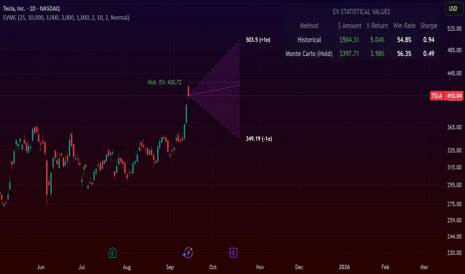
Expected Value Monte CarloI created this indicator after noticing that there was no Expected Value indicator here on TradingView.
The EVMC provides statistical Expected Value to what might happen in the future regarding the asset you are analyzing.
It uses 2 quantitative methods:
Historical Backtest to ground your analysis in long-term, factual data.
Monte Carlo Simulation to project a cone of probable future outcomes based on recent market behavior.
This gives you a data-driven edge to quantify risk, and make more informed trading decisions.
The indicator includes:
Dual analysis: Combines historical probability with forward-looking simulation.
Quantified projections: Provides the Expected Value ($ and %), Win Rate, and Sharpe Ratio for both methods.
Asset-aware: Automatically adjusts its calculations for Stocks (252 trading days) and Crypto (365 days) for mathematical accuracy.
The projection cone shows the mean expected path and the +/- 1 standard deviation range of outcomes.
No repainting
Calculation:
1. Historical Expected Value:
This is a systematic backtest over thousands of bars. It calculates the return Rᵢ for N past trades (buy-and-hold). The Historical EV is the simple average of these returns, giving a baseline performance measure.
Historical EV % = (Σ Rᵢ) / N
2. Monte Carlo Projection:
This projection uses the Geometric Brownian Motion (GBM) model to simulate thousands of future price paths based on the market's recent behavior.
It first measures the drift (μ), or recent trend, and volatility (σ), or recent risk, from the Projection Lookback period. It then projects a final return for each simulation using the core GBM formula:
Projected Return = exp( (μ - σ²/2)T + σ√T * Z ) - 1
(Where T is the time horizon and Z is a random variable for the simulation.)
The purple line on the chart is the average of all simulated outcomes (the Monte Carlo EV). The cone represents one standard deviation of those outcomes.
The dashed lines represent one standard deviation (+/- 1σ) from the average, forming a cone of probable outcomes. Roughly 68% of the simulated paths ended within this cone.
This projection answers the question: "If the recent trend and volatility continue, where is the price most likely to go?"
Here's how to read the indicator
Expected Value ($/%): Is my average trade profitable?
Win Rate: How often can I expect to be right?
Sharpe Ratio: Am I being adequately compensated for the risk I'm taking?
User Guide
Max trade duration (bars): This is your analysis timeframe. Are you interested in the probable outcome over the next month (21 bars), quarter (63 bars), or year (252 bars)?
Position size ($): Set this to your typical trade size to see the Expected Value in real dollar terms.
Projection lookback (bars): This is the most important input for the Monte Carlo model. A short lookback (e.g., 50) makes the projection highly sensitive to recent momentum. Use this to identify potential recency bias. A long lookback (e.g., 252) provides a more stable, long-term projection of trend and volatility.
Historical Lookback (bars): For the historical backtest, more data is always better. Use the maximum that your TradingView plan allows for the most statistically significant results.
Use TP/SL for Historical EV: Check this box to see how the historical performance would have changed if you had used a simple Take Profit and Stop Loss, rather than just holding for the full duration.
I hope you find this indicator useful and please let me know if you have any suggestions. 😊
Stop Loss vs Take Profit Probability and EVThis stop loss and take profit calculator uses a Monte Carlo simulation to calculate the probability of hitting your Stop Loss or Take Profit levels across different time horizons (expressed in bars).
It provides data-driven insights to optimize your risk management and position sizing by showing Expected Value for each scenario.
As a quant, I love using statistical data to help my decisions and get better EV from my trades.
🔬 How It's Calculated
Monte Carlo Simulation: Runs 1,000-10,000 price simulations using a random walk model
Volatility Analysis: Combines ATR-based and Historical Volatility for accurate price movement modeling
Expected Value: Calculates profit/loss expectation using formula: (TP_Probability × Reward) - (SL_Probability × Risk)
Time Horizons: Tests multiple timeframes (1, 5, 10, 20, 50 bars) to find optimal holding periods
Risk/Reward Ratios: Automatically calculates and displays R:R ratios for quick assessment
💡 Use Cases
Position Sizing - Determine optimal risk per trade based on Expected Value
Time Horizon Optimization - Find the best holding period for your strategy
Stop Loss Placement - Validate SL levels using probability analysis
Take Profit Optimization - Set TP levels with statistical backing
Strategy Backtesting - Compare different R:R setups before entering trades
Risk Management - Avoid trades with negative Expected Value
Swing vs Day Trading - Choose timeframes with highest success probability
🎯 How to Use
Setup Trade: Enter your entry price, stop loss, and take profit levels
You can add or remove time horizons denominated in bars. Say you are looking at 1h candles, adding a 24-bar time horizon means you are looking into 24 hours
Choose Direction: Select Long or Short position
Review Table
Analyze Expected Value: Focus on positive EV scenarios (green background)
Optimize Timing: Select time horizons with best risk/reward profile
Adjust Parameters: Modify volatility calculation method and simulation count if needed
Examples
Here's how you can read the tables.
Example 1:
In this chart, we are analyzing the TP and SL probabilities as well as the EV (expected value) for a stock. I want to check what the likelihood is that my SL and TP get triggered over the next 5 days. The stock market is open for 6.5 hours per day, which is 13 bars in this 30-minute bar chart. 26 bars is 2 days, 39 bars is 3 days and so on.
Although this trade is more likely to trigger my SL than my TP, in some of the time horizons we have a positive expected value because of the risk/reward of our trade (i.e. distance of the SL and TP from the price) and the probability of hitting SL and TP.
Example 2:
In this example, we have applied the indicator to gold. Because the TP is much closer to the price, the probability of hitting the TP is much higher.
We can also observe that the expected Value in the shorter time frames is better than in the longer ones. This can give us some clues to set up our trade. If we know that the EV is positive, we can allocate more to that specific trade.
Enjoy, and please let me know your feedback! 😊🥂

Forecasting Quadratic Regression [UPDATED V6] Forecasting Quadratic Regression applies a second-degree polynomial regression model to price data, offering a non-linear alternative to traditional linear regression. By fitting a quadratic curve of the form:
y=a+bx+cx2
the indicator captures both directional trend and curvature, allowing traders to detect momentum shifts earlier than with straight-line models.
🔹 Core Features
Fits a quadratic regression curve to user-defined lookback periods
Extends the fitted curve forward to generate forecast projections
Calculates slope curvature to highlight trend acceleration or deceleration
Adapts dynamically as new bars are added
🔹 Trading Applications
Identify potential reversal zones when the curve inflects (2nd derivative sign change)
Forecast near-term mean reversion targets or extended trend continuations
Filter trades by measuring momentum curvature rather than linear slope
Visualize higher-order structure in price beyond standard regression lines
⚠️ Note: This model is statistical and assumes past curvature informs short-term future price paths. It should be combined with confirmation signals (volume, oscillators, support/resistance) to reduce false inflection points.

Markov Chain Trend ProbabilityA Markov Chain is a mathematical model that predicts future states based on the current state, assuming that the future depends only on the present (not the past). Originally developed by Russian mathematician Andrey Markov, this concept is widely used in:
Finance: Risk modeling, portfolio optimization, credit scoring, algorithmic trading
Weather Forecasting: Predicting sunny/rainy days, temperature patterns, storm tracking
Here's an example of a Markov chain: If the weather is sunny, the probability that will be sunny 30 min later is say 90%. However, if the state changes, i.e. it starts raining, how the probability that will be raining 30 min later is say 70% and only 30% sunny.
Similar concept can be applied to markets price action and trends.
Mathematical Foundation
The core principle follows the Markov Property: P(X_{t+1}|X_t, X_{t-1}, ..., X_0) = P(X_{t+1}|X_t)
Transition Matrix :
-------------Next State
Current----
--------P11 P12
-----P21 P22
Probability Calculations:
P(Up→Up) = Count(Up→Up) / Count(Up states)
P(Down→Down) = Count(Down→Down) / Count(Down states)
Steady-state probability: π = πP (where π is the stationary distribution)
State Definition:
State = UPTREND if (Price_t - Price_{t-n})/ATR > threshold
State = DOWNTREND if (Price_t - Price_{t-n})/ATR < -threshold
How It Works in Trading
This indicator applies Markov Chain theory to market trends by:
Defining States: Classifies market conditions as UPTREND or DOWNTREND based on price movement relative to ATR (Average True Range)
Learning Transitions: Analyzes historical data to calculate probabilities of moving from one state to another
Predicting Probabilities: Estimates the likelihood of future trend continuation or reversal
How to Use
Parameters:
Lookback Period: Number of bars to analyze for trend detection (default: 14)
ATR Threshold: Sensitivity multiplier for state changes (default: 0.5)
Historical Periods: Sample size for probability calculations (default: 33)
Trading Applications:
Trend confirmation for entry/exit decisions
Risk assessment through probability analysis
Market regime identification
Early warning system for potential trend reversals
The indicator works on any timeframe and asset class. Enjoy!

Statistical Pairs Trading IndicatorZ-Score Stat Trading — Statistical Pairs Trading Indicator
📊🔗
---
What is it?
Z-Score Stat Trading is a powerful indicator for statistical pairs trading and quantitative analysis of two correlated assets.
It calculates the Z-Score of the log-price spread between any two symbols you choose, providing both long-term and short-term Z-Score signals.
You’ll also see real-time correlation, volatility, spread, and the number of long/short signals in a handy on-chart table!
---
How to Use 🛠️
1. Add the indicator to your chart.
2. Select two assets (symbols) to analyze in the settings.
3. Watch the Z-Score plots (blue and orange lines) and threshold levels (+2, -2 by default).
4. Check the info table for:
- Correlation
- Volatility
- Spread
- Number of long (NL) and short (NS) signals in the last 1000 bars
5. Set up alerts for signal generation or threshold crossings if you want to be notified automatically.
---
Trading Strategy 💡
- This indicator is designed for statistical arbitrage (mean reversion) strategies.
- Long Signal (🟢):
When both Z-Scores drop below the negative threshold (e.g., -2), a long signal is generated.
→ Buy Symbol A, Sell Symbol B, expecting the spread to revert to the mean.
- Short Signal (🔴):
When both Z-Scores rise above the positive threshold (e.g., +2), a short signal is generated.
→ Sell Symbol A, Buy Symbol B, again expecting mean reversion.
- The info table helps you quickly assess the frequency of signals and the current statistical relationship between your chosen assets.
---
Best Practices & Warnings 🚦
- Avoid high leverage! Pairs trading can be risky, especially during periods of divergence. Use conservative position sizing.
- Check for cointegration: Before using this indicator, make sure both assets are cointegrated or have a strong historical relationship. This increases the reliability of mean reversion signals.
- Check correlation: Only use asset pairs with a high correlation (preferably 0.8–0.9 or higher) for best results. The correlation value is shown in the info table.
- Scale in and out gradually: When entering or exiting positions, consider doing so in parts rather than all at once. This helps manage slippage and risk, especially in volatile markets.
---
⚠️ Note on Performance:
This indicator may work a bit slowly, especially on large timeframes or long chart histories, because the calculation of NL and NS (number of long/short signals) is computationally intensive.
---
Disclaimer ⚠️
This script is provided for educational and informational purposes only .
It is not financial advice or a recommendation to buy or sell any asset.
Use at your own risk. The author assumes no responsibility for any trading decisions or losses.
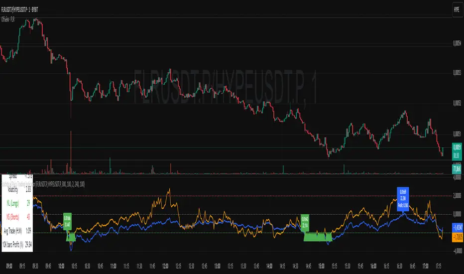
ADX Forecast [Titans_Invest]ADX Forecast
This isn’t just another ADX indicator — it’s the most powerful and complete ADX tool ever created, and without question the best ADX indicator on TradingView, possibly even the best in the world.
ADX Forecast represents a revolutionary leap in trend strength analysis, blending the timeless principles of the classic ADX with cutting-edge predictive modeling. For the first time on TradingView, you can anticipate future ADX movements using scientifically validated linear regression — a true game-changer for traders looking to stay ahead of trend shifts.
1. Real-Time ADX Forecasting
By applying least squares linear regression, ADX Forecast projects the future trajectory of the ADX with exceptional accuracy. This forecasting power enables traders to anticipate changes in trend strength before they fully unfold — a vital edge in fast-moving markets.
2. Unmatched Customization & Precision
With 26 long entry conditions and 26 short entry conditions, this indicator accounts for every possible ADX scenario. Every parameter is fully customizable, making it adaptable to any trading strategy — from scalping to swing trading to long-term investing.
3. Transparency & Advanced Visualization
Visualize internal ADX dynamics in real time with interactive tags, smart flags, and fully adjustable threshold levels. Every signal is transparent, logic-based, and engineered to fit seamlessly into professional-grade trading systems.
4. Scientific Foundation, Elite Execution
Grounded in statistical precision and machine learning principles, ADX Forecast upgrades the classic ADX from a reactive lagging tool into a forward-looking trend prediction engine. This isn’t just an indicator — it’s a scientific evolution in trend analysis.
⯁ SCIENTIFIC BASIS LINEAR REGRESSION
Linear Regression is a fundamental method of statistics and machine learning, used to model the relationship between a dependent variable y and one or more independent variables 𝑥.
The general formula for a simple linear regression is given by:
y = β₀ + β₁x + ε
β₁ = Σ((xᵢ - x̄)(yᵢ - ȳ)) / Σ((xᵢ - x̄)²)
β₀ = ȳ - β₁x̄
Where:
y = is the predicted variable (e.g. future value of RSI)
x = is the explanatory variable (e.g. time or bar index)
β0 = is the intercept (value of 𝑦 when 𝑥 = 0)
𝛽1 = is the slope of the line (rate of change)
ε = is the random error term
The goal is to estimate the coefficients 𝛽0 and 𝛽1 so as to minimize the sum of the squared errors — the so-called Random Error Method Least Squares.
⯁ LEAST SQUARES ESTIMATION
To minimize the error between predicted and observed values, we use the following formulas:
β₁ = /
β₀ = ȳ - β₁x̄
Where:
∑ = sum
x̄ = mean of x
ȳ = mean of y
x_i, y_i = individual values of the variables.
Where:
x_i and y_i are the means of the independent and dependent variables, respectively.
i ranges from 1 to n, the number of observations.
These equations guarantee the best linear unbiased estimator, according to the Gauss-Markov theorem, assuming homoscedasticity and linearity.
⯁ LINEAR REGRESSION IN MACHINE LEARNING
Linear regression is one of the cornerstones of supervised learning. Its simplicity and ability to generate accurate quantitative predictions make it essential in AI systems, predictive algorithms, time series analysis, and automated trading strategies.
By applying this model to the ADX, you are literally putting artificial intelligence at the heart of a classic indicator, bringing a new dimension to technical analysis.
⯁ VISUAL INTERPRETATION
Imagine an ADX time series like this:
Time →
ADX →
The regression line will smooth these values and extend them n periods into the future, creating a predicted trajectory based on the historical moment. This line becomes the predicted ADX, which can be crossed with the actual ADX to generate more intelligent signals.
⯁ SUMMARY OF SCIENTIFIC CONCEPTS USED
Linear Regression Models the relationship between variables using a straight line.
Least Squares Minimizes the sum of squared errors between prediction and reality.
Time Series Forecasting Estimates future values based on historical data.
Supervised Learning Trains models to predict outputs from known inputs.
Statistical Smoothing Reduces noise and reveals underlying trends.
⯁ WHY THIS INDICATOR IS REVOLUTIONARY
Scientifically-based: Based on statistical theory and mathematical inference.
Unprecedented: First public ADX with least squares predictive modeling.
Intelligent: Built with machine learning logic.
Practical: Generates forward-thinking signals.
Customizable: Flexible for any trading strategy.
⯁ CONCLUSION
By combining ADX with linear regression, this indicator allows a trader to predict market momentum, not just follow it.
ADX Forecast is not just an indicator — it is a scientific breakthrough in technical analysis technology.
⯁ Example of simple linear regression, which has one independent variable:
⯁ In linear regression, observations ( red ) are considered to be the result of random deviations ( green ) from an underlying relationship ( blue ) between a dependent variable ( y ) and an independent variable ( x ).
⯁ Visualizing heteroscedasticity in a scatterplot against 100 random fitted values using Matlab:
⯁ The data sets in the Anscombe's quartet are designed to have approximately the same linear regression line (as well as nearly identical means, standard deviations, and correlations) but are graphically very different. This illustrates the pitfalls of relying solely on a fitted model to understand the relationship between variables.
⯁ The result of fitting a set of data points with a quadratic function:
_______________________________________________________________________
🥇 This is the world’s first ADX indicator with: Linear Regression for Forecasting 🥇_______________________________________________________________________
_________________________________________________
🔮 Linear Regression: PineScript Technical Parameters 🔮
_________________________________________________
Forecast Types:
• Flat: Assumes prices will remain the same.
• Linreg: Makes a 'Linear Regression' forecast for n periods.
Technical Information:
ta.linreg (built-in function)
Linear regression curve. A line that best fits the specified prices over a user-defined time period. It is calculated using the least squares method. The result of this function is calculated using the formula: linreg = intercept + slope * (length - 1 - offset), where intercept and slope are the values calculated using the least squares method on the source series.
Syntax:
• Function: ta.linreg()
Parameters:
• source: Source price series.
• length: Number of bars (period).
• offset: Offset.
• return: Linear regression curve.
This function has been cleverly applied to the RSI, making it capable of projecting future values based on past statistical trends.
______________________________________________________
______________________________________________________
⯁ WHAT IS THE ADX❓
The Average Directional Index (ADX) is a technical analysis indicator developed by J. Welles Wilder. It measures the strength of a trend in a market, regardless of whether the trend is up or down.
The ADX is an integral part of the Directional Movement System, which also includes the Plus Directional Indicator (+DI) and the Minus Directional Indicator (-DI). By combining these components, the ADX provides a comprehensive view of market trend strength.
⯁ HOW TO USE THE ADX❓
The ADX is calculated based on the moving average of the price range expansion over a specified period (usually 14 periods). It is plotted on a scale from 0 to 100 and has three main zones:
• Strong Trend: When the ADX is above 25, indicating a strong trend.
• Weak Trend: When the ADX is below 20, indicating a weak or non-existent trend.
• Neutral Zone: Between 20 and 25, where the trend strength is unclear.
______________________________________________________
______________________________________________________
⯁ ENTRY CONDITIONS
The conditions below are fully flexible and allow for complete customization of the signal.
______________________________________________________
______________________________________________________
🔹 CONDITIONS TO BUY 📈
______________________________________________________
• Signal Validity: The signal will remain valid for X bars .
• Signal Sequence: Configurable as AND or OR .
🔹 +DI > -DI
🔹 +DI < -DI
🔹 +DI > ADX
🔹 +DI < ADX
🔹 -DI > ADX
🔹 -DI < ADX
🔹 ADX > Threshold
🔹 ADX < Threshold
🔹 +DI > Threshold
🔹 +DI < Threshold
🔹 -DI > Threshold
🔹 -DI < Threshold
🔹 +DI (Crossover) -DI
🔹 +DI (Crossunder) -DI
🔹 +DI (Crossover) ADX
🔹 +DI (Crossunder) ADX
🔹 +DI (Crossover) Threshold
🔹 +DI (Crossunder) Threshold
🔹 -DI (Crossover) ADX
🔹 -DI (Crossunder) ADX
🔹 -DI (Crossover) Threshold
🔹 -DI (Crossunder) Threshold
🔮 +DI (Crossover) -DI Forecast
🔮 +DI (Crossunder) -DI Forecast
🔮 ADX (Crossover) +DI Forecast
🔮 ADX (Crossunder) +DI Forecast
______________________________________________________
______________________________________________________
🔸 CONDITIONS TO SELL 📉
______________________________________________________
• Signal Validity: The signal will remain valid for X bars .
• Signal Sequence: Configurable as AND or OR .
🔸 +DI > -DI
🔸 +DI < -DI
🔸 +DI > ADX
🔸 +DI < ADX
🔸 -DI > ADX
🔸 -DI < ADX
🔸 ADX > Threshold
🔸 ADX < Threshold
🔸 +DI > Threshold
🔸 +DI < Threshold
🔸 -DI > Threshold
🔸 -DI < Threshold
🔸 +DI (Crossover) -DI
🔸 +DI (Crossunder) -DI
🔸 +DI (Crossover) ADX
🔸 +DI (Crossunder) ADX
🔸 +DI (Crossover) Threshold
🔸 +DI (Crossunder) Threshold
🔸 -DI (Crossover) ADX
🔸 -DI (Crossunder) ADX
🔸 -DI (Crossover) Threshold
🔸 -DI (Crossunder) Threshold
🔮 +DI (Crossover) -DI Forecast
🔮 +DI (Crossunder) -DI Forecast
🔮 ADX (Crossover) +DI Forecast
🔮 ADX (Crossunder) +DI Forecast
______________________________________________________
______________________________________________________
🤖 AUTOMATION 🤖
• You can automate the BUY and SELL signals of this indicator.
______________________________________________________
______________________________________________________
⯁ UNIQUE FEATURES
______________________________________________________
Linear Regression: (Forecast)
Signal Validity: The signal will remain valid for X bars
Signal Sequence: Configurable as AND/OR
Condition Table: BUY/SELL
Condition Labels: BUY/SELL
Plot Labels in the Graph Above: BUY/SELL
Automate and Monitor Signals/Alerts: BUY/SELL
Linear Regression (Forecast)
Signal Validity: The signal will remain valid for X bars
Signal Sequence: Configurable as AND/OR
Table of Conditions: BUY/SELL
Conditions Label: BUY/SELL
Plot Labels in the graph above: BUY/SELL
Automate & Monitor Signals/Alerts: BUY/SELL
______________________________________________________
📜 SCRIPT : ADX Forecast
🎴 Art by : @Titans_Invest & @DiFlip
👨💻 Dev by : @Titans_Invest & @DiFlip
🎑 Titans Invest — The Wizards Without Gloves 🧤
✨ Enjoy!
______________________________________________________
o Mission 🗺
• Inspire Traders to manifest Magic in the Market.
o Vision 𐓏
• To elevate collective Energy 𐓷𐓏
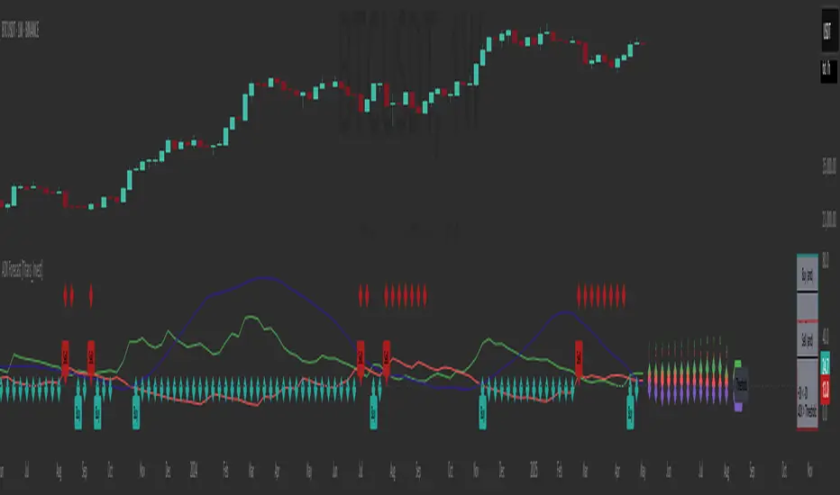
RSI Full Forecast [Titans_Invest]RSI Full Forecast
Get ready to experience the ultimate evolution of RSI-based indicators – the RSI Full Forecast, a boosted and even smarter version of the already powerful: RSI Forecast
Now featuring over 40 additional entry conditions (forecasts), this indicator redefines the way you view the market.
AI-Powered RSI Forecasting:
Using advanced linear regression with the least squares method – a solid foundation for machine learning - the RSI Full Forecast enables you to predict future RSI behavior with impressive accuracy.
But that’s not all: this new version also lets you monitor future crossovers between the RSI and the MA RSI, delivering early and strategic signals that go far beyond traditional analysis.
You’ll be able to monitor future crossovers up to 20 bars ahead, giving you an even broader and more precise view of market movements.
See the Future, Now:
• Track upcoming RSI & RSI MA crossovers in advance.
• Identify potential reversal zones before price reacts.
• Uncover statistical behavior patterns that would normally go unnoticed.
40+ Intelligent Conditions:
The new layer of conditions is designed to detect multiple high-probability scenarios based on historical patterns and predictive modeling. Each additional forecast is a window into the price's future, powered by robust mathematics and advanced algorithmic logic.
Full Customization:
All parameters can be tailored to fit your strategy – from smoothing periods to prediction sensitivity. You have complete control to turn raw data into smart decisions.
Innovative, Accurate, Unique:
This isn’t just an upgrade. It’s a quantum leap in technical analysis.
RSI Full Forecast is the first of its kind: an indicator that blends statistical analysis, machine learning, and visual design to create a true real-time predictive system.
⯁ SCIENTIFIC BASIS LINEAR REGRESSION
Linear Regression is a fundamental method of statistics and machine learning, used to model the relationship between a dependent variable y and one or more independent variables 𝑥.
The general formula for a simple linear regression is given by:
y = β₀ + β₁x + ε
β₁ = Σ((xᵢ - x̄)(yᵢ - ȳ)) / Σ((xᵢ - x̄)²)
β₀ = ȳ - β₁x̄
Where:
y = is the predicted variable (e.g. future value of RSI)
x = is the explanatory variable (e.g. time or bar index)
β0 = is the intercept (value of 𝑦 when 𝑥 = 0)
𝛽1 = is the slope of the line (rate of change)
ε = is the random error term
The goal is to estimate the coefficients 𝛽0 and 𝛽1 so as to minimize the sum of the squared errors — the so-called Random Error Method Least Squares.
⯁ LEAST SQUARES ESTIMATION
To minimize the error between predicted and observed values, we use the following formulas:
β₁ = /
β₀ = ȳ - β₁x̄
Where:
∑ = sum
x̄ = mean of x
ȳ = mean of y
x_i, y_i = individual values of the variables.
Where:
x_i and y_i are the means of the independent and dependent variables, respectively.
i ranges from 1 to n, the number of observations.
These equations guarantee the best linear unbiased estimator, according to the Gauss-Markov theorem, assuming homoscedasticity and linearity.
⯁ LINEAR REGRESSION IN MACHINE LEARNING
Linear regression is one of the cornerstones of supervised learning. Its simplicity and ability to generate accurate quantitative predictions make it essential in AI systems, predictive algorithms, time series analysis, and automated trading strategies.
By applying this model to the RSI, you are literally putting artificial intelligence at the heart of a classic indicator, bringing a new dimension to technical analysis.
⯁ VISUAL INTERPRETATION
Imagine an RSI time series like this:
Time →
RSI →
The regression line will smooth these values and extend them n periods into the future, creating a predicted trajectory based on the historical moment. This line becomes the predicted RSI, which can be crossed with the actual RSI to generate more intelligent signals.
⯁ SUMMARY OF SCIENTIFIC CONCEPTS USED
Linear Regression Models the relationship between variables using a straight line.
Least Squares Minimizes the sum of squared errors between prediction and reality.
Time Series Forecasting Estimates future values based on historical data.
Supervised Learning Trains models to predict outputs from known inputs.
Statistical Smoothing Reduces noise and reveals underlying trends.
⯁ WHY THIS INDICATOR IS REVOLUTIONARY
Scientifically-based: Based on statistical theory and mathematical inference.
Unprecedented: First public RSI with least squares predictive modeling.
Intelligent: Built with machine learning logic.
Practical: Generates forward-thinking signals.
Customizable: Flexible for any trading strategy.
⯁ CONCLUSION
By combining RSI with linear regression, this indicator allows a trader to predict market momentum, not just follow it.
RSI Full Forecast is not just an indicator — it is a scientific breakthrough in technical analysis technology.
⯁ Example of simple linear regression, which has one independent variable:
⯁ In linear regression, observations ( red ) are considered to be the result of random deviations ( green ) from an underlying relationship ( blue ) between a dependent variable ( y ) and an independent variable ( x ).
⯁ Visualizing heteroscedasticity in a scatterplot against 100 random fitted values using Matlab:
⯁ The data sets in the Anscombe's quartet are designed to have approximately the same linear regression line (as well as nearly identical means, standard deviations, and correlations) but are graphically very different. This illustrates the pitfalls of relying solely on a fitted model to understand the relationship between variables.
⯁ The result of fitting a set of data points with a quadratic function:
_________________________________________________
🔮 Linear Regression: PineScript Technical Parameters 🔮
_________________________________________________
Forecast Types:
• Flat: Assumes prices will remain the same.
• Linreg: Makes a 'Linear Regression' forecast for n periods.
Technical Information:
ta.linreg (built-in function)
Linear regression curve. A line that best fits the specified prices over a user-defined time period. It is calculated using the least squares method. The result of this function is calculated using the formula: linreg = intercept + slope * (length - 1 - offset), where intercept and slope are the values calculated using the least squares method on the source series.
Syntax:
• Function: ta.linreg()
Parameters:
• source: Source price series.
• length: Number of bars (period).
• offset: Offset.
• return: Linear regression curve.
This function has been cleverly applied to the RSI, making it capable of projecting future values based on past statistical trends.
______________________________________________________
______________________________________________________
⯁ WHAT IS THE RSI❓
The Relative Strength Index (RSI) is a technical analysis indicator developed by J. Welles Wilder. It measures the magnitude of recent price movements to evaluate overbought or oversold conditions in a market. The RSI is an oscillator that ranges from 0 to 100 and is commonly used to identify potential reversal points, as well as the strength of a trend.
⯁ HOW TO USE THE RSI❓
The RSI is calculated based on average gains and losses over a specified period (usually 14 periods). It is plotted on a scale from 0 to 100 and includes three main zones:
• Overbought: When the RSI is above 70, indicating that the asset may be overbought.
• Oversold: When the RSI is below 30, indicating that the asset may be oversold.
• Neutral Zone: Between 30 and 70, where there is no clear signal of overbought or oversold conditions.
______________________________________________________
______________________________________________________
⯁ ENTRY CONDITIONS
The conditions below are fully flexible and allow for complete customization of the signal.
______________________________________________________
______________________________________________________
🔹 CONDITIONS TO BUY 📈
______________________________________________________
• Signal Validity: The signal will remain valid for X bars .
• Signal Sequence: Configurable as AND or OR .
📈 RSI Conditions:
🔹 RSI > Upper
🔹 RSI < Upper
🔹 RSI > Lower
🔹 RSI < Lower
🔹 RSI > Middle
🔹 RSI < Middle
🔹 RSI > MA
🔹 RSI < MA
📈 MA Conditions:
🔹 MA > Upper
🔹 MA < Upper
🔹 MA > Lower
🔹 MA < Lower
📈 Crossovers:
🔹 RSI (Crossover) Upper
🔹 RSI (Crossunder) Upper
🔹 RSI (Crossover) Lower
🔹 RSI (Crossunder) Lower
🔹 RSI (Crossover) Middle
🔹 RSI (Crossunder) Middle
🔹 RSI (Crossover) MA
🔹 RSI (Crossunder) MA
🔹 MA (Crossover) Upper
🔹 MA (Crossunder) Upper
🔹 MA (Crossover) Lower
🔹 MA (Crossunder) Lower
📈 RSI Divergences:
🔹 RSI Divergence Bull
🔹 RSI Divergence Bear
📈 RSI Forecast:
🔹 RSI (Crossover) MA Forecast
🔹 RSI (Crossunder) MA Forecast
🔹 RSI Forecast 1 > MA Forecast 1
🔹 RSI Forecast 1 < MA Forecast 1
🔹 RSI Forecast 2 > MA Forecast 2
🔹 RSI Forecast 2 < MA Forecast 2
🔹 RSI Forecast 3 > MA Forecast 3
🔹 RSI Forecast 3 < MA Forecast 3
🔹 RSI Forecast 4 > MA Forecast 4
🔹 RSI Forecast 4 < MA Forecast 4
🔹 RSI Forecast 5 > MA Forecast 5
🔹 RSI Forecast 5 < MA Forecast 5
🔹 RSI Forecast 6 > MA Forecast 6
🔹 RSI Forecast 6 < MA Forecast 6
🔹 RSI Forecast 7 > MA Forecast 7
🔹 RSI Forecast 7 < MA Forecast 7
🔹 RSI Forecast 8 > MA Forecast 8
🔹 RSI Forecast 8 < MA Forecast 8
🔹 RSI Forecast 9 > MA Forecast 9
🔹 RSI Forecast 9 < MA Forecast 9
🔹 RSI Forecast 10 > MA Forecast 10
🔹 RSI Forecast 10 < MA Forecast 10
🔹 RSI Forecast 11 > MA Forecast 11
🔹 RSI Forecast 11 < MA Forecast 11
🔹 RSI Forecast 12 > MA Forecast 12
🔹 RSI Forecast 12 < MA Forecast 12
🔹 RSI Forecast 13 > MA Forecast 13
🔹 RSI Forecast 13 < MA Forecast 13
🔹 RSI Forecast 14 > MA Forecast 14
🔹 RSI Forecast 14 < MA Forecast 14
🔹 RSI Forecast 15 > MA Forecast 15
🔹 RSI Forecast 15 < MA Forecast 15
🔹 RSI Forecast 16 > MA Forecast 16
🔹 RSI Forecast 16 < MA Forecast 16
🔹 RSI Forecast 17 > MA Forecast 17
🔹 RSI Forecast 17 < MA Forecast 17
🔹 RSI Forecast 18 > MA Forecast 18
🔹 RSI Forecast 18 < MA Forecast 18
🔹 RSI Forecast 19 > MA Forecast 19
🔹 RSI Forecast 19 < MA Forecast 19
🔹 RSI Forecast 20 > MA Forecast 20
🔹 RSI Forecast 20 < MA Forecast 20
______________________________________________________
______________________________________________________
🔸 CONDITIONS TO SELL 📉
______________________________________________________
• Signal Validity: The signal will remain valid for X bars .
• Signal Sequence: Configurable as AND or OR .
📉 RSI Conditions:
🔸 RSI > Upper
🔸 RSI < Upper
🔸 RSI > Lower
🔸 RSI < Lower
🔸 RSI > Middle
🔸 RSI < Middle
🔸 RSI > MA
🔸 RSI < MA
📉 MA Conditions:
🔸 MA > Upper
🔸 MA < Upper
🔸 MA > Lower
🔸 MA < Lower
📉 Crossovers:
🔸 RSI (Crossover) Upper
🔸 RSI (Crossunder) Upper
🔸 RSI (Crossover) Lower
🔸 RSI (Crossunder) Lower
🔸 RSI (Crossover) Middle
🔸 RSI (Crossunder) Middle
🔸 RSI (Crossover) MA
🔸 RSI (Crossunder) MA
🔸 MA (Crossover) Upper
🔸 MA (Crossunder) Upper
🔸 MA (Crossover) Lower
🔸 MA (Crossunder) Lower
📉 RSI Divergences:
🔸 RSI Divergence Bull
🔸 RSI Divergence Bear
📉 RSI Forecast:
🔸 RSI (Crossover) MA Forecast
🔸 RSI (Crossunder) MA Forecast
🔸 RSI Forecast 1 > MA Forecast 1
🔸 RSI Forecast 1 < MA Forecast 1
🔸 RSI Forecast 2 > MA Forecast 2
🔸 RSI Forecast 2 < MA Forecast 2
🔸 RSI Forecast 3 > MA Forecast 3
🔸 RSI Forecast 3 < MA Forecast 3
🔸 RSI Forecast 4 > MA Forecast 4
🔸 RSI Forecast 4 < MA Forecast 4
🔸 RSI Forecast 5 > MA Forecast 5
🔸 RSI Forecast 5 < MA Forecast 5
🔸 RSI Forecast 6 > MA Forecast 6
🔸 RSI Forecast 6 < MA Forecast 6
🔸 RSI Forecast 7 > MA Forecast 7
🔸 RSI Forecast 7 < MA Forecast 7
🔸 RSI Forecast 8 > MA Forecast 8
🔸 RSI Forecast 8 < MA Forecast 8
🔸 RSI Forecast 9 > MA Forecast 9
🔸 RSI Forecast 9 < MA Forecast 9
🔸 RSI Forecast 10 > MA Forecast 10
🔸 RSI Forecast 10 < MA Forecast 10
🔸 RSI Forecast 11 > MA Forecast 11
🔸 RSI Forecast 11 < MA Forecast 11
🔸 RSI Forecast 12 > MA Forecast 12
🔸 RSI Forecast 12 < MA Forecast 12
🔸 RSI Forecast 13 > MA Forecast 13
🔸 RSI Forecast 13 < MA Forecast 13
🔸 RSI Forecast 14 > MA Forecast 14
🔸 RSI Forecast 14 < MA Forecast 14
🔸 RSI Forecast 15 > MA Forecast 15
🔸 RSI Forecast 15 < MA Forecast 15
🔸 RSI Forecast 16 > MA Forecast 16
🔸 RSI Forecast 16 < MA Forecast 16
🔸 RSI Forecast 17 > MA Forecast 17
🔸 RSI Forecast 17 < MA Forecast 17
🔸 RSI Forecast 18 > MA Forecast 18
🔸 RSI Forecast 18 < MA Forecast 18
🔸 RSI Forecast 19 > MA Forecast 19
🔸 RSI Forecast 19 < MA Forecast 19
🔸 RSI Forecast 20 > MA Forecast 20
🔸 RSI Forecast 20 < MA Forecast 20
______________________________________________________
______________________________________________________
🤖 AUTOMATION 🤖
• You can automate the BUY and SELL signals of this indicator.
______________________________________________________
______________________________________________________
⯁ UNIQUE FEATURES
______________________________________________________
Linear Regression: (Forecast)
Signal Validity: The signal will remain valid for X bars
Signal Sequence: Configurable as AND/OR
Condition Table: BUY/SELL
Condition Labels: BUY/SELL
Plot Labels in the Graph Above: BUY/SELL
Automate and Monitor Signals/Alerts: BUY/SELL
Linear Regression (Forecast)
Signal Validity: The signal will remain valid for X bars
Signal Sequence: Configurable as AND/OR
Condition Table: BUY/SELL
Condition Labels: BUY/SELL
Plot Labels in the Graph Above: BUY/SELL
Automate and Monitor Signals/Alerts: BUY/SELL
______________________________________________________
📜 SCRIPT : RSI Full Forecast
🎴 Art by : @Titans_Invest & @DiFlip
👨💻 Dev by : @Titans_Invest & @DiFlip
🎑 Titans Invest — The Wizards Without Gloves 🧤
✨ Enjoy!
______________________________________________________
o Mission 🗺
• Inspire Traders to manifest Magic in the Market.
o Vision 𐓏
• To elevate collective Energy 𐓷𐓏

RSI Forecast [Titans_Invest]RSI Forecast
Introducing one of the most impressive RSI indicators ever created – arguably the best on TradingView, and potentially the best in the world.
RSI Forecast is a visionary evolution of the classic RSI, merging powerful customization with groundbreaking predictive capabilities. While preserving the core principles of traditional RSI, it takes analysis to the next level by allowing users to anticipate potential future RSI movements.
Real-Time RSI Forecasting:
For the first time ever, an RSI indicator integrates linear regression using the least squares method to accurately forecast the future behavior of the RSI. This innovation empowers traders to stay one step ahead of the market with forward-looking insight.
Highly Customizable:
Easily adapt the indicator to your personal trading style. Fine-tune a variety of parameters to generate signals perfectly aligned with your strategy.
Innovative, Unique, and Powerful:
This is the world’s first RSI Forecast to apply this predictive approach using least squares linear regression. A truly elite-level tool designed for traders who want a real edge in the market.
⯁ SCIENTIFIC BASIS LINEAR REGRESSION
Linear Regression is a fundamental method of statistics and machine learning, used to model the relationship between a dependent variable y and one or more independent variables 𝑥.
The general formula for a simple linear regression is given by:
y = β₀ + β₁x + ε
Where:
y = is the predicted variable (e.g. future value of RSI)
x = is the explanatory variable (e.g. time or bar index)
β0 = is the intercept (value of 𝑦 when 𝑥 = 0)
𝛽1 = is the slope of the line (rate of change)
ε = is the random error term
The goal is to estimate the coefficients 𝛽0 and 𝛽1 so as to minimize the sum of the squared errors — the so-called Random Error Method Least Squares.
⯁ LEAST SQUARES ESTIMATION
To minimize the error between predicted and observed values, we use the following formulas:
β₁ = /
β₀ = ȳ - β₁x̄
Where:
∑ = sum
x̄ = mean of x
ȳ = mean of y
x_i, y_i = individual values of the variables.
Where:
x_i and y_i are the means of the independent and dependent variables, respectively.
i ranges from 1 to n, the number of observations.
These equations guarantee the best linear unbiased estimator, according to the Gauss-Markov theorem, assuming homoscedasticity and linearity.
⯁ LINEAR REGRESSION IN MACHINE LEARNING
Linear regression is one of the cornerstones of supervised learning. Its simplicity and ability to generate accurate quantitative predictions make it essential in AI systems, predictive algorithms, time series analysis, and automated trading strategies.
By applying this model to the RSI, you are literally putting artificial intelligence at the heart of a classic indicator, bringing a new dimension to technical analysis.
⯁ VISUAL INTERPRETATION
Imagine an RSI time series like this:
Time →
RSI →
The regression line will smooth these values and extend them n periods into the future, creating a predicted trajectory based on the historical moment. This line becomes the predicted RSI, which can be crossed with the actual RSI to generate more intelligent signals.
⯁ SUMMARY OF SCIENTIFIC CONCEPTS USED
Linear Regression Models the relationship between variables using a straight line.
Least Squares Minimizes the sum of squared errors between prediction and reality.
Time Series Forecasting Estimates future values based on historical data.
Supervised Learning Trains models to predict outputs from known inputs.
Statistical Smoothing Reduces noise and reveals underlying trends.
⯁ WHY THIS INDICATOR IS REVOLUTIONARY
Scientifically-based: Based on statistical theory and mathematical inference.
Unprecedented: First public RSI with least squares predictive modeling.
Intelligent: Built with machine learning logic.
Practical: Generates forward-thinking signals.
Customizable: Flexible for any trading strategy.
⯁ CONCLUSION
By combining RSI with linear regression, this indicator allows a trader to predict market momentum, not just follow it.
RSI Forecast is not just an indicator — it is a scientific breakthrough in technical analysis technology.
⯁ Example of simple linear regression, which has one independent variable:
⯁ In linear regression, observations ( red ) are considered to be the result of random deviations ( green ) from an underlying relationship ( blue ) between a dependent variable ( y ) and an independent variable ( x ).
⯁ Visualizing heteroscedasticity in a scatterplot against 100 random fitted values using Matlab:
⯁ The data sets in the Anscombe's quartet are designed to have approximately the same linear regression line (as well as nearly identical means, standard deviations, and correlations) but are graphically very different. This illustrates the pitfalls of relying solely on a fitted model to understand the relationship between variables.
⯁ The result of fitting a set of data points with a quadratic function:
_______________________________________________________________________
🥇 This is the world’s first RSI indicator with: Linear Regression for Forecasting 🥇_______________________________________________________________________
_________________________________________________
🔮 Linear Regression: PineScript Technical Parameters 🔮
_________________________________________________
Forecast Types:
• Flat: Assumes prices will remain the same.
• Linreg: Makes a 'Linear Regression' forecast for n periods.
Technical Information:
ta.linreg (built-in function)
Linear regression curve. A line that best fits the specified prices over a user-defined time period. It is calculated using the least squares method. The result of this function is calculated using the formula: linreg = intercept + slope * (length - 1 - offset), where intercept and slope are the values calculated using the least squares method on the source series.
Syntax:
• Function: ta.linreg()
Parameters:
• source: Source price series.
• length: Number of bars (period).
• offset: Offset.
• return: Linear regression curve.
This function has been cleverly applied to the RSI, making it capable of projecting future values based on past statistical trends.
______________________________________________________
______________________________________________________
⯁ WHAT IS THE RSI❓
The Relative Strength Index (RSI) is a technical analysis indicator developed by J. Welles Wilder. It measures the magnitude of recent price movements to evaluate overbought or oversold conditions in a market. The RSI is an oscillator that ranges from 0 to 100 and is commonly used to identify potential reversal points, as well as the strength of a trend.
⯁ HOW TO USE THE RSI❓
The RSI is calculated based on average gains and losses over a specified period (usually 14 periods). It is plotted on a scale from 0 to 100 and includes three main zones:
• Overbought: When the RSI is above 70, indicating that the asset may be overbought.
• Oversold: When the RSI is below 30, indicating that the asset may be oversold.
• Neutral Zone: Between 30 and 70, where there is no clear signal of overbought or oversold conditions.
______________________________________________________
______________________________________________________
⯁ ENTRY CONDITIONS
The conditions below are fully flexible and allow for complete customization of the signal.
______________________________________________________
______________________________________________________
🔹 CONDITIONS TO BUY 📈
______________________________________________________
• Signal Validity: The signal will remain valid for X bars .
• Signal Sequence: Configurable as AND or OR .
📈 RSI Conditions:
🔹 RSI > Upper
🔹 RSI < Upper
🔹 RSI > Lower
🔹 RSI < Lower
🔹 RSI > Middle
🔹 RSI < Middle
🔹 RSI > MA
🔹 RSI < MA
📈 MA Conditions:
🔹 MA > Upper
🔹 MA < Upper
🔹 MA > Lower
🔹 MA < Lower
📈 Crossovers:
🔹 RSI (Crossover) Upper
🔹 RSI (Crossunder) Upper
🔹 RSI (Crossover) Lower
🔹 RSI (Crossunder) Lower
🔹 RSI (Crossover) Middle
🔹 RSI (Crossunder) Middle
🔹 RSI (Crossover) MA
🔹 RSI (Crossunder) MA
🔹 MA (Crossover) Upper
🔹 MA (Crossunder) Upper
🔹 MA (Crossover) Lower
🔹 MA (Crossunder) Lower
📈 RSI Divergences:
🔹 RSI Divergence Bull
🔹 RSI Divergence Bear
📈 RSI Forecast:
🔮 RSI (Crossover) MA Forecast
🔮 RSI (Crossunder) MA Forecast
______________________________________________________
______________________________________________________
🔸 CONDITIONS TO SELL 📉
______________________________________________________
• Signal Validity: The signal will remain valid for X bars .
• Signal Sequence: Configurable as AND or OR .
📉 RSI Conditions:
🔸 RSI > Upper
🔸 RSI < Upper
🔸 RSI > Lower
🔸 RSI < Lower
🔸 RSI > Middle
🔸 RSI < Middle
🔸 RSI > MA
🔸 RSI < MA
📉 MA Conditions:
🔸 MA > Upper
🔸 MA < Upper
🔸 MA > Lower
🔸 MA < Lower
📉 Crossovers:
🔸 RSI (Crossover) Upper
🔸 RSI (Crossunder) Upper
🔸 RSI (Crossover) Lower
🔸 RSI (Crossunder) Lower
🔸 RSI (Crossover) Middle
🔸 RSI (Crossunder) Middle
🔸 RSI (Crossover) MA
🔸 RSI (Crossunder) MA
🔸 MA (Crossover) Upper
🔸 MA (Crossunder) Upper
🔸 MA (Crossover) Lower
🔸 MA (Crossunder) Lower
📉 RSI Divergences:
🔸 RSI Divergence Bull
🔸 RSI Divergence Bear
📉 RSI Forecast:
🔮 RSI (Crossover) MA Forecast
🔮 RSI (Crossunder) MA Forecast
______________________________________________________
______________________________________________________
🤖 AUTOMATION 🤖
• You can automate the BUY and SELL signals of this indicator.
______________________________________________________
______________________________________________________
⯁ UNIQUE FEATURES
______________________________________________________
Linear Regression: (Forecast)
Signal Validity: The signal will remain valid for X bars
Signal Sequence: Configurable as AND/OR
Condition Table: BUY/SELL
Condition Labels: BUY/SELL
Plot Labels in the Graph Above: BUY/SELL
Automate and Monitor Signals/Alerts: BUY/SELL
Linear Regression (Forecast)
Signal Validity: The signal will remain valid for X bars
Signal Sequence: Configurable as AND/OR
Condition Table: BUY/SELL
Condition Labels: BUY/SELL
Plot Labels in the Graph Above: BUY/SELL
Automate and Monitor Signals/Alerts: BUY/SELL
______________________________________________________
📜 SCRIPT : RSI Forecast
🎴 Art by : @Titans_Invest & @DiFlip
👨💻 Dev by : @Titans_Invest & @DiFlip
🎑 Titans Invest — The Wizards Without Gloves 🧤
✨ Enjoy!
______________________________________________________
o Mission 🗺
• Inspire Traders to manifest Magic in the Market.
o Vision 𐓏
• To elevate collective Energy 𐓷𐓏

Strategy Stats [presentTrading]Hello! it's another weekend. This tool is a strategy performance analysis tool. Looking at the TradingView community, it seems few creators focus on this aspect. I've intentionally created a shared version. Welcome to share your idea or question on this.
█ Introduction and How it is Different
Strategy Stats is a comprehensive performance analytics framework designed specifically for trading strategies. Unlike standard strategy backtesting tools that simply show cumulative profits, this analytics suite provides real-time, multi-timeframe statistical analysis of your trading performance.
Multi-timeframe analysis: Automatically tracks performance metrics across the most recent time periods (last 7 days, 30 days, 90 days, 1 year, and 4 years)
Advanced statistical measures: Goes beyond basic metrics to include Information Coefficient (IC) and Sortino Ratio
Real-time feedback: Updates performance statistics with each new trade
Visual analytics: Color-coded performance table provides instant visual feedback on strategy health
Integrated risk management: Implements sophisticated take profit mechanisms with 3-step ATR and percentage-based exits
BTCUSD Performance
The table in the upper right corner is a comprehensive performance dashboard showing trading strategy statistics.
Note: While this presentation uses Vegas SuperTrend as the underlying strategy, this is merely an example. The Stats framework can be applied to any trading strategy. The Vegas SuperTrend implementation is included solely to demonstrate how the analytics module integrates with a trading strategy.
⚠️ Timeframe Limitations
Important: TradingView's backtesting engine has a maximum storage limit of 10,000 bars. When using this strategy stats framework on smaller timeframes such as 1-hour or 2-hour charts, you may encounter errors if your backtesting period is too long.
Recommended Timeframe Usage:
Ideal for: 4H, 6H, 8H, Daily charts and above
May cause errors on: 1H, 2H charts spanning multiple years
Not recommended for: Timeframes below 1H with long history
█ Strategy, How it Works: Detailed Explanation
The Strategy Stats framework consists of three primary components: statistical data collection, performance analysis, and visualization.
🔶 Statistical Data Collection
The system maintains several critical data arrays:
equityHistory: Tracks equity curve over time
tradeHistory: Records profit/loss of each trade
predictionSignals: Stores trade direction signals (1 for long, -1 for short)
actualReturns: Records corresponding actual returns from each trade
For each closed trade, the system captures:
float tradePnL = strategy.closedtrades.profit(tradeIndex)
float tradeReturn = strategy.closedtrades.profit_percent(tradeIndex)
int tradeType = entryPrice < exitPrice ? 1 : -1 // Direction
🔶 Performance Metrics Calculation
The framework calculates several key performance metrics:
Information Coefficient (IC):
The correlation between prediction signals and actual returns, measuring forecast skill.
IC = Correlation(predictionSignals, actualReturns)
Where Correlation is the Pearson correlation coefficient:
Correlation(X,Y) = (nΣXY - ΣXY) / √
Sortino Ratio:
Measures risk-adjusted return focusing only on downside risk:
Sortino = (Avg_Return - Risk_Free_Rate) / Downside_Deviation
Where Downside Deviation is:
Downside_Deviation = √
R_i represents individual returns, T is the target return (typically the risk-free rate), and n is the number of observations.
Maximum Drawdown:
Tracks the largest percentage drop from peak to trough:
DD = (Peak_Equity - Trough_Equity) / Peak_Equity * 100
🔶 Time Period Calculation
The system automatically determines the appropriate number of bars to analyze for each timeframe based on the current chart timeframe:
bars_7d = math.max(1, math.round(7 * barsPerDay))
bars_30d = math.max(1, math.round(30 * barsPerDay))
bars_90d = math.max(1, math.round(90 * barsPerDay))
bars_365d = math.max(1, math.round(365 * barsPerDay))
bars_4y = math.max(1, math.round(365 * 4 * barsPerDay))
Where barsPerDay is calculated based on the chart timeframe:
barsPerDay = timeframe.isintraday ?
24 * 60 / math.max(1, (timeframe.in_seconds() / 60)) :
timeframe.isdaily ? 1 :
timeframe.isweekly ? 1/7 :
timeframe.ismonthly ? 1/30 : 0.01
🔶 Visual Representation
The system presents performance data in a color-coded table with intuitive visual indicators:
Green: Excellent performance
Lime: Good performance
Gray: Neutral performance
Orange: Mediocre performance
Red: Poor performance
█ Trade Direction
The Strategy Stats framework supports three trading directions:
Long Only: Only takes long positions when entry conditions are met
Short Only: Only takes short positions when entry conditions are met
Both: Takes both long and short positions depending on market conditions
█ Usage
To effectively use the Strategy Stats framework:
Apply to existing strategies: Add the performance tracking code to any strategy to gain advanced analytics
Monitor multiple timeframes: Use the multi-timeframe analysis to identify performance trends
Evaluate strategy health: Review IC and Sortino ratios to assess predictive power and risk-adjusted returns
Optimize parameters: Use performance data to refine strategy parameters
Compare strategies: Apply the framework to multiple strategies to identify the most effective approach
For best results, allow the strategy to generate sufficient trade history for meaningful statistical analysis (at least 20-30 trades).
█ Default Settings
The default settings have been carefully calibrated for cryptocurrency markets:
Performance Tracking:
Time periods: 7D, 30D, 90D, 1Y, 4Y
Statistical measures: Return, Win%, MaxDD, IC, Sortino Ratio
IC color thresholds: >0.3 (green), >0.1 (lime), <-0.1 (orange), <-0.3 (red)
Sortino color thresholds: >1.0 (green), >0.5 (lime), <0 (red)
Multi-Step Take Profit:
ATR multipliers: 2.618, 5.0, 10.0
Percentage levels: 3%, 8%, 17%
Short multiplier: 1.5x (makes short take profits more aggressive)
Stop loss: 20%

TradeDots - Buy Sell Signals ProThe TradeDots - Buy Sell Signals Pro is an advanced technical analysis tool engineered to identify key market turning points and trend continuations. By combining multiple confirmation methods, this indicator provides traders with a comprehensive system for recognizing high-probability entry and exit points across various market conditions.
📝 HOW IT WORKS
Enhanced Supertrend Implementation
Unlike the traditional Supertrend indicator that simply changes color when price crosses above or below a calculated line, our implementation incorporates multiple layers of confirmation:
Advanced Calculation: Uses an enhanced ATR-based algorithm that incorporates trend bias detection and momentum filtering
Multi-Factor Confirmation: Considers price interaction with previous Supertrend values, not just current crossovers
Contextual Awareness: Distinguishes between different entry types based on market risk levels and momentum conditions
Visual Enhancement: Provides background shading to clearly indicate trend direction and strength
Smart Trendline Algorithm
The indicator employs a proprietary Smart Trendline that adapts to market conditions using an advanced moving average system. Unlike traditional moving averages that simply track price, the Smart Trendline incorporates volatility data to change colors based on momentum strength, providing immediate visual feedback about the current market phase with zero lag.
Calculation: Processes price data through selectable advanced calculation methods (including Hull, Jurik, and McGinley averages) with dynamic color-coding based on a modified Keltner Channel system.
Visualization: Green indicates strong bullish momentum, purple represents bearish momentum, and gray signals consolidation or uncertain conditions.
Multi-Signal Confirmation System
The indicator integrates three distinct signal mechanisms to confirm trading opportunities:
1. RSI-Sequential Reversal Signals: Combines RSI levels with seq count patterns to identify potential short-term reversals.
Calculation: Analyzes RSI conditions against specific thresholds while tracking consecutive pattern formations.
Visualization: Green triangles for buy signals and red triangles for sell signals.
2. Statistical Reversal Signals: Identifies statistically significant deviations from normal price behavior.
Calculation: Uses a modified standard deviation approach to determine when price has moved too far from its statistical average.
Visualization: Large green arrows emoji for powerful buy signals and red arrows emoji for powerful sell signals.
3. Supply & Demand Zone Detection: Automatically identifies key price levels where significant buying or selling pressure may exist.
Calculation: Uses RSI extremes combined with confirmation periods to establish high-probability reversal zones.
Visualization: Green-filled areas mark support (demand) zones and red-filled areas mark resistance (supply) zones.
Buy/Sell Signal Generation
The system generates several types of signals with varying strengths:
1. Regular Buy/Sell Signals: Generated when:
Price crosses with MA above/below the Supertrend line
RSI conditions confirm the direction
Candlestick patterns support the signal direction (bullish/bearish candle formation)
Visualized as green/red triangles
2. Strong Buy/Sell Signals: Appear when multiple confirmation factors align:
Regular buy/sell condition is met
Price is interacting with a Supply/Demand zone
Additional momentum confirmation from auxiliary indicators
Seq count reaches significant levels
Statistical Reversal signal confirms the direction
3. Breakout Signals: Special case signals that appear during:
Trend transitions after consolidation
When price breaks through significant resistance/support levels from previous trend
Following pattern completions that suggest increased momentum
Market Structure Analysis
The indicator categorizes market conditions and provides visual cues for traders:
Trend Identification: Supertrend-based algorithm with enhanced visual presentation identifies the prevailing market direction.
Bar Coloring System: Candles change color based on price position relative to EMAs to clearly display strength and direction of momentum
🛠️ HOW TO USE
Signal Interpretation
Buy Signals: "Buy" signals, Green triangles (RSI-Sequential) and large green arrows (Statistical Reversals) appear at potential buy points.
Sell Signals: "Sell" signals, Red triangles (RSI-Sequential) and large red arrows (Statistical Reversals) appear at potential sell points.
Highest Probability Entries: Occur when signals appear near or within Supply & Demand zones.
Trading Strategies
Trend-Following Strategy
1. Identify the main trend using the Smart Trendline color
2. Enter long positions during uptrends when:
Price pulls back to the Smart Trendline
Green triangles or arrows appear
Signals occur near green demand zones
3. Enter short positions during downtrends when:
Price bounces up to the Smart Trendline
Red triangles or arrows appear
Signals occur near red supply zones
Counter-Trend/Reversal Strategy
1. Look for Statistical Reversal arrows at significant price extremes
2. Confirm with an RSI-Sequential signal in the same direction
3. Pay special attention when these signals appear inside Supply & Demand zones
4. Use the Smart Trendline color change as additional confirmation
Multiple Confirmation Technique
For highest probability trades, look for:
Signal alignment (both signal types in same direction)
Supply/Demand zone interaction
Smart Trendline color supporting the signal direction
❗️LIMITATIONS
Signal Lag: The system identifies reversals after they have begun, potentially missing the absolute bottom or top.
False Signals: Can occur during periods of high volatility or range-bound markets.
Timeframe Sensitivity: Some signals work better on higher timeframes for long-term trading, while others are more effective on lower timeframes for short-term trading.
Bar Closing Requirement: All signals are based on closed candles and may be subject to change until the candle closes.
RISK DISCLAIMER
Trading involves substantial risk, and most traders may incur losses. All content, tools, scripts, articles, and education provided by TradeDots are for informational and educational purposes only. Past performance is not indicative of future results.
This indicator should be used as part of a complete trading approach that includes proper risk management, consideration of the broader market context, and confirmation from price action patterns. No trading system can guarantee profits, and users should always exercise caution and use appropriate position sizing.

Bull vs Bear CandlesThe Bull vs Bear Candles indicator helps you analyze market sentiment by counting and comparing bullish and bearish candles. It tracks the number of bullish candles and calculates their percentage, then does the same for bearish candles. Based on this data, the indicator determines whether bulls or bears are in control. Additionally, it counts the total number of candles within the selected range, giving you a clearer picture of price action. Use this tool to quickly assess market trends and make more informed trading decisions. 🚀

Adaptive RSI with Monte Carlo Random Walk [EdgeTerminal]The Monte Carlo Random Walk RSI indicator revolutionizes the traditional RSI by replacing static overbought/oversold levels with dynamic, statistically-driven bands that adapt to market conditions. Enhanced with smooth transitions, visual cues, and advanced filtering, this indicator provides a sophisticated approach to market analysis.
How it works:
In this indicator, the machine learning simulation works by combining multiple market signals in a weighted system that adapts to market conditions. Instead of just using simple RSI overbought/oversold levels, it analyzes the relationships between RSI, price momentum, and volatility to generate a comprehensive score.
The RSI component contributes 40% to the final signal, while momentum and volatility each contribute 30%. These signals are normalized and combined to create a score between 0-100, similar to how a machine learning model would generate probability predictions.
When this score is very high (above 80) along with traditional RSI signals, it suggests a stronger likelihood of a price reversal than using RSI alone.
The indicator doesn't use actual Monte Carlo simulations, but it does incorporate the concept of probability through its scoring system. Rather than giving simple buy/sell signals, it provides different levels of conviction (strong vs weak signals) based on how multiple factors align.
For example, a strong buy signal only occurs when both the ML score is above 80 AND the RSI is in oversold territory, indicating that multiple market conditions are favorable. This multi-factor approach helps reduce false signals that might occur with traditional RSI and provides traders with more nuanced information about potential trade opportunities.
Key Innovations:
Dynamic Bands vs Static Levels: Traditional RSI uses fixed 70/30 or 80/20 levels, this adaptive RSI creates adaptive bands based on market behavior and automatically adjusts to volatility and trend changes to reduce false signals in trending markets.
1. Calculate price volatility: σ = stdDev(returns)
2. Generate random walks: R(t) = R(t-1) + N(0,σ)
3. Transform to RSI space
4. Create probability distribution
5. Extract confidence intervals
Statistical Analysis: We use Monte Carlo simulations to generate probability bands. This allows the indicator levels to automatically adapt to current market conditions, generating more accurate overbought and oversold levels.
1. Measure deviation: D = |RSI - nearestBand|
2. Normalize by volatility: N = D/ATR
3. Calculate strength multiplier: max(1, N)
The indicator uses Monte Carlo simulations to model potential RSI paths. For each simulation, we generate random returns using market volatility, then calculate RSI components, calculate RSI, and finally, repeat N times (default 200 simulations)
Settings:
RSI Length: Controls the lookback period for the RSI calculation. Higher values result in smoother RSI, and slower signals. It affects exponential smoothing factor, impacts volatility measurement and influences random walk generation.
Number of Simulations: Controls Monte Carlo simulation count. Higher values result in more accurate bands, but lower calculation. More simulation means you get a better normal distribution, reducing random variation in bands.
Confidence Level: this controls statistical significance of bands. Higher values result in wider bands, meaning fewer trading signals are generated.
- 0.95 = 95% confidence interval
- Captures 2 standard deviations
- Controls false signal probability
Band Smoothing: Applies SMA to raw band values. Higher values mean smoother brands but result in more lag.
Minimum Signal Strength: Normalizes RSI deviation by ATR. The higher the value, it requires stronger moves. It uses ATR for volatility normalization and creates standard deviation equivalent.
Trend Sensitivity: Measures trend strength relative to volatility. Higher values filter more trending conditions
Volume Threshold: Compares current volume to average. Higher values require stronger volume confirmation. It validates price movement and confirms institutional participation.
How to Use:
Background gradually turns red in overbought and turns green in oversold conditions. Based on your trade direction, you want to pay attention when overbought or oversold levels start shifting.
For example, if you're going long on a trade, wait for oversold conditions (green) to start shifting toward red, this can indicate a move into a long direction, helping you catch the trend.
Additionally, the bands represent statistically significant levels where the RSI is likely to reverse, based on recent market behavior. The indicator runs multiple simulations of potential RSI paths. Each simulation uses recent market volatility and characteristics, then creates a statistical distribution of where RSI tends to turn around.
The Upper Band (red line) represents a statistically significant overbought level, when RSI crosses above this band and stays there for a while, the background starts to turn red, indicating it's more extended than normal. This is a lot more reliable than fixed RSI 70 level because it adapts to market conditions. Finally, the probability of reversal increases above this band. You can think of it as a dynamic overbought level.
The Lower Band (green line) is the opposite of the red line, and it represents a statistically significant oversold level. When RSI crosses below this band, it's more oversold than normal. This is a lot more reliable than fixed RSI 30 level because it adapts to market trend and the probability of reversal increases below this band.
Finally, the band width itself represents how volatile the market is. A wider band means the market is more volatile and a narrower band means the market is not as volatile. The width automatically adjusts based on market conditions.
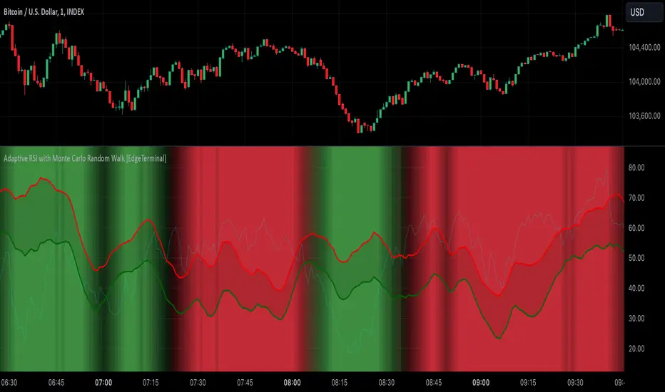
[BRAIN] Absolute Volatility of Price
Hello traders!
Today I want to share with you a series of scripts and strategies that I developed a few years ago. This is one of my first works, born from the curiosity of seeing a candlestick representation in a different way, without considering the price movement along the y-axis.
Imagine observing the price movement in dollars and percentages, always starting from the same reference point: the 0 axis. This approach can offer new insights and ideas on how and how much prices move.
To explain it better, the open of each candle does not start from the previous close negotiations but always starts from the 0 axis . In this way, it is possible to clearly compare the bodies of the candles with each other.
Script Visualization Methods and Input
- Study Normal: Simply reports the prices, including the negative ones of the red candles, on the same scale in absolute terms (ABS), as shown in the first indicator above.
- Study Normal Neg: In this version, the red candles vary negatively below zero, instead of in absolute terms above zero, as shown in the second indicator above.
- Study Perc: Similar to "Study Normal" but uses percentage values instead of dollars, useful for very low timeframes and low variations with many decimals, such as 1 minute on EUR/USD.
- Study Perc Neg: Similar to "Study Normal Neg" but uses percentage values.
Additionally, I have added the possibility to display or not, through two buttons, an average of the candle bodies adjustable in length via input and the range of each candle, always correlated in dollars or percentages, as per the main study setting.
I hope this work can be useful to many of you. I invite you to like if you appreciate my scripts and want to see more like these. Do not hesitate to comment or contact me for any doubts or questions.
PS: If you notice that in the script the sum of the percentage values between the shadow and the body of the candle does not correspond to the range, it is only a rounding issue. Change the precision setting to a lower value and you will see that the rounding disappears.
PS: In the script, to better visualize the percentage growth and decline of the instrument on very high timeframes, I decided to represent it as follows:
- If close ≥ open: (high - low) / low * 100
- If close < open: (high - low) / high * 100
The same method is also applied for calculating the percentage variations of the shadows relative to themselves.
I hope you like this version! If you need any further modifications or adjustments, let me know. Good luck with your project!
(In the photos below I show 3 versions of the indicator open on 3 different tickers as an example: from top to bottom in the 3 indicators are set these Study: Study Normal, Study Perc and Study Perc Neg)
