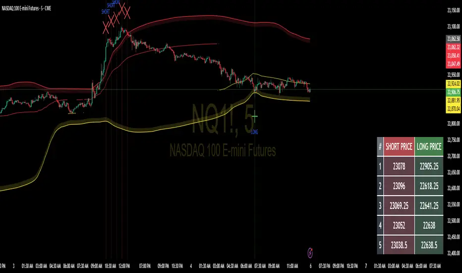
Floor and Roof Indicator with SignalsFloor and Roof Indicator with Trading Signals
A comprehensive support and resistance indicator that identifies premium and discount zones with automated signal generation.
Key Features:
Dynamic Support/Resistance Zones: Calculates floor (support) and roof (resistance) levels using price action and volatility
Premium/Discount Zone Identification: Highlights areas where price may find resistance or support
Customizable Signal Frequency: Control how often signals are displayed (every Nth occurrence)
Visual Signal Table: Optional table showing the last 5 long and short signal prices
Multiple Timeframe Compatibility: Works across all timeframes
Technical Details:
Uses ATR-based calculations for dynamic zone width adjustment
Combines Bollinger Bands with highest/lowest price analysis
Smoothing options for cleaner signal generation
Fully customizable colors and display options
How to Use:
Floor Zones (Blue): Potential support areas where long positions may be considered
Roof Zones (Pink): Potential resistance areas where short positions may be considered
Signal Crosses: Visual markers when price interacts with key levels
Signal Table: Track recent signal prices for analysis
Settings:
Length: Period for calculations (default: 200)
Smooth: Smoothing factor for cleaner signals
Zone Width: Adjust the thickness of support/resistance zones
Signal Frequency: Control signal display frequency
Visual Options: Customize colors and table position
Alerts Available:
Long signal alerts when price touches discount zones
Short signal alerts when price reaches premium zones
Educational Purpose: This indicator is designed to help traders identify potential support and resistance areas. Always combine with proper risk management and additional analysis.
This description focuses on the technical aspects and educational value while avoiding any language that could be interpreted as financial advice or guaranteed profits.
Statistics
Jumping watermark# Jumping watermark
## Function description
- Dynamic watermark: Mainly used to add dynamic watermarks to prevent theft and transfer when recording videos.
- Static watermark: Sharing opinions can easily include information such as trading pairs, cycles, current time, and individual signatures.
### Static watermark:
Display the watermark related to the current trading pair in the center of the chart.
- Configuration items:
- You can choose to configure the display content: current trading pair code and name, cycle, date, time, and individual signature content
### Dynamic watermark
Display the configured watermark content in a dynamic random position.
- Configuration items:
- Turn on or off the display of watermark jumping
- Modify the display text content and style by yourself
----- 中文简介-----
# 跳动水印
## 功能描述
- 动态水印: 主要可用于视频录制时添加动态水印防盗、防搬运。
- 静态水印:观点分享是可方便的带上交易对、周期、当前时间、个签等信息。
### 静态水印:
在图表中心位置显示当前交易对相关信息水印。
- 配置项:
- 可选择配置显示内容:当前交易对代码及名称、周期、日期、时间、个签内容
### 动态水印
动态随机位置显示配置水印内容。
- 配置项:
- 开启或关闭显示水印跳动
- 自行修改配置显示文字内容和样式
Kelly Optimal Leverage IndicatorThe Kelly Optimal Leverage Indicator mathematically applies Kelly Criterion to determine optimal position sizing based on market conditions.
This indicator helps traders answer the critical question: "How much capital should I allocate to this trade?"
Note that "optimal position sizing" does not equal the position sizing that you should have. The Optima position sizing given by the indicator is based on historical data and cannot predict a crash, in which case, high leverage could be devastating.
Originally developed for gambling scenarios with known probabilities, the Kelly formula has been adapted here for financial markets to dynamically calculate the optimal leverage ratio that maximizes long-term capital growth while managing risk.
Key Features
Kelly Position Sizing: Uses historical returns and volatility to calculate mathematically optimal position sizes
Multiple Risk Profiles: Displays Full Kelly (aggressive), 3/4 Kelly (moderate), 1/2 Kelly (conservative), and 1/4 Kelly (very conservative) leverage levels
Volatility Adjustment: Automatically recommends appropriate Kelly fraction based on current market volatility
Return Smoothing: Option to use log returns and smoothed calculations for more stable signals
Comprehensive Table: Displays key metrics including annualized return, volatility, and recommended exposure levels
How to Use
Interpret the Lines: Each colored line represents a different Kelly fraction (risk tolerance level). When above zero, positive exposure is suggested; when below zero, reduce exposure. Note that this is based on historical returns. I personally like to increase my exposure during market downturns, but this is hard to illustrate in the indicator.
Monitor the Table: The information panel provides precise leverage recommendations and exposure guidance based on current market conditions.
Follow Recommended Position: Use the "Recommended Position" guidance in the table to determine appropriate exposure level.
Select Your Risk Profile: Conservative traders should follow the Half Kelly or Quarter Kelly lines, while more aggressive traders might consider the Three-Quarter or Full Kelly lines.
Adjust with Volatility: During high volatility periods, consider using more conservative Kelly fractions as recommended by the indicator.
Mathematical Foundation
The indicator calculates the optimal leverage (f*) using the formula:
f* = μ/σ²
Where:
μ is the annualized expected return
σ² is the annualized variance of returns
This approach balances potential gains against risk of ruin, offering a scientific framework for position sizing that maximizes long-term growth rate.
Notes
The Full Kelly is theoretically optimal for maximizing long-term growth but can experience significant drawdowns. You should almost never use full kelly.
Most practitioners use fractional Kelly strategies (1/2 or 1/4 Kelly) to reduce volatility while capturing most of the growth benefits
This indicator works best on daily timeframes but can be applied to any timeframe
Negative Kelly values suggest reducing or eliminating market exposure
The indicator should be used as part of a complete trading system, not in isolation
Enjoy the indicator! :)
P.S. If you are really geeky about the Kelly Criterion, I recommend the book The Kelly Capital Growth Investment Criterion by Edward O. Thorp and others.

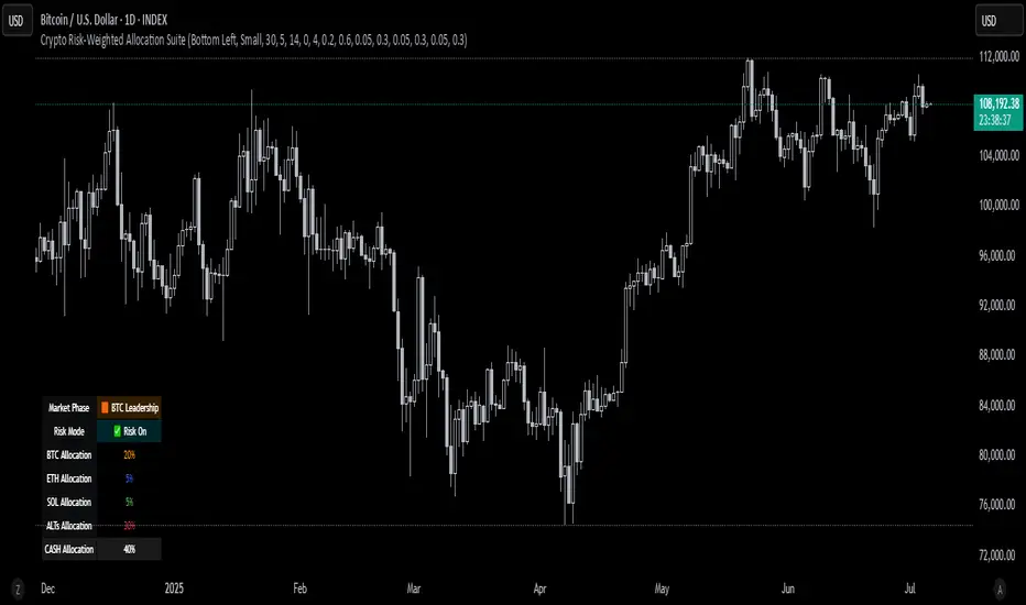
Crypto Risk-Weighted Allocation SuiteCrypto Risk-Weighted Allocation Suite
This indicator is designed to help users explore dynamic portfolio allocation frameworks for the crypto market. It calculates risk-adjusted allocation weights across major crypto sectors and cash based on multi-factor momentum and volatility signals. Best viewed on INDEX:BTCUSD 1D chart. Other charts and timeframes may give mixed signals and incoherent allocations.
🎯 How It Works
This model systematically evaluates the relative strength of:
BTC Dominance (CRYPTOCAP:BTC.D)
Represents Bitcoin’s share of the total crypto market. Rising dominance typically indicates defensive market phases or BTC-led trends.
ETH/BTC Ratio (BINANCE:ETHBTC)
Gauges Ethereum’s relative performance versus Bitcoin. This provides insight into whether ETH is leading risk appetite.
SOL/BTC Ratio (BINANCE:SOLBTC)
Measures Solana’s performance relative to Bitcoin, capturing mid-cap layer-1 strength.
Total Market Cap excluding BTC and ETH (CRYPTOCAP:TOTAL3ES)
Represents Altcoins as a broad category, reflecting appetite for higher-risk assets.
Each of these series is:
✅ Converted to a momentum slope over a configurable lookback period.
✅ Standardized into Z-scores to normalize changes relative to recent behavior.
✅ Smoothed optionally using a Hull Moving Average for cleaner signals.
✅ Divided by ATR-based volatility to create a risk-weighted score.
✅ Scaled to proportionally allocate exposure, applying user-configured minimum and maximum constraints.
🪙 Dynamic Allocation Logic
All signals are normalized to sum to 100% if fully confident.
An overall confidence factor (based on total signal strength) scales the allocation up or down.
Any residual is allocated to cash (unallocated capital) for conservative exposure.
The script automatically avoids “all-in” bias and prevents negative allocations.
📊 Outputs
The indicator displays:
Market Phase Detection (which asset class is currently leading)
Risk Mode (Risk On, Neutral, Risk Off)
Dynamic Allocations for BTC, ETH, SOL, Alts, and Cash
Optional momentum plots for transparency
🧠 Why This Is Unique
Unlike simple dominance indicators or crossovers, this model:
Integrates multiple cross-asset signals (BTC, ETH, SOL, Alts)
Adjusts exposure proportionally to signal strength
Normalizes by volatility, dynamically scaling risk
Includes configurable constraints to reflect your own risk tolerance
Provides a cash fallback allocation when conviction is low
Is entirely non-repainting and based on daily closing data
⚠️ Disclaimer
This script is provided for educational and informational purposes only.
It is not financial advice and should not be relied upon to make investment decisions.
Past performance does not guarantee future results.
Always consult a qualified financial advisor before acting on any information derived from this tool.
🛠 Recommended Use
As a framework to visualize relative momentum and risk-adjusted allocations
For research and backtesting ideas on portfolio allocation across crypto sectors
To help build your own risk management process
This script is not a turnkey strategy and should be customized to fit your goals.
✅ Enjoy exploring dynamic crypto allocations responsibly!
Logistic Regression ICT FVG🚀 OVERVIEW
Welcome to the Logistic Regression Fair Value Gap (FVG) System — a next-gen trading tool that blends precision gap detection with machine learning intelligence.
Unlike traditional FVG indicators, this one evolves with each bar of price action, scoring and filtering gaps based on real market behavior.
🔧 CORE FEATURES
✨ Smart Gap Detection
Automatically identifies bullish and bearish Fair Value Gaps using volatility-aware candle logic.
📊 Probability-Based Filtering
Uses logistic regression to assign each gap a confidence score (0 to 1), showing only high-probability setups.
🔁 Real-Time Retest Tracking
Continuously watches how price interacts with each gap to determine if it deserves respect.
📈 Multi-Factor Assessment
Evaluates RSI, MACD, and body size at gap formation to build a full context snapshot.
🧠 Self-Learning Engine
The logistic regression model updates on each bar using gradient descent, refining its predictions over time.
📢 Built-In Alerts
Get instant alerts when a gap forms, gets retested, or breaks.
🎨 Custom Display Options
Control the color of bullish/bearish zones, and toggle on/off probability labels for cleaner charts.
🚩 WHAT MAKES IT DIFFERENT
This isn’t just another box-drawing indicator.
While others mark every imbalance, this system thinks before it draws — using statistical modeling to filter out noise and prioritize high-impact zones.
By learning from how price behaves around gaps (not just how they form), it helps you trade only what matters — not what clutters.
⚙️ HOW IT WORKS
1️⃣ Detection
FVGs are identified using ATR-based thresholds and sharp wick imbalances.
2️⃣ Behavior Monitoring
Every gap is tracked — and if respected enough times, it becomes part of the elite training set.
3️⃣ Context Capture
Each new FVG logs RSI, MACD, and body size to provide a feature-rich context for prediction.
4️⃣ Prediction (Logistic Regression)
The model predicts how likely the gap is to be respected and assigns it a probability score.
5️⃣ Classification & Alerts
Gaps above the threshold are plotted with score labels, and alerts trigger for entry/respect/break.
⚙️ CONFIGURATION PANEL
🔧 System Inputs
• Max Retests – How many times a gap must be respected to train the model
• Prediction Threshold – Minimum score to show a gap on the chart
• Learning Rate – Controls how fast the model adapts (default: 0.009)
• Max FVG Lifetime – Expiration duration for unused gaps
• Show Historic Gaps – Show/hide expired or invalidated gaps
🎨 Visual Options
• Bullish/Bearish Colors – Set gap colors to fit your chart style
• Confidence Labels – Show probability scores next to FVGs
• Alert Toggles – Enable alerts for:
– New FVG detected
– FVG respected (entry)
– FVG invalidated (break)
💡 WHY LOGISTIC REGRESSION?
Traditional FVG tools rely on candle shapes.
This system relies on probability — by training on RSI, MACD, and price behavior, it predicts whether a gap will act as a true liquidity zone.
Logistic regression lets the system continuously adapt using new data, making it more accurate the longer it runs.
That means smarter signals, fewer false positives, and a clearer view of where real opportunities lie.

EVaR Indicator and Position SizingThe Problem:
Financial markets consistently show "fat-tailed" distributions where extreme events occur with higher frequency than predicted by normal distributions (Gaussian or even log-normal). These fat tails manifest in sudden price crashes, volatility spikes, and black swan events that traditional risk measures like volatility can underestimate. Standard deviation and conventional VaR calculations assume normally distributed returns, leaving traders vulnerable to severe drawdowns during market stress.
Cryptocurrencies and volatile instruments display particularly pronounced fat-tailed behavior, with extreme moves occurring 5-10 times more frequently than normal distribution models would predict. This reality demands a more sophisticated approach to risk measurement and position sizing.
The Solution: Entropic Value at Risk (EVAR)
EVaR addresses these limitations by incorporating principles from statistical mechanics and information theory through Tsallis entropy. This advanced approach captures the non-linear dependencies and power-law distributions characteristic of real financial markets.
Entropy is more adaptive than standard deviations and volatility measures.
I was inspired to create this indicator after reading the paper " The End of Mean-Variance? Tsallis Entropy Revolutionises Portfolio Optimisation in Cryptocurrencies " by by Sana Gaied Chortane and Kamel Naoui.
Key advantages of EVAR over traditional risk measures:
Superior tail risk capture: More accurately quantifies the probability of extreme market moves
Adaptability to market regimes: Self-calibrates to changing volatility environments
Non-parametric flexibility: Makes less assumptions about the underlying return distribution
Forward-looking risk assessment: Better anticipates potential market changes (just look at the charts :)
Mathematically, EVAR is defined as:
EVAR_α(X) = inf_{z>0} {z * log(1/α * M_X(1/z))}
Where the moment-generating function is calculated using q-exponentials rather than conventional exponentials, allowing precise modeling of fat-tailed behavior.
Technical Implementation
This indicator implements EVAR through a q-exponential approach from Tsallis statistics:
Returns Calculation: Price returns are calculated over the lookback period
Moment Generating Function: Approximated using q-exponentials to account for fat tails
EVAR Computation: Derived from the MGF and confidence parameter
Normalization: Scaled to for intuitive visualization
Position Sizing: Inversely modulated based on normalized EVAR
The q-parameter controls tail sensitivity—higher values (1.5-2.0) increase the weighting of extreme events in the calculation, making the model more conservative during potentially turbulent conditions.
Indicator Components
1. EVAR Risk Visualization
Dynamic EVAR Plot: Color-coded from red to green normalized risk measurement (0-1)
Risk Thresholds: Reference lines at 0.3, 0.5, and 0.7 delineating risk zones
2. Position Sizing Matrix
Risk Assessment: Current risk level and raw EVAR value
Position Recommendations: Percentage allocation, dollar value, and quantity
Stop Parameters: Mathematically derived stop price with percentage distance
Drawdown Projection: Maximum theoretical loss if stop is triggered
Interpretation and Application
The normalized EVAR reading provides a probabilistic risk assessment:
< 0.3: Low risk environment with minimal tail concerns
0.3-0.5: Moderate risk with standard tail behavior
0.5-0.7: Elevated risk with increased probability of significant moves
> 0.7: High risk environment with substantial tail risk present
Position sizing is automatically calculated using an inverse relationship to EVAR, contracting during high-risk periods and expanding during low-risk conditions. This is a counter-cyclical approach that ensures consistent risk exposure across varying market regimes, especially when the market is hyped or overheated.
Parameter Optimization
For optimal risk assessment across market conditions:
Lookback Period: Determines the historical window for risk calculation
Q Parameter: Controls tail sensitivity (higher values increase conservatism)
Confidence Level: Sets the statistical threshold for risk assessment
For cryptocurrencies and highly volatile instruments, a q-parameter between 1.5-2.0 typically provides the most accurate risk assessment because it helps capturing the fat-tailed behavior characteristic of these markets. You can also increase the q-parameter for more conservative approaches.
Practical Applications
Adaptive Risk Management: Quantify and respond to changing tail risk conditions
Volatility-Normalized Positioning: Maintain consistent exposure across market regimes
Black Swan Detection: Early identification of potential extreme market conditions
Portfolio Construction: Apply consistent risk-based sizing across diverse instruments
This indicator is my own approach to entropy-based risk measures as an alterative to volatility and standard deviations and it helps with fat-tailed markets.
Enjoy!

Hour-Stats v2cHour-Stats Indicator
The Hour-Stats indicator is a powerful, data-driven tool designed specifically for NQ futures traders who rely on statistically significant hourly price action probabilities. While traditional indicators typically focus only on the likelihood of prices returning to the opening price, Hour-Stats distinguishes itself by offering detailed statistical analysis across multiple critical price points.
Leveraging over 15 years of historical data, this indicator provides traders with robust probabilities for three unique hourly metrics:
Return to Hourly Open – The percentage likelihood of price revisiting the hourly open after breaking the high or low.
Return to Previous Hour Midpoint (PHM) – Offers clear probabilities of price returning to the midpoint (50%) of the previous hour’s range, a valuable metric for gauging reversals and continuations.
Opposite Extreme Targeting – Calculates the statistical likelihood of price moving to the opposite end (high or low) of the previous hour’s candle range, offering actionable insights for range trading strategies.
Additionally, Hour-Stats presents the historical probabilities of hourly highs and lows forming within three distinct 20-minute segments of each trading hour. This breakdown gives traders a precise understanding of when peaks or troughs are most likely, enhancing entry and exit timing.
The indicator’s settings are highly customizable, allowing traders to personalize visuals such as vertical and horizontal line colors, line styles (dotted, dashed, solid), and line thickness. Further customization includes label sizing, label positioning, and the ability to adjust visual dimming of swept price levels, providing clarity and ease of use during live market conditions.
Inspired by NQ Stats' concept (details available at nqstats, Hour-Stats expands significantly upon the original idea, delivering a uniquely comprehensive suite of hourly probability analytics for informed decision-making in futures trading.
Disclaimer: Futures trading involves significant risk. Traders should conduct their own due diligence and are responsible for their trading outcomes. Historical probabilities do not guarantee future results.

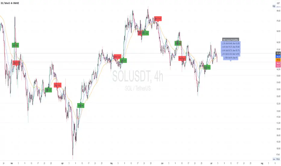
CM EMA Crossover Price Probabilities customCM EMA Crossover Price Probabilities
This indicator combines Exponential Moving Average (EMA) crossovers with swing high/low detection to calculate and display the historical probability of price movements exceeding user-defined percentage thresholds. Unlike standard EMA crossover indicators, it quantifies the likelihood of specific price changes following bullish (fast EMA crossing above slow EMA) or bearish (fast EMA crossing below slow EMA) crossovers, providing traders with data-driven insights into potential price behavior.
How It Works:EMA Crossovers: Detects when the fast EMA crosses above (bullish) or below (bearish) the slow EMA, marking these events with chart labels.
Price Change Measurement: Measures the percentage price change from the crossover point to the next swing high (for bullish crossovers) or swing low (for bearish crossovers), using pivot point detection.
Probability Calculation: Analyses historical crossover data to compute the probability of price changes meeting or exceeding customizable percentage thresholds (e.g., 2.5%, 5%). Probabilities are displayed as labels on the last bar, showing both bullish and bearish outcomes.
Customization: Allows users to adjust EMA lengths, pivot lookback, historical data limit, and probability thresholds via inputs.
Inputs:Fast EMA Length (default: 20): Period for the fast EMA.
Slow EMA Length (default: 50): Period for the slow EMA.
Pivot Lookback (default: 15): Bars used to detect swing highs/lows.
Max Historical Crossovers (default: 100): Limits stored crossovers for performance.
Bin Thresholds (defaults: 2.5%, 4.6%, 8.4%, 21.0%, 100.0%): Five customizable percentage thresholds for probability calculations.
Usage:
Add the indicator to your chart and adjust inputs to match your trading style. Bullish and bearish crossover points are labeled on the chart, and probability labels appear in the top-right corner when sufficient data is available. Use these probabilities to assess the historical likelihood of price movements after EMA crossovers, aiding in trade planning or risk assessment.
Why It’s Useful:
By combining EMA crossovers with swing-based price change analysis, this indicator offers a unique perspective on market behaviour post-crossover. The customizable probability thresholds allow traders to focus on specific price movement targets, making it a versatile tool for studying trend strength and potential outcomes.
Notes:
Probabilities are based on historical data and do not predict future performance.
Set bin thresholds in ascending order for accurate probability calculations.
Designed for educational purposes to analyze EMA crossover patterns.
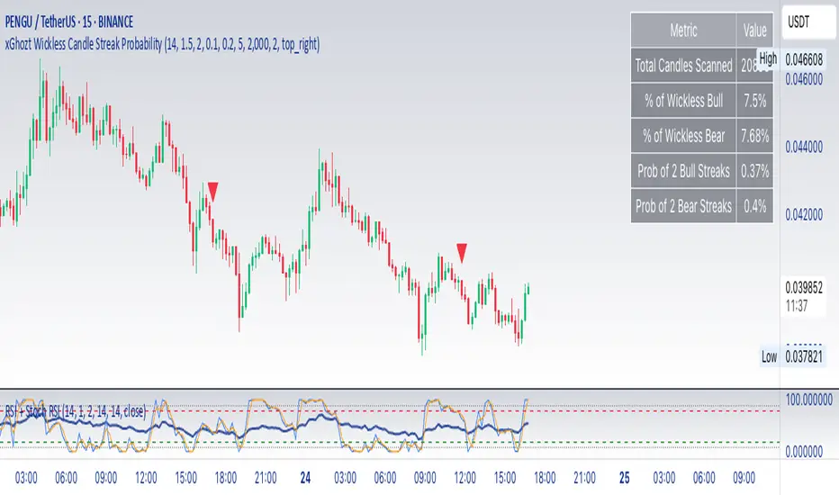
xGhozt Wickless Candle Streak ProbabilityThe xGhozt Wickless Candle Streak Probability is a custom Pine Script indicator designed to identify and quantify the occurrence of consecutive "wickless" candles of the same trend (either bullish or bearish).
Key Features:
Wickless Candle Detection: It first identifies candles that lack an upper or lower wick (meaning their open/close is equal to their high/low, respectively).
Consecutive Streak Tracking: The indicator tracks how many wickless bullish candles occur in a row, and similarly for wickless bearish candles.
User-Defined Streak Length: You can specify a Streak Length in the indicator's settings. This defines how many consecutive wickless candles are needed to register a "streak."
Probability Calculation: For the chosen Streak Length, the indicator calculates the historical probability (as a percentage) of encountering such a streak for both bullish and bearish wickless candles. This is done by dividing the number of times a streak of that length has occurred by the total number of candles scanned.
On-Chart Display: The results, including the total wickless candles, total scanned candles, and the calculated streak probabilities, are displayed in a convenient table directly on your chart.
Purpose:
This indicator helps traders and analysts understand the historical likelihood of sustained, strong directional moves as indicated by consecutive wickless candles. By quantifying these probabilities, it can provide insights into potential continuation patterns or extreme market conditions, which might be useful for developing trading strategies or confirming market biases.
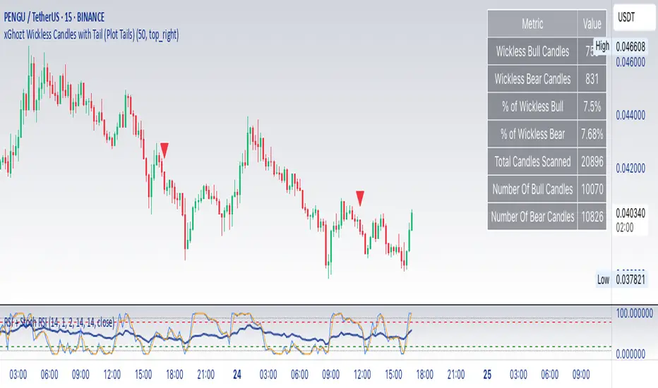
xGhozt Wickless Candles with TailSimple script showing candles missing an upper or lower wick. As candles tend to have a low and a high, they will most certainly form wicks. It is rare to have wickless candles on longer time frames, so it's more relevant on 1h and above.
Additionally, this indicator now visually tracks these 'missing wicks' as horizontal 'tails'. These tails extend from the wickless candle's extreme (low for bullish, high for bearish) and continue to stretch to the right until price action finally touches that level. Once touched, the tail disappears, signifying that the 'missing wick' has been filled or 'mitigated'.
What can you do about it?
If you see for example a Bitcoin 4h candle that hasn't formed two wicks yet, there are high chances that the missing wick will be formed at one point or another. The persistent horizontal tail vividly highlights these unmitigated levels, allowing you to identify potential price magnets. You could therefore consider taking a trade in the direction of the missing wick. You can set alerts on wickless candles if needed.
Shift 3M - 30Y Yield Spread🟧 Shift 3M - 30Y Yield Spread
- This indicator visually displays the **inverse of the US Treasury short-long yield spread** (3-month minus 30-year spread reversal signal) in a "price chart-like" form.
- By default, the spread line is shifted by 1 year to help anticipate forward market moves (you can adjust this offset freely).
- Especially customized to be analyzed together with the movements of US indices like the S&P 500, and to help understand broader market cycles.
✅ Description
- Normalizes the spread based on a rolling window length you set (default: 500 bars).
- Both the normalization window and offset (shift) are fully customizable.
- Then, it scales the spread to match your chart’s price range, allowing you to intuitively compare spread movements alongside price action.
- Instantly see the **inverse (reversal) signals of the short-long yield spread**, curve steepening, and how they align with actual price trends.
⚡ By reading macro yield signals, you can **anticipate exactly when a market crash might come or when an explosive rally is about to start**.
⚡ A perfect tool for macro traders and yield curve analysts who want to quickly catch major market turning points!
copyright @invest_hedgeway
============================================================
🟧3개월 - 30년 물 장단기 금리차 역수
- 이 인디케이터는 미국 국채 **장단기 금리차 역수**(3개월물 - 30년물 스프레드의 반전 시그널)를 시각적으로 "가격 차트"처럼 표시해 줍니다.
- 기본적으로 스프레드 선은 **1년(365봉) 시프트**되어 있어, 시장을 선행적으로 파악할 수 있도록 설계되었습니다 (값은 자유롭게 조정 가능).
- 특히 S&P500 등 미국 지수 흐름과 함께 분석할 수 있도록 맞춤화되었으며, 시장 사이클을 이해하는 데에도 큰 도움이 됩니다.
✅ 설명
- 지정한 롤링 윈도우 길이(기본: 500봉)를 기준으로 스프레드를 정규화합니다.
- 정규화 길이와 오프셋(시프트) 모두 자유롭게 설정 가능
- 이후 현재 차트의 가격 레인지에 맞게 스케일링해, 가격과 함께 흐름을 직관적으로 비교할 수 있습니다.
- **장단기 금리차의 역전(역수) 시그널**, 커브 스티프닝 등과 실제 가격 움직임의 관계를 한눈에 확인
⚡ 거시 금리 신호를 통해 **언제 폭락이 올지, 언제 폭등이 터질지** 미리 감지할 수 있습니다.
⚡ 시장의 전환점을 빠르게 캐치하고 싶은 매크로 트레이더와 금리 분석가에게 완벽한 도구!
copyright @invest_hedgeway

BANKNIFTY Contribution Table [GSK-VIZAG-AP-INDIA]1. Overview
This indicator provides a real-time visual contribution table of the 12 constituent stocks in the BANKNIFTY index. It displays key metrics for each stock that help traders quickly understand how each component is impacting the index at any given moment.
2. Purpose / Trading Use Case
The tool is designed for intraday and short-term traders who rely on index movement and its internal strength or weakness. By seeing which stocks are contributing positively or negatively, traders can:
Confirm trend strength or divergence within the index.
Identify whether a BANKNIFTY move is broad-based or driven by a few heavyweights.
Detect reversals when individual components decouple from index direction.
3. Key Features and Logic
Live LTP: Current price of each BANKNIFTY stock.
Price Change: Difference between current LTP and previous day’s close.
% Change: Percentage move from previous close.
Weight %: Static weight of each stock within the BANKNIFTY index (user-defined).
This estimates how much each stock contributes to the BANKNIFTY’s point change.
Sorted View: The stocks are sorted by their weight (descending), so high-impact movers are always at the top.
4. User Inputs / Settings
Table Position (tableLocationOpt):
Choose where the table appears on the chart:
top_left, top_right, bottom_left, or bottom_right.
This helps position the table away from your price action or indicators.
5. Visual and Plotting Elements
Table Layout: 6 columns
Stock | Contribution | Weight % | LTP | Change | % Change
Color Coding:
Green/red for positive/negative price changes and contributions.
Alternating background rows for better visibility.
BANKNIFTY row is highlighted separately at the top.
Text & Background Colors are chosen for both readability and direction indication.
6. Tips for Effective Use
Use this table on 1-minute or 5-minute intraday charts to see near real-time market structure.
Watch for:
A few heavyweight stocks pulling the index alone (can signal weak internal breadth).
Broad green/red across all rows (signals strong directional momentum).
Combine this with price action or volume-based strategies for confirmation.
Best used during market hours for live updates.
7. What Makes It Unique
Unlike other contribution tables that show only static data or require paid feeds, this script:
Updates in real time.
Uses dynamic calculated contributions.
Places BANKNIFTY at the top and presents the entire internal structure clearly.
Doesn’t repaint or rely on lagging indicators.
8. Alerts / Additional Features
No alerts are added in this version.
(Optional: Alerts can be added to notify when a certain stock contributes above/below a threshold.)
9. Technical Concepts Used
request.security() to pull both 1-minute and daily close data.
Conditional color formatting based on price change direction.
Dynamic table rendering using table.new() and table.cell().
Static weights assigned manually for BANKNIFTY stocks (can be updated if index weights change).
10. Disclaimer
This script is intended for educational and informational purposes only. It does not constitute financial advice or a buy/sell recommendation.
Users should test and validate the tool on paper or demo accounts before applying it to live trading.
📌 Note: Due to internet connectivity, data delays, or broker feeds, real-time values (LTP, change, contribution, etc.) may slightly differ from other platforms or terminals. Use this indicator as a supportive visual tool, not a sole decision-maker.
Script Title: BANKNIFTY Contribution Table -
Author: GSK-VIZAG-AP-INDIA
Version: Final Public Release

Frahm Factor Position Size CalculatorThe Frahm Factor Position Size Calculator is a powerful evolution of the original Frahm Factor script, leveraging its volatility analysis to dynamically adjust trading risk. This Pine Script for TradingView uses the Frahm Factor’s volatility score (1-10) to set risk percentages (1.75% to 5%) for both Margin-Based and Equity-Based position sizing. A compact table on the main chart displays Risk per Trade, Frahm Factor, and Average Candle Size, making it an essential tool for traders aligning risk with market conditions.
Calculates a volatility score (1-10) using true range percentile rank over a customizable look-back window (default 24 hours).
Dynamically sets risk percentage based on volatility:
Low volatility (score ≤ 3): 5% risk for bolder trades.
High volatility (score ≥ 8): 1.75% risk for caution.
Medium volatility (score 4-7): Smoothly interpolated (e.g., 4 → 4.3%, 5 → 3.6%).
Adjustable sensitivity via Frahm Scale Multiplier (default 9) for tailored volatility response.
Position Sizing:
Margin-Based: Risk as a percentage of total margin (e.g., $175 for 1.75% of $10,000 at high volatility).
Equity-Based: Risk as a percentage of (equity - minimum balance) (e.g., $175 for 1.75% of ($15,000 - $5,000)).
Compact 1-3 row table shows:
Risk per Trade with Frahm score (e.g., “$175.00 (Frahm: 8)”).
Frahm Factor (e.g., “Frahm Factor: 8”).
Average Candle Size (e.g., “Avg Candle: 50 t”).
Toggles to show/hide Frahm Factor and Average Candle Size rows, with no empty backgrounds.
Four sizes: XL (18x7, large text), L (13x6, normal), M (9x5, small, default), S (8x4, tiny).
Repositionable (9 positions, default: top-right).
Customizable cell color, text color, and transparency.
Set Frahm Factor:
Frahm Window (hrs): Pick how far back to measure volatility (e.g., 24 hours). Shorter for fast markets, longer for chill ones.
Frahm Scale Multiplier: Set sensitivity (1-10, default 9). Higher makes the score jumpier; lower smooths it out.
Set Margin-Based:
Total Margin: Enter your account balance (e.g., $10,000). Risk auto-adjusts via Frahm Factor.
Set Equity-Based:
Total Equity: Enter your total account balance (e.g., $15,000).
Minimum Balance: Set to the lowest your account can go before liquidation (e.g., $5,000). Risk is based on the difference, auto-adjusted by Frahm Factor.
Customize Display:
Calculation Method: Pick Margin-Based or Equity-Based.
Table Position: Choose where the table sits (e.g., top_right).
Table Size: Select XL, L, M, or S (default M, small text).
Table Cell Color: Set background color (default blue).
Table Text Color: Set text color (default white).
Table Cell Transparency: Adjust transparency (0 = solid, 100 = invisible, default 80).
Show Frahm Factor & Show Avg Candle Size: Check to show these rows, uncheck to hide (default on).

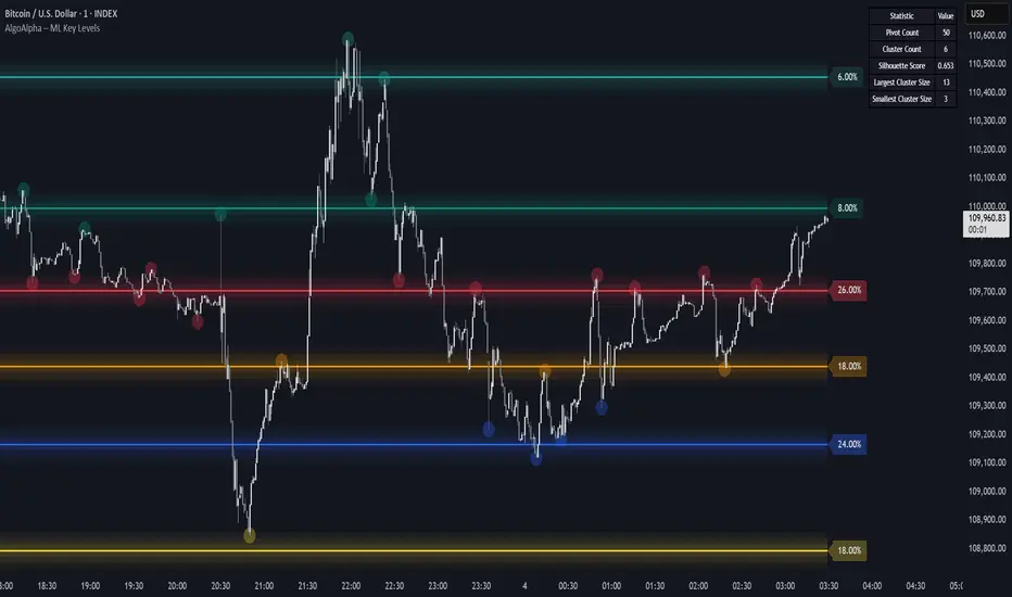
Machine Learning Key Levels [AlgoAlpha]🟠 OVERVIEW
This script plots Machine Learning Key Levels on your chart by detecting historical pivot points and grouping them using agglomerative clustering to highlight price levels with the most past reactions. It combines a pivot detection, hierarchical clustering logic, and an optional silhouette method to automatically select the optimal number of key levels, giving you an adaptive way to visualize price zones where activity concentrated over time.
🟠 CONCEPTS
Agglomerative clustering is a bottom-up method that starts by treating each pivot as its own cluster, then repeatedly merges the two closest clusters based on the average distance between their members until only the desired number of clusters remain. This process creates a hierarchy of groupings that can flexibly describe patterns in how price reacts around certain levels. This offers an advantage over K-means clustering, since the number of clusters does not need to be predefined. In this script, it uses an average linkage approach, where distance between clusters is computed as the average pairwise distance of all contained points.
The script finds pivot highs and lows over a set lookback period and saves them in a buffer controlled by the Pivot Memory setting. When there are at least two pivots, it groups them using agglomerative clustering: it starts with each pivot as its own group and keeps merging the closest pairs based on their average distance until the desired number of clusters is left. This number can be fixed or chosen automatically with the silhouette method, which checks how well each point fits in its cluster compared to others (higher scores mean cleaner separation). Once clustering finishes, the script takes the average price of each cluster to create key levels, sorts them, and draws horizontal lines with labels and colors showing their strength. A metrics table can also display details about the clusters to help you understand how the levels were calculated.
🟠 FEATURES
Agglomerative clustering engine with average linkage to merge pivots into level groups.
Dynamic lines showing each cluster’s price level for clarity.
Labels indicating level strength either as percent of all pivots or raw counts.
A metrics table displaying pivot count, cluster count, silhouette score, and cluster size data.
Optional silhouette-based auto-selection of cluster count to adaptively find the best fit.
🟠 USAGE
Add the indicator to any chart. Choose how far back to detect pivots using Pivot Length and set Pivot Memory to control how many are kept for clustering (more pivots give smoother levels but can slow performance). If you want the script to pick the number of levels automatically, enable Auto No. Levels ; otherwise, set Number of Levels . The colored horizontal lines represent the calculated key levels, and circles show where pivots occurred colored by which cluster they belong to. The labels beside each level indicate its strength, so you can see which levels are supported by more pivots. If Show Metrics Table is enabled, you will see statistics about the clustering in the corner you selected. Use this tool to spot areas where price often reacts and to plan entries or exits around levels that have been significant over time. Adjust settings to better match volatility and history depth of your instrument.
[TCV] - Position Tool Position Tool by TheCryptoVizier is a trade-planning widget that lets you drop Entry, Take-Profit and Stop-Loss levels directly on the chart, instantly calculates risk-to-reward and position size, and shows only the numbers you actually need. It’s designed for traders who plan visually and don’t want to juggle spreadsheets or external calculators.
WHAT PROBLEM DOES IT SOLVE?
When you drag price levels on TradingView you still have to:
work out how many contracts / coins you can buy for a fixed $ risk,
check that your R:R is acceptable,
copy the final values somewhere else.
The Position Tool automates all of that inside the chart and keeps the screen clean.
HOW TO USE
Add the indicator to any chart.
Drag the blue (Entry), green (TP) and red (SL) lines to your desired levels.
Set your Risk in USDT and toggle the check-boxes to show / hide extra fields.
Read off the position size, risk and R:R in the corner table or copy the exact numbers from the Data Window.
Place your order with confidence – the maths is already done.
Whether you scalp lower-timeframes or swing trade higher ones, the Position Tool removes friction from trade preparation and lets you focus on execution.
KEY FEATURES
Drag-and-drop Entry / TP / SL lines – plan the trade visually.
Fixed-risk position sizing – enter how much you’re willing to lose in USDT (or account currency) and the script tells you the exact position value and quantity.
Live R-to-R ratio – instantly see whether the reward compensates the risk as you move levels.
Smart info panel – overlay table shows Entry, TP, SL, R:R and – optionally via check-boxes – position in USDT, position in $TICKER and risk in USDT. Hide what you don’t need.
Copy-ready Data Window values – the same numbers appear in TradingView’s Data Window, so you can click any cell to copy it straight to the clipboard.
----------
Disclaimer: This indicator is provided for educational purposes only. Trading involves substantial risk, and nothing here should be construed as financial advice or a recommendation to trade. Always do your own research and consult a qualified professional.

ReversoReverso – Moving Average Touch Statistics Tracker
Reverso indicator is a technical analysis tool that tracks and visualizes how price interacts with a selected Exponential Moving Average (EMA). It provides detailed statistics about price behavior before, during, and after each EMA touch event.
This script is suitable for both trend-following and mean-reversion traders who want to study EMA reactions, understand market tendencies, and refine entry/exit strategies based on price-memory dynamics.
Features and Functionality
Supported MAs: EMA 9, 20, or 50
Timeframe Support: Uses the chart’s timeframe
Touch Detection: Triggered when the price range (high to low) crosses or touches the EMA
Automatic Data Tracking
Tables for Quick Visual Summary
Visual Overlay: Optional EMA line plotted on chart
Timeframe Support: Uses the chart’s timeframe
Capped history: Most recent 50 touches
Automatic Data Tracking:
Number of EMA touches
Time intervals between touches
Price distance from last touch
Maximum price deviation (above/below EMA) between touches
Time spent above/below EMA
Tables for Quick Visual Summary:
Info Table: Live details about last and first touches, distance from touch, bars above/below, peak movements since last touch
Stats Table: Averages and extreme values for price behavior patterns across recent history
Core Metrics Tracked
Last Touch Price: The last price level where price touched the EMA
Distance from Last Touch: Current % change from the last touch price
Time Between Touches: Average and maximum intervals (in bars or time) between touch events
Max Distance Above/Below: Peak movement above/below EMA between touches
Bars Above/Below: How long price stayed above/below the EMA since last touch
Peak This Cycle: Max deviation above/below in current cycle since last touch
How It Works
Reverso monitors each bar to check if price intersects the selected EMA.
When a new touch occurs, it records the touch price and time, and resets the tracking cycle.
From that point forward, it tracks how far and how long price drifts above or below the EMA.
This process repeats with each new touch, building a detailed profile of how price behaves around the moving average.
The result is a visual and statistical framework for understanding price memory, market rhythm, and mean-reversion opportunities.
Customization Options
EMA Length: Choose from EMA 9, 20, or 50
Show MA Line: Toggle the EMA plot on the chart
Show Info Table: Enable/disable the current-touch summary
Show Statistics Table: Show aggregate data over the history
Table Positioning: Customizable placement for both tables
MA Color: Select custom color for EMA plot
Intended Use Cases
Identify reversal or continuation setups near EMAs
Validate strategies relying on mean reversion
Backtest the consistency of price respect to EMAs
Detect periods of volatility clustering around EMAs
Notes and Disclaimers
This script does not repaint: calculations are made on confirmed bars.
This indicator is educational in nature and should be used alongside other forms of analysis.
Time durations in the tables are approximated using bar timing and may vary across markets/timeframes.
