MS Trades 10/20 indicatorMS Trades 10/20 Indicator is a refined version of the classic 10–20 moving average approach, designed specifically for Index Options traders.
This indicator goes beyond the traditional crossover logic and focuses on the true market structure, trend strength, and momentum confirmation, making it more practical for real intraday execution.
What this indicator helps you identify
Trend stability based on 10/20 dynamic zones
Clean entry confirmation beyond basic crossovers
High-quality trend continuation setups
Early exit warnings during volatility shifts
Clear bias identification for Nifty/BankNifty intraday traders
Why this version is different
Most traders look at 10/20 as a simple crossover strategy…
But MS Trades 10/20 Indicator highlights the real behaviour behind price movement, giving traders clarity on when the market is actually trending vs. when it is just whipsawing.
This makes it one of the most beginner-friendly yet powerful tools for intraday index trading.
Disclaimer
This indicator is for educational purposes only and is not a buy/sell signal provider.
Use this tool as part of your overall price action and risk management framework.
Полосы и каналы

HEMA Trend Levels + MAHEMA Trend Levels + MA
HEMA Trend Levels + MA
HEMA Trend Levels + MA
HEMA Trend Levels + MA

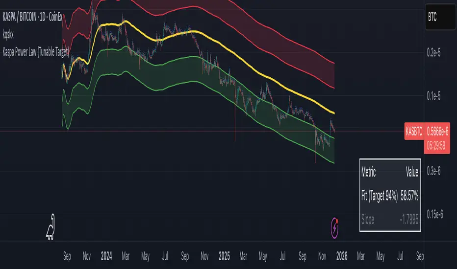
Kaspa Power Law (R=94%)Kaspa Power Law indicatior with 94% regression fit.
i have found that it may be more useful on the kas/btc chart.
SuperTrend Crypto v2This is an advanced version of Supertrend with Capabilites to add TGT/SL/TSL in points and percentage.
User can also Fire Entry and exit qty in dollars seperately.
Buy logic triggers signal when supertrend turns from red to green and vice versa for short.
Added options module to fire orders in options in multiple exchanges like Delta, Coinswitch and more.
Added Indian intraday mode incase if users want to use it for Indian markets as well.

Multi SMAOverlay indicator that displays a complete set of Simple Moving Averages in a single script: SMA 5, 10, 15, 20, 25, 30, 35, 40, 45, 50, 100, and 200.
It includes a selectable source (close, hl2, etc.) and two toggles to quickly show/hide short-term SMAs (5–50) and long-term SMAs (100–200). Ideal for analyzing trend direction, moving average alignment, and dynamic support/resistance zones directly on the price chart.

Fekry BB Entry/Exit with EMA FilterThis indicator is based on Bollinger Bands and exponential moving average strategy by Mr Kekry Zain

Ellipse Price Action Indicator v3Successful Trade Setup Using Ellipse Price Action Indicator (EPAI) 🔥
With the help of the Ellipse Price Action Indicator, this bearish trade setup played out perfectly.
EPAI generated a Sell Signal with a red arrow.
According to the EPAI method:
🔹 If price makes a new high on the next candle — add one more unit.
🔹 Every time a new high forms, add one more unit per candle.
🔹 Exit all units at the Moving Average (MA) — this is the core risk-controlled exit rule.
This is why EPAI consistently provides successful trade setups when followed with discipline.
⚠ Important Notice — Last Chance!
The Ellipse Price Action Indicator (EPAI) will soon become PRIVATE.
Access will be restricted only to Premium Members.
✅ First 25 subscribers can use this indicator absolutely FREE.
After that, it will not be available publicly.

KSL-Fullsystem V2.0Trend Following & Reversal Trading System. It combines **Price Action (Market Structure)** with multiple technical indicators to generate high-quality Buy and Sell signals.
---
1. How Signals are Generated (The Core Logic)
The script uses **"Internal Shifts"** (Market Structure Breaks) to find entry points.
* BUY Signal: The price breaks above a previous bearish structure (Higher High) + All enabled filters are Green.
* SELL Signal: The price breaks below a previous bullish structure (Lower Low) + All enabled filters are Red.
When a signal occurs, the script automatically calculates:
* Stop Loss (SL): Based on the recent Swing High/Low.
* Take Profit (TP): Three levels (TP1, TP2, TP3) based on risk-reward ratios (1.5x, 2.0x, 3.0x).
---
2. The Filters (Your Confirmation Checklist)
You can turn these On/Off in the settings. **Note:** If you turn *all* of them on, you might get very few signals because the conditions become too strict.
**A. Bollinger Bands (BB) Filters (Primary Feature)**
This is the main filter for this version.
* Squeeze Filter: Prevents trading when the bands are too narrow (low volatility). If the background turns **Yellow**, it means the market is "Squeezing" – **Do Not Trade.**
* Touch Entry: Looks for price bouncing off the Lower Band (Buy) or Upper Band (Sell).
* Breakout Entry: Looks for price blasting through the bands.
* Mean Reversion: Checks if price is reverting to the middle line (Basis).
**B. Moving Average Filters (Trend)**
The script includes three types of Moving Averages. You can choose which style suits you:
* EMA (Exponential): Fast-reacting. Good for scalping.
* SMA (Simple): Standard trend lines. Good for position trading.
* LWMA (Linear Weighted): Focuses heavily on recent data.
* Configuration: You can select specific setups like "Scalping" (9/21/50 EMA) or "Trend" (50/200 EMA).
**C. Momentum Filters**
* MACD: Checks momentum. You can choose settings for Scalping, Day Trading, or Swing Trading.
* AO (Awesome Oscillator) & AC: Helps confirm if the momentum is strong enough to support the trend.
---
**3. Visual Guide: What You See on the Chart**
* Green Box: A Buy Zone (Demand).
* Red Box: A Sell Zone (Supply).
* Labels (Text): Shows "BUY" or "SELL" with exact prices for TP1, TP2, TP3, and SL.
* Blue Lines: The Bollinger Bands (Upper and Lower).
* Orange Line: The Bollinger Band Basis (Middle).
* Small Triangles:
* Green Triangle (Below Bar): Price touched the Lower Bollinger Band.
* Red Triangle (Above Bar): Price touched the Upper Bollinger Band.
* Yellow Background: **WARNING.** The market has low volume/volatility (BB Squeeze). Wait for a breakout.
---
4. How to Use This Script
1. Select Your Style: Go to the Settings (Inputs).
* If you are a **Scalper**, turn on "Scalping EMA" or "Scalping MACD".
* If you are a **Swing Trader**, turn on "Swing SMA" or "Trend EMA".
2. Configure Bollinger Bands: Keep `Use Bollinger Bands Filter` checked. Decide if you want to trade "Squeezes" (usually safer to avoid them).
3. Wait for the Label: Do not enter blindly. Wait for the script to print a **BUY** or **SELL** label with the TP/SL targets.
4. Check the Background: If the background is **Yellow**, ignore the signal or wait until the color clears.
5. Manage Risk: Place your Stop Loss at the price shown on the label ("SL").

8EMA+BB-SubiProvides the facility to display 8 EMAs along with Bollinger Bands in the same indicator.

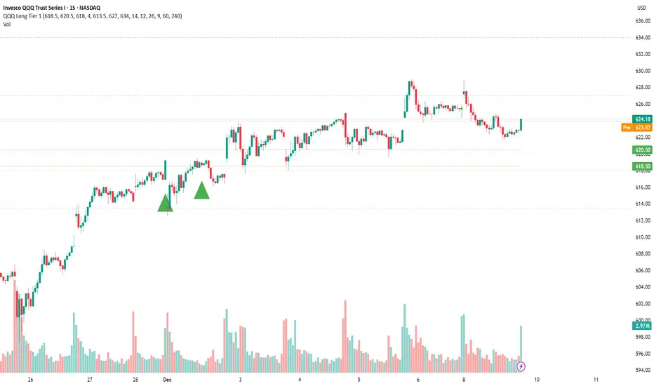
QQQ Long - Aggressive Aggressive Entry (Intraday Breakout)
Parameter Details
Entry Zone Break >626.5 on 15m candle close
Entry Condition 1. Reclaim and hold above VWAP. 2. RSI>60. 3. MACD (15min) zero-line cross. 4. ADDQ positive, TICK > +400.
Stop 623.0
Take Profit 630 (first), 635 (second)
Position Size 1R (smaller timeframe, tighter stop)
Time Invalidation Flatten EOD if fails to hold above 625.
Chart Reference 15m VWAP compression; confirms strong thrust signal supported by positive breadth (ADD/TICK).
________________________________________

QQQ - 8 Dec - Long Tier 2Tier 2 Entry (Balanced Swing)
Parameter Details
Entry Zone 621.5–623
Entry Condition 1. Hourly candle closes above VWAP and 9-EMA. 2. RSI(1H) crosses above 55. 3. Volume > prior 5-bar average.
Stop 616.5 (gamma flip line)
Take Profit 1 632 (upper expected move bound)
Take Profit 2 636 extension if FOMC dovish
Position Size 0.75R
Time Invalidation Dec 12—reduce exposure into event volatility
Chart Reference 4H EMA alignment trending up (9>20>50); price above 623 confirms structure.

rosha xau-usd 3.1.6 (v6)one of my fresh creations, use to trade profitably, includes months of my analysis and sgreen time for you all xauusd traders

QQQ - 8 Dec - Long Tier 1 Tier 1 Entry (Conservative)
Parameter Details
Entry Zone 618.5–620.5
Entry Condition 1. Price closes >1H VWAP after intraday sweep of 618. 2. RSI(15m) > 45. 3. MACD 4H histogram positive and rising.
Stop 613.5 (below VRVP HVN and 20EMA daily cluster)
Take Profit 1 627.0
Take Profit 2 634.0 (call wall)
Position Size 0.5R (reduced due to low IV and positive gamma pin)
Time Invalidation Exit by Dec 11 pre-FOMC if no breakout over 627
Chart Reference QQQ Daily VRVP and 4H structure show base above 618 EMA cluster; OBV confirms accumulation.
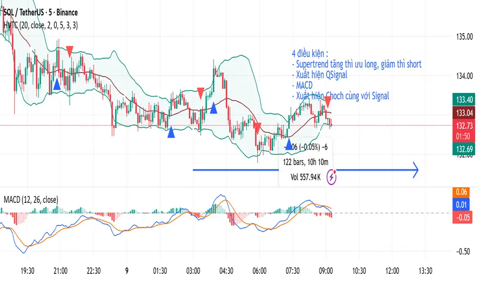
HVTCHVTC – SMC Market Structure & Trend Indicator
HVTC is a Smart Money Concepts–based tool that helps traders visualize market structure and trend direction with clarity.
Features:
CHoCH & BOS Detection
Automatically identifies structural shifts using true SMC logic and labels them directly on the chart.
Trend Filter
Confirms bullish or bearish conditions using an internal trend system to keep trades aligned with the major direction.
EMA 25 Guide
EMA 25 acts as dynamic support/resistance, helping define momentum and bias.
Alerts (Optional)
Notify traders when CHoCH/BOS or key retests occur—ideal for those who don’t monitor charts continuously.
Use Cases:
Works for Crypto, Forex, Gold, Indices, and Stocks across all timeframes. Helps improve entries, exits, and overall market understanding based on institutional structure.
Not financial advice. Use with proper risk management.
QQQ Long Tier 1 (Conservative) - 4-Bar SweepTier 1 Entry (Conservative)
Parameter Details
Entry Zone 618.5–620.5
Entry Condition 1. Price closes >1H VWAP after intraday sweep of 618. 2. RSI(15m) > 45. 3. MACD 4H histogram positive and rising.
Stop 613.5 (below VRVP HVN and 20EMA daily cluster)
Take Profit 1 627.0
Take Profit 2 634.0 (call wall)
Position Size 0.5R (reduced due to low IV and positive gamma pin)
Time Invalidation Exit by Dec 11 pre-FOMC if no breakout over 627
Chart Reference QQQ Daily VRVP and 4H structure show base above 618 EMA cluster; OBV confirms accumulation.

BB & MTF EMAs + DPOC/WPOC v0.1This indicator combines multiple trend and support/resistance tools into a single overlay with specific customization for the Indian Standard Time (IST) session.
Features Included:
Bollinger Bands: 20-period SMA Basis, 1.5 StdDev.
4 Multi-Timeframe EMAs:
EMA 1: 9 Length (1m timeframe)
EMA 2: 20 Length (3m timeframe)
EMA 3: 50 Length (15m timeframe)
EMA 4: 200 Length (15m timeframe)
Session POCs (IST):
Daily POC (DPOC): Calculated 05:30-05:29 IST. Extends for full 24h session.
Weekly POC: Calculated from Monday 05:30 IST Open. Extends for full 7-day week.
Controls:
Toggle visibility for all individual components.
"Show Historical" toggle for pivots to see past levels or keep charts clean.
2 days ago
Release Notes
Description:
This indicator combines multiple trend and support/resistance tools into a single overlay with specific customization for the Indian Standard Time (IST) session.
Features Included:
Bollinger Bands: 20-period SMA Basis, 1.5 StdDev.
4 Multi-Timeframe EMAs:
EMA 1: 9 Length (1m timeframe)
EMA 2: 20 Length (3m timeframe)
EMA 3: 50 Length (15m timeframe)
EMA 4: 200 Length (15m timeframe)
Session POCs (IST):
Daily POC (DPOC): Calculated 05:30-05:29 IST. Extends for full 24h session.
Weekly POC: Calculated from Monday 05:30 IST Open. Extends for full 7-day week.
Controls:
Toggle visibility for all individual components.
"Show Historical" toggle for pivots to see past levels or keep charts clean.

rosha 3.1.6 (v6)ema based for scalping xauusd,good during london and newyork sassions, use withour modifications, dont enter in tranverse markate

Sniper ZonesThe indicator evaluates the relationship between price expansion and compression within daily ranges. Based on these dynamics, it derives upper and lower threshold zones that often behave as supply or demand areas.
These thresholds act as “reaction pockets” where price has a tendency to slow, reverse, or accelerate depending on how it interacts with the levels.
No future data or repainting methods are used; the zones come from completed timeframe evaluations and remain fixed once established for that particular trading session
📌 How Traders Can Use It
Reversal Trading:
When price approaches a marked zone, traders can monitor for rejection signals or momentum fade.
Breakout & Continuation:
If a zone is broken with strength, it often suggests continuation in that direction. The broken zone can then act as a flip level.
Risk Management:
Zones may serve as potential stop-loss areas or context for target placement.
Bias Confirmation:
Zones help traders decide whether market structure is leaning toward exhaustion or expansion.
📌 What Makes This Indicator Valuable
While many supply/demand tools rely on pattern detection or candle shapes, this indicator uses a structured, rule-based approach grounded in range evaluation and volatility footprinting. The zones are clean, stable, and designed for professional reaction-based trading rather than subjective drawing.
This works best of Indices which are Nifty, Banknifty, Finnifty and also works for Indian Stocks. This is for Intraday and Scalpers.

MSB (MM+SP2L+BTB) V6_by_shahriar📝 MSB(MM + SP2L + BTB) V6_by_shahriar
This indicator is the improved and professional version of the earlier Combo V16. The logic has been streamlined by removing less critical patterns and focusing exclusively on the three most powerful strategies—Micro Map (MM), Spike to 2nd Leg (SP2L), and Back To Break Even (Pro BTB). These three form a "strong triangle" of high-probability entries, all strictly filtered by a long-term Simple Moving Average (SMA) to ensure trades align with the prevailing market trend.
💡 Strategy Logic Overview
This strategy generates a Buy or Sell signal only when the signal condition is met and the price is on the correct side of the Trend SMA (default 200).
1. Micro Map (MM): The Catalyst for Strong Profit Moves
The Micro Map strategy is the critical final piece of the Strong Triangle, acting as the precise trigger that signals the end of consolidation and the start of a powerful, high-momentum profit move in the direction of the trend. While SP2L identifies the momentum start and BTB identifies the retest of value, MM identifies the moment price is ready to explode.
Logic: This strategy focuses on identifying a tightly controlled consolidation or pullback (indicated by patterns like Lower Highs or Higher Lows over the MM Correction Bars period) that occurs within the major trend (above/below the Trend SMA).
Trigger: The signal fires when price decisively breaks out of this compressed area (using the MM Breakout Lookback high/low), indicating that the short-term resistance/support has collapsed and the larger trend momentum is taking over.
Profit Potential: Because this entry follows a period of energy buildup (consolidation), the MM signal is often the precursor to the strongest leg of the move, offering the highest potential for profit capture.
2. Spike to 2nd Leg (SP2L)
The SP2L strategy capitalizes on the market's tendency to continue movement after an initial strong impulse.
Trigger: It first detects a strong impulse move (Spike) based on the Min Bars in Spike and Min Spike Move % inputs. The entry is then triggered upon the breakout of the first corrective bar (pullback) that follows that initial Spike, confirming the continuation of the trend.
3. Back To Break Even (Pro BTB)
The Pro BTB strategy identifies high-probability entries near previous support/resistance levels that have been broken and then retested (a "Breaker" structure).
Trigger: It first detects a breakout of a high/low level defined by the Donchian Channel Length. The signal is generated when the price returns to touch the exact breakout level and then confirms the original trend direction with a closing candle (e.g., a bullish close on a retest of a broken resistance).
⚙️ Settings and Customization (Inputs Tab)
The indicator's parameters are fully customizable to adjust sensitivity and adapt to different markets and timeframes.
Setting Name,Category,Description
SMA Length (Trend Filter),General,Defines the period for the Simple Moving Average (SMA) used to determine the primary trend direction. (Default: 200)
Donchian Channel Length,General,"Determines the lookback period for the Donchian Channel, used to establish significant high/low levels for the Pro BTB strategy. (Default: 20)"
ATR Multiplier for Micro Map/BTB SL,General,A multiplier for the Average True Range (ATR) that can be used for calculating Stop Loss (SL) distance outside of the indicator's core logic.
ATR Multiplier for SP2L SL (Wider),General,"A wider ATR multiplier, often used for setting Stop Loss in the higher volatility SP2L strategy."
Min Bars in Spike,Spike Params,Minimum number of bars used to calculate the price change for detecting an initial Spike in the SP2L strategy.
Min Spike Move %,Spike Params,Minimum percentage price change required over the Min Bars in Spike to qualify as a strong Spike.
MM Correction Bars,Micro Map Params,Sets the number of bars to analyze for the Lower Highs/Higher Lows pattern that confirms consolidation/pullback in the MM strategy.
MM Breakout Lookback,Micro Map Params,Sets the lookback period for the high/low that must be broken to trigger a MM signal after consolidation.
🎨 Style Tab
The Style tab allows users to customize the visual appearance of the indicator on the chart:
Trend SMA: Displays the long-term SMA line used for trend filtering.
BTB Long/Short Level: Displays the exact price level of the Donchian Channel breakout when a BTB signal is active (helps visualize the retest point).
Signal Shapes: Allows customization of the color, size, and style of the shapes for Buy/Sell signals for MM, SP2L, and BTB individually.
⚠️ Disclaimer (Liability Waiver)
This indicator is intended for educational and analytical purposes only.
The signals generated by this combination of strategies are based on historical price data and technical analysis principles. Trading involves substantial risk, and past performance is not indicative of future results. Users must conduct their own thorough research (due diligence) and analysis before making any trading decisions. The indicator serves as a supplementary tool and should not be the sole basis for entering or exiting any financial market position. You are solely responsible for all trading decisions and risks taken.

HSS Price Action v1based on price action and SMC concepts this indicator will give you trade entry and also guide on order blocks and liquidity .. good luck

Ghost Super EMAGhost Super EMA: Dynamic Dual-Filter Trend System
Indicator Overview
The GHOST SUPER EMA is a robust trend-following indicator designed to give traders a comprehensive view of trend direction, volatility, and bias. It achieves this by combining a unique mashup of two distinct Supertrend bands with a single Exponential Moving Average (EMA).
The result is a triple-layered visualization of the market's structure: the two Supertrend bands form a Dynamic Cloud for visual support/resistance, and the EMA provides a crucial speed confirmation filter.
Core Components & Technical Justification
The core of this indicator functions powerfully on the current chart timeframe when the Timeframe input is left blank. The components are combined to create a unique, layered filtration system:
Outer Supertrend (Factor 3.35): This is the Macro-Trend Boundary. Its higher factor creates a slower, wider band that acts as the primary threshold for trend direction, preventing noise-related whipsaws often seen with standard settings.
Inner Supertrend (Factor 1.67): This is the Volatility Boundary. Its lower factor makes it quicker and measures current market momentum. It provides an early alert for volatility contraction or expansion within the established macro-trend.
Supertrend Cloud: The visual area between the two Supertrend bands represents a Dynamic Support/Resistance Zone. The cloud's width reflects market volatility. Price trading within this zone signals potential consolidation or momentum loss. Its color is determined by the Close price relative to the Outer Supertrend.
EMA (Length 20): This is the Speed Confirmation Filter. A classic trend measurement, its color (Green/Red) serves as an independent velocity check, validating the primary trend signal from the Supertrend Cloud.
Trading Signals and Confirmation
A confirmed trading bias requires the simultaneous alignment of both the Cloud and the EMA:
🟢 Bullish Confirmation (Go Long): The Supertrend Cloud is Green (Price above Outer ST) AND the EMA is Green (Price above EMA).
🔴 Bearish Confirmation (Go Short): The Supertrend Cloud is Red (Price below Outer ST) AND the EMA is Red (Price below EMA).
Optional Advanced Filtering: Multi-Timeframe (MTF) Tool
The Timeframe input is optional and serves as an advanced filter for obtaining market context.
Function: By entering a Higher Timeframe (HTF) value (e.g., entering "4H" or "D"), the indicator uses the request.security() function to fetch all three components (Dual Supertrend and EMA) from that stable, larger timeframe.
Utility: This anchors trading decisions to the macro-trend, filtering out lower-timeframe noise and false signals. Traders can ensure their entries on a fast chart (e.g., 5-minute) are aligned with the dominant trend of the chosen higher timeframe (e.g., 1-hour). If the input is left blank, the indicator runs on the current chart's timeframe.
Customizable Settings
The following inputs are available for user configuration:
ATR Length: Period for Average True Range calculation (Default: 10).
Supertrend Factor 1: Factor for the Outer (Slow) Supertrend (Default: 3.35).
Supertrend Factor 2: Factor for the Inner (Fast) Supertrend (Default: 1.67).
EMA Length: Period for the Exponential Moving Average (Default: 20).
Timeframe: Optional MTF input. Leave blank for current chart timeframe (Default: "").
Disclaimer: Past performance is not indicative of future results. This indicator is a tool for technical analysis and should not be used as the sole basis for trading decisions.

Dual Session Range Boxes with FIB Lines█ OVERVIEW
The Dual Session Range Boxes with FIB Lines indicator is a powerful tool for identifying and visualizing Range Breakout or Inside Boxes Strategy setups with dual session tracking, customizable Fibonacci extensions, and trade zone levels. Perfect for traders who focus on session-based strategies across multiple markets.
█ FEATURES
◆ DUAL SESSION RANGES
- Range 1: Defines the Range (ORB) based on a specific time window
- Range 2: Extends the Range levels throughout a second session for trade management
- Both ranges can be independently configured with preset sessions or custom times
◆ SESSION PRESETS
- Tokyo Session (00:00 - 09:00)
- London Session (08:00 - 17:00)
- New York Session (14:00 - 21:00)
- Pre Market Session (10:00 - 15:30)
- Custom Time: Define your own session windows
◆ FIBONACCI EXTENSION LEVELS
- Automatically calculated from Range 1 High/Low
- Buy Side Levels: Projected above the range (green)
- Sell Side Levels: Projected below the range (red)
- 10 customizable Fib levels with individual on/off toggles:
- 23.6%, 38.2%, 50%, 61.8%, 78.6%, 100%, 127.2%, 161.8%, 200%, 261.8%
- Special color highlighting for key levels (50%, 100%, 200%)
- All percentage values are fully editable
◆ INSIDE TRADE ZONES
- Two horizontal lines drawn inside the Range 1 box
- Configurable percentage from High/Low (default: 10%)
- Helps identify premium/discount zones within the range
◆ LABELS & DISPLAY OPTIONS
- Show/hide price values on labels
- Show/hide percentage values on labels
- Adjustable label size (Tiny, Small, Normal, Large, Huge)
- Configurable label offset (distance above lines)
- Multiple rounding options for price display:
- 0.25 (quarter points - ideal for indices)
- 0.1 (tenth points)
- 0.01 (two decimals)
◆ STYLE CUSTOMIZATION
- Independent fill and border colors for both ranges
- Adjustable border width (1-5)
- Line style options: Solid, Dashed, Dotted
- Separate color settings for:
- Buy side Fibonacci levels
- Sell side Fibonacci levels
- Trade zone lines
- Special levels (50%, 100%, 200%)
◆ HISTORICAL DATA CONTROL
- Toggle to show/hide historical sessions
- Current session always remains visible
- Clean chart view when analyzing only the active session
█ HOW TO USE
1. Set your timezone in General settings
2. Configure Range 1 to capture your desired Opening Range period
3. Configure Range 2 to define how long levels should extend
4. Adjust Fibonacci levels based on your trading strategy
5. Use Trade Zones to identify key areas within the range
6. Toggle historical data on/off based on your analysis needs
█ USE CASES
- Opening Range Breakout (ORB) strategies
- Session-based trading (London, New York, Tokyo, Pre-Market)
- Fibonacci extension targets for breakout trades
- Identifying support/resistance from session ranges
- Multi-session analysis and confluence zones
█ NOTES
- Indicator works on timeframes lower than Daily
- All times are based on the selected timezone setting
- Range 2 only activates after Range 1 completes
- Fibonacci levels extend from Range 1 start to Range 2 end
Let me know if you like to have any enhancements.
Leave a like if you like it!
