MACD Classic MT5 Style (2 Lines + Histogram)MACD Classic MT5 Style (แบบ MetaTrader 5) มีความแตกต่างจาก MACD ทั่วไปที่ใช้กันใน TradingView พอสมควรครับ นี่คือคำอธิบายว่ามันทำงานอย่างไรและอ่านค่าอย่างไรครับ:
1. ความแตกต่างสำคัญ (Key Difference)
MACD ทั่วไป (Standard):
มี 2 เส้น (เส้น MACD และ เส้น Signal)
ฮิสโตแกรม (แท่งกราฟ) คือ ส่วนต่าง (Gap) ระหว่าง 2 เส้นนั้น
MACD แบบ MT5 (Classic MT5):
เส้น MACD จะถูกวาดออกมาเป็น แท่งกราฟ (Histogram) แทนที่จะเป็นเส้น
เส้น Signal จะเป็น เส้น (Line) สีแดงพาดผ่านแท่งกราฟ
สรุปคือ: ในแบบ MT5 แท่งกราฟคือตัวพระเอก (MACD) ส่วนเส้นคือตัวช่วยกรอง (Signal)
Here is the English translation of the explanation:
MACD Classic MT5 Style vs. Standard MACD
The "Classic MT5 Style" MACD differs significantly from the standard MACD typically found on TradingView. Below is an explanation of its mechanics and how to interpret it.
1. Key Differences
Standard MACD (TradingView Default):
Displays 2 Lines (MACD Line and Signal Line).
The Histogram represents the difference (gap) between those two lines.
MT5 Style MACD (Classic):
The MACD value is plotted as a Histogram (bars) instead of a line.
The Signal Line appears as a standard Line (usually red) overlaying the histogram.
In summary: In the MT5 style, the Histogram represents the actual MACD Line, while the separate line acts as the Signal filter.
Трендовый анализ

MR Generic - 4H OptimizedThis indicator plots a Z-score based on linear regression over the last 80 bars (about 13–14 days on the 4-hour chart), showing how far the current price has deviated from its trend.
Blue line = Z-score
Red shading = Overbought (above 2.2)
Green shading = Oversold (below -2.2)
Darker red/green = Extreme levels (beyond ±2.8)
Small circles mark regular reversal signals when price starts turning back toward the mean. Tiny diamonds highlight rare, extreme exhaustion points.
Perfect for spotting potential mean reversion setups on stocks in the 4 hour

IDAHL | QuantEdgeBIDAHL | QuantEdgeB
🔍 Overview
The IDAHL indicator builds adaptive, volatility-aware threshold bands from two separate ALMA lines—one smoothed from recent highs, the other from recent lows—then uses percentiles of those lines to define a dynamic “high/low” channel. Price crossing above or below that channel triggers clear long/short signals, with on-chart candle coloring, fills, optional labels and even a built-in backtest table.
✨ Key Features
• 📈 Dual ALMA Bands (with DEMA pre-smoothing)
o High ALMA: ALMA applied to DEMA-smoothed highs (high → DEMA(30) → ALMA).
o Low ALMA: ALMA applied to DEMA-smoothed lows (low → DEMA(30) → ALMA).
• 📊 Percentile Thresholds
o Computes a high threshold at the Xth percentile of the High ALMA over a lookback window.
o Computes a low threshold at the Yth percentile of the Low ALMA.
o Shifts each threshold forward by a small period to reduce repainting.
• ⚡ Dynamic Channel Logic
o When price closes above the high percentile line, the “final” threshold flips down to the low percentile line (and vice versa), creating an adaptive channel that only moves when the outer bound is violated.
o Inside the channel, the threshold holds its last value to avoid whipsaw.
• 🎨 Visual & Alerts
o Plots the two percentile lines and fills between them with a color that reflects the current regime (green for long, yellow for neutral, orange for short).
o Colors your candles to match the active signal.
o Optional “Long”/“Short” labels on confirmed flips.
o Alert conditions fire on each long/short crossover.
• 📊 On-Chart Backtest Metrics
o Toggle on a small performance table—complete with win-rate, net P/L, drawdown—from your chosen start date, without any extra code.
⚙️ How It Works
1. Adaptive Smoothing (ALMA)
o Uses ALMA (Arnaud Legoux Moving Average) for smooth, low-lag filtering. In this script, the inputs are additionally pre-smoothed with DEMA(30) to reduce noise before ALMA is applied—improving stability on highs/lows.
2. Percentile Lines
o The High ALMA series feeds a linear-interpolation percentile function to generate the upper bound; the Low ALMA produces the lower bound.
o These lines are offset by a small look-ahead (X bars) to reduce repaint behavior.
3. Channel Logic
o Breakout Flip: When the selected source (default: Close) closes above the upper bound, the active threshold “jumps” to the lower bound—locking in a new channel until price next crosses.
o Breakdown Flip: Conversely, a close below the lower bound flips the threshold to the upper bound.
4. Signal Generation
o Long while the source is above the current “final” threshold.
o Short while below.
o Neutral inside the channel before any flip.
5. Visualization & Alerts
o Dynamic fills between the two percentile lines change hue as the regime flips.
o Candles adopt the regime color.
o Optional pinned “Long”/“Short” labels at flip bars.
o Alerts on every signal crossover of the zero-based regime line.
6. Backtest Table
o From your chosen start date, a mini-table displays cumulative P/L, win rate and drawdown for this strategy—handy for quick in-chart validation.
🎯 Who Should Use It
• Breakout Traders hunting for adaptive channels that auto-recenter on new highs/lows.
• Volatility Traders who want thresholds that expand and contract with market turbulence.
• Trend-Chasers seeking a fresh take on high/low channels with built-in smoothing.
• Systematic Analysts who appreciate on-chart backtesting without leaving TradingView.
⚙️ Default Settings
• ALMA Length: 14
• Percentile Length: 35 bars
• Percentile Lookback Period (offset): 4 bars
• Upper Percentile: 92%
• Lower Percentile: 50%
• Threshold Source: Close
• Visuals: Candle coloring on, labels off by default, “Strategy” palette
• Backtest Table: on by default (toggleable)
• Start Date (Backtest): 09 Oct 2017
📌 Conclusion
IDAHL blends two smooth, low-lag ALMA filters (fed by DEMA-smoothed highs/lows) with percentile-based channel construction for a self-rewiring high/low envelope. It gives you robust breakout/breakdown signals, immediate visual context via colored fills and candles, optional labels, alerts, and even performance stats—everything you need to spot and confirm regime shifts in one compact script.
🔹 Disclaimer : Past performance is not indicative of future results. Always backtest and align settings with your risk tolerance and objectives before live trading.
🔹 Strategic Advice : Always backtest, optimize, and align parameters with your trading objectives and risk tolerance before live trading.

FL Core Signals Only 4AM 4PMFL Core – Signals Only is a confirmation-based trading indicator designed to highlight structured entry and exit points during active market hours.
This script is not predictive and does not generate trade recommendations. It provides visual confirmation only after conditions are met and candles are closed.
Core characteristics:
• Signals are limited to 4:00 AM – 4:00 PM (exchange time)
• Designed for lower timeframes (1–5 minute charts)
• No indicator clutter — entries, exits, and profit target references only
• Logic is based on trend alignment and momentum confirmation
• Customizable profit target distances for different instruments
This indicator is intended for experienced traders who already understand risk management and execution. Users are responsible for their own trade decisions.
This is not an indicator you trade into.
It is a confirmation system you wait for.
Past performance does not guarantee future results.

Hurst-Optimized Adaptive Channel [Kodexius]Hurst-Optimized Adaptive Channel (HOAC) is a regime-aware channel indicator that continuously adapts its centerline and volatility bands based on the market’s current behavior. Instead of using a single fixed channel model, HOAC evaluates whether price action is behaving more like a trend-following environment or a mean-reverting environment, then automatically selects the most suitable channel structure.
At the core of the engine is a robust Hurst Exponent estimation using R/S (Rescaled Range) analysis. The Hurst value is smoothed and compared against user-defined thresholds to classify the market regime. In trending regimes, the script emphasizes stability by favoring a slower, smoother channel when it proves more accurate over time. In mean-reversion regimes, it deliberately prioritizes a faster model to react sooner to reversion opportunities, similar in spirit to how traders use Bollinger-style behavior.
The result is a clean, professional adaptive channel with inner and outer bands, dynamic gradient fills, and an optional mean-reversion signal layer. A minimalist dashboard summarizes the detected regime, the current Hurst reading, and which internal model is currently preferred.
🔹 Features
🔸 Robust Regime Detection via Hurst Exponent (R/S Analysis)
HOAC uses a robust Hurst Exponent estimate derived from log returns and Rescaled Range analysis. The Hurst value acts as a behavioral filter:
- H > Trend Start threshold suggests trend persistence and directional continuation.
- H < Mean Reversion threshold suggests anti-persistence and a higher likelihood of reverting toward a central value.
Values between thresholds are treated as Neutral, allowing the channel to remain adaptive without forcing a hard bias.
This regime framework is designed to make the channel selection context-aware rather than purely reactive to recent volatility.
🔸 Dual Channel Engine (Fast vs Slow Models)
Instead of relying on one fixed channel, HOAC computes two independent channel candidates:
Fast model: shorter WMA basis and standard deviation window, intended to respond quickly and fit more reactive environments.
Slow model: longer WMA basis and standard deviation window, intended to reduce noise and better represent sustained directional flow.
Each model produces:
- A midline (basis)
- Outer bands (wider deviation)
- Inner bands (tighter deviation)
This structure gives you a clear core zone and an outer envelope that better represents volatility expansion.
🔸 Rolling Optimization Memory (Model Selection by Error)
HOAC includes an internal optimization layer that continuously measures how well each model fits current price action. On every bar, each model’s absolute deviation from the basis is recorded into a rolling memory window. The script then compares total accumulated error between fast and slow models and prefers the one with lower recent error.
This approach does not attempt curve fitting on multiple parameters. It focuses on a simple, interpretable metric: “Which model has tracked price more accurately over the last X bars?”
Additionally:
If the regime is Mean Reversion, the script explicitly prioritizes the fast model, ensuring responsiveness when reversals matter most.
🔸 Optional Output Smoothing (User-Selectable)
The final selected channel can be smoothed using your choice of:
- SMA
- EMA
- HMA
- RMA
This affects the plotted midline and all band outputs, allowing you to tune visual stability and responsiveness without changing the underlying decision engine.
🔸 Premium Visualization Layer (Inner Core + Outer Fade)
HOAC uses a layered band design:
- Inner bands define the core equilibrium zone around the midline.
- Outer bands define an extended volatility envelope for extremes.
Gradient fills and line styling help separate the core from the extremes while staying visually clean. The midline includes a subtle glow effect for clarity.
🔸 Adaptive Bar Tinting Strength (Regime Intensity)
Bar coloring dynamically adjusts transparency based on how far the Hurst value is from 0.5. When market behavior is more decisively trending or mean-reverting, the tint becomes more pronounced. When behavior is closer to random, the tint becomes more subtle.
🔸 Mean-Reversion Signal Layer
Mean-reversion signals are enabled when the environment is not classified as Trending:
- Buy when price crosses back above the lower outer band
- Sell when price crosses back below the upper outer band
This is intentionally a “return to channel” logic rather than a breakout logic, aligning signals with mean-reversion behavior and avoiding signals in strongly trending regimes by default.
🔸 Minimalist Dashboard (HUD)
A compact table displays:
- Current regime classification
- Smoothed Hurst value
- Which model is currently preferred (Fast or Slow)
- Trend flow direction (based on midline slope)
🔹 Calculations
1) Robust Hurst Exponent (R/S Analysis)
The script estimates Hurst using a Rescaled Range approach on log returns. It builds a returns array, computes mean, cumulative deviation range (R), standard deviation (S), then converts RS into a Hurst exponent.
calc_robust_hurst(int length) =>
float r = math.log(close / close )
float returns = array.new_float(length)
for i = 0 to length - 1
array.set(returns, i, r )
float mean = array.avg(returns)
float cumDev = 0.0
float maxCD = -1.0e10
float minCD = 1.0e10
float sumSqDiff = 0.0
for i = 0 to length - 1
float val = array.get(returns, i)
sumSqDiff += math.pow(val - mean, 2)
cumDev += (val - mean)
if cumDev > maxCD
maxCD := cumDev
if cumDev < minCD
minCD := cumDev
float R = maxCD - minCD
float S = math.sqrt(sumSqDiff / length)
float RS = (S == 0) ? 0.0 : (R / S)
float hurst = (RS > 0) ? (math.log10(RS) / math.log10(length)) : 0.5
hurst
This design avoids simplistic proxies and attempts to reflect persistence (trend tendency) vs anti-persistence (mean reversion tendency) from the underlying return structure.
2) Hurst Smoothing
Raw Hurst values can be noisy, so the script applies EMA smoothing before regime decisions.
float rawHurst = calc_robust_hurst(i_hurstLen)
float hVal = ta.ema(rawHurst, i_smoothHurst)
This stabilized hVal is the value used across regime classification, dynamic visuals, and the HUD display.
3) Regime Classification
The smoothed Hurst reading is compared to user thresholds to label the environment.
string regime = "NEUTRAL"
if hVal > i_trendZone
regime := "TRENDING"
else if hVal < i_chopZone
regime := "MEAN REV"
Higher Hurst implies more persistence, so the indicator treats it as a trend environment.
Lower Hurst implies more mean-reverting behavior, so the indicator enables MR logic and emphasizes faster adaptation.
4) Dual Channel Models (Fast and Slow)
HOAC computes two candidate channel structures in parallel. Each model is a WMA basis with volatility envelopes derived from standard deviation. Inner and outer bands are created using different multipliers.
Fast model (more reactive):
float fastBasis = ta.wma(close, 20)
float fastDev = ta.stdev(close, 20)
ChannelObj fastM = ChannelObj.new(fastBasis, fastBasis + fastDev * 2.0, fastBasis - fastDev * 2.0, fastBasis + fastDev * 1.0, fastBasis - fastDev * 1.0, math.abs(close - fastBasis))
Slow model (more stable):
float slowBasis = ta.wma(close, 50)
float slowDev = ta.stdev(close, 50)
ChannelObj slowM = ChannelObj.new(slowBasis, slowBasis + slowDev * 2.5, slowBasis - slowDev * 2.5, slowBasis + slowDev * 1.25, slowBasis - slowDev * 1.25, math.abs(close - slowBasis))
Both models store their structure in a ChannelObj type, including the instantaneous tracking error (abs(close - basis)).
5) Rolling Error Memory and Model Preference
To decide which model fits current conditions better, the script stores recent errors into rolling arrays and compares cumulative error totals.
var float errFast = array.new_float()
var float errSlow = array.new_float()
update_error(float errArr, float error, int maxLen) =>
errArr.unshift(error)
if errArr.size() > maxLen
errArr.pop()
Each bar updates both error histories and computes which model has lower recent accumulated error.
update_error(errFast, fastM.error, i_optLookback)
update_error(errSlow, slowM.error, i_optLookback)
bool preferFast = errFast.sum() < errSlow.sum()
This is an interpretable optimization approach: it does not attempt to brute-force parameters, it simply prefers the model that has tracked price more closely over the last i_optLookback bars.
6) Winner Selection Logic (Regime-Aware Hybrid)
The final model selection uses both regime and rolling error performance.
ChannelObj winner = regime == "MEAN REV" ? fastM : (preferFast ? fastM : slowM)
rawMid := winner.mid
rawUp := winner.upper
rawDn := winner.lower
rawUpInner := winner.upper_inner
rawDnInner := winner.lower_inner
In Mean Reversion, the script forces the fast model to ensure responsiveness.
Otherwise, it selects the lowest-error model between fast and slow.
7) Optional Output Smoothing
After the winner is selected, the script optionally smooths the final channel outputs using the chosen moving average type.
smooth(float src, string type, int len) =>
switch type
"SMA" => ta.sma(src, len)
"EMA" => ta.ema(src, len)
"HMA" => ta.hma(src, len)
"RMA" => ta.rma(src, len)
=> src
float finalMid = i_enableSmooth ? smooth(rawMid, i_smoothType, i_smoothLen) : rawMid
float finalUp = i_enableSmooth ? smooth(rawUp, i_smoothType, i_smoothLen) : rawUp
float finalDn = i_enableSmooth ? smooth(rawDn, i_smoothType, i_smoothLen) : rawDn
float finalUpInner = i_enableSmooth ? smooth(rawUpInner, i_smoothType, i_smoothLen) : rawUpInner
float finalDnInner = i_enableSmooth ? smooth(rawDnInner, i_smoothType, i_smoothLen) : rawDnInner
This preserves decision integrity since smoothing happens after model selection, not before.
8) Dynamic Visual Intensity From Hurst
Transparency is derived from the distance of hVal to 0.5, so stronger behavioral regimes appear with clearer tints.
int dynTrans = int(math.max(20, math.min(80, 100 - (math.abs(hVal - 0.5) * 200))))

HoneG_MATSU_4GYAKUBARI_MAIN_v3This tool generates counter-trend signals recommended for 3- to 5-minute trades, though it is applied to 1-minute charts.
適用するのは1分チャートですが、取引は3分~5分推奨の逆張りサインツールです。

QMF- Market Structure & Signal Suite [BullByte]QUANTUM MOMENTUM FUSION - Market Structure and Signal Suite
OVERVIEW
Quantum Momentum Fusion is a comprehensive market analysis framework built around a multi-dimensional momentum oscillator. This indicator was designed to give traders a complete analytical workspace in a single tool, combining momentum measurement, market structure identification, trendline analysis, divergence detection, and multi-timeframe context into one unified system.
The core philosophy behind QMF is that successful trading decisions come from understanding multiple aspects of market behavior simultaneously, not from relying on any single indicator or signal. The oscillator serves as the analytical foundation, and every other component builds upon it to create a complete picture of current market conditions.
This description will walk through each component of the indicator, explaining what it measures, why that information matters, and how to interpret what you see on the chart. Whether you are an experienced trader familiar with oscillator analysis or newer to technical indicators, each section aims to make the concepts accessible and practical.
THE QUANTUM ENGINE: UNDERSTANDING THE CORE OSCILLATOR (why its original and not a mashup)
At the heart of this indicator is the Quantum Momentum Fusion oscillator, displayed in its own pane below the price chart. Unlike traditional oscillators that measure a single aspect of price behavior, the QMF oscillator synthesizes four distinct market dimensions into one unified reading.
WHAT IS AN OSCILLATOR
For those less familiar with the term, an oscillator is a technical indicator that fluctuates between defined boundaries, typically showing whether an asset is experiencing strong buying pressure, strong selling pressure, or neutral conditions. The QMF oscillator moves between 0 and 100, with 50 representing the neutral midpoint.
When the oscillator is high (above 70), it suggests the market has experienced significant upward momentum and may be approaching exhaustion. When low (below 30), it suggests the market has experienced significant downward momentum and may be due for a bounce. The space between these extremes represents normal market fluctuation.
THE FOUR DIMENSIONS
What makes the QMF oscillator different from standard momentum indicators is that it combines four separate measurements into its calculation. Each dimension captures a different aspect of market behavior:
VELOCITY DIMENSION
This measures how quickly momentum itself is changing. Think of it like acceleration in a car. Knowing the car is moving forward (direction) is useful, but knowing whether the driver is pressing the accelerator or the brake (acceleration) tells you what is likely to happen next. The velocity dimension calculates the rate of change of the rate of change, providing early warning when momentum is about to shift direction. In practical terms, this can show momentum weakening before price actually reverses.
Why it matters: Price can continue in one direction for a while even after the underlying momentum starts to fade. By measuring acceleration, you can identify potential turning points earlier than with simple momentum indicators.
How it appears: This dimension is calculated internally and combined with the others. You do not see it separately, but its effect shows in the oscillator responding earlier to momentum shifts.
VOLUME DIMENSION
This measures price movement weighted by trading volume. A price move accompanied by high volume has different significance than the same price move on low volume. High volume suggests conviction and participation from larger traders. Low volume suggests the move may lack follow-through.
The volume dimension multiplies price change by a volume ratio (current volume compared to average volume), giving greater weight to moves that have volume confirmation behind them.
Why it matters: Volume often precedes price. Strong volume on a move suggests institutional participation and increases the probability that the move will continue. Weak volume on a move suggests it may be easily reversed.
How it appears: Moves with strong volume conviction will push the oscillator more definitively, while low-volume moves will have muted effect on the reading.
VOLATILITY DIMENSION
This normalizes price movement against the current volatility environment. Markets go through periods of high volatility (large price swings) and low volatility (small price swings). A 1% move during a low volatility period is more significant than a 1% move during a high volatility period.
The volatility dimension divides price change by Average True Range (ATR), which measures typical price range. This tells you whether current movement is significant relative to what is normal for this market right now.
Why it matters: Without volatility normalization, the oscillator would react the same way to all price moves regardless of context. By adjusting for volatility, the oscillator identifies moves that are genuinely significant versus normal noise within the current regime.
How it appears: During quiet markets, smaller price moves can still register as significant if they exceed normal volatility. During volatile markets, the oscillator will not overreact to moves that are within expected range.
SESSION DIMENSION
This tracks where price is positioned relative to the session Volume Weighted Average Price (VWAP). VWAP represents the average price at which trading has occurred during the session, weighted by volume. Institutional traders often use VWAP as a benchmark for fair value.
When price is consistently above VWAP, it suggests buyers are willing to pay above average prices, indicating accumulation. When price is consistently below VWAP, it suggests sellers are accepting below average prices, indicating distribution.
Why it matters: VWAP positioning provides insight into whether institutional traders are likely accumulating or distributing. Price repeatedly returning to and bouncing from VWAP can indicate support, while price repeatedly failing at VWAP can indicate resistance.
How it appears: The session dimension contributes bullish readings when price maintains above VWAP and bearish readings when price maintains below VWAP.
ADAPTIVE WEIGHTING
The four dimensions are combined using configurable weights, and the system can operate in Adaptive Mode. When Adaptive Mode is enabled, the indicator automatically adjusts its sensitivity based on the current volatility regime. During high volatility periods, sensitivity increases to capture larger moves. During low volatility periods, sensitivity decreases to filter out noise.
This means the oscillator adapts to changing market conditions without requiring manual adjustment.
READING THE OSCILLATOR: DISPLAY MODES AND ZONES
The QMF oscillator can be displayed in four different visual formats. Each shows the same underlying data but presents it differently based on trader preference.
ENERGY CANDLES
This mode displays the oscillator as candlestick-style candles. Just as price candles show open, high, low, and close for price, energy candles show these values for the QMF oscillator.
Green candles indicate the oscillator closed higher than it opened (bullish momentum). Red candles indicate the oscillator closed lower than it opened (bearish momentum). The body size shows how much the oscillator moved during the period. Larger bodies indicate stronger momentum conviction.
This format is useful for traders who are comfortable reading candlestick patterns and want to apply similar visual analysis to the oscillator.
QMF LINE
This mode displays the oscillator as a traditional line chart with a signal line overlay. The main QMF line shows current momentum. The signal line is a smoothed average of the QMF that helps identify direction changes.
When the QMF line is above the signal line, momentum is bullish. When below, momentum is bearish. Crossovers between the two lines can indicate momentum shifts.
This format is familiar to traders who use indicators like MACD and prefer clean line-based visualization.
IMPULSE BARS
This mode displays the oscillator as a histogram centered on the 50 midline. Bars above 50 indicate bullish momentum, bars below 50 indicate bearish momentum. Bar height shows momentum strength.
The color intensity changes based on momentum direction. Bars that are increasing in the bullish direction show brighter color. Bars that are decreasing show muted color. This makes it easy to see momentum acceleration and deceleration at a glance.
HEIKIN FLOW
This mode applies Heikin-Ashi smoothing to the energy candles. Heikin-Ashi is a Japanese technique that averages price data to create smoother trends with fewer reversals.
The result is cleaner visual trends that are easier to follow, though with slightly more lag than standard energy candles. This format is useful for identifying sustained momentum moves without getting distracted by minor fluctuations.
OSCILLATOR ZONES
Regardless of display mode, the oscillator pane includes horizontal reference lines that define important zones:
Midline at 50: The neutral point. When the oscillator is above 50, overall momentum is bullish. When below 50, overall momentum is bearish.
Overbought level at 70: When the oscillator crosses above this level, the market is showing strong bullish momentum. However, this also means prices have risen significantly and bearish reversal probability increases the longer the oscillator stays elevated.
Oversold level at 30: When the oscillator crosses below this level, the market is showing strong bearish momentum. However, this also means prices have fallen significantly and bullish reversal probability increases.
Extreme overbought at 85: Maximum bullish exhaustion. At this level, almost all short-term buying pressure has been expended. Reversal probability is high.
Extreme oversold at 15: Maximum bearish exhaustion. At this level, almost all short-term selling pressure has been expended. Reversal probability is high.
Understanding these zones helps you assess the current market condition before looking at any other indicator components.
MARKET STRUCTURE: DYNAMIC SUPPORT AND RESISTANCE
The second major component of the indicator is market structure analysis through dynamic support and resistance levels. Unlike price-based support and resistance, these levels are calculated directly on the oscillator.
WHAT ARE OSCILLATOR-BASED S/R LEVELS
When the QMF oscillator reaches a high point and then reverses lower, that high point becomes a resistance level on the oscillator. When the oscillator reaches a low point and then reverses higher, that low point becomes a support level.
These levels represent momentum thresholds that the market has previously found difficult to exceed. They answer the question: At what momentum reading has the oscillator historically reversed?
WHY THIS MATTERS
Oscillator support and resistance provides different information than price support and resistance. Price S/R tells you where buyers and sellers have previously entered the market. Oscillator S/R tells you what level of momentum the market has been able to sustain.
If the oscillator approaches its resistance level, it suggests momentum is reaching the upper bounds of what has been achievable recently. Either momentum will break through (indicating unusually strong conditions) or it will reverse (indicating normal mean reversion).
Similarly, if the oscillator approaches support, it suggests momentum is reaching exhaustion levels that have previously triggered bounces.
HOW IT APPEARS ON THE CHART
Resistance is displayed as a horizontal red line with a RES label on the oscillator pane. Support is displayed as a horizontal cyan line with a SUP label. These lines update dynamically as new pivots form.
When the oscillator breaks through these levels, markers appear:
R with up arrow: Resistance level broken, indicating unusually strong bullish momentum
S with down arrow: Support level broken, indicating unusually strong bearish momentum
R with checkmark: Resistance held, price rejected at this level
S with checkmark: Support held, price bounced from this level
The dashboard also shows current S/R status: whether the oscillator recently broke resistance, broke support, is currently at resistance, is currently at support, or is in clear space between levels.
AUTOMATED TRENDLINES: MOMENTUM TREND STRUCTURE
The third major component is automated trendline detection on the oscillator. This identifies trending behavior in momentum itself, separate from price trends.
WHAT ARE OSCILLATOR TRENDLINES
Just as you can draw trendlines on a price chart connecting swing lows (uptrend) or swing highs (downtrend), the indicator draws trendlines on the oscillator connecting pivot points.
Support trendlines connect oscillator pivot lows and project forward with a flat or rising slope. These show upward trending momentum where each pullback finds support at a higher level.
Resistance trendlines connect oscillator pivot highs and project forward with a flat or falling slope. These show downward trending momentum where each rally faces resistance at a lower level.
WHY THIS MATTERS
Price trends and momentum trends do not always align. Price can continue making higher highs while momentum makes lower highs, a condition called bearish divergence. Momentum trendlines help visualize this behavior.
When momentum is making higher lows (rising support trendline), it suggests underlying strength even if price is consolidating. When momentum is making lower highs (falling resistance trendline), it suggests underlying weakness even if price is holding.
Breaks of these trendlines often precede price moves. If a falling momentum resistance trendline breaks upward, it suggests bearish pressure is releasing and bullish momentum may follow. If a rising momentum support trendline breaks downward, it suggests bullish pressure is failing and bearish momentum may follow.
HOW IT APPEARS ON THE CHART
Support trendlines appear in blue/cyan, resistance trendlines appear in pink/magenta. Lines extend forward from the most recent pivot point to show projected levels.
Small circle markers can optionally appear at each pivot point used to construct the trendlines, helping you verify the anchor points.
When the oscillator breaks through a trendline, markers appear:
TL with up arrow: Resistance trendline broken upward (bullish breakout)
TL with down arrow: Support trendline broken downward (bearish breakdown)
Trendline strength is calculated based on three factors: how many pivot points validate the line, how recently it formed, and the angle of the slope. Stronger trendlines have more touches, formed recently, and have moderate slopes. You can filter trendlines by strength to show only the most significant ones.
Optional trendline zones can display a shaded area around each trendline rather than just a single line, showing a zone of influence rather than a precise level.
DIVERGENCE: WHEN PRICE AND MOMENTUM DISAGREE
The fourth major component is divergence detection, which identifies discrepancies between price action and oscillator behavior.
WHAT IS DIVERGENCE
Divergence occurs when price makes a new high or low, but the oscillator fails to confirm it. This disagreement between price and momentum often precedes reversals.
There are four types of divergence:
REGULAR BULLISH DIVERGENCE
Price makes a lower low (new low point below the previous low), but the oscillator makes a higher low (its low point is above its previous low). This suggests that despite price going lower, selling momentum is actually weakening. The implication is that sellers are losing conviction and a bounce or reversal may be approaching.
Visual example: Imagine price drops from 100 to 95, bounces to 97, then drops again to 93. At the same time, the oscillator drops to 25, bounces to 35, then drops only to 30. Price made a lower low (93 vs 95) but the oscillator made a higher low (30 vs 25). This is regular bullish divergence.
REGULAR BEARISH DIVERGENCE
Price makes a higher high (new high point above the previous high), but the oscillator makes a lower high (its high point is below its previous high). This suggests that despite price going higher, buying momentum is actually weakening. The implication is that buyers are losing conviction and a pullback or reversal may be approaching.
HIDDEN BULLISH DIVERGENCE
Price makes a higher low (its low point is above its previous low), but the oscillator makes a lower low (new low below its previous low). This occurs during uptrends and suggests the trend will continue. Price is holding higher but momentum briefly dipped further, indicating a temporary pullback within a larger uptrend.
HIDDEN BEARISH DIVERGENCE
Price makes a lower high (its high point is below its previous high), but the oscillator makes a higher high (new high above its previous high). This occurs during downtrends and suggests the trend will continue. Price is staying lower but momentum briefly spiked higher, indicating a temporary bounce within a larger downtrend.
Regular divergence suggests reversal. Hidden divergence suggests continuation.
HOW IT APPEARS ON THE CHART
When divergence is confirmed, labels appear on the oscillator:
BULL DIV: Regular bullish divergence confirmed
BEAR DIV: Regular bearish divergence confirmed
H-BULL: Hidden bullish divergence confirmed
H-BEAR: Hidden bearish divergence confirmed
Dotted lines connect the pivot points on the oscillator to show the divergence pattern. Regular divergence uses solid colored lines, hidden divergence uses dashed lines.
The dashboard shows divergence status in real-time:
CHECKING BULL: A potential bullish divergence pattern is forming but not yet confirmed
CHECKING BEAR: A potential bearish divergence pattern is forming but not yet confirmed
BULL CONFIRMED: Bullish divergence has been validated
BEAR CONFIRMED: Bearish divergence has been validated
NONE: No divergence currently active
Divergence strength is calculated from the magnitude of the oscillator discrepancy. Only divergences meeting the minimum strength threshold are displayed to filter out minor, less significant patterns.
FLOW RIBBONS: VISUALIZING MOMENTUM ALIGNMENT
The fifth major component is the Flow Ribbon system, which displays multiple moving averages of the QMF oscillator to visualize momentum trend and alignment.
WHAT ARE FLOW RIBBONS
Flow ribbons consist of three Exponential Moving Averages (EMAs) applied to the QMF oscillator values. Think of them as smoothed versions of the oscillator at different speeds:
Fast Ribbon : Responds quickly to momentum changes, showing recent momentum direction
Medium Ribbon: Balances responsiveness with smoothness, showing intermediate momentum
Slow Ribbon: Moves slowly and shows longer-term momentum context
When these three lines are plotted together with filled area between them, they create a visual ribbon that expands and contracts based on momentum conditions.
WHY RIBBON ALIGNMENT MATTERS
The relationship between these three averages tells you about momentum structure:
BULLISH ALIGNMENT (Fast above Medium above Slow)
When the ribbons are stacked with fast on top, medium in middle, and slow on bottom, momentum is aligned bullishly across multiple timeframes. Short-term momentum leads, with medium and long-term momentum confirming. This is the strongest bullish configuration.
BEARISH ALIGNMENT (Fast below Medium below Slow)
When the ribbons are inverted with fast on bottom, medium in middle, and slow on top, momentum is aligned bearishly across multiple timeframes. Short-term momentum leads downward, with medium and long-term momentum confirming. This is the strongest bearish configuration.
MIXED/TRANSITIONING
When the ribbons are not properly stacked, momentum is in transition. This often occurs during consolidation, trend changes, or choppy conditions. Trading during mixed ribbon states carries higher uncertainty.
RIBBON EXPANSION AND CONTRACTION
Beyond alignment, the distance between the fast and slow ribbon provides additional information:
EXPANDING RIBBON
When the gap between fast and slow ribbon is increasing, momentum is accelerating. In a bullish alignment with expansion, upward momentum is strengthening. In a bearish alignment with expansion, downward momentum is strengthening. Expansion confirms trend conviction.
CONTRACTING RIBBON
When the gap between fast and slow ribbon is decreasing, momentum is decelerating. The current trend may be losing steam. Contraction often precedes consolidation or reversal. It serves as an early warning that the current move may be exhausting.
HOW IT APPEARS ON THE CHART
The fast ribbon appears as a thicker line, the slow ribbon as a thinner line. The area between them fills with color:
Green fill: Bullish ribbon alignment
Red fill: Bearish ribbon alignment
Gray fill: Neutral or transitioning state
The dashboard shows ribbon state as BULL, BEAR, or NEUT, and indicates whether ribbons are expanding (EXP) or contracting (CON).
Ribbon crossovers occur when the fast ribbon crosses the slow ribbon, signaling potential momentum shifts. These crossovers are confirmed only after the bar closes to prevent false signals from intrabar movement.
REVERSAL CLOUDS: PROBABILITY ZONES
The sixth major component is the Reversal Cloud system, which visualizes zones where momentum reversals have elevated probability.
WHAT ARE REVERSAL CLOUDS
Reversal clouds are shaded areas around the QMF oscillator that indicate probability zones for mean reversion. They answer the question: How far from average has momentum extended, and what is the probability it will revert?
When the oscillator moves far from its normal range, it creates stretched conditions. Like a rubber band pulled to its limit, the probability increases that it will snap back toward center. Reversal clouds visualize these stretched conditions.
CLOUD CALCULATION METHODS
Five different calculation methods are available, each with different characteristics:
DYNAMIC BOLLINGER
Uses statistical standard deviation to create bands that adapt to oscillator volatility. When the oscillator is volatile, bands widen. When the oscillator is calm, bands narrow. This method identifies moves that are statistically significant relative to recent oscillator behavior.
GOLDEN RATIO
Applies Fibonacci proportions (0.214 and 0.786) to the oscillator range. These ratios appear throughout nature and markets. Some traders believe these proportions have psychological significance in market behavior.
ADAPTIVE HALO
Scales cloud width based on price ATR rather than oscillator volatility. This connects cloud width to actual price volatility, making the clouds wider during volatile price action and narrower during calm periods.
VOLATILITY SQUEEZE
Uses short-term standard deviation to create bands that contract during low volatility and expand during high volatility. This method is particularly useful for identifying potential breakout conditions when volatility is compressed.
ICHIMOKU RSI
Applies concepts from Ichimoku Kinko Hyo equilibrium theory to create balanced zones. Uses multiple lookback periods to establish equilibrium levels where the oscillator tends to find balance.
HOW TO READ THE CLOUDS
The oscillator moves through the cloud area as momentum fluctuates:
When QMF enters the upper cloud region, it indicates extended bullish momentum. The higher into the cloud, the greater the probability of bearish reversal through mean reversion.
When QMF enters the lower cloud region, it indicates extended bearish momentum. The deeper into the cloud, the greater the probability of bullish reversal through mean reversion.
Cloud opacity adjusts based on reversal probability. More opaque coloring indicates higher reversal probability. Subtle coloring indicates lower reversal probability.
IMPORTANT UNDERSTANDING
Clouds show probability zones, not certainty. Price can remain in extreme zones longer than expected, particularly during strong trends. Clouds are most useful when combined with other components like divergence, S/R breaks, and ribbon alignment rather than used in isolation.
MULTI-TIMEFRAME ANALYSIS: SEEING THE BIGGER PICTURE
The seventh major component is Multi-Timeframe (MTF) analysis, which calculates QMF values across multiple timeframes to assess momentum alignment at different time perspectives.
WHY MULTIPLE TIMEFRAMES MATTER
The timeframe you trade on shows only one perspective of market momentum. A bullish signal on a 15-minute chart may occur within a larger bearish trend on the 4-hour chart. Understanding momentum context from higher timeframes helps you assess whether you are trading with or against the larger flow.
When multiple timeframes align in the same direction, the probability of a successful trade increases. When timeframes conflict, the situation is more uncertain and requires additional caution.
HOW MTF ANALYSIS WORKS
The indicator calculates the full QMF oscillator independently on four configurable timeframes. By default, these are set to 5-minute, 15-minute, 60-minute (1 hour), and 240-minute (4 hour), but you can configure them to any timeframes that suit your trading style.
For each timeframe, the system determines the current momentum bias:
OB - Overbought: QMF above 70, indicating extended bullish momentum that may reverse
B+ - Strong Bullish: QMF above 55 and above its signal line, indicating solid bullish momentum
B - Bullish: QMF above its signal line, indicating mild bullish momentum
N - Neutral: QMF near 50 with no clear direction
S - Bearish: QMF below its signal line, indicating mild bearish momentum
S+ - Strong Bearish: QMF below 45 and below its signal line, indicating solid bearish momentum
OS - Oversold: QMF below 30, indicating extended bearish momentum that may reverse
ALIGNMENT SCORING
The dashboard displays an alignment score showing how many of the four timeframes agree with each directional bias. This appears as a fraction like 3/4 or 2/4.
4/4 Bullish: All four timeframes show bullish readings - maximum bullish alignment
3/4 Bullish: Three timeframes bullish, one diverging - strong bullish alignment
2/4: Split between bullish and bearish - no clear alignment, use caution
3/4 Bearish: Three timeframes bearish, one diverging - strong bearish alignment
4/4 Bearish: All four timeframes show bearish readings - maximum bearish alignment
Higher alignment scores indicate more reliable momentum context. Trading with 3/4 or 4/4 alignment in your favor provides better odds than trading against alignment or during mixed conditions.
NON-REPAINTING MTF DATA
The multi-timeframe data uses proper request.security settings with lookahead disabled and gaps handled correctly. This ensures the MTF readings you see in backtesting match what you would see in real-time trading, with no future data leakage that could create misleading results.
LIVE MOMENTUM SCORING: REAL-TIME MARKET ASSESSMENT
The eighth major component is the Live Momentum Scoring system, which provides continuous real-time feedback on current market conditions.
WHAT IS LIVE MOMENTUM SCORING
Unlike signals which only appear when specific patterns complete, live momentum scores update every bar to show the current balance between bullish and bearish factors. This answers the question: Right now, how do the bullish factors compare to the bearish factors?
The system evaluates six categories for each direction and adds up points:
ZONE POSITION (0-25 points)
Rewards positioning in favorable oscillator zones. Deep oversold positioning adds points to the bullish score. Deep overbought positioning adds points to the bearish score. Extreme zones receive maximum points, moderate zones receive partial points, neutral zones receive zero.
DIVERGENCE (0-20 points)
Rewards active or forming divergence patterns. Confirmed divergence receives full points. Forming (checking) divergence receives partial credit. No divergence receives zero points.
TREND ALIGNMENT (0-20 points)
Rewards proper EMA stacking and trend MA positioning. Full bullish EMA stack (fast above medium above slow above trend MA) receives maximum bullish points. Partial alignment receives partial points.
MOMENTUM DIRECTION (0-15 points)
Rewards current momentum direction and acceleration. Accelerating momentum in the favorable direction receives maximum points. Simple directional momentum receives moderate points. Histogram turning (early reversal signs) receives partial points.
RIBBON STATE (0-10 points)
Rewards proper ribbon alignment and expansion. Aligned and expanding ribbons receive maximum points. Aligned but contracting ribbons receive moderate points. Mixed ribbons receive zero points.
MULTI-TIMEFRAME (0-10 points)
Rewards higher timeframe alignment. 4/4 alignment receives maximum points, scaling down as alignment decreases.
READING THE LIVE SCORES
The dashboard displays current scores for both directions:
BULL: Shows bullish score as percentage (0-100) and letter grade (A through D)
BEAR: Shows bearish score as percentage (0-100) and letter grade (A through D)
BIAS: Shows which direction currently dominates (BULL, BEAR, or NEUTRAL if close)
Grade thresholds:
A Grade: 70% or higher - Strong momentum factors aligned
B Grade: 50-69% - Moderate momentum factors present
C Grade: 30-49% - Some momentum factors but incomplete
D Grade: Below 30% - Weak or missing momentum factors
The dominant bias shows which direction currently has stronger factors. When one side leads by more than 10 points, it shows that direction. Otherwise, it shows NEUTRAL indicating balanced or mixed conditions.
WHY LIVE SCORING MATTERS
Live scores help you understand current market conditions even when no signal has fired. You can see momentum building or fading in real-time. A rising bullish score suggests conditions are improving for potential long opportunities. A rising bearish score suggests conditions are deteriorating.
This continuous feedback helps with:
- Anticipating potential signals before they fire
- Assessing whether to act on signals that do fire
- Understanding why a signal did or did not appear
- Monitoring open positions for changing conditions
THE DASHBOARD: YOUR ANALYSIS CONTROL CENTER
The dashboard provides a comprehensive real-time summary of all indicator components in one organized table. It displays on the price chart using force overlay so it remains visible regardless of which pane you are focused on.
DASHBOARD LAYOUT
The dashboard can be configured in three detail levels:
COMPACT MODE
Shows only essential information: QMF value, zone status, S/R status, and volume. Uses minimal screen space for traders who want the indicator to remain unobtrusive.
STANDARD MODE
Shows balanced detail including QMF values, zone status, last signal information, grade statistics, divergence status, S/R and volume status, live momentum scores, and MTF panel. Suitable for most traders.
FULL MODE
Shows maximum detail including everything in Standard mode plus EMA structure, ribbon state, volatility regime, signal statistics breakdown, and trendline counts. For traders who want complete information access.
DASHBOARD ROWS EXPLAINED
Row 1 - HEADER
Shows indicator name for identification.
Row 2 - QMF VALUES
Displays three values:
- QMF with directional arrow showing current oscillator value and whether it is rising, falling, or unchanged
- SIG showing the signal line value
- Histogram value with plus or minus sign showing the difference between QMF and signal line
Row 3 - PROGRESS BAR
Visual representation of oscillator position from 0 to 100 using text characters. Provides quick visual reference without needing to look at the oscillator pane.
Row 4 - ZONE STATUS
Text classification of current zone with color coding:
- EXTREME OB (red): Oscillator at or above extreme overbought level
- OVERBOUGHT (light red): Oscillator in overbought zone
- BULLISH (light green): Oscillator above 55 but below overbought
- NEUTRAL (gray): Oscillator between 45 and 55
- BEARISH (light red): Oscillator below 45 but above oversold
- OVERSOLD (light blue): Oscillator in oversold zone
- EXTREME OS (blue): Oscillator at or below extreme oversold level
Row 5 - LAST SIGNAL (Standard and Full mode)
Shows information about the most recent signal:
- Direction and grade (LONG A, SHORT B, etc.)
- Bars ago since signal fired
- Entry price when signal fired
- Current profit/loss from that price level
This helps track performance of recent signals and manage any open positions based on them.
Row 6 - GRADE STATISTICS (Standard and Full mode)
Running count of signals generated:
- A: Count of Grade A signals
- B: Count of Grade B signals
- C: Count of Grade C signals
- T: Total signal count
This provides perspective on signal frequency and grade distribution over the visible chart period.
Row 7 - DIVERGENCE STATUS (Standard and Full mode)
Current state of divergence detection:
- CHECKING BULL: Bullish divergence pattern forming, not yet confirmed
- CHECKING BEAR: Bearish divergence pattern forming, not yet confirmed
- BULL CONFIRMED: Bullish divergence validated
- BEAR CONFIRMED: Bearish divergence validated
- NONE: No divergence currently active
Row 8 - S/R AND VOLUME
Two pieces of information:
- S/R status: Shows R BROKEN (resistance broken upward), S BROKEN (support broken downward), AT RES (testing resistance), AT SUP (testing support), or CLEAR (between levels)
- Volume status: Shows HIGH (volume 1.5x or more above average), MID (volume near average), or LOW (volume below average)
Row 9 - LIVE MOMENTUM (Standard and Full mode)
Real-time momentum scoring:
- BULL: Bullish percentage and letter grade
- BEAR: Bearish percentage and letter grade
- Dominant bias indicator
Row 10-11 - MTF PANEL (when enabled, Standard and Full mode)
Multi-timeframe status:
- Top row shows the four timeframe labels
- Bottom row shows the status code for each timeframe (OB, B+, B, N, S, S+, OS)
- Final cell shows alignment score as X/4
FULL MODE ADDITIONAL ROWS
Structure row: Shows EMA stack status (BULL STACK, BEAR STACK, or relationship between fast and slow) and trend MA position (ABOVE MA or BELOW MA)
Stats row: Shows count of long signals, short signals, and active trendlines
Ribbon row: Shows ribbon state (BULL, BEAR, NEUT), expansion status (EXP or CON), and volatility regime (H-VOL for high volatility, L-VOL for low volatility, N-VOL for normal)
DASHBOARD POSITIONING AND SIZING
Position options: Top Left, Top Center, Top Right, Middle Left, Middle Right, Bottom Left, Bottom Center, Bottom Right
Size options: Tiny (minimal space), Small (balanced), Normal (maximum readability)
Choose a position that does not obscure important price action on your chart and a size that balances readability with space efficiency.
HOW SIGNALS EMERGE FROM CONFLUENCE
After understanding all the individual components, it becomes clear how signals are generated. Signals in QMF are not arbitrary triggers based on single conditions. They emerge when multiple independent factors align to create confluence.
THE PATTERN-BASED APPROACH
The signal system uses a hierarchical pattern-based approach. Rather than calculating a score from random factors and labeling it, the system actively hunts for specific predefined pattern combinations.
The system first checks for Grade A patterns. If none are found, it checks for Grade B patterns. If none are found, it checks for Grade C patterns. Each grade represents specific combinations of factors that must be present together.
GRADE A REQUIREMENTS
Grade A patterns require multiple strong factors aligned. Examples of Grade A pattern combinations:
Pattern A1 - Perfect Storm Reversal:
- Extreme zone positioning (deeply oversold or overbought)
- Confirmed regular divergence
- Structural break (resistance broken or support broken or trendline broken)
- Strong volume conviction (1.3x or higher)
- High MTF alignment (3 or more timeframes agreeing)
Pattern A2 - Breakout Conviction:
- Resistance or support broken
- Accelerating momentum in the breakout direction
- Full EMA stack aligned
- Ribbon aligned and expanding
- Strong volume conviction (1.4x or higher)
- Good MTF alignment (2 or more timeframes)
Pattern A3 - Zone Reversal Multi-Confirmation:
- Extreme or standard zone positioning
- Regular or hidden divergence confirmed
- Active bounce from zone
- EMA crossover or MA break in reversal direction
- Good MTF alignment (2 or more timeframes)
- Volume conviction present (1.2x or higher)
All factors in the pattern must be present simultaneously. Missing any single factor disqualifies the Grade A pattern.
GRADE B REQUIREMENTS
Grade B patterns require fewer but still meaningful confirmations. These patterns fire only when no Grade A pattern is detected:
Pattern B1 - Zone with Confirmation:
- Oversold or overbought zone positioning
- Momentum in reversal direction
- Hidden divergence, EMA crossover, or trendline break present
- Minimum MTF alignment met
Pattern B2 - Divergence with Structure:
- Regular or hidden divergence confirmed
- Structural break (S/R or trendline or MA)
- Momentum confirming direction
- Volume at least average
Pattern B3 - Clean Trend Continuation:
- Above or below trend MA
- Ribbon aligned in direction
- Oscillator crossed signal line
- EMA stack complete
GRADE C REQUIREMENTS
Grade C patterns require basic confirmations. These patterns fire only when no Grade A or Grade B pattern is detected:
Pattern C1 - Early Zone Entry:
- Zone positioning or approaching zone
- Momentum in expected direction
- Oscillator or EMA crossover present
Pattern C2 - Momentum Shift:
- Histogram turning in expected direction
- Oscillator crossover confirmed
- Oscillator on expected side of midline
SIGNAL QUALITY CONTROLS
Beyond pattern detection, several quality controls must be satisfied:
COOLDOWN
A minimum number of bars must pass between any two signals. This prevents signal clustering during volatile conditions and ensures each signal represents a distinct opportunity.
DIRECTION ALTERNATION
When enabled, signals must alternate between LONG and SHORT. After a LONG signal, only SHORT signals can fire until direction changes. This prevents multiple consecutive signals in the same direction.
PULLBACK REQUIREMENT
After a signal fires, the oscillator must retrace a minimum percentage before another same-direction signal can fire. This ensures re-entry signals occur after meaningful pullbacks rather than immediately after the first signal.
VOLUME CONFIRMATION (Optional)
When enabled, volume must meet minimum threshold relative to average. This filters out signals during low-volume periods when moves may lack follow-through.
BAR CONFIRMATION
All signals require barstate.isconfirmed, meaning they only fire after the bar closes. This prevents signals from appearing and disappearing during live bar formation, ensuring backtest results match live behavior.
A comprehensive example that combines signal generation logic, grading system, with all elements clearly annotated for easy understanding.
SETTINGS REFERENCE
This section provides a reference for the main configurable settings organized by category.
QUANTUM ENGINE SETTINGS
Sensitivity (5-50): Primary lookback period for momentum calculations. Lower values respond faster but may include more noise. Higher values smooth the oscillator but increase lag. Default 14 balances responsiveness with stability.
Smoothing (1-10): Exponential smoothing applied to final QMF value. Higher values reduce noise, lower values preserve detail. Default 3 provides good noise reduction.
Adaptive Mode: When enabled, automatically adjusts sensitivity based on volatility regime. Increases sensitivity during high volatility, decreases during low volatility.
Dimension Toggles: Enable or disable each of the four dimensions (Velocity, Volume, Volatility, Session) individually. Useful for customizing the oscillator for specific instruments or conditions.
Dimension Weights: Adjust relative contribution of each dimension. Weights are normalized so they do not need to sum to 1.0. Higher weight means that dimension has more influence on the final value.
Signal Length: EMA period for the signal line. Lower values make signal line more responsive, higher values make it smoother.
DISPLAY SETTINGS
Display Mode: Choose between Energy Candles, QMF Line, Impulse Bars, or Heikin Flow visualization.
Candle Glow: Adds luminous glow effect around energy candles based on momentum strength. Visually striking but can impact performance on slower systems.
Glow Layers: Number of glow layers when candle glow is enabled. More layers create smoother gradient but use more resources.
VISUAL SETTINGS
Theme: Choose between Tokyo Night (dark blue with vibrant accents), Dracula (purple-grey with high contrast), or Nord (muted arctic tones). Each theme is designed for extended trading sessions.
Glow Intensity: Controls transparency of glow effects. Lower values create more visible glows, higher values more subtle.
Enable Glow Effects: Master toggle for all glow effects around candles and levels.
REVERSAL CLOUD SETTINGS
Enable Reversal Clouds: Toggle cloud display on or off.
Cloud Style: Choose calculation method (Dynamic Bollinger, Golden Ratio, Adaptive Halo, Volatility Squeeze, Ichimoku RSI).
Cloud Transparency: Higher values make clouds more transparent, lower values more visible.
Cloud Width: Multiplier for cloud width. Higher values create wider reversal zones.
FLOW RIBBON SETTINGS
Enable Ribbons: Toggle ribbon display.
Fast/Medium/Slow Ribbon: Period for each ribbon EMA. Faster periods respond quicker, slower periods show longer-term trend.
DIVERGENCE SETTINGS
Enable Divergence: Toggle divergence detection.
Pivot Sensitivity: Bars required on each side to confirm pivot point. Higher values detect more significant pivots but may miss shorter-term divergences.
Confirmation Bars: Bars to wait after pivot detection before confirming divergence.
Min Strength Pct: Minimum divergence strength percentage to display. Higher values filter out weaker divergences.
Show Lines: Draw connecting lines between divergence pivots.
Min/Max Distance: Range of bars between pivots for valid divergence.
SIGNAL SYSTEM SETTINGS
Enable Signals: Toggle signal generation.
Show Signals: Filter by grade (A Only, A and B, All Grades).
Cooldown Bars: Minimum bars between signals.
Pullback Required Pct: Percentage pullback needed before same-direction signal.
Require Direction Alternation: Force signals to alternate LONG and SHORT.
Fast/Slow EMA: Periods for EMA crossover analysis.
Trend MA: Period for trend-defining moving average.
Min MTF Alignment: Minimum timeframes that must align for higher grades.
Require Volume Confirmation: Make volume threshold mandatory for signals.
Min Volume Ratio: Minimum volume relative to average when required.
TRENDLINE SETTINGS
Enable Trendlines: Toggle automated trendline detection.
Pivot Left/Right: Bars for pivot detection.
Extension Bars: How far to extend lines into future.
Min Touch Points: Minimum pivots to validate line.
Enable Strength Filter: Filter by calculated strength.
Minimum Strength: Threshold for strength filter.
Show Trendline Zones: Display shaded zones around lines.
Zone Width StdDev: Standard deviation multiplier for zone width.
Line Style: Solid, Dashed, or Dotted.
Line Width: Thickness in pixels.
Show Touch Points: Display circle markers at pivots.
Show Strength Labels: Display strength percentage at line end.
SUPPORT RESISTANCE SETTINGS
Enable S/R: Toggle dynamic S/R display.
Pivot Lookback: Period for detecting S/R pivots.
DASHBOARD SETTINGS
Enable Dashboard: Toggle dashboard display.
Position: Screen position (8 options).
Size: Tiny, Small, or Normal.
Style: Compact, Standard, or Full detail level.
MTF Panel: Include or exclude multi-timeframe panel.
MTF 1-4: Timeframe selections for MTF analysis.
LEVEL SETTINGS
Overbought/Oversold: Standard zone thresholds.
Extreme OB/OS: Extreme zone thresholds.
PRACTICAL EXAMPLE: READING THE COMPLETE PICTURE
This example walks through analyzing a chart using all the indicator components together.
SCENARIO: You are analyzing a 15-minute chart looking for trading opportunities.
STEP 1: ASSESS OSCILLATOR ZONE
You look at the QMF oscillator and see it reading 24, which is in the oversold zone. The dashboard confirms this showing OVERSOLD in the zone status. The progress bar shows the oscillator is in the lower portion of its range.
Initial assessment: The market has experienced significant selling pressure and is in territory where bullish reversals have elevated probability.
STEP 2: CHECK STRUCTURE
You look at the dynamic S/R levels. The oscillator recently touched its support level at 22 and bounced. You see an S with checkmark marker indicating support held. The dashboard shows AT SUP status.
Assessment update: The oscillator found support at a level that has held before. This adds to the bullish case.
STEP 3: EXAMINE TRENDLINES
You notice a resistance trendline connecting recent oscillator highs that has been declining. The oscillator is currently approaching this trendline from below. No break has occurred yet.
Assessment update: There is overhead resistance that will need to be cleared. A break above would be significant.
STEP 4: CHECK DIVERGENCE
The dashboard shows BULL CONFIRMED in the divergence status. Looking at the oscillator, you see a BULL DIV label with a dotted line connecting two pivot lows. The oscillator made a higher low while price made a lower low.
Assessment update: Confirmed bullish divergence suggests selling momentum is weakening despite price continuing lower. This is a meaningful signal of potential reversal.
STEP 5: EVALUATE RIBBONS
The ribbons are currently mixed with fast below medium but both above slow. Ribbon fill is gray indicating transitioning state. However, you notice the fast ribbon is turning upward and approaching the medium ribbon from below.
Assessment update: Ribbons are not yet aligned bullish, but appear to be transitioning. A bullish crossover may be approaching.
STEP 6: CHECK MTF ALIGNMENT
The dashboard MTF panel shows: 5m is B+, 15m is B, 1H is N, 4H is S. The alignment shows 2/4 bullish.
Assessment update: Lower timeframes support bullish bias, but higher timeframes are neutral or bearish. This is mixed alignment, suggesting caution. Any bullish move may face resistance from higher timeframe sellers.
STEP 7: REVIEW LIVE MOMENTUM SCORES
Dashboard shows BULL at 52% Grade B, BEAR at 28% Grade D. Dominant bias shows BULL.
Assessment update: Bullish factors currently outweigh bearish factors. The score suggests moderate bullish conditions, not yet strong.
STEP 8: SYNTHESIS
Putting it together:
- Oversold zone positioning (bullish factor)
- Support held (bullish factor)
- Bullish divergence confirmed (strong bullish factor)
- Ribbons transitioning but not yet aligned (neutral)
- MTF alignment mixed at 2/4 (caution factor)
- Live score favors bullish moderately (supporting factor)
- Resistance trendline overhead (risk factor)
Conclusion: Conditions favor a bullish reversal but with caution warranted due to mixed MTF alignment and overhead resistance. This would not qualify for a Grade A signal due to insufficient MTF alignment. If a signal fires, it would likely be Grade B.
STEP 9: SIGNAL FIRES
Several bars later, the oscillator crosses above its signal line while still in oversold territory. The EMA fast crosses above EMA slow. A LONG B signal appears at 85% confluence.
The signal represents: Oversold positioning plus confirmed divergence plus momentum crossover, meeting Grade B pattern requirements.
STEP 10: MONITORING
After entry, you monitor the dashboard for changing conditions. Live momentum scores continue rising. The resistance trendline breaks (TL up arrow marker appears). Ribbons align bullish. MTF alignment improves to 3/4 as the 1H turns bullish.
The improving conditions confirm the trade thesis. You hold the position as conditions strengthen.
ALERTS AVAILABLE
28 alert conditions are available covering all major events. To set up alerts, click the alert icon in TradingView, select this indicator, and choose the desired condition.
SIGNAL ALERTS
- A-Grade LONG Signal: Highest probability bullish entry
- A-Grade SHORT Signal : Highest probability bearish entry
- B-Grade LONG Signal: Solid bullish entry
- B-Grade SHORT Signal: Solid bearish entry
- Any LONG Signal: Any bullish signal regardless of grade
- Any SHORT Signal: Any bearish signal regardless of grade
DIVERGENCE ALERTS
- Regular Bullish Divergence: Classic bullish reversal pattern
- Regular Bearish Divergence: Classic bearish reversal pattern
- Hidden Bullish Divergence: Bullish continuation pattern
- Hidden Bearish Divergence: Bearish continuation pattern
- Any Bullish Divergence: Either regular or hidden bullish
- Any Bearish Divergence: Either regular or hidden bearish
STRUCTURE ALERTS
- Trendline Break Up : Resistance trendline broken
- Trendline Break Down: Support trendline broken
- Resistance Broken: S/R resistance level broken
- Support Broken: S/R support level broken
CROSSOVER ALERTS
- EMA Cross Up : Fast EMA crossed above slow EMA
- EMA Cross Down : Fast EMA crossed below slow EMA
- Trend MA Break Up: Oscillator crossed above trend MA
- Trend MA Break Down: Oscillator crossed below trend MA
ZONE ALERTS
- Entered Overbought Zone: Oscillator entered overbought
- Entered Oversold Zone: Oscillator entered oversold
- Entered Extreme Overbought: Oscillator reached extreme overbought
- Entered Extreme Oversold: Oscillator reached extreme oversold
RIBBON ALERTS
- Ribbon Cross Up: Fast ribbon crossed above slow ribbon
- Ribbon Cross Down: Fast ribbon crossed below slow ribbon
BOUNCE ALERTS
- Bounce From Oversold: Active reversal from oversold zone
- Bounce From Overbought : Active reversal from overbought zone
NON-REPAINTING Structure
All visual elements and signals in this indicator are non-repainting:
- Signals use barstate.isconfirmed to fire only after bar close
- Divergence confirmation waits for pivot validation
- Trendline breaks confirm after bar close
- S/R breaks confirm after bar close
- MTF data uses lookahead off setting
- No future data is used in any calculation
What you see in backtesting accurately represents what would have appeared in real-time trading.
RISK DISCLAIMER
This indicator is provided for educational and informational purposes only. It does not constitute financial advice, investment advice, or trading advice.
Trading financial instruments involves substantial risk of loss and is not suitable for all investors. Past performance is not indicative of future results. The analysis provided by this indicator should not be relied upon as the sole basis for any trading decision.
Before trading:
- Understand you may lose some or all of your investment
- Never trade with money you cannot afford to lose
- Conduct your own research and due diligence
- Consider consulting with a qualified financial advisor
- Practice with paper trading before risking real capital
- Implement proper risk management with recommended maximum 1-2% risk per trade
By using this indicator, you acknowledge that you have read and understood this disclaimer and accept full responsibility for your trading decisions.

NCAT Supply & Demand Zones (BoS + Retest Fade)NCAT for TradingView draws Supply and Demand zones based on a simple Break of Structure (BoS) approach using pivot highs/lows.
When a bullish BoS occurs, it searches back for the most recent qualifying bearish “base candle” and creates a Demand zone.
When a bearish BoS occurs, it searches back for the most recent qualifying bullish “base candle” and creates a Supply zone.
Core logic
Structure (BoS): detected when price closes beyond the last pivot high/low.
Base candle selection: searches back a configurable number of bars and requires a minimum candle body size.
Zone source: draw zone from Wick (high/low) or Open (open + wick boundary depending on zone type).
Zone behavior: zones extend to the right, can fade on retests, and optionally delete when broken by a close beyond the distal line.
Inputs
Session filter (optional): only create new zones during a user-defined session/timezone.
Pivot length: controls pivot detection sensitivity.
Search back / Min body points: controls base candle qualification.
Extend / Max zones / Fade controls: manage performance and chart clutter.
Midline: optional 50% level visualization.
Notes
This is an educational tool and does not predict market direction.
Different symbols have different “point” conventions; adjust “Min body size (points)” accordingly.
Created by: Fernando Fortini

Market Internals Dashboard (Time-Based Adaptive)Market Internals Dashboard (Time-Based Adaptive)
⚠️ IMPORTANT DISCLAIMER
This indicator is for CONFIRMATION purposes only and should NEVER be used as a standalone trading signal.
✅ Always test thoroughly in paper trading first
✅ Use as ONE confluence factor within your complete trading model
✅ Combine with price action, support/resistance, and your strategy rules
✅ Never enter trades based solely on this indicator
❌ Past performance does not guarantee future results
You are responsible for your own trading decisions and risk management.
📊 WHAT THIS INDICATOR DOES
This comprehensive Market Internals Dashboard monitors real-time NYSE and NASDAQ market breadth indicators to help traders identify:
Market Bias - Is the overall market bullish, bearish, or neutral?
Market Strength - How strong is the current move?
Divergences - Are internals confirming price action or warning of reversal?
Chop Zones - When to avoid trading due to choppy conditions
Extreme Levels - Overbought/oversold conditions for potential fades
Sector Rotation - Is money flowing to Value (NYSE) or Tech (NASDAQ)?
Key Market Internals Tracked:
NYSE Internals:
USI:TICK - Net advancing vs declining stocks
USI:ADD - Advance/Decline Line
USI:VOLD - Volume difference (up vol - down vol)
Volume Ratio - Up volume / Down volume
Cumulative TICK - Session momentum
NASDAQ Internals:
USI:TICKQ - NASDAQ tick indicator
USI:ADDQ - NASDAQ Advance/Decline
USI:VOLDQ - NASDAQ volume difference
NASDAQ Volume Ratio
Cumulative TICKQ
Additional Features:
TVC:VIX - Volatility index for risk sentiment
Volume Pulse - Institutional volume detection
TICK Delta - Momentum acceleration/deceleration
Adaptive Extreme Levels - Dynamic overbought/oversold zones
Fade Detection - Mean reversion opportunities
🎯 HOW THIS HELPS YOUR TRADING
1. Confirmation of Bias
If you're looking for longs, check if NYSE/NASDAQ show bullish alignment
Strong confluence when both markets agree with your directional bias
Avoid counter-trend trades when internals strongly oppose your setup
2. Timing Entries
Wait for internals alignment before entering
Use extreme levels for fade opportunities (mean reversion)
TICK Delta shows acceleration - enter on momentum confirmation
3. Risk Management
CHOP DETECTION warns when conditions are unfavorable
Reduce position size or stay flat during "DANGER ZONE" readings
Exit trades early if internals flip against your position
4. Divergence Alerts
When VOLD rises but price falls = potential bullish reversal
When VOLD falls but price rises = potential bearish reversal
Early warning system before price confirms the reversal
5. Session Context
Cumulative TICK shows session-wide bias
"Strong Bull Session" = favor longs, be selective with shorts
"Strong Bear Session" = favor shorts, be selective with longs
⚙️ SETTINGS GUIDE
📊 Dashboard Display
Dashboard Position - Choose where the dashboard appears (Top Right recommended)
Text Size - Adjust for screen resolution (Normal recommended)
Compact Mode - Shows only Overall Status + Scores (useful for small screens)
Color Settings - Customize background colors for different states:
Bullish/Bearish - Clear directional signals
Neutral - No clear bias
Chop/Warning - Avoid trading
No Data - Outside trading hours
💎 Signal Label
Show Signal Label - Diamond marker on chart when important signals trigger
The label's tooltip shows:
Aligned Bullish/Bearish
Strong market moves
Divergences
Extreme levels
Fade opportunities
📈 Market Internals Sources
Data Timeframe - ⚠️ CRITICAL SETTING
'1' minute = MAXIMUM ACCURACY (recommended for live trading)
'5' minute = Lower accuracy, saves memory
'15' minute = Lowest accuracy
💡 For real-time trading, ALWAYS use '1' minute!
RTH Only (9:30-16:00 EST) - Filters data to Regular Trading Hours only
Recommended: ON (internals are only meaningful during RTH)
Show NYSE/NASDAQ Groups - Enable/disable entire sections
Individual Indicators - Toggle specific internals on/off:
USI:TICK - Most reactive, shows immediate sentiment
USI:ADD - Confirms breadth, slower than TICK
USI:VOLD - Shows institutional money flow
Vol Ratio - Relative volume strength
VOLD Trend - Compares VOLD direction vs price direction
Vol Ratio Trend - Compares Vol Ratio vs price
⚙️ Thresholds
TICK/ADD Thresholds - Standard levels for bullish/bearish signals
NYSE TICK: 500 (conservative), 300 (aggressive)
NYSE ADD: 500 (conservative), 300 (aggressive)
NASDAQ TICK: 400 (conservative), 250 (aggressive)
NASDAQ ADD: 400 (conservative), 250 (aggressive)
VOLD Thresholds - Only for display color coding, not scoring
⚙️ Adaptive Extreme Levels
Use Adaptive Extreme Levels - 🔥 KEY FEATURE
ON = Dynamic thresholds based on recent volatility (RECOMMENDED)
OFF = Fixed extreme levels
Range Lookback (minutes) - Time window for calculating extremes
⚠️ IMPORTANT: Effective lookback depends on chart timeframe!
1min chart: max ~40min effective
5min chart: max ~200min effective
15min+ chart: full range available ✅
Recommended:
60min = Quick adaptation to changing volatility
120min = Balanced
180min = Stable (requires 5min+ chart)
Early Session Period - First X minutes after open use reduced lookback
30min = recommended (first half hour)
Prevents false extremes when range is still building
Early Session Multiplier - Reduces lookback during early session
0.50 = 50% of normal lookback (recommended)
0.25 = Very conservative
Extreme % from High/Low - How far from range extremes to trigger
0.90 = 90% of range (conservative)
0.80 = 80% of range (aggressive)
⚙️ Volume Ratio
Vol Ratio Bullish Threshold - e.g., 1.5 = up volume is 1.5× down volume
1.5 = balanced (recommended)
2.0 = more selective
Vol Ratio Extreme Threshold - For extreme signals
2.5 = very strong imbalance (recommended)
⚙️ VOLD Trend
VOLD Trend Period - Bars back for trend comparison
3 = recent trend (recommended for scalping)
5 = broader trend (swing trading)
VOLD Trend Weight - Importance in scoring
1.0 = equal to other indicators (recommended)
⚙️ Vol Ratio Trend
Same as VOLD Trend but for Volume Ratio
📊 Volume Pulse
Volume Pulse Lookback - Rolling average window
30min = balanced (recommended)
15min = sensitive to volume spikes
60min = stable, longer-term context
Shows when volume is:
🔵 Institutional (2.0×+ average)
High Volume (1.3×+ average)
Normal (0.7-1.3× average)
⚠️ Low Volume (<0.7× average)
📊 Cumulative TICK
Tracks session-wide momentum by summing all TICK readings.
Strong Bullish/Bearish - Thresholds for session bias
+3000 / -3000 = strong session bias (recommended)
Cumulative TICK Trend - Lookback - Bars on YOUR chart timeframe
On 15min chart: 3 bars = 45min trend
On 5min chart: 3 bars = 15min trend
Threshold - Minimum change for trend detection
200 = balanced (recommended)
500 = only strong trends
🔄 Fade Logic
Enable Fade Detection - Mean reversion after extremes
When TICK hits extreme (e.g., +1200) then reverses by X points, signals potential fade.
Fade Reversal Amount - How much TICK must reverse
200 = moderate fade (recommended)
300 = stronger confirmation needed
Require ADD Confluence - Fade signal needs ADD confirmation
ON = safer (recommended)
OFF = more signals, less reliable
⚙️ Hysteresis
Use Hysteresis - Prevents signal flickering
ON = recommended (smoother signals)
Hysteresis % - How much value must change to flip state
10% = balanced (recommended)
⚠️ Chop Detection
Warns when market conditions are unfavorable for trading.
TICK Range for Chop - If TICK stays within ±X for lookback period
400 = identifies tight consolidation (recommended)
ADD Threshold for Chop - If ADD is weak
300 = balanced (recommended)
Lookback Period - Bars to analyze
30 = recent conditions (recommended)
Max Score Difference for Chop - If bull/bear scores are similar
40% = identifies indecision (recommended)
Lunch Time Warning - 11:00-13:30 EST
ON = recommended (lunch chop is real!)
Chop Score Interpretation:
0-40% = 🟢 Tradeable
40-70% = 🟡 Choppy (be careful)
70-100% = 🔴 DANGER (avoid trading)
🎯 Scoring
Weights - Importance of each indicator in final score:
TICK Weight: 1.5 (most reactive)
ADD Weight: 1.5 (breadth confirmation)
Vol Ratio Weight: 1.0 (volume strength)
VOLD Trend Weight: 1.0 (trend confirmation)
Vol Ratio Trend Weight: 1.0 (trend confirmation)
Cumulative TICK Trend Weight: 1.5 (session momentum - very important!)
Strong Signal Threshold - Minimum % for "strong" signal
70% = recommended
80% = more selective
🔄 Alignment & Divergence
Min Score Difference for BIAS - How clear the bias must be
30% = recommended
50% = very clear bias required
Threshold for ROTATION Warning - When one market opposes the other
40% = balanced (recommended)
Rotation Types:
ROTATION TO VALUE = NYSE↑ NASDAQ↓ (buy financials/industrials)
ROTATION TO TECH = NASDAQ↑ NYSE↓ (buy tech stocks)
🔔 Alerts
Configure alerts for various conditions:
Aligned Bullish/Bearish (both markets agree)
Rotation Detected (sector rotation)
Strong Signals (70%+ score)
Chop/Danger (avoid trading)
Extreme Levels (overbought/oversold)
Divergences (early reversal warnings)
Fade Signals (mean reversion)
🎓 USAGE EXAMPLES
Example 1: Scalping ES during RTH
Setup:
Data Timeframe: 1 minute (max accuracy)
Chart: 5-minute ES
Looking for long scalp
Check Dashboard:
✅ Overall Status = "ALIGNED BULL"
✅ NYSE Score = 🟢 75%
✅ NASDAQ Score = 🟢 72%
✅ Market Quality = 🟢 OK (chop score <40%)
✅ Volume Pulse = High Volume or Institutional
Action: Enter long on your strategy signal with high confidence
Example 2: Avoiding Bad Trades
Setup:
Your strategy gives long signal
Price looks good
Check Dashboard:
❌ Overall Status = "🔴 AVOID - Both Choppy"
❌ NYSE Chop = 🔴 DANGER (75%)
❌ NASDAQ Chop = 🔴 DANGER (72%)
❌ TICK Range = narrow consolidation
Action: SKIP THE TRADE - Internals warn conditions are unfavorable
Example 3: Fade Opportunity
Setup:
Market pushed to extreme
Looking for reversal
Check Dashboard:
🔻 NYSE FADE SHORT signal appears
⚡ TICK was +1200 (extreme)
📉 Now reversed to +950
✅ ADD confirmed (turning negative)
Action: Consider short entry (with your reversal setup)
Example 4: Divergence Warning
Setup:
ES making new highs
You're in a long position
Check Dashboard:
⚠️ NYSE BEAR DIVERGENCE
📊 VOLD falling while price rising
🟡 Overall Status changing to "MIXED"
Action: Tighten stops or take profits - internals warn momentum fading
💡 BEST PRACTICES
DO:
✅ Test extensively before live trading
✅ Use on 5min or 15min charts for swing trades
✅ Use on 1min or 3min charts for scalping
✅ Combine with your proven strategy
✅ Respect CHOP DETECTION warnings
✅ Use Data Timeframe = 1 for accuracy
✅ Monitor Volume Pulse for institutional activity
✅ Watch for divergences as early warnings
DON'T:
❌ Trade based on internals alone
❌ Ignore chop warnings ("I'll be careful")
❌ Use Data Timeframe >5 for live trading
❌ Trade against aligned strong signals
❌ Overtrade - wait for quality setups
❌ Ignore session context (Cumulative TICK)
🔧 RECOMMENDED SETTINGS
For Day Trading (Scalping):
Data Timeframe: 1
Adaptive Extremes: ON
Range Lookback: 60 minutes
VOLD Trend Period: 3
Cumulative TICK Weight: 1.5 (important!)
Chop Detection: ON
For Swing Trading:
Data Timeframe: 5
Range Lookback: 120 minutes
VOLD Trend Period: 5
Strong Threshold: 75%
📝 NOTES
Market internals are most reliable during regular trading hours (9:30-16:00 EST)
Lunch period (11:00-13:30 EST) often shows choppy behavior
First 30 minutes after open can be erratic - use early session adjustments
Power hours (9:30-10:30 and 15:00-16:00) tend to have cleaner trends
Volume Pulse helps identify when "smart money" is active
🤝 SUPPORT
If you find this indicator helpful, please consider:
⭐ Leaving a positive review
💬 Sharing your trading experience
📈 Supporting my work with a TradingView subscription (any tier helps!)
Creating and maintaining free, high-quality indicators takes significant time and effort. Your support enables me to continue developing tools for the trading community and keep them updated. Thank you! 🙏
Remember: This is a tool, not a system. Your trading success depends on YOUR complete strategy, risk management, and discipline.
Good luck and trade safe! 🚀

MARAL Execution WorkflowOverview
MARAL Execution Workflow is a discretionary execution decision-support indicator designed to organize market context into a consistent workflow. It is not an automated trading system, does not place orders, and does not predict outcomes.
Meaning of MARAL: Market Alignment + Risk Awareness + Logic-based execution gating — a structured workflow framework designed to improve clarity and consistency in discretionary execution.
This tool supports discretionary decision-making across three stages: Context → Qualification → Management.
It extends analysis beyond entry by supporting post-entry decisions such as: Should I stay? Should I reduce risk? Should I exit? Or should I wait? These are decision-support questions, not predictions.
Key Features
9-Layer Framework + 3 Boards + EDC
The script uses a 9-layer framework coordinated by a centralized decision-state layer (EDC). Each layer has a defined role:
1. Directional Context (Trend/Bias Layer) — establishes a directional preference using configurable bias filters.
2. Higher-Timeframe Context (HTF Layer) — anchors execution to broader context when enabled.
3. Structure Mapping (Swing/Structure Layer) — identifies structural behavior (highs/lows) to frame decision areas.
4. Location / Proximity Awareness (Obstacle Layer) — evaluates proximity to likely reaction areas for risk awareness.
5. Momentum Quality (Momentum Layer) — distinguishes healthier follow-through vs weakening/choppy conditions.
6. Volatility / Stability Regime (VOL/REGIMI) evaluates volatility using ATR% thresholds and regime support using ADX.
7. Pre-Entry Qualification (Checklist Layer) — confirms whether minimum execution conditions are satisfied before entry.
8. Post-Entry Management Context (Management Layer) — monitors changing conditions after a setup for discretionary management.
9. Liquidity Context (Liquidity Layer) — integrates liquidity-based location context using PDH/PDL proximity, sweep/reclaim behavior, and lookback extreme breaks. When enabled, the script may also plot liquidity reference points for visual mapping.
Liquidity Regime States (Panel Output)
The Liquidity Layer displays a 3-state liquidity regime used for execution risk awareness:
• HIGH — a liquidity event is detected (e.g., sweep/reclaim or lookback extreme break).
• NEUTRAL — no event, but liquidity is nearby (proximity to PDH/PDL within a defined threshold).
• LOW — no event and no nearby liquidity pressure detected.
These are context/risk states used for discretionary gating — not buy/sell signals and not outcome predictions.
Boards
• Context Board — summarizes direction, HTF context, structure, momentum, volatility (ATR%), trend regime (ADX), scores, and liquidity context.
• Qualification Gate — rule-based checklist view to confirm minimum execution conditions before entry.
• Management Desk — post-setup view to monitor risk changes, obstacle proximity, deterioration cues, and management states.
EDC — Execution Decision Core
EDC consolidates outputs from the framework into unified workflow states. It applies rule-based gating to reduce conflict when conditions are mixed.
EDC Unified Output States (Decision-Support Only):
• SETUP: WAIT / LONG / SHORT
• ENTRY PERMISSION: ENTER / WAIT / SKIP
• LIQUIDITY: HIGH / NEUTRAL / LOW
• TRADE STATUS: VALID / RISKY / WEAK / —
• ACTION STATE: HOLD / TIGHT SL / SCALE OUT / EXIT / —
— may appear when a state is not applicable (e.g., no active management window is being tracked).
Panels & Labels (Exact On-Chart Meanings)
1) Context Board (Market Environment Snapshot)
• DIRECTION → Bullish / Bearish / Neutral
• H1 CONTEXT / H4 CONTEXT / DAILY CONTEXT → HTF bias states (when enabled). If HTF is disabled, shows OFF.
• STRUCTURE → Bull Struct / Bear Struct / Neutral Struct
• MOMENTUM → BULL / BEAR / NEUTRAL
• VOLATILITY (ATR%) → ATR as a percentage of price (volatility context)
• TREND STRENGTH → ADX context value
• LONG SCORE / SHORT SCORE → internal workflow alignment scores (0–100) with grade: A++ / A+ / A / B / No-Trade
• ALIGNMENT SCORE → combined alignment score used for gating
• LIQUIDITY CONTEXT → HIGH / NEUTRAL / LOW
Important: Scores are internal workflow scoring for filtering/alignment. They are not performance statistics and do not imply guaranteed probability or outcomes.
2) Qualification Gate (Pre-Entry Checklist)
Gate Legend: OK = passes filter, WARN = mixed/caution, BAD = fails filter (execution gated).
• SETUP → WAIT / LONG / SHORT
• HTF CONTEXT → OK / WARN / BAD / —
• STRUCTURE → OK / WARN / BAD / —
• MOMENTUM → OK / WARN / BAD / —
• VOL/REGIME → OK / WARN / BAD / — (Volatility + regime filter; not volume)
o OK = ATR% within thresholds AND ADX meets regime requirement
o WARN = ATR% within thresholds but regime is mixed (ADX below threshold)
o BAD = ATR% outside thresholds
• LIQUIDITY → HIGH / NEUTRAL / LOW
• ALIGNMENT → shows score vs required minimum threshold
• ENTRY PERMISSION → ENTER / WAIT / SKIP
Purpose: reduce forced entries by requiring minimum execution quality.
3) Management Desk (Post-Setup Decision Support)
The Management Desk operates inside an Active Window measured in bars after the last setup (configurable by input). When the management window is not active, some fields may show —.
• TRADE STATUS → VALID / RISKY / WEAK / —
— appears when no active trade state is being tracked (not applicable).
• MARKET PHASE → RANGE / IMPULSE / PULLBACK / CONTINUATION
Environment classification used for management context (not prediction).
• OBSTACLE AHEAD → YES / NO
Proximity risk context (e.g., near PDH/PDL or near swing levels under the script’s logic).
• EXIT PRESSURE → LOW / RISING / HIGH
Management pressure context based on deterioration cues (not a signal).
• MOMENTUM HEALTH → STRONG / WEAKENING / WEAK / NEUTRAL
Follow-through quality context used for management.
• SCORE TREND → IMPROVING / DETERIORATING / STABLE
Direction of the internal workflow score trend (not P&L, not performance).
• RISK STATE → OVEREXTENDED / NORMAL
Overextension context based on distance from EMA vs ATR.
• TRADE AGE → FRESH / MID / LATE / —
Workflow age based on bars since last setup. — when not applicable.
• SL MODE → BE OK / TIGHT / NORMAL / —
Stop-management context used for discretionary risk control. — when not applicable.
• ACTION STATE → HOLD / TIGHT SL / SCALE OUT / EXIT / —
o HOLD = maintain the current plan under present conditions
o TIGHT SL = discretionary prompt to reduce risk by tightening protection
o SCALE OUT = discretionary prompt to partially reduce exposure (partial exit / trim size), typically when obstacle proximity risk is detected
o EXIT = discretionary prompt that conditions deteriorated and exit may be considered
o — = not applicable
• ACTIVE WINDOW → ON / OFF
Shows whether the post-setup management window is active (bars after the last setup, per the “Active Window” input). When OFF, management/trade states may show —.
Optional Modules (Toggleable)
To keep the chart clean and workflow-focused, optional modules can be enabled/disabled:
A) PDH/PDL Reference (Optional)
• Plots Previous Day High / Previous Day Low as structured reference points (risk awareness only).
B) ATR-Based Planning Guides (Optional)
• Optional visual guides for SL / TP1 / TP2 / TP3 based on ATR.
• Visual planning references only. Does not place orders and does not guarantee outcomes.
C) Visual Color Layer (Optional)
• Optional state-based candle coloring for readability only.
D) State Markers (Optional)
• Optional state markers (e.g., LONG/SHORT confirmations). These are state confirmations only, not trade recommendations.
Display & Layout Options
• Display Mode: Mobile / Medium / Desktop
• Mobile Minimal View: optional minimal mode (EDC-only)
• Panel Positioning: 9 anchor positions
(Top Left / Top Center / Top Right / Middle Left / Middle Center / Middle Right / Bottom Left / Bottom Center / Bottom Right)
Why This Is Not a “Mashup”
This publication is not intended to bundle multiple classic indicators as independent buy/sell tools. While it uses familiar building blocks (trend/bias filtering, volatility/regime context, structure references, liquidity context), each component has a defined role inside a single execution workflow:
• Context Board → Qualification Gate → Management Desk organizes information into a consistent discretionary process.
• EDC consolidates multi-layer conditions into unified states using rule-based gating to reduce conflict and prioritize risk awareness.
This is a decision-support framework designed to improve clarity and consistency in discretionary execution. It does not place orders and does not provide guaranteed outcomes.
How to Use (Recommended Workflow)
1. Set context: Use the Context Board to determine directional preference, volatility/regime stability, and location context.
2. Qualify execution: Use the Qualification Gate as the filter. If alignment is not sufficient, avoid forcing entries.
3. Execute with location awareness: Avoid late entries into nearby obstacles. Treat proximity as increased risk.
4. Manage post-setup: Use the Management Desk to monitor risk changes. If states deteriorate, follow your plan (reduce risk, protect, or exit).
5. Stay consistent: Works best with position sizing rules and disciplined confirmation.
Screenshots / Visual Reference (What each panel shows)
Screenshot 1 — Full Workflow View (Desktop)
Shows the complete workflow layout on one chart: Context Board, Qualification Gate, Management Desk, and the EDC (Execution Decision Core) summary together.
Screenshot 2 — Context Board
Shows directional context, HTF context (if enabled), structure mapping, momentum quality, volatility/stability regime (ATR + ADX), and liquidity context (HIGH/NEUTRAL/LOW). This board is used to understand “market alignment” before considering execution.
Screenshot 3 — Qualification Gate (Pre-Entry)
Shows the rule-based checklist view used for discretionary pre-entry qualification. It summarizes SETUP (WAIT/LONG/SHORT), key confluence checks, liquidity context, and ENTRY PERMISSION (ENTER/WAIT/SKIP). This is a gating view—meant to prevent forced entries when alignment is insufficient.
Screenshot 4 — Management Desk (Post-Entry)
Shows post-entry condition monitoring within the active window after the last setup. It highlights trade status shifts (VALID/RISKY/WEAK), obstacle proximity, exit pressure, momentum health, score trend, risk state, SL mode, and action guidance context.
Screenshot 5 — EDC Panel (Execution Decision Core) — Centralized State
Shows the unified decision-support outputs consolidated from the workflow layers and boards into one compact view:
• SETUP: WAIT / LONG / SHORT
• ENTRY PERMISSION: ENTER / WAIT / SKIP
• LIQUIDITY: HIGH / NEUTRAL / LOW
• TRADE STATUS: VALID / RISKY / WEAK
• ACTION STATE: HOLD / TIGHT SL / SCALE OUT / EXIT
These are rule-based guidance states for discretionary execution and risk awareness — not automated actions.
Screenshot 6 — Example –Execution context
The screenshot shows MARAL Execution Workflow applied to XAUUSD on the 1-hour timeframe. All three boards and the EDC panel are visible:
• Context Board (top-right) – Confirms a fully aligned bullish environment: direction and all HTF contexts are Bullish, structure is “Bull Struct”, momentum is “BULL”, volatility (ATR%) is within normal bounds, and the long-side alignment score is high while the short-side score is in “No-Trade” territory. Liquidity Context is “LOW”, indicating limited immediate liquidity pressure.
• Qualification Gate (top-center) – For the same bar, the checklist produces a LONG setup with HTF CONTEXT, STRUCTURE, MOMENTUM and VOL/REGIME all marked OK. Liquidity is LOW, and ALIGNMENT shows “93 / 65”, meaning the current long-side score (93) is above the user-defined minimum threshold (65). ENTRY PERMISSION = ENTER, signaling that, within this framework, execution conditions are sufficiently aligned to allow a discretionary long entry according to the trader’s own plan.
• Management Desk (left) – Once a trade is active, the post-entry view monitors evolving risk. In this example the trade status is VALID and MARKET PHASE is CONTINUATION, while RISK STATE highlights OVEREXTENDED and TRADE AGE is FRESH. MOMENTUM HEALTH = STRONG, SCORE TREND = STABLE, and ACTION STATE = HOLD. This illustrates how the panel can flag extension or emerging pressure without forcing a decision.
• EDC | Execution Decision Core (bottom-right) – The EDC panel consolidates the key states into one unified view: SETUP = LONG, ENTRY PERMISSION = ENTER, LIQUIDITY = LOW, TRADE STATUS = VALID, ACTION STATE = HOLD. These are rule-based guidelines summarizing the interaction between Context, Qualification, Management and liquidity conditions. They are decision-support outputs only; they do not place orders and do not imply any guaranteed outcome.
Inputs & Customization
Inputs are provided to adapt the workflow to different instruments and timeframes, including:
• bias/trend parameters and smoothing, optional HTF context,
• structure sensitivity and lookback,
• momentum thresholds,
• volatility thresholds (ATR% limits) and regime filter (ADX),
• liquidity sensitivity (lookback / proximity thresholds),
• visuals (show/hide boards, display mode, mobile minimal view, text size, positioning).
Markets & Timeframes
Designed for multiple markets and instruments available on Trading View, including:
• Indices (index charts / index futures where available — not an options-chain or options-pricing tool)
• Crypto
• Forex
• Stocks / ETFs
• Commodities
Timeframe-agnostic: can be applied from lower to higher timeframes based on your trading style. Results vary by instrument, timeframe, and volatility/regime.
Limitations (Important)
• Discretionary analysis tool only; does not place trades.
• Optional markers/labels (if enabled) are state confirmations only, not recommendations.
• HTF values can update as HTF candles develop.
• Structure/obstacle references are informational decision areas and may be exceeded.
• No indicator removes risk; risk management remains essential.
• Provided “as-is.” Outputs may differ across symbols, sessions, spreads, or data feeds.
Risk & Disclaimer
Trading involves risk. Past behavior does not indicate future performance. This script is provided for educational and analytical purposes only. You are responsible for all trading decisions, including entries, exits, position sizing, and risk management. The script does not place trades and does not provide investment advice.


Smart Gap Concepts [MarkitTick]💡 This indicator automates the identification and classification of price gaps, commonly known as Fair Value Gaps (FVG) or Imbalances, by integrating market structure and volume analysis. Unlike standard gap detectors that simply highlight empty space on a chart, this script applies algorithmic filters to categorize gaps into three distinct phases of market movement: Breakaway, Runaway, and Exhaustion. This helps traders understand the potential context of a move rather than just seeing a support or resistance zone.
● Originality and Utility
The primary innovation of this tool is its dynamic classification system. It moves beyond visual detection by checking the "why" behind the gap. By referencing Swing Highs and Swing Lows (Market Structure) alongside Volume efficiency, it determines if a gap represents a breakout, a trend continuation, or a climatic end to a move. Additionally, the script features an automated mitigation tracking system that removes gaps from the chart once price has re-tested the midpoint, ensuring the visual workspace remains clean and relevant to current price action.
● Methodology
The script operates on a multi-stage logic engine:
• Gap Detection
It first identifies the core imbalance where the Low of the current bar does not overlap with the High of the bar two periods prior (for bullish gaps), ensuring the intervening candle represents a strong displacement.
• Structural Analysis (Breakaway Gaps)
The script monitors Pivot Highs and Lows. If a gap occurs simultaneously with a close beyond a key structural Pivot, it is classified as a "Breakaway Gap." This signals the potential start of a new trend.
• Volume and Time Analysis (Exhaustion Gaps)
To identify potential reversals, the script looks for "Trend Maturity." If a gap forms after a long duration since the last pivot and is accompanied by a volume spike (defined by the Volume Spike Multiplier), it is labeled as an "Exhaustion Gap."
• Continuation (Runaway Gaps)
If a gap is valid but meets neither the Breakaway nor Exhaustion criteria, it is considered a "Runaway Gap," typically found in the middle of an established trend.
• Dynamic Cleanup
The script tracks the midpoint of every active gap. If price creates a lower low (for bullish gaps) or higher high (for bearish gaps) beyond this midpoint, the gap is considered mitigated and is removed from the screen.
📖 How to Use
Traders can utilize the color-coded classifications to gauge market intent:
Breakaway (Default Blue): Watch these zones for potential trend initiations. These are often high-probability areas for a retest entry after a structure break.
Runaway (Default Orange): These indicate strong momentum. They can be used to trail stop-losses or add to winning positions, as price should ideally not close below these gaps in a healthy trend.
Exhaustion (Default Red): Be cautious when these appear. They suggest the current move is overextended and a reversal or complex pullback may be imminent.
• Exhaustion Gap : A Practical Case Study
• Breakaway Gap: A Practical Case Study
• Runaway Gap : A Practical Case Study
⚙️ Inputs and Settings
Min Gap Size (Points): Filters out insignificant gaps smaller than this threshold.
Structure Lookback: Defines the sensitivity of the Pivot detection (Swing High/Low).
Volume Avg Length & Multiplier: Determines what qualifies as a "Volume Spike" for exhaustion logic.
Trend Maturity: The minimum number of bars required to consider a trend "old" enough for an exhaustion signal.
Visual Settings: Custom colors for each gap type and box extension length.
● Disclaimer
All provided scripts and indicators are strictly for educational exploration and must not be interpreted as financial advice or a recommendation to execute trades. I expressly disclaim all liability for any financial losses or damages that may result, directly or indirectly, from the reliance on or application of these tools. Market participation carries inherent risk where past performance never guarantees future returns, leaving all investment decisions and due diligence solely at your own discretion.
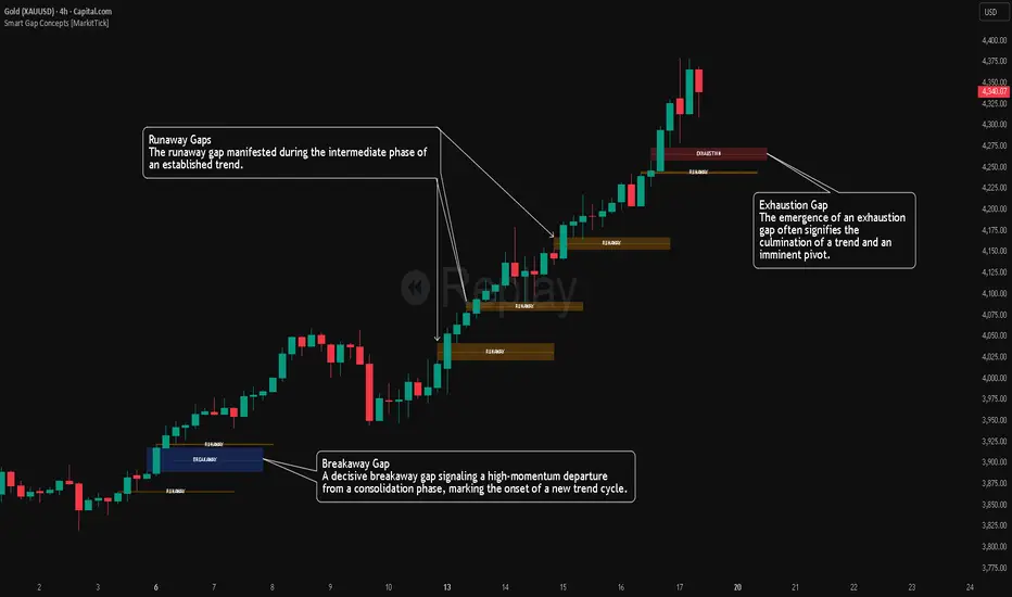
Market Participation Gradient [Interakktive]Market Participation Gradient (MPG) is a diagnostic oscillator that measures the quality and intensity of market participation by combining price efficiency with activity (volume or a FX-safe proxy) into a single 0–100 score.
Most tools tell you "how much activity exists." MPG focuses on "how effective that activity is," helping you differentiate clean directional participation from absorbed / inefficient participation where effort produces limited directional progress.
█ WHAT IT DOES
- Produces a 0–100 participation score (higher = stronger participation environment)
- Uses color as state context (not buy/sell)
- Classifies participation into four tiers for quick readability
- Includes an optional status-line HUD for at-a-glance context without chart clutter
█ WHAT IT DOES NOT DO
- NO buy/sell signals
- NO entries/exits
- NO alerts by default
- NO repainting / no lookahead (diagnostic context only)
█ HOW TO READ MPG
Level (0–100)
- Higher values = stronger participation environment
- Lower values = thin, drifting participation environment
Color (state language, not direction)
- Teal = Clean participation (efficient movement)
- Magenta = Absorbed participation (high activity, low efficiency)
- Amber = Building / transition state
- Grey = Thin / neutral state
█ TIER SYSTEM
MPG uses four tiers:
- THIN (0–20): low participation environment
- BUILDING (20–40): participation emerging / transitional
- STRONG (40–65): solid participation environment (quality becomes more meaningful)
- EXTREME (65+): very high participation environment (contextually important during events or late-cycle pushes)
█ QUALITY ASSESSMENT (STRONG / EXTREME)
Within STRONG and EXTREME tiers, MPG evaluates participation quality:
- Clean (Teal): Efficiency > 55%
- Absorbed (Magenta): Efficiency < 30% AND Activity > 1.5×
- Neutral (Grey): otherwise (mixed quality)
█ STATUS LINE HUD
MPG can display key values in TradingView's status line:
- Minimal: MPG (0–100) + Tier (0–3)
- Full: adds Direction (-1/0/1) and Quality (-1/0/1)
This provides quick context without tables or on-chart panels.
█ HOW IT WORKS (METHODOLOGY)
MPG combines two independent measurements:
1. Efficiency (0–1)
Efficiency = |Net Displacement| / Total Path Length
- High efficiency = price moved more directly
- Low efficiency = price moved less directly (more back-and-forth)
2. Activity (centered at 1.0)
Activity = Current Volume / Average Volume
- Activity > 1 = above-average activity
- Activity < 1 = below-average activity
FX / indices fallback: If volume is unreliable/unavailable, MPG uses a range-based proxy: (High–Low) / ATR (capped) to prevent distortion.
3. Participation Score (0–100)
Participation = Efficiency × √Activity × 100
The square root applies diminishing returns so activity alone cannot dominate without efficiency support.
█ SETTINGS
Core
- ATR Length — normalization baseline
- Efficiency Lookback — bars used for efficiency
- Volume Average Length — baseline for activity
- Smoothing Length — EMA smoothing (1 = minimal smoothing)
Visuals
- Histogram / Line / Tier Bands toggles
- Optional pane background tint (default OFF)
- Theme: Cinematic (subtle) or Vivid (brighter)
HUD
- Status Line HUD toggle
- HUD Detail: Minimal or Full
█ SUITABLE MARKETS
Works on any market with price data. For symbols with unreliable volume (common in FX), MPG automatically uses the range/ATR activity proxy.
█ RELATED (INTERAKKTIVE)
- MER — Market Efficiency Ratio (pure efficiency)
- ERD — Effort–Result Divergence (effort vs outcome)
- VSI — Volatility State Index (expansion/contraction context)
█ DISCLAIMER
This indicator is for educational and informational purposes only and does not constitute financial advice. Always do your own research and use appropriate risk management.


Flux Momentum Oscillator[BullByte]Flux Momentum Oscillator is a professional-grade momentum analysis system built on an original methodology called Momentum Flux Bars (MFB). Unlike conventional oscillators that measure momentum over fixed time periods, this indicator constructs synthetic momentum bars based on actual price movement, creating a pure representation of directional pressure independent of time-based noise.
This is NOT a mashup or combination of existing indicators. The entire system is built from the ground up around a single cohesive concept: measuring momentum through price-triggered synthetic bars rather than time-triggered calculations.
CORE INNOVATION: MOMENTUM FLUX BARS (MFB)
Traditional momentum indicators calculate values at fixed time intervals, which means a slow, grinding move receives the same measurement weight as a fast, explosive move occurring over the same number of bars. This creates distortion in momentum readings.
Momentum Flux Bars solve this problem by forming only when price travels a volatility-adjusted distance. Each MFB represents genuine directional commitment from market participants.
Key Properties of Momentum Flux Bars:
- Form based on price movement, not time passage
- Automatically adjust their formation threshold based on current volatility
- Capture the velocity of price movement (how quickly each bar forms)
- Record volume participation during formation
- Create a noise-filtered view of true market momentum
The oscillator then analyzes the pattern, velocity, and characteristics of recent MFB formations to produce its readings.
WHY THIS APPROACH MATTERS FOR TRADERS
Time-Based Problem: A 14-period RSI on a choppy day produces the same calculation structure as on a trending day, even though market behavior differs completely. The indicator cannot distinguish between meaningful moves and noise.
Flux-Based Solution: When price chops sideways, fewer MFBs form because price fails to travel the required distance. When price trends strongly, MFBs form rapidly in sequence. The oscillator inherently adapts to actual market behavior.
Practical Benefits:
- Cleaner signals during trending conditions
- Automatic noise reduction during consolidation
- Earlier detection of momentum shifts through velocity analysis
- Reduced false signals in choppy markets
- No manual adjustment needed across different market conditions
COMPLETE FEATURE BREAKDOWN
FEATURE 1: AUTO-OPTIMIZATION ENGINE
The indicator includes an optional auto-optimization system that continuously evaluates different sensitivity parameters and selects the configuration producing the cleanest momentum measurement for current conditions.
How It Works:
- Tests multiple ATR multiplier values against recent price history
- Scores each configuration based on trend capture efficiency
- Automatically applies the optimal setting
- Re-evaluates periodically to adapt to changing conditions
Trader Benefit: Eliminates the guesswork of parameter tuning. The indicator finds its own optimal settings.
FEATURE 2: MARKET REGIME CLASSIFICATION
The system classifies current market conditions into four distinct regimes based on MFB formation patterns:
EXPLOSIVE: Rapid MFB formation with strong directional bias and high volume participation. Indicates powerful trending conditions with high momentum.
STEADY: Consistent MFB formation in a primary direction with normal velocity. Represents healthy, sustainable trends suitable for trend-following approaches.
CONSOLIDATING: Mixed direction MFB formation with decreasing velocity. Suggests range-bound conditions where breakout strategies may be appropriate.
DEAD: Minimal MFB formation activity. Indicates extremely low volatility or market indecision. Often precedes significant moves.
Trader Benefit: Instantly understand current market character and adjust strategy accordingly.
FEATURE 3: VELOCITY DIVERGENCE DETECTION
This advanced feature monitors the formation speed of Momentum Flux Bars and compares it against price direction.
Velocity Divergence Bearish: Price making higher highs but MFBs forming progressively slower. Suggests buying pressure is weakening despite higher prices.
Velocity Divergence Bullish: Price making lower lows but MFBs forming progressively slower. Suggests selling pressure is weakening despite lower prices.
Trader Benefit: Early warning system for potential reversals before they appear on price charts.
FEATURE 4: MOMENTUM EXHAUSTION DETECTION
The system identifies when a trending move may be running out of energy by analyzing the duration pattern of consecutive same-direction MFBs.
Exhaustion Pattern: When each successive MFB in a trend takes progressively longer to form, it indicates diminishing momentum even though direction remains unchanged.
States Displayed:
- BUILDING: Momentum is increasing or stable
- PEAK: Maximum momentum velocity reached
- EXHAUSTING: Progressive slowdown detected
Trader Benefit: Know when a trend is losing steam before price reverses.
FEATURE 5: HIGHER TIMEFRAME ALIGNMENT
The indicator checks whether higher timeframe MFB direction supports or conflicts with current timeframe momentum.
ALIGNED BULL: Both timeframes showing bullish MFB direction
ALIGNED BEAR: Both timeframes showing bearish MFB direction
DIVERGENT: Timeframes showing opposing directions
NEUTRAL: Higher timeframe direction unclear
Trader Benefit: Trade with higher timeframe support for higher probability setups.
FEATURE 6: CHOPPY MARKET DETECTION
A dedicated algorithm analyzes recent MFB patterns to determine if the market is in a choppy, directionless state.
Detection Factors:
- Frequency of direction changes in recent MFBs
- Lack of consecutive same-direction formations
- Weak directional bias in the MFB sequence
Trader Benefit: Avoid trend-following strategies when market conditions do not support them.
FEATURE 7: TREND STRENGTH MEASUREMENT
A percentage-based strength reading derived from MFB pattern analysis.
Flux Momentum Oscillator Chart Example
Chart Overview: Bitcoin 15-Minute Chart (Dec 21, 2025)
BTCUSD Market Snapshot
Price: $88,854.53 | Oscillator: 77.38 | Direction: BULLISH | Regime: EXPLOSIVE
1. EXPLOSIVE REGIME DETECTION (Current State - Right Side)
2. MOMENTUM EXHAUSTION ZONE (Mid-Chart)
3. CHOP/CONSOLIDATION PERIOD (Before Breakout)
4. VELOCITY DIVERGENCE (Around 21:00 the previous day)
5. BULLISH MOMENTUM SHIFT (Around 09:00)
6. FORMATION PROGRESS BAR (Bottom of Oscillator)
7. TREND STRENGTH INDICATOR (Bottom Bar)
8. EXTREME ZONES (Top and Bottom Boundaries)
Reading Interpretation:
- Above 70%: Strong trending conditions
- 40% to 70%: Moderate trend or developing move
- Below 40%: Weak trend or choppy conditions
Visual representation provided via the strength bar at the bottom of the indicator panel.
HOW TO READ THE OSCILLATOR PLOT
OSCILLATOR LINE (Main Line):
- Ranges from -100 to +100
- Above zero indicates bullish momentum
- Below zero indicates bearish momentum
- Color intensity reflects momentum direction and strength
- Glow effect (optional) enhances visibility of the main reading
SIGNAL LINE (Secondary Line):
- Smoothed version of the oscillator
- Crossovers indicate momentum shifts
- Purple/accent colored for visual distinction
HISTOGRAM BARS:
- Represent the difference between oscillator and signal line
- Increasing histogram in direction of oscillator confirms momentum
- Decreasing histogram warns of potential momentum shift
- Bright colors indicate increasing momentum
- Faded colors indicate decreasing momentum
ZONE INTERPRETATION:
+75 to +100 (Extreme Bullish Zone):
Very strong bullish momentum. Price has moved significantly and rapidly. Watch for exhaustion patterns. Not ideal for new long entries. Consider profit-taking on existing longs.
+50 to +75 (Strong Bullish Zone):
Healthy bullish momentum. Good conditions for trend-following long strategies. Pullbacks to signal line often provide continuation opportunities.
0 to +50 (Mild Bullish Zone):
Positive but moderate momentum. Trend may be developing or maturing. Watch for strength building or fading.
0 to -50 (Mild Bearish Zone):
Negative but moderate momentum. Downtrend may be developing or maturing. Watch for weakness building or recovering.
-50 to -75 (Strong Bearish Zone):
Healthy bearish momentum. Good conditions for trend-following short strategies. Rallies to signal line often provide continuation opportunities.
-75 to -100 (Extreme Bearish Zone):
Very strong bearish momentum. Price has moved significantly and rapidly to downside. Watch for exhaustion patterns. Not ideal for new short entries. Consider profit-taking on existing shorts.
HOW TO READ THE DASHBOARD
The dashboard provides comprehensive market analysis at a glance. Each row displays specific information:
OSCILLATOR ROW:
Shows current oscillator value with directional icon.
indicates reading above +50 (High)
indicates reading below -50 (Low)
DIRECTION ROW:
Current MFB direction.
BULLISH: Recent MFB formed upward
BEARISH: Recent MFB formed downward
NEUTRAL: No recent MFB or unclear
REGIME ROW:
Current market regime classification.
EXPLOSIVE / STEADY / CONSOLIDATING / DEAD
Color coded for quick recognition.
MARKET ROW:
Trend state assessment.
TRENDING UP: Confirmed uptrend in progress
TRENDING DN: Confirmed downtrend in progress
CHOPPY: No clear trend, high direction changes
MIXED: Partial trend characteristics
STRENGTH ROW:
Visual bar showing trend strength percentage.
More filled bars indicate stronger trend.
Color shifts from red (weak) to yellow (moderate) to green (strong).
VELOCITY ROW:
MFB formation speed status.
ACCELERATING: MFBs forming faster over time
STEADY: Consistent formation speed
DECELERATING: MFBs forming slower over time
MOMENTUM ROW:
Momentum development status.
BUILDING: Momentum increasing
PEAK: Maximum momentum reached
EXHAUSTING: Momentum declining despite same direction
HTF ALIGN ROW:
Higher timeframe alignment status.
BULL: HTF supports bullish bias
BEAR: HTF supports bearish bias
DIVERGENT: HTF opposes current direction
NEUTRAL: HTF unclear
FORMING ROW:
Progress toward next MFB formation.
Visual bar fills as price approaches formation threshold.
Helps anticipate when next MFB will complete.
Additional rows (when not in Compact Mode):
- Flux Size: Current MFB formation threshold value
- ATR Mult: Current optimized ATR multiplier (when auto-optimization enabled)
- Regime %: Numerical regime score
FORMATION PROGRESS INDICATOR
The horizontal line near the bottom of the indicator panel shows progress toward the next MFB formation.
Reading the Progress Line:
- Starts at baseline after each MFB completion
- Rises as price moves toward formation threshold
- Higher position indicates imminent MFB formation
- Color changes from neutral to accent to warning as formation approaches
Practical Use:
- Anticipate when new momentum data will become available
- Gauge intra-bar momentum development
- Understand why signals occur when they do
TREND STRENGTH BAR
The horizontal bar at the very bottom of the indicator displays trend strength visually.
Components:
- Gray background bar represents full scale (0-100%)
- Colored fill represents current strength reading
- Label displays exact percentage value
Color Interpretation:
- Green fill: Strong trend (above 70%)
- Yellow fill: Moderate trend (40-70%)
- Red fill: Weak trend (below 40%)
RECOMMENDED USAGE GUIDELINES
TIMEFRAME RECOMMENDATIONS:
Scalping (1m to 5m):
- Use lower Flux Period (8-10) for faster response
- Focus on oscillator crossovers and histogram momentum
- Regime should be STEADY or EXPLOSIVE for best results
Day Trading (5m to 30m):
- Default settings work well
- Use HTF alignment with 1H or 4H for confirmation
- Avoid trading when regime shows DEAD
Swing Trading (1H to 4H):
- Consider higher Flux Period (18-21) for smoother signals
- Regime classification becomes very valuable
- Velocity divergence provides excellent early warnings
Position Trading (Daily and above):
- Higher Flux Period (21-30) recommended
- Focus on regime changes and exhaustion patterns
- HTF alignment less relevant, oscillator zones more important
ASSET CLASS NOTES:
Forex: Works well on major pairs. Consider slightly higher sensitivity on less volatile pairs.
Crypto: Higher volatility may require lower sensitivity multiplier. Regime detection particularly useful.
Stocks: Excellent for liquid stocks. Less effective on illiquid names due to gappy price action.
Indices: Very effective. Clean price action produces clean MFB patterns.
Commodities: Works well, especially on gold and oil. Adjust sensitivity for different volatility profiles.
SETTINGS OVERVIEW
MODE AND THEME:
- Trading Mode: Simple (clean), Pro (full data), Hybrid (balanced)
- Visual Theme: Dark, Light, Neon, Stealth
- Compact Dashboard: Reduces dashboard rows
FLUX ENGINE:
- Flux Calculation Method: Choose optimization approach
- Enable Auto-Optimization: Let indicator find optimal parameters
- Flux Period: Base volatility calculation period
- Sensitivity Multiplier: Adjust MFB formation threshold
- Optimization Lookback: Bars analyzed for optimization
- Optimization Frequency: How often to re-optimize
OSCILLATOR:
- Oscillator Smoothing: Main line smoothness
- Signal Line Length: Signal line responsiveness
- Momentum Depth: MFBs analyzed for oscillator
- Histogram Scale: Visual scaling of histogram
MARKET STATE:
- Chop Detection Window: MFBs analyzed for chop detection
- Chop Threshold: Sensitivity of chop classification
- Min Trend Confirmation: Consecutive bars for trend confirmation
ADVANCED ANALYSIS:
- Enable Regime Classification: Market regime detection
- Enable Velocity Divergence: Formation speed analysis
- Enable Exhaustion Detection: Trend exhaustion warnings
- Enable HTF Alignment: Higher timeframe checking
- Higher Timeframe: Which timeframe to check
VISUALS:
- Glow Effect: Visual enhancement on oscillator
- Show Zone Fills: Background zone coloring
- Show Formation Progress: Progress indicator display
- Show Trend Strength Bar: Bottom strength bar
- Show Dashboard: Information panel display
- Dashboard Position: Corner placement
SIGNAL INTERPRETATION GUIDELINES
BULLISH MOMENTUM SHIFT:
Oscillator crosses above signal line while not in extreme bearish territory.
Suggests emerging bullish momentum.
Stronger when occurring near zero line or in mild bearish zone.
BEARISH MOMENTUM SHIFT:
Oscillator crosses below signal line while not in extreme bullish territory.
Suggests emerging bearish momentum.
Stronger when occurring near zero line or in mild bullish zone.
STRONG TREND CONDITIONS:
Oscillator beyond +/-55, in direction of signal line, trend strength above 55%, not choppy.
Indicates conditions favorable for trend-following approaches.
EXTREME ZONES:
Oscillator beyond +/-75.
Diamond markers appear.
Exercise caution with new positions in trend direction.
Watch for exhaustion and divergence signals.
ALERT SYSTEM
The indicator includes comprehensive alerts for automated monitoring:
Momentum Alerts:
- Bullish Momentum Shift
- Bearish Momentum Shift
- Strong Uptrend Initiated
- Strong Downtrend Initiated
Zone Alerts:
- Extreme Bullish Zone Reached
- Extreme Bearish Zone Reached
Market State Alerts:
- Choppy Conditions Detected
- Choppy Conditions Cleared
- Explosive Regime Entered
- Dead Regime Entered
Advanced Alerts:
- Velocity Divergence Detected
- Exhaustion Warning Triggered
- HTF Aligned Bullish
- HTF Aligned Bearish
- HTF Divergence Detected
MFB Alerts:
- Bullish MFB Formed
- Bearish MFB Formed
WHAT THIS INDICATOR IS NOT
This indicator is NOT:
- A buy/sell signal generator (it provides momentum context, not trade signals)
- A standalone trading system (combine with price action and other analysis)
- A guarantee of profitability (no indicator can guarantee results)
- A replacement for risk management (always use proper position sizing and stops)
- A mashup of existing indicators (this is original methodology)
ORIGINALITY STATEMENT
The Momentum Flux Bars concept was designed specifically to address limitations of time-based momentum calculations.
Every component of this system serves the central MFB methodology:
- The oscillator measures MFB directional weight
- The regime classifier interprets MFB patterns
- The velocity analysis tracks MFB formation speed
- The exhaustion detector monitors MFB duration progression
- The HTF alignment checks MFB direction across timeframes
This is a unified analytical framework, not a collection of separate indicators.
TECHNICAL NOTES
Non-Repainting Confirmation:
All signal generation uses confirmed bar data only. MFB formations occur on bar close. Historical signals will not change after they appear.
Performance Considerations:
Auto-optimization runs periodically, not every bar, to maintain performance.
MFB history is trimmed to prevent memory issues on extended sessions.
Reduce Max MFB History if experiencing performance issues.
Symbol and Timeframe Handling:
The indicator resets its MFB history when symbol or timeframe changes.
This ensures clean analysis without carryover from previous contexts.
DISCLAIMER
This indicator is provided for educational and informational purposes only. It is not financial advice and should not be considered as such.
Trading involves substantial risk of loss. Past performance of any trading methodology or indicator does not guarantee future results. The author makes no representations regarding the profitability or suitability of this indicator for any particular purpose.
Users are solely responsible for their own trading decisions. Always use proper risk management, including appropriate position sizing and stop-loss orders. Never risk more than you can afford to lose.
Before using this or any indicator in live trading, thoroughly test it on historical data and in a demo environment. Understand its behavior across different market conditions.
The author is not liable for any losses incurred through the use of this indicator.
Developed by BullByte
Version 1.0.0

SuperRSI: Enhanced MomentumSuperRSI is a next-generation momentum indicator designed to overcome the lag and noise found in the traditional Relative Strength Index (RSI). Unlike standard RSI which only looks at close prices, SuperRSI utilizes a unique "Titan Engine" logic that incorporates the full Price Range (Highs and Lows) to calculate momentum. This results in a smoother, more responsive oscillator that detects trend shifts earlier.
Key Features:
🚀 Range-Based Calculation: Factors in the expansion and contraction of price ranges, not just closing prices.
🎨 Dynamic Visuals: Beautiful gradient coloring that adapts to the trend (Bullish/Bearish) and visualizes Overbought/Oversold zones clearly.
⚡ Dual Signal System:
Slow Signal (Default): For reliable trend following.
Fast Signal (Optional): Can be enabled in settings for aggressive entries and scalping.
🔔 Comprehensive Alerts: Built-in alerts for RSI crossovers with Fast/Slow lines and Signal crossovers (Golden/Death Cross).
🛡️ Pine Script v6: Built on the latest version for maximum performance and stability.
How to Use:
Trend Confirmation: When the line is green and above 50, the trend is bullish. When red and below 50, the trend is bearish.
Overbought/Oversold: Look for reversals when the indicator exits the dotted zones (>80 or <20).
Signal Crossovers: Enable the "Fast Signal" in settings to trade the crossovers between the Fast and Slow signal lines (similar to MACD mechanics).
Settings:
Fully customizable colors and lengths.
Option to toggle the "Fast Signal" on or off (Hidden by default to keep the chart clean).

STRIKEZONE INDICATORSTRIKEZONE INDICATOR is an all-in-one trading tool designed for scalping, day trading, and swing trading.
It combines an adaptive EMA based on trading mode, multi-timeframe SuperTrend, dynamic support and resistance levels, RSI, and a multi-TF dashboard for instant market clarity.
The indicator provides:
Main trend identification using EMA and SuperTrend
Key support and resistance zones with breakout detection
Filtered Buy and Sell signals aligned with the trend
A multi-timeframe board showing SuperTrend and EMA alignment
A Mega Signal when all timeframe conditions align and RSI remains neutral
Perfect for spotting high-probability strike zones, improving entry timing, and trading confidently in the direction of the dominant trend.

Strategy Scanner (H4 Trend)
Here is a trend-following strategy I coded for the H4: it first filters the overall direction via the EMA 200, waits for a precise price correction in the recharge zone (between EMA 13 and 32), and only validates the entry if the Stoch RSI confirms an extreme extension (< 10 or > 90) to maximize the chances of a rebound.
aza
@aza 92i

ICT Smart Bias Toolkit FVG, CRT and Multi-Timeframe Market Bias📌 Indicator Description — ICT Smart Bias Toolkit
ICT Smart Bias Toolkit is an advanced price action indicator designed for ICT / Smart Money traders.
It combines Fair Value Gaps (FVG), Candle Range Theory (CRT) logic, and a multi-timeframe (HTF) bias screener to provide clear top-down market context and precise areas of interest.
The indicator does not repaint and is based strictly on closed candles.
🔍 Core Features
🟩 Fair Value Gaps (FVG)
Automatically detects Bullish and Bearish FVGs on the current timeframe
FVG zones:
extend forward in time,
register first touch,
deactivate after full mitigation
User-configurable number of visible FVG zones (default: 2)
📏 CRT – Previous High / Low Levels
When a CRT candle forms, the previous candle’s High and Low are plotted
These levels:
extend until price is reached,
stop automatically on touch
Each level is labeled with its timeframe (W / D / H4)
No arrows or candle markers → clean and uncluttered chart
🧭 HTF Bias Screener (Weekly / Daily / H4)
A compact screener displays:
BIAS for Weekly, Daily, and H4
DIRECTION: Bullish / Bearish
REASON, using a strict priority logic:
If a CRT candle formed on the last closed candle
Otherwise, Close vs Previous Close
This screener is intended for context and directional bias, not trade entries.
🔔 Alerts (Fully Configurable)
Practical, trader-focused alerts are included for:
FVG formation
FVG touch
FVG full mitigation
CRT Previous High / Low hit
Bias change (Weekly / Daily / H4)
Top-down confluence alerts, such as:
Daily CRT bias + H4 FVG touch
Weekly CRT bias + Daily FVG touch
All alerts are designed for real trading scenarios, not signal spam.
🧠 How to Use
Identify directional bias using the HTF screener
Wait for price to return into a relevant FVG zone
Use CRT High/Low levels as liquidity reference points
Execute trades using your own price action confirmation
This indicator provides context, not entries.
⚠️ Disclaimer
This is not a signal indicator.
It is a market structure and bias tool, intended to support an ICT / Smart Money trading framework.

K-Line Midline Indicator@yuanmu指标概述
K线中线指标是一款用于技术分析的自定义工具,专注于在K线图上绘制每根K线的中心位置线。该指标能够帮助交易者快速识别价格的平均位置、观察价格重心的变化趋势,并通过影线分析功能识别潜在的关键支撑阻力位。
核心功能
双模式中线绘制:
实体中线:(开盘价 + 收盘价) ÷ 2,反映多空力量平衡点
整根K线中线:(最高价 + 最低价) ÷ 2,反映整根K线的价格重心
智能影线分析:
自动识别异常长影线K线
双重过滤条件确保只标记有意义的影线
在最长影线中点位置绘制标记线
完全自定义显示:
可调节显示K线数量(1-200根)
独立设置中线和影线的颜色、线宽、线型
透明度渐变效果:当前K线最清晰,历史K线逐渐淡化
性能优化:
只在最后K线时绘制历史数据,避免重复计算
最大线条数量限制,确保图表运行流畅
自动检测可用历史数据范围
应用场景
短线交易:使用实体中线观察多空博弈,辅助判断入场时机
波段分析:使用整根K线中线识别价格重心,判断趋势强度
关键位识别:通过影线中点标记寻找潜在的支撑阻力区域
价格结构分析:观察中线排列形态,识别价格运行结构
参数设置
中线颜色/线宽/线型:调整主中线的视觉效果
显示K线数量:控制同时显示的K线中线数量
影线标记开关:启用/禁用影线分析功能
影线条件设置:调整影线筛选的灵敏度
影线样式设置:自定义影线标记的视觉样式
技术规格 (Technical Specifications)
开发平台: TradingView Pine Script v6
兼容性: 所有交易品种和时间周期
最大显示K线: 200根
线条数量限制: 最多500条线
更新频率: 实时更新
内存占用: 低至中等,取决于显示数量设置
使用提示 (Usage Tips)
从较小的显示数量开始(如20-30根),逐步增加
中线与影线标记使用对比色,便于区分
根据市场波动性调整影线条件参数
结合其他指标使用,如移动平均线或成交量指标
观察中线排列的形态变化,识别趋势转换信号
开发者信息 (Developer Information)
名称: 原木 (Yuanmu)
版本: 1.0
特点: 简洁高效,专注核心功能,注重用户体验
Indicator Overview
K-Line Midline Indicator is a custom technical analysis tool designed to plot the center line of each candlestick on the price chart. This indicator helps traders quickly identify price average positions, observe shifts in price gravity, and identify potential key support/resistance levels through shadow analysis functionality.
Core Features
Dual-Mode Midline Drawing:
Body Midline: (Open + Close) ÷ 2, reflecting the balance point between bullish and bearish forces
Whole K-Line Midline: (High + Low) ÷ 2, reflecting the price gravity of the entire candlestick
Intelligent Shadow Analysis:
Automatically identifies K-lines with abnormally long shadows
Dual-filtering conditions ensure only meaningful shadows are marked
Draws marker lines at the midpoint of the longest shadow
Fully Customizable Display:
Adjustable number of displayed K-lines (1-200)
Independent color, width, and style settings for midline and shadow markers
Transparency gradient effect: current K-line is most clear, historical K-lines gradually fade
Performance Optimization:
Draws historical data only on the last bar to avoid redundant calculations
Maximum line count limit ensures smooth chart operation
Automatic detection of available historical data range
Application Scenarios
Short-term Trading: Use body midline to observe bull-bear battles and assist entry timing decisions
Swing Analysis: Use whole K-line midline to identify price gravity and determine trend strength
Key Level Identification: Locate potential support/resistance areas through shadow midpoint markers
Price Structure Analysis: Observe midline arrangement patterns to identify price movement structures
Parameter Settings
Midline Color/Width/Style: Adjust visual appearance of main midline
Number of K-lines Displayed: Control how many K-line midlines are shown simultaneously
Shadow Marker Toggle: Enable/disable shadow analysis functionality
Shadow Condition Settings: Adjust sensitivity of shadow filtering
Shadow Style Settings: Customize visual appearance of shadow markers

Pivot Levels [BigBeluga]🔵 OVERVIEW
The Pivot Levels indicator automatically detects and draws key market pivot levels across multiple sensitivity settings. Each pivot level represents a significant local high or low in price structure, acting as potential zones of support and resistance. Traders can visualize short-, medium-, and long-term pivot layers simultaneously, helping to identify where price may react, reverse, or break out.
🔵 CONCEPTS
Different pivot lengths provide multi-length sensitivity on the same timeframe — shorter lengths detect local micro-swings, while longer lengths capture broader swing structure within the current chart.
ATR-based color logic marks active, bullish, or bearish pivot zones dynamically.
Lines can extend to the right or both sides to track reactions over time.
🔵 FEATURES
Detects up to four custom pivot levels simultaneously.
Each pivot level has independent settings for length , style , and extension mode .
Auto-colors each pivot as support (green), resistance (orange), or active zone (blue).
Displays dual-width line layers: a solid base and a transparent overlay for visual depth.
Dynamic price labels show exact pivot levels for clarity.
Fully customizable line styles: dashed (--), solid (-), or dotted (..).
Extends lines to the right for future reaction tracking or both directions for structure alignment.
🔵 HOW TO USE
Enable or disable pivot levels (1–4) to control how many layers of structure you want visible.
Use shorter pivot lengths for intraday turning points and longer ones for macro structure.
Watch for multiple pivot lines clustering in the same region — these often mark strong reversal zones.
Observe color changes: green = support, orange = resistance, blue = active neutral zone.
Combine with price action or volume analysis to confirm reactions near major pivots.
🔵 CONCLUSION
The Pivot Levels indicator provides a clean, multi-layered visualization of market structure.
By tracking pivots of varying lengths, traders can easily identify overlapping support and resistance regions, gauge breakout strength, and align trades with the dominant structural zones visible across multiple time horizons.

MarketMastery Pivot Matrix by DGTThe MarketMastery Pivot Matrix™ is an advanced pivot point framework designed to provide comprehensive market context, bias assessment, and trend analysis. It integrates multiple pivot calculation methods, central pivot ranges, higher-timeframe references, and a suite of add-on indicators to deliver a complete market structure toolkit. Suitable for intraday, swing, and positional traders, the tool consolidates key support/resistance levels, equilibrium zones, directional flow, and volatility insights into a single, visually intuitive interface.
KEY FEATURES
⯌ Pivot Point Framework
The MarketMastery Pivot Matrix™ offers a complete solution for analyzing pivot points, price equilibrium, trend direction, and volatility. Supporting multiple pivot calculation methods—including Camarilla, Fibonacci, Swing, Traditional, and Woodie—it allows traders to customize analysis according to strategy and timeframe.
⯌ Central Pivot Range (CPR)
CPR is a core component of the Pivot Matrix™, offering a clear view of market structure and key decision zones. Traditionally used for intraday analysis, CPR is equally effective on higher timeframes (daily, weekly, monthly), highlighting support/resistance, market balance, and swing opportunities. Integrated within the Pivot Matrix™, it works seamlessly with other pivot components to provide a comprehensive trading framework across all timeframes.
⯌ Higher-Timeframe OHLC References
Displays previous session Open, High, Low, and Close from user-selected or dynamically calculated higher timeframes. Assists traders in assessing intraday support/resistance and session reactions.
⯌ Pivot High-Low Levels
Identifies key swing highs and lows as well as short-term potential pivot points. Highlights support/resistance zones, helping traders assess market structure, anticipate reversals, and spot trend continuation opportunities.
⯌ Directional Flow State
Combines ADX and DMI to provide clear insight into trend direction, strength, and momentum. Helps distinguish valid trending conditions from weak or ranging periods.
⯌ Mean Proximity State
Measures price deviation from equilibrium to classify balanced, extended, or extreme market states. Assists in evaluating potential reversion pressure and volatility expansion.
⯌ Logistic EMA Trend State (LEMA)
Applies a logistic transformation to price dynamics, smoothed by EMA for adaptive trend detection. Provides responsive trend visualization with reduced noise, helping identify trend direction and momentum.
⯌ Ichimoku Cloud Projection
Extends the Kumo cloud forward to visualize market bias, momentum, and dynamic support/resistance. Helps identify consolidation, trend direction, and equilibrium zones.
⯌ Linear Regression Channel
Fits a least-squares trend line to price, displaying slope and price dispersion. Helps traders identify trend direction, stability, and volatility.
⯌ Market Sentiment State
Evaluates market bias by analyzing price position relative to CPR and pivot levels. Provides a quick visual assessment of bullish, bearish, or neutral conditions.
⯌ Price Range & ATR State
Displays current and previous higher-timeframe ranges alongside ATR-based expected ranges. Helps assess volatility, monitor session expansion/contraction, and identify potential exhaustion zones.
DISCLAIMER
This script is intended for informational and educational purposes only. It does not constitute financial, investment, or trading advice. All trading decisions made based on its output are solely the responsibility of the user.
Платный скрипт

ORACLE v13: The Gamified Market HUDORACLE v13 is not just an indicator; it is a complete Trading HUD (Heads-Up Display) that translates complex market data into an intuitive, video-game-style interface. It turns abstract concepts like "volatility" and "support/resistance" into actionable game mechanics, allowing you to react faster and trade smarter.
⚔️ Key Features:
🛡️ Boss & Shield Mechanics (Support/Resistance):
Automatic detection of key levels visualized as "Bosses" (Resistance) and "Shields" (Support).
HP System: Watch price "damage" these levels in real-time. When "Boss HP" hits zero, a breakout is imminent.
🔮 The Bestiary (Market Conditions):
Instantly identifies the "Enemy Type" you are fighting:
🟢 SLIME: Squeeze zone (low volatility, prepare for a move).
👺 GOBLIN: Chop/Noise (high risk, avoid trading).
🐉 DRAGON: Strong Trend (ride the momentum).
👹 BERSERKER: Extreme Volatility (proceed with caution).
📈 Live Structure Mapping:
Real-time ZigZag overlays with automatic HH/LL/LH/HL labels.
Breakout Flash: Candles flash WHITE instantly when major structure or Boss levels are broken.
🎮 Combat Stats:
Combo Counter: Tracks consecutive directional candles.
Aggro Meter: Visualizes volume intensity.
Loot Drop Rate: innovative metric calculating the probability of a profitable move based on current ATR.
Momentum Bar: RPG-style health bar for trend strength.
Why use ORACLE? Most indicators just draw lines. ORACLE gives you Context. It tells you exactly what kind of market environment you are in so you never bring a knife to a Dragon fight. Perfect for scalpers and day traders who need instant situational awareness.
Settings: Fully customizable Lookback periods, ZigZag sensitivity, and Visual Themes.
