Big Trades / Intrabar Volume Clusters by HKDescription:
This indicator brings professional Order Flow and Footprint capabilities to your chart. It detects and visualizes high-volume trade clusters inside the candle, allowing you to see exactly at which price level big market participants were active.
Unlike standard volume bars, this tool uses Intrabar Data to map significant buying and selling pressure precisely within the candle body.
ℹ️ IMPORTANT: Resolution Setting (Read First) To ensure this indicator works immediately for all users (including Free/Basic accounts), the default resolution is set to "1 Minute".
Basic/Free Users: Please keep the setting at "1" (Second-based intervals often require a paid plan).
Premium Users: For the best precision and the exact look shown in the screenshots, we highly recommend changing the Resolution setting to "5S" (5 Seconds)!
🚀 Key Features
Intrabar Precision: Leverages request.security_lower_tf to look inside the candle structure.
Noise Filtering: Only displays clusters that exceed your defined Minimum Volume threshold, filtering out retail noise.
Smart Coloring:
Green: Buying pressure (Close >= Open on the lower timeframe).
Red: Selling pressure (Close < Open on the lower timeframe).
🆕 Independent Sizing: A unique feature: You can control the Font Size and Circle Size independently.
This allows for small, non-intrusive circles with large, readable text.
⚙️ Settings
Resolution: Default is 1 (Minute). Premium users should switch to 5S for true order flow precision.
Minimum Volume: The most important filter. Determines how large a trade cluster must be to appear (e.g., 150+ for ETH, higher for BTC).
Visuals: Customize Buy/Sell colors, Circle Size, and Text Size separately.
⚠️ Visual Tip (If text is hidden)
If the bubbles or numbers appear behind the candles or disappear when clicking away:
Right-click on any of the indicator bubbles.
Select Visual Order -> Bring to Front.
This ensures the Big Trades data always floats on top of your price bars.
Волатильность

Statistical Reversion FrameworkIntroduction and Core Philosophy
The Statistical Reversion Framework constitutes a sophisticated quantitative trading instrument designed to identify high-probability mean reversion opportunities across financial markets. Unlike traditional technical indicators that rely on a single dimension of market data, this framework adopts a multi-faceted approach, synthesizing statistical probability, volume profile analysis, institutional money flow proxies, and standard technical momentum into a singular composite score. The core philosophy driving this script is the concept of confluence through heterogeneity; by combining uncorrelated or loosely correlated market factors—such as price deviation (statistics), participant commitment (volume), and macro sentiment (intermarket data)—the algorithm aims to filter out the noise inherent in standard oscillators and isolate moments where market pricing has deviated unsustainably from its intrinsic equilibrium. This tool is specifically engineered to detect market extremes—tops and bottoms—where the probability of a counter-trend move or a snap-back to the mean is mathematically significant. It operates on the premise that while asset prices can remain irrational in the short term, they are bound by statistical variance and mean-reverting properties over longer horizons, particularly when institutional flows and volume exhaustion patterns align with those statistical extremes.
Methodology: The Composite Scoring Architecture
The underlying methodology of the framework relies on a weighted composite scoring system. Rather than generating binary buy or sell signals based on a threshold crossover, the script calculates a granular score ranging from zero to one hundred for various market dimensions. These dimension-specific scores are then weighted according to user-defined inputs to produce a final "Composite Score." This approach allows for a nuanced assessment of market conditions; a setup might have extreme statistical deviation but lack volume confirmation, resulting in a lower confidence score than a setup where price, volume, and macro factors all align. The algorithm normalizes all input data into a standardized scale, typically converting raw values—such as Z-Scores or volume ratios—into a zero-to-ten ranking before aggregating them. This normalization process is critical because it allows the algorithm to compare apples to oranges mathematically, treating a standard deviation of 3.0 and a Relative Strength Index (RSI) of 20 as compatible inputs within the same equation. By summing these normalized values and applying regime-based confidence adjustments, the framework produces a dynamic signal that adapts to the volatility and trend intensity of the current market environment.
Algorithmic Component I: Statistical Analysis via Multi-Timeframe Z-Scores
The backbone of the framework is the Statistical Component, which utilizes the Z-Score (or Standard Score) to quantify the degree of price deviation. The Z-Score measures how many standard deviations the current price is from its moving average. A crucial aspect of this algorithm is its fractal nature; it does not rely on a single lookback period. Instead, it computes Z-Scores across three distinct timeframes—Daily, Weekly, and Monthly—and within each timeframe, it calculates deviations for short, medium, and long-term periods. For instance, on the daily timeframe, it assesses deviation from 50-day, 200-day, and 500-day means simultaneously. This multi-timeframe approach is designed to filter out ephemeral noise. A price move that appears extreme on a 10-day basis but is normal on a 200-day basis is likely a trend pull-back rather than a reversal. Conversely, when the Z-Scores across daily, weekly, and monthly timeframes all register values beyond significant thresholds (such as 2.0 or 3.0 standard deviations), it indicates a rare fractal alignment where the asset is historically overextended on all relevant scales. The algorithm aggregates these nine distinct Z-Score data points to form the "Statistical Score," heavily rewarding scenarios where multiple timeframes show directional alignment, as these synchronized deviations often precede powerful mean-reversion events.
Algorithmic Component II: Volume Signature and Participation Analysis
While statistical deviation highlights where the price is, the Volume Component analyzes the conviction behind the move to determine if a reversal is imminent. This section of the code employs several sophisticated logic gates to identify specific volume signatures known as Capitulation and Exhaustion. The algorithm compares current volume against a 50-day moving average to generate a volume ratio. It then correlates this ratio with price action. For example, the script identifies "Capitulation" when price collapses significantly (more than 2%) on volume that is at least three times the average. This specific signature—panic selling—often marks the psychological wash-out necessary for a market bottom. Conversely, the script detects "Volume Exhaustion" when prices drift without conviction on extremely low volume, indicating a lack of participant interest in pushing the trend further. Furthermore, the algorithm integrates On-Balance Volume (OBV) analysis, specifically looking for divergences. It detects subtle shifts where the price makes a new low, but the OBV makes a higher low, signaling that smart money is accumulating positions despite the falling price. This divergence logic is automated using pivot-based high/low detection arrays, adding a layer of foreshadowing that price-only indicators often miss.
Algorithmic Component III: Institutional Proxy and Intermarket Correlations
The Institutional Component distinguishes this framework from standard retail indicators by incorporating intermarket data that serves as a proxy for macro sentiment and institutional flow. The script pulls data from extraneous tickers—specifically the VIX (Volatility Index), Government Bond Yields (10-year and 2-year), Copper, Gold, and the Dollar Index (DXY). The logic here is grounded in fundamental market mechanics. For instance, the script analyzes the VIX to gauge market fear; however, it applies a contrarian logic. An extremely high VIX (panic) coincident with a low equity price is scored as a bullish factor, while a complacently low VIX at market highs is viewed as bearish. Similarly, the algorithm analyzes the Yield Curve (the spread between 10-year and 2-year yields). A steepening or flattening curve provides context on economic expectations, influencing the score based on whether the environment is "risk-on" or "risk-off." The Copper/Gold ratio is utilized as a barometer for global economic health; rising copper relative to gold suggests industrial demand and growth, confirming bullish setups, whereas falling copper prices signal contraction. By integrating these non-price variables, the framework ensures that a trade signal is not just technically sound but is also supported by the broader macroeconomic undercurrents that drive institutional capital allocation.
Algorithmic Component IV: Technical Momentum and Structure
The final layer of input comes from standard Technical Analysis, which serves to fine-tune the timing of the entry. This component aggregates readings from the Relative Strength Index (RSI), Moving Average Convergence Divergence (MACD), Bollinger Bands, and Support/Resistance proximity. While Z-Scores measure linear distance from the mean, the RSI and Bollinger Bands measure the velocity and elasticity of that move. The algorithm assigns higher scores when RSI hits extreme levels (below 20 or above 80) and when price action pierces the outer bounds of the Bollinger Bands. Additionally, the MACD is monitored for histogram reversals and signal line crosses that align with the mean reversion bias. A unique feature of this component is the proximity logic, which calculates how close the current price is to a 50-period high or low. If a statistical extreme coincides with a retest of a major structural support level, the technical score is maximized. This ensures that the trader is not catching a falling knife in a void, but rather identifying a reversal at a location where technical structure provides a natural floor or ceiling for price.
Regime Detection and Confidence Adjustment
A critical vulnerability of mean reversion strategies is that they can suffer severe drawdowns during strong, unidirectional trending markets (momentum regimes). To mitigate this, the framework incorporates a Regime Detection module using the Average Directional Index (ADX) and volatility thresholds. The script calculates the ADX to measure trend strength regardless of direction. If the ADX is above a certain threshold (default 25), the market is classified as "Trending." The script then cross-references this with volatility data to classify the environment into regimes such as "Crisis," "Trending," "Range," or "Mean-Revert." This classification is not merely cosmetic; it actively influences the final output through a "Regime Confidence" multiplier. If the system detects a strong trending regime, it dampens the Composite Score, requiring extraordinary evidence from the other components to trigger a signal. Conversely, if the market is detected as "Mean-Revert" or "Low-Vol Range," the confidence multiplier boosts the score, making the system more sensitive to reversion signals. This adaptive logic helps protect the trader from fading strong breakouts while aggressively capitalizing on ranging markets.
Usage Instructions and Dashboard Interpretation
Traders utilizing this framework should primarily interact with the on-screen Dashboard, which provides a real-time summary of all computed metrics. The dashboard is organized hierarchically, with the "Composite Score" and "Signal Status" at the top. A Composite Score above 70 is generally considered actionable, with scores above 85 representing "Exceptional" setups. The Dashboard is color-coded: green hues indicate bullish/oversold conditions suitable for buying, while red hues indicate bearish/overbought conditions suitable for selling or shorting. Traders should look for "Confluence" across the rows. Ideally, a robust signal will show a high Statistical score (indicating price is cheap/expensive), a high Volume score (indicating capitulation or accumulation), and a supportive Institutional score. If the Composite Score is high but the Institutional score is low, the trader should proceed with caution, as the macro environment may not support the trade.
The chart visuals provide immediate entry triggers. "Strong Bottom" (Green Triangle) and "Strong Top" (Red Triangle) shapes appear when the Composite Score breaches the high threshold and Z-Scores are at extremes. These are the primary execution signals. Smaller "Potential" markers indicate developing setups that may require lower timeframe confirmation. Additionally, specific volume icons (Diamonds) will appear to denote Capitulation or Climax events. A trader should ideally wait for the candle to close to confirm these signals. The alerts configured in the script allow the trader to be notified of these events remotely. For risk management, because this is a mean reversion tool, stop-losses should typically be placed below the swing low of the capitulation candle (for longs) or above the swing high of the climax candle (for shorts), anticipating that the statistical extreme marks the distinct turning point. By systematically waiting for the Composite Score to align with the visual signals and verifying the regime context on the dashboard, the trader effectively filters out low-probability trades, engaging only when statistics, volume, and macro-economics align.

VIX Percentile OscillatorWhat is this script?
This is a trading tool that helps you decide when to buy or sell options based on market volatility. Think of it as a "fear meter" for the stock market.
What is VIX?
VIX = Volatility Index (also called the "fear index")
When VIX is HIGH → Market is scared/volatile → Options are EXPENSIVE
When VIX is LOW → Market is calm → Options are CHEAP
What does "Percentile" mean?
Instead of just showing VIX price, this script shows where VIX is compared to history.
Example: If VIX Percentile = 85%
This means VIX is higher than 85% of all past readings
Only 15% of the time was VIX higher than now
Translation: Volatility is unusually HIGH
The 5 Trading Zones
The script divides the market into 5 zones:
🔴 EXTREME SELLING ZONE (90-100%)
VIX is in the top 10% historically
Action: AGGRESSIVELY SELL OPTIONS (collect big premiums)
Market panic = expensive options = profit for sellers
🟠 SELLING ZONE (80-89%)
VIX is elevated but not extreme
Action: SELL OPTIONS (good premiums available)
⚪ NEUTRAL ZONE (20-79%)
VIX is normal
Action: WAIT or use other strategies
🟢 BUYING ZONE (10-19%)
VIX is low
Action: BUY OPTIONS (they're cheap)
🟢 EXTREME BUYING ZONE (0-9%)
VIX is in the bottom 10% historically
Action: AGGRESSIVELY BUY OPTIONS (bargain prices)
Market complacency = cheap options = opportunity
Understanding the Chart
Main Line (Blue/Red/Green):
Shows current VIX percentile
Color changes based on zone
Thick line = easy to see
Histogram (Background bars):
Red bars = above 50% (high volatility)
Green bars = below 50% (low volatility)
Purple Momentum Line:
Shows if VIX is rising or falling
Helps you catch trends early
Background Colors:
Light red/orange = Selling zones
Light green = Buying zones
Triangle Markers:
Appear when entering new zones
"EXTREME" label = strongest signals
The Statistics Table (Top Right)
VIX Price: Current VIX value (e.g., 16.50)
Percentile: Where VIX ranks (0-100%)
Z-Score: Statistical measure
Above +2 or below -2 = extreme
Red text = unusually high/low
Momentum: Rate of change
Red = rising (volatility increasing)
Green = falling (volatility decreasing)
Avg VIX: Average VIX over lookback period
Current Zone: Which zone you're in right now
Bars in Zone: How long you've been in this zone
Simple Trading Rules
FOR OPTION SELLERS (Premium Collectors):
✅ SELL when: Percentile > 80% (especially > 90%)
High premiums available
Examples: Sell covered calls, cash-secured puts, credit spreads
FOR OPTION BUYERS (Hedgers/Speculators):
✅ BUY when: Percentile < 20% (especially < 10%)
Cheap options available
Examples: Buy protective puts, long calls, debit spreads
Key Settings You Can Adjust
Lookback Period (default: 252)
How far back to compare (252 = 1 year of trading days)
Longer = smoother, more stable
Shorter = more sensitive to recent changes
Smoothing Period (default: 3)
Reduces noise/wiggling
Higher = smoother line
Lower = more responsive
Zone Thresholds:
Extreme Sell: 90%
Sell: 80%
Buy: 20%
Extreme Buy: 10%
You can customize these!
Real-World Example
Scenario: VIX Percentile jumps to 92%
What this means:
VIX is higher than 92% of all past readings
Market is in panic mode
Option premiums are INFLATED
Trading Action:
✅ Sell covered calls on stocks you own
✅ Sell cash-secured puts on stocks you want to buy
✅ Sell credit spreads
❌ DON'T buy expensive options right now
Why it works: When fear is extreme, it usually calms down eventually. You profit as premiums deflate.
Important Reminders
⚠️ This is a TIMING tool, not a crystal ball
It tells you WHEN premiums are expensive/cheap
It doesn't tell you WHICH options to trade
You still need proper risk management
⚠️ Works on ALL timeframes
Daily charts = swing trading
Weekly charts = position trading
Intraday charts = day trading volatility
⚠️ Best for:
Option sellers during high VIX (>80%)
Option buyers during low VIX (<20%)
Portfolio hedging decisions
Volatility trading strategies
Bottom Line: This script helps you buy options when they're cheap and sell options when they're expensive. It's like shopping for sales, but for volatility!
DISCLAIMER: This information is provided for educational purposes only and should not be considered financial, investment, or trading advice. Please do boost if you like it. Happy Trading.

TZ - India VIX Volatility ZonesTZ – India VIX Volatility Zones is a long-term volatility analysis indicator designed to visually map important India VIX regimes using clearly defined horizontal zones and labels.
The indicator highlights how market volatility cycles between complacency, normal conditions, elevated risk, and panic phases. These zones are based on historical behavior of India VIX and help traders understand when risk is underpriced or overstretched.
This tool is especially useful for:
Index traders
Options sellers and buyers
Risk management and regime filtering
Long-term volatility study
How It Works
The script plots static, historically significant volatility zones on the India VIX chart and visually separates them using shaded bands and labels.
Volatility Zones Explained
1.Extreme Low Volatility (VIX 8–10)
Indicates market complacency and underpriced risk. Often precedes volatility expansion.
2.Low Volatility (VIX 10–13)
Stable market conditions with controlled movement.
3.Normal Volatility (VIX 13–18)
Healthy market behavior and balanced risk.
4.High Volatility (VIX 18–25)
Rising uncertainty and increased intraday swings.
5.Panic Zone (VIX 25–35+)
High fear environment, usually during major events or crises.
How Traders Can Use This Indicator
Identify volatility regimes before choosing option strategies
Avoid aggressive short-volatility trades during extreme zones
Prepare for volatility expansion during low-VIX phases
Use as a market risk context tool alongside price action
This indicator does not provide buy/sell signals. It is designed for contextual analysis and decision support.
Best Usage
Apply on India VIX (NSE:INDIAVIX)
Works best on Weekly and Monthly timeframes
Can be combined with index charts for volatility-based risk assessment
Disclaimer
This indicator is for educational and analytical purposes only.
It does not constitute financial advice or trade recommendations.
Users should apply proper risk management and confirm signals using additional analysis.

Kalman Hull Kijun [BackQuant]Kalman Hull Kijun
A trend baseline that merges three ideas into one clean overlay, Kalman filtering for noise control, Hull-style responsiveness, and a Kijun-like Donchian midline for structure and bias.
Context and lineage
This indicator sits in the same family as two related scripts:
Kalman Price Filter
This is the foundational building block. It introduces the Kalman filter concept, a state-estimation algorithm designed to infer an underlying “true” signal from noisy measurements, originally used in aerospace guidance and later adopted across robotics, economics, and markets.
Kalman Hull Supertrend
This is the original script made, which people loved. So it inspired me to create this one.
Kalman Hull Kijun uses the same core philosophy as the Supertrend variant, but instead of building a Supertrend band system, it produces a single structural baseline that behaves like a Kijun-style reference line.
What this indicator is trying to solve
Most trend baselines sit on a bad trade-off curve:
If you smooth hard, the line reacts late and misses turns.
If you react fast, the line whipsaws and tracks noise.
Kalman Hull Kijun is designed to land closer to the middle:
Cleaner than typical fast moving averages in chop.
More responsive than slow averages in directional phases.
More “structure aware” than pure averages because the baseline is range-derived (Kijun-like) after filtering.
Core idea in plain language
The plotted line is a Kijun-like baseline, but it is not built from raw candles directly.
High level flow:
Start with a chosen price stream (source input).
Reduce measurement noise using Kalman-style state estimation.
Add Hull-style responsiveness so the filtered stream stays usable for trend work.
Build a Kijun-like baseline by taking a Donchian midpoint of that filtered stream over the base period.
So the output is a single baseline that is intended to be:
Less jittery than a simple fast MA.
Less laggy than a slow MA.
More “range anchored” than standard smoothing lines.
How to read it
1) Trend and bias (the primary use)
Price above the baseline, bullish bias.
Price below the baseline, bearish bias.
Clean flips across the baseline are regime changes, especially when followed by a hold or retest.
2) Retests and dynamic structure
Treat the baseline like dynamic S/R rather than a signal generator:
In uptrends, pullbacks that respect the baseline can act as continuation context.
In downtrends, reclaim failures around the baseline can act as continuation context.
Repeated back-and-forth around the line usually means compression or chop, not clean trend.
3) Extension vs compression (using the fill)
The fill is meant to communicate “distance” and “pressure” visually:
Large separation between price and baseline suggests expansion.
Price compressing into the baseline suggests rebalancing and decision points.
Inputs and what they change
Kijun Base Period
Controls the structural memory of the baseline.
Higher values track broader swings and reduce flips.
Lower values track tighter swings and react faster.
Kalman Price Source
Defines what data the filter is estimating.
Close is usually the cleanest default.
HL2 often “feels” smoother as an average price.
High/Low sources can become more reactive and less stable depending on the market.
Measurement Noise
Think of this as the main smoothness knob:
Higher values generally produce a calmer filtered stream.
Lower values generally produce a faster, more reactive stream.
Process Noise
Think of this as adaptability:
Higher values adapt faster to changing conditions but can get twitchy.
Lower values adapt slower but stay stable.
Plotting and UI (what you see on chart)
1) Adaptive line coloring
Baseline turns bullish color when price is above it.
Baseline turns bearish color when price is below it.
This makes the state readable without extra panels.
2) Gradient “energy” fill
Bull fill appears between price and baseline when above.
Bear fill appears between price and baseline when below.
The goal is clarity on separation and control, not decoration.
3) Rim effect
A subtle band around price that only appears on the active side.
Helps highlight directional control without hiding candles.
4) Candle painting (optional)
Candles can be colored to match the current bias.
Useful for scanning many charts quickly.
Disable if you prefer raw candles.
Alerts
Long state alert when price is above the baseline.
Short state alert when price is below the baseline.
Best used as a bias or regime notification, not a standalone entry trigger.
Where it fits in a workflow
This is a context layer, it pairs well with:
Market structure tools, BOS/MSB, OBs, FVGs.
Momentum triggers that need a regime filter.
Mean reversion tools that need “do not fade trends” context.
Limitations
No baseline eliminates chop whipsaws, tuning only manages the trade-off.
Settings should not be copy pasted across assets without checking behavior.
This does not forecast, it estimates and smooths state, then expresses it as a structural baseline.
Disclaimer
Educational and informational only, not financial advice.
Not a complete trading system.
If you use it in any trading workflow, do proper backtesting, forward testing, and risk management before any live execution.

Buying Opportunity Score V2.2Buying Opportunity Indicator V2.2
What This Indicator Does
This indicator identifies potential buying opportunities during market fear and pullbacks by combining multiple technical signals into a single composite score (0-100). Higher scores indicate more fear/oversold conditions are present simultaneously.
Why These Components?
Market bottoms typically occur when multiple fear signals align. This indicator combines five complementary measurements that each capture different aspects of market stress:
1. VIX Level (30 points) - Measures implied volatility/fear. VIX spikes during selloffs as traders buy protection. Thresholds based on historical percentiles (VIX 25+ is ~85th percentile historically).
2. Price Drawdown (30 points) - Distance from 52-week high. Larger drawdowns create better risk/reward for mean reversion entries. A 10%+ drawdown from highs historically presents better entry points than buying at all-time highs.
3. RSI 14 (12 points) - Classic momentum oscillator measuring oversold conditions. RSI below 30 indicates short-term selling exhaustion.
4. Bollinger Band Position (13 points) - Statistical measure of price extension. Price below the lower band (2 standard deviations) indicates statistically unusual weakness.
5. VIX Timing (15 points) - Bonus points when VIX is declining from a recent peak. This helps avoid catching falling knives by waiting for fear to subside.
How The Score Works
- Each component contributes points based on severity
- Components are weighted by predictive value from historical analysis
- Score of 70+ means multiple fear signals are present
- Score of 80+ means extreme fear across most components
How To Use
1. Apply to SPY, QQQ, or IWM on daily timeframe
2. Monitor the Current Score in the statistics table
3. Scores below 50 = normal conditions, no action needed
4. Scores 60-69 = elevated fear, monitor closely
5. Scores 70+ = consider entering long positions
6. Scores 80+ = strongest historical entry points
Important Limitations
- This is a research tool, not financial advice
- Past patterns may not repeat in the future
- Signals are infrequent (typically 2-4 per year reaching 70+)
- Works best on broad market ETFs; not validated for individual stocks
- Always use proper position sizing and risk management
- The indicator identifies conditions that have historically been favorable, but cannot predict future returns
Statistics Table
The table shows:
- Current Score with context message
- Chart Results: Rolling 1Y/3Y/5Y statistics from your loaded chart data
Alerts
Multiple alert options available for different score thresholds.
Open Source
Code is fully visible for review and educational purposes.

ATR-Normalized VWMA DeviationThis indicator measures how far price deviates from the Volume-Weighted Moving Average ( VWMA ), normalized by market volatility ( ATR ). It identifies significant price reversal points by combining price structure and volatility-adjusted deviation behavior.
The core idea is to use VWMA as a dynamic trend anchor, then measure how far price travels away from it relative to recent volatility . This helps highlight when price has stretched too far and may be due for a reversal or pullback.
How it works:
VWMA deviation is calculated as the difference between price and the VWMA.
That deviation is divided by ATR (Average True Range) to normalize for current volatility.
The script tracks the highest and lowest normalized deviations over the chosen lookback period.
It also tracks price structure (highest/lowest highs/lows) over the same period.
A reversal signal is generated when a historical extreme in deviation aligns with a price structure extreme, and a confirmed reversal candle forms.
You get visual signals and color highlights where these conditions occur.
Settings explained:
Lookback period defines how many bars the script uses to find recent extremes.
ATR length controls how volatility is measured.
VWMA length controls how the volume-weighted moving average is calculated.
Signal filters help refine entries based on price vs deviation behavior.
Display options let you customize how signals and levels appear on the chart.
This indicator is especially useful for spotting potential turning points where price has moved far from VWMA relative to volatility, suggesting possible exhaustion or overextension.
Tips for use:
Combine with broader trend context (higher timeframe support/resistance).
Use with risk management rules (position sizing, stops) — signals are guides, not guaranteed entries.
Adjust lookback and ATR settings based on your trading timeframe and asset volatility.

Futures Ultra CVD (Pure )Futures Ultra CVD (Pure)
Futures Ultra CVD (Pure) is a volume-driven Cumulative Volume Delta (CVD) indicator designed to expose real buying and selling pressure behind price movement. Unlike price-only indicators, this script analyzes how volume is distributed within each bar to determine whether aggressive buyers or sellers are in control, then tracks how that pressure evolves over time.
This version is intentionally pure and ungated: it does not rely on external symbols, market filters, session bias, or macro confirmation. All signals are derived strictly from price, volume, and delta behavior of the active chart, making it suitable for futures, equities, crypto, and FX.
Core Concept: How CVD Is Calculated
For each bar, volume is split into buying pressure and selling pressure using the bar’s price position:
Buying volume increases as price closes closer to the high
Selling volume increases as price closes closer to the low
The difference between buying and selling volume forms Delta:
Positive delta = net aggressive buying
Negative delta = net aggressive selling
This delta is then accumulated into Cumulative Volume Delta (CVD) using one of three user-selectable modes:
Total – running cumulative sum of all delta values
Periodic – rolling sum over a fixed lookback period
EMA – smoothed cumulative delta using an exponential average
This flexibility allows traders to choose between raw order-flow tracking or smoother, trend-like behavior depending on timeframe and instrument.
Visual Structure & Histogram Logic
The CVD is displayed as a column histogram, not a line, to emphasize momentum and pressure shifts.
Enhanced coloring provides additional context:
Brighter green/red bars indicate increasing momentum
Muted colors indicate stalling or weakening pressure
Optional footprint-style highlights appear when buy or sell volume overwhelms the opposite side by a user-defined imbalance factor
This allows traders to visually distinguish:
Strength vs weakness
Continuation vs exhaustion
Absorption and aggressive participation
Built-In Order Flow Signals
The script automatically detects and labels key order-flow events:
Strong Delta
Triggered when delta exceeds a user-defined threshold, highlighting unusually aggressive buying or selling.
Delta Surge
Detects sudden expansion in delta compared to the prior bar, often associated with breakout attempts or liquidation events.
Zero-Line Crosses
Marks transitions between net bullish and bearish participation as CVD crosses above or below zero.
CVD Continuation Logic (Trend Confirmation)
Beyond raw delta, the script evaluates CVD structure to identify continuation conditions:
A bullish continuation requires:
Positive and rising CVD
Strong buy delta
Confirmation from at least one of the following:
CVD above its EMA and SMA
Bullish price expansion
Sustained positive delta pressure
Bearish continuation follows the inverse logic.
These continuation signals are designed to confirm participation strength, not predict reversals.
Conflict Detection (Divergence Warning)
The indicator also flags conflict conditions, where:
Strong buying occurs while CVD remains negative
Strong selling occurs while CVD remains positive
These scenarios often precede failed breakouts, absorption zones, or short-term reversals and can be used as cautionary signals.
Alerts & Practical Use
All major events include built-in alerts:
Strong delta
Delta surge
CVD continuations
Zero-line crosses
Buy/sell imbalances
Conflict signals
Alerts can be set to trigger on bar close or intrabar in real time, depending on trader preference.
How Traders Typically Use This Indicator
Confirm breakouts with delta participation
Validate trends using CVD continuation instead of price alone
Identify absorption or exhaustion via conflicts and imbalances
Combine with price structure, VWAP, or market profile tools
This script is not a trading system by itself. It is a decision-support tool designed to reveal what price alone cannot: who is actually in control of the market.
On-Chart Symbols & What They Mean
This script uses a small number of visual symbols to communicate order-flow events clearly and consistently. All symbols are derived directly from the Cumulative Volume Delta calculations described above.
Δ+ (Green Up Arrow)
Strong Buy Delta
Indicates that buying pressure on the current bar exceeded the Strong Delta Threshold
Represents aggressive market buying dominating selling volume
Often appears during breakouts, trend acceleration, or initiative buying
This symbol does not imply direction by itself; it only confirms strong buyer participation.
Δ− (Red Down Arrow)
Strong Sell Delta
Indicates that selling pressure on the current bar exceeded the Strong Delta Threshold
Represents aggressive market selling dominating buying volume
Often appears during breakdowns, liquidation events, or initiative selling
Like Δ+, this symbol measures participation strength, not trade direction.
↑ (Green Label Up)
CVD Bullish Continuation
Appears when all of the following are present:
CVD is positive and increasing
Strong buy delta is detected
At least one confirmation condition is met:
CVD is above its EMA and SMA
Price shows bullish expansion
Consecutive positive delta bars (sustained buying pressure)
This symbol highlights trend continuation supported by volume, not a reversal signal.
↓ (Red Label Down)
CVD Bearish Continuation
Appears when:
CVD is negative and decreasing
Strong sell delta is detected
At least one confirmation condition is met:
CVD is below its EMA and SMA
Price shows bearish expansion
Consecutive negative delta bars (sustained selling pressure)
This indicates bearish continuation with participation confirmation.
Cyan / Orange Histogram Bars
Footprint-Style Volume Imbalance
Cyan bars indicate buy volume exceeds sell volume by the imbalance factor
Orange bars indicate sell volume exceeds buy volume by the imbalance factor
These bars highlight areas where one side is overwhelming the other, often associated with absorption, initiative moves, or failed auctions.
Bright vs Muted Histogram Colors
CVD Momentum State
Bright colors = CVD increasing in the direction of its current bias
Muted colors = CVD losing momentum or stalling
This allows quick visual identification of strengthening vs weakening participation.
Conflict Alerts (No Symbol by Default)
Delta vs CVD Disagreement
These conditions trigger alerts (but no fixed chart icon):
Strong buying while CVD remains negative
Strong selling while CVD remains positive
Conflicts often signal absorption, trap conditions, or short-term exhaustion.
Important Usage Notes
All symbols are informational, not trade entries.
Signals are calculated from price-based volume distribution, not true bid/ask data.
Results depend on the quality of volume data provided by the exchange and TradingView.

RegimeLens [JOAT]RegimeLens — Market Regime Detection and Classification
RegimeLens identifies whether the market is in a Trending, Ranging, or Volatile state using a proprietary combination of trend strength analysis, volatility measurement, and percentile-based classification. Understanding the current market regime helps traders adapt their approach to current conditions—because the strategy that works in a trend will fail in a range.
Why This Script is Protected
This script is published as closed-source to protect the proprietary regime classification algorithm and the specific threshold calibration methodology from unauthorized republishing. The unique combination of ADX analysis, Bollinger Band width percentiles, ATR percentile ranking, and the transition zone logic represents original work that goes beyond standard regime detection approaches.
What Makes This Indicator Unique
Unlike simple trend indicators, RegimeLens:
Classifies markets into four distinct regimes, not just "trending" or "not trending"
Uses percentile-based volatility analysis for more adaptive classification
Includes a transition zone logic to prevent rapid regime flip-flopping
Tracks regime duration and strength for additional context
Provides visual regime changes with on-chart labels
What This Indicator Does
Classifies market into four regimes: Trend Up, Trend Down, Ranging, or Volatile
Displays Bollinger Bands colored according to current regime
Marks regime changes with on-chart labels
Colors price bars according to detected regime
Tracks regime duration and strength metrics
Provides comprehensive dashboard with all regime metrics
Core Methodology
The indicator analyzes multiple market dimensions to determine the current regime:
Trend Strength Analysis (ADX) — Measures directional movement strength regardless of direction. High ADX indicates trending; low ADX indicates ranging.
Directional Bias (DI+ vs DI-) — Determines whether bullish or bearish forces dominate when a trend is detected.
Volatility Expansion/Contraction (BB Width) — Tracks Bollinger Band width relative to historical norms using percentile ranking.
ATR Percentile Ranking — Compares current ATR to its historical distribution to identify abnormally high volatility conditions.
Regime Definitions
Trend Up (Green) — ADX above trending threshold with DI+ > DI- and price above basis. Strong directional movement with bullish bias confirmed.
Trend Down (Red) — ADX above trending threshold with DI- > DI+ and price below basis. Strong directional movement with bearish bias confirmed.
Ranging (Yellow) — ADX below ranging threshold indicating sideways consolidation. Low directional strength suggests mean-reversion strategies may work better.
Volatile (Purple) — Both ATR percentile AND BB width percentile above the high volatility threshold. Indicates unstable, potentially dangerous conditions where normal strategies may fail.
The classification uses a priority system where high volatility conditions take precedence, followed by trend strength evaluation, with ranging as the default state for low-activity periods.
Regime Strength Calculation
Each regime has an associated strength score (0-100%) that indicates how firmly the market is in that state:
For trends: Based on ADX relative to threshold plus BB percentile
For ranging: Based on inverse ADX plus inverse BB percentile
For volatile: Based on ATR percentile
This helps identify when regime transitions may be approaching—declining strength often precedes regime changes.
Visual Features
Regime-Colored Bollinger Bands — Upper, basis, and lower bands all colored by current regime
Band Fill — 85% transparent fill between bands in regime color
Background Highlighting — Optional 90% transparent background in regime color
Regime Change Labels — On-chart markers when regime changes (arrows for trends, diamond for range, X for volatile)
Bar Coloring — Optional price bar coloring by regime
Color Scheme
Trend Up Color — Default: #00C853 (bright green)
Trend Down Color — Default: #FF1744 (bright red)
Range Color — Default: #FFD600 (yellow)
Volatile Color — Default: #AA00FF (purple)
Dashboard Information
The on-chart table (top-right corner) displays:
Current regime name with color coding
ADX value (highlighted if above trend threshold)
DI+ / DI- comparison with directional coloring
Bollinger Band width percentage
Volatility percentile (highlighted if above volatile threshold)
Regime strength percentage
Duration in bars since last regime change
Inputs Overview
Detection Settings:
ADX Length — Period for ADX/DI calculation (default: 14, range: 5-50)
BB Length — Period for Bollinger Bands (default: 20, range: 10-100)
BB Multiplier — Standard deviation multiplier (default: 2.0, range: 1.0-4.0)
ATR Length — Period for ATR calculation (default: 14, range: 5-50)
Thresholds:
Trending ADX Threshold — ADX level above which market is considered trending (default: 25, range: 15-50)
Ranging ADX Threshold — ADX level below which market is considered ranging (default: 20, range: 10-40)
High Volatility Percentile — Percentile above which volatile regime is triggered (default: 75, range: 50-95)
Visual Settings:
Trend Up/Down/Range/Volatile Colors — Fully customizable color scheme
Show Background — Toggle regime-colored background
Show Regime Bands — Toggle Bollinger Bands display
Show Dashboard — Toggle the information table
Color Price Bars — Toggle bar coloring by regime
How to Use It
Strategy Selection:
Trend Up/Down — Use trend-following strategies (breakouts, pullbacks, moving average systems)
Ranging — Use mean-reversion strategies (support/resistance bounces, oscillator extremes)
Volatile — Reduce position size, widen stops, or stay flat until conditions stabilize
For Regime Change Trading:
Watch for regime change labels as potential entry points
Trend regime starting often signals breakout opportunity
Ranging regime starting after trend may signal consolidation before continuation
Volatile regime is a warning to be cautious
For Risk Management:
Increase position size during strong trend regimes
Decrease position size during volatile or ranging regimes
Use regime strength to gauge conviction
Monitor duration—very long regimes may be due for change
Alerts Available
MRD Trend Up — Market regime changed to trending bullish
MRD Trend Down — Market regime changed to trending bearish
MRD Ranging — Market regime changed to sideways consolidation
MRD Volatile — Market regime changed to high volatility state
MRD Any Change — Notification on any regime transition
Best Practices
Don't fight the regime—adapt your strategy to current conditions
Volatile regime is a warning sign, not a trading signal
Use regime strength to gauge how established the current state is
Combine with other indicators appropriate for the detected regime
This indicator is provided for educational purposes. It does not constitute financial advice. Past performance does not guarantee future results. Always conduct your own analysis and use proper risk management before making trading decisions.
— Made with passion by officialjackofalltrades

SD-Range Oscillator | QuantEdgeBSD-Range Oscillator | QuantEdgeB
🔍 Overview
SD-Range Oscillator | QuantEdgeB (SDRO) is a normalized momentum oscillator that compresses a low-lag trend core into a 0–100 style range using standard-deviation (SD) bands. It builds a smooth baseline from a fast triple-smoothed average, wraps it with ±2×SD volatility bounds, then normalizes the core value inside that envelope. Clear Long/Short regimes trigger when the normalized value crosses user-defined thresholds, with optional labels, regime-colored candles, and intuitive filled zones.
✨ Key Features
1.⚡ Low-Lag Core (Triple-Smooth Engine)
- Uses a fast, low-lag triple-smoothed average as the oscillator’s primary signal input.
- Helps keep momentum readings responsive while filtering noise.
2. 📏 SD Volatility Envelope (±2×SD)
- Builds a volatility channel around a smoothed baseline using standard deviation.
- Automatically adapts to changing market turbulence.
3. 🧮 Normalized Range Output
- Converts the core signal into a normalized value by mapping it between the upper/lower SD bounds.
- Makes readings consistent across assets and timeframes.
4. 🎯 Threshold-Based Regimes
- Long when the normalized value exceeds the Long threshold.
- Short when it falls below the Short threshold.
- Includes an additional safety filter to reduce “forced” longs when price is already extended near the upper envelope.
5. 🎨 Visual Clarity & Zones
- Regime-colored oscillator line and candles.
- Filled SD bands around the baseline for quick volatility context.
- Optional highlight fills between the oscillator and thresholds to show active long/short phases.
- Extra OB/OS background zones for quick overextension awareness.
6. 🔔 Signals & Alerts
- Optional “Long/Short” labels on confirmed regime flips.
- Alert conditions fire on long/short regime crossovers.
💼 Use Cases
• Momentum Confirmation: Validate breakouts by requiring SDRO to hold above the Long threshold.
• Mean-Reversion Awareness: Watch for extreme normalized readings near upper/lower bounds.
• Regime Filtering: Use SDRO state (Long/Short/Neutral) to filter trades from other systems.
• Cross-Market Comparison: Normalization makes it easier to compare momentum across different tickers.
🎯 For Who
• Trend traders who want a clean momentum filter with adaptive volatility context.
• System builders needing a simple regime variable (1 / -1 / neutral) to gate entries.
• Discretionary traders who like visual confirmation (fills, candle coloring, threshold zones).
• Multi-asset traders who benefit from normalized, comparable oscillator readings.
⚙️ Default Settings
• TEMA Period: 7
• Base Length (SMMA): 25
• Long Threshold: 55
• Short Threshold: 45
• SD Multiplier: 2× (fixed in code)
• Color Mode: Alpha
• Color Transparency: 60
• Labels: Off by default
📌 Conclusion
SD-Range Oscillator | QuantEdgeB blends a low-lag triple-smoothed core with an adaptive SD envelope to produce a normalized, easy-to-read momentum signal. With clear threshold regimes, volatility-aware context, and strong visuals (fills + candle coloring), SDRO helps separate meaningful momentum shifts from noise across any asset or timeframe.
🔹 Disclaimer: Past performance is not indicative of future results. Always backtest and align settings with your risk tolerance and objectives before live trading.
🔹 Strategic Advice: Always backtest, optimize, and align parameters with your trading objectives and risk tolerance before live trading.

Momentum Echo Oscillator [Community Edition]Concept: The Momentum Echo Oscillator (MEO) is a modern take on classical momentum oscillators. Most indicators only look at the "now". MEO introduces the concept of Momentum Echoes—historical momentum harmonics that are weighted and blended back into the current price velocity.
Why use MEO? Standard momentum tools (like ROC or RSI) can be very "jittery" or noisy. By integrating historical echoes, MEO provides a smoother, more rhythmic representation of price flow, making it easier to spot genuine trend reversals.
Key Elements:
Primary Momentum: The immediate speed of price.
Echo Harmonics: Two adjustable lookback points that act as a "memory" for the indicator, filtering out false breakouts.
Dynamic Histogram: Visualizes the gap between the Echo Engine and the Trigger Line, highlighting acceleration and deceleration.
Settings:
Echo Weight: Adjust how much "memory" you want the indicator to have.
Smoothing: Clean up the signals for higher timeframes.
This is an open-source tool for the TradingView community. Enjoy!

TwinSmooth ATR Bands | QuantEdgeBTwinSmooth ATR Bands | QuantEdgeB
🔍 Overview
TwinSmooth ATR Bands | QuantEdgeB is a dual-smoothing, ATR-adaptive trend filter that blends two complementary smoothing engines into a single baseline, then builds dynamic ATR bands around it to detect decisive breakouts. When price closes above the upper band it triggers a Long regime; when it closes below the lower band it flips to Short—otherwise it stays neutral. The script enhances clarity with regime-colored candles, an active-band fill, and an optional on-chart backtest table.
✨ Key Features
1. 🧠 Twin-Smooth Baseline (Dual Engine Blend)
- Computes two separate smoothed baselines (a slower “smooth” leg + a faster “responsive” leg).
- Blends them into a single midpoint baseline for balanced stability + speed.
- Applies an extra EMA smoothing pass to produce a clean trend_base.
2. 📏 ATR Volatility Bands
- Builds upper/lower bands using ATR × multiplier around the trend_base.
- Bands expand in volatile conditions and contract when markets quiet down—auto-adapting without manual tweaks.
3. ⚡ Clear Breakout Regime Logic
- Long when close > upperBand.
- Short when close < lowerBand.
- Neutral otherwise (no forced signals inside the band zone).
4. 🎨 Visual Clarity
- Plots only the active band (lower band in long regime, upper band in short regime).
- Fills between active band and price for instant regime context.
- Colors candles to match the current state (bullish / bearish / neutral).
- Multiple color palettes + transparency control.
💼 Use Cases
• Trend Confirmation Filter: Use the regime as a higher-confidence trend gate for entries from other indicators.
• Breakout/Breakdown Trigger: Trade closes outside ATR bands to catch momentum expansions.
• Volatility-Aware Stops/Targets: Bands naturally reflect volatility, making them useful as adaptive reference levels.
• Multi-Timeframe Alignment: Confirm higher-timeframe regime before executing on lower timeframes.
🎯 For Who
• Trend Traders who want clean regime shifts without constant whipsaw.
• Breakout Traders who prefer confirmation via ATR expansion rather than raw MA crossovers.
• System Builders needing a simple, robust “state engine” (Long / Short / Neutral) to plug into larger strategies.
• Analysts who want quick on-chart validation with a backtest table.
⚙️ Default Settings
• SMMA Length (Base Smooth Leg): 24
• TEMA Length (Base Responsive Leg): 8
• EMA Extra Smoothing: 14
• ATR Length: 14
• ATR Multiplier: 1.1
• Color Mode: Alpha
• Color Transparency: 30
• Backtest Table: On (toggleable)
• Backtest Start Date: 09 Oct 2017
• Labels: Off by default
📌 Conclusion
TwinSmooth ATR Bands | QuantEdgeB merges a dual-speed smoothing core into a single trend baseline, then wraps it with ATR-based bands to deliver clean, volatility-adjusted breakout signals. With regime coloring, active-band plotting, and optional backtest stats, it’s a compact, readable tool for spotting momentum shifts and trend continuation across any market and timeframe.
🔹 Disclaimer: Past performance is not indicative of future results. Always backtest and align settings with your risk tolerance and objectives before live trading.
🔹 Strategic Advice: Always backtest, optimize, and align parameters with your trading objectives and risk tolerance before live trading.

DDDDD : EMA Pack (Matched Colors + MTF)📌 DDDDD : EMA Pack (Matched Colors + MTF)
🔹 Concept
DDDDD : EMA Pack is a clean and minimal Exponential Moving Average (EMA) overlay designed for trend structure analysis and multi-timeframe context.
This indicator focuses on visual clarity, consistent color mapping, and optional MTF EMA projection, allowing traders to read market structure without clutter or signal noise.
It is not an entry or signal generator, but a trend and regime visualization tool.
🔹 Logic
The script plots a fixed set of EMAs commonly used to define short-term momentum, intermediate trend, and long-term bias:
EMA 5
EMA 10
EMA 25
EMA 50
EMA 75
EMA 200
Each EMA is calculated using the standard exponential moving average formula.
If a higher timeframe is selected, the EMA is calculated on that timeframe and projected onto the current chart using request.security().
🔹 Methodology
Users may select:
Source price (default: close)
EMA timeframe
Empty = current chart timeframe
Any higher timeframe = true MTF EMA projection
All EMA colors are manually matched and fixed to maintain visual consistency across markets and timeframes.
Line thickness is kept uniform to avoid visual hierarchy bias.
This design ensures the indicator remains purely structural, without repainting logic, smoothing tricks, or adaptive parameters.
🔹 How to Use
Use EMA alignment and spacing to assess:
Trend direction
Trend strength
Compression vs expansion
Higher-timeframe EMA projection can be used as:
Dynamic support/resistance
Trend filter
Regime context for lower-timeframe execution
This indicator works best when combined with:
Price action
Market structure
Separate entry/exit logic of your own system
⚠️ This indicator does not provide buy/sell signals and should not be used alone for trade execution.
🔹 Notes
No repainting beyond standard MTF behavior
No performance or profitability claims
Designed for discretionary and systematic traders
Suitable for stocks, crypto, forex, and indices

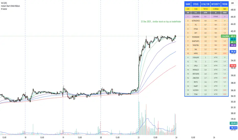
R Factor Advanced Stock Activity Ranking (Experimental) R Factor (relative factor) is a custom logic based 'momentum ranking' parameter, which measures intensity of intraday momentum and volatility. This parameter compared today's activity from last 20 days activity and ranks the stocks according to the intensity of the momentum.
Why momentum ranker?
Because traditional %change sorts intraday stock which show momentum in ascending order of value of % change, for example 3%, 2.5 %, 1% etc. But momentum ranker does not use % change as a sorting parameter for top gainers, or losers. It ranks the stocks, regardless of the direction, according to the intensity it is showing. The value of the momentum ranking has no meaning of itself, just understand that higher the value of momentum ranker, the more intensity the stock is showing.
In this indicator we can only scan 40 F&O stock of Indian Stock Market. This indicator is to be used only on 5 min timeframe.
Tip: Do not change any values in the settings otherwise, the indicator won't work as expected.
Also after applying the indicator, your canvas will shrink, manually fix it by stretching from Y axis, a table will appear showing top 20 stocks. Some times the indicator will glitch & show incorrect names of stocks, refresh the Tradingview website to fix this. Best used on a PC.
Disclaimer/Warning:
This parameter is inspired by TradeFinder and is an attempt to study the momentum of the stocks. This indicator in no way attempts to copy features of the TradeFinder software, this is purely an experimental Indicator, for the people who cannot afford to buy a trading software. This indicator does not provide Buy/Sell signals or nor is an investment advice. This indicator solely for the purpose of study of price and its momentum. Users are responsible for their own actions, profit/loss of the users is not the liability of author.
SMC Post-Analysis Lab [PhenLabs]📊 SMC Post-Analysis Lab
Version: PineScript™ v6
📌 Description
The SMC Post-Analysis Lab is a dedicated hindsight analysis tool built for traders who want to understand what really happened during any historical trading period. Unlike forward-looking indicators, this tool lets you scroll back through time and instantly receive algorithmic classification of market states using Smart Money Concepts methodology.
Whether you’re reviewing a losing trade, studying a successful session, or building your pattern recognition skills, this indicator provides immediate context. The expansion-aware algorithm processes price action within your selected window and outputs clear, actionable classifications ranging from Parabolic Expansion to Consolidation Inducements.
Stop relying on subjective post-trade analysis. Let the algorithm objectively tell you whether institutional players were accumulating, distributing, or running inducements during your trades.
🚀 Points of Innovation
First indicator specifically designed for SMC-based post-trade review rather than live signal generation
Dual-mode analysis system allowing both dynamic scrollback and precise date selection
Expansion-aware classification algorithm that weighs range position against net displacement
Real-time efficiency metrics calculating directional quality of price movement
Integrated visual FVG detection within the analysis window only
Interactive table with clickable date range adjustment via chart interface
🔧 Core Components
Pivot Detection Engine: Uses configurable pivot length to identify significant swing highs and lows for structure break detection
Window Calculator: Determines active analysis zone based on either bar offset or timestamp boundaries
Data Aggregator: Tracks window open, high, low, close and counts bullish/bearish structure break events
State Classification Algorithm: Applies hierarchical logic to determine market state from six possible classifications
Visual Renderer: Draws structure breaks, FVG boxes, and window highlighting within the active zone
🔥 Key Features
Sliding Window Mode: Use the Scroll Back slider to dynamically move your analysis zone backwards through history bar-by-bar
Date Range Mode: Select specific start and end timestamps for precise session or trade review
Six Market State Classifications: Parabolic Expansion (Bull/Bear), Bullish/Bearish Order Flow, Accumulation/Distribution Reversal, and Consolidation/Inducement
Range Position Percentile: See exactly where price closed relative to the window’s high-low range as a percentage
Bull/Bear Event Counter: Quantified count of structure breaks in each direction during the analysis period
Efficiency Calculation: Net move divided by total range reveals trending quality versus chop
🎨 Visualization
Blue Window Highlight: Active analysis zone is clearly marked with blue background shading on the chart
Structure Break Lines: Dashed lines appear at each bullish or bearish structure break within the window
FVG Boxes: Fair Value Gaps automatically render as semi-transparent boxes in bullish or bearish colors
Dashboard Table: Top-right positioned table displays State, Analysis description, and Metrics in real-time
Color-Coded States: Each classification uses distinct coloring for immediate visual recognition
Interactive Tip Row: Optional help text guides users on clicking the table to adjust date range
📖 Usage Guidelines
General Configuration
Analysis Mode: Default is Sliding Window. Choose Date Range for specific timestamp analysis.
Sliding Window Settings
Scroll Back (Bars): Default 0. Increase to move window backwards into history.
Window Width (Bars): Default 100. Range 20-50 for scalping, 100+ for swing analysis.
Date Range Settings
Start Date: Select the beginning timestamp for your analysis period.
End Date: Select the ending timestamp for your analysis period.
Visual Settings
Show Help Tip: Default true. Toggle to hide instructional row in dashboard.
Bullish Color: Default teal. Customize for bullish elements.
Bearish Color: Default red. Customize for bearish elements.
SMC Parameters
Pivot Length: Default 5. Lower values (3-5) catch minor breaks. Higher values (10+) focus on major swings.
✅ Best Use Cases
Post-trade review to understand why entries succeeded or failed
Session analysis to identify institutional activity patterns
Trade journaling with objective algorithmic classifications
Pattern recognition training through historical scrollback
Identifying whether stop hunts were inducements or legitimate breaks
Comparing your real-time read versus what the algorithm detected
⚠️ Limitations
Designed for historical analysis only, not live trade signals
Classification accuracy depends on appropriate pivot length for the timeframe
FVG detection uses simple gap logic without mitigation tracking
State classification is based on window data only, not broader context
Requires manual scrolling or date input to review different periods
💡 What Makes This Unique
Purpose-Built for Review: Unlike most indicators focused on live signals, this is designed specifically for post-trade analysis
Expansion-Aware Logic: Algorithm weighs both position in range AND directional efficiency for accurate state detection
Interactive Date Control: Click the dashboard table to reveal draggable anchors for window adjustment directly on chart
🔬 How It Works
1. Window Definition:
User selects either Sliding Window or Date Range mode
System calculates which bars fall within the active analysis zone
Active zone receives blue background highlighting
2. Data Collection:
Algorithm captures window open, running high, running low, and current close
Structure breaks are detected when price crosses above last pivot high or below last pivot low
Bullish and bearish events are counted separately
3. State Classification:
Range Position calculates where close sits as percentage of high-low range
Efficiency calculates net move divided by total range
Hierarchical logic applies priority rules from Parabolic states down to Consolidation
4. Output Rendering:
Dashboard table updates with State title, Analysis description, and Metrics
Visual elements render within window only to keep chart clean
Colors reflect bullish, bearish, or neutral classification
💡 Note:
This indicator is intended for educational and review purposes. Use it to develop your understanding of Smart Money Concepts by analyzing what institutional order flow looked like during historical periods. Combine insights with your own analysis methodology for best results.

TCI Time Oracle - Intraday
🟢 Green Zone — Opening & Closing Liquidity Window
Time:
Opening Green: ~9:15 – 9:30 AM
Closing Green: ~3:15 – 3:30 PM
Market Character:
Highest liquidity of the day
Overnight positions unwind / fresh positions initiate
Strong directional intent often revealed
Smart money sets the day’s bias
Trading Insight:
Best zone for trend bias identification
Option premiums react fastest here
Not ideal for late entries, but excellent for confirmation
🔵 Blue Zone — Midday Compression / Algo Control
Time: ~11:15 AM – 12:00 PM
Market Character:
Volatility contraction
Algo-driven price control
Time decay dominates options
Fake breakouts and mean reversion
Trading Insight
Worst zone for aggressive option buying
Best for range scalping or staying flat
Institutions wait, retailers get chopped
🔴 Red Zone — Institutional Expansion / Trap Zone
Time: ~1:15 PM – 2:00 PM
Market Character:
Sudden volatility expansion
Institutional orders hit the market
Trend acceleration or sharp reversal
Options see rapid delta & gamma shift
Trading Insight:
High probability trend continuation or trap creation
Strong zone for directional option trades
Requires strict risk management
Big Picture Takeaway
Green sets the intent
Blue compresses and traps
Red expands and delivers the real move
This time-zone behavior is exactly why one strategy cannot work all day. Edge comes from trading the right setup in the right time window.

ZeroDegen Mega Pro Pack v2═══════════════════════════════════════════════════════════════════════════════
ZERODEGEN MEGA PRO PACK v2 — Multi-Mode Trading System
═══════════════════════════════════════════════════════════════════════════════
Professional trading indicator with 11 modes for crypto markets. Clear BUY/SELL signals, real-time market analysis, and institutional-grade filters.
🎯 WHAT IT DOES
Analyzes price action using multi-factor confirmation:
- EMA crossovers (9/21) for trend direction
- RSI momentum filtering
- ADX trend strength validation
- Volume confirmation
- Higher timeframe bias (1H trend filter)
- Institutional concepts: Liquidity sweeps, Fair Value Gaps
Generates clear BUY and SELL signals directly on your chart with a real-time status panel showing all market conditions at a glance.
📊 11 TRADING MODES
SCALP (15m): Standard, Aggressive, Conservative
TREND (1H-4H): Standard, Cloud, Institutional
INSTITUTIONAL: Liquidity Engine
MIXED: Pro, Reversal, Auto Engine, Automation + Confidence
Switch modes with one click to match market conditions.
⚡ KEY FEATURES
✓ Clear visual BUY/SELL/EXIT signals
✓ Real-time status panel with all indicators
✓ Smart filters (Volume, ADX, ATR, Range)
✓ HTF Bias display (1H trend direction)
✓ Institutional Confidence score
✓ Works on any crypto pair
✓ TradingView alert-ready
📈 RECOMMENDED USAGE
Timeframes: 15m (scalp), 1H (swing), 4H (trend)
Markets: BTC, ETH, SOL, and other liquid crypto pairs
🔐 HOW TO GET ACCESS
Visit: xeroc00l.org
- Monthly: $59/mo
- Quarterly: $149 (save 15%)
- Lifetime: $497 (one-time)
After payment, send your TradingView username to zerocool@xeroc00l.org — access granted within 24 hours.
🚀 COMING SOON
We're actively developing additional features including bot integration, automated execution, and a private trading community. Subscribe now and get access to all future updates.
Learn more: xeroc00l.org
⚠️ LEGAL DISCLAIMER
This indicator is provided for educational and entertainment purposes only. It is not financial advice and should not be construed as a recommendation to buy, sell, or hold any cryptocurrency or financial instrument.
Trading cryptocurrencies and leveraged products involves substantial risk of loss and is not suitable for all investors. Past performance is not indicative of future results. You should not trade with money you cannot afford to lose.
The creators of ZeroDegen are not licensed financial advisors, brokers, or dealers. By using this indicator, you acknowledge that all trading decisions are your own responsibility and you agree that ZeroDegen and its creators are not liable for any losses incurred.
Always do your own research and consider consulting a licensed financial professional before making investment decisions.
© 2025 ZeroDegen | For entertainment purposes only

Impulsive Trend Detector [dtAlgo]This advanced Pine Script indicator identifies and tracks impulsive price movements based on Break of Structure (BOS) and Change of Character (CHoCH) concepts from Smart Money trading methodology.
The indicator automatically detects pivot highs and lows, then monitors when price breaks these key levels to signal potential impulsive moves. BOS indicates continuation in the current trend direction, while CHoCH signals potential trend reversals. Each detected move is measured from the break point to the next opposing pivot, providing accurate percentage calculations that match TradingView's measuring tool.
Impulsive moves are categorized into four levels based on magnitude (Level 1: 5-10%, Level 2: 10-15%, Level 3: 15-20%, Level 4: 20%+), with color-coded visual labels and connecting lines displayed directly on the chart.
Comprehensive Session Analysis:
Track moves across 11 distinct trading sessions in Eastern Time: Pre-London/NY, London/NY overlap, NY (with Power Hour and End subdivisions), Sydney, Asia, Sake Time, Asia/London overlap, London, Weekend, and No Session periods.
Three Dynamic Tables provide:
Real-time statistics (bullish/bearish, BOS/CHoCH, levels)
Session breakdown with move counts and average percentages
Event log showing last 10 moves with date, day, session, direction, type, level, percentage, duration, and bar count
Perfect for Smart Money traders seeking data-driven insights into market structure behavior across global trading sessions.

Swing HelperThis script, titled "Swing helper", is a multi-metric dashboard designed to provide a comprehensive snapshot of a security's volatility, relative volume, and price action health directly on the chart. It focuses on Average Daily Range (ADR) relationship and key performance indicators to help traders identify setups like volatility contractions or trend strength.
Key Features
Dual-ADR Analysis: Calculates and compares Long-Term (LT) and Short-Term (ST) ADR percentages. The ADR Ratio helps identify when volatility is expanding or contracting relative to historical norms.
Relative Volume (RVol): Compares current volume to a 20-day moving average, highlighting institutional participation.
Dynamic Closing Range: Visualizes where the price is closing relative to the day's true range (the "Closing Range %"), indicating buying or selling pressure.
SMA 50 Distance: A unique metric that measures the price's distance from the 50-day Simple Moving Average in "ADR units," helping to gauge how overextended a stock is.
Automated Price Projections: Dynamically plots -1x and -2x ADR levels from the current price to provide immediate downside targets or support levels.
Custom Bar Coloring: Highlights specific price action patterns:
Inside Days (Blue)
Upside Reversals (Green)
Downside Reversals (Red)
Visual Customization
The script includes a highly flexible Summary Table with customizable positions, sizes, and colors (including borders and headers), allowing it to fit into any dark or light mode chart layout without obstructing price action.
How to Use
Volatility Contraction: Watch for the ADR Ratio to drop, indicating a tightening range before a potential breakout.
Relative Strength: Look for high RVol combined with a high Closing Range % (e.g., >75%) to confirm strong demand.
Mean Reversion: Use the SMA50 Dist metric to identify when a stock is "stretched" too far from its moving average relative to its daily volatility.

MACD Classic MT5 Style (2 Lines + Histogram)MACD Classic MT5 Style (แบบ MetaTrader 5) มีความแตกต่างจาก MACD ทั่วไปที่ใช้กันใน TradingView พอสมควรครับ นี่คือคำอธิบายว่ามันทำงานอย่างไรและอ่านค่าอย่างไรครับ:
1. ความแตกต่างสำคัญ (Key Difference)
MACD ทั่วไป (Standard):
มี 2 เส้น (เส้น MACD และ เส้น Signal)
ฮิสโตแกรม (แท่งกราฟ) คือ ส่วนต่าง (Gap) ระหว่าง 2 เส้นนั้น
MACD แบบ MT5 (Classic MT5):
เส้น MACD จะถูกวาดออกมาเป็น แท่งกราฟ (Histogram) แทนที่จะเป็นเส้น
เส้น Signal จะเป็น เส้น (Line) สีแดงพาดผ่านแท่งกราฟ
สรุปคือ: ในแบบ MT5 แท่งกราฟคือตัวพระเอก (MACD) ส่วนเส้นคือตัวช่วยกรอง (Signal)
Here is the English translation of the explanation:
MACD Classic MT5 Style vs. Standard MACD
The "Classic MT5 Style" MACD differs significantly from the standard MACD typically found on TradingView. Below is an explanation of its mechanics and how to interpret it.
1. Key Differences
Standard MACD (TradingView Default):
Displays 2 Lines (MACD Line and Signal Line).
The Histogram represents the difference (gap) between those two lines.
MT5 Style MACD (Classic):
The MACD value is plotted as a Histogram (bars) instead of a line.
The Signal Line appears as a standard Line (usually red) overlaying the histogram.
In summary: In the MT5 style, the Histogram represents the actual MACD Line, while the separate line acts as the Signal filter.

SETUP XANDAO ETFEste setap é usado para operar nos futuros, usamos essas métricas para poder achar entradas

IDAHL | QuantEdgeBIDAHL | QuantEdgeB
🔍 Overview
The IDAHL indicator builds adaptive, volatility-aware threshold bands from two separate ALMA lines—one smoothed from recent highs, the other from recent lows—then uses percentiles of those lines to define a dynamic “high/low” channel. Price crossing above or below that channel triggers clear long/short signals, with on-chart candle coloring, fills, optional labels and even a built-in backtest table.
✨ Key Features
• 📈 Dual ALMA Bands (with DEMA pre-smoothing)
o High ALMA: ALMA applied to DEMA-smoothed highs (high → DEMA(30) → ALMA).
o Low ALMA: ALMA applied to DEMA-smoothed lows (low → DEMA(30) → ALMA).
• 📊 Percentile Thresholds
o Computes a high threshold at the Xth percentile of the High ALMA over a lookback window.
o Computes a low threshold at the Yth percentile of the Low ALMA.
o Shifts each threshold forward by a small period to reduce repainting.
• ⚡ Dynamic Channel Logic
o When price closes above the high percentile line, the “final” threshold flips down to the low percentile line (and vice versa), creating an adaptive channel that only moves when the outer bound is violated.
o Inside the channel, the threshold holds its last value to avoid whipsaw.
• 🎨 Visual & Alerts
o Plots the two percentile lines and fills between them with a color that reflects the current regime (green for long, yellow for neutral, orange for short).
o Colors your candles to match the active signal.
o Optional “Long”/“Short” labels on confirmed flips.
o Alert conditions fire on each long/short crossover.
• 📊 On-Chart Backtest Metrics
o Toggle on a small performance table—complete with win-rate, net P/L, drawdown—from your chosen start date, without any extra code.
⚙️ How It Works
1. Adaptive Smoothing (ALMA)
o Uses ALMA (Arnaud Legoux Moving Average) for smooth, low-lag filtering. In this script, the inputs are additionally pre-smoothed with DEMA(30) to reduce noise before ALMA is applied—improving stability on highs/lows.
2. Percentile Lines
o The High ALMA series feeds a linear-interpolation percentile function to generate the upper bound; the Low ALMA produces the lower bound.
o These lines are offset by a small look-ahead (X bars) to reduce repaint behavior.
3. Channel Logic
o Breakout Flip: When the selected source (default: Close) closes above the upper bound, the active threshold “jumps” to the lower bound—locking in a new channel until price next crosses.
o Breakdown Flip: Conversely, a close below the lower bound flips the threshold to the upper bound.
4. Signal Generation
o Long while the source is above the current “final” threshold.
o Short while below.
o Neutral inside the channel before any flip.
5. Visualization & Alerts
o Dynamic fills between the two percentile lines change hue as the regime flips.
o Candles adopt the regime color.
o Optional pinned “Long”/“Short” labels at flip bars.
o Alerts on every signal crossover of the zero-based regime line.
6. Backtest Table
o From your chosen start date, a mini-table displays cumulative P/L, win rate and drawdown for this strategy—handy for quick in-chart validation.
🎯 Who Should Use It
• Breakout Traders hunting for adaptive channels that auto-recenter on new highs/lows.
• Volatility Traders who want thresholds that expand and contract with market turbulence.
• Trend-Chasers seeking a fresh take on high/low channels with built-in smoothing.
• Systematic Analysts who appreciate on-chart backtesting without leaving TradingView.
⚙️ Default Settings
• ALMA Length: 14
• Percentile Length: 35 bars
• Percentile Lookback Period (offset): 4 bars
• Upper Percentile: 92%
• Lower Percentile: 50%
• Threshold Source: Close
• Visuals: Candle coloring on, labels off by default, “Strategy” palette
• Backtest Table: on by default (toggleable)
• Start Date (Backtest): 09 Oct 2017
📌 Conclusion
IDAHL blends two smooth, low-lag ALMA filters (fed by DEMA-smoothed highs/lows) with percentile-based channel construction for a self-rewiring high/low envelope. It gives you robust breakout/breakdown signals, immediate visual context via colored fills and candles, optional labels, alerts, and even performance stats—everything you need to spot and confirm regime shifts in one compact script.
🔹 Disclaimer : Past performance is not indicative of future results. Always backtest and align settings with your risk tolerance and objectives before live trading.
🔹 Strategic Advice : Always backtest, optimize, and align parameters with your trading objectives and risk tolerance before live trading.

BTE/TSS - IB 2.0📊 BTE – IB 2.0 (Initial Balance Framework)
BTE – IB 2.0 is a professional Initial Balance (IB) indicator designed for intraday traders who focus on market structure, auction logic, and contextual decision-making — not signal chasing.
The indicator automatically calculates IB High, IB Low, and IB Mid from a user-defined session (default: NY open) and projects IB-based extensions derived from the actual IB range, not arbitrary multipliers.
This is not a predictive tool.
It is a structural framework for understanding market behavior.
📐 What the indicator displays
• IB High & IB Low – core auction boundaries
• IB Mid (50%) – balance point of the auction
• IB Extensions (1×, 2×, 3×) – range-based projections
• Intermediate 50% levels between all extensions
• Optional IB calculation area (boxed range)
• Clean, readable IB level labels directly on the chart
All elements are fully customizable: colors, line styles, extensions, labels, and visibility.
📊 IB Delta & NY Range Analytics
The indicator includes a 20-day statistical table showing:
• IB Range (IB Delta)
• NY Session Range
• Maximum / Mean / Minimum / Current day values
This helps traders:
• evaluate volatility context
• distinguish rotational vs. expansion days
• avoid trading breakouts when statistics do not support them
👤 Who this indicator is for
• Traders using auction market theory
• Traders working with Initial Balance structure
• Traders focused on context, behavior, and reaction
🚫 Who this indicator is NOT for
• Traders looking for buy/sell signals
• Traders expecting predictions
• Traders ignoring session context and structure
🕒 Recommended use
• ES / NQ / YM / RTY
• Futures & index markets
• NY RTH session
• Best combined with Market Profile, order flow, and price action
⚠️ Important note
This indicator does not predict direction.
It defines auction boundaries — execution and bias are the trader’s responsibility.
If you do not understand how to work with Initial Balance, the issue is not the tool.
📩 Contact
For questions, access, or professional use inquiries:
admin@tradingstrategystore.com
