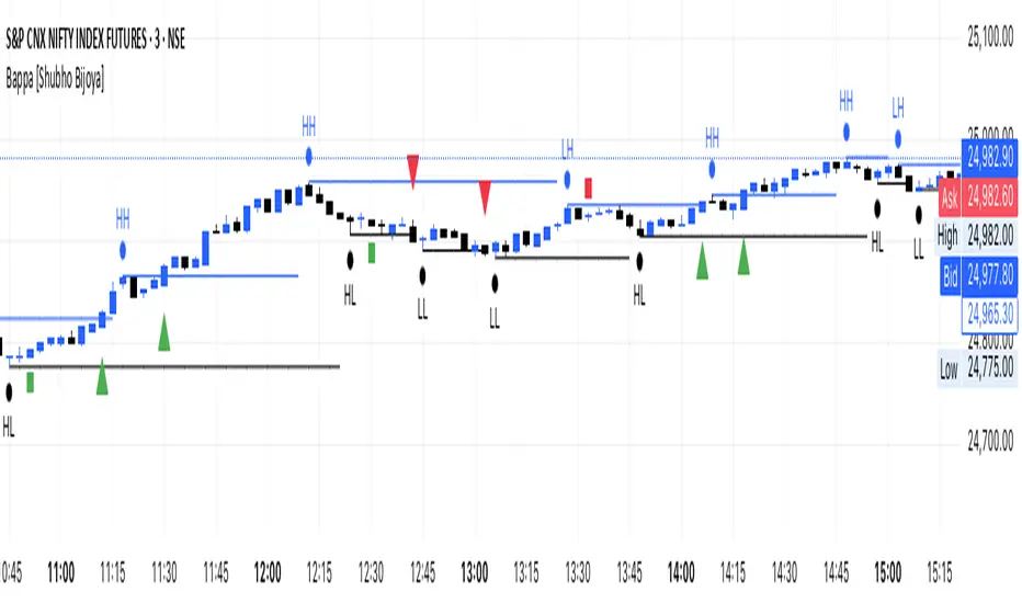
Bappa Swing L/H [Shubho Bijoya] I found this indicator good for scalping on shorter TFs like 3-5 minutes. However it also, works on higher TFs.
It works on Pivots points HH-LH / LL-HL
Поиск скриптов по запросу "pivot"
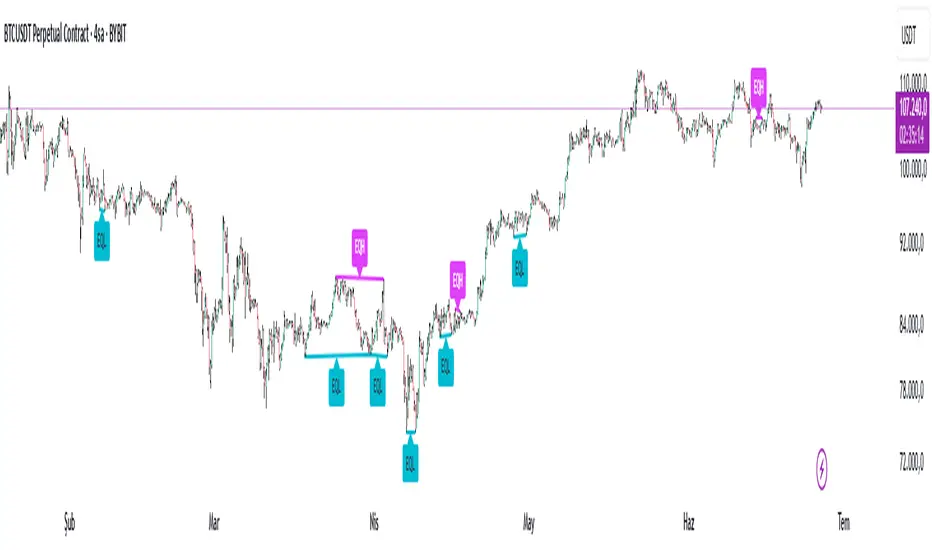
Equal High Low Detector v2.0✅ Equal High Low Detector – Description
This script detects and visualizes Equal Highs (EQH) and Equal Lows (EQL) using multiple user-defined pivot lengths. The indicator compares swing highs and lows based on ATR-based tolerance, identifying price levels that may represent liquidity zones, potential reversals, or breakout traps.
🔹 Uses ATR × tolerance to determine "equal" zones
🔹 Plots dynamic lines and labels for EQH/EQL zones
🔹 Automatically deletes older lines to reduce clutter
🔹 Useful for identifying areas of liquidity, stop hunts, or fakeouts
How it works:
For each active pivot setting, the script checks if the current pivot high/low is within a customizable range (using ATR) of the previous one. If they match within that threshold, it draws a line between the two points and marks the midpoint with a label.
This tool is especially helpful for traders focusing on liquidity engineering, market structure, and price action based strategies.
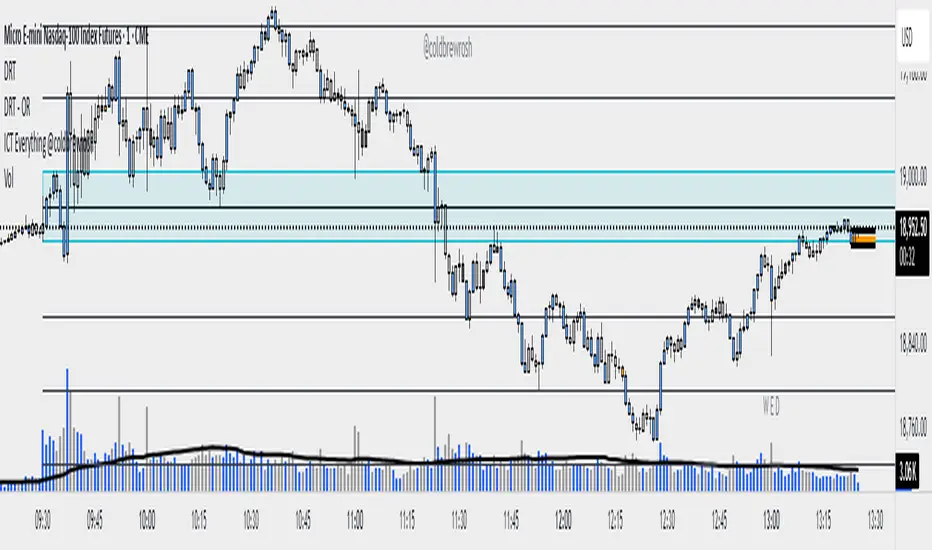
DRT - OR with Fib Extensions [TraderVlad]Overview
The " DRT - OR " indicator is a versatile tool for intraday traders, designed to highlight the opening range (OR) of a market session based on a user-defined timeframe and start time.
It captures the high and low of the first candle at the specified time (default: 9:00 AM Berlin/Europe time, 30-second timeframe), plots a visual box to mark this range, and adds a 50% midpoint line as a potential pivot level.
This indicator is perfect for traders focusing on key market openings, such as the European session (e.g., for DAX, EUR/USD) or other sessions of your choice.
It’s highly customizable, allowing you to adjust the timeframe, start time, timezone, and visual styles to fit your trading strategy.
How It Works
The indicator operates in a straightforward way to provide clear insights:
Captures the Opening Range:
At the specified start time (default: 9:00 AM Berlin/Europe time), the indicator identifies the first candle in the chosen timeframe (default: 30 seconds).
It records the high (highest price) and low (lowest price) of this candle to define the opening range.
The range size is calculated as High - Low.
Draws the Opening Range Box:
A box is drawn on the chart, starting at the specified time and extending to the next day’s start time (or far into the future for the most recent day).
The top of the box is the high, and the bottom is the low, visually marking the range.
Plots the 50% Midpoint Line:
A horizontal line is drawn at the 50% level of the range (calculated as (High + Low) / 2).
This line extends alongside the box, helping you identify a potential pivot point within the range.
Weekday-Only Operation:
The indicator only draws ranges on weekdays (Monday to Friday), skipping weekends when markets are typically closed.
Display Limit:
You can control how many days’ worth of ranges are shown (default: 5 days).
Older ranges are automatically removed to keep your chart clean.
Trading Applications
The opening range often sets the tone for the trading session.
Here’s how to use this indicator:
Identify Key Levels:
The top and bottom of the box (high and low) can act as support and resistance levels.
A breakout above the high or below the low may indicate a directional move.
Use the 50% Midpoint:
The midpoint line can serve as a pivot point within the range.
Price may find support or resistance at this level before breaking out.
Analyze Range Size:
The label shows the range size, helping you gauge volatility at the open.
A larger range suggests higher volatility, while a smaller range indicates a quieter start.
Flexible Application:
Use the indicator for any market session by adjusting the timezone and start time (e.g., 9:30 AM New York for US markets).
Combine with other indicators (e.g., volume, RSI) to confirm trades based on the opening range.
This indicator is part of the DRT (Dynamic Range Theory) series by TraderVlad, aimed at helping traders identify critical price levels at key market openings.
Feedback and suggestions are welcome to improve this tool further!
Liquidity Heatmap SwiftEdgeDescription
Liquidity Heatmap with Buy/Sell Side (Blue/Red) is a technical analysis tool designed to help traders identify potential liquidity zones in the market by combining swing high/low detection with volume analysis, visualized as a heatmap overlay on the chart. This script highlights areas where significant buying or selling pressure may exist, often acting as support or resistance levels, and provides a clear visual representation of these zones using color-coded heatmap boxes and labeled bubbles.
What It Does
The script identifies key price levels (swing highs and lows) where liquidity is likely to be concentrated, such as stop-loss clusters or pending orders. These levels are then grouped into a heatmap, with blue zones representing potential buy-side liquidity (below the current price) and red zones indicating sell-side liquidity (above the current price). Each zone is marked with a bubble showing the estimated liquidity amount, derived from volume data, to help traders gauge the strength of the level.
How It Works
The script combines three main components to create a comprehensive liquidity visualization:
Swing Highs and Lows Detection:
The script uses the ta.pivothigh and ta.pivotlow functions to identify swing highs and lows over a user-defined lookback period (Swing Length). These levels often represent areas where price has reversed, indicating potential liquidity zones where stop-losses or pending orders may be placed.
Volume Analysis:
Volume data at each swing high/low is captured and averaged over a specified period (Volume Average Length). This volume is then scaled using a multiplier (Volume Multiplier for Liquidity) to estimate the liquidity amount at each level, displayed in thousands (e.g., "10K") on the chart via labeled bubbles.
Heatmap Visualization:
The identified levels are grouped into price bins to form a heatmap. The price range is divided into a user-defined number of bins (Number of Heatmap Bins), and each bin is drawn as a colored box (blue for buy-side, red for sell-side). The transparency of the heatmap boxes can be adjusted (Heatmap Transparency) to ensure they do not obscure the price action.
Why Combine These Components?
The combination of swing highs/lows, volume analysis, and a heatmap provides a powerful way to visualize liquidity in the market. Swing highs and lows are natural points where liquidity tends to accumulate, as they often coincide with areas where traders place stop-losses or pending orders. By incorporating volume data, the script quantifies the potential strength of these levels, giving traders insight into the magnitude of liquidity present. The heatmap visualization then aggregates these levels into a clear, color-coded overlay, making it easy to see where buy-side and sell-side liquidity is concentrated without cluttering the chart.
This mashup is particularly useful because it bridges price action (swing levels), market activity (volume), and visual clarity (heatmap), offering a holistic view of potential support and resistance zones that might influence price movements.
How to Use It
Add the Indicator to Your Chart:
Apply the script to your chart by adding it from the Pine Script library. It will overlay directly on your price chart.
Interpret the Heatmap:
Blue Zones (Buy-Side Liquidity): These appear below the current price and indicate levels where buying pressure or stop-losses from short positions may be located.
Red Zones (Sell-Side Liquidity): These appear above the current price and indicate levels where selling pressure or stop-losses from long positions may be located.
The intensity of the color is controlled by the Heatmap Transparency setting—lower values make the zones more opaque, while higher values make them more transparent.
Analyze the Bubbles:
Each liquidity zone is marked with a bubble showing the estimated liquidity amount in thousands (e.g., "10K"). The size of the bubble is scaled by the Bubble Size Multiplier, with larger bubbles indicating higher liquidity.
Adjust Settings for Your Needs:
Liquidity Settings:
Swing Length: Controls the lookback period for detecting swing highs and lows. A smaller value (e.g., 10) is better for shorter timeframes like 1-minute charts, while a larger value (e.g., 50) suits higher timeframes.
Liquidity Threshold: Defines how close two levels must be to be considered the same, preventing duplicate zones.
Volume Average Length: Sets the period for averaging volume data at swing points.
Volume Multiplier for Liquidity: Scales the volume to estimate liquidity amounts shown in the bubbles.
Lookback Period (Hours): Limits how far back the script looks for liquidity zones.
Use Price Window Filter: If enabled, only shows zones within a price range defined by Liquidity Window (Points per Side).
Heatmap Settings:
Number of Heatmap Bins: Determines how many price bins the heatmap is divided into. More bins create a finer resolution but may clutter the chart.
Heatmap Bin Height (Points): Sets the vertical height of each heatmap box in price points.
Heatmap Transparency: Adjusts the transparency of the heatmap boxes (0 = fully opaque, 100 = fully transparent).
Display Settings:
Bubble Size Multiplier: Scales the size of the bubbles showing liquidity amounts.
Trading Application:
Use the heatmap to identify potential support (blue zones) and resistance (red zones) levels where price may react.
Pay attention to zones with larger bubbles, as they indicate higher liquidity and may have a stronger impact on price.
Combine with other analysis tools (e.g., trendlines, indicators) to confirm trade setups.
What Makes It Original?
This script stands out by integrating swing high/low detection with volume-based liquidity estimation and a heatmap visualization in a single tool. Unlike traditional support/resistance indicators that only plot static lines, this script dynamically aggregates liquidity zones into a heatmap, making it easier to see clusters of potential buying or selling pressure. The addition of volume-derived liquidity amounts in labeled bubbles provides a unique quantitative measure of each zone's strength, helping traders prioritize key levels. The color-coded buy/sell distinction further enhances its utility by visually separating zones based on their likely market impact.
Example Use Case
On a 1-minute chart of EUR/USD, you might set Swing Length to 10 to capture short-term pivots, Lookback Period (Hours) to 4 to focus on recent data, and Liquidity Window to 200 points (20 pips) to show only nearby zones. The heatmap will then display blue zones below the current price where buy-side liquidity may act as support, and red zones above where sell-side liquidity may act as resistance. A bubble showing "50K" at a blue zone indicates significant buy-side liquidity, suggesting a potential bounce if the price approaches that level.

next day levelHere's a description you can use to publish your Pine Script:
---
**Future CPR with Next Day Extension**
This indicator calculates and displays the Central Pivot Range (CPR) for different timeframes (Daily, Weekly, Monthly, and Yearly). It also extends the CPR for the next trading session, helping traders plan their strategies in advance.
### 🔹 **Features:**
✅ Calculates CPR using today's (or previous period's) High, Low, and Close
✅ Displays next day's CPR for better planning
✅ Supports multiple timeframes: Daily, Weekly, Monthly, and Yearly
✅ Option to display historical CPR levels
✅ Plots resistance (R1, R2, R3) and support (S1, S2, S3) levels
✅ Customizable colors and display settings
### 📌 **Usage:**
- Use this indicator for pre-market analysis to identify key pivot levels for the next session.
- Helps in understanding price action around crucial levels like pivot points, supports, and resistances.
- Works well for both intraday and swing traders.
🔹 **Tip:** To avoid real-time recalculations, use this indicator only after the current trading session closes.
🚀 **Enhance your trading with better preparation using Future CPR with Next Day Extension!**

Auto Fib Retracement [victhoreb]Auto Fib Retracement is an automated Fibonacci retracement tool for TradingView that dynamically identifies key swing points and plots Fibonacci levels to help traders visualize potential support and resistance areas. Using a Zigzag algorithm, the indicator detects recent pivot highs and lows and calculates retracement levels based on these significant price swings. Key features include:
- Dynamic Pivot Detection: Automatically identifies recent swing highs and lows using configurable lookback periods, ensuring the Fibonacci levels adjust as the market evolves.
- Customizable Fibonacci Levels: Users can tailor the Fibonacci retracement levels (0, 0.214, 0.382, 0.5, 0.618, 0.786,) along with individual colors, offering flexibility to match various trading strategies.
- Zigzag Visualization: Optionally displays a Zigzag line that connects the detected pivot points, providing a clear visual representation of the price swing dynamics.
- Adjustable Line Extension: Retracement lines can be extended for a specified number of bars.
- Repainting Option: Includes an option to repaint the Zigzag, ensuring that the most current price action is reflected in the indicator’s output.
- The Auto Fibonacci Retracement itself DOES NOT REPAINT : )
This indicator streamlines the analysis process by automatically drawing Fibonacci retracement levels, allowing traders to quickly identify potential reversal areas and make more informed trading decisions.

DB Support Resistance LevelsDB Support Resistance Levels
This indicator plots historic lines for high, low and close prices. The settings allow up to 3 periods to be configured based on the current timeframe. Users can toggle the display of high, low or close values for each period along with customizing the period line color. The indicator does not use the security function. Instead, it's designed to use a period multiplier. Each period allows the user to configure a lookback length and multiplier.
For Example on Weekly
A period lookback of 12 with a multiplier value of 12 on weekly would produce historic high, low and close lines for the last 12 weeks.
A period lookback of 10 with a multiplier value of 4 on weekly would produce historic high, low and close lines for the last 4, 4-week months.
A period lookback of 8 with a multiplier value of 13 on weekly would produce historic high, low and close lines for the last 8, 13-week quarters.
Why not use security with higher timeframe?
The goal was to have the lines start at the precise high, low and close points for the current chart timeframe to allow the user to visually trace the start of the line.
What else does this do?
This indicator also plots the pivot points using TradingView's built-in "pivot_point_levels" feature.
How should I use this indicator?
Traders may use this indicator to gain a visual reference of support and resistance levels from higher periods of time. You can then compare these historic levels against the pivot point levels. In most cases, historic high, low and close levels act as support and resistance levels which can be helpful for judging future market pivot points.
Additional Notes
This indicator does increase the max total lines allowed which may impact performance depending on device specs. No alerts or signals for now. Perhaps coming soon...
daily_pivots_beta_persistenttraderDaily central pivots for today and tomorrow are plotted. This is strictly BETA version.
Irrespective of timeframe chosen for the charts, it's DAILY pivots that are plotted.
Pls note that this is made available as-is and I make it clear that I am not responsible for any profilt or loss or any other outcome directly or indirectly arising out of use of this formula.
TRAING.COM.VN V66TRAING.COM.VN V66 – Professional Trend Following System
TRAING.COM.VN V66 is an advanced trend-following toolkit designed to capture major market moves with institutional-grade precision, optimized for both Swing and Position trading.
KEY FEATURES:
Trend Lock Technology: Utilizes HLC3 & Pivot Breakout logic to "lock" the trend color, eliminating noise and fake signals during consolidation.
Smart Target Engine: Automatically scans multi-timeframe data to determine the best Take Profit level:
Safe Mode: Targets strong Daily Resistance levels.
ATH Mode: Switches to Fibonacci Extension when price breaks All-Time Highs to maximize profits.
Pro Risk Management: Features an automatic Swing Low Stoploss (5-candle lookback) and an integrated Trailing Stop to secure gains as price rallies.
Macro Trend Filter: Built-in EMA 200 warning system to prevent trading against the long-term trend.
Clean Chart Mode: Option to display only the Last Active Signal, keeping your chart clutter-free for focused execution.

TRADING.COM.VN Pro V66TRADING.COM.VN – Professional Trend Following System
TRADING.COM.VN is an advanced trend-following toolkit designed to capture major market moves with institutional-grade precision, optimized for both Swing and Position trading.
KEY FEATURES:
Trend Lock Technology: Utilizes HLC3 & Pivot Breakout logic to "lock" the trend color, eliminating noise and fake signals during consolidation.
Smart Target Engine: Automatically scans multi-timeframe data to determine the best Take Profit level:
Safe Mode: Targets strong Daily Resistance levels.
ATH Mode: Switches to Fibonacci Extension when price breaks All-Time Highs to maximize profits.
Pro Risk Management: Features an automatic Swing Low Stoploss (5-candle lookback) and an integrated Trailing Stop to secure gains as price rallies.
Macro Trend Filter: Built-in EMA 200 warning system to prevent trading against the long-term trend.
Clean Chart Mode: Option to display only the Last Active Signal, keeping your chart clutter-free for focused execution.

Previous Day S&R LevelsFor intraday charts only. This shows the previous days Pivot, S1 - S3 and R1 - R3 within the current days session. Often these levels remain significant the following day.

SR Zones and Timeframe LevelsAutomatically identifies and displays support/resistance zones based on pivot points, combined with key timeframe levels (daily, weekly, monthly highs/lows).
* Status line shows closest support and resistance prices.
* Option to merge nearby timeframe levels to channels for cleaner display
* Detailed and simple strength levels based price touches and timeframe confluences.

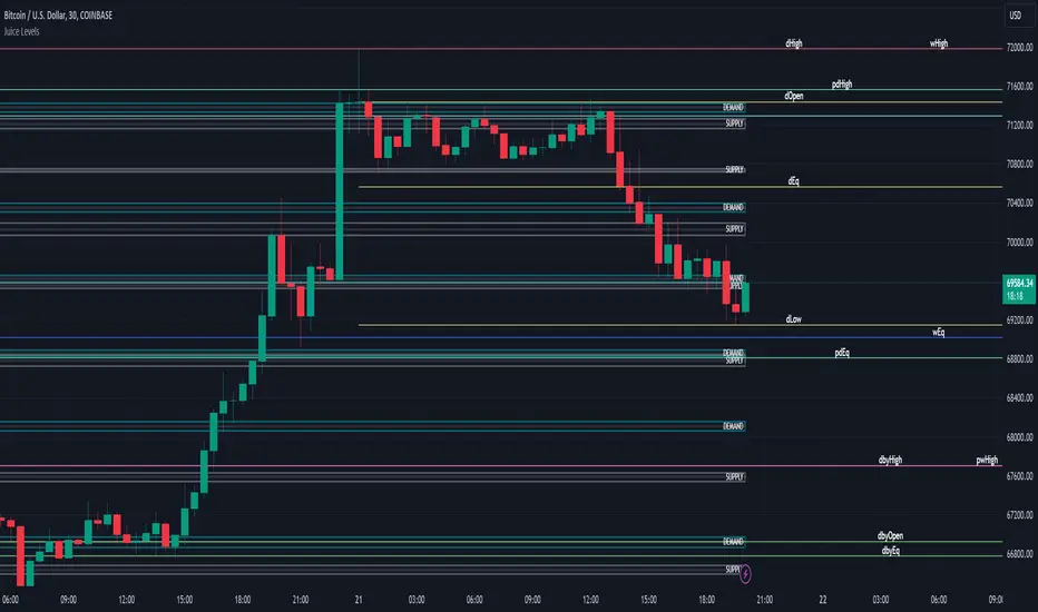
Juice LevelsSupply and Demand Key Levels
These levels encompass key price points derived from various timeframes, providing crucial insights into market dynamics and potential trading opportunities. These levels include daily, prior day, day before yesterday, weekly, prior weekly, monthly, and prior monthly levels.
Daily, Prior Day, Day Before Yesterday Levels
Offer intraday reference points and historical context for analyzing short-term price movements.
Weekly, Prior Weekly Levels
Provide insights into longer-term trends and potential areas of price consolidation or breakout over a one-week timeframe.
Monthly, Prior Monthly Levels
Offer significant insights into macroeconomic trends and investor sentiment over longer timeframes, spanning one month.
Equilibrium Levels
Indicate points where supply and demand are relatively balanced, often serving as pivot points for price movements.
Supply and Demand Zones
Highlight areas on a price chart where significant buying or selling pressure is expected, aiding traders in identifying potential reversal or breakout zones.
These levels and zones are essential tools for traders to analyze market sentiment, identify support and resistance levels, and make informed trading decisions across various timeframes.
Quarterly DFR [Dango]Introducing the Defining Range Indicator, a powerful tool designed to help traders identify and understand the important levels of highs, lows, and equilibrium within a selected quarterly cycle. This innovative script provides valuable insights into the key price levels that are likely to elicit a strong reaction in the market, enabling traders to make more informed decisions and enhance their trading strategies.
Key Features:
Identifies and displays the defining high, low, and equilibrium levels based on the selected quarterly cycle
Utilizes advanced algorithms to analyze price action and determine the most significant levels
Provides a visual representation of the defining range on the chart, making it easy for traders to identify potential support, resistance, and pivot points
Enables traders to backtest and understand how price has reacted to these levels in the past
How It Works:
The Defining Range Indicator employs a sophisticated algorithm to analyze price action within the selected quarterly cycle. By examining the price behavior and patterns within this timeframe, the script determines the most significant high, low, and equilibrium levels that are likely to influence future price movements.
The indicator takes into account various factors, such as price momentum, volatility, and volume, to identify the key levels that define the range. These levels are then visually represented on the chart, providing traders with a clear picture of the important price points to watch.
The Defining Range Indicator works in the following steps:
Quarterly Cycle Selection: Traders select the desired quarterly cycle timeframe (90-minute, daily, weekly, monthly, or yearly) to focus the analysis on.
High and Low Identification: The script analyzes the price action within the selected quarterly cycle to determine the most significant high and low points. These levels are considered the defining high and low of the range.
Equilibrium Calculation: The indicator calculates the equilibrium level, which represents the midpoint between the defining high and low. This level is considered a potential pivot point where price may find balance or reverse direction.
Visual Representation: The defining high, low, and equilibrium levels are plotted on the chart, providing traders with a clear visual representation of the key price levels to monitor.
Expected Usage:
The Defining Range Indicator is designed to help traders gain a better understanding of the important price levels within a selected quarterly cycle. By identifying the defining high, low, and equilibrium, traders can make more informed decisions and enhance their trading strategies.
Support and Resistance Identification: The defining high and low levels act as potential support and resistance areas. Traders can use these levels to plan their trades, set entry and exit points, and manage risk effectively.
Pivot Point Trading: The equilibrium level represents a potential pivot point where price may find balance or change direction. Traders can watch for price behavior around this level to identify potential trading opportunities.
Backtesting and Historical Analysis: The Defining Range Indicator enables traders to backtest their strategies and understand how price has reacted to the defining levels in the past. By analyzing historical price action, traders can gain valuable insights into the effectiveness of their trading approach and make necessary adjustments.
Confluence and Confirmation: Traders can use the Defining Range Indicator in conjunction with other technical analysis tools, such as the Quarterly High and Low Indicator or the Quarterly Cycles Indicator, to confirm trade setups and increase confidence in their trading decisions.
Risk Management: By understanding the location of the defining high, low, and equilibrium levels, traders can make more informed decisions about stop-loss placement and position sizing. Setting stop-losses beyond these key levels can help mitigate the risk of getting stopped out prematurely due to short-term price fluctuations.
Limitations and Disclaimer:
While the Defining Range Indicator is a valuable tool, it should not be used in isolation. Traders should combine the insights gained from this indicator with other forms of analysis, risk management, and sound trading psychology to develop a well-rounded and effective trading approach.
Please note that the indicator's accuracy may be impacted by extreme market volatility or unusual events, and the defining levels should not be relied upon in isolation. As with any trading tool, individual results may vary, and past performance does not guarantee future outcomes. Traders should always exercise caution, use appropriate risk management techniques, and continuously educate themselves to adapt to changing market conditions.
This indicator is provided for educational purposes only and should not be considered financial advice. Always conduct your own due diligence and consult with a financial professional before making any trading decisions.
Privacy of Code:
The underlying logic and specific calculations used in the Defining Range Indicator's algorithm are proprietary and not disclosed to protect the intellectual property of the script. The methods used to identify the defining high, low, and equilibrium levels are the result of extensive research, testing, and refinement. By keeping these details confidential, the script maintains its competitive edge and ensures the protection of its intellectual property.
To be Used in Pair with Quarterly Cycle Indicator

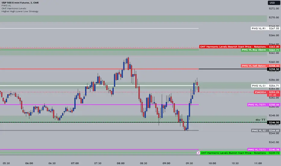
OHT Harmonic LevelsHarmonic Level plotter I've been talking about on the discord - right now a lot of this is manual and some day maybe we can get it to be automatic across different time frames but that is probably far off in the future.
For now, you need to probably create a new tab/layout for each instrument you add this to. It will then ask for the long start price and short start price. I would like to leave this how it is as I don't like using the top of pivot points, its lazy and you don't learn to go find the current trend.
The levels have an area around them equal to 10% of the rotation size, so if NQ has a rotation size of 60, there is a 6pt area around the actual level to either size to account for rotation average changes.
Adaptaive MA PSAR Strategy [PivotProphet]This strategy, leverages a dynamic approach to moving averages, an adaptive Parabolic SAR (PSAR), and volume moving averages to create a versatile trading system suitable for various markets. It includes an array of customizable settings that allow traders to adapt the strategy to their preferences and market conditions.
Key Features
Dynamic Moving Averages: Choose between a standard SMA, EMA, or RMA, and explore dynamic versions for adaptive smoothing and trend detection.
Parabolic SAR: Incorporates both standard and adaptive PSAR for trend reversal signals. The adaptive PSAR settings can be fine-tuned for sensitivity and responsiveness.
Volume MA: Enhances trade confirmation with volume moving averages, offering multiple types for a comprehensive market analysis.
Filter Integration: Includes ATR for volatility filtering, ADX for trend strength, RSI for momentum, and MACD for trend confirmation, each with customizable parameters.
Settings Overview
Trend Settings: Choose your preferred MA type and length for trend analysis.
PSAR Settings: Adjust the PSAR start, increment, and maximum values for tailored trend reversal signals.
Adaptive PSAR Settings: Fine-tune the adaptive PSAR with various modes, smoothing periods, and thresholds for enhanced flexibility.
Volume & Volatility Filters: Set up volume MA type and length, and utilize the ATR filter for volatility-based decision-making.
Exit/Entry Conditions: Select from SMA100, PSAR, or Adaptive PSAR for exit conditions, and customize entry conditions with PSAR settings.
Strategy Implementation
The strategy triggers long positions when the price is above the selected MA, accompanied by a favorable PSAR signal and volume exceeding its MA. Short positions are considered under the inverse conditions. Filters such as ADX, RSI, and MACD are applied to refine entry points, while dynamic exit conditions based on the chosen setting ensure disciplined risk management.
Visualization:
SMA and PSAR plots provide a visual representation of the trend and potential reversal points.
Color-coded bars and shapes indicate trading signals and market sentiment.
Designed for versatility, this strategy aims to cater to both novice and experienced traders seeking a robust framework for their trading endeavors. Customize to your heart's content and adapt to the rhythm of the markets with the Adaptive MA PSAR Strategy.

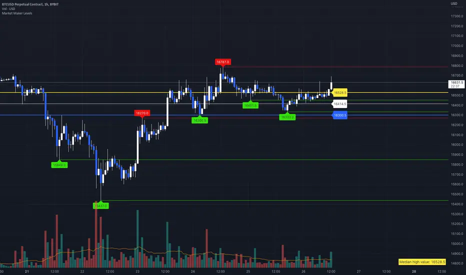
Market Maker LevelsLook for pivot points where liquidity may be.
Don't forget to set the start time for low and high timeframes.
Strong, Weak, IntraThis scripts allows user to manual key in strong, weak and instra day pivot lines by entering the input values. It allows easy inputs value to add lines quickly and efficiently.

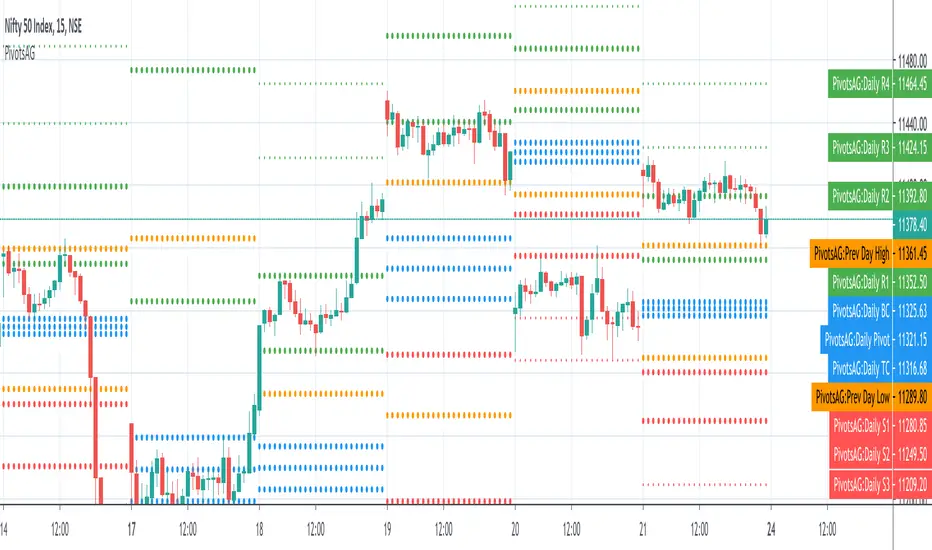
PivotsAGThis is a one in all Pivot based indicator - this includes Central Pivot Range(CPR), Camarilla Pivot and Previous Day High/Low combination that I learnt recently. By default, it show only the CPR however other options can be turned display on from the settings.
Appreciate any feedback on this. Thanks for viewing/trying.
MR_clouds// @author MRodr
// based on pivot points, currently focuses on r1 and 2 and s1 and 2, green is the colour between pivot and r1, lime is the colour between s1 and s2, opposite for purple and red on the resistance side
// only input is the number of minutes to run the cloud on, default settings to 4hours, works best when clouds are 15x time interval or higher

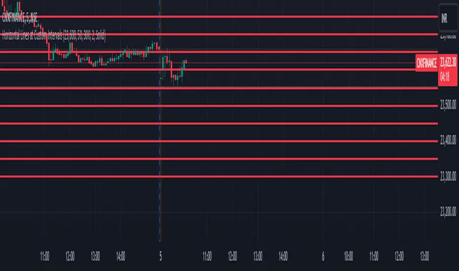
Horizontal Lines at Custom IntervalsThis Pine Script indicator, "Horizontal Lines at Custom Intervals," is a versatile tool designed to help traders visualize key price levels at regular intervals above and below a specified starting price. It is particularly useful for identifying support and resistance zones, psychological price levels, or potential entry and exit points around a central price reference.
Customizable Starting Price**: Set a central price around which the lines will be drawn, such as a current asset price, pivot level, or significant historical level.
- **Adjustable Intervals and Range**: Choose the interval distance (in points) between each horizontal line, as well as the total range above and below the starting price. This flexibility allows the indicator to adapt to different asset classes and timeframes.
- **Full Chart Extensions**: Each line is set to extend across the entire chart, providing a clear, continuous visual reference that spans both past and future price action.
- **Editable Line Style, Width, and Color**: Personalize the appearance of the lines with selectable color, width, and style options (Solid, Dotted, Dashed), enabling the indicator to match your charting preferences and visual style.
### Applications:
1. **Support and Resistance Identification**: Traders can use the evenly spaced lines to identify potential support and resistance zones around the starting price, helping to mark areas of interest where price may react.
2. **Psychological Levels**: Round-number levels often hold psychological significance in trading. By setting intervals to common round numbers, this indicator can help identify these critical levels.
3. **Scalping and Range Trading**: This tool is especially valuable in range-bound markets, where repeated price action within defined levels allows traders to buy and sell around predictable zones.
4. **Trend Reversal and Breakout Signals**: In trending markets, observing how price interacts with these levels can offer insights into possible breakouts or trend reversals.
### Example Use Case:
For instance, if BankNifty is trading around 51,130, you can set this as the starting price. With 50-point intervals and a range of 1,000 points, the indicator will plot lines at 50-point increments both above and below 51,130, covering a total range of 2,000 points. This setup provides clear visual cues for potential price reaction zones as the asset moves through different price levels.
This indicator is a simple yet powerful addition to any trader’s toolkit, offering a structured approach to analyzing price levels and making informed trading decisions.